Quantcast
Channel: Developer Express Inc.
Viewing all 2401 articles
Browse latest View live

Be more productive on Blazor with CodeRush

$
0
0

Did you know CodeRush already has some really cool features to make you even more productive in Blazor?

The last few CodeRush sprints have added several features. I thought it might be a good idea to summarize all of these in a single blogpost as reference material.

Lifecycle Methods

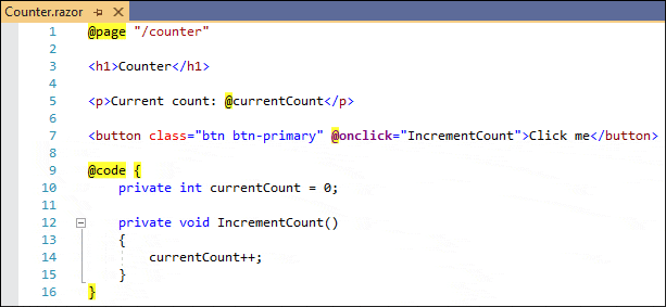
You may have noticed the Visual Studio Editor has some issues with overriding members and code completion inside @code sections in Blazor files.

For example, this happens when you try to override one of the lifecycle methods like OnInitialized(Async) or OnParametersSet(Async) etc.

Fortunately, CodeRush already has code templates to help take away those frustrations.
Just move the caret to the @code section and type one of the templates below (followed by a Tab or Space, depending on your template expansion settings):

TemplateDescription
oar Creates an OnAfterRenderAsync override.
oi Creates an OnInitializedAsync override.
onch Creates an OnChangeAsync override.
ops Creates an OnParametersSetAsync override.
sr Creates a ShouldRender override.

If you want to override one of the synchronous equivalents, just expand the same template followed by a comma. For example, “oi,” generates a synchronous OnInitialized method.

Component Creation

Some other useful templates for creating components including dependency injection, parameters and cascading values, which will save you a boatload of keystrokes include:

TemplateDescription
bch Creates a child component with a parameter.
bcmp Creates a blank component.
bht Creates a component with an HTTP call.
cv Creates a <CascadingValue> component.
dav Creates a <DataAnnotationsValidator> component.
en Creates an <EditForm> component.


These templates all work in the markup sections of razor files.

Input Control Creation

For creating standard html input controls, you can use the following templates:

TemplateDescription
icb Creates an <InputCheckbox> component.
idt Creates an <InputDate> component.
in Creates an <InputNumber> component.
it Creates an <InputText> component.
ita Creates an <InputTextArea> component.
isel Creates an <InputSelect> component.

Blazor Directives

To quickly add a directive above your Blazor component, you can use the following templates:

TemplateDescription
ba Creates an @attribute directive.
bc Creates a Blazor @code block.
bf Creates a Blazor @functions block.
bh Creates an @inherits directive.
bj Creates an @inject directive.
bjc Creates an @inject IConfiguration configuration directive.
bjh Creates an @inject HttpClient Http directive.
bl Creates a @layout directive.
bm Creates a @model directive.
bp Creates a @page "/" directive.

Blazor Markup Templates for Conditionals and Controls

One of the beautiful things about Razor is that you can put conditional logic inside your markup.
CodeRush offers the following templates to help control program flow:

TemplateDescription
do, dw Creates a @do (do/while) control statement.
fe Creates a @foreach control statement.
for, fri, frj Creates @for control statement.
if Creates an @if conditional.
ife, ifl Creates an @if @else conditional.
sw Creates a @switch conditional.
tc Creates a @try/catch block.
tcf Creates a @try/catch/finally block.
tf Creates a @try/finally block.
u Creates a @using statement.
wh, while Creates a @while control statement.

Blazor Refactoring

One of the other great things in CodeRush is its refactoring power, which is based on the Roslyn engine.

For Blazor there are some awesome refactorings which can help save you a lot of work.

Move to Code Behind

Suppose you are building a Blazor Component, adding features and functionality. Over time you realize the @code section is growing in size. There comes to be a point where it makes a lot of sense to put all that code in a separate C# class.

With CodeRush, this can be done in seconds! Just navigate to the @code section.

Activate the CodeRush Action Menu by pressing Ctrl + ` or Ctrl + . (depending on your configuration) and select “Move to Code Behind”.

CodeRush creates a new code-behind file (if it doesn’t already exist), including the partial class. It will then move code from the razor page right into the partial class, including attributes, comments and references.

Extract Razor Component

Another powerful refactoring, Extract Razor Component, allows you to extract the currently selected markup and create a component from it. CodeRush will ask for a new component name inside the original code, and next it will put the extracted code in a new razor file in the ~/Components folder of your project.

Let me know how this works for you!

If you find this post has helped you be more productive by using these features, please let me know by replying to this post below. More importantly, if you have any ideas or tips on how we can improve CodeRush to become even more productive in Blazor, reply as well.

Download CodeRush Today!

Check out CodeRush and discover how to become more productive with your Blazor development!

Get it at https://devexpress.com/coderush or at the Visual Studio Gallery.


WinForms TextEdit — New v20.2 Features

$
0
0

We recently published a list of enhancements and new features we expect to ship across our WinForms product line in our v20.2 release cycle: What’s New in v20.2.

We expect to update this list prior to release as it does not include a complete summary of new WinForms-related features/products. One of the features we did not include in beta involves our new “Advanced Mode” for our WinForms Text Editors. This new option adds a number of interesting options to all of our TextEdit-based WinForms editors (except for TokenEdit, HyperTextLabel and HyperlinkEdit controls).

To activate this new mode, enable the Properties.UseAdvancedMode property, or (if you want to upgrade all editors in your app) the static WindowsFormsSettings.UseAdvancedEditMode property.

Animated Caret and Selection

We reworked TextEdit painters so that caret movement and text selection are more pleasing to the eye (smoother, more elegant):

Additionally, text selection color is now based on the currently applied skin.

Caret and selection animations are managed by the AdvancedModeOptions.AllowCaretAnimation and AdvancedModeOptions.AllowSelectionAnimation properties.

Embedded Labels

Labels are a text box controls best friends - they seem to always travel together. If an app includes a text box for first name values, it will often have a “First Name” label next to the text box itself. Otherwise, users would have no way to distinguish the purpose of the text field.

In our new advanced mode you can set the AdvancedModeOptions.Label property and the editor will embed this string directly within the text box. I think you’ll agree that this is an elegant solution for those who want to eliminate use of field labels.

As you can see in this animation, this updated mode is fully compatible with our overhauled mask engine (if you’ve missed this major update announcement, see the “Editors” section of our What’s New page: WinForms Controls v20.2)

Emojis

Whether your users insert a string that contains an emoji, or press the “Win+.” hotkey to enter an emoji from the Windows library, text editors running in this new mode will display them automatically. Note: if you want colored emojis, you will need to enable the AdvancedModeOptions.UseDirectXPaint property for required editors. Otherwise, editors will display black-and-white versions of standard emojis.

Performance Upgrade

Of course, this wouldn’t be a DevExpress feature without meaningful performance enhancements. Text Edit controls in this new advanced mode allow users to insert text blocks of any sizes (standard editors have the 32,767 characters limitation). And yes, text insert operations are faster than the Windows Notepad even with text wrapping enabled.

During our tests, we resized a sample edit form with 400 text edits. A form with our updated text edit results in 1,581,427 ticks on average – a 37% boost when compared to the 2,542,614 ticks for a form with standard text edits.

Download and run the following samples to test the smoothness of our text box with 100,000 lines: MemoEdit Sample, TextEdit Sample.

Tell Us What You Think

By now, you may be wondering why we implemented a dedicated mode for these new features. The reason is that TextEdits in “advanced” and “standard” mode are significantly different controls (though you won’t notice any difference).

A TextEdit running in standard mode uses the default WinForms masked text box. We have added a pinch of DevExpress flavor to this default control, but at its core, this is still the same control with all of its strengths and weaknesses. Our “advanced” Text Edit uses a completely different control. This allows us to access and modify all portions of the control (like caret and movement animations). On the downside, such a new control can introduce unforeseen issues – simply said, when you create your own implementation of a platform’s most frequently used control, chances are high that something, somewhere will not work as expected.

The “UseAdvancedMode” property is a safety kill switch that allows you to instantly roll-back to the standard DevExpress TextEdit should you encounter issues (however rare those issues might be). We expect this mode to be the default in a future release – once we have rock-solid evidence that all outstanding issues have been addressed. For now, please test this mode in your solutions and share your feedback.

And do comment below - Do you see a place for these upgraded text editors in your next WinForms app?

XAF – Deploy ASP.NET Core Blazor Server Apps to Azure, Linux with Nginx or Windows with IIS

$
0
0

Azure Deployment

As you may already know, XAF's Blazor Server UI can be deployed to Azure. If you are new to Azure, please refer to the following Microsoft deployment topic: Host and deploy ASP.NET Core Blazor Server. Popular Azure deployment options include:

  1. The default option with no additional settings and no WebSockets.
  2. Application Request Routing (ARR).
  3. Azure SignalR Service. This option is supported in v20.2.3 (RTM) and requires additional setup in the YourSolutioName.Blazor.ServerSide/Startup.cs file. Note that the ProxyHubConnectionHandler class is available in the Blazor demo (C:\Users\Public\Documents\DevExpress Demos 20.2\Components\eXpressApp Framework\MainDemo.Blazor\CS\MainDemo.Blazor.ServerSide\Services\ProxyHubConnectionHandler.cs) included in our unified .NET Framework installer.
    public void ConfigureServices(IServiceCollection services) {
        services.AddSingleton(
            typeof(HubConnectionHandler<>), 
            typeof(ProxyHubConnectionHandler<>)
        );
       //...
    }

Windows and Linux Deployment

Should you prefer Windows with IIS or Linux with Nginx, a number of XAF customers successfully deployed XAF's Blazor in these hosting environments. You may find these additional community resources helpful: Deploy Blazor App on Ubuntu (Support Center Ticket) | XAF in Linux (Video by Joche Ojeda).

When you deploy your Blazor apps to IIS, make certain to activate the following features: WebSocket Protocol and Sticky sessions with Application Request Routing (often forgotten by developers). BTW, our online Blazor demo is hosted on IIS: https://demos.devexpress.com/XAF/BlazorDemo/ 

WinForms and WPF Map Control - Vector Tile Support (v20.2)

$
0
0

As you may already know, both our WinForms and WPF Map Controls support vector tiles. For a quick overview of this feature, please refer to the following blog post: WinForms and WPF Maps – Vector Tile Providers (v20.1). Briefly, our Map Control for WinForms and WPF now supports a set of vector tile providers and a predefined set of vector styles. 

We would like to thank everyone who shared their feedback about vector tile support over the last 6 months. Our development team worked hard to enhance this capability in our v20.2 release cycle. Among the most popular user requests was the visualization of vector tile labels. With our upcoming release, both our WinForms and WPF Map Controls can display labels oriented along polylines. In the following image, street names are rendered in this manner: 

Another useful enhancement is related to fractional zoom levels and overscaled tiles. In v20.2, vector tiles are no longer scaled like raster images – our Map Control uses a new vector scaling method. You can clearly see the difference between images produced at the fractional zoom level (in this example, zoom level = 13.7). The first screenshot was created with v20.1, while the second illustrates the new scaling method introduced in v20.2: 

v20.1: 

v20.2: 

In certain situations, vector tile providers do not return vector tiles with a zoom level higher than a predefined value. In this instance, vector providers recommend that you rescale tiles from the maximum zoom level based on the current map zoom level. This technique is called “overscaled tiles.” As you may have guessed, our Map Control now supports this capability. To appreciate the benefit of this feature, check out the screenshots below. They illustrate the difference at a zoom level of 17 when the tile provider only supports tiles up to 14: 

v20.1: 

v20.2: 

As you can see, our Map Control can now render a much smoother image.

All of these features are automatically available for both WinForms and WPF. You do not need to modify your source code to incorporate this functionality into your app.

Should you have any questions or require additional information on these features, please post your comment below.

XAF – WinForms and ASP.NET UI Case Study by UKIGMO (Multi-Platform .NET App UI)

$
0
0

Meet Masato Ubukata of UKIGMO, a Japanese IT consulting company established in 2019.

UKIGMO primarily utilizes Microsoft technologies/platforms such as .NET, Azure, SQL Server, etc. to develop business applications for small and medium-sized enterprises. UKIGMO's founder has more than 20 years of development experience and more than 10 years of experience with DevExpress tools.

We recently published a case study about their product It's Coooool (an software solution for the apparel industry). It leverages XAF and all its capabilities to connect apparel warehouses, manufacturers and retails with one another. Through its intuitive interface, organizations that adopt It's Coooool can more effectively manage their supply chain, understand quantities desired by dealers, control warehouse capacity, and accurately determine the number/timing of shipments that must be made by the manufacturer. Prior to It's Coooool, this process was cumbersome and error-prone – as many organizations within the apparel industry relied on Excel files to communicate supply chain realities.

Here’s what Masato Ubukata said about XAF's main benefits:

Thanks to XAF's screen/UI generation capabilities, we were able to respond to spec changes very quickly. Said differently, XAF made it easy for us to update UI elements on each screen (as our specification evolved throughout the development process). We were also impressed by XAF's Role and User Management infrastructure – this capability allowed us to spend more time on business logic and less time on building basic app functionality.

Read the full article to learn how UKIGMO came to choose the DevExpress eXpressApp Framework (XAF) and eXpress Persistent Objects (XPO) for their WinForms and ASP.NET project development and what they liked about our tools. For more information on our Security System for XAF and non-XAF .NET apps, please refer to these Frequently Asked Questions and our landing page.

Do You Have a Story to Share?

We'd love to publish your story on our website. It doesn’t matter if the project is big or small, or which DevExpress tools you used. Fill out this simple case study form and email us at clientservices@devexpress.com.

While we are at it, I wanted to share an interesting screenshot from Bahalddin Elsayed, an experienced and longtime XAF user from Dubai. As you can see in this image, his XAF-powered WinForms app integrates Autodesk Forge. This is a perfect example of what’s possible with XAF’s extensive UI customization and extensibility options.

WPF - Tips & Tricks (October 2020)

$
0
0

Here are a handful of interesting support questions we received over the last couple of months. We hope this information will be helpful as you explore the capabilities and potential of our WPF product line. Should you have any questions, feel free to comment below. We will be happy to follow up.

WPF Data Grid

WPF Editors

WPF Scheduler

WPF Charting

WPF Property Grid

WPF Docking

Other controls


If you’ve come across a WPF-related support ticket that you’d like to share with the rest of the DevExpress community, feel free to share your link in the comments section.

Data Grid for Blazor - Group and Total summary, Column Resize, Fixed Columns, and more (available in v20.2)

$
0
0

As you may know, last week marked the official release of v20.2, our next major update. If you missed the announcement or would like to know more about this release, please refer to the following webpage for more information: "What's New in v20.2".

v20.2 includes several new Blazor UI components. It also includes a series of new features/capabilities for existing DevExpress Blazor UI controls. In this post, I'll focus on the most recent enhancements to our Blazor Data Grid and Blazor Data Editor components. Rest assured, I'll discuss other Blazor enhancements in future posts.

Before I proceed, a quick word about v20.1 and our expired free Blazor UI component offer. If you downloaded v20.1 free-of-charge, you are entitled to use v20.1 as long as you wish. With our v20.2, our Blazor UI controls are no longer available free-of-charge. Should you require additional information on v20.1, please forward your comments to clientservices@devexpress.com.

.NET 5.0 Support

Microsoft should launch .NET 5.0 in November, but you can test .NET 5.0 with our Blazor components today. v20.2.3 supports .NET 5.0 Release Candidate 2.

To learn more about what's new for Blazor in .NET 5, watch this interview with Microsoft PM for Blazor, Dan Roth.

Once .NET 5 ships officially, we’ll update our v20.2 Blazor product line accordingly.

DevExpress Installer

We've made our Blazor components easier to download and install. DevExpress Blazor UI components can now be installed via the DevExpress Unified Installer.

If you own an active ASP.NET/DXperience/Universal Subscription, you can download our Unified Installer here: Download Manager.

While you can still install our Blazor components with NuGet, consider using our Unified Installer if the following is of value to your business:

  • Demos: When you install our Blazor UI components via our Unified Installer, you’ll have access to all DevExpress Blazor demos locally. Full demo source code is also installed so you can load any demo within your local Visual Studio environment.
  • Project Templates: The DevExpress Unified Installer includes our Blazor project templates. If you require project templates, installation via our Unified Installer is the way to go.

DevExpress Blazor Project Templates

Documentation

Blazor Data Grid

Total and Group Summary Computation

Our Blazor Data Grid can compute summaries (using aggregate functions such as SUM, MIN, MAX, etc) for both the entire contents of the grid and each individual group level. "Total" summaries are calculated across all grid records and displayed within the grid’s footer. "Group" summaries are calculated across rows in individual groups and displayed within group rows. If you have questions about this particular capability, please post your question in the comment section below.

DevExpress Blazor Data Grid Group and Total Summary

Blazor Data Grid – How to Create Total or Group Summaries

To create Total or Group summaries, simply add DxDataGridSummaryItem objects to the TotalSummary or GroupSummary collection.

Key DxDataGridSummaryItem properties are summarized below.

  • Field– Specifies the name of the data field whose values are used to calculate the summary.
  • SummaryType– Specifies the aggregate function (SUM, MIN, MAX, AVG, etc) used. – Specifies the appropriate aggregate function (SUM, MIN, MAX, AVG, etc) used.
  • ShowInColumn– Specifies the name of the column used to display the summary.
  • DisplayFormat– Specifies the desired summary display format. The ‘{0}’ placeholder returns the summary value and ‘{1}’ returns the parent column’s caption.

Demo | Documentation

Resize Columns

The DevExpress Blazor Data Grid allows users to resize columns as needed. Users can move the mouse pointer over the right border of a column to display a double-sided arrow. Users can drag column border to change column width.

To enable column resize operations, set the ColumnResizeMode property to one of the following values:

DevExpress Blazor DataGrid - Column Resize

Demo | Documentation

Fixed Columns

Our Blazor Data Grid allows you to anchor columns to its left or rightmost edge. Fixed columns can help improve data readability as columns fixed to the right or left remain visible when users scroll the grid horizontally. To fix a column, set its FixedStyle property to DataGridFixedStyle.Left or DataGridFixedStyle.Right.

DevExpress Blazor DataGrid - Fixed and Frozen Columns

Demo | Documentation

Other Recent Enhancements

In case you missed it, we added the following Data Grid features in a recent minor release:

New Popup Edit Form

End-users can now edit column values within a popup form. To activate Popup Edit Form mode, set the EditMode property to PopupEditForm.

DevExpress Blazor DataGrid - Popup Edit Form

Demo | Documentation

Incremental Filtering

End-users can filter list items dynamically, based upon the text typed into the editor's input box. Filter modes include: Contains and StartsWith.

DevExpress Blazor DataGrid - Incremental Filtering

Documentation

Blazor Data Editors

New Time Editor

This release ships with a new time editor for Blazor:

DevExpress Blazor Time Editor

Our Time Edit component includes the following features:

  • TimeSpan / DateTime binding
  • Integrated drop-down time picker
  • 12 / 24-hour format support
  • Min / max time support
  • Read-only and disabled states
  • Nullable time
  • Clear button

Demo | Documentation

Date Edit - Display Time

The Date Edit component can now display time. Set the TimeSectionVisible property to true to add the time section to the component.

DevExpress Blazor Date Edit Time Section

To format a time value in display and edit modes, use the DisplayFormat and Format properties.

Demo

Should you have any questions about these new features, or if you require assistance on our Blazor product line, please comment below. Please remember, that the features described in this post relate to v20.2. v20.2 is not available free-of-charge. The capabilities described in this post are available to those who own an active ASP.NET/DXperience/Universal Subscription.

Design-Time Support for DevExpress WinForms Controls for .NET 5

$
0
0

Back in July this year, I announced that DevExpress controls had been enhanced such that they supported the latest .NET 5 Preview. However, I did warn that, although we’d been working hard to ensure that our WinForms controls were compatible with .NET 5, it was a different story with regard to the designer support in Visual Studio. Now that .NET 5 has been officially released along with Visual Studio 2019 v16.8, it is time to talk about what to expect from design-time tools using DevExpress WinForms v20.2.

The Good News (yes, unfortunately, some bad news will follow)

While the WinForms platform has yet to fully address important design-time issues, Microsoft has made good progress for those considering .NET 5. For example, you can call up smart tag menus for a control...

Smart tag menu

...use the control designers...

Grid control designer

...and utilize the stand-alone designer dialogs for to set complex properties, such as the Mask Settings dialog for our recently overhauled editor input masks.

Mask settings dialog

Basic operation

In order to develop a new WinForms app that targets .NET 5 with DevExpress controls, you should do the following:

1) Install Visual Studio 2019 version 16.9 Preview 1 with the “.NET Core development tools” option checked in the VS Installer.

2) Register the special Early Access NuGet feed as described in this help article: Setup Visual Studio's NuGet Package Manager. We’re distributing our .NET 5 controls via a separate feed because, as you’ll soon see, Microsoft still has to implement a few details that are crucial for our complete design time support.

Note: at this moment, the NuGet feed is the only way to get the latest DevExpress WinForms controls optimized for .NET 5. DevExpress WinForms v20.2 controls distributed via the classic .NET Core installer available in our Download Manager can also operate under .NET 5, but lack the design-time support.

3) In Visual Studio, make sure your application targets .NET 5.0. Go to “Project | Manage NuGet Packages...”. Select the feed you registered in step #2 and install the pre-release package with the required localization culture. Each package includes all available DevExpress WinForms controls.

NuGet Package Manager with Localized WinForms packages

4) Once the selected package has been installed, you can add DevExpress controls from the Visual Studio toolbox.

Visual Studio Toolbox with DevExpress controls

Now the Bad News – Known Issues

While design-time features/capabilities mentioned above seem to indicate that .NET 5 is ready and usable (it indeed is usable for basic WinForms controls inside Visual Studio), important limitations/issues remain with standard WinForms designer interfaces. These limitations cannot be “worked around” – these issues mean that our sophisticated WinForms controls are not fully supported in the designer at this time. Of course, Microsoft will be enhancing these interfaces in future Visual Studio builds and DevExpress WinForms design-time support will follow. At this time, we don’t have guidance from Microsoft as to when such changes will be ready and so we cannot offer exact release timeframes to our users. Some examples of why we have yet to deliver the best possible design-time experience for .NET 5:

  • Properties that accept custom structures (for example, DevExpress.Utils.Padding) as values can appear in the Visual Studio Properties panel. However, any attempt to edit such a property may cause the IDE to crash.
  • Icons are not supported for controls that appear in the Visual Studio Toolbox. You can see that in the image above.
  • Custom glyphs cannot be rendered at design time. Our WinForms controls that target the regular .NET Framework utilize such glyphs to indicate bound UI elements, to show a button that invokes the Data Source Configuration Wizard, etc.
  • Data sources and bindings are not supported in the designer and can only be specified in code.
  • Some interactive features, such as dragging control elements, are not supported.
  • Our testing has shown that the process that hosts the WinForms Designer is prone to hanging.
  • A few other issues exist on the performance side, but we’ll describe such problems at a later time.

As you may know, DevExpress was the first component vendor to release a commercial WinForms UI control (nearly 20 years ago). Over the years, we’ve created some very sophisticated and intricate designers for our complex WinForms UI controls. We’ve focused resources on the design-time experience because we know it matters. A great design-time experience improves productivity and reduces development costs. This is not hyperbole – it’s a simple fact.

Generally speaking, our WinForms design-time experience is not dependent upon Visual Studio’s standard designer interfaces. Hence, to deliver the same design-time experience for .NET 5 as we do for earlier versions of the .NET Framework would require an uphill climb – one that is simply impossible at this time. We’d have to:

  • Add smart tag menus for individual control elements (grid columns, tiles, etc).
  • Create custom wizards, such as the Template Gallery, Data Source Configuration Wizard, Scaffolding Wizard, etc (not yet possible).
  • Extended smart tags (not yet possible).
  • Deal with designer dialogs that do not allow you to create event handlers.
  • Figure out a way to work around a missing Find Panel for Visual Studio properties.
  • Solve the issue of type conversion for DevExpress Editors.
  • And sort out what t do about non-operational Assistant components.

Finally there are a few features and controls that are not available in the current version: XPO, reporting, and XtraDialogs. The reason for these missing features is not related to major technical difficulties and will be addressed in future DevExpress releases.

The Future

We are excited about the possibilities and we are doing everything we can to bring a great design-time experience to .NET 5. I wish we had better news to share today but we will definitely keep our foot on the gas pedal and figure out what we can do for those of you considering .NET 5.


VCL Subscription v20.2 Beta 1

$
0
0

As you may already know, we just released the first beta for our next major VCL update - v20.2. Official release is slated for the end of November. If you own an active VCL Subscription, you can download Beta 1 directly from our website.

We've completed work on major functionality and look forward to your feedback so we can finalize our release and address any major shortcomings. When using Beta 1, please remember that we have yet polish our code and have a few minor issues to resolve. Accordingly, Beta 1 should not be used in production projects.

The following is a summary of changes/updates you may wish to review prior to official release. For a complete list of features included in v20.2, please navigate to our VCL What’s New webpage.

VCL Gantt – the New ExpressGantt Control (Beta)

Our new DevExpress VCL Gantt Control allows you to plan projects and visualize/schedule associated tasks via its Microsoft Project inspired UX. The DevExpress VCL Gantt Control uses DirectX Hardware Acceleration for the fastest possible performance on 4K displays. It supports undo/redo, zoom operations, timescale customization and other important Gantt-related features.

DevExpress VCL Gantt Control

VCL Data Grid – the Updated ExpressQuantumGrid

Custom Row Layouts in Table and Banded Table Views (CTP)

This release includes new RowLayout options for our VCL Grid’s TableView. These options allow you to leverage the flexibility of our LayoutView without losing the power of “tables” within Master-Detail Layouts or when grouping/summarizing information within the Grid itself.

DevExpress VCL Grid Control

Performance Enhancements

We improved VCL Grid performance for a number of usage scenarios. We’ll share specific information in this regard once we officially ship v20.2.

VCL Rich Text Editor – the Updated ExpressRichEdit Control

New File API/Document Server Component

This release includes a new non-visual component. TdxRichEditDocumentServer allows you to process Rich Text documents in code. Said simply, you no longer need to incorporate a Rich Text UI if your app simply needs to process RTF documents in code.

Performance Enhancements

We improved VCL Rich Text Editor performance for a number of usage scenarios. We’ll share specific information in this regard once we officially ship v20.2.

VCL PDF Viewer – the ExpressPDFViewer

We introduced a series of methods to help you manage/save security and signature settings for your PDF documents.

VCL Open/Save File Dialogs (CTP)

This release includes two new non-visual components: TdxOpenFileDialog and TdxSaveFileDialog.

DevExpress VCL OpenFileDialog

Data Filtering Enhancements

We’ve extended the capabilities of our VCL Filtering engine with new Breadcrumb user interface elements. The Filter Panel used within our VCL Grid, VCL TreeList, and VCL Vertical Grid controls is now easier to read, more compact, and more flexible. As you can see in the image below, filtering conditions can be refined at runtime in the blink of an eye.

DevExpress Filter Panel

Similar improvements have also been made to the Filter Builder dialog and standalone Filter Control.

DevExpress Filter Builder Dialog

Your Feedback is Very Important

If you own an active VCL Subscription, we ask that you download Beta 1 and share your feedback with us via the DevExpress Support Center. Feedback during this beta stage will ensure that our products address your business needs.

If you are new to our VCL product line, feel free to post your questions below. We’ll be happy to elaborate on the capabilities included in our upcoming release.

DevExtreme React Application Template – Authentication UI (v20.1)

$
0
0
DevExtreme React Application Template v20.1 includes new user authentication forms and a client-side API that you can easily integrate with your backend.

Authentication Forms

We added new Sign In, Sign Up, Reset and Change Password forms to our React Application Template. These forms comply with today’s most common web-based password authentication patterns/workflows. Of course, you can easily customize our pre-built authentication forms to better address organizational needs/requirements.

Backend Integration

In addition to the authentication forms, we included a simple client-side API designed to handle authentication form submit events. Once a user submits a form, form data is automatically collected and passed to a corresponding submit handler. You can make minor changes to our built-in handlers to send corresponding HTTP requests to your authentication backend API – regardless of backend technology in use. For your convenience, we placed all these handlers in a single file (/src/api/auth.js). Please refer to our documentation for more details.

Access Authenticated User Data

We implemented a new `useAuth` React Hook to give you access to authenticated user data from any part of your application. The code below helps demonstrate this capability:
import React from 'react';
import { useAuth } from './contexts/auth';

export default function() {
  const { user } = useAuth();
  return <div>{ user ? user.email : 'Not authenticated' }</div>;
}
Note that we implemented our React Application Template using React Hooks and functional components (best practice according to the React team). You can learn more about React Hooks here.

Angular and Vue

Authentication forms are available for both our Angular and Vue Application Templates.

Give it a Try

To explore these capabilities first-hand, you can download our demo app and associated source code or view a short introductory video using the links below:

Your Feedback Counts

Please help us shape the long-term direction of our Application Template Roadmap by responding to the following survey questions:

DelphiCon 2020 kicks off tomorrow!

$
0
0

DelphiCon-2020_Header-text-fade

Just a quick reminder if you’re a Delphi developer: Embarcadero’s virtual DelphiCon 2020 conference starts tomorrow, November 17, and runs until the 19th. It’ll be well worth your registering for the three days – I already have – since I’m going to bet you will learn something new that you could immediately apply in your current development work. There are some excellent speakers lined up (some of whom I’ve known for a little while shall we say, although that “John Hodges” character sounds way dubious!), with some really interesting topics in the mix.

My personal selection for sure: Functional Programming With Delphi by Nick^H^H^H^HJohn Hodges, High Performance Delphi by Primož Gabrijelčič, Leveraging High DPI in VCL Applications by Ray Konopka, and Code Faster in Delphi by Alister Christie.

See you online!

WPF - .NET 5 Support & New Designer Features

$
0
0

As you may already know, Microsoft released .NET 5 last week. We are pleased to announce that DevExpress WPF controls v20.2 officially support .NET 5.

Once you install our WPF controls, they will be visible in your .NET 5 app’s Toolbox (even if the app does not itself reference DevExpress packages).

New WPF XAML Designer

Visual Studio 2019 Preview includes a new WPF XAML Designer. Microsoft continues to evolve this designer – with plans to use it both for .NET Core and .NET Framework projects. We are hopeful that Microsoft will deliver on this stated promise in short order.

.NET Core applications use the new WPF XAML Designer by default. For .NET Framework apps, enable the following option in Visual Studio:

Tools> Options> Preview Features> New WPF XAML Designer for .NET Framework (requires restart)

New WPF XAML Designer Extensions

Select Non-Visual Elements (Data Grid Columns, Toolbar and Ribbon Items) (v20.1)

You can select non-visual elements (such as a data grid’s column and toolbar/ribbon item) and quickly navigate to its markup as needed.

Switch Tabs at Design Time (v20.2)

You can switch tabs in controls such as our WPF Docking component, LayoutControl, and Ribbon component.

Use Adorners within Dock and Layout Controls (v20.2)

To see this capability in action, open our WPF Dock Windows - Layout Panels demo. Note that you can use adorners to add new groups and panels as needed.

Status Update on Suggested Actions

Visual Studio’s new WPF XAML Designer includes Suggested Actions, currently available only in Preview builds. Suggested Actions operate like DevExpress Smart Tags and offer easy access to common properties associated with a selected control.

We did our best to maximize the potential of Suggested Actions (and incorporate some Smart Tag functionality) in DevExpress WPF controls. The most important features we considered include quick actions - access to most used properties and MVVM behaviors and services.

The screenshot below illustrates an extended Suggested Action menu for the DevExpress WPF Data Grid.

Our Suggested Action extensions were available in Visual Studio v16.8 Preview 4 and earlier. Unfortunately, these extensions were removed in Visual Studio v16.9 Preview 1 (current version) because of changes introduced to the Visual Studio Designer by Microsoft. We are a bit disappointed by Microsoft’s decision in this regard, but we are working with Microsoft on extensibility for Suggested Actions and will make this capability available once Microsoft updates Visual Studio.

Your Feedback Matters

We’d love to get your thoughts on .NET 5 and your WPF development plans for the future. Let us know if you expect to make .NET 5 an integral part of your development strategy.

DevExtreme JavaScript - Tips & Tricks (September - October 2020)

$
0
0

Due to the number of interesting support tickets we collected over the last couple of months, we decided to publish separate tips & tricks posts for Angular, React, and Vue. This post covers topics that apply to JavaScript generally – so its content will be helpful to those targeting jQuery, Angular, React, and Vue. 

As always, we’re here to help. Should you have any questions about this content, feel free to post your feedback in the comment section below. 

Support Tickets that Apply to All Supported Platforms

Documentation & Demos Updates

New Examples

New Knowledge Base Article

If you’ve come across an interesting support ticket you’d like to share with the rest of the DevExpress developer community, please comment below and include the appropriate link. Thanks for choosing DevExtreme.

PDF – Sticky Notes and Comments

$
0
0

As you may already know, our most recent release (v20.2) includes a couple of highly requested features for our .NET PDF product libraries. Both our .NET PDF Document API and our PDF Viewer (for WinForms and WPF) now support sticky notes (sticky notes represent text annotations linked to contents within a PDF document). PDF documents that include sticky notes can be printed and exported as necessary.

.NET PDF Document API

Our PDF Document API v20.2 allows you to:

  • Create sticky notes
  • Change sticky note parameters
  • Add replies (including nested responses) and review status for a specific annotation

The following code sample illustrates the ease with which you can create a sticky note in code, specify its parameters, add a reply, and review status:

using DevExpress.Pdf;
//...
using (PdfDocumentProcessor processor = new PdfDocumentProcessor())
{
    //Load document:
    processor.LoadDocument("..\\..\\Document.pdf");

    //Add sticky note on the first page:
    PdfTextAnnotationData textAnnotation = processor.AddTextAnnotation(1, new PdfPoint(100, 300));

    //Specify sticky note parameters:
    textAnnotation.Author = "Nancy Davolio";
    textAnnotation.Checked = true;
    textAnnotation.Color = new PdfRGBColor(0.8, 0.2, 0.1);
    textAnnotation.Contents = "Please proofread this document";
    textAnnotation.IconName = PdfTextAnnotationIconName.Check;

    //Save result:
    processor.SaveDocument("..\\..\\Result.pdf");
}

PDF Viewer (for WinForms and WPF)

You can now create sticky notes in code or via our WinForms or WPF PDF Viewer’s UI. To create a sticky note using our PDF Viewer UI, select the Sticky Note tool in the Comment ribbon group and place the sticky note within the document. Specify the desired annotation color and opacity within the drop-down menu.

Call the PdfViewer.AddStickyNote (or PdfViewerControl.AddStickyNote for WPF) method to create a sticky note in code:

pdfViewer.AddStickyNote(new PdfDocumentPosition(1, new PdfPoint(29, 568)), "Comment", Color.Crimson);

You can handle the following PDF Viewer events to manage multiple sticky note-related actions:

  • AnnotationCreating
  • AnnotationCreated
  • AnnotationGotFocus
  • AnnotationLostFocus
  • AnnotationChanged
  • AnnotationDeleting
  • AnnotationDeleted (WPF)

Please note that we renamed existing events and changed associated event arguments to process these events in response to sticky note actions. Please refer to the following breaking change document for more information: T924471

Our PDF Viewers (for WinForms and WPF) now ship with an integrated Comments pane. This pane displays all markup annotations and related comments. You can sort, filter, and show annotations with a specific text string as needed.

When you select an annotation within the pane, the Reply editor is activated. Enter text in the editor and click Reply to add a response to the annotation. Double-click the annotation to edit its contents.

Right-click an annotation and select Set Status to specify the annotation or response review status.

Your Feedback Matters

As always, we welcome your thoughts. Please comment below and let us know what you think about our sticky notes implementation. Should you have technical questions, feel free to contact us via the DevExpress Support Center.

eXpressApp Framework - Tips & Tricks (October 2020)

$
0
0

Here is this month’s edition of XAF Tips & Tricks. As always, we hope the information contained within this post is of benefit as you explore and leverage the capabilities of the eXpressApp Framework.

If you are new to XAF and are considering it for an upcoming project, be sure to visit XAF’s product page for introductory information on its many capabilities: devexpress.com/xaf.

As always, feel free to share helpful XAF-related support tickets in the comment section below. Thank you for your continued commitment to XAF!

Interesting Support Tickets

New and Updated KB Articles

Resolved Issues

Documentation Updates

We updated our help file with the following new Blazor UI-related topics.

The Task-Based Help section contains up-to-date information on Blazor UI.

Web API Service for XPO

The following document explains how you can implement a Web API controller and connect it to an XPO client: Transfer Data via REST API.


Office File API & Office-Inspired Desktop UI Controls – Tips & Tricks (October 2020)

$
0
0

As always, we hope you and your family are doing well in this unpredictable time. If we can be of service, please contact us at your convenience.

We’ve compiled this month’s list of interesting support tickets (tickets answered throughout September and October). We hope you find these support tickets of business value as you explore our Office File API and our Office-inspired desktop (WinForms & WPF) UI controls. Should you have any questions, feel free to comment below.

Tips & Tricks

Spreadsheet Document API

  1. T931106 - How to specify a date format for cell values when a document is exported to CSV
    https://supportcenter.devexpress.com/ticket/details/T931106
  2. T933994 - How to extract cell references from a parsed formula
    https://supportcenter.devexpress.com/ticket/details/T933994
  3. T933343 - Print or export (to PDF) a pivot table with an empty cache
    https://supportcenter.devexpress.com/ticket/details/T933343

PDF Document API

  1. T942135 - How to extract PDF pages with highlighted text
    https://supportcenter.devexpress.com/ticket/details/T942135

WinForms and WPF Rich Text Editors

  1. T937392 – How to find bookmarks located in table cells
    https://supportcenter.devexpress.com/ticket/details/T937392
  2. T929068 - How to bind the Rich Text Editor to a data field that contains plain and RTF text
    https://supportcenter.devexpress.com/ticket/details/T929068
  3. T937000 - How to change encoding of HTML text copied from the Rich Text Editor
    https://supportcenter.devexpress.com/ticket/details/T937000
  4. T937229 - How to show a progress bar during mail merge
    https://supportcenter.devexpress.com/ticket/details/T937229

WinForms PDF Viewer

  1. T937728 - How to enable a custom Save button after a PDF document has been modified
    https://supportcenter.devexpress.com/ticket/details/T937728

WinForms Spreadsheet Control

  1. T932660 - How to show a command shortcut in the Spreadsheet control’s context menu
    https://supportcenter.devexpress.com/ticket/details/T932660
  2. T940978 - How to paste only cell values when cells are copied using the Fill Handle
    https://supportcenter.devexpress.com/ticket/details/T940978

Enhancements

WinForms and WPF Rich Text Editors

  1. T880621 - You can now specify the preferred fonts used for substitution
    https://supportcenter.devexpress.com/ticket/details/T880621

    The properties of the FontSubstitutionOptions class allow you to set desired ASCII, Complex Script, High ANSI, and East Asian Unicode fonts used for substitution. When the current font does not include the necessary characters, the preferred font for substitution is used first (to search for these characters).

    The following code sample demonstrates how to specify the preferred font used for substitution:

    FontSubstitutionOptions fontSubstitutionOptions =
             wordProcessor.Options.Behavior.FontSubstitution;
    fontSubstitutionOptions.ComplexScript = "Dubai Medium";
    fontSubstitutionOptions.EastAsia = "SimSum";
  2. T936309 – Our Rich Text Editor includes enhanced Font and Paragraph forms
    https://supportcenter.devexpress.com/ticket/details/T936309

    As you can see below, we redesigned both our Font and Paragraph forms. They now use our DevExpress Layout Control. This helped us address form scaling issues for applications with non-default localization and fonts.

Spreadsheet Document API

  1. T936265 - The SetValueFromText method can now parse currency strings
    https://supportcenter.devexpress.com/ticket/details/T936265
  2. T934970 – Enable the classic PivotTable layout
    https://supportcenter.devexpress.com/ticket/details/T934970/

    Activate the PivotTable.Behavior.EnableGridDropZones property to display the classic PivotTable layout used in Microsoft Excel 2003. You should also turn on the PivotTable.Cache.RefreshOnLoad option. In this instance, Microsoft Excel will refresh the pivot cache when opening the document and generate the report's layout as needed.

    PivotTable pivotTable = worksheet.PivotTables[0];
    pivotTable.Behavior.EnableGridDropZones = true;
    pivotTable.Cache.RefreshOnLoad = true;
  3. T932988 – You can now skip hidden columns when you export a workbook to CSV or TXT format
    https://supportcenter.devexpress.com/ticket/details/T932988
  4. T931425 - Use the Axis.AxisType property to replace the category axis with the date axis and vice versa
    https://supportcenter.devexpress.com/ticket/details/T931425

    The following example creates a chart with the date axis. Set the Axis.Auto property to false before you change the axis type.

    var sheet = spreadsheetControl1.ActiveWorksheet;
    
    // Create chart.
    var chart = sheet.Charts.Add(ChartType.LineMarker, sheet[0, 0]);
    chart.Series[0].Values = new CellValue[] { 1, 2, 3, 4, 5 };
    chart.Series[0].Arguments = new CellValue[] { 44054, 44055, 44056, 44057, 44060 };
    
    // Display dates on the category axis.
    chart.PrimaryAxes[0].Auto = false;
    chart.PrimaryAxes[0].AxisType = AxisType.Date;
    chart.PrimaryAxes[0].NumberFormat.IsSourceLinked = false;
    chart.PrimaryAxes[0].NumberFormat.FormatCode = "dd-mmm";

PDF Document API

  1. T949108 – Use the PdfPage.GetPageIndex method to obtain the index of a PDF page
    https://supportcenter.devexpress.com/ticket/details/T949108

If you’ve come across an interesting support ticket you’d like to share with the rest of the DevExpress developer community, please comment below and include the appropriate link.

DevExpress VCL Subscription v20.2 released

$
0
0

Without a doubt, this is a difficult time for all of us. If you or your business has been impacted by the pandemic, please contact us and let us know how we can help.

Despite having to get used to remote working and virtual meetings, our Delphi team have managed to provide you some great new features and enhancements in the new version, and I am pleased to announce the immediate availability of DevExpress VCL Subscription v20.2, our suite of controls for building effective Windows apps with RAD Studio, using either Delphi or C++Builder.

This release ships with numerous new features including:

  • the beta for a new Gantt control
  • replacements for the standard (yes, and boring!) open/save file dialogs that use your selected theme
  • various UX enhancements, including smooth scrolling in various controls, and padding for our in-place editors
  • a new display style for Filter Criteria in our grid, treelist, and vertical grid controls
  • …and much more

For a complete list of what’s new in this v20.2 release, please go to this page, and select the VCL link. Even easier, you can always navigate to devexpress.com/new and see what’s new in the latest version, whichever version number that happens to be.

As usual, we’ve listed the Resolved Issues introduced in this release (follow that link to the version history page, make sure you clear any filters that may be set, and then select VCL, as well as “Resolved Issues”). That page also enables you to review the changes we’ve made from any release to any other.

For every major release, no matter how hard we try and minimize the impact, some new features and enhancements are bound to cause a few breaking changes. You can see those from that same version history page: just select “Breaking Changes” instead.

I pretty much say something like this with every major release: we would not be able to produce and release such robust and full-featured controls, features, and enhancements without the invaluable help of our customers. By reviewing comments and support tickets, and contacting customers directly, we find that we can more easily focus on providing what our customers want from our products going forward. Also, we’ve been concentrating on publishing relevant posts on what we are doing, posts detailing various tips and tricks, and posts on how we aim to move forward. My strong recommendation is to monitor our community site for these helpful posts.

I’d like to thank everyone who provided feedback on our products throughout this year, who used and tested the v20.2 beta we produced and provided information on the issues they found, and, of course, to all our customers who use our products every day in their applications. We are confident that the new features and enhancements in v20.2 will strengthen and validate your trust in our products. Thank you, it is much appreciated.

DevExtreme Scheduler – Virtual Scrolling (v20.2)

$
0
0

DevExtreme Scheduler now ships with a Virtual Scrolling option. When enabled, Virtual Scrolling allows you to efficiently render large lists of appointments and event resources without noticeable performance degradation. This feature is available for Angular, React, Vue and jQuery - in Week, Day, and WorkWeek views when using vertical group orientation.

The screencast below helps illustrate this feature in action - thousands of appointments grouped by resources are instantly rendered when scrolling the contents of the Scheduler.

Virtual Scrolling Under the Hood

When Virtual Scrolling is enabled, only visible appointments and groups are rendered to the web browser’s DOM and removed once appointments/groups leave the Scheduler’s viewport during scroll operations. This solution significantly improves scrolling performance and initial render time.

This approach mimics Virtual Scrolling support in our JS DataGrid.

Configuration

We recommend that you enable this new feature within your app. To do this, simply set the 'scrolling.mode' option to 'virtual' as shown below:

scrolling: { 
   mode: 'virtual'
}

Future Plans

As you would expect, Virtual Scrolling support will be introduced for both the Scheduler's Timeline View and to horizontal groups. We’ll update you on progress once we have specific information to share in this regard.

Feedback

Please try our new Scheduler Virtual Scrolling and let us know what you think of this new capability. Should you have any questions or suggestions, feel free to leave a comment below or submit a support ticket via the DevExpress Support Center.

WPF - Application Themes (v20.2)

$
0
0

As you may already know, v20.2 ships with new Visual Studio 2019 theme palettes, a Windows 10 inspired theme, and a palette that can apply Windows 10 accent colors to your DevExpress-powered WPF applications.

New Windows 10 Light Theme

Windows 10 allows you to specify custom accent colors. This color changes the overall appearance of an application. You can now use v20.2 to apply a Windows 10 accent color to your WPF application.

(if you are new to our WPF product line, be sure to check out our complete collection of WPF Themes).

Win10Light theme

Our WPF Windows 10 Light Theme leverages the best visual attributes of Windows 10. We patterned this theme after Windows Explorer, added a few appearance elements from WinUI, and extended it to the entire set of DevExpress WPF UI controls/tools.

Follow this link to explore this new Windows 10 Light Theme (demo link requires that you first install DXperience v20.2 with associated demos).

New Windows 10 Palette

When used with the Windows 10 Light Theme, our WPF Win10Palette allows you to replicate the visual appearance of Windows 10 within your WPF application.

Win10Palette

As you might expect, our WPF Win10Palette can obtain Windows 10 accent colors and update a theme each time users change accent color:

protected override void OnStartup(StartupEventArgs e)
   {
      var accentpalette = new Win10Palette();
      var customtheme = Theme.CreateTheme(accentpalette, Theme.Win10Light);
      Theme.RegisterTheme(customtheme);
      ApplicationThemeHelper.ApplicationThemeName = customtheme.Name;
      base.OnStartup(e);
   }

You can also specify a custom accent color and disable theme updates when users modify Windows 10 accent colors. To do so, simply create a new theme, pass an accent color to the ActualAccentColorconstructor parameter, and set listenAccentColorChanges to false. This will produce a Windows 10 Light Theme with your custom accent color:

protected override void OnStartup(StartupEventArgs e)
   {
      var accentpalette = new Win10Palette((Color)ColorConverter.ConvertFromString("#ffffb900"), false);
      var customtheme = Theme.CreateTheme(accentpalette, Theme.Win10Light);
      Theme.RegisterTheme(customtheme);
      ApplicationThemeHelper.ApplicationThemeName = customtheme.Name;
      base.OnStartup(e);
   }

New Visual Studio 2019 Predefined Palettes

In our v20.1 release, we added the three new Visual Studio 2019-inspired themes. With v20.2, you can apply the following predefined themes to our Visual Studio 2019-inspired themes:

Blue: Latte, BlueNavy.

Dark: BlueberryCake, DeepSea,Dimmed,Sand,Storm.

Light: Berberis, Cornflower,EmeraldSea,LightLilac,Loft.

VS2019Palettes

Refer to the following help topic for more information: Palettes.

DevExtreme Angular - Tips & Tricks (September - October 2020)

$
0
0

Here is a new list of Angular-specific support tickets we think might be of value to those of you targeting the Angular framework. This post also includes links to a few new demos and help topics. 

As always, if you have questions about the content below, feel free to post your feedback in the comments section. We’ll happily follow-up. 

Support Tickets that Apply to Angular

Documentation & Demos Updates

New Examples

New Knowledge Base Article

If you want to share your own tip or support ticket with the rest of the DevExpress Angular developer community, please comment below and include the appropriate link below.

Thanks for choosing DevExtreme for Angular.

Your Feedback Counts

Viewing all 2401 articles
Browse latest View live