Quantcast
Channel: Developer Express Inc.
Viewing all 2401 articles
Browse latest View live

Sankey Diagram Control — A New Data Visualization for Desktop (WinForms, WPF)

$
0
0

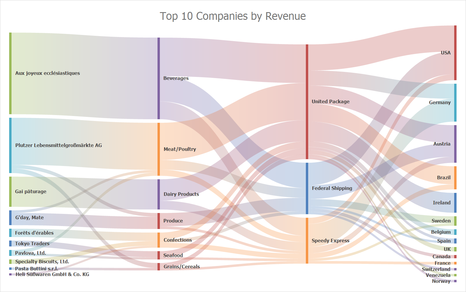
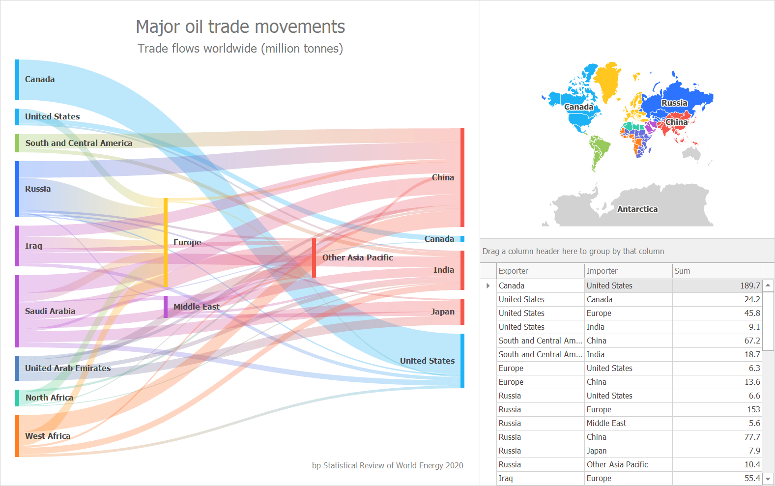
We’ve got some good news for those looking to visualize data in new and unique ways. Our upcoming release will include a new Sankey Diagram Control (for WinForms and WPF).


Sankey Diagrams display paths between nodes and associated quantities. The thickness of each path varies based on the value of a corresponding node. When used, end-users can easily see major paths and spot inefficiencies or losses within a given flow. These diagrams are typically used to display resource flows (sales, budget) along with information or energy usage.

Note: This Early Access Preview (EAP) only includes our WinForms implementation. We will add the Sankey Diagram control for WPF prior to official release (v20.2).

Supported Features

Here is a brief summary of the features that we’ll include in this release:

  • Built-in coloring algorithms (palette-based and custom colorizers);
  • Recursive Nodes and Custom Node Order;
  • Title Elements;
  • Printing / Export;
  • Node and Link Highlighting, Tooltips.

Try It Today

If you’ve installed our v20.2 EAP build, you can explore the capabilities of our Sankey Diagram using the following WinForms demo link: Sankey Diagram demo.

You can also refer to the following help topic for additional information: SankeyDiagramControl

Your Feedback

We welcome your feedback. If you’re considering this control for an upcoming project or if you have technical questions, please post a comment below. We’ll be happy to follow-up.


eXpressApp Framework — Early Access Preview (v20.2)

$
0
0

As you may already know, we are a couple of months away from our next major update (v20.2). This post details some of the features we expect to ship in November – features you can test today when you download and install our Early Access Preview build.

Active Universal subscribers can download the Early Access Preview (EAP). If you own an active DXperience Subscription and would like to learn more about XAF, you can explore the features described herein by logging onto the DevExpress Download Manager and installing this EAP build in trial mode. Once you do, please take a moment to tell us whether these new features address your business needs. This will help us fine-tune our code before official launch.

Early Access and CTP builds are provided solely for early testing purposes and are not ready for production use. This build can be installed side by side with other major versions of DevExpress products. Please backup your project and other important data before installing Early Access and CTP builds.

This EAP may not include all features/products we expect to ship in our v20.2 release cycle. As its name implies, the EAP offers an early preview of what we expect to ship in two months.

Blazor UI: Report Viewer

The Document Viewer is now available in XAF’s Blazor UI. You can display, print and export Reports created at design time.

Note: This feature has not been integrated into the Solution Wizard in this preview build. Feel free to download our Blazor demo to explore its capabilities: Download | Run Online.

Blazor UI: EF Core Support

Blazor UI can now use EF Core data models. The following example demonstrates use of EF Core with XAF’s Security System: XAF Blazor UI with Entity Framework Core Data Model and Security System.

We expect to add the EF Core option to the Blazor Solution Wizard as a CTP (community tech preview) in our v20.2 release cycle.

Blazor UI: Other Enhancements

The following features were completed in our current release cycle. They are available in both v20.1 and v20.2:

Basic Tutorial

.NET App Security API for EF Core

We officially released the Security System API for EF Core. This update allows you to use XAF’s Security System with EF Core classes for non-XAF applications. In addition to basic CRUD Console and WinForms examples, we added the following training videos:

These tutorials include a quick review of our Security System API and also detail necessary app integration steps. Remember, XAF’s Security System can be used by DevExpress and non-DevExpress customers alike – so please do spread the word.

About | FAQ

Security: Action Permissions

Action Permissions offer fine-grain control over execution of both custom and XAF system Actions within the UI. Action Permissions support is now available for XAF’s Blazor UI. To see it in action, point your browser to the following online demo: Blazor Main Demo (Roles -> Users -> Denied Actions). 

Core: Non-Persistent Object Enhancements

We removed most of the differences between persistent and non-persistent/proxy objects for XAF. You can now edit non-persistent data in a nested/lookup ListView, define custom fields at runtime, filter/sort/validate data, and track changes just as you would for persistent objects.

To avoid boilerplate code, we incorporated the following API enhancements:

  • You can inherit from NonPersistentBaseObject with a key property, change tracking support and enforce best practices for non-persistent classes.
  • The new PopulateAdditionalObjectSpaces method automatically initializes the AdditionalObjectSpaces collection based on registered object space providers.

Documentation

Core: Model Editor for .NET Standard

Our Model Editor for .NET Core and .NET Standard now ships as part of the DevExpress .NET Framework Unified installer. It includes the following enhancements:

  • Visual Studio Color Theme mirroring;
  • Visual Studio keyboard shortcut support (F5, Ctrl+S, etc.);
  • Improved error dialog with copy support;
  • Wait cursor is displayed during long operations.

    Core: Feature Toggles

    We added a DevExpress.ExpressApp.FrameworkSettings.DefaultSettingsCompatibilityMode property to enable/disable feature toggles in a single place. You can choose whether to enable all new features after a version update or retain previous behaviors. Refer to the following article for additional information: Core - FrameworkSettings.DefaultSettingsCompatibilityMode sets default XAF configuration options and feature toggles.

    XPO: Database Schema Migrations

    The Generate Migration Script menu command within XPO’s Data Model Designer now supports External Types. If your ORM Data Model uses XAF classes from the DevExpress.Persistent.BaseImpl library (e.g., BaseObject) as External Types, you can now generate a schema migration script to implement incremental schema updates.

    Database Schema Migrations also include the necessary API to generate migration scripts in code: How to Use the Database Schema Migrations API.

    Breaking Changes

    Before you migrate and test existing projects, we ask that review the following breaking change(s) document: XAF's breaking changes.

    Your Feedback Matters!

    We realize beta-testing is a time consuming process and we are grateful to those who invest time with our preview builds. Find the current implementation lacking flexibility? Feel we've overlooked a valuable usage scenario? Does our current implementation fail to address your business requirements? Please post your thoughts in the comment section below or create a Support Center ticket. We will happily follow-up and do what we can to extend the capabilities of our new products/features.

    WPF — Early Access Preview (v20.2)

    $
    0
    0

    As you may know by now, we are a few months away from our next major release (v20.2). In this post, I’ll summarize some of the WPF-related features/capabilities we expect to ship in November.

    If you own an active DevExpress Universal or DXperience Subscription, you can download and install our v20.2 Early Access Preview (EAP) today. Visit the DownloadManager page to obtain the EAP build.

    And please remember - your feedback matters. Once you’ve installed the EAP and had the opportunity to explore its capabilities, reach out to us via the DevExpress Support Center and tell us how we can improve our implementation and better serve your business needs going forward.

    Early Access and CTP builds are provided solely for early testing purposes and are not ready for production use. This build can be installed side by side with other major versions of DevExpress products. Please backup your project and important data before installing Early Access and CTP builds.

    Perhaps most importantly, this EAP may not include all features/products we expect to ship in our v20.2 release cycle. We are working hard to finalize all v20.2 features/capabilities and once we have more information to share, we’ll post updates on this channel.

    Table of Contents

    WPF Data Grid and TreeList

    Filter Panel Enhancements

    We enabled our new Filter Panel by default. This panel highlights individual field names, field values, and date-time functions to help improve filter expression readability/usability.

    If your WPF Data Grid displays detail views, the Filter Panel indents expressions so they visually correspond to individual detail views.

    We also changed colors used within our Filter Editor - they now mirror Filter Panel colors.

    DemoDocumentation

    Disabled and Read-Only Cells

    Our WPF Data Grid and TreeList allows you to disable cells or mark them as read-only (based on a specific condition). Use the BaseColumn.IsEnabledBinding and BaseColumn.IsReadOnlyBinding properties to associate the cell state with a property in the data source.

    GitHub ExampleDocumentation

    Bulk Updates

    We added AddRange methods so you can add multiple columns, summaries, and conditional formats as needed. AddRange updates the WPF Data Grid or TreeList once all relevant items have been added. With this new feature, you no longer need to enclose changes within BeginUpdate and EndUpdate method calls.

    Documentation

    WPF Gantt

    Print and Export

    This release extends the print/export capabilities of our WPF Gantt control. You can now print and export both the Gantt TreeList and the Gantt Timeline.

    DemoDocumentation

    WPF Scheduler

    Updated TimelineView

    We updated the look and feel of our WPF Scheduler's TimelineView. The redesign features dynamic time scales, per-pixel horizontal scrolling, and improved zoom operations. You can switch between the previous implementation and our new design by setting the TimelineView.ViewMode property.

    DemoDocumentation

    Fetch Data-On-Demand

    You can now handle our new DataSource.FetchAppointments event to load data for a specific date range and resource set. The DevExpress WPF Scheduler caches loaded data to reduce the number of requests.

    public void FetchAppointments(FetchDataEventArgs args) {
        using(var dbContext = new DbContext()) {
            args.Result = dbContext.AppointmentEntities
                .Where(x => x.QueryStart <= args.Interval.End
                    && x.QueryEnd >= args.Interval.Start)  || 
                    (x.Start <= args.Interval.End && x.End >= args.Interval.Start))
                .ToArray();
        }
    }

    DemoDocumentation

    Horizontal Scroll Operations

    You can scroll the WPF Scheduler horizontally via the Shift+Mouse scroll wheel. If your mouse wheel has tilt buttons, you can also scroll by moving the wheel side to side.

    WPF Diagram

    SVG Export

    The Diagram Control now supports vector (SVG) file export.

    Documentation

    Measure Units

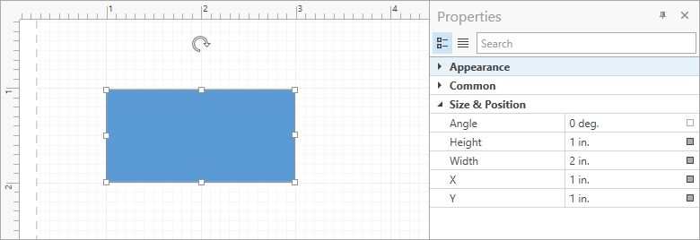
    You can enable the DiagramControl.ShowMeasureUnit option to display measure units in the Properties Panel, Page Setup Window, and Bottom Panel. In addition to pixels (used by default), users can specify values in other measurement units (inches and millimeters).

    Documentation

    Miscellaneous

    • This update includes a new OrgChartLayoutIsCompact option for the Org Chart's automatic layout. Set this option to false to calculate the offset for all tip-over subtrees rather than individual levels of the hierarchy. This improves readability for diagrams with extensive use of subtrees.
    • You can now hold the middle mouse button and drag to pan the diagram. The AllowMiddleButtonDrag option allows you to disable this behavior.

    WPF Pivot Grid

    Filter Panel Enhancements

    We enabled our new Filter Panel by default. This panel highlights individual field names, field values, and date-time functions to help improve the filter expression readability/usability.

    DemoDocumentation

    WPF Gauges

    Template for Custom Labels

    Our WPF Gauges control allows you to generate custom labels from a template. Use the Scale.CustomLabelsSource and Scale.CustomLabelTemplate properties as needed.

    <Style TargetType="{x:Type dxga:ArcScale}">
        <Setter Property="CustomLabelsSource" Value="{Binding RomanLabels}"/>
        <Setter Property="CustomLabelTemplate">
            <Setter.Value>
                <DataTemplate>
                    <dxga:ScaleCustomLabel Value="{Binding Hour}"
                                           Content="{Binding RomanHour}"
                                           Visible="{Binding Visible}"/>
                </DataTemplate>
            </Setter.Value>
        </Setter>
    </Style>

    DemoDocumentation

    Snap Indicator Values to Tickmarks

    Set the ValueIndicatorBase.SnapMode property to MinorTickmarks / MajorTickmarks to integrate this capability in your WPF app. Once set, the WPF Gauge control will snap its value to minor or major tickmarks.

    DemoDocumentation

    WPF Docking

    You can now use the FloatGroup.WindowStyle and FloatingPaneWindow.OverlapTaskbar properties to specify whether a maximized FloatGroup overlaps the Windows Taskbar.

    <dxdo:DockLayoutManager FloatingMode="Desktop">
    	<dxdo:FloatGroup xmlns:platform="http://schemas.devexpress.com/winfx/2008/xaml/docking/platform">
    	    <dxdo:FloatGroup.WindowStyle>
    	        <Style TargetType="platform:FloatingPaneWindow">
    	            <Setter Property="OverlapTaskbar" Value="True"/>
    	        </Style>
    	    </dxdo:FloatGroup.WindowStyle>
    	</dxdo:FloatGroup>
    </dxdo:DockLayoutManager>

    Documentation

    WPF MVVM

    The EnumItemsSourceBehavior's ImageSize property allows you to specify an item's image size.

    <dxe:ComboBoxEdit>
        <dxmvvm:Interaction.Behaviors>
            <dxmvvm:EnumItemsSourceBehavior EnumType="{x:Type common:UserRole}" 
                                            SortMode="DisplayName" 
                                            ImageSize="20,20"/>
        </dxmvvm:Interaction.Behaviors>
    </dxe:ComboBoxEdit>

    Documentation

    WPF Themes

    Predefined Palettes for VS2019 Themes

    We added the following predefined palettes to our VS2019 themes:

    Palette NameSupported Theme
    LatteVS2019Blue
    NavyVS2019Blue
    BlueberryCakeVS2019Dark
    DeepSeaVS2019Dark
    DimmedVS2019Dark
    SandVS2019Dark
    StormVS2019Dark
    BerberisVS2019Light
    CornflowerVS2019Light
    EmeraldSeaVS2019Light
    LightLilacVS2019Light
    LoftVS2019Light

    Documentation

    Your Feedback Matters

    We realize beta-testing is a time consuming process and we are grateful to those who invest time with our preview builds. Find the current implementation lacking flexibility? Feel we've overlooked a valuable usage scenario? Does our current implementation fail to address your business requirements? Please post your thoughts in the comment section below or create a Support Center ticket. We will happily follow-up and do what we can to extend the capabilities of our new products/features.

    WPF - Tips & Tricks (August 2020)

    $
    0
    0

    As always, we hope you are doing well in this difficult time period. If we can be of service, please contact us at your convenience.

    In this month’s edition of our WPF Tips & Tricks post, we decided to create a couple of WPF Grid-related examples – examples that address important usage scenarios. We also summarized a list of interesting support tickets answered throughout the previous month. Should you have any questions about our WPF Grid examples or the support tickets listed herein, feel free to comment below.

    WPF Data Grid - Examples

    Our WPF Data Grid control ships with a series of properties that help define custom row/cell styles and cell templates. (for more information, please refer to the following help topics: CellStyle, RowStyle, CellTemplate, CellDisplayTemplate, CellEditTemplate). The following samples illustrate how you can build binding paths for elements that rely on these styles and templates:

    Note: Tools like Snoop help show the runtime visual tree and objects within DataContext (and can help build binding paths).


    To review best practices related to synchronous and asynchronous CRUD operations (in a data bound WPF Grid control), please refer to projects listed in this example:


    TICKETS:

    WPF Data Grid

    WPF Editors

    WPF Bars

    WPF Scheduler

    WPF Charting and Maps

    Other Controls


    Your Feedback Matters

    Your thoughts and comments are important. If you find these blog posts of value, please post a note below. If you feel they can be improved, please share your recommendations with us. Thank you for your continued support.

    WinForms and WPF Maps - Map Rulers, Rotation (v20.2)

    $
    0
    0

    In this post, I’ll describe a couple of features we expect to release in our v20.2 release cycle – features that are currently available in the DevExpress Map Control (WinForms and WPF) Early Access Preview (EAP) build.

    All active Universal or DXperience subscribers can download this build today via the DevExpress Client Center.

    Map Rulers 

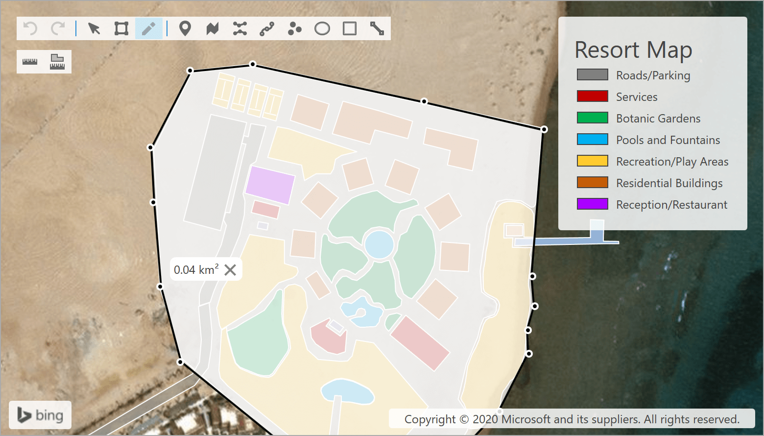
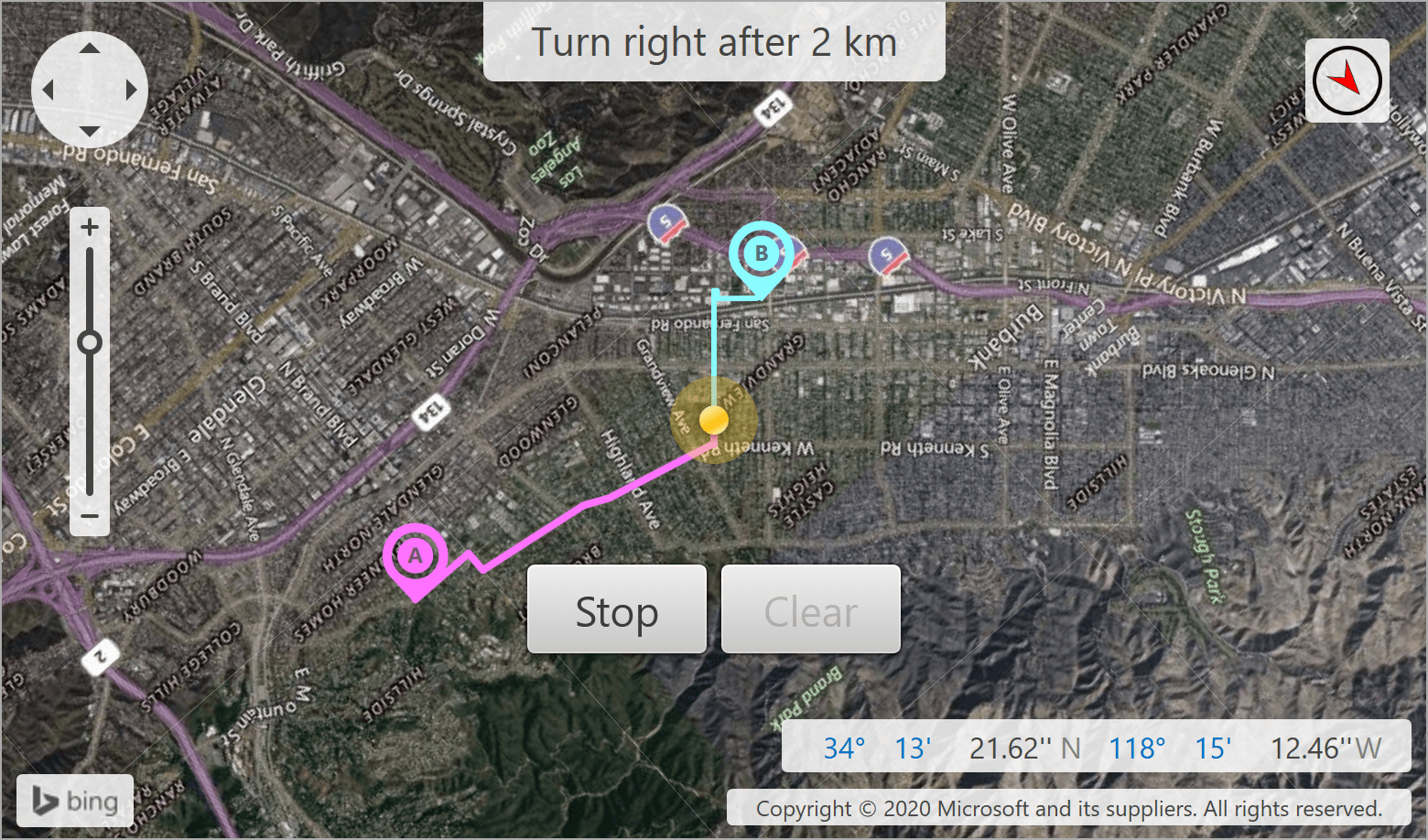
    We extended the interactive capabilities of our DevExpress Map Control by introducing a new Measurement Toolbar. This toolbar will help end users to measure geometrical and geographical objects using the appropriate buttons: Add Distance Ruler and Add Area Ruler

    You can also use our Measurements class API to create and update rulers and specify measurement units in code. 

    Demo: Map Editor (WinForms) | Map Editor (WPF) 

    Documentation: Measurements class (WinForms) 

    Map Rotation (WPF) 

    Your end-users can now rotate WPF maps as needed. Simply set the required rotation angle using the MapControl.Angle property or by calling the MapControl.RotateAt method. 

    Demo: Navigator 

    Your Feedback

    As always, we welcome your feedback. Please share your thoughts below and let us know how you’re using our Map control within your desktop app.

    DevExtreme React Scheduler — Resources & Grouping

    $
    0
    0
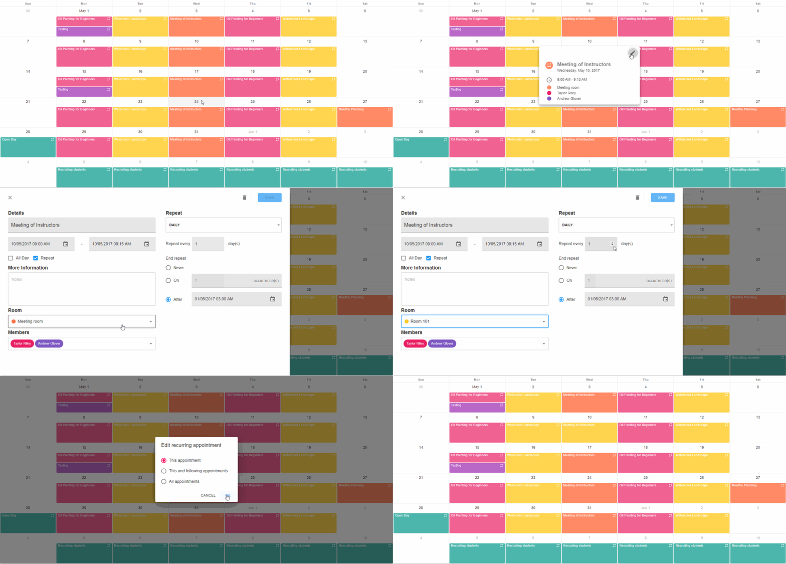
    The most recent update of our React Scheduler includes custom resources support and appointment/event grouping support. Users can now link appointments/events to different resources (such as employees, locations, physical assets) and group appointments/events by a resource or by dates.

    Appointment Resources

    DevExtreme React Scheduler allows users to associate appointments/events with resources. Single-instance resources can be used for one-to-one associations - such as a meeting in a single room. Multiple-instance resources can be used where multiple associations are allowed. For instance, an event with multiple attendees.
    Color coding helps distinguish appointments associated with different resources. We use Google Material Design Colors as our default palette. You can easily customize this palette using the component’s corresponding API.
    Use the Resources plugin to enable this feature in your Scheduler.
    Resources data also displayed in the Appointment tooltip and appointment form. You can also assign resources thought the form.

    Appointment Grouping

    Users can group appointments by resource or by date. This is useful when you have to display lots of appointments and resources.
    To enable this feature, add our grouping plugins (GroupingState, IntegratedGrouping and GroupingPanel) and the Resources plugin to the Scheduler as shown below

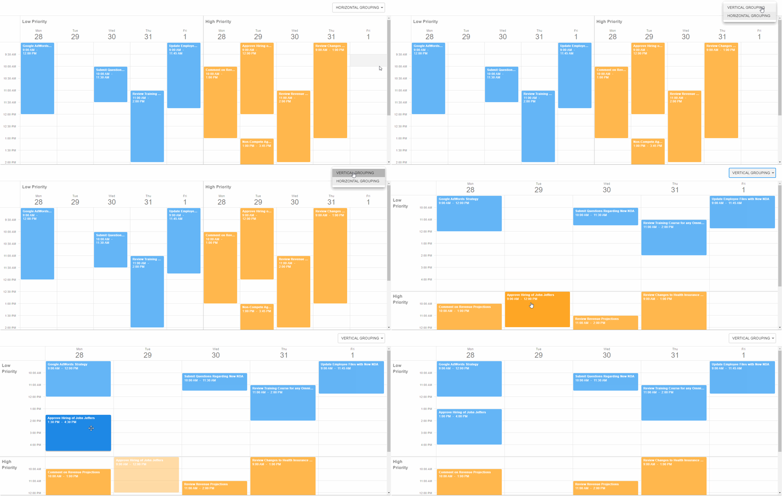
    Group Appointments by Resources

    You can group appointments by single or multiple resources. Use the grouping property to specify this. Group names (resource titles) are displayed in the group panel. A single appointment can appear across multiple groups if it is assigned to multiple instances of a resource.
    Groups can be arranged horizontally (one next to another) or vertically (one under another). Specify the desired groupOrientation property value to arrange groups within your app. You can use different group orientations for different views.
    End-users can place an appointment to a different group via our built-in Appointment Form or by using Drag-and-Drop operations.

    Group Appointments by Date

    The Scheduler also allows you to group appointments by date. To enable this feature, set the groupByDate property to true:

    Feedback

    As always, we welcome your thoughts. Please share your feedback in the comments section below or submit issues to our GitHub repository.

    WPF Sample Apps - Stock Market Demo Update with New Charting Features and More (v20.1)

    $
    0
    0

    As you may already know, our demos include sample applications that replicate potential real-word usage scenarios. In our last major release, we updated our WPF Stock Market demo and extended its capabilities. In this post, I’ll summarize some of the changes we made and ask for feedback from those of you in the finance sector. We’d love to hear your thoughts as we want to refine this demo further in future builds.

    If you have the WPF Subscription v20.1 installed, you can launch the demo by selecting the following link below:

    dxdemo://WPF/StockMarketTraderDemo

    WPF Charts

    The primary view within the Stock Market app is the Trading Chart. As you’d expect, we used our WPF Chart control’s Candle Stick Series for prices and Side-by-side Bars for sales volume. Series use panes to help generate advanced layouts.

    Our WPF Chart control was configured to display up to 1200 series points at any point in time. Use your mouse scroll wheel to zoom in and out as needed.

    The crosshair is a built-in feature. By default, the crosshair displays content within in a label. In this sample app, we chose to display crosshair content in a legend above the chart to avoid UI clutter.

    The Toolbar is a new addition to our WPF Chart control. In this demo, the Toolbar allows users to add indicators/annotations and specify the desired time interval.

    The Market Depth view is a new addition to the demo. To create this view, we used our WPF Chart control to display two Step Area series– one bids (buy orders) and the other for asks (sell orders).

    WPF Grid

    We used our WPF Data Grid to display raw data on the right side of the screen. Order Book consists of two grids, one atop the other. Sorting was disabled, and each time the data source updates, the MoveLastRow and MoveFirstRow methods scroll both grids to the most recent record.

    Conditional formatting helps improve data visualization and readability.

    App Layout

    We used our WPF Tab control to organize individual UI elements. Each market stock is displayed within a separate tab. You can drag a tab outside the panel to create a new window.

    When you click the new tab button, it displays a popup menu with available stocks. This menu is a custom ControlBoxPanelTemplate and it displays a GridControl.

    The WPF Tab control is integrated into a ThemedWindow. ThemedWindow supports DevExpress themes and provides numerous customization options. For instance, we placed the InformationPanel view in the HeaderItems collection to display market trends.

    MVVM

    We used the DevExpress MVVM Framework to build our views and view models. This framework allows you to skip tedious steps – such as notification and commands implementation. DXBinding and DXEvent markup extensions give you easy-to-use syntax to bind views and view models as needed.

    Your Feedback

    As mentioned earlier, we’d love your feedback on this demo. How would you improve/extend the UX? What can we do to improve this demo? Which DevExpress WPF control would you like to see incorporated?

    WinForms Layout Control — Five New Features to Expect in v20.2

    $
    0
    0

    A few days ago, we released our v20.2 Early Access Preview. If you missed the announcement, please refer to the following post for more information: WinForms — Early Access Preview (v20.2).

    In this post, I want to summarize new features we expect to ship for our WinForms Layout/Data Layout Control in our v20.2 release cycle.

    Highlight Non-Resizable Elements

    If you’ve used the DevExpress WinForms Layout Control, you know that it offers nearly unlimited layout customization options. Unfortunately, this flexibility comes at a cost, as the control requires that you specify numerous settings - settings that may conflict with one another.

    If you ever tried to resize a layout item and could not figure out why it won't budge, you will love this small enhancement. With v20.2, our design time and runtime customization form automatically highlights items that have reached their minimum/maximum size (and thus cannot be resized any further).

    In the figure above, "Contact Title" cannot be enlarged because the neighboring TextEdit ("Contact Name") has reached its minimum width. The pink highlight allows you to quickly determine the item that is affecting resize operations.

    If you want to limit element size, we recommend that you use standard Control.MinimumSize and Control.MaximumSize properties for controls hosted inside these items. You can also set SizeConstraints to "Custom" and limit the size of an entire Layout Item, but we do not recommend this approach. First, it is less flexible - it requires that you set both width and height limits, whereas standard properties allow you to limit only one control dimension. Second, this approach may lead to undesirable results if the Layout Item text changes (for instance, when you localize an app to another language). We have created a Knowledge Base article that discusses this matter in greater depth (size calculation logic used in the Layout Control) and explains how to address common usage scenarios/customer requirements: DevExpress WinForms Cheat Sheet - LayoutControl Resizing Mechanism.

    New API in Data Layout Control

    Data Layout Control is a data-aware version of our standard Layout Control. It automatically builds a layout based on your data source, and displays the first data source record. To display values of other records, previous versions required that you implement a custom data navigator. In v20.2 you will be able to use embedded Data Layout Control API to navigate through data items.

    • CurrentRecordPosition - assign a data row index to this property to display values of this row in our WinForms Data Layout Control;
    • CurrentRecord - returns an object (for instance, a DataRow) whose values are currently displayed in the Data Layout Control;
    • GetCurrentRecordFieldValue(string fieldName) - allows you to retrieve the value of a cell that belongs to the current row and the specific data source column;
    • SetCurrentRecordFieldValue(string fieldName, object value) - allows you to edit data source records;
    • RecordCount - returns the total number of data source records.

    All methods are implemented for the DataLayoutControl class.

    Hyperlink Support

    We recently added support for HTML tags (including HTML images) in both Layout Item and Layout Group captions. This means you can now add hyperlinks to these captions.

    To respond to hyperlink clicks, handle the LayoutControl.HyperlinkClick event. This event is a single entry point for any clicked hyperlink, and the event "e.Item" parameter allows you to identify which Layout Item triggered the event.

    layoutControl.HyperlinkClick += OnHyperlinkClick;
    
    void OnHyperlinkClick(object sender, LayoutItemHyperlinkClickEventArgs e) {
        if(e.Item == layoutControlItem1)
            System.Diagnostics.Process.Start(e.Link);
    }

    Row and Column Visibility Settings in Table Layout Mode

    ColumnDefinition and RowDefinition objects for the Table Layout Mode now include the Visible property. Invisible columns or rows are hidden alongside their Layout Items. If an item spans multiple rows or columns, and you hide one of them, the item reduces its size but remains visible.

    Advanced Serialization Options

    We recently received a Support Center ticket whose author saved form layouts to files, and compared them in v18.1.7 and v19.2.7. Turns out, the size of these files grew by 30-40% because the Layout Control serialized more of its properties (for instance, Appearance settings). In v20.2 you will be able to use the LayoutControl.OptionsSerialization property to choose which Layout Controls settings to save into a file or stream.

    This property exposes the following Boolean options:

    • StoreAppearance
    • StoreSpaceOptions
    • StoreEnabledState
    • StoreText
    • StorePrintOptions
    • DiscardOldItems

    DevExtreme File Manager - Standalone File System Providers (Available Now in v20.1)

    $
    0
    0

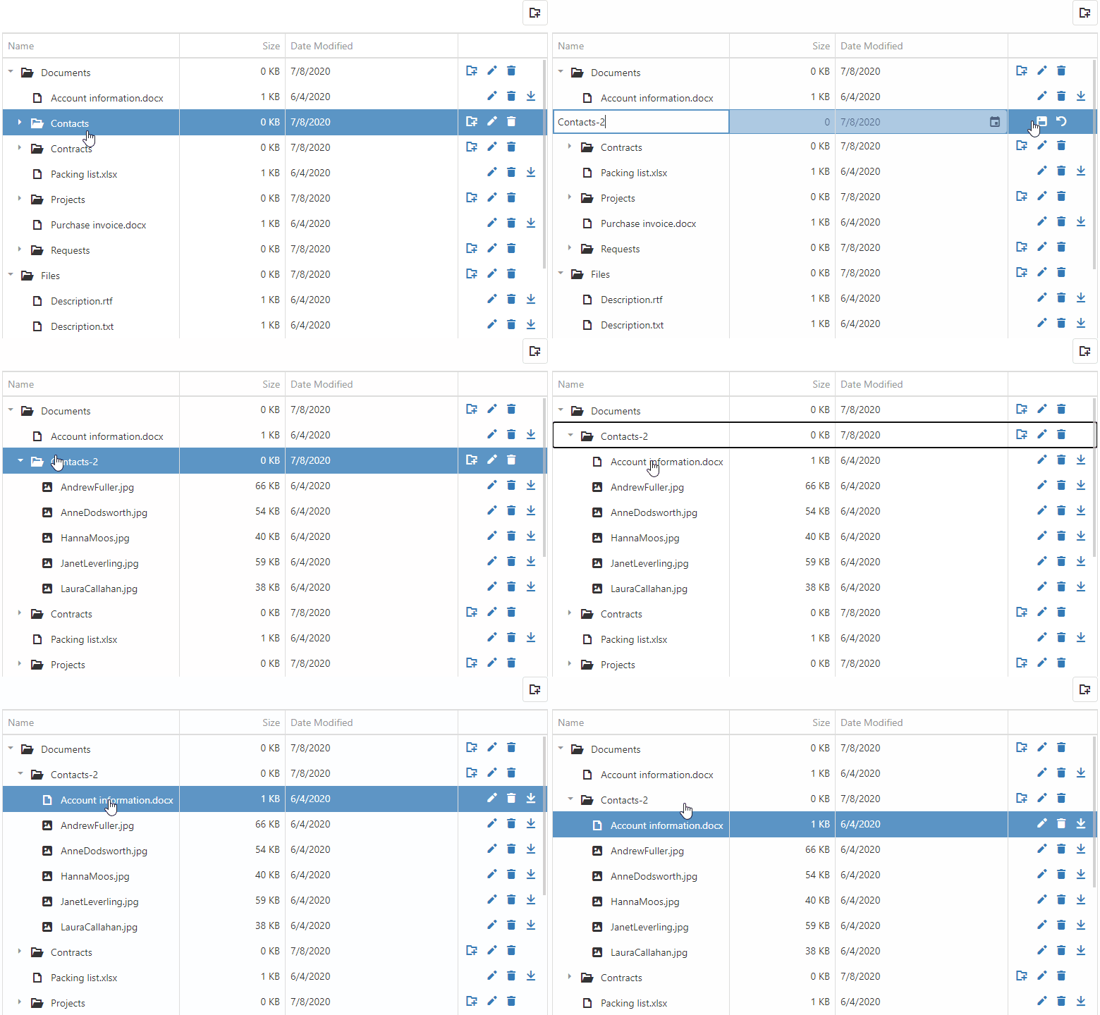
    Our most recent version of DevExtreme (v20.1) includes the official release of the DevExtreme File Manager. This client-side component emulates a familiar file manager experience by providing a built-in UI for your end users to browse, manage, and upload files to your web server.

    Unfortunately, the component as it stands does not address the possibility of working with non-standard file systems, an example being if your end users needed to view and manage files located in different directories at the same time.

    This blog post describes how to create a custom file manager to address this kind of use case. You will see how to:

    • Use DevExtreme File Manager's standalone file system providers to access, browse, and manage remote files and directories.
    • Build a custom file manager UI using the DevExtreme TreeList component. (Our TreeList component has a hierarchical display similar to the File Manager component.)
    • Add command buttons to provide essential file manager functions for your users.
    • Use the TreeList's drag and drop API to allow the user to move and copy files.

    Custom File Manager

    The standard DevExtreme File Manager component is divided into two key parts: a server-side file system and a client-side UI to display the file system contents.

    DevExtreme Custom File Manager - TreeList

    In order to create a custom File Manager component to emulate this pattern, you'll need to:

    • Set up both client and server file system providers
    • Bind these providers to our TreeList component for the UI

    From the client-side, a RemoteFileSystemProvider will manage file system items and send requests to a Web API service. On the server, a PhysicalFileSystemProvider connected to a physical file system will process requests from the Web API service.

    Note: The code examples below are for the Angular framework. This feature also works with all other frameworks supported by DevExtreme.

    Learn more here:

    Bind TreeList - Custom Data Source

    To connect our DevExtreme TreeList component to a Web API service, you should:

    • Create a custom data source
    • Add empty load, insert, update, and remove methods for this data source (you'll be implementing them in a moment)
    • Bind the data source to the TreeList
    <dx-tree-list id="treeList" [dataSource]="dataSource"   ...>
       ...
    </dx-tree-list>
    
    //The data source uses the RemoteFileSystemProvider API
    this.dataSource = {
        key: "key",
        load: options => { ... },
        insert: values => {
            …
        },
        update: (key, values) => { ... },
        remove: key => { ... }
    };
    

    Then you will need to create a RemoteFileSystemProvider to manage your files and directories:

    const provider = new RemoteFileSystemProvider({
        endpointUrl: "https://js.devexpress.com/Demos/Mvc/api/file-manager-file-system-scripts"
    });
    

    Learn more here:

    TreeList - How to display and edit file system with the client-side RemoteFileSystemProvider

    Browse Files/Folders

    In order to add client-side file navigation support, the data source's load function needs to be implemented. Calling the getItems method in this method will allow file items to load on demand.

    load: options => {
      const parentIds = options.parentIds || [""];
      const promises = parentIds.map(parentId => {
        const directory = new FileSystemItem(parentId, true);
        return provider.getItems(directory);
      });
    
      if (promises.length === 1) {
        return promises[0];
      }
    
      return Promise.all(promises).then(parts => {
        const result = [];
        return result.concat.apply(result, parts);
      });
    },
    

    On the server, the PhysicalFileSystemProvider will manage client requests to loads files and directories as a user browses the file system.

     public object FileSystem(FileSystemCommand command, string arguments) {
        // Configure File System Options
        var config = new FileSystemConfiguration {
            Request = Request,
            // Specify a file system provider.
            FileSystemProvider = new PhysicalFileSystemProvider(_hostingEnvironment.ContentRootPath + "/wwwroot"),
        };
        var processor = new FileSystemCommandProcessor(config);
        var result = processor.Execute(command, arguments);
        return result.GetClientCommandResult();
    }
    

    Add Command Buttons

    Our DevExtreme Treelist can display a command column with buttons to execute custom actions.

    For this custom file manager, you should create command buttons that allow users to add and delete files or directories, download files, etc. As an example, the code below shows a command column that includes buttons to create new directories, and rename, delete, and download files:

    <dx-tree-list
      id="treeList"
      [dataSource]="dataSource"   ...>
       …
      <dxi-column type="buttons">
          <dxi-button name="add" ...></dxi-button>
          <dxi-button name="edit" hint="Rename"></dxi-button>
          <dxi-button name="delete"></dxi-button>
          <dxi-button name="download" ... ></dxi-button>
      </dxi-column>
    
    </dx-tree-list>
    

    Use the RemoteFileSystemProvider methods to implement corresponding data source functions for the buttons.

    Back to implementation of the custom data source. The insert function creates a new directory. It gets the current file system item based on the item's parent path and then calls the createDirectory method:

    insert: values => {
        …
        const parentPath = values.parentId || "";
        const directory = new FileSystemItem(parentPath, true);
        return provider.createDirectory(directory, values.name);
    },
    

    The update function for the data source renames files and directories. It finds a file or directory with the specified key and calls the renameItem method:

     update: (key, values) => {
         …
    
         return this.findItemByKey(key).then(item =>
            provider.renameItem(item, values.name)
            );
        }
    

    The remove function uses the deleteItems method to delete items with the specified keys:

    remove: key => {
        …
    
        return this.findItemByKey(key).then(item =>
        provider.deleteItems([item])[0]
        );
    }
    

    By default, the server-side PhysicalFileSystemProvider denies file management operations until you explicitly allow them. You should control the availability of the various file operations by setting the following properties to true or false: AllowDownload, AllowUpload, AllowCreate, and AllowDelete.

    public object FileSystem(FileSystemCommand command, string arguments) {
       var config = new FileSystemConfiguration {
            Request = Request,
            FileSystemProvider = new PhysicalFileSystemProvider(_hostingEnvironment.ContentRootPath + "/wwwroot"),
            // Allow create, delete and modify files and folders, download files.
            AllowDownload= true,
            AllowUpload = true,
            AllowCreate = true,
            AllowDelete = true,
        };
    ...
    }
    

    Download Support

    Add the download command button to the client-side TreeList to allow your users to download files.

    <dx-tree-list id="treeList" ...>
      …
      <dxi-column type="buttons">
        …
        <dxi-button
          name="download"
          icon="download"
          hint="Download"
          [visible]="isDownloadButtonVisible"
          [onClick]="onDownloadButtonClick">
        </dxi-button>
      </dxi-column>
    </dx-tree-list>
    

    To initiate file download, call downloadItems from the onDownloadButtonClick event handler.

    onDownloadButtonClick(e) {
        this.provider.downloadItems([e.row.data]);
        e.event.preventDefault();
    }
    

    Make sure that the AllowDownload option is set to true to support download functionality on the server side.

    var config = new FileSystemConfiguration {
        ...
        AllowDownload= true
    };
    

    Drag and Drop Support

    While the DevExtreme File Manager does not support drag and drop operations, you can add this functionality using the DevExtreme TreeList's built-in functions. You should use the following events of the TreeList control to allow the user to move and copy files: OnDragChange, OnReorder, and OnDragMove.

    To implement copy and move operations, use the getNodeByKey method to identify the directory that contains the selected files. Verify that the current and target directory are different: if they are the same location then you should cancel the operation (e.cancel=true).

    Use the Ctrl key to check if a user is copying or moving an item during a drag and drop operation. Set the dragCopyMode property to true when the user holds the Ctrl key and copies items:

    onDragChange(e) {
        const visibleRows = this.treeList.instance.getVisibleRows();
        const sourceNode = this.treeList.instance.getNodeByKey(e.itemData.key);
        let targetNode = visibleRows[e.toIndex].node;
    
        if (!targetNode.data.isDirectory) {
          e.cancel = true;
          return;
        }
    
        while (targetNode && targetNode.data) {
          if (targetNode.data.key === sourceNode.data.key) {
            e.cancel = true;
            return;
          }
          targetNode = targetNode.parent;
        }
        this.dragCopyMode = e.event.ctrlKey;
    }
    
    onDragMove(e) {
        const element = document.body;
        const hasCopyMarker = element.classList.contains("drag-copy-mode");
        const copyMode = e.event.ctrlKey;
        if (copyMode !== hasCopyMarker) {
          element.classList.toggle("drag-copy-mode", copyMode);
        }
      }
    

    Once a directory is dragged, the control fires the onReorder event. The source (e.itemData) and target locations (e.toIndex) are either moved or copied (if the Ctrl key is pressed):

    onReorder(e) {
        const visibleRows = e.component.getVisibleRows(),
          sourceData = e.itemData,
          targetData = visibleRows[e.toIndex].data;
    
        const destDirectory = e.dropInsideItem
          ? targetData
          : new FileSystemItem("", true);
        const editItemsFunc = this.dragCopyMode
          ? this.provider.copyItems
          : this.provider.moveItems;
    
        editItemsFunc
          .call(this.provider, [sourceData], destDirectory)[0]
          .then(() => this.treeList.instance.refresh());
    }
    

    Enable copy/move operations by setting the AllowMove and AllowCopy options to true:

    var config = new FileSystemConfiguration {
        ...
        AllowMove = true,
        AllowCopy = true
    };
    

    XAF - Watch the Last Webinar Recording with a QA, Blazor and XPO Teasers, Best Practices and More

    $
    0
    0

    Our MVPs, Jose Columbie of Xari.io, Joche Ojeda of BitFrameworks.com and Manuel Grundner of Delegate.at hosted a monthly webinar on XAF, XPO and related topics (subscribe for free). Jose, Joche and Manuel demoed XAF for 30 minutes, discussed performance-related best practices, XPO and EF Core ORM. They also covered numerous other topics, including UI customization, WebAssembly, unit testing, and time-savings one can achieve with XAF's security system.

    As always, the chat was quite active and I answered XAF/XPO-related audience questions in real-time. I personally liked a comment from a customer who shared that in their company 2 developers worked 5 months to build a security system similar to XAF for their LOB app and with XAF they now get it for free in no time at all (time code: 1:08:05). 

    If you missed this monthly event, check out this recording below: 

    If you’re using XAF or are considering it for an upcoming project, feel free to post general questions to the XAF community via the following chat group: https://gitter.im/XAF-Community/community. XAF MPVs, experienced XAF developers and I will share development experiences and offer our 2cents on this chat platform. If you require consulting and custom development services for XAF, XPO and other DevExpress products, feel free to reach out to our MVPs and third party consultants.

    ASP.NET WebForms, MVC and Core - Tips & Tricks (July 2020)

    $
    0
    0

    We’ve compiled a list of recently updated help topics, code examples and interesting ASP.NET/MVC related support tickets for your review. If you have an ASP.NET WebForms or MVC-related support ticket you’d like to share with the DevExpress developer community, feel free to post a link in the comment section below.

    Knowledge Base Articles

    The following new article describes use of custom fonts within our Rich Text Editor control:

    New Examples

    The following examples demonstrate use of our Rich Text Editor in ReactVue and MVC-powered applications:

    We also created an example that illustrates use of our client Rich Text Editor for ASP.NET Core within ASP.NET MVC applications:

    The following examples address popular MVC GridView-related usage scenarios:

    Finally, a Bootstrap Chart control example:

    You can find these and other DevExpress examples in our GitHub repository.

    Interesting Technical Support Tickets

    Common (ASP.NET MVC and Web Forms)

    ASP.NET Web Forms

    ASP.NET Web Forms Bootstrap

    ASP.NET MVC

    ASP.NET Core

    Documentation Updates

    New binding related help topics for the DevExpress ASP.NET Diagram component:

    Feedback

    As always, we welcome your comments and questions. Submit your feedback below and we’ll be happy to follow-up.

    Office File API & Office-Inspired Desktop UI Controls – Tips & Tricks (August 2020)

    $
    0
    0

    We’ve compiled a list of interesting support tickets answered throughout July and August. Hopefully, you’ll find these support tickets of value as you explore and leverage the capabilities of our Office File API and Desktop Office-inspired UI components. Should you have any questions about these support tickets, feel free to comment below.

    Tips & Tricks

    Spreadsheet Document API

    1. T920110 - How to expand or collapse a pivot item’s outline
      https://supportcenter.devexpress.com/ticket/details/T920110

    PDF Document API

    1. T924826 - How to restore a clip region in a PDF document
      https://supportcenter.devexpress.com/ticket/details/T924826

    Rich Text Editor

    1. T914899 - How to filter the language list in the Language dialog
      https://supportcenter.devexpress.com/ticket/details/T914899
    2. T915274 - How to count words in a document
      https://supportcenter.devexpress.com/ticket/details/T915274

      You can use the Visitor-Iterator pattern to count words. Create a DocumentVisitorBase implementation and override the corresponding DocumentVisitorBase.Visit methods. Create DocumentIterator and StatisticsVisitor instances in the main class. Call the MoveNext and Accept methods to move through document text and collect statistics.

      public class StatisticsVisitor : DocumentVisitorBase
          {
              readonly StringBuilder _buffer;
              int _wordCount;
      
              public StatisticsVisitor()
              {
                  this._buffer = new StringBuilder();
              }
      
      	// Declare properties used to return the text buffer
      	// and word count
              StringBuilder Buffer { get { return _buffer; } }
              public int WordCount { get { return _wordCount; } }
      
              // Add document text to the buffer     
              public override void Visit(DocumentText text)
              {
                  Buffer.Append(text.Text);
              }
      
              // Split buffer text into words and count them.     
             // This method is called when the visitor encounters section and 
              paragraph ends   
              void FinishParagraph()
              {
                  string text = Buffer.ToString();
                  this._wordCount += text.Split(new char[] { ' ', '.', '!', '?' }, 
                  StringSplitOptions.RemoveEmptyEntries).Length;
                  if (!string.IsNullOrWhiteSpace(text))
                      Buffer.Length = 0;
              }
      
              public override void Visit(DocumentSectionEnd sectionEnd)
              {
                  FinishParagraph();
              }
              public override void Visit(DocumentParagraphEnd paragraphEnd)
              {
                  FinishParagraph();
              }
      
          }
      
          public partial class Form1 
          {
      	// In this example, words are counted on button click:
              private void countWordsBarButtonItem_ItemClick(object sender, 
              DevExpress.XtraBars.ItemClickEventArgs e)
              {
      	 // Create iterator and visitor objects            
      	 DocumentIterator iterator = new DocumentIterator(richEditControl1.Document, true);
               StatisticsVisitor visitor = new StatisticsVisitor();
      			
                // Allow the visitor to retrieve encountered document elements            
      	  while (iterator.MoveNext())
                      iterator.Current.Accept(visitor);
                 
      	  // Show result in a message box
      	  MessageBox.Show(String.Format("{0} WORDS", visitor.WordCount));
              }
          }
    3. T923827 - How to show SuperToolTip until a user clicks somewhere different
      https://supportcenter.devexpress.com/ticket/details/T923827

    WinForms PDF Viewer

    1. T920036 - How to mark a location for a signature in a PDF document
      https://supportcenter.devexpress.com/ticket/details/T920036

    WPF PDF Viewer

    1. T919109 - How to implement Fit to Height zoom mode
      https://supportcenter.devexpress.com/ticket/details/T919109

    WPF Spreadsheet Control

    1. T922458 - How to copy a cell range in one SpreadsheetControl and paste only cell values to a different SpreadsheetControl
      https://supportcenter.devexpress.com/ticket/details/T922458

      Handle the SpreadsheetControl.ClipboardDataObtained event and set the e.Flags property to PasteSpecial.Values to paste only cell values from the clipboard.

      private void spreadsheet_ClipboardDataObtained(object sender, 
              DevExpress.Spreadsheet.ClipboardDataObtainedEventArgs e)
      {
          e.Flags = DevExpress.Spreadsheet.PasteSpecial.Values;
      }
      

    WinForms Spreadsheet Control

    1. T919991 - How to expand a drop-down list for a cell for which a List data validation rule has been applied
      https://supportcenter.devexpress.com/ticket/details/T919991

    Enhancements

    Spreadsheet Document API

    1. T917379 – You can now hide filter drop-down arrows in a pivot table
      https://supportcenter.devexpress.com/ticket/details/T917379

      Set the PivotViewOptions.ShowFieldHeaders property to false to hide drop-down buttons within PivotTable field headers. In this instance, end users will not be able to sort or filter field items.

      // Hide drop-down button for the Product field. 
       pivotTable.Fields["Product"].ShowHeaderDropDown = false;
      

    PDF Document API

    1. T923412 - Check if a document has a certification signature
      https://supportcenter.devexpress.com/ticket/details/T923412

      We added a GetSignatureInfo method (used to retrieve information about document signatures). Each PdfSignatureInfo object - contained in the returned collection - allows you to check the signature’s certification level.

      using (var signer = new PdfDocumentSigner(@"D://Docs//SignedDocument.pdf"))
      {
          var signatures = signer.GetSignatureInfo();
          for (int i = 0; i < signatures.Count; i++)
              Console.WriteLine(String.Format("{0} signature certification level: {1}",
                  i, signatures[i].CertificationLevel));
      }
      
    2. T925676 - You can now set a predefined date and time for a signature
      https://supportcenter.devexpress.com/ticket/details/T925676

    If you’ve come across an interesting support ticket you’d like to share with the rest of the DevExpress developer community, please comment below and include the appropriate link.

    The Fastest Way to Your Next Test – TestCafe + TestCafe Studio - Q&A's

    $
    0
    0

    Thank you to all that attended the recent TestCafe Studio presentation, the questions raised have been answered by the team and listed below. 

    Watch the Webinar

    Questions & Answers

    Will the webinar recording on YouTube include the Q&A section?

    We discussed the most popular Q&As at the end of the webinar. This part is included in the recording. The remaining questions are answered in this post.

    Can I test Windows Form applications with TestCafe Studio? 

    TestCafe Studio can test web applications only. 

    Am I allowed to install TestCafe Studio on our customer’s site to test it in their environment?

    TestCafe Studio is a desktop application installed on a developer’s/tester’s local computer, not on a website. You can install TestCafe Studio on any Windows, macOS, or Linux machine. If the machine where TestCafe Studio runs can access the website deployed on your customer’s infrastructure, you can simply specify its URL to test it in its native environment.

    Does TestCafe Studio support multiple languages?

    The TestCafe Studio UI only supports English. If you are asking about programming languages in which you can write tests, TestCafe Studio supports JavaScript, TypeScript, CoffeeScript, and of course tests recorded in TestCafe Studio (*.testcafe files).

    Can I include TestCafe Studio in Continuous Integration? 

    You can use the open-source TestCafe to run tests recorded or written in TestCafe Studio in CI systems. See the Integrate Tests with CI Systems topic for more information.

    What value does TestCafe Studio add to an automated CI pipeline in which tests are executed in headless mode?

    TestCafe Studio allows you to create and modify tests with ease. In a CI system, the tests will run with an open-source TestCafe runner that doesn’t make any difference between TestCafe Studio recorded tests and JavaScript TestCafe tests. See the Integrate Tests with CI Systems topic for more information. So, TestCafe Studio’s goal is to facilitate recording and maintenance.

    Is there a way to record tests in TestCafe Studio and export them to JavaScript to run individually?

    Yes, you can do this. See the Convert Recorded Tests to JavaScript topic for more information.

    Does TestCafe Studio have any known issues with SPA apps, specifically Angular?

    No, we are not aware of any significant issues with SPAs including Angular applications. You can also make use of the following selector extension that enables you to test Angular applications even easier: DevExpress/testcafe-angular-selectors

    Are there any recommendations on the best method for initializing a selector?

    We plan to publish an article that details the best practices for TestCafe tests, including suggestions on how to build effective selectors. In the meantime, refer to the Element Selectors topic to learn more about them.

    Does the open-source TestCafe have the reporting and screen capturing capabilities?

    Yes, it has both. See the Reporters and Screenshots and Videos topics for details. 

    Can I test “concurrent” scenarios where two users use the app and modify the data simultaneously? 

    To simulate users interacting with the app concurrently, you need two browser windows. Support for multiple browser windows is currently available in beta for coded tests only. See the details in the open-source TestCafe documentation: Multiple Browser Windows. As an alternative solution, you can try running the same test that edits a data record in different browsers at the same time.

    Can I run tests at specific moments in time, e.g. on schedule?

    You can integrate your test with any CI service to run them on schedule. 

    Can I receive an email notification with test results once they are done?

    You can search for a TestCafe reporter that sends an email with test run results or create a new custom reporter for your needs. 

    Can I deliberately slow down the test run in TestCafe Studio for more convenient  viewing?

    Yes, you can adjust the Speed option to slow down test execution.

    How do you use the GUI to create a custom attribute for a webpage?

    You can customize the selector generation mechanism to take into account custom attributes. Add a custom attribute name to the list of selector types. TestCafe Studio will then use this attribute to create selectors. On your website end, you should specify the custom attribute for page elements manually.

    Is it possible to write a text assertion with wildcards in it, so that it matches multiple text values?

    Yes, you can use regular expressions for this purpose: Match Assertion

    Is it possible to load user credentials from a file to use them in tests?

    You can use the Run TestCafe Script action. Write a script that imports the fs Node.js module, reads the file content and saves the credentials in the test context. Now you can read these values from `t.ctx` in other scripts within Run TestCafe Script actions. Currently, you cannot pass the test context to recorded action parameters.

    Can I create variables to store secrets or URLs for different environments?

    TestCafe Studio can save selectors and functions to variables. In Run TestCafe Script action code, you can create other types of variables and use them according to your needs. To share variables between different scripts, store them in the test context.

    Can I use conditions, add conditional jumps or go-to statements?

    In recorded tests, you cannot use conditions and go-to statements. You can record test scenarios and then convert them to JavaScript to add conditions. 

    How to organize tests in TestCafe Studio? How can I tag Smoke and Regression tests to distinguish between them? I tried metadata but found it ineffective. Is there an alternative way in TestCafe Studio?

    This is no such capability built in so far. You can split your tests across different directories or convert the recorded tests into JavaScript and use metadata with the open-source TestCafe test runner. 

    Can I use data from external sources (text files or databases) in my tests? 

    Yes, but not in the Test Editor UI. If you convert the recorded tests into JavaScript, you can use any Node.js or npm module to read data from your files or load from a database to use it in your test cases. 

    How can I ensure temporary objects that pop up briefly after a button is pushed or the mouse hovers over something are displayed? The display doesn't last long enough for me to click on it after activating the "=" assertion. 

    In recoded tests, you can add the Define Function action that checks if the target element exists every n milliseconds and returns the result when the element is found (you can use a Promise). Then add an action for click. After that, use the client function’s return value in an assertion. 

    How would I test visuals that indicate drag-and-drop, since that visuals only exist while you are actively dragging? 

    TestCafe cannot execute an assertion while you are dragging. We may suggest a multi-step workaround where you inject client-side code that is triggered during the drag, checks for the visuals, and stores the result. When drag is finished, you can obtain this value via a client function and verify it in an assertion. For manual verification, you can use the open-source TestCafe to record a video of a test run to ensure that the drag-and-drop indicator is displayed.

    How do I run the same test against my app versions deployed in different environments (at different URLs), e.g., FAT/UAT/production?

    In coded tests, you can specify the test’s start page programmatically. To test multiple versions of your app with the same test suite, start the tests as many times as you need while passing a different URL each time.

    In recorded tests, you can use the same approach, but instead of setting the start page (which is not possible programmatically), begin tests with a custom script that accesses the passed URL and navigates to the required page with the t.navigateTo method.

    Can variables be parameterized?

    Currently, you cannot use parameters for recorded test steps but you can write any custom code in the Run TestCafe Script action.

    Can the JS scripts act as a REST client to obtain assertion values (via a service call to a helper endpoint)? 

    Yes, you can use a Node.js HTTP client like got.

    In our tests, selectors throw errors occasionally. How can we get rid of this irregular behavior? 

    Let us know how we can replicate this behavior. Please submit an issue in the Support Center.

    Can I record accessibility tests with TestCafe Studio?

    No, but you can use axe-testcafe in coded tests for accessibility testing.

    How do I integrate TestCafe reports with Xray?

    Check out the following custom reporter plug-in for Xray: antreyes/testcafe-reporter-xray

    Can you show an example of a much more complex real-life test?

    We publish TestCafe examples in this GitHub repository: DevExpress/testcafe-examples. You can find both basic examples as well as samples that address some rare scenarios.

    However, you wouldn’t find a really complex test among our examples because it’s not good practice to overengineer end-to-end tests. After all, we created TestCafe to keep your tests simple. 

    Can you please show an example with the DevExpress Grid Control?

    DevExpress Grid Controls can be easily tested with TestCafe like any other web control/page. You can try to record your own test on JS Grid demo pages with TestCafe Studio. 

    Will TestCafe be able to generate tests in other languages, like C#, or using Selenium API, etc?

    Not in the nearest future.

    Do you offer a testing framework for desktop applications (specifically, .NET)? 

    Yes, we offer Coded UI for WinForms applications.

    DevExtreme JavaScript - Tips & Tricks (June - August 2020)

    $
    0
    0
    We hope all of you are safe and in good health. As we’ve done throughout this past year, we’ve compiled a list of support tickets that may be of value to you as you explore the capabilities of the DevExpress JavaScrpt product line.
    Should you have any questions about these tickets or if you have a support ticket you’d like to share with the DevExpress developer community, please reply in the comment section below.

    All Platforms

    Angular

    React

    Vue

    Your Feedback Matters

    As always, we welcome your comments and feedback. If you find these tips & tricks valuable, please let us know in the comment section below. We want to do whatever we can to engage you in the most effective manner possible.

    XAF - External Authentication Providers (Google, GitHub, etc.) for Blazor UI

    $
    0
    0

    DevExpress v20.2 Beta 1 should ship in the next few weeks. Among XAF-related features we expect to ship is support for additional authentication schemes for XAF’s Blazor UI. This capability will allow you to use Windows Active Directory Authentication and popular OAuth providers (such as Google and Facebook) as an alternative to cookie-based forms authentication used by default.

    Try It Now

    We’ve created an intermediate build with a sample project demonstrating this functionality: XAF Blazor UI: External Authentication – Windows Active Directory and OAuth providers (Google, GitHub, Azure AD).

    As always, we welcome your thoughts. Please comment below and let us know what you think of these new features. Should you have technical questions, feel free to contact us via the DevExpress Support Center. 

    Security System for Entity Framework Core and XPO

    Remember, XAF’s User Authentication and Group Authorization APIs can be used in XAF and non-XAF .NET apps – so please do spread the word. For more information, please refer to these Frequently Asked Questions and our landing page.

    Word Processing – How to Generate and Send Business Letters within Your Blazor Server Apps

    $
    0
    0

    This is the second post in a series dedicated to the use of our Office File API library (v19.2 and higher) within server-side Blazor apps. If you have yet to read our previous post, feel free to do so using the following link:

    Office File API – How to Convert Documents (DOCX, XLSX, PDF) within Your Blazor Server Apps.

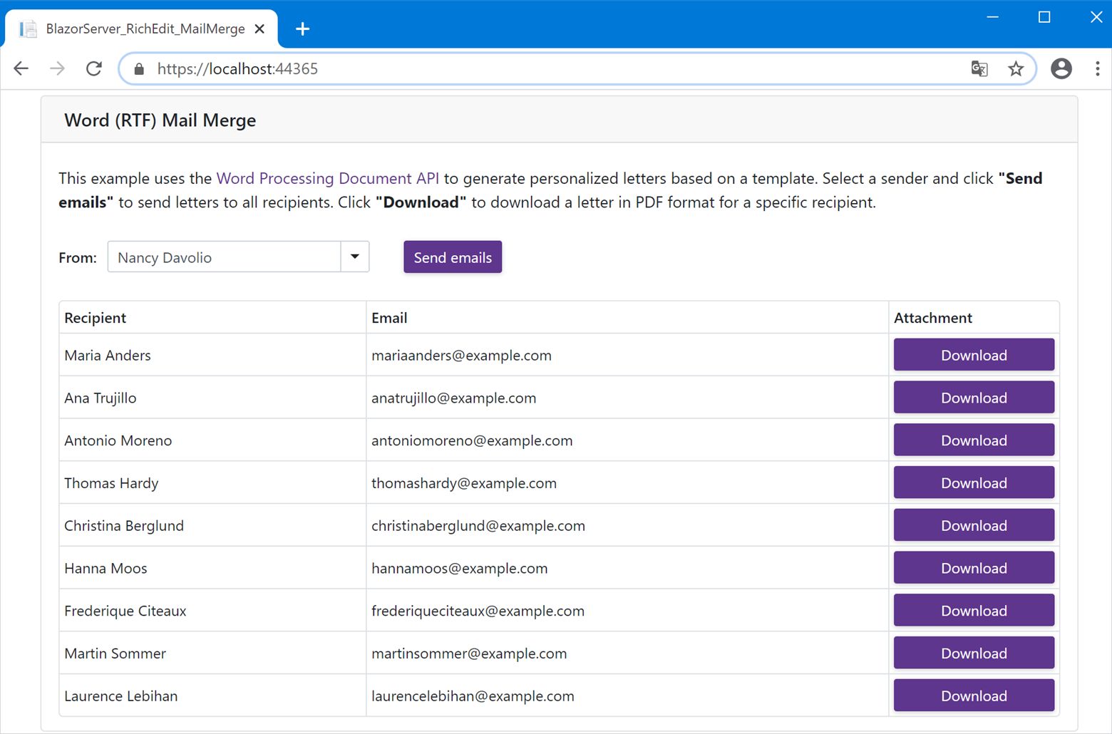
    In this post, we'll show you how to create a Blazor Server application that leverages the capabilities of our Word Processing Document API. This sample app will generate multiple business letters based on a template. Users can download these letters in PDF format or send them via e-mail.

    Prerequisites

    Source Code

    You can download a complete sample project from the following GitHub repository:

    Word Processing – How to Generate and Send Business Letters within Your Blazor Server Apps

    Step 1: Create a Blazor Server App

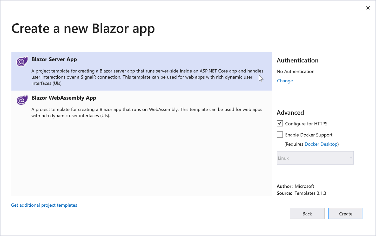
    Create a new project in Visual Studio and select the Blazor App template.

    Specify project name and location. In the next window, select Blazor Server App and click Create.

    Step 2: Install DevExpress NuGet Packages

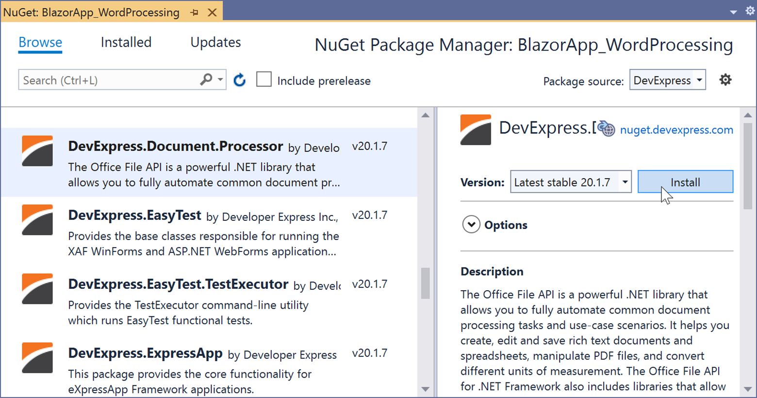
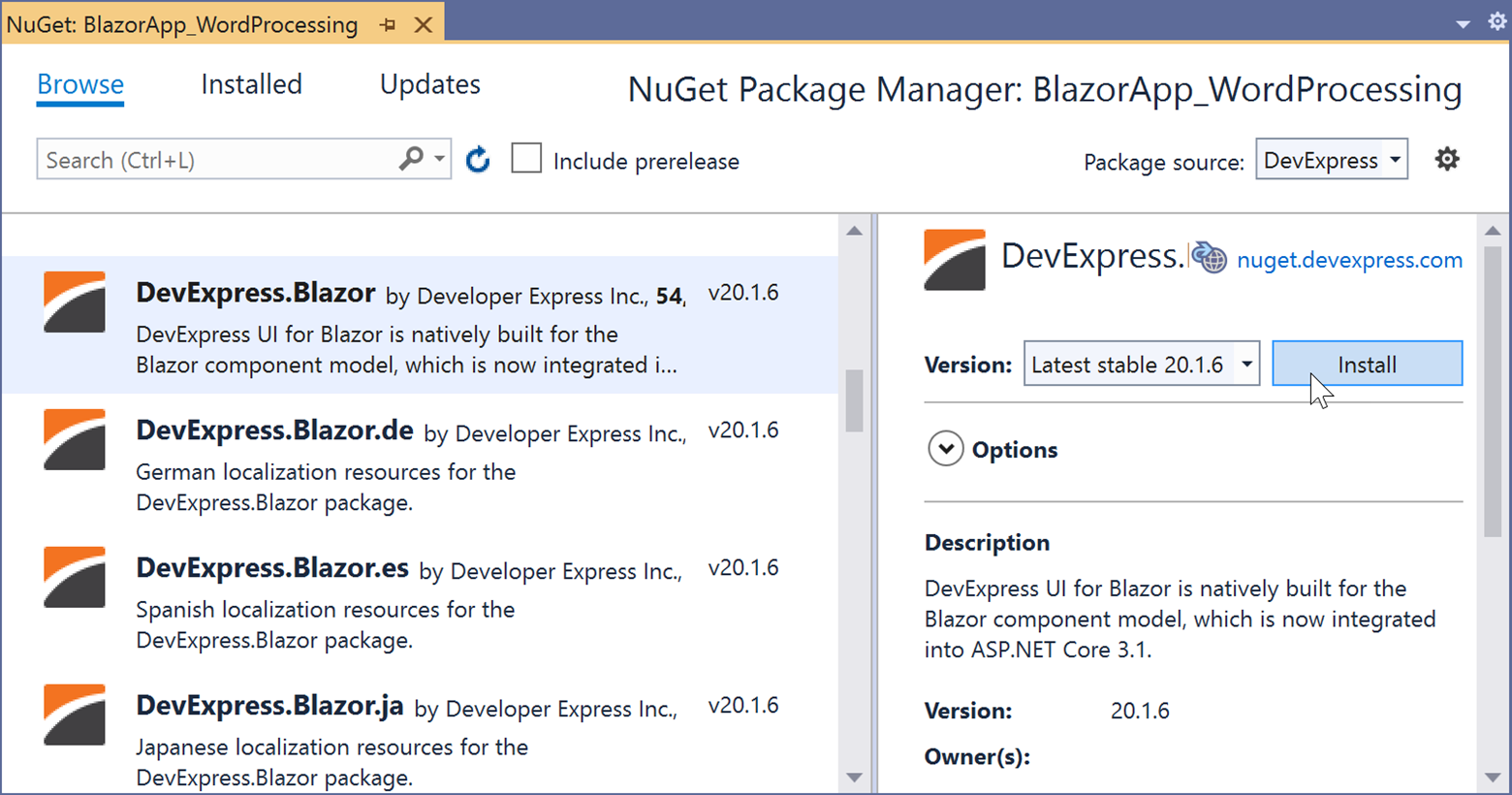
    Visit nuget.devexpress.com to obtain the DevExpress NuGet feed URL. Register your feed URL as a package source in the NuGet Package Manager and install the following packages.

    DevExpress.Document.Processor

    This package contains the DevExpress Office File API components. You need an active license for the DevExpress Office File API Subscription or the DevExpress Universal Subscription to use this package in production code.

    DevExpress.Blazor

    Contains DevExpress Blazor UI components. This product line is available as part of the DevExpress Universal, DXperience, or ASP.NET Subscription.

    If you are new to NuGet Packages, please refer to the following installation guide: Install DevExpress Components Using NuGet Packages.

    Step 3: Create a Data Model

    1. Create new SampleData.cs file within the Data folder.

    2. Define a Recipient class to store information about recipients.

      public class Recipient {
          public Recipient(string companyName, string contactName, string contactTitle, 
          	string address, string city, string postalCode, string email) {
              CompanyName = companyName;
              ContactName = contactName;
              ContactTitle = contactTitle;
              Address = address;
              City = city;
              PostalCode = postalCode;
              Email = email;
              }
      
          public string CompanyName { get; set; }
          public string ContactName { get; set; }
          public string ContactTitle { get; set; }
          public string Address { get; set; }
          public string City { get; set; }
          public string PostalCode { get; set; }
          public string Email { get; set; }
      }
    3. Create a Sender class to store information about senders.

      public class Sender {
          public Sender(string firstName, string lastName, string title) {
              FirstName = firstName;
              LastName = lastName;
              Title = title;
          }
      
          public string FirstName { get; set; }
          public string LastName { get; set; }
          public string Title { get; set; }
          public string FullName => $"{FirstName} {LastName}";
      }
    4. Create lists of Recipient and Sender objects with sample data. We will use these lists to supply data for the UI components in our app.

      class SampleData
      {
      
          public List<Recipient> RecipientList { get; }
          public List<Sender> SenderList { get; }
      	
      	public SampleData()
          {
              RecipientList = CreateRecipientList();
              SenderList = CreateSenderList();
          }
      
          List<Recipient> CreateRecipientList()
          {
              return new List<Recipient>() {
                  new Recipient("Alfreds Futterkiste", "Maria Anders", "Sales Representative",
                  "Obere Str. 57", "Berlin", "12209", "mariaanders@example.com"),
                  new Recipient("Ana Trujillo Emparedados y helados", "Ana Trujillo", "Owner",
                  "Avda. de la Constitucion, 2222", "Mexico D.F.", "5021", "anatrujillo@example.com"),
                  new Recipient("Antonio Moreno Taqueria", "Antonio Moreno", "Owner", 
                  "Mataderos  2312", "Mexico D.F.", "5023", "antoniomoreno@example.com"),
                  new Recipient("Around the Horn", "Thomas Hardy", "Sales Representative", 
                  "120 Hanover Sq.", "London", "WA1 1DP", "thomashardy@example.com"),
                  new Recipient("Berglunds snabbkop", "Christina Berglund", "Order Administrator",
                  "Berguvsvegen  8", "Luleе", "S-958 22", "christinaberglund@example.com"),
                  new Recipient("Blauer See Delikatessen", "Hanna Moos", "Sales Representative", 
                  "Forsterstr. 57", "Mannheim", "68306", "hannamoos@example.com"),
                  new Recipient("Blondel pure et fils", "Frederique Citeaux", "Marketing Manager",
                  "24 Place Kleber", "Strasbourg", "67000", "frederiqueciteaux@example.com"),
                  new Recipient("Bolido Comidas preparadas", "Martin Sommer", "Owner", 
                  "C-Araquil, 67", "Madrid", "28023", "martinsommer@example.com"),
                  new Recipient("Bon app'", "Laurence Lebihan", "Owner", "12, rue des Bouchers",
                  "Marseille", "13008", "laurencelebihan@example.com")
              };
          }
      
          List<Sender> CreateSenderList()
          {
              return new List<Sender>() {
                  new Sender("Nancy", "Davolio", "Sales Representative"),
                  new Sender("Andrew", "Fuller", "Vice President, Sales"),
                  new Sender("Janet", "Leverling", "Sales Representative"),
                  new Sender("Margaret", "Peacock", "Sales Representative"),
                  new Sender("Steven", "Buchanan", "Sales Manager")
              };
          }
      }

    Step 4: Add DevExpress Blazor UI Components and Bind Them to Data

    1. Add the following line to the HEAD section of the Pages/_Host.cshtml file to register DevExpress resources:

      <head>
          <!--...-->
          <link href="_content/DevExpress.Blazor/dx-blazor.css" rel="stylesheet" />
      </head>
    2. Open the _Imports.razor file and add the following namespace:

      @using DevExpress.Blazor
    3. Apply the DevExpress Blazing Berry theme to the app as described in this help topic: Apply a DevExpress Bootstrap Theme.

    4. Design the application UI. Our app includes the following DevExpress Blazor UI components:

      • DxFormLayout - Form Layout component that allows you to construct responsive and auto-aligned edit forms.
      • DxComboBox - A combo box. The Data property specifies the data source for the editor (SenderList in our example). The TextFieldName property allows you to select a data source field whose values must appear in the editor's drop-down list (we use the Sender.FullName values). The Value property specifies the selected item.
      • DxButton - A button. Use the Text property to define the button's text.
      • DxDataGrid - A Data Grid component. The Data property allows you to bind the grid to a data source (RecipientList here). Create three columns (DxDataGridColumn type). Use the DxDataGridColumn.Field property to bind the first two columns to data source fields (Recipient.ContactName and Recipient.Email). The last column will contain buttons to generate and download letters in PDF format.

      Open the Index.razor file and change its code as follows:

      @page "/"
      
      <div class="container">
          <div class="card mt-3">
              <div class="card-header">
                  Word (RTF) Mail Merge
              </div>
              <div class="card-body px-0">
                  <DxFormLayout>
                      <DxFormLayoutItem ColSpanMd="12">
                          <Template>
                              <p>
                                  This example uses the Word Processing Document API
                                  to generate personalized letters based on a template. 
                                  Select a sender and click <b>"Send emails"</b> to send 
                                  letters to all recipients. Click <b>"Download"</b> to
                                  download a letter in PDF format for a specific recipient.
                              </p>
                          </Template>
                      </DxFormLayoutItem>
                      <DxFormLayoutItem Caption="From:" ColSpanMd="4">
                          <Template>
                              <DxComboBox Data="@dataSource.SenderList" 
                                          TextFieldName="FullName" 
                                          @bind-Value="@SelectedSender" CssClass="p-0" />
                          </Template>
                      </DxFormLayoutItem>
      
                      <DxFormLayoutItem>
                          <Template>
                              <DxButton Text="Send emails" />
                          </Template>
                      </DxFormLayoutItem>
                  </DxFormLayout>
                  <div class="col">
                      <DxDataGrid Data="@dataSource.RecipientList" 
                                  SelectionMode="DataGridSelectionMode.None" 
                                  CssClass="mt-3" 
                                  ShowPager="false">
                          <DxDataGridColumn Field="@nameof(Recipient.ContactName)" 
                                            Caption="Recipient" />
                          <DxDataGridColumn Field="@nameof(Recipient.Email)" 
                                            Caption="Email" />
                          <DxDataGridColumn Caption="Attachment" 
                                            Width="150px">
                              <DisplayTemplate>
                                  @{
                                      <DxButton Text="Download" 
                                                CssClass="btn-block" />
                                  }
                              </DisplayTemplate>
                          </DxDataGridColumn>
                      </DxDataGrid>
                  </div>
              </div>
          </div>
      </div>
      
      @code {
          SampleData dataSource;
          Sender selectedSender;
      
          Sender SelectedSender
          {
              get => selectedSender;
              set { selectedSender = value; 
                  InvokeAsync(StateHasChanged); }
          }
      
          protected override Task OnInitializedAsync()
          {
              dataSource = new SampleData();
              selectedSender = dataSource.SenderList[0];
              return base.OnInitializedAsync();
          }
      }

    Step 5: Use Mail Merge to Generate Personalized Letters

    Our Word Processing Document API fully supports mail merge operations. The API allows you to create multiple documents based on a single template. Execute the following actions to initiate mail merge within your app:

    1. Specify a data source for Mail Merge. Open the SampleData.cs file and create a DataTable instance:

      DataTable dataTable;
      
      public SampleData()
      {
      	// ...
          dataTable = new DataTable();
          CreateDataTableColumns(dataTable);
      }
      
      void CreateDataTableColumns(DataTable dataTable)
      {
          dataTable.Columns.Add("FirstName", typeof(string));
          dataTable.Columns.Add("LastName", typeof(string));
          dataTable.Columns.Add("Title", typeof(string));
          dataTable.Columns.Add("CompanyName", typeof(string));
          dataTable.Columns.Add("ContactName", typeof(string));
          dataTable.Columns.Add("ContactTitle", typeof(string));
          dataTable.Columns.Add("Address", typeof(string));
          dataTable.Columns.Add("City", typeof(string));
          dataTable.Columns.Add("PostalCode", typeof(string));
          dataTable.Columns.Add("Email", typeof(string));
      }
    2. Implement the following method to populate the data table with values based on the selected sender and recipient.

      public DataTable GetDataSource(Sender sender, Recipient recipient)
      {
          dataTable.Rows.Clear();
          dataTable.Rows.Add(sender.FirstName,
                              sender.LastName,
                              sender.Title,
                              recipient.CompanyName,
                              recipient.ContactName,
                              recipient.ContactTitle,
                              recipient.Address,
                              recipient.City,
                              recipient.PostalCode,
                              recipient.Email);
          return dataTable;
      }
    3. Create a mail merge template. The template should contain merge fields that will be replaced with data source values during Mail Merge.

      Feel free to download the MailMerge.rtf template to proceed. Add this file to the Data folder of the project.

    4. Open the Index.razor file and add the following namespaces:

      @using System.IO
      @using DevExpress.XtraRichEdit
    5. Load the mail merge template using a RichEditDocumentServer instance.

      @code {
          RichEditDocumentServer documentServer;
      	// ...
      
          protected override Task OnInitializedAsync() {
              documentServer = new RichEditDocumentServer();
              documentServer.LoadDocument("Data/MailMerge.rtf", DocumentFormat.Rtf);
              // ...
          }
      }
    6. Implement the following method to run Mail Merge. The output document is exported to PDF.

      MemoryStream CreateAttachment(Recipient recipient) {
          using (RichEditDocumentServer resultDocumentServer = new RichEditDocumentServer()) {
              MemoryStream stream = new MemoryStream();
      		// Fill the data table with information about the selected sender
              // and recipient. Use the table as a data source for mail merge.
              documentServer.Options.MailMerge.DataSource = 
              	dataSource.GetDataSource(selectedSender, recipient);
              documentServer.Options.MailMerge.ViewMergedData = true;
      		// Execute mail merge.
              documentServer.MailMerge(resultDocumentServer.Document);
      		// Export the result to PDF.
              resultDocumentServer.ExportToPdf(stream);
              stream.Seek(0, SeekOrigin.Begin);
              return stream;
          }
      }

    Step 6: Download Letters in PDF Format to the Browser

    In our example, we will use JavaScript Interop to download generated letters in PDF format on the client side.

    1. Create a wwwroot/js/exportToPdf.js file with the following JavaScript function:

      function exportToPdf(filename, base64Content) {
          var link = document.createElement('a');
          link.download = filename;
          link.href = "data:application/pdf;base64," + base64Content;
          document.body.appendChild(link);
          link.click();
          document.body.removeChild(link);
      }
    2. Embed the script in the Pages/_Host.cshtml page before the closing </body> tag.

      <script src="js/exportToPdf.js"></script>
    3. Inject an instance of the IJSRuntime object into the Index.razor page.

      @page "/"
      @inject IJSRuntime JS
    4. Handle the Click event of the Download button in the Attachment column of the grid. When a user clicks Download, the Mail Merge process is executed for the selected sender and recipient. The generated letter is exported to PDF and saved on the client.

      <DxDataGridColumn Caption="Attachment"
                        Width="150px">
          <DisplayTemplate>
              @{
                  Recipient recipient = context as Recipient;
                  <DxButton Text="Download"
                            CssClass="btn-block" 
                            Click="@((MouseEventArgs args) => DownloadPdf(recipient))"/>
              }
          </DisplayTemplate>
      </DxDataGridColumn>
      void DownloadPdf(Recipient recipient)
      {
          // Execute mail merge.
          using (MemoryStream stream = CreateAttachment(recipient))
          {
              // Download letter in PDF format on the client.
              JS.InvokeVoidAsync("exportToPdf", "output.pdf", 
              	Convert.ToBase64String(stream.ToArray()));
          }
      }

    Step 7: Send Letters via E-mail

    You can upgrade your application to allow users to send generated letters via e-mail. This example uses the MailKit open source library to send e-mail messages.

    1. Install the MailKit NuGet package.
    2. Add the following namespaces to the Index.razor file:

      @using MimeKit;
      @using MailKit.Net.Smtp
    3. Handle the Click event of the Send emails button.

      <DxButton Click="SendEmails" 
                Text="Send emails" />
    4. Add the following code to send e-mail messages to all recipients when a user clicks the button. Letters will be attached to messages as PDF files.

      @code {
      	void SendEmails(MouseEventArgs mouseEventArgs) {
              // Obtain a list of recipients.
              List<Recipient> recipientList = dataSource.RecipientList;
      
              for (int i = 0; i < recipientList.Count; i++) {
                  // Execute mail merge to generate a letter for each recipient.
                  using (MemoryStream attachmentStream = CreateAttachment(recipientList[i])) {
                      // Create e-mail message for each recipient. 
                      // Attach letter to the message as a PDF file. 
                      MimeMessage message = CreateMessage("YOUR_EMAIL_ADDRESS", 
                      	recipientList[i], attachmentStream);
                      // Send the message.
                      SendMessage(message);
                  }
              }
          }
      	
      	MimeMessage CreateMessage(string from, Recipient recipient, 
          MemoryStream attachmentStream = null) {
              var message = new MimeMessage();
              // Specify the sender's address.
              message.From.Add(new MailboxAddress(SelectedSender.FullName, from));
              // Specify the recipient's address.
              message.To.Add(new MailboxAddress(recipient.ContactName, recipient.Email));
              message.Subject = "Your message subject";
      
              // Create the body of your message.
              var body = new TextPart() {
                  Text = "Your message text"
              };
      
              // Create a PDF attachment to send the generated letter.
              var attachment = new MimePart("application", "pdf") {
                  Content = new MimeContent(attachmentStream, ContentEncoding.Default),
                  ContentDisposition = new ContentDisposition(ContentDisposition.Attachment),
                  ContentTransferEncoding = ContentEncoding.Base64,
                  FileName = "attachment.pdf"
              };
      
              var multipart = new Multipart("mixed");
              multipart.Add(body);
              multipart.Add(attachment);
      
              message.Body = multipart;
      
              return message;
          }
      	
      	void SendMessage(MimeMessage message) {
              using (var client = new SmtpClient()) {
                  // Connect to your SMTP server to send the message.
                  // Use one of these ports: 25, 465, 587, or 2525.
                  client.Connect("MAIL_SERVER", 587, false);
      
                  // Use the code below if your SMTP server requires authentication.
                  client.Authenticate("USERNAME", "PASSWORD");
      
                  try {
                      // Send the message.
                      client.Send(message);
                  }
                  catch (Exception e) {
                  }
                  finally {
                      client.Disconnect(true);
                  }
              }
          }
      }

    Your Feedback Matters

    As always, we welcome your feedback. Should you have any questions about this examples, feel free to comment below.

    CodeRush Code Places - First Look and Customization

    $
    0
    0

    As the size of your code bases increases, we know just how it is important it is to be able to quickly navigate to where you want to be in your code. To this end, CodeRush provides a variety of powerful navigation tools: Tab to Next Reference, Markers, the Jump To window, and more.

    In this post, we want to take a closer look at the new Code Places feature, and discuss ways to efficiently use it.

    Let’s first enable Code Places from CodeRush's Visualize toolbar in Visual Studio:


    The Code Places window works with C#, Visual Basic, TypeScript, and JavaScript files (*.cs, *.vb, *.ts or *.js). 

    Code Places displays members inside collapsed regions, presenting an outline of your code in the TextView's margin:

    The Code Places window docks to the editor’s left margin by default. We can move it to the right margin instead, and we can also automatically hide it when the editor has focus.

    To change Code Places settings, click the options button on the Code Places window:

    In the invoked options page, enable the "Auto hide Code Places" checkbox if you prefer to only see the Code Places window when you click to invoke it, and select the right or left margin as the dock location:

    Click OK.

    After making these changes, the Code Places window will look something like this:

    You can use the Code Places options to increase the font size, for example:

    Code members are presented the order they appear in the source code, by default. You can specify a different sort criteria, such as alphabetically:

    Navigation

    As developers, we know it's not unusual to spend most of your day working in only a few methods. Fortunately, Code Places tracks changed members, making it easy to quickly return to those important places later when needed.

    Let’s see how this works. 

    It's easy. Just change a method in the code editor and the Code Places window will add a “clock” icon to the right of the member name.

    So now you can quickly scan through the Code Places window for the clock icons, to see recently changed members in the active file. To find methods changed in other files, look in the “Global History” tab.

    Recently changed members are tracked for the active Visual Studio session. What about members you frequently need to find across sessions? Code Places lets you track these important members as favorites:

    These members will always be easy to access until removed from the code or from the Favorites list.

    Filtering

    Sometimes a class may grow to have so many members that they do not all fit in the Code Places window. Or maybe you only recall a part of the member name. In either of these cases, you can use the search box to quickly find members matching a specified mask. Once found, jumping is as easy as clicking the filtered member. Here’s how it works:

    Conclusion

    We hope you find the new functionality useful and that it saves you time. If you have any suggestions for improvement, please let us know in the comments below, or contact us through Support Center. Thanks so much!

    XAF - New Monthly Webinar and Welcoming a New DevExpress MVP

    $
    0
    0

    Welcome Jose Javier Columbie, a New DevExpress MVP

    You might know Jose as the organizer of monthly webinars on XAF, XPO and related topics. Please mark your calendar for his next meetup on Thursday, October 8th

    Jose is also the author of training videos for Xamarin, OData, Azure, XAF and Blazor. His unofficial XAF Facebook developer group (https://www.facebook.com/groups/xafxpoxamarin) has almost 700 members and keeps growing.

    If you are new to XAF, you may want to check out Jose's new XAF introduction video and demo. In this video, he explains the core XAF concepts that underly XAF and builds a business app for Windows and Web in less than 20 minutes:

    Jose is a Master of Electrical Engineering turned .NET Developer/Architect. Big DevOps advocate and Xamarin Certified. Jose spends most of his time on training, consulting and development of Azure based solutions for enterprise customers. Passionate about performance, data access, application design and DevExpress products, specially XAF and XPO. There is no project where he does not include XAF in one way or another. From mobile, windows to web applications his goal is to have XPO and XAF security everywhere. He is also a tech speaker, blogger and is always pushing to grow the community. Blazor is his new crush.

    For a complete list of Jose's contributions and his full bio, please visit his web sites: http://www.xari.io/ | YouTube Channel.

    Additional Information on Rapid .NET Development with XAF

    For more XAF getting started tutorials and videos, please refer to this DevExpress documentation page.

    If you’re using XAF or are considering it for an upcoming project, feel free to post general questions to the XAF community via the following chat group: https://gitter.im/XAF-Community/community. XAF MPVs, experienced XAF developers and I will share development experiences and offer our 2cents on this chat platform.

    If you require consulting and custom development services for XAF, XPO and other DevExpress products, feel free to reach out to our MVPs and third party consultants.

    Reporting for Blazor – New Customization API for Viewer and Designer Components (v20.1.7)

    $
    0
    0

    Our newest release (v20.1.7) allows you to customize Document Viewer and Report Designer components in your Blazor applications.

    New Settings

    The following two new properties give you access to customization events:

    Review the help topics above to see the list of available events and to learn the basic steps required to assign a handler.

    Customization Examples

    We published several customization examples to following GitHub repository: Blazor Reporting - Customization API.

    This project shows how you can customize the Viewer and Designer components in the following ways:

    • Localize user interface
    • Remove time portion from Date-Time parameter editors
    • Customize commands in Menus and Toolbars
    • Change the Viewer’s default zoom level
    • Modify the Designer’s Wizard dialog

    Let Us Know What You Think

    We would love to know if the published examples were sufficient or if you need additional information to customize the Document Viewer or Designer per your project’s requirements. Leave a comment below or create a new ticket in the Support Center and we’d be happy to follow up.

    Before We Let You Go

    Your feedback matters and we would like to know more about your Blazor development experience. Please submit your response to the short survey below:

    eXpressApp Framework - Tips & Tricks (September 2020)

    $
    0
    0

    Here is this month’s edition of XAF Tips & Tricks. As always, we hope the information contained within this post is of value as you explore and leverage the capabilities of the eXpressApp Framework. If you have a support ticket you'd like to share with the XAF developer community, feel free to post a link in the comment section below.

    Thank you for your continued commitment to XAF!

    Interesting Support Tickets

    New and Updated KB Articles

    Resolved Issues

    Documentation Updates

    Blazor UI

    In the following, we describe how you can create new Property Editors and customize existing Property Editors within XAF’s Blazor UI:

    Feature Toggles

    In the following, we describe how you can use the new FrameworkSettings.DefaultSettingsCompatibilityMode property (and detailed the features it manages): 

    Audit Trail

    The following help topics describe recent Audit Trail Module enhancements: 

    Web API Service for XPO

    In the following, we detail how you can implement a Web API controller and connect an XPO client to it: Transfer Data via REST API

    Viewing all 2401 articles
    Browse latest View live