Quantcast
Channel: Developer Express Inc.
Viewing all 2401 articles
Browse latest View live

XAF - Release of Security System API for EF Core, Action Permissions, New Documentation, Videos, Survey (v20.1.6)

$
0
0

Official Release: Security System for Entity Framework Core 

We officially released Security System for EF Core 3.1 in our most recent build (v20.1.6). In addition to basic CRUD Console and WinForms examples, we added the following training videos:

These tutorials include a quick review of the Security System’s API/architecture and also describe integration steps. Remember, XAF’s Security System can be used by DevExpress and non-DevExpress customers – so please do spread the word. 

For more information on XAF’s User Authentication and Group Authorization APIs for .NET Core and .NET Framework, please refer to these Frequently Asked Questions. 


Official Release: Security Permissions for Actions 

v20.1.6 also includes the official release of Action Permissions. These permissions offer fine-grain control over execution of both custom and XAF system Actions within an app’s UI. This maintenance update also supports Action permissions for our ASP.NET Core Blazor UI.

Video Overview | Documentation

Survey: Do You Want To Set Permission States Automatically? 

When a user creates new permissions for XAF's Security System role, permission states ('read', 'write'...) are empty by default. Some may find it helpful to set these states based on the role's PermissionPolicy property automatically. For example, if PermissionPolicy='DenyAllByDefault', you may want to set the newly created permissions to 'Allow'. If PermissionPolicy='AllowAllByDefault', you may want to set its state to 'Deny'.

To achieve this, we created a custom Controller that sets states for all newly generated Type and Navigation permissions:

This controller works with ASP.NET and WinForms XAF applications as well. We would appreciate your feedback on this feature.

Documentation and Usability Enhancements


DevExpress FMX Grid CTP - Available Now

$
0
0

Yes, this is not a misprint – our FMX Data Grid is finally available for download. Before we get into the details, a quick word or two about the role FMX will play in our Delphi/RAD Studio product strategy.

Though we want to include every single VCL product and include every single VCL feature in our FMX offering, we have limited resources and are always short on time. Yes, we want to have a full FMX product portfolio, but we would be telling a lie if this is in the cards. Our current goal is to ship as many features as humanly possible for a few key products. The marketplace will ultimately decide what happens next – if everyone moves to FireMonkey, we’ll be sure to follow.

We also want to make it clear that it’s going to take time for our FMX Data Grid to reach the level of maturity of its VCL counterpart. We don’t have any magic bullets in this regard. We’ll certainly work with you and do everything reasonable to improve the Grid over time.

Ok – with that disclaimer out of the way, let’s get into it and take a closer look at our FMX Grid.

A Brand New Product

Our FMX Data Grid is not a port of the ExpressQuantumGrid – it is an entirely new product with an entirely new code base. It has been designed and optimized for FireMonkey and cross-platform development. This is one reason it took us so long to deliver the product (this of course is not the only reason).

As much as we would have liked to port the QuantumGrid to FM, our VCL Grid relies too heavily on GDI/GDI+ and low-level Windows API calls. Starting from scratch was the only option…

Cross platform

To deliver a truly cross-platform Data Grid, we used standard primitives wherever possible. In so doing, our FMX Data Grid appears as a native control on each target platform (Windows, macOS and Android).

Simple Table

Features

Our FMX Grid (currently available as a community tech preview), ships with many of the features found in its VCL counterpart. These include:

  • Integrated Data Filtering
  • Multi-Column Sorting
  • Data Grouping
  • Column Resize/Reorder
  • Master-Detail Layout
  • Adaptive Layout View

Runtime Customization

As you might expect, our FMX Grid will allow end-users to edit data, append new records, delete and navigate through records as needed. Presently, we ship 4 in-cell data editors:

  • single line editor
  • multi line editor
  • date editor
  • switch editor

Obviously, this is a tiny subset of what we offer for our VCL Grid. Yes, we know we have to ship more editors and once again, usage and the marketplace will determine how quickly we allocate resources in this area.

Getting Started: Customizing the DevExpress FMX Grid to Display a Simple Table

To begin, simply select DevExpress FMX | TdxfrmGrid from your Tool Palette and place the control on a form. Double-click the control to invoke its Designer dialog. Assign an existing TDataSource component to the DataController.DataSource property (at the grid’s root level) within the Object Inspector.

DataSource Assigning


Next, press the "Add Missing Columns" button to generate grid columns for the associated dataset.

Add Missing Columns


Rearrange grid columns as needed and run your application to view results.

Getting Started: Master-Detail Layout

The DevExpress FMX Grid supports master-detail data layouts. In master-detail mode, our Grid displays a set of detail (child) records for each master (parent) row. You can nest an unlimited number of Master-detail relationship levels.

Master-Detail table

To generate a master-detail layout, Click the "Add Level" button in the Designer dialog. This will add a new detail level to the grid’s root level.

Add Detail Level


Associate your data source with the Grid and create columns as described earlier. Set key fields via corresponding properties within the DataController to display master-detail information.

Key Fields

Getting Started: Table and Layout Views

Like its VCL counterpart, our FMX Grid allows you to display data within a flexible “Layout” view.

Layout View

Like its VCL counterpart, the FMX Grid’s Layout View dynamically adapts cell layout to its container (size of the grid).

Layot View

To switch display mode and use the Layout View, change the level's Appearance property.

Change Appearance property

Configure it by clicking on the "Customize Level" button within the Grid Designer window.

Customizing Layot View

To enable dynamic/adaptive cell layout, click the root item group in the Layout Designer and set the group's WrapItemsMode property to AllChildren in the Object Inspector.

WrapItemsMode

Getting Started: Group Operation

With DevExpress FMX Grid, you can group data by unlimited columns.

Group Operation

To enable data grouping, associate an existing dataset with the Grid and populate it with columns as described earlier.
Second, click the column header against which you wish to group dataset records. Set the column’s GroupIndex property to 0 in the Object Inspector to create the group. The selected column header will be positioned above all other headers, and the FMX Grid will display column records as group rows (nodes). To create a nested group, click another column header and set the corresponding GroupIndex property to 1. You can use column GroupIndex properties to change grouping order when necessary.

Group Index

At runtime, end-users can right-click a column header and click the "Group By This Field" item to group data against the specified column. To remove grouping, end-users can right-click the appropriate column header and select "Remove From Grouping" from the popup menu. You can set a column's Options.Grouping to False to disable context menu items for a column.

Group Customization

Getting Started: Sort Operation

DevExpress FMX Grid automatically sorts data against columns used in grouping operations. To sort data against one or more columns, click a column header and set the column's SortOrder property to Ascending or Descending in the Object Inspector. Repeat the same operation for other columns as needed. Use the SortIndex property to change sort order during multi-column sorting.

SortOrder Property

At runtime, end-users can right-click a column header and select "Sort Ascending" or "Sort Descending" to initiate sort operations against the column (or to change sort order). If sorting has been applied to a column, the column header displays a triangular icon (to indicate ascending or descending sort order). End-users can click this icon to reverse sort order when necessary. To exclude a column from sort operations, end-users can right-click the header and select "Remove Sorting" from the popup menu. You can set a column's Options.Sorting to False to disable context menu items for a column.

Sort Customization

Download the CTP

The DevExpress FMX Grid is available as a CTP (community technology preview) and can be downloaded directly from our website.

Please remember, this is a work in progress – we’ve done a lot but we have more to do.

Your Feedback Matters

As always, we welcome your thoughts. Please explore the capabilities of the DevExpress FMX Grid and share your experiences with us. We’ll be happy to follow up.

Blazor Components - Data Grid Column Enhancements, Modal Toolbar Items, & New Data Editor features (v20.1.5)

$
0
0

This post summarizes recent enhancements made to DevExpress UI for Blazor (v20.1.5).

.NET Core 3.1.5 Support

v20.1.5 supports the most recent version of .NET Core 3.1.5 update that contains security and reliability fixes.

Data Grid Enhancements

Filter Row

This release introduces a new property for our Blazor Grid columns: AllowFilter. Use this property to display/hide a corresponding column's filter editor:

<DxDataGridColumn ... AllowFilter="false">

The DevExpress Blazor Grid now hides its Filter Row by default. Enable the ShowFilterRow option to make it visible:

<DxDataGrid ... ShowFilterRow="true" >
To learn more, please review this ShowFilterRow document.

Documentation

ComboBox Column

Our Blazor Grid's ComboBox column now includes 'StartsWith' and 'Contains' filter modes. When filtering is enabled, the drop-down list is automatically filtered when an end user enters values within it.

<DxDataGrid DataAsync='@ForecastService.GetForecastAsync' ShowFilterRow='true'>
  <DxDataGridComboBoxColumn
    Field='@nameof(WeatherForecast.CloudCover)'
    Caption='Cloud Cover'
    FilteringMode='DataGridFilteringMode.Contains'
  />
</DxDataGrid>

The ComboBox column can load visible items within its drop down list (loads data virtually and on demand). This improves performance when binding to a large dataset.

Set the ListRenderMode property to one of the following options:

  • Entire - The editor renders the entire list simultaneously. Use this mode for short lists - when rendering the entire list does not slow performance.
  • Virtual - The editor renders list items when they appear in the viewport. Use this mode to optimize rendering speed for large lists.

Documentation

Navigation

Toolbar - Adaptivity Enhancement

For those targeting mobile devices, we've added a popup and modal mode for the Toolbar's drop down window. These modes mimic the behavior of a standard drop down control on mobile browsers.

Blazor-toolbar-modal-mobile-mode

Use the DropDownDisplayMode property to specify display mode for all menus within the toolbar. When the property is set to Auto, the menus adapts itself for a given device.

Demo | Documentation

Editors

Drop-Down Width Mode

You can control how our Blazor ComboBox and TagBox components display associated drop-down windows. Use the DropDownWidthMode property to specify the width of the drop-down list. The following values are available:

  • ContentOrEditorWidth (default) - minimum drop-down width matches the editor. Drop-down width is increased to fully display list item text (as needed).
  • ContentWidth - drop-down width equals the width of the longest list item.
  • EditorWidth - drop-down width matches editor width. List items are truncated if they do not fit.

ComboBox Demo | TagBox Demo

Min/Max Dates

Our date picker/data selection editors, Calendar and Date Edit, now allow you to set the date range available for selection. Assign the required dates to the component’s MinDate and MaxDate properties.

DevExpress Blazor-dateedit-calendar-min-max-date-range-limition

Calendar Demo | Date Edit Demo

PDF Document API - Signature Enhancements

$
0
0

As you may already know, we introduced multiple signature support in our v20.1 release cycle.

Based on your great feedback, we introduced a series of enhancements in our v20.1.6 minor update and expect to issue additional updates in upcoming builds. Thanks for all your help and your continued support. We appreciate it.

v20.1.6

PAdES Support

You can now apply signatures with a B-T level PAdES profile to a document. To do so, specify the signature profile in the Pkcs7Signer object constructor.

The IOcspClient and ICrlClient interfaces allow you to add certificate revocation information. You can use our default implementations or create a custom implementation as needed.

using (var signer = new PdfDocumentSigner("Document.pdf"))
{
    IOcspClient ocspClient = new PdfOcspClient();
    ICrlClient crlClient = new PdfCrlClient();

    ITsaClient tsaClient = new PdfTsaClient(new Uri(@"https://freetsa.org/tsr"), PdfHashAlgorithm.SHA256);

    //Create a PKCS#7 signature:
    Pkcs7Signer pkcs7Signature = new Pkcs7Signer("Signing Documents//testcert.pfx", "123",
     PdfHashAlgorithm.SHA256, tsaClient, ocspClient, crlClient, PdfSignatureProfile.PAdES_BES);
     
    //Apply a signature to a form field:
    var signature =
    new PdfSignatureBuilder(pkcs7Signature, "Sign");

    //Sign and save the document:
    signer.SaveDocument("SignedDocument.pdf", signature);
}

Certification Signature

The PdfSignatureBuilder.CertificationLevel property defines the changes available to users when the signature is applied. If a user makes a restricted change, the signature is invalidated. You can specify the following permissions:

  • Allow all changes
  • Allow users to populate forms and sign the document
  • Allow users to populate forms, manage annotations, and sign the document
  • Restrict all changes
//Load a document:
using (var signer = new PdfDocumentSigner("Document.pdf"))
{

    //Create a PAdES PKCS#7 signature
     Pkcs7Signer pkcs7Signature = 
     new Pkcs7Signer("Signing Documents/certificate.pfx", "123", PdfHashAlgorithm.SHA256);

    //Apply a signature to a form field:
    var signature = 
    new PdfSignatureBuilder(pkcs7Signature, "Sign");


    //Specify an image and signer information:
    signature.SetImageData(File.ReadAllBytes
    ("Signing Documents//SantuzzaValentina.jpg"));    
    signature.Name = "Santuzza Valentina";
    santuzzaSignature.CertificationLevel = PdfCertificationLevel.FillFormsAndAnnotate;

    //Sign and save the document:
    signer.SaveDocument("SignedDocument.pdf", signature);
}

Document-Level Timestamps

You can now use document-level timestamps to sign a document.

The PdfTimeStamp object allows you to generate a document-level timestamp. Use the ITsaClient interface implementation to specify the timestamp client.

Pass the PdfTimeStamp object to the PdfSignatureBuilder constructor to apply the timestamp to the signature field.

using (var signer = new PdfDocumentSigner("Document.pdf"))
{
    //Create a timestamp:
    ITsaClient tsaClient = new PdfTsaClient(new Uri(@"https://freetsa.org/tsr"), PdfHashAlgorithm.SHA256);

    //Create a new signature form field:
    var signatureFieldInfo = new PdfSignatureFieldInfo(1);
    signatureFieldInfo.Name = "SignatureField1";
    signatureFieldInfo.SignatureBounds = new PdfRectangle(200, 200, 250, 250);

    //Create a document-level timestamp:
    PdfTimeStamp pdfTimeStamp = new PdfTimeStamp(tsaClient);

    //Apply this timestamp to the form field:
    var timestampSignature = new PdfSignatureBuilder(pdfTimestamp, signatureFieldInfo);

    //Sign and save the document:
    signer.SaveDocument("SignedDocument.pdf", timestampSignature);
}

v20.1.7 (Next Update)

Sign Documents in Deferred Mode

The PDF Document API will allow you to use a document hash to apply a signature or a document-level timestamp externally.

You can use the ExternalSignerInfo class object to specify signature parameters: type, size, hashing algorithm, etc. The PdfDocumentSigner.SignDeferred method applies the signature to the document and returns a document hash. Utilize the PdfDeferredSigner.Sign method to write signature contents to the document and save the result to a file or stream.

using (var signer = new PdfDocumentSigner(File.OpenRead("SignDemo.pdf")))
{
  //Specify information about signature metadata:
  var digestCalculator = new PdfDigestCalculator(PdfHashAlgorithm.SHA256);

  var signerInfo = new ExternalSignerInfo(PdfSignatureType.Pkcs7, 8000, digestCalculator);

  //Create a new form field:
  var fieldInfo = new PdfSignatureFieldInfo(1) { SignatureBounds = new PdfRectangle(10, 10, 100, 100) };

  //Apply the metadata to the form field:
  var builder = new PdfDeferredSignatureBuilder(signerInfo, fieldInfo);

  //Add the signature to the document:
  var deferredSigner = signer.SignDeferred(builder);

  //Obtain the document hash and the hash algorithm's object identifier:
  var digest = deferredSigner.HashValue;
  var digestAlgorithmOID = digestCalculator.AlgorithmOid;

  //Generate the signature content for the document:
  byte[] signature = CreateSignature(digest, digestAlgorithmOID);

  //Add signature contents and save the document to a file:
  deferredSigner.Sign("signed.pdf", signature);
}

static byte[] CreateSignature(byte[] digest, string digestAlgorithmOID)
{
  var signer = new Pkcs7Signer(@"SignDemo.pfx", "dxdemo");
  byte[] signature = signer.BuildSignature(digest, digestAlgorithmOID);
  return signature;
}

Add Signatures to Multiple Pages

We will add a new PdfSignatureFieldInfo class constructor. You can use this constructor to create a signature with a widget that belongs to multiple document pages.

var numbers = new List<int>() { 1, 2, 5 };
var fieldInfo = new PdfSignatureFieldInfo(numbers) 
{ SignatureBounds = new PdfRectangle(10, 10, 100, 100) };

What’s Next

PAdES signatures with LT and LTA levels are not yet supported. We plan to address this issue in our v20.2 release cycle. We will share updates with you in an upcoming blog post.

Your Feedback Matters

As always, we welcome your thoughts. Please comment below and let us know what you think of these new features. Should you have technical questions, feel free to contact us via the DevExpress Support Center.

Reporting - Enhanced Drawing Engine for Linux and MacOS (v20.1)

$
0
0

As you may already know, we added .NET Core support to DevExpress Reports two years ago (v18.1). One of the decisions we made was to stay with GDI+. As such, our .NET Core implementation for Linux and MacOS relied on the System.Drawing.Common package that was based on an open-source library called libgdiplus.

The upside of libgdiplus is that it uses the same API as Windows GDI+. The downside is that libgdiplus measures strings and draws images differently than does Windows. Since it’s an open-source library and does not have official support from Microsoft, libgdiplus has not progressed as we’d have liked.

Quick Note: We encourage you to use the latest version of libgdiplus if you are using DevExpress Reports/.NET Core. The package manager still downloads an older build – so be sure to verify build information before you deliver your application to end-users.

The Path Forward

Based on internal testing and customer feedback, we know that Linux / MacOS rendering is not what it ought to be. We’ve addressed as many issues as possible at the DevExpress component level, and done our best not to touch drawing engine code.

One solution to the rendering problem was to use a third-party library called pango. This path led to a new measurement and drawing engine – one that replaced our standard implementation. To avoid direct open-source library dependencies, we released this new drawing engine as a separate NuGet package that must be installed manually.

The new engine improves results (we’ve blogged about this previously) when reports are exported to image or PDF format on Linux:

Proper text measurement and word wrapping

libgdiplusCross-Platform Drawing Engine

International character set support

libgdiplusCross-Platform Drawing Engine

Correctly applied text style

libgdiplusCross-Platform Drawing Engine

Proper text alignment (justify)

libgdiplusCross-Platform Drawing Engine

How to use the DevExpress Cross-Platform Drawing Engine in Your Application

If you’re ready to use this updated rendering engine in your .NET Core app, you should:

  1. Add the DevExpress.CrossPlatform.Printing.DrawingEngine NuGet package to your ASP.NET Core application.

     dotnet add package DevExpress.CrossPlatform.Printing.DrawingEngine
  2. Configure the environment.

Debian Linux

Install the following operating system libraries:

sudo apt-get update  
sudo apt-get install -y software-properties-common  
sudo add-apt-repository 'deb http://deb.debian.org/debian sid main'  
sudo apt-get update  
sudo apt-get install libgdiplus
sudo apt-get install libicu-dev libharfbuzz0b libfontconfig1 libfreetype6
sudo apt-get install libpango-1.0-0
sudo apt-get install libpangocairo-1.0

MacOS

  1. Install homebrew.
  2. Install additional operating system libraries.
brew install mono-libgdiplus  
brew install pango

Windows

Use vcpkg to install DLLs. Run the Admin Command Prompt and execute the following commands:

git clone https://github.com/microsoft/vcpkg.git
cd vcpkg
.\bootstrap-vcpkg.bat
vcpkg.exe integrate install
vcpkg.exe install pango --triplet x86-windows
vcpkg.exe install pango --triplet x64-windows

The assemblies are located in the vcpkg repository’s installed subfolder.

  1. Register the cross-platform drawing engine at application startup.

The code below registers the drawing engine in an ASP.NET Core appplication if it is executed on a non-Windows platform. The engine does not need to be registered on Windows because reports are rendered without the issues described above.

public void ConfigureServices(IServiceCollection services) {
    // ...
    if(!RuntimeInformation.IsOSPlatform(OSPlatform.Windows)) {
        DevExpress.Printing.CrossPlatform.CustomEngineHelper.RegisterCustomDrawingEngine(
            typeof(
                DevExpress.CrossPlatform.Printing.DrawingEngine.PangoCrossPlatformEngine
            ));
    }
}

Once you perform these steps, your application will be ready to go. It will use our updated cross-platform drawing engine to print/export reports, and to display them within the Document Viewer. You can download a complete sample project from the following GitHub repository to learn more: Reporting - Use the DevExpress Cross-Platform Drawing Engine.

Recommendations

  1. All fonts used in the report should be available on the server that hosts the report. Please do install all fonts on the server.

  2. If you go with libgdiplus, use the latest version (v6 at the time of writing) of the library to avoid glitches like this:

You can build the library from source code, but this may introduce instability. See the Download page for additional details.

Your Feedback Matters

As always, we welcome any feedback. Feel free to post comments below and let us know your experience with this enhanced drawing engine.

Tell us about your development environment and how you use DevExpress Reports within your organization:

Layouts, VCL, FireMonkey, and … DevExpress!

$
0
0

Last week I was having a chat with an old “Delphi” friend, Andrea Raimondi, about DevExpress’ recent CTP release of our FireMonkey (FMX) grid for RAD Studio. For some reason he kept on veering away from that to layouts, what they are, and why they are important. After wondering what beer he was drinking, fine, says I, write me a post and I’ll publish it on the DevExpress Community blog site. A couple of hours later, I got The Email. A great discussion on using layouts with the DevExpress VCL Subscription, with a neat follow-up on FMX. Take it away, Andrea!

DevExpress Layouts: When you only look at the grid you're missing out!

Introduction

We all know what DevExpress is good at: grids, right? Maybe you know about the editing ones and, the most advanced of you may even know about the pivot grid. Well, if that is what you think, maybe it's time for you to try the Layout control. The layout control is the only (as far as I know) visible control that disappears at runtime. I know it sounds weird but in a sense that is exactly its purpose: it gives your UI structure while being completely invisible.

A small example

Let's create a layout at design time and align it to client.

 clip_image002

Then, let's add three layout groups:

clip_image003

You get here with a double-click on the control. Now let's move those onto the actual layout surface by selecting them and dragging and dropping them onto the root one by one (multi-select isn't supported – noted! Ed.).

This is what you see then:

clip_image005

This gives you hints as to what it is set up like: it's flowing vertically and not aligned to client. Which is fine for us because now we are going to change the layout direction and something else will appear, this:

clip_image007

What happened? Let's align everything to client, shall we? Look:

clip_image009

Tabs. We did this by changing the layout direction, like so:

clip_image010

You get a tabbed view by simply changing a property. We will look at the look and feel later on because we can do some neat stuff with that as well.

A simple login screen

By today's standards, we might want a slightly different way to approach a login screen because doing the classic dialog doesn't really work anymore. You can do that very easily.

When working with layouts you must reason as though you were working with panels but the trick is that layouts don't require nearly as many: you can use a layout group everywhere you would otherwise use a panel.

First of all, we need it centered, therefore we add a layout group to do just that:

clip_image012

Now we need two groups one of which is aligned to the bottom (that's for the buttons) and another which is aligned to client inside the centered one:

clip_image014

Finally, we add the edits and the buttons with no labels. Why? Because those are built-in, making label controls redundant in this situation:

clip_image015

It would however look better if the buttons were on the same line and maybe aligned at left and right, like so:

clip_image016

Playing with the LayoutDirection property you can get this effect.

Do you like all those borders though? I do not, thus let's change a few ShowBorder properties in the groups and make it slightly slicker:

clip_image017

I have changed all the captions by modifying the "CaptionOptions" property set in both groups and items. To get a better feeling of it, I have also renamed the groups and a few other things:

clip_image018

Naming the layout control as "Layout" is very helpful because then you get everything much more easily recognizable. As you can see I have a very consistent naming convention, which I advise you use as well just to make your life easier.

Now though, we don't really want to see those tabs, right? Yeah you can hide them straight up, by doing so:

clip_image019

p>Let's see how it looks at runtime:

clip_image021

Not bad, huh!?

Look and feel

But we can do better: let's add some skinning. Make the project skin aware and add a LookAndFeel controller. Obviously in a real application you would do that on a datamodule, but let's keep it simple.

When you have done that, here comes the magic: there is a controller for layouts!

clip_image022

To connect the layout to the main controller just double-click on it and add a new item, like so:

clip_image023

To get this, when you click on the plus sign just select "Use LookAndFeel controller".

To connect it to the actual layout control, you set this property:

clip_image024

Now let's change the controller to a skin and run it again:

clip_image026

Now we're talking, right?

CTP for FireMonkey

Here cometh the real giggle though: you can do this very thing with FireMonkey as well. Unlike the VCL side, however, you need to use FireMonkey styles, but the result is incredibly similar (but not the same, at least for now).

What is missing at the moment is a tab layout but it's a CTP so it's kind of fair. It means you will have to find ways around this issue, and I have a suggestion further down, so keep reading!!!

Because we have seen the basics of how it works and because there are no major operational differences, I will start with the complete screen and walk you through what changes: first of all, if you want to test this properly you will need to do so on an Android phone. The Windows side doesn't work all that well for now, but again it's a CTP so fair enough.

When you do so – that is, testing on Android – you will get this:

clip_image028

So, how did I do this?

The basic idea is quite simple: here is the structure view on FMX (with appropriate names):

clip_image029

Note that there are no buttons and the reason for that relies on how the password button is configured:

clip_image030

By doing so, we spare the need for a button and make the UI lighter and snappier. (Do please note how this UI is incredibly fast!)

Advanced layout usage

One great thing about layouts is that you can do nearly anything. For example, you can use entire frames as controls. This obviously works both in VCL and in FMX (may I, once more, quietly remind you that this is a CTP, basically DX is still touching it gently, not at full steam!) and it's stunning. I do absolutely invite and encourage you to try for yourself. I can't get a picture of it running on my phone because something isn't working just right and I have no idea if it's the CTP or RAD Studio 10.4. (I tossed a coin and it came up RAD Studio ! Ed.)

Because of a lack of tabbed layouts, you may need to get creative on FMX (for example by using TFrameStand and switching frames around).

Conclusion

By this point, I think I made a compelling argument for you to try using layouts in your app: they are powerful, flexible and work cross-platform. And for FMX this is just a starting point. Oh, just one more thing: this article has been written with the RichEditor sample that comes with the DevExpress VCL Subscription. Yes, seriously. (Score! Ed.)

clip_image032


Thanks for a great post, Andrea!

Office File API – How to Convert Documents (DOCX, XLSX, PDF) within Your Blazor Server Apps

$
0
0

As you may already know, our Office File API allows you to read, edit and print rich-text documents, spreadsheets, and PDF files inside your .NET solutions.

This post will explain how to use our Office File API (v19.2 and higher) within server-side Blazor apps. To help demonstrate what’s possible, we’ll create a simple Blazor Server application and use our File API to convert Excel and Word documents to PDF.

Prerequisites

Step 1: Create a Blazor Server App

Create a new project in Visual Studio and select the Blazor App template.

Specify project name and location. In the next window, select Blazor Server App and click Create.

Install the DevExpress Document Processor NuGet Package

Visit nuget.devexpress.com to obtain the DevExpress NuGet feed URL. Register your feed URL as a package source in the NuGet Package Manager and install the DevExpress.Document.Processor package.

If you are new to NuGet Packages, please refer to the following installation guide: Install NuGet Packages.

Step 2: Use the DevExpress Office File API to Convert Documents to PDF

  1. Open the _Imports.razor file and add the following namespaces:

    @using DevExpress.XtraRichEdit
    @using DevExpress.Spreadsheet
  2. Create a new Files folder within your project. This folder will store the documents to be converted.

  3. Open the Index.razor file. Create two buttons and handle their click events. These buttons call the following methods:

    @page "/"
    
    <button class="btn btn-primary" @onclick="() => ConvertRichTextDocument(docxFile)">Export DOCX to PDF</button>
    <button class="btn btn-primary" @onclick="() => ConvertSpreadsheetDocument(xlsxFile)">Export XLSX to PDF</button>
    
    @code {
        string docxFile = "Files/FirstLook.docx";
        string xlsxFile = "Files/InvestmentPortfolio.xlsx";
    
        void ConvertRichTextDocument(string path)
        {
            RichEditDocumentServer server = new RichEditDocumentServer();
            server.LoadDocument(path);
            using (var s = new System.IO.MemoryStream())
            {
                server.ExportToPdf(s);
            }
        }
    
        void ConvertSpreadsheetDocument(string path)
        {
            Workbook workbook = new Workbook();
            workbook.LoadDocument(path);
            using (var s = new System.IO.MemoryStream())
            {
                workbook.ExportToPdf(s);
            }
        }
    }

Step 3: Download PDF Files to the Browser

In our example, we will use JavaScript interop to download PDF files on the client.

  1. Create the wwwroot/js/exportToPdf.js file with the following JavaScript function:

    function exportToPdf(filename, base64Content) {
        var link = document.createElement('a');
        link.download = filename;
        link.href = "data:application/pdf;base64," + base64Content;
        document.body.appendChild(link);
        link.click();
        document.body.removeChild(link);
    }
  2. Embed the script in the Pages/_Host.cshtml page before the closing </body> tag.

    <script src="js/exportToPdf.js"></script>
  3. Inject an instance of the IJSRuntime object into the Index.razor page.

    @page "/"
    @inject IJSRuntime JS
  4. Call the exportToPdf JavaScript function asynchronously within the ConvertRichTextDocument and ConvertSpreadsheetDocument methods to download generated PDF files.

    void ConvertRichTextDocument(string path)
    {
        RichEditDocumentServer server = new RichEditDocumentServer();
        server.LoadDocument(path);
        using (var s = new System.IO.MemoryStream())
        {
            server.ExportToPdf(s);
            JS.InvokeAsync<object>("exportToPdf", "docx.pdf", Convert.ToBase64String(s.ToArray()));
         }
    }
    
    void ConvertSpreadsheetDocument(string path)
    {
        Workbook workbook = new Workbook();
        workbook.LoadDocument(path);
        using (var s = new System.IO.MemoryStream())
        {
            workbook.ExportToPdf(s);
            JS.InvokeAsync<object>("exportToPdf", "xlsx.pdf", Convert.ToBase64String(s.ToArray()));
        }
    }

The Final App

Run the application and click the Export DOCX to PDF and Export XLSX to PDF buttons to generate and download PDF files.

Your Feedback Matters

As always, we welcome your feedback. Please take a moment to answer the following survey questions so we can better understand your requirements regarding use of our Office File API in Blazor.

WPF - Tips & Tricks (July 2020)

$
0
0

Here’s this month’s edition of WPF Tips & Tricks.

Should you have questions regarding the support tickets referenced in this post, feel free to comment below. We’ll be happy to follow-up.

Data Grid


Tree List


Editors


Other Controls


If you’ve come across a WPF-related support ticket you’d like to share with the rest of the DevExpress community, feel free to share the link in the comments section.


MDI, SDI, and MFI Interface Types in WinForms Applications

$
0
0
In my last blog post, I described a few of our traditional WinForms UI controls and how they can be replaced by their more modern counterparts: DevExpress WinForms Controls – New Ways to Address Old UI Requirements.

In this post, I’ll discuss multi-document interface (MDI), single document interface (SDI), and multi-frame interface (MFI) UI construction.

Document Interfaces

It’s not an exaggeration to state that document-based interfaces are the most popular UI paradigms for desktop app development. This paradigm is seen virtually everywhere, from web browsers to professional tools like Microsoft Visual Studio and Adobe Photoshop. By "documents" I mean fully independent client areas that are incorporated into a single application frame. Document-based interfaces allow users to switch between different graphical windows while retaining constant access to the main application menu and associated navigation elements.

As you know, document-based interfaces can be placed into three broad categories:

  • MDI (multi-document interface) - allows users to simultaneously view multiple documents.
  • SDI (single-document interface) - unlike MDI, SDI only supports a single “active” document. A classic example of an SDI interface are static tabs.
  • MFI (multi-frame interface) - the hallmark of MFI apps is that every document looks like a completely separate instance of an app – with its own button in the Windows Taskbar. This notwithstanding, MFI documents are still part of a single application. In Microsoft Word, each text document opens in a separate window, but you can use the "Switch Windows" Ribbon command to navigate between these windows (documents are interconnected).

Multi-Document Interface

For years, if you wanted to incorporate a multi-document UI in an app, your best option was to use the DevExpress XtraTabbedMdiManager component. This UI control allowed you to create floating or docked "documents," and merge parent/child BarManager or Ribbon menus.

Just like the XtraTabbedMdiManager, our WinForms Document Manager allows you to build MDI apps with ease. Unlike the XtraTabbedMdiManager, our WinForms Document Managers also allows you to:

  • Create dashboard-inspired apps using its “Widget View.”
  • Create modern, Windows Store-inspired apps using its “Windows UI View.”
  • Use it alongside our WinForms Dock Manager. To learn more about the synergy between these two components, please review the following topic: Interaction with Dock Panels.
  • Load content on-demand at runtime and increase application start-up speed.
  • Use its "non-document mode" and display a single document.

If you’ve used our Document Manager, you already know that we’re constantly enhancing the control so that it can mirror Visual Studio’s UI elements. For instance, all floating documents in Tabbed and Widget Views are always drawn on top of parent forms. In our upcoming v20.2 release, you will be able to change this behavior: floating documents will be able to collapse to the Windows Taskbar and lay beneath parent forms.

Single-Document Interface

To create a tab-based UI and force users to work with a single tab, use our classic XtraTabControl, or the DevExpress TabPane.

If you’re willing to consider alternatives and looking for new design ideas, our WinForms Navigation Frame might be the right control for you. This straightforward SDI container requires that you manually implement a navigation UI (to switch between pages). If you choose this route, you can use our Pager Navigation Behavior to turn a Radio Group or a WindowsUIButtonPanel into a navigation element. Please review the following help topic for more information: Pager Navigation Behavior.

Multi-Frame Interface

If you want your apps to mimic the UI capabilities of modern web browsers, simply use the DevExpress Tab Form. With our WinForms Tab Form, users can split tabs into separate windows and merge them together as needed.

This form incorporates tab headers into its title bar. Undocked tabs are placed into windows that fully replicate parent forms.

Much like our Toolbar Forms, Tab Forms can display bar items in the title bar. In the image above, I've added two buttons to the left of the Tab: Skin and Palette selectors.

Your Feedback Matters

We’d love to hear your thoughts on single document-based interfaces vs MDI-based apps. Which do you prefer most? Are you using a different UI option to arrange application content? Let us know in the comments section below.

TestCafe Webinar - Your Questions Answered

$
0
0

We recently hosted a webinar on TestCafe and found the response overwhelming. During the presentation a large number of questions were raised, and as promised, the team have been through and answered them all. 

Webinar resources

Does the book (End-to-End Testing with TestCafe by Dennis Martinez) go over the examples from the Webinar?
This webinar is based on the book, so you will certainly find details about the examples we showed.

Where can I watch the webinar recording?

Is the webinar available in other languages?
We currently hold online events in English only.

In what language the application you show is written?
It is JavaScript, the ES6 standard.

TestCafe Benefits

What are the advantages of TestCafe over Selenium/Cypress/Nightwatch.js/Robot Framework/WebdriverIO?
  • TestCafe does not require browser plugins, SDKs or other tools and libraries - just Node.js and browsers.
  • You don’t need to configure testing environment. Install TestCafe from npm and you are ready to test.
  • TestCafe is truly cross-browser and cross-platform. It can run tests on Windows, macOS, Linux, iOS, and Android. Supported browsers include Chrome, Firefox, Safari, Edge, and Internet Explorer.
  • TestCafe features a built-in wait mechanism. You don’t need to insert manual waiting in your tests. TestCafe waits for all kinds of loadings and animations automatically, so your tests are stable even when they slow down for whatever reason.
  • TestCafe allows you to test even the most complex scenarios like those with cross-domain navigation, file upload, sophisticated iframe use cases, secure services (payment, geolocation) or multiple windows (in beta).

License

Do I need to purchase a separate license for TestCafe? Is it included in any of the DevExpress subscriptions?
TestCafe is open-source and free. It is licensed under the MIT license: https://github.com/DevExpress/testcafe/blob/master/LICENSE

Desktop Application Testing

Does TestCafe only work in a browser? Can I use it to test desktop applications, like WinForms?
TestCafe is designed for Web applications only. Thankfully, if you use Electron.js for your desktop application, you can easily test it with TestCafe. https://github.com/DevExpress/testcafe-browser-provider-electron

Parallelization

Can I start 100 TestCafe tests to simulate high load?
You can start 100 parallel browser instances if your computer has sufficient resources to run such a number of browsers. But we recommend using TestCafe for end-to-end rather than load testing.

Can I run the tests in parallel in multiple browser windows?
Yes, TestCafe allows you to execute tests concurrently. In concurrent mode, TestCafe invokes multiple instances of each browser. These instances constitute the pool of browsers against which tests run concurrently, i.e. each test runs in the first available instance. You can find information how to run tests in parallel here https://devexpress.github.io/testcafe/documentation/guides/basic-guides/run-tests.html#run-tests-concurrently.

How well does TestCafe scale when it comes to parallelization? What is the ideal number of tests that can be run in parallel?
You can run any number of tests in concurrent mode. Regarding the number of browser instances that can be used to run these test, it’s hard to name an optimal number. It all depends on the resources available on your machine and the tests themselves. It is best to choose this number on a case-by-case basis.

Can I have multiple TestCafe instances running tests?
Yes, you can use several TestCafe instances. There are no special restrictions here. But in this case you will have to make sure that the instances do not conflict for resources (open ports, access to files, etc.).

Is there a way to start more parallel tests in memory without running browsers?
Concurrent mode implies launching the specified number of browser instances. All instances will be launched even if the number of tests is not enough to run at least one on each of them. Therefore, now there is no way to use this mode without launching browsers.

Integrations

Does TestCafe integrate with BrowserStack?
Yes, you can run tests in Cloud Testing Services (BrowserStack, Sauce Labs) via the corresponding plugins. See more in the documentation: https://devexpress.github.io/testcafe/documentation/guides/concepts/browsers.html#browsers-in-cloud-testing-services.

Can I run TestCafe on Azure DevOps?
You can find a topic about Azure DevOps integration in the TestCafe documentation: https://devexpress.github.io/testcafe/documentation/guides/continuous-integration/azure-devops.html

Can I run TestCafe on Jenkins where there are no local browsers installed? Should I use headless mode on Jenkins?
If the machine that runs Jenkins does not have local browsers installed, you can use portable browsers or cloud testing services (BrowserStack, SauceLabs).
Headless mode is supported for both locally installed and portable browsers. We recommend that you use headless mode to decrease testing time. You can run browsers in headless mode even on machines without graphical system.
The following tutorial describes how to integrate TestCafe with Jenkins: https://devexpress.github.io/testcafe/documentation/guides/continuous-integration/jenkins.html
You may also wish to check the TestCafe plugin for Jenkins that attaches screenshots and videos to the Jenkins test results page: https://devexpress.github.io/testcafe/media/team-blog/introducing-the-testcafe-jenkins-plugin.html.

Is TestCafe compatible with Angular applications?
Yes, TestCafe has full support for Angular applications. You can use the Angular selector plugin (https://github.com/DevExpress/testcafe-angular-selectors) that adds selector extensions to make it easier to test Angular applications with TestCafe. These extensions allow you to create a Selector to find elements on the page in a way that is native to Angular applications.

Does TestCafe support Vue?
Yes, TestCafe allows you test Vue applications the same way as any other apps. You can use the Vue selector plugin (https://github.com/DevExpress/testcafe-vue-selectors) that contains selector extensions to make it easier to test Vue components with TestCafe. These extensions allow you to test Vue component state and result markup alongside.

Can TestCafe pick elements by their React component name?
You can use the TestCafe selector plugin for React components: https://github.com/DevExpress/testcafe-react-selectors. This plugin adds selector extensions that allow you to select page elements in a way that is native to React. For instance, you can use component names to identify page elements.

Is TestCafe compatible with Knockout?
Yes, TestCafe can test applications based on Knockout. There are no known issues.

Does TestCafe support Bamboo?
You can use "Script Task" in Bamboo setting to write a wrapper that invokes automated tests. Alternatively, you can use TestCafe Docker image.


Blazor

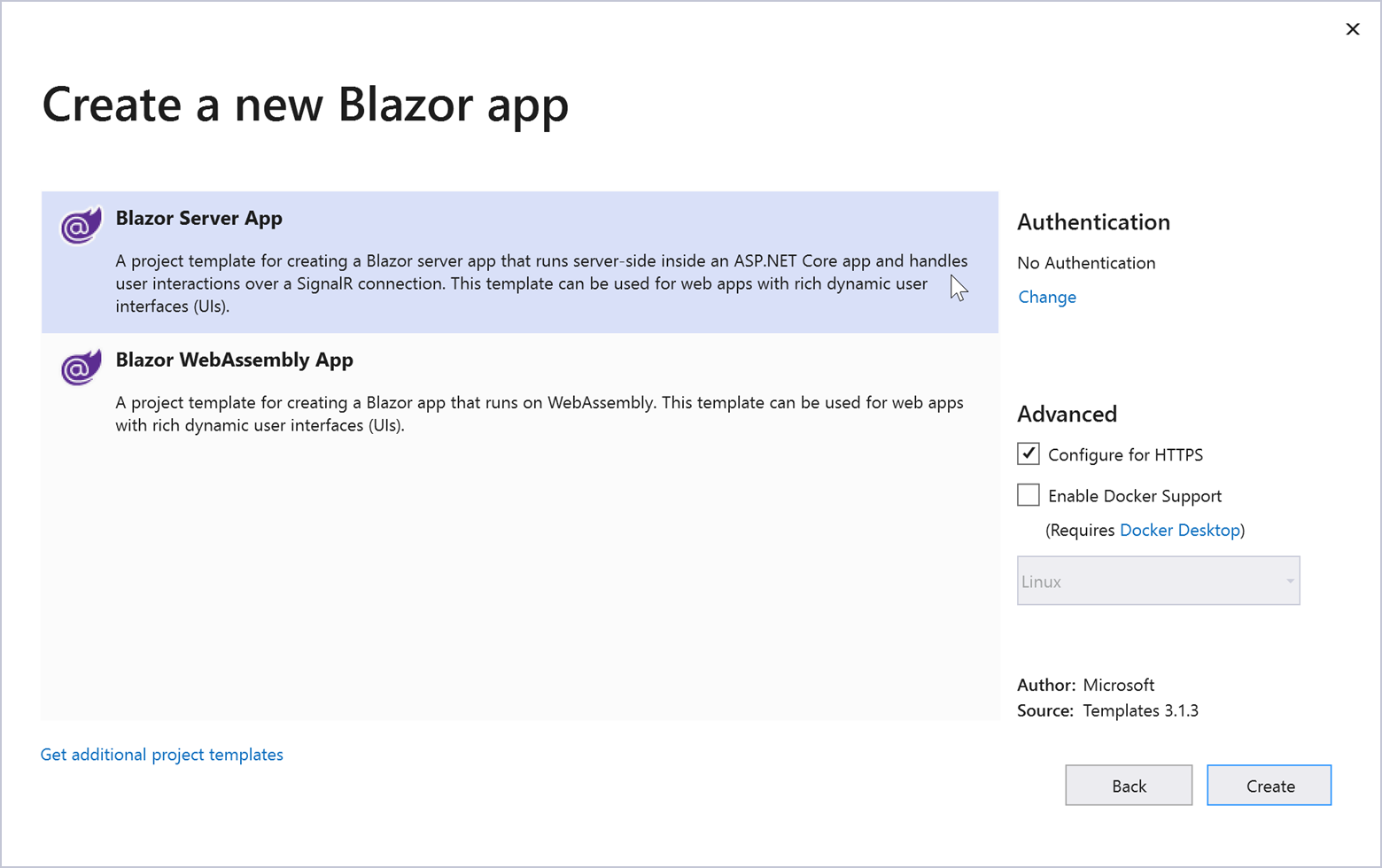
Can I use TestCafe to test a Blazor application?
TestCafe supports testing for Blazor apps. You can test your Blazor app the same way as any other application. There are no known issues.

Action chaining

Are there limitations as to what kinds of actions can be chained? Is it the best practice to chain as many actions as I can?
Almost all TestCafe test controller’s methods https://devexpress.github.io/testcafe/documentation/reference/test-api/testcontroller/ can be chained, except those that return a value and hence break the chain:

You can chain these methods in any desirable manner but we recommend adding blank lines between logical parts of the action chain to improve tests readability, e.g.

await t
. click(‘#id1’) //some settings
. click(‘#id1’)
. click(‘#id1’)

.expect(Selector(‘#result’).textContent).eql(‘expected text’);//assertion

Can I extend the TestController object with my own chainable methods? Or only helpers and pageobjects are the way to go?
TestController cannot be extended with custom methods at the moment. We may consider adding this feature, but it isn’t in our current roadmap. As you correctly suggested, you can use helpers and page objects to implement custom methods.


TestCafe Studio

Can TestCafe record my actions (some tests need many entries and writing them is very time-consuming)?
You can use TestCafe Studio that has a built-in test recorder. It allows you to record your actions without coding them. https://www.devexpress.com/products/testcafestudio/

Is there a user interface for building tests, or is it all JS-based?
You can use TestCafe Studio which is a UI tool to maintain your tests.

Is TestCafe Studio a desktop application or is it available as a Web service?
TestCafe Studio is a cross-platform desktop application (powered by Electron.js). You can download its installer for Windows, macOS or Linux and install on your machine. Offline registration is available for computers without internet access. Read more in the Installation topic in the Docs https://docs.devexpress.com/TestCafeStudio/400163/guides/installation

Does TestCafe Studio require a license?
Yes, this is a commercial product that requires obtaining a license: https://devexpress.com/testcafestudio. There are two options available: TestCafe Studio and TestCafe Studio Pro with DevExpress Technical support.

Can TestCafe Studio generate tests steps in a more user-friendly form than code?
TestCafe Studio has the built-in Test Editor https://docs.devexpress.com/TestCafeStudio/400190/user-interface/test-editor designed for codeless test creation.

Can you change the order of tests on the side panel on the left?
The Explorer Panel allows you to view and manage files in your testing directory https://docs.devexpress.com/TestCafeStudio/400182/user-interface/explorer-panel. For recorded tests, the Explorer Panel displays fixtures and tests. You can create new tests, copy/paste them and more. But currently you can’t change the order of the tests.

Are there more formats of report logs in TestCafe Studio?
In the Report View you can see tests run report in the TestCafe Studio format - Grid view https://docs.devexpress.com/TestCafeStudio/400187/user-interface/report-view
The following built-in reports formats are also available:
  • JSON
  • xUnit
  • List
  • Minimal
  • Spec

Is there any guide with comprehensive instructions and examples for TestCafe Studio?
See docs, guides, videos, and examples here https://docs.devexpress.com/TestCafeStudio/400157/testcafe-studio

What is the element locator strategy?
TestCafe Studio use some characteristic of the DOM element in order to identify it on the page, such as id, class, text etc. You can set the usage priority of these characteristics, switch them off (e.g. for auto generated id) or create new ones based on custom attributes. See the details in the documentation https://docs.devexpress.com/TestCafeStudio/400407/test-actions/element-selectors

Is TestCafe Studio a part of the Universal Subscription?
Yes, TestCafe Studio Pro version is: https://www.devexpress.com/subscriptions/universal.xml

Does TestCafe Studio support console.log output? I am currently running tests from the command line so I’d like to see my console.log statements.
You can add the Run TestCafe Script action https://docs.devexpress.com/TestCafeStudio/401265/test-actions/custom-scripts. In this action, you can use console.log() to print messages directly, or even call t.getBrowserConsoleMessages() to fetch messages from the browser’s console: https://devexpress.github.io/testcafe/documentation/reference/test-api/testcontroller/getbrowserconsolemessages.html

Can TestCafe Studio generate reports with statistics, graphs, pies, etc., illustrating execution results?
Currently there is no such capability.

In TestCafe Studio, moving a line becomes almost impossible over 100 lines. Is that a memory issue that can be changed via config?
We cannot reproduce this behavior on our side. Please create an inquiry on https://www.devexpress.com/ask and provide more detail about the issue you encounter.

We are using both DevExpress and custom controls in our application. We record tests in TestCafe Studio, but they fail when we run them. Can you tell why this happens?
To resolve the issue, please refer to the Troubleshooting section on our FAQ page. If suggestions describe there do not help or apply to your case, create a ticket on https://www.devexpress.com/ask and describe your issue in detail.


Page Model

Do you create the page models manually? Can the page models be dynamically generated?
Page Models should be created manually, there is no built-in way to generate page models automatically. A page model reflects the internal structure of the testing page: what is the container, what is the parent and what is the child, etc., which distinguishing characteristics are best used to identify elements. Any automatically generated model is unlikely to reflect these semantics.

Is it necessary to create selectors with the Selector constructor in a page object class?
No, you can use CSS strings:

class Page {
constructor(){
this.submitButton = ‘#submit’;
}
}


But if you want to extend or chain such a selector with selector’s methods https://devexpress.github.io/testcafe/documentation/reference/test-api/selector/, you will need to use the Selector constructor:

class Page {
constructor(){
this.button = Selector(‘button’);
this.submitButton = this.button.withText(‘Submit’);
this.cancelButton = this.button.withText(‘Cancel’);
}
}


Can I add additional methods to page object in TestCafe?
Yes, you can add methods to a page model. Usually these methods are the most frequently repeated actions specific to this page. See an example in TestCafe docs https://devexpress.github.io/testcafe/documentation/guides/concepts/page-model.html#step-7---add-actions-to-the-page-model

Does TestCafe support the PageObjects library?
If you mean this PageObjects library, then TestCafe does not support it because this library is designed for Selenium.

Database Access

Can test results be sent to a database?
There's no built-in functionality for this, but you can certainly make a plugin that will do this: https://devexpress.github.io/testcafe/documentation/guides/extend-testcafe/reporter-plugin.html

Can TestCafe connect to databases to verify that the correct data was written?
TestCafe doesn’t have built-in functionality for interaction with databases. But you can use any npm module for it.

Browsers

Does TestCafe support Microsoft Edge? Can TestCafe create mocks and run tests in IE11?
Yes, TestCafe supports both browsers. You can find the list of supported browsers in TestCafe docs https://devexpress.github.io/testcafe/documentation/guides/concepts/browsers.html#officially-supported-browsers.

Selectors

What type of selectors are available? Is it only HTML element IDs and/or classes?
You can use any pure CSS selectors or TestCafe Selector API that extends capabilities offered by CSS selectors: https://devexpress.github.io/testcafe/documentation/reference/test-api/selector/

Can I target elements based on text that is actually visible to the end-user?
TestCafe Selector’s withText method finds elements by text that is visible to the end-user (the element’s innerText property). You can also create a selector that uses custom logic to find an element. Pass a function to the selector’s constructor.

Is it possible to set the waiting time for an element? What if I mistyped the selector's "name" or the page is loading really slow? How long does TestCafe wait by default?
You can specify the Selector’s timeout option. During this timeout, the selector waits for the element. The default timeout duration is 10000 ms.

I use auto-generated names for DevExpress control’s elements in my application. Can TestCafe interact with them?
Yes, you can identify these elements by their static parts. See an example in our docs https://devexpress.github.io/testcafe/documentation/guides/basic-guides/select-page-elements.html#select-elements-with-dynamic-ids

Can I use XPath to locate elements?
XPath selectors are not built-in with TestCafe, but you can implement a simple helper method to use them. See an example https://github.com/DevExpress/testcafe-examples/tree/master/examples/use-xpath-selectors

Can I verify a certain element does not exist or will that cause a failure?
If an element used in some action doesn’t exist, a test fails. A test run report then indicates that the test failed because a target element doesn’t exist on the page. To check if the element exists before TestCafe attempts to interact with it, use the following approach

if(await Selector(‘#element’).exists)
await t.click(Selector(‘#element’))
For instance, you would use this verification to close ad popups (should they appear).

Debug

Are there any approaches that help debug tests? How can I debug TestCafe and the Hammerhead proxy?
Check out the following blog post on how to debug your application and tests: https://devexpress.github.io/testcafe/media/team-blog/how-to-debug-tests-in-testcafe-quick-guide.html
You can also find the instruction about how to debug in other IDEs in our guide: https://devexpress.github.io/testcafe/documentation/guides/basic-guides/debug.html
To debug TestCafe and Hammerhead, enable the development mode. Use the --dev flag when you run tests:

What are the available debug options?
The following capabilities help you determine the cause of errors and failures:
  • Take screenshots automatically when tests fail
  • Capture videos of test runs
  • Set the speed of test execution
  • Enter debug mode automatically when the first test fails
  • Execute tests step by step in debug mode

Can TestCafe capture a screenshot when a test fails?
Absolutely, enable the takeOnFails option to do this.

Authentication

Can I log in once and execute multiple tests under the same account rather than logging in in every test?
Yes, you can use roles to perform actions that log you in only once. In the subsequent tests, you just activate the role you defined earlier to log in without repeating the authentication process each time. See User Roles in the documentation for details.

Do roles work with auth0/openid which has JWT in headers?
Roles can process the JWT if it is sent in the cookies or stored in the local or session storage.

Would we run into any issues if we're using Microsoft authentication tokens for permissions?
You should not have any issue. Please try this and see how it works. If you face any issues, let us know, so we can research it.

How does TestCafe log out the user to switch to a different role? Does it just re-open the page?
When you switch to a role that was active previously in the current session, TestCafe restores cookies and browser’s local and session storage where authentication data is located. If the new role wasn’t used yet, TestCafe just resets the cookies and storage and then performs authentication actions.

Can you create Roles with API calls instead of functional steps?
If your question is about REST API, then yes, you can call REST API to authenticate a user in a role. Just note that you need to use a client function to call REST API from the browser. You may want to inject a library that can call API into the tested page.

What are the options for smart card logins?
TestCafe only supports web-based authentication. That is, your website should be able to authenticate you by your actions in the web browser, without relying on additional hardware. The only way is to deploy a testing instance of your web app without smart card authentication.

Multiple Apps, windows, Tabs

Can TestCafe test integration across multiple applications?
Yes, you can test any number of web applications.

Can you test multiple browser windows at the same time? For example, I may need to access application A, then check application B and come back to A.
Yes, you can do this. We released multiple window support in beta in v1.9.0. Please find more information in the Multiple Browser Windows topic and don’t hesitate to leave your feedback. Your opinion helps us make sure you get the best experience when this feature is released.

Does TestCafe support multiple tabs?
You can open and switch between multiple browser windows with this new beta feature. TestCafe will open a new popup window instead of a tab when necessary. This is because tabs can be throttled which interrupts TestCafe scripts.

iFrames

Does TestCafe support iframes?
Yes, TestCafe supports iframes and provides two simple methods to interact with their content: switchToIframe to switch the test's browsing context to iframe’s context and switchToMainWindow to switch it back to the main window.

Reports

How does TestCafe output test run reports? Where can I find test results?
TestCafe shows the test run report in the console by default. You can redirect output to a file or use dedicated reporters to post reports to a CI system or elsewhere.

What happens when a test fails? What logs are produced?
If a test fails, you will see a comprehensive report in the console.
For example
Multiple report formats are supported, including the following:
  • spec
  • list
  • minimal
  • xUnit
  • JSON
Read more in the TestCafe documentation:

In what format does TestCafe generate the reports? Is it XML or HTML?
The format depends on the reporter. It can be XML, JSON, HTML, and many others.
You can explore the available reporter packages on npm: https://www.npmjs.com/search?q=testcafe-reporter

Test Organization

Can I use logic operators to have different conditional "paths" during a test?
Yes, TestCafe can do conditional testing. You can use standard JavaScript if-clauses to make this happen.

Is it possible to share fixtures between test files?
TestCafe treats fixtures declared in different files separately. If you can share your use case when merging fixtures is useful, please open an issue on GitHub.

How TestCafe Works

Did I miss what the ‘async’ keyword means in code? Is that to say TestCafe commands can run as other tests are running?
‘async’ is a JavaScript keyword that indicates that the function is asynchronous. Technically, an asynchronous function means that this function returns a Promise. TestCafe actions are asynchronous because so are the page events. Page loading, animations, HTTP requests take different amounts of time. The test function is asynchronous as well because it uses asynchronous TestCafe actions.
‘await’ means that the next command should not execute until the previous (‘awaited’) command is completed. This is required to execute test actions in the right sequence (and, in the same manner, TestCafe ‘awaits’ tests in a fixture to run them one by one). Note that, by contrast, tests in different browsers can run in parallel, just like in concurrency mode.

Async in this context means the JavaScript UI thread doesn't stop and wait for the response from the server. (In essence, TestCafe uses JS promises.) In other testing products, there are issues with timeouts, for example, because they expect the response within a certain amount of time.

Please provide technical insight about how TestCafe avoids installing special plug-ins in order to interact with the browser. How does it actually interact with browsers?
TestCafe proxies the tested webpage and injects automation scripts right inside the proxied copy. This way, browsers do all the work when they execute the injected scripts. You can find more details in the How It Works article.

Is it possible to access runtimeJS objects from application client libraries loaded in the browser?
TestCafe is designed to conceal itself from application’s JavaScript code. This is necessary to ensure that pages proxied by TestCafe run exactly in the same way as they do on the website. For this reason, application code cannot access TestCafe scripts or test code entities.

Waiting and Asynchrony

What if a portion of a page takes a while to render (for instance, the page uses AJAX). Can TestCafe take it into account?
Yes, TestCafe tests wait automatically until the page is rendered completely. You can also insert manual waiting, but it shouldn’t be necessary in almost all cases.

I set up my page in a jQuery callback: $(document).ready(function(){}). Will there be JS races with TestCafe?
TestCafe will wait until the page loads completely and run tests only after that. TestCafe wait mechanisms are designed to prevent races with JS code.

It is great that TestCafe handles waiting internally. Would there be a need to override default timeout functionality though? How should a user go about it?
You may need to override the default timeout if your page requires extra long waiting. All TestCafe auto-wait timeouts are customizable. You can find more information in the Built-in Wait Mechanisms topic.

Other Features

Does TestCafe support all ES6 or later features? Do I need plugins to support arrow functions or the async/await syntax?
TestCafe supports all modern JavaScript and TypeScript features. No plugins needed, everything works out of the box.

Can TestCafe work with the Service Worker?
We are currently in progress of implementing full support for Service Workers. Stay tuned for our updates to be the first to know when we are ready.

Does TestCafe work with Python?
You can write tests in JavaScript/TypeScript/CoffeeScript only.

Does TestCafe support upload ( excel ) data functionality?
TestCafe can upload files, including Excel, to websites if it is a part of the test scenario. However, if you are asking about API to access Excel data sheets from test code, TestCafe does not provide one out of the box. You can search for npm modules that implement the functionality you need and use them from TestCafe tests.

What about functional test coverage? Does TestCafe support it?
Test coverage estimation is not available at the moment.

Miscellaneous

If TestCafe runs in headless mode, is it still possible to grab screenshots on failures?
Yes, TestCafe can take screenshots even in headless mode.

Does this require a test framework like jest/mocha/jasmine?
No additional frameworks are required for TestCafe.

How can I use TestCafe to test different resolutions?
You can use the t.resizeWindow action to change the browser window size and test adaptive UIs. TestCafe also supports Chromium device emulation to test on emulated mobile devices of various sizes.

Can we use Test Cafe to compare two documents? Like documents with logos, disclaimers and other information?
If you mean visual comparison, TestCafe does not provide this functionality out of the box. However, you can find multiple open source packages that try to solve this task, like https://github.com/tacoss/testcafe-blink-diff. Note that they are maintained by the community and are not related to the TestCafe team.
If your goal is to compare HTML, you can pass ‘innerHTML’ to a TestCafe assertion as shown in the example in this topic.

How do you change the base URL to test in different environments?
You can import the base URL from a configuration file or an environment variable, and then use it to build start page URLs in test code. See this example on the FAQ page.

Can I run TestCafe on a Linux computer without the UI?
Yes, you can run your tests on Linux and use headless browsers to run your tests without the UI.

Could you please share ideas about how to do localization testing? Does TestCafe support that?
TestCafe does not have built-in functionality for localization testing. As a suggestion, you can fetch the localization strings from a resource file or database with Node.js means or third-party npm modules. Then, you can create data-driven tests that check if the displayed strings are localized (present in the localization resources).

When do you plan to release version 1.9.0?
1.9.0 was released on August 6th. If you are asking about the multi-window support final release, we do not have an exact date yet.

How does TestCafe handle exceptions?
TestCafe considers the test failed if its code throws an exception. The report will indicate the line of code and call stack where this exception originated. Exceptions in JavaScript code on the tested page also make tests fail. However, this behavior is customizable. You can use the --skip-js-errors flag to ignore page errors. Similarly, the --skip-uncaught-errors flag allows you to continue tests when test code throws an exception.

Can we measure client-side performance using TestCafe (both HTTP and script execution time)?
TestCafe is not intended for this task. In fact, TestCafe impacts the webpage performance when it runs tests. We are constantly optimizing our code to minimize this slowdown, but we do not aim to precisely match the original performance.

Are tests executed in sequence within a fixture?
Yes, tests are executed as they are declared in code.

Can I add my custom element library to the context object?
You can add anything to the feature and test context objects. However, keep in mind that test code does not run in the browser, so adding browser libraries to the context objects might not help. If this is the case, you may be more interested in the custom script injection functionality designed for user’s client libraries.

Can TestCafe test HTML5 features like fullscreen, camera, audio or video interaction?
Yes, you can test these HTML 5 features with TestCafe.
Note that you might need to set the --autoplay-policy=no-user-gesture-required browser flag as explained in this article to test the fullscreen mode and audio/video. The camera can be mocked using ClientFunctions.

TestCafe does not currently support multimedia interaction features.

Does TestCafe support multiple domains in a test?
Yes, navigation and requests between different domains work out of the box. You do not need to care if you visit pages on one or several domains.

What happens if TestCafe loses network connection with a remote device that runs tests?
Tests cannot run without network connection because TestCafe must be able to send commands to the remote device. If the connection is interrupted, TestCafe will throw an error saying that a browser connection is lost.

Is it possible to run all JS in one command? Could you please specify this command?
If I understand you correctly, yes, you can run all your JS tests using a single console command.
Here is the CLI reference where you can see the ‘testcafe’ command syntax: https://devexpress.github.io/testcafe/documentation/reference/command-line-interface.html

I noticed non-standard code indentation. Is a respective formatter for VS Code available?
We didn’t release a specific formatter because you can use any indentation you prefer with TestCafe.

Can I use TestCafe to test the development and production instances of my app? If so, how can I configure different URLs for my instances?
Yes, you can import the base URL from a configuration file or an environment variable, and then use it to build start page URLs in test code. See this example on the FAQ page.

Does TestCafe have support for file download? Can you set the default file download location using TestCafe API?
Yes, if test actions on the page trigger file download, the browser will download it as usually. Then you can access the file from test code to perform verification. Currently, TestCafe API does not allow you to set the default download location.


ASP.Net Core, Web Forms and MVC RichEdit - Table Layout Enhancements

$
0
0

With our most recent minor update, we’ve improved table support within our Rich Text Editor for ASP.NET Core, Web Forms and MVC. We’ve incorporated the following enhancements across multiple versions (v19.1.11, v19.2.8, and v20.1.5). As always, we welcome your thoughts and feedback.

AutoFit Enhancements

With this update, the DevExpress ASP.NET Rich Edit control correctly displays large tables when the AutoFit option is set to AutoFit Contents:


Inner table width is calculated correctly when the AutoFit option for both outer and inner tables equals AutoFit Contents:

Fixed Table Style support

As you might expect, fixed table width has priority. A column's fixed width can be modified to fit the table.

Column Fixed Width

If a column’s width is fixed, content does not increase column width. Content increases row height instead.

Dash Sign is a Separator

The dash sign is considered a word separator.


eXpressApp Framework - Tips & Tricks (July 2020)

$
0
0

Here is this month’s edition of XAF Tips & Tricks. As always, we hope the information contained within this post is of value as you explore and leverage the capabilities of the eXpressApp Framework. If you have a support ticket you'd like to share with the XAF developer community, feel free to post a link in the comment section below.

Thank you for your continued commitment to XAF!

Interesting Support Tickets

New and Updated KB Articles

Documentation Updates

XPO Documentation Structure Update

We updated XPO’s documentation structure to improve navigation between learning materials:eXpress Persistent Objects Documentation. Let us know if this change helps and how we can enhance our help file further. 

Non-Persistent Object Validation

We updated the following topic to explain the requirements for the non-persistent objects you can validate via our Validation Module: Declare Validation Rules.

Blazor Basic Tutorial

Create a simple Blazor application, customize its UI, and extend its functionality with our built-in Validation Module: Basic Tutorial (Blazor SimpleProjectManager Application).

If you’d like to learn more about XAF’s Blazor UI, feel free to watch the following introductory video.

Blazor UI Components - New Memo Edit, Data Grid, and Scheduler enhancements and more (v20.1.6)

$
0
0

In this post, I'll discuss the most recent enhancements to the DevExpress UI for Blazor (v20.1.6).

.NET Core 3.1.7 and Blazor WebAssembly 3.2.1 Support

v20.1.6 supports the most recent versions of Blazor WebAssembly 3.2.1 and .NET Core 3.1.7. If you have yet to upgrade, please do so as Microsoft has addressed important vulnerabilities.

The update addresses the vulnerability by correcting how the ASP.NET Core web application handles web requests. -Rahul (Microsoft)

All .NET Core 3.1 applications running on .NET Core 3.1.6 or lower are affected by the CVE-2020-1597: ASP.NET Core Denial of Service Vulnerability. To learn more, please review the following: Microsoft Security Advisory CVE-2020-1597 | ASP.NET Core Denial of Service Vulnerability.

New Blazor Memo Editor

This release ships with a new multi-line memo editor component for Blazor:

DevExpress Blazor - Memo Edit

Our Blazor Memo component includes the following features:

  • rows– Use rows to control the number of visible text lines
  • columns– use columns to limit editor width by character count
  • resize – Our memo control supports multiple display modes including: Vertical, Horizontal, VerticalHorizontal, & Disabled
  • Clear button -Use the clear button to remove all content within the memo field.
  • read-only mode

Demo | Documentation

Blazor Data Grid

Popup Edit Form

You can now select between two edit modes when using our Blazor Data Grid: built-in or modal popup edit form. To enable the popup edit form, set the EditMode property to DataGridEditMode.PopupEditForm.

Demo | Documentation

Blazor Scheduler

Appointment Templates

Our Blazor Scheduler now allows you to use templates to specify a custom appearance for individual events/appointments. To declare custom content for all-day appointments, use HorizontalAppointmentTemplate.

<HorizontalAppointmentTemplate>
  <div
    class="card shadow-sm p-1 bg-white text-dark"
    style="width:100%; font-size: .925em; font-weight:600; box-shadow: .125rem .25rem rgba(34,34,34,0.15)"
  >
    @context.Appointment.Subject
  </div>
</HorizontalAppointmentTemplate>

For appointments less than one day in duration, use the VerticalAppointmentTemplate:

<VerticalAppointmentTemplate>
  <div
    class="card shadow-sm bg-white p-2"
    style="overflow: hidden; height: 100%;box-shadow: .125rem .25rem rgba(34,34,34,0.15)"
  >
    <div>
      <span class="badge badge-info mb-1 @context.Status.CssClass"
        >@context.Status.Caption</span
      >
    </div>
    <span
      class="text-dark pl-0 mb-1"
      style="font-weight:600; font-size: .925em;"
      >@context.Appointment.Subject</span
    >
    <div
      style="height:100%; display:flex; flex-direction:column; justify-content:flex-end;"
    >
      <div>
        <span class="badge badge-light"
          ><span class="oi oi-clock pr-1"> </span
          >@context.Appointment.End.ToString("MMM dd HH:mm")</span
        >
      </div>
    </div>
  </div>
</VerticalAppointmentTemplate>

DevExpress Blazor - Scheduler - Appointment Template

Demo | Documentation

Custom Fields

Scheduler elements require a few standard data-bound properties (AppointmentID, Start, End, etc.). With this release, you can now add custom fields to appointments, labels, and status values.

For example, use the AppointmentMappings.CustomFieldMappings collection to add custom fields for appointments:

DxSchedulerDataStorage DataStorage = new DxSchedulerDataStorage()
{
  AppointmentsSource = AppointmentCollection.GetAppointments(),
  AppointmentMappings = new DxSchedulerAppointmentMappings()
  {
    …
    CustomFieldMappings = new List<DxSchedulerCustomFieldMapping> {
      new DxSchedulerCustomFieldMapping { Name = "IsApproved", Mapping = "Approved" },
      new DxSchedulerCustomFieldMapping { Name = "Progress", Mapping = "Progress" }
    }
  }
};

Custom field mapping properties are also available for Labels and Status values.

Documentation

To access custom field values in templates, use the Context.Appointment.CustomFields property:

<VerticalAppointmentTemplate>
    ...
        @if (Convert.ToBoolean(context.Appointment.CustomFields["IsApproved"])) {
            <p class="text-dark"><span class="oi oi-check"></span> Approved</p>
        }
        <div class="progress border-primary" style="height: 5px;">
            <div class="progress-bar bg-success"
                 style="width:@context.Appointment.CustomFields["Progress"]"
                 role="progressbar"></div>
        </div>
    </div>
</VerticalAppointmentTemplate>

Blazor Scheduler Appointment Custom Fields

New Customization API

With this update, you can now assign CSS classes to customize appointments, labels, and status values:

AppointmentLabelMappings = new DxSchedulerAppointmentLabelMappings() {
    Id = "Id",
    Caption = "LabelName",
    Color = "LabelColor",
    TextCssClass = "TextCssClass",
    BackgroundCssClass = "BackgroundCssClass"
}

Documentation

Blazor Data Editors

Multiple Columns

Our Blazor List Box, ComboBox, and TagBox components can now display data across multiple columns. To create the new column type, use the DxListEditorColumn object and specify the following properties to customize your column

  • FieldName - Binds the column to a specified data source field
  • Width - Specifies the column's width
  • Visible - Specifies the column's visibility
  • VisibleIndex - Specifies the column's display position
<DxComboBox Data=”@DataSource”
                  @bind-Value=”@SelectedValue”
                  EditFormat=”{1} {2}”>
    <DxListEditorColumn FieldName=”Id” Width=”50px” />
    <DxListEditorColumn FieldName=”FirstName” VisibleIndex=”1”/>
    <DxListEditorColumn FieldName=”LastName” />
    <DxListEditorColumn FieldName=”Country” Visible=”false” />
</DxComboBox>

Our Blazor ComboBox and TagBox components now offer an EditFormat property. Use this property to format values displayed in both standard and multi-column modes. In multi-column mode, you can specify a visible column's index in curly braces. The code above adds three columns to the ComboBox and applies the {1} {2} format to the component's edit values. This format specifies that the editor value includes values for the following columns: FirstName (VisibleIndex = 1) and LastName (VisibleIndex = 2).

Blazor Editors Multiple Column EditFormat

Demo | Documentation

Bind to a Data Object Field

Our ComboBox, TagBox, and List Box components allow you to bind to any IEnumerable data source (database, custom objects, etc.). These components use the TextFieldName property to display item text.

With this release, we've added a new ValueFieldName property for the ComboBox, TagBox, and List Box. Use TextFieldName to display human-readable strings and ValueFieldName to read the connected "non-friendly" values. For example, use TextFieldName to display 'Employee Name' and ValueFieldName to read the corresponding 'Employee ID':

public class Employee
{
    public int Id { get; set; }
    public string FirstName { get; set; }
    public string LastName { get; set; }
    public Department Department { get; set; }

    public string Text => $"{FirstName} {LastName} ({Department} Dept.)";
}

...

<DxComboBox Data="@Employees.DataSource"
            TextFieldName="@nameof(Employee.Text)"
            ValueFieldName="@nameof(Employee.Id)"
            SelectedItemChanged="@((Employee employee) => SelectedItem = employee)"
            @bind-Value="@Value">
</DxComboBox>
Note that both Value and ValueFieldName property types should match.

To bind the component to the entire object, do not specify the ValueFieldName property:

<DxComboBox Data="@Employees.DataSource"
            @bind-Value="@Value">
</DxComboBox>

This feature implementation required the following API changes.

Input ID

We added a new InputID property to the following components: CheckBox, Date Edit, Spin Edit, Text Box, ComboBox, and TagBox.

Multiple editors can be added to our form layout item's template. You can now use the InputID property to control which editor receives focus when the user clicks on the form layout item's caption.

<DxFormLayout>
    <DxFormLayoutItem Caption="Birth Date:" CaptionFor="date_edit">
        <Template>
            <DxDateEdit @bind-Date="@BirthDate" InputId="date_edit"></DxDateEdit>
        </Template>
    </DxFormLayoutItem>
    @*...*@
</DxFormLayout>

Documentation

Calendar - Bind to a Single Object

Use the new SelectedDate property to bind Calendar to a single DateTime value instead of an IEnumerable collection of dates:

<DxCalendar @bind-SelectedDate="Date" />

@code {
    DateTime Date { get; set; } = new DateTime.Today;
}

Calendar - Date Validation

We added support for Calendar validation. You can now validate the SelectedDate property by adding our Calendar component to Blazor's standard EditForm.

The Calendar is outlined in green if validation is successful and in red if validation fails:

Blazor Calendar Date Validation

Documentation

Calendar - Nullable DateTime Support

You can now bind a Calendar to a nullable DateTime value:

<DxCalendar @bind-SelectedDates="Dates"  EnableMultiSelect="true" />

@code {
    IEnumerable<DateTime?> Dates { get; set; } = new List<DateTime?>() {
        null, new DateTime(2020, 08, 16), new DateTime(2020, 08, 17)
    };
}

Form Layout - CSS Classes

We added a new CssClass property for the Form Layout component. Use it to assign CSS classes to layout items and captions (including tab pages and groups).

Documentation

Enhanced Event Processing

We've improved the delegate type from Action to EventCallback for multiple events. A call to StateHasChanged isn't required with these updated event handlers. StateHasChanged is called automatically to rerender the component after changes in the event.

Before:

<DxButton Click="@Click"../>
@code
{
    void Click(MouseEventArgs args)
    {
      // Use this event to process your code
      // during the click event then call StateHasChanged
      InvokeAsync(StateHasChanged);
    }
}

After:

<DxButton Click="@Click"../>
@code
{
    void Click()
    {
      // Use this event to process your code
      // during the click event without StateHasChanged
    }
}

For a complete list of changes to events and information about EventCallback advantages, please refer to the following Breaking Change: T920147

Upcoming Enhancements

To learn more about our upcoming plans for Blazor (v20.2), please review the following blog post: Blazor Roadmap.

Office Inspired Tools & Components (Office File API, PDF, WinForms and WPF UI Components) — Early Access Preview (v20.2)

$
0
0

This post details some of the features we expect to ship in our next major release (v20.2).  If you own an active Universal or DXperience subscription, you can download our Early Access Preview (EAP) build today. To test the functionality described herein, simply navigate to our Download Manager to obtain the appropriate installer.

As always, we thank you for choosing our Office-inspired component libraries and for placing your faith in DevExpress.

Remember, Early Access and CTP builds are provided solely for early testing purposes and are not ready for production use. This build can be installed side by side with other major versions of DevExpress products. Please backup your project and important data before installing Early Access and CTP builds.

Perhaps most importantly, this EAP does not include all features/products we expect to ship in our v20.2 release cycle. We are working hard to finalize all v20.2 features/capabilities and once we have more information to share, we’ll post updates on this channel.

PDF Document API

Cross-Platform Rendering

Our PDF Document API (v20.2) will allow you to use the Skia Graphics Engine to render page content on any supported platform (Windows, Linux, or Azure).

If you’re using our Office File API on Linux, add the DevExpress.Pdf.SkiaRenderer NuGet package.

This Skia Graphics Engine allows you to render graphical elements within Azure, even with Azure plans that prohibit GDI calls (such as the Basic plan). To activate the cross-platform engine in an Azure service project, add a reference to the DevExpress.Pdf.SkiaRenderer package and set the PdfDocumentProcessor.RenderingEngine property to PdfRenderingEngine.Skia. You can also use this property on Windows OS to deliver unified rendering/output.

Draw Page Content

The PdfGraphics.DrawPageContent method allows you to insert page content to a different page. When used, you can merge the contents of two separate pages into one.

The code below inserts a portion of a page to a document. The content is scaled and inserted at the bottom of the page:

using DevExpress.Pdf;
using System.Drawing;

using (PdfDocumentProcessor processor = new PdfDocumentProcessor())
{
    processor.CreateEmptyDocument();
    PdfPage page = processor.AddNewPage(PdfPaperSize.A4);
    using (PdfDocumentProcessor processor2 = new PdfDocumentProcessor())
    {
        processor2.LoadDocument(@"Demo.pdf");
        using (PdfGraphics graphics = processor.CreateGraphics())
        {
            graphics.SaveGraphicsState();

            //Define position for the content on your target page:
            graphics.TranslateTransform((float)(page.CropBox.Width * 1 / 3), 
            (float)(page.CropBox.Height * 4 / 5));
            PdfRectangle clip = processor2.Document.Pages[0].CropBox;

            //Resize source page content to fit the target page:
            float scaleFactor = (float)(page.CropBox.Width / clip.Width / 3);
            graphics.ScaleTransform(scaleFactor,scaleFactor);

            //Crop source content:
            graphics.IntersectClip(new RectangleF((float)clip.Left, (float)(clip.Top / 2.8), 
            (float)clip.Width, (float)(clip.Height / 2.8)));

            //Draw the cropped segment in the target page:
            graphics.DrawPageContent(processor2.Document.Pages[0]);
            graphics.RestoreGraphicsState();

            //Apply changes:
            graphics.AddToPageForeground(page, 72, 72);
        }
    }
    processor.SaveDocument("result.pdf");
}

Page Manipulation Enhancements

You can now execute the following actions on PDF page content:

  • Scale content
  • Specify content offset
  • Rotate content
  • Resize the page. Content aspect ratio is maintained.

The code below demonstrates the use of these PdfPage class methods:

using (PdfDocumentProcessor processor = new PdfDocumentProcessor())
{
   processor.CreateEmptyDocument();
   processor.LoadDocument(@"Document.pdf");

   //Set offset for content on the first page:
   processor.Document.Pages[0].OffsetContent(50, 100);

   //Scale and rotate the content on the second page:
   processor.Document.Pages[1].ScaleContent(0.5, 0.5);
   processor.Document.Pages[1].RotateContent(200, 100, 270);

   //Resize the third page:
   processor.Document.Pages[2].Resize(PdfPaperSize.Legal, 
   PdfContentHorizontalAlignment.Center, PdfContentVerticalAlignment.Center);
   processor.SaveDocument("result.pdf");
}

Word Processing Document API

Note: To use the functionality described below in production code, you need an active license for our Office File API or the DevExpress Universal Subscription.

Load Document Properties

Our Word Processing Document API (v20.2) allows you to load document metadata (or document properties) without loading the document itself. You can use retrieved information to search for a specific document, catalogue files, or collect statistics as needed.

The code below uses document metadata to sort files by modification date:

using DevExpress.XtraRichEdit;
using DevExpress.XtraRichEdit.API.Native;
using System;
using System.IO;
using System.Diagnostics;

static void Main(string[] args)
{
    DirectoryInfo directoryInfo = 
    new DirectoryInfo(@"C:\Users\Public\Documents\DevExpress Demos 20.2\Components\Data");
    FileInfo[] files = directoryInfo.GetFiles("*.docx");
    foreach (FileInfo file in files)
    {
       SortDocuments(file.FullName, file.Name);
    }
    Process.Start("explorer.exe", @"C:\Documents");
}

public static void SortDocuments(string filePath, string fileName)
{
  using (RichEditDocumentServer wordProcessor = new RichEditDocumentServer())
  {
     //Load metadata from the specified document:
     ReadOnlyDocumentProperties docProperties = 
     wordProcessor.LoadDocumentProperties(filePath);
     DateTime date = docProperties.BuiltIn.Modified;

     //Check the year the document was last modified,
     //And copy the file to the corresponding folder:
     switch (date.Year)
     {
       case 2019:
           File.Copy(filePath, string.Format("C://Documents//2019//{0}", fileName), true);
           break;
       case 2020:
           File.Copy(filePath, string.Format("C://Documents//2020//{0}", fileName), true);
           break;
    }
  }
}

Asynchronous Load and Save

Our new API allows you to load, save, and export documents to PDF and HTML asynchronously. Use the following new methods (RichEditDocumentExtensions class) as needed:

These methods can accept a CancellationToken as a parameter. This allows you to terminate the operation when appropriate.

The example below merges two documents and saves results asynchronously.

private async void MergeDocuments()
{
  using (RichEditDocumentServer wordProcessor = new RichEditDocumentServer())
  using (RichEditDocumentServer wordProcessor2 = new RichEditDocumentServer())
  {
      await Task.WhenAll(new Task[]
      {
          wordProcessor.LoadDocumentAsync("Document1.docx"),
          wordProcessor2.LoadDocumentAsync("Document2.docx")
      });
      wordProcessor.AppendDocumentContent(wordProcessor2.Document.Range);
      await wordProcessor.SaveDocumentAsync("merged.docx", DocumentFormat.OpenXml);
  }
}

Word Processing (Office File API, WinForms, WPF)

New File Formats Support

Our Word Processing Document API and both WinForms and WPF Rich Text Editor controls now support the following file formats:

  • DOCM (Microsoft Office Open XML Macro-Enabled Document format)
  • DOT (Microsoft Word 97-2003 Template format)
  • DOTM (Microsoft Office Open XML Macro-Enabled Template format)
  • DOTX (Microsoft Office Open XML Template format)
  • FlatOpc XML (Microsoft Word XML Document stored in a flat XML file instead of a ZIP package).

“Fill in Forms” Protection

You can now specify “Fill in Forms” protection in code and via the component’s UI.

Rich Text Editor (WinForms and WPF)

Footnotes and Endnotes UI

The Rich Text Editor for WinForms and WPF ship with new UI elements designed to insert, navigate, and format footnotes and endnotes.

Spreadsheet (WPF)

New Layout Engine

Our WPF Spreadsheet control ships with a new layout calculation engine. This new engine improves layout accuracy, increases render and scroll performance, and enhances PDF export and printing capabilities.

Please note that this update modifies the manner in which our Spreadsheet control renders and prints certain documents. Activate the SpreadsheetCompatibilityOptions.EnableLegacyLayoutEngine option to revert to our legacy layout engine when appropriate.

<dxsps:SpreadsheetControl.Options> 
    <dxsps:SpreadsheetControlOptions> 
        <dxsps:SpreadsheetControlOptions.Compatibility> 
             <dxsps:SpreadsheetCompatibilityOptions EnableLegacyLayoutEngine="True"/> 
        </dxsps:SpreadsheetControlOptions.Compatibility> 
    </dxsps:SpreadsheetControlOptions> 
</dxsps:SpreadsheetControl.Options> 

Rich Text Support in Spreadsheet Cells

Our WPF Spreadsheet control can now display rich text within worksheet cells. Documents with rich text can also be printed and exported to PDF. This capability is only available if our new layout calculation engine is used.

Note: The WPF Spreadsheet control does not allow you to apply rich formatting to cell text via the control’s UI. Use our Rich Text API to create rich text in code and assign it to a cell.

Your Feedback Matters

We realize beta-testing is a time-consuming process and we are grateful to those who invest time with our preview builds. Find the current implementation lacking flexibility? Feel we've overlooked a valuable usage scenario? Does our current implementation fail to address your business requirements? Please post your thoughts in the comment section below or create a Support Center ticket. We will happily follow-up and do what we can to extend the capabilities of our new products/features.

WinForms — Early Access Preview (v20.2)

$
0
0

First and foremost, we hope that this post finds you and your family well.

Our next major release - v20.2 – is a couple of months away. In this post, I’ll describe what we expect to include in our v20.2 Early Access Preview (EAP) build. If you are an active DevExpress Universal or DXperience subscriber, you can download and install the EAP today. Simply, point your browser to the DevExpress Download Manager to get started.

Remember, Early Access and CTP builds are provided solely for early testing purposes and are not ready for production use. This build can be installed side by side with other major versions of DevExpress products. Please backup your project and important data before installing Early Access and CTP builds.

Perhaps most importantly, this EAP does not include all features/products we expect to ship in our v20.2 release cycle. We are working hard to finalize all v20.2 features/capabilities and once we have more information to share, we’ll post updates on this channel.

WinForms Data Grid - New Fixed Columns Mode

As you may know, you can use our WinForms Grid’s GridColumn.Fixed property to anchor columns to either side of the Grid Control. Once anchored, a column remains visible when users scroll data horizontally. In v20.2, you’ll be able to apply our new "MiddleLeft" fixed mode option. When active, “MiddleLeft” columns can move freely to the right, but dock to the left when you scroll the control in the opposite direction.

The following animation helps illustrates the power of this new feature. “MiddleLeft” has been applied to both the "Country" and "Address" columns.

Documentation: Fixed Columns

WinForms Scheduler Control

Year View

In addition to classic calendar Views (Day, Week and Month), our WinForms Scheduler control will ship with a Year View display option. It’s been designed to visualize events/appoints that span multiple days and weeks.

Much like the MonthView.WeekCount property (allows you to set the number of weeks that are simultaneously displayed within the Month View), our new WinForms Scheduler Year View will include a MonthCount property. Additional View-related settings mirror those of the Month View.

Please note that we have yet to finalize the Year View’s feature set. At this point, you cannot group appointments or scroll through months (you must use the Date Navigator instead). We expect to add these (and other) features prior to official release.

New Cell AutoHeight Mode in Timeline View

The CellsAutoHeightOptions.Enabled property has been renamed to AutoHeightMode and now accepts enumeration values instead of Boolean. "None" and "Limited" values correspond to "false" and "true". A third value - "Full" - activates our new AutoHeight mode.

When AutoHeight is used, time cells ignore the ResourcesPerPage property value and resize based upon content. This also allows users to pixel-scroll the Timeline View.

Documentation: AutoHeightMode

WinForms Gantt Control - Split Tasks

In this EAP build, you can test our Gantt control’s new Split Task feature. If a partially completed task needs to be put on hold, a user can drag the unfinished portion to the left to pause the task. A task can be split into multiple segments. To merge two task segments, drag one portion into the other. This will eliminate the time gap between the two.

Users can split tasks at runtime when the GanttControlOptionsBehavior.AllowSplitTasks property is enabled. Split tasks are stored in a separate data source assigned to the GanttControl.SplitTaskSource property.

Documentation: Split Tasks

Data-bound WinForms TokenEdit Control

You can now bind our WinForms TokenEditontrol to a data source and populate it with items. To set data members that store token captions and internal values, specify the DisplayMember and ValueMember properties.

tokenEdit1.Properties.DataSource = categoryBindingSource;
tokenEdit1.Properties.ValueMember = "ID";
tokenEdit1.Properties.DisplayMember = "Name";

Documentation: Token Edit Control

WinForms Diagram Control

SVG Export

The Diagram Control now supports export in vector (SVG) format.

Documentation: Printing and Exporting

Measure Units

You can enable the DiagramOptionsView.ShowMeasureUnit option to display measure units in the Properties Panel, Page Setup Window, and Bottom Panel. In addition to pixels used by default, users can specify values in other measurement units (inches and millimeters).

Miscellaneous

  • We now offer a IsCompact option for the Org Chart. Set this option to false to calculate the offset for all tip-over subtrees rather than individual levels of the hierarchy. This improves readability for diagrams with extensive use of subtrees.
  • You can hold the middle mouse button and drag to pan the diagram. The AllowMiddleButtonDrag option allows you to disable this behavior.

Your Feedback Matters

We realize beta-testing is a time consuming process and we are grateful to those who invest time with our preview builds. Find the current implementation lacking flexibility? Feel we've overlooked a valuable usage scenario? Does our current implementation fail to address your business requirements? Please post your thoughts in the comment section below or create a Support Center ticket. We will happily follow-up and do what we can to extend the capabilities of our new products/features.


Reporting — Early Access Preview (v20.2)

$
0
0

v20.2 is a couple of months away, and as such, we wanted to describe some of the features we expect to ship in November.

Before we get into it – a quick reminder: If you are an active Universal or DXperience subscriber and want to review/test upcoming v20.2 related features before official release, please download our Early Access Preview build via the DevExpress Download Manager. Your feedback is important to please let us know how the functionality described herein addresses your business requirements. Your insight will help us fine-tune our implementation prior to official release.

Early Access and CTP builds are provided solely for early testing purposes and are not ready for production use. This build can be installed side by side with other major versions of DevExpress products. Please backup your project and other important data before installing Early Access and CTP builds.

This EAP may not include all features/products we expect to ship in our v20.2 release cycle. As its name implies, the EAP offers an early preview of what we expect to ship later this year.

Performance Enhancements

We refactored and re-worked the following aspects of our document generation engine:

  • Report controls style calculation and caching
  • Control expression value pre-processing and caching
  • Text measurement method calls to optimize their frequency
  • Chart processing

DevExpress Reports v20.2 can now generate printable documents 30-35% faster than previous builds. The following graph details internal test results (rendering our Large Dataset demo with different record sets):

Page Countv20.1, time (sec)v20.2, time (sec)Difference, %
10005340
5000191236.84
10000402537.5
250001036833.98

If you choose to install/use our EAP, please share your performance metrics with us so we can further improve our implementation.

Convert Your RDLC Reports to DevExpress Reports

Looking for an alternative for RDLC? Want to add reporting capabilities to your ASP.NET Core application?

With this release, you can migrate your RDLC reports (SQL Server Reporting Services (SSRS), SyncFusion BoldReports, Active Reports) to DevExpress Reports via our updated report conversion tool. Our new converter supports the following RDLC report controls and features:

  • TextBoxes, Rectangles, Images, Lines
  • Data Bindings and Expressions
  • Parameters
  • DataSet to SqlDataSource Conversion
  • Tablix to Band Structure Conversion (both vertical and horizontal bands)
  • Tablix to Cross Tab Conversion

The “Open/Import” command in our report smart tag allows you to select the appropriate *.RDLC file. Refer to the following help topic to learn more about this option: Convert Third-Party Reports to DevExpress Reports - Visual Studio Report Designer.

If you’d like to convert multiple reports simultaneously, use the command-line utility available in this GitHub repository.

Web Reporting - Async Report Storage

We have extended the capabilities of our web report storage with asynchronous save and load operations. You can also leverage the IReportProviderAsync service – it resolves a report ID to a report instance and expedites subreport load operations. Now, applications can access threads from the ThreadPool while reporting components load, save or export report documents.

To switch to the asynchronous mode, you must:

  • Modify the ReportStorageWebExtension service to implement async counterparts of its methods
  • Replace the CreateDocument, ExportTo… and GetModel method calls in your application with async counterparts
  • Create and register the IReportProviderAsync service
  • Call the UseAsyncEngine method at startup to activate asynchronous operations.

Refer to the following example to learn more: How to Use the Asynchronous Engine for Web Reporting.

Federation Data Source Enhancements

The features listed in this section are available for our WinForms End-User Report Designer and our Visual Studio Report Designer.

Data Flattening

The Federation Data Source allows you to flatten (or expand/denormalize) your data source structure via a Transformation option. The inner elements of your data source (such as arrays and lists) can now be transformed into a row set. This option is especially useful for JSON, Entity Framework, Object and XPO Data Sources.

Consider the following JSON example:

[
  {
    "manager": "Ann",
    "sales": [
      {
        "state": "Florida",
        "amount": 132000
      },
      {
        "state": "Alabama",
        "amount": 414000
      }
    ]
  },
  {
    "manager": "Bob",
    "sales": [
      {
        "state": "California",
        "amount": 320000
      }
    ]
  }
]

The Field List in the Report Designer will display the data source above with a master-detail structure and a relationship:

Field List - Master-Detail

To flatten this data source, create a new Federation Data Source, add a new query, and choose the new Transformation option:

Federation Data Source - Transformation

The Field List will be updated to the following:

Field List - Plain List

This allows you to print all data using a tabular layout and to calculate summaries with ease.

Select All Columns and Unbound Columns

We added two new options for your Join Federation Data Source Queries.

  • You can now use “*" (all columns) operator to select all data source columns in the Federation Data Source Wizard. We also added the SelectAll method to the API.

Federation Data Source - All Columns

Federation Data Source - Expressions

Your Feedback Counts

We realize beta-testing is a time consuming process and we are grateful to those who invest time with our preview builds. Find the current implementation lacking flexibility? Feel we've overlooked a valuable usage scenario? Does our current implementation fail to address your business requirements? Please post your thoughts in the comment section below or create a Support Center ticket. We will happily follow-up and do what we can to extend the capabilities of our new products/features.

DevExpress Dashboard – Early Access Preview (v20.2)

$
0
0

Our next major update (v20.2) is a couple of months away. As such, we wanted to preview the features we expect to ship this Autumn and invite all active DevExpress Universal subscribers to download our Early Access Preview (EAP). Your feedback will help us refine the features described below and allow us to ship the best possible royalty-free Dashboard platform in the marketplace.

Early Access and CTP builds are provided solely for early testing purposes and are not ready for production use. This build can be installed side by side with other major versions of DevExpress products. Please backup your project and other important data before installing Early Access and CTP builds.

This EAP may not include all features/products we expect to ship in our v20.2 release cycle. As its name implies, the EAP offers an early preview of what we expect to ship in two months.

Active Universal Subscribers: Download the EAP Today

Angular & React Web Dashboard Components

Modern web app developers can now incorporate our Angular Web Dashboard or our React Web Dashboard component within their project.

DevExpress Angular and React components are delivered via npm packages and allow you to natively integrate our Web Dashboard Control as needed. You can bind your properties to the components using one and two-way bindings and handle events using native methodologies.

Angular

<dx-dashboard-control
  endpoint="https://demos.devexpress.com/services/dashboard/api"
  [workingMode]="workingMode"
  (onBeforeRender)="beforeRender($event)">
</dx-dashboard-control>

React

import DashboardControl from 'devexpress-dashboard-react';

function App() {
  return (
    <div>
      <DashboardControl  
        endpoint="https://demos.devexpress.com/services/dashboard/api"
        workingMode = { this.state.workingMode }
        onBeforeRender = { this.onBeforeRender }>
      </DashboardControl>
  </div>
  );
}

Our documentation has been updated accordingly:

We've created a simple Angular application with the DevExpress Web Dashboard Component. It is available on GitHub. To learn more, feel free to review its source code in our GitHub repo.

While these new Angular & React Components can be incorporated into new projects with ease, you can also integrate the components within existing projects.

Our Early Access Preview v20.2 does not include a Vue Dashboard Component. We have not determined whether Vue support will make it into our v20.2 release cycle. If you use Vue in your project and need a Web Dashboard Component for Vue – please comment below!

Chart Conditional Formatting

You can now specify rules to highlight Points and Series Lines in Dashboard Chart Item.

Conditional Formatting can be applied to any Line series, any Bar series (including Range Bars), Area series and Bubble chart type.

DevExpress Dashboard Chart Item Conditional Formatting

When a user specifies a Format Rule to highlight important points via Conditional Formatting, we gray out remaining points by default. We do this because enabling Conditional Formatting with a fully colored chart can often produce visually noise/overwhelming results. If this default behavior does not meet end-user requirements, you can explicitly enable coloring for chart Values.

DevExpress Web Dashboard Chart Item Conditional Formatting Coloring by Hue

You can specify a predefined conditions based on Values/Arguments/Series or Hidden Measure values, or set up a custom expression as needed

You can also select a predefined highlight colors or pick a custom color for every rule. Your rule can include Gradient coloring - this will allow you to display the difference in values as an auto-calculated difference using sequential or diverging coloring.

Finally, you can add a color for every rule in your Chart legend with a custom description.

We've created a help topic that describes Chart Conditional Formatting in greater detail.

Please note that our Early Access Preview only allows you to test Conditional Formatting for our WinForms Designer/Viewer and WPF Viewer.

Chart Conditional Formatting within the Web Dashboard is still in active development. We'll have more news to share in this regard as we get closer to official release.

Ongoing Desktop Async Enhancements

We understand the importance of Async functionality for our WinForms and WPF customers. In our v20.2 release cycle, we've addressed a series of known issues, improved performance and stabilized our code.

As you may already know, we've already released Async related features in our most recent build. (v20.1.6).

New Federation DataSource options

We added two new options for your Join Federation Queries.

You can now use "*" (all columns) operator when you initiate Join operations in you Federation Data Source. You can use this feature within our WinForms End-User Wizard and in our Federation Data Source API. You can also create unbound columns in your Join Federation Queries using custom Expressions.

DevExpress Dashboard Data Federation Expressions Select All

Data Source – Transform Nested Arrays

Federation Data Source now offers a Transformation option. You can use it to flatten (or expand, or denormalize) your data. Said differently, if one of your columns contains a data array, you can now transform it to a set of rows.

This option is especially useful for JSON, EF and XPO Data Sources.

Assume you have a JSON with nested arrays as follows:

[{
        "manager": "Ann",
        "sales": [{
            "state": "Florida",
            "amount": 132000
        }, {
            "state": "Alabama",
            "amount": 414000
        }]
    },
    {
        "manager": "Bob",
        "sales": [{
            "state": "California",
            "amount": 320000
        }]
    }
]

Though you can use this JSON as a data source for your Dashboard in v20.1.x, the only available field is manager.You cannot use sales or any nested properties.

With our most recent update, you can pass this JSON data source to the Federation Data Source and perform a Transformation.

DevExpress Dashboard Data Federation Transformation

Behind the scene, the original JSON is transformed into the following:

[
    { "manager": "Ann", "sale_state": "Florida", "sale_amount": 132000},
    { "manager": "Ann", "sale_state": "Alabama", "sale_amount": 414000},
    { "manager": "Bob", "sale_state": "California", "sale_amount": 320000}
]

As you would expect, this table can be used to build you dashboards as needed.

Early Access Preview - This feature is currently available in our WinForms End-User Federation Wizard and via code using the new TransformationNode.

Viewport Filter for Dashboard Items

You now include a new filter option within your Dashboard – Viewport Filter.

The Viewport Filter is applied to a dashboard item after calculations are executed and hides visual data without filtering out the underlying data used in a calculation.

DevExpress Dashboard Viewport Filter

A typical use cases for the Viewport Filter is as follows: Assume you want to display monthly sales differences within a Chart. In this instance, the value for the first Month is always null.

You can now use Viewport Filter to hide the first month and draw you chart from the second month onward.

HTML/JS Dashboard – changing options at runtime

You can now change every property of the Web Dashboard Control using option(args) method.

This change was introduced as part of our Angular & React integration initiative.

In the Works

Configuring Connection Pool in WinForms/WPF Dashboard

We expect to officially support parallel query execution mode for SQL Data Sources in Server Mode. You will be able to use a new API to configure pool size.

Other Changes

Neutral Filter Mode is enabled by default

We enabled Neutral Filter Mode by default for all our Dashboard Controls (Web, WinForms, WPF).

Neutral Filter Mode was announced in v18.1.5 and released in v18.2. Since its release, we've recommended its use (versus Standard Mode). As you may know, Neutral Filter Mode is also used in our demos and new Project Templates.

We've enabled Neutral Filter Mode by default in v20.2.1 because it addresses a few known UX and performance bottlenecks.

If you prefer Standard Filter Mode, please review this Breaking Change document.

Your Feedback Matters

As always, we welcome your feedback. Please post your comments below or create a new support ticket if you've beta tested our Early Access Preview.

ASP.NET Core, Web Forms and MVC - Early Access Preview (v20.2)

$
0
0

In this post, I’ll summarize some of the features we expect to deliver in our next major update (v20.2). If you are an active DevExpress Universal or DXperience subscriber, you can download and install our Early Access Preview (EAP) to explore the capabilities outlined herein. Once you’ve installed this EAP, please feel free to post your feedback here or on the DevExpress Support Center.

Note: Early Access and CTP builds are provided solely for early testing purposes and are not ready for production use. This build can be installed side by side with other major versions of DevExpress products. Please backup your project and important data before installing Early Access and CTP builds.

Perhaps most importantly, this EAP does not include all features/products we expect to ship in our v20.2 release cycle. We are working hard to finalize all v20.2 features/capabilities and once we have more information to share, we’ll post updates on this channel.

ASP.NET Core

DataGrid and TreeList

Export to PDF

v20.2 will include the first version of our PDF Export engine. We researched multiple solutions and decided to build our new client-side PDF Export atop the jsPDF library.

The current version of our PDF Export engine allows end users to export the contents of the ASP.NET Core DataGrid to a PDF document while maintaining UI configurations (sort order, grouping, band layout, summary computation, etc.). Default PDF Export settings replicate the appearance of the DevExtreme Generic theme. If required, you can easily customize the appearance of individual cells or the PDF document itself.

Our PDF Export API allows you to:

  • Customize cell content and appearance
  • Add headers and footers
  • Export custom PDF content
  • Export multiple grids into a single document

To learn more and try our PDF Export demo app, please refer to the discussion page on GitHub.

Editing API Enhancements

We have extended ASP.NET Core DataGrid and TreeList data editing APIs to better support declarative data bindings within React, Vue, and Angular applications. In addition, the following new capabilities will be available in v20.2:

  • Get or set updated/inserted/deleted rows via declarative bindings
  • Save all modified rows in a single request - batch edit mode
  • Cancel changes made to an individual row - batch edit mode
  • Get notified when editing is complete

Please note that these enhancements are not included in this EAP build. We’ve already published our API specification on GitHub and hope to preview the new API in an upcoming pre-release build. Please review our specification and let us know how we can improve our implementation to better serve your needs going forward.

PivotGrid

New Export to Excel API

The ASP.NET Core Pivot Grid will ship with a new Export to Excel API. With this API you can:

  • Customize cell data and appearance
  • Export PivotGird Field Panel configuration data
  • Add additional worksheets with custom data
  • Display PivotGrid export progress/status
  • Protect Excel cells and worksheets with passwords

Please refer to the corresponding discussion page to learn more and share your feedback.

Scheduler

Virtual Scrolling

We’ve enhanced both the performance and usability of the Scheduler for ASP.NET Core. A new Virtual Scrolling mode is available when using the Scheduler’s Day view. If enabled, only visible Scheduler grid cells are rendered.

We are currently working to extend Virtual Scrolling mode to Week and Timeline views. We expect to ship this capability in our final v20.2 release.

Please subscribe to the discussion page for notifications related to Virtual Scrolling.

Recurrence Rule Support

We replaced our custom Recurrence Engine with the RRule open source library (currently used in more than 1800 projects worldwide). As a result, ASP.NET Core Scheduler now supports the iCalendar RFC 2445 specification.

Learn more on this discussion page.

Diagram

Partial Updates

Our Diagram for ASP.NET Core can now partially update its UI in response to external changes in its data source. As you might expect, data editing will no longer require a full reload on data change.

Data Binding Enhancements

Our new nodes.customDataExpr and edges.customDataExpr options allow you to link extra fields (from a data source) to Diagram elements. Linked data is replicated in the Diagram’s change history. As such, the Diagram control can undo/redo changes made to additional data fields. You can also use this new API to replicate custom element data when copying this element.

New Toolbox Configuration Options

We extended the ASP.NET Core Diagram’s Toolbox customization options. You can now specify toolbox width (toolbox.width), set the number of shapes displayed within a toolbox row (toolbox.shapeIconsPerRow), and hide the Toolbox search box (toolbox.showSearch). A new toolboxWidthToHeightRatio property allows you to modify the aspect ratio of toolbox shape items.

 Toolbox Shape Templates

We introduced a new API for shape templates within the toolbox. Use the customShapeToolboxTemplate option to create a common template for all shapes and the toolboxTemplate option to set a template for an individual shape.

Gantt

Context Menu Customization

Our new contextMenu.enabled option allows you to disable/enable the Gantt context menu when appropriate. With the new contextMenu.items option, you can customize Gant context menu items (add, remove and reorder items, customize default item behavior, etc.).

To review the API usage examples and share you feedback, please refer to the following discussion page.

Editing API Enhancements

This release includes new client-side events designed to improve the editing process. Our Gantt for ASP.NET Core invokes these events after a task, a resource or a dependency is modified:

  • startCellEditing and endCellEditing
  • taskInserting , taskDeleting , taskMoving , taskEditDialogShowing , taskUpdating
  • dependencyInserting and dependencyDeleting
  • resourceInserting and resourceDeleting
  • resourceAssigning and resourceUnassigning

Each event argument includes a cancel property (to cancel an action). For instance, you can prevent the display of the default dialog within the taskEditDialogShowing event handler or you can switch edit mode in the startCellEditing event handler. All these event arguments include values and newValues properties so you can access both original and modified object values.

Live examples are available on the corresponding discussion page.

Data Visualization

Annotations in Maps, Pie

We added Data Annotations to Vector Maps and Pie Charts for ASP.NET Core.

You can review supported use cases and our new API here:

Annotations in Pie Chart

Annotations in Vector Map (in progress)

 Axis Label Customization

You can now use templates to render images (or any other custom content) within chart axis labels.

Please, refer to this discussion page to learn more about the new axis label customization API

RichEdit

Spell Checking

RichEdit for ASP.NET Core includes a special API to implement spell checking based on third-party tools. Use the options.spellCheck.enabled property to enable spell checking. The options.spellCheck.checkWordSpelling and options.spellCheck.addWordToDictionary settings should be set to functions that control the word checking process.

Our Rich Text Editor package includes a webpack configuration file so you can build the NSpell bundle with required dictionaries.

Document protection

Our Rich Text Editor for ASP.NET Core can now open/edit protected documents. These documents can include range permissions – wherein editing is restricted to specific sections (for a unique user or user group).

Use the editor’s options.authentication property to authorize the current document user by name or by user group name. Use the options.rangePermissions property to define how permitted ranges are highlighted.

Web Forms and MVC

Gantt

Context Menu Customization

This release includes a client-side PopupMenuShowing event. This event allows you to manage the context menu as needed.

The event argument includes a menuItems property. The property returns a collection of items. You can modify this collection to add and remove items when appropriate. To add a custom item to the context menu, add an ASPxClientGanttPopupMenuItem object type to the menuItems collection.

var customItem = new ASPxClientGanttPopupMenuItem();
customItem.name = “ToggleResources”;
customItem.text = “Toggle Visibility of Resources ”;
customItem.beginGroup = true;
e.menuItems.Add(customItem); 

When a user selects a custom item, our ASP.NET Gantt invokes a client-side CustomCommand event. The event argument’s commandName property returns the name of the clicked item.

function CustomCommand(s, e) {
    switch (e.commandName) {
        case “ToggleResources”:
            // operations
        break; ...
    }
} 

To prevent the ASP.NET Gantt context menu from being displayed, set the event argument’s cancel property to true:

function PopupMenuShowing(s, e) {
e.cancel = true; }

New Client-side API 

This release includes new client-side events designed to improve the editing process. Our WebForms and MVC Gantt control invokes these events after a task, a resource or a dependency is modified:

Each event argument includes the cancel property to cancel the action. For instance, you can prevent the display of the default dialog in the TaskEditDialogShowing event handler or you can switch edit mode in the StartCellEditing event handler. All these event arguments include values and newValues properties so you can access both original and modified object values.

See API Documenation for details.

Diagram

New Toolbox Configuration Options

The number of shapes displayed within a Toolbox row now can be customized via the SettingsToolbox.ShapeIconsPerRow property. You can hide the search box via the SettingsToolbox.ShowSearch property.

<SettingsToolbox Width="500px" ShapeIconsPerRow="5" ShowSearch="False" />

The Diagram’s new ToolboxWidthToHeightRatio property allows you to modify the aspect ratio of toolbox shape items:

<CustomShapes>
    <dx:DiagramCustomShape CategoryName="MyShapes" Type="square" Title="Square"
           BaseType="Rectangle" ToolboxWidthToHeightRatio ="1" DefaultHeight="1" 
           DefaultWidth="1" />
</CustomShapes> 

Toolbox Shape Template

We introduced a new API for shape templates in the toolbox. Use the CustomShapeCreateToolboxTemplate event to create a common template for all shapes:

<ClientSideEvents CustomShapeCreateToolboxTemplate="CustomShapeCreateToolboxTemplate" /> 
function CustomShapeCreateToolboxTemplate(s, e) {
    var svgNS = "http://www.w3.org/2000/svg"
    var svgEl = document.createElementNS(svgNS, "svg");
    svgEl.setAttribute("class", "template");
    e.container.appendChild(svgEl);

    var textEl1 = document.createElementNS(svgNS, "text");
    textEl1.setAttribute("class", "template-name");
    textEl1.setAttribute("x", "50%");
    textEl1.setAttribute("y", "40%");
    textEl1.textContent = "New";

    var textEl2 = document.createElementNS(svgNS, "text");
    textEl2.setAttribute("class", "template-name");
    textEl2.setAttribute("x", "50%");
    textEl2.setAttribute("y", "70%");
    textEl2.textContent = "Employee";

    svgEl.appendChild(textEl1);
    svgEl.appendChild(textEl2);
}

The image below illustrates the resulting shape template.

Your Feedback Matters

We realize beta-testing is a time consuming process and we are grateful to those who invest time with our preview builds. Find the current implementation lacking flexibility? Feel we've overlooked a valuable usage scenario? Does our current implementation fail to address your business requirements? Please post your thoughts in the comment section below or create a Support Center ticket. We will happily follow-up and do what we can to extend the capabilities of our new products/features.

Xamarin.Forms UI Controls - Early Access Preview (v20.2)

$
0
0

In this blog post, I’ll review some our newest Xamarin-related products/features. We expect to officially ship the products/features listed in this post in our v20.2 release cycle.

If you own an active Universal Subscription, please navigate to the DevExpress Download Manager and download our v20.2 Early Access Preview today. Should you have any questions about the build or this post, feel free to comment below. Your feedback is always welcome and appreciated.

Note: Remember, Early Access and CTP builds are provided solely for early testing purposes and are not ready for production use. This build can be installed side by side with other major versions of DevExpress products. Please backup your project and important data before installing Early Access and CTP builds.

Perhaps most importantly, this EAP does not include all features/products we expect to ship in our v20.2 release cycle. We are working hard to finalize all v20.2 features/capabilities and once we have more information to share, we’ll post updates on this channel.

Xamarin.Forms Charts – Point Colorizer

v20.2 will include a new Series Point Colorizer – This new feature will allow you to define colors for chart series points (based on data) with absolute ease.

Xamarin.Forms Charts – Axis Label Format Enhancements

Our Xamarin ChartView can now automatically format DateTme and Numeric axis labels - this feature will allow you to display extended information within chart axes.

Xamarin.Forms Charts – Spline Series

v20.2 will ship with a new Xamarin.Forms Spline Series (please refer to the following article for additional information on this new chart series).

Xamarin.Forms Data Grid – Virtual Horizontal Scrolling

Our new AllowVirtualHorizontalScrolling property substantially improves the performance of the Xamarin DataGridView (when using a large number of columns). If this option is enabled, the DataGridView only renders columns displayed onscreen and updates its UI elements when a user scrolls the grid horizontally.

New Xamarin.Forms Data Editors

v20.2 will include the following new Xamarin.Forms field/data editors:

Xamarin.Forms Data Form – Layout Enhancements

Thanks to some great feedback, we've extended the capabilities of our Xamarin.Forms Layout component. Field editors can now span multiple rows (simply use the RowSpan property of the DataFormItem class as needed).

Your Feedback Matters

We realize beta-testing is a time consuming process and we are grateful to those who invest time with our preview builds. Find the current implementation lacking flexibility? Feel we've overlooked a valuable usage scenario? Does our current implementation fail to address your business requirements? Please post your thoughts in the comment section below or create a Support Center ticket. We will happily follow-up and do what we can to extend the capabilities of our new products/features.

DevExtreme JavaScript — Early Access Preview (v20.2)

$
0
0

As you may already know, we expect to release our next major update (v20.2) in November. Before we wrap up our current cycle, we want to give you the opportunity to test new functionality and share your feedback on proposed API changes.

If you wish to evaluate our Early Access Preview (EAP), please use the DevExpress Support Center (or links to individual GitHub discussion pages) to share feedback with us. Feel free to install the 'devextreme@20.2-next’ NPM package or use our online demos to explore the capabilities of our newest features.

Early Access and CTP builds are provided solely for early testing purposes and are not ready for production use. This build can be installed side by side with other major versions of DevExpress products. Please backup your project and other important data before installing Early Access and CTP builds.

This EAP may not include all features/products we expect to ship in our v20.2 release cycle. As its name implies, the EAP offers an early preview of what we expect to ship in two months.

DevExtreme DataGrid/TreeList

Export to PDF

v20.2 will include the first version of our PDF Export engine. We researched multiple solutions and decided to build our new client-side PDF Export atop the jsPDF library.

The current version of our PDF Export engine allows end users to export the contents of the DataGrid to a PDF document while maintaining UI configurations (sort order, grouping, band layout, summary computation, etc.). Default PDF Export settings replicate the appearance of the DevExtreme Generic theme. If required, you can easily customize the appearance of individual cells or the PDF document itself.

Our PDF Export API allows you to:

  • Customize cell content and appearance
  • Add headers and footers
  • Export custom PDF content
  • Export multiple grids into a single document

To learn more and try our PDF Export demo app, please refer to the discussion page on GitHub.

Editing API Enhancements

We have extended DataGrid and TreeList data editing APIs to better support declarative data bindings within React, Vue, and Angular applications. The following new capabilities will be available in v20.2:

  • Get or set updated/inserted/deleted rows via declarative bindings
  • Save all modified rows in a single request - batch edit mode
  • Cancel changes made to an individual row - batch edit mode
  • Get notified when editing is complete

Please note that these enhancements are not included in this EAP build. We’ve already published our API specification on GitHub and hope to preview the new API in an upcoming pre-release build. Please review our specification and let us know how we can improve our implementation to better serve your needs going forward.

DevExtreme PivotGrid

New Export to Excel API

The DevExtreme Pivot Grid will ship with a new Export to Excel API. With this API you can:

  • Customize cell data and appearance
  • Export PivotGird Field Panel configuration data
  • Add additional worksheets with custom data
  • Display PivotGrid export progress/status
  • Protect Excel cells and worksheets with passwords

Please refer to the following discussion page to learn more and share your feedback.

DevExtreme Scheduler

Virtual Scrolling

We’ve enhanced both the performance and usability of the DevExtreme Scheduler. A new Virtual Scrolling mode is available when using the Scheduler’s Day view. If enabled, only visible Scheduler grid cells are rendered.

We are currently working to extend Virtual Scrolling mode to Week and Timeline views. We expect to ship this capability in our final v20.2 release.

Please subscribe to this discussion page for notifications related to Virtual Scrolling.

Recurrence Rule Support

We replaced our custom Recurrence Engine with the RRule open source library (currently used in more than 1800 projects worldwide). As a result, DevExtreme Scheduler now supports the iCalendar RFC 2445 specification.

Learn more here.

DevExtreme Diagram

Partial Updates

Our JavaScript Diagram can now partially update its UI in response to external changes in its data source. As you might expect, data editing will no longer require a full reload on data change.

Data Binding Enhancements

Our new nodes.customDataExpr and edges.customDataExpr options allow you to link extra fields (from a data source) to Diagram elements. Linked data is replicated in the Diagram’s change history. As such, the Diagram can undo/redo changes made to additional data fields. You can also use this new API to replicate custom element data when copying this element.

Please, refer to this discussion page to learn more about the new data binding enhancements and partial updates.

New Toolbox Configuration Options

We extended the Diagram’s Toolbox customization options. You can now specify toolbox width (toolbox.width), set the number of shapes displayed within a toolbox row (toolbox.shapeIconsPerRow), and hide the Toolbox search box (toolbox.showSearch). A new toolboxWidthToHeightRatio property allows you to modify the aspect ratio of toolbox shape items.

Toolbox Shape Templates

We introduced a new API for shape templates within the toolbox. Use the customShapeToolboxTemplate option to create a common template for all shapes and the toolboxTemplate option to set a template for an individual shape.

DevExtreme Gantt

Context Menu Customization

Our new contextMenu.enabled option allows you to disable/enable the Gantt context menu when appropriate. With the new contextMenu.items option, you can customize Gant context menu items (add, remove and reorder items, customize default item behavior, etc.).

To review the API usage examples and share your feedback, please refer to the following discussion page.

Editing API Enhancements

This release includes new client-side events designed to improve the editing process. Our JavaScript Gantt component invokes these events after a task, a resource or a dependency is modified:

  • startCellEditing and endCellEditing
  • taskInserting, taskDeleting, taskMoving, taskEditDialogShowing, taskUpdating
  • dependencyInserting and dependencyDeleting
  • resourceInserting and resourceDeleting
  • resourceAssigning and resourceUnassigning

Each event argument includes a cancel property (to cancel an action). For instance, you can prevent the display of the default dialog within the taskEditDialogShowing event handler or you can switch edit mode in the startCellEditing event handler. All these event arguments include values and newValues properties so you can access both original and modified object values.

Live examples are available on the corresponding discussion page.

Data Visualization

Annotations in Maps, Pie

We added Data Annotations to DevExtreme Vector Maps.

You can review supported use cases and our new API here:

Axis Label Customization

We’ll allow you to use templates to render images (or other custom content) within chart axis label.

Please, refer to this discussion page to learn more about the new axis label customization API.

DevExtreme Architectural Enhancements

SCSS Support

We migrated existing DevExtreme LESS styles to the more modern SCSS format and made them modular. You can now integrate DevExtreme SCSS styles into your application build process. This change also allows you to precisely customize CSS styles and minimize resulting CSS bundles. DevExtreme SCSS styles fully support the recently announced next-generation SCSS module system.

Join the discussion here.

ES6 Modules Support

DevExteme v20.2 will ship with a new ES6 module set. ES6 modules leverage Tree Shaking bundle size optimization techniques and allow DevExtreme to better integrate with the modern JavaScript toolchain. To retain backward compatibility, we will ship CommonJS modules side-by-side with our new ES6 modules.

Discussion page

Native React Components

Native React Grid

Detail Editing

You can now integrate the React Grid’s TableDetailRow plugin with the EditingState plugin and allow React Grid users to edit records within an inline detail form.

Documentation & Demo

Native React Scheduler

Enhanced Rendering for Overlapped Events/Appointments

We improved the readability of our React Scheduler by using available screen space more efficiently. In Week and Day views, overlapped appointments are distributed evenly across the cell’s width and consume as much space as possible. If enough room exists to display appointment title and dates, appointments are layered one above another.

Demo

Get Notified of the Further Product Updates

We regularly publish DevExtreme pre-release information on GitHub. We encourage you to subscribe to our GitHub repository for release-related notifications.

Your Feedback Matters 

We realize beta-testing is a time-consuming process and we are grateful to those who invest time with our preview builds. Find the current implementation lacking flexibility? Feel we've overlooked a valuable usage scenario? Does our current implementation fail to address your business requirements? Please post your thoughts in the comment section below, create a Support Center ticket or communicate with us via GitHub. We will happily follow-up and do what we can to extend the capabilities of our new products/features.

Viewing all 2401 articles
Browse latest View live