Quantcast
Channel: Developer Express Inc.
Viewing all 2400 articles
Browse latest View live

WinForms and WPF Maps – Vector Tile Providers (v20.1)

$
0
0
The following v20.1 feature is available in both our WinForms and WPF Map Controls. 

The DevExpress Map Control (WinForms & WPF) ships with built in support for Bing Maps and OpenStreetMap. In both instances, maps are built from a set of tile images at multiple zoom levels. When an end user zooms or pans the current map view port area, a new set of raster tiles are downloaded from the server. 

As you may already know, a few issues exist with use of raster files, including inability to modify map styles or captions in a client application. To address this, many map services also offer vector tile maps. Unlike raster tiles, vector tiles do not contain an actual map image – instead, they include a set of vector shapes (geometries) that are processed on the client. This makes it possible to apply custom map styles and change map content based on regional settings and screen resolution.

If you currently use vector maps in a Shapefile format, you may want to use a third-party tools to convert your existing Shapefile maps to a vector tile map for better rendering performance.

You can also use vector tile packages in offline environments where it’s impossible to load tiles from online map providers. 

Supported formats 

 v20.1 includes support for the following vector tile formats and providers: 

  • MVT or PBF files (see UriBasedVectorTileDataProvider and the TileUriTemplate property).  
  • Mapbox online tile provider service (see MapboxDataProvider and the AccessToken property).  
  • MBTILES files (see MbTilesDataProvider and the FileUri property).  

You can certainly implement your own custom tile provider as needed. Simply inherit it from the VectorTileDataProviderBase class and define your own tile delivery method. 

Code Example 

Use the following syntax to assign a selected provider to a map:  

WinForms MapControl

ImageLayer layer = new ImageLayer() {
DataProvider = new MbTilesDataProvider() { FileUri = new Uri(“your file path.mbtiles”) }
 };
this.mapControl1.Layers.Add(layer);

WPF MapControl

<dxm:MapControl>
<dxm:ImageLayer>
<dxm:MbTilesDataProvider FileUri="your file path.mbtiles" />
</dxm:ImageLayer>
</dxm:MapControl>

Custom Styles 

The MapBox team developed a common style specification (JSON) that is currently used by many vector map suppliers. Our MapControl supports multiple style definitions specified in the MapBox style standard. 

To apply a custom map style, specify the style file’s URI using the adapter’s StyleFileUri property. 

dataProvider.StyleFileUri = new Uri(@"D:\style.json", UriKind.Absolute); 

You will find a complete list of supported style elements in the following help topics: 

Vector Tile Styles (WinForms)Vector Tile Styles (WPF)

What’s Next

Our Map Control currently uses a hybrid rendering engine to render tiles displayed on screen. We are considering a dedicated vector map rendering engine for the ultimate map experience in future updates. Please give the Map Control a try and let us know about your specific usage scenarios so we can evolve the control in future builds.

For additional information and code examples, please refer to following help topics: 


XAF - Permissions for UI Actions and Security System for non-XAF Apps Powered by Entity Framework Core 3 (v20.1)

$
0
0

Security Permissions for Actions (CTP)

This new XAF security layer allows developers to prohibit execution of both custom and XAF system Actions within WinForms and ASP.NET applications.
First, a word or two about Actions – XAF Actions represent UI commands within an application. These include a broad range of UI commands – from menu items and Ribbon commands, to navigation links. To demonstrate how XAF developers can institute fine-grain control over user roles and hide or deactivate UI Actions as needed, we recently published the following YouTube video:

To enable this feature, set the static EnableSecurityForActions property to True. To add custom Actions or remove system Actions available in the Denied Actions tab, handle the NonSecureActionsInitializing event.

Note that Action permissions will hide Actions unconditionally: we don't expect to interfere with Conditional AppearanceState MachineTargetObjectsCriteriaMode or any custom rules that are driven by criteria or object/UI changes within Controllers. If you require dynamic functionality for Actions, use these specific methods and built-in criteria functions such as IsCurrentUserInRole and CurrentUserId.

Security System for Entity Framework Core (CTP)

Our goal is to help DevExpress and non-DevExpress customers benefit from XAF's Security System and Entity Framework Core. In v20.1, we've added a secured Object Space (a DbContext wrapper) for EF Core 3.1+ and demonstrated its use for basic CRUD operations in Console and WinForms applications. This functionality mirrors our XPO ORM implementation. This feature is currently available as a community tech preview, so we welcome your feedback.

If are not familiar with XAF's security system, the following GitHub repo offers an overview of its architecture and its key features: User Authentication and Group Authorization .NET API.

Three main steps to integrate XAF's User Authentication and Group Authorization API using EF Core data access are shown below:

Similar code will work in any client or server .NET Core app, (including Blazor Server). Note that primary protection takes place at the data store level - secured record fields get 'null' values or whole records are filtered out internally if role permissions deny access. 

You can also use CanRead or other CanXXX methods to mask secured fields or modify the UI further (in the following image departments are masked with 'Protected Content' when title does not contain the word 'Development').

Security System - New Learning Materials

Charts (WinForms, WPF, ASP.NET, MVC, .NET Core) – API enhancements (v20.1)

$
0
0

Calculated Fields

Our .NET Chart Control (across all supported platforms including WinForms, WPF, ASP.NET, MVC and .NET Core) now supports a new data processing option that allows end-users to define new data fields using Criteria Language Syntax.

This feature is especially useful when you enable our runtime Chart Designer in your application. If an end-user needs to visualize extra parameters based on an existing model, you do not need to change data model definition and redeploy your application. A calculated field will be automatically evaluated at runtime, and can be used like any other data source field at runtime. Of course, you can also create charts with predefined calculated fields within the Visual Studio IDE.

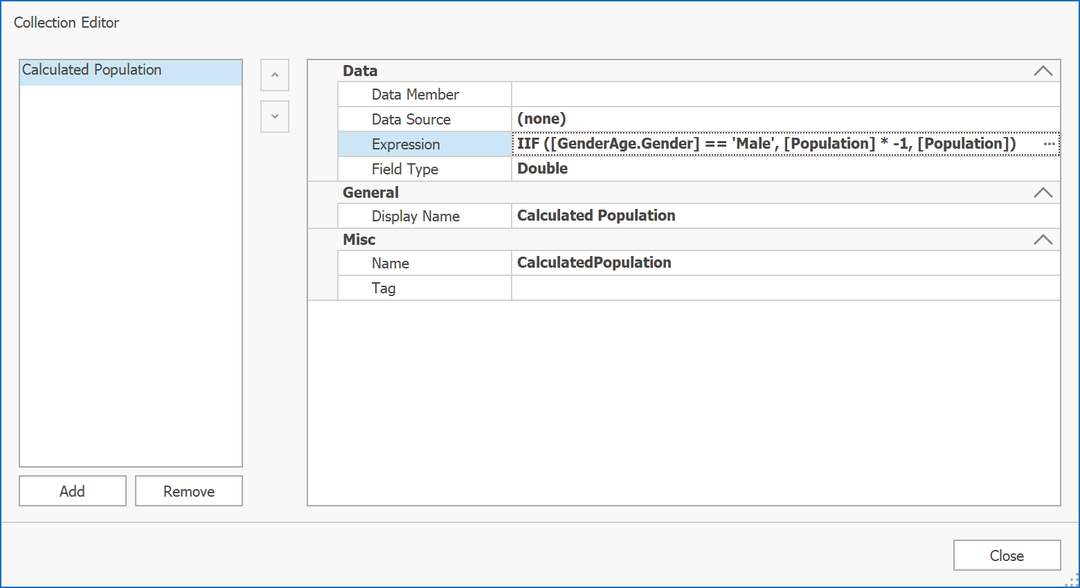
A quick example. We used a calculated field in our new Tornado Chart demo module to apply a negative sign to the Series point value. Note the expression definition below:

IIF ([GenderAge.Gender] == 'Male', [Population] * -1, [Population])

The result is that “Male” Stacked Bar Series points are displayed on the left, while Series labels still show original “Population” field values.

You can add calculated fields by entering the required expression manually or using our standard Expression Editor dialog.

For additional information, please refer to the following help topics: Calculated Fields (WinForms), Calculated Fields (ASP.NET), Calculated Fields (WPF).

If you’ve already installed our latest version (v20.1) on your machine, you can also try our corresponding demo modules: Tornado Chart (WinForms), Tornado Chart (WPF).

New Axis Side Margin

Another useful feature is related to axis side margins. As you may know, our Chart control already supports a Range.SideMarginsValue property. This property increases the space between outermost Series points and the diagram's edge by a specified margin value.

Based on the support traffic we found that in certain scenarios, developers need to specify side margin values separately. To address this requirement we enhanced v20.1’s Range class API with two new properties: StartSideMargin and EndSideMargin. Note that you can still use the Range.SideMarginsValue property to define start/end margins simultaneously.

You can also specify margins as a percentage of the axis range by setting the Range.SideMarginSizeUnit property to AxisRangePercentage. In this instance, actual margin size will be calculated relative to current axis range intervals. This will help those who need to allocate extra space in the chart’s diagram for display text or image annotations (see the screenshot below).

If Range.SideMarginSizeUnit is set to AxisUnit, our Chart control uses the current axis measurement unit when calculating actual margin size.

For additional information, please refer to the following help topics: StartSideMargin, EndSideMargin (WinForms), StartSideMargin, EndSideMargin (WPF).

Feedback

As always, we welcome your thoughts. Please comment below and let us know what you think of these new features.

DevExpress Universal v20.1 released

$
0
0

Without a doubt, this is a difficult time for all of us. If you or your business has been impacted by the pandemic, please contact us and let us know how we can help.

Even with the various Stay-At-Home rules, we’ve been working extra hard to provide you with new features and enhancements to our product line, and I am proud to announce the immediate availability of DevExpress Universal v20.1. This release includes our platform suites for WinForms, WPF, UWP, Xamarin, the assorted varieties of ASP.NET, as well as DevExtreme and Blazor. As is usual, however, the new version of our VCL Subscription will be released in a couple of weeks' time.

Packed with dozens of new products and features across all supported platforms – we’ve been extra diligent in publishing blog posts and videos about them all – our newest release delivers the capabilities you'll need to build compelling, high-impact desktop, web and mobile solutions. Get started today and create apps that fully address the needs of your enterprise regardless of computing device or platform.

For what’s new in this release — and there have been many enhancements and new features across the board — please go to this page. Of course, you can always navigate to devexpress.com/new and see what’s new in the latest version, whichever version number that happens to be.

As usual, we’ve listed the Resolved Issues introduced in this release. That page also enables you to review the changes we’ve made from any release to any other.

Unfortunately, for every major release, no matter how hard we try and minimize the impact, some new features and enhancements are bound to cause a few breaking changes. You can read about the v20.1 breaking changes here.

I pretty much say something like this with every major release: we would not be able to produce and release such robust and full-featured controls, features, and enhancements without the invaluable help of our customers. By publishing surveys, reviewing comments and support tickets, we find that we can more easily focus on providing what our customers want from our products going forward. Also, you may have noticed that we’ve been publishing relevant blog posts on what we are doing, posts detailing various tips and tricks, and posts on how we aim to move forward. My strong recommendation is to monitor our community site more than ever before.

I’d like to thank everyone who provided feedback on our products throughout this year, who used and tested the various v20.1 betas we've produced and provided information on the issues they found, and, of course, to all our customers who use our products every day in their applications. We are confident that the new controls, features, and enhancements in v20.1 will strengthen and validate your trust in our products. Thank you, it is much appreciated. And, again, please stay safe in these uncertain times.

DevExtreme Data Grid - New Excel Export API (RTM in v20.1)

$
0
0
We are days away from official launch of our next major update – v20.1
As you may know, our JavaScript Data Grid (for Angular, React, Vue and jQuery) will soon ship with a new Export to Excel API - A fully client-side data export programming interface based on the ExcelJS. This new API offers total control and allows you to customize exported data as needed.

What’s New
Let’s walk through a few usage scenarios you can no incorporate into any Angular, React, Vue or jQuery app:
  • Our new exportDataGrid API allows you to use the customizeCell callback and fully control value, display format and appearance of individual exported cells. Within this callback, you can access the original DataGrid Cell object to implement WYSIWYG or custom Excel Cell appearance.
  • The DevExtreme DataGrid can now export banded header cells and mirror original configuration.
  • ‘Alignment’ and ‘wrapText’ (for DataGrid source cells) are now applied to exported Excel cells. Group, Header, Group Footer, and Total Footer cells are exported using bold highlighting.
  • DataGrid cell format is now applied to exported Excel cells. You can specify a custom format when necessary.
  • You can now export DataGrid cell images into your Excel worksheet.
  • You can now enable built-in Excel column filters using the new autoFilterEnabled option.
  • A new status panel is automatically displayed until export operations are complete. Use the LoadPanel configuration option to customize the status panel.

Take a Tour

To demonstrate all these features in greater detail, we’ve created a video overview and posted it to our YouTube channel. Please feel free to share this link with your colleagues.
A couple of quick notes...
We expect to offer this new API for both our DevExtreme PivotGrid and TreeList components. Once we finalize development plans (based on answers to the survey question below), we’ll share them here.
As of this moment, we have not included support for Master-Detail export. Detail Rows are rendered via developer generated custom HTML templates. No generic solution currently exists for this usage scenario. 

Feedback

Your feedback is important. Please take a moment to answer the following question so we can fine-tune this feature going forward.

WPF Charting - Large Data Source Processing (v20.1 - CTP)

$
0
0

Introduction

Over the last year, we’ve improved our WPF Chart control’s rendering methods to address a series of customer requests. One of our top priorities was to retain built-in functionality and avoid major API changes so everyone could benefit from new features without major changes to application code.

As you may know, we introduced a new DirectX surface rendering mode last year (WPF Charting – New Rendering Mode (v19.1, experimental). Last Fall, we optimized Chart layout rendering speed for fast real-time updates (Real-time Charting (WPF) - Rendering performance enhancements (19.2). These enhancements allowed us to retain high FPS rates when visualizing up to 100K points.

Of course, another important aspect of data visualization is efficient memory management. Take an app that measures/tracks sensor data – in such usage scenarios, an app can easily be asked to track/visualize millions of input values. Regardless of rendering speed, improved memory management will be necessary to deliver optimum results in these scenarios.

Prior to this release, our WPF Chart control used a legacy data processing model wherein the amount of allocated RAM was driven by data source collection size. This certainly limited the efficiency of our Chart control against extremely large data sources.

This issue forced our hand and with v20.1, we’ve taken the necessary steps to address it.

New Data Processing Mode

v20.1 ships with a new data processing mode (AllowResample) – one that minimizes the Chart control’s memory footprint and keeps it constant. With this update, our WPF Chart control limits processing to current viewport data and uses a smart visualization (resampling) algorithm for faster rendering. Based on internal tests, this makes it possible to process up to 50 million points.

The new data processing mode supports DateTime and Numeric scales and sorted data source collections. You will find a complete list of supported Series types in the following help topic: Automatic Resampling.

Test Results

The following chart summarizes internal test results. We tested the following use cases:

  • Data load time
  • Memory consumption
  • Interactivity (zoom and scroll operations)

We used sample data sets ranging from one thousand to two million points (mapped to X-Axis).

All charts below except the second one use a millisecond Y-Axis scale.

Data Loading time

When the new data processing mode is activated (Blue Series), data load time increases at a moderate pace, whereas our previous data processing (Orange Series) engine demonstrates exponential growth.

Memory Consumption

The memory allocated by the Chart control’s new data processing mode (Blue Series) stays at relatively the same level throughout – regardless of input data collection size. As you can see, our old data processing engine allocates much more memory (Orange Series).

Interactivity – Zoom Operations

This graph displays UI thread delays during zoom operations in milliseconds (our test case includes five zoom operations).

Though the delay between our new (Blue Series) and old (Orange Series) data processing engine is minimal at fewer points, the old data processing mode causes more delays when using more than 300K points.

Interactivity – Scroll Operations

You can see that the new data processing mode (Blue Series) is slower than our old (Orange Series) engine. This occurs because the old data mode uses preprocessed (cached) data, while the new mode reads data as the viewport changes. We are currently working on a solution to address this and minimize the difference between old and new.

Feedback

AllowResample is not currently enabled by default. We are still working to fine-tune our new algorithms. We also need to increase Series compatibility and to deliver similar data processing capabilities for our WinForms Chart control.

If you have enabled this new option in an existing project and would like to provide feedback, feel free to comment below or contact us via the Support Center. We appreciate your continued support.

WPF - Designer Enhancements in .NET Core 3 (v20.1)

$
0
0

As you may know, Visual Studio 2019 16.3 includes a new XAML Designer for WPF .NET Core. We worked closely with the Visual Studio team to address as many issues as possible and to seamlessly integrate our v19.2 WPF .NET Core control set with the new designer.

In our upcoming release (v20.1), we continue to enhance the design-time experience for those targeting the WPF .NET Core platform.

To demonstrate Visual Studio integration and designer support, we recently published the following YouTube video.

Apply application themes from App.config to all designer previews

In our new release, the theme specified in App.config is automatically applied to all the designer previews.

Select non-visual elements (Data Grid columns, Toolbar and Ribbon items) (starting with VS 2019 16.5)

If you've installed Visual Studio 16.5 and our most recent update (v20.1) you can select non-visual elements (such as a data grid's column and toolbar/ribbon item) and quickly navigate to its markup as needed. You can also switch DXTabControl tabs at design time.

Documentation and Application Theme Smart Tags

You can now navigate to the relevant help topic via smart tags. We also added a field for application theme (for root XAML elements including ThemedWindow, standard Window, UserControl, etc).

Note, that the Available themes list is based on themes installed with our Nuget packages. If you install DevExpress.WindowsDesktop.Wpf.Themes.All (a package that contains all DevExpress Themes), you can select any themes from our WPF Theme collection.

Future Plans

As you know, Microsoft continues to evolve its XAML Designer and plans to use a new designer for WPF .NET Framework projects. We don't know when the new designer will replace the current designer, but its inevitable that Microsoft will make this change.

The new designer includes a Suggested Actions menu - a menu that works like our Smart Tags. We will support Suggested Actions within our WPF controls once the Visual Studio team give us the ability to extend this element.

DevExtreme Charts - Polar Chart Annotations (v20.1)

$
0
0

Early last year, we introduced annotation support to DevExtreme Charts. With our v20.1 release, we’ve extended annotation support to our Polar ChartYou can now apply text, image, or custom annotations as needed. Once you create aannotation, you caattach it to a Polar Chart element (such aa series point) or display it at specific coordinates. 

 
The new functionality described herein is available on all platforms supported by DevExtreme, including AngularVueReactjQuery and ASP.NET MVC and ASP.NET Core. 

Annotation Types

To display annotations in our Polar Chart, use the new ‘annotations‘ option (accepts an array of configuration objects that represent individual annotations)Each object includes ‘type‘  property.  Supported annotation types include ‘image’, ‘text’ and ‘custom’. Based upon the desired annotation type, your configuration object must specify ‘image‘, ‘text‘ or ‘template‘. 

The example below lists all supported annotation types: 

<dx-polar-chart> 
    …
    <dxi-annotation 
        image="https://sun.png " 
        type="image" 
        argument="July" 
        series="Day"> 
    </dxi-annotation> 
    <dxi-annotation 
        text="Custom text" 
        type="text" 
        [radius]="100" 
        [angle]="45"> 
    </dxi-annotation> 
    <dxi-annotation 
        template="template" 
        type="custom" 
        argument="October" 
        [value]="17"> 
    </dxi-annotation> 
    <svg *dxTemplate="let annotation of 'template'"> 
        <image attr.href="https://cloud.png" width="60" height="40" />  
        <text x="8" y="60" >and text</text>    
    </svg> 
</dx-polar-chart> 

The configuration above generates the following visualization:   


Annotation Position

You can attach aannotation to a Polar Chart UI element, or leave it unanchored aabsolute coordinates. Let’s review position-related options available to you:   

Unanchored Annotations

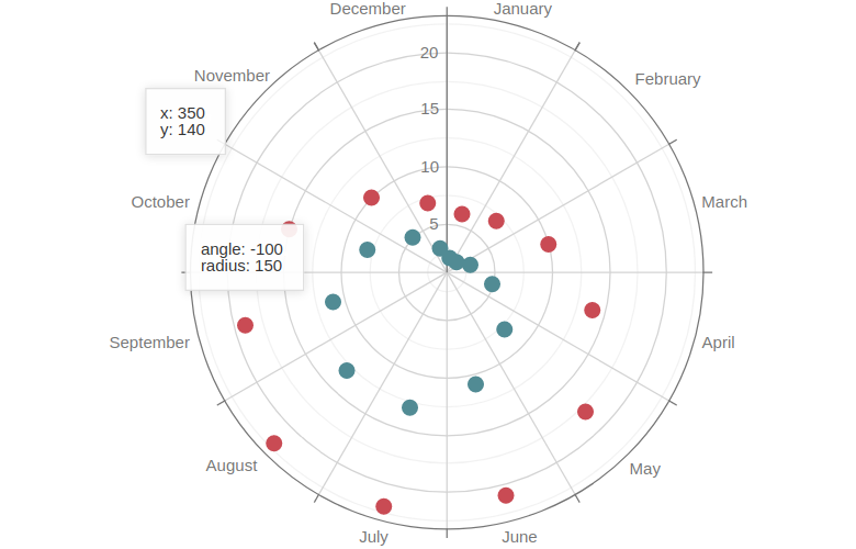
In the following example, annotations are not connected to any Polar Chart UI element. They use absolute coordinates. 

annotations: [{
    x: 350,
    y: 140
}, {
    angle: -100,
    radius: 150
}]

Annotation Anchored to an Argument

annotations: [{
    argument: "February",
    value: 7
}]

Annotation Anchored to a Series Point

annotations: [{
    argument: "March",
    series: "Series 1"
}]

Annotation Anchored to an Axis

annotations: [{
    argument: "May"
}, {
    value: 15
}]

Annotations with Mixed Anchoring

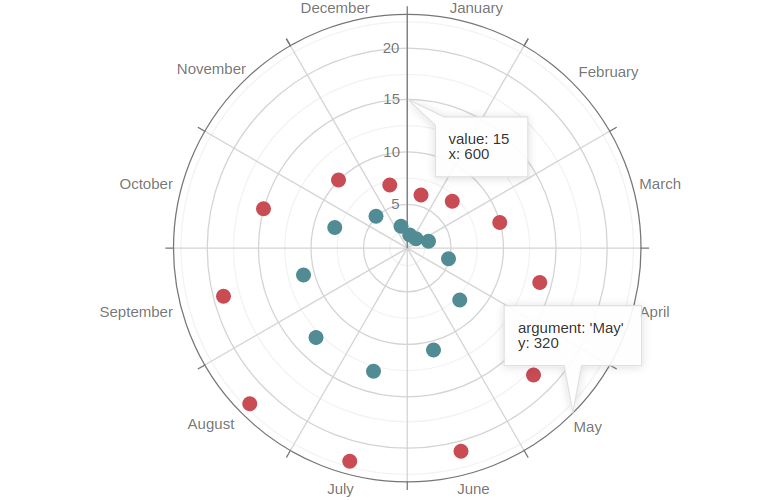
In this example pixel and chart coordinates are used simultaneously:

annotations: [{
    argument: "May",
    y: 320
}, {
    value: 15,
    x: 600
}]

Common Annotation Settings

To specify common options for all annotations, use the ‘commonAnnotationsSettings‘ option. The following code sample applies background and font color for all annotations on the Polar Chart (Angular markup is used): 

<dx-common-annotation-settings color="#5258c7"> 
    <dxo-font color="#ffffff"></dxo-font>
</dx-common-annotation-settings> 


Configuration Based on Individual Annotation Data Points

Our Polar Chart component allows you to customize individuaannotations via the ‘customizeAnnotation‘ callback function. This can help those who wish to obtain an annotation array from a remote data service. In the example belowwe specify a background color for the annotations that belong to the ‘ DayTemperature‘ series: 

<dx-polar-chart … 
    customizeAnnotation: "customizeAnnotation"> 
    <dxi-annotation ... 
        series="DayTemperature" 
        text="Custom text 1"> 
    </dxi-annotation> 
    <dxi-annotation ... 
        text="Custom text 2"> 
    </dxi-annotation> 
    <dxi-annotation ... 
        text="Custom text 3"> 
    </dxi-annotation> 
    <dxi-annotation … 
        series="DayTemperature" 
        text="Custom text 4"> 
    </dxi-annotation>
</dx-polar-chart>
// app.component.ts 
//... 
export class AppComponent {
    customizeAnnotation(item) {
        if (item.series === "DayTemperature") {
            item.color = "#5258c7";
            item.font = {
                color: "#ffffff"
            };
        }
        return item;
    }
}

To learn more about our new Polar Chart Annotations feature, please refer to the following documentation topics: annotationscommonAnnotationSettingscustomizeAnnotation. 

Feedback

Aalways, we welcome your feedback. Please comment below and let us know what you think. Alternatively, you can share your thoughts via the following discussion page: Polar Chart Annotations  


Reporting JsonDataSource - Parameters and Expression Bindings (v20.1)

$
0
0

Our next major update (v20.1) includes multiple enhancements to our JSON Data Source and its wizard. In this post, I’ll describe how you can use these new features for your next desktop (WinForms, WPF) or web app (ASP.NET, MVC, ASP.NET Core).

Data Source Parameters

The Json Data Source Wizard now offers a way to construct the request URI by using a path parameter. A path parameter appends a path element to a JSON endpoint’s Uri.

As you can see in the screenshot below, we redesigned the start wizard page for the Web Service Endpoint option. Once you select it, you can configure URI path parameters and query parameters simultaneously:

Json Data Source - Wizard

A query parameter specifies the HTTP request parameter that is passed to a JSON endpoint. Generally, these parameters are used to filter data:

Json Data Source Wizard - Query Parameters

Path parameters and query parameters are included in endpoint requests in the same order as they are added and listed. You can move a parameter up or down the list to change its position in endpoint requests.

We also added a Resulting URI read-only field at the bottom of this wizard page so you can view and validate the generated URI:

Json Data Source Wizard - Resulting URI

Expression Bindings and Report Parameters

You can enable the new parameter’s Expression property and use expressions to set path, query, and header parameter values. Once you’ve done this, select the Expression Editor from the Value property’s drop-down list and specify the expression in the Expression Editor:

Json Data Source Wizard - Expressions

All available JSON Data Source parameter types can now be bound to report parameters. Select new report parameter from the Value property’s drop-down list, configure the report parameter in the Add New Parameter dialog, and click OK.

Json Data Source Wizard - Parameter Bindings

We always recommend filtering a report’s data at the data source level to speed the document generation process and reduce application workload. Binding data source parameters to report parameters will give you and your users this ability while using JSON Data Source.

We also recorded a short tutorial demonstrating these features in action, so please visit our YouTube channel to see how it works.

You can download the video’s script using the following URL: JSON Data Source Wizard – Parameter Expressions Video Script.

As always, we welcome any feedback. Feel free to post comments below and let us know what we can do to extend this feature in the future.

WPF - What's New in Data Editors (v20.1)

$
0
0

We have introduced a bunch of small and useful enhancements in our Data Editor controls.

These enhancements include:

  • TrackBar: customizable tick labels and tooltips
  • DateNavigator: customizable visible range and customizable cell appearance
  • Date Editor: different icons for different dropdown UIs
  • Text Editors: improved text selection experience

For a complete list of all our new WPF-related features/products please visit: What's New page.

DevExtreme React Scheduler – UI Overview

$
0
0
Our Google-inspired React Scheduler for Material-UI continues to evolve - our most recent update includes two major new features: resources support and appointment grouping. Before we describe these two features (a separate post is coming), we thought it would be best to document the basics of our React Scheduler and its UI elements.

Since a “moving” picture is worth a thousand words, we published a video on our YouTube channel that describes the following:

  • Individual React Scheduler UI elements and appointment/event visualization options
  • Appointment/event editing via built-in UI elements
  • Recurring appointment/event editing via built-in UI elements
  • Drag & Drop support
  • Resources and appointment/event organization within a calendar
  • Appointment/event grouping by resources and dates


    You can download the video’s script using the following URL: UI Overview Video Script.

    As always, we welcome your thoughts. Please comment below and let us know what you think of our React Scheduler and its new features.

    WPF Data Grid and TreeList - Filter Panel Enhancements

    $
    0
    0

    The Filter Panel used by both our WPF Data Grid and TreeList ships with a redesigned UI. We’ve done our best to make the Filter Panel easier to read and more intuitive to use.

    If you’ve installed v20.1 on your machine, you can use this link to launch the Filter Panel Demo.

    To demonstrate the new Filter Panel, we recently published the following YouTube video.

    Video Script: WPF Grid and TreeList - Filter Panel Enhancements

    New UI

    The new Filter Panel groups filters by columns and display values as tokens. This allows you to remove unwanted column filters with ease.

    You can recall previously executed filters via our Recently Used Filters button.

    Enable the New Filter Panel

    We expect to enable our new Filter Panel by default in v20.2. To use this panel in v20.1:

    • For a specific Data Grid or TreeList, set the DataViewBase.UseLegacyFilterPanel property to false.

      <dxg:GridControl Name="grid" FilterString="[ShipCountry] = 'USA'">
          <dxg:GridControl.View>
              <dxg:TableView x:Name="view" UseLegacyFilterPanel="False">
      </dxg:GridControl>
    • For all Data Grids and TreeLists in your app, set the CompatibilitySettings.UseLegacyFilterPanel property to false.

    Feedback

    As always, we welcome your thoughts/opinions. Please post a comment below and let us know what you think about our updated Filter Panel.

    WPF Data Grid and TreeList - Automatic Best Fit

    $
    0
    0

    Our WPF Data Grid and TreeList v20.1 can now automatically and dynamically resize columns during scroll and edit operations.

    To demonstrate this feature, we recently published the following YouTube video.

    Video Script: WPF Data Grid and WPF TreeList v20.1 - Dynamic Column Resizing

    Enable Automatic Best Fit

    To activate this new WPF Grid and TreeList option, simply set the appropriate column's Width property to Auto.

    <dxg:GridControl.Columns>
        <dxg:GridColumn FieldName="FullName" Width="3*"/>
        <dxg:GridColumn FieldName="BirthDate" Width="2*"/>
        <dxg:GridColumn FieldName="JobTitle" Width="Auto" AllowResizing="False"/>
        <dxg:GridColumn FieldName="Phone" Width="2*"/>
    </dxg:GridControl.Columns>

    Best Fit During Source Change

    We also added a BestFitModeOnSourceChange option. This allows our WPF Data Grid or TreeList to calculate the optimal width for all columns when the ItemsSource changes.

    <dxg:GridControl Name="grid">
    	<dxg:GridControl.View>
    		<dxg:TableView Name="view" BestFitModeOnSourceChange="VisibleRows"/>
    	</dxg:GridControl.View>
    </dxg:GridControl>

    Feedback

    As always, we welcome your thoughts/opinions. Please post a comment below and let us know what you think about Automatic Best Fit.

    WPF - Tips & Tricks (May 2020)

    $
    0
    0

    We’ve compiled a list of interesting support questions submitted to us last month. We hope this information will be of value for those using our WPF product line. Should you have any questions, feel free to comment below.

    WPF Data Grid

    WPF Bars

    WPF Charting and Maps

    WPF Docking

    WPF Gantt Control

    WPF Scheduler

    Other Products


    If you’ve come across a WPF-related support ticket you’d like to share with the rest of the DevExpress community, feel free to share the link in the comments section.

    DevExtreme Charts – Custom Axes Position (v20.1)

    $
    0
    0

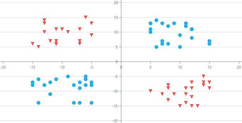
    DevExtreme Charts (v20.1) ships with enhancements to axes positioning logic. You can now locate axes at any position on a chart (not just its edge) and specify intersection point coordinates. For instance, this new feature allows you to create quadrant charts or display axes at a fixed position during scroll and zoom operations.

    Custom Intersection Point

    Normally, you use the ‘position’ property to specify the edge against which an axis must be rendered (left and bottom edges by default). In this instance, axes intersect in visible range corners. The visible range depends on data points and scroll/zoom coordinates.
    In certain instances, you may want to stick an axis to a specific value at its orthogonal axis. To implement this requirement, you can use the new customPosition property of the ‘argumentAxis’ and ‘valueAxis’ configuration objects. In the example below, axes are fixed at the 0 point of one another.
    argumentAxis: {
        customPosition: 0 // value at valueAxis 
    },
    valueAxis: {
        customPosition: 0 // value at argumentAxis 
    }

    Axes Offset

    For certain usage scenarios, you may need to display axes at a fixed position independent of current zoom level and scroll position. You can use the new offset option to specify axes coordinates in pixels relative to their original intersection point. In the example below, the axes always intersect at the center of the chart’s visible range:

    argumentAxis: {
        offset: -200 // a half of visible range height 
    },
    valueAxis: { 
        offset: 390 // a half of visible range width 
    }

    Multiple Axes Support

    If your chart includes multiple value axes, you can use the customPositionAxis option to set the name of related value axis. You can use it as follows:

    argumentAxis: {
        customPosition: -10,
        customPositionAxis: "leftAxis"
    },
    valueAxis: [{
        position: "right"
    },{
        position: "left",
        name: "leftAxis"
    }]

    Please refer to our new Custom Axis Position demo to explore these new options in greater detail.

    Feedback

    Please share your thoughts on this new feature in the comments below. We’ll be happy to follow-up.


    eXpressApp Framework - Tips & Tricks (May 2020)

    $
    0
    0
    Here are XAF-related tips & tricks for this month. If you have a support ticket you'd like to share with the XAF developer community, feel free to post a link in the comment section below.

    Interesting Support Tickets

    New and Updated KB Articles

    Documentation Updates

    Asynchronous Data Loading (CTP)

    GridListEditor in Client DataAccessMode and DetailView can now load data asynchronously in XPO-based apps. The UI continues responding to user actions as data is being retrieved. The following new topics describe how to enable this feature and customize it in your application:

    Non-Persistent Object Enhancements

    NonPersistentObjectSpace now tracks changes for non-persistent objects and supports filter and sort operations in List Views. Also, a parent NonPersistentObjectSpace reloads and disposes of its inner Object Spaces. You can find more information in this help topic and new GitHub examples:

    Action Permissions (CTP)

    The Security System allows users to prohibit execution of both custom and XAF system Actions in WinForms and ASP.NET applications. For more information, read our help topic or watch the following video.

    Office File API & Office-Inspired Desktop UI Controls – Tips & Tricks (May 2020)

    $
    0
    0

    Here is this month’s edition of our tips & tricks for our Office File API and Office-inspired UI controls. We hope you find these support tickets interesting and of business value. Should you have any questions, feel free to comment below.

    Tips & Tricks

    Enhancements

    If you’ve come across an interesting support ticket you’d like to share with the rest of the DevExpress developer community, please comment below and include the link. Thank you for your continued support.

    CodeRush Automatic Updates and Visual Studio

    $
    0
    0

    CodeRush - Automatic Updates

    From time to time customers have reached out to Support Center asking why their older copy of CodeRush has unexpectedly switched to trial mode. This blog post explains how this can happen, and also shows you how to change your settings (and revert to an earlier licensed version of CodeRush) so it doesn't happen again.

    What's Going On?

    When you purchase a СodeRush subscription, it includes one full year of free updates. СodeRush updates ship every month, and the latest version of СodeRush is always available in Visual Studio Marketplace.
    When a new CodeRush version appears in Visual Studio Marketplace, by default, Visual Studio automatically updates the extension to the latest release. This happens because CodeRush uses a built-in Visual Studio Marketplace mechanism for automatic updates, which is enabled by default in Visual Studio for all extensions. The automatic update feature provides customers with quick and easy access to new CodeRush features and bug fixes.
    If you use the automatic update functionality for more than a year, and if you let your subscription expire, and if automatic updates are enabled, then Visual Studio will download the latest (not yet licensed) version of CodeRush.
    When that happens, you'll likely see a dialog that looks like this:

    Visual Studio updates across license boundaries without asking because it does not know about the CodeRush licensing mechanism. It is simply keeping Visual Studio extensions up-to-date because that's what the settings dictate.

    One easy fix: simply renew your CodeRush license.

    It is also possible to revert to an earlier release (and turn off automatic updates).

    Reverting to an Earlier CodeRush Release

    Steps to revert to an earlier CodeRush release:

    1. Uninstall the latest CodeRush version (through the “Extensions | Manage Extensions…” dialog). 
    2.  Restart Visual Studio.
    3.  Open the “Tools | Options…” menu to launch the Visual Studio’s Options dialog.
    4. Go to the “Environment Extensions” options page and clear the “Automatically update extensions” checkbox:
    5. Close Visual Studio and run the CodeRush installer (for example, v19.2) to install the licensed CodeRush version. You can download the required installer through our Download Manager:
    • Go to the “Download Manager” (https://www.devexpress.com/ClientCenter/DownloadManager/)
    • Expand the “CodeRush Ultimate Subscription” item.
    • In the “Select Version” dropdown list, choose the older version you have already licensed (e.g., “v19.2.x”):

    • Click the “.vsix” or “.exe” link near the “CodeRush” entry below to download the installer.
    After you install CodeRush, you can activate the “global” “Automatically update extensions” option (on the “Environment Extensions” options page) to automatically install updates for all the other Visual Studio’s extensions you have, and then clear the “Automatically update this extension” checkbox for only the CodeRush item in the “Manage Extensions” dialog.

    Note: Visual Studio resets this option after installing an update for the extension. So, if you manually install a minor update (for example, updating from v19.2.7 to v19.2.8), be sure to clear this checkbox again after installing.

    WPF Gantt - Resources (v20.1)

    $
    0
    0

    As you may already know, our WPF Gantt control (v20.1) allows you to assign resources to individual tasks as needed. Resources can be anything needed to successfully complete an actual task (from individuals and employees to physical equipment and assets).

    To help demonstrate this feature, we recently published the following YouTube video.

    Video Script: WPF Gantt - Resource Allocation

    To learn more, please explore our Startup Plan demo. If you are reading this post on a machine that includes our most recent WPF distribution (v20.1x), please follow this link to start the demo.

    Resource Binding

    Use the ResourcesSource property to bind the WPF Gantt control to a collection of resources.

    <dxgn:GanttControl ItemsSource="{Binding Items}">
        <dxgn:GanttControl.Columns>
            <dxgn:GanttColumn BindTo="Name"/>
            <dxgn:GanttColumn BindTo="StartDate"/>
            <dxgn:GanttColumn BindTo="FinishDate"/>
        </dxgn:GanttControl.Columns>
        <dxgn:GanttControl.View>
            <dxgn:GanttView ResourcesSource="{Binding Resources}" ... />
        </dxgn:GanttControl.View>
    </dxgn:GanttControl>
    
    public class StartupBusinessPlanViewModel {
        public List<GanttTask> Items { get; private set; }
        public List<GanttResource> Resources { get; private set; }
        // ...
    
        public StartupBusinessPlanViewModel() {
            this.Items = CreateData();
            this.Resources = CreateResources();
            // ...
        }
    
        List<GanttTask> CreateData() {
            var tasks = new List<GanttTask>();
            // ...
            tasks.Add(new GanttTask { Id = 53, 
                ParentId = 48, 
                Name = "Describe strengths, weaknesses, assets and threats", 
                StartDate = new DateTime(2019, 1, 9, 13, 0, 0), 
                FinishDate = new DateTime(2019, 1, 10, 12, 0, 0), 
            });
            tasks.Add(new GanttTask { Id = 54, 
                ParentId = 48, 
                Name = "Estimate sales volume during startup period", 
                StartDate = new DateTime(2019, 1, 10, 13, 0, 0), 
                FinishDate = new DateTime(2019, 1, 11, 12, 0, 0),
            });
            // ...
            return tasks;
        }
        List<GanttResource> CreateResources() {
            var resources = new List<GanttResource>();
            resources.Add(new GanttResource { Name = "Business Advisor", Id = 1 });
            resources.Add(new GanttResource { Name = "Peers", Id = 2 });
            resources.Add(new GanttResource { Name = "Lawyer", Id = 3 });
            resources.Add(new GanttResource { Name = "Government Agency", Id = 4 });
            resources.Add(new GanttResource { Name = "Manager", Id = 5 });
            resources.Add(new GanttResource { Name = "Owners", Id = 6 });
            resources.Add(new GanttResource { Name = "Accountant", Id = 7 });
            resources.Add(new GanttResource { Name = "Banker", Id = 8 });
            resources.Add(new GanttResource { Name = "Information Services", Id = 9 });
            return resources;
        }
    }

    The code example above uses built-in data classes available in our MVVM library, but you can link our WPF Gantt control to your custom resource classes as well.

    Retrieve Resource Dependencies

    Once you bind the WPF Gantt control to resources, assign these resources to tasks. Your data source can store resource dependencies in the following ways:

    • in a separate collection, wherein each element contains a task-resource pair.
    • in task objects that contain information about their resources.

    Retrieve Resource Dependencies Stored in a Separate Collection

    Collection items should contain task and resource fields.

    
    public class GanttResourceLink {
        public object TaskId { get; set; }
        public object ResourceId { get; set; }
    }

    Bind the ResourceLinksSource property to a collection of resource dependencies (exposed by the ResourceLinks ViewModel property in the code sample below).

    <dxgn:GanttControl ItemsSource="{Binding Tasks}">
        <dxgn:GanttControl.View>
            <dxgn:GanttView ...
                            ResourcesSource="{Binding Resources}"
                            ResourceLinksSource="{Binding ResourceLinks}">
            </dxgn:GanttView>
        </dxgn:GanttControl.View>
    </dxgn:GanttControl>

    Retrieve Resource Dependencies Stored in the Task Object

    Collection items should contain a resource field.

    
    public class GanttResourceLink {
    	public object ResourceId { get; set; }
    }

    A task object should provide access to a collection of task resources.

    public class GanttTask {
        public object Id { get; set; }
    	public object ParentId { get; set; }
    	public string Name { get; set; }
    	public DateTime? StartDate { get; set; }
    	public DateTime? FinishDate { get; set; }
    	public ObservableCollection<GanttResourceLink> ResourceLinks { get; set; }
    	// ...
    }

    Assign a path to resource dependency data field to the GanttView.ResourceLinksPath property (exposed by the ResourceLinks task property in the code sample below).

    <dxgn:GanttControl ItemsSource="{Binding Tasks}">
        <dxgn:GanttControl.View>
            <dxgn:GanttView ...
                            ResourcesSource="{Binding Resources}"
                            ResourceLinksPath="ResourceLinks">
            </dxgn:GanttView>
        </dxgn:GanttControl.View>
    </dxgn:GanttControl>

    Feedback

    We hope this blog post was helpful. As always, we welcome your thoughts/feedback. Please post a comment below and let us know what you think about the Resource implementation in our WPF Gantt control.

    WPF Diagram Enhancement - A New Text Tool (v20.1)

    $
    0
    0

    The v20.1 release brings an addition to the set of tools available in our Visio-inspired Diagram control. The new Text tool allows you to add a text label or an annotation to your diagram in just two clicks.

    You can also use the Text tool to edit the text content of an existing shape or container.

    You can select the Text tool in the DiagramControl’s ribbon. The Font ribbon section allows you to change the text settings – select the font, size, color, style, and so on. A text label with empty text is automatically deleted to avoid clutter.

    To showcase the Text tool in action, we have published a brief YouTube video.

    If you are reading this post on a machine that includes our most recent WPF distribution (v20.1x), you can follow this link
    to start the Diagram control demo.

    Viewing all 2400 articles
    Browse latest View live