Quantcast
Channel: Developer Express Inc.
Viewing all 2399 articles
Browse latest View live

WinForms - How to Allow Users to Skip Messages

$
0
0

It’s an unbelievably difficult time – we do hope everyone is doing well and making the best out of present circumstances. If we can be of help, please don’t hesitate to reach out (clientservices@devexpress.com). A big shout-out to all the brilliant scientists throughout the world focused on a vaccine/cure...Thank you for your hard work.


Each time our team implements a new feature, we do our best to describe its capabilities. In our zeal to document popular controls such as our WinForms Data Grid, we often fail to articulate the power and flexibility of the utility controls included in our WinForms Subscription.

Message Boxes are a perfect example of high-value utility controls within our WinForms product portfolio. Since most applications communicate with users via message boxes, I thought it’s time we described our WinForms Message Box controls in greater detail and show you what we have in store in our upcoming release (v20.1).

DevExpress XtraMessageBox objects are counterparts to default WinForms messages. At first glance, the primary advantage of XtraMessageBox lies in its ability to use DevExpress application skins. Though this is an important advantage (after all, who wants to display standard gray-ish messages within a fully themed WinForms application), it is by no means the only strength of XtraMessageBox.

While you can display a message using a standard approach (pass text strings and a button set into a static XtraMessageBox.Show() method overload), you can also create an XtraMessageBoxArgs object and pass it as the only Show method parameter. As you might expect, this object allows you to incorporate additional behavior. For example, you can display messages that automatically close when an embedded timer expires.

XtraMessageBoxArgs args = new XtraMessageBoxArgs();
args.AutoCloseOptions.Delay = 5000;
args.Caption = "Auto-close message";
args.Text = "This message closes automatically after 5 seconds.";
args.Buttons = new DialogResult[] { DialogResult.OK, DialogResult.Cancel };
//show a countdown on a default button
args.AutoCloseOptions.ShowTimerOnDefaultButton = true;
XtraMessageBox.Show(args);

The XtraMessageBoxArgs.Showing event allows you to access and modify a message form before it is displayed on-screen. You can use this for all sorts of things. For instance, to limit message width...

XtraMessageBoxArgs args = new XtraMessageBoxArgs();
args.Caption = "A very long message";
args.Text = "A message box attempts to show all of its text content in one line. " +
    "If you do not limit the form size, this message will be very long and thin. " +
    "Set the maximum form width and the form will wrap this long text.";
args.Buttons = new DialogResult[] { DialogResult.OK, DialogResult.Cancel};
args.Showing += Args_Showing;
XtraMessageBox.Show(args);

private void Args_Showing(object sender, XtraMessageShowingArgs e)
{
    e.Form.MaximumSize = new Size(600, 600);
}

...or customize message buttons (change captions or supply them with vector images).

XtraMessageBoxArgs args = new XtraMessageBoxArgs();
args.Caption = "A message with icons";
args.Text = "This message displays custom SVG images in its buttons";
args.Buttons = new DialogResult[] {
    DialogResult.OK, DialogResult.Cancel, DialogResult.Retry };
args.Showing += Args_Showing;
XtraMessageBox.Show(args);

void Args_Showing(object sender, XtraMessageShowingArgs e) {
    foreach (var control in e.Form.Controls)
    {
        SimpleButton button = control as SimpleButton;
        if (button != null)
        {
            button.ImageOptions.SvgImageSize = new Size(16, 16);
            button.ImageOptions.ImageToTextAlignment = ImageAlignToText.LeftCenter;
            //button.Height = 25;
            switch (button.DialogResult)
            {
                case (DialogResult.OK):
                    button.ImageOptions.SvgImage = svgImageCollection1[0];
                    break;
                case (DialogResult.Cancel):
                    button.ImageOptions.SvgImage = svgImageCollection1[1];
                    break;
                case (DialogResult.Retry):
                    button.ImageOptions.SvgImage = svgImageCollection1[2];
                    break;
            }
        }
    }
}

With v20.1, you will be able to easily include a "Do not show this message again" checkbox into your messages. If you’d like to incorporate this capability in your project, simply set the Boolean XtraMessageBoxArgs.DoNotShowAgainCheckBoxVisible property to true. And yes, the checkbox text is also customizable.

XtraMessageBoxArgs args = new XtraMessageBoxArgs();
args.Caption = "Message";
args.Text = "You are using a trial version. The trial period expires in 30 days";
args.DoNotShowAgainCheckBoxVisible = true;
args.DoNotShowAgainCheckBoxText = "Do not remind me again";
XtraMessageBox.Show(args);

This checkbox does not do anything itself. When the message appears on-screen (or is dismissed), it raises Load and Closed events. You need to handle these events to store and retrieve e.Visible property value. This property value specifies whether a user chose to suppress the message. If Load event arguments receive false for the e.Visible property value, the message is canceled.

args.Load += Args_Load;
args.Closed += Args_Closed;

void Args_Closed(object sender, XtraMessageBoxClosedArgs e) {
    //save e.Visible to a database or a local storage file
}

void Args_Load(object sender, XtraMessageBoxLoadArgs e) {
    //retireve the value from a database or a local storage file
    e.Visible = value;
}

Along with e.Visible, you can also store the e.DialogResult property value. It corresponds to the last known DialogResult used when the message was closed. If a message was suppressed, you can use this value so that the Show method returns the last user choice instead of DialogResult.None.

void Args_Load(object sender, XtraMessageBoxLoadArgs e) {
    e.Visible = _restoredVisibleValue_;
    if (!e.Visible)
    {
        //restore the e.DialogResult property
        e.DialogResult = _restoredDialogResultValue_;
    }
}

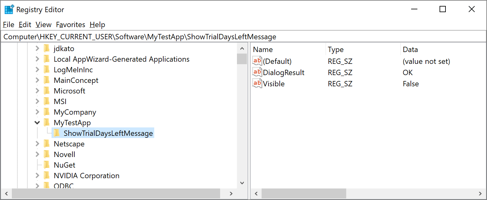
For those who do not want to manually save and restore these parameters, we give you the option to store them in the registry. To that, call the SaveToRegistry method on the Closed event, and RestoreFromRegistry on Load.

void Args_Closed(object sender, XtraMessageBoxClosedArgs e) {
    e.SaveToRegistry();
}

void Args_Load(object sender, XtraMessageBoxLoadArgs e) {
    e.RestoreFromRegistry();
}

This code saves DialogResult and Visible keys under the Computer\HKEY_CURRENT_USER\Software\X\Y path, where:

  • X - value of the XtraMessageBox.RegistryPath property, or Path.Combine(Application.CompanyName, Application.ProductName, "Messages") if the property is not set;
  • Y - value of the XtraMessageBoxArgs.RegistryKey property, or an automatically generated ID.

Last but not least, you can forcibly display a message even when a user has chosen to hide it. To do that, call the e.ShowMessage method in the Load event handler. The boolean method parameter specifies whether the "Do not show again" checkbox should be checked.

XtraMessageBoxArgs args;
int trialDaysLeft;
//...
args = new XtraMessageBoxArgs();
args.Caption = "Message";
args.Text = "You are using a trial version. The trial period expires in " +
    trialDaysLeft.ToString() + " days.";
args.DoNotShowAgainCheckBoxVisible = true;
args.RegistryPath = "MyTestApp";
args.RegistryKey = "ShowTrialDaysLeftMessage";
args.Load += Args_Load;
args.Closed += Args_Closed;

void Args_Closed(object sender, XtraMessageBoxClosedArgs e) {
    e.SaveToRegistry();
}

void Args_Load(object sender, XtraMessageBoxLoadArgs e) {
    e.RestoreFromRegistry();
    if (!e.Visible && trialDaysLeft < 3) {
        e.MessageBoxArgs.Text =
            "Your trial expires in " + trialDaysLeft.ToString() + " day(s)!";
        e.MessageBoxArgs.DoNotShowAgainCheckBoxVisible = false;
        e.ShowMessage(false);
    }
}

XAF - Blazor Demo Update with User Authentication and Permission Management

$
0
0

We hope everyone is safe and in good health. These are certainly challenging times – but we can get through it together.

We updated our Blazor Demo to help demonstrate our newest enhancements. Please feel free to test the new features online and share your feedback in the comments section below. 

Security System

In this iteration, we focused our efforts on user authentication and group authorization features (UI). As we all know, it’s quite important for XAF developers and end-users to configure users, roles and data access rights at runtime. Our update includes the following: 

  • Users can log in and log off;
  • Records inaccessible through permissions are hidden;
  • Record fields inaccessible through permissions are displayed as 'Protected Content'; 
  • Users can edit permissions using appropriate editors.

Since Blazor Components do not have specialized editors for certain scenarios, we used the following temporary solutions: 

  • Criteria properties use a multi-line text editor with syntax validation; 
  • The combo box for Navigation Permissions displays a plain list instead of a hierarchy.

Miscellaneous Enhancements

  • Incremental filtering in lookup editors;
  • Clearer expand/collapse icons in the navigation menu;
  • StaticImage view item;
  • An additional dark Bootswatch theme is now available - Superhero;
  • The following known issues have been resolved:
    • Items are now correctly aligned in popup Detail Views;
    • Date editors with a value of 1/1/0001 have empty text and show the current date in the calendar.

What's Next?

We'll polish these features and hope to publish the next update in April. We have not added data input validation support (only error notifications are shown for broken rules) nor have we added a compact theme - we will work on this after the our v20.1 release (around May). For more information on our plans for Blazor UI, see eXpressApp Framework - 2020 Roadmap.

WinForms - Tips & Tricks, March 2020

$
0
0

It’s an unbelievably difficult time – we do hope everyone is doing well and making the best out of present circumstances. If we can be of help, please don’t hesitate to reach out (clientservices@devexpress.com).


In this post, I’ll share some interesting WinForms-related customer questions we received over the last few months. Hopefully they will be of value as you build your next WinForms project.

Reporting - Tips & Tricks (March 2020)

$
0
0

Here is this month’s edition of tips & tricks for DevExpress Reports. We hope this information will be of value as you explore and leverage the capabilities of our royalty-free reporting libraries.

Interesting Tickets

Reporting – Multiple Supported Platforms (WinForms, WPF, ASP.NET, .NET Core)

WinForms Reporting

WPF Reporting

Web Reporting

Report & Dashboard Server

Documentation Updates

ASP.NET WebForms, MVC and Core - Tips & Tricks (February - March 2020)

$
0
0

In this post, we’ll summarize a few interesting ASP.NET examples, articles and support tickets we’ve compiled over the last two months. We hope this information is of value as you explore the capabilities of our ASP.NET product line.

Knowledge Base Articles

We published an article on our ASP.NET Scheduler’s XML helpers and a troubleshooting guide for ASP.NET controls that include file upload functionality:

New Examples

We recently published examples for our ASP.NET MVC Diagram control on GitHub.

Interesting Technical Support Tickets

Common

ASP.NET Web Forms

ASP.NET WebForms for Bootstrap

ASP.NET MVC

Documentation Updates

We published multiple help topics for those using our Rich Text Edit Control for ASP.NET Core:

Client-side API contains all Rich Text Edit members available on the client.

Document Managementdescribes available API to create, open, save, download, and print (it also includes other document management operations available to you when using our Rich Text Edit control). 

Feedback

As always, we welcome your comments and feedback. If you’ve come across a useful Support Center ticket, feel free to share it with the DevExpress developer community here.

React Scheduler for Google Material Design

$
0
0

As you may already know, DevExtreme ships with a native React Scheduler component – one that seamlessly integrates with Material-UI.

If you’ve yet to explore the capabilities of our React Scheduler, please take a moment to visit our new React-specific Product website.

New Website, Documentation and Live Demos

Our new React-powered website includes detailed product descriptions, extensive documentation and various samples that help demonstrate product features/usage scenarios.

Among the most compelling items on the new website is our CodeSandbox button. This boots up a development experience at CodeSandbox for the code of the example under review. CodeSandbox also loads all necessary libraries and assets into the environment so you can start experimenting immediately.

Native React

Our React Scheduler is a native reactive component and it leverages all things React.

The component implements various reactive concepts like Controlled and Uncontrolled modes, Redux integration, Live updates and reactive properties. Because of its seamless integration with Material-UI, the component looks much like Google Calendar (which is also built according to the Material Design Style guide).

Though a highly advanced UI control - we’ve tried to keep things straightforward with our highly flexible customization features.

Appointment Editing UI

Our React Scheduler provides multiple ways to add, edit and delete appointments. Based on plugins you configure, the Scheduler can open a form and allow users to edit every single detail of an appointment, including resources and recurrence patterns.

To quickly modify event time, you can drag appointments within a schedule and resize appointments to adjust event duration. You can also enable a delete action inside the tooltip.

Appointment Resources UI

A very popular use case for a Scheduler component is resource management (employees, equipment, etc).

As you might expect, our React Scheduler fully supports resource display within its container. Event resources are displayed using different colors (we use Google Material Design Colors by default). You can easily customize resource colors via the component’s API. You can even use Material-UI colors colors as needed. Resource information will be displayed in the appointment form as well as the tooltip.

Grouping UI

Another powerful feature is the ability to group appointments. This is useful when dealing with lots of appointments and resources.

When using our Scheduler’s grouping UI, the component will group appointments by resource and date, providing vertical and horizontal groups.

Tooltip UI

The Scheduler can include a tooltip with additional information about individual appointments. This feature was inspired by Google Calendar and does not require additional code.

To help address a broad range of usage scenarios, our React Scheduler gives you several ways to customize tooltips.

View Switching UI

To help you build the best possible user experience, our Scheduler makes it easy to switch between the following calendar views:

  • Day View
  • Week View
  • Workweek View (from Week View)
  • Month View
  • Timeline View (coming soon - track its progress)

Date Navigation UI

Our Scheduler component ships with a date navigator – one that allows you and your users to view a different time frame based upon the currently selected View. The Today button navigates you to the current date. This feature includes built-in calendar and shortcut buttons.

Light, Dark and Custom Material Design Themes

All DevExtreme reactive controls ship with 2 Material Design themes - Light and Dark. Of course, you can always create your own themes should requirements dictate.

Additional Features

In addition to the features outlined above, our React Scheduler is able to visualize different appointment types including:

  • All Day
  • Recurring
  • Zero-time (reminders without duration)

Our Current Time Indicator is a small visual element for current time.

And yes, the component supports Typescript and can be easily localized.

Let us know what you think

Please feel free to comment below, or follow this link to our GitHub repository. Your feedback is always appreciated.

Important Changes to the DevExpress.Data and Other Assemblies for .NET Core 3, .NET Standard, .NET Framework Apps (v20.1)

$
0
0

The New DevExpress.Data.Desktop Library with Platform-Specific Functionality

  1. DevExpress.Data assemblies for .NET Core 3 (WinForms & WPF) and .NET Framework apps have been split into the following:
  • DevExpress.Data.Desktop for NET Core 3 (WinForms & WPF) and .NET Framework apps
  • DevExpress.Data for .NET Standard.
  • Certain DevExpress.Data-based cross-platform libraries for .NET Core 3 (WinForms & WPF) have been replaced with corresponding .NET Standard versions (for instance, DevExpress.Xpo.v20.1.dll). Associated functionality is now either cross-platform or moved to platform-dependent assembly versions.
  • Certain .NET Standard assembly versions have been removed. These assemblies are now available only for .NET Core 3 (WinForms & WPF) and .NET Framework (for instance, DevExpress.XtraScheduler.v20.1.Core.dll).
  • Why This Was Done and How Will It Affect You

    These changes were done for easier maintenance, clearer dependencies, and future code extension for .NET Core apps and corresponding NuGet packages. These changes also help simplify common development tasks such as sharing Class Libraries with DevExpress.Data or DevExpress.Xpo dependencies across different Target Frameworks (learn more). We received lots of feedback from early .NET Core 3 adopters interested in these scenarios.

    These changes will not affect the majority of users, as our Project Converter tool will automatically add DevExpress.Data.Desktop and other required assembly references to individual projects. This change may affect your application if you are building a complex framework that relies on full assembly or type names.

    For more information on affected assemblies and product-specific breaking changes, please see the following:

    Your Feedback Matters

    As always, we welcome your feedback. We’d love to know more about your .NET Core 3 experiences and whether you expect to port an existing WinForms and/or WPF app over the next six months? 

    WinForms - Upcoming v20.1 API Changes

    $
    0
    0

    This blog post contains breaking change information that may impact those using two undocumented methods in our WinForms Data Editors namespace. We apologize in advance for this change.

    With our v20.1 release, DoFormatEditValue and DoParseEditValue (in the XtraEditors namespace) will no longer be virtual and can no longer be overridden. Both methods were undocumented and never intended for direct use. Unfortunately, we did demonstrate use of these virtual methods in our own code examples (E1491 and E2482) – and suspect that some of our users may have relied upon this incorrect technical guidance.

    We have updated both technical examples. If you’re using this API in your app, we ask that you make equivalent changes in your code should you decide to upgrade to v20.1.

    Previous implementation

    protected override ConvertEditValueEventArgs DoFormatEditValue(object val)
    protected override ConvertEditValueEventArgs DoParseEditValue(object val)

    Current implementation

    protected override object DoFormatEditValue(object val, out bool handled)
    protected override object DoParseEditValue(object val, out bool handled)

    Note that we do not recommend that you override these new methods. Please use RaiseFormatEditValue and RaiseParseEditValue instead. These methods raise corresponding editor events and are unlikely to be changed again.

    //version 19.2 and older
    protected override ConvertEditValueEventArgs DoFormatEditValue(object val) {
        ConvertEditValueEventArgs result = base.DoFormatEditValue(val);
        result.Value = MyFormatEditValue(result.Value);
        result.Handled = true;
        return result;
    }
     
    protected override ConvertEditValueEventArgs DoParseEditValue(object val) {
        ConvertEditValueEventArgs result = base.DoParseEditValue(val);
        result.Value = MyParseEditValue(result.Value);
        result.Handled = true;
        return result;
    }
    
    //version 20.1 and newer
    protected override void RaiseFormatEditValue(ConvertEditValueEventArgs e) {
        base.RaiseFormatEditValue(e);D
        e.Value = MyFormatEditValue(e.Value);
        e.Handled = true;
    }
     
    protected override void RaiseParseEditValue(ConvertEditValueEventArgs e) {
        base.RaiseParseEditValue(e);
        e.Value = MyParseEditValue(e.Value);
        e.Handled = true;
    }
    //Version 19.2 and older
    protected override ConvertEditValueEventArgs DoFormatEditValue(object val) {
        if(val is int) {
            switch((int)val) {
                case 0: return new ConvertEditValueEventArgs("zero");
                case 1: return new ConvertEditValueEventArgs("one");
                case 2: return new ConvertEditValueEventArgs("two");
                case 3: return new ConvertEditValueEventArgs("three");
            }    
        }
        return base.DoFormatEditValue(val);
    }
    protected override ConvertEditValueEventArgs DoParseEditValue(object val) {
        if(val is string) {
            switch((string)val) {
                case "zero": return new ConvertEditValueEventArgs(0);
                case "one": return new ConvertEditValueEventArgs(1);
                case "two": return new ConvertEditValueEventArgs(2);
                case "three": return new ConvertEditValueEventArgs(3);
            }
        }
        return base.DoParseEditValue(val);
    }
    
    //Version 20.1 and newer
    protected override void RaiseFormatEditValue(ConvertEditValueEventArgs e) {
        base.RaiseFormatEditValue(e);
        if(e.Value is int) {
            e.Handled = true;
            switch((int)e.Value) {
                case 0: e.Value = "zero"; break;
                case 1: e.Value = "one"; break;
                case 2: e.Value = "two"; break;
                case 3: e.Value = "three"; break;                            
            }
        }            
    }
    
    protected override void RaiseParseEditValue(ConvertEditValueEventArgs e) {
        base.RaiseParseEditValue(e);
        if(e.Value is string) {
            e.Handled = true;
            switch((string)e.Value) {
                case "zero": e.Value = 0; break;
                case "one": e.Value = 1; break;
                case "two": e.Value = 2; break;
                case "three": e.Value = 3; break;
            }
        }
    }

    And since we’re discussing a breaking change, I'd be remiss if I did not mention two more things you should considering as you begin use of v20.1. As you may know, we’ve made our DevExpress.Data assembly platform-independent in this release cycle. This generated two changes that were announced in the following BCs:

    For custom implementations of the IRangeControlClient, , you will need to manually replace System.Windows.Forms.Orientation type with DevExpress.XtraEditors.RangeControlClientOrientation.

    For the Scheduler Control, replace all occurrences of System.Windows.Forms.KeyEventArgs and System.Windows.Forms.MouseEventArgs types with their appropriate counterparts: DevExpress.Portable.Input.PortableKeyEventArgs and DevExpress.Portable.Input.PortableMouseEventArgs.

    // Version 19.2 and earlier
    public class MyKeyboardHandlerService : KeyboardHandlerServiceWrapper {
        public override void OnKeyDown(KeyEventArgs e) {
            ...
        }
    }
     
    public class MyMouseHandlerService : MouseHandlerServiceWrapper {
        public override void OnMouseWheel(MouseEventArgs e) {
            ...
        }
    }
     
    // Version 20.1 and newer
     
    public class MyKeyboardHandlerService : KeyboardHandlerServiceWrapper {    
        public override void OnKeyDown(PortableKeyEventArgs e) {
            ...
        }        
    }
    
    public class MyMouseHandlerService : MouseHandlerServiceWrapper {
        public override void OnMouseWheel(PortableMouseEventArgs e) {
            ...
        }
    }

    Should you have any questions about this post, please submit a support ticket via the DevExpress Support Center.


    XPO - Automate Database Schema Migrations using the ORM Data Model Designer or APIs (CTP)

    $
    0
    0
    We’ve got some good news for the majority of XPO and XAF users! With v20.1, you can incrementally update your database schema once changes are made to an XPO data model. You can generate diffs (the SQL script) between the latest data model and the existing database schema in the ORM Data Model Designer or in code. Database schema migration is available as a community technology preview (CTP) in this release cycle. As always, we welcome your feedback. 

    How it Works

    In the Data Model Designer, right-click the design surface and select the Generate Migration Script menu item. The designer will add a new file with SQL commands and open it in Visual Studio.

    If you create XPO classes manually, the following example demonstrates how to generate a schema migration script and update your database programmatically: How to Use the Database Schema Migrations API.

    Supported Databases and Limitations

    • At present, the following data store providers support this feature: MSSqlConnectionProvider, MySqlConnectionProvider, OracleConnectionProvider, ODPConnectionProvider, ODPManagedConnectionProvider, PostgreSqlConnectionProvider.
    • The Database Schema Migration API may change prior to official release. Interfaces and method names are subject to change in the final release.
    • The Data Model Designer cannot generate a schema migration script if your Data Model contains classes imported from external assemblies. For instance, in XAF applications, the Base Class property can reference built-in business classes shipped with eXpressApp Framework (XAF). This scenario is not supported in our CTP version. You can still use API methods to generate a migration script in XAF apps.
    • The Data Model Designer does not allow you to specify custom schema migration options. 
    • If you rename a class or property, the schema migration script will delete the corresponding table or column and create a new one. 
    • The Data Model Designer cannot generate a database update script if the Data Model contains classes mapped to database views.

    WinForms Data Grid - Kanban Board Enhancements (v20.1)

    $
    0
    0

    The next major release of our WinForms product suite – due out in early May 2020 – is set to ship with a number of important Kanban Board related features. These include:

    • AutoHeight support for any tile/card template row. Allows you to proportionally grow (shrink) tile/card size based on content.
    • Empty child tiles/cards. Use the new TileViewOptionsKanban.Groups collection to generate groups that remain visible even when they have no child tiles/cards.
    • Extended button support. Each Tile Group can now display a footer button and multiple header buttons as needed.
    • Background color support. You can now color-code your Kanban Board with custom group background colors.

    To demonstrate all these features in greater detail, we’ve created a video overview and posted it to our YouTube channel. Please feel free to share this link with your colleagues.

    You can download the video’s script using the following URL: Kanban Boards Video Script

    As always, we welcome your thoughts. Please comment below and let us know what you think of this new feature.

    Reporting - Merge PDF Documents into Your Report (v20.1)

    $
    0
    0

    Consider the following use case: Your company needs to issue an invoice and include tech specifications for each product listed within the invoice. The tech specifications are stored as PDF files.

    If you’ve used DevExpress Reports in the past, you know that a solution exists to address this use case. With the help of our Office File API, you can merge multiple PDF files together with your report. Unfortunately, this solution does not allow you to display a preview of the merged document prior to printing/export. 

    With our newest release (v20.1), we’ve addressed this limitation and eliminated the need to use our Office File API to merge PDF documents with your report. By using our new XRPdfContent report control, you embed PDF documents alongside your report and preview the complete report within our Document Viewer.

    Quick note: If you’d like to merge RTF and DOCX files, use our XRRichText report control instead (XRRichText has been available for numerous years).

    We’ve prepared the following video tutorial to help demonstrate XRPdfContent’s capabilities. You can download the video script here .

    In the rest of this post, I’ll describe a few things you should consider when using XRPdfContent.

    Primary Features 

    Design-Time

    As you might expect, XRPdfContent is available in the Report Designer toolbox by default. Once dropped onto a report’s surface, XRPdfContent spans the entire width of the live report area – from the left to the right side of your document’s margins. The control cannot be resized (remember that we are merging a PDF file at the end of the report, not embedding it within the report itself).

    Report Designer - PDF Content Control Drag and Drop

    This implementation mirrors merge operations when using subreports. The following diagram illustrates the merge logic behind XRPdfContent.  

    Pdf Content Control - How it works

    The control exposes two properties: Source and SourceUrl. Both properties can be bound to a data source field or expression. You can load a PDF file using the Source property. When specified, PDF content will be stored within your report definition and serialized together with a report’s layout. The SourceUrl property allows you to specify a path to a local file or a URL: 

    Report Designer - PDF Content Control

    To load PDF content, you can specify either of these properties, or you can simply drop a PDF file onto the report’s design surface.

    Runtime Experience

    XRPdfContent includes the following runtime characteristics and limitations:  

    • The page generation engine always surrounds PDF content with page breaks. This means that PDF content always starts with a new page and report document continues printing on a new page (after PDF content). 

    • PDF content is displayed as an image in Print Preview (text selection is unavailable). If you’d like to enable text selection, simply export the report to PDF.

    • When using a Linux-based environment or Azure hosting, you can only programmatically export a report to PDF. Previewing reports and exporting to other formats is not yet supported.

    Your Feedback Counts 

    We expect to refine the capabilities of XRPdfContent in future updates. Please share your thoughts/comments below and tell us how you’d like us to improve DevExpress Reports in our next release cycle.

    WinForms Data Grid - Summaries by Selection (v20.1)

    $
    0
    0

    As you may already know, our WinForms Grid will soon ship with summary computation support against selected records (v20.1). Said differently, our Grid will allow you to calculate summary values against selected rows, rather than the entire data set.

    To enable this feature, set the GridSummaryItem.Mode property to either Selection or Mixed. We recommend that you use Mixed mode as it is the jack of all trades - when only a single row is selected (or none selected), our summary computation algorithm works like before and calculates value for all data records. Select two or more rows - and the summary automatically switches to selection-based computation.

    For an in-depth discussion of this new feature, please visit our YouTube channel and launch our "Summaries by Selection" video.

    You can download the video’s script using the following URL: Summary Computation for Selected Rows

    As always, we welcome your thoughts. Please comment below and let us know what you think of this new feature.

    WinForms Data Grid and Tree List - Hovered Row Appearance

    $
    0
    0

    Our next major update (v20.1 – set for release in early May 2020) will include a number of major enhancements to our WinForms product line - among them support for hot-track (mouse hover) row highlighting for both the DevExpress WinForms Data Grid and Tree List controls.

    To enable this feature, set the DataGrid.OptionsSelection.EnableAppearanceHotTrackedRow or TreeList.OptionsSelection.EnableAppearanceHotTrackedRow property to DefaultBoolean.True. Hover appearance automatically adapts to your active application skin (or vector skin palette).

    If needed, you can create custom hover colors via the control's Appearance section. We recommend that you only do this if you plan to use one skin that users will be unable to change. Otherwise, your custom appearance may look severely off-tone with active theme colors.

    To demonstrate all these features in greater detail, we’ve created a video overview and posted it to our YouTube channel. Please feel free to share this link with your colleagues.

    You can download a PDF script for the video from this URL: Hot Track Row Highlighting

    As always, we welcome any feedback that you have to share. Feel free to post comments down below, or contact us via private Support Center tickets.

    Reporting - Localization (v20.1)

    $
    0
    0

    As you may already know, our upcoming release (v20.1) includes built-in support for report content localization. You and your users can now quickly translate reports in both desktop and web applications and transfer culture-related settings with your report layout. New Localization related features include:

    • Reports localization support for the DevExpress End-User Report Designer across all supported platforms.

    • Reports localization support within our Visual Studio Report Designer.

    • Built-in Localization Editor to help you populate our new XtraReport.LocalizationItems collection. This collection stores localized strings and other culture-related settings. It is always serialized alongside your report layout.

    • Our End-User Report Designers can use a culture specified in a report’s internal Language property and ignore an application’s regional settings when generating a report’s print preview. This allows users to validate report rendering as if it was localized.

    • Use the XtraReport.ApplyLocalization method to change a report’s language at runtime. You can create a report parameter to help manage language settings - as illustrated in the following image

    New Parameter Dialog

    Now, handle the XtraReport.BeforePrint event to call the XtraReport.ApplyLocalization method and pass the parameter value to it:

    private void XtraReport_BeforePrint(object sender, System.Drawing.Printing.PrintEventArgs e) { 
                    ApplyLocalization(language.Value.ToString());         
    } 
    

    Once complete, your users will be able to switch parameters and view localized reports within the document viewer:

    Change Language In Print Preview

    I’ll stop here and encourage you to visit our YouTube channel to learn more about our new Localization Editor.

    You can download the video’s script using the following URL: Report Localization Video Script.

    As always, we welcome your thoughts. Please comment below and let us know what you think of this new feature.

    Spreadsheet Document API - An Old Excel Format and the Covid-19 Pandemic

    $
    0
    0

    We recently had a private support ticket submitted to us – it included the following in BOLD.

    NOTE: We are a medical device manufacturer and helping companies delivering medical products to hospitals affected by COVID-19. Your urgent help is really appreciated.

    Use Case

    A couple of weeks ago, a customer wrote to us with a problem. They were using our .NET Spreadsheet Document API to transfer data from an XLS file to a database. The XLS file contained data that was exported from a legacy FoxPro application. Needless to say, the app itself could not be upgraded to support newer versions of XLS.

    Problem

    The FoxPro app in question generated Excel 2 Worksheets binary files (Microsoft Excel 2.0 released in 1987). As you can probably imagine, our Spreadsheet Document API does not support this format as it’s frankly not used by any of our customers (or so we thought).

    Our Solution

    Once we were made aware of the need – and given the pressures facing medical device manufacturers today – we decided to add support for Excel 2.

    An Excel 2 Worksheets (or BIFF2) stores data for a single worksheet as separate binary records. Each record has a header and an optional block of data (which includes numeric values, text, formulas, etc.).

    To support this format, we had to:

    1. Detect the BIFF2 format when loading a document. To do this, our Spreadsheet Document API analyzes the first record header of the incoming binary file stream.
    2. Determine the types of records to support. We ultimately chose to import nine types of data records: BOF, EOF, BLANK, INTEGER, NUMBER, LABEL, BOOLERR, FORMULA, and STRING.
    3. Test our solution. We ran tests against the user’s file and actual documents generated by Microsoft Excel to ensure files were imported correctly.

    With these three steps complete, we released a hotfix for the customer. The good news was this - our solution addressed their problem.

    Current Progress and Limitations

    We’ve since enhanced our implementation and the Spreadsheet Document API can now import the following Excel 2 features/settings:

    • Cell values (numeric, string, Boolean, and errors)
    • Formulas
    • Row heights and column widths
    • Cell, row, and column formatting
    • Selection
    • Comments
    • Frozen panes
    • Headers and footers, page margins, and page breaks
    • Protection options
    • Calculation options and the 1904 date system support
    • Defined names (including Print_Area)
    • Files with XOR obfuscation

    The following document elements are not supported:

    • External references
    • Some built-in defined names (for instance, Print_Titles)
    • Chart sheets and macro sheets

    Please remember, if you and your company are on the frontlines of this horrible pandemic, do let us know. We’ll do what we can to support your efforts.

    Thank you to everyone fighting to save lives across the globe.


    WPF Data Grid - Virtual Source Enhancements

    $
    0
    0

    The DevExpress WPF Data Grid v20.1 ships with important enhancements to virtual data source support.

    To demonstrate data editing related enhancements, we recently published the following YouTube video.

    You can download the PDF script for the video from this URL: WPF Data Grid - Virtual Data Source Editing

    Data Editing

    Your users can now edit data at the row level. They should modify row values and press Update to post changes to the underlying data source.

    To enable data editing:

    1. Set the AllowEditing property to true for editable columns. 
    2. Enable Edit Entire Row mode. 
    3. Handle the ValidateRow event and save the changes to your underlying data source (database). To save changes asynchronously, set the e.UpdateRowResult property to a task that saves changes.
    <dxg:GridControl x:Name="grid">
        <dxg:GridControl.Columns>
            <dxg:GridColumn FieldName="Subject" IsSmart="True" AllowEditing="true"/>
            <dxg:GridColumn FieldName="User" IsSmart="True" AllowEditing="true"/>
            <dxg:GridColumn FieldName="Created" IsSmart="True" AllowEditing="true"/>
            <dxg:GridColumn FieldName="Votes" IsSmart="True" AllowEditing="true"/>
            <dxg:GridColumn FieldName="Priority" IsSmart="True" AllowEditing="true"/>
        </dxg:GridControl.Columns>
        <dxg:GridControl.View>
            <dxg:TableView ValidateRow="TableView_ValidateRow" 
                           ShowUpdateRowButtons="OnCellValueChange" />
        </dxg:GridControl.View>
    </dxg:GridControl>
    private void TableView_ValidateRow(object sender, GridRowValidationEventArgs e) {
        e.UpdateRowResult = Task.Run(() => {
            IssuesService.UpdateRow(e.Row as IssueData);
        });
    } 

    To learn more, please explore our Enable Editing demo. If you are reading this post on a machine that includes our most recent WPF distribution (v20.1x), please follow this link to start the demo.

    Partial Reload

    If you used virtual sources in the past, you know that they include full row reload support. You can call the RefreshRows method or press F5 at runtime to execute a reload.

    With v20.1, we extended the capabilities of this operation. You can now reload a subset of grid data instead.

    Call the ReloadRows method with an array of key values that identify the rows you want to reload. ReloadRows raises the FetchRows event wherein you can process passed keys.

    The following code reloads selected rows.

    private void Button_Click(object sender, RoutedEventArgs e) {
        int[] selectedRowIds = 
        	grid.SelectedItems.Cast<IssueData>().Select(x => x.Id).ToArray();
        ((InfiniteAsyncSource)(grid.ItemsSource)).ReloadRows(selectedRowIds);
    }
    
    static async Task<FetchRowsResult> FetchRowsAsync(FetchRowsAsyncEventArgs e) {
        if(e.Keys != null) {
            var reloadedIssues = 
            	await IssuesService.GetIssuesById(e.Keys.Cast<int>().ToArray());
            return new FetchRowsResult(reloadedIssues);
        }
        // ...
    }

    Retain Selected Row and Scroll Position after Refresh

    Our WPF Data Grid now retains selected row and scroll position information after refresh. Use the Take property in the FetchRows event handler to obtain row count within and above the viewport. Pass this number to your data source to return rows to a result set.

    static async Task<FetchRowsResult> FetchRowsAsync(FetchRowsAsyncEventArgs e) {
        var take = e.Take ?? 30;
        var issues = await IssuesService.GetIssuesAsync(
            skip: e.Skip,
            take: take);
        return new FetchRowsResult(issues, hasMoreRows: issues.Length == take);
    }

    Custom Summaries

    Virtual sources now allow you to process custom summaries and display them within the WPF Data Grid.

    To display summaries, handle the GetTotalSummaries event. In the event handler, obtain summaries from the data source and process the e.Summaries property to return summary information to the Data Grid.

    static async Task<object[]> GetTotalSummariesAsync(GetSummariesAsyncEventArgs e) {
        IssueFilter filter = MakeIssueFilter(e.Filter);
        var summaryValues = await IssuesService.GetSummariesAsync(filter);
        return e.Summaries.Select(x => {
            if(x.SummaryType == SummaryType.Count)
                return (object)summaryValues.Count;
            if(x.SummaryType == SummaryType.Max && x.PropertyName == "Created")
                return summaryValues.LastCreated;
    
            // Custom Summaries
            if(x.SummaryType == SummaryType.Custom && x.PropertyName == "Votes") {
                var tag = x.Tag as string;
                if(tag == "Median")
                    return summaryValues.VotesMedian;
                if(tag == "StdDev")
                    return summaryValues.VotesStdDev;
            }
            throw new InvalidOperationException();
        }).ToArray();
    }

    Specify the TotalSummary property to display summaries in the Data Grid.

    <dxg:GridControl.TotalSummary>
        <dxg:GridSummaryItem SummaryType="Count" Alignment="Right"/>
        <dxg:GridSummaryItem SummaryType="Max" FieldName="Created" 
                             DisplayFormat="{}Last created: {0}" Alignment="Right"/>
        <!-- Custom Summaries -->
        <dxg:GridSummaryItem SummaryType="Custom" Tag="StdDev" FieldName="Votes" 
                             DisplayFormat="{}Votes StdDev={0}" Alignment="Right"/>
        <dxg:GridSummaryItem SummaryType="Custom" Tag="Median" FieldName="Votes" 
                             DisplayFormat="{}Votes Median={0}" Alignment="Right"/>
    </dxg:GridControl.TotalSummary> 

    As always, we welcome any feedback. Feel free to post comments below, or contact us via the DevExpress Support Center.

    Word Processing API - Footnotes and Endnotes (v20.1)

    $
    0
    0

    As you may already know, the DevExpress Word Processing API and Rich Text Editor (WinForms and WPF) can now process footnotes and endnotes. Documents with footnotes/endnotes can also be printed and exported to PDF.


    The new Note API allows you to execute the following actions:

    • Manage existing footnotes/endnotes
    • Create new footnotes/endnotes
    • Edit footnote/endnote separators
    • Change footnote/endnote appearance

    Manage Existing Notes

    You can access existing footnotes/endnotes, edit content and delete them when necessary.

    The following code sample edits a footnote:

    static void EditFootNote(RichEditDocumentServer wordProcessor)
    {
        wordProcessor.LoadDocument("Documents//Grimm.docx");
        Document document = wordProcessor.Document;
    
        //Access the first footnote:
        SubDocument footnote = document.Footnotes[0].BeginUpdate();
    
        //Exclude the reference mark and the space after it 
        //from the edit range:
        DocumentRange footnoteTextRange = 
        footnote.CreateRange(footnote.Range.Start.ToInt() + 2, footnote.Range.Length
            - 2);
    
        //Clear the range:
        footnote.Delete(footnoteTextRange);
    
        //Append new text:
        footnote.AppendText("the text is removed");
    
        //Finalize the update:
        document.Footnotes[0].EndUpdate(footnote);
    }

    Create New Notes

    You can create new footnotes/endnotes with a regular or custom reference mark.

    static void InsertEndnotes(RichEditDocumentServer wordProcessor)
    {
        wordProcessor.LoadDocument("Document.docx");
        Document document = wordProcessor.Document;
    
        //Insert an endnote at the end of the last paragraph:
        DocumentPosition endnotePosition = 
        document.CreatePosition(document.Paragraphs[document.Paragraphs.Count - 1].Range.End.ToInt() - 1);
        document.Endnotes.Insert(endnotePosition);
    
        //Insert an endnote at the end of 
        //the second to last paragraph with a custom mark:
        DocumentPosition endnoteWithCustomMarkPosition = 
        document.CreatePosition(document.Paragraphs[document.Paragraphs.Count - 2].Range.End.ToInt() - 2);
        document.Endnotes.Insert(endnoteWithCustomMarkPosition, "\u002a");
    }

    Edit Note Separators

    You can access and edit footnote and endnote separators. Our word processing components support the following separator types:

    • Separator - separates footnotes/endnotes from the main text.
    • Continuation Separator - separates the main text from footnotes/endnotes that continue from the previous page.
    • Continuation Notice - indicates that the footnote/endnote continues on the next page.

    The following code clears the footnote separator:

    static void EditSeparator(RichEditDocumentServer wordProcessor)
    {
        wordProcessor.LoadDocument("Document.docx");
        Document document = wordProcessor.Document;
    
        //Check whether the footnotes already have a separator:
        if (document.Footnotes.HasSeparator(NoteSeparatorType.Separator))
        {
            //Initiate the update session:
            SubDocument noteSeparator = 
            document.Footnotes.BeginUpdateSeparator(NoteSeparatorType.Separator);
    
            //Clear the separator range:
            noteSeparator.Delete(noteSeparator.Range);       
    
            //Finalize the update:
            document.Footnotes.EndUpdateSeparator(noteSeparator);
        }
    }

    Change Note Appearance

    You can change note location on a page and reference mark format.

    using (RichEditDocumentServer wordProcessor = new RichEditDocumentServer())
    {
        wordProcessor.LoadDocument("Document.docx");
        Document document = wordProcessor.Document;
        
        //Show endnotes at the end of each section:
        document.EndnotePosition = EndnotePosition.EndOfSection;
    
        foreach (Section section in document.Sections)
        {
             //Change footnote reference format:
            EndnoteOptions endnoteOptions = section.EndnoteOptions;
            endnoteOptions.NumberingFormat = NumberingFormat.CardinalText;
            endnoteOptions.StartNumber = 3;
    
            //Change endnote reference format and display it below text:
            FootnoteOptions footnoteOptions = section.FootnoteOptions;
            footnoteOptions.NumberingFormat = NumberingFormat.UpperRoman;
            footnoteOptions.StartNumber = 5;
            footnoteOptions.Position = FootnotePosition.BelowText;
        }
    }

     Complete code sample projects are available on GitHub:

    Limitations

    Our current footnote/endnote implementation ships with the following limitations:

    • No user interface elements to insert and remove notes. This is on our ToDo list and we are working hard to deliver it in our upcoming release cycle.
    • Notes split across multiple columns are displayed in a single column.

    WPF - Visual Studio 2019 Themes and New Default Theme

    $
    0
    0

    With the Visual Studio 2019, Microsoft has refreshed its application appearance. The DevExpress v20.1 WPF Controls will help you to replicate this appearance in your applications.

    New Visual Studio 2019 Themes

    The following release adds three new Visual Studio 2019-inspired themes to our WPF Theme collection:

    • Blue
    • Dark
    • Light

    Combined with our powerful Docking suite and ThemedWindow that can display Toolbars in its header, new themes provide modern Visual Studio inspired UI:

    Office 2019 Themes

    Follow this link to see the new Visual Studio 2019 themes in action (you need an installation of DXperience v20.1 Beta with demos on your machine):

    Visual Studio Docking

    New Default DevExpress Theme

    DevExpress WPF Controls now use the Office 2019 Colorful theme by default.

    Office 2019 Themes

    Compared to the previous default theme (Office2016White), Office2019Colorful includes the following advantages:

    • Lightweight templates for Toolbar and Ribbon items.
    • Easily customizable color palettes.
    • Seven built-in color presets.
    • Reworked templates with better support for appearance properties.
    • Templates for WPF PasswordBox, Menu, and ContextMenu controls (starting with v20.1).

    To avoid breaking changes in existing projects, the Project Converter tool will apply the Office 2016 White theme to all projects that did not specify a theme. Please refer to the following article for more information on the migration process:

    T856665 - The default theme has been changed to "Office 2019 Colorful"

    As always, we welcome any feedback. Feel free to post comments below, or contact us via the DevExpress Support Center.

    Reporting - How to Use the Microsoft Azure Translator Text API to Localize Your Reports (v20.1)

    $
    0
    0

    In this post I’ll continue with a v20.1 topic I covered earlier – Reporting - Localization (v20.1). If you’ve not had the chance to read my previous blog post, you may want to review it before you proceed with this post. Alternatively, you can watch our YouTube Report Localization video for the same background info on new Localization-related features.

    As the title of this blog posts suggests, I want to briefly explore report translation via Microsoft Azure Translator Text API - and point you to technical resources so you can automatically translate report strings/resources when using the DevExpress Web Report Designer.

    Before I get into it, a quick word about Report Localization and why we chose Microsoft Azure Translator Text API. The answer is simple – we have a long-standing business relationship with Microsoft and we like Microsoft’s implementation. Countless other translation services exist, so you can apply our logic and incorporate your own should you wish.

    Translating Text within the Web Report Designer

    When a custom translation service is registered in the application, our Localization Editor displays a button next to the Language drop-down. The Web Report Designer collects all text strings displayed in the Localization Editor and sends a request to a translation service once a user clicks this button. This action translates all text strings to the selected language simultaneously:

    Localization Editor - Translation Button

    We’ve created an introductory video tutorial and a sample GitHub project to document implementation details. You can find the complete source code and a detailed technical tutorial in the following repository: How to Use the Microsoft Azure Translator Text API in Report Localization.

    You can download the YouTube video script here: How to Use Azure Text Translator API to Localize Reports Video Script .

    Hope you enjoy the video.

    Your Feedback Counts

    We want to hear from you. Share your thoughts below and tell us your thoughts on automated text translation within our WinForms and WPF Report designers.

    WinForms - MVVM Enhancements (v20.1)

    $
    0
    0

    In recent months, we've noticed a spike in customer questions regarding our WinForms MVVM Framework. This increase in demand could not come at a better time as we’ve been hard at work updating demos and documentation. First things first though – I want to mention WinForms MVVM Framework-related changes we expect to ship in v20.1.

    New Services

    MVVM pattern suggests that you keep data management code separated from the UI - inside ViewModels that are independent from Views. This recommendation means that if you need to open a View as a tab, or close a currently open dialog, or do anything else on a View layer - the ViewModel code that executes these actions should be kept independent from a View. In other words, the "open a new tab" command should not refer to a View control instance. Instead, the application should be able to automatically locate an appropriate UI element that fits the action (for instance, a Document Manager component that displays tabs).

    DevExpress MVVM Framework allows you to implement this logic with the help of Services. All you need to do is register the appropriate Service, and call its public methods in a ViewModel. The Framework will automatically find an appropriate View control and "translate" Service methods into specific control commands.

    With v20.1, we've extended our existing Service collection with three additional Services:

    • WindowService - allows you to open Views as separate XtraForms, RibbonForms or Flyouts.
    • CurrentWindowService - allows you to manage windows (forms) from the ViewModel layer. The Service provides methods to change the form's window state or close any active window.
    • CurrentDialogService - use this Service to manage open dialogs. Allows you to close a dialog with a specific DialogResult.

    To learn more about our WinForms MVVM Services, please refer to the following help topic: Services.

    New Tutorial Demo Module

    We understand that MVVM can be challenging for those unfamiliar with its underlying concepts. To simplify the learning curve, we've added a "Simple ToDo Application" module to our "MVVM Best Practices" demo. This module demonstrates uses a sample app to demonstrate basic MVVM concepts, such as data binding and ViewModel communications. The "Walkthrough" demo breaks the process down into "bite-sized" steps. Each step is supplied with a description and related code, so you can easily track how empty forms turn into Views, data management code becomes ViewModel classes, and separate layers communicate with one another.

    You can also download both C# and Visual Basic versions of this sample app from the Simple TODO Application repository on GitHub.

    Documentation Enhancements

    In addition to the new walkthrough demo module, we've begun to update our other learning resource. Previous versions focused on a thorough description of what's possible. With v20.1, we’ve shifted focus to clarity and brevity. Our Data Bindings help section now outlines the difference between "regular" and "data" bindings, and demonstrates the best way to implement both. Each binding technique is followed by a demo example. We’ve also overhauled our API Samples section to fit this new pattern.

    "Data Bindings" is the first completely reworked section. We expect to update other sections as time allows.

    As we work to perfect things, we’d love to get feedback from those currently using MVVM or considering it in a future WinForms project. Let us know if the changes outlined above are of value to your business.

    Viewing all 2399 articles
    Browse latest View live