Quantcast
Channel: Developer Express Inc.
Viewing all 2400 articles
Browse latest View live

WinForms - Tips & Tricks, May 2020

$
0
0

This month’s Tips & Tricks post includes a few examples and ways you can tweak our WinForms UI components. We hope this information will be of value as you explore the capabilities of our WinForms product line.

How to Distinguish Light from Dark Skins in Code

Vector icon colors can be adjusted based upon the theme applied to a DevExpress powered WinForms app (assuming you generate vector icons based on DevExpress guidelines - see How To: Draw and Use SVG Images). If you prefer raster icons, you may want to manually implement similar behaviors. In the simplest scenario, you will need two image sets: darker images that contrast well with light skins, and vice versa. Place your images in separate Image Collections, and swap them when users change a skin. To identify whether a dark or light skin is active, call the FrameHelper.IsDarkSkin method.

using DevExpress.Utils.Frames;
//...
if (FrameHelper.IsDarkSkin(this.GetActiveLookAndFeel())) {
    //current skin/palette is dark
}
else {
    //current skin/palette is light
}

For vector skins, this method also takes the active palette into consideration. Consider our Bezier skin – for the default palette the IsDarkSkin method returns "true,” but if a user applies a light palette (for instance, "Aquarelle"), the method returns "false." Please comment below if you deal with similar tasks in your applications, and would like to have a related public API instead of the IsDarkSkin method that we use internally in our code.

Overlay Forms as Stop Screens

In v18.1 we introduced Overlay Forms - splash screens that lock the UI thread and do not allow users to interact with underlying forms. Normally, splash screens help indicate on-going operations. Overlay Forms are different in that they use custom painters to fully redraw splash screens (and even show images that behave as buttons).

You can utilize Overlay Forms to restrict user access to specific application screens. In the animation below, our Navigation Frame includes four pages. The last page is accessible only to users with a "Premium Subscription." By using a combination of custom text painter and two image painters, you can allow users without a subscription to activate this tab - and instantly "obfuscate" it with a transparent screen that includes an upgrade offer.

Of course, you can simply handle the NavigationFrame.SelectedPageChanging event to cancel user navigation when a user does not have access permission. But as you can see, Overlay Forms can help add a unique touch and help you better communicate with end-users.

Bind Data Grid Columns to Nested Properties

If you’ve used our WinForms Data Grid in the past, you may be familiar with the GridColumn.FieldName. If you create columns in code, this property must be set to a name of a data source field. Implementation details for this property are straightforward if your data class is a flat list of properties. In real-life cases, data source classes often include properties that store objects from other custom classes. In the code sample below, each "Employee" record includes an "Occupation" field with two nested properties: "Department" and "Position.”.

public class Employee {
    public string FirstName { get; set; }
    public string LastName { get; set; }
    public Occupation Occupation { get; set; }
}

public class Occupation {
    public DepartmentEnum Department { get; set; }
    public string Position { get; set; }
}

public enum DepartmentEnum {
    RnD = 1,
    Support = 2,
    Design = 3,
    TW = 4,
    Management = 5
}

To generate a standard (non master-detail) Grid and display "Employee" entities, you need to add four columns and set correct FieldName properties. For the first two columns it's simple: FieldNames are "FirstName" and "LastName". However, it may be less obvious (especially for novice DevExpress users) that the two other columns can be set just as easily. Specify these columns in the same way you'd access properties in code - type a parent property name, the dot character ("."), and the child property name.

GridColumn colFirstName = new GridColumn() {
    Caption = "First Name",
    FieldName = "FirstName",
    Visible = true
};
GridColumn colLastName = new GridColumn() {
    Caption = "Last Name",
    FieldName = "LastName",
    Visible = true
};
GridColumn colDepartment = new GridColumn() {
    Caption = "Department",
    FieldName = "Occupation.Department",
    Visible = true
};
GridColumn colPosition = new GridColumn() {
    Caption = "Position",
    FieldName = "Occupation.Position",
    Visible = true
};
gridView1.Columns.AddRange(new GridColumn[] {
    colFirstName, colLastName, colDepartment, colPosition
});

Prevent Form Load Flickers

The default form initialization engine displays a form as soon as it's ready. Child controls and skin bitmaps are loaded after the form is already visible. This behavior - common to both Microsot and DevExpress forms, - may lead to flickering. The bigger the child control, the longer it will take to load (and the more pronounced the flicker). If you notice this issue in your app, override the form's ShowMode property:

protected override FormShowMode ShowMode {
    get {
        return FormShowMode.AfterInitialization;
    }
}

The AfterInitialization value sets initial form opacity to zero. When a form and its child items are ready, opacity is restored and the entire form is displayed simultaneously. Note that this tweak has no impact on child MDI forms since these forms do not support Opacity.

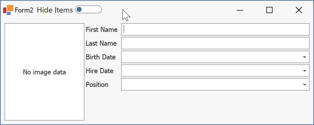
Hide Layout Control Items

Developers who need to display and hide Layout Control items in code often use the BaseLayoutItem.Visibility property. Changing this property from Always to Never does the trick, but remaining layout items automatically resize to occupy free space.

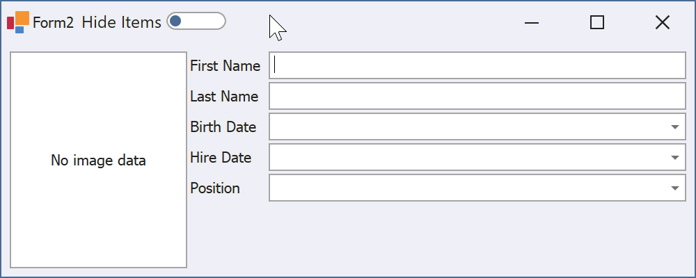
If you do not want Layout Control items to resize automatically, use the Boolean ContentVisible property instead.

Feedback

As always, we welcome your thoughts and comments. Should you have any questions about these examples, feel free to comment below.


XPO - Important Changes to Default Query Parameter Validation (v20.1)

$
0
0

Problem

We recently documented the following changes in v20.1.3:

Unfortunately, we failed to anticipate the scope of query parameter inconsistencies within customer apps (EAP/Beta feedback did not uncover this issue). Despite benefits associated with our changes, we do not want to force XPO users to modify their code immediately or revert to previous behavior manually (with feature toggles).

Solution

We softened default parameter validation with regard to SELECT, UPDATE, and INSERT statements in our v20.1.4 release.
We introduced a new DevExpress.Xpo.DB.QueryParameterMode enumeration with the following values:

  • Legacy: for v19.2 and older versions.
  • SetType (Default): will only validate parameter type without size. Will preserve all performance optimizations. SetType will still catch errors such as Guid parameter comparisons with strings (learn more).
  • SetTypeAndSize: will validate type and size. It will be automatically set for MSSqlConnectionProvider and Always Encrypted).

You can set the ConnectionProviderSql.QueryParameterMode property or the ConnectionProviderSql.GlobalQueryParameterMode static property as needed. Example:

using DevExpress.Xpo.DB;
//...
ConnectionProviderSql.GlobalQueryParameterMode = QueryParameterMode.Legacy;

The majority of XPO users will not need to modify this behavior, because new defaults should address most requirements.

Feedback

Please test a new build and let us know how this solution works for you.

DevExtreme React Scheduler - Enhanced Rendering for Overlapped Events/Appointments (An Update to our Roadmap)

$
0
0
Wanted to keep everyone in the loop about a change to our React Scheduler’s v20.2 Roadmap.
We’ve updated our Roadmap with a new feature – one that will improve the presentation of overlapped event/appointment information. This new implementation replaces our plans for a “Compact Appointment View”.

v20.2 Roadmap Update: Enhanced Rendering for Overlapped Events/Appointments

We’ll significantly improve readability of our React Scheduler via efficient usage of available free screen space. In Week and Day views, overlapped appointments will be distributed evenly across the cell’s width and will consume as much space as possible. If enough room exists to display appointment title and dates, appointments are layered one above another.

Feedback

We think this approach will significantly improve the usability of our React Scheduler control. Your feedback is always welcome. Please tell us what you think in the comment section below.

VCL Subscription v20.1 Beta 1

$
0
0

The release of v20.1 of the DevExpress VCL Subscription is just around the corner and is targeted for early June. However, if you own an active subscription to the product, you now can download Beta 1 from the Download Manager and investigate the new features in the context of your applications.

We've completed the development of the new major functionality in this release and look forward to your feedback as you explore the capabilities of Beta 1. Please remember though that we have yet to fully finalize our code and still have a few minor issues to resolve and retest. As such, we don’t recommend that you use this version in production.

The following is a summary of changes/updates we'd love you to try first and perhaps concentrate on. To review the complete list of features included with v20.1 navigate to the What’s New page on our website.

ExpressQuantumGrid Suite

Performance Enhancements

We optimized the text measurement mechanism for single-line cells in Table Views so that drawing and scrolling operations can be up to four times faster when Best Fit mode is enabled.

Entity Mapping Framework-based View

This new view leverages the Entity Mapping Framework's superior performance with data management. Now you are able to handle large datasets as you would do in normal Server Mode, but without the various restrictions associated with it. As an example, the new view supports data modification and Master-Detail layouts.

Modal Edit Forms

Any built-in Edit Form can now be displayed as a separate modal dialog. You and your users can customize its layout as needed.

Search and Group Panel Integration

Our Grid control now allows you to integrate the Find Panel with the Group By box.

Filtering Enhancements

Users can create and set new filter criteria using formulas written as string expressions.

ExpressSkins Library

In this release, we have introduced three new Office 2019 vector skins (White, Dark Gray, and Black) and a new Basic Skin with six color palettes.

ExpressPDFViewer Enhancements

Through optimizations with clip operations and image rendering, pages are now displayed significantly faster and use less memory.

PDF signing

You and your users now have the ability to digitally sign PDF documents when you export them, using new options in the "PDF Export Options" dialog.

Fluent Design support

v20.1 ships with a new Fluent Design Form that is inspired by Microsoft's Fluent Design System. Its features include:

  • Hamburger Menu/Accordion View Integration.
  • Adaptive Layout.
  • Acrylic Material (a semi-transparent texture).
  • Reveal Highlight (a lighting effect that brings focus to interactive elements).

Fluent Design Form

Conclusion

Although this is somewhat self-evident, the superior quality of a release is fully dependent on the valuable feedback we receive from you, our beta testers. We would encourage you to download the beta and give it your all, and let us know your opinions and issues via the Support Center -- the team awaits! We thank you in advance for your help. Do please post your comments below should you have any questions on Beta 1 or our upcoming release.

A quick extra note!

Although this blog post is exclusively about our new v20.1 beta for the DevExpress VCL Subscription, we know there will be questions about FireMonkey, and any releases we have planned for it. To pre-empt those questions to a certain degree, we can reveal that we have all but finished developing the initial FMX controls and features, and have created a couple of demos to show them off. Now that we're nearing the end of the development cycle for v20.1 of our VCL Subscription, it only remains to polish the FMX code enough for a beta and release it. Stay tuned!

And to whet your appetite, here's a screenshot of one of our demos:

FMX Demo

DevExtreme TreeView – API Enhancements (v20.1)

$
0
0
In our most recent release (v20.1), we addressed a series of user requests and added three new methods to our JavaScript TreeView component:
Let’s take a closer look at these new features and describe how they can be incorporated into your DevExtreme powered web app.

Scroll to Item

The scrollToItem method allows you to programmatically scroll to the desired node. This method can accept the node’s key, its DOM element, or an underlying data object. If the target node is hidden within collapsed parent nodes, parent nodes are expanded automatically. The following example demonstrates it in action:
The scrollToItem method returns a Promise object that gets resolved as soon as scroll operations are completed. You can handle it to execute custom logic once the scroll operation finished.
Live examples: Angular | Vue | React | jQuery

Get Selected Nodes

In previous versions, you needed to traverse the entire node tree and search for selected nodes to obtain all selected rows. The new ‘getSelectedNodes’ method allows you to obtain all selected nodes via a single method call. For a usage example, please refer to the following demo: Node Selection and Customization
Note: You can also get selected nodes keys when necessary. To accomplish this task, you need to use our new ‘getSelectedNodeKeys’ method. This option can help synchronize selected nodes with other UI components. One of such use case is demonstrated in the following demo: Drop-Down TreeView.

Important Notes

The following limitations apply if lazy node loading has been enabled (Virtual Mode or the createChildren callback is used):
  • scrollToItem scrolls the TreeView to loaded nodes only. It returns a rejected Promise object once you try to scroll to a node that has yet to be loaded.
  • The getSelectedNodes and getSelectedNodeKeys methods only return loaded nodes and keys.

Feedback

As always, we look forward to your feedback. Feel free to comment below or post a support ticket in the DevExpress Support Center. 

DevExtreme HTML/Markdown Editor – Multiline Toolbar (v20.1)

$
0
0
As you may know by now, our major update (v20.1) ships with a new Multiline Toolbar option for the DevExtreme HTML/Markdown Editor. When used, the HTML/Markdown Editor arranges its toolbar items across multiple lines based upon available space width. New lines can be added/removed automatically when a user resizes their web-browser's window or changes to a mobile device orientation.

Configuration

You can enable or disable our Editor’s Multiline Toolbar Mode via the new toolbar.multiline option:
{
    toolbar: {
        multiline: true
    }
}
Note: We enabled this new mode by default, since it improves overall usability. If you wish to rollback to our old Overflow Menu Mode, simply set the toolbar.multiline option to ‘false’. Please refer to the following ticket for more code examples: T873435 - HTMLEditor - Multiline toolbar mode is used by default.

Further Enhancements

We are currently considering improvements to toolbar item group configuration and associated behaviors. We may introduce a simplified configuration API and allow you to move grouped items together to a new line. We are looking forward for your thoughts on this. Please comment below at your convenience.

Feedback

Please visit our updated Widgets Gallery and test-drive the new Multiline Toolbar Mode and let us know what you think. If you have any questions or suggestions, please take part in our HTML Editor discussion on GitHub: HTMLEditor - Multiline Toolbar.

XPO - Updated .NET Core Examples, Performance Benchmarks for EF Core 5.0 and More (v20.1)

$
0
0

Performance Benchmarks

The release of XPO v20.1 gave us an opportunity to update our benchmarks for XPO and Entity Framework Core: https://github.com/DevExpress/XPO/tree/master/Benchmarks. We were primarily interested in EF Core 3.1.3 vs EF Core 5.0, but we did not notice much difference in our tests (PDF). As for XPO vs EF Core 3.1.3, results are very similar to v19.2.

As always, we welcome your feedback. If you had the opportunity to execute our benchmark tests, please share your thoughts below. We’d love to know whether our findings are in-line with yours.

Updated .NET Core Examples

We identified 30 of our most popular XPO examples and added .NET Core 3.1 projects to them. I hope you find this update useful as .NET Core gains in popularity. To learn XPO faster, feel free to explore the following technical resources:

We have also updated XPO and EF Core examples with XAF's user authentication and group authorization API to v20.1.4 (GitHub). Hopefully, you will find these access control/security functions of value for your enterprise. To quickly familiarize yourself with XAF's security system, please review these Frequently Asked Questions.

Noteworthy Support Center Tickets

  • Changes in Visual Studio 2019 v16.6.0 caused the standard Class.cs item template (with an empty class) to disappear in the Add | New Item dialog. As a fix, you can update to the latest version or disable the XPO extension (T892485).
  • We softened default parameter validation with regard to SELECT, UPDATE, and INSERT statements in XPO v20.1.4 (T890958).
  • We demonstrated how to unit test custom logic in XAF/XPO business classes with InMemoryDataStore (T884471).
  • Check how to use XPO Dependency Injection extensions to setup multiple data layers for ASP.NET Core Web API services (T864202).
  • Learn how to troubleshoot the "Reentrancy or cross thread operation detected" errors (T419520).
  • We implemented a console version of XPO Profiler to detect performance bottlenecks and code issues (T882761).
  • FileNotFoundException and TypeLoadException related to Microsoft.Data.SqlClient may occur in debug mode (T885153).

DevExpress VCL Subscription v20.1 released

$
0
0

Without a doubt, this is a difficult time for all of us. If you or your business has been impacted by the pandemic, please contact us and let us know how we can help.

Despite the various Stay-At-Home and social distancing rules, our Delphi team have been working extra hard to provide you with new features and enhancements, and I am pleased to announce the immediate availability of DevExpress VCL Subscription v20.1, our suite of controls for building effective Windows apps with RAD Studio, using either Delphi or C++Builder.

This release ships with numerous new features including:

  • DirectX Hardware acceleration: more controls have been updated for high-DPI screens and faster rendering
  • Alongside that, three new vector-based application skins
  • Fluent Design form
  • Expression-based filters for the grid controls
  • Modal edit forms for editing records in a grid
  • Digitally signing PDFs when exporting them
  • …and much more

For a complete list of what’s new in this v20.1 release, please go to this page, and select the VCL link. Even easier, you can always navigate to devexpress.com/new and see what’s new in the latest version, whichever version number that happens to be.

As usual, we’ve listed the Resolved Issues introduced in this release (follow that link to the version history page, make sure you clear any filters that may be set, and then select VCL, as well as “Resolved Issues”). That page also enables you to review the changes we’ve made from any release to any other.

For every major release, no matter how hard we try and minimize the impact, some new features and enhancements are bound to cause a few breaking changes. You can see those from that same version history page: just select “Breaking Changes” instead.

I pretty much say something like this with every major release: we would not be able to produce and release such robust and full-featured controls, features, and enhancements without the invaluable help of our customers. By publishing surveys, reviewing comments and support tickets, we find that we can more easily focus on providing what our customers want from our products going forward. Also, we’ve been concentrating on publishing relevant posts on what we are doing, posts detailing various tips and tricks, and posts on how we aim to move forward. My strong recommendation is to monitor our community site more than ever before.

Also, having said that, be aware that now we’ve released VCL v20.1, we are going back to polish our FireMonkey controls ready for a beta.

I’d like to thank everyone who provided feedback on our products throughout this year, who used and tested the various v20.1 betas we've produced and provided information on the issues they found, and, of course, to all our customers who use our products every day in their applications. We are confident that the new featuresand enhancements in v20.1 will strengthen and validate your trust in our products. Thank you, it is much appreciated.


ASP.NET Core & MVC - New Visual Studio Integration Features (v20.1)

$
0
0

v20.1 brings with it two new Visual Studio wizards for the DevExtreme-based ASP.NET Controls:

  • ASP.NET Core Project Wizard - Redesigned
  • New Wizard to Scaffold API Controllers using XPO

In this blog post, I'll explain how these wizards work and why we created them.

ASP.NET Core Project Wizard - Redesigned

As you may know, we offer several project templates for DevExtreme ASP.NET Core. We combined these templates and grouped several options into one new unified wizard:

The new wizard is now easier to locate in the Visual Studio File-New dialog. You can select your project options in the following ways:

  • Bootstrap or Material application layout
  • Razor Pages or MVC Views
  • Two .NET Core LTS versions - 2.1 and 3.1. Note that 3.1 is only available in Visual Studio 2019. Rest assured, once '.NET 5' is released, we'll add this option to the drop down as well.
Note: The project templates for MVC 5 have not been modified and are available through the File-New dialog.

New Wizard to Scaffold API Controllers using XPO

Thanks to your feedback, we've created a new wizard to help developers using eXpress Persistent Objects (XPO).

You can now scaffold API Controllers based on XPO data models. You'll find a new 'DevExtreme API Controller with actions, using XPO' item in the 'Add New Scaffolded Item' dialog:

DevExtreme ASP.NET MVC/Core - API Wizard

The new wizard to scaffold XPO API controller is available for ASP.NET Core and MVC 5 projects.

To learn more, please explore the following help topic: Scaffolding - XPO Data Model

Note: If you expect to create an XPO data model for an existing database, please review the Nullable behavior hint in this help topic.

Feedback

We hope this blog post was helpful. As always, we welcome your thoughts/feedback. Please post a comment below and let us know what you think about the new Visual Studio wizards for the DevExtreme-based ASP.NET controls.

DevExpress Bower Packages are Discontinued

$
0
0
In October 2017, Bower announced maintenance mode for their package manager. Their official website encourages people to migrate to available alternatives. To quote Bower: “While Bower is maintained, we recommend using Yarn and Webpack or Parcel for frontend projects read how to migrate!”
Three years later, Bower is still available but is no longer considered as a dependency manager of choice by modern web projects. For instance, Angular and React discontinued Bower support in favor of NPM and Yarn. Microsoft created a separate library manager for quick migration: Libman.
DevExtreme and Web Reporting Bower packages are no longer available. While you can use Bower for previous versions (19.1 and older), we encourage you to migrate to modern package managers.
The following packages are available on NPM as an alternative:
Of course, you can also use Yarn to install these packages as well.
If you encounter issues during migration to NPM/Yarn, feel free to create a support ticket in the DevExpress Support Center. We will be more than happy to assist in the migration process.

ASP.NET Core, WebForms and MVC RichEdit - Insert RTF Content, Client PDF Printing, and Font Management (available in v20.1)

$
0
0

Insert RTF from clipboard

As you know, word processors like Microsoft Word can automatically send RTF content to the clipboard. In previous versions, our ASP.NET RichEdit control inserted content as HTML. This caused the loss of structural elements, such as fields, lists, and table formatting.

With our most recent release, we've introduced the ability to insert RTF from the clipboard while retaining structural elements.

Note: This new feature does not work in Internet Explorer since the browser itself does not allow you to obtain RTF content from the clipboard.

Export to PDF on the client

With v20.1, our ASP.NET RichEdit for both WebForms and MVC can export a document to PDF on the client. Exported documents will look identical to the one displayed within the browser. Our client-side PDF export feature offers the following options:

  • Export the current document to PDF and download the file (use the DownloadPdf method).
  • Obtain the exported document and modify it in code (the ExportToPdf method).
  • Print the PDF document. Our ASP.NET RichEdit exports the current document to PDF and invokes the Print dialog for the PDF file.

Our RichEdit for ASP.NET Core also includes an API to download, export, and print PDF documents.

Client-side PDF export requires you to specify a list of fonts available on the client. In this release we implemented font management functionality that helps you address this issue.

Font Management

Our RichEdit allows you to specify a custom font set and limit the number of fonts available to a user in the the control's ribbon or within its dialogs on the client side. You can supply fonts in TTF, TTC, or WOFF format. The RichEdit control can also download source files from Google Fonts on the fly.

Please refer to our documentation to learn more about font management across all supported platforms (ASP.NET Core, ASP.NET WebForms, or ASP.NET MVC)

PDF Document API v20.1 - Multiple Signatures and Timestamps

$
0
0

Our PDF Document API (v20.1) allows you to apply multiple signatures to a document without existing signatures and to apply new signatures to a document that has yet to be signed.

This new PDF Signature API allows you to execute the following actions:

  • Sign an existing signature field
  • Sign a new field
  • Apply a signature with a timestamp

The PdfDocumentSigner class is an entry point to the Signature API. Use it to save a document with applied signatures. You can pass a single signature or an array of signatures to the PdfDocumentSigner.SaveDocument method.

For a complete sample project, please refer to the following in our GitHub repository: How to Apply Multiple Signatures

Sign an Existing Signature Field

Use the PdfSignatureBuilder class to apply a signature to an existing form field. The Pkcs7Signer class allows you to specify signature validation data (certificate, hash algorithm, etc.). The PDF Document API supports PKCS#7 signatures with X.509 certificates.

//Load a document to sign:
using (var signer = new PdfDocumentSigner("Document.pdf"))
{
    //Create a PKCS#7 signature:
    Pkcs7Signer pkcs7Signature = new Pkcs7Signer("Documents/testcert.pfx", "123", 
    PdfHashAlgorithm.SHA256);

    //Apply the signature to an existing form field with the name "Sign":
    var signature = new PdfSignatureBuilder(pkcs7Signature, "Sign");

    //Sign and save the document:
    signer.SaveDocument("SignedDocument.pdf", signature);
}

Sign a New Field

Use the PdfSignatureFieldInfo class to specify information about a new form field (name, location on the page, etc.) and pass it to the PdfSignatureBuilder, as shown below:

//Load a document to sign
using (var signer = new PdfDocumentSigner("Document.pdf"))
{
    //Create a PKCS#7 signature:
    Pkcs7Signer pkcs7Signature = new Pkcs7Signer("Documents/testcert.pfx", "123", 
    PdfHashAlgorithm.SHA256);

    //Specify the name and location of a new signature field
    var signatureFieldInfo = new PdfSignatureFieldInfo(1);
    signatureFieldInfo.Name = "SignatureField";
    signatureFieldInfo.SignatureBounds = new PdfRectangle(10, 10, 150, 150);
    signatureFieldInfo.RotationAngle = PdfAcroFormFieldRotation.Rotate90;

    //Apply the signature with a new signature field created above:
    var signature = new PdfSignatureBuilder(pkcs7Signature, signatureFieldInfo);

    //Sign and save the document
    signer.SaveDocument("SignedDocument.pdf", signature);
}

Apply a Timestamp to a Signature

The TsaClient class allows you to generate a timestamp. Pass its instance to the Pkcs7Signer constructor to apply the timestamp to a signature.

//Create a timestamp
ITsaClient tsaClient = new PdfTsaClient(new Uri(@"https://freetsa.org/tsr"), PdfHashAlgorithm.SHA256);

//Create a PKCS#7 signature with a timestamp:
Pkcs7Signer pkcs7Signature = new Pkcs7Signer("Documents/testcert.pfx", "123", PdfHashAlgorithm.SHA256, tsaClient);

Create a Custom Signer and a Timestamp Client

If you want to implement a custom signer, you can declare a descendant of the Pkcs7SignerBase class.

Implement the ITsaClient interface to use a custom timestamp client. Sample projects with complete code are available on GitHub:

Use PdfDocumentProcessor to Sign Documents

We enhanced our old approach, so you can use PdfDocumentProcessor to sign a document with a PKCS#7 signature.

    
  using (PdfDocumentProcessor processor = new PdfDocumentProcessor())
  {
      processor.LoadDocument("Document.pdf");
            
      //Create a PKCS#7 signature
      Pkcs7Signer pkcs7Signature = new Pkcs7Signer("Documents/certificate.pfx", "123", PdfHashAlgorithm.SHA256);

      //Specify the signature's image data and location parameters:
      byte[] imageData = File.ReadAllBytes("Documents/JohnSmith.jpg");
      int pageNumber = 1;
      PdfOrientedRectangle signatureBounds = new PdfOrientedRectangle(new PdfPoint(0, 460), 250, 90);

      //Pass all instances created above to the PdfSignature constructor:
      PdfSignature signature = new PdfSignature(pkcs7Signature, imageData, pageNumber, signatureBounds);

      //Save the signed document:
      processor.SaveDocument("SignedDocument.pdf", new PdfSaveOptions()
      { Signature = signature });
  }
    

Please note that the PdfDocumentProcessor class has the following limitations:

  • You can sign a document only once.
  • Existing signatures are removed from a document when saved. However, if you use PdfDocumentProcessor to apply a signature, it is retained.

Feedback

As always, we welcome your thoughts. Please comment below and let us know what you think about this new feature.

DevExtreme React Grid – Export to Excel (v20.1)

$
0
0
You can now export React Grid’s data to an Excel document with ease.
In our most recent update, we introduced a new GridExporter component that retains React Grid configurations during the export process. It also makes it easy to customize the export based on specific business requirements. Customization options include custom cell appearance, header and footer rendering, etc.

Basic Export to Excel Configuration

To enable the Export to Excel feature in your React Grid, you need to use two new components:

  • ExportPanel renders a panel within the Grid’s UI with an ‘Export to Excel’ button;
  • GridExporter creates Excel documents and handles export customizations.

Data Shaping Configuration

In line with our native React product-line philosophy, we gave you full control over exported data and associated data shaping options. You can apply, skip or modify the following Grid’s configurations during Excel data export:

The primary Export configuration principle is simple. GridExporter accepts the same properties as the React Grid’s state plugins. Let’s review how this works.

Sorting and Filtering

To retain the Grid’s sorting and filtering configurations in exported Excel documents, simply pass the `sorting` property value of the SortingState plugin and the `filters` property value of the FilteringState plugin to corresponding GridExporter properties as shown below:

<Grid>
  …
  <SortingState sorting={sorting} />
  <FilteringState filters={filters} />
  …
</Grid>
<GridExporter
  …
  filters={filters}
  sorting={sorting}
/>

As you can see, sorting and filtering are applied to the exported document:

Grouping

Grouped rows are exported as follows:
  • Group captions (aka Group Rows) occupy individual Excel sheet rows;
  • Grouped rows are exported as Excel expandable groups.
Multiple group levels are supported:

Selection

React Grid allows end-users to only export selected rows. To export selected rows, pass the `selection` property value of the SelectionState plugin to GridExporter. In this instance, the Export panel automatically renders two items: One to export all data or and to limite export to selected rows.

Summaries

Total Summaries and Group Summaries are exported as Excel formulas. This ensures that summaries are recalculated if data is modified in the exported Excel document.

Export Customization

Cell Customization

Use the ‘customizeCell’ and ‘customizeSummaryCell’ callback properties of GridExporter to alter cell value, display format, or appearance.

Header and Footer Customization

The GridExporter’s ‘customizeHeader’ and ‘customizeFooter’ callback properties allow you to add a header and a footer.

Advanced Customization

Internally, GridExporter uses the ExcelJS open-source library to generate Excel documents. You can access the ExcelJS workbook being exported by handling the ‘onSave’ event. With ExcelJS, you can add extra worksheets or modify the exported worksheet as needed.
The example below demonstrates this approach in action:
const onSave = (workbook) => {
  // modify data here
  workbook.addWorksheet('My Sheet');
  workbook.xlsx.writeBuffer().then((buffer) => {
    saveAs(new Blob([buffer], { type: 'application/octet-stream' }), 'MyWorkbook.xlsx')
  });
};
...
<GridExporter
  ...
  onSave={onSave}
/>

Refer to the ExcelJS GitHub repository to learn more about its capabilities.

Try it Yourself

To see this new feature in action, please explore our step-by-step guide.

Feedback

As always, we welcome your feedback. Please comment below and let us know what you think of our React Data Grid’s export feature.

Reporting - New Blazor Components to Design and View Reports (now available in v20.1.4)

$
0
0

DevExpress Reports now ships with two new components: Blazor Document Viewer and Blazor Report Designer. If you currently own a DevExpress Subscription (such as Universal, DXperience, ASP.NET, Reporting), you can download DevExpress Reports for Blazor (v20.1.4) today.

DevExpress Reports for Blazor - What’s Inside

As you know, the DevExpress Reporting platform can be integrated into any JavaScript-based application with ease (see JavaScript Reporting for more information). Last year, we published a post that described how to integrate DevExpress Reporting into Blazor apps using mainly JavaScript. This, of course, was a temporary solution.

In our v20.1 release cycle, we’ve added two new components (Blazor Report Viewer and Blazor Web Report Designer) so you can leverage the capabilities of DevExpress Reports in your next Blazor project.

Blazor, Microsoft’s newest web development framework, offers C# developers the ability to create web apps with minimal need for JavaScript. To that end, our new Blazor Reporting controls hide as much JavaScript and CSS as possible. Yes, with our Blazor wrappers for the DevExpress HTML5 Document Viewer and Web Report Designer, you’ll have minimal exposure to JavaScript.

Blazor Reports Document Viewer

Our suite of Blazor Report components perform all initialization steps automatically and you can now integrate them into your Server-Side Blazor apps with ease. Online demos are available here: DevExpress UI Components for Blazor - Reporting.

Limitation

Please note that our Blazor Reporting components currently support server-side Blazor (document generation is performed at backend). Our long-term vision is to deliver a document generation engine compatible with Blazor WebAssembly. We’ll keep you posted once we have any news in this regard.

Download via Nuget

We deliver Reporting for Blazor via the DevExpress.Blazor.ReportingNuGet package. The versioning for this package mirrors the rest of our .NET Reporting tools (they will retain versioning in future builds for the sake of simplicity). Updates we introduce to our reporting platform will also be available as a part of the DevExpress.Blazor.Reporting package (since the base DevExpress.Reporting.Core package is used internally).

Install the DevExpress.Blazor.Reporting package to use our reporting tools inside a Blazor application. The DevExpress.Blazor.Reporting package is not dependent upon the DevExpress.Blazor package used by other DevExpress Blazor UI components.

Licensing

Reporting for Blazor is a part of our Web Reporting component package. You need to acquire a license to use this product. If you are evaluating the product, simply activate a trial in our NuGet feed to obtain access for eval purposes.

If you’d like to design reports within Visual Studio, you’ll need to download the DevExpress Unified Installer.

Our Visual Studio Report Designer is not available via Nuget. Once again, if you don’t own a license, you can download our free 30-day trial to evaluate the product.

How to Use?

To get started, you must first create ASP.NET Core 3.1 Blazor Server App and install the NuGet package I mentioned above.

  1. Once installed, navigate to the Startup.cs file and register our reporting components as follows:
public void ConfigureServices(IServiceCollection services) {
    services.AddDevExpressBlazorReporting();
}

public void Configure(IApplicationBuilder app,
        IWebHostEnvironment env) {
    app.UseStaticFiles();
    app.UseDevExpressBlazorReporting();
}
  1. Once complete, modify the _Imports.razor file to register DevExpress.Blazor.Reporting namespace:
@using DevExpress.Blazor.Reporting
  1. Add the Document Viewer and End-User Report Designer controls to your Blazor application. Our Web Reporting components require unique report identifiers to retrieve reports, so I recommend that you implement and register a custom report storage as described in the following help topic: Implement a Report Storage.
Note: If you're going to only use the Document Viewer component then be sure to implement the `IsValidUrl` and `GetData` methods.

Your Feedback Counts

Your feedback will drive development plans in both the short and long-term. Do you expect to customize the UI of our Blazor Reporting Components? Let us know what you need from API perspective. If you are looking for theming capabilities - specify the themes you are most likely going to use in your Blazor app.

Blazor UI Components - An Update with New Controls & Features, and Blazor Reports! (available in v20.1)

$
0
0

We just updated our UI controls for Blazor with official support for the latest version of Blazor WebAssembly. This release also includes two new UI components, a number of new features, and DevExpress Reports for Blazor.

Blazor WebAssembly 3.2.0 support

I'm thrilled to announce that Blazor WebAssembly is now officially released. This is a fully-featured and supported release of Blazor WebAssembly that is ready for production use. Full stack web development with .NET is now here! - Dan Roth, Blazor PM

As you know, Microsoft has officially released both server and client hosting models for the Blazor framework. Our most recent release (v20.1) supports Microsoft’s latest releases: .NET Core 3.1.4 and the Blazor Web Assembly 3.2.0.

Download

To get started with v20.1 today, use the DevExpress NuGet server.

New Reports for Blazor

If you currently own a DevExpress Reports Subscription, you’ll have access to our new Blazor Reporting platform. This Suite includes a Visual Studio Report Designer, a Blazor Report Viewer and a rich set of integrated report elements (tables, shapes, fields, etc).

Blog post | Demo | Documentation

New Adaptive Toolbar

v20.1 ships with a new Command Toolbar component for Blazor. This component allows you to add a lightweight adaptive toolbar to your Blazor apps:

DevExpress Blazor Toolbar

You can create and incorporate the following commands types within your Blazor apps:

  • Button
  • Drop-down list
  • Radio button
  • Check button
  • Link button

Each button can include an icon, text, or both. Use the DxToolbarItem.Template property to create a custom toolbar item as needs dictate. You can also divide toolbar items into groups.

Our Blazor Toolbar component automatically adapts size for desktop and mobile browsers. When the toolbar cannot fit into its container, the control hides text for items with an icon or moves root items one by one to a root submenu (until the toolbar contains the appropriate number of root items).

Demo | Documentation

New Context Menu

Our new Context or popup menu can display both a single or multi-level context menu.

DevExpress Blazor Context Menu

The Context Menu can organize and display items from a hierarchical structure or from a standard list. You can bind the menu to a data source and populate the item collection at runtime. You can also create custom context menu items directly within your Razor markup.

We've added a menu items API to set properties such as Text and Icon, start a new group, and more.

Use the Show(x, y) method to specify the location wherein the context menu is to be displayed. Call the Show method from the either the onClick or onContextMenu Blazor mouse events.

Demo | Documentation

Data Grid

Command Toolbar

Include custom tool buttons in your Blazor Grid by integrating our new Toolbar component. Use the Grid's HeaderTemplate to add toolbars:

Blazor data grid command toolbar

Demo | Documentation

Column Chooser

Our Blazor Data Grid allows you to customize visible columns via its runtime Column Chooser (Column Selector).

Users can reorder columns by dragging icons next to column headers. They can also hide or display columns using checkboxes:

Blazor-data-grid-change-column-visibility-using-column-chooser

To enable, add the DxDataGridColumnChooserToolbarItem to the grid toolbar's markup.

The Column Chooser is mobile-friendly. On mobile devices it adapts automatically and displays a panel:

Blazor-data-grid-adaptive-column-chooser-for-mobile

Demo | Documentation

Control Display Size

The majority of DevExpress Blazor Editor components now support three size options: Small , Medium , and Large.

Blazor-editors-small-medium-large-size-mode

Some components, like our Data Grid, are more complex than others (i.e. Button). To accommodate these differences, we introduced the following three SizeMode properties:

  • SizeMode - used for simple components, such as our Data Editors, Buttons, and Pager.
  • InnerComponentSizeMode - used for the Data Grid and Scheduler. Changes the size of internal UI elements.
  • ItemSizeMode - used for our Form Layout and Toolbar. Resizes items.

You can also use the DevExpress global option to modify size mode for the entire Blazor app.

Important note : In v20.1, we changed the default size of all editors to small. If you prefer a different size, simply use the properties listed above.

Documentation

Data Editors

Display Format Support

Our Text Box, Spin Edit, ComboBox and Date Edit components now support the DisplayFormat property. This allows you to display formatted values (based on conditional formatting rules) that differ from underlying field values. For example, you can display currency values for a field with float values. This property only changes how the value is displayed at runtime and does not affect the underlying value.

Use the new DisplayFormat property to specify a format pattern with standard format strings.

Blazor-data-editors-custom-display-format

Demo | Documentation

Specify when Values Update

When the Text Box and Spin Edit components are bound to a property or field, associated values are only updated when the editor loses focus. With this release, we added a new BindValueMode property to our Text Box and Spin Edit components.

Set the BindValueMode property to either:

  • OnLostFocus - Editor value is updated after the editor loses focus.
  • OnInput - Editor value is updated when input values change.

To update editor values immediately after user input changes, set this property to OnInput.

Note: each Blazor editor supports a default onInput event. Override this event to execute custom code when a user enters a new value within an editor.

Demo | Documentation

Input HTML attributes

Many of our Blazor editor components are built with the standard HTML input element. With this release, we've added the ability to assign HTML attributes. Our Text Box, ComboBox, Spin Edit, Date Edit, and TagBox now support the following attributes:

The Text Box, Spin Edit, and Date Edit also support the following attributes:

To apply these attributes, specify them directly in Razor markup:

<DxTextBox name="abc" tabindex="1" autocomplete="on" />

Documentation

Drop-down Window Direction

Our Blazor ComboBox, TagBox, and Date Edit components display a drop-down window below a standard text field. However, if one of these editors was located at the bottom of a page, then the drop-down window portion can be cut off.

With this release, our Blazor ComboBox, TagBox, and Date Edit will automatically open a window above or below their text field (based on available space).

Blazor-dropdown-window-above-text-box

Use the DropDownDirection property to manually define direction as Up or Down.

Documentation

CheckBox

Content Alignment

Use the new CheckBox Alignment property to align a check mark and text relative to one another.

Blazor-checkbox-left-right-center-alignment

Demo | Documentation

Spin Edit

Custom Increment Value

Use our Blazor Spin Edit's new Increment property to set custom increment values, including decimals:

Blazor-spin-edit-custom-increment-decrement-value

Demo | Documentation

Charts

Resolve Label Overlap

If chart series contain multiple points, point labels can overlap. With this release, we introduced a LabelOverlap property. Use it to specify how the chart should process overlapping labels.

Blazor-chart-labels-hide-stackled-overlap

Demo | Documentation

Series API Enhancement

We added a VisibleChanged event to the chart series object. The event fires when a user changes series visibility (for example, by toggling checkboxes near the series title in the legend). You can also implement two-way binding for the DxChartSeries.Visible property.

Documentation

XAF's Blazor UI & Example with Security System APIs

For our XAF customers, the team will soon update the online XAF Blazor demo based on the release version of our Blazor components. It will include bug fixes and improved data validation support.

Even if you do not plan to use XAF's UI, you may find this new non-XAF Blazor Server demo and tutorial helpful. It demonstrates how to use DevExpress Blazor components with XAF's non-visual APIs for user authentication and group authorization.

For more information on our business application framework for .NET developers, please follow the XAF Team blog.


.NET Spreadsheet – New File Format, Enhanced Printing and PDF Export (v20.1)

$
0
0

This blog post describes all Spreadsheet-related features/capabilities we introduced in our current release cycle (v20.1). Should you have any questions about these features or if you require assistance from a member of our support team, feel free to submit a ticket via the DevExpress Support Center.

New Document Format

We extended the list of supported file formats for our Spreadsheet Document API and Spreadsheet controls (WinForms and WPF). You can now load and save workbooks using the XML Spreadsheet 2003 format.

// Load a document.
workbook.LoadDocument("Document.xml", DocumentFormat.XmlSpreadsheet2003);
// Modify the document.
// ...
// Save the document.
workbook.SaveDocument("DocumentModified.xml", DocumentFormat.XmlSpreadsheet2003);

The new file format is also available to end users via the Open File and Save File dialogs.

PDF Export Enhancements

We created a new PDF export engine and made it the default export option for our Spreadsheet Document API and WinForms Spreadsheet control. The new engine uses DevExpress PDF Document API library to generate PDF files. It renders more precise layouts and has better performance and a smaller memory footprint than its predecessor.

The charts below compare total export time and memory consumption for our new and our legacy PDF export engines. We ran our tests on a set of documents with different content: unwrapped and wrapped (multiline) cell text, conditionally formatted cells, and chart sheets.

To demonstrate PDF export enhancements, we’ve created a video and posted it to our YouTube channel. You can download the video script here: WinForms Spreadsheet - PDF Export Enhancements.

Print-Related Enhancements

Print Layout

We improved row height calculation for printed workbooks in our Spreadsheet Document API and WinForms Spreadsheet control. They now generate a printout that closely mirrors the print output of Microsoft Excel.

Specifically, this enhancement will help you avoid unwanted page breaks that could appear in previous versions of the Spreadsheet control.

Specify What to Print in the Spreadsheet Control (WinForms and WPF)

In a recent minor update (v20.1.4), we introduced a SpreadsheetControl.Options.Print.PrintContent property. This property allows you to specify spreadsheet content to print/display within the Print Preview. You can set this property to one of the following values:

  • SpreadsheetPrintContent.Default - default value (= EntireWorkbook).
  • SpreadsheetPrintContent.EntireWorkbook - prints the entire workbook.
  • SpreadsheetPrintContent.ActiveSheets - prints the active sheet and all selected sheets (if any). To print multiple sheets, hold Ctrl when clicking sheet tabs in the control.
  • SpreadsheetPrintContent.Selection - prints selected cells of the active worksheet. If a chart sheet is active, it is printed completely.
// Specify that the Spreadsheet control should print only selected sheets.
spreadsheetControl1.Options.Print.PrintContent = 
    DevExpress.XtraSpreadsheet.SpreadsheetPrintContent.ActiveSheets;

We use this API inside our demo modules for both our WinForms and WPF Spreadsheet controls to replicate Microsoft Excel behavior. We set the PrintContent property to ActiveSheets for most of our demos except for the following modules: Document Properties, Hyperlinks, and all Mail Merge results. The latter demos still print the entire workbook.

Try It Now

If you've installed the DevExpress Demo Center, use the following links to load our new Spreadsheet demos:

Your Feedback Matters

As always, we welcome your thoughts. Please comment below and let us know what you think of these new features.

Once again, should you have technical questions, feel free to contact us via the DevExpress Support Center.

ASP.NET AJAX Control Toolkit v20.1.0 - Now Available

$
0
0

A few years ago, we took over maintenance and guidance for the ASP.NET AJAX Control Toolkit project. Please refer to this blog post for more information on the project and why we stepped in to assist.

As part of our ongoing commitment to the project, we’ve released an update (ASP.NET AJAX Control Toolkit v20.1.0) to address the following issues.

Resolved Issues

  • CascadingDropDown continuously refreshes in Firefox 65 (#477)
  • MaskedEditExtender with ClearMaskOnLostFocus=False adds an extra character at the first position (#493)
  • ListSearchExtender does not work in Firefox 66+ (#494, contributed by @TheUlderico)
  • AjaxFileUpload fails with <sessionState cookieless="UseUri"> (#500)
  • ReorderList adds the opacity CSS property to the <LI> element (#503)
  • SCRIPT1028 error in legacy IE (#515, contributed by @SIkebe)
  • Tabs control doesn't preserve the active tab when it contains a LinkButton with a validator (#518)
  • DragPanelExtender - JavaScript errors in IE 11 with non-100% zoom (#522)
  • The onchange handler on a TextBox with AutoComplete is triggered twice in Google Chrome (#529)
  • HtmlEditorExtender.Decode - Remove insecure HTML (#532)

Ready to Upgrade?

To update the ASP.NET AJAX Control Toolkit, please download our most recent installer using the link below.

Download

Or, if you prefer, use Nuget:

ASP.NET AJAX Control Toolkit Nuget package

As always, we welcome your feedback. Please share your thoughts on this update via GitHub.

Want More? Try the DevExpress ASP.NET Subscription Free for 30-days

We’d like to thank you for installing the DevExpress Edition of the AJAX Control Toolkit and look forward to your feedback as you begin leveraging its capabilities.

If you require additional UI controls for your ASP.NET WebForms application, we invite you to download and try a free 30-day evaluation of our ASP.NET Subscription. With over 100 UI controls, the DevExpress ASP.NET Subscription helps you build your best, and deliver elegant line-of-business applications in the shortest possible time. For a complete list of products and features in our ASP.NET Subscription, please refer to the following webpage.

TestCafe Studio v1.3.0 - A New Way to Work with Selectors

$
0
0

TestCafe's Visual Test Recorder automatically creates selectors for all elements used in a test. This complicated algorithm balances many different variables, and we just recently added a few options so that you can customize it to meet your specific needs.

This article first covers what we consider to be a reliable selector. We then mention the pros and cons of various selector strategies, and custom attributes in particular. Finally, we'll show you how to customize TestCafe options so that it builds selectors that are optimized for your website.

How TestCafe Studio Generates Selectors

To record an automated test in TestCafe Studio, specify the tested page’s URL and start the recorder. TestCafe Studio launches the selected browser, opens the web page, and records your actions. Once the test scenario is ready, you can run it in any local browser, a mobile device, or as part of your CI pipeline.

TestCafe Studio not only records your actions (element clicks, text input), but it also creates a selector for every affected page element. The selector generation algorithm was developed to adhere to the following requirements:

  • Selectors shouldn’t be too specific. Otherwise, you might have to rewrite them after each page modification. For instance, Selector(‘body’).find(‘div’).nth(5).find(‘p’).nth(3) must be revised each time the number of elements on the page changes.
  • Selectors shouldn't be too generic. Otherwise, they may return different elements after each markup change. For example, Selector(‘div > button’) can match multiple elements at once.
  • Selectors shouldn’t rely on element parameters that are likely to change. For instance, Selector('[style*="background-color: red"]') uses a CSS style that changes frequently.
  • Selectors should remain readable. Selectors should be easy to understand (by you or another developer) for as long as the test is maintained. For instance, it may be difficult to understand which element corresponds to the following selector: Selector(‘div’).find(‘pre’).nextSibling(-1). If you use Selector(‘#topContainer’).find(‘.child’).withText(‘Add item’) instead, the selector is much easier to read.
  • Selectors should reflect the user’s point of view. Since TestCafe supports end-to-end testing, it’s a good idea to build selectors that identify elements as an end-user would. For instance, Selector(‘form’).find(‘[name=”btn-foo-123”]’) might be stable, but it is written from the programmer’s perspective rather than from the user’s point of view.

In addition to these general requirements for selectors, page organization is also vital in the testing process. Some pages may have stable selectors that rely on the ‘id’ attribute, while other pages use auto-generated ‘id’ attributes - so it does not make sense to use ‘id’ in a selector. This also applies to other attributes such as ‘class’. Text-based selectors can also be ineffective, depending on changes you introduce to the page over time.

Why Custom Attributes are Required

Modern web component frameworks, like React, complicate DOM element identification. This is why many developers prefer to assign custom attributes to page elements. Custom attributes enable tests to survive changes in HTML structure, script behavior, and styles.

Let’s consider the following Populate button on our example page:

<inputtype="button" id="populate" data-testid="populate-button" value="Populate">

You can build the following selectors for this button:

HTML-based

  • Selector:Selector('input').nth(1)
    Pros and Cons: Too generic.
    Summary: Might match the wrong elements because it is vague.
  • Selector:Selector('body').find('form').find('div').find('fieldset').find('input').nth(1)
    Pros and Cons: Too strict.
    Summary: May break due to minor changes in HTML structure.

ID-based

  • Selector:Selector('#populate')
    Pros and Cons: Relies on ID only, which could be introduced for styling or event handling, or may be auto-generated.
    Summary: Better options are available.
  • Selector:Selector('#main-form').find('input').nth(1)
    Pros and Cons: Similar to the above selector, but relies on the parent ID.
    Summary: Appears to be more specific than the above selector, but it is not.

Class-based

  • Selector:Selector('.column.col-1').find('input').nth(1)
    Pros and Cons: The element has no class, so this selector uses the parent class. Classes can change because they are usually assigned for styling purposes.
    Summary: Sensitive to CSS modifications; difficult to maintain.

Text-based (text matches the attribute value in this case)

  • Selector:Selector('input[value="Populate"]')
    Pros and Cons: Mirrors how users perceive the page, so it may be stable. Detects actual issues caused by accidental text changes.
    Summary: Satisfactory, but fails even when text changes are intended.

Custom attribute-based

  • Selector:Selector('[data-testid="populate-button"]')
    Pros and Cons: The most stable selector, since it is not affected by changes.
    Summary: The preferred selector type for most scenarios.

In summary, custom attributes have the following benefits:

  • Tests do not break based on markup or code changes. A test will not fail when you refactor HTML or implement new behavior in JavaScript.
  • Tests do not depend on page styles. You can switch themes as many times as you wish - tests will not fail because of a certain style or theme.
  • Text content modifications do not affect tests. Tests are not affected by changes to content, including localization changes. Note, however, that if an element’s text is essential to a test scenario, you should verify the text content or use a text-based selector: Selector(‘div’).withText(‘Add to Cart’).
  • Use a custom attribute to indicate that an element is used in tests.

A New Way to Customize Selectors

When you record a test, TestCafe automatically generates a selector. TestCafe also lets you choose an alternative selector from a drop-down list or create one manually. The latest TestCafe update (v1.3.0) ships with an adjustable selector generation algorithm. You can now configure the selector generator on the fly, based on the tested page:

  • Prioritize selector types. Use this option if you often need to choose a different selector from the suggestion list. The default selector is generated based on your preferences.

    Prioritize selector types

  • Disable unwanted selector types. For instance, your website can generate id, class, or other element attributes automatically, so that they change each time the page reloads. However, you cannot use these values in selectors because the test cannot be replayed. In this instance, you may want to exclude these attributes from selector generation rules. You can now simply disable the corresponding selector type - and switch back to it at any time - without restarting the recorder.

    Prioritize selector types

  • Add selector types based on custom attributes. These selector types are preferred because if you configure them, you won’t have to edit selectors due to changes. The only requirement is that you maintain unique attribute values during development.

    Prioritize selector types

Recap

TestCafe Studio generates selectors for every page element that takes part in a test. Good selectors must comply with strict guidelines to be stable and reliable. TestCafe algorithms use best practices to generate selectors that meet these criteria. You can also optimize selectors based on your understanding of how the website works. Our latest update (v1.3.0) allows you to instruct TestCafe Studio to use custom attributes in selectors or ignore dynamic IDs. The result is more stable selectors that are easy to read and maintain.

You can read more about the new adjustable selector generation algorithm in our documentation. As always, we are happy to answer your questions in the comments. Happy testing!

DevExpress Controls for WinUI 3 Preview are Now Available

$
0
0

At Microsoft Build 2020 the WinUI team released its first public preview of WinUI 3. In addition to fixes and enhancements for UWP-powered apps, this preview introduces support for managed desktop C#/.NET and native C++/Win32 desktop apps. Today, we are excited to announce that the entire suite of DevExpress UWP controls is available for WinUI 3 as well.

What is WinUI?

WinUI is a framework that contains controls and tools for building modern Windows apps that incorporate the principles of Fluent Design.

The current production-ready version of WinUI is WinUI 2. This library contains controls and utilities for UWP apps, such as a Tree View, toolbars, and the Acrylic brush.

WinUI 3 – under current development - expands WinUI into a standalone framework. It takes the entire UI component toolset for the native Windows UI layer and ships them separately from Windows updates via NuGet. This allows developers to fully utilize WinUI features in any UWP or Win32 app that targets Windows 10 1803 (Oct 2018 update) and above.

Source: Developer platform updates at Microsoft Ignite 2019

Since the first preview of WinUI 3 was just made available, it’s difficult to predict long-term demands for the framework. This notwithstanding, WinUI can potentially become the primary Windows desktop development platform for the following reasons:

  • WinUI's rendering engine uses the newest version of DirectX and can achieve better performance levels that potentially outpace both WPF and WinForms.
  • Most of the framework’s API is asynchronous, making it easier to develop responsive applications.
  • Animations can be smoother and less resource-intensive. Many built-in transition animations are available.
  • As a native Windows 10 UI platform, WinUI will be the first to support new features as they are introduced Windows. Some examples are - support for modern input devices, built-in gesture recognition, screen capture protection, additional application states.
  • WinUI makes it easier to develop apps for dual-screen devices running on Windows 10X.
  • Support for managed desktop and native apps removes sandbox restrictions, simplifying access to hardware and the file system.

Limitations

Of course, as a new framework, WinUI handles some things differently and has limitations, both temporary and permanent.

Preview 1 limitations:

  • Visual Studio designer and UI debugging tools for XAML are not supported.
  • IntelliSense in XAML is not supported.
  • WinUI content can only be hosted in one window per process (ETA: Preview 3).
  • XAML Islands are not supported (ETA: Preview 3).
  • Background Acrylic is not supported.
  • Debugging is limited.
  • Desktop apps developed with WinUI must be packaged.
  • You may encounter performance issues caused by marshalling.
  • Controls don't react to INotifyCollectionChanged notifications.

Other Preview 1 limitations not included in this list can be found in this help topic: Preview 1 limitations and known issues.

Platform limitations that will likely remain unresolved in the release version:

  • WinUI 3.0 requires Windows 10 1803 (April 2018 Update) or higher. Previous Windows versions are not going to be supported.
  • WinUI controls are written in C++. This complicates debugging and makes it harder to derive from standard controls.
  • Asynchronous API can be harder to work with and complicates debugging.
  • WPF developers will not have access to certain XAML-related features that they are familiar with. TypeConverters, RelativeSource bindings, Triggers, Dynamic Resources, and markup extensions such as x:Type and x:Shared are not available.

DevExpress UWP Controls for WinUI 3

The complete set of DevExpress UWP controls is now available for WinUI 3 Preview and can be used in applications that target UWP. This WinUI 3 component set includes over 30 controls, utilities, and multi-purpose tools for those targeting Windows 10. Components include a WinUI 3 Data Grid, Scheduler, Charting, and Navigation.

To explore the capabilities of DevExpress controls for WinUI 3, you first have to configure your development environment - install the latest Visual Studio 2019 Preview and the WinUI 3.0 Preview 1 VSIX extension. You can find detailed instructions in the following help topic: Try WinUI 3.0 Preview 1.

Once everything is installed, you can check our product demos available on GitHub
DevExpress WinUI UWP Demos

Your Vote Counts

Needless to say, WinUI 3 will play an important part in future product development plans. We are actively working with Microsoft to synchronize objectives – both for ourselves and our loyal users. Your early feedback will help shape future product offerings and help us deliver UI components that meet and exceed expectations. Please take a moment to answer the following survey questions and let us know what you think about WinUI 3.

Reporting - Enhancements, Documentation Updates and Tips & Tricks (April - May 2020)

$
0
0

In this post, I will highlight recent enhancements to DevExpress Reports and share links to a few interesting technical support tickets. We hope the information in this post will be of value to those of you using DevExpress Reports. Should you have any questions, feel free to post your comments below. We’ll be happy to respond.

Our Most Recent Enhancements

The following is a list of v20.1.4 enhancements.

Report Designer - Group Band Captions Update

The WinForms End-User Report Designer and Visual Studio Report Designer reflect the appropriate grouping level within group band captions. This enhancement helps you associate group headers and footers within the same grouping level when viewing/constructing a report:

Report Designer - Group Band Captions

Expression Editor - Visual Warning Indicator

We updated the Report Designer Expression Editor to display a visual warning indicator when executing [int] / [int] division. Since our tools are built atop the .NET Framework, 10 divided by 4 will equal 2 ([int] / [int] = [int]). This is obviously unexpected behavior for those unfamiliar with .NET.

Yes, most users will in fact expect Excel-like results in this scenario: [int] / [int] = [double] (i.e. 10 / 4 = 2.5). We decided to add a warning during [int] to [int] division operations to avoid confusion and possible data loss.

Expression Editor - Visual Warning Indicator

Web Report Designer - Incremental Search for Subreport Sources

Based on your feedback, we introduced incremental search to the ReportSourceUrl property editor. This should help quickly locate subreport sources.

Web Report Designer - Incremental Search for Subreport Sources

If you’d like to see us add similar functionality elsewhere within the Web Report Designer, please let us know in the comments section below.

Web Report Designer and Document Viewer - Skeleton Screens

Skeleton screens indicate that a screen or a component is being loaded. This version of the UI that does not contain actual content, but it is more like a wireframe of the screen or component. Skeleton screens mimic the screen or component layout using a shape similar to actual content during load operations. Skeleton screens can help reduce user frustration and improve an app’s user experience. The picture helps illustrate the value of skeleton screens and how we’ve implemented this feature within DevExpress Reports.

Web Report Designer and Document Viewer - Skeleton Screens

While this skeleton screen is available by default for our Blazor Document Viewer, you can enable it in ASP.NET Core web apps using the dx-reporting-skeleton-screen.css file from the devexpress-reporting NPM package as follows:

Viewer.cshtml

@model ASPNetCoreApp.Models.ViewerModel
@{
    var viewerRender = Html.DevExpress().WebDocumentViewer()
        .AutoBind(false)
        .Height("700px")
        .Name("viewer")
        .Bind(Model.ReportName);
    @:@viewerRender.Build("viewerModel")
}

@section Scripts {
    <link href="~/lib/devexpress-reporting/dist/css/dx-reporting-skeleton-screen.css" rel="stylesheet" />
    <link href="~/lib/jquery-ui-dist/jquery-ui.min.css" rel="stylesheet" />
    @*do not forget to include the other required scripts and styles*@
    <script type="text/javascript">
        (function() {
            ko.applyBindings({ viewerModel: @viewerRender });
        })()
    </script>
 }
Layout.cshtml
<div class="container body-content">
	  @RenderBody()
	  @RenderSection("Scripts", false)
	</div >

Web Report Designer - Localizable Properties

We enhanced usability during report localization within the DevExpress Web Report Designer. Our Properties panel is now filtered, and displays only localizable report control properties (when you select a non-default language in the Localization Editor and switch to Web Report Designer).

Web Report Designer - Localizable Properties

Web Report Designer - Expression Bindings Validation

Bindable property editors in the Web Report Designer properties panel now display a warning icon if a field name used within the expression binding does not exist in the data source schema.

Web Report Designer - Expression Bindings Validation

Report & Dashboard Server - Desktop Report Designer Update

We updated the Report and Data Source Wizard in the Desktop Report & Dashboard End-User Report Designer.

Report & Dashboard Server - Desktop Report Designer Update

You can now create Vertical and Cross Tab reports, use Invoice Templates, and define page settings and report color schemes with the help of the wizard. For more information about individual wizard pages, refer to the following help topics:

Interesting Support Tickets

Here is a list of interesting tickets our support team answered in the past two months. If you have a support ticket you’d like to share with the DevExpress developer community, feel free to post a link in the comment section below.

Reporting – Multiple Supported Platforms (WinForms, WPF, ASP.NET, .NET Core)

WinForms Reporting

Web Reporting

Documentation Updates

Examples

End-User Documentation Updates

We updated the End-User Documentation section for the DevExpress Report Designer and Document Viewer controls. They now include descriptions of features released in v20.1. Remember, you can freely distribute the End-User Documentation section of our help file with your solution.

Viewing all 2400 articles
Browse latest View live