As always, our thanks to everyone who reviewed our proposed 2020 WPF Roadmap last year. We appreciate your feedback and hope that our official 2020 Roadmap meets with your approval. Don’t forget to check out the following blog posts for information on other DevExpress WPF-specific products:
Table of Contents
- Future of .NET
- New Controls and Features
- Data Grid
- Data Grid and TreeList - Common Features
- Pivot Grid
- Charting
- Data Editors
- Themes
- Ribbon and Toolbars
- Scheduler
- Diagram
- Gantt
- Mapping
Future of .NET
.NET 5 Support
.NET 5 is scheduled for release in November 2020. You can expect full .NET 5 support across our WPF product line around this date. We also hope to release beta versions built for .NET 5 a few months in advance.
.NET Core 3.1 - Designer Extensions
We introduced official support for .NET Core 3.0 in our v19.2 release cycle. Starting with v19.2.5, DevExpress WPF controls support .NET Core 3.1 and ship with new project templates.
Since .NET Core uses a new surface isolation architecture for the WPF designer, most of our designer extensions are currently available only for .NET Framework. In 2020, we will add the following designer features for .NET Core.
v20.1:
- Applying application themes from App.config to all designer previews.
- Selection of non-visual elements (Data Grid columns, Toolbar & Ribbon items).
- Basic Smart Tags - displaying links to documentation, selecting the application theme.
v20.2:
We are exploring the capabilities of Visual Studio's new Suggested Actions to determine if they can be extended to support DevExpress controls. Since Suggested Actions are still under development, we have yet to determine whether they can effectively replace Smart Tags in the future.
UWP Controls and WinUI 3.0
Last year, Microsoft announced a complete overhaul of WinUI - the native UI platform for Windows 10. TThe new incarnation (WinUI 3.0) will decouple the UWP UI framework and distribute it as a separate package (rather than a part of Windows 10 and UWP SDKs). Existing UWP Xaml APIs are going to be in the maintenance mode and will not receive feature updates.
A preview release of WinUI 3.0 is scheduled for the first half of 2020. We are monitoring the development of WinUI 3.0 and hope to port DevExpress UWP controls to WinUI 3.0 once a stable enough build is available.
New Controls and Features
WPF Splash Screen (v20.1)
We will extend the capabilities of our WPF Splash Screen with the following appearance and behavior enhancements:
- Increased startup performance.
- New templates to help you deliver visually appealing Splash Screen windows that change colors depending on a selected theme.
- Acrylic effect support.
- The capability to drag a Splash Screen window.

UI Testing Support (v20.2)
This feature received 63% of the vote in our survey.
DevExpress controls support the UI Automation framework for screen reader tools. This allows you to create basic UI tests with any testing tool that uses UI Automation to access visual elements. However, since screen reader tools only use a portion of the UI Automation API, some test cases are not supported out-of-the-box and need to be implemented with custom code.
We will extend support for UI Automation in our most popular controls (such as the Data Grid, Data Editors, and Ribbon). Updated UI Automation peers will cover common test cases written manually or with popular UI testing tools and frameworks based on UI Automation. In addition, we will support the Appium and WinAppDriver approach recommended by Microsoft.
Sankey Chart (v20.2)
We will introduce a Sankey Chart designed to visualize a flow from one set of values to another.

WPF Data Grid
Virtual Sources - Data Editing (v20.1)
Infinite and Paged sources will support data editing via Edit Entire Row. End users will be able to press the Update button after entering cell values to post changes to a data source asynchronously.
Virtual Sources - Miscellaneous Enhancements (v20.1)
We expect to address the following limitations associated with Infinite and Paged sources:
- Keeping the selected row and scroll position after a refresh.
- Updating individual rows.
- Calculating custom Total summaries.
WPF Data Grid and TreeList - Common Features
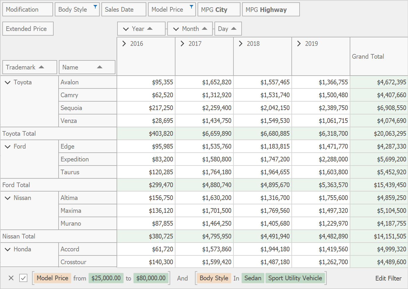
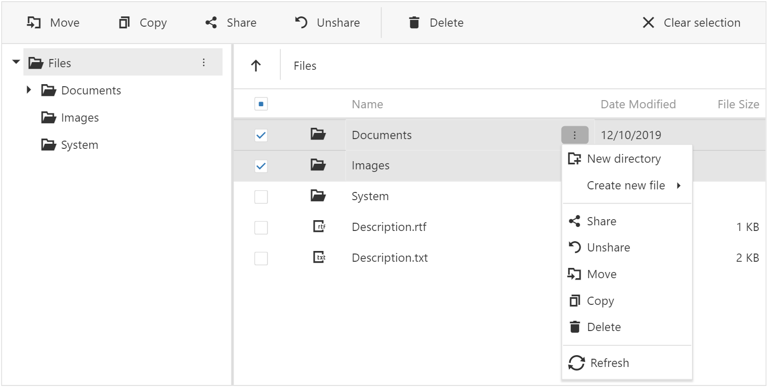
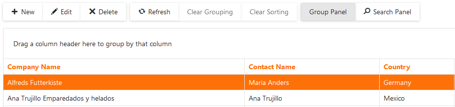
New Filter Panel (v20.1)
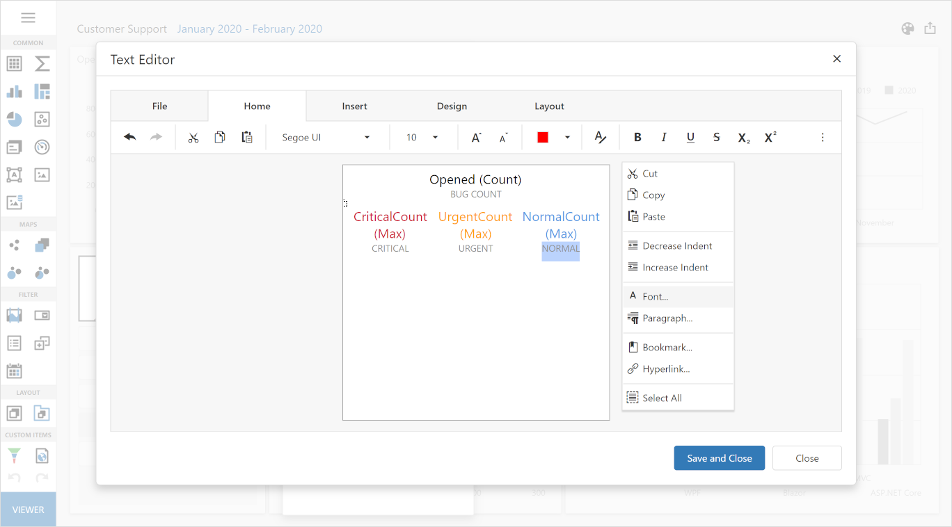
This feature was initially planned for 2019 but we postponed it to polish Excel-Inspired filters and enable them by default. The new Filter Panel will display separate tokens with filters for each column (making it easier to read and manage).
If an applied filter does not fit within the screen area, detailed information will be displayed within a popup.
Automatic Column Best Fit (v20.1)
Our WPF Data Grid and TreeList can both calculate the optimal width for columns based on header text and content. To do this, you either need to call the BestFitColumn/BestFitColumns method or click a corresponding item in a column's context menu. With this new feature, the Data Grid and TreeList will automatically calculate optimal width for columns when loading data or when underlying data changes. To make this possible with large data sources, we will research possible optimizations for the Best Fit process and introduce a new mode wherein optimal width is calculated based on visible data and recalculated again during scrolling.
Conditional Formatting - Disable Cells and Rows (v20.2)
New Conditional Formatting rules will allow developers and end users to disable rows and cells (or make them read-only) based on a specific condition.

WPF Tree View (v20.2)
This feature received 48% of the vote in our survey.
At present, you can customize our TreeList so that it looks like a Tree View - hide headers and row indicators, disable cell navigation, configure horizontal scrolling. However, customizing the TreeList requires time and knowledge of our API. We are going to provide a separate control that looks like a Tree View and inherits the best TreeList features - performance, formatting API, and rich filtering options.
WPF Pivot Grid
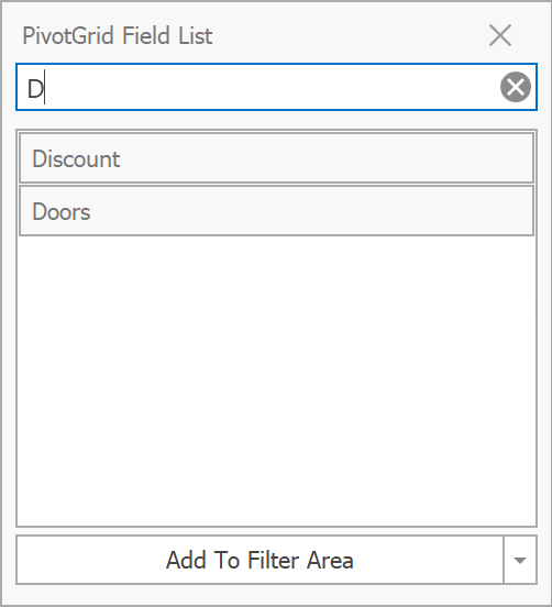
Customization Form Search (v20.1)
The Pivot Grid's Customization Form will display a search box that allows end users to filter the list of available fields.
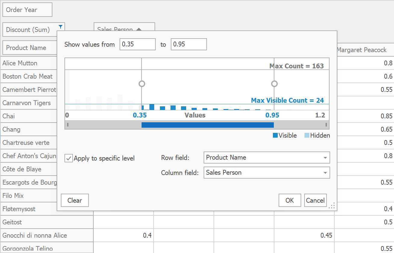
Summary Filter Popup (v20.1)
Data Field headers will display a filter button that invokes a popup window that allows end users to configure summary filters.
New Filter Panel (v20.2)
In our second major release of 2020, we will extend the capabilities of our WPF Pivot Grid with a new Filter Panel. This panel will contain separate tokens with filters for each column (instead of displaying the entire filter string as plain text).
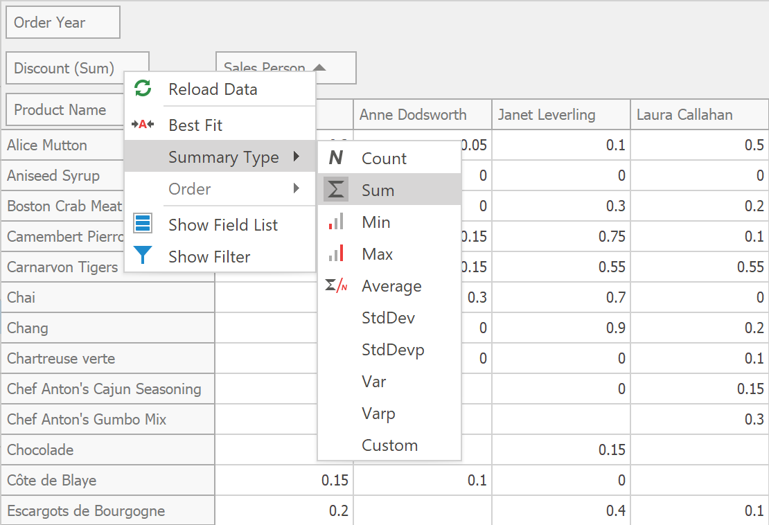
Context Menus for Summary Type and Group Interval (v20.2)
New context menu items will allow end users to change summary type and group interval at runtime.
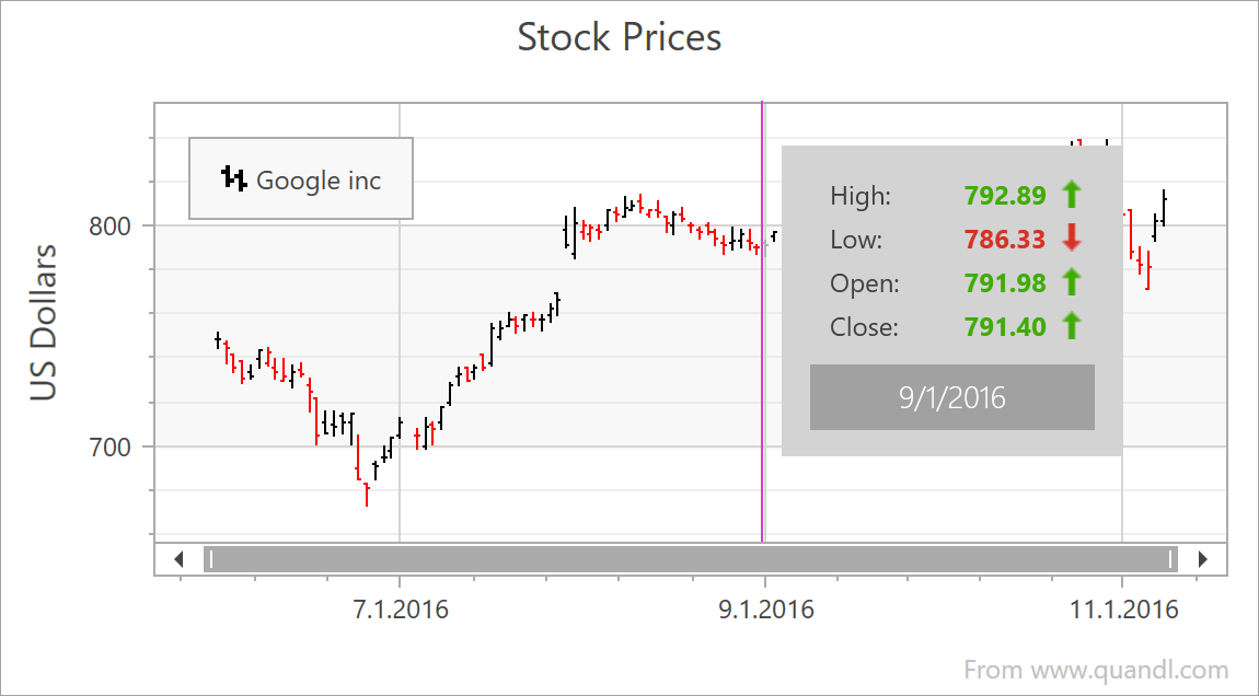
WPF Charting
Large Data Source Processing (v20.1)
We will introduce a new data processing mode to minimize overall memory footprint when processing large data sources. This will address the needs of those with extremely large statistical/financial datasets (especially useful for those using multiple Series or multiple Chart Controls simultaneously).
Chart Ribbon and Toolbars (v20.1)
Charts will be able to generate Ribbon or Toolbar items to help end-users to execute basic charting tasks and tasks specific to financial charting.

In-place Edit Mode for Annotations and Other Text Elements (v20.1)
We will make Annotations and Constant Lines editable at runtime (a new option will be added to the Chart Toolbar).

For more information on this feature, please review the following support tickets: Q531396, T182416, E1003.
New DateTime Scale Mode (v20.1)
Our Chart Control includes a configurable DateTime scale (you can exclude non-working days and time as needed). We will extend DateTime scale processing by automatically excluding intervals without data. This will simplify DateTime scale configuration for those using financial charts.
New Series Label Display Mode (v20.1)
All XY-Diagram compatible Series will support a new label type for easier Series identification when multiple Series are displayed simultaneously.

Support Percent Values for Side Margins (v20.1)
For more information on this feature, please review the following support tickets: T700625, T148976.
Mini Map for Easy Navigation (v20.2)

Chart Designer Template Gallery (v20.2)
We will extend the customization capabilities of our Chart Control and Chart Designer to address various usage scenarios (the Chart Designer allows end users to quickly customize existing chart layouts or create new charts from scratch). We plan to introduce Chart Designer Template Gallery in the v20.2 release.
Calculated Fields and Parameters (v20.2)
We will introduce Calculated Fields and Parameters to extend data processing capabilities for end users.
Advanced Text Formatter for Crosshair Panel (v20.2)
You will be able to specify Crosshair label width and alignment.

WPF Data Editors
Date Navigator Enhancements (v20.1)
We expect to rewrite the visual portion of our Date Navigator so that it is more customizable and lightweight. We will also introduce the following features:
- Touch support.
- An API to define available views (e.g., show only months and years).
- Improved keyboard navigation.
- An API to define the Date Navigator's visible range.
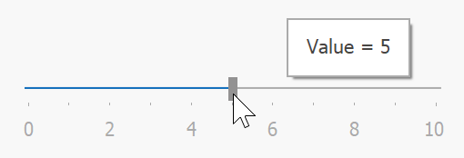
TrackBarEdit Enhancements (v20.1)
TrackBarEdit will draw labels alongside ticks and display a tooltip with the current value when a user drags the thumb.
WPF Themes
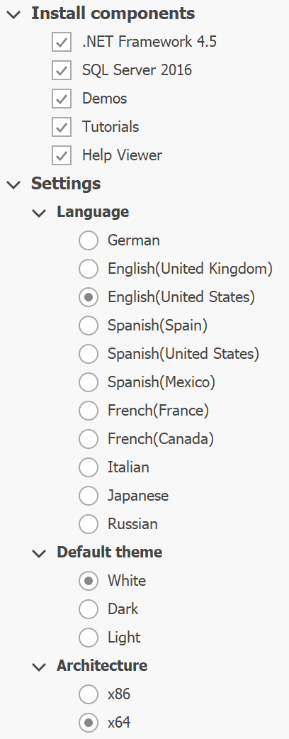
Visual Studio 2019 Themes (v20.1)
We will release a set of new themes inspired by Visual Studio 2019.
Appearance Properties Support (v20.1)
We will simplify appearance customization for our most popular controls (Data Grid, Data Editors, Ribbon, Toolbars) via the following appearance properties:
- Background;
- BorderBrush;
- BorderThickness;
- CornerRadius;
- Padding.
This is not a trivial task because many of these controls have unique requirements. We will investigate available options and will do our best to avoid breaking changes and performance issues.
Fluent Design - Reveal Highlight Effect Enhancements (v20.1)
We expect to add the support for dark and white themes to our Reveal Highlight API.

Theme Designer - .NET Core Support (v20.1 or v20.2)
You can already use theme libraries built against .NET Framework in your .NET Core apps (see .NET Core 3 Support). In 2020, we hope to support themes built against .NET Core 3 and run Theme Designer previews under .NET Core.
WPF Ribbon and Toolbars
Bar Item Appearance Options (v20.1)
- Background;
- BorderBrush;
- BorderThickness;
- CornerRadius;
- Padding.
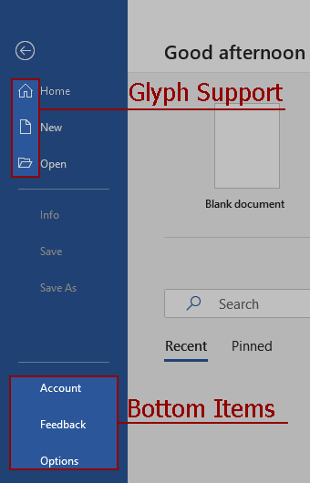
Ribbon - Backstage View Enhancements (v20.1)
Ribbon's Backstage View will support glyphs for individual items and will be able to display items at the bottom.
WPF Scheduler
Appointment and Time Region Filtering (v20.1)
Our WPF Scheduler will include an API that allows you to dynamically hide appointments and time regions. You will be able to handle events to describe your custom filtering logic.
scheduler.FilterAppointment += (d, e) => {
    e.Visible = object.Equals(e.Appointment.StatusId, 1);
};
In addition, the new FilterString and FilterCriteria properties will help you bind your Scheduler to the Filter Editor or to Filter Elements for advanced filtering scenarios.
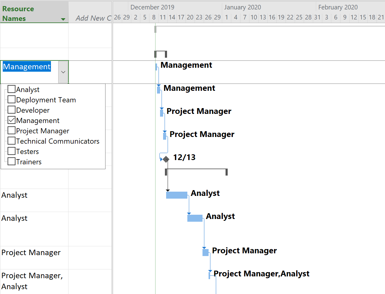
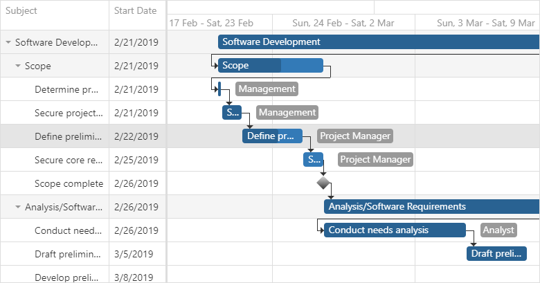
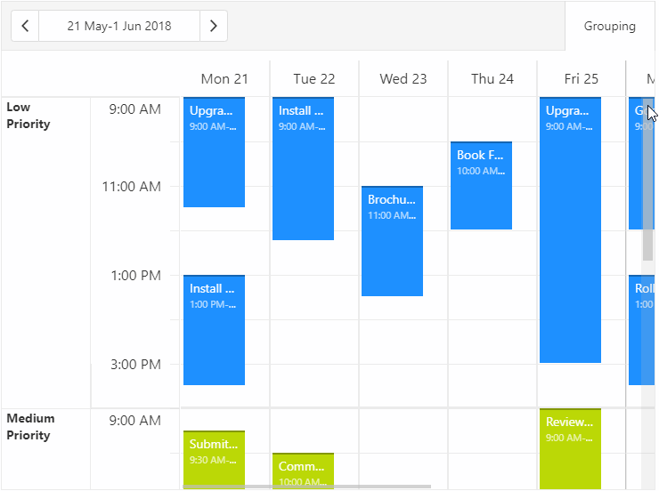
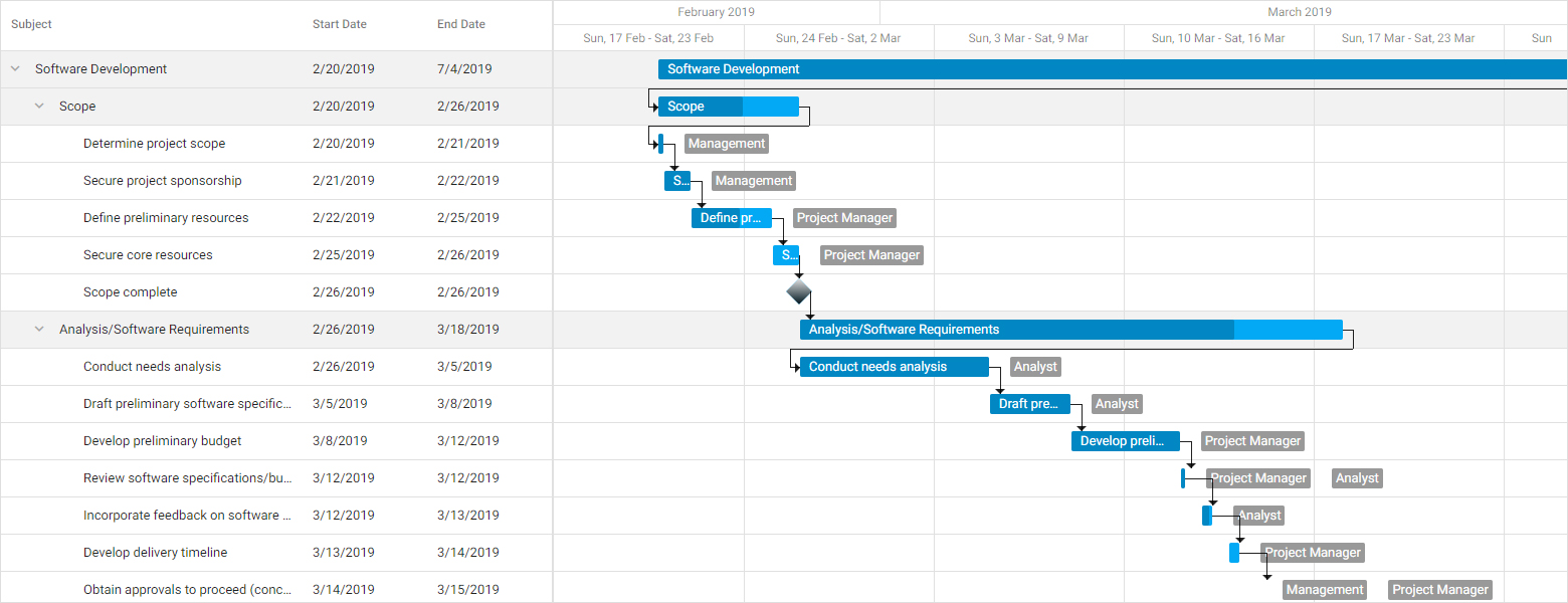
New Timeline View Layout (v20.1 or v20.2)
We will rewrite the visual portion of the Timeline View and introduce new dynamic time scales, per-pixel horizontal scrolling, and smooth zoom to the mouse pointer. The overall experience will be similar to scrolling and zooming in the Gantt control:
Unlike the Gantt control and our current Timeline View implementation, the new Timeline View will limit horizontal scroll range depending on the current zoom factor. For example, when the time scale displays days, you will be able to scroll within a month before zooming out or switching to the next month in the Date Navigation Panel. Limiting the horizontal scroll range will help us calculate the resource height for the entire range so that resources don't change height during scroll operations.
In addition to improved zooming and scrolling, the new Timeline View layout will provide a more flexible way to control resource height. You will be able to define the minimum and maximum height for your resources, and the Scheduler will calculate actual height for each resource (based on appointments contained within the displayed range). If appointments exceed the maximum resource height, resources will display a button that expands the resource even further.
On-Demand Data Loading (v20.2)
With this feature, our WPF Scheduler will request data only for the visible range and will make additional queries after scrolling. Loaded data will be cached to reduce the number of requests.
scheduler.FetchAppointments += (d, e) => {
    e.AppointmentsSource =
        from x in dbContext.Appointments
        where (((x.QueryStart >= e.Interval.Start && x.QueryStart < e.Interval.End) || (x.QueryEnd >= e.Interval.Start && x.QueryEnd < e.Interval.End))
                || (x.QueryStart < e.Interval.Start && x.QueryEnd >= e.Interval.End))
                && e.ResourceIds.Contains(x.ResourceId)
        select x;
};
On-demand data loading can significantly increase the loading speed for applications with large data sources.
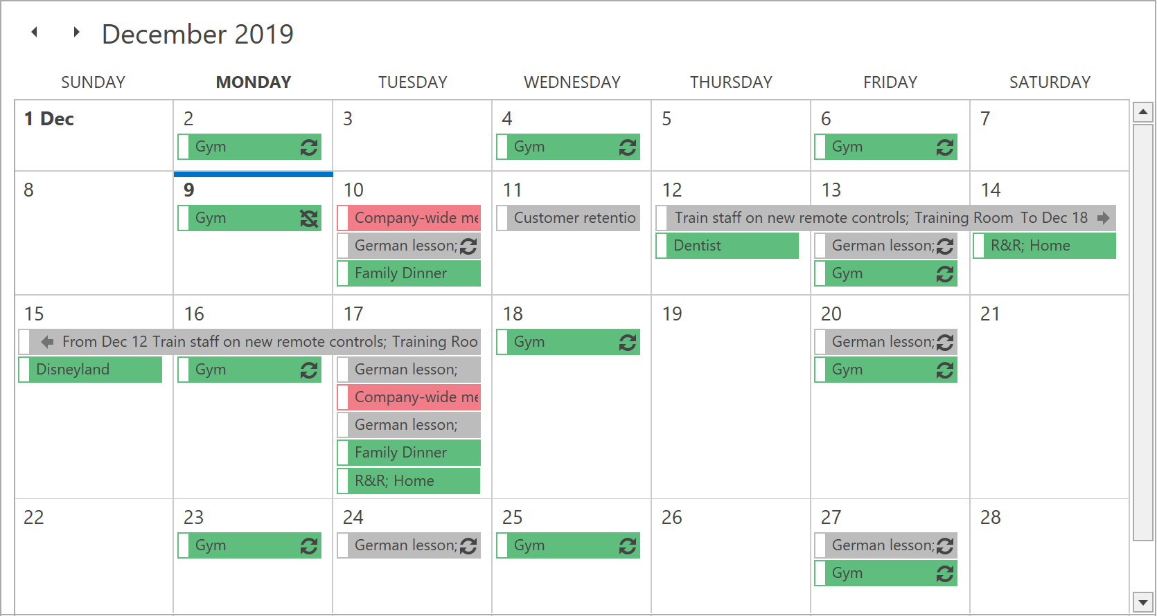
One Month View (v20.2)
This feature received 35% of the vote in our survey.
In our second release of 2020, we will ship a new view that displays a single month. Individual weeks within this new view can be of varying height (based upon the number of appointments contained within the week). If all weeks fail to fit the screen, a vertical scroll bar will be displayed.
WPF Diagram
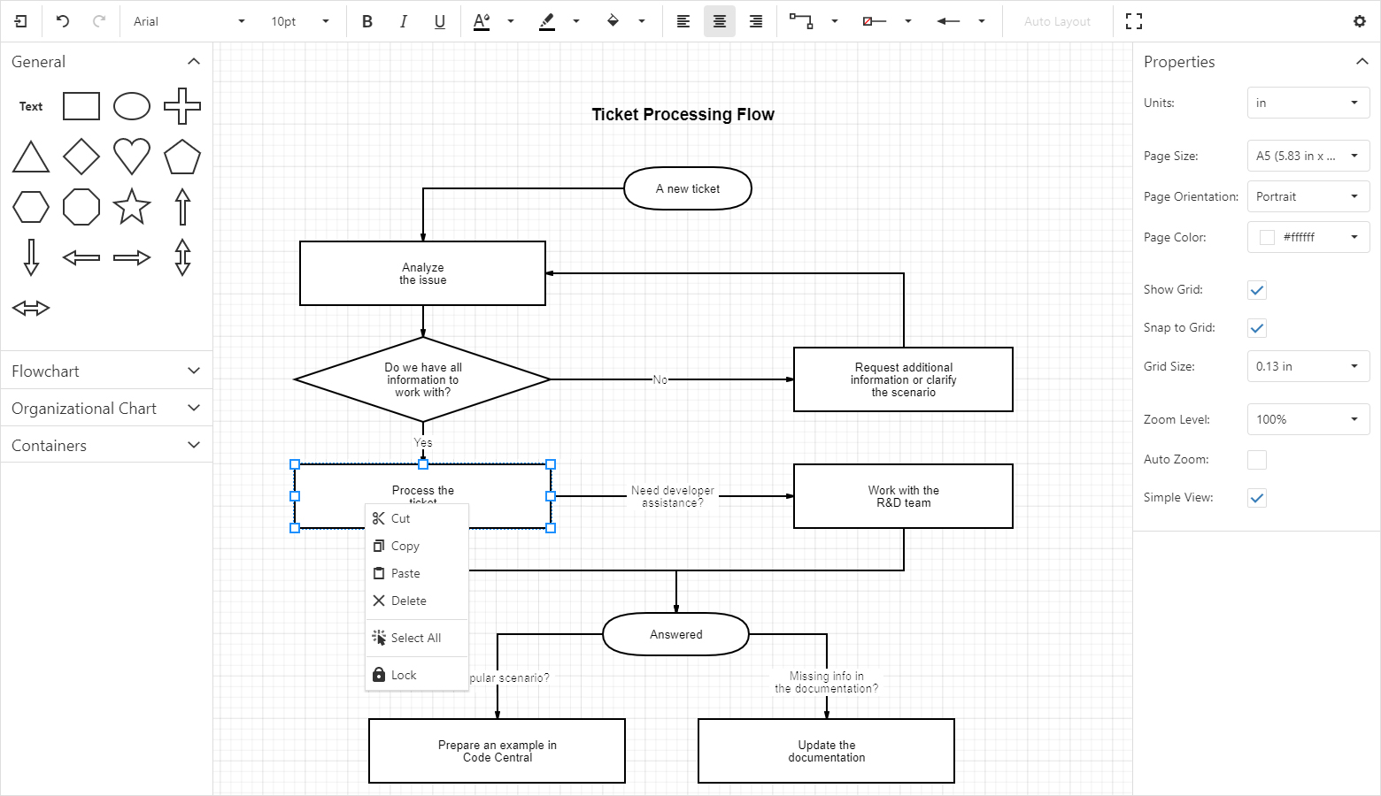
Text Tool (v20.1)
We will ship a new tool that allows you to add labels to a diagram by clicking an empty region and entering the appropriate caption via the keyboard.

Localization and Measure Units for the Properties Panel (v20.1)
Diagram item properties displayed within the Properties Panel will support localization. In addition to pixels used by default, end users will be able to specify property values in other measurement units (inches and centimeters).
List Item (v20.2)
Our second major release of 2020 will include a new container item that arranges its child items in a list. End users will be able to add, remove, and reorder items in this list.
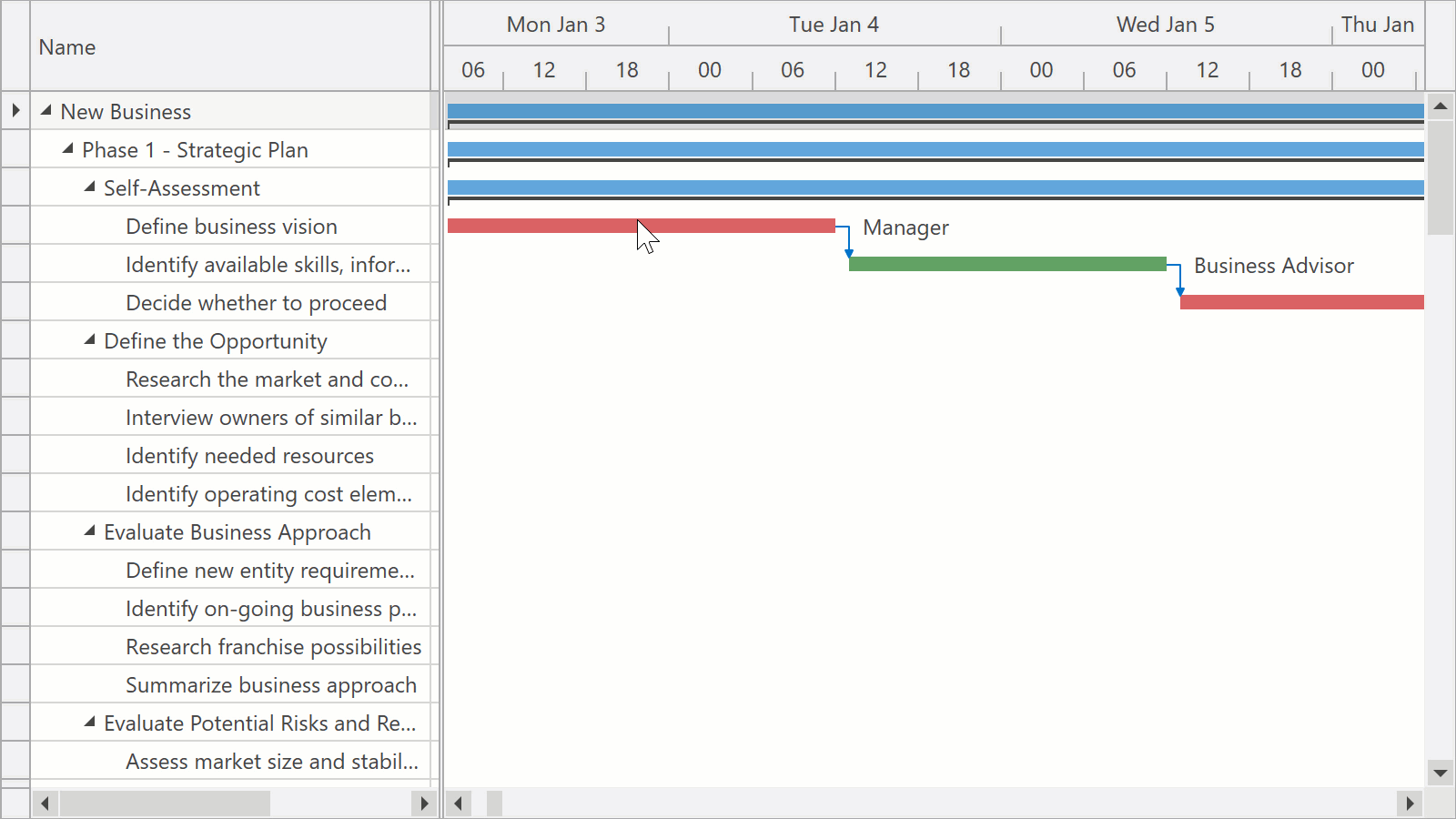
WPF Gantt
Backward Scheduling (v20.1)
The Backward Scheduling API will help you manage projects that have a specific deadline. You will be able to plan backwards - scheduling each task from a deadline to the beginning of the project.
Resources (v20.2)
This feature received 54% of the vote in our survey.
You will be able to assign resources to tasks and specify the percentage of time a resource spends on a task. The Gantt control will automatically schedule tasks based on resource availability.
Printing (Under Research)
Though still under investigation, we hope to allow users to leverage existing Printing classes to print our Gantt control. If existing Printing classes are insufficient, this feature will likely be postponed.
WPF Mapping
New Vector Data Providers (v20.1)
We will introduce new data providers for formats such as vector tiles (PBF, MBTiles), GeoJSON, KMZ and GPX.
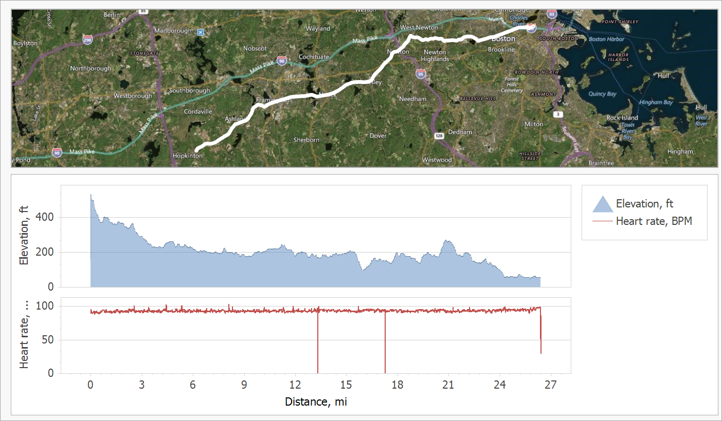
Vector tiles have a big advantage over raster maps from existing providers (Bing, OSM) because they reduce data transfer size. In addition, vector tiles make it possible to address popular requests such as map rotation.

For more information on this feature, please review the following support tickets: T825567, T833987, T745712.
Map Editor UI (v20.2)
We will introduce new vector elements and extend the Map Editor’s UI to make it more suitable for geo measurements and for in-place editing.
For more information on this feature, please review the following support tickets: T749863, T717633.
WPF Syntax/Code Editor versus Additional Enhancements to Core WPF Controls
Though we remain interested in a Syntax/Code Editor, we know that this component will only address the needs of a small subset of users. To help crystallize the opportunity cost (in terms of R&D resources) associated with a Syntax/Code Editor, we are compiling a list of minor enhancements across our WPF product line that would be deferred were we to create a Syntax/Code Editor in 2020.


 More than one year ago I explained to my collaborators that - in my opinion - it was possible to integrate XAF's security layer with UI interface into an existing WinForms enterprise application that was 10 years old. We successfully implemented it! It took 40 man-days of job in total instead of at least 400 if I had decided to start from scratch. You guys saved my life!!
 …and probably around a street corner near you! Yes, we at DevExpress are crossing the final T’s and dotting the final I’s with Carl: the US Blazor Roadshow is starting next Monday, February 10, in Burlington, MA. Carl is doing 21 presentations in various cities in the US, aided and abetted (and sponsored) by DevExpress, over the next 7 weeks. Next Tuesday is New York, Wednesday is Philadelphia, Thursday is Washington, so we certainly have our travel cut out for us!