After careful consideration of your feedback and support center tickets, we’ve finalized our 2020 Roadmap. Thank you for sharing your perspective with us and for your continued support and commitment to DevExpress WinForms controls.
If you have any questions about our 2020 WinForms Roadmap, feel free to comment below or email us at support@devexpress.com. We will be happy to follow up.
Table of contents
See Also
.NET Core Support (v20.1 and v20.2)
In 2020, we will switch from .NET Core version 3 to 3.1 LTS (Long Term Support).
Microsoft released this version a few weeks ago.
You can expect multiple enhancements to our .NET Core product line throughout 2020 – including designer dialogs, wizards, and Template Gallery templates.
Additionally, we will move forward with .NET 5 support once the framework is released.
Appearance and Skins (v20.1 and v20.2)
We hope to support DirectX and Acrylic effect in Overlay Screens, the BackstageView, and popup menus.
![]()
Additionally, Splash Screens will be able to change colors based on current application skin.
![]()
We also expect to move outdated raster skins into our Bonus Skins library.
Appium Automated UI Test Support (v20.1)
We recently published a blog post regarding Appium and how it can be used to test DevExpress-based WinForms applications. We will fully test all DevExpress WinForms controls using this framework and officially announce Appium support later this year for active WinForms subscribers.
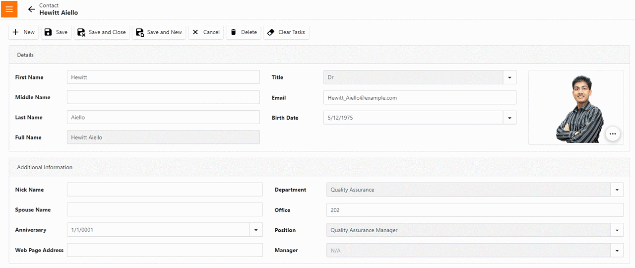
WinForms Data Editors (v20.1 and v20.2)
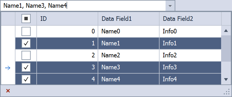
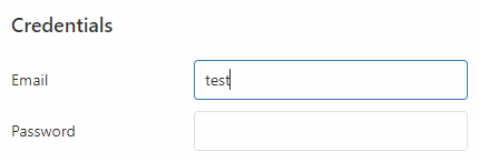
We will add two new WinForms Data Editors in 2020 - a highly requested editor that supports DateTimeOffset values, and a lookup editor that supports multiple item selection.
![lookup]()
Charts
Large Data Source Processing (v20.1)
We will introduce a new data processing mode to minimize the overall memory footprint when processing large data sources. This will address the needs of those with extremely large statistical/financial datasets (especially useful for those using multiple Series or multiple Chart Controls simultaneously).
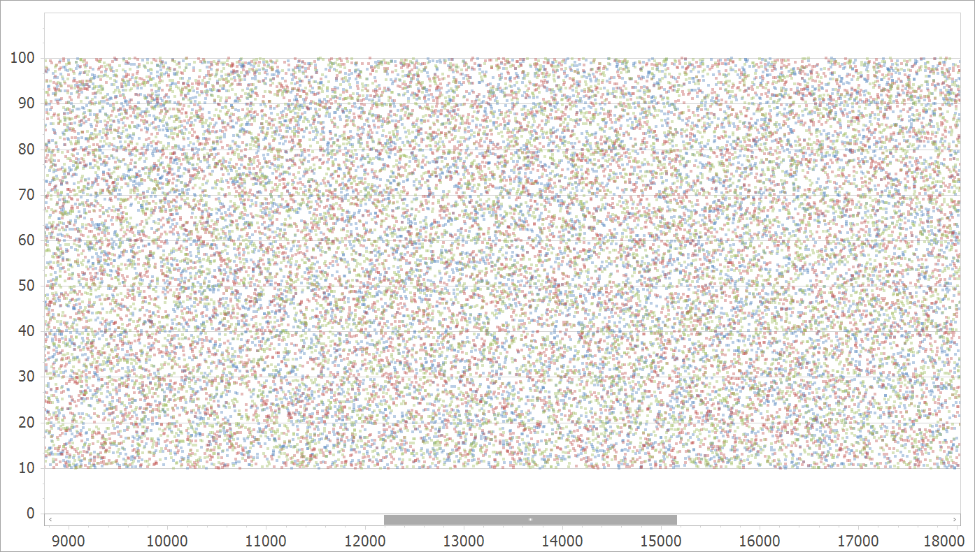
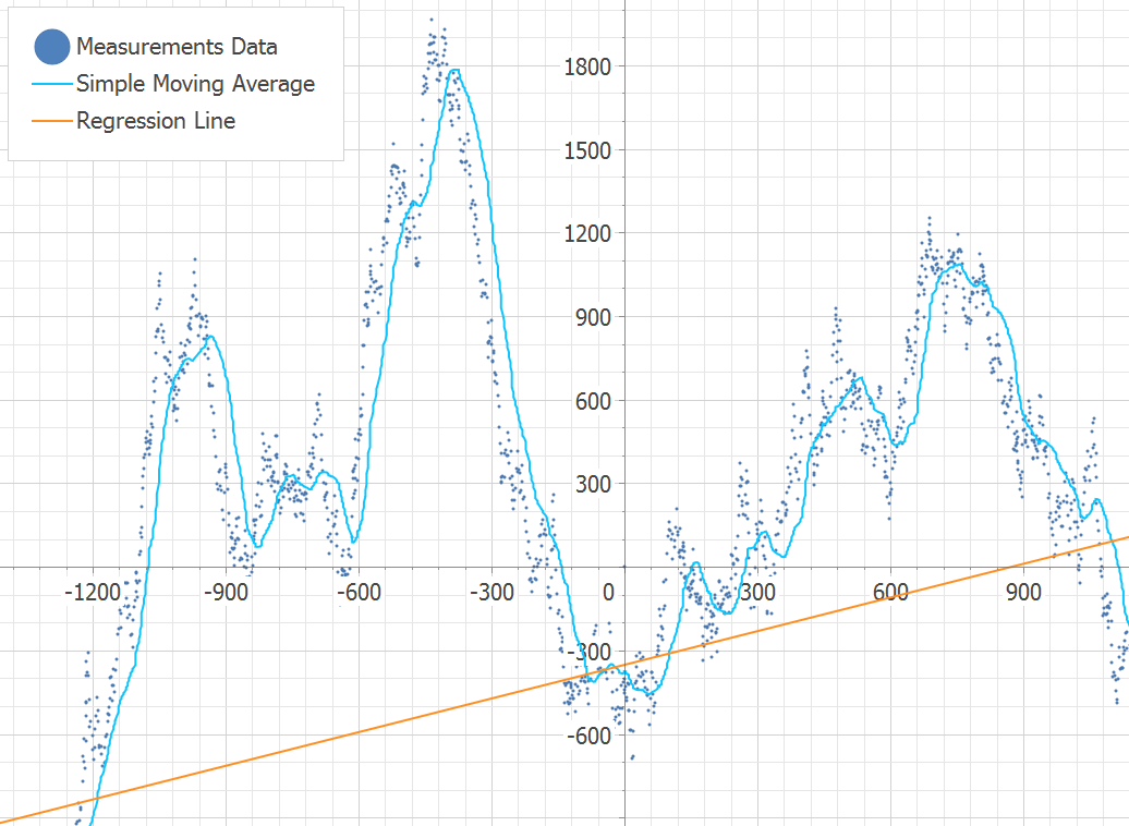
New Swift Point Series Type (v20.2)
Swift Point Series will be optimized for quick analysis of large input data via the use of point markers.
![swift-series]()
For more information on this feature, please review the following support tickets: T752918, S34103, Q455568.
Chart Designer Template Gallery (v20.2)
We will extend the customization capabilities of our Chart Control and Chart Designer to address various usage scenarios (the Chart Designer allows end-users to quickly customize existing chart layouts or create new charts from scratch). We plan to introduce the Chart Designer Template Gallery in the v20.2 release.
In-place Edit Mode for Annotations and other Text Elements (v20.1)
We will make Annotations and Constant Lines editable at runtime (a new option will be added to the Chart Toolbar).
![]()
For more information on this feature, please review the following support tickets: Q531396, T182416, E1003.
New DateTime Scale Mode (v20.1)
Our Chart Control includes a configurable DateTime scale (you can exclude non-working days and time as needed). We will extend DateTime scale processing by automatically excluding intervals without data. This will simplify the DateTime scale configuration for those using financial charts.
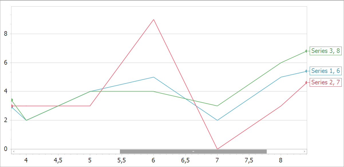
New Series Label Display Mode (v20.1)
All XY-Diagram compatible Series will support a new label type for easier Series identification when multiple Series are displayed simultaneously.
![edge-labels]()
Support percent values for Side Margins (v20.1)
For more information on this feature, please review the following support tickets: T700625, T148976.
Mini Map for easy navigation (v20.2)
![]()
New Sankey Chart Control (v20.2)
We will introduce a Sankey Chart designed to visualize a flow from one set of values to another.
![]()
Calculated Fields and Parameters (v20.2)
We will introduce Calculated Fields and Parameters to extend data processing capabilities for end-users.
Advanced Text Formatter for Crosshair Panel (v20.2)
You will be able to specify Crosshair label width and alignment.
![]()
WinForms Data Grid
Hovered state support (v20.1)
Our WinForms Data Grid will support a hovered state for data rows.
Kanban Board enhancements (v20.1)
As you may know, our Grid’s Tile View ships with Kanban Board mode. We will extend our Kanban Board with the following new features:
- Empty groups support
- Multi-line group captions
- Group captions formatted with HTML tags
- UI elements that allow users to quickly add new columns and cards at runtime
- Variable (dynamically changed) tile heights
![]()
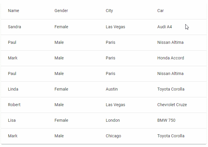
New customization form (v20.2)
We will introduce a new customization form to our WinForms Data Grid control. This new form will improve usability when working with a large collection of columns and bands. We will also extend the capabilities of the form and include features such as checkbox-based multi-selection.
Miscellaneous Enhancements (v20.1 and v20.2)
Though not exhaustive, the following list of minor features should also be implemented in 2020:
- Mix conditional formatting colors with row appearance settings
- Fix (align) the checkbox selection column to either side of the control
- Improve WYSIWYG and data-aware export
- Conditional Formatting Rules Manager enhancements
- Colorful search text highlight
WinForms Diagram Control
Data Binding - DataTable Support (v20.1)
Our Data Binding and Org Chart controllers use data bindings to link the content of a generated item to data objects. The data binding engine that we use for the WinForms Diagram control does not support dynamic properties. Therefore, those of you who chose DataTable or DataSet as a source collection have to synchronize data between data objects and diagram items manually. To support DataTable, we will need to create a new data binding engine for the Diagram control.
Text Tool (v20.1)
We will ship a new tool that allows you to add labels to a diagram by clicking an empty region and entering the appropriate caption via the keyboard.
![diag2]()
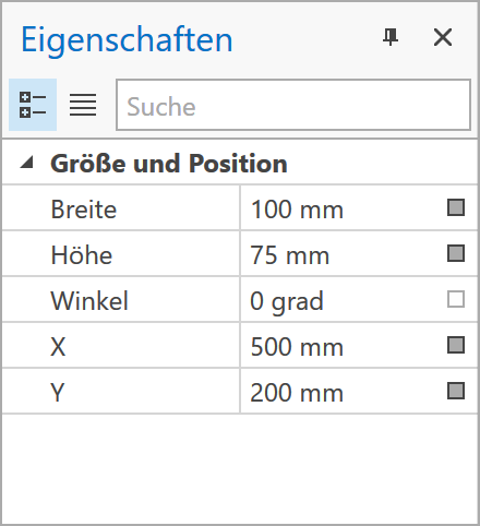
Localization and Measure Units for the Properties Panel (v20.1)
Diagram item properties displayed within the Properties Panel will support localization. In addition to pixels used by default, end-users will be able to specify property values in other measurement units (inches and centimeters).
![]()
Rendering Performance (v20.2)
The Diagram control will automatically adjust render quality on small zoom levels - significantly increasing performance for diagrams with 1000+ items or diagrams that contain complex SVG shapes.
List Item (v20.2)
Our second major release of 2020 will include a new container item that arranges its child items in a list. End-users will be able to add, remove, and reorder items in this list.
![diag1]()
WinForms Common Dialogs (v20.1 and v20.2)
We will extract common dialog logic into stand-alone behaviors. This will allow you to create your own file and folder managers. Additionally, we expect to implement a few user-requested features, including the ability to filter file\folder\drive lists or add custom controls into dialogs.
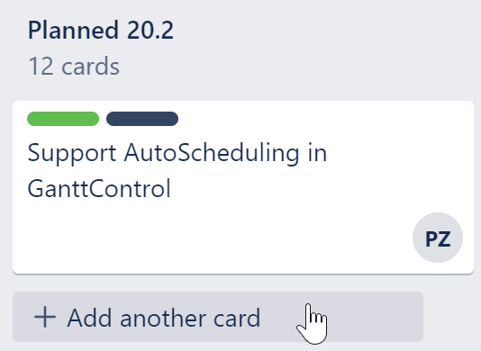
WinForms Gantt Control (v20.1 and v20.2)
In 2020, we will extend the capabilities of our Gantt Control. We expect the include the following features this year:
![]()
- Auto-scheduling
- Runtime customization
- Task Split support
- Critical Path support
- Embedded timeline with two display modes
- Printing support
Maps
New Vector Data Providers (v20.1)
We will introduce new data providers for formats such as vector tiles (PBF, MBTiles), GeoJSON, KMZ, and GPX.
![]()
Vector tiles have a big advantage over raster maps from existing providers (Bing, OSM) because they reduce data transfer size. In addition, vector tiles make it possible to address popular requests such as map rotation.
![vector-tiles]()
For more information on this feature, please review the following support tickets: T825567, T833987, T745712.
Vector Element Layout (v20.1)
We will add new options (rotation angle and SVG image support) to extend the capabilities of vector items such as Pushpins and Custom Elements.
![]()
Map Editor UI (v20.2)
We will introduce new vector elements and extend the Map Editor’s UI to make it more suitable for geo measurements and for in-place editing.
For more information on this feature, please review the following support tickets: T749863, T717633.
Navigation and Layout Controls
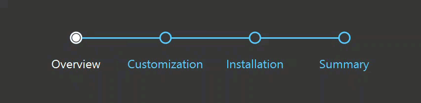
New WinForms Step Progress Bar Control (v20.1)
This new control will help you better visualize linear processes. Each process step in your linear process will be drawn as a circle and the current step will be highlighted. Transitions between steps will include animation effects.
![]()
Stack and Table Panel Enhancements (v20.1)
We expect to enhance our simple layout panels via the following features:
- the ability to change visibility for Table Panel rows and columns
- right-to-left (RTL) layout support for both Table and Stack Panels
- automatic panel sizing
- automatic tab order
- baseline caption alignment
- performance optimizations
WinForms Pivot Grid (v20.1 and v20.2)
We will add a search panel to the Pivot Grid control to help simplify the record search within the Pivot Grid.
In addition, we're planning to introduce support for fixed columns within the Pivot Grid control.
WinForms Scheduler Control
Year View (v20.2)
We will add a Year View to our Scheduler Control in our v20.2 release cycle.
![]()
Timeline View (v20.1)
This year, we’ll shift development focus to our WinForms Timeline View. We hope to introduce resource pixel scrolling to this View.
Flyout Customization (v20.2)
We will allow you to customize our Appointment Flyout as needs dictate (for instance, give you the ability to incorporate custom fields).
![]()
Resource Category Tab Buttons (v20.1)
We expect to enhance our recently released Resource Category feature by adding buttons (both standard like "Close" and custom) to resource tab headers.
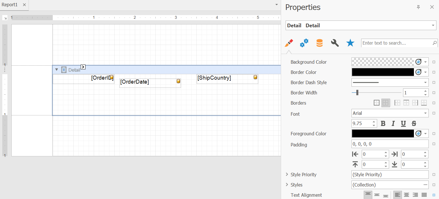
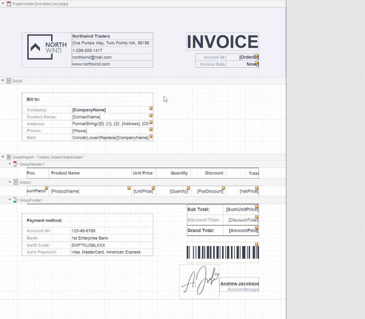
Tree List (v20.1)
We will add an empty row (new item row) option to the TreeList Control in our first major release of 2020 (it will mirror the capabilities of our Data Grid).
![]()
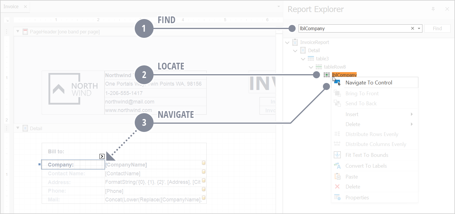
Your Feedback Matters
As always, we look forward to your comments and questions. Please share your thoughts below or email support@devexpress.com.
The information contained within this blog post details our current/projected development plans. Please note that this information is being shared for INFORMATIONAL PURPOSES ONLY and does not represent a binding commitment on the part of Developer Express Inc. This roadmap and the features/products listed within it are subject to change. You should not rely on or use this information to help make a purchase decision about Developer Express Inc products.
![]()


/1%20Mock%20up.png)
/2%20Result.gif)