Quantcast
Channel: Developer Express Inc.
Viewing all 2399 articles
Browse latest View live

eXpressApp Framework Roadmap 2020 - Your Vote Counts

$
0
0

It's All 'Bout the Blazor, Blazor, Blazor

XAF v20.1 will include a CTP version of Blazor UI with XPO ORM for data access. XAFers will be able to create Blazor Server apps using the Solution Wizard (Blazor WebAssembly support is postponed until officially released by Microsoft). We expect to ship the following functionality for desktop and mobile apps:
  • Navigation control with group and item hierarchy.
  • Main menu with all standard XAF command types (buttons, popups, input/search boxes, drop-down menus).
  • Grid List Editor with sorting & grouping.
  • Detail form layout with group and tab controls.
  • Property Editors for all data types (no advanced editors for criteria, RTF, etc.).
  • Simple forms authentication with a login and password, role-based authorization and basic user/role management with access rights created in code (no specialized permission editors in the UI).
  • Data input validation with RuleRequiredField, RuleCriteria, RuleRange and other popular rules.
  • Multiple UI themes and a runtime theme chooser (similar to the 'gear' in the top-right corner of https://demos.devexpress.com/blazor/).
By our second release of 2020 (v20.2), XAF’s Blazor UI should be ready for production use. We hope to include additional XAF modules (please cast your vote below), online documentation, support for UI customization and advanced CRUD usage scenarios (as well as custom control integration). We also hope to support more end-user customization capabilities once they are included within individual DevExpress Blazor controls (for instance, grid column filters, add/remove columns, data export, inline edit).
We will continue to update XAF’s online Blazor demo with new features as they become available. Our next update (in 1-2 weeks) should include support for collection, reference, enumeration, Boolean, image and other data editors.

Housekeeping

  • We want to remove Visual Studio dependencies from the design-time Model Editor to increase stability and performance. We like the WPF designer that runs as a separate process and draws itself inside the Visual Studio frame. This will also help us support the Model Editor in .NET Core 3+ and .NET Standard 2+ projects (v20.1).
  • We will also incorporate a number of usability enhancements to the Model Editor based on user feedback - please let us know if you have any issues with this editor (v20.1).
  • We will monitor Microsoft updates with regard to the component designer in .NET Core 3+ and see if we can support our Application, Module, Controller and Action Designers. We will also support the SDK-style project format for all XAF design-time tools (v20.1, v20.2).
  • We will add support for Visual Studio vNext, .NET 5 and C# 8.0 features like Nullable Reference Types (v20.2).

Security System

We hope to publish Blazor, Xamarin and WPF examples for XAF's User Authentication and Group Authorization API powered by the XPO ORM (see our GitHub repository for more information). To make these examples more elegant and modern, we've thought about the following enhancements: 
  • Introduce asynchronous versions of popular security APIs (IsGranted, CanRead, CanWrite, CanDelete, etc.). 
  • Support token-based authentication.
  • Simplify XAF's security system integration with the help of utility libraries (they will encapsulate boilerplate code). 

We hope to support Entity Framework Core to help more DevExpress and non-DevExpress customers benefit from XAF's Security System. In v20.1, we will introduce a secured Object Space for EF Core 3.1+ and examples for corresponding platforms. Later in v20.2, we will support EF Core in our Blazor UI. We will decide on the EF Core support for WinForms UI based on user demand. Please share your thoughts on this subject in the survey below.

WinForms UI & Core

  • We hope support the following asynchronous operations out-of-the-box in the WinForms UI based on IObjectSpaceAsync introduced in v19.2: open List or Detail View, save View changes, save audit data (v20.1). If you are missing important use-case scenarios, please specify them in comments below.
  • We will support basic Entity Framework Core usage scenarios (v20.1) – those needed for XAF's Security System in non-XAF apps and Blazor UI (see above).
  • We want to rewrite our Tree List Editors module and support inplace data editing (v20.1), better filtering options and more features (S30514S30735 S38121) based on user feedback (v20.2).
  • We want to enable enhanced WinForms Filter and Expression editors in the Model Editor and within built-in List and Property Editors (v20.2).
  • We will make a number of Non-Persistent/proxy object enhancements (v20.2): support for filtering; propagate FindObject, CommitChanges, Refresh and other methods from NonPersistentObjectSpace to AdditionalObjectSpaces (T509228); support CRUD operations with non-persistent objects in a nested ListView of a persistent object DetailView (T486427T510338T695631).

ASP.NET WebForms UI

Our primary focus will be on XAF’s new Web & Mobile UI for Blazor. This notwithstanding, we will do our best to address the needs of existing ASP.NET WebForms UI users.

Your Feedback Counts

Though we want to deliver everything (and deliver it yesterday), we can’t make any guarantees. As always we welcome your comments and specific usage-scenarios. The more you share, the better we can understand your business needs now and into the future.

Before we proceed to the 2020 Roadmap voting, please tell us about yourself and share your experience with the features we released in 2019.

ASP.NET Core Roadmap 2020 – Your Vote Counts

$
0
0

Support for .NET Core Evolution

As you would expect, we'll support the next the big release of .NET Core (currently known as .NET 5) in 2020.

Gantt


We will officially ship our ASP.NET Core Gantt component in 2020. We hope to extend its capabilities with the following features:
  • Localization support
  • Touch device support
  • Integrated toolbar
  • Current Time Maker that indicates the current date and time within the Gantt region
  • Custom colors for Task nodes within the Gantt area
  • Customizable Context Menu
  • Customizable Task Details dialog (used to edit tasks)
  • Data validation support

Diagram

Like our Gantt component, we expect to officially release our ASP.NET Core Diagram components in 2020. New features will include:
  • Localization support
  • API to manage changes to the Diagram’s data model
  • Template-enabled custom shapes
  • Improved Diagram UI with an additional workspace inside the control
  • Support for dash, dot, and other types of lines for shapes and connectors
  • Auto-creation and shape connection once a connector is generated
  • Drawing- related performance enhancements
  • Support for touch-first devices

RichEdit

Implement a WYSIWYG client-side PDF export.

File Manager


  • Upload and download files via our ArrayFileProvider
  • Declarative column customization using component options
  • New API to manage file and directory selection and control end-user actions on UI elements
  • Intuitive server-side and client-side file management error handling support
  • Notification and Progress panel UX enhancements
  • Asynchronous API for server-side file modification
  • Support for file and directory access based on user roles

HTML/Markdown Editor

Table Support

As you may already know, we selected the most popular open-source implementation (Quill) as the core for ASP.NET Core HTML/Markdown Editors. We constructed the control’s user interface with DevExtreme components (theme support, keyboard navigation, customization, etc).

Quill 2.0 was expected in 2019 and was purported to offer a new API with table support. Unfortunately, Quill 2.0 has yet to be released. We now need your help to make the best possible decision about table support within our editor.

Upload Images via a Form, Drag-and-Drop, and Copy/Paste

We couldn’t deliver this feature in 2019. We have prepared a custom solution you can use today if this feature is important for you. We expect to integrate this feature within the control in 2020.

Visual Studio Integration

Accessibility

We usually incorporate accessibility with each new ASP.NET Core feature/component. Some of you create products for government or other sectors that require strict compliance with existing accessibility standards such as Section 508 and Web Content Accessibility Guidelines (WCAG). We will compile and publish the necessary documents/materials/references for those that must meet compliance specifications/standards. 

Improved Responsiveness/Adaptivity

We plan to create and publish a fully responsive real-world ASP.NET Core application built from ground up. We want it to look and work perfectly on any screen – from wide desktops and tablets to mobile phones. Adaptability enhancements can be applied to many components from Toolbars and Menus to our ASP>NET Core Scheduler and DataGrid.

DataGrid/TreeList

New Export to Excel API

Export to Excel will be made more flexible and robust approach via the ExcelJS library.
Our new export capabilities will give you granular control over the Excel file generation process. We’ll do our best to make the migration process as smooth as possible. For a limited time, both options (old and new) will work side by side.
We expect to deliver the following features prior to official release:
  • Introduce transparent (WYSIWYG) export of our DataGrid’s column format.
  • Export the DataGrid’s filter configuration as Excel worksheet column filters.
  • Fully document our new export to Excel API.
  • Demonstrate popular usage scenarios via technical demos.
Once we finish with the DataGrid, we’ll extend the new Export to Excel API to our JavaScript PivotGrid and TreeList controls.

Remote Validation Support

We’ll extend Asynchronous Validation Rule support in DataGrid/TreeList cells in row and batch editing modes.

New Splitter Component

A Splitter allows you to divide a workspace into multiple panels (with dynamic widths). An end-user can use touch or a pointing device to resize panels at run-time.

TreeView Drag-and-Drop Enhancements

Node Reordering

Change parent-child relationships of TreeView nodes via drag-and-drop.

Cross-Component Nodes Drag-and-Drop

Move a node from one hierarchy to another using drag-and-drop.

Editors & Form Layout

Label Animations

According to Material Design Guidelines, editor placeholder text can turn into a label once the editor obtains focus. We plan to support this feature.

Scheduler

Our Scheduler will inherit the architectural enhancements mentioned above. If you have specific requirements, please list your needs below:

Data Visualization

Annotations in Maps, Pie and Polar Charts

We recently introduced chart annotations. We plan to extend this capability to Maps, Pie and Polar Charts.

Custom Position of Chart Axes

We planned to release this feature in 19.2 but failed to do so. Please, refer to our discussion page for more information.

Additional Customization Options

We’ll allow you to use templates to render images (or other custom content) within chart axis labels.

DevExpress UI for .NET Core Roadmap 2020 (Desktop and Web) – Your Opinion Counts

$
0
0

Desktop (WinForms & WPF)

.NET Core 3.1 and .NET 5

We introduced official support for .NET Core 3.0 in our v19.2 release cycle. In a couple of weeks, we will publish a maintenance update that was tested against .NET Core 3.1. We are also excited about .NET 5 and we will be ready to publish our update alongside its release in November 2020.

WPF Designer

Since .NET Core uses a new surface isolation architecture for the WPF designer, most of our designer extensions are currently available only for .NET Framework. We are working on the following designer features for .NET Core:

  • Smart Tags.
  • Selection of non-visual elements (Data Grid columns, Toolbar & Ribbon items).
  • Applying application themes from App.config to all designer previews.
  • Configuration wizards (Chart Designer, Diagram Designer, Feature Browser for the Data Grid).

WinForms and Reporting Designers

The latest preview version of the WinForms designer for .NET Core is now available (Visual Studio 16.5 Preview 1). It introduces new features such as designer actions and scroll bars but does not support third-party controls. We will continue to monitor updates from Microsoft and will release a preview build with our designer extensions as soon as the WinForms designer matures.

For now (due to the lack of designer support), our WinForms controls are available as a community tech preview (CTP). DevExpress WinForms and WPF Reporting controls also rely on the WinForms designer and as such, are also available as a CTP.

XAF Designers and EF Core Support

We will continue to monitor Microsoft updates with regard to the component designer in .NET Core 3+ and see if we can support our Model Editor, Application, Module, Controller and Action Designers. This is important for XAF's WinForms and Blazor UI.

We will also support basic Entity Framework Core usage scenarios – those needed for XAF's User Authentication and Group Authorization API in non-XAF apps and XAF's Blazor UI.

Additional Plans

All new desktop functionality coming in 2020 will run on .NET Core. Please refer to the following blog posts for more information on some of the things we have planned for 2020.

Web

ASP.NET Core Controls

Our ASP.NET Core components will include a number of additions in 2020:

  • We will officially ship our ASP.NET Core Gantt and ASP.NET Core Diagram components as well as implement the new one from scratch - Splitter.
  • We will implement a WYSIWYG client-side PDF export in RichEdit and numerous FileManager enhancements (extended APIs, improved UX for notifications, etc.).
  • We will ship a new unified wizard with more options to configure ASP.NET Core projects, accessibility and other numerous enhancements for TreeView, DataGrid, Scheduler, Charts and Maps.
  • You should also expect improved responsiveness (from Toolbars and Menus to our Scheduler and DataGrid) and much more.

For more detailed information and to cast your vote for each item described above, please refer to the following post: ASP.NET Core Roadmap 2020 - Your Vote Counts.

Blazor Components and App Framework

To see roadmap for our Blazor components for the first half of 2020, refer to this post. For more information on how we will use these DevExpress Blazor components to build the new XAF's Web & Mobile UI in 2020, refer to this post.

Xamarin 2020 Roadmap – Your Vote Counts

$
0
0

As you may know, this year we shipped a number of new Xamarin.Forms UI components. In 2020, we will expand our Xamarin product offering and extend the functionality of existing DevExpress Xamarin.Forms controls.

Your feedback to this post will help us prioritize development efforts. We expect to publish our final Xamarin.Forms roadmap in January 2020.

New Xamarin.Forms Components

We expect to release the following Xamarin.Forms components in 2020:

  • Data Editors

    • Button

    • Text Edit

    • Date Edit

    • Check Box

    • Auto Complete

    • Mask

    • Combo Box

    • Chips

  • Data Forms

  • Dialogs

Xamarin.Forms Data Grid Enhancements

  • Advanced Cells Layout (Arranging data cells inside a row by lines and columns)

  • Row Drag and Drop

  • Cell Appearance Customization

Xamarin.Forms Charts Enhancements

  • New Series Types (Range Bar and Range Area)

  • Chart Axis Enhancements (Zero Axis Position, Logarithmic Scale)

  • Series Colorizer

Xamarin.Forms Scheduler Enhancements

  • Appointment Drag and Drop

  • Agenda View

ASP.NET Diagram for WebForms and MVC (CTP) (v19.2)

$
0
0

Our most recent v19.2 release includes a new ASP.NET Diagram control, both for ASP.NET WebForms and for ASP.NET MVC as well.

This new Diagram control gives you the opportunity to incorporate information-rich diagrams, flow charts, and organization charts into your apps simply and easily. It provides a visual interface with powerful formatting and data binding functionality that allows end-users to design new diagrams and modify existing ones.

DevExpress ASP.NET Diagram Control

Note: These components are available as a CTP (community technology preview) as we work on improving their features and functionality.

Features

The ASP.NET Diagram control for WebForms and MVC ships with the following basic but important features:

  • 35+ Predefined Shapes
  • Custom Shapes:

DevExpress ASP.NET Diagram - Custom Shapes

  • Bind to Any External Data
  • Shape Sizing and Drag-and-Drop
  • Collapsible Containers
  • Auto Layout
  • ReadOnly Mode
  • Configurable Page Settings
  • Export to SVG, PNG, and JPEG images
  • Zoom and Auto Zoom
  • Full Screen and Simple View Modes:

DevExpress ASP.NET Diagram - FullScreen

With these features, you can design diagram types such as:

  • Flow charts
  • Organizational structures
  • Network diagrams

End-users can design, edit, display, and export diagrams.

Design Improvements

We have created a brand new design concept that makes this new component's toolbars and other UI elements look more appropriate and convenient for diagram editing. You can test drive the new Diagram control by using the demo links in the 'Test it now' section below.

Limitations and future plans

Here are the features we're working on before the official release of the ASP.NET Diagram control:

  • An API to handle certain user actions (for example, node click and selection) and the control's data modifications
  • Image Shapes
  • AutoConnect shapes
  • Touch Support

We plan to launch the ASP.NET Diagram controls for both the WebForms and MVC environments in the first major release of next year (v20.1).

Test it now

Test drive the new ASP.NET Diagram control demos here:

Or download the latest release and test the new control in your local development environment.

Your Feedback

As always, we welcome your feedback. Please share your thoughts about the new ASP.NET Diagram control in the comment section below.

Xamarin.Forms UI Controls - Porting our Mobile Stock Market App to the Xamarin Platform (Part 3)

$
0
0

In this third post of our on-going blog series, we’ll detail the data presentation logic used for our Mobile Stock Market App and why/how we used lists for a variety of usage scenarios.

If you are new to this series, please be sure to review our first and second posts for background information on this app.

NOTE: At present, DevExpress Xamarin.Forms UI controls ship as part of our Universal Subscription. We expect to release a Xamarin-only product subscription in our v19.2 release cycle.

Sort Watchlist

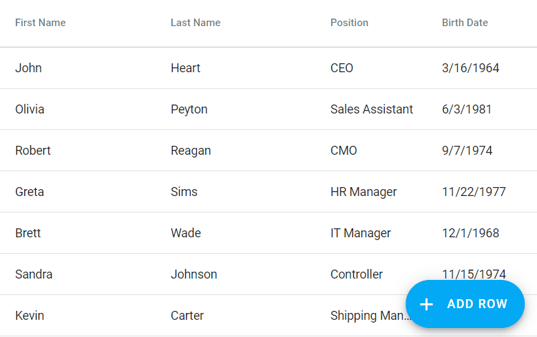
As you may recall, the Watchlist includes a list of ticker symbols tracked/followed by a user. Our design allows users to sort the contents of the Watchlist against ticker symbols or a stock’s profitability. As you would expect, the DevExpress Xamarin Data Grid allows users to sort records via the column header as pictured below:

Unfortunately, in our app design, the Watchlist page does not include grid column headers and so we must rely upon the grid’s API to sort records. The easiest way to implement sort selection is to use a built-in Xamarin method to invoke an Action Sheet:

Our Xamarin Data Grid allows you to easily specify the desired sort column/sort order and its direction. In our app, we used the following code to modify sort order/direction via an Action Sheet:

View Markup

<views:UpdatablePage.ToolbarItems> 
    <ToolbarItem IconImageSource="sorting" Clicked="OnSortClicked"/ 
</views:UpdatablePage.ToolbarItems> 
<dxg:DataGridView ItemsSource="{Binding Content}">    
    <dxg:DataGridView.Columns> 
        <dxg:TemplateColumn  
            x:Name="contentColumn"  
            SortIndex="0"> 
            <dxg:TemplateColumn.DisplayTemplate> 
                <DataTemplate> 
                    <views:SymbolRow/> 
                </DataTemplate> 
            </dxg:TemplateColumn.DisplayTemplate> 
        </dxg:TemplateColumn> 
    </dxg:DataGridView.Columns> 
    Other grid customization is here.
</dxg:DataGridView>

View Code Behind

const string SortTitle = "Sort by"; 
const string CancelAction = "Cancel"; 
const string NoneAction = "None"; 
const string ByTickerAction = "Ticker"; 
const string ByTickerDescendingAction = "Ticker (Descending)"; 
const string ByProfitabilityAction = "Profitability"; 
const string ByProfitabilityDescendingAction = "Profitability (Descending)"; 
 
async Task SortSymbols() { 
    string action = await DisplayActionSheet( 
        SortTitle,  
        CancelAction, 
        null,  
        NoneAction, ByTickerAction, ByTickerDescendingAction, ByProfitabilityAction, ByProfitabilityDescendingAction); 
    switch (action) { 
        case NoneAction: 
            contentColumn.SortOrder = ColumnSortOrder.None; 
            break; 
        case ByTickerAction: 
            contentColumn.FieldName = "Ticker"; 
            contentColumn.SortOrder = ColumnSortOrder.Ascending; 
            break; 
        case ByTickerDescendingAction: 
            contentColumn.FieldName = "Ticker"; 
            contentColumn.SortOrder = ColumnSortOrder.Descending; 
            break; 
        case ByProfitabilityAction: 
            contentColumn.FieldName = "Change"; 
            contentColumn.SortOrder = ColumnSortOrder.Ascending; 
            break; 
        case ByProfitabilityDescendingAction: 
            contentColumn.FieldName = "Change"; 
            contentColumn.SortOrder = ColumnSortOrder.Descending; 
            break; 
        case CancelAction: break; 
        default: 
            throw new Exception("Cannot handle the specified action."); 
    }
}

Though Action Sheets are fine, we believe better UI options exist for sort order/direction (when using our Xamarin Data Grid without column headers).

Here are a couple of alternatives to Action Lists:

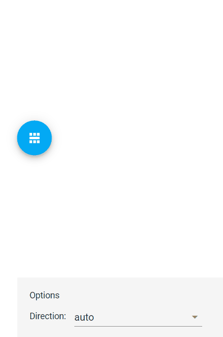
  1. A dropdown panel that displays available sort options within the page. A radio button signifies the current sort operation.

  2. A chips panel that allows users to select the data field by which the rows should be sorted, and its order (ascending or descending).

Which of these three methods do you consider more intuitive and easier to use? Please share your thoughts with us in the comments section below.

Swipe Actions to Remove and Edit Transactions

The Transaction list page allows users to manage hypothetical portfolio transactions. Users can add a new transaction and edit/remove an existing transaction as needed. Since our goal is UI simplicity and clarity, we included transaction actions (edit and remove) for each row and allowed users to apply them via swipes.

Our Xamarin Data Grid allows us to attach these actions to individual rows with ease.

<dxg:DataGridView  
    FullSwipeMode="None" 
    ItemsSource="{Binding Rows}"> 
    <dxg:DataGridView.StartSwipeItems> 
        <dxg:SwipeItem Width="95" Command="{Binding EditTransactionCommand}"> 
            <dxg:SwipeItem.Template> 
                <DataTemplate>  
                    <views:EditSwipeButton/> 
                </DataTemplate> 
            </dxg:SwipeItem.Template> 
        </dxg:SwipeItem> 
    </dxg:DataGridView.StartSwipeItems> 
    <dxg:DataGridView.EndSwipeItems> 
        <dxg:SwipeItem Width="95" Command="{Binding RemoveTransactionCommand}"> 
            <dxg:SwipeItem.Template> 
                <DataTemplate>  
                    <views:DeleteSwipeButton/> 
                </DataTemplate> 
            </dxg:SwipeItem.Template> 
        </dxg:SwipeItem> 
    </dxg:DataGridView.EndSwipeItems> 
    Other grid customization is here.
<dxg:DataGridView> 

Group Symbols in the Market Conditions Page

The Market Conditions Page displays trending stock market symbols: Most Active, Gainers, and Losers.

The DataGridView offers various column types that we can use to display content and to group data. The code below uses our PickerColumn to provide values against which the grid will group rows and our TemplateColumn to display row content:

<dxg:DataGridView 
    ItemsSource="{Binding Content}" 
    AllowGroupCollapse="True"> 
    <dxg:DataGridView.Columns> 
        <dxg:PickerColumn 
            FieldName="ListType" 
            IsGrouped="True"/> 
        <dxg:TemplateColumn> 
            <dxg:TemplateColumn.DisplayTemplate> 
                <DataTemplate> 
                    <views:SymbolRow/> 
                </DataTemplate> 
            </dxg:TemplateColumn.DisplayTemplate> 
        </dxg:TemplateColumn> 
    </dxg:DataGridView.Columns> 
    <dxg:DataGridView.GroupRowTemplate> 
        <DataTemplate> 
            <views:SymbolGroupRow  
                Text="{Binding Value, Converter={converters:ListTypeToListCaptionConverter}}" 
                GroupImageSource="{Binding Text, Source={x:Reference groupRow}, Converter={converters:ToFilenameConverter}}"/> 
        </DataTemplate> 
    </dxg:DataGridView.GroupRowTemplate> 
    Other grid customization is here.
</dxg:DataGridView> 

Update Row on Data Object Change within the Search Page

The Search Symbol page is invoked from the app’s Watchlist. It allows users to populate watchlists with desired stock symbols. All symbols found by the typed ticker fragment are divided into two groups: symbols that are in the watchlist, and symbols that are not in the watchlist. A symbol is moved from one group to another via a row click event.

The IsInWatchlist property specifies whether a symbol is in a watchlist. The Data Grid must handle these property changes and move the item to the appropriate group. The grid can handle object changes when an item’s source implements the IBindingList interface. Note that data objects also should implement the INotifyPropertyChanged interface.

View Markup

<dxg:DataGridView 
    ItemsSource="{Binding Content}" 
    SortMode="Multiple"> 
    <dxg:DataGridView.GroupRowTemplate> 
        <DataTemplate> 
            <views:SymbolGroupRow  
                Text="{Binding Value, Converter={converters:BoolToStringConverter TrueString='IN WATCHLIST', FalseString='ADD TO WATCHLIST'}}"/> 
        </DataTemplate> 
    </dxg:DataGridView.GroupRowTemplate> 
    <dxg:DataGridView.Columns> 
        <dxg:CheckBoxColumn 
            FieldName="IsInWatchlist" 
            IsGrouped="True" 
            SortIndex="1" 
            SortOrder="Descending"> 
        </dxg:CheckBoxColumn> 
        <dxg:TemplateColumn 
            FieldName="Ticker" 
            SortIndex="2" 
            SortOrder="Ascending"> 
            <dxg:TemplateColumn.DisplayTemplate> 
                <DataTemplate> 
                    <views:WatchListSymbolSearchRow/> 
                </DataTemplate> 
            </dxg:TemplateColumn.DisplayTemplate> 
        </dxg:TemplateColumn> 
    </dxg:DataGridView.Columns> 
</dxg:DataGridView> 

View Model Code

public class SearchListSymbolItem: ListSymbolWrapper { 
    bool isInWatchlist; 
 
    public bool IsInWatchlist { 
        get => isInWatchlist; 
        set => SetProperty(ref isInWatchlist, value); 
    } 
    public ICommand OpenSymbolDetailCommand { get; } 
 
    public SearchListSymbolItem( 
        ListSymbol listSymbol,  
        bool isInWatchlist = false, 
        Action<ListSymbol> openSymbolDetailHandler = null 
    ) : base(listSymbol) { 
        IsInWatchlist = isInWatchlist; 
        OpenSymbolDetailCommand = new DelegateCommand(() => openSymbolDetailHandler?.Invoke(listSymbol)); 
    } 
} 
 
public abstract class ItemSearchViewModel<T> : NotificationObject { 
    string fragment; 
    BindingList<T> content; 
 
    public string Fragment { 
        get => fragment; 
        set => SetProperty(ref fragment, value, onChanged: OnFragmentChanged); 
    } 
    public BindingList<T> Content {  
        get => content; 
        set => SetProperty(ref content, value); 
    } 
 
    // The parent calls this method when a user finises typing. 
    protected void LoadContent() { 
        LoadContentAsync().InvokeAndForgetSafeAsync(this); 
    } 
    async Task LoadContentAsync() { 
        BindingList<T> symbols = await FindSymbolsAsync(); 
        await Device.InvokeOnMainThreadAsync(() => { Content = symbols; }); 
    } 
    // Other members are here. 
} 
 
public class WatchListSymbolSearchViewModel : ItemSearchViewModel<SearchListSymbolItem> { 
    // The parent calls this method when a user finises typing. 
    protected async override Task<BindingList<SearchListSymbolItem>> FindSymbolsAsync() { 
        IEnumerable<ListSymbol> symbols = await this.ListSymbolRepository.FindByFragment(this.Fragment); 
        List<SearchListSymbolItem> symbolItems = symbols 
            .Select(s => new SearchListSymbolItem(s, IsTickerInWatchList(s.Ticker), OpenSymbolDetail)) 
            .ToList(); 
        return new BindingList<SearchListSymbolItem>(symbolItems); 
    } 
    // Other members are here. 
} 

Shared Scrolling within the Portfolio Page

One of our most interesting uses of the DevExpress Xamarin Grid is within the Portfolio page. In it, the Grid View shares scrolling with its container - the Scroll view.

We had to manually calculate the DataGridView height to implement the behavior pictured above:

View Markup

<ScrollView> 
    <Grid> 
        <dxg:DataGridView 
            Grid.Row="2" 
            HeightRequest="{Binding RowsHeight}" 
            ItemsSource="{Binding Rows}" 
            RowHeight="{Binding RowHeight}" 
            ColumnHeaderHeight="{Binding HeaderHeight}"> 
            Other data grid customizations are here.
        </dxg:DataGridView> 
        Other layout customizations are here.
    </Grid> 
</ScrollView>

View Model Code

public class PortfolioViewModel : BaseViewModel, IErrorHandler { 
    ICollection<PortfolioItemViewModel> rows; 
 
    public ICollection<PortfolioItemViewModel> Rows { 
        get => rows; 
        set => SetProperty(ref rows, value, onChanged: (_, v) => RaisePropertyChanged(nameof(RowsHeight))); 
    } 
    public double RowHeight => 95; 
    public double HeaderHeight => 25; 
    public double RowsHeight => (rows != null) ? HeaderHeight + RowHeight * rows.Count : HeaderHeight; 
 
    // Other members go there. 
} 

What’s Next

With list related tasks complete, we’ll move our focus to charting and demonstrate how to leverage our Xamarin UI Charting library to deliver information rich analytics to your end-users.

Your Feedback Matters

As always, if you’ve yet to try our Xamarin.Forms UI controls or would like to discuss your business needs, please comment below or write to us at info@devexpress.com.

XAF - Blazor Demo with Image, Collection, Lookup, Enumeration, Boolean, File Property Editors and More

$
0
0

As you probably know, we are building XAF's next-gen Web and Mobile UI with the DevExpress Blazor components. At this stage, we use the Blazor Server Side hosting model because it is stable and fast (we will look at Blazor WebAssembly again when it is out of preview).

If you are interested in our new Web and Mobile UI, please take a look at our updated web demo: https://www.devexpress.com/go/XAF_Blazor_Demo.aspx. This updated demo shows-off familiar XAF property editors and even additional extra modules: File Attachments, View Variants and Audit Trail.

What's Next?

In the next sprint, we will focus on stability and usability. We also hope to complete basic editor functionality such as nullable type and formatting support, TimeSpan and Object property editors.
In our next Blazor-related post, I will discuss unit and functional as it relates to XAF's Blazor UI - this will be very important to teams creating complex enterprise apps. Please stay tuned!

Your Feedback Matters

If you have not yet voted in our roadmap survey, please do so within the next couple of weeks. We hope to publish our official roadmap in January.

VCL Controls - 2020 Roadmap - Your Vote Counts

$
0
0

First and foremost – our deepest thanks for your continued support of DevExpress VCL technologies. We value your business and commitment to our products. This blog post is divided into two sections: the first details features we will release in 2020, and the second describes products/features that are under consideration.

New Features/Capabilities We Will Release in 2020

ExpressQuantumGrid Suite

Performance Enhancements

  • Distribute calculations to threads
  • Optimize calculation algorithms

Custom layout for data rows (T845963)

Custom layout for data rows


Popup Edit Form (T845967)

Popup Edit Form


Search and Group Panel Integration (T845991)

Search and Group Panel Integration


Filtering Enhancements

  • Ability to compare values in two fields (B1086)

    Field to field compare


  • Ability to compare a field value to an expression's result (T845993)

    Field to expression compare


  • Implement Breadcrumb Style UX for the Filter Panel (T846166)

    FilterBox Tokens

New Gantt Control

We expect to officially release a new VCL Gantt Control.

New Gantt Control

ExpressSkins Library

New Office 2019 Skins

New Office 2019 Skins


New Basic Skin

New Basic Skin

New Features/Capabilities that Require Your Feedback

The remainder of our 2020 VCL Roadmap will be shaped by a simple question – whether you want us to release a Chart Control in 2020 or not. The resources we must dedicate to a Chart Control will affect resources available for enhancements to other controls.

New Chart Control

In 2020 we can implement a new chart control that will contain all the functionality that is implemented in the Chart View of TcxGrid control, as well as frequently requested functionality that is not implemented in the Chart View, namely:

  • Ability to create an X-Y chart from two sequences of values (S91108)
  • Ability to display multiple diagrams on a single chart (AS16671)
  • Ability to add secondary axes to diagrams (DS4238)
  • Zoom support (T330130)

If you cast your vote for this new VCL Chart Control, we will not be able to introduce the four enhancements listed below. If you vote against the standalone Chart Control, we should be able to deliver all the features listed below.

ExpressPDFViewer Enhancements

  • Ability to edit interactive forms in a PDF document (T408315)
  • Add support for PDF interactive form data import and export (T845924)
  • Ability to manage pages in a PDF document and save changes (T408004)
  • Implement Single Page view mode with support for scroll and pan operations (T759079)
  • Marquee zoom mode (T653105)
  • Reduce memory consumption when a user actively navigates through a PDF document (T467673)
  • Ability to forbid select and copy operations in a PDF document (T756015)

ExpressRichEdit Control Enhancements

  • Implement a non-visual component that processes rich text documents (T375226)
  • Ability to use IME as an embedded editor (T353641)
  • Ability to load and save documents with shapes based on different geometry patterns (T320518)
  • Add support for paragraph borders (T531568)

ExpressLibrary Enhancements

  • Add support for smooth content scrolling with animation (T845974)
  • FormattedLabel enhancements:
    • Rotate text
    • Insert inline images
    • Bulleted and numbered lists
    • Display rich text formatted content in column/row headers
    • Display rich text formatted content in layout element captions
  • Add support for Fluent Design System (T846060)
  • Implement a control that replicates the DevExpress WinForms Flyout Panel (T207259)
  • Implement basic draw routines with support for DirectX rendering (for example as in T724576 ticket)
  • Update UI of all controls based upon Section 508 accessibility guidelines (AS11009)
  • TdxCloudStorage - Add support for Dropbox (T697922)

ExpressPivotGrid Suite Enhancements

  • Performance Enhancements
    • Implement multi-threaded algorithms to improve performance of summary calculations (T189818)
    • Optimize table layout calculation routines
  • Add a new 'count unique values' summary type (S90560)
  • Implement the TotalForSingleValues property for separate fields (Q404402)
  • Give end-users the ability to change summary type via a context menu (T845998)
  • Allow end-users to customize group options via a context menu (T845972)
  • New group options for date-time fields (T846012)
  • Export data to Excel with the ability to repeat group values in each expanded row/column (T325668)
  • Extend the ApplyBestFit method with the ability to size each column individually (CS56271)


DevExtreme Floating Action Button Enhancements (v19.2)

$
0
0

We added new functionality to the DevExtreme Floating Action Button: dxSpeedDialAction now supports label, visible and index options. The direction option is available for the floatingActionButtonConfig.

Action Labels

Specify the label option for the dxSpeedDialAction to display a text label next to an action button. The label is shown either in the Floating Action Button, or in the speed dial menu.

$(".action-add").dxSpeedDialAction({
  label: "Add to card",
  icon: "add",
  onClick:  function(e) { ... }
});

Action Labels

Action Visibility

We added the visible option to the dxSpeedDialAction to control item visibility. It is not necessary anymore to dispose and recreate the widget.

You can change the option after initialization to show or hide an action.

const addAction = $(".action-add").dxSpeedDialAction({
  icon: "add",
  visible: false,
  onClick: function(e) { ... }
}).dxSpeedDialAction("instance");

// later:
const newVisibility = ... // calculate visibility
addAction.option("visible", newVisibility);

Action Index

Set the index option to define the appearance order for actions in the speed dial menu. We implemented this option using the familiar logic of the CSS z-index: greater index values are farther away from the Floating Action Button.

$(".action-add").dxSpeedDialAction({
  icon: "add",
  index: 1,
  onClick: function(e) { ... }
});

$(".action-edit").dxSpeedDialAction({
  icon: "edit",
  index: 0,
  onClick: function(e) { ... }
});

Speed Dial Menu Direction

By default, the Floating Action Button is rendered in the bottom right corner of the browser window, and the speed dial menu expands upwards. We added the direction option to change the expansion direction of the speed dial menu. The default setting auto assigns the direction depending on the position configured for the Floating Action Button, but you can also use up or down to set the direction explicitly.

DevExpress.config({
  floatingActionButtonConfig: {
    position: {
      at: 'left top',
      my: 'left top',
      offset: '16 16'
    },
    direction: 'down'
  }
  // ...
});

Speed Dial Menu Direction

Demo

We updated the Floating Action Button demo to illustrate the new options.

Feedback

As always we’d like to hear your thoughts about the new functionality. A discussion thread is available on GitHub.

Please click here for a short poll about the new functionality.

To let us know your priorities for future Floating Action Button development, please follow this link.

.NET Core 3.1 Support for ASP.NET Core, WinForms, and WPF Controls (v19.2.5)

$
0
0

DevExpress components that are compatible with .NET Core 3.1 (LTS) are ready for download from both the Download Manager and NuGet: https://www.devexpress.com/dotnet-core-3/. This maintenance release also ships many new usability features that stem from .NET Core.

Common

  • v19.2.5 of the DevExpress assemblies have been built under .NET Core 3.0 for the best user coverage. Another reason for doing so is because the .NET Core runtime updates are compatible within a major version, for instance, netcoreapp3.0. To stress this point, our online help system shows ".NET Core 3.0+" in the version checker:

    Note that the latest Visual Studio version replaces the .NET Core 3.0 runtime with .NET Core 3.1. Microsoft ends .NET Core 3.0 support on March 3, 2020.
  • You can now download PDB files for our .NET Core 3.0+ and .NET Standard 2.0+ libraries from the Download Manager. For more information, see How can I debug DevExpress .NET source code using PDB files.
  • In the future, we are aiming to provide a built-in way to specify either .NET Core, .NET Standard, or .NET Framework when you create or filter tickets in the Support Center. We're considering the addition of an optional "Framework" field to these ticket forms. In the meantime, feel free to provide the information about the assemblies you use in the ticket subject or body. Thanks!

WPF Controls

  • We have reorganized our WPF packages in online and local NuGet feeds so that you can reference only the required controls instead of adding a package that contains the entire WPF suite (see changes to .NET Core NuGet package structure).
  • Visual Studio's New Project dialog now features WPF project templates for .NET Core.

Where to get:
DevExpress .NET Core Desktop Libraries Installer v19.2.5
DevExpress NuGet feed

Useful links:
.NET Core Support | WPF Documentation
Creating a New .NET Core 3.0 Application
Migrate WPF Applications to .NET Core 3
WPF Controls - Prerequisites 

WinForms Controls

The entire WinForms product line supports .NET Core 3.1. As we noted earlier, we had to update our code to react to breaking changes in the official Microsoft release. Our components remain in the CTP (Community Technical Preview) stage, because the new WinForms designer for .NET Core apps itself is still in preview. It is only possible to work with UI controls in code or use a workaround with linked files. You are welcome to experiment with our WinForms components in our demos or in your own projects.

Where to get:
DevExpress .NET Core Desktop Libraries Installer v19.2.5 
DevExpress NuGet feed

Useful links:
.NET Core Support | WinForms Documentation
How to: Port a Windows Forms desktop app to .NET Core
WinForms - Single-File Applications With .NET Core 3
WinForms Controls - Prerequisites

ASP.NET Core MVC Controls

Where to get:
DevExpress .NET Products Installer v19.2.5
npm and NuGet packages

Useful links:
Get started with a Visual Studio project
Get started with a non-Visual Studio project

Blazor Controls

For a limited time, you can download and use our Blazor UI component suite free-of-charge.

Where to get:
Use DevExpress NuGet feed in your .NET projects to install Blazor component
Setup Visual Studio's NuGet Package Manager

Useful links:
Introduction to Blazor
Create a New Blazor Application

Dashboard, Reporting & Office File API 

  • ASP.NET Core, WinForms, and WPF Dashboards and Reporting tools support .NET Core 3.1 (the Visual Studio designer is missing due to changes in the design-time architecture for .NET Core).
  • ASP.NET Core Reporting Project Templates now give the ability to set the Target Framework to ASP.NET Core 3:

Where to get:
ASP.NET Core and cross-platform projects: DevExpress .NET Products Installer v19.2.5+
WinForms and WPF: DevExpress .NET Core Desktop Libraries Installer v19.2.5
All platforms: DevExpress NuGet feed 

Useful links:
Reporting in .NET Core 3 (CTP) | Documentation

App Framework (XAF)

Due to significant changes in the design-time architecture of .NET Core, XAF's WinForms UI for .NET Core 3.1 remains a CTP (Community Tech Preview). Our Model Editor, Module, Application, Controller and Action designers are not yet available within Visual Studio. 

  • XAFers can use Middle Tier Security client-related classes (WcfSecuredClient, MiddleTierServerObjectSpaceProvider and MiddleTierClientSecurity) in .NET Standard 2.0/.NET Core projects. The server app still requires .NET Framework 4.5 due to .NET Core platform limitations.
  • New List View Data Access Modes (ServerView and InstantFeedbackView) are available in WinForms .NET Core 3+ and .NET Framework apps using XPO for data access - all to achieve lower memory consumption and improved load, sort, group and filter performance. For more information, see this XPO blog post.

Where to get:
DevExpress .NET Core Desktop Libraries Installer v19.2.5
DevExpress NuGet feed

Useful links:
.NET Core 3.0 and .NET Standard 2.0 Support
Port an Existing XAF Application to .NET Core 3.0

ORM Library (XPO)

  • XPO Profiler now supports WinForms & WPF .NET Core 3+ apps. It can also profile ASP.NET Core apps regardless of whether System.Text.Json or Newtonsoft.Json are used for serialization.
  • XPO now supports Microsoft.Data.SqlClient v1.1.0 for .NET Standard that can be used in .NET Core apps. This feature is available in .NET Framework 4.5 apps as well.
  • We published an ASP.NET Core version of the XPO + OData V4 example on GitHub. The example currently uses .NET Core 2.2, but we will add a newer version once Microsoft supports .NET Core 3 for Microsoft.AspNetCore.OData. For more information, track this GitHub issue.

Where to get:
DevExpress .NET Core Desktop Libraries Installer v19.2.5
DevExpress.Xpo on NuGet
DevExpress NuGet feed

Useful links:
.NET Core 3.0 and .NET Standard 2.0 Support
Getting Started with .NET Core

Your Feedback Matters

We know you are busy this time of the year, but please let us know what you think about our .NET Core 3.1 support in general. What can we improve?

We would also value your thoughts about rebuilding the DevExpress source code for this new platform. How is this scenario important for you and why? 

Currently, we do not provide tools to rebuild the DevExpress source code for .NET Core 3.0+ and .NET Standard 2.0+ assemblies automatically. First, because of minimal interest from our customers (popular debugging scenarios are solved with PDB files or third-party decompilers). Second, recompiled assemblies alone do not make much sense in .NET Core apps without NuGet packages and it is difficult to create them automatically.

DevExtreme - Asynchronous Validation (v19.2)

$
0
0

You can now use an async validation rule to execute field validation logic on a server. Implement the function validationCallback to return a Promise (or the jQuery equivalent).

Asynchronous Validation

Here is an example:

$('#textBox').dxTextBox({ ... })
  .dxValidator({
    validationRules: [{
      type: 'async',
      message: 'Invalid value',
      validationCallback: ({value}) =>
        new Promise((resolve, reject) => {
          fetch('https://mydomain.com/validationService', {
            method: 'POST',
            body: JSON.stringify({ data: value })
          })
          .then(res => {
            if (!res.ok)
              throw new Error(`HTTP error: ${res.status} ${res.statusText}`);
            // Assuming the server returns JSON
            return res.json();
          })
          .then(serverResult => {
            // Server decided whether data is valid
            if (serverResult.dataIsValid)
              resolve();
            else
              reject(serverResult.errorMessage);
          })
          .catch(error => {
            // There's been a technical error.
            console.error('Server-side validation error', error);

            // Decide what to tell the user.
            reject('Cannot contact validation server');
          });
        });
    }
  }]
});

As you can see, validation succeeds if the Promise is resolved and fails if the Promise is rejected. However, there’s one more option. You can resolve the Promise with an object like this:

{
  isValid: false,
  message: 'Invalid value'
}

We support this scenario to allow you to return a server result directly, without any extra logic. In this case, even though the Promise is resolved, validation succeeds or fails depending on the isValid property and the optional message is shown to the user on failure. To illustrate this use case, here’s the shortest possible example:

validationCallback(params) {
  return $.getJSON('https://mydomain.com/validationService',
    { data: params.value });
}

Note that without any processing, you may end up displaying technical errors to the end user as validation messages. We recommend more detailed algorithms which consider the edge cases, as shown in the first sample.

To keep validation efficient, any synchronous rules are always evaluated first, and asynchronous rules are only evaluated if all synchronous rules pass. Once asynchronous validation begins, all such rules are checked in parallel.

ASP.NET Core and ASP.NET MVC

We added support for the ASP.NET [Remote] attribute to enable asynchronous validation on ASP.NET Core and ASP.NET MVC. You can apply this attribute to properties of your model, passing the names of a controller and a method to be called for validation:

[Remote("CheckEmailAddress", "Validation")]
public string Email { get; set; }

The attribute automatically generates client-side code for an ‘async’ validation rule, calling back to the controller running on the server. The controller method should check validity:

[HttpPost]
public IActionResult CheckEmailAddress(string email) {
  if (!_userRepository.VerifyEmail(email)) {
    return Json($"Email {email} is already registered.");
  }

  return Json(true);
}

This code uses return values as defined in Microsoft documentation for the .NET Core Remote attribute.

Alternatively you can return validity information in the JSON format described above, inluding the isValid and message fields. This allows you to create validation services in .NET Core which are compatible with clients written for other supported DevExtreme platforms.

Explicit Validation

If you call validate() on a Validator or a ValidationGroup and there are asynchronous rules to be checked, you need to use the Promise interface provided by the property ValidationResult.complete to handle the results.

const result = validator.validate(); // OR validationGroup.validate();

result.complete.then(res => {
  // res.status is 'valid' if all rules passed
  // res.status is 'invalid' if any rules failed
  if (res.status === 'invalid') {
    // res.brokenRules contains an array of rules
    // that failed validation
  }
});

Limitations

At this time, asynchronous rules are not supported by the Data Grid and Tree List widgets when you use the Row, Batch or Cell editing modes. We will add this functionality in a future update.

Demo and Documentation

Here is the documentation for the ‘async’ rule..

The Validation Overview Demo includes samples of the ‘async’ rule for all supported platforms.

Happy Holidays from DevExpress - Free Greetings Card Tool

$
0
0

As the 2019 year winds down, the DevExpress team hopes you have a happy holiday season. We want to thank you for your continued support and for placing your faith in our products and services.

Free Greetings Card Builder

To help you create festive holiday greeting cards, our Reporting team has created a small demo using the DevExpress End-user Report Designer.

Design your own card and print it out, or save it to a file and share with friends:

DevExpress Season's Greetings Card Builder

DevExpress Reporting - Season's Greeting Tool

Automated Web Testing - When to Choose Recording Over Scripting?

$
0
0

As you may know, we currently offer both scripting-based (TestCafe) and visual recording-based (TestCafe Studio) platforms for web test automation. Though both options can get you where you want to go, we believe that visual test recording offers unique strengths for those who want to incorporate automated testing in the product delivery process.

Visual Recording in a Nutshell 

Unlike script-based test automation, visual test recording eliminates (or significantly reduces) the need to write test script. We like to think of visual test recording as “codeless automation.” To create a recorded test, you simply open a browser and click through your way to a web test (you interact with your web app in the same way end-users would). The visual recorder tracks actions and generates test scripts that you or a CI system can automatically replay later.

This leads to the obvious question - when does it make sense to select automated recording over manual scripting?

1. When You Have Limited Programming Experience

With TestCafe Studio’s visual test recorder, test authors don’t have to be software developers.  To create an automated test with the visual recorder, you simply open a web browser and execute standard user actions (click buttons, fill in forms, drag sliders). Once you’ve recorded actions, you specify the page elements that require verification (via point and click) within your test scenario.

2. When You Have Multiple Test Scenarios

If you have programming experience and you need to write ten or twenty tests – you can write your test scripts manually without much difficulty. If, however, you must write a few hundred tests, scripting could be rather time-consuming. In such instances, it may make sense to consider automated recording. Regardless of how fast you write code, point and click recording is always faster and less costly. This is especially true when the recorder allows you to re-record individual actions and modify selectors when the user interface changes over time.

3. When You Have to Test Apps Based on Different Technologies

Coding tests for large web applications requires that you examine the structure of every page involved. This can be hard if the application consolidates multiple services, includes third-party iframes, etc. If you write tests for more than one application, you may spend unnecessary energy on platform-specifics - specifics that can affect your test code.  Recording conceals these complexities and allows QA engineers to get the job done with the least amount of effort. When using an automated recorder, test script generation remains straightforward regardless of how technologies are used on a webpage.

4. When You Have to Perform Black-Box Testing

When you write a test with a web testing framework, you would normally call page code or browser API to perform actions against page elements. This approach can lead to situations wherein test authors make modifications that are unavailable to end-users. When recording tests visually, engineers are limited to the same screen elements available to end-users.

Visual Recording and You

Though visual recording cannot address every single test scenario, we think it offers important advantages over manual scripting – advantages that can save your team significant time. If you are currently using scripting alone or recording your test scripts, we’d love your feedback. Please tell us why you prefer manual scripting or visual recording in the comments section below.

About TestCafe Studio

TestCafe Studio is a cross-platform, end-to-end web testing IDE with the fully integrated Visual Web Test Recorder. TestCafe Studio requires no WebDrivers and allows you to create, run and maintain automated web tests with zero code. Download Free 30-day Trial.

XAF - Unit and Functional Testing with Blazor UI

$
0
0
I want to share our vision on unit/functional testing as early as possible, because it is important to XAF's target audience - development teams creating complex enterprise apps. Increased support traffic regarding this topic and our recent roadmap surveys underscore the importance of this subject. Everything I will describe below is already battle-tested by our team internally.

Functional Tests

We continue to use our cross-platform EasyTest engine for functional testing. Chrome or FireFox web browser interaction is powered by Selenium.

If you have Google Chrome installed on your desktop, you can run automatic tests for our online Blazor demo with Visual Studio or the command prompt - no special configuration is required. For more information, refer to the following KB article: How to use EasyTest and Selenium WebDriver to create functional tests for XAF's Blazor UI with C#, VB.NET or a human-readable scripting language.

The following are supported:

1. Functional tests with C# or VB.NET (for developers).

using DevExpress.ExpressApp.EasyTest.BlazorAdapter;
using DevExpress.ExpressApp.EasyTest.BlazorAdapter.TestControls;
using DevExpress.ExpressApp.EasyTest.BlazorAdapter.Utils;
using NUnit.Framework;

namespace MainDemo.Blazor.FunctionalTest {
    public class TakeScreenshortTests : FunctionalTestBase {
        public TakeScreenshortTests() {
            TestSettings.DefaultApplicationUrl = "https://demos.devexpress.com/XAF/BlazorDemo/";
        }
        [Test]
        public void StartPageScreenshot() {
            CompareScreenshot.Exec(TestSettings.CombineWithCWD(@"..\..\Images\MainDemo.png"), Browser.GetImage());
        }
        [Test]
        public void DeatailViewScreenshot() {
            var mainListView = new MainListView(Driver);
            mainListView.Grid.RowClick("Hewitt Aiello");
            CompareScreenshot.Exec(TestSettings.CombineWithCWD(@"..\..\Images\ContactMainDemo.png"), Browser.GetImage());
        }
        [Test]
        public void CRUD() {
            var contactsListView = new MainListView(Driver);
            contactsListView.Toolbar.FindControl("New").Act(null);
            var contactDetailView = new MainDetailView(Driver);
            ((IControlText)contactDetailView.Form.FindControl(TestControlType.Field, "First Name")).Text = "TestName";
            contactDetailView.Toolbar.FindControl("Save and Close").Act();
            contactsListView = new MainListView(Driver);
            contactsListView.Grid.RowClick("TestName");
            contactDetailView = new MainDetailView(Driver);
            contactDetailView.Toolbar.FindControl("Delete").Act();
            wait.Until(BlazorAppResponseAwaiter.IsAlertPresent);
            var dialog = new DialogTestControl(Driver);
            Assert.AreEqual("You are about to delete the selected record(s). Do you want to proceed?", dialog.Text);
            dialog.Act("Yes");
            wait.Until(SeleniumUtils.ElementExists(GridTestControl.ByGrid));
            contactsListView = new MainListView(Driver);
            Assert.AreEqual(0, contactsListView.Grid.WebElement.FindElements(GridTestControl.ByRowByValue("TestName")).Count);
        }
    }
}

2. Functional tests with human-readable scripts (for non-developers).

#Application MainDemoBlazor_Chrome

*Action New
*FillForm
 First Name = TestContact
*Action Save and Close

*ProcessRecord 
 Full Name = TestContact

*Action Delete

*HandleDialog
 Respond = Yes
 Message = You are about to delete the selected record(s). Do you want to proceed?

!ProcessRecord 
 Full Name = TestContact

Unit Tests

Thanks to XAF's modular architecture and mocks, we can keep our unit tests as lightweight as possible. Unit tests for Blazor UI are no different than XAF tests for WinForms or WebForms. Consider the following test cases: 

1. Test whether a Controller's Action is active in DetailView and ListView.

#if DebugTest
using DevExpress.ExpressApp.Base.Tests;
using DevExpress.ExpressApp.Blazor.SystemModule;
using DevExpress.ExpressApp.Tests.Blazor.Helpers;
using NUnit.Framework;

namespace DevExpress.ExpressApp.Tests.Blazor.SystemModule {
    [TestFixture]
    public class ModificationsControllerTests : BaseDBTest {
        [Test]
        public void TestUpdateActionState() {
            DetailView detailView = new TestDetailViewFactory(this).CreateView<TestPersistentObject>(true);
            BlazorModificationsController modificationsController = new BlazorModificationsController();
            modificationsController.SetView(detailView);
            Assert.IsTrue(modificationsController.SaveAction.Active["OnlyForDetailView"]);
            Assert.IsTrue(modificationsController.SaveAndCloseAction.Active["OnlyForDetailView"]);
            Assert.IsTrue(modificationsController.SaveAndNewAction.Active["OnlyForDetailView"]);
            Assert.IsTrue(modificationsController.CancelAction.Active["OnlyForDetailView"]);

            ListView listView = new TestListViewFactory(this).CreateView<TestPersistentObject>();
            modificationsController = new BlazorModificationsController();
            modificationsController.SetView(listView);
            Assert.IsFalse(modificationsController.SaveAction.Active["OnlyForDetailView"]);
            Assert.IsFalse(modificationsController.SaveAndCloseAction.Active["OnlyForDetailView"]);
            Assert.IsFalse(modificationsController.SaveAndNewAction.Active["OnlyForDetailView"]);
            Assert.IsFalse(modificationsController.CancelAction.Active["OnlyForDetailView"]);
        }
//...
}

2. Test whether a boolean property editor has localized values in the underlying control based on the Application Model.

//...
[Test]
public void SelectedItemTest() {
    ModelPropertyEditorImpl model = new ModelPropertyEditorImpl("Bool");
    model.CaptionForFalse = "CaptionForFalse";
    model.CaptionForTrue = "CaptionForTrue";
    BooleanPropertyEditor propertyEditor = new BooleanPropertyEditor(typeof(TestObjectWithNullableProperties), model);

    propertyEditor.ComponentValue = null;
    Assert.IsNull(propertyEditor.SelectedItem);
    Assert.IsNull(propertyEditor.ComponentValue);

    propertyEditor.ComponentValue = true;
    Assert.AreEqual(model.CaptionForTrue, propertyEditor.SelectedItem.Caption);
    Assert.AreEqual(propertyEditor.ComponentValue, propertyEditor.SelectedItem.Value);

    propertyEditor.ComponentValue = false;
    Assert.AreEqual(model.CaptionForFalse, propertyEditor.SelectedItem.Caption);
    Assert.AreEqual(propertyEditor.ComponentValue, propertyEditor.SelectedItem.Value);
}
//...

Future Plans

Ultimately, we will release all required assemblies with helper/mock classes (like TestDBTest, TestDetailViewFactory, BlazorAdapter, etc.) - all to reduce the time needed to write unit and functional tests with XAF.

If you have problematic scenarios that you want us to document, please leave comments to this post - thank you in advance.

ASP.NET Gantt - Data Editing, Scaling, and Undo/Redo Functionality (available in v19.2)

$
0
0

In our most recent release (v19.2), we added a few major features to our ASP.NET Gantt control. We also released a Gantt control for the ASP.NET MVC platform.

Editing

Our ASP.NET Gantt control allows users to modify tasks and manage resources via an integrated dialog. Invoke the edit dialog by double-clicking a task in the Gantt area:

DevExpress MVC Gantt - Edit Task

You can also resize and move tasks directly on the timeline or edit values in the task list:

DevExpress MVC Gantt - Edit Task

Once modifications are complete, the Gantt control sends a request to the server and saves the changes to the data source.

Use the GanttSettingsEditing options to manage available edit operations for your end-users. Use the GanttSettingsEditing.Enabled property to disable editing.

Real-time scaling

By default, our ASP.NET Gantt component displays tasks for an entire day using the Day View. Use the GanttViewSettings.ViewType property to set a different initial view type for the chart's timeline.

An end-user can scale the timeline by holding down the Control key and scrolling the mouse wheel. The current position of the cursor is used as the geometric center of the scaled area:

DevExpress MVC Gantt - Zoom

Undo/Redo Functionality

With this release, our WebForms and MVC Gantt control tracks changes made by end-users and allows them to rollback these changes as needed:

DevExpress MVC Gantt - Undo and Redo

Use the Ctrl+Z and Ctrl+Y shortcuts to initiate Undo and Redo commands. Once officially released, we'll add a toolbar and corresponding buttons for this functionality.

CTP

Our Gantt control is available as a CTP (community technology preview) in our v19.2 release cycle. We're not quite finished with all its features but rest assured, we're working to officially release this product by May 2020.

Test it today

Test-drive the new ASP.NET Gantt WebForms control on your local machine. If you own an active DXperience or Universal subscription, simply download our v19.2 release from the DevExpress Client Center.

Your Feedback Counts

We’d like to hear from you about your development plans and needs. Feel free to leave comments below or open Support Center tickets for detailed discussions.

For some quick feedback, please submit your responses to this short survey:


DevExtreme - Data Form Efficient Dynamic Updates (v19.2)

$
0
0

You can now update parts of DevExtreme Data Forms efficiently, without affecting unchanged elements. New rendering logic helps you optimize use cases where you dynamically add, remove, show and hide items at runtime.

Add and Remove Items

If you change the items list associated with a group or tab, only the content represented by that list is rerendered.

var form = $('#form').dxForm({
  items: [
    ...,
    {
      itemType: 'group',
      caption: 'Phones',
      items: [ ... ]
    }]
}).dxForm('instance');

form.itemOption('Phones', 'items', [ /* new items */ ]);

Add and Remove Items

Show or Hide Items

If you change an option of an item contained in a group or tab, only that group or tab is rerendered. Here is an example where the visible option changes on the address element in the addressGroup.

var form = $('#form').dxForm({
  ...,
  items: [
    {
      itemType: 'group',
      items: [
        'name', 'lastName',
        {
          editorType: 'dxCheckBox',
          editorOptions: {
            text: 'Show Address',
            onValueChanged: function(e) {
              form.itemOption('addressGroup.address',
                'visible', e.value);
            }
          }
        }]
    },
    {
      itemType: 'group',
      name: 'addressGroup',
      items: [{ dataField: 'address', visible: false }]
    }
  ]
}).dxForm('instance');

Show or Hide Items

Control Rerendering with Extra Groups

To limit rerendering to specific visual areas of your Form, it may be necessary to add groups to your structure. These don’t need to have captions assigned, so they can be completely invisible to the user. As described above, any required rendering work is contained at the group level and does not result in higher level changes.

Demo

Please see the demo Customize Fields at Runtime for examples of dynamic Form updates.

DevExtreme - Diagram - New User Actions API (v19.2.4)

$
0
0

We added three events to the DevExtreme Diagram widget. You can handle these events to react to user actions and run custom business logic.

Selection Changed Event

The new selectionChanged event fires when the user selects or deselects a shape or a connector. The handler receives an object which includes the items list of all selected elements in the diagram.

onSelectionChanged: function(info) {
  // info.items is a list of all selected elements
}

Item Click and Double Click Events

We added the two new events itemClick and itemDblClick. These events fire when a user clicks or double-clicks a shape or a connector. The object passed to the handler includes the item as a reference to the element clicked by the user. The item is either a DiagramShape or a DiagramConnector, and you can evaluate individual properties like item.type to find out which kind of element has been clicked.

onItemClick: function(info) {
  var item = info.item;
  if (item.type && item.type === 'rectangle') {
    // user clicked a shape of type 'rectangle'
    // item.dataItem contains the complete data object
  }
}

As you can see from the sample code, shape elements also include the property dataItem, which provides access to the original object from the data source. This object includes all data source fields, whether or not they are used by the Diagram.

For connector elements, the dataItem property is supplied if the connectors are created from a data source (as opposed to a setup using parentKeyExpr).

Demo

We prepared a jQuery CodePen demo where you can see how the new events are handled and what information they receive (check the console!).

The code samples in this post use jQuery syntax to assign the event handlers. If you need details about event handling on other DevExtreme platforms, please follow these links for Angular, Vue, React, AngularJS, Knockout, ASP.NET MVC 5 or ASP.NET Core.

Let Us Know What You Think

As always we are interested in your feedback. The Diagram widget has CTP status at this time and we can use your ideas to improve the new API before release.

Carl Franklin’s Blazor Roadshow. Plus, DevExpress!

$
0
0

Carl Franklin from .NET Rocks is hitting the road for a world-wide Blazor Roadshow. Taking only a couple of hours, Carl will share architecture best practices, how to make and consume generic components, how to call JavaScript to enhance your apps, and how to implement Authentication/Authorization, all using the new Microsoft Blazor platform. He'll show you how to monitor the traffic going back and forth between the browser and the server, measure your app's memory footprint, and how to optimize it. Basically, if you want details about implementing Blazor apps, he’s your man.

And DevExpress is sponsoring the whole Roadshow. Here's the timetable of the cities we’ve arranged to visit so far (note, a couple do still need that final confirmation):


Burlington, MAFebruary 10
New York, NYFebruary 11
Philadelphia, PAFebruary 12
Washington, DCFebruary 13
 
Raleigh/Durham, NCFebruary 17
Atlanta, GAFebruary 18
Charlotte, NCFebruary 19
Louisville, KYFebruary 20
 
San Diego, CAMarch 2
Los Angeles, CAMarch 3
Mountain View, CAMarch 4
Portland, ORMarch 5
 
Redmond, WAMarch 9
Salt Lake City, UTMarch 10
Omaha, NEMarch 11
Des Moines, IAMarch 12
 
Nashville, TNMarch 16
St. Petersburg/Tampa, FLMarch 18
Boca Raton, FLMarch 19
 
Pittsburg, PAMarch 23
Milwaukee, WIMarch 26

To register and for details on where/how to attend, please visit the Roadshow website. Seating is limited, so make sure to reserve your seat today.

DevExpress is a corporate sponsor of the .NET Foundation

$
0
0

If you are one of our customers, I’m pretty sure that you’re aware that DevExpress recognizes that .NET is of great importance. We were the first Microsoft partner to produce a UI control for WinForms way back in 2002 (the grid!), and have moved forward with other components and libraries for .NET in leaps and bounds. We now cover ASP.NET, MVC, WPF, with UI controls, reporting, and dashboards, and now are fully embracing .NET Core, Blazor, and the other platforms and features that Microsoft are targeting.

Back in 2014, Microsoft formed the .NET Foundation as an independent, non-profit organization, designed to encourage and promote open-source development for and collaboration around the .NET ecosystem. As part of this organization, we took over the ASP.NET AJAX Control Toolkit from Microsoft and have actively maintained it as open source and enhanced it along with the improvements in ASP.NET over the years.

Today, we are taking that collaboration a step further: I am proud to announce that Developer Express has become a corporate sponsor of the .NET Foundation. As such, we are looking forward to being even more involved in the planning for .NET, collaborating even more (is that possible?) with the various product teams, and helping that valuable .NET open source community grow.

DevExtreme - React Chart Update Transitions

$
0
0

The new Animation plugin for the React Chart enables update transition animations. Once you add the plugin to your chart configuration, animations are automatically shown on data updates.

Transition Animation

Custom Animations

You can use the two properties duration and easing to customize the animation. easing is a function, as supplied by the package d3-ease. Here is a sample chart configuration with a custom animation setup:

import { easeBounceOut } from 'd3-ease';
...

<Chart data={chartData}>
  <BarSeries
  ...
  >
    <Animation duration={2000} easing={easeBounceOut} />
  </BarSeries>
</Chart>

Custom Animation

All Series Types Supported

All chart series types support animation. Here is a pie chart with the Animation plugin configured.

Pie Chart Animation

Documentation

Please click here for the documentation of the animation feature.

Viewing all 2399 articles
Browse latest View live