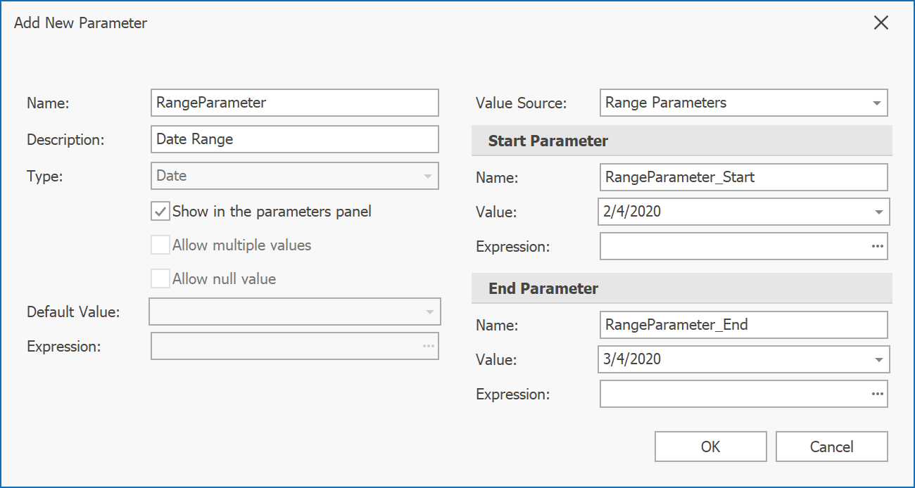
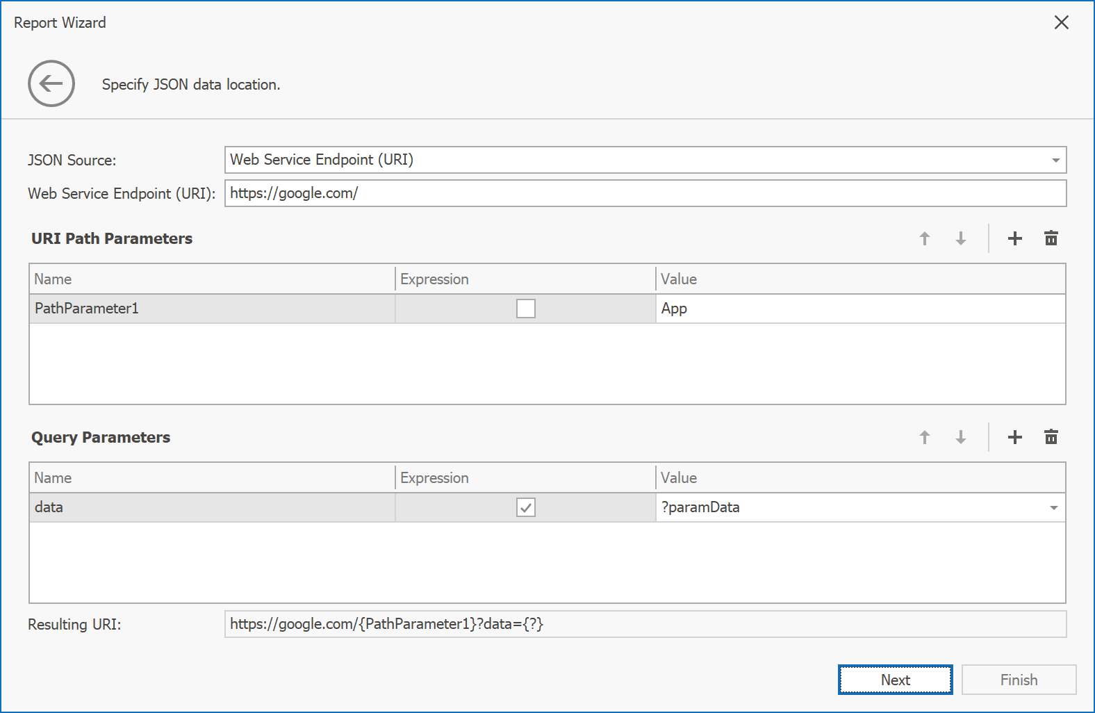
In this post, I'll discuss the most recent enhancements to the DevExpress UI for Blazor (v19.2.3). This update incorporates features and changes introduced in our most recent beta.
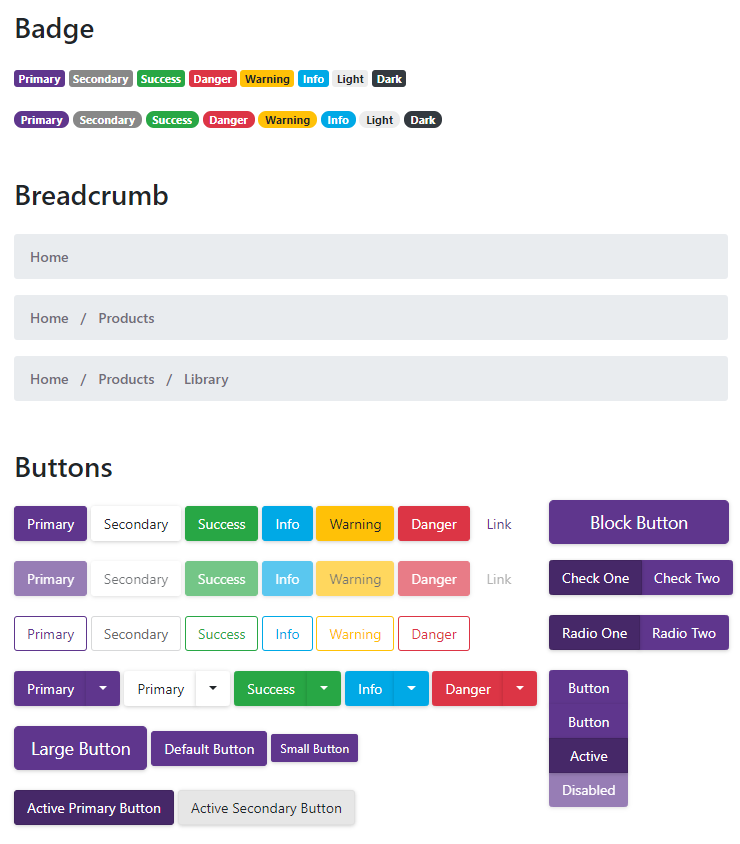
New "Blazing Berry" Theme
Our new "Blazing Berry" theme is now available. It was built with Bootstrap v4:
We love the new theme so much we made it our default for our online Blazor demos.
Download, or clone, the themes from our free open source GitHub repository here:
https://github.com/DevExpress/bootstrap-themes
New TagBox
A new TagBox component has been added in this release. As you know, a TagBox is an editor which allows your end users to select or type multiple items and display them in a text area.

Use the AllowCustomTags property to enable custom item input.
Filtering
Our Blazor TagBox ships with 'Contains' and 'StartsWith' filter modes. When filtering is enabled, the drop-down list is automatically filtered once an end user starts typing.
Virtual Scrolling
Our Blazor TagBox also supports Virtual Scrolling (to help you work with large data sources). In this mode, the TagBox loads a small item set and additional items are dynamically loaded from the server when an end user scrolls the drop-down list.
Template
You can customize default tag appearance using the TagBox's Tag Template.
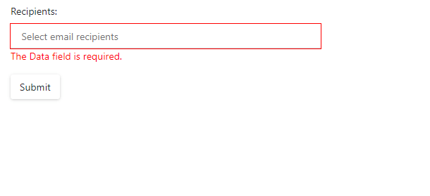
Data Validation
Add our TagBox to the standard Blazor EditForm to leverage built-in Data Validation features:
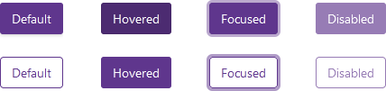
New Button
We now offer a Blazor Button component with support for nine standard Bootstrap styles and three display modes. The Button component ships with the following states: default, hovered, focused, and disabled.
You can also create custom buttons.
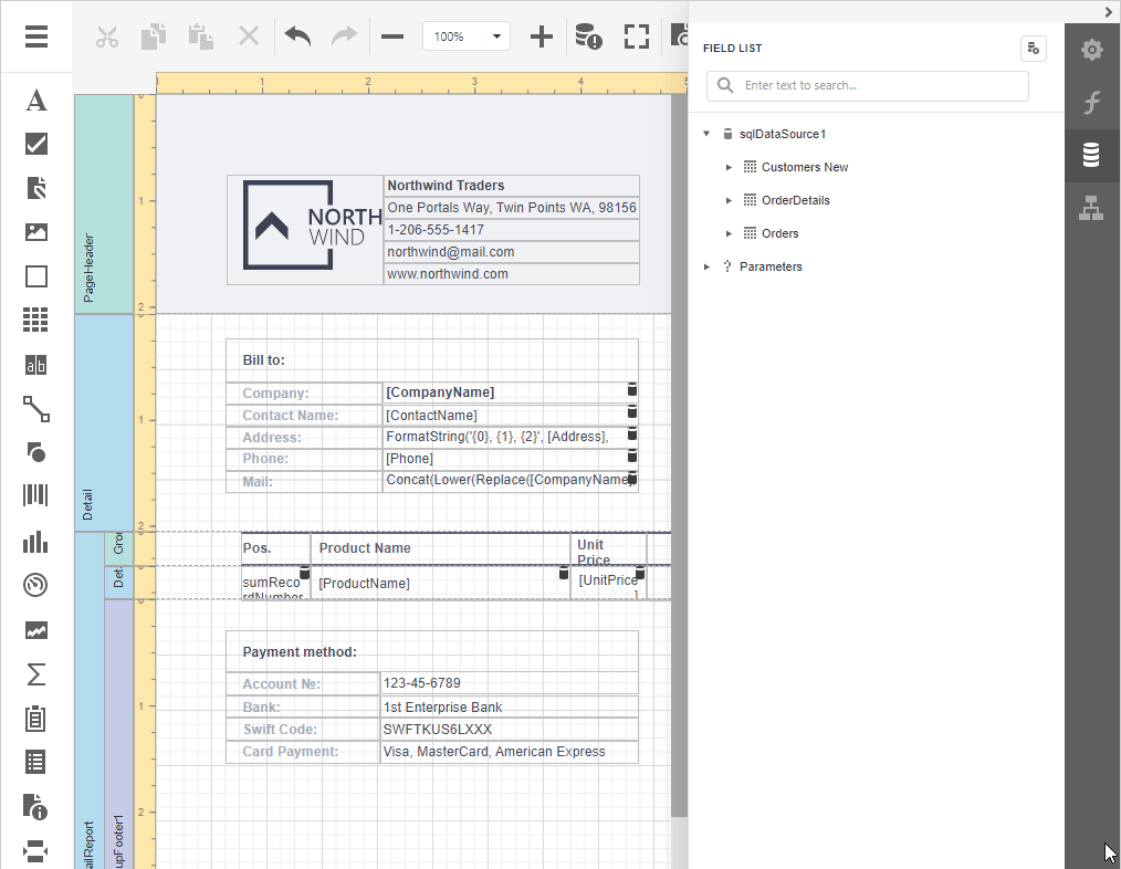
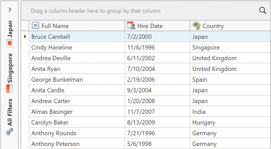
Data Grid
Row Preview Template
You can now customize Blazor Data Grid rows via our preview row template. The layout of the preview section is located below each data row:
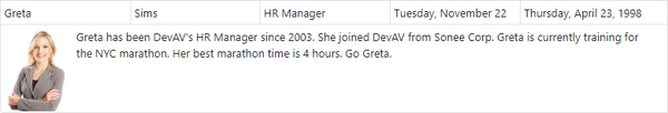
<RowPreviewTemplate Context="ItemInfo"> @{ Employee employee = ItemInfo.DataItem;
  <table cellpadding="5" cellspacing="0">
    <tbody>
      <tr>
        <td rowspan="4" style="border: 0px;">
          <img src="images/Employees/@(employee.FileName).png" width="76" /></td>
        <td style="border: 0px; white-space: normal;"> @employee.Notes </td>
      </tr>
    </tbody>
  </table>
  }
</RowPreviewTemplate>
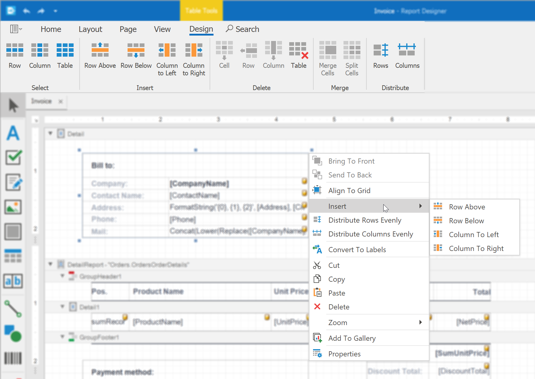
New UI Elements in Pager
Our Blazor Data Grid offers improved UI navigation elements for paging. The new Page Size selector allows your end users to specify page size as needed. You can also add custom values to the Page Size drop-down list.
We added a Go To Page edit box so users can navigate to a specific data page:
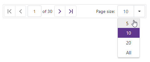
We've also updated the Data Grid Pager's public API so you can manage our new UI elements.
New Row Initialization
This release includes a new InitNewRow event. The event allows you to set custom row values when an end user adds a new row to the grid.
Task OnInitNewRow (Dictionary<string, object> values) {
{
    values.Add("Field1Name", Field1Value);
    values.Add("Field2Name", Field2Value);
    ...
    return Task.CompletedTask;
}
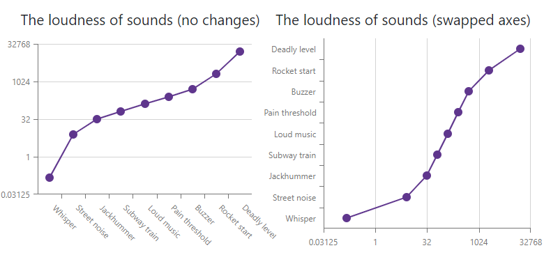
Charts
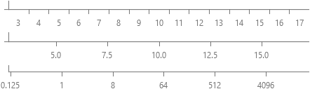
Axis Type Selections
Typically, the Chart component automatically creates an axis depending on your data. With this release, we've now added the following axis types which can be set in code: Continuous, Discrete, or Logarithmic.
Hide Spin Edit Buttons
Our Blazor Spin Edit now allows you to hide spin buttons using its new ShowSpinButtons property.

Popup
Header and Footer
With this release, we have improved the appearance of our Blazor Popup component. You can add custom content to the Popup's footer using the new FooterTemplate:
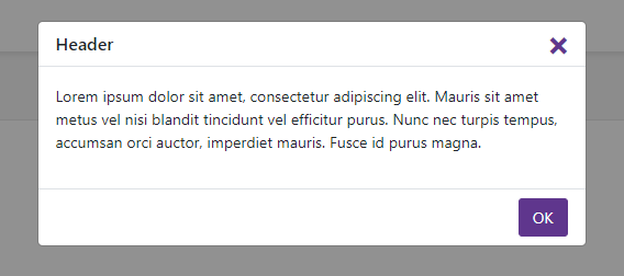
The Popup can now display internal scroll bars when the dialog contains lots of content. Unless hidden, the header and footer will also be displayed with scroll bars.
We've also added a new Visible property which can be easily bound to a Boolean field to control the popup's visibility.
Updated XAF's Blazor UI & Example with Security System APIs
For our XAF customers: We've updated our online XAF Blazor demo based on release versions of DevExpress Blazor components.
Even if you do not plan to use XAF's UI, you may find this new non-XAF Blazor Server demo and tutorial helpful. It demonstrates how to use DevExpress Blazor components with XAF's non-visual APIs for user authentication and group authorization. For more information on our business application framework for .NET developers, please follow the XAF Team blog.
.png)