Quantcast
Channel: Developer Express Inc.
Viewing all 2400 articles
Browse latest View live

Xamarin.Forms UI Controls - Building the Logify Client App (Part 3)

$
0
0

This is the third blog post in our "Building the Logify Client App" series. If you are new to this blog series, you can review part 1 and 2 using the links below:

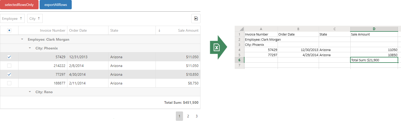
In our last post, we described data loading/binding for Logify’s Reports list view. In this post, we will customize our Xamarin Grid’s visual elements to deliver the best possible user experience for the Logify mobile client app.

NOTE: At present, DevExpress Xamarin.Forms UI controls ship as part of our Universal Subscription. We expect to release a Xamarin-only product subscription in our v19.2 release cycle.

Xamarin Grid Customization for Logify's Crash Reports List

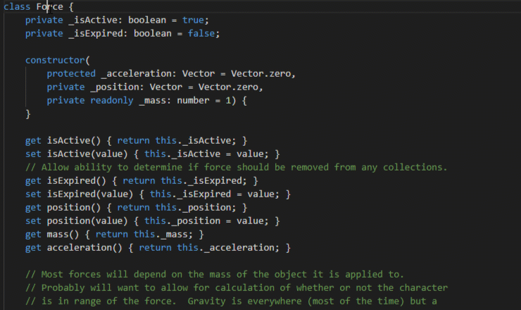
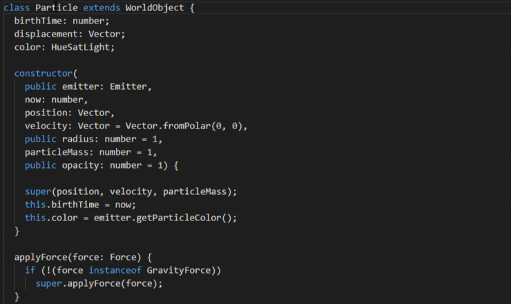
As you know, we rely on the DevExpress Xamarin Data Grid and its TemplateColumn to do most of the heavy lifting in our Logify mobile client app.

The following image details each UI element/field within an individual grid row.

Using TemplateColumn

To implement the custom design pictured above, the Logify client app uses our Xamarin Grid’s TemplateColumn object. This object provides a DisplayTemplate property which accepts Xamarin.Forms.DataTemplate. Once cell content has been created from this template, a CellData object is assigned to its BindingContext. CellData has both Value and Source properties. Value holds the current cell value, and Source stores a user’s data object. Since the current template is quite detailed, we are going to use the Source object to access the Report object.

<dxg:TemplateColumn>
  <dxg:TemplateColumn.DisplayTemplate>
    <DataTemplate>
      <Grid>
        <Grid.ColumnDefinitions>
          <ColumnDefinition Width="*"/>
          <ColumnDefinition Width="7"/>
        </Grid.ColumnDefinitions>
        <Grid Grid.Column="0">
          <Grid.RowDefinitions>
            <RowDefinition Height="Auto"/>
            <RowDefinition Height="Auto"/>
            <RowDefinition Height="Auto"/>
          </Grid.RowDefinitions>
          <Grid Grid.Row="0">
            <StackLayout Orientation="Horizontal" Grid.Column="0">
              <StackLayout Orientation="Horizontal" IsVisible="{Binding Source.HasAffectedUsers}">
                <controls:IconView ImageSource="Users.svg"/>
                <Label Text="{Binding Source.AffectedUsersCount}"/>
              </StackLayout>
              <StackLayout Orientation="Horizontal" IsVisible="{Binding Source.HasCounter}">
                <controls:IconView ImageSource="Count.svg"/>
                <Label Text="{Binding Source.Counter}"/>
              </StackLayout>
            </StackLayout>
            <StackLayout Orientation="Horizontal" HorizontalOptions="End">
              <Label Text="{Binding Source.Version}" HorizontalTextAlignment="End"/>
              <Label Text="{Binding Source.DateTimeLastReport}" HorizontalTextAlignment="End" IsVisible="{Binding Source.HasDateTimeLastReport}" />
            </StackLayout>
          </Grid>
          <Label Grid.Row="1" MaxLines="2" Text="{Binding Source.ApplicationName}"/>
          <Label Grid.Row="2" MaxLines="1" Text="{Binding Source.ReportsListInfo}"/>
        </Grid>
        <BoxView Grid.Column="1" Color="{Binding Source.StatusColor}"/>
      </Grid>
    </DataTemplate>
  </dxg:TemplateColumn.DisplayTemplate>
</dxg:TemplateColumn>

This is an abridged version of our source code. You can review the full code here.

Swipe Actions

Logify’s web interface allows users to modify the status of individual crash reports with ease. The Logify mobile client will offer users the same capability (each crash report is associated with one of the following: Active, Ignore, or Close)

Once a crash report/problem has been addressed, Logify users can close the report (change its status to closed) or ignore the problem (change its status to ignore).

Since we believe that swipe actions help reduce UI complexity and improve an app’s overall user experience, the Logify mobile client will use swipe actions to allow users to change a report’s status. As you might expect, we will use our Xamarin Grid’s Swipe Actions feature to activate swipe support within the Logify app.

We will define our swipe actions in XAML.

<ContentPage>
  <dxg:DataGridView>
    <dxg:DataGridView.EndSwipeItems>
      <dxg:SwipeItem Image="Ignore.png" Caption="Ignore" Command="{Binding IgnoreCommand}" />
      <dxg:SwipeItem Image="Close.png" Caption="Close" Command="{Binding CloseCommand}" />
    </dxg:DataGridView.EndSwipeItems>
  </dxg:DataGridView>
</ContentPage>

The default appearance of swipe actions are displayed in the screenshot above. Because we have a slightly different UI design, we will use a custom template to modify this default appearance:

<ContentPage>
  <dxg:DataGridView>
    <dxg:DataGridView.EndSwipeItems>
      <dxg:SwipeItem Template="{StaticResource SwipeItemIgnoreTemplate}" Command="{Binding IgnoreCommand}" />
      <dxg:SwipeItem Template="{StaticResource SwipeItemCloseTemplate}" Command="{Binding CloseCommand}" />
    </dxg:DataGridView.EndSwipeItems>
  </dxg:DataGridView>
</ContentPage>

One of our custom SwipeItem templates:

<DataTemplate x:Key="SwipeItemIgnoreTemplate">
  <StackLayout Margin="0,8,1,7.5" BackgroundColor="{DynamicResource SwipeItemBackgroundColor}">
    <controls:IconView ImageSource="Ignore.svg" ForegroundColor="{DynamicResource SwipeItemForegroundColor}" VerticalOptions="EndAndExpand" HorizontalOptions="Center" WidthRequest="24" HeightRequest="24"/>
    <Label Text="Ignore" Style="{StaticResource GridCellMainText}" TextColor="{DynamicResource SwipeItemForegroundColor}" VerticalOptions="StartAndExpand" HorizontalOptions="Center" Margin="0,8,0,0"/>
  </StackLayout>
</DataTemplate>

With our UI changes in place, we’ll now focus on the functionality associated with IgnoreCommand and CloseCommand.

IgnoreCommand = new Command(report => ((ReportViewModel)report).UpdateStatus(ReportStatus.IgnoredOnce));
CloseCommand = new Command(report => ((ReportViewModel)report).UpdateStatus(ReportStatus.ClosedOnce));

To update report status, we need to send a request to LogifyRestApiEndpoint.

POST https://logifyRestApiEndpoint/status
{
  "ReportId": reportId,
  "Status": status
}

Both commands update the report status via the ReportDataProvider.

using LogifyRWA.Services

namespace LogifyRWA.ViewModels {
  public class ReportViewModel : NotificationObject {
    ReportDataProvider dataProvider;

    ...

    public void UpdateStatus(ReportStatus status) {
      if (status != Report.Status) {
        Task.Run(() => dataProvider.UpdateStatus(Report, status));
        Report.Status = status;
        OnPropertyChanged("StatusColor");
      }
    }
  }
}

In our UI mockup, each crash report record includes a status indicator (a colored stripe on the rightmost edge of each report record). The following colors are used:

  • active – red

  • closed – yellow

  • ignored – gray

Our ReportViewModel maintains this info within its StatusColor property. The property is bound to our custom template. Once a given report status changes, the OnPropertyChanged(“StatusColor”) method updates the color for the report status indicator.

NOTE: Complete source code is available for download on GitHub.

As mentioned earlier, we’ve used our data provider instance to update the report’s status in (see source code above). To do this, ReportDataProvider sends a request to Logify’s HTTP API:

using System.Net.Http;

namespace LogifyRWA.Services {
  public class ReportDataProvider {
    readonly HttpClient httpClient = new HttpClient();

    ...

    public async Task<string> UpdateStatus(Report report, ReportStatus status) {
      IDictionary<string, string> data = BuildPostData(report);
      data["Status"] = ((int)status).ToString();
      return await Post("logifyRestApiEndpoint/status", data);
    }

    public async Task<string> Post(string url, IDictionary<string, string> data) {
      try {
        var content = new FormUrlEncodedContent(data);
        var response = await httpClient.PostAsync(url, content);
        var result = await response.Content.ReadAsStringAsync();
        return result;
      } catch (Exception e) {
        return string.Empty;
      }
    }
  }
}

As you can see in the image above, we’ve used our Xamarin Grid’s TemplateColumn to create a compact/efficient UX for our app’s custom cell layout. We’ve also used swipe actions to deliver the best possible user experience.

This concludes part 3 of this series. In our next post, we’ll implement the main menu used within the Logify app.

Should you have any questions about our Xamarin Grid’s TemplateColumn or its support for swipe actions, leave your comments below or contact us at info@devexpress.com. We’ll be happy to follow-up.


New Dental Clinic Demo

$
0
0

As you already know, our WinForms distribution includes two types of demo apps:

  • Simple demos and API Code examples. These modules showcase specific controls and associated features. The goal of these demos is to address specific tasks with our control libraries.
  • Sample Apps. These solutions integrate multiple DevExpress controls and illustrate how to introduce popular UI patterns and incorporate modern design methodologies with our products.

When it comes to sample apps, our goal is simple – we want to deliver a working template you can customize and/or extend with your own business logic. Over the years, we’ve built a handful of sample apps and though we’ve done our best to keep things simple, these projects have taken a life of their own. We know that a number of these apps (such as our “Outlook Inspired App”) are difficult to disassemble, as they include dozens of interconnected modules with relevant code hidden into helper classes.

To address this reality and reduce sample app complexity, we decided to create a new demo (Dental Clinic). The #1 objective of this project is to write as little code as possible and to create a relatively modern UX – a user experience that can be applied to different industries with minimal changes.

We will post detailed UI mock-ups in our next blog post. For now, here are a couple of preview images:

As I mentioned a moment ago, we will write a series of blog posts to describe the application in greater detail. We will explain how we chose/used specific DevExpress WinForms components and how we wired up internal logic.

Help Us Make the Best Possible Demo App

Our goal is to create a demo that will be helpful to all of you. You can participate in this process by joining our online forums. We want your thoughts on UI, security, MVVM and more. Your feedback will help us deliver a demo app that is easy to build and of value to multiple industries.

Please join the discussion using the links below:

Note: You must be logged in to DevExpress.com to view these forums (and must have any active .NET subscription).

ASP.NET and MVC PDF Printing - Issue with Google Chrome 77.0.3865.75

$
0
0

We've discovered that PDF printing is broken in the recent Chrome 77.0.3865.75 update. This version of the Chrome browser does not display or print PDF documents which are displayed in an IFrame.

Affected components

ASP.NET WebForms:

  • ASPxDocumentViewer
  • ASPxRichEdit
  • ASPxSpreadsheet
  • BootstrapRichEdit
  • BootstrapSpreadsheet

ASP.NET MVC Extensions:

  • DocumentViewer
  • RichEdit
  • Spreadsheet

ASP.NET Core

  • Spreadsheet

We are working on this issue, and we expect to address it soon. Please add the following tickets to your Support Center favorites to be notified of a hotfix when available:

Solutions

If you cannot wait for a hotfix, please use the following code to resolve this issue (this code will also work for old versions of our products).

Document Viewer Solution

  1. Handle the client-side Init event in the ASPxDocumentViewer or DocumentViewer MVC Extension :

[WebForms]

<dx:ASPxDocumentViewer ID="ASPxDocumentViewer1" runat="server" ... >
       <ClientSideEvents Init="onDocumetnViewerInit" />
       ...
</dx:ASPxDocumentViewer>

[MVC]

@Html.DevExpress().DocumentViewer(settings =>(
    settings.Name="MyDocumentViewer";
    settings.ClientSideEvents.Init="onDocumetnViewerInit";
    ...
  )
).GetHtml();
  1. Implement the following JavaScript Init function in the <head> or <body> or tags of your web page:
function onDocumetnViewerInit (s) {
    var createFrameElement = s.viewer.printHelper.createFrameElement;
    s.viewer.printHelper.createFrameElement = function (name) {
        var frameElement = createFrameElement.call(this, name);
        if(ASPx.Browser.Chrome) {
            frameElement.addEventListener("load", function (e) {
                if (frameElement.contentDocument.contentType !== "text/html")
                    frameElement.contentWindow.print();
            });
        }
        return frameElement;
    }
}

RichEdit Solution

  1. Handle the client-side Init event, ASPxRichEdit , BootstrapRichEdit or RichEdit MVC Extension :

[WebForms]

<dx:ASPxRichEdit ID="ASPxRichEdit1" runat="server" ... >
        <ClientSideEvents Init="onRichEditInit" />
        ...
</dx:ASPxRichEdit>

[Bootstrap]

<dx:BootstrapRichEdit ID="ASPxRichEdit1" runat="server" ... >
        <ClientSideEvents Init="onRichEditInit" />
        ...
</dx:BootstrapRichEdit>

[MVC]

@Html.DevExpress().RichEdit(settings =>(
    settings.Name="MyRichEdit";
    settings.ClientSideEvents.Init="onRichEditInit";
    ...
  )
).GetHtml();
  1. Implement the following JavaScript onRichEditInit function in the <head> or <body> or tags of your web page:
function onRichEditInit(s) {
  if (ASPx.Browser.Chrome && ASPx.Browser.Version >= 77) {
    var createHelperFrame = s.createHelperFrame;
    s.createHelperFrame = function () {
      var helperFrame = createHelperFrame.call(this);
      helperFrame.frameElement.addEventListener("load", function () {
        if (helperFrame.frameElement.contentDocument.contentType === "application/pdf")
          helperFrame.frameElement.contentWindow.print();
      });
      return helperFrame;
    }
  }
}

Spreadsheet Solution

  1. Handle the client-side Init event in the ASPxSpreadsheet , ASP.NET Core Spreadsheet, BootstrapSpreadsheet and Spreadsheet MVC Extension:

[WebForms]

<dx:ASPxSpreadsheet ID="ASPxSpreadsheet1" runat="server" ... >
        <ClientSideEvents Init="onSpreadsheetInit" />
        ...
</dx:ASPxSpreadsheet>

[ASP.NET Core]

@(Html.DevExpress()
    .Spreadsheet("spreadsheet")
    .ClientSideEvents(events => {
        events.OnInit("onSpreadsheetInit");
     })
    ...
)

[Bootstrap]

<dx:BootstrapSpreadsheet ID="BootstrapSpreadsheet1" runat="server" ... >
        <ClientSideEvents Init="onSpreadsheetInit" />
        ...
</dx:BootstrapSpreadsheet>

[MVC]

@Html.DevExpress().Spreadsheet(settings =>(
    settings.Name="MySpreadsheet";
    settings.ClientSideEvents.Init="onSpreadsheetInit";
    ...
  )
).GetHtml();
  1. Implement the following JavaScript onSpreadsheetInit function in the <head> or <body> or tags of your web page:
Note: we provide two workarounds for different versions of Spreadsheet. Make sure you implement an appropriate workaround in your web application.

[v18.1+]

function onSpreadsheetInit(s, e) {
    if(ASPx.Browser.Chrome && ASPx.Browser.Version >= 77) {
        var createSupportFrameElement = s.getRenderHelper().createSupportFrameElement;
        s.getRenderHelper().createSupportFrameElement = function() {
            var printFrame = createSupportFrameElement.call(this);
            var printFrameElement = document.getElementById(printFrame.name);
            printFrameElement.addEventListener("load", function(e) {
                if(printFrameElement.contentDocument.contentType === "application/pdf")
                    printFrameElement.contentWindow.print();
            });
            return printFrame;
        }
    }
}

[v16.2 – v17.2]

function onSpreadsheetInit(s, e) {
    if(ASPx.Browser.Chrome && ASPx.Browser.Version >= 77) {
        var createSupportFrameElement = s.getRenderProvider().createSupportFrameElement;
        s.getRenderProvider().createSupportFrameElement = function() {
            var printFrame = createSupportFrameElement.call(this);
            var printFrameElement = document.getElementById(printFrame.name);
            printFrameElement.addEventListener("load", function(e) {
                if(printFrameElement.contentDocument.contentType === "application/pdf")
                    printFrameElement.contentWindow.print();
            });
            return printFrame;
        }
    }
}

Please contact our support team if you need any assistance with this issue or the solutions above.

Updated Microsoft Blazor Video Training Course Available

$
0
0

Blazor

Blazor development at Microsoft has been very active the past few months. Six .NET Core 3.0 Preview versions were released since we announced the DevExpress Blazor Video Training Course.

The source code repository with the samples used in the training course is fully up to date, currently on .NET Core 3.0 Preview 9. We will follow future updates and adapt the samples as necessary. As you may know, the WebAssembly side of Blazor will not be released with .NET Core 3.0, so future updates are expected.

In spite of this, the upcoming .NET Core 3.0 release is an opportunity to update the recorded Blazor Video Training Course. This brings the video materials back in line with the sample source code, so it’s easier for you to follow along.

Click here for the Preview 9 Blazor Video Training Course

Please feel free to comment here or on YouTube to let us know your thoughts about Blazor and this course.

Demo Development - Your Comments Needed

$
0
0

In March 2019, we published Desktop and Web development surveys to better understand your business requirements and product usage patterns. The surveys revealed fascinating UI design trends and directed our demo development teams in a few interesting directions.

To help sync our demo development vision and engage the DevExpress developer community in a more meaningful way, we have begun a mobile development blog series and recently created a few private WinForms-related forums on this server. Please take a moment to review the following and share your business/UI requirements with us so we can deliver demo applications that are of real value (Our WinForms team would love to hear from health-care experts/those in the health care market).

While we cannot promise to implement all your suggestions, our teams are ready to listen to your ideas and work through usability issues. Before we involve other teams and create demos for other projects, we want to hear from you. Please take a moment to answer the following questions:

WPF Theme Designer — v19.2.1 Update (Available Now)

$
0
0

The newest version of the DevExpress WPF Theme Designer (v19.2.1) ships with two major features designed to improve overall usability (the Visual Tree and Properties Windows). These new windows allow you to locate an element and its properties within XAML more quickly. You can download the latest WPF Theme Designer from our GitHub repository.

Properties Window

The Properties Window displays all element properties (except read-only and attached properties).

WPF Theme Designer 19.2.1 - Properties Window

You can click the link in a property’s Value Source column to open the CodeView Window and highlight the line in XAML wherein the property is declared.

Visual Tree Window

The Visual Tree Window displays the visual element structure of the current preview.

WPF Theme Designer 19.2.1 - Visual Tree Winndow

The Visual Tree Window contains bold UI elements. You can double-click these elements to navigate to its XAML code.

Use the built-in Search Panel to locate a UI element and navigate through the search results. Matching text is highlighted within the Visual Tree Window.


Let’s quickly consider two usage scenarios that are made easier with our new WPF Theme Designer:

Find the location of a property defined in XAML

Goal: To change the hover color for a Ribbon tab text.

You can use the Inspect Element tool to select a UI element. This tool highlights the selected element, displays its properties, XAML code, and its position in the Visual Tree. Hold Ctrl+Shift and click the Ribbon tab text.

WPF Theme Designer 19.2.1 - Inspect Element tool


In the Properties Window, we are looking for the Foreground property. The property is inherited from another UI element. Click the “Inherited” link to highlight the line in the XAML file where the Foreground property is defined. To make changes, simply specify a new color value and save the file.


Navigate to an element’s XAML from the Visual Tree

Goal: Change the CheckEdit’s border color.

WPF Theme Designer 19.2.1 - How to use Visual Tree Window

The main challenge here is to locate/select a small UI element like a border. As you’ll soon see, the Visual Tree is an invaluable asset in such usage scenarios.

Activate the Inspect Element tool, hold Ctrl+Shift, and click the CheckBox to expand the Visual Tree. In the search panel, enter ‘border’ to highlight all instances of ‘border.’ Use the search panel’s ‘Next’ button or the `F3` key to navigate to the next search result.

WPF Theme Designer 19.2.1 - Visual Tree Search

Double-click the ‘(IsDefault)’ bold UI element to open its XAML code. You can also select the element and use the Enter or Space keys. Change the BorderBrush property value and save the file to apply changes.


Your Feedback Is Important to Us!

Please download the latest version of the DevExpress WPF Theme Designer from our GitHub repository and evaluate the app’s newest capabilities. Let us know what you think of this update (comment below or create a new Support Center ticket) and how you’d like us to extend the WPF Theme Designer in 2020.

Xamarin.Forms UI Controls - Porting our Mobile Stock Market App to the Xamarin Platform (Part 1)

$
0
0

This is the first post in a multi-part blog series.

As you may already know, Universal Subscribers have access to our 100% native chart library for iOS and Android. When we released these native mobile UI controls last year, we created a small Stock Market app to demonstrate the speed and capabilities of DevExpress Chart for iOS and Android.

In this blog series, we will take this Mobile Stock Market App and port it to the Xamarin platform. In addition to the port, we’ll add new features to the app and describe some of the capabilities of our newest Xamarin.Forms UI controls. The goal of this first post is to detail our new app design and briefly describe the Xamarin UI components we will use to complete the project.

  • DevExpress Xamarin Drawer Page
  • DevExpress Xamarin Data Grid
  • DevExpress Xamarin Chart Library
NOTE: At present, DevExpress Xamarin.Forms UI controls ship as part of our Universal Subscription. We expect to release a Xamarin-only product subscription in our v19.2 release cycle.

The Purpose of the Mobile Stock Market App

This app is designed to deliver relevant/timely stock market data to users. It will allow individuals to track their favorite stocks and to monitor hypothetical portfolio gains/losses. As you’ll soon see, the application will allow users to create a ‘virtual’ stock portfolio and test their investment acumen without incurring financial risk.

Data

We will use the IEX Cloud data provider to load financial data within the application. IEX provides historical and intraday stock prices. It also offers users access to important market statistics and trading news. IEX data is limited to the U.S. stock market.

App Navigation

Our Stock Market app will include several top-level views.

To help simplify app navigation, we will use the DevExpress Xamarin Drawer Page and allow users to select top-level modules within the Stock Market app.

Main Page

Market Conditions Page

This page will provide a snapshot of current market conditions (most active stocks, biggest losers/gainers, etc). The list will be updated as conditions warrant. We will activate the Stock Detail Page when a user taps a data row. As you would expect, users can locate a specific stock by tapping the search icon.

We’ll use our Xamarin Data Grid View to display stock information. To help implement the design above, we’ll use custom templates and group data within the grid.

Market Conditions Page

Watchlist News Page

This page will display news items for stocks added to the app’s watchlist. Users will be able to tap a row in the News tab to read the entry.

Like the Market Conditions page, the Watchlist News page will use our Xamarin Grid to present information to the end-user. We’ll display news items within a single custom template column.

Watchlist News Page

Watchlist Page

This page will contain a list of stocks added to the watchlist. User will be able to track up to 20 symbols. The application will open the Stock Detail Page when a user taps a data row. User will be able to search for a specific stock by tapping the search icon in the toolbar.

As our design mockup illustrates, our Xamarin Grid will display detailed stock information for each item and allows users to delete watchlist records via swipe gestures. Once again, we’ll use custom templates to create the best possible row/column layout.

Watchlist Page

Search Page

The search page will allow users to add stock symbols to their watchlist. Symbols returned by the search query will be grouped (In My Watchlist | Add to Watchlist). Like other modules, the page will update stock quotes automatically and will open the Stock Detail Page when a user taps a row.

Once again, we’ll use our Xamarin Data Grid and a custom template column to replicate the design pictured above.

Search Page

Stock Detail Page

As its name implies, this page will display detailed stock information – from historical price data to key statistics and news items. Historical prices will be aggregated against multiple time frames. Key stats will include next dividend date, price to earnings ratio, 52-week price range, etc. The third tab will display a list of news items for the stock symbol.

We’ll use the TabPage page to navigate between the individual views pictured above.

This page will display a simple area chart plotted by closing price and complex candlesticks that will display Open-High-Low closing price. The page will also display volume via a bar chart positioned below the price chart. Needless to say, our high-performance Xamarin Chart control supports all chart types we expect to use in this app.

Stock Detail Page

Portfolio Page

The Portfolio page will allow users to measure their stock market acumen by entering hypothetical buy/sell orders. This page will allow users to track earnings/losses over time, track purchase history, and review the stocks that generated the highest profit/loss.

Users will be able to add a new symbol to a portfolio using the add icon in the toolbar.

The Chart within this page will help visualize historical and statistical data. The TabView will allow users to switch between chart types. Note that both the chart and stock list will be placed in a shared vertical scrolling container. This is an interesting engineering task we will solve using our Xamarin Data Grid.

Portfolio Page

What’s Next in this Blog Series

In our next post, we’ll discuss navigation-related matters and how we expect to deliver the best possible user experience with our Xamarin UI controls. Our third post will discuss lists and use of our Xamarin Data Grid. We’ll wrap up this series with a in-depth dive into charting and describe how to leverage our cross-platform Xamarin charting library.

Your Feedback Matters

If you’ve yet to try our Xamarin.Forms UI controls or would like to discuss your business needs, please comment below or write to us at info@devexpress.com.

.NET Conf 2019 is Here!

$
0
0


.NET Conf is back and better than ever! It starts this coming Monday, Sept 23 @ 9 AM PST.  You can see the whole schedule here.  At a glance:  .NET Core 3.0 launches at .NET Conf and they have an amazing keynote in store for you this year! Partners (including DevExpress!)  are also hosting two virtual attendee parties on Day 1 and Day 3 where you can participate in a technical treasure hunt, answer trivia questions, and win prizes.  In order to participate you do need a Twitch account, so head over to their site and create one if you haven't already (you know, to watch Mark Miller and CodeRushed). 

Wait! What was that about a Treasure Hunt? I love those! Really? So do we! And this year you gotta follow the clues in order to win some amazing prizes.  Here are the details:

As part of .NET Conf 2019, viewers have an opportunity to participate in a Technical Treasure Hunt where they are given clues to 10 different questions. Each person who answers all 10 questions correctly will receive a gift card to the .NET Foundation Store and will be entered into a drawing to win one of 10 prizes.

Contest Hours

The .NET Conf Technical Treasure Hunt will begin on Monday, September 23 immediately following the .NET Conf Keynote and will end at 4 a.m. PT on Wednesday, September 25 at the second CodeParty. You don't need to be present to win.

Where do you find the clues?

Clues are available at https://www.dotnetconf.net/party. Additional clues will also be broadcast throughout .NET Conf so be sure to stay tuned throughout!

What do you do once you feel you have a correct answer?

You will whisper your answer to the bot in the twitch.tv/visualstudio chat room. Again, you gotta create a Twitch account to participate. 

To whisper an answer, simply type /w thedotnetbot into the chat. Enter only your answer to the clue.

As an example, if the answer to the first clue is 87, you would type:

/w thedotnetbot 87

The bot will confirm the correct answer or tell you to try again. You do not have to provide the answers in the same order the clues were delivered. 

Winners will be selected at random and will be notified via the twitch.tv/visualstudio channel. Winners will also be announced live at 4 a.m. PT on Wednesday, September 25 at the second CodeParty.

Speaking of CodeParty(s) -- there will be 2 this year for time zone reasons ;)  The first one is Sept. 23 @ 5 PM PST and the second one is Sept. 25 @ 4 AM PST. Jeff Fritz is hosting both parties and there will be interviews with partners (us!), trivia questions with even more prizes, and of course, the treasure hunt clues we already talked about... 

You can keep up with all things .NET Conf 2019 if you follow @dotnet or @visualstudio or @dotnetfdn on Twitter. 

And of course follow @devexpress on Twitter for all our news revolving around .NET Core 3 and Blazor! ALSO! Keep an eye out for a special URL in our twitter feed for a CodeRush surprise! NEXT WEEK ONLY

Alright, enjoy .NET Conf 2019 and...

Good luck!

Amanda


Welcome to CodeRush!

$
0
0

What Can CodeRush Do?

The CodeRush extension for Visual Studio helps you write code more quickly, reducing physical and mental effort.

CodeRush also offers in-depth static code analysis, next-generation debugging tools, powerful refactorings, and code formatting to help improve the quality of your code with ease.

The more you learn about CodeRush, the greater the impact of all of these benefits and the more powerful you become as a developer.

Installation

Download the latest version of CodeRush from the Visual Studio Marketplace or use the DevExpress Download Manager

Getting Started

Here’s how to get up and running with CodeRush quickly:

1. Watch this Introduction to CodeRush:

2. Download the latest CodeRush Cheat Sheet:

CheatSheetImage

3. Subscribe to the CodeRush Feature of the Week video series.

4. Follow CodeRushed on Twitch.tv/CodeRushed to watch us live dogfood CodeRush three times a week. Ask your CodeRush questions, talk to other CodeRush users, and watch us write code at high speed, all live. Tuesdays-Thursdays, starting at 11am Pacific (Los Angeles), 2pm Eastern (New York), and 19:00 BST.

Leave a Review!

And if you're enjoying the quality of CodeRush, please leave a review here so the whole world can see. As always, thank you for your support!


Yes, Your Opinion Matters: Share Your Thoughts on Roadmaps, Early Previews, Tips & Tricks and Blog Content

$
0
0

Early Access Preview & Roadmap Poll 

As you know, v19.2 was our third Early Access Preview (EAP) in the last 12 months. We published test builds, polls and described upcoming features - all to help detail our progress and give you the opportunity to voice your opinions with us. Our goal was simple – do what we can to better address your business requirements by the end of our 2019 release cycle.
Though we received some great feedback during the EAP, we want to improve the process and determine how to engage more of our users. The following survey questions will help shape EAP related plans in 2020.

Blog Content

We want to produce high-value content and need your feedback. Please answer the following questions and tell us how we can improve our online content to better address your business needs.

And just in case you’ve missed it – we would love to get feedback on some of the new demo apps in active development. We want to make certain we’re building solutions you can leverage within your business: 

.NET Core 3.0 Support for ASP.NET Core, WinForms, and WPF Controls

$
0
0

.NET Core 3.0 and some supporting libraries, such as Entity Framework Code 3.0, is being launched at the online .NET Conf conference this week. As a .NET developer, you should have a myriad of questions: What benefits does .NET Core 3.0 provide compared to .NET Core 2.x or the full .NET Framework? Should you wait or start upgrading right away? Are DevExpress controls ready to be used in the .NET Core 3.0 environment?

Without further ado, let me explain where we are, and what we're doing with .NET Core 3.0.

Advantages of .NET Core 3.0

Starting off with ASP.NET Core, .NET Core 3.0 introduces many improvements to your projects - support for gRPC, new features for SignalR (such as streaming), performance optimizations, ReadyToRun images, assembly linking, and much more.

And now, for the first time, version 3.0 also expands .NET Core to cover desktop technologies, by which I mean: WinForms and WPF. Even though some parts of WinForms and WPF for .NET Core are still very much under active development (such as the WinForms designer, whose first preview was announced at .NET Conf), there are several features that desktop developers can look forward to. Self-contained deployment allows you to publish your app with a specific .NET runtime build and not worry about version conflicts and breaking changes. ReadyToRun images generated in advance on a build server can improve the application startup performance without the hassle of using the Ngen.exe tool. And the inclusion of WinForms and WPF to .NET Core gives developers hope for more underlying enhancements to these platforms in the future.

Finally, and perhaps most importantly, Microsoft has clearly stated that .NET Core is the future of the .NET family. .NET 5, which was announced back in May and scheduled for release in November 2020, is going to build on the work done in .NET Core 3.0 to create a unified platform for all .NET development. The plan for the unified .NET platform

At this juncture, it is safe to say that any significant enhancements and new features to be worked on in the future will be exclusive to .NET Core and will not make it into the full .NET Framework.

Useful links:
What's new in .NET Core 3.0

Having had a quick look at the advantages of .NET Core 3.0 and its future, let us now explore the effects it has had on our components and libraries.

ASP.NET Core Controls

Our ASP.NET Core controls support .NET Core 3.0 without limitation and are production-ready starting with v19.1.6.

The only exception to this is the Diagram control, which is currently in CTP and works as a jQuery component. We plan to release it as a native ASP.NET Core 3.0 component in v19.2 later on this year.

The DevExtreme ASP.NET Data library responsible for the data binding functionality within our controls is also fully compatible with Entity Framework Core 3.0, which was released alongside .NET Core 3.0.

We made sure that the Visual Studio tool that adds DevExtreme to existing projects can work with projects targeting ASP.NET Core 3.0. In the future, we also plan to add new project templates specifically made for ASP.NET Core 3.0.

Where to get:
DevExpress .NET Products Installer v19.1.6+
npm and NuGet packages

Useful links:
DevExtreme-Based ASP.NET Controls support ASP.NET Core 3 Preview
Add DevExtreme to an Existing Project

WPF Controls

Our WPF components for .NET Core 3.0 will be officially released before the end of this month. They've been extensively tested and are ready for production. We encourage you to try migrating your current projects to see if they are compatible.

Our WPF suite for .NET Core 3.0 includes all the controls and components available for the .NET Framework, with the following notable exceptions:

  • Theme Designer
  • Scaffolding Wizards
  • ApplicationJumpListService

Data-bound WPF controls also support Entity Framework Core 3. In v19.1, you can configure the CriteriaToEFExpressionConverter class to use Server Mode and Instant Feedback sources with EF Core 3. Starting with v19.2, no configuration will be needed: the Entity Framework version will be resolved automatically.

In terms of Visual Studio integration, .NET Core 3.0 introduces some significant changes. The WPF designer in Visual Studio now uses a new Surface Isolation architecture, which prevents third-party extensions such as ours from directly accessing elements in the designer area. As a result, most of DevExpress WPF designer features such as Smart Tags and wizards will not work for .NET Core 3.0 projects. We are working together with Microsoft to resolve this situation, and are starting to rewrite those designer features for the new architecture. Some basic features such as the Toolbox and switching tabs in TabControl are already working, and there is a chance that other extensions will make a return in the fairly near future.

Where to get:
DevExpress .NET Core Desktop Products Installer
DevExpress NuGet feed

Useful links:
.NET Core Support | WPF Documentation
Creating a New .NET Core 3.0 Application
Migrate WPF Applications to .NET Core 3

You can also download a preview build of our WPF controls for .NET Core from our Early Access NuGet feed here: https://github.com/DevExpress/netcore-wpf-demos

WinForms Controls

The entire WinForms product line supports .NET Core 3.0. However, since the new WinForms designer is not yet available in Visual Studio (the first preview of this was only released alongside .NET Core 3.0 -- we got it at the same time as everyone else!), it is only possible to work with UI controls in code or use a workaround with linked files. Our components remain in the CTP (Community Technical Preview) stage, and you are welcome to experiment with them in our demos or in your own projects.

Where to get:
DevExpress .NET Core Desktop Products Installer
DevExpress NuGet feed

Useful links:
.NET Core Support | WinForms Documentation
How to: Port a Windows Forms desktop app to .NET Core
WinForms - Single-File Applications With .NET Core 3

You can also download a preview build of our WinForms controls for .NET Core from our Early Access NuGet feed here: https://github.com/DevExpress/netcore-winforms-demos

Reporting

You can run applications with DevExpress Reporting targeting .NET Core 3.0 on all platforms – WinForms, WPF, and ASP.NET Core. ASP.NET Core 3.0 reports maintain the feature parity with previous .NET Core versions and use the same report designer approach as before. A Visual Studio extension associated with XML report definition files launches the Report Designer window and saves your edits back to XML.

Visual Studio's integrated report designer in desktop platforms (WinForms and WPF) is based on the standard WinForms designer. Since the new WinForms designer for .NET Core is not yet fully available, the best way to design your reports is to use the workaround with linked *.cs and *.Designer.cs files. Because of this limitation, WinForms and WPF reports for .NET Core 3.0 remain in the CTP stage.

Where to get:
DevExpress .NET Products Installer v19.1.6+ (ASP.NET Core Reports)
DevExpress .NET Core Desktop Products Installer (WinForms and WPF Reports)
DevExpress NuGet feed

Useful links:
Reporting in .NET Core 3 (CTP) | Documentation

Dashboard

ASP.NET Core Dashboard will support .NET Core 3.0 starting with v19.1.7. The new EndpointRouteBuilderExtension class is going to provide extension methods for endpoint routing enabled by default in version 3.0.

WinForms and WPF Dashboards can run on .NET Core 3.0 without issue but lack the integrated Visual Studio designer due to changes in the architecture for .NET Core. You can still load XML dashboard files and edit them at runtime using the WinForms Dashboard Designer. The WinForms Dashboard Viewer & Designer for .NET Core follow other WinForms controls and remain in the CTP stage. The WPF Dashboard Viewer for .NET Core releases together with other WPF controls and can display dashboard files created in any WinForms or Web Dashboard Designer.

Where to get:
DevExpress .NET Products Installer v19.1.6+ (ASP.NET Core Dashboard)
DevExpress .NET Core Desktop Products Installer (WinForms and WPF Dashboard)
DevExpress NuGet feed

Useful links:
ASP.NET Core Dashboard | Add Route Definition

Office File API

The Office File API library fully supports .NET Core 3.0 and is ready to be used in production.

Where to get:
DevExpress .NET Products Installer (ASP.NET Core and cross-platform projects)
DevExpress .NET Core Desktop Products Installer (WinForms and WPF projects)
DevExpress NuGet feed

XAF

You can build and run desktop XAF applications on .NET Core 3.0. All desktop modules except for obsolete ones and those relying on deprecated functionality (such as the Windows Workflow Foundation) are already supported. In line with the WinForms controls on which it relies, XAF for .NET Core remains in the CTP stage.

XAF's .NET Core 3.0 support currently does not span mobile and web apps. Back in August, we made a decision to cancel XAF's React-based SPA UI project in order that we might target Blazor instead. In v19.2, we will release .NET Standard 2.0 Nuget packages that you can use implement XAF features like the Security System in non-XAF web and mobile apps (see How to: Use the Integrated Mode of the Security System in Non-XAF Applications). After this, you can expect more updates from us regarding XAF and Blazor in 2020.

Where to get:
DevExpress .NET Core Desktop Products InstallerDevExpress NuGet feed

Useful links:
.NET Core 3.0 and .NET Standard 2.0 Support
XAF - Important Changes to the SPA UI Strategy: The Future is Blazor

XPO

The XPO library supports .NET Core 3.0 and is ready to be used in production on all platforms: WinForms, WPF, and ASP.NET Core. The XPO build for WinForms and WPF comes with the .NET Core Desktop Products Installer where the ORM Data Model Designer is unavailable. To use XPO's design-time features, you should run the main .NET Products Installer.

Where to get:
DevExpress .NET Products Installer, DevExpress.Xpo on NuGet (ASP.NET Core and cross-platform projects)
DevExpress .NET Core Desktop Products Installer (WinForms and WPF projects)
DevExpress NuGet feed

Useful links:
Getting Started with .NET Core
XPO - .NET Core 3.0 Desktop SDK Support for WinForms and WPF Apps

Blazor Controls

Blazor is an exciting new technology for .NET developers looking to build interactive web apps using C# instead of JavaScript. There are two versions of Blazor: Server-side Blazor, which runs on the server and interacts with the browser via SignalR; and Client-side Blazor, which uses the WebAssembly (WASM) standard in the browser.

Server-side Blazor was released as a platform with .NET Core 3.0, whereas Client-side Blazor is no longer considered "experimental" and will be released some time later as a future part of .NET Core.

To support those already trying to create Blazor apps, we provide a set of UI components (Data Grid, Pivot Grid, Scheduler, Charts, data editors, and all-purpose layout controls) for both server-side and client-side Blazor platforms.

Where to get:
DevExpress UI for Blazor - GitHub (free download)

Useful links:
Introduction to Blazor
Create a New Blazor ApplicationDemos: Blazor UI Components

Introducing RushNav 0.0.4 for VS Code

$
0
0

RushNav is a powerful new free navigation tool for VS Code, helping you jump to TypeScript type declarations and references with ease.

Installation

  1. Click the VS Code Extensions button or press Ctrl+Shift+X.
  2. In the Extensions window, search for “rushnav
  3. Click Install.

RushNavInstall

Navigation

To bring up RushNav’s navigation menu, place the caret inside a type reference and press Ctrl+Alt+P (or right-click the type reference, and select “CodeRush: Peek Locations”).

MenuPeekLocations

The navigation menu appears:

RushNavMenu

From here select the kinds of places you want to navigate to.

Base Types

Navigate to ancestors of the active type reference.

Base Types

Derived Types

Navigate to descendants of the active type reference.

Derived Types

Implementations

Navigate to classes that implement the active interface reference.

Instantiations

Navigate to code that creates a new instance of the active type reference.

Members

Navigate to fields, properties, and functions of the class.

Alternate UI

You can get the same results in a dedicated Navigation pane next to the editor if you invoke RushNav with the Ctrl+Alt+N shortcut.

Give RushNav a Try

If you’re working in VS Code, give RushNav a try and let us know what you think in the comments below.

Want to See More?

Want to see more CodeRush features ported over to VS Code? Let us know what we should work on next.

Also, this is important: please upvote the Let Extensions Change Line Height issue (#63791) so it receives attention from the VS Code team.

As always, thanks for your support!

Blazor - Official Release, Free Offer, and Future Plans

$
0
0

I'm happy to announce the official release of DevExpress UI for Blazor. To help celebrate the Blazor official launch at #dotnetconf, we're offering our this release to our customers free of charge!

Download

Version 19.1.7 is available on the DevExpress NuGet server. Find your personal NuGet feed URL in the Download Manager and set up Visual Studio's NuGet Package Manager to proceed with installation.

What's Included

Our initial release includes 12 native Blazor UI controls:

Data Grid

DevExpress Blazor DataGrid

Main features:

  • Data binding, including binding to a large data source.
  • Different column types to display and edit text, numbers, dates, and Boolean values.
  • Built-in Edit Form.
  • Sorting data by a single or several columns.
  • Data grouping.
  • Filter column values by 'Starts With' condition.
  • Paging.
  • Templates.
  • Single and multiple row selection.
  • Virtual Scrolling.

See our Blazor Data Grid online demo and documentation for more information.

Pivot Grid

DevExpress Blazor PivotGrid

Main features:

See our Blazor Pivot Grid online demo and documentation for more information.

Scheduler

DevExpress Blazor Scheduler

Main Features

  • Binding to a data source
  • Day, Week and Work Week views.
  • Appointment CRUD operations.
  • Drag-and-drop appointments support

See our Blazor Scheduler online demo and documentation for more information.

Charts

DevExpress Blazor Charts

The DevExpress Charts for Blazor includes ten different chart series:

  • Line
  • Area
  • Bar
  • Bubble
  • Range Bar
  • Range Area
  • Candlestick
  • Stock
  • Pie
  • Donut

Our Blazor Chart controls also support multiple series, series tooltip customization, and a legend. See our Blazor Chart control online demo and documentation for more information.

Data Editors

DevExpress Blazor Data Editors

DevExpress provides 6 native editors for Blazor:

  • Calendar
  • ComboBox
  • Date Edit
  • List Box
  • Spin Edit
  • Text Box

In addition, the DevExpress Blazor editors support the default Blazor EditForm component, which enables model data validation.

See our Blazor Data Editors online demo and documentation for more information.

Navigation and Layout

DevExpress Blazor Navigation and Layout

The DevExpress navigation and layout control set provides you with the following capabilities:

  • You can create an adaptive layout on your page with Blazor FormLayout
  • Implement custom data paging using the DevExpress Pager for Blazor
  • Use the Popup component popup to add popup dialogs to your Blazor application page.
  • Build a tabbed layout on a web page with the Blazor Tabs component .
  • Add a TreeView to your Blazor web pages to display hierarchical data or implement numerous navigation scenarios.

See our Blazor Navigation and Layout online demo and documentation for more information.

Source Code

Source code is available only for active DXperience and Universal subscribers.

Licensing

The DevExpress UI for Blazor will be part of the DevExpress ASP.NET Subscription. If you own an active ASP.NET, DXperience, or Universal Subscription, all DevExpress Blazor products will be made available to you automatically. If you are a new to DevExpress or if your subscription has lapsed, you can download our first release free of charge.

Plans

This release is our first milestone. Here’s what you can expect in the future releases:

  • Various Data Grid enhancements.
  • Data Editors enhancements.
  • Localization support.
  • New native Blazor components (we will announce plans in our 2020 roadmap).

DevExpress at the BASTA! Conference in Mainz, Germany

$
0
0

This week the BASTA Fall conference is happening in Mainz Germany. I’m super excited because it happThiens at the same time as the official release of .NET Core v3!

Oliver has already done a workshop and on Wednesday I will do a session about Blazor. John, Vladimir, Dmitry and I will be manning our booth and we’ll be able to tell you everything about our .NET Core v3 support.

Stop by our booth for a “I’d rather be coding” T-Shirt and other cool swag

I hope to see you there.

DevExpress is sponsoring Techorama 2019 NL

$
0
0

This week, the second edition of Techorama NL will kick off in Ede, The Netherlands.

It's going to be a full house again, and John and I will be there as well to hear what you're doing with our products.

We're also happy to answer all of your questions about our .NET Core v3 support including our Blazor Controls!

Make sure to come by and get a T-Shirt and a raffle ticket.


WinForms and WPF Spreadsheet - How to Use the Real-Time Data Function

$
0
0

Last month, we showed you how to quickly create an intuitive data entry form with our Spreadsheet control. In July, we showed you how to incorporate a rich text editor for worksheet cell editing. In this post, we will review the calculation/computational capabilities of our WinForms and WPF Spreadsheet controls.

As you may already know, DevExpress Spreadsheet for both the WinForms and WPF platforms supports over 400 built-in functions designed to address a broad range of usage scenarios. You can use basic mathematical functions to aggregate data within a spreadsheet or create complex formulas with statistical, engineering, and financial functions for advanced data analysis.

The focus of this post is an important function called RTD - a function that allows you retrieve data from real-time data servers. To help demonstrate the ease with which you can use RTD, we’ll show you how to use this function to create the following simple stock analysis dashboard.

What is the RTD function?

The RTD (Real-Time Data) function retrieves data in real time from programs that support COM automation. Financial apps use this function to pull market data from various financial service data providers (Yahoo! Finance, Google Finance, Bloomberg, etc.) into spreadsheets.

The RTD function contains the following syntax:

RTD(ProgID, ServerName, Topic1, [Topic2], ...)

  • ProgID: The data server's programmatic ID.
  • ServerName: The name of the machine on which the real-time data server is running. If the RTD server is running locally, ServerName is an empty string or can be omitted.
  • Topic1, [Topic2], ... Specifies the data to retrieve from the real-time data server.

How to use the RTD function within the DevExpress Spreadsheet control

  1. Run Visual Studio as an administrator and create a new Spreadsheet application (WinForms or WPF).
  2. Specify a real-time data server. In this example, we use a custom COM Automation server that implements the IRtdServer interface. Our server provides data for stock prices, number of shares, and price change.

    Specify a unique GUID and ProgID for the server and add the ComVisible(true) attribute to make the created server COM-visible.

    View our RTD Server implementation.

    Open the project's properties, and select the Register for COM interop check box on the Build tab. This option automatically registers our COM server when the project is compiled.

  3. Use the Spreadsheet’s RTD function to retrieve data (from the server) into worksheet cells. Our RTD function requires two topics (said differently, it will request two items from the server): a ticker symbol and stock information.

    The following properties allow you to control real-time data updates:

    • SpreadsheetControl.Options.RealTimeData.RefreshMode Specifies whether to update data manually via the RealTimeData.RefreshData method or to use a timer for automatic updates;
    • SpreadsheetControl.Options.RealTimeData.ThrottleInterval Specifies the time interval between automatic updates.

Once you’ve retrieved the necessary data, you can use the Spreadsheet charts and conditional formatting to better visualize information and highlight data trends for your end users.

If you are ready to get started, feel free to download a complete sample project from https://github.com/DevExpress-Examples/how-to-implement-real-time-data-server-and-use-rtd-worksheet-function-e5204.

We Want to Hear from You

If you’re currently using RTD functions or are considering its use in a future project, please post your feedback/thoughts below. We’d love to learn more about your usage scenarios and the real-time data servers you use within your app.

Should you have technical questions, feel free to contact us via the DevExpress Support Center.

Reporting - Tips & Tricks (September 2019)

$
0
0

Thank you for you continued support and for choosing DevExpress Reports.

We’ve compiled a short list of interesting support tickets we answered in September. Hopefully you’ll find them of value as you integrate our reporting platform in your next desktop or web project.

Reporting - Multiple Supported Platforms (WinForms, WPF, ASP.NET, .NET Core)

WinForms Reporting

WPF Reporting

Web Reporting

Report & Dashboard Server

As always, we welcome your comments and feedback. If you’ve come across a useful Support Center ticket, feel free to share it with the DevExpress developer community here.

WinForms Financial Charting - Extra features from the upcoming v19.2 release

$
0
0

In this post, we’ll discuss a couple of features we failed to mention in our v19.2 EAP blog post. Though the functionality described herein is primarily designed for financial charting, we believe it can be of value for other usage scenarios as well.

Extended Chart Toolbar

We’ve extended our existing Chart Toolbar with a set of new functions to address the following requirements:

  • Change a Financial Series view
  • Draw Fibonacci indicators
  • Plot any technical indicator on a separate Pane
  • Change the X-Axis measurement units
  • Set the X-Axis visible range to a predefined interval

These new Financial toolbar options can be integrated into our Ribbon control… 

or into our Bar Manager… 

Runtime Pane Resizing

We’ve improved the runtime user experience of our Chart library with a new Pane resizing option. You can now set the XYDiagram2D.RuntimePaneResize property to True and resize Panes via the mouse – you no longer need to invoke the Chart Designer and modify Pane size manually.

These features outlined in this post will be available in our upcoming v19.2 Beta. All active Universal or DXperience subscribers will be able to download this build once released via the DevExpress Client Center.

DevExtreme - Data Grid - New Excel Export API Update (CTP in v19.1)

$
0
0

In the v19.1 timeframe we started work on ExcelJS-based export functionality for the Data Grid widget, and you may remember that we previously posted about our early results. We have had lots of feedback since then, and we’ve been able to address common questions by creating additional demos, improving and extending our implementation as we went along.

ExcelJS Export

As before, the Widget Gallery includes the section Advanced Document Customization, where you can see how the new functionality works with all supported platforms, including Angular, Vue, React, jQuery and ASP.NET MVC and ASP.NET Core.

To prepare the demo scenarios below, we have created a set of tickets in Support Center. Please click here to see the list and find the use cases you are most interested in.

Please note that the ExcelJS Export functionality is still in CTP stage at this time. Don’t hesitate to get back to us with your scenarios and we will do your best to help you!

Export Only Selected Rows

We added an option to export only the rows selected by the user:

1
2
3
4
5
6
7
8
9
DevExpress.excelExporter
.exportDataGrid({
component:$('#gridContainer').dxDataGrid('instance'),
worksheet:worksheet,
selectedRowsOnly:true
})
.then(function() {
// ...
});

Export Only Selected Rows

Please follow this link for a CodePen demo.

Column Sizing

We extended the exportDataGrid function to automatically initialize Excel column widths to correspond to the widths used by the Data Grid. It is possible to disable this behavior by setting keepColumnWidths to false:

1
2
3
4
DevExpress.excelExporter.exportDataGrid({
keepColumnWidths:false
// ...
});

Using ExcelJS functionality, you can then configure specific Excel column widths:

 1
2
3
4
5
6
7
8
9
10
11
12
13
varworkbook=newExcelJS.Workbook();
varworksheet=workbook.addWorksheet('Main sheet');

worksheet.columns= [
{ width:25 },
{ width:20 },
{ width:20 },
{ width:30 },
{ width:30 },
{ width:15 }
];

// ...

Column Sizing

Please see the documentation page ExcelJS: Columns and our CodePen demo.

Customize Cells

By passing a function to the customizeCell option of exportDataGrid, you can apply flexible customizations to individual cells. We have created samples that use this approach to support several use cases:

Cell Alignment

Cell Alignment

Please see ExcelJS: alignment and our CodePen demo.

We plan to improve implement automatic alignment in the future, so that column alignment in the Data Grid is reflected by the Excel export.

Hyperlink Export

Excel cells can be formatted as hyperlinks using this structure:

1
2
3
4
excelCell.value= {
text:'text value',
hyperlink:'https://myurl.com'
};

Please see ExcelJS: Hyperlink value and our CodePen demo.

Custom Cell Formatting

Custom Cell Formatting

This CodePen demo shows how you can customize cell formats for data cells.

Click here for a second CodePen demo that shows how to customize the cell format of a group summary cell.

Please also see the documentation pages ExcelJS: Styles and ExcelJS: Number Formats.

Embed Excel Formulas

Embed Excel Formulas

We created a demo that shows how you can embed Excel formulas in the export file, dynamically referring to exported data cells.

Please see the related documentation pages Formula Value, ExcelJS: Styles, ExcelJS: Number Formats and our CodePen demo.

Use an External Button to Trigger Export

External Button Trigger

We created this CodePen demo to show how you can run an export using a simple external button as a trigger.

Take Advantage of ExcelJS Functionality

ExcelJS has lots of built-in functionality that is available to you within an export process. We created the following demos to illustrate some common use cases:

Try It Today

All new features are now available in our release v19.1.6. Please keep in mind the CTP status of the ExcelJS Export feature set. Once more, your feedback is very welcome!

WPF Data Grid and TreeList – Summaries for Selected Records (v19.2)

$
0
0

If your end-users are like most, they need to perform specific operations against selected Data Grid / TreeList records. If your app necessitates such functionality, you may need to provide additional information to your end-users to improve the app’s overall user experience. For example, you may wish to display the total number of selected items or calculate a specific total for records selected within the Data Grid / TreeList.

Prior to v19.2, our WPF Data Grid and TreeList required use of Custom Summaries to address this use case. Our newest version addresses this limitation and allows you to compute summaries against selected records with absolute ease. Your users can now select records and immediately obtain summary values within the Data Grid / TreeList summary footer.

To better explain the power of this new features, let’s quickly consider two usage scenarios:

Selected Items: Count

The TreeList below displays a list of employees.

Goal: Calculate the total count of selected employee records.

You can compute the selected record count with the SummaryItemBase.CalculationMode property. In default mode, our Data Grid and TreeList controls calculate summaries against all rows. To calculate a summary against selected rows, set the SummaryItemBase.CalculationMode property to SelectedRows:

<dxg:TreeListControl SelectionMode="Row">
    <dxg:TreeListControl.TotalSummary>
        <dxg:TreeListSummaryItem FieldName="FullName" 
                                 SummaryType="Count" 
                                 DisplayFormat="Selected Count={0}" 
                                 Alignment="Left" 
                                 CalculationMode="SelectedRows" />
        <dxg:TreeListSummaryItem FieldName="FullName" 
                                 SummaryType="Count" 
                                 DisplayFormat="Total Count={0}" 
                                 Alignment="Right" />
    </dxg:TreeListControl.TotalSummary>
    <dxg:TreeListControl.View>
        <dxg:TreeListView x:Name="view" />
    </dxg:TreeListControl.View>
</dxg:TreeListControl>

Demo: TreeList - Multiple Node Selection

Selected Rows: Sum

The following screenshot contains a list of product orders.

Goal: Calculate the total purchase price of selected products when at least two products are selected (when no product or only a single product is selected, cost summary will not be computed).

If you set the SummaryItemBase.CalculationMode property to Mixed, our WPF Data Grid will calculate summary by selected rows when count exceeds one; otherwise, it calculates summaries against all rows:

<dxg:GridControl x:Name="grid" SelectionMode="Row">
    <dxg:GridControl.View>
        <dxg:TableView SummaryCalculationMode="Mixed"
                       ShowTotalSummary="True" />
    </dxg:GridControl.View>
    <dxg:GridControl.TotalSummary>
        <dxg:GridSummaryItem FieldName="Total" SummaryType="Sum" />
    </dxg:GridControl.TotalSummary>
    <dxg:GridControl.GroupSummary>
        <dxg:GridSummaryItem FieldName="Total" SummaryType="Sum" />
    </dxg:GridControl.GroupSummary>
</dxg:GridControl>

The DataViewBase.SummaryCalculationMode property allows you to specify the calculation mode used for all summaries within the grid’s view.

Demo: Data Grid - Web Style Row Selection

Your Thoughts Count

Please let us know what you think about the new feature, or if you have any additional requests related to it.

Viewing all 2400 articles
Browse latest View live