Quantcast
Channel: Developer Express Inc.
Viewing all 2405 articles
Browse latest View live

BASTA Fall 2019 Impressions

$
0
0

Last week, John and I put up our booth at the BASTA Fall Conference in the Rheingoldhalle in Mainz, Germany.

It was exciting because the conference took place at the same time as the official release of .NET Core v3 incl. Blazor. This led to some interesting discussions about it and also my session on Blazor was well attended.

Fortunately two of our program managers - Vladimir and Dmitry - joined us at the booth so we had plenty of time talking with attendees of the conference.

The closing keynote of the conference was being held by our own Oliver Sturm - who asked me to accompany him on stage to operate the slides and a number of demo applications. That worked out nice.

To get an impression about the BASTA Fall conference, check the pictures below:


eXpressApp Framework - Tips & Tricks (September 2019)

$
0
0
Like in months past, we’ve compiled a list of interesting support tickets in this month’s Tips & Tricks blog post. We’d also like to remind active Universal subscribers that v19.2 Beta 1 can be downloaded today. If time permits, please install v19.2 Beta 1 and share your feedback with us – we’d love to know what you think of our most recent build.

Interesting Support Tickets

eXpressApp Framework

eXpress Persistent Objects

Documentation Updates

.NET Core 3 and .NET Standard 2 Support

Custom Aggregates

We are working on documentation for our new feature you can try with the v19.2 Beta release: CustomAggregateCollectionCustomAggregateEvaluationContext<T> | ICustomAggregate | ICustomAggregateConvertibleToExpression | ICustomAggregateFormattable

Get more information on this feature in our What's New (v19.2 Beta) overview.

Best Practices

All examples in our documentation use nameof instead of hardcoded API names.

Community News

  • The eXpand Framework, managed by Apostolis Bekiaris, released almost 10 new free and low-dependency modules for XAF since we wrote about it in July: http://xaf.expandframework.com/. I want to highlight the RefreshView and GridListEditor packages: the first refreshes a View periodically based on the Application Model's option and the second contains GridListEditor extensions. All the modules are small, include documentation, and ship with Azure unit tests. Please check them out and let us know what you think.
  • A new version of XAFARI with full support for XAF v19.1.6 is available (DevExpress updates are slightly ahead of XAFARI versions). As you may know, Galaktika Soft has been providing paid reusable XAF modules with documentation and support services for more than 5 years.
  • Joche Ojeda published a YouTube video and GitHub sample that demonstrate how a custom IDataStore implementation can be used to feed a Xamarin Forms application with data from an XAF application using the same XPO data model. 

Techorama NL 2019 Impressions

$
0
0

Last week, John and I arrived in Ede, The Netherlands for another great conference - Techorama NL!

With a great list of speakers and a variety of interesting sessions, the second edition of this conference was again a big success.

I had the opportunity to do a session myself - which was a last-minute call. I was happy I could help out, and it was awesome to speak at this conference.

It was good to talk with a lot of DevExpress customers but we also spoke with quite some attendees that could really benefit from our products.

We've had some interesting discussions about Blazor and .NET Core v3, and I even gave a mini session at our booth about Blazor.

Below is an impression of Techorama NL:

XAF - Using XAF's Security System in ASP.NET WebForms Apps and Updates for WinForms, DevExtreme/OData Examples

$
0
0

I realize you are all busy, but if you have a moment, I’d love your feedback on our new ASP.NET WebForms CRUD demo and its step-by-step tutorial. The new demo helps demonstrate use of XAF's Security System APIs for the WebForms platform.

With our last GitHub repository update, we also completed Create, Read, Update, Delete (CRUD) functionality for the ASP.NET OData service used by DevExtreme clients (previously only 'read' operations were implemented).


Ready-To-Use Login, List and Detail Forms for Your Next WinForms, DevExtreme and ASP.NET Apps

Even if you do not plan to use XAF and XPO in your apps, you can save time if you copy and modify these free form templates. They are now High DPI-ready, use SVG images and now ship with a more polished UI/UX. 

What's Next

We are now preparing .NET Core 3 versions of WinForms, Console and DevExtreme/OData examples. Please let us know which example you'd like to see next: ASP.NET MVC Core, Xamarin, WPF, or Blazor. 

WPF - Tips & Tricks (September 2019)

$
0
0

Thank you for your great feedback this month. Like our previous tips & tricks posts, we’ve compiled a list of useful/interesting support tickets for your review. If you’d like to share a support ticket with other members of the DevExpress dev community, feel free to comment below or email us at wpfteam@devexpress.com.

Performance Related Support Tickets

WPF Data Grid and WPF Tree List

WPF Charting

WPF Docking

Other Controls

Blazor Components - New Charts customization, Updated Data Grid and TreeView API and more (available in v19.1.8)

$
0
0

The newest version of DevExpress UI for Blazor (v19.1.8) is now available. This update includes key enhancements for the following DevExpress Blazor components: Data Grid, Charts, TreeView and Tabs.

Data Grid

New Data Paging API

Our Blazor Data Grid component ships with an external data navigation API. Activate the grid’s paging mode (DataNavigationMode = DataGridNavigationMode.Paging) and use the following API to enable paging:

  • PageIndex - Specifies the current page index.
  • PageIndexChanged - Fires when the current page index is changed.
  • PageCount - Returns the current page count.
  • PageCountChanged - Fires when the current page count is changed.

To synchronize paging, link the grid’s API with an external navigation component using the @bind- directive:

<DxPager @bind-ActivePageIndex="@GridPageIndex" PageCount="@GridPageCount"></DxPager>
<DxSpinEdit @bind-Value="@GridPageNumber" MinValue="1" MaxValue="@GridPageCount"></DxSpinEdit>
<DxDataGrid ...
    @bind-PageIndex="@GridPageIndex"
    @bind-PageCount="@GridPageCount"
    ...>
...
</DxDataGrid>
@code {
    int gridPageIndex;
    [Parameter] public int GridPageIndex {
        get => gridPageIndex;
        set { gridPageIndex = value; InvokeAsync(StateHasChanged); }
    }
    [Parameter] public int GridPageNumber {
        get => gridPageIndex + 1;
        set { gridPageIndex = value - 1; InvokeAsync(StateHasChanged); }
    }
    int gridPageCount;
    [Parameter] public int GridPageCount {
        get => gridPageCount;
        set { gridPageCount = value; InvokeAsync(StateHasChanged); }
    }
}

TreeView

Node Template Support

Our Blazor TreeView allows users to create reusable layouts for both nodes and associated content via templated UI elements. Available templates are listed below:

  1. NodeTemplate - Specifies a template for all TreeView node content. The template is the same for all nodes.
  2. NodeTextTemplate - Specifies a template for all TreeView node text. The template is the same for all nodes.
  3. Template - Specifies a template for an individual node's content.
  4. TextTemplate - Specifies a template for an individual node's text.

To learn more, please review our TreeView templates demo.

New Node Expand/Collapse Actions

You can now specify which user action expands or collapses a node. To enable this feature, set the NodeExpandCollapseAction property to one of the following actions:

  • Auto– Click (or double-click if the AllowNodeSelection property is set to “true”) a node or its expand button to expand/collapse the node.
  • NodeClick - Click a node or its expand button to expand or collapse the node.
  • NodeDoubleClick - Double click a node or its expand button to expand or collapse the node.
  • ButtonClick– Only click a node’s expand button to expand or collapse the node.
<DxTreeView @ref="@treeView"
    AllowSelectNodes="true"
    NodeExpandCollapseAction="TreeViewNodeExpandCollapseAction.NodeClick"
    ...>
    <NodeTemplate>
        <h4 class="d-inline-block m-0 @GetNodeCssClass(context)">@context.Text</h4>
    </NodeTemplate>
    ...
</DxTreeView>
@code {
    DxTreeView treeView;
    protected string GetNodeCssClass(ITreeViewNodeInfo nodeInfo) {
        var selectedNode = treeView.GetSelectedNodeInfo();
        var selectedStateClass = selectedNode != null &&
            selectedNode.Name == nodeInfo.Name ? "text-primary" : "text-secondary";
        var expandedStateClass = !nodeInfo.IsLeaf &&
            treeView.GetNodeExpanded(n => n.Name == nodeInfo.Name) ?
            "font-weight-bold" : "";
        return (selectedStateClass + " " + expandedStateClass).Trim();
    }
}

Event Source Detecting

We’ve extended the functionality of TreeViewNodeEventArgs. You can now use the TreeViewNodeEventArgs.CausedByAPI event argument to detect whether an event was raised through end-user interaction or programmatically.

<DxTreeView @ref="@treeView"
    BeforeExpand="@BeforeExpand" ...>
    ...
</DxTreeView>
@code {
    protected void BeforeExpand(TreeViewNodeCancelEventArgs e)
    {
        if (!e.CausedByAPI)
            treeView.CollapseAll();
    }
}

Node API

The new GetNodesInfo method provides information about required nodes. We’ve also extended the ITreeViewNodeInfo interface to include a property option that contains information about a node’s parent.

<DxTreeView @ref="@treeView"
    AllowSelectNodes="true"
    SelectionChanged="@SelectionChanged" ...>
    ...
</DxTreeView>
@code {
    protected void SelectionChanged(TreeViewNodeEventArgs e) {
        if (e.NodeInfo.Parent != null) {
            var parentSiblingNodesInfo = treeView.GetNodesInfo(n.Level ==
                e.NodeInfo.Parent.Level &&
                !string.Equals(n.Name, e.NodeInfo.Parent.Name));
            foreach (var nodeInfo in parentSiblingNodesInfo)
                treeView.SetNodeExpanded(
                    n => string.Equals(n.Name, nodeInfo.Name), false);
        }
        else
            treeView.CollapseAll();
    }
}

Charts

Point Customization

We’ve added new Blazor Charts API that allows you to customize point appearance. Handle the OnCustomizeSeriesPoint event and change how a point is drawn via the ChartSeriesPointCustomizationSettings object.

For example, you can customize a point’s visual settings (color, image, label’s text and visibility) as necessary:

<DxChart Data="@WeatherForecasts" OnCustomizeSeriesPoint="@PreparePointColor">
    ...
</DxChart>
@code {
    protected void PreparePointColor(ChartSeriesPointCustomizationSettings pointSettings)
    {
        double value = (double)pointSettings.Point.Value;
        if (value > 75)
            pointSettings.PointAppearance.Color = System.Drawing.Color.Red;
        else if (value < 25)
            pointSettings.PointAppearance.Color = System.Drawing.Color.Blue;
    }
}

The following image helps illustrate the power of this new Blazor Chart feature (Point Customization):

DevExpress Blazor Charts

Chart point customization demos:

Point Customization

Point Image Customization

Point Label Customization

Tabs

With this update, DevExpress Blazor Tabs allow you to display an icon for any tab. To properly display an icon, set the CSS class of the icon to the TabIconCssClass property.

The code sample below illustrates how you can assign a custom CSS class to display an image on the first tab

<DxTabs>
    <DxTabPage Text="Tab Page 1" TabIconCssClass=" custom-icon-css-class">
        <div>Tab Page 1 Content</div>
    </DxTabPage>
    <DxTabPage Text="Tab Page 2">
        <div>Tab Page 2 Content</div>
    </DxTabPage>
</DxTabs>

Your Feedback Counts

As always, we welcome your feedback. Please share your thoughts below and tell us more about your Blazor-related development plans.

WinForms Scheduler - Resource Categories

$
0
0

Our WinForms Scheduler Control can now arrange resources into categories. Resources that belong to a specific category can be presented as tabs or displayed as colored columns. This feature delivers two distinct benefits:

  • allows you to re-arrange resources and combine closely related resources into groups (in the figure below, business-related and personal resources are grouped into two separate categories);
  • allows you to create a more “space-efficient” user interface (when compared to our standard “group by resource” mode) and allows the Scheduler to display more resources on-screen.

To create categories, first set the GroupType property to “Resource”. Each category is an object of the DevExpress.XtraScheduler.ResourceCategory class. Scheduler stores these objects in its ResourceCategories collection. To place a resource into a category, you need to add it to the category’s Resources collection. The following code from the Scheduler Demo (Tabs demo module) arranges resources by their parent.

 1
2
3
4
5
6
7
8
9
10
11
12
13
14
15
16
17
18
19
20
21
usingSystem.Linq;

voidGroupByParentId() {
varcategories =
this.schedulerDataStorage1.Resources.Items
// group resources by their parent resource IDs
.GroupBy(x => x.ParentId ?? x.Id)
// merge resources with equal parent IDs
// into ResourceCategory objects
.Select(x => {
varrc = newResourceCategory();
foreach (Resourceresourceinx) {
rc.Resources.Add(resource);
}
returnrc;
});
// add created ResourceCategories objects to the Scheduler
foreach (ResourceCategorycatincategories) {
Scheduler.ResourceCategories.Add(cat);
}
}

Resources are displayed as tabs when the OptionsView.ResourceCategories.ResourceDisplayStyle property is set to Tabs. You can also set this property to Header to display standard resource headers. In this instance, headers display the names of all Resources for a given Category (separated by commas).

Note: if you enable the OptionsView.ResourceCategories.ShowResourcesAsTabs property, but do not manually group resources, each resource will be automatically placed into a stand-alone category.

Your feedback matters

We’d love to know your thoughts on this new feature. Are there any additional features you’d like to see us add? Category captions? Close buttons in tab headers? Drag-and-drop functionality so that end-users could move resources between categories? Please share your thoughts in the comment section below.

Word Processing (WinForms, WPF, Office File API) – Track Changes (v19.2)

$
0
0

Our Word Processing Document API and Rich Edit Controls (WinForms and WPF) now ship with Track Changes support. With this new feature, you and your end-users can obtain, accept or reject changes made to a document. Documents - along with their revisions - can be printed and exported to PDF as needed.

New User Interface elements in our WinForms and WPF Rich Edit Controls allow end-users to activate Track Changes. End-users can specify a password to prevent others from disabling change tracking and can use new ribbon and context menu items to navigate between revisions and accept or reject changes when appropriate.

You can specify how revisions are displayed and printed in code and via the control’s User Interface. Our word processing components support the following revision display modes:

  • All Markup - displays detailed revision information.
  • Simple Markup - uses a red line within the margin to highlight revisions made.
  • No Markup - displays the document without visible revision information (as if all revisions are accepted).

Our Track Changes API allows you to execute the following actions:

  • Manage Existing Revisions
  • Create New Revisions
  • Specify Display Options for Revisions

Manage Existing Revisions

You can obtain revision parameters (date, type and author) and accept or reject revisions. You can accept or reject a specific revision, all revisions or revisions that meet a given criteria.

The code sample below demonstrates how to retrieve a collection of revisions/accept and reject revisions:

RevisionCollection documentRevisions = wordProcessor.Document.Revisions;

// Reject all revisions in the header of the first page:
SubDocument header = 
	wordProcessor.Document.Sections[0].BeginUpdateHeader(HeaderFooterType.First);
documentRevisions.RejectAll(header);
wordProcessor.Document.Sections[0].EndUpdateHeader(header);

// Reject all revisions from a specific author on the first section:
var sectionRevisions = documentRevisions.Get(wordProcessor.Document.Sections[0].Range)
										.Where(x => x.Author == "Janet Leverling");
foreach (Revision revision in sectionRevisions)
	revision.Reject();

// Accept all format changes:
documentRevisions.AcceptAll(x => x.Type == RevisionType.CharacterPropertyChanged || 
								 x.Type == RevisionType.ParagraphPropertyChanged || 
                                 x.Type == RevisionType.SectionPropertyChanged);

Create New Revisions

You can enable Track Changes and specify what to track (formatting changes, movements) so that new edits are added as revisions.

The code sample below demonstrates how to activate Track Changes and change the document’s character properties (a new revision will be added to the collection):

Document document = wordProcessor.Document;

// Enable Track Changes:           
DocumentTrackChangesOptions documentTrackChangesOptions = document.TrackChanges;
documentTrackChangesOptions.Enabled = true;
documentTrackChangesOptions.TrackFormatting = true;

// Format the document range:
CharacterProperties characterProperties = document.BeginUpdateCharacters(document.Range);
characterProperties.FontName = "Segoe UI";
characterProperties.Bold = true;
document.EndUpdateCharacters(characterProperties);

Specify Display Options for Revisions

You can change the review mode, color and format used for each revision type. These changes are applied when you print or export the document to PDF.

The code sample below shows how to change the review mode and specify format options for insertions and formatting changes:

TrackChangesOptions trackChangesOptions = richEditControl.Options.Annotations.TrackChanges;

// Specify the review mode:
trackChangesOptions.DisplayForReviewMode = DisplayForReviewMode.AllMarkup;

// Change display options for formatting changes:
trackChangesOptions.DisplayFormatting = DisplayFormatting.ColorOnly;
trackChangesOptions.FormattingColor = RevisionColor.ClassicBlue;

// Change display options for insertions:
trackChangesOptions.DisplayInsertionStyle = DisplayInsertionStyle.Underline;
trackChangesOptions.InsertionColor = RevisionColor.DarkRed;

Complete code sample projects are available on GitHub:

Limitations

Our current Track Changes implementation ships with the following limitations:

  • Revisions in OpenDocument (.odt) format are not supported.
  • No Original mode to view changes. This mode displays the document without suggested changes.
  • No user interface elements to specify color and format for each revision type.
  • The Reviewing Pane does not display revisions.
  • Revisions are not displayed in balloons within the document margin.

Your Feedback Matters

As always, we’d love to hear from you. If you’re using our Rich Edit Controls or our Word Processing API, feel free to comment below and share your experiences with the entire DevExpress community.


Xamarin.Forms UI Controls - Building the Logify Client App (Part 4)

$
0
0

This is the fourth post in our "Building the Logify Client App" blog series. As you may already know, the purpose of this blog series is to document how we build the Logify Mobile Client app using DevExpress Xamarin.Forms UI Controls. Feel free to review our previous posts using the following links:

NOTE: At present, DevExpress Xamarin.Forms UI controls ship as part of our Universal Subscription. We expect to release a Xamarin-only product subscription in our v19.2 release cycle.

UI Changes – App Navigation

In our original design mockup, we planned to use a side drawer for app-wide navigation. We have since determined that a tab bar is more efficient – it reduces the number of taps required to navigate between app views. While an extra tap may not seem like much, we think our new approach improves the app’s overall user experience. We’d certainly love to hear what you think – be sure to comment below if you think this change is for the positive.

Tab Bar Navigation

The DevExpress Xamarin.Forms UI component suite includes a TabPage control – a simple control for those that require tab navigation within their apps.

To incorporate tab navigation within the Logify Mobile Client, we must first add the required tabs to the TabPage control. Each tab is described by a separate TabPageItem, so we’ve added four different items to our project. In addition, we’ve specified the Title property for each page (caption used for tab items).

<dxn:TabPage
  xmlns="http://xamarin.com/schemas/2014/forms"
  xmlns:x="http://schemas.microsoft.com/winfx/2009/xaml"
  xmlns:dxn="clr-namespace:DevExpress.XamarinForms.Navigation;assembly=DevExpress.XamarinForms.Navigation"
  xmlns:views="clr-namespace:LogifyRWA.Views"
  x:Class="LogifyRWA.Views.MainPage"
  NavigationPage.HasNavigationBar="False"
  HeaderPanelPosition="Bottom">
  <dxn:TabPageItem>
    <views:DrawerReportsFilterView Title="Reports"/>
  </dxn:TabPageItem>
  <dxn:TabPageItem>
    <views:DrawerApplicationsDetailView Title="Apps"/>
  </dxn:TabPageItem>
  <dxn:TabPageItem>
    <views:StatisticView Title="Statistic"/>
  </dxn:TabPageItem>
  <dxn:TabPageItem>
    <views:UserView Title="Account"/>
  </dxn:TabPageItem>
</dxn:TabPage>

As you can see in the image above, our new user interface differs slightly from the original design mockup.

To improve overall appearance, we will change the default color of tab captions via the TabPage.ItemHeaderTextColor property. We’ll also add icons to our tab headers. To include icons, we need to specify the Page.Icon property for each content page.

One final change – to help highlight the active tab page, we will set its color via the control’s TabPage.SelectedItemHeaderIconColor property.

<dxn:TabPage
  ItemHeaderTextColor="#979797"
  SelectedItemHeaderIconColor="#548ed3"
  SelectedItemHeaderTextColor="#548ed3">
  <dxn:TabPageItem>
    <views:DrawerReportsFilterView Icon="reports" Title="Reports"/>
  </dxn:TabPageItem>
  <dxn:TabPageItem>
    <views:DrawerApplicationsDetailView Icon="apps" Title="Apps"/>
  </dxn:TabPageItem>
  <dxn:TabPageItem>
    <views:StatisticView Icon="statistic" Title="Statistic"/>
  </dxn:TabPageItem>
  <dxn:TabPageItem>
    <views:UserView Icon="user" Title="Account"/>
  </dxn:TabPageItem>
</dxn:TabPage>

Follow this link to git if you’d like to review the complete source code for this project.

Your Feedback Counts

As always, we’d love to hear your thoughts on our Logify Mobile Client and our Xamarin.Forms UI controls. Leave your comments below or contact us at info@devexpress.com.

WPF - Visual Studio Integration and Designer Support in .NET Core 3.0

$
0
0

v19.2 is right around the corner and will include an updated version of WPF components for .NET Core 3.0. As such, we want to describe changes WPF developers can expect in their design-time experience moving forward.

Distribution

Since .NET Core 3.0 projects don't use the Global Assembly Cache, the best way to reference assemblies is to add NuGet packages using the NuGet Package Manager. Our components ship in a separate installer and include local NuGet packages, demos, and source code.

NuGet packages are also available in the DevExpress feed for those who don't want to download the installer.

Project Templates

Later this year, the following templates will be available from the console as a .NET Core CLI package:

  • Blank Application
  • Blank MVVM Application
  • Ribbon Application

We are going to extend the number of .NET Core templates and register them in Visual Studio's New Project dialog in the future.

Toolbox

The DevExpress installer cannot register our components in the Visual Studio Toolbox because there is noGlobal Assembly Cache for .NET Core. However, Visual Studio can now retrieve Toolbox components from NuGet packages. Once you add a local .NET Core 3.0 package or a package from the DevExpress feed and build your project, Visual Studio will display our controls in the Toolbox.

Visual Studio Extensions

Our most popular Visual Studio extensions for .NET Framework apps - the Project Converter and the Assembly Deployment Tool, are not available for .NET Core 3.0 projects. Both of them rely on assembly references that are rarely used in .NET Core apps. To upgrade your .NET Core project to a newer version of DevExpress products, simply update DevExpress packages in the NuGet Package Manager (see How to reinstall and update packages). Deployed applications will contain all assemblies from DevExpress packages added using this method, even if they are not used directly in your code.

Designer Extensions

The WPF designer for .NET Core 3.0 uses a new surface isolation architecture that separates extensions from displayed controls.

Without direct access to displayed controls, most of our designer extensions are unable to function.

Supported features:

  • Toolbox
  • Switching tabs in TabControl

Unsupported features:

  • Smart Tags
  • Selection of non-visual elements (Data Grid columns, Toolbar & Ribbon items)
  • Data Source Wizard
  • Configuration wizards (Chart Designer, Diagram Designer, Feature Browser for the Data Grid)
  • Applying the application theme from App.config to all designer previews
  • Custom context menu items

Your Vote Counts

We are going to do more research and communicate with Microsoft to see which designer features can be rewritten for the surface isolation architecture. However, rewriting all designer features will take time. We would like to hear from you - which designer features are you using most in your projects? Please take the survey below or share your opinion in the comments field below.

DevExpress is coming to .NET DeveloperDays 2019 Warsaw, Poland

$
0
0

This week, John and I will be travelling to Poland for the .NET DeveloperDays 2019 Conference.

I'm quite sure we'll have a lot of talks about .NET Core v3.1 Preview 1 as well as Blazor and our native Blazor controls, specially because Scott Guthrie will do the opening keynote.

As usual we'll be handing out our cool T-shirts and other swag so if you're attending, make sure to come by and get one.

See you this week in Warsaw!


Xamarin.Forms UI Controls - Porting our Mobile Stock Market App to the Xamarin Platform (Part 2)

$
0
0

In this second post of our on-going blog series, we'll describe app navigation logic and how we've tried to create an intuitive/straightforward UX for a variety of usage scenarios.

If you are new to this series, please be sure to review our first post for background information on this app.

NOTE: At present, DevExpress Xamarin.Forms UI controls ship as part of our Universal Subscription. We expect to release a Xamarin-only product subscription in our v19.2 release cycle.

Navigation Between Top Level App Screens

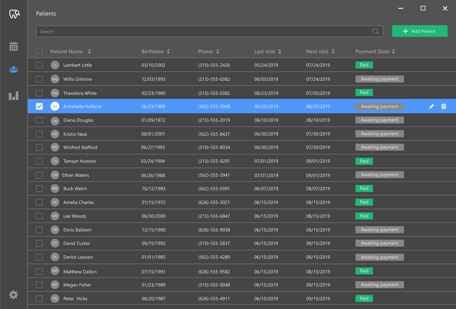
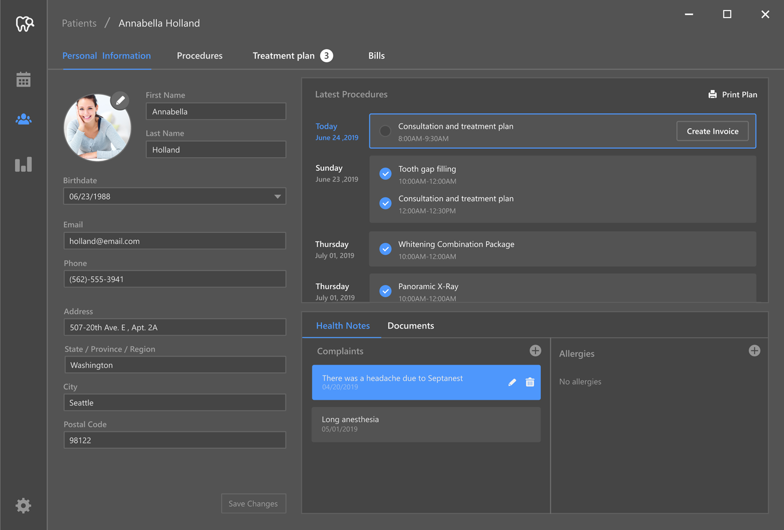
In our previous post, we detailed several top-level app screens (screens that allow users to check market state, track their favorite stocks, and monitor hypothetical portfolio gains/losses). As you may already know, we will use our Navigation Drawer component to navigate between individual levels:

Navigation Drawer

The DrawerPage page allows us to create a list with target destinations to the drawer and display content in the main area. The DrawerPage offers swipe gesture support and multiple appearance options.

In the following code snippet, we customize the drawer page so our app mirrors the UI design displayed above.

View Markup

<dxn:DrawerPage 
    xmlns:dxn="clr-namespace:DevExpress.XamarinForms.Navigation;assembly=DevExpress.XamarinForms.Navigation" 
    x:Class="Stocks.UI.Views.MainPage">
	...
    <dxn:DrawerPage.BindingContext> 
        <viewmodels:MainViewModel> 
    </dxn:DrawerPage.BindingContext> 
    
    <dxn:DrawerPage.DrawerHeaderContent> 
        <views:MenuHeader Style="{StaticResource DrawerHeaderStyle}"/> 
    </dxn:DrawerPage.DrawerHeaderContent> 
    <dxn:DrawerPage.DrawerContent> 
        <ListView 
            ItemsSource="{Binding Children}" 
            Style="{StaticResource DrawerContentStyle}" 
            ItemTapped="OnPageListItemTapped"> 
            <ListView.ItemTemplate> 
                <DataTemplate> 
                    <ViewCell> 
                        <views:MenuRow Style="{StaticResource DrawerContentItemStyle}"/> 
                    </ViewCell> 
                </DataTemplate> 
            </ListView.ItemTemplate> 
        </ListView> 
    </dxn:DrawerPage.DrawerContent>  
    <dxn:DrawerPage.MainContent> 
        <ContentPage BackgroundColor="{StaticResource BackgroundColor}"/> 
    </dxn:DrawerPage.MainContent> 
</dxn:DrawerPage> 

View Code Behind

public partial class MainPage : DrawerPage, INavigationHost { 
    MainViewModel ViewModel => (MainViewModel)BindingContext; 
    public MainPage() { 
        InitializeComponent(); 
    } 
    private void OnPageListItemTapped(object sender, ItemTappedEventArgs e) { 
        this.IsDrawerOpened = false; 
        if (!(e.Item is BaseViewModel child)) return; 
        ViewModel.SelectedChild = child; 
    } 
    void ToggleDrawer(object sender) { 
        IsDrawerOpened = !IsDrawerOpened; 
    }   
} 

View Model Code

public class MainViewModel: BaseViewModel {
    BaseViewModel selectedChild;

    public IEnumerable<BaseViewModel> Children { get; }
    public BaseViewModel SelectedChild {
        get => selectedChild;
        set => SetProperty(
            ref selectedChild, value,
            onChanged: (oldValue, newValue) => {
                if (oldValue != null) oldValue.IsSelected = false;
                if (newValue != null) newValue.IsSelected = true;
                NavigationService.Replace(oldValue, newValue);
            }
        );
    }    
    // Other properties.

    public MainViewModel(IViewModelFactory viewModelFactory, INavigationService navigationService): base(navigationService) {
        Children = new List<BaseViewModel> { 
            viewModelFactory.CreateMarketViewModel(), 
            viewModelFactory.CreateMarketNewsViewModel(), 
            viewModelFactory.CreateWatchlistViewModel(),
            viewModelFactory.CreatePortfolioViewModel() 
        };
        // Initialization of other properties.
    }
}

NavigationService creates a new page by view model type and assigns it to the MainContent property of the main page.

Data Grouping

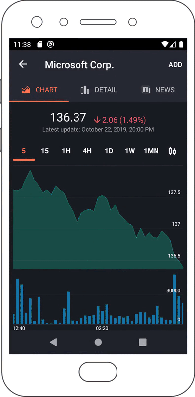
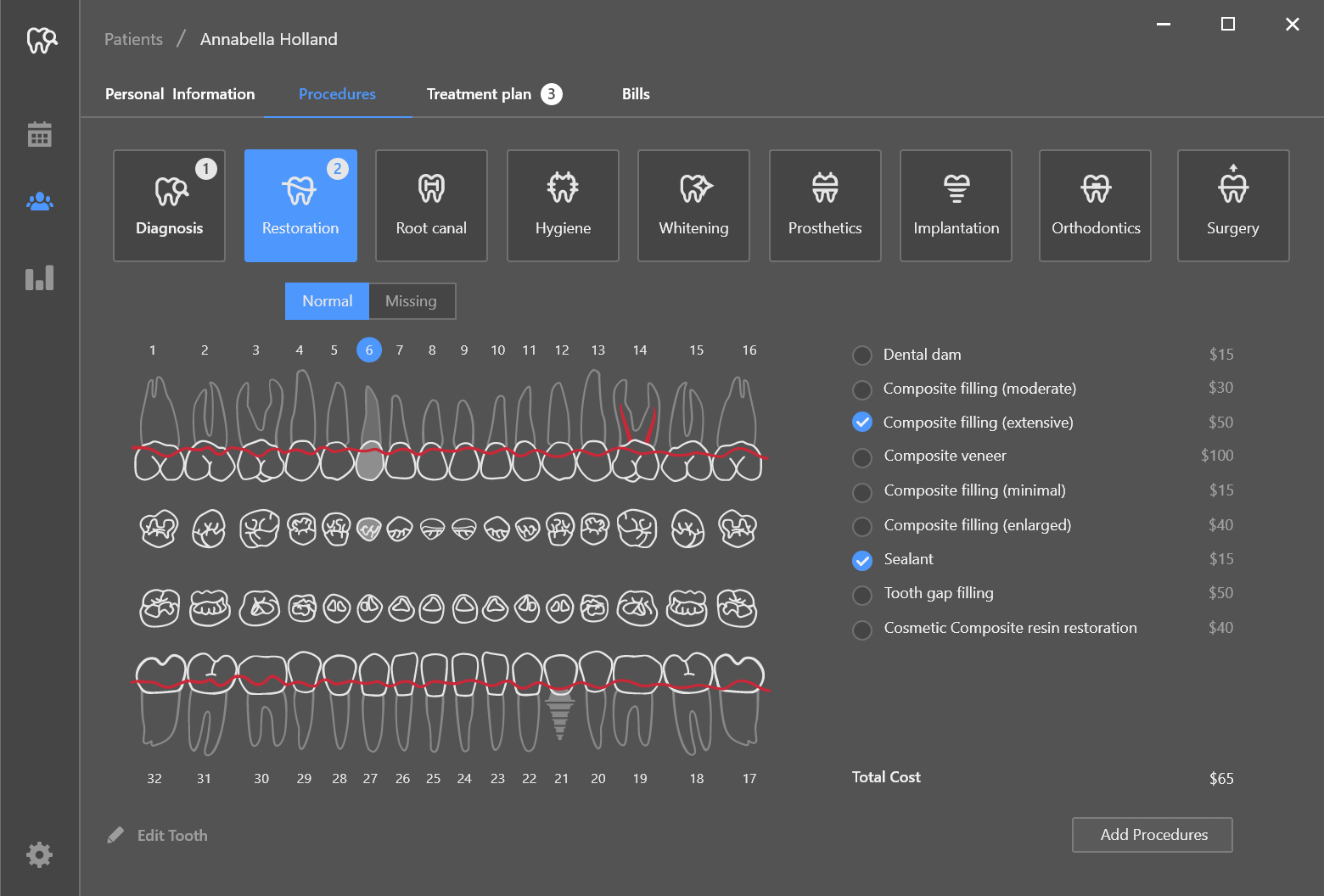
Since our app displays large chunks of data, we thought it important to group information by categories (by using tabs). For example, the Ticker Detail page displays 3 tabs – each with different information/unique visualization:

Tab Page

The DevExpress Xamarin UI suite includes two tab components: TabPage and TabView. These controls offer configurable headers, support item sources and templates, and offer a wide variety of behavioral customization options.

Since we must initialize view models when pages appear, we’ll use the DevExpress Xamarin TabPage (our TabView does not support this behavior).

In the following code snippet, we customize the TabPage so our app mirrors the UI design displayed above.

View Markup

<dxn:TabPage
    xmlns:dxn="clr-namespace:DevExpress.XamarinForms.Navigation;assembly=DevExpress.XamarinForms.Navigation"
    x:Class="Stocks.UI.Views.SymbolPage"
    Title="{Binding Title}"
    ItemsSource="{Binding Children}"
    SelectedItem="{Binding SelectedChild}"
    ItemTemplate="{utils:PageLocatorTemplateSelector}">
    <dxn:TabPage.BindingContext>
        <viewmodels:SymbolViewModel>
    </dxn:TabPage.BindingContext>
    <dxn:TabPage.Resources>
        <themes:SymbolPageStyle>
    </dxn:TabPage.Resources>
    <dxn:TabPage.ItemHeaderTemplate>
        <DataTemplate>
            <views:TabHeader Style="{StaticResource TabHeaderStyle}"/>
        </DataTemplate>
    </dxn:TabPage.ItemHeaderTemplate>
</dxn:TabPage>

View Model Code

public class SymbolViewModel : BaseViewModel {
    BaseViewModel selectedChild;

    public override string Title { get; private set; }
    public ICollection<BaseViewModel> Children { get; private set; }
    public BaseViewModel SelectedChild {
        get => selectedChild;
        set => SetProperty(ref selectedChild, value, onChanged: (oldV, v) => {
            if (oldV != null) { oldV.IsSelected = false; }
            if (v != null) { v.IsSelected = true; }
        });
    }

    public SymbolViewModel(string ticker, string companyName, IViewModelFactory viewModelFactory, INavigationService navigationService): base(navigationService) {
        Title = companyName;
        Children = new List<BaseViewModel> { 
            viewModelFactory.CreateSymbolChartViewModel(ticker), 
            viewModelFactory.CreateInfoViewModel(ticker),
            viewModelFactory.CreateNewsListViewModel(ticker)
        };
        SelectedChild = Children[0];
    }
}

Carousel

Our last navigation related requirement is use of a chart carousel within the Portfolio page:

Tab View

As you can see below, we will use our TabView to emulate a chart "carousel" (the TabView will be embedded in the page layout).

View Markup

<ContentPage
    xmlns:dxn="clr-namespace:DevExpress.XamarinForms.Navigation;assembly=DevExpress.XamarinForms.Navigation">
    <ContentPage.BindingContext>
        <viewmodels:PortfolioViewModel/>
    </ContentPage.BindingContext>
    <ContentPage.Resources>
        <ResourceDictionary>
            <DataTemplate x:Key="headerItemTemplate">
                <dxe:IconView 
                    ForegroundColor="{Binding IsSelected, Converter={converters:BoolToColorConverter TrueColor={StaticResource AccentColor}, FalseColor={StaticResource PortfolioPage_TabViewHeaderItemColor}}}"
                    ImageSource="circle.svg"
                    Style="{StaticResource CarouselIndicatorStyle}">
                </dxe:IconView>
            </DataTemplate>

            <DataTemplate x:Key="lineChartTemplate">
                <views:PortfolioLineChart/>
            </DataTemplate>
            <DataTemplate x:Key="donutChartTemplate">
                <views:PortfolioDonutChart/>
            </DataTemplate>
            <DataTemplate x:Key="barChartTemplate">
                <views:PortfolioBarChart/>
            </DataTemplate>
            <utils:PortfolioChartTemplateSelector 
                x:Key="chartSelector"
                LineChartTemplate="{StaticResource lineChartTemplate}"
                DonutChartTemplate="{StaticResource donutChartTemplate}"
                BarChartTemplate="{StaticResource barChartTemplate}">
            </utils:PortfolioChartTemplateSelector>
            <!-- Other resources -->
        </ResourceDictionary>
    </ContentPage.Resources>

    <ScrollView>
        <Grid Style="PortfolioContainerStyle">
            <dxn:TabView
                ItemsSource="{Binding Charts}"
                ItemTemplate="{StaticResource chartSelector}"
                SelectedItem="{Binding SelectedChart, Mode=TwoWay}"
                Style="{StaticResource CarouselStyle}"/>
            <!-- Other views. -->
        </Grid>
    </ScrollView>
</ContentPage>

View Model Code

class PortfolioViewModel {
    // Other fields.
    public override string Title => "Portfolio";
    public IEnumerable<PortfolioChartViewModel> Charts { get; }
    public PortfolioChartViewModel SelectedChart {
        get => selectedChart;
        set => SetProperty(ref selectedChart, value, onChanged: (oldV, newV) => {
            if (oldV != null) oldV.IsSelected = false;
            if (newV != null) newV.IsSelected = true;
        });
    }
    // Other properties.
    
    public PortfolioViewModel(ILocalStorage localStorage, IListSymbolRepository listSymbolRepository, IHistoricalPriceRepository priceRepository, IViewModelFactory viewModelFactory, INavigationService navigationService) : base(navigationService) {
        //Other class initialization.
        Charts = new List<PortfolioChartViewModel>() { 
            new PortfolioLineChartViewModel(), 
            new PortfolioDonutChartViewModel(), 
            new PortfolioBarChartViewModel(OpenBarChartDetail) 
        };
        SelectedChart = charts[0];
        InitializePortfolioIfNeeds();
    }
}

What's next

With major navigation related tasks complete, we’ll move our focus to data rendering/presentation and show you how we leveraged the flexibility of our Xamarin UI controls to deliver both an elegant and easy-to-use mobile interface.

Your Feedback Matters

As always, if you’ve yet to try our Xamarin.Forms UI controls or would like to discuss your business needs, please comment below or write to us at info@devexpress.com.

Charting (WinForms, WPF) - Scrollbar Annotations (v19.2)

$
0
0

Do you currently use scrollbar annotations within our WinForms Grid control? If so, please be sure to check out similar functionality we’ve introduced for both our WinForms and WPF Chart controls (v19.2).

Annotations demo module screenshot (see ChartControl demo).

Availability and Supported Chart Elements

Scrollbar annotations reflect the location of chart elements and help end-users quickly navigate between key chart elements. Both our WinForms and WPF Chart controls generate annotations for the following chart elements:

Scrollbar annotations are enabled by default (with one exception: Custom axis labels - see T814131: XYDiagram - The default scrollbar appearance has been changed). You can partially or fully disable annotations when necessary.

API Reference

Please refer to the following help topics to learn more about scrollbar annotations:

WinFormsThe ScrollBarAnnotaionOptions class
WPFThe ScrollBarOptions.AnnotatedElements property

Your Feedback Matters

We’d love to hear from you. Please share your thoughts about scrollbar annotations below and whether you expect to integrate it in an upcoming project.

WPF Data Grid and TreeList – Data Analysis and Conditional Formatting Filters (v19.2)

$
0
0

The newest versions of our WPF Data Grid and TreeList controls ship with two advanced filter options. As you’ll soon see, Data Analysis filters and Conditional Formatting filters allow users to quickly analyze information within the Data Grid without constructing complex queries/filter conditions.

Data Analysis Filters

We now support the following numerical filters within the DevExpress WPF Data Grid and WPF Tree List:

  • Top / Bottom N
  • Above / Below Average
  • Unique / Duplicate

To appreciate the value of this new capability, let’s consider a Data Grid populated with financial data (by State):

Demo Link

Goal: Display Top 10 States with the Highest Profit Margin

As you can see in this image, our objective was to display a list of Top 10 most profitable states. Achieving this result was easy – we simply activated the Profit column’s drill-down filter and applied the Top N filter rule:

As you would expect, the same filter can be applied in code:

grid.FilterString = "[#TopItems]([Profit], 10)";

Goal: Display a List of States with Above Average Customer Satisfaction

To limit records based on states with above average customer feedback, we navigated to the Customer Satisfaction column’s drill-down filter and applied the Above Average filter rule:

Once again, the same result can be applied in code:

grid.FilterString = "[#AboveAverage]([CustomerSatisfaction])";

Documentation: Data Analysis Filters

Conditional Formatting Filters

The WPF Data Grid above included Conditional Formatting rules. Our most recent release (v19.2) allows you to apply filters based on these rules.

To get started, simply open a column’s drop-down filter and select Format condition filters. The drop-down filter will display rules for the selected column. Select the appropriate rule and our WPF Data Grid will apply the corresponding filter:

Documentation: Conditional Formatting Filters

Your Feedback Matters

We’d love to know your thoughts on these new features. If you’re using our Data Grid and TreeList, feel free to comment below and share your usage experiences with the entire DevExpress community.

Blazor Components - Data Grid Layout Management and New Scroll Picker Mode (Available in v19.1.9)

$
0
0

The latest version of DevExpress UI for Blazor (v19.1.9) is now available and it includes enhancements for the DataGrid and DateEdit components.

Data Grid

Save and Restore Layout

Our Blazor Data Grid allows you to save and restore layout information. Saved layout information includes the current page, column sort order/direction, column position, and both group and filter values. Use these two new events to save and restore the grid's layout with ease:

  • LayoutChanged - o persist the grid’s layout instantly (when changed by a user).
  • LayoutRestoring - to restore a previously saved layout.

Handlers of both events accept an argument of type IDataGridLayout:

public interface IDataGridLayout {
    string SaveLayout();
    void LoadLayout(string json);
}

The string SaveLayout() method returns a string with grid layout data. The void LoadLayout(string json) method accepts the string with grid layout data (saved using the SaveLayout method) to restore the layout. Here is an example of how you can use the grid’s new API:

<DxDataGrid ...
    LayoutRestoring="@OnLayoutRestoring"
    LayoutChanged="@OnLayoutChanged">
</DxDataGrid>
 
@code {
     void OnLayoutChanged(IDataGridLayout dataGridLayout)
    {
        var layout = dataGridLayout.SaveLayout();
        // persist the layout in your storage
    }
    void OnLayoutRestoring(IDataGridLayout dataGridLayout)
    {
        var layout = … // restore layout from your storage
        dataGridLayout.LoadLayout(layout);
    }
}

We've also implemented similar SaveLayout and LoadLayout methods for the Data Grid. This allows you to save and restore the grid’s layout on demand.

GitHub Example

Take a look at this full Visual Studio example on GitHub which demonstrates how to save and restore Blazor Data Grid layout automatically and on demand.

Date Edit

Scroll Picker Mode

In v19.1.9, we added a new ScrollPicker mode for touch devices. You can specify a picker type using the PickerDisplayMode property:

  • Auto (default) - Mobile and tablet devices display the Blazor Date Picker using a scroll UI metaphor. Mobile devices display the Blazor Date Picker within a modal popup dialog, while tablet devices display the Date Picker in a non-modal popup. Desktop devices display the Date Picker as a calendar.
  • Calendar - All devices display a datepicker as a calendar.
  • ScrollPicker - All devices display a datepicker as a scroll picker.

DevExpress Blazor Date Edit Scroll Picker

When Scroll Picker mode is enabled, you can use the ScrollPickerFormat property to define a date format for each scroll picker element (day, month, and year). Supported formats are:

  • ddd– Specifies the day and the short name of the day of the week (15 Fri).
  • dddd - Specifies the day and the full name of the day of the week (15 Friday).
  • dd or d– Specifies only the day (15).
  • MMM– The shortened version of month name is used (Oct).
  • M,MM,or MMMM– The full version of month name is used (October).
  • y, yy, yyy, or yyyy– Four digit year is used (2019).

Specified format order defines corresponding scroll picker element order. For example, the image above demonstrates use of the "dddd MMMM yyyy" format string.

Your Feedback Matters

As always, we welcome your feedback. Please share your thoughts about these enhancements in the comment section below.


Getting Started with DevExpress WPF Controls for .NET Core

$
0
0

OTHER RELATED ARTICLES:

  1. WPF - Visual Studio Integration and Designer Support in .NET Core 3.0
  2. THIS POST: Getting Started with DevExpress WPF Controls for .NET Core
  3. Migrate WPF Apps to .NET Core (coming soon)
  4. How to Deploy a .NET Core 3 App (coming soon)

This guide describes how you can create a .NET Core 3 application, configure it to use DevExpress WPF controls, and how to add a DevExpress control to the app itself (for this tutorial, we’ll show you how to add our Spreadsheet control to your .NET Core 3 project).

Prerequisites

Step-by-Step Tutorial

  1. Open Visual Studio 2019 v16.3 and create a new WPF Application (.NET Core).

  2. Add DevExpress NuGet Packages

    In this blog post, we describe how to get DevExpress WPF Controls via DevExpress NuGet Feed. The Getting Started topic describes how to use DevExpress WPF Controls for .NET Core from a local feed.

    Obtain your personal NuGet feed URL.

    Go to Tools | NuGet Package Manager | Manage NuGet Packages for Solution

    Open "Settings"...

    ... and add a new NuGet feed with the following attributes:

    Name: DevExpress
    Source: https://nuget.devexpress.com/{your feed authorization key}/api

    Select the DevExpress package source you just added.

    In the "Browse" tab, search for 'WindowsDesktop.Wpf' and install the following two packages into the current project.

    • DevExpress.WindowsDesktop.Wpf
    • DevExpress.WindowsDesktop.Wpf.Themes.Office2019Colorful

    Read and accept the license agreement.

    Build the solution. This will force the project to resolve all NuGet package dependencies. Visual Studio will load available controls into its Toolbox.

  3. Apply an Application Theme

    Set the ApplicationThemeHelper.ApplicationThemeName property to the desired theme name at application startup.

    public partial class App : Application {
        protected override void OnStartup(StartupEventArgs e) {
            DevExpress.Xpf.Core.ApplicationThemeHelper.ApplicationThemeName = 
                DevExpress.Xpf.Core.Theme.Office2019ColorfulName;
            base.OnStartup(e);
        }
    }
  4. Add the control.

    Drag the Spreadsheet control from the Visual Studio Toolbox to the XAML code. Change the application markup as follows:

    <Window x:Class="DxWPFNetCoreApp.MainWindow"
        xmlns="http://schemas.microsoft.com/winfx/2006/xaml/presentation"
        xmlns:x="http://schemas.microsoft.com/winfx/2006/xaml"
        xmlns:dxsps="http://schemas.devexpress.com/winfx/2008/xaml/spreadsheet"
        xmlns:local="clr-namespace:DxWPFNetCoreApp"
        Title="MainWindow" Height="450" Width="800">
        <Grid>
            <dxsps:SpreadsheetControl CommandBarStyle="Ribbon" ShowFormulaBar="True"/>
        </Grid>
    </Window>


  5. Build and run the solution. Congrats, you’ve just built your own .NET Core 3 Spreadsheet app 😉

Documentation

Our .NET Core 3 documentation contains numerous resources including migration guides, and known limitations.

We'd Love to Hear From You

As always, thanks for choosing DevExpress for your software development needs. Please take a moment to share your thoughts with us and tell us about your upcoming .NET Core project. Comment below or email us at wpfteam@devexpress.com

DevExpress Universal v19.2 released

$
0
0

I am pleased to announce the release of DevExpress Universal v19.2. This release includes our platform suites for WinForms, WPF, UWP, Xamarin, the assorted varieties of ASP.NET, as well as DevExtreme and Blazor. And that's even before announcing the inclusion of new features for dashboards, reporting, the Office API, CodeRush, and so on. As is usual, however, the new version of our VCL Subscription will be released in a couple of weeks' time.

For what’s new in this release — and there have been many enhancements and new features across the board — please go to this page. Also, you can always navigate to devexpress.com/new and see what’s new in the latest version, whichever version number that happens to be.

As usual, we’ve listed the Resolved Issues introduced in this release. That page also enables you to review the changes we’ve made from any release to any other.

For every major release, no matter how hard we try and minimize the impact, some new features and enhancements are bound to cause a few breaking changes. You can read about the v19.2 breaking changes here.

I pretty much say something like this with every major release: we would not be able to produce and release such robust and full-featured controls, features, and enhancements without the invaluable help of our customers. By publishing surveys, chatting with customers at conferences, reviewing comments and support tickets, we find that we can more easily focus on providing what our customers want from our products going forward. Also, we’ve been concentrating on publishing relevant posts on what we are doing, posts detailing various tips and tricks, and posts on how we aim to move forward. My strong recommendation is to monitor our community site more than ever before.

I’d like to thank everyone who provided feedback on our products throughout this year, who used and tested the various v19.2 betas we've produced and provided information on the issues they found, and, of course, to all our customers who use our products every day in their applications. We are confident that the new controls, features, and enhancements in v19.2 will strengthen and validate your trust in our products. Thank you, it is much appreciated.

Reporting – Populate Empty Space and Display Cross-Band Content (v19.2)

$
0
0

The newest version of our royalty-free .NET Reporting platform ships two major features. These features allow you

  • To display report content across a page or group;

  • And to print empty table rows and conform to a predefined report layout.

These features have been incorporated into our new Invoice report demo:

Invoice Demo Report

To create a similar report, please refer to the Create a Report with Cross-Band Content and Populate Empty Space help topic for a step-by-step tutorial.

Add Cross-Band Content

DevExpress Reports has always printed individual bands in succession (one after another). With this release, you can display bands across two layers. We’ve extended both our PageHeader and GroupHeader bands with a new PrintAcrossBands property.

PrintAcrossBands Property

When this property is enabled, the band’s content is displayed in a background layer and subsequent band content is displayed on the top layer.

Print Across Bands Schema

This allows you to introduce extended group/page watermarks or display group/page-specific information in conjunction with detail records and footer content.

You can also display cross-band content under the page/group header. To do so, simply add a SubBand to the PageHeader/GroupHeader band and enable the PrintAcrossBands property.

Print Across Bands with Subbands Schema

Please review the GroupHeaderBand.PrintAcrossBands, PageHeaderBand.PrintAcrossBands, or SubBand.PrintAcrossBands property descriptions for more information.

Populate Empty Space

Previously, the only way to populate empty space between report bands was to handle the report’s FillEmptySpace event. With this release, we’ve added a FillEmptySpace property to the Detail band. When this property is enabled, the empty space below the Detail band is populated with empty copies of the band. The band retains its layout, but report controls are printed without data.

Empty Space With Group Footer Schema

Empty Space - Preview Result

You can display static text in the band’s copies. For this purpose, specify the Text property of the controls located in the Detail band.

Empty Space - Preview Result With Text

If the Detail band includes line numbers, they are added to the copies as well.

Empty Space - Preview Result With Record Number

Please review the FillEmptySpace property description for more information.

Your Feedback Counts

As always, we’d like to hear from you. Please feel free to leave comments below, and we would appreciate it you can submit your responses to this short survey:

Real-time Charting (WPF) - Rendering performance enhancements (19.2)

$
0
0

The Goal

In this post, we will summarize the results of ongoing performance optimizations made during our v2019 development cycle. As you may recall from previous posts on this subject, our objective was to increase Chart Layout rendering speed without sacrificing built-in functionality.

If you’re currently using real-time charting within your WPF application, we hope you’ll notice improved rendering performance after you upgrade to our most recent release (v19.2).

Optimizations and Test Results

To help track progress and compute improvements, we used our “Real-Time Chart” demo module as our target app.

The demo module we shipped in our v18.2 release displayed six Line Series with 1000 points each. Series were split across three separate Panes and we applied a data refresh rate of 40ms.

v18.2 rendering speed: 16 FPS (average)

Realtime demo module screenshot (v18.2)

After applying various optimization methods and running a series of tests, we saw that the rendering performance improved by at least 300%.
We also found that the resulting FPS count was more than 40 if we added two extra Series and another Pane.

So, our “Real-Time Chart” demo now includes eight Line Series with 1000 points each shown in four Panes. We set the refresh rate to 15ms.

v19.2 rendering speed: 49 FPS (average)

Realtime demo module screenshot (v19.2)

We recorded a short screencast for a side-by-side comparison (v18.2 vs v19.2). As you can see, our latest version (on the right) executes much more smoothly than its predecessor.

Here are the specs on our test machine should you wish to replicate this test and share your results with the DevExpress developer community.


HP Pavilion Gaming Laptop 15-cx0xxx
Microsoft Windows 10 Pro
Intel® Core™ i7-8750H CPU @ 2.20GHz
16Gb RAM

Your Feedback Matters

If you are already using our newest release and would like to provide feedback, feel free to comment below. As always, we appreciate your continued support and commitment to DevExpress WPF technologies.

WinForms Dental Clinic Demo and SvgImageBox Control

$
0
0

Last month, we previewed our brand new Dental Clinic demo. Our thanks to everyone who shared their initial thoughts with us via blog comments and within our WinForms RWA forum. In this post, I’d like to share detailed design mock-ups and explain how we used our newest WinForms Editor within this sample app (a control we built specifically for this demo).

As you can see in the image below, the Dental Clinic app includes a vertical sidebar with buttons that allow users to navigate between application modules. The “Patients” module displays a grid with relevant patient data.

Staff can activate a multi-tab patient card to add new patient information or modify existing patient data. The first patient card tab stores/displays “Personal Information”, medical procedures (both upcoming procedures and those completed in the past), and important health advisories.

If a patient requires treatment, the dentist can navigate to the “Procedures” tab (wherein all procedures are grouped into categories). The doctor chooses the category (i.e., “Restoration”) and uses the interactive “tooth map” to select the appropriate procedure for each tooth.

As you probably know by now, this “tooth map” was built with a new DevExpress WinForms control - the SvgImageBox editor (part of our v19.2 distribution).

Vector images are comprised of simple elements (paths, groups, etc.) rather than pixels. SvgImageBox analyzes the elements contained within a vector image, and allows you to highlight them or change visibility settings when necessary. In the Dental Clinic demo, the control displays/hides elements like "root canal" or "sealant" based upon selections made by the doctor.

Our v19.2 installation includes a new module within the XtraEditors demo. This module demonstrates another use case for the SvgImageBox - ticket booking (users can reserve a spot in a theater with a simple mouse click). The seats inside the demo are drawn using three simple elements (seat number, the rectangle around it, and an element that represents armrests) organized into a group. A user can click or hover any of these three elements, and the entire group automatically “lights up” (the control fires a series of events that allows you to identify which element was hovered\clicked, and highlight this or any other element in response).

The third tab of a patient card is “Treatment Plan.” As its name implies, this tab allows a doctor to review all prescribed procedures and schedule them as needed.

The “Calendar” module allows you to browse all scheduled procedures.

The final module of the app displays various graphs and charts, and full appointment history within the second tab.


In the next post of this blog series, we’ll dive into the technical details – we’ll detail the controls used for each module and how we wired up the app’s internal logic.

Feel free to share your questions and thoughts below, and stay tuned for the next blog post.

Viewing all 2405 articles
Browse latest View live