Quantcast
Channel: Developer Express Inc.
Viewing all 2401 articles
Browse latest View live

Office Inspired Controls and File API – Early Access Preview (v19.2)

$
0
0

In this post, we'll detail some of the features we expect to ship in our next major release (v19.2) and invite active Universal and DXperience Subscribers to test new functionality before we complete our current dev cycle.

As always, we thank you for choosing our Office components and for placing your faith in DevExpress.

Word Processing – Hyphenation

Our Word Processing Document API and Rich Text Editor (WinForms and WPF) now supports soft hyphens and automatic hyphenation. You can load, print and export documents with soft hyphens, or insert hyphens within the UI (WinForms & WPF) using the Ctrl+- shortcut.

Link a dictionary that specifies hyphenation rules to enable automatic hyphenation. Please refer to the hyphenation-simple-example repository for a sample project.

Once you provide hyphenation dictionaries, you can enable or suppress automatic hyphenation in code or within the UI (WinForms & WPF).

Spreadsheet – Excel Binary Workbook (XLSB) Support

The Spreadsheet Document API and WinForms and WPF Spreadsheet controls now supports the XLSB (BIFF12) format. Give it a try and load and save your documents using this format.

Note: the Early Access Preview build has the following limitations:

  • Encryption is not supported for XLSB documents;
  • Slicers will be stripped from your binary files.

Spreadsheet – Status Bar

This release includes a new Status Bar for both the DevExpress WinForms and WPF Spreadsheet control. This status bar allows you to zoom (in or out) the current worksheet. When you select two or more cells with numeric data, the status bar displays the following summary information:

  • Number of selected cells (Count)
  • Number of selected cells with numerical values (Numerical Count)
  • Average
  • Minimum value (MIN)
  • Maximum value (MAX)
  • Sum

The Customize Status Bar context menu for our WPF Spreadsheet control allows you to show of hide status bar entries.

You can generate the status bar at design or runtime.

Please note that the status bar can only be displayed when using our Ribbon command UI.

PDF Document API – Custom Properties

The PDF Document API allows you to manage a document’s custom property collection. Use PdfDocument.CustomProperties to access the collection. You can add and delete custom properties or change associated names or values.

Please check the pdf-document-api-custom-properties repository for a sample project.

// Add new property
document.CustomProperties.Add("NumberOfCopies", "3");

// Modify the CompanyEmail property value:
if (document.CustomProperties.ContainsKey("CompanyEmail"))
    document.CustomProperties["CompanyEmail"] = "clientservices@devexpress.com";

// Remove the HasImages property:
document.CustomProperties.Remove("HasImages");

Get Started Today

If you own an active Universal or DXperience subscription, you can download our Early Access Preview build via the DevExpress Download Manager.

As always, your feedback will help us deliver the best possible build. Should you have questions about these new features, or should you experience technical issues during the Early Access Preview, please contact us via the DevExpress Support Center or the comment section below.

If you are using a trial version and would like to access these new features today, purchase a Universal or DXperience subscription license and you will automatically receive access to the Early Access Preview version. If you are ready to upgrade to Universal or DXperience from another subscription level, email us at clientservices@devexpress.com for preferential upgrade pricing.
NOTE: Early Access and CTP builds are provided solely for early testing purposes and are not ready for production use. This build can be installed side by side with other major versions of DevExpress products. Please backup your project and other important data before installing Early Access and CTP builds.

DevExpress Dashboard - Early Access Preview (v19.2)

$
0
0

v19.2 - our next major update - is a couple of months away. As such, we wanted to share the features we expect to ship in October and invite all active DevExpress Universal users to download our early access preview. Your feedback will help us refine these new features and allow us to ship the best possible royalty-free Dashboard platform in the marketplace.

WinForms Dashboard - Asynchronous Data Processing and Rendering

Our next major release will include the first version of DevExpress Dashboard's Asynchronous Data Processing and Rendering Engine for the WinForms platform. As its name implies, this engine was designed to decouple data processing from UI-related threads. Yes, with v19.2, your users will be able to continue using your app while time-consuming operations are performed on the server side.

To switch the Dashboard Viewer/Designer to Async mode, you will simply set its AsyncMode property to true.

The Advantages of Asynchronous Data Processing

  • Responsiveness: We render dashboard widgets more quickly. Your application will be more responsive and feel "lighter."

  • Immediate Rendering: Asynchronous data processing helps accelerate dashboard data calculations and rendering – Items appear sequentially as they are ready (data that is processed first appears without waiting for more time-consuming calculations).

WinForms Dashboard - Asynchronous Data Processing and Rendering

Note: If you currently handle control events, please be aware of API changes designed to support the modified lifecycle of the Async data processing. We've created a migration guide to simplify the transition process ( KB article ). Full product documentation will be published prior to official release.

As you can imagine, this early access preview ships with a number of limitations. We are actively working on our Async API, and testing our UX. This reality notwithstanding, we encourage you to evaluate our implementation and experience the performance advantages first-hand. We need your help so please do share your thoughts and your technical issues with us.

Web Dashboard Themes

Our next major release will include an extended web theme set and allow you to create custom themes as needed.

Predefined Themes – Powered by DevExtreme

Since our Dashboard is tightly integrated with our DevExtreme component library, many of you have asked us to fully support DevExteme's set of Predefined Themes. In this early access preview, you can use any Generic DevExtreme theme within your project.

Web Dashboard Themes

To explore this new option, simple open an existing v19.2 Web Dashboard Demo and switch between themes using the dropdown button within the Dashboard Title.

Note: Material themes are not available in this early access preview. Material design support involves numerous moving parts and though we hope to include support once v19.2 ships, we may have to defer this feature.

Custom Themes and Command-Line Interface

For those who wish to create a custom Dashboard theme and those who have already created a custom theme using the DevExtreme ThemeBuilder, v19.2 includes our new Dashboard Theme Builder CLI (command line interface).

Our Dashboard Theme Builder CLI is a command line tool based on Node.js and was designed to work together with DevExtreme ThemeBuilder. It allows you to create a custom Web Dashboard theme with ease.

The following KB article details usage of our new Theme Builder CLI.

Note: In this early access preview, we do not apply palettes to data-specific colors (present in our Chart, Range Filter, TreeMap and other visualization widgets). Palettes used in these Items are tightly bound with data, and we don't expect to make modifications to our existing implementation. You can customize specific colors by handling the CustomPalette event. If this does not address your requirements, please comment below. We'll be happy to review your use-case in greater detail and reconsider our implementation if necessary.

Data Inspector

We've created a basic UI to allow end-users to inspect data (underlined or aggregated, at your discretion) used to populate our visualization widgets.

Data Inspector - DevExpress Dashboard

To invoke this dialog, use one of the following methods:

  • click "Data Inspector" in the Dashboard Item Caption. The item is visible if the AllowInspectAggregatedData or AllowInspectRawData property is true;
  • call the ShowDataInspector method within your own UI.

The new UI is available for all platforms (WinForms Dashboard, WPF Dashboard, Web Dashboard). We activated this feature for all DevExpress Dashboard Demos in this early access preview.

JSON DataSource

You can now use JSON Data Source to feed JSON data to Dashboards - across every platform.

End-users can create a JSON data source with the Data Source Wizard available in our WinForms Designer and Web Dashboard.

JSON DataSource - DevExpress Dashboard

You can use the new DashboardJSONDataSource class to create the JSON data source in code.

XPO DataSource

DevExpress Dashboard now supports our XPO Data Source. You can bind your XPOBusiness Model to DevExpress Dashboard (feel free to use our WinForms Dashboard Wizard for this task).

You can also instantiate the DashboardXpoDataSource in code and add it to your dashboard / data source storage as follows:

DashboardXpoDataSource dataSource = new DashboardXpoDataSource() {
    ConnectionStringName = "nwind"
};

dataSource.SetEntityType(typeof(Products));

Data Federation – Union

Our Data Federation Data Source now supports Union operations.

When creating a new federated query in our WinForms Wizard, you can select the appropriate operation type – Join, Union or Union All

Data Federation Data Source - Union - DevExpress Dashboard

In addition, our API allows you to create complex queries when a Federation Data Source performs a Join with one data source and a Union operation with another data source. The query is generated as illustrated in the following code snippet:

DashboardFederationDataSource federationDataSource = new DashboardFederationDataSource();
var msSource = new Source("MSSQL Source", msSqlDataSource, "query");
var mySqlSource = new Source("MySQL Source", mySqlDataSource, "query");
var excelSource = new Source("Excel Source", excelDataSource, "");

var query =
    msSource.From().Select("ProductName", "CategoryID").Build("MSSQL select")
    .UnionAll(mySqlSource.From().Select("ProductName", "CategoryID").Build("MySQL select"))
        .Build("Products union")
    .From().Select("ProductName")
        .Join(excelSource, "[Products union].[CategoryID] = [Excel Source].[CategoryID]").Select("CategoryName")
    .Build("query");
federationDataSource.Queries.Add(query);

Extract Data Source API

We extended our Extract Data Source API and made it easier to manage millions of data rows. (if you've not evaluated Extract Data Source, we recommend that you consider it for future projects as it is blazing fast.

Some of you reported issues when updating your Extract Data Source in the concurrent multi-user request world of the web. Our current workaround required that you write code to address this issue. With v19.2, you can use the following straightforward API:

DashboardExtractDataSource.UpdateFile(extractDS,
    (_, result) => logger.Log("onDataUpdated", result),
    (_, result) => logger.Log("onFileUpdated", result));
extractDS.Dispose();

Behind the scenes, we redirect data requests to a new file and delete the old file when it is no longer necessary. This operation is seamless. No additional thread synchronization tasks are required on your end.

Data Federation + Extract

We improved how our Data Federation and Extract Data Sources work together.

With v19.2, you can create an extract from your Federation Data Source. You can also include Extract Data Source in the Federation Data Source and join/union with other data sources.

Window Function for Calc Fields

Back in v16.1, we enhanced our DevExpress Dashboard with Window Calculations , available at Dashboard Item's level. Since then we collected a (very little) number of your request to perform similar calculations on the previous data processing step, before the data was aggregated to be displayed.

You can now do it in your Calculated Field with our new w function.

To better illustrate its concept, we have created this article which gives examples of various aggregation types so you can compare and analyze.

Before We Let You Go

To better address your business needs, we ask that you complete the following DevExpress Dashboard product survey. We'd love to know how you're using DevExpress Dashboard and how we can better address your needs in 2020. The survey should only take 4 ½ minutes to complete (yes, we’ve made certain to keep it short and to the point). 

NOTE: Early Access and CTP builds are provided solely for early testing purposes and are not ready for production use. This build can be installed side by side with other major versions of DevExpress products. Please backup your project and other important data before installing Early Access and CTP builds.

Web Reporting - Early Access Preview (v19.2)

$
0
0

As you may already know by now, we are nearing the official launch of v19.2. The goal of this post is to share our progress and give you the opportunity to test major new functionality before we wrap up our current dev cycle.

If you are an active Universal or DXperience subscriber and would like to test upcoming v19.2 features prior to the official release, you can download the early access preview build from the DevExpress Download Manager and test the features described in this blog post. Let us know how well the new functionality addresses your requirements.

If you are using a trial and want to try this feature today, you can purchase a DevExpress Universal or DXperience license online (this will give you access to the early access preview build). If you own a non-Universal subscription and are ready to upgrade, email us at clientservices@devexpress.com for preferential upgrade pricing. 

Web Report Designer - In-Place Rich Text Editing

Our XRRichText control allows end-users to edit its content. Double click the control to activate the editor:

Rich Text In-Place Editing


Tell Us What You Think

Please explore the following online demo to learn more about this feature: Web Report Designer - In-Place Rich Text Editing. The Data -> Load File properties panel editor allows you to load your file (HTML, DOCX and RTF) and check how its rendered within the editor (or within the print preview).  

We are eagerly waiting for your feedback, so cast your vote to the survey below:

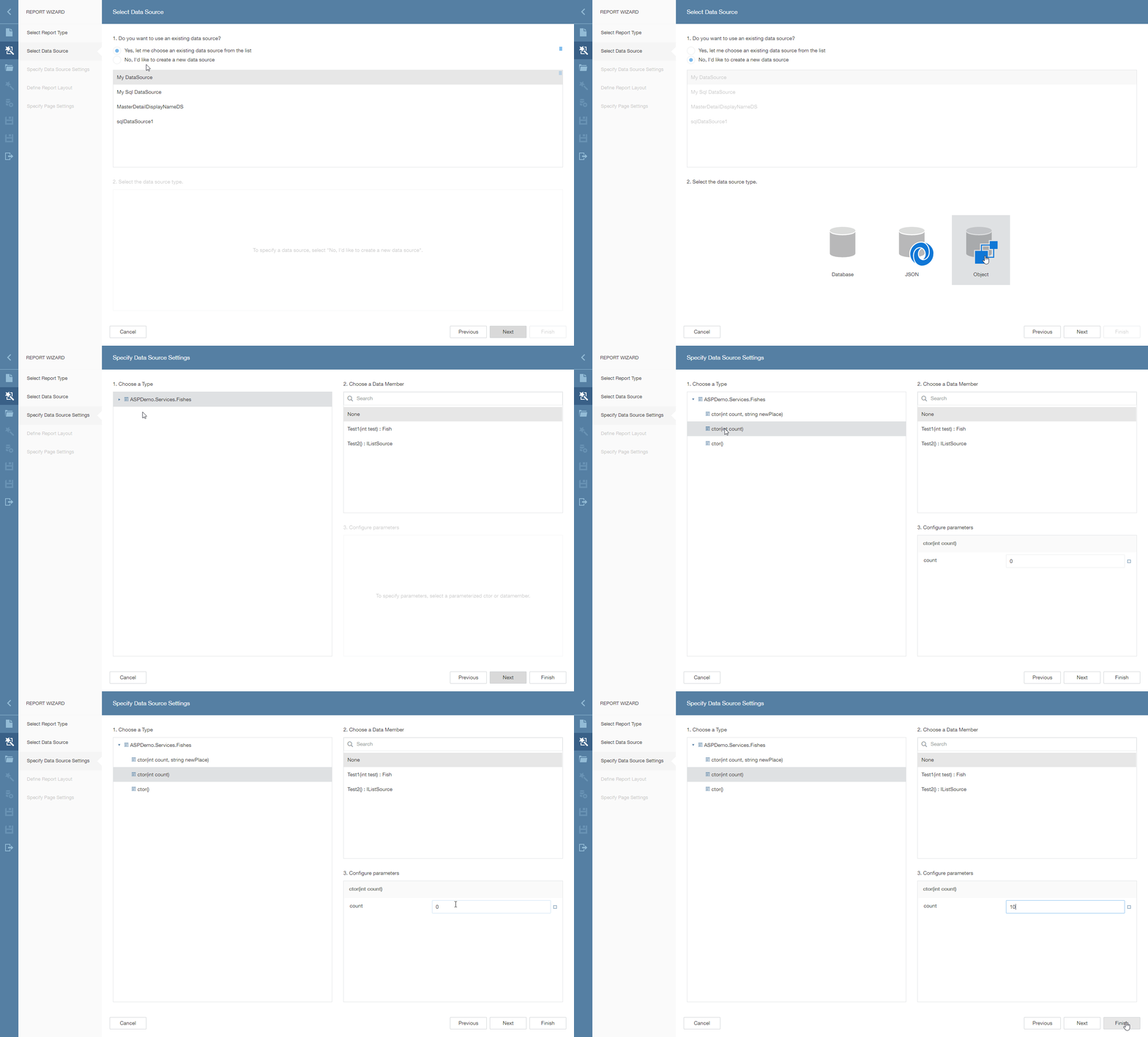
Web Report Designer - Bind a Report to ObjectDataSource Using the Data Source Wizard

You can use this data source type in the Data Source Wizard to bind a report to a collection of business objects.

Bind a Report to Object Data Source in Web Report Designer

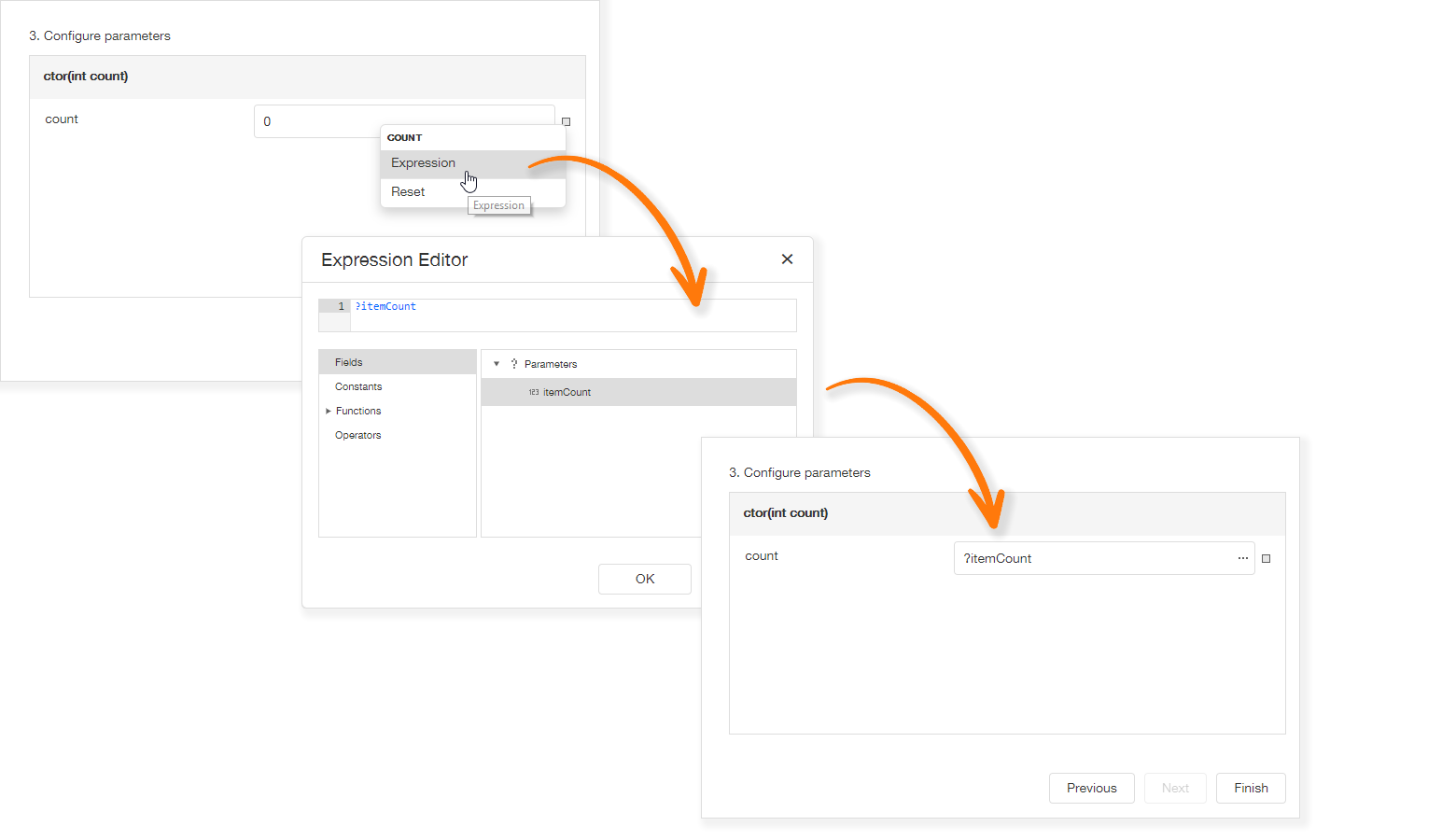
The data source wizard allows you to specify the parameter expression (using the Expression Editor) and pass an existing report parameter to the constructor or a method that returns a collection of business objects:

Specify Object Data Source Parameters

Tell Us What You Think

Please explore the following online demo to learn more about this feature: Web Report Designer - Object Data Source Wizard.

If you’d like to check how the wizard works with your own data access layer, you should:

  • Backup your application and then upgrade it to v19.2;
  • Implement the DevExpress.DataAccess.Web.IObjectDataSourceWizardTypeProvider interface:
  public class ObjectDataSourceWizardTypeProvider : IObjectDataSourceWizardTypeProvider {
        public IEnumerable<Type> GetAvailableTypes(string context) {
                return new [] { typeof(MyBusinessObjectType) };
        }
    }
  • Register your implementation at the application startup:
DefaultReportDesignerContainer.RegisterObjectDataSourceWizardTypeProvider<ObjectDataSourceWizardTypeProvider>();

Web Report Designer - Properties Panel Update

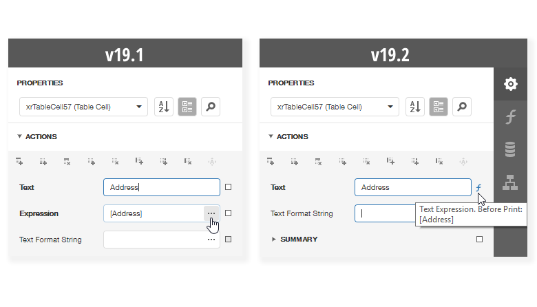
In previous versions, two editors were used for a single property: the first was created to specify a static value and the second to provide an expression. We updated the properties panel to make it more compact and eliminate the confusion related to the use of two editors for a single property:

Properties Panel - Comparison

This enhancement helps bring the Web Report Designer closer to its WinForms counterpart. Previously a square icon could be used to reset a property to its default value. With this update, the icon near each property also indicates whether a property value differs from its default value, and allows you to define an expression as needed. Property editor values that were specified via an expression now display a formula icon to the right of the editor.

NOTE: Early Access and CTP builds are provided solely for early testing purposes and are not ready for production use.This build can be installed side by side with other major versions of DevExpress products. Please backup your project and other important data before installing Early Access and CTP builds.

ASP.NET - Early Access Preview (v19.2)

$
0
0

In this post, we'll detail some of the features we expect to ship in our next major release (v19.2) and invite active Universal and DXperience Subscribers to test new functionality before we complete our current dev cycle.

As always, we thank you for choosing our ASP.NET components and for placing your faith in DevExpress.

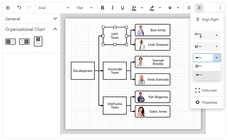
1. Web Diagram (available in 19.2 Early Access Preview)

Availability

In this Early Access Preview, the DevExpress Web Diagram component will only be available as a DevExtreme widget. We will ship ASP.NET Core, ASP.NET WebForms and ASP.NET MVC versions of our web Diagram component once v19.2 is released officially.

Diagram for ASP.NET Core, WebForms and MVC

Shape Containers

New shape types - horizontal and vertical containers - allow you to combine other shapes within a "container". Our Web Diagram component supports stacked containers and ships with expand and collapse functionality.

Images in Shapes

You can now associate a predefined (or custom) image with new image shapes via a database or the widget’s UI. The image will maintain the shape's size and its position when the shape is moved or resized.

New Data Binding Capabilities

We implemented advanced data binding for shape settings. You can bind all shape properties including shape and connectors style, shape image URL, position, and size to a database. We expect to support data binding for all new shape settings.

Full Screen Mode

Our Diagram now supports fullscreen mode. You can add a corresponding toolbar command or use the fullscreen property to enable Fullscreen mode within your web app.

Read Only Mode

Read only mode protects the Diagram from edit operations. Use the readOnly property to enable this diagram option.

Simple View

When you activate our new Simple View mode, the Web Diagram removes gray document borders and the diagram’s content fully occupies available screen real-estate.

Zooming Document Content

DevExpress Web Diagram can now apply zoom levels to its content. To change zoom level, use the 'Zoom Level' editor on the Properties panel or CTRL+Mouse Scroll combination. Select the 'Auto Zoom' check box to auto zoom the diagram to fit the page.

UI Customization

Web Diagram provides new APIs to control the visibility and the content of the following UI elements:

To learn more and explore the features described herein, please see our online Web Diagram demo.

2. Web Gantt

Availability

We expect to ship a Gantt component for ASP.NET Core, ASP.NET WebForms and ASP.NET MVC in an upcoming build. Please stay tuned to this website for more information on our ASP.NET Gantt control.

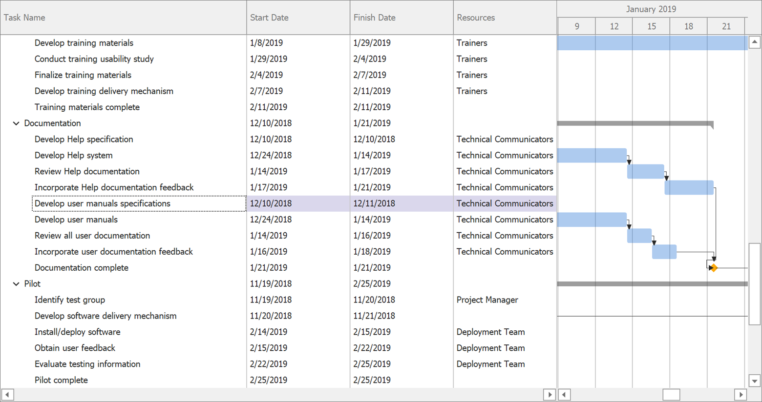
DevExpress Web Gantt

Node Editing

The following edit actions will be available:

  • Resize and modify tasks
  • Change dependencies between tasks
  • Edit cell values within the Tree List region. The component immediately saves changes on the server and updates the Gantt chart when cell values change.

Change History

Our Gantt stores changes made by an end-user. Changes may be rolled back when necessary.

Task Selection API

DevExpress Gantt ships with a comprehensive API and a customizable UI to control the task selection process.

Region Resizing

End users can resize both Gantt and Tree List regions as needed (via the control’s built-in separator bar).

Real-time Scaling

DevExpress Gantt allows you to browse data across various levels of detail. Hold the CTRL key and rotate your mouse’s scroll wheel to zoom (in or out).

3. ASP.NET WebForms and MVC Extensions

3.1 Pivot Grid

Aggregation at Any Level

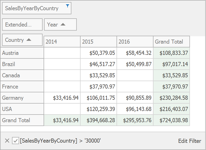
This release includes an optimized WinForms Pivot Grid calculation engine. This new engine provides a more versatile summary expression function. The scope of the function is unbound fields. The Aggr function aggregates data with a specific summary function against a specific set of dimensions. Aggr functions can be nested as needed (you can easily create the desired aggregation level within the control).

DevExpress ASP.NET PivotGrid

The Aggr function has the following syntax:

Aggr(summaryExpression, dimension1, dimension2, ...)

The first argument is a summary expression calculated against a data source field. It is followed by a set of dimensions whose values are grouped to calculate summaries for the first argument.

Aggregation at Any Level thread on Support Center

3.2 Charts

3.2.1 TimeSpan Axis Scale Support

v19.2 will ship with full support for TimeSpan scales. You can plot your TimeSpan data as-is or specify a custom aggregation mode. TimeSpan data can be mapped to an X-Axis, Y-Axis or both.

DevExpress ASP.NET Charts - TimeSpan Axis

3.2.2 Waterfall Series

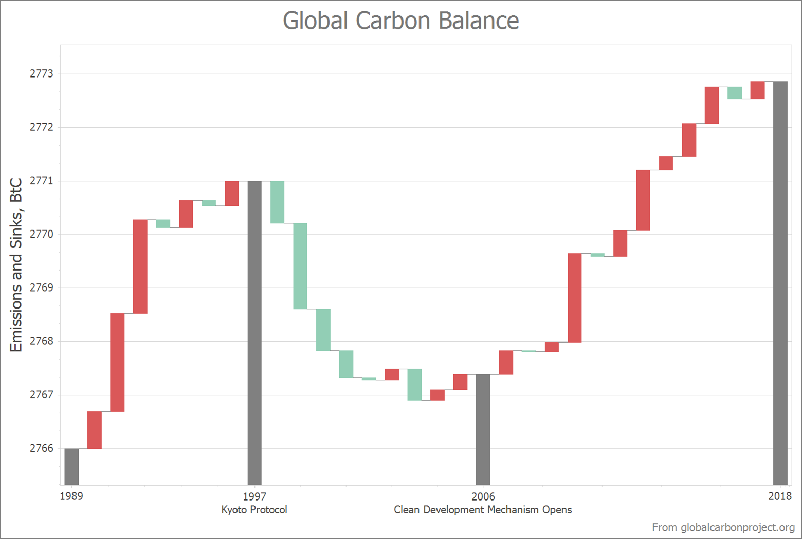
Waterfall charts display the manner in which initial values are affected by a series of intermediate positive or negative values. You can plot Waterfall charts based on relative or absolute data values. We have also implemented two summary types: Total bar summarizes all values and is always positioned on the right side of the chart's diagram; Subtotals can be defined between two adjacent points (bars) to display intermediate values.

DevExpress ASP.NET Charts - Waterfall

3.2.3 Box Plot Series

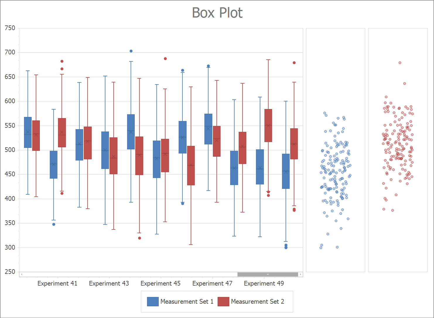
The Box Plot chart is a simple way to analyze statistic-driven data points. To draw a Box Plot point, you must specify Min, Quartile1, Median, Quartile3 and Max parameters. You can optionally display a set of Outliers and a Mean value.

Note: This early access release only includes our WinForms implementation. This features will be added to both our ChartControl for WPF and WebChartControl for ASP.NET prior to official release.

DevExpress ASP.NET Charts - Box Plot

4. DevExtreme-Based ASP.NET Controls

4.1. Form Scaffolding Wizard

We added Form to the list of controls supported by our Visual Studio scaffolding wizard. You can now quickly generate forms based on model classes.

DevExtreme ASP.NET Form Wizard

We also added support for two useful data annotations: [Display(Prompt)] and [Display(Description)]. Values are automatically picked up at runtime to populate Placeholder for editors and HelpText for form items.

4.2. 'Add DevExtreme to the Project' Command Compatible with ASP.NET Core 3.0

Recently, we announced ASP.NET Core 3 compatibility of our DevExtreme-based ASP.NET Core controls. We have also checked and updated our Visual Studio 'Add DevExtreme to the Project' command to make certain that it works as expected with Endpoint routing and the new JSON serialization introduced in ASP.NET Core 3. Though, we have yet to provide project templates for ASP.NET Core 3, you can use this tool to integrate DevExtreme-based controls into an existing ASP.NET Core 3 project (using Visual Studio 2019 Preview).

4.3. Async Support in DevExtreme.AspNet.Data

This release includes async support (preview) within the DevExtreme.AspNet.Data library (used for data binding).

Once officially released, we will update our API Controller Scaffolding to generate asynchronous code. In the interim, you can update your NuGet package to 2.5.0-rc1 and try the new DataSourceLoader.LoadAsync method to take advantage of this feature (async capabilities provided by Entity Framework Core, Entity Framework 6, NHibernate, and XPO).

Refer to GitHub release notes for details and code samples.

4.4. ASP.NET Core File Manager

DevExpress File Manager for ASP.NET Core and ASP.NET MVC is not included in this Early Access Preview but will be added to an upcoming build. Key features will include:

4.4.1. Data Binding

ASP.NET Core File Manager will retrieve data from a database and generate a UI automatically.

4.4.2. Progress and Status UI

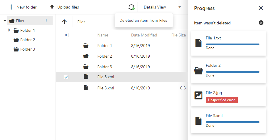
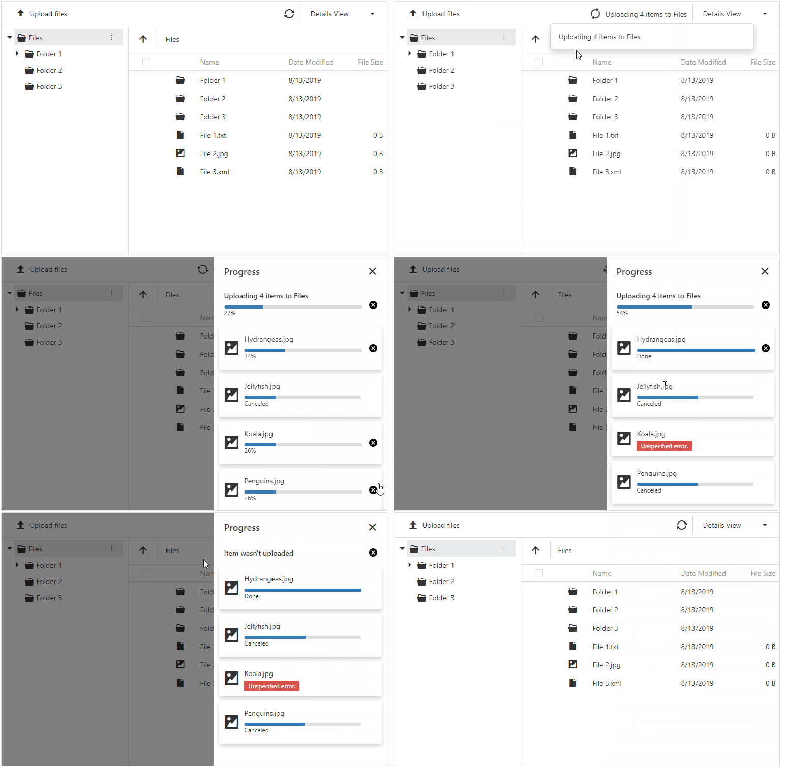
The DevExtreme-based ASP.NET File Manager provides new UI elements to track file operation progress in real time:

  • A notification popup appears when a file operation starts, finishes or fails.
  • The progress side panel displays operation status.
  • The ‘Refresh’ toolbar item includes text and an icon to reflect the status of your current operation.

DevExtreme ASP.NET Core File Manager

5. Reporting

5.1 In-Place Rich Text Editing

Our XRRichText control allows end-users to edit its content. Double click the control to activate the editor:

Rich Text In-Place Editing

Tell Us What You Think

Please explore the following online demo to learn more about this feature: Web Report Designer - In-Place Rich Text Editing. The _Data -> Load File _properties panel editor allows you to load your file (HTML, DOCX and RTF) and check how its rendered within the editor (or within the print preview).

We are eagerly waiting for your feedback, so cast your vote to the survey below:

5.2 Bind a Report to ObjectDataSource Using the Data Source Wizard

You can use this data source type in the Data Source Wizard to bind a report to a collection of business objects.

Bind a Report to Object Data Source in Web Report Designer

The data source wizard allows you to specify the parameter expression (using the Expression Editor) and pass an existing report parameter to the constructor or a method that returns a collection of business objects:

Specify Object Data Source Parameters

Tell Us What You Think

Please explore the following online demo to learn more about this feature: Web Report Designer - Object Data Source Wizard.

If you’d like to check how the wizard works with your own data access layer, you should:

  • Backup your application and then upgrade it to v19.2;
  • Implement the DevExpress.DataAccess.Web.IObjectDataSourceWizardTypeProvider interface:
public class ObjectDataSourceWizardTypeProvider : IObjectDataSourceWizardTypeProvider {
        public IEnumerable<Type> GetAvailableTypes(string context) {
                return new [] { typeof(MyBusinessObjectType) };
        }
    }
  • Register your implementation at the application startup:
DefaultReportDesignerContainer.RegisterObjectDataSourceWizardTypeProvider<ObjectDataSourceWizardTypeProvider>();

5.3 Properties Panel Update

In previous versions, two editors were used for a single property: the first was created to specify a static value and the second to provide an expression. We updated the properties panel to make it more compact and eliminate the confusion related to the use of two editors for a single property:

Properties Panel - Comparison

This enhancement helps bring the Web Report Designer closer to its WinForms counterpart. Previously a square icon could be used to reset a property to its default value. With this update, the icon near each property also indicates whether a property value differs from its default value, and allows you to define an expression as needed. Property editor values that were specified via an expression now display a formula icon to the right of the editor.

6. Office File API

6.1 Word Processing – Hyphenation

Our Word Processing Document API now supports soft hyphens and automatic hyphenation. You can load, print and export documents with soft hyphens.

Link a dictionary that specifies hyphenation rules to enable automatic hyphenation. Please refer to thehyphenation-simple-example repository for a sample project.

Once you provide hyphenation dictionaries, you can enable or suppress automatic hyphenation in code.

6.2 Excel Binary Workbook (XLSB) Support

The Spreadsheet Document API now supports the XLSB (BIFF12) format. Give it a try and load and save your documents using this format.

Note: the Early Access Preview build has the following limitations:

  • Encryption is not supported for XLSB documents;
  • Slicers will be stripped from your binary files.

6.3 PDF Document API – Custom Properties

The PDF Document API allows you to manage a document’s custom property collection. Use PdfDocument.CustomProperties to access the collection. You can add and delete custom properties or change associated names or values.

Please check the pdf-document-api-custom-properties repository for a sample project.

// Add new property
document.CustomProperties.Add("NumberOfCopies", "3");

// Modify the CompanyEmail property value:
if (document.CustomProperties.ContainsKey("CompanyEmail"))
    document.CustomProperties["CompanyEmail"] = "clientservices@devexpress.com";

// Remove the HasImages property:
document.CustomProperties.Remove("HasImages");

Get Started Today

If you own an active Universal or DXperience subscription, you can download our Early Access Preview build via the DevExpress Download Manager.

As always, your feedback will help us deliver the best possible build. Should you have questions about these new features, or should you experience technical issues during the Early Access Preview, please contact us via the DevExpress Support Center or the comment section below.

If you are using a trial version and would like to access these new features today, purchase a Universal or DXperience subscription license and you will automatically receive access to the Early Access Preview version. If you are ready to upgrade to Universal or DXperience from another subscription level, email us at clientservices@devexpress.com for preferential upgrade pricing.

**NOTE:** Early Access and CTP builds are provided solely for early testing purposes and are not ready for production use. This build can be installed side by side with other major versions of DevExpress products. Please backup your project and other important data before installing Early Access and CTP builds.

Automated Web Testing: How to Create a Web Test in 2 Minutes with TestCafe Studio

$
0
0

In this quick tutorial, I’ll describe how to get started with TestCafe Studio and how to test an existing webpage (in this instance, a relatively advanced web page with integrated file upload functionality). As you’ll soon see, I will select and upload two files and then run two assertions: The first for correct file name output and the other for correct file size label format.

I promise – this should only take two minutes of your time - TestCafe Studio’s Visual Test Recorder makes it easy to visually record web tests.

Step 1: Record a Script

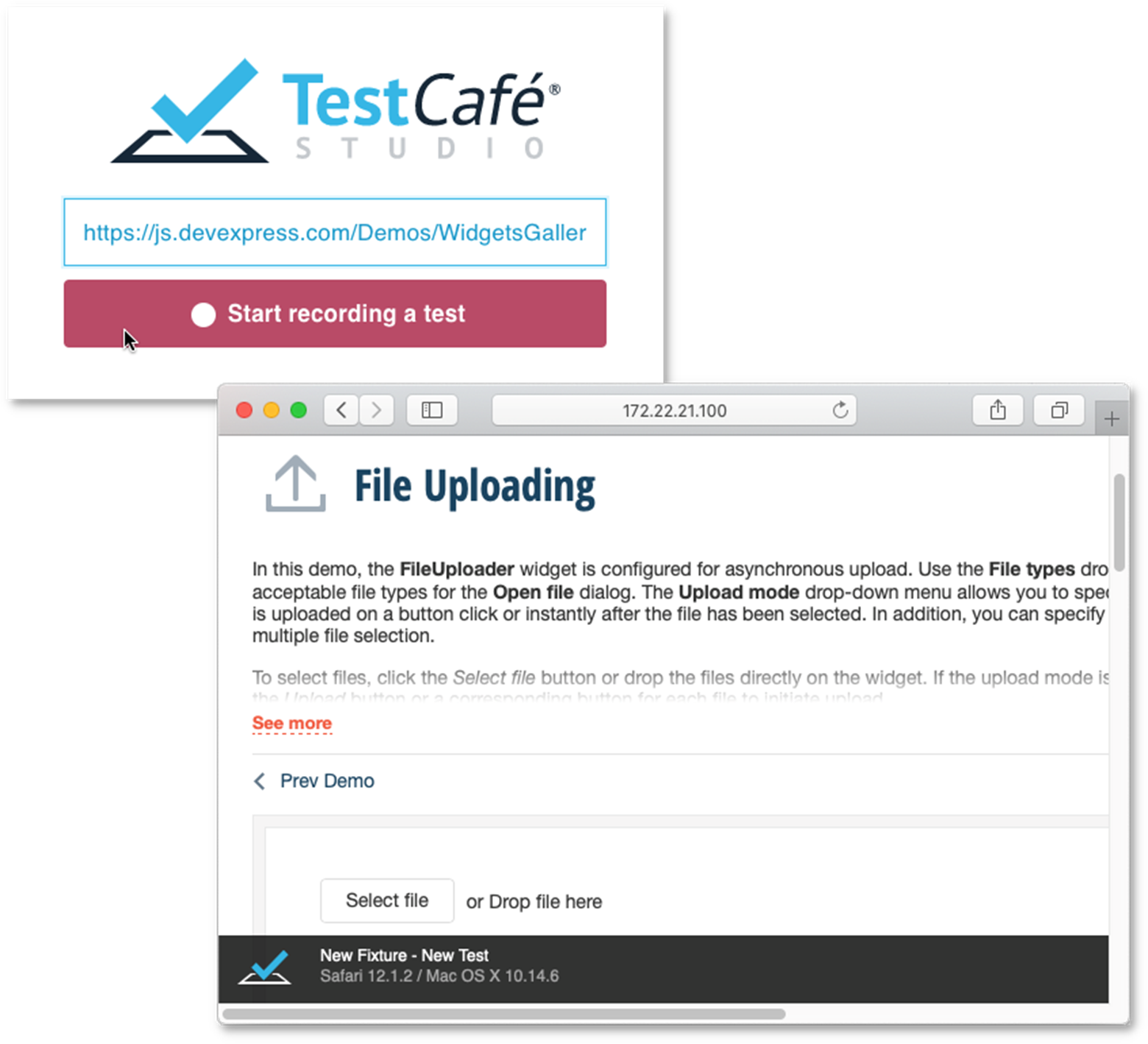
I’ll first launch TestCafe Studio (if you’d like to install TestCafe Studio and follow along, simply download our 30-day trial), enter the website URL inside TestCafe’s Welcome screen and press ‘Start Recording a Test’. My browser will navigate to the appropriate address – and since TestCafe’s Visual Test Recorder is up and running in the background – I’ll be ready to record actions performed on this webpage.

Start the Visual Test Recorder

I’ll use the Upload mode drop-down and specify that I wish to begin file upload manually.

Select upload mode

I’ll then enable multi-file checkbox.

Check box action

I’ll click Select file and make my file selections.

Select the files

I’ll click Upload to complete the process.

Click Upload

Step 2: Review the Action List

Its time to switch to TestCafe Studio and review the commands generated by my actions.

Visual Test Recorder - Action List Editor

Step 3: Add a Value Assertion

As you can see, site UI is rendered in an IFRAME, so the first action represents a context switch - click and upload steps follow thereafter (replicating my earlier site actions).

It’s time to finalize the test with a couple of assertions. I’ll first check whether the demo app displays the correct file name.

As you can see, you don’t have to write a single line of code to do this (unlike competing web testing tools which do require you to write lots of custom test code). I’ll simply click a toolbox icon to add an assertion with an “equals” condition.

Add assertion

I’ll then use the Element Picker button to select the target element within the browser.

Invoke Element Picker

This focuses the browser window so you can point to the appropriate element.

Pick the Label on the Web Page

As you can see below, TestCafe Studio generates a selector for this element and opens a list of its properties. Select the property you wish to assert.

Select an element's property from the Property Grid

TestCafe Studio obtains the current property value and asks me to confirm its use (for comparison).

Confirm the value

Step 4: Add a Format Assertion

In much the same way, you can assert a label’s font-size CSS property value.

Add a CSS Style Assertion

Step 5: Stop the Recorder and Run the Test

My test is ready and recording can be stopped. To execute my newly recorded test, I’ll press the Run button and watch TestCafe replay my actions.

Run the Web Test

Step 6: Review the Test Report

Once TestCafe completes the test run, I can review test results within TestCafe’s intuitive UX.

Review the Test Execution Report

That’s it. In just a few minutes and without a single line of code, I created a test that was ready to run across all modern browsers and on different platforms (Win, Mac, and Linux).

Get Started Today

Ready to compare TestCafe Studio to your current web testing platform and experience the TestCafe difference for yourself?

Download Free 30-Day Trial

Should you have any questions or need assistance, share your comments below.

eXpressApp Framework - Early Access Preview (v19.2)

$
0
0

We are two months away from our next major update (v19.2). The purpose of this post is to share our progress and give XAF users the opportunity to test new functionality before we wrap up our current dev cycle.

XAF is part of the Universal Subscription. Active Universal subscribers are entitled to download and install this Early Access Preview. If you currently own an active DXperience Subscription, you can test the features described herein by logging onto the DevExpress Download Manager and installing this build in trial mode. Once you do, please take a moment to tell us whether these new features address your business needs. This will help us fine-tune our code before official launch. 

If you are using a trial version and are considering XAF for your next project, purchase a Universal subscription license for automatic access to this early access preview. If you are ready to upgrade to Universal from another subscription level, email us at clientservices@devexpress.com for preferential upgrade pricing.

.NET Core 3 Desktop SDK Support in WinForms Apps

To download and test XAF's WinForms Main Demo for .NET Core 3.0 Desktop, please refer to this knowledge base article. We are still working to finalize our unit and functional tests for the final release.

.NET Standard 2.0 Support for Platform-Agnostic Modules

These core libraries only provide non-visual APIs and do not offer a ready-made UI (like XAF modules for WinForms and WebForms): 

  • DevExpress.ExpressApp | DevExpress.ExpressApp.Xpo | DevExpress.ExpressApp.Objects | DevExpress.ExpressApp.Images.
  • DevExpress.Persistent.Base | DevExpress.Persistent.BaseImpl.
  • DevExpress.ExpressApp.Security | DevExpress.ExpressApp.Security.Xpo.
  • DevExpress.ExpressApp.Validation | DevExpress.ExpressApp.ConditionalAppearance
  • DevExpress.ExpressApp.AuditTrail | DevExpress.ExpressApp.CloneObject.
  • DevExpress.ExpressApp.Kpi | DevExpress.ExpressApp.StateMachine | DevExpress.ExpressApp.ViewVariantsModule.
These libraries should be extremely helpful for XAF developers who create cross-platform non-XAF .NET apps and libraries. You can now reuse existing XAF data models and Security System settings (users, roles and permissions) in a custom Xamarin mobile client or an ASP.NET Core service hosted on Linux-based servers.
Using NuGet? Our unified .NET installer automatically configures the Local NuGet feed for you.

Security System in non-XAF .NET Apps (Powered by XPO)

We’re doing our best to explain XAF’s security system and how it can be used in non-XAF .NET apps powered by XPO. 

Please check our new WinForms CRUD demo and tutorial - the most popular configuration based on a hundred of blog comments and survey responses!

In addition, please review our updated Console and ASP.NET Core Web API/OData v4 + DevExtreme apps.

Changes to XAF's SPA UI Strategy: The Future is Blazor 

As you may already know, we officially canceled XAF's React-based SPA UI project. We’ve made the decision to focus our efforts on Blazor.

ASP.NET WebForms Spreadsheet Editor

XAF's Office module now includes the DevExpress WebForms Spreadsheet control. You can use it to display and edit Excel documents stored in byte array properties of your business objects.

To learn more about new capabilities and to help shape future development efforts, please read this knowledge base article.

ASP.NET WebForms Batch Edit Support for Reference & ImmediatePostData Properties in ASPxGridListEditor

We now support reference and ImmediatePostData properties in ASPxGridView's Batch Edit mode - one of the most popular customer requests for our WebForms UI! 

To learn more about this new feature, please read this sample on GitHub.

Note: Our primary focus in 2020 will be on XAF’s Blazor UI but we will do what we can to address the needs of those reliant on our ASP.NET WebForms UI. 

Asynchonous Method Support in IObjectSpace

To learn more about the new IObjectSpaceAsync inteface and custom async operations in WinForms apps, please read this knowledge base article and respond to a few questions from the R&D team.

This will help shape future development plans - asynchronous operations within standard XAF WinForms and Blazor UI modules.

Improved Usability of Layout Groups in WinForms & WebForms

We replaced the IModelLayoutGroupWeb.IsCollapsibleCardGroup and IModelLayoutGroupWeb.IsCardGroupCollapsed properties with new platform-agnostic options: IModelLayoutGroup.IsCollapsibleGroup and IModelLayoutGroup.IsGroupCollapsed. This was necessary to implement a popular user request - collapsible layout groups for WinForms.

For more information, please read this breaking change document.

Performance & Stability Enhancements (Design-Time)

With this update, XAF's Model Editor, Application & Module Designers start faster and require less memory. We have done the impossible - we reimplemented Visual Studio's ITypeDiscoveryService, because its GetTypes method caused problems, especially for complex apps.

For more information, please read this knowledge base article.

Breaking Changes

Before you migrate and test existing projects, we ask that you read XAF's breaking changes document.

Your Feedback Matters!

Your thoughts and perspectives are always appreciated. Please use the comments section below, create a new Support Center ticket or email xafteam@devexpress.com to engage us.
We know you’re busy, but we ask that you take a moment out of your schedule to answer the survey questions below. Thanks in advance for your participation.
NOTE: Early Access and CTP builds are provided solely for early testing purposes and are not ready for production use. This build can be installed side by side with other major versions of DevExpress products. Please backup your project and other important data before installing Early Access and CTP builds.

DevExtreme JavaScript – Early Access Preview (v19.2)

$
0
0
In this post, we'll detail some of the features we expect to ship in our next major release (v19.2). As always, active Universal and DXperience Subscribers can test the functionality described herein prior to official release. Simply log onto our website and obtain the appropriate build via the DevExpress Download Manager or install the appropriate NPM package.

DataGrid & TreeList

Reordering Records/Nodes & Cross-Component Drag-and-Drop

Our next major release will allow you to reorder DataGrid records and TreeList nodes. We also expect to ship cross-component drag-and-drop support. You can find more information on our implementation and share your feedback via the following discussion page on GitHub.

File Manager
Our JavaScript File Manager component will officially ship in the v19.2 release cycle. File Manager can now display file operation progress and its associated status. You can find more information on our implementation and share your feedback via the following discussion page on GitHub.


Diagram

Images in Shapes

You can now associate a predefined (or custom) image with new image shapes via a database or the widget’s UI. The image will maintain the shape's size and its position when the shape is moved or resized.

 Diagram for ASP.NET Core, WebForms and MVC

Shape Containers

New shape types - horizontal and vertical containers - allow you to combine other shapes within a "container". Our JavaScript Diagram component supports stacked containers and ships with expand and collapse functionality.

Demo


New Data Binding Capabilities

We implemented advanced data binding for shape settings. You can bind all shape properties including shape and connectors style, shape image URL, position, and size to a database. We expect to support data binding for all new shape settings.

Demo

Full Screen Mode

Our Diagram now supports fullscreen mode. You can add a corresponding toolbar command or use the fullscreen property to enable Fullscreen mode within your web app.

Read Only Mode

Read only mode protects the Diagram from edit operations. Use the readOnly property to enable this diagram option.

Demo

Simple View

When you activate our new Simple View mode, the JavaScript Diagram removes gray document borders and the diagram’s content fully occupies available screen real-estate.

Demo

Zooming Document Content

DevExpress JavaScript Diagram can now apply zoom levels to its content. To change zoom level, use the 'Zoom Level' editor on the Properties panel or CTRL+Mouse Scroll combination. Select the 'Auto Zoom' check box to auto zoom the diagram to fit the page.

UI Customization

JavaScript Diagram provides new APIs to control the visibility and the content of the following UI elements:

To learn more and explore the features described herein, please see our online JavaScript Diagram demo.

Gantt

Node Editing

The following edit actions will be available:

  • Resize and modify tasks.
  • Change dependencies between tasks.
  • Edit cell values within the Tree List region. The component immediately saves changes on the server and updates the Gantt chart when cell values change.

Change History

Our Gantt stores changes made by an end-user. Changes may be rolled back when necessary.

Task Selection API

DevExpress Gantt ships with a comprehensive API and a customizable UI to control the task selection process.

Region Resizing

End users can resize both Gantt and Tree List regions as needed (via the control’s built-in separator bar).

Real-time Scaling

DevExpress Gantt allows you to browse data across various levels of detail. Hold the CTRL key and rotate your mouse’s scroll wheel to zoom (in or out).

HTML/Markdown Editor

We expect to officially ship our HTML/Markdown Editor in this release cycle. We have addressed several issues including some related to its user interface. We hope to ship enhanced image management functionality (such as file upload and drag-and-drop support) but will not introduce Table support in this release. Table support remains on our ToDo list and we hope to complete it next year.

New Drag-and-Drop Utilities

DevExtreme’s new Drag-and-Drop Utilities will be the base for our DataGrid’s new record/node reordering option. These new utilities will also allow you to construct custom drag-and-drop functionality independent of our UI components. You can find more information on our proposed implementation and share your feedback via the following discussion page on GitHub.

Other UI Widget Enhancements

  • You can now control the visibility of our Floating Action Button via its new ‘visible’ option.
  • We will introduce Material Design label animation support (based upon Google’s guidelines).

Data Visualization

Discrete Aggregation

We’ve introduced a new ‘aggregateByCategory’ option that changes the way our Chart widget aggregates discrete data. When set to ‘true’, Charts aggregate series points for the same category.
const chartConfig = {
    dataSource: [
        {arg: "A", val: 1},
        {arg: "A", val: 1},
        {arg: "A", val: 1},

        {arg: "B", val: 1},
        {arg: "B", val: 1}
    ],
    series: {
        type: "bar",
        aggregation: {
            enabled: true,
            method: "sum"
        }
    },
    argumentAxis: {
        aggregateByCategory: true
    }
}
The Chart configuration above generates the following:

Display Negative Values for Logarithmic Scales

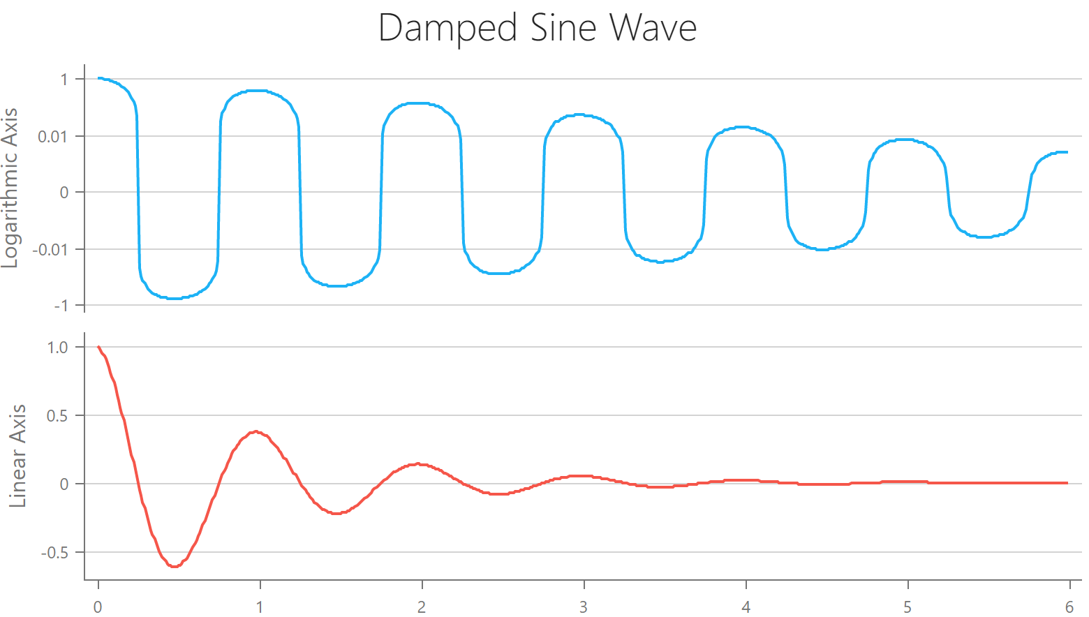
Datasets that contain rapidly growing values with negative and/or zero values can now be visualized within our logarithmic axis.

Custom Annotations

Our Chart widget now supports custom annotations. You can use a template to render the desired content inside the annotation container.

New API for the VectorMap Coordinate Translation

Based upon your great feedback, we've introduced two new methods for coordinate translation (VectorMap). With this new API, you can now deliver more sophisticated map interaction usage-scenarios.
convertToGeo(x, y)
convertToXY(longitude, latitude)

Custom Legend Item Markers

You can now use a custom template to render Chart legend markers.

Manage Chart Pane Size

You can now control the size of chart panes. Pixels and percentage units are supported.

Custom Text Inside a Donut

With the aid of our template, you can now place your custom SVG markup inside a Donut chart (your content will be placed at the center of Donut/Pie chart)

Other Customization Enhancements

We expect to apply the power of template-based customization to other Chart elements (including points, labels, and tooltips). This change will allow you to use any custom HTML/SVG markup to render these elements.


Data Validation

Asynchronous Validation

We expect to introduce asynchronous remote validation support in this release cycle (an example of asynchronous remote validation includes checking whether a user already exists in a database during website registration). You can find more information on our proposed implementation and share your feedback via the following discussion page on GitHub.

Improved Code Splitting

This item is in progress and affects our entire codebase. It will take more than one release cycle to complete. Currently, we are focused on making our CSS more modular (you’ll be able to bundle only those styles/features being used in your app).

Native React Grid

Column Resizing Enhancements

Previously, you could only use pixels to specify Grid column width. We now support other CSS size units - such as ‘em’ or ‘%’. This feature is not yet available publicly, but it will be included in an upcoming build.

Virtual Table Enhancements

We’ve introduced the following user-requested enhancements to our VirtualTable plugin:
  • Access and track table scroll position via API.
  • Virtual table can now seamlessly work with banded column mode.
  • Lazy loading with record grouping enabled.
These features are not yet available publicly, but they will be included in an upcoming build.

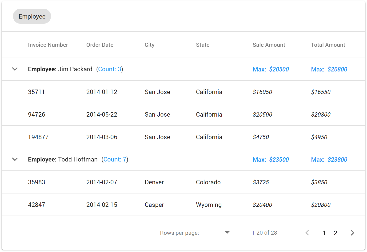
Group Row Summary

You can now display summary values for a record group.

Other React Grid Features

We expect to implement the following features later this year:
  • Inline cell editing. Improve cell editing by placing a cell into edit mode when clicked (without the need to press the edit button within the edit column).
  • List View (adaptive mode). Render/display records as a traditional list with a custom, responsive layout (for improved usability on mobile devices).

Native React Scheduler

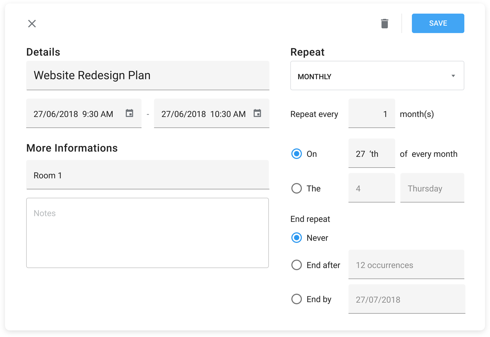
Recurring Appointments

React Scheduler users can now specify recurrence patterns for an appointment in code.

We are working on a new recurring appointment edit form.

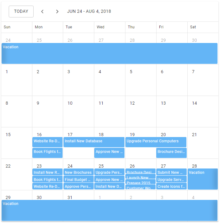
Today Navigation Button

We’ve added a ‘Today’ button to the React Scheduler’s navigation panel. This feature was inspired by Google’s Calendar. A user can use this button to quickly navigate to the current date.

Native React Chart

Chart Rotation

You can now change chart orientation as needed (swap argument and value axes).

Transitions on Update

When a chart data source is updated, a transition will be applied to the chart. We are working on this feature and expect to deliver it this year.


NOTE: Early Access and CTP builds are provided solely for early testing purposes and are not ready for production use. This build can be installed side by side with other major versions of DevExpress products. Please backup your project and other important data before installing Early Access and CTP builds.


WinForms Gantt Control - The Path Forward

$
0
0

A few days before our Early Access Preview build was released, we published the first image of our new Gantt Control via Facebook and Twitter (remember to follow us so you have access to breaking news going forward).

One of the comments/questions we received was the following:

What will be the main differences between this and the current <Scheduler> Gantt View?

In this post, I’ll discuss the differences between our new WinForms Gantt control and our existing Scheduler Gantt View and detail why our Gantt control makes an excellent addition to the DevExpress WinForms product line-up.

The Backstory – Scheduler Gantt View

Before I describe our new Gantt control for WinForms, let me take you back a few years. Eight years ago, we released our Gantt View for the DevExpress Scheduler (v11.2). At the time, we felt the quickest way to deliver a Gantt control to market was to leverage our existing Scheduler codebase.

Once we released the product and received feedback, it became clear that Gantt functionality could not be limited to placing tasks on an endless timeline with basic hierarchical text data pinned to its side. A true Gantt demanded more – capabilities our Scheduler control could not provide. Though many were able to address their business needs with our Gantt View, some of you asked that we overhaul the product (or create a new product) to fully address your requirements.

Like any other customer-driven business, we had to make tough decisions and set priorities. We knew that our existing Scheduler Gantt View was not perfect, but we also knew that demand for a full-featured Gantt control was somewhat limited. We made the choice to postpone this product (repeatedly) until our WPF team announced its plans last year. Yes, the minute we announced our WPF Gantt, the flood gates opened and calls for a WinForms equivalent reverberated through our Support Center (and many of you voted for a new Gantt control in our 2019 Roadmap survey).

The Difference

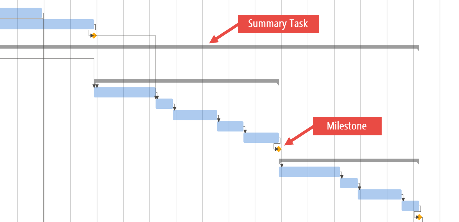
As I’ve already mentioned, feature-wise, our Scheduler’s Gantt View shipped with a limited feature set. For instance, it lacked visual elements such as milestones and summary tasks. There was no easy way to introduce these elements for one specific Scheduler View without affecting others. For our stand-alone WinForms Gantt control, no such limitation exists.

Another major limitation of our Scheduler’s Gantt View was the integrated treeview. In the Gantt View, this side panel was a called Resource Tree because it hosts Resources, while the main control region renders “Appointments.” These are two separate Scheduler elements, while in a true Gantt, both areas display data from the same source. There is a way to display “Appointment” data in Resource Tree, but it requires a significant amount of custom code. Again, our stand-alone WinForms Gantt control has no such limitations and as such, allows you to deliver a genuine Gantt experience with ease.

Our WinForms Gantt control is a direct TreeList descendant and derives its built-in features from our TreeList control (like the ability to select a hierarchy column or switch to a single-column TreeView-like layout).

At present, the DevExpress Gantt Control does not support direct import and export from Microsoft Project, but you can save Microsoft Project files as XML files, parse them and feed the data directly to our Gantt control (Microsoft Project import/export is something we will continue to address in upcoming release cycles).

Perhaps most important, our new Gantt is much faster than our Scheduler’s Gantt View. Simply said, the Gantt View was not designed to display hundreds of tasks, and though it’s not very often that you see a project timeline of such complexity, our new Gantt control can effectively handle very large data sets. Unlike 8 years ago, our WinForms product line now supports DirectX rendering– performance will not be the Achilles heel of our Gantt control.

Your Feedback Counts

If you’ve read our blog posts over the last year, you know that we take customer feedback seriously. Your thoughts/opinions help us shape our product line. While the difference between the old Gantt View and the new Gantt control is definitely real, what matters most is how you use Gantt controls within your organization. Please help us improve our new Gantt by sharing your use cases with us. Tell us what features are missing from our current product and how you’d like to see us improve the product going forward.

We just released our Early Access Preview build - if you are an active Universal or DXperience subscriber, please install the EAP build and run the Gantt Control demo and tell us what you think. We can’t wait to hear from you.


Xamarin.Forms UI Controls - Building the Logify Client App (Part 2)

$
0
0

In this blog post (the second in our Xamarin.Forms UI development series), we’ll describe how portions of our Logify client app were built using our Xamarin controls and hopefully share a few UI-related tips with you for your next Xamarin.Forms mobile project.

If you have yet to read our first post, you can do so here. If you have questions about Xamarin, feel free to comment below.

NOTE: At present, DevExpress Xamarin.Forms UI controls ship as part of our Universal Subscription. We expect to release a Xamarin-only product subscription in our v19.2 release cycle.

Building Logify’s Report List View

If you’ve used Logify or are familiar with its web UX, you know the importance of reports – the means by which exception information is displayed within the Logify web app.

To display the same data/information within our mobile client, we chose to use our Xamarin Data Grid control as our primary UX element. Our Xamarin Grid uses a list of typed objects for its data source.

Our Logify client must obtain the appropriate report(s) from the Logify service and prepare data for display within the Xamarin Grid.

Using Logify’s HTTP API

Our Logify mobile client obtains reports from Logify server via the following API:

GET https://logifyRestApiEndpoint/reports?subscriptionId=SubscriptionId&filter=Filter&count=pageReportCount&page=pageNumber

The server response is in json and includes a list of crash reports:

“[
  ...,
  {
    "DateTime": "2018-04-19T20:55:02.063Z",
    "ApplicationName": "Hotel Booking System",
    "ReportsListInfo": "Specified argument was out of range of valid values",
    ...
  },
  ...
]”

Load Server Data within the Client

For our mobile app, exception/crash reports are represented by a Report class:

using System;
using System.Collections.Generic;

namespace Logify.Models {
    public class Report {
        public DateTime DateTime { get; set; }
        public string ApplicationName { get; set; }
        public string ReportListInfo { get; set; }
    }
}

To interact with the Logify service, we need to create a ReportDataProvider class that loads the necessary data and prepares the object collection for our Xamarin.Forms Data Grid. This class includes a Load method that sends requests to Logify – It parses json it receives into our Report object collection.

public class ReportsDataProvider {
    public ObservableCollection<Report> Reports { get; private set; }
    readonly HttpClient httpClient = new HttpClient();
    int lastPageNumber = 0;

    public ReportsDataProvider() {
        this.Reports = new ObservableCollection<Report>();
    }

    public void Load(Action finalAction = null) => Task.Run(async () => {
        var items;
        try {
            string requestString = string.Format("https://logifyRestApiEndpoint/reports?subscriptionId={0}&filter={1}&count={2}&page={3}", "", "", 20, lastPageNumber);
            var jsonString = await httpClient.GetStringAsync(requestString);
            items = JsonConvert.DeserializeObject<IEnumerable<Report>>(jsonString);
        } catch (Exception e) {}
        Device.BeginInvokeOnMainThread(() => {
            AddToReports(items);
            finalAction?.Invoke();
        });
        lastPageNumber++;
    });

    void AddToReports(IEnumerable<Report> items) {
        foreach (var report in items) {
            Reports.Add(report);
        }
    }
    ...
}

Creating the Report List View

To proceed, we must create the UI used for our exception/crash report list. We will discuss custom grid appearance settings in a separate blog post. For now, we’ll only use a simple structure – a grid with a single text column (one that displays ReportListInfo):

<ContentPage>
    <dxg:DataGridView >
        <dxg:DataGridView.Columns>
            <dxg:TextColumn FieldName="ReportsListInfo" Caption="Reports"/>
        </dxg:DataGridView.Columns>
    </dxg:DataGridView>
</ContentPage>

Preparing the DataSource

To prepare the view model, we need to add the ReportViewModel class. It contains the data provider we created earlier along with the Reports property. This property returns the element collection and is used as a data source for our Xamarin Grid.

using System.Collections.ObjectModel;
using Logify.Services;

namespace Logify.ViewModels {
    public class ReportViewModel : NotificationObject {
        ReportDataProvider dataProvider;
        public ObservableCollection<Report> Reports => dataProvider?.Reports;

        public ReportViewModel() {
            dataProvider = new ReportDataProvider();
            dataProvider.Load();
        }
    }
}

Binding to Data

To proceed, we need to assign an instance of ReportViewModel to the BindingContext of the view:

<ContentPage.BindingContext>
    <vm:ReportViewModel/>
</ContentPage.BindingContext>

Test the view and check the first few reports.

Implementing the LoadMore Method

The LoadMore Data Provider method allows us to employ “lazy” loading. Lazy data loading improves application speed because data is loaded in small/incremental batches.

LoadMore is the perfect option for those who are primarily concerned with app execution speed. Common use cases for this UX includes apps that display news feed, timelines or direct message dialogs (social networks, messengers, etc.). The bottom-line is this: With LoadMore, you can improve loading speed via the Grid’s infinite scroll UI.

To use LoadMore and partially load data, we must create a LoadMoreCommand in the view model. Each time the command executes, a new data batch is loaded. The IsRefreshing property sends a notification to the grid each time a new batch loads within the UX.

using System.Collections.ObjectModel;
using System.Windows.Input;
using Logify.Services;
using Xamarin.Forms;

namespace Logify.ViewModels {
    public class ReportsViewModel : NotificationObject {
        ReportsDataProvider dataProvider;
        bool isRefreshing = false;
        public ICommand LoadMoreCommand { get; private set; }

        public bool IsRefreshing {
            get => isRefreshing;
            set => SetProperty(ref isRefreshing, value);
        }

        public ReportsViewModel() {
            dataProvider = new ReportDataProvider();
            LoadMoreCommand = new Command(ExecuteLoadMoreCommand, () => !IsRefreshing);
            ExecuteLoadMoreCommand();
        }

        void ExecuteLoadMoreCommand() {
            dataProvider.Load(() => {
                IsRefreshing = false;
            });
        }
        ...
    }
}

To load data initially, we call a command that uses the Load method.

To enable the LoadMore function for the grid, we set the IsLoadMoreEnabled to ‘true’ and bind the LoadMoreCommand and IsRefreshing properties.

<dxg:DataGridView ItemsSource="{Binding Reports}"
    IsLoadMoreEnabled="True"
    LoadMoreCommand="{Binding LoadMoreCommand}"
    IsRefreshing="{Binding IsRefreshing, Mode=TwoWay}">
    ...
</dxg:DataGridView>

Image of our current reports module prior to Data Grid customizations:

With that, we’ll wrap up this post – in our next tutorial, we’ll customize our Xamarin Grid and improve the overall usability of the Logify client.

Should you have any questions or would you like to share your Xamarin experiences with our team, do not hesitate to contact us at info@devexpress.com or leave your comments below.

Report and Dashboard Server - Docker Image and New Data Source Options - Early Access Preview (v19.2)

$
0
0

If you are an active Report and Dashboard Server subscriber and would like to test upcoming v19.2 features prior to official release, you can download the early access preview build from the DevExpress Download Manager and test the features described in this blog post.

Your feedback matters – should you have any questions regarding these new features or need technical assistance, please submit your comments below.

Report and Dashboard Server Docker Image

We currently use a Dockerized version of Report and Dashboard Server for internal testing. We decided to release this Docker image as part of our general distribution. Feel free to experiment with our containerized version and determine whether you’d like to deploy Report and Dashboard Server in a container.

Both the image and associated instructions are available on Docker Hub.

Feedback

Bind Reports and Dashboards to JSON Web Services

You can now create a JSON Data Model, specify its parameters, and use it within our data source wizards:

Create JSON Data Model

Feedback

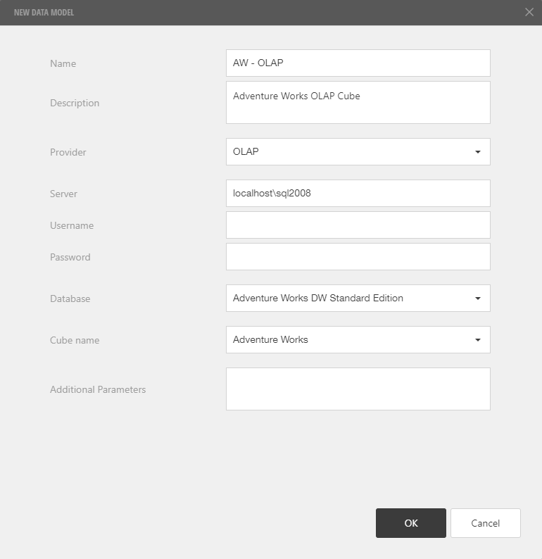
Bind Dashboards to OLAP Cubes

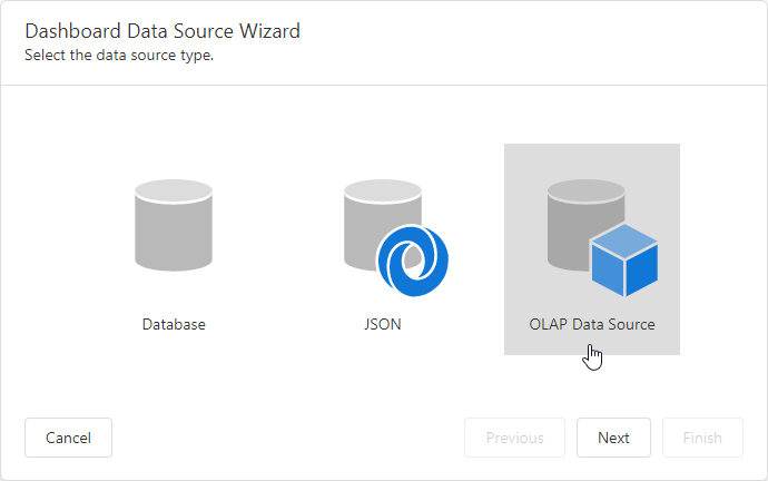
You can now create an OLAP Data Model, point it to a specific OLAP cube and use the Dashboard Data Source Wizard to bind dashboard items to OLAP cubes:

Create OLAP Data Model

Bind a Dashboard to OLAP Cube

Feedback

Export Documents Using the Web API Method Calls

We’ve extended the Report And Dashboard Server’s Web API methods and now allow you to trigger document export operations and generate resulting files. Here are some examples:

  1. How to get a scheduled job result:
> POST /api/jobs/results
> Content-Type: application/json
> Authorization : Bearer <oauth-token>
>
> {  
>     id:32,
>     exportOptions:
>     {   
>         exportFormat:"pdf"
>     }
> }
	
< HTTP/1.1 200 OK
< Content-Type: application/pdf
< Content-Disposition: attachment; filename=document.pdf

  1. How to export a dashboard to an image:
> POST /api/dashboards/export
> Content-Type: application/json
> Authorization : Bearer <oauth-token>
>
> {
>    id:5,
>    exportOptions:
>    {
>       exportFormat:"image",
>       format:"jpeg"
>    },
>    documentParameters:
>    [
>    	{
>   	   name:"dashboardParameter",
> 	   value:5
> 	}
>    ]
> }

< HTTP/1.1 200 OK
< Content-Type: image/jpeg
< Content-Disposition: attachment; filename=dashboard.jpeg
  1. How to export a report to PDF:
  • Start an export task:
> POST /api/reports/export
> Content-Type: application/json
> Authorization : Bearer <oauth-token>
>
> {
>    id:10,
>    exportOptions:
>    {
>    	exportFormat:"pdf"
>    },
>    documentParameters:
>    [
> 	{
>   	   name:"CustomerID",
> 	   value:15
> 	}
>    ]
> }

< HTTP/1.1 200 OK
< Content-Type: application/json; charset=utf-8
<
< {
<    "exportId": "l39b47e1d8dd4d1a80303ae84da8rab9"
< }
  • Get an export task status:
> GET api/documents/l39b47e1d8dd4d1a80303ae84da8rab9/export
> Authorization : Bearer <oauth-token>

< HTTP/1.1 200 OK
<
< "Complete"
  • Download an exported document:
> GET /api/documents/l39b47e1d8dd4d1a80303ae84da8rab9/export/download
> Authorization : Bearer <oauth-token>

< HTTP/1.1 200 OK
< Content-Type: application/pdf
< Content-Disposition: attachment; filename=report.pdf
NOTE: Early Access and CTP builds are provided solely for early testing purposes and are not ready for production use. This build can be installed side by side with other major versions of DevExpress products. Please backup your project and other important data before installing Early Access and CTP builds.

Blazor Components - Free Anchor Navigation Tool

$
0
0

As you may know, Blazor does not currently support navigation via anchors. In addition, Blazor does not support hyperlinks that only include anchor IDs within the href attribute (<a href=”#MyAnchor1”>some text</a>). To help address these limitations, we created a free navigation tool for both client-side and server-side Blazor projects.

Features and Capabilities

The DevExpress Anchor Navigation tool automatically scrolls a page to an anchor in the following instances:

  • When an end-user clicks a hyperlink with an anchor;
  • When a page is first opened and contains an anchor ID within its URL (for instance, https://demos.devexpress.com/blazor/SchedulerViewTypes#DayView).

Our tool also includes a Blazor AnchorLink component. Use this component to create in-page navigation links as needed:

<AnchorLink class="nav-link py-3 px-4" href="#MySection1">My Section 1</AnchorLink>
<AnchorLink class="nav-link py-3 px-4" href="#MySection2">My Section 2</AnchorLink>

When an end-user clicks the link, the page scrolls to the corresponding anchor:

<h2 id="MySection1">Section 1</h2>
<p>Lorem ipsum dolor sit amet...</p>
<h2 id="MySection2">Section 2</h2>
<p>Quisque imperdiet risus quis nisl vulputate...</p>

Integrating the Anchor Navigation Tool

Full source code for our Blazor Anchor Navigation tool is available on GitHub. Please follow the instructions below to include it within your next Blazor project.

  1. Download the DevExpress.Blazor.AnchorUtils project and add it to your Blazor solution.
  2. Add the DevExpress.Blazor.AnchorUtils namespace to _Imports.razor:

@using DevExpress.Blazor.AnchorUtils

  1. Add AnchorUtilsComponent to Shared/MainLayout.razor file:
<div>
    ...
    <div class="content px-4">
          @Body
    </div>
</div>
<AnchorUtilsComponent />
  1. Find the JavaScript wwwroot/anchor-utils.js file in the anchor navigation source code. Copy this file to the wwwroot folder or to its subfolders.
  • For server-side Blazor: register this file in Pages/_Host.cshtml of your project.
  • For client-side Blazor: register this file in wwwroot/index.html of your project.

<script type="text/javascript" src="~/anchor-utils.js"></script>

  1. (optional) If your page layout contains a pinned (non-scrollable) header (like the standard Blazor project), edit the anchor-utils.js file and update the following code to obtain vertical scroll offset appropriate for your application:

y -= document.querySelector(".main .top-row").offsetHeight;

Note: If a client-side Blazor application is deployed as a set of static files, the web server provides the index.html file by a root URL (e.g., https://mywebsite.com/) only. If a browser requests a specific page by its direct URL (e.g., https://mywebsite.com/MyPage1), the web server raises a 404-code exception. Refer to the Getting 404 on pages other than root when Blazor hosted in IIS to learn more about this issue and a possible solution. The solution requires URL Rewrite Module.

How it works

First, we need to obtain an anchor from the current URI (if it exists). We’ll use the IUriHelperOnLocationChanged event event to do so:

@inject IUriHelper UriHelper
...
@code {
    string Anchor { get; set; }
    bool ForceScroll { get; set; }
 
    protected override void OnInitialized()
    {
        base.OnInitialized();
        ForceScroll = true;
        UriHelper.OnLocationChanged += OnLocationChanged;
    }
 
    void OnLocationChanged(object sender, LocationChangedEventArgs args)
    {
        var anchor = UriHelper.ToAbsoluteUri(args.Location).Fragment;
        ...
    } 
}

The ScrollToAnchor C# method invokes the scrollToAnchor JavaScript function and sends an anchor ID as a parameter:

...
@inject IJSRuntime JSRuntime
@inject IComponentContext ComponentContext
...
    bool ScrollToAnchor(string anchor)
    {
        if (ComponentContext.IsConnected && (!string.IsNullOrEmpty(anchor) || ForceScroll))
        {
            JSRuntime.InvokeAsync<string>("scrollToAnchor", anchor);
            return true;
        }
        return false;
    }

We’ll call the ScrollToAnchor method in the OnLocationChanged event handler to scroll the page when navigation location changes. We’ll also call the method in the OnAfterRenderAsync event handler to initiate scrolling (if necessary) when a page first loads:

protected override Task OnAfterRenderAsync()
    {
        ScrollToAnchor(Anchor);
        if (ForceScroll)
        {
            ForceScroll = false;
        }
        return base.OnAfterRenderAsync();
    }
 
    void OnLocationChanged(object sender, LocationChangedEventArgs args)
    {
        var anchor = UriHelper.ToAbsoluteUri(args.Location).Fragment;
        if (!ScrollToAnchor(anchor))
        {
            Anchor = anchor;
        }
    }

The scrollToAnchor JavaScript function scrolls to the required anchor element.

Javascript:

function scrollToAnchor(anchor) {
    var selector = anchor || document.location.hash;
    if (selector && selector.length > 1)
    {
        var element = document.querySelector(selector);
        if (element)
        {
            var y = element.getBoundingClientRect().top + window.pageYOffset;
            /* The following code updates the vertical scroll bar's offset for a standard Blazor Visual Studio template.
               Update the code to get an offset that is suitable for your application.  */
            y -= document.querySelector(".main .top-row").offsetHeight
            window.scroll(0, y);
        }
    }
    else
    {
        window.scroll(0, 0);
    }
}

Feedback

As always, your feedback matters. Do you plan on using anchors in your Blazor applications? Post your comments below and share your Blazor-related development experiences with us.

XAF - Using XAF's Security System in WinForms Apps (powered by XPO)

$
0
0

I hope this bit of news was not buried beneath our EAP announcements last week.

Please check our new WinForms CRUD demo and tutorial to learn about our most popular configuration (based on hundreds of blog comments and survey responses).

This represents existing functionality - is available right now in XAF v19.1 (and older versions). The new v19.2 release adds .NET Standard 2.0 support - helpful for developers who create cross-platform non-XAF .NET apps and libraries.  

If you are interested in XAF's cross-platform Security System APIs, please answer 3 short survey questions at the end of the introduction blog post.

Our next example will be for ASP.NET WebForms. Though mature technology, WebForms remains highly popular and will likely remain relevant over the coming years. As always, we look forward to your questions or suggestions. 

Office-Inspired UI Components and File API – Enhancements, Tips & Tricks (August 2019)

$
0
0

Thank you for your ongoing support and your commitment to DevExpress technologies and our award-winning Office-inspired product line.

The following is a short list of support tickets we answered in August – support tickets you may find useful as you incorporate DevExpress desktop Office-inspired controls and our File API library (DOC, XLS, PDF) in your next .NET project. As always, we welcome your comments and feedback.

If you come across a useful Support Center ticket we failed to list in this blog post, feel free to share it with the DevExpress developer community by commenting below.

Enhancements and Performance Related Support Tickets

Tips & Tricks

eXpressApp Framework - Tips & Tricks (August 2019)

$
0
0

Interesting Support Tickets

eXpressApp Framework

eXpress Persistent Objects

Documentation Updates


Have you come across an interesting support ticket? Share it with the DevExpress developer community below.

Reporting – Tips & Tricks (August 2019)

$
0
0

Thank you for you continued support and for choosing DevExpress Reports.

We’ve compiled a short list of interesting support tickets we answered in August. Hopefully you’ll find them of value as you integrate our reporting platform in your next desktop or web project.

Reporting – Multiple Supported Platforms (WinForms, WPF, ASP.NET, .NET Core)

WinForms Reporting

WPF Reporting

Web Reporting

Report & Dashboard Server

Documentation Updates

More Demos Described

The following step-by-step tutorials will help you recreate demos we ship within our distribution:

We just reworked our Create a Table Report tutorial. The report generated in this tutorial is now based on the Table Report Demo.

End-User Documentation Updates

As you may know, we include end-user documentation for our Report Designer and Document Viewer controls. You can access this documentation on GitHub.

The following sections have been updated in branch 19.1:

New Tips in Docs

As always, we welcome your comments and feedback. If you’ve come across a useful Support Center ticket, feel free to share it with the DevExpress developer community here.


DevExtreme JavaScript - Trips & Tricks (August 2019)

$
0
0
We’ve compiled a short list of interesting support tickets we answered in August. Hopefully you’ll find them of value as you integrate our DevExtreme JavaScript Components in your next Angular, React, Vue or jQuery project.

All Platforms

Support Tickets

Documentation Updates

Angular

Support Tickets

React

Support Tickets

Vue

Support Tickets

Documentation Updates

Vue documentation has been updated and moved from GitHub to our website.

JQuery

Support Tickets

WinForms - Enhancements, Tips & Tricks (August 2019)

$
0
0

This edition of our WinForms Tips & Tricks series is somewhat unique. It includes a list of interesting Support Center tickets (just like previous editions) and a closer look at minor enhancements/features we expect to ship in our v19.2 release cycle.

SvgImageCollection - Import Images From Shared Assemblies

Based on Support Center traffic, many of you want to populate the SvgImageCollection with images stored in referenced assemblies. Prior to this release, we could only say “no,” and suggest that you load images in code (with the static FromResources method) as a workaround.

With v19.2, you can now address this requirement at design time.

Export Image Picker Images to Project Resources

Another image-related v19.2 enhancement involves the Vector Image Picker we introduced in v18.2. This is a panel that you can dock anywhere in Visual Studio – one that makes adding images to controls much easier (you can double-click icons to add them to selected controls or drag icons directly onto control surfaces). This WinForms utility even reads selected control captions and automatically displays matching icons under the “Suggestions” category.

Selection-Based Suggestions

Apart from adding the “PNG” tab to this panel (you can now add both vector and raster images), we’ve added a button that adds the selected image to the project resource file.

LayoutControl - Content Alignment Settings

In versions 19.1 and earlier, the was a certain ambiguity about the LayoutControlItem's ContentAlignment property. If you wanted to align a control embedded into a stretched Layout Item that is not limited by neighboring items, the ContentAlignment property was not enough. To achieve a layout similar to that in the following image, you also had to adjust the TrimClientAreaToControl and\or FillControlToClientArea settings.

Starting with v19.2, all three abovementioned properties will be hidden. In return, you’ll get the ContentVertAlignment and ContentHorzAlignment properties that work with any Layout Item regardless of the current setup.

Disabled Cell Behavior

In our very first Tips&Tricks post we mentioned our Behavior Manager component. In this release we’re adding a new behavior to the pool - Disabled Cell Behavior. This behavior automatically disables GridControl, VGridControl, and TreeList cells that do not match your custom expression. At your discretion, you can modify appearance settings for these disabled cells.

To learn more about this behavior, refer to the Disabled Cell Behavior help topic or launch the Data Grid API Code Samples demo.

Image Options for DevExpress Forms

Standard Visual Studio forms display .ico files within headers. Our own equivelants (XtraForm, RibbonForm, ToolbarForm, etc.) inherited this same logic. In v19.2 we’ve added an IconOptions settings group to all of our forms. Properties within this group allow you to specify regular and raster images as form icons. You can use custom images or those from our Image Galleries.

Thanks to this enhancement, we're thinking to replace the default Form icon with a vector counterpart for DevExpress forms. How would you rate this possible change? Do you ever use default form icons, or do you hide them (via the ShowIcon property) when there’s no custom replacement icon?

Interesting Customer Support Tickets

Here's our August selection interesting support tickets. Hopefully, you'll find them of value and can incorporate the suggestions in your next WinForms project. And of course, a huge shout-out to everyone who shared their real-life usage scenarios and unorthodox cases with us.

WPF - Tips & Tricks (August 2019)

$
0
0

Thank you for your continued support and ongoing feedback. If you’ve encountered a support center ticket you feel might be of value to the DevExpress developer community, feel free to post a comment below. 

Performance Related Support Tickets

WPF Data Grid and WPF Tree List

WPF Charting

WPF Diagram

WPF Docking

Other Controls

See Also


Once again, thank you choosing DevExpress. Before we let you go, please take a moment to share your thoughts with us. Which controls and usage scenarios do you think we should feature in future Tips & Tricks posts? Let us know in the comments section below or email us at wpfteam@devexpress.com

Word Processing (WinForms, WPF, Office File API) - Breaking Changes (v19.2)

$
0
0

In this post, we’ll discuss two important changes to our Word Processing product line (v19.2). These changes may affect your v19.2 upgrade path. Please review this document carefully.

Theme Fonts

Based on feedback, we included document theme support in our 2019 word processing roadmap. To help deliver this functionality, we’ve been forced to change how we select the default document font. In previous versions, you could control the default document font via our DefaultFontName static property. With v19.2, our Rich Edit Control (WinForms and WPF) and Word Processing Document API will use document themes to retrieve default document font information. As such, the DefaultFontName property will no longer affect the default document font.

We understand that this represents a substantial change. To reduce its impact as much as possible, we’ve introduced two properties to disable document themes:

  1. A static property to disable themes for all components within your application.
  2. A property that allows you to disable themes in specific instances (for both our Rich Edit control and RichEditDocumentServer).

To make certain that this solution addresses your business needs, please take a moment to answer the following question:

Adjacent Tables

We’ve received a number of reports regarding an issue that occurs when adjacent tables (created in code) are exported to the DOCX format.

This issue does not occur when users create tables via the user interface. When creating adjacent tables via the UI, our Rich Edit Controls (WinForms and WPF) combine adjacent tables like Microsoft Word.

The following image helps describe the issue (when creating adjacent tables in code) in greater detail:

The following code snippet reproduces the issue outlined above:

DevExpress.XtraRichEdit.API.Native.Document doc = richEditControl1.Document;  
doc.Tables.Create(doc.Range.End, 1, 3, 
                  DevExpress.XtraRichEdit.API.Native.AutoFitBehaviorType.AutoFitToWindow);  
doc.Tables.Create(doc.Range.End, 3, 5, 
                  DevExpress.XtraRichEdit.API.Native.AutoFitBehaviorType.AutoFitToWindow);  

doc.SaveDocument("123456.docx", DocumentFormat.OpenXml);  
doc.SaveDocument("123456.rtf", DocumentFormat.Rtf);

The cause of this issue lies with Microsoft Word. It interprets two adjacent tables as invalid and combines these tables into one just after document load - regardless of document format. The problem of course is that the resulting table’s layout is format-specific.

We’ve modified our TableCollection.Create method to address this issue. If you create a new table prior to or after an existing table, this method automatically combines both tables.

To restore the previous behavior, simply set the MergeSuccessiveTable property to false (this will keep successive tables separate from one another):

DevExpress.XtraRichEdit.RichEditControlCompatibility.MergeSuccessiveTables = false;

Should you have any questions regarding these changes, feel free to comment below or submit it a support ticket via the DevExpress Support Center.

Blazor Components - DataGrid and Scheduler Enhancements (available in Beta #3)

$
0
0

The third Beta of the DevExpress UI for Blazor is now available. This update includes a series of enhancements for both our Blazor Data Grid and Scheduler component (see below). It also includes support for Blazor Preview 9 and updates to our online documentation.

Blazor Preview 9 Support

Last week, Microsoft announced the release of .NET Core 3.0 Preview 9. Our Blazor components fully support Preview 9 with our Beta 3 release.

Data Grid

We've added four major features to our Blazor Data Grid:

Column Reorder

You can now drag a column header and reposition it to change column order. Two arrows indicate valid drop positions.

DevExpress Blazor Grid - Column Reorder

Note: The edit form displays editors in the same order as columns in the grid. You can use the EditFormVisibleIndex property to arrange editors in the edit form as needed.

Column Groups

Enable the Group Panel within the Blazor Data Grid to allow end-users to group data by individual columns.

<DxDataGrid … ShowGroupPanel="true">
Note: Group panel column order is of consequence whenever you group data against multiple columns. The grid groups data by column values sequentially (starting from the leftmost column in the group panel).

DevExpress Blazor Grid - Column Groups

Column order in the group panel matters when you group data by several columns. The grid groups data by each column one by one (starting from the left).

To exclude a column from grouping, set its AllowGroup property to false.

<DxDataGridColumn AllowGroup="false"></DxDataGridColumn>

To group data in code, specify the column's GroupIndex property to define its grouping priority. The lower the value, the higher a column's priority in grouping. In the following example, our Blazor Data Grid first groups data by a column with GroupIndex = 0 and then - by a column with GroupIndex = 1.

<DxDataGridComboBoxColumn GroupIndex="0"></DxDataGridComboBoxColumn>
<DxDataGridColumn GroupIndex="1"></DxDataGridColumn>

To see this feature in action, please refer to our Data Grid online demo.

By default, grouped column data is not displayed. Set the ShowGroupedColumns property to true to display data.

Master-Detail Layout

Our Blazor Data Grid allows you to build master-detail layouts ( DetailRowTemplate ) of any complexity and depth. Our template implementation is not limited and allows you to address a broad range of usage scenarios..

To see our master-detail implementation in action, please review our online Master-Detail View demo. The template used within this demo contains a detailed Data Grid inside a plain HTML.

Multiple Row Selection

To select multiple rows in the DevExpress Blazor Data Grid, click a row, a command checkbox (if shown), or use our Data Grid API. The SelectionMode property allows you to specify selection mode:

  • Single Selection (default behavior) - Only one data row can be selected at any one time. See our Single Data Row Selection online demo.

  • Multiple Selection - Multiple data rows can be selected at any one time. See our Multiple Data Rows Selection online demo.

  • Optimized Multiple Selection - In this mode, the component does not store row data objects and information about all selected rows - The grid maintains row key values instead (make sure the KeyFieldName property is initialized). If you select all rows via the Grid’s UI or its API and then unselect multiple rows, the component only stores unselected row keys (and vice versa). This reduces the amount of stored data. We recommend you use this mode if your Blazor Grid contains a significant number of rows. See our online demo for more information.

  • None - Row selection is disabled.

Scheduler

Appointment Editing

DevExpress Scheduler for Blazor now includes a popup edit form to edit appointment data. The default edit form only displays primary data input fields (it hides others). Click the "Expand Form" button in the top-right corner to display all available fields.

DevExpress Blazor Scheduler

To create a new appointment quickly, select a time range in the Scheduler. The Scheduler component displays an appointment within the view and automatically invokes the edit form:

DevExpress Blazor Scheduler

Drag-And-Drop and Resize Appointments

Though you can change appointment time range within the Edit Form, our Blazor Scheduler component allows you to reschedule the appointment via drag & Drop (drag the appointment to a new time cell within the current view or resize the appointment to change the current time range):

DevExpress Blazor Scheduler

Tooltip

Click or tap on an appointment to view its full description. In addition, the Scheduler displays a tooltip with detailed appointment information:

DevExpress Blazor Scheduler

Note: At present, all Scheduler features described herein are enabled by default. We will give you the ability to customize and disable these features in future versions.

Documentation

I am happy to announce that our online Blazor documentation is now available.

Feedback

Your feedback matters and I would love to hear how you plan to use these new features in your next Blazor application.

Viewing all 2401 articles
Browse latest View live