Quantcast
Channel: Developer Express Inc.
Viewing all 2401 articles
Browse latest View live

WinForms — New DirectX Form with HTML and CSS Template Support

$
0
0

As you may already know, the DevExpress WinForms Subscription ships with a number of counterparts to standard System.Windows.Forms.Form objects. Before we dive into a new Form option shipping in our v22.1 release, let's quickly review all currently available Form options.

XtraForm

XtraForm is your default go-to option when it comes to standard Form replacements. This is the most basic, “skinnable” Form option from DevExpress.

The list below summarizes some of the unique features available in XtraForm:

  • Accepts raster and vector images as icons (whereas standard Form objects can only accept ".ico" images).
  • XtraForm can increase the thickness of its border (you can read more about this feature in the following blog post: Thicker Form Borders). This mode is automatically activated when you enable the OptimizeRemoteConnectionPerformance property.
  • Incorporate MDI document captions within title strings (see the ShowMdiChildCaptionInParentTitle property).
  • Can display Glow effect instead of standard shadows (see the FormBorderEffect property).
  • Supports attachable Behaviors. The Snap Window Behavior allows you to implement "sticky" windows that snap to screen edges and each other, and the Persistence Behavior saves user Form layout customizations to the registry.

Most XtraForm features are also available for XtraForm descendants, such as Toolbar Forms.

Ribbon Form

The selling points for this type of DevExpress Form is extremely short: use it whenever you plan on adding a Ribbon. This form merges its title bar with our WinForms Ribbon Control to create a unified block.

Toolbar Form

My personal favorite, this handy Form option embeds two regions for BarItems into its title bar. Toolbar Forms are perfect when you do not need a dedicated command region with a large number of toolbars or Ribbon actions.

Tabbed Form

Tabbed Form is built for one specific UI metaphor — browser-like windows with tabs in form title bar area. You can click the "+" button at design time to add tabs, each tab includes its own content container that can host controls.

Fluent Design Form

Fluent Design Form is definitely the most exquisite Form option in the DevExpress WinForms subscription. Inspired by Windows 10, this Form offers actions in its title bar (similar to those in the Toolbar Form), adaptive layout based on Form width, and advanced communication with its child Accordion Control. In addition, the Form's side area renders a semi-transparent Acrylic material.

DirectX Form

Our newest DirectX Form (available in v22.1) is a convergence of all our breakthrough initiatives started in the last few years: High DPI support, DirectX rendering, and HTML & CSS Templates.

As its name implies, this Form enables DirectX Hardware Acceleration for all child controls capable of using the DirectX render engine. Compared to standard techniques (when you flip the global WindowsFormsSettings.ForceDirectXPaint switch) the DirectX form offers the following advantages:

  • Enables the DirectX engine for Ribbon Control, Gallery Control, Buttons, Stack and Layout Panels, Editors, and many other controls that previously could not run in DirectX mode. For example, a SimpleButton is not in the DirectX-compatible controls list. It does not have an individual UseDirectXPaint property (unlike, for instance, Data Grid or Accordion Control) that allows you to choose the preferred rendering engine. However, when placed on a DirectX Form, these (and many other controls) run in DirectX mode.
    Note: A number of DevExpress WinForms controls (for example, Spreadsheet) do not support DirectX rendering. These controls are currently not displayed if you place them on a DirectX Form. We expect to introduce the DirectX support for these controls in future updates.
  • All DirectX-enabled controls are rendered in a single device context, which offers better performance (especially with large numbers of controls).
  • Form resize calculations are faster, and resize animations are smoother.

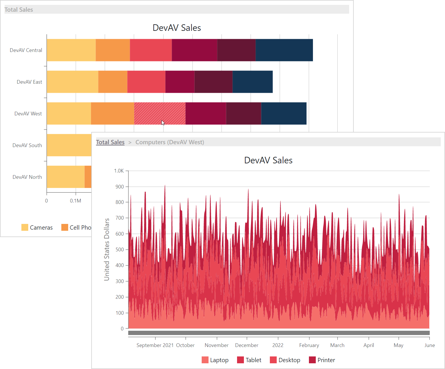
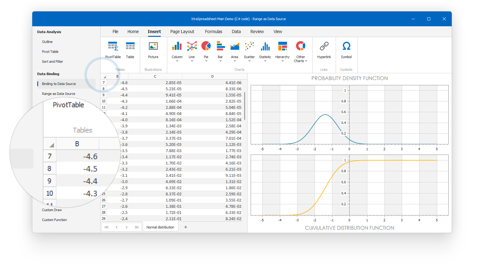
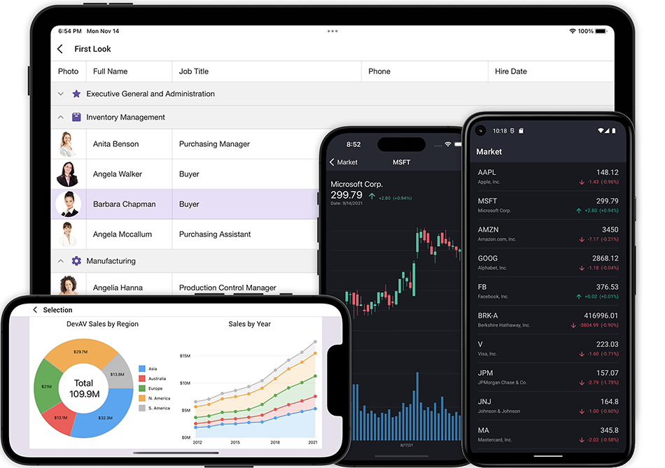
DirectX Forms also accept HTML & CSS templates, which allows you to design stunning Forms inspired by modern Web UI solutions. The following figure from our Demo Center illustrates an example of such custom UI.

The initial DirectX Form’s appearance emulates the standard XtraForm style. This standard appearance is stored in the default template:

<dx-form-frame id="frame">
    <dx-form-titlebar id="titlebar">
        <dx-form-icon id="icon"></dx-form-icon>
        <dx-form-text id="text"></dx-form-text>
        <dx-form-minimizebutton id="minimizebutton"></dx-form-minimizebutton>
        <dx-form-maximizebutton id="maximizebutton"></dx-form-maximizebutton>
        <dx-form-closebutton id="closebutton"></dx-form-closebutton>
    </dx-form-titlebar>
    <dx-form-content id="content"></dx-form-content>
</dx-form-frame>

This default template requires neither CSS styles nor onClick properties for buttons — appearance and behavior for these standard elements are hard-coded. The appearance of an element depends on tag name, and its behavior is set via the element ID. For example, the following line adds a button that looks like a Close button, but behaves like a Minimize button.

<dx-form-closebutton id="minimizebutton"></dx-form-closebutton>

This feature allows you to use standard Form elements when you do not need a custom design, or quickly set a behavior for a custom element. For instance, you can create a custom button from a <div> element, and set its ID to "closebutton".

If you aim for a completely custom Form layout, start with the following template.

<div id="frame" class="frame">
    <div id="content">
    </div>
</div>
.frame {
    height: 100%;
}

This is the shortest valid custom template you can add - templates without "frame" and "content" element IDs are considered invalid.

Your Opinion Matters

We'd love to hear more from you. Use the form below to submit your comments to us.


New WPF Windows 11 Theme and Window Appearance Enhancements

$
0
0

Over the years, we've been tracking the latest appearance changes in Windows and have been implementing them within our WPF Subscription to give the best experience to your users and help make your applications look familiar and up to date.

The v22.1 release includes two new appearance features from Windows 11:

  • a new Windows 11-inspired DevExpress WPF Theme
  • a ThemeWindow control that can use the operating system’s window rendering mechanism to display rounded corners and drop shadows.

Windows 11 Light Theme

Our new WPF Windows 11 Light Theme leverages the best visual attributes of Windows 11: rounded corners, underlined editors in the focused state, element animations, and a balanced color palette. In this theme, we have redesigned every DevExpress WPF control. We have also adjusted element spacing to make the UI more lightweight. This will help your applications keep to the general Windows 11 appearance. At the same time, the density is not too low, allowing you to fit more data on the screen.

As with the prior DevExpress WPF Themes, the Win11Light theme supports lightweight templates and standard WPF Controls.

Win11Light WPF Theme

Follow this demo link to explore this new Windows 11 Light Theme (the demo link requires that you first install DXperience v22.1 with associated demos).

Use the Operating System's Native Windows in ThemedWindow

With this release, you can set a ThemedWindow's UseNativeWindow static property to true to display the operating system’s native corners and shadows around the ThemedWindow control. With this property, you no longer need to detect the Windows version your app is running on in order to make sure that it looks consistent.

ThemedWindow - UseNativeWindow property

Create your First MVVM Application in WinUI

$
0
0

In this blog post, I will describe how to create a WinUI MVVM application from scratch and in doing so, reveal the power of DevExpress WinUI MVVM Framework.

Originally, we created the MVVM Framework for the WPF platform. Afterwards we found that the techniques developed in this framework could easily be used in WinForms, so we ported the framework there. In v22.1, we optimized our MVVM Framework for WinUI keeping the core functionality the same. If you use our WPF or WinForms Controls, you won't face any issues when migrating to WinUI.

Let's start with creating a bare view model. You can choose of the following view model types:

  1. Compile-time generated view model
  2. ViewModelBase - descendant view model
  3. A simple class with an implementation of the INotifyPropertyChanged interface

I will use the first option as it keeps your view model code clean, compact, and helps you avoid typos.

Add the DevExpress.Mvvm.CodeGenerators and DevExpress.WinUI NuGet packages to your project (note that you need to obtain the free offer feed or install our components to access the DevExpress.WinUI package). Once the packages have been added, create a view model class and assign the GenerateViewModel attribute to it:

using DevExpress.Mvvm.CodeGenerators;

[GenerateViewModel] 
public partial class MainViewModel {
    [GenerateProperty]
    string userName;

    [GenerateCommand]
    void Register() {
        Debug.WriteLine($"{UserName} was successfully registered!");
    }
}

Note that you need to make the class partial and also add the DevExpress.Mvvm.CodeGenerators namespace.

The сompile-time generator automatically creates a view model counterpart with INotifyPropertyChanged support:

partial class MainViewModel : INotifyPropertyChanged {
    public event PropertyChangedEventHandler? PropertyChanged;

    protected void RaisePropertyChanged(PropertyChangedEventArgs e) => PropertyChanged?.Invoke(this, e);

    public string? UserName {
    	get => userName;
        set {
            if(EqualityComparer.Default.Equals(userName, value)) return;
            userName = value;
            RaisePropertyChanged(UserNameChangedEventArgs);
        }
    }
    DelegateCommand? registerCommand;
    public DelegateCommand RegisterCommand => registerCommand ??= new DelegateCommand(Register, null);
    static PropertyChangedEventArgs UserNameChangedEventArgs = new PropertyChangedEventArgs(nameof(UserName));
}

You can view the generated class in your project: Dependencies -> Analyzers -> DevExpress.Mvvm.CodeGenerators -> DevExpress.Mvvm.CodeGenerators.ViewModelGenerator -> MainViewModel.g.cs

WinUI MVVM - Generated Code in Solution

Add the CanRegister method to your view model to determine when the Register command can be executed. Note that WinUI commands don't use CommandManager, therefore you need to manually refresh the CanExecute state using RaiseCanExecuteChanged:

public partial class MainViewModel {
    //...
    void OnUserNameChanged() {
        RegisterCommand.RaiseCanExecuteChanged();
    }
    bool CanRegister() => !string.IsNullOrEmpty(UserName);  
}

The code generator will automatically incorporate OnUserNameChanged and CanRegister in the UserName property and Register command.

The view model has the UserName property that stores a user's name and the RegisterCommand method that registers the user. Let's create a simple UI to work with the view model. Add a TextBox and a Button to the main window and bind them to the view model's property and command:

<StackPanel>
    <TextBox Text="{x:Bind ViewModel.UserName, Mode=TwoWay, UpdateSourceTrigger=PropertyChanged}"/>
    <Button Content="Register" Command="{x:Bind ViewModel.RegisterCommand}"/>
</StackPanel>

As you may have noticed, I've used x:Bind instead of Binding. x:Bind is a relatively new markup extension introduced in UWP. It uses type information at compile-time to optimize the binding, therefore it's preferable to use it when possible. When you use x:Bind in a window or user control, the default binding source is the window itself, so it's necessary to define the view model as the window property:

public sealed partial class MainWindow : Window {
    public MainViewModel ViewModel { get; } = new MainViewModel();
    public MainWindow() {
    	this.InitializeComponent();
    }
}

Now our simple MVVM application can send information from the view to the view model and execute the view model's command. Let's extend it to show a message box when a user clicks the Register button. I will use a UI service in order not to access visual elements directly from the view model. This will help us maintain a clean MVVM pattern. Add the MessageBoxService to the view and bind its ServiceClient property to your view model:

<Window ...
    xmlns:dxc="using:DevExpress.WinUI.Core">
    <StackPanel>
        <dxc:Interaction.Behaviors>
            <dxc:MessageBoxService ServiceClient="{x:Bind ViewModel}"/>
        </dxc:Interaction.Behaviors>
        <TextBox Text="{x:Bind ViewModel.UserName, Mode=TwoWay, UpdateSourceTrigger=PropertyChanged}"/>
        <Button Content="Register" Command="{x:Bind ViewModel.RegisterCommand}"/>
    </StackPanel>
</Window>  

Then, add the ImplementISupportUIServices parameter to the GenerateViewModel attribute and use the MessageBoxService in the Register method:

using DevExpress.Mvvm;
using DevExpress.Mvvm.CodeGenerators;

[GenerateViewModel(ImplementISupportUIServices = true)]
public partial class MainViewModel {
    [GenerateProperty]
    string userName;
    IMessageBoxService MessageBoxService { get => ServiceContainer.GetService<IMessageBoxService>(); }
    [GenerateCommand]
    void Register() {
        MessageBoxService.ShowAsync($"{UserName} was successfully registered!", "Registration");
    }
}

Now, a user will see a message box once they click the button. Note that your view model doesn't access any visual elements directly. Instead, the services mechanism is used as an interlayer.

Let's enhance the user experience by invoking the Register command when a user hits the Enter key. WinUI buttons don't have the IsDefault property, so it's necessary to process key events to catch the moment when Enter is pressed. Luckily, our MVVM suite has the KeyToCommand behavior that can invoke a command when specified keys are used. Add the KeyToCommand behavior to the Interaction.Behaviors collection and set its KeyGesture and Command properties:

<StackPanel>
    <dxc:Interaction.Behaviors>
        <dxc:KeyToCommand KeyGesture="Enter" Command="{x:Bind ViewModel.RegisterCommand}"/>
        <!--...-->
    </dxc:Interaction.Behaviors>
    <!--...-->
</StackPanel>

KeyToCommand is a behavior that's ready to use, however, you can easily create a custom behavior for your needs to avoid writing similar code-behind in different views.

You can download a complete example at the following GitHub repository: Simple MVVM application on WinUI.

To get more MVVM examples, please refer to the MVVM section in our WinUI Demos.

Recap

In the blog, you learned how to create a simple MVVM application in WinUI with the following techniques:

WinForms — WXI Skin Options

$
0
0

In last week’s WXI Skin announcement post, I mentioned that our latest vector skin includes certain API-based options. This post will explain why you may want to use these options, and how they can help you create a unified appearance within your WinForms app.

Regular and Compact Modes

Let me start with the Compact mode that was already mentioned in the original WXI skin announcement. This WXI skin variation was designed for data-intense applications, where increased margins and the overall “airy” appearance of the standard WXI skin are not an option.

While users at runtime select "WXI Compact" as a separate skin, you should still think of it as a setting for the original WXI theme. Note that users can select between these two WXI style options only when the CompactUIMode property has its default value. Otherwise, only one style option is availble (depending on the current CompactUIMode setting).

The code below illustrates how to apply the "Compact" variation in code.

DevExpress.LookAndFeel.UserLookAndFeel.Default.SetSkinStyle(SkinStyle.WXICompact);
// or
DevExpress.LookAndFeel.UserLookAndFeel.Default.SetSkinStyle(SkinSvgPalette.WXICompact.Sharpness);

You can read the UserLookAndFeel.Default.CompactUIModeForced property to identify which WXI variation is currently active. This property can be useful to re-apply the correct style when the application restarts.

bool isCompact = UserLookAndFeel.Default.CompactUIModeForced;
// Save the isCompact variable
// ...


// Load the isCompact variable
// ...
if (isCompact)
    UserLookAndFeel.Default.SetSkinStyle(SkinSvgPalette.WXICompact.Calmness);
else UserLookAndFeel.Default.SetSkinStyle(SkinSvgPalette.WXI.Calmness);

The Case of Rounded Corners

The traditional approach to application layout is to break a form down into rectangular regions, and put a control inside each one of them. In previous versions, we introduced features built upon this layout concept: Side Panels and Light style for Docking.

While Windows 11 did not completely bust this design thesis, the overall form design metaphor drifted towards a panel-based UI. One of the most notorious examples is the rounded Ribbon item panel, which is a questionable match for underlying rectangular controls (for example, Data Grid).

The "WXI" skin offers you complete control of your project's visual narrative, and allows you to decide the optimal solution for this issue. If you'd love to bring back the familiar look of a Ribbon's items panel and get rid of its rounded corners, set the RibbonControl.ItemPanelStyle property to "Classic".

The "classic Ribbon" is a universal solution that suits any UI type. However, this isn't your only option to eliminate design inconsistencies.

Rounded Panel

One of the most popular UI types is the classic Microsoft Office-inspired UI with a Ribbon at the top of your form, and a single client area control below. If this client area control does not support rounded corners out-of-the-box, you can always wrap it in the DevExpress.XtraEditors.RoundedSkinPanel.

At the moment, you'll need to add this panel manually in code, which only requires a few lines.

// Designer.cs file

this.rootPanel = new DevExpress.XtraEditors.RoundedSkinPanel();
// ...
this.rootPanel.Dock = System.Windows.Forms.DockStyle.Fill;
this.Controls.Add(this.gridControl1);
// ...
this.Controls.Add(this.rootPanel);
// ...
private DevExpress.XtraEditors.RoundedSkinPanel rootPanel;

The Rounded Panel has certain limitations (you should not add more than one Panel per each Form, and it does not affect certain controls, for example WinForms Map Control). And we also understand this is not the most convenient solution when you need to update a huge number of Forms. For these reasons we're keeping this Panel away from the Visual Studio toolbox, and suggest it as a workaround solution for those who'd love to replicate the Windows 11-inspired UI seen in our WinForms demos. At the same time, we're actively looking for alternative options and will do our best to create a more flexible solution for "rounding" corners of individual controls.

Layout Control

Another option available to you is to wrap your content in Layout or Data Layout Controls. In the WXI Skin, margins of layout control items are optimized to align your content with Ribbon's item panel. This solution works wonders in complex data editing UIs.

The image above illustrates another WXI feature: rounded editor corners. When looking at Windows 11 apps, most people instantly recognize rounded window corners. However, we believe that rounded editors are a much more significant update in terms of refreshing the overall application appearance.

Docking UI

While docked, docking panels have old-fashioned rectangular corners. For that reason, the aforementioned "Classic" Ribbon style (RibbonControl.ItemPanelStyle) is the best match for these panels. Among other options, you may want to manually adjust panel margins so that they line up with the rounded Ribbon.

As an option, you can also enable the Light docking style that eliminates side panel borders, and allows you to wrap panels into the Rounded Panel.

Your Opinion Matters

We’d love to know what you think of these options and the importance of rounded corners in your WinForms app.

Reporting – No-Code Parameters Panel Layout Customization (v22.1)

$
0
0

In this blog post, I’ll review our new Parameters Panel customization editor (v22.1). Before I do, a quick word or two about the Parameters Panel...

The Parameters Panel

The DevExpress Parameters Panel is a UI element that allows you to specify parameter values and dynamically supply data to a given report.

In our previous release (v21.2), we introduced an API (ParameterPanelFluentBuilder class) to customize the appearance of the Parameters Panel itself. Specifically, the API allowed you to combine report parameters into expandable groups, place parameters side-by-side, and add separators as needed.

While the API offered robust customizations options, these capabilities were only available via code.

Parameters Panel Customization UI

v22.1 ships with our new Parameters Panel Customization UI editor – allowing you to customize the panel directly inside the Report Parameters Editor window without writing any code.

Once you create the appropriate parameters for your report, you can open this new editor and apply the same customizations to the panel as those available via our API. The new UI is available in the Visual Studio Report Designer, the DevExpress End-User Report Designer (for WinForms and WPF), and the DevExpress Web End-User Report Designer (for all supported web platforms). All customizations applied to the panel are serialized within a report definition file (REPX).

To show you what’s possible, let's take a quick look at some examples and let’s customize the panel within a WinForms application.

Basics on How to Use the New UI to Customize the Panel

Invoke the Report Parameters Editor

Once you have created the necessary parameters for your report, right-click the Parameters node in the Field List and select Edit Parameters. This action invokes the Report Parameters Editor.

The editor's tree list on the left displays all generated parameters.

Customize Parameters

Select a parameter in the tree list. In the pane on the right (where parameter properties are listed), you can specify how to position the parameter's label relative to the parameter's editor.

The following examples display a panel with two parameters. In the first example (left panel), label orientation for both parameters is set to Horizontal. The second example (right panel) demonstrates the same parameters with label orientation set to Vertical.

In addition to label orientation, you can set the parameter's Visible and Enabled properties to show/hide or enable/disable the parameter's editor. You can specify an expression for these properties to change the parameter's behavior based on specific conditions.

In the example below, the customerName parameter's Enabled property is set to the following expression:

!IsNullOrEmpty(?companyName)

This expression ensures that the customerName parameter's editor is enabled only when the companyName parameter has been specified.

You can also change parameter order in the tree list, and in so doing, change parameter order within the Parameters panel. To change parameter order in the tree list, simply use the Up and Down buttons or drag-and-drop parameters within the tree itself.

Create and Customize Groups

Click the Add Group button to create a group.

To change the default group title, select the group and assign a new title to the Title property.

To place parameters inside or outside groups, use the Up and Down buttons or drag-and-drop parameters into the desired group.

Here is an example of a panel that uses groups:

In addition to specifying a group title, you can also customize group appearance with the following properties:

Add Separators

Click the Add Separator button to add a new separator.

Much like parameters, you can use the Up and Down buttons or drag-and-drop operations to place separators inside or outside groups and between parameters.

The following is an example of a Parameters panel with a separator between parameters:

Example: Customize the Parameters Panel in a Web Document Viewer

We've shown you all the basic features available for customization of the Parameters Panel. Now, let's consider a somewhat more advanced example – one in which multiple customization options are combined together.

The images below demonstrate the difference between the default and customized version of the Parameters Panel within the DevExpress Web Document Viewer.

The default panel contains four parameters (the same as those used in our Report Merging demo). The customized panel includes the same parameters: the first two (Sort Categories By and Sort Order) are combined into a group called Specify Sort Settings and placed side-by-side inside the group.

The other two parameters (Chart Appearance and Color Each Bar) are combined into a group called Setup Appearance (with separators between the parameters in both groups).

Once you apply these changes, the list of parameters, groups, and separators will render as follows within the DevExpress Report Designer's Edit Parameters window.

As you’ll hopefully agree, our new Parameters Panel UI editor offers a robust set of customization options – all available from within the Visual Studio Report Designer and the DevExpress End-User Report Designer (for all supported desktop and web platforms).

Your Feedback Matters

Thanks to your feedback/requests, we’ve implemented many new report parameter-related features over the last couple of years. Please take a moment to answer the following two questions:


Blazor - End of Support for .NET 5

$
0
0

As you may already know, the Microsoft .NET team has announced the end of life support for the .NET 5 framework:

.NET 5.0 will reach end of support on May 10, 2022. After the .NET May updates, Microsoft will no longer provide servicing updates, including security fixes or technical support, for .NET 5.0. You'll need to update the version of .NET you're using to a supported version (.NET 6.0) before this date in order to continue to receive updates. -Rahul Bhandari (MSFT)

Accordingly, DevExpress Blazor UI Components v22.1+ will no longer support .NET 5. If you are targeting Blazor and wish to use our newest Blazor components, we ask that you upgrade your projects to .NET 6 (DevExpress has supported .NET 6 since v21.2). If you cannot upgrade to .NET 6, you can continue to use v21.2 in your .NET 5 Blazor projects.

By moving to .NET 6, we've leveraged important framework features, including:

  • custom elements - used throughout our Blazor component lineup (Data Grid, Popup, DropDown, and Flyout)
  • custom event arguments - used to create C# event handlers for JavaScript events without JSInterop

Update your application

To upgrade your application to .NET 6, I recommend the steps outlined in these Microsoft resources:

.NET 7

As you may know, Microsoft will likely release .NET 7 later this year.

While .NET 7 is currently in preview mode, we are actively testing our components with the upcoming framework and are engaged with the Microsoft Blazor team. Of course, once .NET 7 is officially released, we will publish an official support announcement and a compatible release build.

If you're testing .NET 7 previews for 'AoT Compilation' or 'Link Trim Mode' features, please refer to this blog post for information on limitations.

Survey

Please help us prioritize our 2022 objectives by completing this survey:

Your Feedback Matters

As always, we welcome your feedback. Let us know what you think in the field below or submit a support ticket via the DevExpress Support Center if you need to discuss a specific business need.

WinUI Data Grid in MVVM Applications: Column Generation, Selection Binding, and other MVVM Techniques

$
0
0
MVVM is a well-known foundation for flexible and well-structured applications for such platforms as WinUI and WPF. That’s why we pay special attention to MVVM usage scenarios when developing our suite of controls. In this blog post, we will show you how to use the WinUI Data Grid with some basic MVVM scenarios.

Create a View Model and Bind the Data Grid to Data

Let's start with a simple view model that contains data for the Data Grid.
Create a WinUI application and install the DevExpress WinUI Controls suite. Refer to the following help topic for a complete tutorial: DevExpress WinUI Controls - Get Started.
This example uses a compile-time generated view model to keep its code compact and clean. Install the DevExpress.Mvvm.CodeGenerators NuGet package to obtain access to view model generators.
Create a view model with the Source property that retrieves data from the data model and can be used as the GridControl's binding source:
using DevExpress.Mvvm.CodeGenerators;
// ...
[GenerateViewModel]
public partial class MainViewModel {
    public MainViewModel() {
        Source = ProductsDataModel.GetProducts();
    }

    [GenerateProperty]
    ObservableCollection<Product> source;
}
In the Window class, create a ViewModel property that returns the created view model. This property allows you to use the x:Bind technique to bind the Data Grid to view model properties. The x:Bind is a relatively new markup extension that uses type information at compile-time to optimize the binding.
public sealed partial class MainWindow : Window {
    public MainViewModel ViewModel { get; } = new MainViewModel();
    public MainWindow() {
        this.InitializeComponent();
    }
}
Bind the Data Grid's ItemsSource property to the Source collection of the view model:
<Window
    x:Class="WinUIMVVMGrid.MainWindow"
    xmlns="http://schemas.microsoft.com/winfx/2006/xaml/presentation"
    xmlns:x="http://schemas.microsoft.com/winfx/2006/xaml"
    xmlns:local="using:WinUIMVVMGrid"
    xmlns:d="http://schemas.microsoft.com/expression/blend/2008"
    xmlns:mc="http://schemas.openxmlformats.org/markup-compatibility/2006" 
    xmlns:dxg="using:DevExpress.WinUI.Grid"
    mc:Ignorable="d">
    <Grid>
        <dxg:GridControl ItemsSource="{x:Bind ViewModel.Source}"/>
    </Grid>
</Window>

Generate Data Grid Columns from your View Model

The Data Grid offers flexible APIs to generate and configure columns according to the MVVM pattern. This technique allows you to change the set of grid columns dynamically, based on the data source type or other custom logic in your view model.
Create classes that describe grid columns. In this example, we use columns that display text values, a column with the ComboBox editor, and a column that displays DateTime values:
using DevExpress.Mvvm;
// ...
public class TextColumn : BindableBase {
    public TextColumn(string fieldname) {
        FieldName = fieldname;
    }
    public string FieldName { get; }
}
public class ComboBoxColumn : TextColumn {
    public ComboBoxColumn(string fieldname, IList items) : base(fieldname) {
        Items = items;
    }
    public IList Items { get; }
}
public class DateColumn : TextColumn {
    public DateColumn(string fieldname) : base(fieldname) { }
}
Add the Columns collection to the view model and populate it with grid columns you want to display:
[GenerateViewModel]
public partial class MainViewModel {
    public MainViewModel() {
        Source = ProductsDataModel.GetProducts();

        IList Countries = Source.Select(x => x.Country).Distinct().ToList();
        Columns = new ObservableCollection<TextColumn>() {
            new TextColumn(nameof(Product.ProductName)),
            new ComboBoxColumn(nameof(Product.Country), Countries),
            new TextColumn(nameof(Product.UnitPrice)),
            new DateColumn(nameof(Product.OrderDate))
        };
    }

    [GenerateProperty]
    ObservableCollection<Product> source;

    [GenerateProperty]
    ObservableCollection<TextColumn> columns;
}
The Data Grid generates its columns based on templates. Specify a template for each column type and create a template selector that returns a column template based on a column type:
xmlns:dx="using:DevExpress.WinUI.Core"

<Grid.Resources>
    <dx:TypedDataTemplateSelector x:Name="ColumnTemplateSelector">
        <DataTemplate x:DataType="local:TextColumn" x:Name="TextColumn">
            <dxg:GridTextColumn FieldName="{x:Bind FieldName}"/>
        </DataTemplate>

        <DataTemplate x:DataType="local:ComboBoxColumn" x:Name="ComboBoxColumn">
            <dxg:GridComboBoxColumn FieldName="{x:Bind FieldName}" ItemsSource="{x:Bind Items}"/>
        </DataTemplate>

        <DataTemplate x:DataType="local:DateColumn" x:Name="DateColumn">
            <dxg:GridDateColumn FieldName="{x:Bind FieldName}"/>
        </DataTemplate>
    </dx:TypedDataTemplateSelector>
</Grid.Resources>
In the code snippet above, we use TypedDataTemplateSelector, which allows you to choose templates without writing a single line of C# code. You can specify a standard template selector instead.
Bind the ColumnsSource property to the view model's Column collection and assign the template selector to the ColumnTemplateSelector property:
<dxg:GridControl ItemsSource="{x:Bind ViewModel.Source}" 
                 NavigationStyle="Cell" 
                 ColumnsSource="{x:Bind ViewModel.Columns}" 
                 ColumnTemplateSelector="{StaticResource ColumnTemplateSelector}"/>

Obtain Selected Items in your View Model

The Data Grid allows you to bind the collection of its selected items to a property in your view model.
Add a collection for selected items to the view model and initialize it in the view model's constructor. You can also modify this collection, and the Data Grid will reflect such changes:
[GenerateViewModel]
public partial class MainViewModel {
    public MainViewModel() {
        Source = ProductsDataModel.GetProducts();
        // ...
        Selection = new ObservableCollection<Product>() {Source.ElementAt(0)};
    }
    // ...
    [GenerateProperty]
    ObservableCollection<Product> selection;
}
Enable Multiple Row Selection mode and bind the Data Grid's SelectedItems property to the Selection collection:
<dxg:GridControl ...
                 SelectionMode="RowExtended"
                 SelectedItems="{x:Bind ViewModel.Selection, Mode=TwoWay}"/>
This is all you need to do to synchronize the Data Grid's selected items with a view model property.

Use UI Services to Invoke a Message Box from your View Model

Now we'll describe how to show a message box with the selected rows according to the MVVM technique. In this case, we'll use our UI Services to avoid accessing visual elements from the view model.
Add MessageBoxService to the view and bind its ServiceClient property to the view model:
<dxg:GridControl ...
                 SelectionMode="RowExtended"
                 SelectedItems="{x:Bind ViewModel.Selection, Mode=TwoWay}">
    <dx:Interaction.Behaviors>
        <dx:MessageBoxService ServiceClient="{x:Bind ViewModel}"/>
    </dx:Interaction.Behaviors>
</dxg:GridControl>
Add the ImplementISupportUIServices parameter to the GenerateViewModel attribute and create a command that uses MessageBoxService to display selected items:
[GenerateViewModel(ImplementISupportUIServices=true)]
public partial class MainViewModel {
    // ...
    IMessageBoxService MessageBoxService => GetUIService<IMessageBoxService>();
    
    [GenerateCommand]
    async void ShowSelectedRows() {
        string Text = "";
        foreach (Product product in Selection) {
            Text += product.ProductName + "\r\n";
        }
        await MessageBoxService.ShowAsync(Text, "Selected Products");
    }
    bool CanShowSelectedRows() => Selection.Any();
}
Subscribe to the Selection collection's CollectionChanged event to refresh the ShowSelectedRows command's CanExecute state each time a user selects or unselects a row:
[GenerateViewModel(ImplementISupportUIServices=true)]
public partial class MainViewModel {
    public MainViewModel() {
        // ...
        Selection.CollectionChanged += (s, e) => ShowSelectedRowsCommand.RaiseCanExecuteChanged();
    }
    // ...
}
Add a button that executes the ShowSelectedRows command:
<Grid>
    <Grid.RowDefinitions>
        <RowDefinition/>
        <RowDefinition Height="35"/>
    </Grid.RowDefinitions>
    <!-- ... -->
    <Button Grid.Row="1" 
            HorizontalAlignment="Stretch" 
            Content="Show Selected Products" 
            Command="{x:Bind ViewModel.ShowSelectedRowsCommand}"/>
</Grid>

Use the EventToCommand Behavior to Assign Data Grid events to View Model Commands

The Data Grid allows you to use the EventToCommand behavior to associate Data Grid events with the view model commands. You can use this behavior to initialize a new row in the view model.
Specify the NewItemRowPosition property to show the New Item Row. This row allows users to add new rows to the Data Grid.
Add an EventToCommand behavior that executes a view model command instead of the AddingNewRow event:
<dxg:GridControl ...
                 NewItemRowPosition="Top">
    <dx:Interaction.Behaviors>
        <dx:EventToCommand EventName="AddingNewRow"  
                           PassEventArgsToCommand="True"
                           Command="{x:Bind ViewModel.AddingNewRowCommand}"/>
    </dx:Interaction.Behaviors>
</dxg:GridControl>
Create a command that adds a new object with predefined values to the data source when a user starts to edit the New Item Row:
[GenerateCommand]
void AddingNewRow(AddingNewEventArgs e) =>
    e.NewObject = new Product {ProductName = "", Country = "Austria", UnitPrice = 0, OrderDate = System.DateTime.Today};

Recap

In this post, we have described how to use our MVVM techniques with the WinUI Data Grid. You have learned how to:
  • Bind the Data Grid's ItemsSource property to a collection in a view model.
  • Specify grid columns in a view model and display them in the Data Grid.
  • Access the Data Grid's selected items from the view model.
  • Convert the Data Grid's events to commands in a view model.
The application created in this post is available on GitHub: WinUI Data Grid in MVVM Scenarios.
Note that v22.1 also offers new great features for the WinUI Data Grid. See What’s New for complete information.

DevExpress Multi-Platform App UI Controls Support .NET MAUI GA Release (v22.1)

$
0
0

.NET MAUI GA Release

As you probably know, Microsoft released .NET MAUI to production recently. Our free .NET MAUI product line for mobile development (with Android and iOS) is compatible with this .NET MAUI release. To see what is new in v22.1, please follow this link. If you are migrating from Xamarin, please check out Microsoft migration guidelines and also our article on navigation control changes.

We thank those of you who explored our preview builds and shared feedback via the DevExpress Support Center and developer surveys. 

Getting Started

To get started with DevExpress .NET MAUI mobile controls, please use our tutorials and examples in the Online Documentation. Our Project Templates will also help you create your first .NET MAUI app with grids, charts, and other DevExpress controls in a matter of seconds, automatically. 

If you missed it, yes, the preview of our .NET MAUI controls and our production-ready Xamarin UI components are available free-of-charge. If you have yet to obtain your free copy of our mobile components, please register for this free offer today.

DevExpress Components for .NET MAUI

Windows Desktop Support (WinUI) - Experiments Ongoing

As you may already know, our .NET MAUI controls are currently available for mobile development with Android and iOS. Our mobile product line primarily exists to help existing DevExpress customers (WinForms, WPF, WinUI, ASP.NET or XAF) build mobile companion apps in addition to their existing desktop or web apps. Our current vision does not include desktop support at this stage. We ran a couple of surveys and they confirmed low interest from our customers in this direction, especially with regard to Linux or macOS desktop support. Windows desktop support (with WinUI) was a bit more popular in requests, but it is still insufficient for us to heavily invest into. We are still looking forward to the adoption of the WinUI and may revise our .NET MAUI plans in 2023.

Although we have not planned to support .NET MAUI desktop in 2022, we are still excited about the capabilities that .NET MAUI offers for cross-platform UI development, and for the desktop form-factor in particular. For this, our R&D team made a few spikes for WinUI support in our .NET MAUI controls that make sense in desktop apps (for example, data grids, charts and certain editors). Below you can see a screenshot of our .NET MAUI data grid, a wrapper above our WinUI component (powered by our WinUI product line). We have also tested a few other simpler controls like text box or button. This is NOT by all means a commitment to support WinUI in our .NET MAUI controls - just honestly sharing where we are at with this in 2022.

Future Plans

Here are just a few big things we are planning to work on for the next major release (v22.2) at the end of 2022. As always, we will keep posting information on additional capabilities in this blog.

Support Cross-Platform DevExpress.Data Library

We will migrate our mobile-specific fork/clone to the full-featured version of the DevExpress.Data library currently used by all DevExpress customers on other .NET UI platforms. This migration will help us:

  • Deliver a seamless user experience (API-wise) for DevExpress customers who have used our WinForms, WPF and ASP.NET components in the past.
  • Make code sharing across multiple platforms easier. Example: Presently, our .NET MAUI customers are using CriteriaOperator from the "DevExpress.XamarinForms.Core.Filtering" namespace. In the future, these customers will use the "DevExpress.Data.Filtering" namespace instead.
  • Automatically add new features to our .NET MAUI data grid, collection view, etc. Example: advanced mask input and performance enhancements powered by the DataController from our WinForms/WPF data grids or the new CriteriaOperator.FromLambda API.

Simplify .NET MAUI Control Localization

At present, you can only localize our .NET MAUI controls if you set localized values to component properties in code. In v22.2, we hope to make it easier for our .NET MAUI customers to localize controls using options that mirror ours WinForms, WPF and ASP.NET product lines:

  • Static: satellite assemblies downloaded from the DevExpress Localization Service or NuGet (example);
  • Dynamic: runtime localizer objects (example).
If you have not yet voted in our Localizing Your DevExpress-powered .NET App survey, please do so - your feedback matters.


XAF - 2022 Roadmap (Cross-Platform .NET App UI & API Services)

$
0
0

Before I detail XAF’s 2022 Roadmap, my thanks to everyone who shared feedback/comments last year. Your contribution to XAF’s evolution is appreciated. The following list outlines the features/capabilities we expect to introduce in our Cross-Platform .NET App UI - XAF and .NET App Security API this year. 

Table of Contents

ASP.NET Core Blazor UI

We expect to introduce the following to XAF's Blazor UI in the v22.1 release cycle:

  • Release of DxGridListEditor (Server Mode support, custom calculated field support, column resizing support, performance enhancements, Column Chooser). Available in v22.1.
  • Main Menu Toolbar Enhancements (learn more). Available in v22.1.
  • Preview of Runtime Form Layout Customization for End-Users (learn more). Postponed to v22.2.
  • Migration to the DevExpress themes. Postponed to v22.2.
  • Bootstrap 5 Support. Available in v22.1.

v22.1 is mostly a service release for XAF's Blazor UI, because it is fully dependent on the progress made with DevExpress Blazor components. Even though the XAF team is heavily involved at early planning and testing stages, we still require additional time to integrate and test the latest component enhancements (roadmap). So, not all new Blazor component features available in v22.1 will ship as part of XAF's Blazor UI v22.1. We expect to catch up in v22.2 with enhancements such as accordion for navigation, inline row editing and export in the grid control, split view like Outlook, advanced popup windows, etc. We will detail these plans in another roadmap post around the July time frame.

We also encourage XAF developers to remember that XAF is fully extendable framework/constructor, and that you can incorporate Blazor and DevExtreme components/customize XAF’s default UI as needed today, without waiting for another release. More customization tips | Blazor UI (FAQ).
BACK TO THE TOP

WinForms UI

Release of Entity Framework Core 5 for Data Access

In v22.1, we can recommend production use of Entity Framework Core 5 (EF Core 5) data models in .NET 6 WinForms apps (Documentation). You can find a demo at: c:\Users\Public\Documents\DevExpress Demos 22.1\Components\eXpressApp Framework\EFCoreDemo\. EF Core 5 can also be used in XAF's Blazor apps and .NET App Security API. Enhancements include multiple stability fixes and support for the Server and DataView access modes in ListView. Available in v22.1. 

As we noted 1 year ago, we encourage our Entity Framework 6 (EF 6) users to consider EF Core 5 for new XAF's Blazor and WinForms .NET 5+ projects. Microsoft has moved EF 6 into maintenance mode, and as such, EF 6 will not mirror XAF's .NET 5+ offering. At present, EF Core 5 supports key XAF technologies/capabilities including advanced security and comprehensive audit trail support. EF Core 5 also offers better performance when compared to EF 6. For more information, see Porting from EF 6 to EF Core.

Release of Middle Tier Application Server for .NET 6 

In v22.1, we can recommend production use of our Middle Tier application server with XPO-based .NET 6 WinForms apps. Available in v22.1.

Entity Framework Core 6 Support in WinForms, Blazor & API Services for Data Access

Support for Entity Framework Core 6 (EF Core 6) is expected in our v22.2 release cycle. EF Core 6 is the latest version of Entity Framework and has a number of advantages over EF Core 5: https://docs.microsoft.com/en-us/ef/core/what-is-new/ef-core-6.0/whatsnew. Unfortunately, Microsoft introduced a number of breaking changes that we will need to address. We will not support EF 7 in 2022 unless there are strong reasons to do so (because this is NOT an LTS release). 
BACK TO THE TOP

API Services for Non-XAF UI Clients

Release of the FREE Web API Service for Basic CRUD & Authorization in v22.1

Our Web API backend service is powered by Swagger/OpenAPI and allows you to reuse XAF application data, logic, and modules within non-XAF apps. Our v22.1 release will include stability, performance, and documentation updates. In addition, we will support EF Core 5 for Web API Service (in previous versions, only XPO was supported). We will also update example E4908 to use the Web API Service instead of a custom implementation with plain OData v4. Available in v22.1.

The Future of XAF API Services: FREE and PAID Capabilities

We will keep offering basic CRUD and authorization functions for free as part of our .NET Role-based Access Control & Permission Management API. In v22.1, this free product will also include a project template that will generate a Web API Service with the same basic functions powered by Entity Framework Core 5 and XPO ORM. To download your free copy, please verify your contact information and click Register on the following web page: https://www.devexpress.com/security-api-free.  

We will also add paid enterprise features for this security API and Web API Service. Like technical support, these paid features will be a part of the XAF/Universal license. For instance, v22.1 will include end points to get localized captions for classes and members in the Web API Service. Available in v22.1.

Later this year we also hope to support XAF's audit trail for Entity Framework Core 6 and XPO, end points to download reports in PDF or FileData-based attachments, advanced CRUD with XAF validation rules, etc). For more information on these paid capabilities, check out XAF modules.
BACK TO THE TOP


BACK TO THE TOP

Cross-Platform Enhancements

.NET 6 Is Used By Default

XAF's Blazor and WinForms (.NET Core) assemblies will target .NET 6 with our v22.1 release. .NET 6 is a long-term support (LTS) release, and with it we can deliver the best experience from a UX and performance perspective for Blazor, XAF Model Editor, and our WinForms design-time. Available in v22.1.

Simplified XAF Solution Structure

We removed SolutionName.Module.XXX projects and allowed XAF developers to add Controllers, business classes, list and property editors, view items, and other XAF-specific entities to automatically load from SolutionName.XXX executable projects. This should make it easier for new XAFers to get started with the product and also eliminate mistakes for existing XAF developers. Available in v22.1.

BACK TO THE TOP

Preview of XAF Module Extensions for Unified Application Configuration in WinForms & Blazor

As you may recall from our 2021 roadmap, we will NOT support Module and Application Designers in .NET 5+ apps. These designers duplicate Solution Wizard functionality and are rarely used (occasional module or application configurations can be easily addressed with a few lines of code: example).

To promote straightforward and consistent configurations for security and application modules across WinForms and Blazor in .NET 6, XAF v22.1 will support  fluent API syntax in Startup.cs. Available in v22.1.

...
services.AddXaf(Configuration, builder => {
builder.UseDefaultApplicationFactory<SimpleAppSetupDemoBlazorApplication>();
builder.Modules
    .AddSystemBlazorModule()
    .Add<SimpleAppSetupDemoModule>()
    .AddSecurityModule()
    .AddAuditTrailModule(auditTrailModule =>
        auditTrailModule.AuditDataItemPersistentType = typeof(DevExpress.Persistent.BaseImpl.AuditDataItemPersistent))
    .AddCloneObjectModule()
    .AddConditionalAppearanceModule()
    .AddDashboardsBlazorModule(null, options => {
        options.SetupDashboardConfigurator = (configurator, serviceProvider) => {
            configurator.DefaultDataReloadingTimeout = TimeSpan.FromSeconds(5);
        };
        options.RouteOptions.Endpoint = "customApiRoute/dashboards";
    })
...

The PlatformApplication.designer.xx and Module.designer.xx files will be removed from the Solution Wizard template in .NET 6 apps as well. These changes will NOT affect .NET Framework apps and you can keep using the old-good option with the designers as before. 
BACK TO THE TOP 

Model Editor Enhancements

The Model Editor is now built with .NET 6 and delivers better performance and stability. Users will also like the simplified drag-and-drop implementation under the NavigationItems node (you no longer need to precisely point out the Items sub-node and can drop an item directly on the root node). Available in v22.1.


BACK TO THE TOP

Support for XAF Data Sources in the .NET 6 Report Designer

XAF developers will be able to use XAF-specific report data sources in the new .NET 6 Report Designer for Visual Studio. Known issues such as missing XAF business classes in the ObjectTypeName editor or missing members in the Field List have been addressed. Available in v22.1.

Unit & Functional Test Infrastructure in Solution Wizard

Solution Wizard will include built-in end-to-end (e2e) tests in C# powered by our EasyTest functional testing engine and popular unit testing libraries such as xUnit, nUnit. Available in v22.1.

Later this year will add boilerplate code for unit testing and CI/CD template to help you get started with specific tests-related tasks in minutes using GitHub Actions and Azure DevOps. 
BACK TO THE TOP 

[Theory]
[InlineData(BlazorAppName)]
[InlineData(WinAppName)]
public void CreateStudent(string applicationName) {
    FixtureContext.DropDB(AppDBName);
    var appContext = FixtureContext.CreateApplicationContext(applicationName);
    appContext.RunApplication();
    appContext.GetForm().FillForm(("User Name", "Admin"));
    appContext.GetAction("Log In").Execute();

    appContext.Navigate("Student");
    Assert.Equal(0, appContext.GetGrid().GetRowCount());

    appContext.GetAction("New").Execute();
    appContext.GetForm().FillForm(("First Name", "John"), ("Last Name", "Smith"));
    appContext.GetAction("Save").Execute();
    Assert.Equal("John Smith", appContext.GetForm().GetPropertyValue("Full Name"));

    appContext.Navigate("Student");
    Assert.Equal(1, appContext.GetGrid().GetRowCount());
    Assert.Equal(new string[] { "John", "Smith" }, appContext.GetGrid().GetRow(0, "First Name", "Last Name"));
}

BACK TO THE TOP

Release of Pre-Built Code & Project Error Diagnostics

We shared a preview of this useful feature in v21.2, and are now releasing it under the CodeRush umbrella. The DevExpress.ExpressApp.CodeAnalysis package will be renamed to DevExpress.CodeRush.CodeAnalysis.XAF and the Project Converter will take care of this automatically. Available in v22.1.

If you have not yet voted in the CodeRush 2022 Roadmap survey, I strongly recommend you do this today, because certain enhancements may be very interesting for XAF/XPO users.

New Database Connection Providers in XPO

We will keep XPO connection providers up to date with the latest database engines and extend support based on user feedback.

  • MySqlConnector is a new ADO.NET data provider (MIT) for MySQL, MariaDB, Amazon Aurora, Azure Database for MySQL and other MySQL-compatible databases. It should deliver more value than the old MySql.Data provider (GPLv2). Available in v22.1.
  • We will support the latest version of PostgreSQL driver for .NET Core apps - Npgsql 6.0. Available in v22.1.
  • We will also expand XPO connection provider support with SAP HANA. Available in v22.1.

BACK TO THE TOP 

Your Opinion Counts

As always, we look forward to your comments and questions. Use the field below to share feedback with us.

The information contained within this blog post details our current/projected development plans. Please note that this information is being shared for INFORMATIONAL PURPOSES ONLY and does not represent a binding commitment on the part of Developer Express Inc. This roadmap and the features/products listed within it are subject to change. You should not rely on or use this information to help make a purchase decision about Developer Express Inc products.

DevExpress Multi-Platform App UI Controls Support .NET MAUI GA Release (v22.1)

$
0
0

.NET MAUI GA Release

As you probably know, Microsoft released .NET MAUI to production recently. Our free .NET MAUI product line for mobile development (with Android and iOS) is compatible with this .NET MAUI release. To see what is new in v22.1, please follow this link. If you are migrating from Xamarin, please check out Microsoft migration guidelines and also our article on navigation control changes.

We thank those of you who explored our preview builds and shared feedback via the DevExpress Support Center and developer surveys. 

Getting Started

To get started with DevExpress .NET MAUI mobile controls, please use our tutorials and examples in the Online Documentation. Our Project Templates will also help you create your first .NET MAUI app with grids, charts, and other DevExpress controls in a matter of seconds, automatically. 

If you missed it, yes, the preview of our .NET MAUI controls and our production-ready Xamarin UI components are available free-of-charge. If you have yet to obtain your free copy of our mobile components, please register for this free offer today.

DevExpress Components for .NET MAUI

Windows Desktop Support (WinUI) - Experiments Ongoing

As you may already know, our .NET MAUI controls are currently available for mobile development with Android and iOS. Our mobile product line primarily exists to help existing DevExpress customers (WinForms, WPF, WinUI, ASP.NET or XAF) build mobile companion apps in addition to their existing desktop or web apps. Our current vision does not include desktop support at this stage. We ran a couple of surveys and they confirmed low interest from our customers in this direction, especially with regard to Linux or macOS desktop support. Windows desktop support (with WinUI) was a bit more popular in requests, but it is still insufficient for us to heavily invest into. We are still looking forward to the adoption of the WinUI and may revise our .NET MAUI plans in 2023.

Although we have not planned to support .NET MAUI desktop in 2022, we are still excited about the capabilities that .NET MAUI offers for cross-platform UI development, and for the desktop form-factor in particular. For this, our R&D team made a few spikes for WinUI support in our .NET MAUI controls that make sense in desktop apps (for example, data grids, charts and certain editors). Below you can see a screenshot of our .NET MAUI data grid, a wrapper above our WinUI component (powered by our WinUI product line). We have also tested a few other simpler controls like text box or button. This is NOT by all means a commitment to support WinUI in our .NET MAUI controls - just honestly sharing where we are at with this in 2022.

Future Plans

Here are just a few big things we are planning to work on for the next major release (v22.2) at the end of 2022. As always, we will keep posting information on additional capabilities in this blog.

Support Cross-Platform DevExpress.Data Library

We will migrate our mobile-specific fork/clone to the full-featured version of the DevExpress.Data library currently used by all DevExpress customers on other .NET UI platforms. This migration will help us:

  • Deliver a seamless user experience (API-wise) for DevExpress customers who have used our WinForms, WPF and ASP.NET components in the past.
  • Make code sharing across multiple platforms easier. Example: Presently, our .NET MAUI customers are using CriteriaOperator from the "DevExpress.XamarinForms.Core.Filtering" namespace. In the future, these customers will use the "DevExpress.Data.Filtering" namespace instead.
  • Automatically add new features to our .NET MAUI data grid, collection view, etc. Example: advanced mask input and performance enhancements powered by the DataController from our WinForms/WPF data grids or the new CriteriaOperator.FromLambda API.

Simplify .NET MAUI Control Localization

At present, you can only localize our .NET MAUI controls if you set localized values to component properties in code. In v22.2, we hope to make it easier for our .NET MAUI customers to localize controls using options that mirror ours WinForms, WPF and ASP.NET product lines:

  • Static: satellite assemblies downloaded from the DevExpress Localization Service or NuGet (example);
  • Dynamic: runtime localizer objects (example).
If you have not yet voted in our Localizing Your DevExpress-powered .NET App survey, please do so - your feedback matters.
Thanks,
Dennis Garavsky
Principal Product Manager
dennis@devexpress.com 

Free WinUI Components in the Unified Installer

$
0
0

We are happy to announce that our WinUI components are now available from the DevExpress Unified Installer. If you are using our Unified Installer and wish to install our WinUI controls, simply select the WinUI tile pictured below.

And some more good news - we decided to extend our free WinUI offer until December 2022. You can use our WinUI controls via the Unified Installer or through the NuGet feed with absolutely no charge until December 2022.

If you are new to WinUI, our interactive demos should help you get your feet wet with the platform: WinUI Demos. The same demo launcher is also available from our main Interactive Demo Menu:

We’ve also extended our WinUI suite with many great Data Grid-related features, including:

  • Excel Inspired Filtering
  • Formatted Clipboard Operations
  • Cell and Column Tooltips
  • MVVM API to Populate Columns
  • Sorting by Summaries
  • Enhanced Row Indicator
  • Horizontal and Vertical Grid Lines
  • Group Row Button Customization API

Moreover, the suite now includes a Ribbon Control and MVVM Framework to help you create modern MVVM applications with absolute ease. We will describe a complete list of WinUI-related enhancements in an upcoming What’s New blog post.

Please be sure to download our free offer and tell us what you think.


A 1-Click Solution for Role-based Access Control with Web API Services via Entity Framework Core & XPO

$
0
0

In XPO blog post in November 2021, I grumbled about how difficult it was to develop a robust and flexible app security system from scratch with any .NET ORM, including Entity Framework (by security, I’m referring to user authentication and role-based data authorization with flexible permission management). Based on feedback, it seems that many of you agree with my position.

But let's be honest: for most (myself included), creating a robust security system is a serious and costly undertaking. This is especially true if your enterprise requires field-tested Role-Based Access Control (RBAC) and advanced authentication based on JWT + OAuth2 for Azure AD. Yes, too many acronyms and SDK to master, too many `principals`, `access tokens`, and `claims` to remember (brrr…my apologies to ASP.NET Core Identity creators and experts, but I personally hate this complexity. If people reading this are the same down-to-earth .NET developers like I am, please add "+1" in the comments section below).

CRUD, Authorization, Localization, and Much More for Entity Framework Core 5-based API Services

v22.1 marks the official release of our Web API Service. The Solution Wizard scaffolds an OData v4 Web API Service with integrated authorization & CRUD operations powered by EF Core 5 and our XPO ORM library. You can use OAuth2, JWT or custom strategies for authentication alongside tools like Postman or Swagger (OpenAPI) for API testing. The built-in security system also filters out secured server data based on permissions granted to users.

The basic functions of our Web API Service are available for FREE (as part of our .NET App Security & Web API Service free offer). To download your free copy, please visit: https://www.devexpress.com/security-api-free.


Additional services/benefits of our Web API Service are available to active DevExpress Universal Subscribers and include:

  • Technical support and full source code
  • XAF's administrative UI to manage users and roles at runtime using WinForms, WebForms, and Blazor apps
    Security_TypePermissions
  • Localization functions (endpoints to obtain localized captions for classes, members, and custom UI elements). The Web API Service project includes a XAFML file with a designer (Model Editor) to help you localize and store strings under the BOModel and Localization nodes - you do not need to worry about the localization structure yourself.
    Localization Support - Web API Service, XAF | DevExpress
  • Advanced/enterprise functions such as audit trail, endpoints to download reports, file attachments, check validation, etc.
NOTE: The Solution Wizard template for Web API projects is available in Visual Studio 2022+. It generates .NET 6-based projects.

Future Plans

  • The next major version (v22.2) should support EF Core 6+ for data access.
  • We also want to publish this Web API Service template as VSIX in the Visual Studio Marketplace for everyone who registered for our free offer (this will eliminate the need to download and run the DevExpress Unified Component Installer).

Your Feedback Matters

Our long-term customer, Mario Blatarić (Logon Ltd.), shared his recent experience with the Web API Service:


Mario Blatarić, Logon Ltd.I have new, rather big, project and I decided to give Web API services a serious go (for a mobile app with GIS functionality). It turned to be serious time saver with ability to reuse entire data model and security. Before, I would have to write new project, replicate and constantly maintain data structure, deal with security and so on. Web API Services are just natural fit for XAF Blazor, I really like it.

Please take a moment to reply to the following questions – your feedback will help us shape/define future development strategies.

Thanks,
Dennis Garavsky
Principal Product Manager
dennis@devexpress.com 

CodeRush - Visual Studio Productivity Tools Are Available Free-of-Charge in v22.1!

$
0
0

Available Free-of-Charge to Everyone

With our most recent release (v22.1), we’re making CodeRush available free-of-charge. If you’re not familiar with CodeRush, you can learn more about its feature set here and download your copy today at https://devexpress.com/coderush-free. We have redesigned the landing page to describe its most popular features – those used most by CodeRush customers.

If you’ve used CodeRush in the past or are familiar with capabilities, you can read what’s new in v22.1 below.

What's Else New in CodeRush v22.1?

As you may recall from our CodeRush's strategy blog post, our #1 goal is to help you save time – wherever/whenever possible. In the recent past, we released the following shortcuts for DevExpress customers: XAF Templates | XPO Templates | Blazor Component Templates

For our v22.1 release cycle, the CodeRush team allocated most of its resources to Best Practice Diagnostics & Fixes. NOTE: Owners of active DevExpress Universal, DXperience, and CodeRush subscriptions were already entitled to this new functionality. To provide access to the same benefits, owners of active DevExpress WinForms, ASP.NET, WPF Subscriptions have been automatically assigned a free license of CodeRush (as of today). 

DevExpress XAF and XPO Error Diagnostics

You can now analyze your solution with pre-built error diagnostics and view a detailed report in the Error List window. v22.1 includes the following new diagnostics to help you correctly define your business model and controllers:

  • XAF0009: Properties decorated with the 'RuleRequiredFieldAttribute' should be of nullable or reference type.
  • XAF0010: Set the 'DelayedAttribute.UpdateModifiedOnly' property to True.
  • XAF0011: Implement the delayed property correctly.
  • XAF0012: Avoid calling the 'XafApplication.CreateObjectSpace()' method overload without the 'Type' parameter.
  • XAF0013: Avoid reading the 'XafApplication.ConnectionString' property.
  • XAF0014: The property with the 'Association' attribute must have a correct unique pair.
  • XAF0015: Association must not have the 'Aggregated' attribute if it is paired to the 'many' end of the association.
  • XAF0016: Descendants of 'NonPersistentBaseObject' and 'NonPersistentLiteObject' must be decorated with the 'DomainComponent' attribute.

xaf code analysis
Documentation

DevExpress WinForms Error Diagnostics

You can now detect C# code errors as you type. You can check errors (if any) in the code editor and in the Error List window.
Code Diagnostics - WinForms UI Controls | DevExpress

Install the 'DevExpress.Win.CodeAnalysis' package to enable Code Diagnostics. The analyzer requires Visual Studio 2019 or a newer version, and supports both .NET Framework and .NET 5+.

Documentation

DevExpress WPF Error Diagnostics

CodeRush can now check XAML code for DevExpress component-related usage issues and help you follow best practices with modern code. v22.1 includes diagnostics for the following issues and legacy practices: 

  • Legacy drag-and-drop - Drag-and-Drop Managers are a legacy way to enable drag-and-drop. Consider setting the 'DataViewBase.AllowDragDrop' property to 'true' instead.

    Documentation

  • ColumnBase.EditTemplate is used - The 'EditTemplate' property is outdated. Consider using CellEditTemplate instead.

  • FieldName matches the Binding path - When the Binding property is specified, 'FieldName' should not contain an existing property name.

    Documentation

  • Outdated windows The DXWindow, DXRibbonWindow, and DXTabbedWindow classes are outdated. Use ThemedWindow instead.

  • Cell templates missing PART_Editor - Consider setting the editor’s Name to 'PART_Editor' to automatically bind and configure the editor.

    Documentation

  • EditValueChanging/EditValueChanged is handled in CellTemplate - Due to the grid's virtualization mechanism, this event handler will be invoked whenever a user scrolls data. Consider handling 'CellValueChanging/CellValueChanged' (for the grid's View) instead.

    Documentation

  • An invalid EventToCommand.EventName - The EventToCommand's associated object is missing the event specified in EventName.

    Documentation

  • In-place editing is unavailable when NavigationStyle is set to Row or None - Setting the 'ColumnBase.AllowEditing' property to 'true' will have no effect if the 'DataViewBase.NavigationStyle' property is set to 'Row' or 'None'.

    Documentation

  • AutoWidth and relative column size are used together - Setting the relative (star) column size will have no effect if the 'TableView.AutoWidth/TreeListView.AutoWidth' property is set to 'true'.

    Documentation


Miscellaneous Enhancements

To view a complete list of new CodeRush features/capabilities, please visit: https://www.devexpress.com/subscriptions/new-2022-1.xml#coderush

Frequently Asked Questions

Is CodeRush free for commercial use?

Absolutely. Every version of CodeRush is available free-of-charge. To download your copy, visit: https://devexpress.com/coderush-free.

When you register for a free DevExpress product (such as CodeRush), you can use your registered product for as long as you need. Should an update be made available free-of-charge, you will be notified via email and/or through this website. Updates that are issued free-of-charge can also be used indefinitely. Please refer to the DevExpress End User License Agreement for detailed licensing information.

Is technical support included with the free offer?

Technical support for CodeRush is only available if you own the DevExpress Universal/DXperience or CodeRush Ultimate subscriptions. Of course, you can always search our large support database for assistance with a specific issue.

Has anything changed for existing CodeRush subscribers?

Nothing has changed for those with active subscriptions to DevExpress Universal, DXperience, and CodeRush Ultimate. The former CodeRush subscription (for $49.99) is now archived (unavailable for new purchases or renewals). If you require technical support on CodeRush, please purchase DevExpress Universal, DXperience, or CodeRush Ultimate. Should you have any questions about your existing CodeRush Subscription ($49.99), please email management@devexpress.com.

Is source code included in this offer?

No.

Can I report bugs or share suggestions on CodeRush development?

Yes, absolutely! If you encounter a bug and can provide steps to reproduce (or other actionable data), please submit a ticket via our online support system: https://www.devexpress.com/ask. To direct suggestions to our development team, please see our roadmap survey.

I want to use CodeRush, but I don't own a paid subscription (thus, I have no access to support services). How should I get started on my own if using the free version?

Please refer to our tutorial videos and online documentation. Once installed, you can also bring up interactive training from the following Visual Studio menu item: Extensions | CodeRush | Support | Open Learning CodeRush Solution.

Where can I find all the CodeRush keyboard shortcuts?

Please refer to Keyboard ShortcutsYou can also download the CodeRush Cheat Sheet if you require a printable copy of CodeRush shortcuts.

Your Feedback Matters

Please take a moment to reply to the following questions – your feedback will help us shape/define future development strategies. And remember, if you have questions about this free offer, please email management@devexpress.com at your convenience.
Thanks,
Dennis Garavsky
Principal Product Manager

BI Dashboard — Create Dashboards in Visual Studio Desktop .NET Apps (v22.1)

$
0
0

With our upcoming release (v22.1), we’ve addressed dashboard design-time limitations for those targeting .NET 5+ (you no longer need to use auxiliary projects). You can now create, design, and display dashboards in a single .NET WPF or WinForms Dashboard Viewer application for .NET 5+ with ease.

BI Dashboard - Visual Studio Report Designer (.NET 6)

Main Features

The following capabilities are now available at design time for .NET 5+:

  • Make changes to existing dashboard classes or save XML files with a dashboard definition for use later, at runtime.
  • Preview results before you run the application and display this dashboard in the Dashboard Viewer.
  • Design newly generated dashboards.
  • Connect a dashboard to all supported data sources.
  • Leverage the functionality/capabilities available in our BI Dashboard’s integrated Ribbon toolbar.
  • Use Grid, Chart, Pivot, and other dashboard items to display data as needed.

Note: If your dashboard is populated with data at runtime, you will still see the associated dashboard layout and will be able to interact with individual elements:

BI Dashboard - Empty Dashboard

Documentation

If you are new to DevExpress BI Dashboard and our Dashboard Designer, please review the following help topic Visual Studio Dashboard Designer (.NET).

If you are ready to create and design dashboards with the DevExpress Dashboard Designer, be sure to review the following articles:

WinForms — Create a Dashboard in Visual Studio (.NET)

WPF — Create a Dashboard in Visual Studio (.NET)

Your Feedback Counts

We'd love to hear more from you. If you've used Dashboards in the past, please tell us about the preferred dashboard creation way in your apps:

Blazor Charts — Histogram, Drill-Down, Export to PDF & API Enhancements (v22.1)

$
0
0

As you may already know, we extended the capabilities of our Chart control for Blazor in our upcoming major update (v22.1). For a complete list of new features, please refer to the following web page: What's New in v22.1 - Blazor Charts.

In this post, I will highlight new Blazor Chart-related capabilities we use to create our demos.

Histogram

Histograms allow you to visualize the distribution of numerical data. We created our Histogram demo to demonstrate how you can configure chart settings to plot a histogram.

This demo displays two series plotted using two axes. Prior to v22.1, axes were always synchronized. Since this particular demo contains large differences in range values, synchronization can distort data presentation. v22.1 includes a new DxChart.SynchronizeAxes property that disables axis synchronization. 

In the demo, we used a bar series to display histogram bins that do not have gaps between one another. We also used other new options to control bar width (DxChart.BarGroupPadding and DxChartBarSeriesBase.BarPadding) and configure the histogram’s bin width.

See the following demo to review new options: Histogram

Drill-Down Chart

Drill-down charts allow you to analyze information across different levels of hierarchical data. To drill down, we must obtain the source data used to display the current data hierarchy level and then pass it to visualize the parent or nested hierarchy level. We implemented a new IChartSeries.Data property to make that possible. 

Refer to the following demo to learn more about this feature: Drill Down 


Selection

Users can now select series points and entire series in the DxChart and DxPieChart. This feature can be of value when you wish to display detailed information for a selected point or series in another chart or other component (for example, in a DxGrid). 

In the Selection demo, users can select multiple pie sectors. The DxPieChart.PointSelectionMode property allows you to enable multi-select for pie sectors. Use the DxPieChart.SelectionChanged (DxChart.SelectionChanged) event to respond to user selection actions. 

In this demo, once you select a pie sector, it is added to a collection of selected items. This collection is used to filter series in the bottom chart and to only select series that correspond to sectors selected in the pie.

To review the new API, please review the following demo: Selection

For more information about selection, refer to the following help topics: DxChart Selection | DxPieChart Selection

Financial Chart

v22.1 includes simplified financial chart configuration options. You can now use the OpenField, HighField, LowField, and CloseField properties to specify the source field for each value separately. This approach makes chart creation clearer and more straightforward. To see why, please compare the following code samples: 

v21.2

<DxChartCandlestickSeries ValueField="@((BargainDataPoint i) => i.Price)" 
                        ArgumentField="@(i => new DateTime( 
                                                 i.DateTimeStamp.Year, 
                                                 i.DateTimeStamp.Month, 
                                                 i.DateTimeStamp.Day, 
                                                 i.DateTimeStamp.Hour, 
                                                 i.DateTimeStamp.Minute, 
                                                 0) )" 
                        Name="Eco Supreme" /> 

v22.1

<DxChartCandlestickSeries OpenField="(StockDataPoint sdp)=>sdp.Open" 
                        HighField="sdp=>sdp.High" 
                        LowField="sdp=>sdp.Low" 
                        CloseField="sdp=>sdp.Close"
                        ArgumentField="@(sdp => new DateTime( 
                                                       sdp.DateTimeStamp.Year, 
                                                       sdp.DateTimeStamp.Month, 
                                                       sdp.DateTimeStamp.Day, 
                                                       sdp.DateTimeStamp.Hour, 
                                                       sdp.DateTimeStamp.Minute, 
                                                       0) )" 
                        Name="Eco Supreme" /> 

To learn more, please explore the following demo: Candlestick

Range Chart

The enhancement mentioned in the previous section is also available for range series. v22.1 allows you to define fields that store start and end values separately for each value (StartValueField and EndValueField properties).

<DxChartRangeAreaSeries StartValueField="(DetailedWeatherSummary  i) => i.MinTemperatureF" 
                            EndValueField="i=>i.MaxTemperatureF" 
                            ArgumentField="i => new DateTime(2000, i.Date.Month, 1)" 
                            Name="Temperature, °F" 
                            Filter="@((DetailedWeatherSummary  i) => i.City == "HILO")"> 
        <DxChartSeriesLabel Visible="true" 
                            Format="@(ChartElementFormat.FromLdmlString("0# °F"))" /> 
        <DxChartSeriesPoint Visible="true" />
    </DxChartRangeAreaSeries> 

Refer to the following demo to learn more: Range Area

Series Label Format

v22.1 extends formatting capabilities for series labels and adds a new DxChartSeriesLabel.FormatPattern property to format labels as needs dictate. For example, you can now incorporate point arguments within labels. The following labels display a point argument using a month format and point values with two digits after comma:

<DxChartSeriesLabel Position="RelativePosition.Outside" 
                            FormatPattern="{argument:MMMM}: {value:#.##} °F"> 
            <DxChartSeriesLabelConnector Visible="true" 
                                         Width="3" /> 
        </DxChartSeriesLabel> 

To learn more, please explore the following demo: Series Label Customization

Your Feedback Matters

Are you currently using our Blazor Chart components? If so, please take a moment to tell us how we can better serve your needs.


Blazor: New CSS Location (Breaking Change in v22.1)

$
0
0

In our v22.1 release, we improved theme delivery with the new DevExpress.Blazor.Themes NuGet package. This package contains DevExpress Blazor themes and CSS styles used to apply Bootstrap themes to DevExpress controls.

By using a NuGet package:

  • you to avoid manually downloading CSS stylesheets from GitHub
  • you get simplified version control
  • minimize upgrade issues because the DevExpress themes package automatically updates with other DevExpress Blazor packages

The move to use of a NuGet package requires that we change the location of DevExpress CSS stylesheets.

Impact on Existing Apps

All Blazor applications that use DevExpress v22.1 controls will have to be updated to reference CSS stylesheets from the DevExpress.Blazor.Themes NuGet package. This change does not affect the appearance of DevExpress controls or theme customizations, only the stylesheet reference syntax.

Please note that you cannot use the Project Converter tool to update your Blazor apps for this upcoming change.

How to Update Existing Apps

Follow the steps below to update your application.

  1. Remove the link to the dx-blazor.css and dx-blazor.bs5.css stylesheets in the _Layout.cshtml file for Blazor Server apps or the index.html file in Blazor WebAssembly apps.
// For Bootstrap 5
@*<link href="_content/DevExpress.Blazor/dx-blazor.bs5.css" rel="stylesheet" />*@
// For Bootstrap 4
@*<link href="_content/DevExpress.Blazor/dx-blazor.css" rel="stylesheet" />*@
  1. Update the theme link in the same file.

    • If using a DevExpress theme, replace the old link to the stylesheet with the following:

      // For Bootstrap 5
      @*<link rel="stylesheet" href="css/bootstrap/<theme-name>.min.css" />*@
      <link href="_content/DevExpress.Blazor.Themes/<theme-name>.bs5.min.css" rel="stylesheet" />
      // For Bootstrap 4
      @*<link rel="stylesheet" href="css/bootstrap/<theme-name>.min.css" />*@
      <link href="_content/DevExpress.Blazor.Themes/<theme-name>.bs4.min.css" rel="stylesheet" />
      

      Note that words within a theme name are separated by a hyphen: office-white, blazing-berry, blazing-dark.

    • If using a Boostrap-based theme, add a link to the bootstrap-external stylesheet below your theme:

      <link rel="stylesheet" href="css/pulse/bootstrap.min.css" />
      // For Bootstrap 5
      <link href="_content/DevExpress.Blazor.Themes/bootstrap-external.bs5.min.css" rel="stylesheet" />
      // For Bootstrap 4
      <link href="_content/DevExpress.Blazor.Themes/bootstrap-external.bs4.min.css" rel="stylesheet" />
      
  2. If you use Bootstrap 5, specify your Bootstrap version explicitly in Program.cs.

builder.Services.AddDevExpressBlazor(configure => configure.BootstrapVersion = DevExpress.Blazor.BootstrapVersion.v5);

If you want to customize a DevExpress theme, refer to the following topic for more information: Themes.

Warning Message

If you don't upgrade your Blazor app theme to our new v22.1 NuGet package, your app will display the following warning message on the page:

Blazor Themes Message

Rest assured that once you update your app, this will no longer appear.

Future: No Bootstrap Native Render in v22.2

With our next major release, some of our components (Grid, Data Editors) will render their HTML using our own rendering engine instead of Bootstrap. The new rendering engine will help us deliver:

  • Improved performance with fewer JavaScript interop calls.
  • Consistent appearance across DevExpress Blazor controls.
  • Three different size modes with improved control spacing. New size modes will apply to all controls that use the new rendering engine and allow you to create "dense" interfaces with more relevant information on the screen.

If you develop apps that make use of the four DevExpress themes, you will only see changes in font size and margins/paddings for specific elements. However, if you are working with a Bootstrap-based theme, you should plan an upgrade path in advance. Once the new rendering engine ships, DevExpress controls that support it (Grid, Data Editors) will only take CSS variable values (colors, fonts) from your Bootstrap theme. Other theme settings (paddings & margins, colors defined in widgets, shadows, border thickness, rounded corners, pseudo-classes) will be ignored.

More Info to Come

As we get closer to v22.2, we will post more information and upgrade instructions for your apps. In the meantime, please submit any support questions via the DevExpress Support Center if you need to discuss a specific business need.

Your Feedback Matters

As always, we welcome your feedback.

Blazor - New Flyout Control (v22.1)

$
0
0

Our most recent release (v22.1) ships with a new Blazor Flyout control - a popup window with an arrow displayed next to its element. The DevExpress Blazor Flyout controls's base functionality mimics those found in our Blazor Popup and DropDown UI controls. While similar in some respects, the Flyout is more suitable for the following use cases:

  • Display additional information, such as hints or educational tips next to an element
  • Display a context popup window with actions next to an element
  • Display tooltips

Display Hints & Educational Tips with Flyout

You can use the Flyout to display hints in your Blazor-powered web application. For instance, you can highlight new functionality available in your Blazor app.

DevExpress Blazor Flyout - Hint

To add the Flyout to your application, you must add the necessary control markup, specify target position, and write code to manage component visibility.

<DxMenu>
    <Items>
        <DxMenuItem Text="SUPPORT" />
        <DxMenuItem Text="BLOGS" id="blog-item" />
        <DxMenuItem Text="ABOUT US" />
        <DxMenuItem Text="PRODUCTS" />
        <DxMenuItem Text="DEMOS" />
        <DxMenuItem Text="BUY" />
    </Items>
</DxMenu>
<DxFlyout
    IsOpen="true"
    PositionTarget="#blog-item"
    BodyText="Now you can subscribe to our blogs to get notifications about new posts and updates."
    Width="300px">
</DxFlyout>

Our Blazor Flyout will appear at the most suitable position around the target element and will recalculate its position when the page is scrolled or resized. If needs dictate, you can specify an exact position, a list of allowed positions, or restrict control position with custom boundaries.

Contextual Popups with Complex Content

Another Flyout use case is to display the control as a context popup window with actions next to an element. For instance, you can display detailed information about an individual.

DevExpress Blazor Flyout - Contextual Popup

The Flyout window includes a header and a footer and you can populate these elements with text or implement custom templated content. Each element (header, body, and footer) is fully customizable with CSS rules.

<DxFlyout @bind-IsOpen=IsOpen
          PositionTarget=@($"#employee-{CurrentEmployee?.EmployeeId}")
          FooterVisible="true"
          FooterCssClass="custom-flyout-footer"
          Position=@(FlyoutPosition.BottomStart | FlyoutPosition.TopStart)>
    <BodyTemplate>
        <div class="custom-flyout-body">
            <EmployeeCard EmployeeInfo=@CurrentEmployee CustomDetails=true/>
        </div>
    </BodyTemplate>
    <FooterTextTemplate>
        <div class="w-100">
            <div class="custom-flyout-footer">
                <DxTextBox NullText="Send a message" CssClass="flex-grow-1"/>
                <DxButton CssClass="popup-button" Text="Send" Click=@(()=> IsOpen = false)/>
            </div>
        </div>
    </FooterTextTemplate>
</DxFlyout>

@code {
 bool IsOpen { get; set; } = false;.
}

Note: We use the DevExpress Blazor Flyout control for similar tasks within our Scheduler component (to help deliver consistent and predictable behaviors, position recalculation, etc within the Scheduler).

DevExpress Blazor Flyout - Scheduler Integration

Display Tooltips with Flyout

To incorporate tooltip functionality in your application, use the control's mouseover and mouseout event handlers.

DevExpress Blazor Flyout - Tooltips

<div class="d-flex align-items-center" style="padding-bottom: 2px">
    <span class="opacity-75 pe-1">Password</span>
    <span id="position-target" @onmouseover=@(()=> IsOpen = true) @onmouseout=@(()=> IsOpen = false) class="p-warning" ></span>
</div>
<DxTextBox Password=true/>
<DxFlyout @bind-IsOpen=IsOpen
    Position="FlyoutPosition.Right"
    PositionTarget="#position-target"
    Width="200px"
    BodyText="@Text"/>

@code {
    string Text { get; set; } = "Password must contain at least 10 characters and include uppercase and lowercase letters, numbers, and special characters.";
    bool IsOpen { get; set; } = false;
}

To learn more about our Blazor Flyout control, please explore our online demos or review the following help topic.

Your Feedback Matters

We'd love to know what you think of our new Flyout control.

Reporting — Material Design Support for Web Apps (v22.1)

$
0
0

As always, thank you for your continued support and for choosing DevExpress Reports. With our most recent release (v22.1), DevExtreme-powered web applications can now apply Material Design themes to our Document Viewer and Report Designer (alongside other DevExtreme components) for consistent styling and modern appearance.

Document Viewer

Report Designer

How to Apply Themes

All theme style classes are included in the following CSS files:

  • dx.material.(blue | lime | orange | purple | teal).(light | dark).css
  • dx-analytics.material.(blue | lime | orange | purple | teal).(light | dark).css

As you’d expect, our Blue Light theme requires both dx.material.blue.light.css and dx-analytics.material.blue.light.css files.

To apply the new themes, you must replace css theme files in your application with the appropriate material theme file listed above. If your application uses the npm package manager, you can find theme stylesheets in the following locations:

  • node_modules/devextreme/dist/css/ (dx.material css files)
  • node_modules/@devexpress/analytics-core/dist/css/ (dx-analytics.material css files)

DevExpress Web Reporting themes are based on DevExtreme themes. For more information on your preferred application development platform, please review the following help topics: ASP.NET Web Forms, ASP.NET MVC, ASP.NET Core, Angular, React, and Vue frameworks.

Sample DevExtreme React Reporting Application

Let’s dive into details and create a sample DevExtreme React application. We’ll incorporate the DevExpress Document Viewer and apply our Orange Dark Material Design theme.

Generate a New DevExtreme Application

Generate a new application from template with the DevExtreme CLI:

npx -p devextreme-cli devextreme new react-app orange-dark-sample
cd orange-dark-sample

Add a new DocumentViewer view:

npx devextreme add view DocumentViewer

Change the Theme

To change the theme, we’ll open the src\themes\metadata.base.json and src\themes\metadata.additional.json files and assign our Orange Dark Material Design theme to the baseTheme field:

{
    // ...
    "baseTheme": "material.orange.dark",
    // ...
}

Once complete, we’ll run a command to rebuild themes:

npm run build-themes

Add the Document Viewer Component

To install DevExpress Reporting packages, we’ll run the following:

npm install devextreme devexpress-reporting @devexpress/analytics-core

Note: Make certain that the following DevExpress packages (within the package.json file) refer to the same version (v22.1+):

  • @devexpress/analytics-core
  • devexpress-reporting
  • devextreme
  • devextreme-react
  • devextreme-themebuilder

If a version mismatch exists, specify the correct version and run npm install.

Add the Document Viewer component to the view in the src\pages\DocumentViewer\DocumentViewer.js file, as described in the following help topic: Document Viewer Integration in React Application. The file should include the following content:

import React from 'react';
import ko from 'knockout';
import 'devexpress-reporting/dx-webdocumentviewer';
import './DocumentViewer.scss';

class ReportViewer extends React.Component {
constructor(props) {
    super(props);
    this.reportUrl = ko.observable("TestReport");
    this.requestOptions = {
    host: "https://localhost:0000/",
    invokeAction: "DXXRDV"
    };
}
render() {
    return (<div ref="viewer" data-bind="dxReportViewer: $data"></div>);
}
componentDidMount() {
    ko.applyBindings({
    reportUrl: this.reportUrl,
    requestOptions: this.requestOptions
    }, this.refs.viewer);
}
componentWillUnmount() {
    ko.cleanNode(this.refs.viewer);
}
};

export default () => (
  <React.Fragment>
    <h2 className={'content-block'}>Document Viewer</h2>
    <div className={'content-block'}>
      <div className={'dx-card responsive-paddings'}>
        <div style={{ width: "100%", height: "1000px" }}>
          <ReportViewer />
        </div>
      </div>
    </div>
  </React.Fragment>
);

Note: the host address uses “https://localhost:0000/” by default. You must specify the appropriate address/port when the host backend application executes.

Switch the Document Viewer Theme

Open the src\pages\DocumentViewer\DocumentViewer.scss file and enter the following directives that define the appropriate stylesheets to apply:

@import url("../../../node_modules/jquery-ui/themes/base/all.css");
@import url("../../../node_modules/devextreme/dist/css/dx.material.orange.dark.css");
@import url("../../../node_modules/@devexpress/analytics-core/dist/css/dx-analytics.common.css");
@import url("../../../node_modules/@devexpress/analytics-core/dist/css/dx-analytics.material.orange.dark.css");
@import url("../../../node_modules/devexpress-reporting/dist/css/dx-webdocumentviewer.css");

Orange Dark Material Design theme:

  • node_modules/devextreme/dist/css/dx.material.orange.dark.css
  • node_modules/@devexpress/analytics-core/dist/css/dx-analytics.material.orange.dark.css

Run the Reporting Backend Application

As you may already know, our web reporting components require a backend application to store and process reports. If you haven’t done this already, you must create an ASP.NET Core application as described in the following help topic: Document Viewer Server-Side Application (ASP.NET Core).

Run the backend application to determine the address, and specify that address as the host option for the ReportViewer component in the src\pages\DocumentViewer\DocumentViewer.js file.

If you have just created backend application, you will have a TestReport created from the template. Instead of this simple report, you can load one of the reports that ships with our distribution. To load a report, open the Invoice module in our WinForms Reporting demo, switch to the Designer, and save the report as a REPX file. Open the TestReport report in the Visual Studio Designer and click Open/Import in the report’s smart tag to load your saved REPX file.

Run the Client Application

Make certain that the backend application is running. Navigate to the orange-dark-sample folder, and execute the following command:

npm run start

Once complete, the application should appear as follows:

Your Feedback Matters

Thank you for your continued support. Before we let you go, please take a moment to answer the following survey question:

Blazor - New Accordion Control (v22.1)

$
0
0

As you may already know, v22.1 ships with a new Blazor Accordion component. Our Accordion control allows you to organize content within collapsible groups. These collapsible groups can be used to reveal/hide content via a mouse click.

Each Accordion group can include a title, icon, and expand\collapse button. The Accordion can expand one or more groups (at your discretion), position expand\collapse buttons for its groups and subgroups, and use templates to render custom content for both root and nested items.

Manage Navigation within your Blazor App

You can use our Blazor Accordion component to manage navigation paths within your Blazor-powered web app. The Accordion will allow you to introduce a flat or hierarchical navigation structure. To implement this in your app, assign a data source to the Data property, add a DxAccordionDataMapping instance to the DataMappings object (within the component's markup), and map item properties. Activate the ShowFilterPanel option to allow users to filter items:

DevExpressBlazorAccordion_Navigation

<DxAccordion Data=@DemoItems
    ShowFilterPanel="true"
    @ref="Accordion">
    <DataMappings>
        <DxAccordionDataMapping CssClass="CssClass" Text="ItemName" Key="Id"
          ParentKey="ParentId" NavigateUrl="Url"></DxAccordionDataMapping>
    </DataMappings>
</DxAccordion>

@code {
      public IEnumerable<DemoItem> DemoItems;
      @* ... *@
}

Create Custom Collapsible Content

You can organize custom content as a set of collapsible groups. Create a single group at the root level to hide specific content within the page or incorporate a set of multiple stacked cards (for instance, you can use stacked cards to create FAQ or registration form sections). The component also allows you to apply templates for content customization.

DevExpressBlazorAccordion_CustomContent

<DxAccordion ExpandMode="AccordionExpandMode.SingleOrNone">
  <Items>
    <DxAccordionItem Text="What is Blazor?">
      <ContentTemplate>
        <div class="p-2">
          <ul>
            <li>Blazor runs C# code directly in the browser.</li>
            <li>Blazor gives you access to .NET on the client side so you can
              re-use libraries and code from the server side.</li>
            <li>Blazor works in all modern browsers and is built on open Web
              standards.</li>
          </ul>
        </div>
      </ContentTemplate>
    </DxAccordionItem>
      @* ... *@
    </Items>
</DxAccordion>

Your Feedback Counts

Please take a moment to respond to the following survey question. Your answers will help us understand your needs and refine future Accordion-related development plans.

Blazor TreeView - Node Filtering (v22.1)

$
0
0

Our most recent update ships with a new filter option for the DevExpress Blazor TreeView control. As you would expect, this filter option allows you to locate information displayed in tree nodes with ease.

Integrate Filtering into Your Blazor-powered App

To display our Blazor TreeView's filter panel, you must first set the ShowFilterPanel option. Our Blazor TreeView component will display matching nodes (including parent nodes) when your end user enters filter values. You can use the control's FilterString property to specify filter criteria within code. Use the FilterMode property to control filter options. You can limit the display to matching nodes, nodes with parents, or force the control to display the entire tree branch once a filter has been applied.

<DxTreeView ShowFilterPanel="true" FilterString="York">
  @* ... *@
</DxTreeView>

BlazorTreeViewNodeFilterString

Filter operations begin with three input symbols. Use the FilterMinLength property to increase or decrease the required symbols.

Custom Filter

You can integrate custom filter logic to better address your business needs. When creating a custom filter, you'll need to implement a Boolean function that defines whether the search string meets a user's filter criteria. The following example shows how your app can search for values separated by a comma:

<DxTreeView CustomFilter=@CustomFilter>
  @* ... *@
</DxTreeView>

static IEnumerable<string> SplitByComma(string value) => value
  .Split(',', StringSplitOptions.TrimEntries |
    StringSplitOptions.RemoveEmptyEntries);
bool CustomFilter(ITreeViewNodeInfo info) {
  return SplitByComma(info.FilterInfo.Value)
    .Any(word => info.Text.Contains(word,
      StringComparison.InvariantCultureIgnoreCase));
}

BlazorTreeViewNodeCustomFilter

Refer to our GitHub repository for complete source code: Blazor TreeView - How to implement custom filter

Your Feedback Matters

Help us improve the capabilities of the DevExpress Blazor TreeView control. Please take a moment to answer the following questions:

Viewing all 2401 articles
Browse latest View live