Quantcast
Channel: Developer Express Inc.
Viewing all 2401 articles
Browse latest View live

Reporting — Server-side Filtering of Cascading Parameters, EF Core 6 Support, Stored Procedures with Multiple Data Tables, and More (v22.1)

$
0
0

DevExpress Reports v22.1 will ship with a series of new data source-related features, including the following:

Stored Procedures with Multiple Data Tables

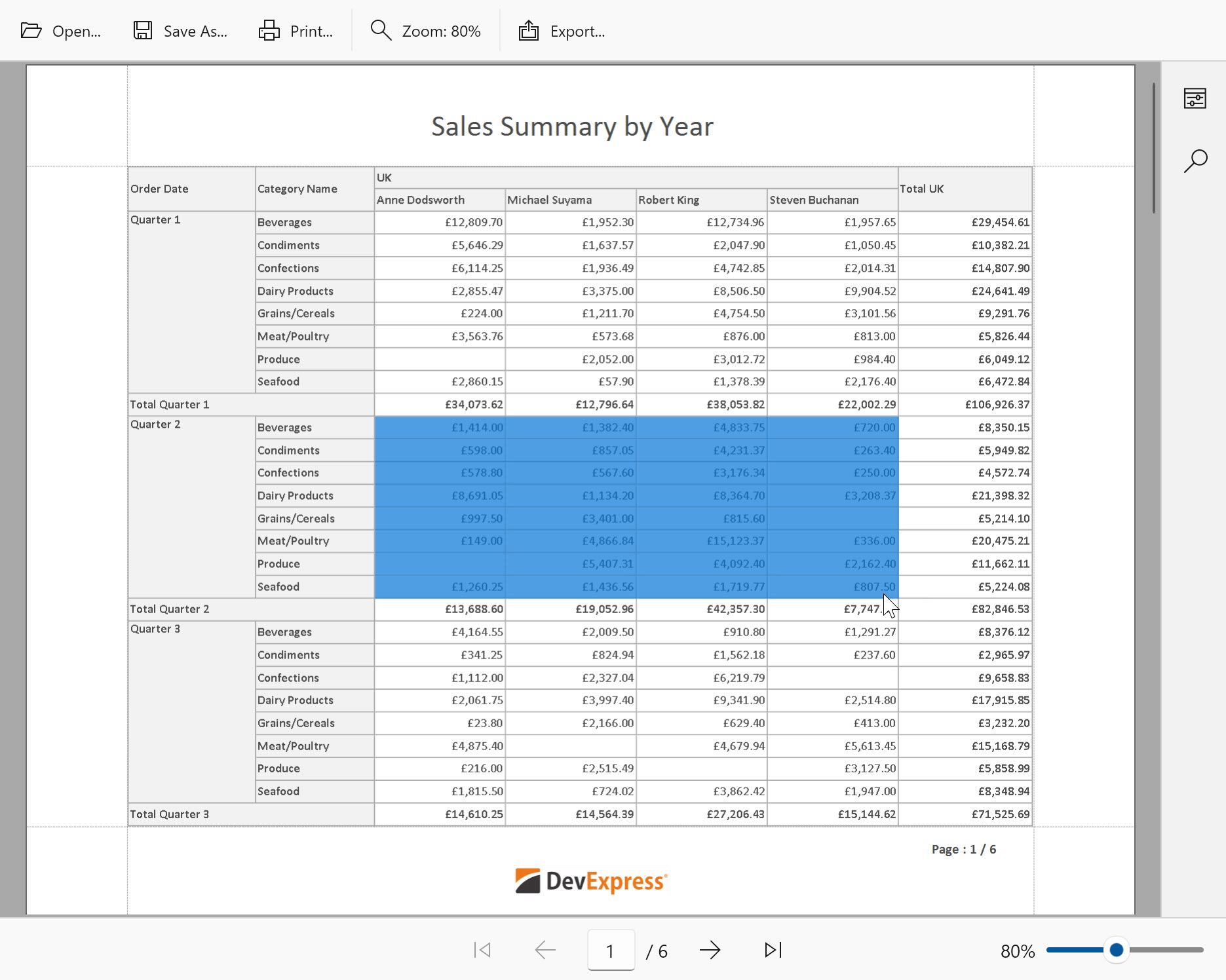
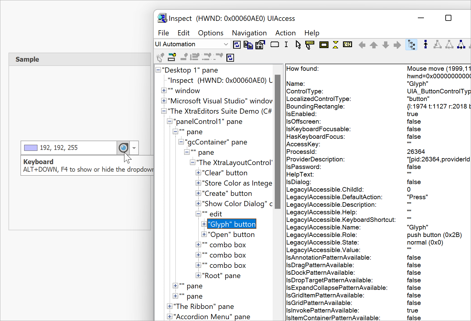
If stored procedures for your SQL database can return multiple data tables (result sets), we’ve got some good news for you. Our next major release (v22.1), allows you to retrieve all these tables as needed. The following image displays multiple tables from one stored procedure (ProductInfo) within the Field List:

Stored procedure with multiple data tables in the Field List
The tables have the following titles: Result1, Result2, ..., ResultN, where N is the number of tables that the stored procedure returns.

As you would expect, you can display data from each of these data tables within your report. To display data, set your report's Data Member property to the appropriate table (the table that includes the data you wish to display).

Specify a report's Data Member

Once set, you can drop the table fields from the Field List onto report bands.

Drop table fields onto the Detail band

Your report document will then display all records from the table:

Report preview

The same method works for any other data table from for these stored procedures (those with multiple data tables).

If you want to combine multiple stored procedure data tables into one table, simply use our Federation Data Source. If you wish to display data from all the tables successively in one report, follow the approach described in the following help topic: Bind a Report to Multiple Data Tables.

When you select a stored procedure in the Data Source Wizard, you can preview stored procedure execution results.

Preview of a stored procedure execution result

For stored procedures that return multiple data tables, the data preview window displays a drop-down menu with all available tables. Simply select the desired table to preview your data.

Preview of a stored procedure table

Note: If such a stored procedure accepts query parameters, the procedure is executed with values determined using the following rules:

  • if a query parameter is static, the actual static value is used;
  • if a query parameter is expression, the expression value is used;
  • if a query parameter is mapped to a report parameter, the report parameter's default value is used.

Support of the ODBC Driver for the Google BigQuery SQL Datasets

Our SQL Data Source supports multiple data providers and allows you to connect DevExpress .NET Reports with BigQuery datasets. Recently, Google released an official ODBC driver for these datasets, and we now allow you to leverage Google’s driver to connect DevExpress Reports-powered .NET reporting applications with BigQuery SQL datasets.

The release of Google’s ODBC driver means that we will no longer support/maintain our custom BigQueryProvider driver.

Our custom BigQueryProvider  driver only supports legacy SQL syntax, and since we won't fix any bugs, implement new features, and provide any support for this driver, we recommend that you install Google's official ODBC  driver for use with BigQuery datasets.

New Options for Configuring MongoDB Data Source Schema

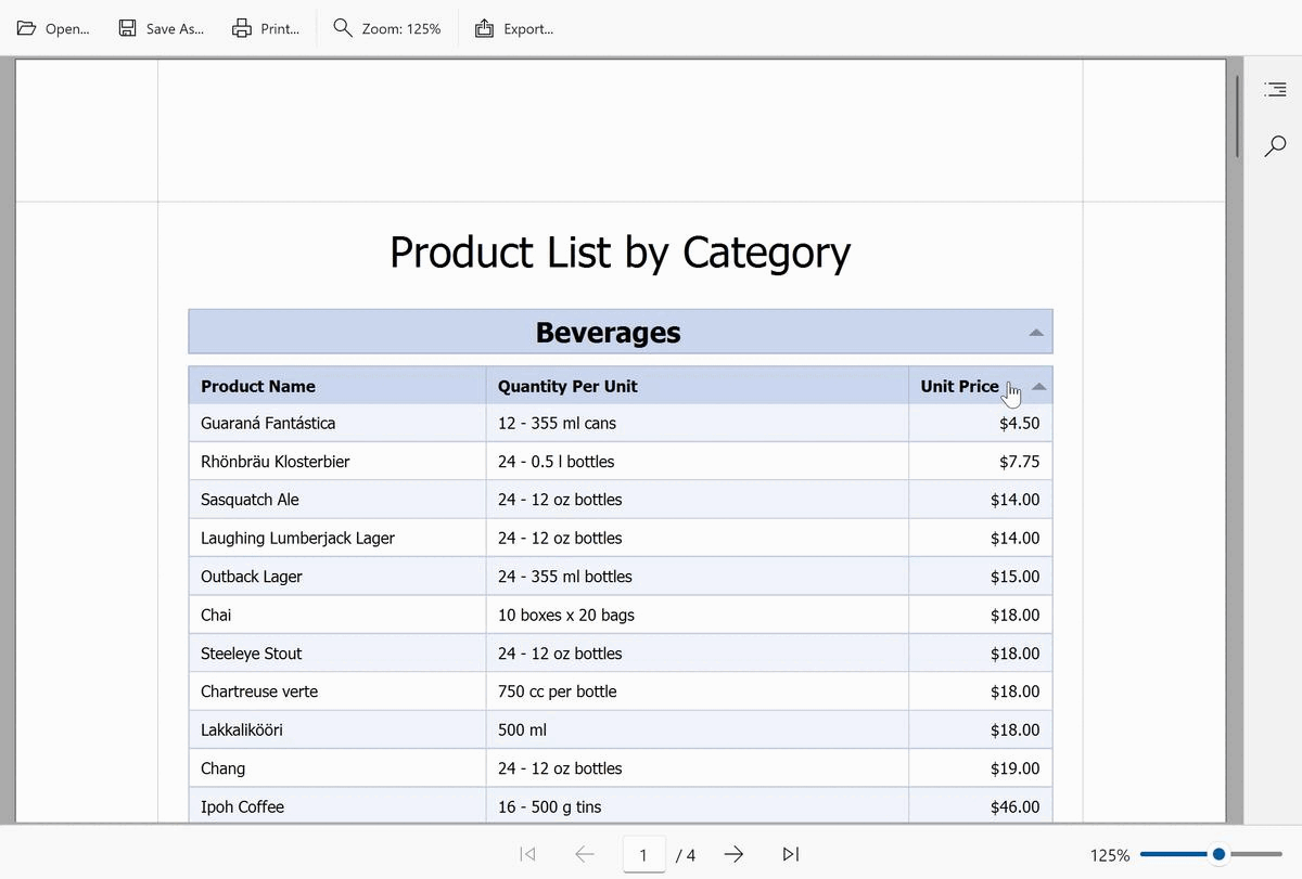
We added a new Select data fields page to our MongoDB Data Source Wizard.

The 'Select data fields' wizard page

This new page allows you to select the data fields that you wish to include in your MongoDB collection (and also change associated display names).

Use the drop-down menu to select the appropriate collection (the collection that includes the data fields you wish to configure).

Specify a query to configure

Enable or disable the checkbox in the Field Name column to include or remove a field from a collection.

Enable/disable a data field

Use editors within the Field Display Name column to change default field names.

Change field display name

Note: To generate field types and build its data source schema, the Data Source Wizard analyzes the first 100 documents (if the number of available documents is less than this default limit, the wizard analyzes all documents).

If the number of documents is greater than the default limit, the wizard page includes an Analyze all records button for your convenience (You can click this button to analyze all available documents instead of 100). Please keep in mind that a full analysis might be a time consuming process.

The 'Analyze all documents' button

Updated Manage Queries Dialog for the Federation Data Source

The Federation Data Source allows you to combine data from multiple data sources and apply operations such as UnionJoin, and Transforms to the federated data.

In certain cases, you might want to modify federated data after initial configuration. Use our Manage Queries dialog for this purpose (you can invoke the dialog from the Field List).

Invoke the 'Manage Queries' dialog from the Field List

With v22.1, you can add, modify, or delete queries when using our Manage Queries dialog.

The 'Manage Queries' dialog

Let's see some basic examples.

To rename a table, double-click the table name in the left menu and use the editor to change its name.
Change query name

To add a new query, click the Add button in the left menu.

Add a new query

Whether working with new or existing queries, you can execute the same operations as those available in our Query Builder. Please refer to the Data Federation section of our help file for more information on our Query Builder and federated data.

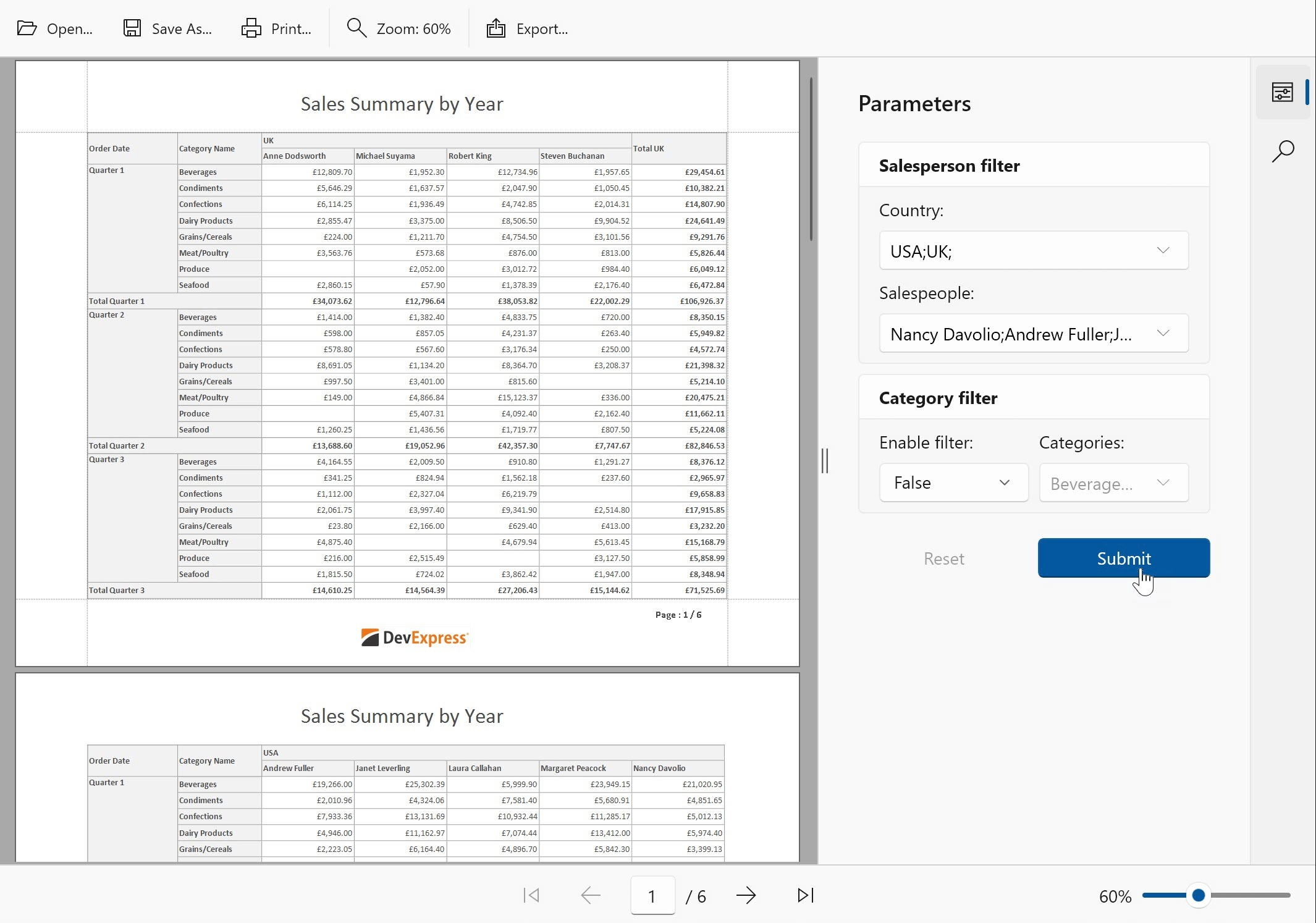
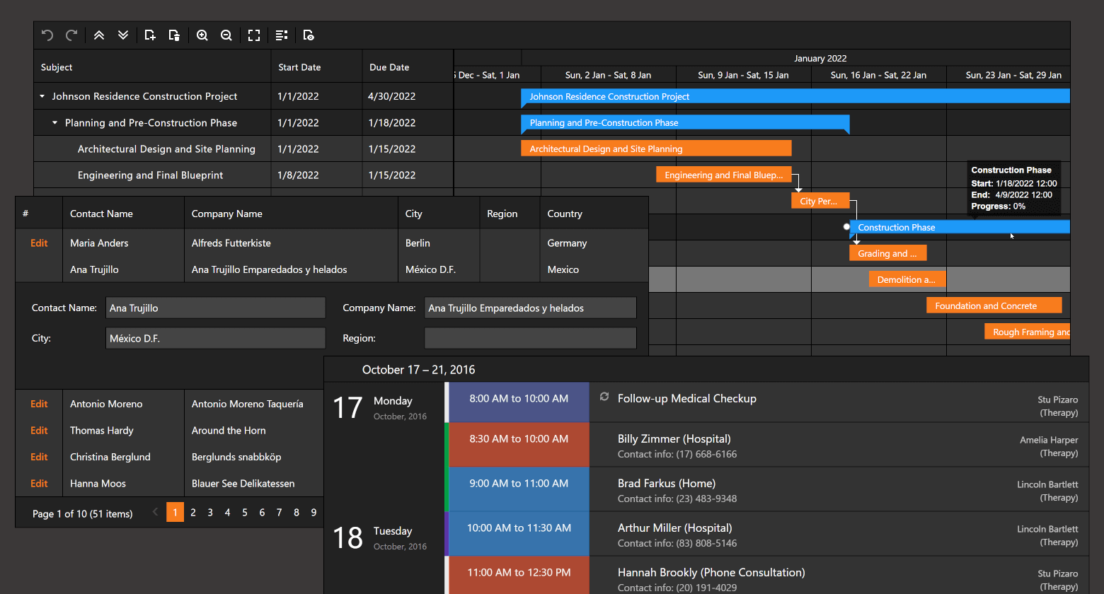
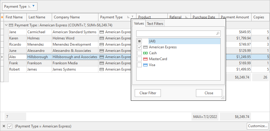
Database Level (Server-Side) Filtering of Cascading Parameters

DevExpress Reports allows you to create a report parameter (let's call it primary) and use it to filter values for a second parameter. These parameters are known as cascading parameters.

Cascading parameters example

With our most recent release (v22.1), you can filter the values of a secondary cascading parameter at the database level. In the above screenshot, the selected product category contains 15 items. In real-world applications, such a category might contain hundreds or even thousands of products or items. When this new feature is enabled, only filtered values are loaded into the memory. As you might expect, this helps reduce memory usage/allocation.

The following data source types support this new capability:

  • SQL Database (SelectQuery only)
  • MongoDB Instance
  • Entity Framework

If you want to apply a filter to the aforementioned data source types at the application level, simply disable the secondary cascading parameter’s DynamicListLookUpSettings.UseServerSideFiltering property. Note: For other supported data sources, cascading parameter filter operations are always applied at the application level.

Entity Framework Core 6 Support

For the Entity Framework Data Source, we supported Entity Framework (EF) Core 6.0 context class bound to Microsoft SQL Server.

Your Feedback Matters

We’d love to hear your thoughts on these new features. Have we addressed a specific business need? What additional data source-related feature would you like us to introduce in DevExpress Reports?


WinForms — Customize Accessibility Properties

$
0
0

In the past few release cycles, we have added a number of innovative features to the DevExpress WinForms product line, including:

While "modern" features such as these are highlighted on this community site, we rarely take time to discuss "basic" product features – capabilities crucial to the needs of our user base.

One such overshadowed, but extremely important (and constantly enhanced) feature is Accessiblity support. As you may know, our most recent major update (v22.1) includes a new DXAccessible.QueryAccessibleInfo event — a powerful feature that takes Accessibility customization or UIAutomation to a whole new level. In this post, I'll demonstrate a few Accessibility customization tasks that in the past could only be addressed through the use of descendants of internal WinForms classes.

Before We Start

For this post, I’ll retrieve Accessibility information for individual UI elements using Microsoft Inspect. Though Inspect may be outdated when compared to the Accessibility Insights application, it is still a powerful tool that can be used with perfect utility.

Inspect is a free tool included in the Windows SDK installation. Once installed, you can find the "inspect.exe" file in the C:\Program Files (x86)\Windows Kits\10\bin\sdk_build_version\x64 folder.

Magnifier Button

Run the Inspect tool and hover over the ColorEdit's Magnifier button (you can find a sample editor in the "Data Editors | Color Edit" demo module). If you're wondering how to enable this button in your editors, please refer to the following help topic: Magnifier Behavior.

As you can see in Inspect, the accessible button name is "Glyph". This is the name read aloud by Accessibility clients, such as Windows Narrator, and it gives no indication of what the button actually does.

To fix this issue and assign a more sensible accessibility name, handle the new QueryAccessibleInfo event as shown below.

using DevExpress.Accessibility;

public MyForm() {
    InitializeComponent();
    // ...
    DXAccessible.QueryAccessibleInfo += (s, e) => {
        if (e.OwnerControl == this.colorEdit1 && e.Name == "Glyph")
            e.Name = "Magnifier";
    };
}

Grid Row Names

Switch to the "Inplace Grid Cell Editors" module of the same demo and inspect Grid cell names. The Accessibility tree looks like the following:

Rows are called simply "Row 1", "Row 2", "Row 3", and so on. Cell names are "Editor Name Row N" and "Value row N". While these names give users a vague understanding of current mouse pointer location, the QueryAccessibleInfo event allows us to specify more accurate row and cell names.

using DevExpress.Accessibility;

DXAccessible.QueryAccessibleInfo += (s, e) => {
    if (e.OwnerControl == gridControl1) {
        if (e.Role == AccessibleRole.Cell) {
            if (e.Name.StartsWith("Editor Name"))
                e.Name = "Editor Name";
            else if (e.Name.StartsWith("Value"))
                e.Name = e.AccessibleObject.Parent.GetChild(0).Value + " Value";
        }
        if (e.Role == AccessibleRole.Row)
            e.Name = e.AccessibleObject.GetChild(0).Value + " Row";
    }
    /* For builds of v22.1.3 and older
    if(e.Role == AccessibleRole.ListItem && e.Name.StartsWith("Row"))
        e.Role = AccessibleRole.Row;
    if (e.Role == AccessibleRole.Row)
        e.Name = e.AccessibleObject.GetChild(0).Value; */
};

The commented block is required for v22.1.3 and older builds because the AccessibleRole of Grid rows incorrectly returned "ListItem" in these versions. We have fixed this issue in our latest build (in addition to numerous other fixes implemented earlier).

Hierarchical Accessibility Data

The final example is a bit more complex. The figure below illustrates data retrieved by Inspect from our "Tree List | Banded Layout" demo. The result is similar to what we saw in the previous Grid example: node and row names are in a simple "Object N" format.

Let's amp up these default names by merging parent and child Tree List node names. For instance, if a user hovers over the root "Sun" node, the Accessibility name should be "Sun star". Hovering over the Jupiter node should return the name of a planet plus the name of its main solar system star: "Jupiter planet Sun star". The complete name of planet satellites will then be in the following format: "Io satellite Jupiter planet Sun star". Here's an image that illustrates what we're trying to achieve.

With Accessibility names like these, users will never get lost in the complex hierarchy of banded nodes. To set these names, we will require the same QueryAccessibleInfo event, plus a custom method that receives a node and starts moving upwards until it reaches the topmost parent node, merging node names in the process.

using DevExpress.Accessibility;

public MyForm() {
    InitializeComponent();
    // ...
    DXAccessible.QueryAccessibleInfo += (s, e) => {
        if (e.OwnerControl == treeList1) {
            if (e.Role == AccessibleRole.OutlineItem && e.Owner is TreeListNode)
                e.Name = GetNodeAccessibleName((TreeListNode)e.Owner);
        }
    };
}

// Obtain the topmost parent and merge all parent node names
string GetNodeAccessibleName(TreeListNode node) {
    TreeListNode currentNode = node;
    string name = "";
    while (currentNode != null) {
        if (name != "")
            name += " ";
        name += currentNode.GetDisplayText("Name");
        name += " " + currentNode.GetDisplayText("TypeOfObject");
        currentNode = currentNode.ParentNode;
    }
    return name;
}

This code sample does the trick, but we've only modified node names. Cells still return names like "Mass row 1" or "Volume row 5". The problem here is that we cannot modify cell names right away, since we have no means to identify which node owns the current cell. Event properties do not offer us this information. But here's a trick: if you add a breakpoint in the GetNodeAccessibleName event handler and call the e.GetDXAccessible<BaseAccessible>() method, you can get a descendant of our internal BaseAccessible class that returns information about UI elements. In the case of Tree List cells, the descendant is TreeListAccessibleRowCellObject.

We normally recommend that you avoid using API of internal classes since we do not guarantee compatibility with future versions (so don't tell anybody that I shared this trick with you), but if you go the class definition (F12 in Visual Studio), you will see that TreeListAccessibleRowCellObject implements the IGridItemProvider interface from the System.Runtime.InteropServices namespace. It is safe to assume this interface is stable and is not subject to future change. As such, we can utilize its Column and Row properties to identify the parent of our current cell.

using DevExpress.Accessibility;
using DevExpress.UIAutomation;

DXAccessible.QueryAccessibleInfo += (s, e) => {
    if (e.OwnerControl == treeList1) {
        // ...
        if (e.Role == AccessibleRole.Cell && e.GetDXAccessible<BaseAccessible>() is IGridItemProvider) {
            string cellName = GetCellAccessibleName((IGridItemProvider)e.GetDXAccessible<BaseAccessible>());
            if (cellName != null)
                e.Name = cellName;
        }
    }
};

string GetCellAccessibleName(IGridItemProvider gridItemProvider) {
    TreeListNode node = treeList1.GetNodeByVisibleIndex(gridItemProvider.Row);
    if (node != null && treeList1.Columns[gridItemProvider.Column] != null)
        return GetNodeAccessibleName(node) + " " + treeList1.Columns[gridItemProvider.Column].Caption;
    return null;
}

The figure below illustrates the final result (individual cell elements are highlighted).

Tell Us What You Think

The QueryAccessibleInfo event is a great customization option, but it's only a fraction of Accessibility-related features we delivered in v22.1. We have not called it a day and intend to evolve Accessibility-related features in future builds.

Please take a moment to answer the following question so we can better understand your business needs in this regard.

WinUI Charts — API Enhancements in v22.1

$
0
0

With our v22.1 release, the DevExpress WinUI Chart Control ships with a lightweight API hierarchy to help simplify discoverability. Said simply, we revised the Chart Control’s public API structure and decreased API member nesting levels. We also think our API is more intuitive and MVVM-friendly.

In this blog post, I’ll demonstrate the new settings you’ll need to use to modify the Chart Control.

Axes

First, we removed the AxisBase.AxisLabelOptions property and the respective class itself: The following label properties are available at the AxisBase class level:

The same kind of change was applied to the AxisBase.AxisTitle property and the AxisTitle class. You can now use the following AxisBase class properties to set up a chart’s title options:

We also hid WholeAxisRange and VisualAxisRange classes from the public API. As such, the following API members (used to define both Visual and Whole ranges) are now available at the AxisBaseclass level:

Series

Given the nature of changes we applied to Axes APIs, we used the same pattern for Series.

Properties required to set up Series Label options and Titles for Pie and Funnel view were moved to the base SeriesView class and its descendants for a series. The SeriesView class now features the following API members:

To set up titles for Pie and Funnel views you must now use the following properties:


Finally, the following properties have changed from attached to regular: 

Series Hierarchy Changes

With this release, we also modified the way in which Series are used in the Chart Control. A simple rule to remember is that series type now relies on the Chart Control.

Examples below:

CartesianChart– Use CartesianSeries descendants with this chart. For example, the Series class allows you to add a common XY series that takes one value per argument. See the following help topic for more information: CartesianChart - Series and Series Views.

FunnelChart– Use FunnelSeries objects with this chart. See the following section for more information: FunnelChart - Series and Series Views.

PieChart– Use PieSeries objects with this chart. See the following section for more information: PieChart - Series and Series Views.

This API change will allow us to introduce new series types that require two or more values per argument in the future. For example, when we introduce financial series to our WinUI Chart library, we will need four values ("Open", "High", "Low", and "Close") per argument.

Series View Hierarchy Changes

We’ve also revised the hierarchy of available series and removed some series-specific classes like StackedBarSeriesView or DonutSeriesView. For a complete list of classes, please review the following breaking change document: WinUI Charts - Some series view classes have been removed.

The following diagram demonstrates our new series view hierarchy:

Now, if you’d like to create Stacked or Step charts, you need to use the following properties: 

To create donuts and nested donuts, use the PieSeriesView class properties:

Refer to the following help topic for a full list of available series views: Charts Gallery.

Data Source Adapter Changes

To simplify data source initialization, we renamed the DataSourceAdapter class to DataSource and simplified data source assignment. With v22.1, you only need to specify ArgumentDataMember and ValueDataMember properties and disregard DataMemberobject creation:

v21.2

<Charts:Series.Data>  
    <Charts:DataSourceAdapter DataSource="{Binding ItemsSource}">       
            <Charts:DataMember DataMemberType="Argument"   
                               ColumnName="PointArgument" 
                               ScaleType="DateTime"/>  
            <Charts:DataMember DataMemberType="Value"  
                               ColumnName="PointValue" 
                               ScaleType="Auto"/>   
    </Charts:DataSourceAdapter>  
</Charts:Series.Data> 

v22.1

<Charts:Series.Data> 
    <Charts:DataSource PointSource="{Binding ItemsSource}" 
                       ArgumentDataMember="PointArgument" 
                       ValueDataMember="PointValue"/> 
</Charts:Series.Data> 

Data Source & Points

DataPointCollection and DataPoint classes are used to supply static data list to a chart. We renamed these to PointDataCollection and PointData (to follow API naming conventions). 

As you can see from the code snippet above, you can now use the DataSource object along with the PointDataCollection list to initialize series data: 

We also introduced a base class for point data classes - PointDataBase. The motivation for this change is to create point data entities for new series types in future release cycles. We migrated the following properties from PointData to PointDataBase

Create Series - MVVM Style

You can now create chart series from a collection of view models with the help of the ChartBase.SeriesSource property. The ChartBase.SeriesItemTemplate and ChartBase.SeriesItemTemplateSelector properties allow you to convert a model object to a series.

Here’s a sample:

<UserControl 
    x:Class="ChartsDemo.SeriesSourceDemo.View"
xmlns="http://schemas.microsoft.com/winfx/2006/xaml/presentation" 
    xmlns:x="http://schemas.microsoft.com/winfx/2006/xaml" 
    xmlns:local="using:ChartsDemo.SeriesSourceDemo" 
    xmlns:dxc="using:DevExpress.WinUI.Charts"> 
        <DataTemplate x:Key="LineSeriesTemplate" x:DataType="local:SeriesViewModel"> 
            <dxc:Series DisplayName="{x:Bind Name}"> 
                <dxc:Series.View> 
                    <dxc:LineSeriesView 
                        ShowMarkers="True" 
                        Brush="{x:Bind ColorIndex, Converter={StaticResource seriesBrushConverter}}" 
                        ToolTipPointPattern="{}{A}: ${V}K" 
                        LegendMarkerTemplate="{StaticResource LineSeries_LegendMarkerTemplate}" /> 
                </dxc:Series.View> 
                <dxc:Series.Data> 
                    <dxc:DataSource 
                        PointSource="{x:Bind DataSource}" 
                        ArgumentDataMember="Category" 
                        ValueDataMember="SalesVolume" /> 
                </dxc:Series.Data> 
            </dxc:Series> 
        </DataTemplate> 
        <DataTemplate x:Key="BarSeriesTemplate" x:DataType="local:SeriesViewModel"> 
            <dxc:Series DisplayName="{x:Bind Name}"> 
                <dxc:Series.View> 
                    <dxc:BarSeriesView Brush="{x:Bind ColorIndex, Converter={StaticResource seriesBrushConverter}}" ToolTipPointPattern="{}{A}: ${V}K" /> 
                </dxc:Series.View> 
                <dxc:Series.Data> 
                    <dxc:DataSource 
                        PointSource="{x:Bind DataSource}" 
                        ArgumentDataMember="Category" 
                        ValueDataMember="SalesVolume" /> 
                </dxc:Series.Data> 
            </dxc:Series> 
        </DataTemplate> 
        <local:SeriesTemplateSelector 
            x:Key="selector" 
            LineSeriesTemplate="{StaticResource LineSeriesTemplate}" 
            BarSeriesTemplate="{StaticResource BarSeriesTemplate}" /> 
    </UserControl.Resources> 
    <Grid> 
        <Grid.RowDefinitions> 
            <RowDefinition Height="Auto" /> 
            <RowDefinition Height="*" /> 
        </Grid.RowDefinitions> 
        <TextBlock 
            Text="Sales Volume (Thousands of USD)" 
            FontSize="18" 
            HorizontalAlignment="Center" 
            TextWrapping="WrapWholeWords" 
            Margin="10" /> 
        <dxc:CartesianChart 
            Grid.Row="1" 
            SeriesSource="{x:Bind ViewModel.Series}" 
            SeriesItemTemplateSelector="{StaticResource selector}" 
            SelectionMode="None" 
            ToolTipEnabled="True" 
            Margin="100,0,100,0"> 
        </dxc:CartesianChart> 
    </Grid> 
</UserControl>

Your Feedback Matters

We would love to know what you think of these WinUI-related enhancements and the changes to our WinUI Chart Control’s API.

Reporting — Report Design Analyzer Enhancements (v22.1)

$
0
0

As you may already know, the End-User Report Designer (for WinForms, WPF, and web platforms) that ships as part of the DevExpress Reports, integrates a built-in Report Design Analyzer  a tool that helps you and your end users detect and fix issues within a report.

Report Design Analyzer
If you are not familiar with our Report Design Analyzer, please refer to the following blog post: Reporting – Avoid Mistakes in Report Creation with The Help of Report Design Analyzer (v21.1).

We’ve received lots of great feedback since the release of the analyzer, and based on your requests/comments, we’ve introduced a few new features/capabilities in our v22.1 release cycle.

API for Configuring Analyzer Default Settings

Prior to v22.1, you and your end users could configure only a limited set of analyzer settings – via our UI. For example, you (users) could specify an error source (layout, creation, scripts), so that the analyzer displays only those messages that belong to this source. Additionally, you could enable/disable specific error message types (errors, warnings, information).

Since our default configuration did not always address application requirements (or needs to be modified prior to the first application run), we’ve introduced the ability to configure default analyzer settings in code.

Namely, in v22.1 we introduced an API (the DesignAnalyzerOptions class) to specify custom default settings for the analyzer. For example, you can now enable/disable the following analyzer elements:

  • messages that belong to a particular error source (group);
  • error codes, so that the analyzer does not show messages associated with these codes;
  • links that navigate users to detailed error code descriptions;
  • ... and more.

Some of these options can be configured via the UI and in code, while others are only available in code. The sections below offer a brief glimpse into our new API and document the analyzer’s newest capabilities.

Access Analyzer Default Settings

You can use the DesignAnalyzerOptions class to configure the analyzer within the End-User Report Designer for all supported desktop (WinForms and WPF) and web platforms. To change default settings, access the class instance in a method called at application startup and specify instance properties:

using DevExpress.XtraReports.Configuration;
//...

Settings.Default.DesignAnalyzerOptions.ShowErrors = false;

In reporting applications with ASP.NET Core backend, change the default settings as follows:

public void Configure(IApplicationBuilder app, /* ... */ ) {
    //...
    
    app.UseReporting(x => {
        x.DesignAnalyzerOptions.ShowErrors = false;
    });

    //...
}

Filter Messages by Error Source

Based on source, report errors are divided into four groups:

  • Report layout errors: These occur if report controls overlap one another or extend beyond the report’s printable area.

  • Report creation errors: These occur while the report document is created. It may involve errors related to invalid property values or unreachable sources of content.

  • Report export errors: These occur while the report document is exported to PDF, XLSX, and other file formats.

  • Report scripts errors: These are associated with script syntax errors.

Our default error source configuration will appear as follows:

Report Design Analyzer - Default error source configuration
Since report scrips are disabled in the default End-User Report Designer configuration for .NET/.NET Core projects,  script errors are not displayed. Refer to the following article for more information: Use Report Scripts.

Use the following properties to disable error messages for a specific error source:

The following code sample disables report layout and report export messages:

using DevExpress.XtraReports.Configuration;
//...  

Settings.Default.DesignAnalyzerOptions.EnableReportLayoutErrorSource = false;
Settings.Default.DesignAnalyzerOptions.EnableReportExportErrorSource = false;

If you apply these changes, the analyzer's default error source list will appear as follows:

Report Design Analyzer - Custom error source configuration

Filter Messages Associated with a Specific Error Code

Each analyzer message is associated with a unique error code. You can disable error codes, so that the analyzer does not display messages associated with each code. Let's take a look at some instances when this capability might be of value.

If your report contains overlapped controls, the End-User Report Designer highlights the controls and also displays warning messages. In other words, warning notifications come from two sources (which might introduce redundancy).

Report Design Analyzer - Overlapped controls, error notifications from two sources
To avoid this redundancy, suppress the XRE004 error code or disable highlighting for overlapped controls (set the DesignerOptions.ShowExportWarnings property to false).

Here is another use case: Assume you have expression bindings in your report but specify the data source at runtime. In this instance, error code XRE023 will appear for each control property that references a field from the data source. In this situation, it's appropriate to suppress this code.

To disable a message associated with a specific error code, add the code to the SuppressedErrorCodes collection. In the following code sample, we suppress both XRE004 and XRE023 error codes:
using System.Collections.Generic;
using DevExpress.XtraReports.Configuration;
//...

var suppressedErrorCodes = new List<string> { "XRE004", "XRE0023" };
Settings.Default.DesignAnalyzerOptions.SuppressedErrorCodes = suppressedErrorCodes;

Filter Messages by Error Type

As I already mentioned, the Report Design Analyzer displays "Error", "Warning", and "Information" message types. Using our new API, you can disable any of these message categories. The following code sample disables both "Error" and "Warning" message types.

using DevExpress.XtraReports.Configuration;
//...

Settings.Default.DesignAnalyzerOptions.ShowErrors = false;
Settings.Default.DesignAnalyzerOptions.ShowMessages = false;

The following is an image of the analyzer with disabled error and warning message types (Errors and Warnings panes are inactive):

Report Design Analyzer - Errors and Warnings messages are disabled

The properties above allow you to specify the default configuration in code - but after the End-User Report Designer is invoked you can also enable/disable specific messages types via the UI by clicking the corresponding pane.

For more information on this new capability, please review the following properties:

Navigate to Error Code Descriptions from the End-User Report Designer

You can now enable code links for error codes (so that you and your end users can click an error code and navigate to the appropriate DevExpress help topic and determine the underlying cause of the error).

The following image illustrates this feature within the DevExpress Web End-User Report Designer:

Report Design Analyzer in the Web End-User Report Designer
Set the EnableErrorCodeLinks property to true to enable error code links.

Show/Hide an Error Notification Popup in Preview

When you open a report Preview, report document generation begins, and certain errors may arise during this process. In these instances, the Report Design Analyzer displays a notification popup:

Preview - Error notification popup
If you don't want to display this popup for end users, simply set  ShowNotificationPopup to false.

New Export Error Notification Messages for End-Users

We added two new messages (XRE230 and XRE270to help you and your end users detect and fix issues related to report export operations. 

Messages associated with the XRE230 error code appear when a report layout contains overlapped controls and the document cannot be exported to Excel correctly.

Messages associated with the XRE270 error code appear if your report document contains elements that span across multiple pages and the document cannot be exported to RTF, DOCX, or Excel correctly.

Your Feedback Matters

Do you find the implemented features useful in your application and helpful for your end users? Which other customization capabilities for the Report Design Analyzer do you want to see in the future?

WinForms — Deprecation of the MaskBox Property

$
0
0

In our v20.2 release cycle, we announced the availability of our Advanced Text Editors mode. Advanced Text Editor mode introduced a number of high-impact features including caret/selection animation support and embedded text labels. Our release announcement detailed future plans and our intention to make this the default editor mode once all reported issues were addressed. Though we have yet to make this the default mode, our newest WXI skin is a big step towards this objective.

As you may already know, all text editors switch to this Advanced Mode when the WXI skin is active. Tinted text selection may have been a clue in this regard, but it certainly wasn't the only reason for the switch-over. In the new WXI skin, editors utilize additional background elements that correspond to different editor states. More elements mean additional client area and bounds calculations, increased border and content drawing logic, and an increase in overall complexity. Solving these challenges in standard mode would've produced side effects and artifacts. Accordingly, we made the decision to leverage the power of Advanced Mode to resolve these issues.

The use of Advanced Mode within the WXI skin prompted internal discussions that revolved around the compatibility of legacy code (code written specifically for legacy, non-Advanced editor mode). First and foremost among the areas of concern was the MaskBox property. This property allows you to obtain a standard WinForms text box control (the foundation of the DevExpress WinForms TextEdit editor). Since TextEdits in Advanced Mode are complete custom controls and no longer based on standard TextBoxes (see this initial post for more information: WinForms TextEdit — New v20.2 Features), the MaskBox property for these editors returns null (Nothing in VB.NET).

We analyzed numerous Support Center questions in search of real-life use cases that required access to the standard text box via the MaskBox property. Based on our research, the majority of these cases fall into one of the two main categories: autocomplete and text processing (including custom input masks).

Text Auto Completion

Autocomplete functionality is now available via native TextEditor API. To introduce autocomplete, set the Editor.AdvancedModeOptions.AutoCompleteSource property to specify whether the editor suggests entries from your custom data source or an auto-populated source (recent items, URLs from the history list, system file and folder names, etc). You’ll need to specify the appropriate mode (Suggest, Append, a combination of both, or SuggestSingleWord), and assign your custom data source (if you selected CustomSource auto-complete mode).

using DevExpress.XtraEditors;

void OnFormLoad(object sender, EventArgs e) {
    var DaysOfTheWeek = new AutoCompleteStringCollection();
    DaysOfTheWeek.AddRange(new string[]
      {"Monday", "Tuesday", "Wednesday", "Thursday", "Friday", "Saturday", "Sunday"});

    textEdit1.Properties.UseAdvancedMode = DevExpress.Utils.DefaultBoolean.True;
    textEdit1.Properties.AdvancedModeOptions.AutoCompleteMode =
        TextEditAutoCompleteMode.SuggestAppend;
    textEdit1.Properties.AdvancedModeOptions.AutoCompleteSource =
        AutoCompleteSource.CustomSource;
    textEdit1.Properties.AdvancedModeOptions.AutoCompleteCustomSource = DaysOfTheWeek;
 }

See this help article for more information on how to set up the autocomplete functionality in text editors: Text Auto Completion.

Masks and Text Processing API

In previous release cycles, we introduced a series of methods to help obtain and modify editor text:

These methods are identical to standard TextBox methods, for instance TextBoxBase.GetCharFromPosition(Point). If you retrieved the standard TextBox to utilize its methods, you can now use native TextEdit API to obtain the same result.

As for low-level input masks, we recently added the EnableCustomMaskTextInput method. This method allows you to manually track user actions and assign editor values as needed.

For example, if you need to limit the number of bytes entered by a user, previous versions required you to implement a custom TextEdit descendant with an overridden TextEdit.CreateMaskBoxInstance method, which accepted custom TextBoxMaskBox objects. User input would then be handled by this custom class.

With our EnableCustomMaskTextInput method, you no longer need any inheritance logic. All you need is to check byte length directly in the assigned callback.

using DevExpress.Data.Mask;

int m_maxByteLength = 5;

textEdit1.Properties.EnableCustomMaskTextInput(args => {
    // Do nothing if no edits were made
    if (args.IsCanceled || args.ActionType == CustomTextMaskInputAction.Init)
        return;

    if (GetByteLength(args.ResultEditText) > m_maxByteLength) {
        args.Cancel();
        return;
    }
    args.SetResult(
        args.ResultEditText, args.ResultCursorPosition, args.ResultSelectionAnchor);
});

int GetByteLength(string text) {
    return System.Text.Encoding.Default.GetBytes(text).Length;
}

MaskBox Deprecation

To sum up, our updated TextEdit API allows you to address all popular usage scenarios that previously required the use of the MaskBox property. This means that we can now deprecate this property. This isn't to say we're going to remove this property entirely, and render your existing code invalid. Rather, we now consider all MaskBox-related scenarios obsolete and will recommend the use of our native editor API instead.

If you are currently using the MaskBox property for a use-case scenario that cannot be implemented via the TextEdit's Advanced Mode API, please contact us via the DevExpress Support Center or use the text field below. We will do our best to address your requirements.

Your Feedback Matters

Reporting — Conditional Cell Visibility, New Summaries, and HTML-Inspired Text Formatting for Cross-Tab (v22.1)

$
0
0

As you may know, our Cross Tab Report control was first introduced in October 2019. The Cross Tab Report control was designed to address limitations in our Pivot Grid control and to enhance overall cross-tab reporting capabilities with DevExpress Reports

From the beginning, the Cross Tab Report control could create cross tab reports in a few easy steps via our integrated wizard, edit cross tab elements directly within the DevExpress Report Designer, customize cell contents with expressions, and much more…

To help address key usage scenarios (based on customer feedback), our most recent major release (v22.1) ships with a number of enhancements — features designed to augment the capabilities of the DevExpress Cross Tab Report control.

Hide Cells by Condition

Cross Tab Cells now support expression bindings for the XRCrossTabCell.ColumnVisible and XRCrossTabCell.RowVisible properties. The properties are bindable for all cross tab field areas: rows, columns, and data cells. You can hide rows, columns, and totals based on a condition, all without a single line of code. 

Example 1: Hide a column based on another column value

In this example, we will hide the Count column if the Required column value is False. The initial cross tab is pictured below:  


To hide the Count column when the Required column value is False, select the row total cell for the Count  column, click the f button to activate the Expression Editor, and specify the following expression for the ColumnVisible property: 

[Required] == True

With this modification, the report will be rendered as follows:

Example 2: Hide a row when a column value is empty

The Cross Tab control displays empty cells in the following cases:  

  • The data source contains no records for a column. 

  • The data source contains NULL values for a column.  

Our goal is to hide the cross tab rows if the Required cell in this row is empty. To achieve this, we must specify the following expression for the RowVisible property of the Required Column Grand Total cell: 

[Required] > 0

With this modification, the report will be rendered as follows:

Html-Inspired Text Formatting

In v22.1, Cross Tab cells include a XRCrossTabCell.AllowMarkupText property. Once enabled, this property allows you to use HTML-inspired tags to format data displayed within cells. 

The following formatted string aligns the text to the center of the header cell, applies the Red color to the first line, and appends a new line with a smaller font: 

<p align="center"><color=red>Count</color><br><size=-3>The number of values</size></p>

Here’s the result:

You can use HTML-inspired tags in a cell Text expression. For example, the following expression highlights the count in Yellow when the value is greater than 5. 

IIF([QtyCount] > 5, '<backcolor=yellow>' + [QtyCount] + '</backcolor>', [QtyCount]) 
The Image tag allows you to display images in Cross Tab cells. 

To display images, add images to the XtraReport.ImageResources collection. Specify an expression for a cell Text property and assign the ImageItem.Id to the Image tag

IIF([QtyCount]>[QtyCountDistinct],[QtyCountDistinct] + '<image=downarrow;size=16,16>', [QtyCountDistinct])


Optimized Calculation Engine and New Summary Functions

With this release, the Cross Tab control runs a more optimized calculation engine inherited from the WinForms PivotGrid control.

Migration to the optimized calculation engine allowed us to extend the control's summary function set. CountDistinct, Median, and Mode summary functions are now available. The following report displays a Cross Tab control which calculates various summaries and a tabular report which displays the same data grouped by Year. 


If you'd like to learn more about these new features, please refer to the following sample project: Reporting - CrossTab Control Customization.  

Your Feedback Matters

Please take a moment to answer the following question. Your vote will help us fine tune our Cross Tab-related development plans.


Web Forms & MVC Data Grid — Multiple Cell Selection (v22.1)

$
0
0

Our most recent update introduced multi cell selection support to the DevExpress Web Forms and MVC Grid View, Vertical Grid, and Tree List controls. This new feature allows users to select a cell range by hovering the mouse over the control - then copying the range (and pasting it into grid cells, external controls, or Microsoft Excel).

To enable multi cell selection in your DevExpress-powered WebForms or MVC app, set edit mode to Batch and the EnableMultipleCellSelection property to true.

<dx:ASPxGridView ID="Grid" runat="server" DataSourceID="DemoDataSource"  KeyFieldName="ProductID">
    <SettingsEditing Mode="Batch">
        <BatchEditSettings EnableMultipleCellSelection="true" />
    </SettingsEditing>
</dx:ASPxGridView>

Available Interactions

This new feature allows users to select values as they would in Microsoft Excel. Specifically, multi-select allows users to:

  • Select multiple cells via a pointing device or the keyboard.

  • Use our built-in context menu and shortcuts (Ctrl+C, Ctrl+V) to copy/paste cell values.

  • Copy and paste selected cells in the same grid, or in a spreadsheet document.

  • Copy values and paste them in all selected cells.

Cell Selection API

The following API allows you to integrate cell selection within your WebForms and/or MVC app:

  • The SelectCell method selects a cell.
  • The UnselectCell method deselects a cell.
  • The GetSelectedCells method obtains information about the selected cells.
  • The CellSelectionChanging event fires when a user selects or deselects a cell.

To explore this feature in greater detail, navigate to the following online demo: Multiple Cell Selection

Your Feedback Matters

Do you find the multi cell selection features useful in your application and helpful for your end users? Which other customization capabilities for the DevExpress ASP.NET Data Grid do you want to see in the future?

WPF Editors Library — Upcoming Features (v22.2)

$
0
0

In this blog post, I’ll summarize WPF Editors Library-related features we expect to ship in our next major release cycle (v22.2). As always, we welcome your feedback. Responses to the survey questions within this post will help us fine tune our development plans.

New WPF BrowsePath Editor Control

Over the last few years, users have asked to deliver a UI control that can address a straightforward requirement: select a file or folder and pass the result to the editor. Though you can implement this capability using our WPF Button Edit and custom code, it can take time to implement a complete feature set that incorporates the following:

  • File and folder icons loaded from the file system
  • Drag & Drop support - ability to drag a file from the file system and obtain the file path in the editor
  • A Clear button displayed next to the selected path

We expect to implement these features and adapt our WPF BrowsePath Editor for different usage scenarios:

  • Existing File Selection
  • Folder Selection
  • Selection of a non-existent file to use for a future save operation
Browse Path Editor

New DateRangeEdit Control

Undoubtedly, you’ve used date range selectors for flight departure/return dates, hotel stays, and date range values within a custom filter.

We expect to ship a WPF Date Range picker in our v22.2 release cycle. The editor will allow you to select a date range within a single popup, pass selection to the edit box and display it in an easy-to-read format.

To help us deliver the best possible solution/UI, we need your help with the following questions:

  • Should a user be able to edit text?
  • Should the editor display predefined ranges (day, week, month) within the popup?
  • Should the editor be switched to month selection mode when the month area is clicked?
  • Is an option to specify max selection range required?
  • Do we need to implement an option to automatically close the popup when the second date is selected?

Password Box - Show/Hide the Password Button

As the screenshot below illustrates, we expect to incorporate a show/hide button within our WPF PasswordBox.

Masks - Custom Rules, DateOnly, TimeOnly

Restrictions are not always bad. A mask is a great way to control data input/data integrity. We expect to extend our set of predefined masks and help you create custom rules from your own masks.

Advanced Masks

Even though we already ship a flexible mask engine, certain user scenarios are still hard to implement without writing custom logic. We expect to implement APIs to help you dynamically define rules applied to entered text.

DateOnly & TimeOnly Masks

As you may know, .NET 6 contains two new structures to represent date and time: DateOnly and TimeOnly. As the name suggests, DateOnly only contains a year, month, day value and TimeOnly only contains hour, minute, second and millisecond values. We expect to create new mask types to help edit these structures. Editors that use these masks will return DateOnly or TimeOnly instead of DateTime (to the bound object based on the applied mask).


Blazor Grid — Inline Row Editing (v22.1)

$
0
0

As you may already know, the DevExpress Blazor Grid (v22.1) ships with inline row editing support. In this post, I’ll summarize all 3 edit modes and describe how to introduce inline row editing within your Blazor-powered app.

Different Edit Modes

In previous versions of our Blazor Grid, you could select one of the following data edit modes:

  • EditForm— The Grid displays a standard edit form instead for the target row.

    blazor-grid-inline-edit-form
  • PopuEditForm— The Grid displays an edit form within a pop-up window.

    blazor-grid-popup-edit-form

You now have access to one more edit mode option — EditRow. If enabled, once the Edit button is clicked inside a grid row, all row values can be modified dynamically within grid cells. This option allows users to edit data directly within the grid (no need to open an edit form with multiple editors). The benefits of inline data editing include a more compact view. Users can also visually associate edits with specific grid columns.

Interactive Inline Row Editing Demo

Activate the New EditRow Mode

To activate this new mode, set the EditMode property to EditRow. Once set, you will need to specify the edit template used for row cells in one of two ways:

<DxGrid EditMode="GridEditMode.EditRow" ...>
  <DataColumnCellEditTemplate>
    @{
      var employee = (EditableEmployee)context.EditModel;
      switch (context.DataColumn.FieldName) {
        case "FirstName":
          <DxTextBox @bind-Text="@employee.FirstName"></DxTextBox>
          break;
        case "LastName":
          <DxTextBox @bind-Text="@employee.LastName"></DxTextBox>
          break;
        case "Title":
          <DxTextBox @bind-Text="@employee.Title"></DxTextBox>
          break;
        case "HireDate":
          <DxDateEdit @bind-Date="@employee.HireDate"></DxDateEdit>
          break;
      }
    }
  </DataColumnCellEditTemplate>
...
</DxGrid>
  • Use the CellEditTemplate to define an individual edit cell template for a column.
<DxGridDataColumn FieldName="FirstName">
  <CellEditTemplate>
    @{
       var employee = (EditableEmployee)context.EditModel;
     }
     <DxTextBox @bind-Text="@employee.FirstName"></DxTextBox>
  </CellEditTemplate>
</DxGridDataColumn>

Input Validation

Our Blazor Grid's new EditRow mode supports data validation. The Grid's built-in validation engine is based on DataAnnotationValidator. The Grid verifies input data for fields with data annotation attributes. When a user enters invalid data into a cell and navigates away (or attempts to save the edited row), DataAnnotationValidator marks an editor with an invalid value (using a red outline).

If you wish to display additional information about validation errors, you can obtain the validation message from the EditContext property. For example, the code below displays an error icon with a tooltip next to an invalid editor:

...
  <CellEditTemplate>
    @{
      var employee = (EditableEmployee)context.EditModel;
      var message = GetValidationMessage(context.EditContext);
    }
    <div class="d-flex align-items-center">
      <DxTextBox @bind-Text="@employee.FirstName" CssClass="w-100"></DxTextBox>
      @if(!string.IsNullOrWhiteSpace(message)) {
        <div class="grid-validation-message bg-danger" title="@message"></div>
      }
    </div>
  </CellEditTemplate>
...

Reusing Cell Templates

Once you configure data editors for your columns and specified validation error logic, you may wish to reuse your code in other Grids within your Blazor app. Those of you familiar with WPF know that cell templates there can be stored and reused as resources. In Blazor, the best way to reuse the UI is to create components (https://docs.microsoft.com/en-us/dotnet/architecture/blazor-for-web-forms-developers/components).

For Inline Editing, you can create components that implement the following functionality:

  • Define a common UI for the display of validation errors.

  • Create a component used as a cell editor by multiple columns of the same type (e.g., a currency editor).

  • Create a component used as a "fallback cell editor" if no other editor is defined for a column.

We prepared the following GitHub example to demonstrate this approach with Inline editing: Blazor Grid — Inline Editing and Cell Edit Templates.

Your Feedback Counts

Please take a moment to respond to the following survey question.

VCL Subscription – Upcoming Features

$
0
0

In this blog post, I'll summarize new VCL features we expect to ship in mid to late August. As always, thank you for your continued support.

The information contained within this blog post details our current/projected development plans. Please note that this information is being shared for INFORMATIONAL PURPOSES ONLY and does not represent a binding commitment on the part of Developer Express Inc. This blog post and the features/products listed within it are subject to change. You should not rely or use this information to help make a purchase decision about Developer Express Inc products.

Vector Icon Sets for Auto Generated Ribbon and Toolbar UIs

Vector icons are an integral part of modern, high-DPI interfaces. With this update, you'll be able to incorporate vector icons into your auto generated Ribbons and Toolbars (for use within our Spreadsheet, Rich Edit, Scheduler, and PDF Viewer controls).

We've shipped vector icons as a part of our Icon Library for quite some time. With this update, we'll introduce a new "Use SVG Icon Set" option in the Generate Ribbon/Toolbar UI design-time dialog (available for all supported DevExpress VCL products). This option replaces the predefined bitmap icon set with a corresponding set of SVG icons. I hope this particular enhancement will save everyone time as you transition from bitmaps to SVG icons.

Support for BBCode-inspired Formatting Tags in the Alert Window Manager and Hint Style Controller

BBCode-inspired tags allow you to use limited text formatting within controls that do not support RTF strings and other text formatting options. We already support BBCode-inspired format tags in formatted label controls, layout items, and skin-able message boxes. With our August update, BBCode support will be extended to both our TdxAlertWindowManager and TcxHintStyleController components.

VCL Data Grid Enhancements

Our August update will include a series of VCL Data Grid-related enhancements.

First, we extended our list of global data export methods with the following methods (they allow you to export TcxGrid control content to a stream in different formats):

Like existing data export methods, the listed procedures are declared in the cxGridExportLink unit. Refer to the following help topic for detailed information on target export formats and corresponding methods: VCL Data Grid: Data Export.

Second, we implemented the following events in the TcxCustomGridTableViewStyles class to help you customize styles at runtime (based on displayed data and specific usage requirements):

Support for Icons in Filter Dropdowns

Our upcoming release will give you the ability to display icons for values displayed within filter drop-down windows in both our Data Grid and Tree List. This new option should help improve usability and data discoverability.

And yes, this option will be available for Excel-inspired filter dropdowns.


New Editors

We expect to ship TdxShellListView and TdxShellTreeView controls based on the TdxListViewControl and TdxTreeViewControl we introduced previously. The new shell controls complete our line of high-performance utility interface products – controls designed to replace corresponding standard VCL components. TdxShellListView and TdxShellTreeView will support look & feel settings common to all DevExpress controls. These settings allow you to maintain a consistent appearance across all DevExpress-powered VCL UI elements, including shell dialogs.


Miscellaneous Editor Enhancements

We added help topics for the following methods that invoke our skinnable Input Query dialogs:

Additionally, the Input Query dialogs can now display password characters (much like standard counterparts). Refer to the following documentation topic for more information: Input Dialog Boxes. 

And the UseMouseWheel property now affects both standalone and in-place controls (a feature many of you have requested in the past).

Localization Enhancements

With our August update, you will be able to localize names for the following aggregate functions (used in summaries of our Data Grid and Tree List controls): MIN, MAX, SUM, AVG, and COUNT:

Reporting — Enhanced Document Viewer for WinUI (22.1)

$
0
0

As you may already know, we extended the capabilities of our WinUI Report Viewer in our v22.1 release cycle. If you are new to WinUI and/or DevExpress Reports, please review the following help topic to learn more about our WinUI Report Viewer: Get Started with WinUI Reporting.

The DevExpress WinUI Document-Report Viewer is included in the following DevExpress subscriptions:

Universal | DXperience | Reporting.

What's New

WinUI Export Options Dialog

Users can click Export in the Document Viewer toolbar to invoke the Export Document dialog (by default, the most common export options will be visible - export format and file name). The More options drop-down arrow expands the Export Document dialog and displays additional export options (available options vary based on the selected export file format).

For more information on export options, please review the following help topic: Export Reports.

WinUI Search Panel

The Search tab (displayed on the right) opens the Search panel and allows users to enter a search string. A selection made within the Search Results list moves focus to the appropriate location and highlights the element with matching values. The search is asynchronous and keeps the UI responsive while searching through a huge document.

WinUI Document Map Panel

The Document Map tab (displayed on the right) is available when a report contains bookmarks. A selection made within the Document Map automatically moves focus to the appropriate page and highlights the element associated with the bookmark. For more information on bookmarks and the document map, please review the following help topic: Add Bookmarks and a Document Map.

Zoom

The Zoom combobox in the toolbar users to specify a zoom factor via values contained in the drop-down list. The slider in the bottommost panel can also modify the zoom factor.

Drill-Down & Interactive Sorting

The DevExpress WinUI Document Viewer now supports drill-down reports (expand/collapse report details with a mouse click). Also, reports with interactive data sorting allow the user to change the sort order with a mouse click: 

For more information on interactive documents/reports, please review the following help topic: Document Interactivity.

Configurable WinUI Parameters Panel Layout

The layout of our Parameters Panel can be configured visually (via the user interface) or in code. Please refer to the following blog post to learn more about layout configuration options: Reporting – No-Code Parameters Panel Layout Customization (v22.1).

Responsive Report Layout

DevExpress WinUI Reports allows you to create «responsive» report layouts with ease. When you create a report, use the XRControl.AnchorHorizontal property to anchor the report control to individual containers (bands, panels, or table cells that host report controls). If a user changes page size, document margins, or orientation, report controls will be auto-sized based on new page dimensions.

Text Selection

Users can select text using a pointing device and copy the selected text to the clipboard.

Async Document Generation

When a document is being created/exported, the bottommost panel displays the progress of the operation and allows users to cancel lengthy operations. 

Your Feedback Matters

We’d love to learn more about your WinUI development plans.

Blazor Grid — Upcoming Features (v22.2)

$
0
0

In this blog post, I'll summarize new Blazor Grid features we expect to deliver in our next major update (v22.2) this fall. Please feel free to share your feedback via the inline survey questions below.

The information contained within this blog post details our current/projected development plans. Please note that this information is being shared for INFORMATIONAL PURPOSES ONLY and does not represent a binding commitment on the part of Developer Express Inc. This blog post and the features/products listed within it are subject to change. You should not rely or use this information to help make a purchase decision about Developer Express Inc products.

Export to Excel

Data export is a frequently requested Blazor Grid feature. We expect to add data aware export functionality in our next major release (export to XLS, XLSX, and CSV file formats). Exported documents will retain the following grid data shaping features:

  • Data Grouping — allows end users to collapse/expand groups within a worksheet.
  • Data Sorting and Filtering — allows end users to display relevant data in a desired order.
  • Total and Group Summaries — allows end users to modify/change formulas.
blazor-grid-excel-export

You can take a look at our WebForms demo for Excel Data Aware Export to see this feature in action. Our Blazor Grid’s export engine will offer similar capabilities.

Search Panel

The DevExpress Blazor Grid will ship with a new, built-in Search Panel. As you might expect, the Search box will allow users to search against text displayed within any visible grid cell, filter out rows that don't match the search string, and highlight search results.

blazor-grid-search-panel

Our Blazor Grid will ship with an API designed to limit search to specific columns, get/set the current search string, and configure search box visibility.

New Render & Size Mode Support

The DevExpress Blazor Grid will switch from Bootstrap to its own rendering engine. The new rendering engine will help us deliver a consistent appearance across DevExpress Blazor controls.

With this new rendering engine, our Grid will support three different size modes with improved control spacing.

blazor-grid-size-mode

New size modes will apply to all controls that use the new rendering engine (Grid, Editors, Layout components) and allow you to create "dense" interfaces with more relevant information on the screen.

In addition to size modes, we expect to add a frequently requested feature. With our next major release, our Blazor Grid can be set to a fixed height regardless of how many rows displayed within it.

blazor-grid-fixed-height
Important Note. If you develop apps that make use of the four DevExpress themes, you will only see changes in font size and margins/paddings for specific elements. However, if you are working with a Bootstrap-based theme, you should plan an upgrade path in advance. Once the new rendering engine ships, DevExpress controls that support it (Grid, Data Editors) will only take CSS variable values (colors, fonts) from your Bootstrap theme. Other theme settings (paddings & margins, colors defined in widgets, shadows, border thickness, rounded corners, pseudo-classes) will be ignored.

Filter Rows by Display Text

Our Blazor Grid will ship with a setting that enables filtering by display text for specific columns in the filter row. Displayed text can be supplied using the following methods:

Filtering by display text is especially useful for lookup columns that store IDs and retrieve their values from a separate table.

Focused Row

The DevExpress Blazor Grid will highlight the focused (current) row and expose an API to get/set the focused row or its index (it will also get notifications when the focused row changes).

This feature will simplify certain usage scenarios:

  • where external actions need to apply to the current row
  • when an app displays a detail pane next to the Grid)
blazor-grid-focused-row

Select All

At present, the checkbox in the column header only selects rows on the current page, and also ignores rows within collapsed groups. Our next major update will introduce a new selection mode. When used, the column header checkbox will select rows across all pages, in both expanded and collapsed groups, as long as they meet currently applied filter criteria.

Filter Expression API

We will implement an API to get/set the filter expression applied to the Blazor Grid and get notified when this filter expression changes. This will make it easier to implement an external filtering UI tailored to specific usage scenarios.

blazor-grid-filter-api

WinForms — HTML & CSS Templates: New Controls (v22.2)

$
0
0

The HTML & CSS Templates are quickly becoming yet another pillar of our WinForms product line. And rightfully so: this unique feature takes UI customization to an entirely new level (and opens up extraordinary design opportunities for your enterprise). Of course, we're still at the beginning stages of this exciting journey. A lot remains to be done.

In this post, I’ll give you a sneak peek into our upcoming release plans and show you what we expect to implement by year’s end in regards to HTML & CSS Templates.

New Controls and Components

Mass adoption of our WinForms HTML & CSS Templates will require us to deliver support for more DevExpress WinForms UI components. We totally understand this reality, and expect to extend template support across our WinForms control library. While we want to extend HTML & CSS Template support to all of our products, our strategy is to focus first on components that stand to benefit most from this capability.

The DevExpress WinForms Accordion Control remains the last piece of the traditional form layout puzzle that does not support web-inspired templates (given that both client area controls and toolbars - implemented via the HtmlContentControl - already do). With HTML & CSS Templates, you'll be able to design this crucial navigation control so that it fully matches the rest of your template-powered app.

Another area where applying web-inspired design techniques makes perfect sense is pop-up windows: messages, dialogs, splash screens, and tooltips. We took the first step in this direction with the release of our WinForms Alert Control. We expect to introduce template support for other user interaction tools in v22.2.

Once again, we expect to implement template support for other UI elements/controls, and will prioritize development based on your feedback.

Tell Us What You Think

This post is the first in a series of v22.2-related feature announcements. Subscribe to the "WinForms" tag to stay informed about our development plans. To help us refine our HTML & CSS Template development strategy, please take a moment to respond to the following survey questions. Your comments/opinions are invaluable.

Reporting — How to Manage Report Data Sources at Runtime

$
0
0

For some of our users, reports initially created within the DevExpress Visual Studio Report Designer require modifications at runtime prior to display in either our royalty-free End-User Report Designer or Document Viewer.

Specifically, runtime modifications (or configuration) is often required for a report’s data source. For example, your app might need to change default report settings or replace a report data source with another.

In this blog post, we would like to describe common runtime modification/configuration options for report data sources and also describe how to address these tasks using theDataSourceManager class.

The DataSourceManager Class

This static class contains five methods that allow you to execute basic operations with report data sources at runtime: 

By using these methods, you can address different runtime modification/configuration tasks for your report data source. Some of these tasks and their solutions are described in the first four sections of this blog post. The last section (Platform-Specific Code Samples) contains code snippets that demonstrate the use of DataSourceManager class methods within reporting applications targeting WinForms, WPF, and ASP.NET Core platforms. 

Add Data Sources to a Report

In certain situations, you may want to add data sources to the End-User Report Designer at runtime so that data sources are displayed in the Field List and can be used in a report immediately after the designer is invoked.

To solve this requirement, you can use our AddDataSources method. Pass the report to which you want to add the data sources as the first argument, and then specify the data sources.

The following code sample adds two JSON data sources to a report:

var report = new XtraReport1();

var jsonDataSource1 = new JsonDataSource { /* ... */ };
var jsonDataSource2 = new JsonDataSource { /* ... */ };

DataSourceManager.AddDataSources(report, jsonDataSource1, jsonDataSource2);
Please refer to the following article to learn how to display data from different data sources in the same report: Bind a Report to Multiple Data Sources.

Replace a Report Data Source

Another common requirement is to replace a report’s data source with another (for example, in order to switch from mock data to real data at runtime).

If your new data source is of the same type as the original report data source, you can simply update settings associated with the initial data source. However, if types (between your new and original data sources) are different, we recommend that you create a new data source and assign it to a report using the ReplaceDataSource method.

The following code sample replaces a report’s original data source with a JSON data source:

var report = new XtraReport1();

var jsonDataSource = new JsonDataSource {/* ... */};

DataSourceManager.ReplaceDataSource(report, report.DataSource, jsonDataSource);

Make sure that the schema of the new data source matches the schema of the original report data source. Otherwise, bindings in your report will not work as expected, and report data will be displayed differently (not like that displayed in the original report/original data source.

Update All Report Data Source Settings

Assume that you want to bind your report and its elements (subreports, controls, bands, or parameters) to SQL databases and use different settings for these databases in your development and production environments. Here is an obvious question: how can you access these data sources at runtime and update settings? 

The answer is to retrieve all SQL data sources associated with the report and update settings as needed (the same approach can be used for any other data source type).

The following code template uses the GetDataSources method to retrieve all SQL data sources and update query parameters for each data source:

var report = new XtraReport1();

var sqlDataSources = DataSourceManager.GetDataSources<SqlDataSource>(
    report: report,
    includeSubReports: true
);

foreach (var sqlDataSource in sqlDataSources) {
    foreach (var query in sqlDataSource.Queries) {
        // Access and change query parameters here.
        query.Parameters["paramName"].Value = 32;
    }
}

Update Report and Subreport Data Source Settings

One more common task is to update a report data source and sub report data sources at runtime.

The solution for this requirement is much like the previous example. The difference is that you don’t need to access all report data sources but only the data sources for your subreports and the report itself. As you would expect, you cannot simply call the GetDataSourcesmethod - since it can return a data source whose bound control type differs fromXtraReport (for example, DetailReportBand or XRCrossTab).

The correct solution is to call the GetDataSourceAssignables<T> method with T = XtraReportto get the report itself alongside all its subreports. Once called, you can iterate through retrieved report objects, access data sources, and update settings as needed.

The following code sample shows how to retrieve a report and all its subreports (elements of the XtraReport type) and update settings (the ConnectionName property) of their data sources. In this example, we assume that the type of each data source is SqlDataSource.

var report = new XtraReport1();

var dataBoundReports = DataSourceManager.GetDataSourceAssignables<XtraReport>(
    report: report,
    includeSubReports: true
);

foreach (var report in dataBoundReports) {
    (dataBoundReport.DataSource as SqlDataSource).ConnectionName = "nwind";
}

Platform-Specific Code Samples (WinForms, WPF, ASP.NET Core)

Depending on your target platform, you might need to use different strategies to modify/configure data source settings at runtime.

If you wish to add data sources to your report so that they are displayed in the End-User Report Designer's Field List once the designer is invoked, simply call the AddDataSources method before you invoke the designer. 

If you want to change data source settings before displaying a report preview, you will need to complete a few more steps (advanced configuration of the End-User Report Designer). Please see the sections below for detailed examples. 

Add Data Sources to a Report when Invoking the Report Designer

WinForms

private void Form1_Load(object sender, EventArgs e) {
    var report = new XtraReport1();
    var reportDesignTool = new ReportDesignTool(report);

    var jsonDataSource1 = new JsonDataSource { /* ... */ };
    var jsonDataSource2 = new JsonDataSource { /* ... */ };
    DataSourceManager.AddDataSources(report, jsonDataSource1, jsonDataSource2);

    reportDesignTool.ShowRibbonDesigner();
}

WPF

private void Window_Loaded(object sender, RoutedEventArgs e) {
    var report = new XtraReport1();

    var jsonDataSource1 = new JsonDataSource { /* ... */ };
    var jsonDataSource2 = new JsonDataSource { /* ... */ };
    DataSourceManager.AddDataSources(report, jsonDataSource1, jsonDataSource2);

    reportDesigner.OpenDocument(report);
}

ASP.NET Core

In an ASP.NET Core reporting application, add data sources to a report in a service method that retrieves the report from storage and returns this report to the designer. The following code sample uses theGetData method of the ReportStorageWebExtension service:

public override byte[] GetData(string url) {
    //...

    if (ReportsFactory.Reports.ContainsKey(url)) {
        using var ms = new MemoryStream();
        using XtraReport report = ReportsFactory.Reports[url]();

        var jsonDataSource1 = new JsonDataSource { /* ... */ };
        var jsonDataSource2 = new JsonDataSource { /* ... */ };
        DataSourceManager.AddDataSources(report, jsonDataSource1, jsonDataSource2);
        
        report.SaveLayoutToXml(ms);
        return ms.ToArray();
    }
    
    //...
}

Update Data Source Settings when Showing Report Preview in the End-User Report Designer

WinForms

private void Form1_Load(object sender, EventArgs e) {
    // Create a ReportDesignTool instance and
    // implement a DesignPanelLoaded event handler as
    // shown below. After that, invoke the designer.
    
    var reportDesignTool = new ReportDesignTool(new XtraReport1());
    reportDesignTool.DesignRibbonForm.DesignMdiController.DesignPanelLoaded += DesignMdiController_DesignPanelLoaded;
    reportDesignTool.ShowRibbonDesigner();
}

private void DesignMdiController_DesignPanelLoaded(object sender, DevExpress.XtraReports.UserDesigner.DesignerLoadedEventArgs e) {
    ReportTabControl tabControl = ((XRDesignPanel) sender).GetService(typeof(ReportTabControl)) as ReportTabControl;
    tabControl.PreviewReportCreated += TabControl_PreviewReportCreated;
}

private void TabControl_PreviewReportCreated(object sender, EventArgs e) {
    var reportTabControl = sender as ReportTabControl;
    var report = reportTabControl.PreviewReport;
    
    // Update data source settings of the retrieved report here.
    var jsonDataSource = new JsonDataSource { /* ... */ };
    DataSourceManager.ReplaceDataSource(report, report.DataSource, jsonDataSource);
}

WPF

public MainWindow() {
    InitializeComponent();
    
    // Implement the designer's ActiveDocumentChanged event handler as shown below.
    reportDesigner.ActiveDocumentChanged += reportDesigner_ActiveDocumentChanged;
}

private void reportDesigner_ActiveDocumentChanged(object sender, DependencyPropertyChangedEventArgs e) {
    if (reportDesigner.ActiveDocument != null) {
        reportDesigner.ActiveDocument.ReportCloned += ActiveDocument_ReportCloned;
    }
}

private void ActiveDocument_ReportCloned(object? sender, DevExpress.Xpf.Reports.UserDesigner.ReportClonedEventArgs e) {
    var report = e.Cloned;
    
    // Update data source settings of the retrieved report here.
    var jsonDataSource = new JsonDataSource { /* ... */ };
    DataSourceManager.ReplaceDataSource(report, report.DataSource, jsonDataSource);
}

ASP.NET Core - Basic Approach

In an ASP.NETCore reporting application, inherit from the PreviewReportCustomizationService class and override its CustomizeReport method. In this method, update settings of report data sources as needed.

public class CustomPreviewReportCustomizationService : PreviewReportCustomizationService {
    public override void CustomizeReport(XtraReport report) {
        var jsonDataSource = new JsonDataSource {/* ... */};
        DataSourceManager.ReplaceDataSource(report, report.DataSource, jsonDataSource);
    }
}

Add this class to the services collection in the ConfigureServices method of the Startup.cs file:

public void ConfigureServices(IServiceCollection services) {
    //...
    services.AddScoped<PreviewReportCustomizationService, CustomPreviewReportCustomizationService>();
    //...
}

ASP.NET Core - Advanced Example

Assume that you wish to implement an ASP.NET Core reporting application that meets the following requirements:

  • You want to create and edit reports in the End-User Report Designer and display a preview.

  • You can get report data only from a custom data provider - specifically, from a service method stored in the ServiceContainer collection.

To address these requirements, you should use the ObjectDataSource component.

  • This component can generate a schema for your data and serialize data types. It allows you to create and edit reports in the designer without populating the component with actual data.

  • You can populate this component with data from a custom data provider when switching to the report preview.

To address the 2nd task, you should:

  1. Inherit from the PreviewReportCustomizationService class and override its CustomizeReport method.
  2. In this method, get a data object of a required type from the ServiceContainer collection.
  3. Assign the object to the component's DataSource property. To find the required component, call the DataSourceManager.GetDataSources method.
public override void CustomizeReport(XtraReport report) {
    var objectDataSources = DataSourceManager.GetDataSources<ObjectDataSource>(report, includeSubReports: true);
    foreach (var ods in objectDataSources) {
        if (ods.DataSource is Type dataSourceType) {
            ods.DataSource = ServiceProvider.GetRequiredService(dataSourceType);
        }
    }
}

Refer to the following example for more information in this regard: Reporting for ASP.NET Core – Inject Data from the Entity Framework Core DbContext into a Report Using the Object Data Source.

Code samples are available in the following files:

Your Feedback Counts

As always, we would love your feedback. Do you need to manage report data sources at runtime? If so, does the DataSourceManagerclass address your requirements? 

    ASP.NET Web Forms and MVC — New Office 365 Dark Theme (v22.1)

    $
    0
    0

    As you may already know, our most recent major update (v22.1) includes a new Office 365 Dark Theme for DevExpress ASP.NET Controls.

    aspnet-office365-dark-theme

    Many companies like Google, YouTube, Facebook, Twitter, and Reddit have recognized the benefits of dark themes, and have introduced a dark mode feature within their apps. Emma Lunn from Forbes believes that dark themes can:

    • Potentially reduce eye strain and dry eyes in low-light conditions
    • Use less energy so your phone battery will last longer
    • Some experts say dark mode can help people with light sensitivity or visual impairment
    • There will be less 'blue light' emitted from your phone - which can keep you awake if you use your device before you go to bed

    How To Use New Theme

    At design time, you can set the Theme Name attribute to the theme name in the Web.config file’s themes configuration section:

    <devExpress>
         <themes enableThemesAssembly="true" styleSheetTheme="" theme="Office365Dark"/>
         ...
    </devExpress>
    

    At runtime, set the ASPxWebControl.GlobalTheme property to the theme name:

    protected void Application_PreRequestHandlerExecute(object sender, EventArgs e) {
         DevExpress.Web.ASPxWebControl.GlobalTheme = "Office365Dark";
    }
    

    Unlike other themes, Office365Dark can automatically change a page's background color. This theme affects the background color of a web page when you apply the theme to:

    • A specific page (the DevExpress or ASP.NET mechanism).

    • The entire website (the DevExpress or ASP.NET mechanism). Note that the theme does not affect pages without DevExpress controls.

    You can define a page's background color for the Office365Dark theme. To do this, use the following example of a CSS selector combination:

    .dxTheme-Office365Dark > body {
        background-color: white;
    }
    

    Demo

    Test out the new Dark theme by visiting any of our ASP.NET Control demos, click the settings icon at the top right, and select the "Office 365 Dark" option:

    aspnet-office365-dark-theme-change-theme-demos

    Try it now on this demo DevExpress ASP GridView — Large Database (Server Mode).

    Your Feedback Matters

    We'd love to know what you think of our new Office 365 Dark theme.


    WinForms — HTML & CSS Templates: Core Enhancements (v22.2)

    $
    0
    0

    In this post, I'll detail upcoming changes to our HTML & CSS Template-engine – new capabilities we expect to implement in our v22.2 release cycle.

    If you’re considering our HTML & CSS Template engine for an upcoming project, be sure to review the following post – it lists the components that will support this engine in our next major update: WinForms v22.2 — HTML & CSS Templates: New Controls.

    CSS Style Selector

    With v22.2, you will be able to specify multiple styles for the same element, and choose the active style based on the value of a given property. For example, the following markup is copied from the "HTML Demo | WinExplorer View module. In this markup, the outer <div> element serves as a container for multiple data-bound elements, and is styled with the static item_info-outer style.

    <div class="item_info_outer">
        <div class="name">${TrademarkName} {Name}</div>
        <!--Other data-bound elements-->
    </div>
    .item_info_outer { background-color: @HighlightAlternate/0.2; ... }

    In v22.2, you will be able to use the dx-class attribute to specify the CSS selection condition. In the sample below, the outer container selects a CSS class based on the Modification field value. As a result, this entire item block will be rendered differently for "SUV", "Truck", "Car", and other values.

    <div dx-class="{Modification}">
        <div class="name">${TrademarkName} {Name}</div>
        <!--Other data-bound elements-->
    </div>
    .SUV { background-color: @Red/0.2; ... }
    .Car { background-color: @Blue/0.2; ... }
    .Truck { background-color: @Green/0.2; ... }

    For this example, you will require CSS classes with names that match the values of the "Modification" enum. If a selector property is a different type, the dx-class attribute syntax may differ. For example, the code below illustrates how to select a style based on a Boolean property value.

    <div dx-class="{InStock: item-instock, item-outofstock}">${InStock}</div>
    .item-instock { color: @ControlText; }
    .item-outofstock { color: @DisabledText; }

    You will be able to use both class and dx-class attributes together. The standard class specifies the default item style, and if a dx-class condition is met, a conditional style is applied above.

    Reusable Custom Elements

    In v22.2, you will be able to create custom HTML tags that encapsulate specific functionality, and include these tags in templates as child elements Please refer to the following article for more information on WebComponents: Web Components.

    This mechanism will also allow DevExpress to ship custom tags. Specifically, tags that can be used to visualize data collections. For example, a collection of employees assigned to a Grid card.

    <div class="card">
        <div class="title">{Title}</div>
        <!--other child elements-->
        <avatars-box
            Items="${Owners}" 
            ImageMember="Avatar"
            Initials="FullName">
        </avatars-box>
    </div>

    Since there is no out-of-the-box HTML element to render such child collections, you’ll need to handle the control's CustomizeHtmlTemplate event and patch the template on-the-fly — adding or removing <div> elements based on the number of collection items. This approach is far from a native web-inspired design, and will be addressed once you have WebComponents at your disposal.

    Element Alignment

    We expect to support the position and top/bottom/left/right attributes. You can use a combination of these attributes to align elements inside their parent elements, and set offsets from required borders.

    position: absolute;
    bottom: 0;
    right: 0;

    Text Selection

    Our next major update will ship with a highly reqested template-related feature: the ability to select and copy text from HTML templates.

    Your Feedback Matters

    Web-inspired template support is a key addition to our WinForms product line, but not the only feature we expect to release by the end of this development cycle. Our next blog post will cover these other features. Please use the text field below to share your opinion on templates with us.

    .NET MAUI — Upcoming Features (v22.2)

    $
    0
    0

    Our primary goal for our next major .NET MAUI release is to build a solid base for future development should MAUI adoption increase and overall demand rise. We expect to address a series of platform-related challenges and simplify mobile development for beginners and improve the overall experience of seasoned MAUI devs. Needless to say, quality and performance remain atop our priority list. 

    In this post, I’ll summarize the .NET MAUI-related features we expect to deliver in v22.2. As always, your feedback will help us fine-tune our overall strategy. Please take a moment to answer the survey questions below once you acquaint yourself with our dev plans.

    The information contained within this blog post details our current/projected development plans. Please note that this information is being shared for INFORMATIONAL PURPOSES ONLY and does not represent a binding commitment on the part of Developer Express Inc. This blog post and the features/products listed within it are subject to change. You should not rely or use this information to help make a purchase decision about Developer Express Inc products.

    Get Started with DevExpress .NET MAUI Mobile Controls

    For those considering .NET MAUI, please be sure to download our free distribution available till the end of 2022: Free Offer from DevExpressIf you are new to .NET MAUI and our .NET MAUI UI components, please review the following learning materials to acquaint yourself with the DevExpress .NET MAUI product line: Get Started with DevExpress Controls for .NET Multi-platform App UI (.NET MAUI) | YouTube videos

    Material 3 Design

    Appearance is among the first things users evaluate during application use. As you may know, Material Design is an adaptable system of guidelines, components, and tools that adhere to user interface design best practices. We expect to modernize our .NET MAUI product line with the help of Material 3 Design guidelines and help you create elegant applications with absolute ease.

    Material 3 Design iOSMaterial 3 Design Android

    Themes - Performance and Usability

    We will optimize and enhance the way our controls are represented internally in XAML code. This will produce the following benefits: Startup time will be reduced (approximately by 20% according to our initial tests) Implicit styles will work properly for all controls You will be able to customize all controls in a similar manner

    Simplify .NET MAUI Control Localization

    At present, you can only localize our .NET MAUI controls if you set localized values to component properties in code. In v22.2, we hope to create APIs that will help you localize your application with ease - across multiple languages without implementing any complex logic.

    Hot Reload

    As you may know, Hot Reload is a Visual Studio feature that enables you to view the result of XAML changes in a running app, without having to rebuild your project. This capability may significantly reduce the time it takes to adjust a view to your requirements. We expect to support Hot Reload for all .NET MAUI controls. Like other features described in this post, this addition should help introduce faster/more straightforward development processes.

    Visual Studio for Mac - Project Templates

    For your quick start on Mac, we will create project templates that will help you get started with our controls with a few clicks. Here are our current project templates for Visual Studio for Windows:

    You will be able to use similar templates within Visual Studio for Mac.

    ComboBox & AutoCompleteEdit Multiple Selection

    Selecting multiple items from a dropdown is a common user scenario that we expect to support in our ComboBox and AutoComplete Editors:

    iOS ComboBox Multiple SelectionAndroid ComboBox Multiple Selection

    Support Cross-Platform DevExpress.Data Library

    We will migrate our mobile-specific fork/clone to the full-featured version of the DevExpress.Data library currently used by all DevExpress customers on other .NET UI platforms. This migration will help us:

    • Deliver a seamless user experience (API-wise) for DevExpress customers who have used our WinForms, WPF and ASP.NET components in the past.
    • Make code sharing across multiple platforms easier. Example: Presently, our .NET MAUI customers are using CriteriaOperator from the "DevExpress.XamarinForms.Core.Filtering" namespace. In the future, these customers will use the "DevExpress.Data.Filtering" namespace instead.
    • Automatically add new features to our .NET MAUI data grid, collection view, etc. Example: advanced mask input and performance enhancements powered by the DataController from our WinForms/WPF data grids or the new CriteriaOperator.FromLambda API.

    Reporting — Create a Vite-Powered Web App

    $
    0
    0

    In this post, we’ll address the needs of front-end web developers and show you how to use the Vite library to dramatically increase launch/update speed for Javascript client applications.

    Vite is a build tool based on a development server that assembles JavaScript code before launching an application. As you may already know, Vite helps reduce load times when making changes and allows you to view results almost instantly.

    Vite creates code as ES modules – modules that modern browsers can use to load JavaScript. In the case of large dependencies, Vite pre-bundles these modules to reduce the number of browser requests to the web server. If you are unfamiliar with Vite, be sure to visit the following web page to learn more: Why Vite. The framework-independent nature of Vite allows support for a variety of frameworks, but the most impressive results are for Vue and React. In the following sections, we’ll show you how to add Vite to your DevExtreme-powered React Reporting application.

    Create a Sample DevExtreme App

    To get started, generate a new application from a template with the DevExtreme CLI:

    
    npx -p devextreme-cli devextreme new react-app devextreme-react-sample --template="typescript"
    cd devextreme-react-sample
    

    Add a view for the DevExpress Document Viewer:

    
    npx devextreme add view document-viewer
    

    Add a view for the DevExpress Report Designer:

    
    npx devextreme add view report-designer
    

    Configure the App to Use Vite and DevExpress Reports

    First, modify the package.json file:

    1. Add dependencies:

      "@devexpress/analytics-core": "^22.1.2",
      "devexpress-reporting": "^22.1.2",
      "jquery-ui-dist": "1.13.1"
      
    2. Add devDependencies:

      "@vitejs/plugin-react": "^1.3.0",
      "vite": "^2.9.9"
      
    3. Replace the scripts section with the following:

      "scripts": {
          "start": "vite",
          "build": "vite build",
          "preview": "vite preview",
          "build-themes": "devextreme build",
          "postinstall": "npm run build-themes"
        },
      

    Then, modify the index.html file:

    1. Move the index.html file from the public folder to the project root folder.
    2. Remove %PUBLIC_URL% strings from the index.html file.
    3. Add entry points to the index.html file:
      <body class="dx-viewport">
          <noscript>You need to enable JavaScript to run this app.</noscript>
          <div id="root"></div>
          <script type="module" src="/src/jquery.js"></script>
          <script type="module" src="/src/jquery-ui.js"></script>
          <script type="module" src="/src/index.tsx"></script>
        </body>
          
    4. Add the file src/jquery-ui.js with the following content:
      
      			import "jquery-ui-dist/jquery-ui";
          
    5. Add the file src/jquery.js with the following content:
      
      import jQuery from "jquery";
      Object.assign(window, { $: jQuery, jQuery })
          
    6. Add a vite.config.js file to the root folder with the following content:
      
                  import { defineConfig } from 'vite'
                  import react from '@vitejs/plugin-react'
      
                  // https://vitejs.dev/config/
                  export default defineConfig({
                    plugins: [react()],
                    build: {
                      rollupOptions: {
                        treeshake: false
                      }
                    }
                  })
          

    Add the DevExpress Document Viewer and Report Designer Components

    Steps to add the Document Viewer

    Replace src/pages/document-viewer/document-viewer.tsx file content with the following:

    
    import React from 'react';
    import ko from 'knockout';
    import 'devexpress-reporting/dx-webdocumentviewer';
    import './document-viewer.scss';
    
    class ReportViewer extends React.Component {
      constructor(props) {
        super(props);
        this.viewerRef = React.createRef();
        this.reportUrl = ko.observable("Invoice");
        this.requestOptions = {
          host: "https://localhost:5001/",
          invokeAction: "DXXRDV"
        };
      }
      render() {
        return (<div ref={this.viewerRef} data-bind="dxReportViewer: $data"></div>);
      }
      componentDidMount() {
        ko.applyBindings({
          reportUrl: this.reportUrl,
          requestOptions: this.requestOptions
        }, this.viewerRef.current);
      }
      componentWillUnmount() {
        ko.cleanNode(this.viewerRef.current);
      }
    };
    
    export default () => (
      <React.Fragment>
        <h2 className={'content-block'}>Document Viewer</h2>
        <div className={'content-block'}>
          <div className={'dx-card responsive-paddings'}>
            <div style={{ width: "100%", height: "700px" }}>
              <ReportViewer />
            </div>
          </div>
        </div>
      </React.Fragment>
    );
    

    Where the following property specifies the report name:

    
    this.reportUrl = ko.observable("Invoice");
    

    and the host one specifies the server-side app address:

    
    host: https://localhost:5001/
    

    Finally, add the following content to the src/pages/document-viewer/document-viewer.scss page:

    
    @import url("../../../node_modules/jquery-ui/themes/base/all.css");
    @import url("../../../node_modules/devextreme/dist/css/dx.material.orange.light.css");
    @import url("../../../node_modules/@devexpress/analytics-core/dist/css/dx-analytics.common.css");
    @import url("../../../node_modules/@devexpress/analytics-core/dist/css/dx-analytics.material.orange.light.css");
    @import url("../../../node_modules/devexpress-reporting/dist/css/dx-webdocumentviewer.css");
    

    Steps to add DevExpress Report Designer

    Replace src/pages/report-designer/report-designer.tsx file content with the following:

    
    import React from 'react';
    import ko from 'knockout';
    import 'devexpress-reporting/dx-reportdesigner';
    import './report-designer.scss';
    
    class ReportDesigner extends React.Component {
      constructor(props) {
        super(props);
        this.designerRef = React.createRef();
        this.reportUrl = ko.observable("Invoice");
        this.requestOptions = {
          host: "https://localhost:5001/",
          getDesignerModelAction: "/DXXRD/GetDesignerModel"
        };
      }
      render() {
        return (<div ref={this.designerRef} data-bind="dxReportDesigner: $data"></div>);
      }
      componentDidMount() {
        ko.applyBindings({
          reportUrl: this.reportUrl,
          requestOptions: this.requestOptions
        }, this.designerRef.current);
      }
      componentWillUnmount() {
        ko.cleanNode(this.designerRef.current);
      }
    };
    export default () => (
      <React.Fragment>
        <h2 className={'content-block'}>Report Designer</h2>
        <div className={'content-block'}>
          <div className={'dx-card responsive-paddings'}>
            <div style={{ width: "100%", height: "700px" }}>
              <ReportDesigner />
            </div>
          </div>
        </div>
      </React.Fragment>
    );
    

    Where the following property specifies the report name:

    
    this.reportUrl = ko.observable("Invoice");
    

    and the host one specifies the server-side app address:

    
    host: https://localhost:5001/
    

    Thus, add the following content to the src/pages/report-designer/report-designer.scss page to complete this step:

    
    @import url("../../../node_modules/jquery-ui/themes/base/all.css");
    @import url("../../../node_modules/devextreme/dist/css/dx.material.orange.light.css");
    @import url("../../../node_modules/@devexpress/analytics-core/dist/css/dx-analytics.common.css");
    @import url("../../../node_modules/@devexpress/analytics-core/dist/css/dx-analytics.material.orange.light.css");
    @import url("../../../node_modules/@devexpress/analytics-core/dist/css/dx-querybuilder.css");
    @import url("../../../node_modules/devexpress-reporting/dist/css/dx-webdocumentviewer.css");
    @import url("../../../node_modules/devexpress-reporting/dist/css/dx-reportdesigner.css");
    

    Run the Reporting Backend Application

    Our web reporting components require a backend application to store and process reports. If you haven’t done this already, you must create an ASP.NET Core application as described in the following help topic: Report Designer Server-Side Configuration (ASP.NET Core).

    Run the backend application to determine the address, and specify that address as the host option for the ReportViewer and ReportDesigner components in the src/pages/document-viewer/document-viewer.tsx and src/pages/report-designer/report-designer.tsx files, respectively.

    If you have just created a backend application, you will have a TestReport created from the template. Instead of this simple report, you can load one of the reports that ships with our distribution. To load a report, open the Invoice module in our WinForms Reporting demo, switch to the Designer, and save the report as a REPX file. Open the TestReport report in the Visual Studio Report Designer and click Open/Import in the report’s smart tag to load your saved REPX file.

    Run the Client App

    Make certain that the backend application is running. Navigate to the devextreme-react-sample folder, and execute the following command:

    
    npm install
    npm run start
    

    Once complete, the application should appear as follows:

    Vite-Powered Reporting App

    Your Feedback Matters

    As always, we welcome your thoughts.

    .NET MAUI — Support for the Latest .NET 6 Updates & New Learning Materials

    $
    0
    0

    We are happy to announce that we released our first official version of the DevExpress .NET MAUI Controls for mobile development (Android and iOS). If you have yet to try our MAUI components, please remember that they are available free-of-charge until the end of 2022: Free MAUI Offer.

    As you may already know, Microsoft recently released .NET MAUI 6.0.419 (Service Release 3). Our free .NET MAUI Controls for mobile (Android and iOS) v22.1.4 are compatible with this .NET MAUI build.

    In the sections below, I will outline our new learning materials to help you get started with our suite. As always, we encourage you to leave feedback in the survey at the end of the post.

    YouTube Videos: Get Started with DevExpress .NET MAUI Mobile Controls

    We are pleased to announce that the DevExpress .NET MAUI get-started videos are already on our YouTube channel. These videos cover the following topics:

    Moreover, we are working on other get started videos, so stay tuned.

    GitHub Example: Get Started with the DXCalendar

    We continue extending our GitHub Examples repository with samples that help you get started with our .NET MAUI Controls. Refer to our new DXCalendar Get Started example to see the DXCalendar control in action.

    Documentation Updates

    New Topic: Migration from Xamarin.Forms to .NET MAUI

    .NET MAUI is an evolution of the Xamarin platform. Most DevExpress components for Xamarin.Forms have counterparts in .NET MAUI. Only the TabPage, DrawerPage, and DrawerView Xamarin classes do not have .NET MAUI equivalents. You can, however, use .NET MAUI alternatives - FlyoutPage and TabView. Refer to the following learning materials for more information:

    To ease migration from the DevExpress Xamarin Controls to .NET MAUI Controls, we have created a Migration from Xamarin.Forms to .NET MAUI help topic. This document lists Xamarin types and their equivalents in .NET MAUI.

    Other Updates

    Your Opinion Matters

    WinForms & WPF — .NET and ARM Support (v22.2)

    $
    0
    0

    In a previous post, I shared our v22.2 plans regarding our WinForms HTML & CSS templates engine. In this post, I’ll describe .NET and ARM-related enhancements we expect to ship in our v22.2 release cycle.

    .NET 6

    As you may know, .NET 6 (released on November 8, 2021) is at the long-term support level (LTS). We intend to migrate our products to .NET 6 (both WinForms and WPF desktop platforms) this year. Our plans include the following:

    • Update our Template Gallery and add missing templates for .NET projects.
    • Implement the Project Settings Page for .NET solutions.
    • Deprecate the .NET support for Visual Studio 2019, since this IDE version does not support .NET 6 applications.

    In addition to these items, we intend to overhaul our internal API:

    This is a huge undertaking which involves updating our internal source code. As a user, you should not encounter significant breaking changes. If anything, this overhaul should introduce a series of positive effects: enhanced cross-platform support, a genuine asynchronous API (for example, the async Task LoadAsync() method instead of the current void LoadAsync() method in the WinForms PictureEdit control), and stronger security due to thorough web request management.

    We will keep you posted on any significant changes to .NET support via separate blog posts.

    Your feedback counts, so please share your plans regarding .NET in future projects.

    ARM Support

    Thanks to excellent efficiency levels (without significant performance tradeoffs when compared to x86/x64 processors), ARM adoption continues its ascendence. As you know, the Microsoft Store has supported 64-bit ARM apps since November 2018, and Windows 10 is capable of running both 32-bit and 64-bit ARM applications. The availability of competitive ARM-based laptops is also growing at a rapid pace. Apple's latest MacBooks powered by M1 and M2 chips offer terrific performance/battery life, and Lenovo's ThinkPad X13s (released this March) is the first Windows 11 ARM laptop with Microsoft's Pluton security processor.

    Visual Studio cannot ignore ARM and in June 2022, Microsoft announced Visual Studio 2022 17.3 Preview 2— the first version of Visual Studio that can natively build and debug ARM64 apps on ARM-based processors.

    You can already build and run DevExpress WPF applications on ARM64 devices (see ARM Support). In v22.2, we expect to support ARM across our WinForms product line as well.

    Viewing all 2401 articles
    Browse latest View live