Quantcast
Channel: Developer Express Inc.
Viewing all 2401 articles
Browse latest View live

New CodeRush Strategy 2022 - Saving DevExpress Customer Time Will Be Our Highest Priority

$
0
0

Strategic Goals for DevExpress IDE Productivity Tools Going Forward

Saving DevExpress Customer Time Will Be Our Highest Priority

We want to accelerate frequently-performed DevExpress component tasks across a number of UI platforms and also reduce maintenance costs by automatically guiding developers toward best-practice usage scenarios with the DevExpress API. 

This is our #1 goal and where the CodeRush team will allocate most of its resources in 2022. For more information, see "DevExpress Customer Needs Validation Survey" (below) and complete the survey so we can allocate resources to better meet your needs.

CodeRush Will Be the Fastest Productivity Tool for Visual Studio

Performance is an important, non-negotiable requirement for IDE productivity. Tools like CodeRush should never get in your way and should never make you wait. And so we will continue the work originally documented in Pursuit of Optimum Performance, made possible with our internal telemetry and also due to generous support from the Visual Studio team. 

Optimal performance can only be achieved with a relentless attack on the problem. With each release we improve and we learn more and we will simply never stop our efforts to make each release of CodeRush even faster than the one before.

Experienced CodeRush developers may sometimes notice our work here in the form of changing the default settings for a feature from enabled to disabled. This could happen when a feature appears to contribute to a performance or stability issues based on customer usage metrics. We did this a few sprints ago when we disabled Rich Comments and Image Embedding by default. We're still shipping and supporting the features (we're using them internally as well). A feature disabled-by-default feature just needs to be explicitly enabled if you want to use it.

We will also continue to allow customers to opt-in to our anonymous performance data analytics collection, which we use to determine how to best allocate our resources so we can have the broadest customer impact.

Finally, we also rely on your feedback and welcome reports with reproducible steps and/or actionable diagnostic information in the DevExpress Support Center.

Support the Latest C# and .NET Versions for the Highest Usage CodeRush Features

We will continue to support the latest C# language, .NET 6 and Visual Studio 2022 capabilities for our most-frequently-used CodeRush features. One example you may see when working with .NET 6 and C# 9 (suggested by several CodeRush customers): the ability to convert a class to the new record struct or record class types and back.

One of the challenges in building an extension for any IDE is what to do when the host environment introduces a new feature similar to one you've been shipping for years. You may have noticed the latest release of Visual Studio 2022 ships a number of features very similar to those in CodeRush. When this happens, these features lose some of their value, both to our customers, and to the team. Our response when this happens is to shift resources away from further development on the now redundant feature, unless we can justify continued investment.

There's also another opportunity we're seeing here, and that is in the form of cohesive feature access. As the responsibility for maintaining a feature set shifts from DevExpress to Microsoft (due to Microsoft releasing features similar to those in CodeRush), we can make accessing these features universally easy across the shift. For example, we may give you a CodeRush shortcut to declare local variables, and that key would use the CodeRush Declare Local feature in situations where it was arguably better (or simply available when Visual Studio's declare local wasn't), but that same key could also provide access to the Visual Studio feature when it was arguably better (or available when ours wasn't). This is one example. For examples of more feature consolidation possibilities, see Caps as a Modifier. Cohesive feature access offers developers a smoother transition and makes future CodeRush feature adoptions much less disruptive and less painful.

But our primary focus will be on the most-used and most unique features of CodeRush that are more effective at addressing developer needs than those shipping in Visual Studio. As you know, our team is not comprised of infinite resources and so we must be wise about where to apply direct our momentum. If Visual Studio matches or leapfrogs a CodeRush feature, we'll let it go (e.g., disabled by default and in bug fix/maintenance mode only). If a CodeRush feature is just a bit better than a brand new Visual Studio feature, then we may also let that feature go. If a CodeRush feature mostly duplicates a standard Visual Studio feature but costs us in performance overhead, support and/or maintenance, we will consider disabling it (for instance, the former CodeRush Decompiller).

And moving forward, there are areas where we will not even try to compete with Visual Studio. For instance, we are unlikely to move into the space of AI-assisted development in 2022. We think the work Microsoft has pioneered in this space is a great start and we expect to see continued improvements in this area from the Visual Studio team. We are also considering limiting future investment in Visual Basic tooling and shifting more resources to focus on C#, primarily because implementing every CodeRush feature for VB.NET takes up about 25% of the CodeRush team's resources.

Following this strategy, the DevExpress code snippet helpers, error diagnostics and interactive training tutorials (we're teasing below), as well as new features introduced later this year are all expected to be implemented in C# exclusively, unless equivalent VB.NET support can be achieved at essentially no cost. Now with that said, our intention is to continue to support current VB.NET customers relying on existing CodeRush features.

Of course, our team wants to hear about your needs for other language support, like TypeScript, JavaScript and related IDE and CI/CD tooling. Let us know what we can do for you moving forward.

DevExpress Customer Needs Validation Survey

As mentioned above, our intention is to help DevExpress customers more quickly and easily achieve success with our components in Visual Studio. And we also want to save our customers time building with our controls. To further explore these possibilities, we present seven hypotheses (with some supported by design prototypes) that we would like to get your feedback on. Please let us know what resonates with you the most in the survey or comments section below. Disclaimer: these are just ideas; not a roadmap yet.

Customer Need #1: Find Solutions to Common DevExpress API Tasks Faster 

Problem Hypothesis

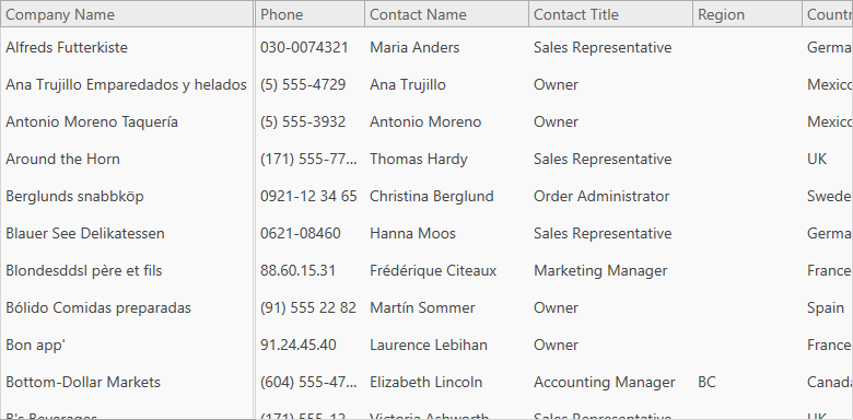
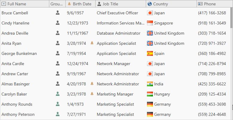
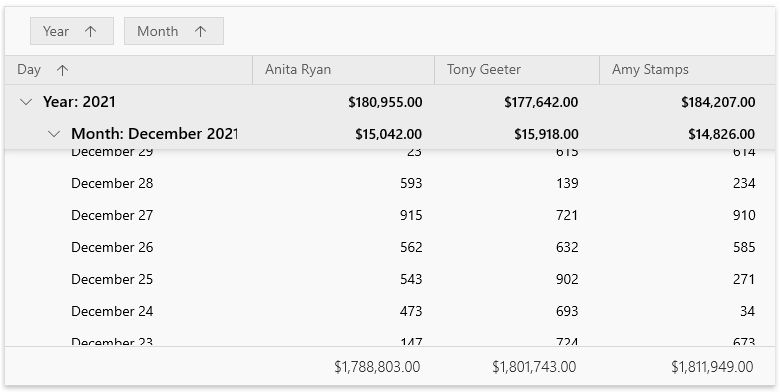
A large percentage of our support hits come from DevExpress customers with questions about common tasks (such as sorting, grouping, assigning a data source to a grid, etc.). What do you currently do when you have a question about a DevExpress control? Some of you search Google or DevExpress docs/Support Center, others head straight to a demo they bookmarked in the web browser or desktop, and a few search the DevExpress source and demo code. And many developers go after the challenge inside Visual Studio, using Intellisense, tooltips, and "trial-and-error". And if that all doesn't work they can always submit a new question to support. Regardless of path, when you have a question on the best approach to working with a DevExpress control, the research usually requires multiple attempts before you have the information you need to start solving the problem.

Solution Idea - Code Snippet Helper

With the Code Snippet Helper, DevExpress customers can get the following benefits:

  • Quickly search and insert code snippets containing examples for the top 50-100 tasks related to DevExpress products, all from the comfort of Visual Studio. Snippet popularity will be determined by metrics pulled from API popularity in docs, our Support Center, code examples, demos, and as well as contributions from experts.
  • Filter out irrelevant code snippets based on context (solution/project/file/class, etc.), adapt snippets to blend with your existing code (for instance, reference existing control names).
  • Allow you to create and share your own custom code snippets in specific categories.

For more information, check out this video and or test it live (using the instructions in point #2 below).

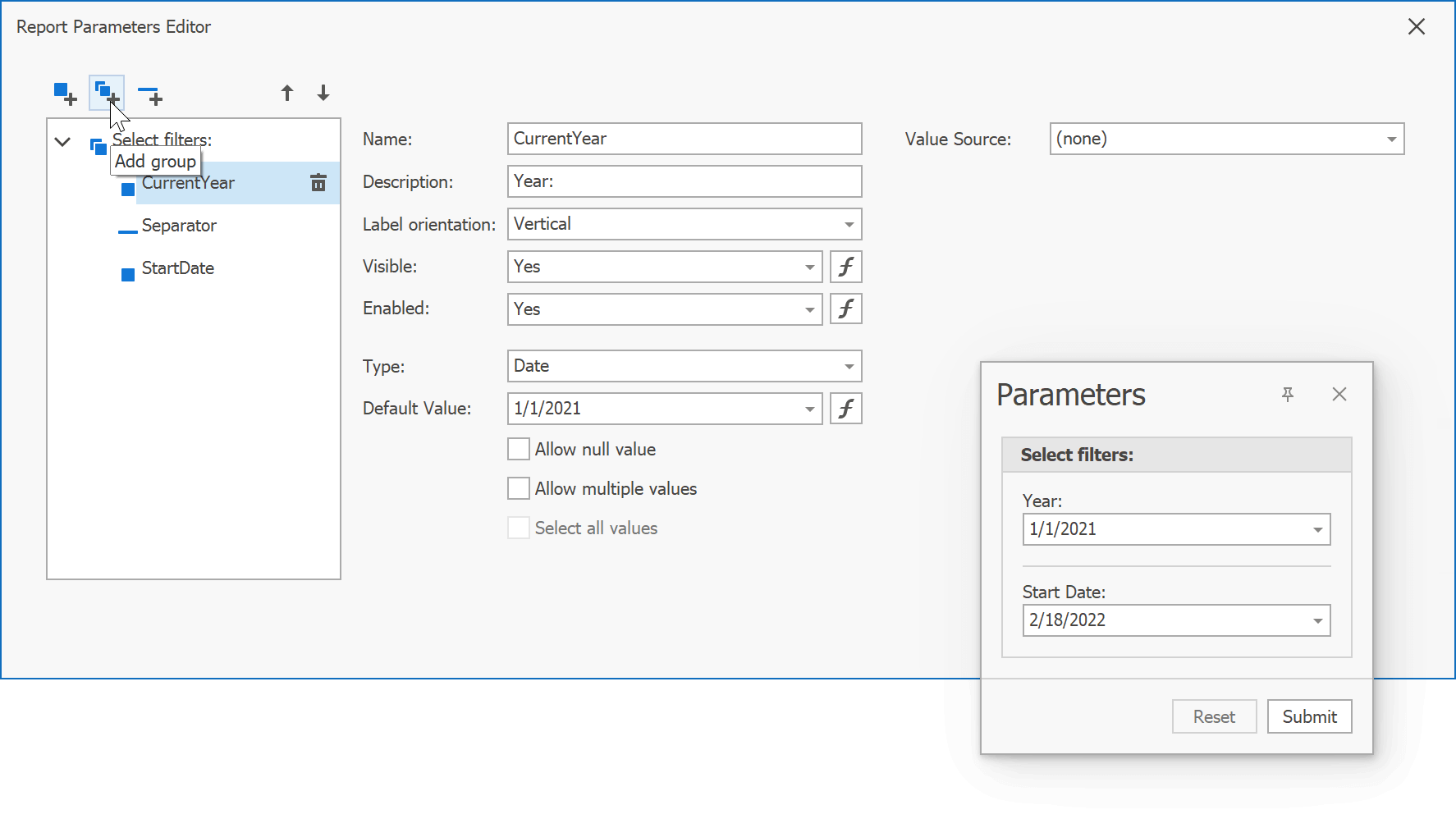
Customer Need #2: Create DevExpress Criteria Operators Quickly with Little Knowledge

Problem Hypothesis

As you may know, the CriteriaOperator API (and its associated Criteria Language) is a common feature that appears in a number of DevExpress controls and frameworks. The criteria language is similar to C# or VB.NET, SQL, but it's distinctive enough that it takes some time to master. And taking time to learn the Criteria Language can get in the way of a smooth first-time experience with our grid controls, reporting, dashboards, XAF, XPO, and many other DevExpress products.

Solution Idea - Visual Criteria Editor

The Visual Criteria Editor can be invoked directly from the Visual Studio to help you express your ideas with the DevExpress Criteria Language.

With the Criteria Editor in Visual Studio, DevExpress developers gain the following benefits:

  • Select a data filter context from your solution (currently, XPO classes are available for filtering)
  • Build criteria expressions of any complexity (with related collection and reference properties), select criteria operators and functions visually. 
  • Generate compatible C# code in the Criteria Language dialect of your choice (text-based, regular strongly-typed, and advanced LINQ-based) and insert it right into Visual Studio.

For more information, check out this video and/or test it live below.

To try out the criteria editor and code snippet helper live, follow these steps:

  1. Download this experimental CodeRush v21.2 preview (VSIX) for Visual Studio 2019 or Visual Studio 2022. Close Visual Studio, and install this VSIX extension.
  2. In Visual Studio, under the menu Extensions | CodeRush | Options, focus the node Quick Setup and enable the option DevExpress Code Helper & Criteria Editor (experimental), and click OK in the dialog.
  3. In the Code Editor, press Control + ~ OR Control + . (dot) to invoke these helpers as shown in the videos above. Read the preview note below for more details.

     
NOTE: This experimental option is disabled by default, because it contains early and incomplete design prototypes that may contain known bugs or be missing functionality. We are showing these design prototypes just to better explain and validate customer needs for this survey. Eventually, we intend to shape development plans based on customer feedback. Please disable this experimental option or avoid using these design prototypes for production development.

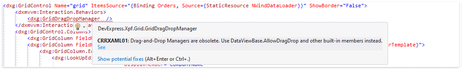
Customer Need #3: Best Practice Diagnostics & Fixes 

Problem Hypothesis

Currently, many DevExpress products come with best practices and/or troubleshooting guides: WinForms,  WPF, ASP.NET, Reporting, XAF, XPO, etc. These guides are typically lengthy documents, that are the most helpful when accompanied by a search for error messages or callstack content. Even if you searched and found the right guide, it's going to take time to understand the content and figure out a fix.

But guides can't find coding mistakes or less-than-best-practice implementations that have no immediate effect at compile time or runtime. But this is technical debt, and it (and the costs associated with it, such as brittle code, hard-to-read code, performance hits, or memory leaks) can accumulate over time.

Solution Idea - Best Practice Diagnostics

In theory, any code that resides in C#, XAML, CSPROJ, CONFIG, JSON, RAZOR, HTML, JavaScript, etc., can be validated. This opens up interesting possibilities for advanced heuristics and best practice pattern matching (as well as anti-pattern detection), focused on DevExpress and third-party APIs.

With Best Practice Diagnostics, DevExpress customers gain the following benefits:

  • Check their solutions for typical DevExpress usage errors across a number of platforms, powered by Roslyn Analyzers and/or the built-in CodeRush Code Issues engine.
  • View a detailed error report locally, or integrate our diagnostics into your CI system. Issues found will include a link to the online documentation with the correct usage guidelines, allowing you to correct the code manually.
  • Issues found will also offer auto-fixes or specific code suggestions based on context where possible. 

For illustration, here's a sample of DevExpress XAF/XPO-specific code and project diagnostics:

xaf code analysis

Here's a screenshot from our WPF design prototype: 

Customer Need #4: Customize DevExpress ASP.NET Core and Blazor Components Visually

Problem Hypothesis

We see that certain WinForms and ASP.NET WebForms customers love the power of the design-time property grid to quickly configure DevExpress controls. We also see customers who migrate from these technologies to ASP.NET Core (for instance, to MVC, Razor Pages or Blazor), BUT there is not yet a property grid for controls in Razor markup. And the built-in Razor markup editor doesn't stop you from specifying incorrect values, and it is not always clear what values should be there.

Solution Idea - Razor Property Grid

With the Razor Property Grid, DevExpress customers gain the following benefits:

  • Set DevExpress component properties visually and much faster than it takes to manually edit Razor markup.
  • Learn more about different property modes and value possibilities using rich hints that appear in the property grid.
  • Reduce manual typing mistakes that would otherwise occur in the Razor editor, because the property grid validates settings.

For an example, here's a rough mockup of a dialog that can be shown if you place a cursor on Blazor DxGrid in a *.RAZOR file or `Html.DevExtreme().DataGrid()` in a *.CSHTML file.


Customer Need #5: Get Rich Help on DevExpress API Directly in Code Editor

Problem Hypothesis

As only a few probably know, you can already place the cursor on a DevExpress API in the Visual Studio Code Editor and hit F1 to view relevant help topics directly within your web browser (learn more). Currently, this feature has very low discoverability - you must know about this feature and its shortcut.

The built-in Visual Studio hint with plain-text information for an API type or member when you hover with mouse is more noticeable, but it still has limits on the quality of information it can present to developers inside Visual Studio.

Solution Idea - Documentation Preview Helper

  • At minimum, we can make this hidden F1 gem more discoverable for DevExpress API with some visual clues or icons. Many help topics include code examples that you can copy - a potential time saver.
  • At maximum, we can display a rich text documentation based on the DevExpress online documentation. With all the information you need, you could learn about proper API usage and even copy code snippets from the help topic without ever leaving Visual Studio.

Here's an illustration of the idea from https://www.kite.com/copilot/:


Customer Need #6: Learn DevExpress Faster without Leaving Visual Studio

Problem Hypothesis

Video and text-based tutorials are great, but they require developers to leave the working IDE environment often during the learning process - you jump between the web browser (to check instructions) and your IDE (to replicate the code you just learned and/or copied). Also, tutorials often include steps that have nothing to do with writing code like "add an assembly reference X", "install a NuGet package Y" or "invoke the wizard Y", which can sometimes be missed unless the instruction is emphasized or accompanied by a screenshot. 

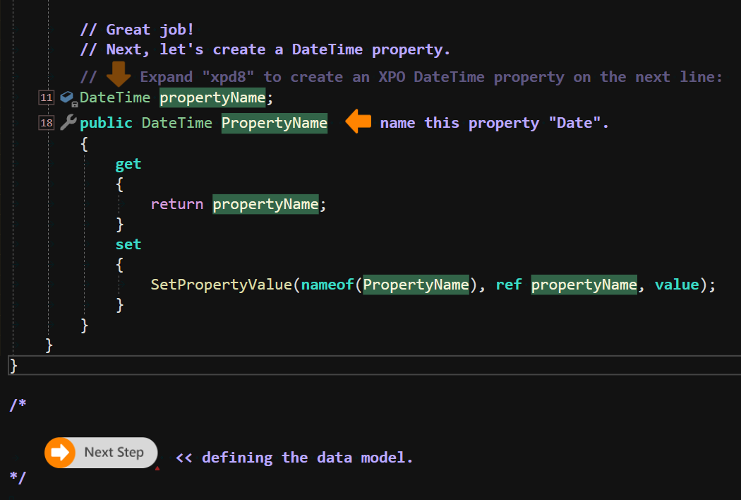
Solution Idea - Interactive Training Tutorials

CodeRush can provide an experience that is very similar to what you can see in online JavaScript learning platforms. CodeRush lessons are a combination of source code, comments, interactive training steps, images, and buttons that can open other source files, copy text to the clipboard, and/or bring up Visual Studio tooling.

With Interactive Training, developers gain the following benefits:

  • No more switching between your IDE and a browser. Developers stay and learn in Visual Studio. Learn one focused step at a time. Instead of scrolling down through a lesson in a web browser, CodeRush lessons tend to be broken into small pieces that easily fit into a screen.
  • Focus only on what you need to learn. Arrows show you where to look and what to change. More quickly realize what's important. Once you complete a step, click the button to move on to the next step.
  • Avoid mistakes and stay on track, because CodeRush can immediately provide feedback or generate the rest of the boilerplate code from the lesson for you. Bring up relevant Visual Studio tooling (like the NuGet Package Manager or a Console Window) instantly just by clicking a button in the code or help you paste the correct code when you are stuck.

For more information, please check out these screenshots that illustrate how the XPO getting started tutorial (or any other product tutorial) CAN be reimagined with CodeRush interactive lessons:


Customer Need #7: Load Only the Parts of CodeRush You Need

Problem Hypothesis

Every developer who sees the CodeRush Test Runner loves it. It is arguably the fastest test runner in the world, and it can run tests that other test runners can't. And it supports a wide range of test frameworks. So if running tests is your thing, you definitely want the CodeRush test runner. But what if running tests is the only thing you do? What is you want only the test runner, but no other feature of CodeRush?

Well, it's not easy to manually disable the rest of CodeRush (it requires multiple interactions in the Options dialog), and even if you did, you would still might incur memory and/or performance hits as those disabled engines load into Visual Studio.

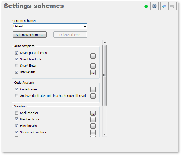
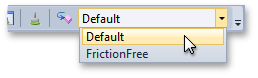
Our Solution Idea - Prebuilt Setting Schemas

These schemas will allow CodeRush users to enable or disable groups of related features all at once, as well as import or export option schemas for exchange with the team or community. With Prebuilt Setting Schemas, DevExpress customers can get the following benefits:

  • Speed getting started with CodeRush and increase overall adoption with lightweight setting schemas like "Top 20 Features as Rated by the Community". Select the schema that matches your style and needs, like "Test Runner-only", "CodeRush Expert", "Refactoring Pro", "Issues Manager".
  • Access the DevExpress Code Snippet Helper and Visual Criteria Editor even if you are using third-party IDE productivity tools. For instance, developers can enable the schema "DevExpress Helpers & Diagnostics Only" and avoid potential conflicts with other IDE tooling or have it work in Visual Studio without loading the rest of CodeRush.
  • Faster startup times. Use less memory.

If we move in this direction, we intend to keep our existing Options Layers mechanism and build on the knowledge gained from the old CodeRush Classic product where this functionality was available. 

opStart

ChangeSettingsScheme

NOTE: The information contained within this blog post is being shared for INFORMATIONAL PURPOSES ONLY and does NOT represent a binding commitment on the part of Developer Express Inc. The ideas and design prototypes listed within it are subject to change and cancellation, should we experience technical feasibility risks OR receive insufficient customer need confirmation through the survey below and other channels. You should NOT rely on or use this information to help make a purchase decision about Developer Express Inc products.

Complete the Survey to Help Shape Our Development Strategy!

Thanks,
Dennis
Principal Product Manager
dennis@devexpress.com


Word Processing: WinForms, WPF, Office File API – Watermark API Enhancements (v21.2)

$
0
0

As you may know, we overhauled watermark support across our Word Processing product line (Document API and UI controls for WinForms and WPF) in our most recent release cycle (v21.2). Changes include an enhanced API and the ability to modify existing watermarks/add different watermarks to document sections.

In this blog, we’ll review two methods to process watermarks within a Word document.

Use WatermarkManager to Insert and Delete Watermarks

Our WatermarkManager– the main API object used to manage document watermarks – now ships with SetText and SetImage method overloads. These overloads allow you to insert text and image watermarks into the headers of individual document sections. If a section passed to these methods does not have a specified header type, WatermarkManager will create the header.

The code sample below adds different watermarks to document sections. Our sample document contains two sections: the first section occupies the first page, and the second section is located on the second page. Sections do not have headers. The SetImage method creates a primary header with an image watermark for the first section, and the SetText method adds a primary header with a text watermark to the second section.

using DevExpress.XtraRichEdit;
using DevExpress.XtraRichEdit.API.Native;
using System.Drawing;
// …

using (var wordProcessor = new RichEditDocumentServer())
{
    Document document = wordProcessor.Document;
    document.LoadDocument(@"Documents\Watermarks.docx");

    var firstSection = document.Sections[0];
    var secondSection = document.Sections[1];

    // Add image watermark to the first section's header.
    document.WatermarkManager.SetImage(firstSection, HeaderFooterType.Primary,
        Image.FromFile(@"Images\DevExpressLogo.png"),
        new ImageWatermarkOptions() { Washout = false });

    // Add text watermark to the second section's header.
    document.WatermarkManager.SetText(secondSection, HeaderFooterType.Primary, "DRAFT");

    document.SaveDocument(@"Documents\WatermarksUpd.docx", DocumentFormat.OpenXml);
}

In conjunction with the ability to insert watermarks into individual document sections, we also implemented a WatermarkManager.Remove method overload. This overload allows you to remove a watermark from the header of a specific section.

Use ShapeCollection to Insert, Modify, and Delete Watermarks

Watermarks are now stored in the SubDocument.Shapes collections of section headers. You can use shape collection members to add a text or image watermark to a specific section header (via the InsertTextWatermark or InsertImageWatermark method), retrieve an existing watermark (as a Shape object of type Watermark), or remove a watermark when necessary.

We also introduced a new Shape.WatermarkFormat property that allows you to obtain and modify watermark settings. With this option, you can execute the following actions:

  • Change text watermark settings (font attributes, text color, and layout).
  • Modify image watermark settings (change image scale percentage and apply/remove washout effects).
  • Assign new text to a watermark.
  • Replace an existing watermark image with another image.

You can use different properties of the Shape object to modify watermark position, resize the watermark, and customize its appearance (add a border to a watermark image, fill and outline watermark text).

The example below adds an image watermark to the first document section, customizes watermark appearance, and rotates the watermark counterclockwise by 45 degrees.

using DevExpress.XtraRichEdit;
using DevExpress.XtraRichEdit.API.Native;
using System.Drawing;
// …

using (var wordProcessor = new RichEditDocumentServer())
{
    Document document = wordProcessor.Document;
    document.LoadDocument(@"Documents\Watermarks.docx");

    Section firstSection = document.Sections[0];

    // Access the first section's primary header.
    var headerContent = firstSection.BeginUpdateHeader();
    // Add image watermark to the section.
    var watermark = headerContent.Shapes.InsertImageWatermark(headerContent.Range.End,
        Image.FromFile(@"Images\DevExpressLogo.png"));
    // Remove washout effect.
    watermark.WatermarkFormat.ImageOptions.Washout = false;
    // Add border to watermark image.
    watermark.Line.Thickness = 3;
    watermark.Line.Fill.SetSolidFill(Color.Gray);
    // Rotate watermark.
    watermark.RotationAngle = -45;
    firstSection.EndUpdateHeader(headerContent);

    document.SaveDocument(@"Documents\WatermarksUpd.docx", DocumentFormat.OpenXml);
}

Learn More

Refer to the following help topics for additional information on watermark support within our Word Processing products (WinForms-WPF-Office File API):

Your Feedback Matters

As always, we welcome your thoughts and feedback. Please feel free to leave a “watermark-related” comment below or contact us via the DevExpress Support Center.

Office File API & Office-Inspired UI Controls – Tips & Tricks (January 2022)

$
0
0

This post includes a series of interesting support tickets answered throughout December and January along with a few enhancements made to our Office-inspired product line. We hope you find the contents of this post interesting and of business value. Should you have any questions about this post, feel free to comment below.

Tips & Tricks

Word Processing Document API and Rich Text Editors (WinForms and WPF)

Spreadsheet Document API and Spreadsheet Controls (WinForms and WPF)

  • T1052887 - How to ignore all errors in worksheet formulas
    https://supportcenter.devexpress.com/ticket/details/t1052887

    To ignore specific formula errors, call the Worksheet.IgnoredErrors.Add method and pass a target range and necessary error type flags as method parameters. The following code snippet demonstrates how to ignore all errors in worksheet formulas:

    sheet.IgnoredErrors.Add(sheet.GetDataRange(), IgnoredErrorType.EmptyCellReferences |
                IgnoredErrorType.EvaluateToError | IgnoredErrorType.FormulaRange |
                IgnoredErrorType.InconsistentColumnFormula | IgnoredErrorType.InconsistentFormula |
                IgnoredErrorType.ListDataValidation | IgnoredErrorType.NumberAsText |
                IgnoredErrorType.TextDate | IgnoredErrorType.UnlockedFormula);
  • T1054845 - How to determine a clicked cell in a read-only worksheet
    https://supportcenter.devexpress.com/ticket/details/t1054845

    If the SpreadsheetControl.ReadOnly option is enabled, handle the SpreadsheetControl.SelectionChanged event and check the SpreadsheetControl.ActiveCell property to determine the clicked cell in a worksheet.

    private void SpreadsheetControl_SelectionChanged(object sender, EventArgs e)
    {
         Cell cell = spreadsheetControl.ActiveCell;
    }

    If a worksheet is protected and the "Select Locked Cells" and "Select Unlocked Cells" protection options are disabled, handle the SpreadsheetControl.MouseDown event and call the SpreadsheetControl.GetCellFromPoint method to obtain the clicked cell by its coordinates.

    private void SpreadsheetControl_MouseDown(object sender, MouseEventArgs e)
    { 
         Cell cell = spreadsheetControl.GetCellFromPoint(e.Location); 
    }
  • T1054824 - How to assign cell values with line breaks and enable text wrapping
    https://supportcenter.devexpress.com/ticket/details/t1054824

PDF Document API

  • T1055635 - How to print a PDF document as a booklet
    https://supportcenter.devexpress.com/ticket/details/t1055635
  • T1059318 - How to add a PDF page to the background of a different PDF page
    https://supportcenter.devexpress.com/ticket/details/t1059318

    Use the PdfGraphics.DrawPageContent(PdfPage) method to merge content from multiple PDF pages into a single page. The following code snippet merges the first pages from two PDF files and draws one PDF page in the background and another page in the foreground:

    using DevExpress.Pdf;
    using DevExpress.Pdf.Drawing;
    
    PdfDocumentProcessor processor = new PdfDocumentProcessor(); 
    processor.CreateEmptyDocument(); 
    
    PdfDocumentProcessor foregroundDocument = new PdfDocumentProcessor();
    foregroundDocument.LoadDocument(@"doc1.pdf"); 
    
    PdfDocumentProcessor backgroundDocument = new PdfDocumentProcessor();
    backgroundDocument.LoadDocument(@"doc2.pdf"); 
    
    processor.AddNewPage(PdfPaperSize.A4);
    
    PdfGraphics graphics = processor.CreateGraphics(); 
    graphics.DrawPageContent(backgroundDocument.Document.Pages[0]);
    graphics.AddToPageBackground(processor.Document.Pages[0]);
    graphics.DrawPageContent(foregroundDocument.Document.Pages[0])
    graphics.AddToPageForeground(processor.Document.Pages[0]);
    
    processor.SaveDocument("Result.pdf");
  • T1064863 - How to use the PDF Document API to print a PDF file to a specific printer tray
    https://supportcenter.devexpress.com/ticket/details/t1064863
  • T339557 - How to draw text or an image in the center of a PDF page
    https://supportcenter.devexpress.com/ticket/details/t339557

Enhancements

Spreadsheet Document API and Spreadsheet Controls (for WinForms and WPF)

T1062005 – You can now determine when a user expands/collapses a group in a worksheet or clicks an outline button
https://supportcenter.devexpress.com/ticket/details/t1062005

We added four new events to the WinForms and WPF Spreadsheet controls:

  • GroupStateChanging
  • GroupStateChanged
  • BeforeOutlineButtonClick
  • AfterOutlineButtonClick

The GroupStateChanging event occurs before a group is expanded or collapsed and allows you to cancel the operation. The GroupStateChanged event is raised after the group was expanded or collapsed. Event arguments allow you to determine group state (expanded or collapsed), to check group type (row or column), and to retrieve information about affected groups.
The following code snippet prevents users from expanding row groups:

using DevExpress.XtraSpreadsheet;

private void SpreadsheetControl_GroupStateChanging(object sender, 
    GroupStateChangingEventArgs e)
{
     if (e.IsRowGroup && e.IsExpanding)
         e.Cancel = true;
}

The BeforeOutlineButtonClick event fires when a user clicks an outline button and allows you to cancel the default action. The AfterOutlineButtonClick event occurs after the outline button was clicked and the default action was executed. The IsRowOutline event argument allows you to determine whether a user clicked the row or column outline button, and the Level argument returns the outline level.

The following code snippet prevents all column groups from collapsing when a user clicks the outline button 1:

using DevExpress.XtraSpreadsheet;

private void SpreadsheetControl_BeforeOutlineButtonClick(object sender, 
    BeforeOutlineButtonClickEventArgs e)
{
     if (e.Level == 1 && !e.IsRowOutline)
         e.Cancel = true;
}

PDF Document API

T1063961 – You can now create ZUGFeRD-compliant invoices with XRechnung conformance
https://supportcenter.devexpress.com/ticket/details/t1063961

Pass the PdfZugferdConformanceLevel.XRechnung value to the PdfDocument.AttachZugferdInvoice method, as shown below:

using (PdfDocumentProcessor pdfDocumentProcessor = new PdfDocumentProcessor())
{
    pdfDocumentProcessor.LoadDocument("Invoice.pdf");
    pdfDocumentProcessor.Document.AttachZugferdInvoice
        (File.ReadAllBytes("XRechnung-invoice.xml"), PdfZugferdVersion.Version2_1, 
        	PdfZugferdConformanceLevel.XRechnung);
    pdfDocumentProcessor.SaveDocument("Invoice_Upd.pdf");
}

WinForms and WPF PDF Viewers

T1049595 – You can now obtain printer settings selected in the Print Page Setup dialog
https://supportcenter.devexpress.com/ticket/details/t1049595

A new ShowPrintPageSetupDialog method allows you to open the Print Page Setup dialog in code. This method returns the PdfPrinterSettings object if a user pressed OK and closed the dialog. If a user clicked Cancel or closed the dialog, the ShowPrintPageSetupDialog method returns null.

You can use the following code to obtain printer settings selected in the Print Page Setup dialog:

PdfPrinterSettings printerSettings = pdfViewerControl.ShowPrintPageSetupDialog(); 

if (printerSettings != null) 
{ 
    // add your code here 
}

New Examples and Documentation Updates

As you probably know, the DevExpress PDF Document API library allows you to retrieve a certificate from a hardware device (such as Windows certificate store, SmartCard, and USB Token). We created an example that shows how to sign a PDF file using a certificate stored on a user's machine. Please note that you can also adapt this solution to sign documents with certificates from any physical store.

PDF Document API - Sign a PDF Document with a Certificate Stored on a Hardware Device

We also expanded the list of signature examples in our PDF Document API documentation and included the above-mentioned example in this list.

PDF Document Protection Examples

As always, if you’ve come across an interesting support ticket you’d like to share with the rest of the DevExpress developer community, please comment below and include the appropriate link.

DevExpress WinForms — 2022 Roadmap

$
0
0

This Roadmap outlines our core priorities for 2022. As always, you can expect many other smaller additions across our entire range of WinForms controls and components.

HTML & CSS Templates

Last year we released this unique feature (a DevExpress WinForms exclusive) and we expect to expand its capabilities in 2022.

If you’ve used our WinForms HTML & CSS Template engine in the past, you already know that this feature offers unmatched design capabilities. With HTML & CSS Templates, you can fully alter the visual appearance of supported DevExpress controls – and deliver customizations that are beyond the reach of traditional API-based design methods.

Throughout 2022, we hope to extend our HTML & CSS Template engine with the following new features:

  • Increase the number of supported tags and attributes;
  • Introduce template support for additional DevExpress WinForms controls, including our TreeList, Flyout Panels, Accordion, ListBox, Alert Windows, and more;
  • Allow you to insert editors into templates;
  • Enhance our built-in Syntax Editor;
  • Introduce a more sophisticated and flexible way to work with CSS styles (conditional style selection, and global CSS styles to re-use across multiple controls);
  • Add a new Form object with built-in template support (see the DirectX section);
  • Support text selection;
  • Incorporate the ability to include files.

We also understand that it may be challenging to start using templates - especially for those who have never worked with HTML and CSS in the past. To facilitate adoption, we created a dedicated module in our Demo Center to help demonstrate usage and uploaded a couple of YouTube tutorials. In 2022, we intend to double-down on this work and release additional educational content to help you to master this unique technology.

.NET

Supporting the newest .NET releases remains one of our top priorities. We expect to introduce complete support of .NET 7 (scheduled for release in late 2022). Be sure to follow our blog posts for updates/release announcements in this regard.

WinForms Scheduler

Microsoft Office 365 Synchronization

We expect to give you the ability to synchronize DevExpress Scheduler events with Microsoft Office 365 calendars. Additionally, we intend to expand HTML/CSS Template support in our Scheduler control.

WinForms Editors

Custom Event-based Masks

In our first major release of 2022 (v22.1), we plan to introduce a new way to implement custom masks. You will be able to track editor text changes via events, and alter resulting text based on your custom logic. You will also be able to register these custom masks and make them accessible from the Mask Designer dialog (and reuse them across multiple editors).

WinForms Chart Control

Chart Designer in .NET 5 and .NET 6 (Visual Studio IDE)

We expect to add full support for our Chart Designer tool, so you will be able to easily create new charts and customize existing charts in .NET 5 and .NET 6 projects for WinForms.

WinForms Map Control

Search Panel Customization

In v22.1 you will be able to the search panel width and height in relative units. This enhancement will improve search panel usability and appearance on monitors with different DPI settings.

Per-Monitor V2 Support

Our WinForms Map Control will address issues related to mixed-mode DPI scaling.

WinForms Heatmap

Cell Selection

We plan to enhance our HeatMap control and allow users to select heatmap cells as needed. Selection functionality will include:

  • Selection modes (single cell, multiple cells, rectangular selection)
  • Support for the SelectionChanged event
  • Customization of selected cells

Word Processing Document API and Rich Text Editors

Rotated Text Support (v22.1)

We expect to add rotated text support within text boxes and table cells. You will be able to specify text direction in code or via the Rich Text Editor’s UI (in addition to UI display and print output, you will be able to export rotated text to PDF).

Spreadsheet Document API and Spreadsheet UI Controls

Page Break Preview (v22.1)

Our WinForms Spreadsheet will support Page Break Preview– a separate view that displays horizontal and vertical page breaks for a worksheet. You will be able to insert/remove page breaks via the Spreadsheet control’s UI and drag existing page breaks to a new position with a mouse.

Shrink to Fit (v22.1)

We plan to introduce a Shrink to Fit alignment option across our Spreadsheet product line (Document API and UI controls for WinForms and WPF). When enabled, this option automatically reduces text size to fit a cell.

DirectX

DirectX hardware accelleration gives our WinForms controls distinct performance advantages, especially for data-heavy controls rendered on high DPI devices. Moreover, our exclusive WinForms DirectX engine enables functionality that would be very hard (if not impossible) to implement with traditional WinForms GDI rendering (for example, complex visual effects that emulate Windows Fluent UI). In 2022, we plan to enhance our DirectX implementation for remote desktop connections.

Additionally, we will combine our industry exclusive DirectX engine with our market-first HTML & CSS Template engine to create a new DirectX Form— another replacement for standard Visual Studio forms with built-in HTML template support and native DirectX rendering.

High-DPI Support

We hope to introduce complete support for PerMonitorV2 scaling mode across our entire WinForms product line.

Accessibility

We expect to introduce a QueryAccessibleInfo event that will serve as a single entry point to customize accessibility info for all DevExpress controls.

UI Automation

Throughout 2022, we plan to enhance UI Automation support for our WinForms controls.

Appearance & Skins

We expect to release a new theme based on Windows 11 and/or Microsoft Office 2021. Also, based on your overwhelmingly positive feedback on our Winter Joy Vector Skin, we hope to continue working in this direction and release other festive/seasonal skins in future releases.

As an indispensable part of any Office-inspired UI, the Ribbon Control will also be updated to match the appearance and behavior of the newest Microsoft Office products.

Your Feedback Matters

As always, we welcome your feedback. Let us know what you think in the field below or submit a support ticket via the DevExpress Support Center if you need to discuss a specific business need.

The information contained within this blog post details our current/projected development plans. Please note that this information is being shared for INFORMATIONAL PURPOSES ONLY and does not represent a binding commitment on the part of Developer Express Inc. This roadmap and the features/products listed within it are subject to change. You should not rely on or use this information to help make a purchase decision about Developer Express Inc products.

.NET Spreadsheet (WinForms, WPF, Office File API) – Create Thumbnail Images for Worksheets and Chart Sheets (v21.2)

$
0
0

Our Spreadsheet Document API v21.2 allows you to generate thumbnails from worksheets and chart sheets. A thumbnail is a small image that you can insert into a document, presentation, or website to display a preview of worksheet or chart sheet content.

As you may recall, we added the ability to save a cell range as an image in our previous major release (v21.1). For background information on our implementation, please review the following blog post:

.NET Spreadsheet (WinForms, WPF, Office File API) – Export and Copy Cell Ranges as Images (v21.1).

With v21.2, we added a new API to save a worksheet or chart sheet as a thumbnail image. The following image formats are supported:

  • PNG
  • JPEG
  • BMP
  • TIFF
  • GIF
  • EMF (not available for Linux and macOS)
  • WMF (not available for Linux and macOS)

Note: You need a license for the DevExpress Office File API Subscription or the DevExpress Universal Subscription to use this API in production code. If you’d like to purchase the Office File API or if you wish to upgrade your current subscription to DevExpress Universal, write to us at clientservices@devexpress.com.

Create a Thumbnail Image for a Worksheet

To generate a thumbnail image for a worksheet, call the WorksheetExtensions.CreateThumbnail extension method for a Worksheet object. The generated thumbnail image includes worksheet cells (from “A1” to the bottom-right cell) with data or formatting (excluding hidden rows and columns). Worksheet row and column headers are also exported to the thumbnail.

You can use the WorksheetThumbnailOptions class instance to specify the following thumbnail settings:

  • Define image resolution (in DPI)
  • Scale worksheet content before thumbnail generation
  • Change image background color
  • Set row and column indexes from which thumbnail generation should start
  • Stretch a worksheet to fit output image size

The code sample below specifies thumbnail options and generates a thumbnail image from a worksheet.

using DevExpress.Spreadsheet;
using System.Drawing;
// ...

// Create Workbook object.
using (var workbook = new Workbook())
{
    // Load workbook from file.
    workbook.LoadDocument("TopTradingPartners.xlsx");

    // Access worksheet.
    var worksheet = workbook.Worksheets["Trading Partners"];

    // Specify thumbnail options.
    var thumbnailOptions = new WorksheetThumbnailOptions
    {
        Resolution = 192,
        Scale = 80,
        ColumnOffset = 1,
        RowOffset = 1,
        BackgroundColor = Color.FromArgb(0xF2, 0xF2, 0xF2)
    };

    // Create thumbnail image.
    worksheet.CreateThumbnail("Worksheet_Thumbnail.png", 
        ImageFileFormat.Png, 1600, 900, thumbnailOptions);
}

Create a Thumbnail Image for a Chart Sheet

Call the ChartSheetExtensions.CreateThumbnail extension method for a ChartSheet object to generate a thumbnail image for a chart sheet. Use SheetThumbnailOptions to customize thumbnail settings as needed. You can specify thumbnail resolution (in DPI), define background color, scale chart sheet content before export, or stretch the chart sheet to fit output image size.

The code sample below specifies thumbnail options and creates a thumbnail image for a chart sheet.

using DevExpress.Spreadsheet;
using System.Drawing;
// ...

// Create Workbook object.
using (var workbook = new Workbook())
{
    // Load workbook from file.
    workbook.LoadDocument("VariableCosts.xlsx");

    // Access chart sheet.
    var chartSheet = workbook.ChartSheets["Variable Costs"];

    // Specify thumbnail options.
    var thumbnailOptions = new SheetThumbnailOptions
    {
        Resolution = 192,
        Scale = 40,
        BackgroundColor = Color.FromArgb(0xF2, 0xF2, 0xF2)
    };

    // Create thumbnail image.
    chartSheet.CreateThumbnail("Chart_sheet_Thumbnail.png", 
        ImageFileFormat.Png, 800, 600, thumbnailOptions);
}

Thumbnail generation is also available for the WinForms Spreadsheet and WPF Spreadsheet controls. Add the DevExpress.Docs.v21.2.dll assembly to your project to use our CreateThumbnail extension methods. Once again, please remember that you must own an active Office File API or Universal Subscription to use this assembly in production code.

Tell Us What You Think

As always, we welcome your feedback. Please feel free to leave comments below or contact us via the DevExpress Support Center.

DevExpress BI Dashboard – 2022 Roadmap

$
0
0

This short blog post summarizes our BI Dashboard development plans for our upcoming v22.1 release. You can also expect a separate blog post that outlines our plans for v22.2.

Our current focus is to add value for existing BI Dashboard users and those wishing to migrate to BI Dashboard from standalone components.

Web Dashboard – Material Design Theme Support

v22.1 will incorporate the DevExtreme Material Design theme to our Web Dashboard Viewer.


Dashboard Designer in .NET 5 and .NET 6 projects

Visual Studio Dashboard Designer will be made available for applications targeting .NET 5 and .NET 6.

WinForms Dashboard - Per-Monitor V2 support

Our WinForms Dashboard will address issues related to mixed-mode DPI scaling.

Performance Monitor Tool

To troubleshoot unexpected delays when generating or updating dashboard data, we will release a new developer tool to help trace data operations. This new tool will allow you to inspect performance-related operations and to modify dashboard layouts/optimize the data source schema.

Data Processing API

We have received excellent feedback on our Data Processing API library. We continue to gather feedback and expect to set future milestones for this product by mid-year.

DevExpress / dataprocessingapi-mvp-example

If you have any questions about our upcoming v22.1 release, feel free to submit a support ticket via the DevExpress Support Center, or post your comment below.

The information contained within this blog post details our current/projected development plans. Please note that this information is being shared for INFORMATIONAL PURPOSES ONLY and does not represent a binding commitment on the part of Developer Express Inc. This roadmap and the features/products listed within it are subject to change. You should not rely on or use this information to help make a purchase decision about Developer Express Inc products. 

DevExpress Reports Roadmap — What You Can Expect in v22.1

$
0
0

As always, thank you for your continued support and for choosing DevExpress Reports. We appreciate the faith and confidence you’ve placed in our product. Please take a moment to review our planned enhancements in our upcoming release cycle and share your thoughts with us.

Oh and like last year, this post will be updated from time to time to reflect our progress. Make sure to bookmark this page for future reference. Last updated on February, 21th, 2022.

If you have any issues with the roadmap, questions and/or suggestions related to implementation, or you feel that we’ve missed an important opportunity - feel free to email us at reportingteam@devexpress.com. We will be happy to follow up.

.NET 7 Support for non-Windows Platforms

ASP.NET CoreBlazor Server
In Development

As you may already know, System.Drawing.Common was deprecated for non-Windows operating systems in .NET 6 and higher. See the help topic from .NET documentation for more information: System.Drawing.Common only supported on Windows.

This breaking change affects those using DevExpress Reports on Linux and macOS (we use System.Drawing.Common to measure document text and render graphic objects including shapes, pictures, and charts). To address rendering-related issues on non-Windows operating systems, we will work on our own cross-platform rendering engine based on the SkiaSharp library throughout this year.

In this release cycle (v22.1), we will update our internal API to use our new cross-platform implementation for all System.Drawing classes not supported in .NET 6 and higher (Image, Bitmap, Font, Pen, Brush, etc.).

Once complete, we'll refine our public API and implement its cross-platform counterparts for use on non-Windows platforms. After completion, you will need to replace System.Drawing object calls with custom DevExpress counterparts to maintain continuity for apps that target .NET 7 (if they are deployed to Linux-based servers). This part of our transition will likely finish by year end (v22.2).

Parameters - Server-Side Filtering for Cascading Parameters

All Platforms
In Development

We expect to offer a new feature for nested parameters that display dynamic lists of values. If a user changes the value of a parent report parameter, you can run a parametrized SqlDataSource query or invoke a stored procedure to update the list of values for the child report parameter. This functionality will be also available for MongoDbDataSource and EFDataSource.

Cross-Tab Enhancements

All Platforms
In Development

We're going to expand the Cross-Tab capabilities for end-users and address the following requests:

  • Calculate custom totals and grand totals with expressions
  • Calculate distinct count summary
  • Conditionally hide rows and colums based on neighbor cell values
  • Apply Html-inspired formatting to cross-tab cells

Also, if time permits, we hope to introduce the ability to prevent cells, row/column groups from being split across page breaks (KeepTogether functionality).

WinUI Report Viewer

WinUI
In Development

In this release cycle, we’ll continue our investment in the WinUI 3 desktop platform. Our team expects to deliver feature-parity between our WinUI Report Viewer and the rest of our desktop Report Viewer components. Enhancements will include:

  • Document Map, Search, Export Options Panels
  • Interactivity features: Sorting, Drill-Down, Editing Fields
  • Text Selection
  • Zoom
  • Multi-Page View Mode
  • and many more..

Parameters Panel - Build the Layout Visually

WinFormsWPF
In Development

You will be able to customize Parameter panel layout directly inside the Report Parameters Editor window: group, change editor label location, and set up dynamic accessibility and visibility. This feature will be of benefit to end-users as it will be available both in the DevExpress Visual Studio Report Designer and desktop End-User Report Designer components:


To learn more about this new feature, please refer to the following blog post: Reporting - Parameters Panel Customization API (v21.2).

Report Design Analyzer Enhancements

WinFormsWPF
Development has not started yet

We will incorporate the following enhancements to our Report Design Analyzer panel (based on recent feedback from our users):

  • Hide/prevent the display of certain errors and warnings
  • Display "code links" within End-User Report Designer components. This will allow your end-users to navigate to the DevExpress documentation and learn how fix/avoid mistakes
  • A new category of advisory messages that outline export-related mistakes

PerMonitorV2 Support

WinForms
Development has not started yet

We expect to introduce a PerMonitorV2 scaling mode for our WinForms Reporting components - Document Viewer and End-User Report Designer.

Federation Data Source - Updated Manage Queries Dialog

All Platforms
In Development

The Manage Queries dialog for the Federation Data Source will integrate the Query Builder and list all federation query types (joins, transforms, unions). This dialog will allow you to create, copy (clone), edit, and delete queries.

Web Report Designer - Federation Data Source

ASP.NET CoreBlazor ServerASP.NET MVCASP.NET Web Forms
In Development

The Web Report Designer Data Source Wizard will include a new option to create combined (federated) queries from different data sources. Your end-users will be able to create all supported query types: joins, unions and transforms.

Material Design Support

ASP.NET CoreASP.NET MVCAngular
In Development

We will optimize the layout of our web reporting components (Web Report Designer, Web Document Viewer, and all their internal dialogs, panels, and menus) and refine the structure of CSS styles used inside. We are working on resolving conflicts with Material-related CSS styles. Once complete, you’ll be able to use DevExpress Reports components in apps that follow Material Design Guidelines with minimal effort.

Visual Studio Item Templates for ASP.NET Core

ASP.NET Core
Development has not started yet

We will include dedicated item templates to quickly embed our Web Report Designer and Web Document Viewer to your ASP.NET Core apps. The item template will register all required backend services and third-party dependencies such as stylesheets and JavaScript libraries needed for correct UI display.

Blazor WebAssembly (ASP.NET Core Hosted) Reporting Components

Blazor WebAssembly (ASP.NET Core Hosted)
Development has not started yet

We'll introduce a set of components for Blazor WebAssembly and ASP.NET Core backend. We expect to use our JavaScript-based Blazor Server Reporting Components as a base and offer a wrapper compatible with this technology. Our next step is to offer similar capabilities for our Blazor Native Report Viewer.

The information contained within this blog post details our current/projected development plans. Please note that this information is being shared for INFORMATIONAL PURPOSES ONLY and does not represent a binding commitment on the part of Developer Express Inc. This roadmap and the features/products listed within it are subject to change. You should not rely on or use this information to help make a purchase decision about Developer Express Inc products.

DevExpress Cross-Platform Products — Getting Ready for .NET 7

$
0
0

This blog post details our solution for the System.Drawing.Common-related breaking change in our cross-platform products. Because the number of apps deployed on non-Windows machines continues to increase, this task is a high priority for multiple development teams at DevExpress.

As you might expect, we must refactor and modify significant portions of our code for .NET 7. This is not a trivial undertaking and your feedback on this matter is very important.

What Changed

Microsoft attributed System.Drawing.Common as a Windows-specific library in .NET 6 and higher. Please visit the following page and review the Reasons for Change section for more information: System.Drawing.Common only supported on Windows.

In .NET 6, use of the System.Drawing.Common library on non-Windows operating systems produces compile-time warnings and throws TypeInitializationException and PlatformNotSupportedException exceptions. To give software developers time to migrate to more modern graphics libraries, Microsoft introduced a runtime configuration switch. You can set the System.Drawing.EnableUnixSupport option to true in the runtimeconfig.json file to enable support for non-Windows platforms and avoid runtime exceptions:

{
  "configProperties": {
	"System.Drawing.EnableUnixSupport": true
  }
}

However, this runtime configuration switch will not be supported in .NET 7 and higher, and all apps that use Sytem.Drawing.Common APIs on non-Windows platforms will throw PlatformNotSupportedException.

Impact on Existing Apps

This breaking change affects the following DevExpress cross-platform products - components that use System.Drawing.Common as a rendering/text measurement engine:

Since it is crucial for us to maintain component functionality within all supported non-Windows environments (Linux and macOS, Azure App Service, and Docker containers), we plan to update our products in 2022 to eliminate dependence on System.Drawing.Common and implement a custom cross-platform rendering engine. We expect to complete this task by .NET 7’s official release in November 2022.

Our Plans for Upcoming Releases

We are going to introduce a new DevExpress.Drawing assembly in our v22.1 release cycle. This assembly will contain custom implementations of all System.Drawing classes not supported for non-Windows systems (Image, Font, Pen, Brush, etc.). With v22.2, we expect to release another assembly with our SkiaSharp-based cross-platform rendering engine. We researched different options, but selected SkiaSharp because it is a stable, full-featured open-source library that fully meets our requirements. Once new assemblies are available, you will need to incorporate them into your project. (If you develop a Windows-specific app, you will be able to use our Project Converter tool to upgrade your project to newer versions and add necessary assembly references/update NuGet packages).

In the second half of 2022, we also plan to revise our public API to replace System.Drawing objects with custom DevExpress.Drawing counterparts. You will need to update your code to use these new APIs.

Your Feedback Matters

As always, we welcome your feedback and look forward to your suggestions. Should you have any questions regarding rendering-related changes described in this blog post, feel free to comment below or submit a support ticket via the DevExpress Support Center. We will be happy to follow-up.


Blazor UI – 2022 Roadmap

$
0
0

The Blazor UI Roadmap outlined below includes development priorities for 2022. We will revise our plans for the second half of 2022 and include new features based on your feedback once we release v22.1 in May.

The information contained within this Roadmap details our current/projected development plans. Please note that this information is being shared for INFORMATIONAL PURPOSES ONLY and does not represent a binding commitment on the part of Developer Express Inc. This roadmap and the features/products listed within it are subject to change. You should not rely or use this information to help make a purchase decision about Developer Express Inc products.

New Components

Accordion (v22.1)

In Development

Our Blazor Accordion component will allow you to display collapsible panels and help visualize information within a limited amount of page space. You will be able to use the DevExpress Accordion component for navigation purposes and to organize items into groups. Its built-in search engine will allow end-users to locate required items among all elements.

Flyout (v22.1)

In Development

This Blazor contextual popup UI element can be used to display hints, warnings, or additional information.

Window (v22.1)

Not Yet Started

This popup non-modal Window for Blazor will allow you to introduce a resizable/draggable popup UI to your Blazor-powered application.

Spreadsheet (v22.2)

Not Yet Started

In the second half of 2022, we plan to release a Spreadsheet control for Blazor. As you might expect, it will be an Excel-inspired control that will allow you to incorporate spreadsheet functionality into a Blazor Server application. With our Blazor Spreadsheet’s UI and API, you will be able to create, edit and save spreadsheet documents as needs dictate.

Sidebar (v22.2)

Not Yet Started

With our new Sidebar component, you’ll be able to add a sidebar alongside the primary display region of your app and display relevant information or navigation options for end users.

Splitter (v22.2)

Not Yet Started

Our Splitter UI for Blazor will allow you to better organize web page layout by dividing it across multiple resizable content panes.

File Manager (v22.2)

In Development

We're creating a new Blazor File Manager component to manage a remote file systems using standard file management operations.

Grid

We will officially release our Grid for Blazor in our v21.2.6 release cycle (March 2022). This year, you may expect the following features:

Server Mode Data Binding (v21.2)

In Development

Server mode will allow you to execute data operations against millions of records in seconds.

Master/Detail View (v21.2)

In Development

Collapsible detail row will allow you to display additional information for parent rows.

Preview Row (v21.2)

In Development

Our Blazor Data Grid’s Preview row will allow you to incorporate additional information for quick preview by your end-users.

Row and Cell HTML Decoration (v21.2)

Available in v21.2.4

Our Blazor Grid’s API will allow you to change the appearance of rows and cells.

Column Resizing (v21.2)

In Development

We will ship two resize modes and allow your end-users to resize Blazor Grid columns.

Column Chooser (v21.2)

In Development

Our Blazor Column Chooser UI will allow users to manage column position and visibility at runtime.

Automatic Data Refresh (v21.2)

In Development

If a data source implements IBindingList, INotifyCollectionChanged, or INotifyPropertyChanged interfaces, our Blazor Grid will automatically track data source changes and refresh displayed data when necessary. 

Column Visibility API (v21.2)

In Development

We will ship an updated engine to manage column visibility in code.

Inline Row Editing (v22.1)

Not Yet Started

We will add a new edit mode to edit an entire data row simultaneously.

Save and Restore a Layout (v22.1)

Not Yet Started

With our updated Blazor Grid API, you will be able to save a grid’s layout (e.g., column position, size, visibility, sort order and direction, applied filters, grouped columns, etc).

Summary Item Visibility API (v22.1) 

Not Yet Started

We will implement an API to manage summary item visibility in code.

Data Editors

Common Enhancements (v22.1 & v22.2)

To leverage the capabilities of our next-gen Blazor Data Grid, improve component performance and resolve known issue , we will replace several data editors and upgrade the remainder throughout our v22.1 and v22.2 release cycles.

New Editors (v22.1)

In Development

Text Input

A generic text editor for Blazor. Our Text input will allow you to automatically transform end-user input into a typed non-string value.

Toggle Button

Toggle button will allow you to include two-state (pressed/released, on/off) buttons to your Blazor application.

Password Box

This editor will allow your end-users to enter passwords safely.

Drop Down

The drop-down window for this text editor can include any content. The component API will allow you to synchronize drop-down content operations with the text field itself.

Custom Text Editor Buttons (v22.1)

In Development

Our Blazor text editors will have built-in action buttons that allow users to open a drop-down menu, increase/decrease/nullify values, and perform other actions. 

Masked Input Enhancements (v22.1)

In Development

We will extend the capabilities of our Blazor Masked Input component with the following mask types:

  • DateTimeOffset

  • TimeSpan

  • DateOnly

  • TimeOnly

We will also introduce a new way to generate masks. You will be able to track editor text changes via events, and alter resulting text based on custom logic.

Validation Enhancements (v22.1)

In Development

We will add a new validation API to our editors. This API will offer more control over data validation.

Charts

Runtime Series Label Customization (v22.1)

Not Yet Started

We will extend the Chart API to allow you to format series label text at runtime.

Export (v22.1)

In Development

You will be able to call a new Export method to export a chart to the following formats:

  • PNG
  • PDF
  • JPEG
  • GIF

Data Binding for Multi-Value Series (v22.1)

Not Yet Started

For series with multiple values, we will add the new API to define data fields for individual values:

  • Financial Series - new OpenValueField, HighValueField, LowValueField, CloseValueField properties
  • Range Series - new Value1Field and Value2Field properties

Selection (v22.2)

Not Yet Started

We plan to extend our Blazor Chart's selection capabilities with the following functionality:
  • Selection for separate points and entire series
  • Single and Multiple selection modes
  • Programmatic access to selected series and points

Palette Customization (v22.2)

Not Yet Started

We will add an ability to set a palette for a chart - a set of colors used to paint series in multi-series charts or pie chart sectors. A separate palette will allow you to color charts regardless of the application theme. 

Reports

.NET 7 Support for non-Windows Platforms (v22.1 & v22.2)

Blazor Server
In Development

As you may already know, System.Drawing.Common was deprecated for non-Windows operating systems in .NET 6 and higher. See the help topic from .NET documentation for more information: System.Drawing.Common only supported on Windows.

This breaking change affects those using DevExpress Reports on Linux and macOS (we use System.Drawing.Common to measure document text and render graphic objects including shapes, pictures, and charts). To address rendering-related issues on non-Windows operating systems, we will work on our own cross-platform rendering engine based on the SkiaSharp library throughout this year.

In this release cycle (v22.1), we will update our internal API to use our new cross-platform implementation for all System.Drawing classes not supported in .NET 6 and higher (Image, Bitmap, Font, Pen, Brush, etc.).

Once complete, we'll refine our public API and implement its cross-platform counterparts for use on non-Windows platforms. After completion, you will need to replace System.Drawing object calls with custom DevExpress counterparts to maintain continuity for apps that target .NET 7 (if they are deployed to Linux-based servers). This part of our transition will likely finish by year end (v22.2).

Parameters - Server-Side Filtering for Cascading Parameters (v22.1)

In Development

We expect to offer a new feature for nested parameters that display dynamic lists of values. If a user changes the value of a parent report parameter, you can run a parametrized SqlDataSource query or invoke a stored procedure to update the list of values for the child report parameter. This functionality will be also available for MongoDbDataSource and EFDataSource.

Cross-Tab Enhancements (v22.1)

In Development

We're going to expand the Cross-Tab capabilities for end-users and address the following requests:

  • Calculate custom totals and grand totals with expressions
  • Calculate distinct count summary
  • Conditionally hide rows and colums based on neighbor cell values
  • Apply Html-inspired formatting to cross-tab cells

Also, if time permits, we hope to introduce the ability to prevent cells, row/column groups from being split across page breaks (KeepTogether functionality).

Web Report Designer - Federation Data Source (v22.1)

In Development

The Web Report Designer Data Source Wizard will include a new option to create combined (federated) queries from different data sources. Your end-users will be able to create all supported query types: joins, unions and transforms.

Blazor WebAssembly (ASP.NET Core Hosted) Reporting Components (v22.1)

Blazor WebAssembly (ASP.NET Core Hosted)
Not Yet Started

We'll introduce a set of components for Blazor WebAssembly and ASP.NET Core backend. We expect to use our JavaScript-based Blazor Server Reporting Components as a base and offer a wrapper compatible with this technology. Our next step is to offer similar capabilities for our Blazor Native Report Viewer.

Rich Text Editor

Mail Merge (v22.1)

In Development

We will introduce mail merge support to our Blazor Rich Text Editor in our v22.1 release cycle. The mail merge implementation will allow you to bind the control to an external data source, preview dynamic content, and execute the final merge operations.

Ribbon Customization (v22.1)

In Development

We expect to incorporate Ribbon UI customizations in our v22.1 release cycle. Through customization, you will be able to hide, modify default ribbon items, and add custom items to the Rich Text Editor’s default UI ribbon.

Navigation and Layout

Form Layout  Enhancements (v22.1 & v22.2)

In Development

  • Collapsible groups will allow you to expand and collapse Form Layout groups using UI elements and in code.

  • New group header icon API will allow you to easily add custom icons to a form layout group header. 

Not Yet Started

  • Compact size mode will reduce margins and paddings (to free up space on a page). 

TreeView - Search (v22.1)

Not Yet Started

We will add a search UI to our TreeView for Blazor. New settings will allow you to customize the control’s UI and search behaviors. Additionally, we will introduce an ability to search and filter nodes in code.

Your Feedback Matters

WPF & WinUI - 2022 Roadmap

$
0
0

First and foremost – thank you for your continued support and faith you’ve placed in DevExpress. In this post, we will outline our roadmap for XAML-based desktop projects, a roadmap developed based on your valuable feedback (collected from our desktop survey and through Support Center tickets).

Table of Contents

WinUI

In 2022, many of our WinUI components will reach feature parity with other DevExpress desktop controls.

We will add the DevExpress WinUI suite to our Unified Component Installer in our v22.1 release cycle and since WinUI will replace UWP, we will offer our UWP customers an upgrade path to our new WinUI Subscription. For more information on UWP and its future, please refer to our WinUI 3 – UWP’s Successor blog post.

If you are considering WinUI for a future project, be sure to download your free copy today. This free WinUI offer will expire on May 1, 2022.

WinUI Data Grid

Extending the Data Grid is one of our key WinUI priorities. The summary below outlines WinUI Grid-related features/capabilities we expect to introduce in 2022.

Excel-Style Filter Popups

WinUI Excel-Style Filter Popups

We will introduce a filter dropdown element inspired by Microsoft Excel.

Clipboard Operations

Excel Copy-Paste WinUI Data Grid

Your users will be able to copy formatted rows from the WinUI Data Grid and paste copied values into Microsoft Word, Excel, Outlook, and other applications.

Cell Tooltips

WinUI Data Grid Cell Tooltip

You will be able to display default tooltips for trimmed cells or create custom tooltips and bind them to your data properties.

Frozen Columns

WinUI Data Grid Frozen Column

You will be able to freeze columns so that a user can always see the fixed column during horizontal scroll operations.

Cascade Update

WinUI Data Grid Cascade Update

We expect to offer delayed rendering during scroll operations. This feature will help maintain responsiveness within the Data Grid when using complex cell templates.

Fixed Groups

WinUI Data Grid Frozen Group Row

We will offer you an option to freeze group rows during scroll operations. Fixed groups are displayed at the top of the grid if at least one data row is visible. This behavior is extremely helpful when groups contain multiple rows.

Sort by Summary

WinUI Data Grid Sort by Summary

We will add APIs and menu items to allow you to sort the Data Grid against summary values:

Grid Lines

WinUI Data Grid Lines

Though minimalistic interfaces are in line with modern design guidelines, business applications often require maximum data separation. As such, we will offer an option to display/hide lines in the Data Grid.

Scrolling and Loading Performance

We will continue to work on performance enhancements. As a first step, we will create a lightweight CheckBox for the Data Grid to improve scroll speed when data contains Boolean properties.

WinUI Tree List

WinUI Tree List 
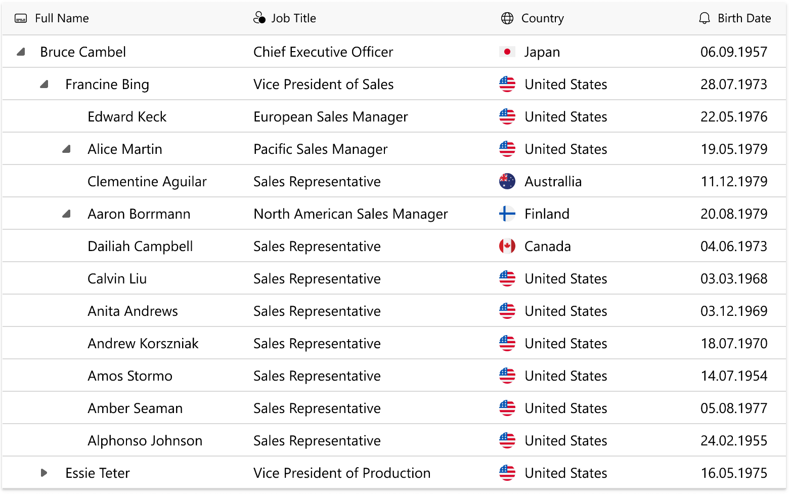
We expect to ship a TreeList control with our WinUI suite (for display/editing of multi-column hierarchical data). Many of the features available within our WinUI Data Grid will be replicated in the DevExpress WinUI Tree List.

WinUI Ribbon Control

WinUI Ribbon Control

We will deliver a new Ribbon control to help you introduce Office-like ribbon bars to your WinUI app. You will be able to create pages (including contextual), groups and different types of ribbon items (buttons, toggle buttons, dropdowns, split buttons, ComboBox items, custom items).

WinUI Charts

MVVM Binding Support

We will extend our Chart API and allow you to generate chart elements (such as series) based on View Model properties.

WinUI Charts – New Series Views (Financial Series, Range Series)

We will add the following new series views:

  • Financial OHLC series views – Candles and Stock Bars
  • Range Areas and Range Bars

WinUI Report Viewer

Our team expects to deliver feature-parity between our WinUI Report Viewer and the rest of our desktop Report Viewer components. Enhancements will include:

  • Document Map, Search, Export Options Panels
  • Interactivity features: Sorting, Drill-Down, Editing Fields
  • Text Selection
  • Zoom
  • Multi-Page View Mode
  • and many more..

WinUI PDF Viewer

In the second half of 2022, we are going to release a PDF Viewer control that will allow you to display and print PDF files within your WinUI app. Our PDF Viewer will ship with the following integrated features:

  • Ribbon Toolbar
  • Page Thumbnails
  • Page Navigation
  • Text Selection
  • Text Search
  • Zoom Settings

WPF

Key Priorities

The following list summarizes our WPF-related development priorities for 2022:

  • Enhance performance
  • Modernize UI
  • Simplify development for new and existing users

Most of our new enhancements and features will align with these development priorities. The list below is not exhaustive. You can expect even more WPF-related features and capabilities in 2022.

.NET

.NET 7 Support

We expect to support .NET 7 when it is released this year. We will issue compatible builds a few months in advance.

.NET 6 Tooltips Support

As you may know, the behavior of tooltips was changed in .NET 6 to support WCAG 2.1 accessibility requirements. We will support this new behavior in our controls.

Performance & Responsive UI

Performance and application responsiveness remain high on our WPF priority list. We are currently researching optimization strategies and will communicate our 2022 development plans in future blog posts.

Startup Time

Our primary objective is to reduce the time required to open a complex WPF view for the first time. To reach our goal, we plan to rework our new themes.

PivotGrid Performance Optimization

We expect to reduce the time our WPF PivotGrid requires to initialize its state when DataContext is assigned.

WPF Pivot Grid Optimization

Filter Popup, Filter Editor, Filter Panel Optimization

We will optimize filter-related controls within the Data Grid. Filter-related UI elements will work much faster when used against large data sources.

Data Grid Scrolling Optimization

We expect to enhance horizontal scrolling in the Data Grid when format conditions are applied. The impact of this change will be most noticeable in Data Grids with many columns.

Tree List Async Node Loading

WPF Tree List Acync Node Loading

Our WPF TreeList will support asynchronous node loading to retain UI responsiveness. You will be able to load nested items in asynchronous tasks when a user expands a node. The Tree List will automatically display a waiting indicator.

Windows 11 Light Theme

WPF Windows11 Theme

We will create a modern theme patterned after Windows 11. The theme will support rounded corners for all elements (following fluent design guidelines).

Visual Studio Extensions

Item Source Wizard

The wizard will allow you to bind our WPF Data Grid to any source with a few clicks and automatically generate MVVM code for CRUD operations. We've prepared an example to demonstrate usage scenarios we expect to support: Implement CRUD Operations in the WPF Data Grid

Data Grid Feature Browser for .NET/.NET Core

WPF Feature Browser

Our Feature Browser allows you to configure the DevExpress WPF Grid faster than ever before. It displays grouped properties and allows you to easily locate necessary APIs. We expect to extend the Feature Browser and will include support for .NET/.NET Core projects.

Code Diagnostics

Code Diagnostics

This feature will help detect potential issues in your code (related to DevExpress WPF controls). It will help you avoid the most frequent configuration issues and save time throughout the app development process.

WPF Reporting

You can find a complete Reporting roadmap here: Reporting DevExpress Reports Roadmap - What You Can Expect in v22.1. The following is a quick synopsis of planned reporting features/capabilities related to WPF.

Parameters - Server-Side Filtering for Cascading Parameters

We expect to offer a new feature for nested parameters that display dynamic lists of values. If a user changes the value of a parent report parameter, you can run a parametrized query or stored procedure to update the list of values for the child report parameter.

Cross-Tab Enhancements

We're going to expand the Cross-Tab capabilities for end-users and address the following requests:

  • Calculate custom totals and grand totals with expressions
  • Calculate distinct count summary
  • Conditionally hide rows and columns based on neighbor cell values
  • Apply Html-inspired formatting to cross-tab cells

Parameters Panel - Build the Layout Visually

Reporting Parameters Panel

You will be able to customize Parameter panel layout directly inside the Report Parameters Editor window: group, change editor label location, and set up dynamic accessibility and visibility. This feature will be of benefit to end-users as it will be available both in the DevExpress Visual Studio Report Designer and desktop End-User Report Designer components:

Report Design Analyzer Enhancements

We will incorporate the following enhancements to our Report Design Analyzer panel (based on recent feedback from our users):

  • Hide/prevent the display of certain errors and warnings
  • Display "code links" within End-User Report Designer components. This will allow your end-users to navigate to DevExpress documentation and learn how fix/avoid mistakes
  • A new category of advisory messages that outline export-related mistakes

Federation Data Source - Updated Manage Queries Dialog

Reporting Federation Data Source

The Manage Queries dialog for the Federation Data Source will integrate the Query Builder and list all types of federation queries (joins, transforms, unions). This dialog will allow you to create, copy (clone), edit, and delete queries.

Office-inspired Components - Additional Features

Rich Text Editor

We expect to add rotated text support within text boxes and table cells. You will be able to specify text direction in code or via the Rich Text Editor’s UI (in addition to UI display and print output, you will be able to export rotated text to PDF)

WPF Rich Text Editor Vertical Text

Spreadsheet

Shrink to Fit

We plan to introduce a Shrink to Fit alignment option in our WPF Spreadsheet. When enabled, this option automatically reduces text size to fit a cell.

WPF Spreadsheet Shrink to Fit Option

Page Break Preview

WPF Spreadsheet control will support Page Break Preview– a separate view that displays horizontal and vertical page breaks for a worksheet. You will be able to insert/remove page breaks via the Spreadsheet control’s UI and drag existing page breaks to a new position with a mouse.

Heatmap Control

Selection

You will be able to select heatmap cells and customize selection logic: Specify selection modes: single or multiple cell selection Handle the SelectionChanged event and execute custom actions when user selects cells

Titles

Heatmap Control Title

We expect to add titles to our WPF Heatmap control (like its WinForms Heatmap counterpart).

Your Feedback Matters

As always, we welcome your thoughts/feedback. Feel free to use the form below to submit your comments to us.

The information contained within this blog post details our current/projected development plans. Please note that this information is being shared for INFORMATIONAL PURPOSES ONLY and does not represent a binding commitment on the part of Developer Express Inc. This roadmap and the features/products listed within it are subject to change. You should not rely on or use this information to help make a purchase decision about Developer Express Inc products.

XAF - 2022 Roadmap (Cross-Platform .NET App UI & API Services)

$
0
0

Before I detail XAF’s 2022 Roadmap, my thanks to everyone who shared feedback/comments last year. Your contribution to XAF’s evolution is appreciated. The following list outlines the features/capabilities we expect to introduce in our Cross-Platform .NET App UI - XAF and .NET App Security API this year. 

Table of Contents

ASP.NET Core Blazor UI

We expect to introduce the following to XAF's Blazor UI in the v22.1 release cycle:

  • Release of DxGridListEditor (Server Mode support, custom calculated field support, column resizing support, performance enhancements, Column Chooser);
  • Main Menu Toolbar Enhancements (learn more);
  • Preview of Runtime Form Layout Customization for End-Users (learn more).
  • Migration to the DevExpress themes;
  • Bootstrap 5 Support.

v22.1 is mostly a service release for XAF's Blazor UI, because it is fully dependent on the progress made with DevExpress Blazor components. Even though the XAF team is heavily involved at early planning and testing stages, we still require additional time to integrate and test the latest component enhancements (roadmap). So, not all new Blazor component features available in v22.1 will ship as part of XAF's Blazor UI v22.1. We expect to catch up in v22.2 with enhancements such as accordion for navigation, inline row editing and export in the grid control, split view like Outlook, advanced popup windows, etc. We will detail these plans in another roadmap post around the July time frame.

We also encourage XAF developers to remember that XAF is fully extendable framework/constructor, and that you can incorporate Blazor and DevExtreme components/customize XAF’s default UI as needed today, without waiting for another release. More customization tips | Blazor UI (FAQ).
BACK TO THE TOP

WinForms UI

Release of Entity Framework Core 5 for Data Access

In v22.1, we can recommend production use of Entity Framework Core 5 (EF Core 5) data models in .NET 6 WinForms apps (Documentation). You can find a demo at: c:\Users\Public\Documents\DevExpress Demos 22.1\Components\eXpressApp Framework\EFCoreDemo\. Enhancements include multiple stability fixes and support for the Server and DataView access modes in ListView. EF Core 5 can also be used in XAF's Blazor apps and .NET App Security API.

As we noted 1 year ago, we encourage our Entity Framework 6 (EF 6) users to consider EF Core 5 for new XAF's Blazor and WinForms .NET 5+ projects. Microsoft has moved EF 6 into maintenance mode, and as such, EF 6 will not mirror XAF's .NET 5+ offering. At present, EF Core 5 supports key XAF technologies/capabilities including advanced security and comprehensive audit trail support. EF Core 5 also offers better performance when compared to EF 6. For more information, see Porting from EF 6 to EF Core.

Release of Middle Tier Application Server for .NET 6 

In v22.1, we can recommend production use of our Middle Tier application server with XPO-based .NET 6 WinForms apps.

Entity Framework Core 6 Support in WinForms, Blazor & API Services for Data Accesse

Support for Entity Framework Core 6 (EF Core 6) is expected in our v22.2 release cycle. EF Core 6 is the latest version of Entity Framework and has a number of advantages over EF Core 5: https://docs.microsoft.com/en-us/ef/core/what-is-new/ef-core-6.0/whatsnew. Unfortunately, Microsoft introduced a number of breaking changes that we will need to address. We will not support EF 7 in 2022 unless there are strong reasons to do so (because this is NOT an LTS release).
BACK TO THE TOP

API Services for Non-XAF UI Clients

Release of the FREE Web API Service for Basic CRUD & Authorization

Our Web API backend service is powered by Swagger/OpenAPI and allows you to reuse XAF application data, logic, and modules within non-XAF apps. Our v21.2 release will mostly include stability, performance, and documentation updates. In addition, we will support EF Core 5 for Web API Service (in previous versions, only XPO was supported). We will also update example E4908 to use the Web API Service instead of a custom implementation with plain OData v4.

The Future of XAF API Services: FREE and PAID Capabilities

We will keep offering basic CRUD and authorization functions for free as part of our .NET Role-based Access Control & Permission Management API. In v22.1, this free product will also include a project template that will generate a Web API Service with the same basic functions powered by Entity Framework Core 5 and XPO ORM. To download your free copy, please verify your contact information and click Register on the following web page: https://www.devexpress.com/security-api-free.  

We will also add paid enterprise features for this security API and Web API Service. Like technical support, these paid features will be a part of the XAF/Universal license. For instance, v22.1 will include end points to get localized captions for classes and members in the Web API Service. Later this year we also hope to support XAF's audit trail for Entity Framework Core 6 and XPO, end points to download reports in PDF or FileData-based attachments, advanced CRUD with XAF validation rules, etc). For more information on these paid capabilities, check out XAF modules.
BACK TO THE TOP


BACK TO THE TOP

Cross-Platform Enhancements

.NET 6 Is Used By Default

XAF's Blazor and WinForms (.NET Core) assemblies will target .NET 6 with our v22.1 release. .NET 6 is a long-term support (LTS) release, and with it we can deliver the best experience from a UX and performance perspective for Blazor, XAF Model Editor, and our WinForms design-time.

Simplified XAF Solution Structure

We removed SolutionName.Module.XXX projects and allowed XAF developers to add Controllers, business classes, list and property editors, view items, and other XAF-specific entities to automatically load from SolutionName.XXX executable projects. This should make it easier for new XAFers to get started with the product and also eliminate mistakes for existing XAF developers.

BACK TO THE TOP

Preview of XAF Module Extensions for Unified Application Configuration in WinForms & Blazor

As you may recall from our 2021 roadmap, we will NOT support Module and Application Designers in .NET 5+ apps. These designers duplicate Solution Wizard functionality and are rarely used (occasional module or application configurations can be easily addressed with a few lines of code: example).

To promote straightforward and consistent configurations for security and application modules across WinForms and Blazor in .NET 6, XAF v22.1 will support  fluent API syntax in Startup.cs.

...
services.AddXaf(Configuration, builder => {
builder.UseDefaultApplicationFactory<SimpleAppSetupDemoBlazorApplication>();
builder.Modules
    .AddSystemBlazorModule()
    .Add<SimpleAppSetupDemoModule>()
    .AddSecurityModule()
    .AddAuditTrailModule(auditTrailModule =>
        auditTrailModule.AuditDataItemPersistentType = typeof(DevExpress.Persistent.BaseImpl.AuditDataItemPersistent))
    .AddCloneObjectModule()
    .AddConditionalAppearanceModule()
    .AddDashboardsBlazorModule(null, options => {
        options.SetupDashboardConfigurator = (configurator, serviceProvider) => {
            configurator.DefaultDataReloadingTimeout = TimeSpan.FromSeconds(5);
        };
        options.RouteOptions.Endpoint = "customApiRoute/dashboards";
    })
...

The PlatformApplication.designer.xx and Module.designer.xx files will be removed from the Solution Wizard template in .NET 6 apps as well. These changes will NOT affect .NET Framework apps and you can keep using the old-good option with the designers as before. 
BACK TO THE TOP 

Model Editor Enhancements

The Model Editor is now built with .NET 6 and delivers better performance and stability. Users will also like the simplified drag-and-drop implementation under the NavigationItems node (you no longer need to precisely point out the Items sub-node and can drop an item directly on the root node).


BACK TO THE TOP

Support for XAF Data Sources in the .NET 6 Report Designer

XAF developers will be able to use XAF-specific report data sources in the new .NET 6 Report Designer for Visual Studio. Known issues such as missing XAF business classes in the ObjectTypeName editor or missing members in the Field List have been addressed.

Unit & Functional Test Infrastructure in Solution Wizard

Solution Wizard will include built-in end-to-end (e2e) tests in C# powered by our EasyTest functional testing engine and popular unit testing libraries such as xUnit, nUnit.

Later this year will add boilerplate code for unit testing and CI/CD template to help you get started with specific tests-related tasks in minutes using GitHub Actions and Azure DevOps. 
BACK TO THE TOP 

[Theory]
[InlineData(BlazorAppName)]
[InlineData(WinAppName)]
public void CreateStudent(string applicationName) {
    FixtureContext.DropDB(AppDBName);
    var appContext = FixtureContext.CreateApplicationContext(applicationName);
    appContext.RunApplication();
    appContext.GetForm().FillForm(("User Name", "Admin"));
    appContext.GetAction("Log In").Execute();

    appContext.Navigate("Student");
    Assert.Equal(0, appContext.GetGrid().GetRowCount());

    appContext.GetAction("New").Execute();
    appContext.GetForm().FillForm(("First Name", "John"), ("Last Name", "Smith"));
    appContext.GetAction("Save").Execute();
    Assert.Equal("John Smith", appContext.GetForm().GetPropertyValue("Full Name"));

    appContext.Navigate("Student");
    Assert.Equal(1, appContext.GetGrid().GetRowCount());
    Assert.Equal(new string[] { "John", "Smith" }, appContext.GetGrid().GetRow(0, "First Name", "Last Name"));
}

BACK TO THE TOP

Release of Pre-Built Code & Project Error Diagnostics

We shared a preview of this useful feature in v21.2, and are now releasing it under the CodeRush umbrella. The DevExpress.ExpressApp.CodeAnalysis package will be renamed to DevExpress.CodeRush.CodeAnalysis.XAF and the Project Converter will take care of this automatically. 

If you have not yet voted in the CodeRush 2022 Roadmap survey, I strongly recommend you do this today, because certain enhancements may be very interesting for XAF/XPO users.

New Database Connection Providers in XPO

We will keep XPO connection providers up to date with the latest database engines and extend support based on user feedback.

  • MySqlConnector is a new ADO.NET data provider (MIT) for MySQL, MariaDB, Amazon Aurora, Azure Database for MySQL and other MySQL-compatible databases. It should deliver more value than the old MySql.Data provider (GPLv2).
  • We will support the latest version of PostgreSQL driver for .NET Core apps - Npgsql 6.0.
  • We will also expand XPO connection provider support with SAP HANA.

BACK TO THE TOP 

Your Opinion Counts

As always, we look forward to your comments and questions. Use the field below to share feedback with us.

The information contained within this blog post details our current/projected development plans. Please note that this information is being shared for INFORMATIONAL PURPOSES ONLY and does not represent a binding commitment on the part of Developer Express Inc. This roadmap and the features/products listed within it are subject to change. You should not rely on or use this information to help make a purchase decision about Developer Express Inc products.

Blazor - New Grid (Official Release)

$
0
0

I'm happy to announce the official release of DevExpress Grid for Blazor. Our most recent release (v21.2.6) includes several key Grid enhancements that I'll briefly describe in this post.

Migration Guide and Maintenance Mode

We recommend using the new Grid for Blazor instead of the previous component (Data Grid). Our team has created a detailed migration guide document that will help you: Migrate from Data Grid to Grid.

Our previous grid component is now in maintenance support mode. Therefore, we do not plan to add new features or capabilities to this component. However, our support team will address any issues you may encounter with it.

Server Mode Data Source

Our Blazor Grid now supports Server Mode data binding. Use this mode when working with large data collections in Server-based applications. Server mode allows you to quickly execute data operations against millions of records, typically within a few seconds. The following code demonstrates how to bind DevExpress Grid for Blazor to a large data source in Server mode.

<DxGrid Data="InstantFeedbackSource">
  <Columns>
    <DxGridDataColumn FieldName="ShipName" />
    <DxGridDataColumn FieldName="ShipCity" />
    @*...*@
  </Columns>
</DxGrid>

@code {
  EntityInstantFeedbackSource InstantFeedbackSource { get; set; }
  NorthwindContext Northwind { get; set; }

  protected override void OnInitialized() {
    Northwind = NorthwindContextFactory.CreateDbContext();
    InstantFeedbackSource = new EntityInstantFeedbackSource(e => {
      e.KeyExpression = "OrderId";
      e.QueryableSource = Northwind.Orders;
    });
  }

  public void Dispose() {
    InstantFeedbackSource?.Dispose();
    Northwind?.Dispose();
  }
}

Demo | Documentation

Support for Observable Data Collections

You can bind the Blazor Grid to a data collection that implements the INotifyCollectionChanged or IBindingList interface. This collection notifies the Grid about relevant changes (when items are added or removed, when the entire collection is refreshed, etc.). The Grid will update its data automatically to reflect appropriate changes.

<DxGrid Data="@WeatherForecastData">
  <Columns>
  @*...*@
  </Columns>
</DxGrid>

@code {
  ObservableCollection<WeatherForecast> WeatherForecastData { get; set; }
  // ...
}

Demo | Documentation

Master-Detail View

Our Blazor Grid component allows you to create hierarchical layouts of any complexity and depth. For example, you can use a nested grid to visualize a master-detail relationship between two data tables or to display preview sections under each grid data row across all columns.

The following code demonstrates how to create two grids with Masted-Detail relationship. Start by creating a Master Grid :

<DxGrid @ref="Grid" Data="MasterGridData" AutoCollapseDetailRow="true">
  <Columns>
    <DxGridDataColumn FieldName="ContactName" SortIndex="0" />
    <DxGridDataColumn FieldName="CompanyName" />
    <DxGridDataColumn FieldName="Country" />
    <DxGridDataColumn FieldName="City" />
  </Columns>
  <DetailRowTemplate>
    <Grid_MasterDetail_NestedGrid_DetailContent Customer="(Customer)context.DataItem" />
  </DetailRowTemplate>
</DxGrid>
@code {
  IGrid Grid { get; set; }
  object MasterGridData { get; set; }

  protected override async Task OnInitializedAsync() {
    MasterGridData = await NwindDataService.GetCustomersAsync();
  }
  protected override void OnAfterRender(bool firstRender) {
    if(firstRender) {
        Grid.ExpandDetailRow(0);
    }
  }
}

Note that the Master Grid includes a DetailRowTemplate which contains a custom Blazor Grid_MasterDetail_NestedGrid_DetailContent component. This component encapsulates a Phone data field and additional Detailed Grid :

<div class="mb-2">
    Contact Phone: @Customer.Phone
</div>

<DxGrid Data="DetailGridData"
        PageSize="5"
        AutoExpandAllGroupRows="true">
  <Columns>
    <DxGridDataColumn FieldName="OrderId" DisplayFormat="d" GroupIndex="0" />
    <DxGridDataColumn FieldName="ProductName" Width="40%" />
    <DxGridDataColumn FieldName="UnitPrice" DisplayFormat="c" />
    <DxGridDataColumn FieldName="Quantity" />
    <DxGridDataColumn FieldName="Discount" DisplayFormat="p0" />
    <DxGridDataColumn FieldName="ExtendedPrice" DisplayFormat="c" />
  </Columns>
  <GroupSummary>
    <DxGridSummaryItem SummaryType="GridSummaryItemType.Sum"
                       FieldName="ExtendedPrice"
                       FooterColumnName="ExtendedPrice" />
  </GroupSummary>
</DxGrid>

@code {
  [Parameter]
  public Customer Customer { get; set; }
  object DetailGridData { get; set; }
  protected override async Task OnInitializedAsync() {
    var invoices = await NwindDataService.GetInvoicesAsync();
    DetailGridData = invoices
      .Where(i => i.CustomerId == Customer.CustomerId)
      .ToArray();
  }
}

Blazor-master-detail-data-grid

Demo | Documentation

Row Preview

The Grid now allows you to show preview sections for data rows. These sections can display any content, including tables, values from data source fields, custom text, etc. Add the required content to the DetailRowTemplate and set the DetailRowDisplayMode equal to GridDetailRowDisplayMode.Always. This setting allows the Blazor Grid to expand the detailed rows without an end-user accidentally collapsing them.

<DxGrid Data="GridData"
        DetailRowDisplayMode="GridDetailRowDisplayMode.Always">
  <Columns>
      @* ... *@
  </Columns>
  <DetailRowTemplate>
    @{
      var employee = (Employee)context.DataItem;
        <text>@employee.Notes</text>
    }
  </DetailRowTemplate>
</DxGrid>

Demo | Documentation

Column Resize

The Grid now supports different resize modes for columns. Use the ColumnResizeMode property to specify whether and how users can resize Grid columns.

<DxGrid Data="@Data"
        ColumnResizeMode="GridColumnResizeMode.NextColumn">
  <Columns>
    @_..._@
  </Columns>
</DxGrid>

blazor-data-grid-column-resize

Demo | Documentation

Column Visibility and Column Chooser

We implemented an API to manage column visibility in code. Use the new Visible and VisibleIndex properties to manage column visibility and order.

The Grid also allows users to display, hide, and reorder columns with its integrated Column Chooser. You can invoke the Column Chooser from any area of the Razor page that contains our Grid.

<DxButton Text="Column Chooser"
          RenderStyle="ButtonRenderStyle.Secondary"
          CssClass="column-chooser-button"
          Click="OnClick" />
<DxGrid Data="@Data" @ref="Grid">
  <Columns>
    <DxGridDataColumn FieldName="Country" />
    <DxGridDataColumn FieldName="Phone" Visible="false" />
    @*...*@
  </Columns>
</DxGrid>

@code {
  // ...
  DxGrid Grid { get; set; }
  void OnClick() {
    Grid.ShowColumnChooser(".column-chooser-button");
  }
}

blazor-data-grid-column-visibility-and-column-chooser

Demo | Documentation

Grid in DevExpress Project Templates

DevExpress project templates for Blazor now include the Grid component. Use these templates to save time by quickly creating a fully-functional Blazor application that contains our Grid component pre-configured and ready-to-use

ASP.NET WebForms and MVC - End of Support for Internet Explorer (v22.1)

$
0
0

Earlier this year, we asked if Internet Explorer was still important for your applications. Thank you for answering our survey.

About 95% of you responded that you do not need Internet Explorer support in your application(s) or you plan to stop supporting it in a year.

After analyzing your feedback, we have come to the decision to end support for Internet Explorer with the next major update (v22.1) of the following products:

  • ASP.NET Web Forms
  • ASP.NET MVC Extensions
  • ASP.NET Web Forms controls for Bootstrap

We understand (and appreciate) that some of our customers may still need to support Internet Explorer, so we recommend that you use v21.2 as long as necessary. However, we strongly recommend you consider Microsoft's advice: Move users to Microsoft Edge from Internet Explorer.

WinForms HTML & CSS Templates — Alert Control

$
0
0

As you may already know, you can create two types of notifications/alerts with our WinForms product line (via the DevExpress AlertControl and ToastNotificationManager). Until recently, we recommended use of the DevExpress ToastNotificationManager to display native Windows 10+ notifications.

Despite somewhat limited customization options (toasts only offer nine layout templates), we felt that the ToastNotificationManager represented a better and more modern alternative to our traditional panel-based AlertControl.

This recommendation may change once we release HTML & CSS templates for our AlertControl. These web-inspired templates should allow you to create stylish notifications while leveraging the simplicity of the AlertControl itself. The figure below illustrates some of the sample templates available in our Demo Center (find and copy templates you like to your own projects)

Most notifications are simply a rectangle with a couple of text blocks, images, and buttons. Designing such simple objects should be relatively easy for everyone – whether you have experience with HTML & CSS or are beginning to leverage its potential inside your WinForms app. For example, the following template (included in the Demo Center) creates a notification with an icon, title, description, and "OK" button.

<div class="container">
    <div class="popup">
		<img src="${SvgImage}" class="image" />
    	<div class="caption">Notification Title</div>
    	<div class="text">This notification uses a web-inspired template.</div>
		<div id="okButton" class="ok-button">OK</div>
	</div>
</div>

Note that in this sample markup, notification title and description are static strings. This solution works just fine if you have a single message to display for your users.

Of course, our data binding feature offers more flexibility — you can create a single template and pass different data objects to it. As such, you may reuse a single template for multiple notification messages.

If you prefer this option, use the ${Data_property_name} placeholder as follows:

<div class="text">${Caption}</div>
<div class="text">${Text}</div>

"Caption" and "Text" are standard placeholders that can be replaced directly via AlertControl.Show overloads:

alertControl1.Show(this, "Sample caption", "Sample notification text");

You can add as many placeholders as your template design requires, but remember to handle the AlertControl.BeforeFormShow event and pass a data object to the e.HtmlPopup.DataContext property. For example, the code below uses a div element to display a string combined from five placeholders: two for string values (FullName, Ticker), two for numbers (Percentage, Price), and one for custom Direction enum values.

<div class="message-text">
    ${FullName} ({Ticker}) {Direction} {Percentage}%. The current price is ${Price}.
</div>

The notification image is also retrieved at runtime, the img tag uses a placeholder instead of a static src property value.

<img src="${StockImage}" class="message-image" />

This sample app utilizes StockInfo class objects as data items.

public class StockInfo {
    public StockInfo(string ticker, string fullName, Direction direction,
        double percentage, double price, SvgImage img) {
        Ticker = ticker;
        FullName = fullName;
        Direction = direction;
        Percentage = percentage;
        Price = price;
        StockImage = img;
    }

    public string Ticker { get; set; }
    public  string FullName { get; set; }
    public Direction Direction { get; set; }
    public double Percentage { get; set; }
    public double Price { get; set; }
    public SvgImage StockImage { get; set; }
}

public enum Direction {
    [Description("rises")]
    Up,
    [Description("falls")]
    Down
}

Notifications are triggered when a data item's "Price" value changes significantly over a short period of time. The corresponding item is assigned to the e.HtmlPopup.DataContext property in the AlertControl.BeforeFormShow event handler.

void AlertControl1_BeforeFormShow(object sender, AlertFormEventArgs e) {
    // TODO: Retrieve a data item
    e.HtmlPopup.DataContext = myStockInfoInstance;
}

As a result, a notification retrieves data for its ${Field_Name} placeholders from a data item assigned as a DataContext. Note that the color of the side strip changes based on the "Direction" enumeration value.

Tell Us What You Think

It's been some time since our initial release of HTML & CSS template support for our WinForms Data Grid and WinForms Scheduler (as well as our stand-alone HtmlContentControl and HtmlContentPopup components). If you've already tried our HTML & CSS template engine, please tell us your thoughts and share suggestions so we can adjust our product roadmap accordingly.

WinForms HTML & CSS Templates — New Controls and Features

$
0
0

A few days ago, we announced support for HTML & CSS templates in our Alert Control. As last week’s post outlined, HTML & CSS templates allow you to create custom/modern notifications with ease. In this post, I'll share a few more template-related updates you can expect from our v22.1 release.

ListBox Control

In previous releases, we introduced standard templates for the WinForms ListBox Control— a designer similar to one available in the Tile View allows you to easily arrange elements across a ListBox item surface. HTML & CSS templates available in v22.1 will take this customization flexibility to a whole new level.

This image was taken from our updated HTML Demo Center module. We're using the following HTML markup to create this sample UI.

<div class="contact">
    <div class="contact-avatar">
        <img class="photo" src="${Photo}" />
        <div class="status" id="status"></div>
    </div>
	<div>
        <div class="contact-body">
            <div class="contact-info">
                <div class="name-info">
                    <div class="name">${FirstName} {LastName}</div>
                    <img class='info' src='Contact' id="info" />
                </div>
                <div class="phone">${HomePhone}</div>
            </div>
        </div>
        <div class='selection'></div>
	</div>
</div>

ComboBox Edit

The ComboBox Edit is yet another logical candidate for web-inspired templates. Similar to ListBox Edit templates, you can utilize ${FieldName} syntax to add data placeholders. At runtime, these placeholders are replaced with actual values from a Data Source. As you can see below, this makes our HTML & CSS templates a perfect tool for building data-aware control layouts.

The template for this sample ComboBox Edit UI is as follows:

<div class="contact">
    <div class="contact-avatar">
        <img class="photo" src="${Photo}" />
    </div>
	<div>
        <div class="contact-body">
            <div>
                <div class="name">${FirstName} {LastName}</div>
                <div class="label">${Department}</div>
            </div>
        </div>
        <div class='selection'></div>
	</div>
</div>

Item AutoHeight for TileView Templates

HTML & CSS template support for our TileView was introduced in the v21.2 release cycle. With our upcoming release, you’ll be able to adjust tiles based on content size.

To enable this feature, simply set the OptionsHtmlTemplate.ItemAutoHeight property to true.

At the markup level, you do not need to do anything unusual. The image above is created using the following HTML code.

<div class="container">
	<div class="card">
		<div class="stripe" id="stripe"></div>
		<div class="content">
			<div class="top-block">
				<div class="caption"><b>${Name}</b></div>
			</div>
			<div class="description">${Description}</div>
			<div class="bottom-block">
				<div class="bottom-block-near">
					<div><span style="color:@DisabledText">Due Date: </span>${DueDate}</div>
					<div><span style="color:@DisabledText">Employee: </span>${Employee}</div>
				</div>
				<div class="status">${Status}%</div>
			</div>
		</div>
	</div>
</div>

Your Opinion Matters

Tell us what you think about these newest additions. Have you already designed layouts with our web-inspired templates?


WPF View Model Generator - Prism & MVVM Light Support

$
0
0

View Models in complex views contain many properties, commands, and repeated interface implementations. Writing code for all these members is not only boring, but may result in typos and bugs. Fortunately, code writing evolves and new techniques allow you to save time, keep your code base compact, clean, and readable. Compile time generators are one kind of such techniques. The generators work seamlessly as you type code, so you don’t even need to build the project or execute any actions to get code generated.

Our MVVM Code Generator automatically creates commands based on methods, properties based on fields and implements such interfaces as INotifyPropertyChanged, INotifyPropertyChanging, IDataErrorInfo, ISupportServices and ISupportParentViewModel (see How to: Use View Models Generated at Compile Time). This is a good addition for users utilizing DevExpress MVVM Framework. Nevertheless, our components are also compatible with other MVVM frameworks and if you are using Prism or MVVM Light, you can still use our Code Generator as well.

Prism Code Generator

Our Prism View Model Code Generator helps you with all the basic view model functionality: commands, properties, and notifications. It uses Prism’s DelegateCommand class to generate commands. Apart from this, the generator can automatically implement Prism’s IActiveAware interface. It’s sufficient to assign GenerateViewModel to your model class and set ImplementIActiveAware to true:

Base View Model

[GenerateViewModel(ImplementIActiveAware = true)] 
partial class ViewModel { 
    // ... 
    void OnIsActiveChanged() {
        // ... 
    } 
} 

Generated View Model

partial class ViewModel : INotifyPropertyChanged, IActiveAware { 
    // ... 
    bool isActive; 
    public bool IsActive { 
        get => isActive; 
        set { 
            isActive = value; 
            OnIsActiveChanged(); 
            IsActiveChanged?.Invoke(this, EventArgs.Empty); 
        } 
    } 
    public event EventHandler? IsActiveChanged; 
    // ... 
} 

You will need to declare the DevExpress.Mvvm.CodeGenerators.Prism namespace to use the Prism code generator.

You can find additional information at Third-party Libraries Support: Prism. A complete example for this topic is available here: View Model Code Generator for PRISM.

MVVM Light Code Generator

In addition to standard view model functionality, our MVVM generator can automatically create a Messenger and implement the ICleanup interface:

Base View Model

[GenerateViewModel(ImplementICleanup = true)] 
partial class ViewModel { 
    // ... 
    void OnCleanup() { 
        // ... 
    } 
} 

Generated View Model

partial class ViewModel : INotifyPropertyChanged, ICleanup { 
    // ... 
    protected IMessenger MessengerInstance { get; set; } = Messenger.Default; 
    public virtual void Cleanup() { 
        MessengerInstance.Unregister(this); 
        OnCleanup(); 
    } 
    // ... 
} 

Declare the DevExpress.Mvvm.CodeGenerators.MvvmLight namespace to use View Model Generator with MVVM Light.

You can find additional information at Third-party Libraries Support: MVVM Light Toolkit. A complete example for this topic is available here: View Model Code Generator for MVVM Light.

To quickstart with code generators, use our MVVM Application Template.

WinForms — New WXI Skin

$
0
0

Over the years, we’ve done our best to update the DevExpress WinForms Skin library and associated API settings (for example, RibbonControl.RibbonStyle) to mirror Microsoft’s design language.

Our next release will be no exception in this regard. v22.1 will include a new "WXI" ("W-X-I" or "W-eleven") theme – one that introduces a series of UI design innovations for the WinForms platform. As its name implies, this new skin/theme is patterned around Windows 11 (not just Microsoft Office).


The underlying emphasis of our new "WXI" skin is effective data presentation/communication. Soft palettes, subtle contrasts, slightly increased control sizes and paddings have been introduced to help you deliver an “airy” and lightweight solution... The goal is to move focus away from ornamental UI elements and drive focus to content in a meaningful manner.

We also understand the need to maintain “tight” designs for data-intense applications. To help you display the maximum amount of information on-screen, "WXI" will ship with a "Compact" variation (available as a separate option within skin selector items).


Like other vector-based DevExpress Skins, "WXI" ships with five palettes — "Freshness" (default), "Darkness", "Clearness", "Sharpness" and "Calmness". Each palette is a comprehensive option rather than a simple color variation. For example, the "Calmness" palette doubles down on the neutral appearance of a skin, while "Clearness" elevates contrasts to improve overall skin perception on displays with poor image quality.


Your Feedback Matters

As always, we welcome your thoughts/feedback. Feel free to use the form below to submit your comments to us.

Word Processing: WinForms, WPF, Office File API – Watermark API Enhancements (v21.2)

$
0
0

As you may know, we overhauled watermark support across our Word Processing product line (Document API and UI controls for WinForms and WPF) in our most recent release cycle (v21.2). Changes include an enhanced API and the ability to modify existing watermarks/add different watermarks to document sections.

In this blog, we’ll review two methods to process watermarks within a Word document.

Use WatermarkManager to Insert and Delete Watermarks

Our WatermarkManager– the main API object used to manage document watermarks – now ships with SetText and SetImage method overloads. These overloads allow you to insert text and image watermarks into the headers of individual document sections. If a section passed to these methods does not have a specified header type, WatermarkManager will create the header.

The code sample below adds different watermarks to document sections. Our sample document contains two sections: the first section occupies the first page, and the second section is located on the second page. Sections do not have headers. The SetImage method creates a primary header with an image watermark for the first section, and the SetText method adds a primary header with a text watermark to the second section.

using DevExpress.XtraRichEdit;
using DevExpress.XtraRichEdit.API.Native;
using System.Drawing;
// …

using (var wordProcessor = new RichEditDocumentServer())
{
    Document document = wordProcessor.Document;
    document.LoadDocument(@"Documents\Watermarks.docx");

    var firstSection = document.Sections[0];
    var secondSection = document.Sections[1];

    // Add image watermark to the first section's header.
    document.WatermarkManager.SetImage(firstSection, HeaderFooterType.Primary,
        Image.FromFile(@"Images\DevExpressLogo.png"),
        new ImageWatermarkOptions() { Washout = false });

    // Add text watermark to the second section's header.
    document.WatermarkManager.SetText(secondSection, HeaderFooterType.Primary, "DRAFT");

    document.SaveDocument(@"Documents\WatermarksUpd.docx", DocumentFormat.OpenXml);
}

In conjunction with the ability to insert watermarks into individual document sections, we also implemented a WatermarkManager.Remove method overload. This overload allows you to remove a watermark from the header of a specific section.

Use ShapeCollection to Insert, Modify, and Delete Watermarks

Watermarks are now stored in the SubDocument.Shapes collections of section headers. You can use shape collection members to add a text or image watermark to a specific section header (via the InsertTextWatermark or InsertImageWatermark method), retrieve an existing watermark (as a Shape object of type Watermark), or remove a watermark when necessary.

We also introduced a new Shape.WatermarkFormat property that allows you to obtain and modify watermark settings. With this option, you can execute the following actions:

  • Change text watermark settings (font attributes, text color, and layout).
  • Modify image watermark settings (change image scale percentage and apply/remove washout effects).
  • Assign new text to a watermark.
  • Replace an existing watermark image with another image.

You can use different properties of the Shape object to modify watermark position, resize the watermark, and customize its appearance (add a border to a watermark image, fill and outline watermark text).

The example below adds an image watermark to the first document section, customizes watermark appearance, and rotates the watermark counterclockwise by 45 degrees.

using DevExpress.XtraRichEdit;
using DevExpress.XtraRichEdit.API.Native;
using System.Drawing;
// …

using (var wordProcessor = new RichEditDocumentServer())
{
    Document document = wordProcessor.Document;
    document.LoadDocument(@"Documents\Watermarks.docx");

    Section firstSection = document.Sections[0];

    // Access the first section's primary header.
    var headerContent = firstSection.BeginUpdateHeader();
    // Add image watermark to the section.
    var watermark = headerContent.Shapes.InsertImageWatermark(headerContent.Range.End,
        Image.FromFile(@"Images\DevExpressLogo.png"));
    // Remove washout effect.
    watermark.WatermarkFormat.ImageOptions.Washout = false;
    // Add border to watermark image.
    watermark.Line.Thickness = 3;
    watermark.Line.Fill.SetSolidFill(Color.Gray);
    // Rotate watermark.
    watermark.RotationAngle = -45;
    firstSection.EndUpdateHeader(headerContent);

    document.SaveDocument(@"Documents\WatermarksUpd.docx", DocumentFormat.OpenXml);
}

Learn More

Refer to the following help topics for additional information on watermark support within our Word Processing products (WinForms-WPF-Office File API):

Your Feedback Matters

As always, we welcome your thoughts and feedback. Please feel free to leave a “watermark-related” comment below or contact us via the DevExpress Support Center.

WinForms — New WXI Skin

$
0
0

Over the years, we’ve done our best to update the DevExpress WinForms Skin library and associated API settings (for example, RibbonControl.RibbonStyle) to mirror Microsoft’s design language.

Our next release will be no exception in this regard. v22.1 will include a new "WXI" ("W-X-I" or "W-eleven") theme – one that introduces a series of UI design innovations for the WinForms platform. As its name implies, this new skin/theme is patterned around Windows 11 (not just Microsoft Office).


The underlying emphasis of our new "WXI" skin is effective data presentation/communication. Soft palettes, subtle contrasts, slightly increased control sizes and paddings have been introduced to help you deliver an “airy” and lightweight solution... The goal is to move focus away from ornamental UI elements and drive focus to content in a meaningful manner.

We also understand the need to maintain “tight” designs for data-intense applications. To help you display the maximum amount of information on-screen, "WXI" will ship with a "Compact" variation (available as a separate option within skin selector items).


Like other vector-based DevExpress Skins, "WXI" ships with five palettes — "Freshness" (default), "Darkness", "Clearness", "Sharpness" and "Calmness". Each palette is a comprehensive option rather than a simple color variation. For example, the "Calmness" palette doubles down on the neutral appearance of a skin, while "Clearness" elevates contrasts to improve overall skin perception on displays with poor image quality.


Your Feedback Matters

As always, we welcome your thoughts/feedback. Feel free to use the form below to submit your comments to us.

WPF Accessibility - .NET 6 Tooltips Support

$
0
0

We continue to improve accessibility-related capabilities of DevExpress WPF Controls. For example, in our previous release (v21.2), we included UI Automation-based alerts for validation errors and Enhanced Contrast palettes: WPF Accessibility – Enhanced Contrast Palettes and Validation Support.

In our upcoming release (v22.1), we modified tooltip behavior for .NET 6 (based on Web Content Accessibility Guidelines 2.1 requirements).

The following features will soon be available:

  • Users can hover the cursor over tooltips.
  • Controls will display a tooltip immediately after receiving keyboard focus.
  • Users can display or dismiss the tooltip using the Ctrl+Shift+F10 keyboard shortcut.

VPAT

For more information on accessibility support, feel free to download/review the latest version of our Voluntary Product Accessibility Template (VPAT).

Your Feedback Matters

As always, we welcome your thoughts/feedback. Feel free to use the form below to submit your comments to us.

Viewing all 2401 articles
Browse latest View live