Quantcast
Channel: Developer Express Inc.
Viewing all 2399 articles
Browse latest View live

Windows 11 Support for DevExpress Controls (WinForms & WPF)

$
0
0

As you already know, Microsoft Windows 11 went live this week. If you have yet to do so, you can download Microsoft’s new OS here: https://www.microsoft.com/en-us/windows/windows-11 (the good news is that many Windows 10 users are eligible for a free upgrade!).

Windows 11 features numerous changes, including security updates, UX enhancements, Microsoft Edge upgrades, and more (What's new in Windows 11). In this post, we'll explore two features that directly impact desktop (WinForms/WPF) application developers.

Appearance-Related Updates

Windows 11 leverages Microsoft’s "Fluent" design paradigm. To learn more about Microsoft’s design initiative, please review the following article: Windows 11 design principles.

Among notable changes to Windows 11 is the return of rounded corners for forms, panels and dialogs.

Once you upgrade to DevExpress v21.2 (currently available as an EAP), your DevExpress-powered WinForms and WPF apps will support rounded forms within Windows 11. If using WinForms, you can toggle the static WindowsFormsSetting.AllowRoundedWindowCorners setting to manually control the appearance of form corners. For WPF, you can use the RoundCorners setting for ThemedWindow objects.

And yes, we also expect to release a new Skin/Theme inspired by Windows 11/Office 2021 in the first half of 2022 (v22.1 major update). We’ll share more information in this regard later this year (our #1 priority at present is to deliver v21.2 in November).

Snap Layout and Snap Groups

Windows 11 users are able to quickly switch between multiple applications and re-arrange them across the desktop.

Hover your mouse over the maximize button in the upper right corner of a window, and Windows will suggest a few layout options for your app. Click the desired option and the app will instantly snap into position. Other apps can be added to remaining regions of the selected layout option.

Applications placed into different portions of a layout are now accessible from the Windows Taskbar as a single Snap Group — you can minimize and access the entire group without having to control each window individually (as was the case in Windows 10).

DevExpress WinForms forms and WPF windows are fully compatible with this new Windows 11 UI paradigm/implementation.

Application Compatibility

In 2018, Microsoft started its App Assure initiative (applications will work on Windows 10, and if they do not — Microsoft engineers will help find a solution).

Microsoft claims that application compatibility remains a core tenet of their planning and development process. According to Microsoft, this application compatibility promise applies to Windows 11. To double-check whether your application works as expected on Windows 11, please review the following official testing routine: Testing Guidelines.

Tell Us What You Think

If you’ve already moved to Windows 11 or are considering the platform for your user-base, please comment below and tell us what you think of Microsoft’s new OS — and of course tell us what you’d like to see us deliver in 2022 (to better serve your business needs as it relates to Windows 11).


DevExtreme HTML/Markdown Editor – Enhanced Table Support and Soft Line Breaks (v21.2)

$
0
0
We expect to ship the next major version of our HTML/Markdown Editor (v21.2) in November. This update will include the following new features/capabilities:

Table Support Enhancements

Table Resize Support

v21.2 allows you to resize tables displayed within our HTML/Markdown Editor. To enable this new feature, set the tableResizing.enabled property to true. You can limit minimum column width and row height using the tableResizing.minColumnWidth and tableResizing.minRowHeight properties:
Angular
<dx-html-editor>
  <dxo-table-resizing
    [enabled]="true"
    [minColumnWidth]="70"
    [minRowHeight]="30">
  </dxo-table-resizing>
</dx-html-editor> 
Vue
<DxHtmlEditor>
  <DxTableResizing
    :enabled="true"
    :min-column-width="70"
    :min-row-height="30"
  />
</DxHtmlEditor>

React

<HtmlEditor>
  <TableResizing
    enabled={true}
    minColumnWidth={70}
    minRowHeight={30}
  />
</HtmlEditor> 
jQuery
$(function() {
  $("#html-editor").dxHtmlEditor({
    tableResizing: {
      enabled: true,
      minColumnWidth: 70,
      minRowHeight: 30
    }
  });
}); 

Multiline Text in Table Cells

With v21.2, our HTML/Markdown Editor adds support for multiline text within table cells. To add a new line, users can simply press the Enter key.

Table Context Menu

Table cells now include a context menu with common table operation commands. Previously, these commands were executed using toolbar controls. The introduction of this context menu allows you to free toolbar space for other controls/commands.
To activate the context menu, set the tableContextMenu.enabled property to true. You can also use the tableContextMenu.items array to rearrange or hide menu commands:
Angular
<dx-html-editor>
  <dxo-table-context-menu
    [enabled]="true">
    <dxi-item name="tableProperties"></dxi-item>
    <dxi-item name="cellProperties"></dxi-item>
  </dxo-table-context-menu>
</dx-html-editor> 
Vue
<DxHtmlEditor>
  <DxTableContextMenu
    :enabled="true">
    <DxItem name="tableProperties" />
    <DxItem name="cellProperties" />
  </DxTableContextMenu>
</DxHtmlEditor> 
React
<HtmlEditor>
  <TableContextMenu
    enabled={true}>
    <Item name="tableProperties" />
    <Item name="cellProperties" />
  </TableContextMenu>
</HtmlEditor> 
jQuery
$(function() {
  $("#html-editor").dxHtmlEditor({
    tableContextMenu: {
      enabled: true,
      items: [ "tableProperties", "cellProperties" ]
    }
  });
}); 

Table Header Support

We improved our table markup processing algorithm and now support table headers (<thead>).
To add a header row, end users can click the Insert Header Row toolbar button. Use the following code to add this button to the toolbar:
Angular
<dx-html-editor>
  <dxo-toolbar>
    <dxi-item name="insertHeaderRow"></dxi-item>
  </dxo-toolbar>
</dx-html-editor> 
Vue
<DxHtmlEditor>
  <DxToolbar>
    <DxItem name="insertHeaderRow" />
  </DxToolbar>
</DxHtmlEditor> 
React
<HtmlEditor>
  <Toolbar>
    <Item name="insertHeaderRow" />
  </Toolbar>
</HtmlEditor> 

jQuery

$(function() {
  $("#html-editor").dxHtmlEditor({
    toolbar: {
      items: [
        // ...
        "insertHeaderRow"
      ]
    }
  });
}); 
Alternatively, users can select the Insert Header Row command from our newly introduced table context menu (see the previous section of this blog post to learn more about our table context menu).

Table/Cell Appearance Customization

New pop-up dialogs allow users to modify table and cell properties as requirements dictate.
The following table properties can be changed:
  • Outer border (style, thickness, color)
  • Width and height
  • Alignment
  • Fill color
Cells support the following properties:
  • Outer border (style, thickness, color)
  • Width and height
  • Fill color
  • Content alignment (vertical and horizontal)
  • Paddings (vertical and horizontal)
Our HTML/Markdown Editor saves corresponding attributes and styles in output markup and can parse them when they are specified in the input markup.

Soft Line Break Support

We have added the ability to insert a line break within block elements (lists, tables, quotes). To start a new line, users must use the Shift + Enter key combination. Assign true to the allowSoftLineBreak property to enable this functionality:
Angular
<dx-html-editor
  [allowSoftLineBreak]="true">
</dx-html-editor> 
Vue
<DxHtmlEditor
  :allow-soft-line-break="true">
</DxHtmlEditor> 
React
<HtmlEditor
  allowSoftLineBreak={true}>
</HtmlEditor> 
jQuery
$(function() {
  $("#html-editor").dxHtmlEditor({
    allowSoftLineBreak: true
  });
}); 

Your Feedback Matters

If you’re currently using our HTML/Markdown Editor, please tell us which of the features described in this post you are most likely to use?

DevExpress Reports – New Tutorial Videos & Recent Minor Enhancements

$
0
0

If you are new to DevExpress Reports or are considering our reporting platform for a future project, please take a moment to review the following tutorials on our YouTube channel.

Getting Started Videos

A Few Recent DevExpress Reports-related Enhancements

A new image sizing mode - Cover

As you may already know, we recently added a Coverimage sizing mode. In this mode, the smaller side of the image is scaled to match control dimensions (height or width). The larger side is scaled proportionally and exceeds the control’s bounds. Portions outside control boundaries are clipped.

Original Image
XRPictureBox dimensions
Resulting Appearance

Chart Designer - 3D Series

The Chart Wizard in our new .NET Core Report Designer allows you to integrate 3D series within XRChart controls.

Note: Our new 3D series are not yet available on Linux-based platforms/Azure. A report with a 3D chart series will raise an exception on these platforms.

Blazor - Asynchronous Engine

Those using our Blazor Report Viewer may know that the PreviewReportCustomizationService.CustomizeReportAsync asynchronous method was not available previously. We removed this limitation in our most recent v21.1 update. As such, you can now register PreviewReportCustomizationService service implementations and call the DefaultReportDesignerContainer.UseAsyncEngine method to access threads from the thread pool when reporting components load, save, or export reports.

Your Feedback Matters

As always, we welcome your thoughts/feedback. If you found our YouTube tutorials of value, please comment below. We expect to release additional tutorial videos over the coming months.

Visual Studio 2022 and .NET 6 Support

$
0
0

We have noticed a slight uptick in Microsoft Visual Studio 2022 and .NET 6-related support traffic. In this post, we'll take a closer look at what you can expect from DevExpress in our upcoming release (v21.2).

Visual Studio 2022 Support

First and foremost — yes, v21.2.3 will support the most recent Release Candidate build of Visual Studio 2022. Once Microsoft releases a final build, we'll update our release plans and make an official announcement on our website (we expect to offer official Visual Studio 2022 support in v21.2.4).

Like you, we have been testing our products against preview builds and we don’t expect to encounter any showstoppers (be they runtime or design time) prior to Microsoft’s official release.

DevExpress installers will ship separate VSIX extensions for Visual 2022 (alongside older versions of Visual Studio) to ensure that all major design-time tools (like the "DevExpress" menu, DevExpress Template Gallery, Project Updater, Toolbox, etc.) are fully functional.

CodeRush

CodeRush v21.1.6+ includes a new extension with Visual Studio 2022 RC support. You can download this extension from the Visual Studio Marketplace (the existing CodeRush extension supports Visual Studio 2015, 2017, and 2019).

Xamarin & .NET MAUI

Our free .NET MAUI or Xamarin.Forms UI controls will include a new Template Gallery (v21.2.3). Like other DevExpress application template wizards, our .NET MAUI/Xamarin.Forms Template Gallery was designed to simplify initial app setup.

Known Visual Studio RC 2022-related Issues (EAP and Beta 1 builds)

  • WinForms .NET: You cannot design .NET Core applications in Visual Studio 2022 RC/Preview. To use the design time in a .NET Core 3.1, .NET 5 or .NET 6 project, use Visual Studio 2019. This limitation applies to .NET 5 and .NET 6 projects only, .NET Framework is fully supported.
  • Reports: At present time, our Report Designer is not available within Visual Studio 2022. We expect to offer complete Visual Studio 2022 support for both .NET Framework and .NET projects in v21.2.4.
  • XAF/XPO: We will support XPO's ORM Data Model Designer, XAF's Model Editor and Solution Wizard in v21.2.4 (we are awaiting stable versions of the Modeling SDK and other tooling. The good news is that some XAF/XPO users are successfully running their projects under .NET 6 previews today (learn more).

According to Microsoft, Preview builds of Visual Studio should not be used for production code. To better address your business needs, we’d love to learn more about your Visual Studio migration strategy. Are you using Visual Studio 2022 Preview/RC for production code today? Please comment below or post a ticket on the DevExpress Support Center. Your feedback will help us refine delivery schedules/announcements for future versions of Visual Studio.

.NET 6 Support

Our desktop controls/components (WinForms and WPF) support the latest Preview build of .NET 6. In addition, the DevExpress Template Gallery includes WinForms and WPF templates for .NET 5 and .NET 6.

XAF, XPO, Reports, DevExtreme and MAUI controls/components will work in our upcoming v21.2 beta. We expect to announce official support in November (once we officially release v21.2).

Though v21.2 beta 1 will not include .NET 6 support for Blazor, we expect to deliver .NET 6 support once Microsoft officially releases .NET 6.

Known .NET 6-related Issues (EAP and Beta 1 Builds)

Visual Studio Design Tooling does not support multiple unique (IDE-specific) design assemblies inside a single NuGet package. For this reason (and this reason alone), our DevExpress.Win.Design NuGet package does not offer design-time support for .NET 6 projects in Visual Studio 2022 (Preview/RC builds). While frustrating, a workaround exists: start and design a .NET 5 project in Visual Studio 2019 then rebuild the project with .NET 6.

Project Converter

Many of you are already familiar with our Project Converter – an indispensable tool for those converting from one major version of our product library to another. If you have never used our Project Converter and wish to learn more, please check out the following help topic: Project Converter.

We are currently working on a .NET Framework to .NET 6 Converter. At present, this new tool can convert standard WPF and WinForms projects to .NET 6, but we're hoping to extend it so you can leverage its capabilities (as a universal conversion tool) regardless of application type/target platform.

Visual Studio 2022 and .NET 6 Support for Older Versions

Our current focus remains on v21.2. We have yet to finalize Visual Studio 2022-related delivery plans for older builds (v21.1x or earlier). If we do offer a Visual Studio 2022-compatible version of an older build, we’ll announce it here.

Your Feedback Matters

As always, we welcome your feedback. If you’re using Visual Studio 2022/targeting .NET 6, we’d love to hear from you. Specifically, are you using Visual Studio 2022 for production code? Have you migrated existing solutions to .NET 6 (or begun a new .NET 6 project)? What framed your decision to migrate to .NET 6 and/or use Visual Studio 2022 prior to official release?

Reporting — Tips & Tricks (October 2021)

$
0
0

This blog post includes links to a series of interesting DevExpress Reports-related support tickets. We hope you find these tickets of value as you explore the capabilities of our reporting platform.

In addition, we’ve included links to a number of help topics. Should you have any questions about this post, feel free to post a comment below or submit a support ticket.

Interesting Support Tickets

Reporting for WinForms

Reporting for WPF

Reporting for Web

Reporting - Multiple Supported Platforms (WinForms, WPF, ASP.NET, .NET Core)

Documentation Updates

We updated the Report Parameters section of our help system:

New code snippets for the following help section:

Our ASP.NET Core template section has been updated (templates now use a database instead of file-based storage):

Updates to our Use Expressions help section:

Updates to our Bind Reports to Data help section:

New help topics that describe the use of report parameters on Web-based platforms:

Your Feedback Matters

As always, we welcome your thoughts/feedback. Please post a comment below and let us know how we can help.

DevExtreme Data Grid & Tree List - New Toolbar Customization API (v21.2)

$
0
0
As you may already know, our next major update is set to ship in a few weeks. If you have not yet done so, please take a moment to review our What’s New webpage for information on our upcoming release.
In this blog post, I’ll describe our new DataGrid and TreeList Toolbar Customization API and show you how to leverage its capabilities in your next DevExtreme-powered app.

New toolbar Property

In previous versions, you could customize our toolbar using the onToolbarPreparing event handler. Though this approach addressed basic use cases, it did not allow you to modify the toolbar dynamically or configure the toolbar declaratively (important for Angular, React, and Vue users). To address this limitation, v21.2 ships with a new toolbar property:
toolbar: {
  visible: Boolean,  // `true` - the toolbar is visible;
                     // `false` - the toolbar is hidden;
                     // `undefined` - the toolbar is visible if it contains items
  disabled: Boolean, // Specifies whether the toolbar responds to user interaction
  items: Object[]    // Configures toolbar items
} 

Common Use Cases

In the following sections, we’ll describe a few usage scenarios and discuss the use of our new toolbar property. Please note that while each code listing targets only one of our supported frameworks, all our new features are available for Angular, Vue, React, jQuery, ASP.NET MVC, and ASP.NET Core.

Add a Custom Toolbar Item

To configure toolbar items, you need to specify the items array. This array can contain predefined items (Export button, Search Panel, etc.) and custom items. The following code adds a custom 'Refresh’ button to the toolbar. Note: You should also declare predefined items (such as the Column Chooser button) in your code if you wish to make them available to end-users.
Angular
<!-- app.component.html -->
<dx-data-grid id="gridContainer">
  <dxo-column-chooser [enabled]="true"></dxo-column-chooser>
  <dxo-toolbar>
    <dxi-item location="after">
      <dx-button
        icon="refresh"
        (onClick)="refreshDataGrid($event)">
      </dx-button>
    </dxi-item>
    <dxi-item name="columnChooserButton"></dxi-item>
  </dxo-toolbar>
</dx-data-grid> 
// app.component.ts
// ...
import {
  DxDataGridModule,
  DxDataGridComponent
} from "devextreme-angular/ui/data-grid";
import { DxButtonModule } from "devextreme-angular/ui/button";

@Component({
  // ...
})
export class AppComponent {
  @ViewChild(DxDataGridComponent, { static: false }) dataGrid: DxDataGridComponent;
  refreshDataGrid() {
    this.dataGrid.instance.refresh();
  }
}

Remove or Rearrange Toolbar Items

If you declare a custom items array, the default array will be overridden. You can leverage this behavior to remove a toolbar item (do not include it in the custom array).
Toolbar items within the UI preserve the order in which they are declared. If you wish to rearrange toolbar items, simply modify their declaration order. You can also control the location wherein a toolbar item appears (the location property specifies the location of a toolbar item within the toolbar itself). In the following sample, the location property is used to move the Search Panel to the left side of the toolbar:
React
export default function App() {
  return (
    <DataGrid>
      <ColumnChooser enabled={true} />
      <SearchPanel visible={true} />
      <Editing allowAdding={true} allowUpdating={true} allowDeleting={true} />
      <Toolbar>
        <Item name="searchPanel" location="before" />
        <Item name="columnChooserButton" />
        <Item name="addRowButton" />
      </Toolbar>
    </DataGrid>
  );
}

Customize Predefined Toolbar Items

If you do not wish to define toolbar items from scratch, you can customize predefined items with the options property. This property accepts the configuration of a DevExtreme component used as the toolbar item. For instance, to customize the Add Row button, use DevExtreme Button properties; for the Export button, use DropDownButton properties, etc. The following code overrides the onClick event handler of the Add Row button and adds a custom item to the Export drop-down menu. Note that the Export menu items array contains undefined entries. They are used as placeholders for default menu commands.
React
export default function App() {
  const dataGridRef = useRef();
  const addRowButtonOptions = useMemo(() => {
    return {
      onClick() {
        dataGridRef.current.instance.addRow();
        notify("Add Row was clicked");
      }
    };
  }, []);
  const exportButtonOptions = useMemo(() => {
    return {
      items: [
        undefined,
        undefined,
        {
          icon: "export",
          text: "Export to CSV",
          onClick() {
            notify("Export to CSV was selected");
          }
        }
      ]
    };
  }, []);

  return (
    <DataGrid
      ref={dataGridRef}>
      <Editing allowAdding={true} allowUpdating={true} allowDeleting={true} />
      <Export enabled={true} allowExportSelectedData={true} />
      <Toolbar>
        <Item name="addRowButton" options={addRowButtonOptions} />
        <Item name="exportButton" options={exportButtonOptions} />
      </Toolbar>
    </DataGrid>
  );
}

Disable/Enable a Toolbar Item

Toolbar items include a disabled property. You can use this property to control user interaction with individual toolbar items (whether the toolbar item responds to a click).
Vue
<template>
  <DxDataGrid>
    <DxColumnChooser :enabled="true" />
    <DxSearchPanel :visible="true" />
    <DxToolbar>
      <DxItem name="columnChooserButton" :disabled="isColumnChooserDisabled" />
      <DxItem name="searchPanel" />
    </DxToolbar>
  </DxDataGrid>
  <DxCheckBox
    text="Disable the Column Chooser Button"
    v-model="isColumnChooserDisabled"
  />
</template>
<script>
// ...
export default {
  // ...
  data() {
    return {
      isColumnChooserDisabled: true
    };
  }
};
</script> 

Hide/Display the Toolbar

To control toolbar visibility, use the visible property.
Angular
<!-- app.component.html -->
<dx-data-grid>
  <!-- … -->
  <dxo-toolbar [visible]="isToolbarVisible"></dxo-toolbar>
</dx-data-grid>
<dx-check-box
  text="Display the Toolbar"
  [(value)]="isToolbarVisible">
</dx-check-box> 
// app.component.ts
// …
export class AppComponent {
   isToolbarVisible: boolean = true;
   // ...
} 

Your Feedback Matters

As always, we welcome your thoughts and feedback. Let us know what you think of our new Toolbar Customization API. Feel free to leave a comment below or contact us via the DevExpress Support Center.
 

Office File API & Office-Inspired Desktop UI Controls – Tips, Tricks, and a Breaking Change (October 2021)

$
0
0

This post includes a series of interesting support tickets answered throughout August and September along with a breaking change notice. It also includes a list of enhancements made to our Office-inspired product line. We hope you find the contents of this post interesting and of business value. Should you have any questions about this post, feel free to comment below.

Breaking Change

T1032641 - The PdfChoiceFormFieldFacade<T> class and its descendants were changed
https://supportcenter.devexpress.com/ticket/details/t1032641

With our most recent update (v21.1.6), the MultiSelect and Value properties were moved from the PdfChoiceFormFieldFacade<T> class to its descendants: PdfComboBoxFormFieldFacade and PdfListBoxFormFieldFacade. The latter class now includes a Values property that allows you to specify multiple values for a list box form field.

If you need to specify a single value for a list box form field, use the PdfListBoxFormFieldFacade.Values property in the following manner:

using (PdfDocumentProcessor pdfDocumentProcessor = new PdfDocumentProcessor())
{   
   pdfDocumentProcessor.LoadDocument("Documents//FormDemo.pdf");
   PdfDocumentFacade documentFacade = pdfDocumentProcessor.DocumentFacade;
   PdfAcroFormFacade acroForm = documentFacade.AcroForm;
   PdfListBoxFormFieldFacade listField = acroForm.GetListBoxFormField("List");
   listField.Values = new List<string>() { listField.Items[2].Value };
   pdfDocumentProcessor.SaveDocument("Documents//Result.pdf");
}

Tips & Tricks

Word Processing Document API

  • T1019089 - How to use the Word Processing Document API to insert an image into the MVC Rich Text Editor
    https://supportcenter.devexpress.com/ticket/details/t1019089

  • T1026292 - How to obtain custom document properties
    https://supportcenter.devexpress.com/ticket/details/t1026292

    The Document.CustomProperties property returns custom properties. To access an individual property, obtain the property’s name, and pass this name to the indexer. The following code sample retrieves all custom properties:

    using DevExpress.XtraRichEdit;
    using DevExpress.XtraRichEdit.API.Native;
    using System.Linq;
    using (RichEditDocumentServer wordProcessor = new RichEditDocumentServer())
    {
      // Load document
      wordProcessor.LoadDocument("Document.docx");               
    
      // Access custom property collection
      DocumentCustomProperties customProperties =
      		wordProcessor.Document.CustomProperties;
    
      for (int i = 0; i <= customProperties.Count-1; i++)
      {
         // Get property name
         string propertyName = customProperties.Names.ElementAt(i);
                      
         // Retrieve property by its name
         var property = customProperties[propertyName];
    
         // Your code here
       }
    }
  • T1025985 - How to display a Data Table below a chart
    https://supportcenter.devexpress.com/ticket/details/t1025985

WinForms and WPF Rich Text Editors

Spreadsheet Document API

  • T1024059 - How to merge data from multiple worksheets into a single worksheet
    https://supportcenter.devexpress.com/ticket/details/t1024059

    Call the CellRange.CopyFrom method to copy data (e.g., text, numbers, and formula calculated values) from one worksheet to another. Use the GetDataRange method to retrieve a data range from a source worksheet.

    using DevExpress.Spreadsheet;
    
    using (var targetWorkbook = new Workbook())
    {
    
      // Specify copy options if needed
      targetWorkbook.Options.Copy.KeepSourceThemeColors = true;
      targetWorkbook.Options.Copy.KeepSourceThemeFonts = true;
    
      var targetWorksheet = targetWorkbook.Worksheets[0];
      using (var sourceWorkbook = new Workbook())
      {
         // Load source worksheet
         sourceWorkbook.LoadDocument("merge.xlsx");
         int topRowIndex = 0;
         foreach (var sourceWorksheet in sourceWorkbook.Worksheets)
         {
           if (!sourceWorksheet.HasData)
           continue;
    
           // Retrieve data from source worksheet
           var sourceRange = sourceWorksheet.GetDataRange();
                          
           // Define target worksheet area to paste data
           int rightColumnIndex = sourceRange.ColumnCount - 1;
           int bottomRowIndex = topRowIndex + sourceRange.RowCount - 1;
           var targetRange = targetWorksheet.Range.FromLTRB(0, topRowIndex, 
           		rightColumnIndex, bottomRowIndex );                      
    
           // Copy data from one worksheet to another
           targetRange.CopyFrom(sourceRange, PasteSpecial.Values | PasteSpecial.Formats);
           topRowIndex += sourceRange.RowCount;
         }
      }
      targetWorkbook.SaveDocument("result.xlsx");
    }

WinForms and WPF Spreadsheet Controls

PDF Document API

  • T1025879 - How to add a stamp to a PDF file
    https://supportcenter.devexpress.com/ticket/details/t1025879

    You can use the PDF Graphics API to draw an image (stamp) on a page. The code sample below draws an image in the corner of the page:

    using (PdfDocumentProcessor documentProcessor = new PdfDocumentProcessor())
    {
       // Load document
       documentProcessor.LoadDocument("Document.pdf");               
    
       // Create PDF graphics
       using (PdfGraphics graph = documentProcessor.CreateGraphics())
       {
         // Draw image
         graph.DrawImage(File.ReadAllBytes("Documents//stamp.png"),
         	new System.Drawing.PointF(500, 50));                   
    
         // Add image to the page foreground
         graph.AddToPageForeground(documentProcessor.Document.Pages[0]);
       }
       
       // Save the result
       documentProcessor.SaveDocument("result.pdf");
    }

    Note: We are going to enhance annotation support in our upcoming major release (v21.2). Our new API will allow you to add interactive rubber stamp annotations.

Enhancements

Spreadsheet Document API and Spreadsheet Controls (for WinForms and WPF)

  • T1024708 - We implemented new ColumnCollection.Insert method overloads that allow you to format inserted columns
    https://supportcenter.devexpress.com/ticket/details/t1024708

    ColumnCollection.Insert methods now accept the formatMode parameter and allow you to specify how to format inserted columns. The following options are supported:

    • ColumnFormatMode.FormatAsNext - New columns have the same formatting as the column to the right of inserted columns.
    • ColumnFormatMode.FormatAsPrevious - New columns have the same formatting as the column to the left of inserted columns.
    • ColumnFormatMode.None - Inserted columns have no formatting applied.

    The following example inserts two columns ("B" and "C") with the same format settings as column "A":

    worksheet.Columns.Insert("B", 2, ColumnFormatMode.FormatAsPrevious);
  • T1017380 – We added a SpreadsheetCompatibilityOptions.TruncateLongStringsInFormulas option to load documents containing formulas with text values longer than 255 characters
    https://supportcenter.devexpress.com/ticket/details/t1017380

    Disable this property to allow users to load documents that contain formulas with string values longer than 255 characters.

    spreadsheetControl1.Options.Compatibility.TruncateLongStringsInFormulas = false;

    Consider the following restrictions:

    • The following message appears when a user edits a formula with string values longer than 255 characters:

    • Text values in formulas are truncated to 255 characters when you export a document to Excel formats (for example, XLSX, XLSB, XLS, or XML Spreadsheet 2003).

    We recommend that you use the CONCATENATE function or the concatenation operator (&) to create formulas with text values longer than 255 characters. The following example iterates through all formulas in a workbook and splits long strings with the CONCATENATE function:
    Spreadsheet - How to use the CONCATENATE function to update formulas with text values longer than 255 characters

PDF Document API

New Example: Word Processing Document API

This new example demonstrates how to use the Layout API to execute the following page actions:

  • Get page text
  • Get page number and page count
  • Search for text on a specific page

Use the RichEditDocumentServer.DocumentLayout property as an entry point to the Layout API.

Layout API - How to perform page-based operations

As always, if you’ve come across an interesting support ticket you’d like to share with the rest of the DevExpress developer community, please comment below and include the appropriate link.

DevExpress Universal v21.2 released

$
0
0

It’s that time of the year – time for our second major release of 2021. A couple of days ago we officially released v21.2 and introduced enhancements and new features across the whole of our .NET/JavaScript product portfolio (including updates to the following subscriptions/product lines: WinForms, WPF, ASP.NET/MVC, Blazor, DevExtreme, Reports, BI Dashboards, XAF, and Office File API). As is usual, however, the new version of our VCL Subscription will be released in a couple of weeks' time.

For a complete list of what’s new in this release, please check out devexpress.com/new. This particular cycle is also of major importance in that Microsoft are due to publish the release candidates for both Visual Studio 2022 and .NET 6 within a few days, and obviously our teams have been adding new functionality and features to support them both (and making sure everything continued to work as we progressed through the beta cycle).

Important features, at least from my viewpoint, include:

  • Support for HTML/CSS templates in various WinForms controls
  • Support for Windows 11 in WinForms and WPF
  • A Heat Map control for both WinForms and WPF
  • Accessible PDF support across the board, and in fact we’ve done a lot for accessibility throughout this release
  • Dashboard, Rich Text Editor, DropDown control, and a major set of features for the new Grid, all for Blazor
  • Talking of Blazor, our cross-platform .NET app development product, XAF, is deepening its support for it in leaps and bounds
  • So many improvements to our reporting suite that it’s hard to select even one or two to point out, but we now have a Report Viewer for Blazor and for WinUI
  • And of course, we’ve been doing a lot of work for .NET MAUI.

But, just to reiterate, this list was a deliberately sparse selection of the many new enhancements we’ve done for v21.2. You really should visit the What’s New page to see the full list.

As usual, we’ve listed the Resolved Issues introduced in this release from the latest version of the previous major release. That page also enables you to review the changes we’ve made from any release to any other.

Unfortunately, for every major release, no matter how hard we try and minimize the impact, some new features and enhancements are bound to cause a few breaking changes. You can read about the v20.1 breaking changes here, although one major one for our web-based products was ending support for Internet Explorer 11.

I pretty much say something like this with every major release: we would not be able to produce and release such robust and full-featured controls, features, and enhancements without the invaluable help of you, our customers. By publishing surveys, reviewing comments and support tickets, we find that we can more easily focus on providing what our customers want from our products going forward. Also, you may have noticed that we’ve been publishing relevant blog posts on what we are doing, posts detailing various tips and tricks, and posts on how we aim to move forward. My strong recommendation is to monitor our community site more than ever before.

I’d like to thank everyone who provided feedback on our products throughout this year, who used and tested the various v21.2 betas we've produced and provided information on the issues they found, and, of course, to all our customers who use our products every day in their applications. We are confident that the new controls, features, and enhancements in v21.2 will strengthen and validate your trust in our products. Thank you, it is much appreciated.


XPO - 2.7M Downloads, Visual Studio 2022 Support (Visual Designer) Coming Soon, Secure Web API Service Generation Made Easier

$
0
0

XPO ORM – It’s Free and Will Remain Free

A quick reminder: XPO ORM is available free-of-charge. To obtain your free copy, point your browser to: https://www.nuget.org/packages/DevExpress.Xpo (and feel free to share this link with friends/colleagues).

Before I describe our near-term plans for XPO ORM, I’d like to quickly mention a few enhancements of note for the ever-evolving .NET world:

As you probably know, XPO is available for use across all major .NET UI platforms including WinForms, WPF, ASP.NET, Xamarin, MAUI, and XAF (GitHub tutorials).

XPO is also at the core of many commercial DevExpress products including BI DashboardDevExpress Reports, XAF and its security module.

Visual Studio 2022 Support for the ORM Data Model Designer Coming Soon (in v21.2.4)

As you may already know from our recent announcement, we will support XPO's Data Model Designer in v21.2.4 (we awaited stable versions of the Modeling SDK and other tooling - available in the official Visual Studio 2022 release). In the meantime, you can:

  • continue to use design-time functionality in Visual Studio 2019;
  • reuse our prebuilt CodeRush templates in Visual Studio 2022 to quickly generate your XPO data model in code.

.NET 6 Support

XPO already supports .NET 6 (because XPO assemblies target .NET Standard 2.0). Many users have successfully incorporated XPO in their .NET 6 projects already - please let us know if you encounter any issues in this regard.

1-Click Solution to Create Secure OData v4 API Services from an XPO Data Model

Problem

As I noted above, XPO includes APIs to generate CRUD or OData v4 services (powered by ASP.NET Core Web API). These services, however, do not include any data protection or authorization functionality by default. Authorization and authentication need to be implemented on their own (just like with any other .NET ORM, including Entity Framework).

But let's be honest: for most (myself included), creating a robust security system is a serious and costly undertaking. This is especially true if your enterprise requires field-tested Role-Based Access Control (RBAC) and advanced authentication based on JWT + OAuth2 for Azure AD. Yes, too many acronyms and SDK to master, too many `principals`, `access tokens`, and `claims` to remember (brrr…my apologies to ASP.NET Core Identity creators and experts, but I personally hate this complexity. If people reading this are the same down-to-earth .NET developers like I am, please add "+1" in the comments section below).

A long-term customer and MVP, Joche Ojeda, explained the complexity problem much better than I can:

Joche Ojeda, Business Owner at BitFrameworksOne of the things I ask my customers is 'do you really want to develop a security system from scratch?' Experience tells me that when someone really wants to build a security system from scratch, it is because they have never had to build one before. Fact is that if you have built a security system from scratch, you'll definitely want to avoid it.

Solution

XAF's Solution Wizard v21.2 includes a "1-Click" solution to create ASP.NET Core Web/HTTP API services (via OData v4 and Swagger/OpenAPI). This service allows developers to reuse ORM-based application data, logic, and modules (like CRUD, security authorization and authentication) within non-XAF apps. You can use OAuth2, JWT or custom strategies for authentication and tools like Postman or Swagger for API testing.

How It Works

To test this automatic API scaffolding, XPO users can:

1. Register a free offer at https://www.devexpress.com/security-api-free. When you register for a free DevExpress product, you can use your registered product for as long as your needs dictate. Should an update be made available free-of-charge, you will be notified via email or this website. Updates that are issued free-of-charge can also be used indefinitely.

2.Download and run the DevExpress Unified Component Installer to register XAF's Solution Wizard within Visual Studio 2019 (Visual Studio 2022 support will be available soon - v21.2.4+); 

3. Create a new application with the Web API using XAF's Solution Wizard, and register your XPO classes for interoperability needs. Run the service and it will display the Swagger UI for API testing automatically.

NOTE: should you prefer to implement secure Web API services with XPO or EF Core 5 manually, please check our GitHub examples.

Future Plans

  • Our Web API Service project template (for XPO users) ships as a preview in v21.2. We plan to officially release this functionality for XPO in May, 2022 (v22.1). The next major version (v22.2) should also support EF Core 6 for data access. Finally, we expect to support new .NET 6-related features and optimize assembly dependencies in 2022.
  • We also want to publish this Web API Service template as VSIX in Visual Studio Marketplace for everyone who registered for our free offer (we will eliminate the need to download and run the DevExpress Unified Component Installer). 
  • We will keep XPO connection providers up to date with the latest database engine versions (Oracle, SQL Server, MySQL, PostreSQL, Firebird, etc.) and extend support based on user feedback. We will also expand XPO connection provider support with SAP HANA.

Your Feedback Matters

Thank you for your continued support and your commitment to XPO. Feel free to post your thoughts/comments below and let us know what you think of XPO and where you’d like to see us take XPO in 2022.

Grid for Blazor - Standard and Popup Edit Forms (Now available in v21.2)

$
0
0

As you may know, our most recent major update - v21.2 – introduced new data editing and validation features for our new DevExpress Blazor Grid component(CTP). Should you have any questions/comments about these new features, please post a comment below or create a new support ticket.

New Blazor Edit Forms

Our Blazor Grid supports two new edit modes: Standard and Popup Edit Forms.

DevExpress Blazor Grid - Edit Form

Use the Edit Mode option to switch between available modes:

Online Demo

New Blazor Command Column

To enable data editing, add a DxGridCommandColumn to your Grid's Razor markup. This column displays the New, Edit, and Delete buttons:

<DxGrid Data="DataSource" ...>
  <Columns>
    <DxGridCommandColumn />
    @*...*@
  </Columns>
</DxGrid>

The NewButtonVisible, EditButtonVisible, and DeleteButtonVisible options allow you to hide the default command buttons. If you want to implement custom buttons, use the CellDisplayTemplate.

Customizing Edit Form

Currently, our Blazor Grid requires that you create a custom edit form. The EditFormTemplate allows you to create edit forms using standard or DevExpress data editors. I recommend that you use our Form Layout component within the Edit Form to generate form layouts with ease:

<DxGrid ...>
  ...
  <Columns>
    <DxGridCommandColumn />
    @*...*@
  </Columns>
  <EditFormTemplate Context="editFormContext">
    @{
      var employee = (Employee)editFormContext.EditModel;
    }
    <DxFormLayout>
      <DxFormLayoutItem Caption="First Name:">
        <DxTextBox @bind-Text="@employee.FirstName" />
      </DxFormLayoutItem>
      <DxFormLayoutItem Caption="Last Name:">
        <DxTextBox @bind-Text="@employee.LastName" />
      </DxFormLayoutItem>
    </DxFormLayout>
  </EditFormTemplate>
</DxGrid>

Edit Model and Data Item

Our Blazor Grid will create an internal Edit Model based on your data item's class when a user edits data. The Grid uses .NET value equality comparison to compare data Items by default. If your data source includes a key field or multiple keys, assign them to the KeyFieldName or KeyFieldNames property to disable .NET value comparison and instead allow the grid to compare data objects using keys.

You can access the Edit Model in the CustomizeEditModel event handler to update its values. The following code initializes values when a new row is being edited:

async Task Grid_CustomizeEditModel(GridCustomizeEditModelEventArgs e) {
  if (e.IsNew) {
    var editModel = (Employee)e.EditModel;
    editModel.HireDate = DateTime.Today;
  }
}

This event also allows you to create a custom Edit Model instead of an automatically created object.

Validate Data

If you assign data annotation attributes to the Edit Model properties, our Blazor Grid automatically validates associated values. Add Blazor's ValidationMessage component to display validation errors for data editors separately or ValidationSummary to summarize validation error messages.

<DxGrid ...>
  ...
  <Columns>
    <DxGridCommandColumn />
    @*...*@
  </Columns>
  <EditFormTemplate Context="editFormContext">
    @{
      var employee = (Employee)editFormContext.EditModel;
    }
    <DxFormLayout>
      <DxFormLayoutItem Caption="First Name:">
        <DxTextBox @bind-Text="@employee.FirstName" />
      </DxFormLayoutItem>
      <DxFormLayoutItem Caption="Last Name:">
        <DxTextBox @bind-Text="@employee.LastName" />
      </DxFormLayoutItem>
      <DxFormLayoutItem ColSpanMd="12">
        <ValidationSummary />
      </DxFormLayoutItem>
    </DxFormLayout>
  </EditFormTemplate>
</DxGrid>
Note: Since our Grid supports Blazor's Validator components, you can easily implement custom validation scenarios.

Save Changes

Before saving changes, you can handle the following events to validate user input, access permissions-related info, and post changes to the underlying data source:

  1. The Grid raises its EditModelSaving event after a user has submitted the edit form and data validation has passed.
  2. The DataItemDeleting event is triggered after the user has confirmed the delete operation.
  3. The DataItem property returns your data object.
  4. The EditModel properties contain updated values.

Perform any additional checks, if necessary, and update your data source in these event handlers. Finally, be sure to re-bind the Grid with the updated data source to refresh displayed data:

async Task OnEditModelSaving(GridEditModelSavingEventArgs e) {
  var editModel = (Employee)e.EditModel;
  var dataItem = e.IsNew ? new Employee() : NorthwindContext.Employees.Find(editModel.EmployeeId);

  if (dataItem != null) {
    dataItem.FirstName = editModel.FirstName;
    dataItem.LastName = editModel.LastName;
    if (e.IsNew)
        await NorthwindContext.AddAsync(dataItem);
    await NorthwindContext.SaveChangesAsync();

    // Reload the entire Grid.
    GridDataSource = await NorthwindContext.Employees.ToListAsync();
  }
}

async Task OnDataItemDeleting(GridDataItemDeletingEventArgs e) {
  var dataItem = NorthwindContext.Employees.Find((e.DataItem as Employee).EmployeeId);

  if (dataItem != null) {
    NorthwindContext.Remove(dataItem);
    await NorthwindContext.SaveChangesAsync();

    // Reload the entire Grid.
    GridDataSource = await NorthwindContext.Employees.ToListAsync();
  }
}

Stock Market App for .NET Multi-platform App UI (.NET MAUI) (Part 1)

$
0
0
As you probably know, Microsoft’s .NET Multi-platform App UI (.NET MAUI - a development framework designed to target multiple platforms from a single shared codebase) is set to ship soon. If you are new to .NET MAUI, please refer to the following blog post for more information on our .NET MAUI/Xamarin development strategy: Transition to .NET MAUI.
At present, we’ve ported the following DevExpress UI components to .NET MAUI (available free-of-charge):
In this blog post, I’ll demonstrate how to build an elegant and intuitive iOS/Android app with .NET MAUI and our UI components. This sample application will display historical stock information (past three months) for companies listed on NASDAQ. The complete project is available here: https://github.com/DevExpress-Examples/maui-stocks-mini.
The app includes two screens. The main app screen uses the DevExpress Collection View for .NET MAUI to display a list of stock symbols.

iPhone 12Pixel 4

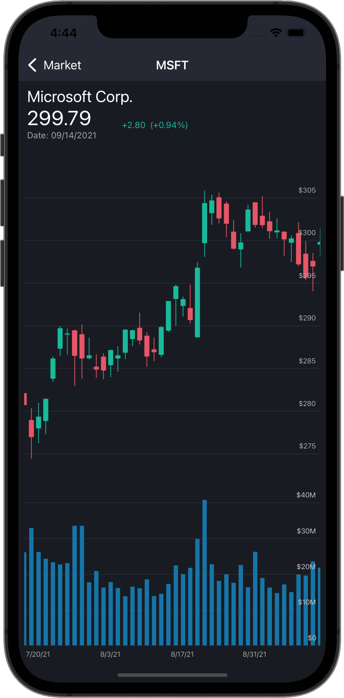
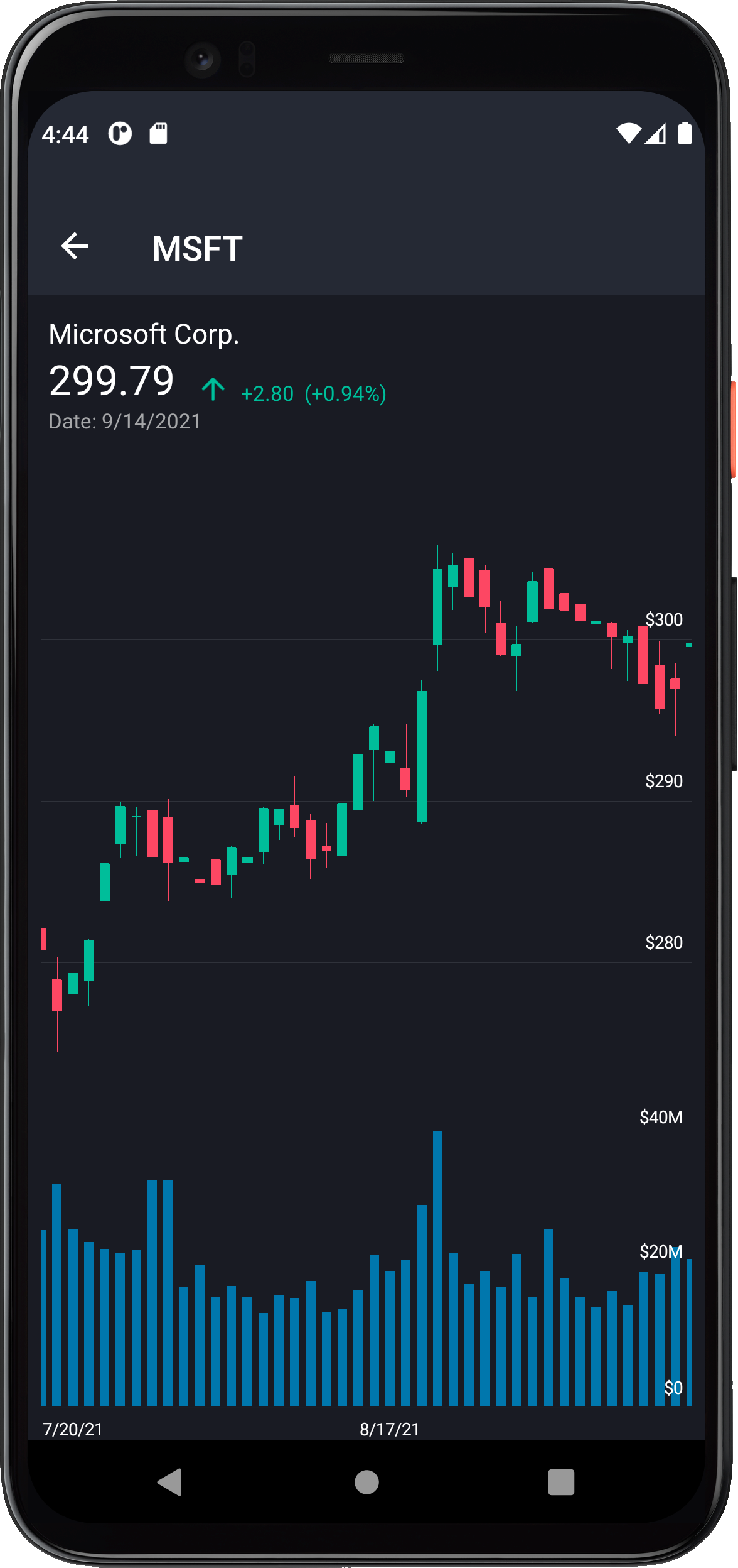
The second screen uses the DevExpress Chart View for .NET MAUI to display historical data (daily open-close-high-low stock prices and transaction volume).

iPhone 12Pixel 4

The UI components used in this sample application (alongside other DevExpress .NET MAUI components) are available free of charge. To learn more about our free offer and reserve your free copy, please visit the following webpage: Xamarin.Forms UI Controls – Free Offer from DevExpress.

Prerequisites

  1. Install Visual Studio 2022 and the latest version of .NET MAUI. Review the following Microsoft help topic for more information: Installation.
  2. Register the https://nuget.devexpress.com/free/api or your personal NuGet feed within Visual Studio. If you are unfamiliar with NuGet packages, please review the following Microsoft help topic (to register a NuGet source): Install and manage packages in Visual Studio.

How to Reproduce This Application

The following step-by-step tutorial details how to reproduce this application. In this blog post, I'll show you how to create the first screen that uses our Collection View. In the next post, I will show how to use our Japanese Candlestick Chart.

Create a New Project

  1. Create a new .NET MAUI project in Visual Studio 2022. Name it Stocks. If you are new to .NET MAUI, the following Microsoft help topic will be of value: Build your first app. You can also call the following command in a CLI to create a new .NET MAUI project: 
    dotnet new maui -n Stocks
  2. Install the following packages from the https://nuget.devexpress.com/free/api or your personal NuGet feed:
    • DevExpress.Maui.CollectionView - contains the DevExpress .NET MAUI DXCollectionView component.
    • DevExpress.Maui.Charts - contains the DevExpress .NET MAUI ChartView component.
Collection View and Charts for .NET MAUI support both iOS and Android. Your project cannot target MacCatalyst and/or Windows. To remove them, right-click the project and click Edit Project File. Remove any references to Windows and MacCatalyst. Use the project file in the repository as an example. In addition, please remove MacCatalyst and Windows folders from the Platforms folder in Solution Explorer.

The Main Page

Our main page displays a list of companies. In the MainPage.xaml file, you must:
  1. Define the dxcv XAML namespace that refers to the DevExpress.Maui.CollectionView CLR namespace.
  2. Remove default content and add an instance of the DXCollectionView class to the page. Remove default content event handlers in the code-behind. We recommend that you remove default styles (fonts, colors, and other settings) in the App.xaml file.
<ContentPage
    xmlns="http://schemas.microsoft.com/dotnet/2021/maui"
    xmlns:x="http://schemas.microsoft.com/winfx/2009/xaml"
    xmlns:d="http://schemas.microsoft.com/dotnet/2021/maui/design"
    xmlns:dxcv="clr-namespace:DevExpress.Maui.CollectionView;assembly=DevExpress.Maui.CollectionView"
    xmlns:local="clr-namespace:Stocks"
    Title="Market"
    BackgroundColor="{DynamicResource BackgroundColor}"
    x:Class="Stocks.MainPage">
    <dxcv:DXCollectionView/>
</ContentPage>

Register Handlers for the Chart and Collection Views

The .NET MAUI Framework requires a registered handler for all third-party controls used in an application. Review the following Microsoft help topic for more information: Register handlers.
In the MauiProgram.cs file, register a handler for the DXCollectionView type as shown below. Since we use a chart on the second page, we also register a handler for the ChartView type.
using DevExpress.Maui.CollectionView;
using DevExpress.Maui.Charts;
using Microsoft.Maui;
using Microsoft.Maui.Hosting;
using Microsoft.Maui.Controls.Hosting;
using Microsoft.Maui.Controls.Xaml;

[assembly: XamlCompilationAttribute(XamlCompilationOptions.Compile)]

namespace Stocks {
    public static class MauiProgram {
        public static MauiApp CreateMauiApp() {
            var builder = MauiApp.CreateBuilder();
            builder
                .UseMauiApp<App>()
                .ConfigureMauiHandlers((handlers) => 
                    handlers.AddHandler(typeof(IDXCollectionView), typeof(DXCollectionViewHandler)))
                .ConfigureMauiHandlers((handlers) => 
                    handlers.AddHandler(typeof(ChartView), typeof(ChartViewHandler)))
                .ConfigureFonts(fonts => fonts.AddFont("OpenSans-Regular.ttf", "OpenSansRegular"));
            return builder.Build();
        }
    }
}

Data Source

If we run the application as it stands, it will display an empty collection view on the main page. The next step is to populate the app with data. This sample application follows the MVVM pattern. To store data, the application uses the following classes:

  • Symbol - contains company name, ticker, and a collection of daily historical data.
  • StockPrice - contains open-close-high-low prices and transaction volume for a single day.

Create a new class in the project and paste the following code:

using System;
using System.Collections.Generic;

namespace Stocks {
    public class Symbol {
        public string Ticker { get; set; }
        public string Name { get; set; }
        public IList<StockPrice> Prices {  get; set; }
    }
    public class StockPrice {
        public DateTime Date { get; set; }
        public double Open { get; set; }
        public double Close { get; set; }
        public double High { get; set; }
        public double Low { get; set; }
        public double Volume { get; set; }
    }
}

Populate the Data Source

Most mobile applications use a REST API to obtain data from a web service. The response can be formatted in HTML, XML, JSON, or any other format. This sample application uses static data formatted in JSON and stored in a file. The JSON file contains an array of companies, with an array of daily historical stock prices for each.

Download the symbols.json file, and add this file to the solution. Right-click the project, click Add > Existing Item. Once added, right-click the file, go to properties, and set Build Action to Embedded resource.

Specify the logical name in the project file as shown below.

<EmbeddedResource Include="symbols.json">
	<LogicalName>symbols</LogicalName>
</EmbeddedResource>

Use the code below to read data from the file and populate the data source. Create a new class in the project as follows:

using System.Collections.Generic;
using System.IO;
using System.Reflection;
using System.Text;

namespace Stocks {
    public static class Data {
        static readonly string logicalName = "symbols";

        static IList<Symbol> symbols;
        public static IList<Symbol> Symbols {
            get {
                if (symbols == null) {
                    symbols = GetSymbols();
                }
                return symbols;
            }
        }

        static IList<Symbol> GetSymbols() {
            List<Symbol> symbols = null;
            using (Stream stream = Assembly.GetExecutingAssembly().GetManifestResourceStream(logicalName))
            using (StreamReader reader = new(stream, Encoding.UTF8)) {
                var json = reader.ReadToEnd();
                symbols = Newtonsoft.Json.JsonConvert.DeserializeObject<List<Symbol>>(json);
            }
            return symbols;
        }
    }
}
You should install the Newtonsoft.Json package to deserialize data. Review the following Microsoft help topic for more information: Install and use a package in Visual Studio.

The Main View Model

To proceed, we will need to create a view model for the main page. As the data source contains an array of daily stock prices, we can display the price change next to each company in the list. The code below defines the following view models:

  • ItemViewModel - a view model for an item in the view. It contains company name, close stock price, price change, and change percentage.
  • MainViewModel - a view model for the main page. It contains a collection of item view models. When the main view model is created, it populates the item collection with data.
using System;
using System.Collections.Generic;

namespace Stocks {
    public class MainViewModel {
        public IList<ItemViewModel> Items { get; set; }

        public MainViewModel() {
            Items = new List<ItemViewModel>();
            foreach (Symbol symbol in Data.Symbols) {
                var symbolViewModel = new ItemViewModel();
                symbolViewModel.Ticker = symbol.Ticker;
                symbolViewModel.CompanyName = symbol.Name;
                symbolViewModel.Change = symbol.Prices[0].Close - symbol.Prices[1].Close;
                symbolViewModel.ChangePercent = symbol.Prices[0].Close / symbol.Prices[1].Close - 1;
                symbolViewModel.Date = symbol.Prices[0].Date;
                symbolViewModel.ClosePrice = symbol.Prices[0].Close;
                Items.Add(symbolViewModel);
            }
        }
    }

    public class ItemViewModel {
        public string Ticker { get; set; }
        public string CompanyName { get; set; }
        public double ClosePrice { get; set; }
        public double Change { get; set; }
        public double ChangePercent { get; set; }
        public DateTime Date { get; set; }
    }
}

Update the Main Page Markup

We can now update main page markup so it displays data from the view model. We set the ContentPage.BindingContext property to a view model object and bind the DXCollectionView.ItemsSource property to a collection in this view model.

<ContentPage.BindingContext>
    <local:MainViewModel/>
</ContentPage.BindingContext>
<ContentPage.Content>
    <dxcv:DXCollectionView
        ItemsSource="{Binding Items}">
    </dxcv:DXCollectionView>
</ContentPage.Content>

Item Template

The DXCollectionView.ItemTemplate property allows you to specify a data template used to render items in the view. In this example, the template contains multiple labels and an image. Review the following Microsoft help topic for more information on data templates: Creating a Data Template.
Let's create a grid layout in the item template.
<dxcv:DXCollectionView.ItemTemplate>
    <DataTemplate>
        <Grid
            Margin="0"
            BackgroundColor="Transparent"
            RowSpacing="0"
            ColumnSpacing="0"
            Padding="8,0"
            ColumnDefinitions="*, *"
            RowDefinitions="Auto, Auto, 1">
        </Grid>
    </DataTemplate>
</dxcv:DXCollectionView.ItemTemplate>

We also need to populate the grid layout with labels and images.

<Label
    Text="{Binding Ticker}"
    Margin="12,12,0,0"
    VerticalOptions="End"
    TextColor="{DynamicResource PrimaryTextColor}"
    FontSize="Medium"/>
<Label
    Text="{Binding CompanyName}"
    Grid.Row="1"
    Margin="12,4,0,12"
    VerticalOptions="Start"
    FontSize="Caption"
    TextColor="{DynamicResource SecondaryTextColor}"/>
<Label
    Text="{Binding ClosePrice}"
    Grid.Column="1"
    VerticalOptions="End"
    Margin="0,12,12,0"
    HorizontalOptions="End"
    FontSize="Medium"
    TextColor="{DynamicResource PrimaryTextColor}"/>
<StackLayout
    Orientation="Horizontal"
    Grid.Column="1"
    Grid.Row="1"
    VerticalOptions="Start"
    HorizontalOptions="EndAndExpand"
    Margin="0,4,12,12">
    <Image
        Source="{Binding Change, Converter={local:DoubleToImageSourceConverter
        PositiveValue='quote_arrow_up',
        NegativeValue='quote_arrow_down',
        ZeroValue='not_changed'}}"
        WidthRequest="18"
        HeightRequest="18"
        VerticalOptions="Start"
        Margin="0,0,3,0"/>
    <Label
        Text="{Binding Change, StringFormat='{0:+0.00;-0.00;0.00}'}"
        TextColor="{Binding Change, Converter={local:DoubleToColorConverter
        PositiveValue='RisingValueColor',
        NegativeValue='FallingValueColor',
        ZeroValue='TextColor'}}"
        VerticalOptions="Start"
        FontSize="Caption"
        Margin="3,0"/>
    <Label
        Text="{Binding ChangePercent, StringFormat='{0:(+0.00%);(-0.00%);(0.00%)}'}"
        TextColor="{Binding Change, Converter={local:DoubleToColorConverter
        PositiveValue='RisingValueColor', 
        NegativeValue='FallingValueColor', 
        ZeroValue='TextColor'}}"
        VerticalOptions="Start"
        Margin="3,0,0,0"
        FontSize="Caption"/>
</StackLayout>
<BoxView
    Grid.Row="2"
    Grid.ColumnSpan="2"
    Color="{DynamicResource SeparatorColor}"
    Margin="12,0"/>

Value Converters

As you may notice, the markup uses a converter to display an up or down arrow (depending on price increase/decrease). You can find the appropriate image files in the Images folder. Copy these files to the Resources folder in your project. The text color also depends on price change. To learn more about converters, review the following Microsoft help topic: Binding Value Converters.

using Microsoft.Maui.Controls;
using Microsoft.Maui.Controls.Xaml;
using Microsoft.Maui.Graphics;
using System;
using System.Globalization;

namespace Stocks {
    public class DoubleToImageSourceConverter : IValueConverter, IMarkupExtension<DoubleToImageSourceConverter> {
        public ImageSource ZeroValue { get; set; } = string.Empty;
        public ImageSource PositiveValue { get; set; } = string.Empty;
        public ImageSource NegativeValue { get; set; } = string.Empty;
        public object Convert(object value, Type targetType, object parameter, CultureInfo culture) {
            if (!(value is double doubleValue) || targetType != typeof(ImageSource)) return null;
            switch (doubleValue) {
                case > 0: return PositiveValue;
                case < 0: return NegativeValue;
                default: return ZeroValue;
            }
        }
        public object ConvertBack(object value, Type targetType, object parameter, CultureInfo culture) {
            throw new NotSupportedException();
        }

        public object ProvideValue(IServiceProvider serviceProvider) {
            return this;
        }

        DoubleToImageSourceConverter IMarkupExtension<DoubleToImageSourceConverter>.ProvideValue(IServiceProvider serviceProvider) {
            return this;
        }
    }

    public class DoubleToColorConverter : IValueConverter, IMarkupExtension<DoubleToColorConverter>{
        public string ZeroValue { get; set; } = string.Empty;
        public string PositiveValue { get; set; } = string.Empty;
        public string NegativeValue { get; set; } = string.Empty;
        public object Convert(object value, Type targetType, object parameter, CultureInfo culture) {
            if (!(value is double doubleValue) || targetType != typeof(Color)) return null;
            switch (doubleValue) {
                case > 0: return (Color)Application.Current.Resources[PositiveValue];
                case < 0: return (Color)Application.Current.Resources[NegativeValue];
                default: return (Color)Application.Current.Resources[ZeroValue];
            }
        }
        public object ConvertBack(object value, Type targetType, object parameter, CultureInfo culture) {
            throw new NotSupportedException();
        }

        public DoubleToColorConverter ProvideValue(IServiceProvider serviceProvider) {
            return this;
        }

        object IMarkupExtension.ProvideValue(IServiceProvider serviceProvider) {
            return this;
        }
    }
}

Theme

The application applies a dark theme to controls. You can find colors and styles in the DarkTheme.xaml and SharedStyles.xaml files within the https://github.com/DevExpress-Examples/maui-stocks-mini repository. Create similar styles and colors in your project and add them to the resource dictionary in the App.xaml file.

Run the Application

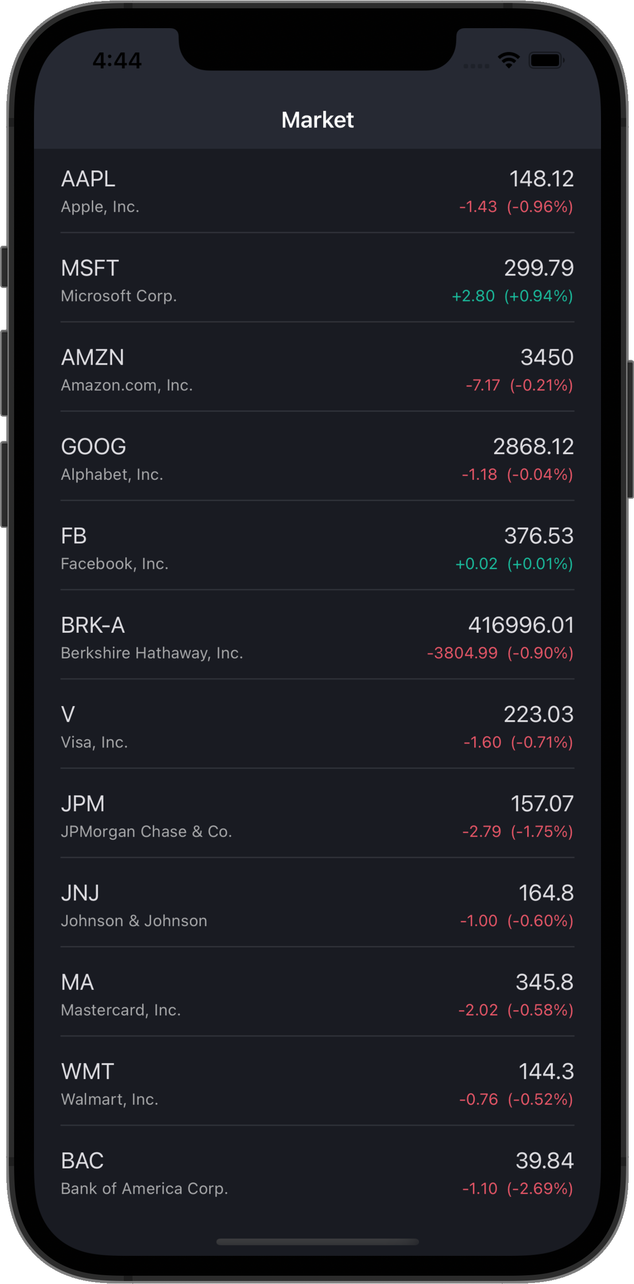
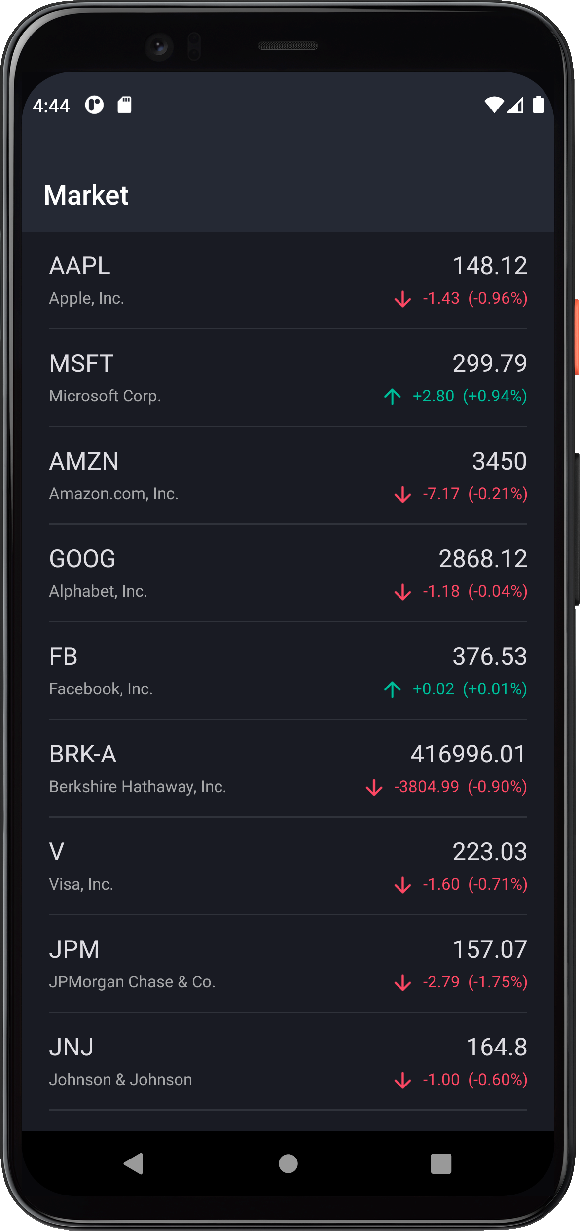
You can now execute the application. Your main page should now display a list of companies.

iPhone 12Pixel 4


Microsoft’s New XAML Designer for WPF apps

$
0
0

As you may already know, Visual Studio 2022 uses an entirely new WPF XAML Designer (for all versions of .NET and .NET Framework). We’ve been working closely with Microsoft to replicate (and extend) the design-time capabilities of our WPF product line withing this new XAML Designer. In this post, I’ll summarize what we’ve accomplished in this regard. Should you have any questions about the contents of this post, feel free to comment below.

Quick Actions

v21.1 introduced Quick Actions support (smart tag replacement within the new XAML Designer). With v21.2, we have added actions to auto-generate a full-featured Ribbon-based UI for the following component libraries:

  • Rich Text Editor
  • Scheduler
  • Spreadsheet

You can choose to generate a full Ribbon UI or limit it to specific/selected categories.

XAML Designer Extensions

We have replicated the following DevExpress design-time capabilities for Microsoft’s new XAML Designer:

Conditional Formatting Rules Manager

Available both at design and runtime for our WPF Grid control. This extension replicates the Microsoft Excel’s Conditional Formatting Rules Manager.

Chart Designer

The DevExpress Chart Designer (for Developers) allows you to create/customize/preview charts within a separate window.

Mask Editor

The Mask Editor allows you to construct WPF input masks. It includes a comprehensive selection of predefined masks and intuitive customization options.

Template Galleries

You can use a platform selector in WPF Template Galleries to choose between .NET Framework and .NET platforms. We have also added an MVVM template that utilizes the View Model Code Generator.

DevExpress Reports: Visual Studio Report Designer for .NET Apps

Our Visual Studio Report Designer supports all .NET platforms and deserves an entire post of its own. The Report Designer was published as a CTP (community technology preview) in our v21.1 release cycle. With our most recent major update (v21.2), we’ve addressed all major limitations. A detailed description of our Visual Studio Report Designer will be posted shortly.

DevExpress UI Controls Support the Latest Microsoft .NET MAUI Preview 10

$
0
0

As of last Friday, our .NET MAUI controls fully support Microsoft Preview 10. If you’re ready to install the latest version of Microsoft’s .NET MAUI platform, please review the following post: https://devblogs.microsoft.com/dotnet/announcing-net-maui-preview-10/.

To install the latest version of DevExpress .NET MAUI controls, please review the following help topic: https://docs.devexpress.com/MAUI/.

If you’d like to see what’s possible with our .NET MAUI controls, please check out our .NET MAUI sample app for iOS and Android: Stock Market App for .NET Multi-platform App UI (.NET MAUI) (Part 1).

iPhone 12Pixel 4

Get the Best of Two Mobile Worlds Using One NuGet Feed

As you can see below, our Xamarin Forms UI components are also available free-of-charge. If you’ve obtained our Xamarin UI controls in the past, your personal NuGet feed will also include our latest .NET MAUI controls.

Your Feedback Counts!

If you are currently using Xamarin Forms, considering MAUI, or just investigating your options, feel free to comment below, we’ll be happy to follow-up. Thanks for considering DevExpress for your development needs.

Stock Market App for .NET Multi-platform App UI (.NET MAUI) (Part 2)

$
0
0

In this second post of our .NET MAUI “Stock App” blog series, we'll show you how to leverage the capabilities of the DevExpress Chart View for .NET MAUI and illustrate how to display historical data (daily open-close-high-low stock prices and transaction volume) within your next mobile app. If you are new to this series, please be sure to review our first post for background information on this app. The complete sample is available here: https://github.com/DevExpress-Examples/maui-stocks-mini.


The UI components used in this sample application (alongside other DevExpress .NET MAUI components) are available free of charge. To learn more about our free offer and reserve your free copy, please visit the following webpage: Xamarin.Forms UI Controls – Free Offer from DevExpress.

Prerequisites

  1. Install Visual Studio 2022 and the latest version of .NET MAUI. Review the following Microsoft help topic for more information: Installation.
  2. Register the https://nuget.devexpress.com/free/api or your personal NuGet feed within Visual Studio. If you are unfamiliar with NuGet packages, please review the following Microsoft help topic (to register a NuGet source): Install and manage packages in Visual Studio.

How to Reproduce This Application

The following step-by-step tutorial details how to reproduce this application. In this blog post, I will show how to use our Japanese Candlestick Chart.

The Historical Data Page

The second page displays historical data (using our .NET MAUI Chart component). Create a new page in Visual Studio and name it HistoricalDataPage. Ensure Build Action is set to MauiXaml.
HistoricalDataPage.xaml File Properties
Define the dxc XAML namespace that refers to the DevExpress.Maui.Charts CLR namespace.
<ContentPage
    xmlns="http://schemas.microsoft.com/dotnet/2021/maui"
    xmlns:x="http://schemas.microsoft.com/winfx/2009/xaml"
    xmlns:dxc="clr-namespace:DevExpress.Maui.Charts;assembly=DevExpress.Maui.Charts"
    xmlns:local="clr-namespace:Stocks"
    x:Class="Stocks.HistoricalDataPage"
    BackgroundColor="{DynamicResource BackgroundColor}">
    <ContentPage.Content>
    </ContentPage.Content>
</ContentPage>

Populate the Chart with Data


We’ll need to create a view model for this page and populate it with data. The code below defines the HistoricalDataViewModel class and exposes the following properties:

  • StockPrices - daily open-close-high-low stock prices.
  • RangeStart and RangeEnd - specify the visible date range in the chart. The chart displays data for the last 60 days. Users can scroll the chart to explore all historical price data.
using System;
using System.Collections.Generic;
using System.Linq;

namespace Stocks {
    public class HistoricalDataViewModel {
        public ItemViewModel Item { get; set; }
        public IList<StockPrice> StockPrices { get; set; }
        public DateTime RangeStart { get; set; }
        public DateTime RangeEnd { get; set; }

        public HistoricalDataViewModel(ItemViewModel item) {
            Item = item;
            Symbol symbol = Data.Symbols.Where(s => s.Ticker == this.Item.Ticker).First();
            RangeStart = symbol.Prices.First().Date;
            RangeEnd = RangeStart.AddDays(-60);
            StockPrices = new List<StockPrice>();
            foreach(StockPrice price in symbol.Prices) {
                StockPrices.Add(price);
            }
        }
    }
}

Update the Historical Data Page Markup

We can now update the historical data page so it displays data from the view model. We set the ContentPage.BindingContext property to a view model object in the page constructor.

using Microsoft.Maui.Controls;

namespace Stocks {
    public partial class HistoricalDataPage : ContentPage {
        public HistoricalDataPage(HistoricalDataViewModel viewModel) {
            InitializeComponent();
            BindingContext = viewModel;
            Title = viewModel.Item.Ticker;
        }
    }
}

At the top of the page, the app displays company name and the last price. Below company name, the app displays a chart. We place these elements within a grid layout.

<Grid>
    <Grid.RowDefinitions>
        <RowDefinition Height="115"/>
        <RowDefinition Height="*"/>
    </Grid.RowDefinitions>
</Grid>

The first grid row contains company name and the last price. We use labels and images to display this information.

<StackLayout
    Grid.Row="0" Grid.Column="0"
    BackgroundColor="Transparent"
    Orientation="Vertical"
    HorizontalOptions="StartAndExpand"
    VerticalOptions="CenterAndExpand"
    Spacing="0"
    Margin="12">
    <Label
        Text="{Binding Item.CompanyName}"
        TextColor="{DynamicResource TextColor}"
        FontSize="Subtitle"
        Margin="0,0,12,0"/>
    <StackLayout
        Orientation="Horizontal"
        Spacing="0"
        HorizontalOptions="StartAndExpand">
        <Label
            Text="{Binding Item.ClosePrice, StringFormat='{0:0.00}'}"
            TextColor="{DynamicResource TextColor}"
            FontSize="Title"
            Margin="0,0,12,0"
            VerticalOptions="End"
            VerticalTextAlignment="End"
            LineBreakMode="TailTruncation"/>
        <Image
            WidthRequest="18"
            HeightRequest="18"
            HorizontalOptions="End"
            Margin="0,0,3,0"
            Source="{Binding Item.Change, 
            Converter={local:DoubleToImageSourceConverter
                PositiveValue='quote_arrow_up.svg', 
                NegativeValue='quote_arrow_down.svg',
                ZeroValue='not_changed.svg'}}"
            VerticalOptions="End">
            <Image.WidthRequest>
                <OnPlatform x:TypeArguments="x:Double">
                    <On Platform="Android" Value="20"/>
                    <On Platform="iOS" Value="24"/>
                </OnPlatform>
            </Image.WidthRequest>
            <Image.HeightRequest>
                <OnPlatform x:TypeArguments="x:Double">
                    <On Platform="Android" Value="20"/>
                    <On Platform="iOS" Value="24"/>
                </OnPlatform>
            </Image.HeightRequest>
        </Image>
        <Label
            Text="{Binding Item.Change, StringFormat='{0:+0.00;-0.00;0.00}'}"
            TextColor="{Binding Item.Change, 
            Converter={local:DoubleToColorConverter
                PositiveValue='RisingValueColor', 
                NegativeValue='FallingValueColor', 
                ZeroValue='TextColor'}}"
            HorizontalOptions="End"
            VerticalOptions="End"
            FontSize="Caption"
            Margin="3,0"/>
        <Label
            Text="{Binding Item.ChangePercent, StringFormat='{0:(+0.00%);(-0.00%);(0.00%)}'}"
            TextColor="{Binding Item.Change, 
            Converter={local:DoubleToColorConverter
                PositiveValue='RisingValueColor', 
                NegativeValue='FallingValueColor', 
                ZeroValue='TextColor'}}"
            HorizontalOptions="End"
            VerticalOptions="End"
            Margin="3,0,0,0"
            FontSize="Caption"/>
    </StackLayout>
    <Label
        Text="{Binding Item.Date, StringFormat='Date: {0:d}'}"
        TextColor="{DynamicResource SecondaryTextColor}"
        FontSize="Caption"/>
</StackLayout>

We place the chart in the second row.

<dxc:ChartView
    Theme="Dark"
    Grid.Row="1"
    AxisXNavigationMode="ScrollingAndZooming"
    AxisMaxZoomPercent="100000">
    <dxc:ChartView.ChartStyle>
        <dxc:ChartStyle
            BackgroundColor="{StaticResource BackgroundColor}">
            <dxc:ChartStyle.Padding>
                <dxc:Padding Left="8" Right="8"/>
            </dxc:ChartStyle.Padding>
        </dxc:ChartStyle>
    </dxc:ChartView.ChartStyle>
</dxc:ChartView>

Axes

The ChartView.AxisX and ChartView.AxisY properties allow you to configure chart axes:
<dxc:ChartView.AxisX>
    <dxc:DateTimeAxisX
        x:Name="axisX"
        EmptyRangesVisible="False"
        MeasureUnit="Day">
        <dxc:DateTimeAxisX.Range>
            <dxc:DateTimeRange
                SideMargin="3"
                VisualMin="{Binding RangeStart}"
                VisualMax="{Binding RangeEnd}"/>
        </dxc:DateTimeAxisX.Range>
    </dxc:DateTimeAxisX>
</dxc:ChartView.AxisX>
<dxc:ChartView.AxisY>
    <dxc:NumericAxisY
        AlwaysShowZeroLevel="False"
        AutoRangeMode="VisibleValues">
        <dxc:NumericAxisY.DisplayPosition>
            <dxc:AxisDisplayPositionFar/>
        </dxc:NumericAxisY.DisplayPosition>
        <dxc:NumericAxisY.Layout>
            <dxc:AxisLayout Anchor1="0.333" Anchor2="1.0" />
        </dxc:NumericAxisY.Layout>
        <dxc:NumericAxisY.Label>
            <dxc:AxisLabel Position="Inside" TextFormat="$#.#"/>
        </dxc:NumericAxisY.Label>
        <dxc:NumericAxisY.Style>
            <dxc:AxisStyle
                LineVisible="False"
                MajorGridlinesVisible="True"
                MajorGridlinesColor="{StaticResource SeparatorColor}"/>
        </dxc:NumericAxisY.Style>
    </dxc:NumericAxisY>
</dxc:ChartView.AxisY>

Japanese Candlestick Chart

The CandleStickSeries contains open-close-high-low stock prices. The CandleStickSeries.Data property is set to a SeriesDataAdapter object. This object interprets bound data source fields. To specify data source fields with data, we use ValueDataMember objects. Review the following topic for more information: Data Adapters.

<dxc:ChartView.Series>
    <dxc:CandleStickSeries>
        <dxc:CandleStickSeries.Data>
            <dxc:SeriesDataAdapter
                DataSource="{Binding StockPrices}"
                ArgumentDataMember="Date">
                <dxc:ValueDataMember Type="Open" Member="Open"/>
                <dxc:ValueDataMember Type="High" Member="High"/>
                <dxc:ValueDataMember Type="Low" Member="Low"/>
                <dxc:ValueDataMember Type="Close" Member="Close"/>
            </dxc:SeriesDataAdapter>
        </dxc:CandleStickSeries.Data>
    </dxc:CandleStickSeries>
</dxc:ChartView.Series>

We assign a CandleStickSeriesStyle object to the CandleStickSeries.Style property to specify candlestick-related appearance settings.

<dxc:CandleStickSeries.Style>
    <dxc:CandleStickSeriesStyle
        RisingFill="{StaticResource RisingValueColor}"
        RisingStroke="{StaticResource RisingValueColor}"
        FallingFill="{StaticResource FallingValueColor}"
        FallingStroke="{StaticResource FallingValueColor}"/>
</dxc:CandleStickSeries.Style>

Bar Chart

The BarSeries display data as bars. We use Bar charts to display daily stock volumes.

<dxc:BarSeries>
    <dxc:BarSeries.Data>
        <dxc:SeriesDataAdapter DataSource="{Binding StockPrices}"
                                ArgumentDataMember="Date">
            <dxc:ValueDataMember Type="Value"
                                Member="Volume" />
        </dxc:SeriesDataAdapter>
    </dxc:BarSeries.Data>
    <dxc:BarSeries.Style>
        <dxc:BarSeriesStyle
            Fill="{StaticResource SymbolDetailPage_VolumeChartColor}"
            Stroke="{StaticResource SymbolDetailPage_VolumeChartColor}"/>
    </dxc:BarSeries.Style>
</dxc:BarSeries>
We can use the BarSeries.AxisY property to specify the Y-axis. A NumericAxisY object allows you to specify the following settings:
<dxc:BarSeries.AxisY>
    <dxc:NumericAxisY
        AutoRangeMode="VisibleValues">
        <dxc:NumericAxisY.LabelValueNotation>
            <dxc:AxisLabelEngineeringNotation/>
        </dxc:NumericAxisY.LabelValueNotation>
        <dxc:NumericAxisY.Layout>
            <dxc:AxisLayout Anchor1="0" Anchor2="0.333" />
        </dxc:NumericAxisY.Layout>
        <dxc:NumericAxisY.DisplayPosition>
            <dxc:AxisDisplayPositionFar/>
        </dxc:NumericAxisY.DisplayPosition>
        <dxc:NumericAxisY.Label>
            <dxc:AxisLabel Position="Inside" TextFormat="$#">
                <dxc:AxisLabel.Style>
                    <dxc:AxisLabelStyle>
                        <dxc:AxisLabelStyle.TextStyle>
                            <dxc:TextStyle Color="{StaticResource TextColor}"/>
                        </dxc:AxisLabelStyle.TextStyle>
                    </dxc:AxisLabelStyle>
                </dxc:AxisLabel.Style>
            </dxc:AxisLabel>
        </dxc:NumericAxisY.Label>
        <dxc:NumericAxisY.Style>
            <dxc:AxisStyle
                LineVisible="False"
                MajorGridlinesVisible="True"
                MajorGridlinesColor="{StaticResource SeparatorColor}"/>
        </dxc:NumericAxisY.Style>
    </dxc:NumericAxisY>
</dxc:BarSeries.AxisY>

Navigation Between Two Pages

When a user taps a company in the list on the main page, the application displays historical data for that company on the second page. Let's wrap the main page in a NavigationPage to support navigation from the main page to the second page (and back). Update the App.xaml.cs file as follows:

using Microsoft.Maui.Controls;
using Application = Microsoft.Maui.Controls.Application;

namespace Stocks {
    public partial class App : Application {
        public App() {
            InitializeComponent();
            MainPage = new NavigationPage(new MainPage());
        }
    }
}

In the MainPage.xaml file and the code-behind, handle the DXCollectionView.Tap event as follows:

using DevExpress.Maui.CollectionView;

private void DXCollectionView_Tap(object sender, CollectionViewGestureEventArgs e) {
	var item = (ItemViewModel)e.Item;
	var historicalDataViewModel = new HistoricalDataViewModel(item);
	Navigation.PushAsync(new HistoricalDataPage(historicalDataViewModel));
}

Run the Application

Let’s execute the application once more. Users can now tap a company name on the main page and analyze the company's historical data on the second page.

iPhone 12Pixel 4


iPhone 12Pixel 4

Reporting — Video Tutorial, Enhancements, Documentation Updates, Tips & Tricks (November 2021)

$
0
0

New DevExpress Reporting Video Tutorial

DevExpress MVP Jose Javier Columbie has started a new DevExpress Reporting training course on YouTube (DevExpress XtraReports). We want to thank Jose for his hard work and ongoing commitment to our tools. Jose welcomes feedback – so be sure to show your appreciation and let him know what you think of his course.

A Few Recent Enhancements of Note

RDLC and Crystal Reports Conversion Tool Supports New Expression Functions

As of last month, our Report Conversion Tool recognizes the following third-party expressions: RDLC’s Right and Mid functions, Crystal’s Length & Mid functions, and Crystal’s CurrentDate special field.

XRChart - RTL Support

Our XRChart control is now RTL-enabled! XRChart maintains right-to-left orientation if its parent container is placed into RTL mode (default behavior), or if the chart’s RightToLeft property is set explicitly.

New PDF Content Demo (Desktop and Web)

Check out the following demos if you want to embed a PDF file directly into your report:

DirectX WinForms Demo

Our WinForms Reporting demos (within the DevExpress Demo Center) now include a DirectX | GDI+ switch. If you have yet to explore the benefits of DirectX rendering on the WinForms platform (a DevExpress exclusive), be sure to specify DirectX mode before you execute our report demos (DirectX improves glyph rendering quality and scrolling performance).

Documentation Updates

We updated the WPF Application Security section of our help system:

We also added the following help topic:

Since bitmap icons are no longer supported (v21.2), the following help topics have been rewritten:

The following topics have been updated:

Updates to our WPF Reporting Document Preview help section:

The following help topic has been updated with new information:

Interesting Support Tickets

Reporting for Blazor

Reporting for Windows Forms

Reporting for WPF

Reporting for Web

Your Feedback Matters

As always, we welcome your thoughts/feedback. Please post a comment below and let us know how we can help.


Office File API & Office-Inspired Desktop UI Controls - Generate Accessible PDF Files (v21.2)

$
0
0

Our most recent release (v21.2) includes enhanced PDF export options for our Spreadsheet and Word Processing product lines (WinForms-WPF-Office File API). You can now convert your spreadsheet and rich text documents to accessible PDF files. This will allow people with disabilities to use screen readers and other assistive technologies to read and navigate PDF documents.

Supported Accessible PDF File Formats

With the DevExpress Office File API and our Office-inspired WinForms and WPF UI components, you can generate PDF files that conform to the following standards:

  • PDF/A Conformance Level A (Accessible): PDF/A-1a, PDF/A-2a, PDF/A-3a

    PDF/A is an archival PDF format used for long-term preservation of electronic documents. Conformance level A includes requirements designed to preserve a document’s logical structure, semantic content, and natural reading order. This conformance level helps produce accessible documents for people with disabilities (for example, visually impaired individuals).

  • PDF/UA (Universal Accessibility)

    This standard applies specific demands on the semantic structure of PDF documents to help ensure accessibility and support for assistive technologies. The requirements outlined in the PDF/UA spec are based on Web Content Accessibility Guidelines (WCAG) 2.0.

When you save a text document or workbook in one of the formats described above, the DevExpress PDF export engine creates tags for all meaningful document elements (headings, paragraphs, tables, lists, images, etc.). These tags are organized into a hierarchical tree – a tree that defines the order in which a screen reader recites document content.

How to Generate an Accessible PDF File

Use the following PdfExportOptions class properties to specify the desired accessibility standard (exported PDF files will conform to one of these standards):

Pass a PdfExportOptions class instance to the ExportToPdf method of the appropriate DevExpress component (Spreadsheet/Rich Text Control for WinForms/WPF or Office File API) to export a workbook or text document to PDF.

Example 1. Use the Spreadsheet Document API to Save an Excel Workbook as a PDF/UA File

using DevExpress.Spreadsheet;
using DevExpress.XtraPrinting;
// ...

using (var workbook = new Workbook())
{
    // Load XLSX document. 
    workbook.LoadDocument("Document.xlsx", DocumentFormat.Xlsx);
    
    // Specify PDF export options.
    var options = new PdfExportOptions();
    options.PdfUACompatibility = PdfUACompatibility.PdfUA1;

    // Save workbook as PDF/UA file.
    workbook.ExportToPdf("OutputDocument.pdf", options);
}

Example 2. Use the Word Processing Document API to Save a Word Document as a PDF/UA File

using DevExpress.XtraRichEdit;
using System.Drawing;
// ...

using (var wordProcessor = new RichEditDocumentServer())
{
    // Load DOCX document.
    wordProcessor.LoadDocument("Document.docx", DocumentFormat.OpenXml);
    
    // Specify PDF export options.
    var options = new PdfExportOptions();
    options.PdfUACompatibility = PdfUACompatibility.PdfUA1;

    // Save document as PDF/UA file.
    wordProcessor.ExportToPdf("OutputDocument.pdf", options);
}

You can also save a text document or workbook as an accessible PDF file directly within our Rich Text Editor or Spreadsheet control’s Print Preview window.

Try It Now

To explore PDF accessibility features in greater detail, be sure to check out our new Office File API demo modules:

Once you generate a PDF file, you can use Adobe Acrobat Pro DC or PDF Accessibility Checker (PAC) to check adherence to accessibility standards. The following image displays verification results for our sample document saved as a PDF/UA file (we used Acrobat Pro DC to verify adherence):

Your Feedback Matters

We’d love to know what you think of PDF accessibility support within our Office-inspired products. Please share your thoughts in the comment section below or submit a support ticket via the DevExpress Support Center.

WPF Themes - Use System Colors and Switch Between Light and Dark App Modes Like Office 2021 (v21.2)

$
0
0

In the latest version of Microsoft Office products, users can select a theme based on system settings. When this theme is used, Office takes Windows Accent Color and App Mode (Light/Dark) settings and applies them to Office itself. If a user changes the Accent Color or App Mode in the OS, Office detects this change and updates the appearance of the application automatically.

With DevExpress WPF Controls v21.2, you can obtain appropriate Windows Accent Color and App Mode (Dark/Light) settings and apply these colors to your application (using our new System Colors theme). If you prefer a Dark application theme, you can use our new Win10Dark theme instead (like any other DevExpress WPF application theme).

System Colors Theme

Just like Microsoft Office, our System Colors theme obtains Windows Accent Color and App Mode (Dark/Light) settings and applies these colors to your application. Our System Colors theme uses palettes to switch colors at run time.

Report Designer - New Expression Button

You can find our System Colors theme in the following theme selectors:

Set the theme selector’s behavior inherited ShowWin10SystemColorTheme property to true to display the theme in the selector.

To apply the Window's Accent Color and App Mode to your application in code-behind, create a Win10Palette instance and pass true to the listenAppModeChangesconstructor parameter. Then, generate a new theme based on the Win10Palette and apply this theme to your application.

var palette = new Win10Palette(true);
var theme = Theme.Create(palette);
Theme.Register(theme);
ApplicationThemeHelper.ThemeName = theme.Name;

You should also reference the Mono.Cecil NuGet package and the DevExpress.Xpf.Core assembly to apply the System Colors theme to your application (either in code behind and from a theme selector).

Windows 10 Dark Theme

As mentioned above, you can also activate the Dark App Mode for your application (based on system settings). To enable this option, we created a new Win10Dark application theme. If you prefer to use the Dark version regardless of user settings, select the Win10Dark theme like any other DevExpress WPF application theme.

Report Designer - New Expression Button

For more information, please refer to our Themes help topic for more information on how to apply a theme to your application.

Your Feedback Matters

As always, we welcome your thoughts. Do you expect to use our new Dark theme? Do you allow end-users to modify theme selection within your application?

Blazor Rich Text Editor - Localization and Text Customization Enhancements (v21.2)

$
0
0

As you may know, we released a preview version of our Rich Edit Blazor component last July. We are happy to announce the official release of the DevExpress Rich Text Editor for Blazor in our v21.2 release cycle.

For those unfamiliar with this product, the DevExpress Blazor Rich Text Edit component allows you to quickly incorporate Microsoft Word-inspired text editing functionality for web apps targeting the Blazor platform.

Blazor Rich Text and Word Document Editor

Our Blazor Rich Text Editor/Word Processing component includes all features announced with the EAP version and the following new capabilities:

Localization

As you may know, DevExpress Blazor components ship with localizable resources for UI elements (such as button captions, menu items, error messages, and dialog boxes). You can now also localize our Blazor Rich Text Editor for specific languages and locales.

DevExpress Blazor - Localization

To localize your Blazor application, please follow the instructions outlined in the following help topic: Blazor Localization

Context Menu

Our Rich Text Editor for Blazor ships with a built-in context/popup menu (able to display both single and multi-level menu items). As you would expect, this context/popup menu allows users to quickly access word-processing-related functions/operations.

The menu itself displays contextually relevant options when a user right-clicks on a given document element.

Blazor rich text editor image context menu

New Blazor Word Processing API

v21.2 includes the following new Rich Text Editor API members:

  • ReadOnly - specifies whether users can edit a document.
  • Modified - indicates if the current document includes unsaved changes.
  • DocumentFormat - allows you to set a base format for storing document content. Specify this option so that you can open and save document formats other than OpenXml.
  • DocumentLoaded - this event fires after the control has successfully created or opened a document.
  • DocumentContentChanging - use this event to edit the document before saving it.
  • SaveDocumentAsync - this asynchronous method saves the document and raises the DocumentContentChanged event once saved.
  • GotFocus - fires after the Rich Text Editor receives focus.
  • LostFocus - triggers after the Rich Text Editor loses focus.

New Dialogs

v21.1.5 introduced the Table and Hyperlink dialogs. In v21.2, we added the following UI dialogs to help users edit documents within our Blazor Rich Text Editor:

  • Font - includes all available font settings: name, style, size, color, and more.

Blazor rich text editor font customization dialog

  • Paragraph - displays paragraph settings, including options for "Indents and Spacing" and "Line and Page Breaks".
  • Bookmark - allows a user to configure, insert and delete document bookmarks.
  • Tabs - users can add, remove, and customize settings for document tab stops.
  • Insert Cells - allows a user to insert a group of cells into a table.
  • Delete Cells - can be used to delete a selected group of table cells.
  • Split Table Cells - allows a user to split table cells.
  • Find and Replace - can be used to find and optionally replace small text blocks within the document.

Blazor rich text editor search and replace

  • Page Setup - contains page settings such as paper size, page margins, and layout options.

Blazor rich text editor page size settings

  • Alert - a special dialog used to display notifications and errors to end-users.

Try these new UI dialogs now: Online Demo.

Your Feedback Matters

As always, we welcome your feedback. Please let us know what you think of our Blazor Rich Text Edit control by leaving a comment below or creating a support ticket. We'll be happy to follow up.

WPF Accessibility – Enhanced Contrast Palettes and Validation Support

$
0
0

As you may already know, our most recent release includes two major accessibility-related enhancements for our WPF product line (Enhanced Color Palettes and Validation Support).

Enhanced Contrast Palettes

We have added Enhanced Contrast predefined palettes to aid individuals with visual impairments. These predefined palettes use curated color combinations to better distinguish visual elements such as text, selection states, and borders.

The following themes support our Enhanced Contrast palette:

  • Office2016SE
  • Office2019
  • Visual Studio 2017
  • Visual Studio 2019

Our palettes require the Mono.cecil NuGet package. To apply the Enhanced Contrast palette, reference the Mono.cecil package and add the following code:

// Enable predefined palettes. 
Theme.RegisterPredefinedPaletteThemes(); 
// Apply the palette with the base theme of choice. 
ApplicationThemeHelper.ApplicationThemeName = PredefinedThemePalettes.EnhancedContrast.Name + Theme.Office2019White.Name; 

Validation Support

Windows Automation API now receives information about validation errors within editors and grid data cells. Screen readers that utilize the Automation API (such as Narrator) can inform users about validation errors within the focused editor or grid cell. Alerts notify users about validation errors and prompt the user to enter correct values (alerts also notify users as to the number of errors remaining within a form).

To activate validation support, set the DevExpress WPF Data Grid’s (or Data Editors) ValidationService.AllowAccessibilityAlerts attached property to true. You can also activate this property for a container (to send validation alerts for child elements).

VPAT

For more information on accessibility support, feel free to download/review the latest version of our Voluntary Product Accessibility Template: https://www.devexpress.com/products/net/accessibility.xml

Reporting — Parameters Panel Customization (v21.2)

$
0
0

As you may already know, DevExpress Reports v21.2 allows you to customize the appearance of the Parameters panel for both the WinForms and WPF platform. If you are unfamiliar with our Parameters panel, please refer to the following help topic for more information: The Parameters Panel.

Our new Parameters panel customization API allows you to combine report parameters into expandable groups, place parameters side-by-side, add separators, and more.

Default panelCustomized panel

Default panel

Customized panel

API Examples

The following code sample customizes the Parameters panel to mimic the screenshot above:


using DevExpress.XtraReports.Parameters;
using Orientation = DevExpress.XtraReports.Parameters.Orientation;

ParameterPanelFluentBuilder.Begin(report)
    .AddGroupItem(g0 => g0
        .WithTitle("Select ship date")
        .AddParameterItem(report.Parameters[0], p0 => p0
            .WithLabelOrientation(Orientation.Vertical)))
    .AddGroupItem(g1 => g1
        .WithTitle("Specify sort options")
        .WithOrientation(Orientation.Horizontal)
        .WithShowExpandButton(true)
        .AddParameterItem(report.Parameters[1], p1 => p1
            .WithLabelOrientation(Orientation.Vertical))
        .AddSeparatorItem()
        .AddParameterItem(report.Parameters[2], p2 => p2
            .WithLabelOrientation(Orientation.Vertical)))
.End();

The primary entry point is the ParameterPanelFluentBuilder static class. This class allows you to call various customization methods sequentially. The Begin method accepts a report whose panel is to be customized (and starts the customization flow,) and the End method ends the process. In between these two methods, you can customize report parameter appearance, create and customize groups, and add separators as requirements dictate.

In the code sample above, the AddGroupItem method adds a visual group to the panel. The method accepts a customization action (to chain various methods to set up the group’s appearance). The AddParameterItem method adds an existing report parameter to the group. This method accepts a parameter object and an action that allows you to modify parameter appearance.

You may also refer to the following GitHub example for instructions on how to customize the Parameters panel in a WinForms application: Reporting for WinForms - Customize the Parameters Panel.

How to Customize the Location of a Parameter Description

You can use the WithLabelOrientation(Orientation orientation) method to specify the location of a parameter’s label relative to the editor.

orientation = Horizontal (Default)orientation = Vertical

using DevExpress.XtraReports.Parameters;
using Orientation = DevExpress.XtraReports.Parameters.Orientation;

ParameterPanelFluentBuilder.Begin(report)
    .AddParameterItem(report.Parameters[0], p => p
        .WithLabelOrientation(Orientation.Vertical))
.End();

How to Create and Customize a Group of Parameters

The following code sample creates a group and places parameters inside the group side-by-side:


using DevExpress.XtraReports.Parameters;
using Orientation = DevExpress.XtraReports.Parameters.Orientation;

ParameterPanelFluentBuilder.Begin(report)
    .AddGroupItem(g => g
        .AddParameterItem(report.Parameters[0], p0 => p0
            .WithLabelOrientation(Orientation.Vertical))
        .AddParameterItem(report.Parameters[1], p1 => p1
            .WithLabelOrientation(Orientation.Vertical))
        .WithTitle("Specify sort options")
        .WithOrientation(Orientation.Horizontal))
.End();
Default panelCustomized panel with a group

This example uses the WithTitle method to specify a group title and the WithOrientation method to change parameters orientation inside the group. If you want parameters to be displayed side-by-side in the panel but outside the group, hide the group borders. Call the WithBorderVisible(bool borderVisible) method and set its borderVisible argument to false.

borderVisible = true (Default)borderVisible = false

Other customization methods allow you to hide a group title, add an expand/collapse button, and expand/collapse a group.

WithTitleVisible(bool titleVisible)

titleVisible = true (Default)titleVisible = false

WithShowExpandButton(bool showExpandButton)

showExpandButton = false (Default)showExpandButton = true

WithExpanded(bool expanded)

expanded = true (Default)expanded = false

New Expressions for Enabled and Visible Properties

A couple of other new features of note.

Our Parameters panel includes a new Enabled property (places a parameter editor into a read-only state).

You can also specify an expression for this property to enable/disable the editor based on the value of a different parameter.

You can set this property when you create a report parameter in the Report Designer (Desktop and Web) or in code.


using DevExpress.XtraReports.Parameters;
using DevExpress.XtraReports.Expressions;

report.Parameters["sortOrder"].ExpressionBindings.Add(
    new BasicExpressionBinding() {
        PropertyName = "Enabled",
        Expression = "!IsNullOrEmpty(?sortProductsBy)",
});

In much the same way, you can now assign an expression to the Visible property. This allows you to display/hide the parameter editor based on the value of another parameter.

Note that this functionality does not automatically modify a report's filter string - you have to modify it manually according to the submitted values in the XtraReport.DataSourceDemanded event handler.

Future Plans

Build the Parameters Panel Layout Visually

The customization options described herein must be applied/implemented via our API (in code). For those interested in visual (UI-based) customization, we expect to introduce this option (within the DevExpress Report Designer) in our next update. Once we add this feature, you will be able to customize the panel directly inside the Report Parameters Editor window:

While the screenshot above demonstrates the Parameters panel within a desktop app, we will maintain feature parity between platforms and will add this functionality for Web-centric Reporting components as well.

Use a Control as a Parameter Editor

Current Built-in customization options allow you to substitute default parameter editors with DevExpress controls (BaseEdit descendants) when targeting WinForms or DevExtreme editors when targeting the Web. We are also considering ways in which to extend this capability and allow you to use any control (e.g. ListBox) as a parameter editor. 

Your Feedback Matters

We’d love to hear your feedback on this new capability. Does our customization API effectively address your needs? Do you need additional customization options? Feel free to share your thoughts and suggestions below.

Viewing all 2399 articles
Browse latest View live