Quantcast
Channel: Developer Express Inc.
Viewing all 2401 articles
Browse latest View live

DevExpress at DeveloperWeek Nuremberg

$
0
0

This week, DevExpress is sponsoring the DWX DeveloperWeek Nuremberg, Germany. John and I will be there with our cool “I’d rather be coding” T-Shirts and other giveaways.

I will do a session as well on Generics and abstract classes in C#.

On our daily raffles you could win one of the DevExpress backpacks or even a Platform Subscription of choice!

Make sure to visit our booth to find out what’s new in our v19.1 release and grab a T-Shirt.


Blazor Roadmap – What You Can Expect in the Next Few Months from DevExpress

$
0
0

Here’s a quick post on our upcoming development plans for Blazor. We expect to publish blog posts on each of these Blazor components in the next couple of months.

If you’re targeting Blazor for an upcoming project and would like to participate in our beta (August, 2019), please send an email to support@devexpress.com.

DevExpress-Blazor-Roadmap

New Blazor UI components

Products we expect to ship by Sept, 2019:

  • Scheduler
  • Charts
  • Popup control (modal mode only)
  • Toolbar
  • Popup menu
  • Calendar
  • TreeView
  • ListBox

Updated Blazor UI components

New features we expect to add to our existing Blazor product line:

Data Grid

  • Grouping
  • Filter enhancements
  • Multiple row selection
  • Virtual Scrolling
  • Master-detail support

Combo Box

  • Filtering support
  • Multiple column support
  • Custom values support

Should you have any questions, please feel free to comment below.

JavaScript Charts & Gauges - Legend Customization, Label Word-Wrap, and Other Enhancements (v19.1)

$
0
0

Thanks to great feedback from users such as yourself, we’ve extended the capabilities of our JavaScript Chart and Gauge widgets with the following new features (v19.1).

Legend

  • Customize Legend Items - Use the new legend.customizeItems callback to change the order, text, and visibility of legend items.

DevExtreme Charts Legend Customization

Demo

  • Legend Title - A legend title can now be specified and configured using the legend.title option. You can customize the title's appearance and its position. You can also add a subtitle as needed. This new option includes the same capabilities as the widget's root title option.

  • Legend in BarGauge - Our BarGauge widget can now display a legend.

Demo

DevExtreme - Legend in BarGauge

Demo

Word-wrap

In v19.1, we added the wordWrap and textOverflow options to enable word-wrap within the Title and Chart axis, PieChart, Funnel, and TreeMap labels.

DevExtreme Charts Word Wrap

These options are similar to CSS word-wrap and text-overflow properties. Refer to the following two help topics for more information: wordWrap and textOverflow.

Note: A minor breaking change was introduced when we created this feature. To learn more, please review the following article: BC4997 - Long Titles and Chart axis, PieChart, Funnel, and TreeMap labels can now be wrapped

Other features

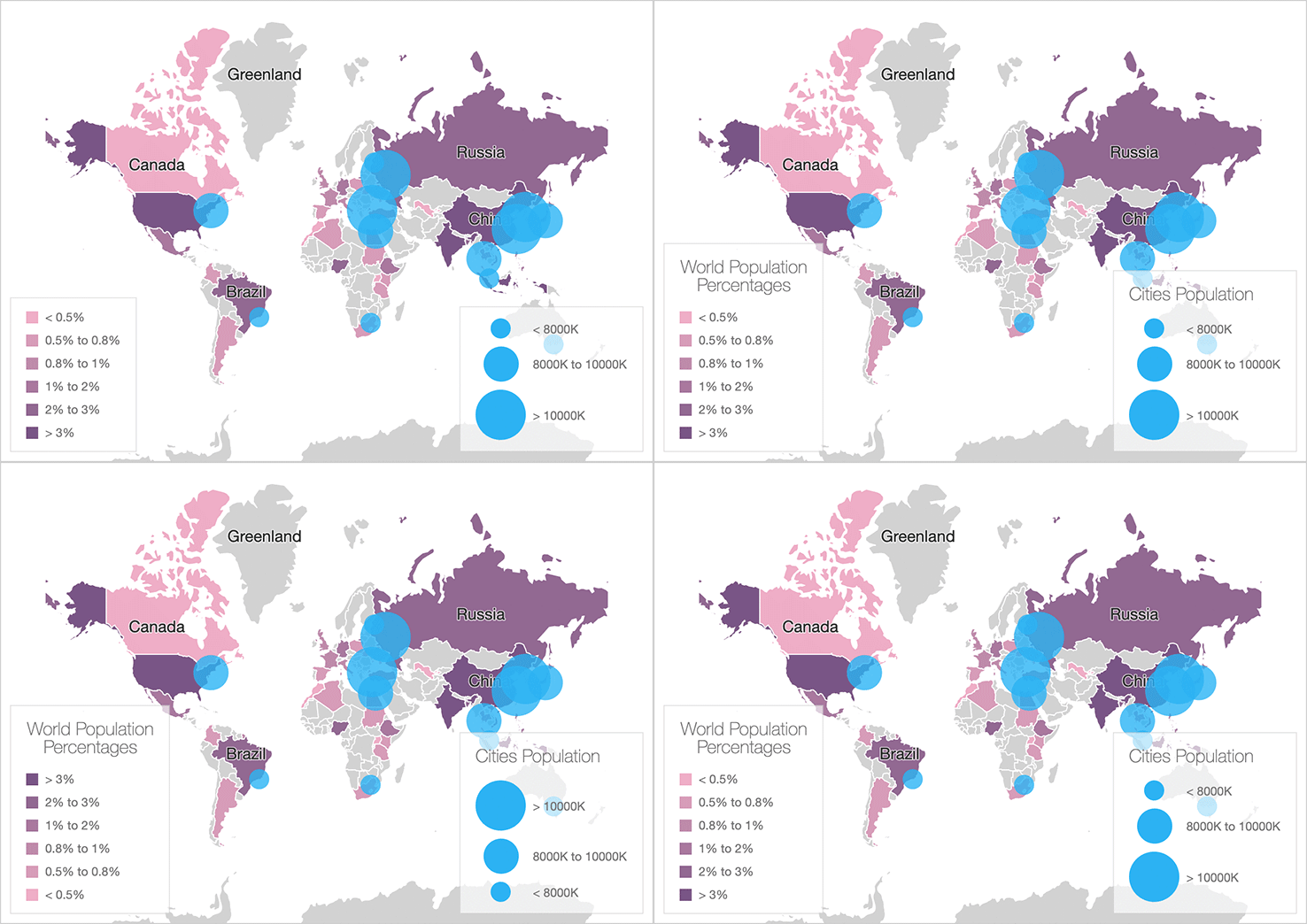
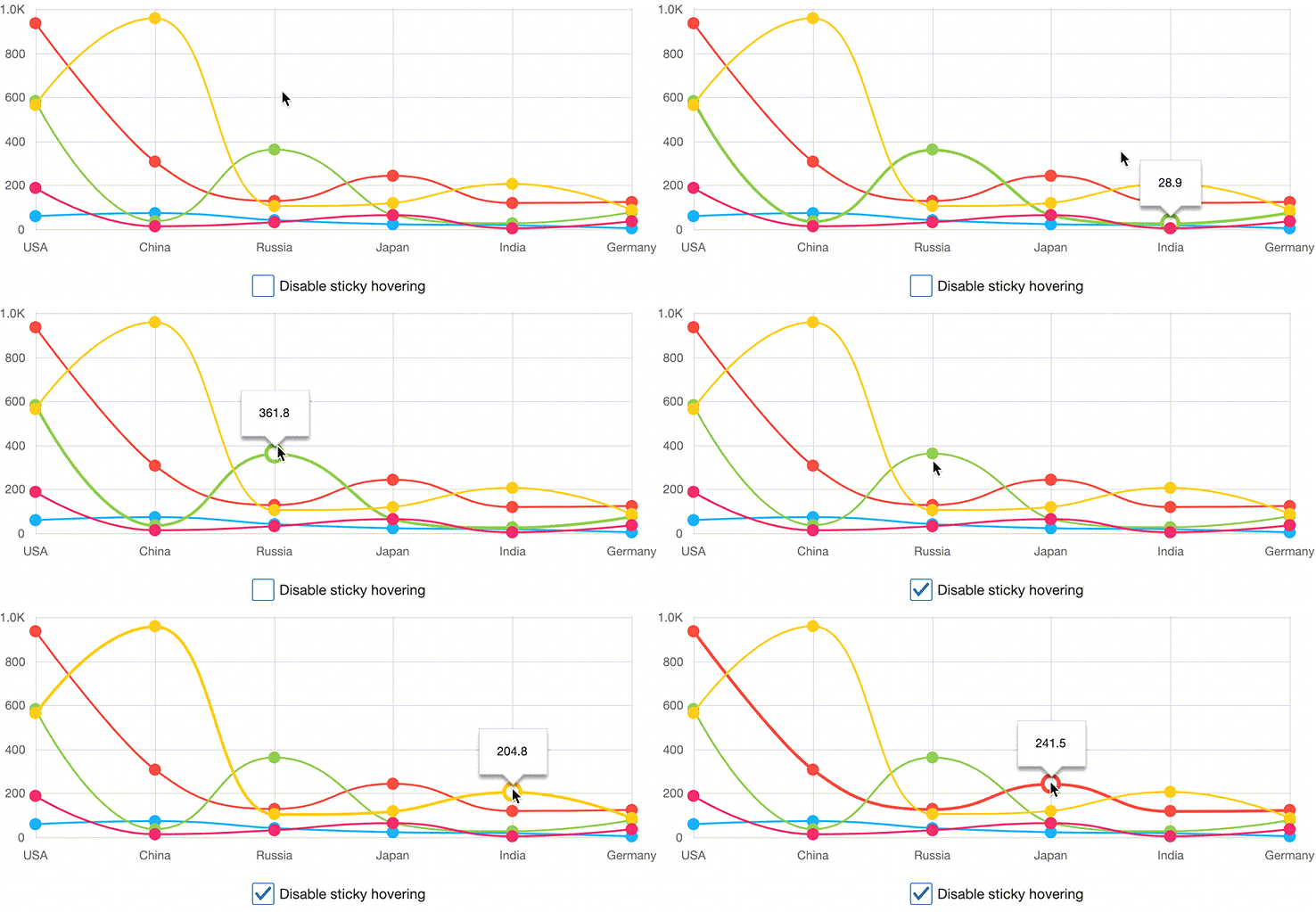
  • Display a tooltip only when a point is hovered:

DevExtreme Charts Tooltip

Documentation - Demo

  • Overlapped Bars - This feature allows you to create a TimeLine chart or an Overlapped Bar chart.

DevExtreme Charts Overlapped Bars

Documentation - Demo

  • Manage exported chart layout (layout by columns, etc.)

Documentation - Demo

Angular, Vue, React, ASP.NET MVC / Core and more

As you know, DevExtreme supports multiple web development frameworks. All enhancements described herein are available for:Angular, Vue, React, jQuery, Knockout, ASP.NET MVC and .NET Core.

Watch the Webinar

To learn more about all JavaScript related features introduced in our v19.1 release, please watch our "New in v19.1 - DevExtreme HTML / JS Controls" webinar.

Test It Now (and provide feedback)

Test-drive the public release now. Use the npm package:

npm install --save devextreme@19.1

We’d love to hear from you – please tell us what you think about these enhancements below.

What's new in v19.1 WinForms - Q&A

$
0
0
In our recent "What's New for WinForms" webinar we received a large number of questions, some of which we were unable to get to during the live Q&A. As promised, I'm listing each of the questions with their respective answer below.  
General:
Q: How can I change "And" to "Or" filtering across two columns? 
A: You can do this by clicking the EditFilter button in the Filter Panel and modify logical operators as your needs dictate in the Filter Editor see: https://documentation.devexpress.com/WindowsForms/1424/Controls-and-Libraries/Data-Grid/Visual-Elements/View-Common-Elements/Filter-Panel

Q: Is v19.1 Per-Monitor DPI-Aware?  
A: At present, our components support only System–DPI awareness. I would recommend you review the High DPI Support help article to learn how to enable dpi-awareness for our controls. We are now researching possible ways to support Per-Monitor DPI-Awareness in our controls and will do our best to support the Per-Monitor mode in the future. https://documentation.devexpress.com/WindowsForms/116666/Common-Features/High-DPI-Support

Q: The shown 'SearchBar' in the RibbonDemo to find commands... is this only available for Ribbons?  
A: Yes, it is available in RibbonControl only.

Q: Is there a way to do rounded corners easily? I know we can do it in skin editor but it is not easy and fast for all controls
A: Our components don’t provide a way to make them have round corners. Would you please describe your scenario in greater detail? A couple of images demonstrating the expected result would allow us to better understand all possible areas where this feature can be used. 

Q: on the grid animation, what datasoure is supported?
A: The animation doesn’t depend on a data source. GridView tracks a cell value changing and performs animation. So you can use any supported source including Server Mode. I would recommend you review Traditional Data Binding Methods and Large Data Sources: Server and Instant Feedback Modes for a complete list. https://documentation.devexpress.com/WindowsForms/2385/Common-Features/Data-Binding-Common-Concepts/Traditional-Data-Binding-Methods

Q: Can we convert normal Layout to Table Layout ?
A: While we don’t provide a tool to migrate a regular layout to the table one with TablePanels, you can convert it to a Layout Control in your project as described in Converting a Regular Layout of Controls to an XtraLayoutControl. Then invoke the Convert to Table Layout command as shown in the Table Layout documentation.

Q: Any benchmarking available on DirectX rendering performance?
A: There are no benchmarks available, however, you can see that DirectX already gives you noticeable performance improvements and we will continue working in this direction to make  faster.

Q: Are you going to add an Office 2019 Black theme. I'm using the Office 2019 Colorful theme in my app but want to offer users a black theme. If I use the Office 2016 Black theme, it uses the older style ribbon with the visible tabs.
A: Yes, we have plans to introduce new Office 2019 skins in v19.2.

Q: Where can I see a list of the other demo's

A: All our demos are available from Demo Center. To launch it, click the "Demo Center 19.1" shortcut in Windows Start Menu. You can learn more about the Demo Applications here https://documentation.devexpress.com/WindowsForms/14962/What-s-Installed/Demo-Applications


Q: Any project templates for Microsoft teams in future? 
A: Currently our components don’t provide such templates. But we found this idea interesting and will consider adding such templates in the future.

Q: Can we use these controls in C++ managed code? or these are valid only for C# and VB?  
A: Yes, you can. Our components should work flawlessly in this environment, though the application development process may differ.

Q: Besides Google, that other services I can connect to XtraScheduler
A: Along with the Google Calendars, our SchedulerControl also supports Synchronization with Microsoft Outlook and provides iCalendar Support. Please refer to the Import and Export article for additional information.

Q: Layout control, if I want to move my content in the center of the form, how to do it ? 
A: You can use the new Table Panel for this. 

Q: Will the Image Edit control support the WEBP file format?
A: While we don't have immediate plans to support it this format, you can convert a WEBP image to a regular image (for instance, to jpg) using a third-party library and then display this image in the PictureEdit control. 

Q: Is there any news on a scheduler annual view?
A: We will consider implementing this view in the future versions of our components.

Q: This function is only for the Control "Excel Style Filtering" ? its possible to use in ChartControl or GridControl? 
A: Excel Style filtering dropdown menus are part of our data aware controls (GridControl, TreeList etc). To be able to use custom functions in your application, it is necessary to register them using the CriteriaOperator.RegisterCustomFunction method. I would recommend your review Implementing Custom Functions for additional details.

To add a custom function to the GridControl’s Excel Style filtering dropdown menu, enable the GridView.OptionsFilter.ShowCustomFunctions property and handle the GridView.QueryCustomFunctions event. http://newdoc.devexpress.devx/WindowsForms/DevExpress.XtraGrid.Views.Base.ColumnViewOptionsFilter.ShowCustomFunctions?v=19.1
http://newdoc.devexpress.devx/WindowsForms/DevExpress.XtraGrid.Views.Base.ColumnView.QueryCustomFunctions?v=19.1

As for the ChartControl, once the custom functions are registered, you can use it for filtering. For instance, your can build a required filter criteria and assign it the SeriesBase.FilterCriteria property. Alternatively, you can add a separate 
FilterControl, connect it to ChartControl. Then enable the FilterControl.ShowCustomFunctions option and handle the FilterControl.QueryCustomFunctions event to add your custom functions.

Q: Will Borders and Shading API in RichEditControl be supported?
A: This is something we may look at in the future.

Q: When will you add a true PDF editor?
A: Our last survey for desktop platforms showed that it is not very popular suggestion. We do however have a non-visual PDF document API library which allows modify PDF documents:
 
Q: what about spell checker? for example: can I install it for Georgian language?
A: Customer can use any dictionaries for spell checking. Information about adding dictionaries are here:

Q: I thinks its a good idea the conditional formats in excel viewer in devexpress.
A: Our Spreadsheet control supports conditional formatting.

Q: It's possible to use functions in XtraSpreadSheet? but all functions like excel? for example, search, indirect, sum, and others?
A: Yes, it possible.
 
In upcoming v19.1 release we added support for Excel 2016 functions: CONCAT, TEXTJOIN, IFS, SWITCH, MAXIFS and MINIFS.
 
 
Most of Excel functions are currently supported.

Q: Spreadsheet: Is there a automatic internal Zoom-Object now included?
A: If you are referring to the zoom control in status bar, it is not a part of the Spreadsheet control, however, we demonstrate ability to implement this control in our ‘First Look’ demo (first demo for the Spreadsheet Control)

Diagram Control:

Q: Good Job, but the Editor SVG Icon is not funcionally that all for custom Shapes in DiagramControl that planing best the editor in some version for support this funcionallity?
A: If you mean SVG Icon Builder, we don't have plans to extend it to a fully-functional SVG editor or incorporate into DiagramControl. You can use an arbitrary SVG editor and import an SVG image to DiagramControl as described at SVG Shapes. Note that there are certain limitations mentioned in that topic which should be considered when importing SVG images to DiagramControl

Analytics:

Q: In winforms -  chartControl have a new updates? 
A: Yes, ChartControl has a set of new features.  They were also covered in the Analytics webinar (5/16)

https://www.devexpress.com/Subscriptions/New-2019-1.xml#xtracharts


Q: Looking forward to more speed improvements in map rendering of tiles and vector layers with large map items.
A: According to our tests, MapControl renders tiles and vector items at appropriate speed in most common scenarios. If you find the rendering performance too slow in your scenario, please submit a ticket in Support Center and describe your use case in greater detail. We will check if there is a room for improvements.

Q: Hello, I would like to know if in this version you can already assign the colors to the graphics in the dashboard in runtime execution
A: The Dashboard Suite allows you to customize chart colors using the Coloring feature. If you need to customize default colors in the dashboard palette at runtime, handle the CustomPalette event.

Q: I think is a good idea use this skin in Graphis with chart control
A: While the ChartControl appearance depends on the current application theme, ChartControl also uses a set of its own appearance schemas


ASP.NET Rich Text Editor (for WebForms, MVC, .NET Core and Bootstrap) - New Client HTML Printing

$
0
0

In our most recent update (v19.1), we added client HTML printing support to our ASP.NET Rich Text Editor (this support is available to WebForms, MVC, Core, and Bootstrap versions of the control library).

Why New Client-side Printing?

In previous versions, our Rich Text Editor shipped with server-side printing support (for purposes of this blog post, I’ll refer to our old implementation as server-side printing). When printing was initiated on the server, our RichEdit Document Server generated a PDF document on the server using a server-side document model. Once prepared, the browser downloaded the document for subsequent printing.

The primary disadvantage of server-side printing is that the server-side document model does not have exact document layout information from the client-side. As a result, the PDF file’s layout differs from the one displayed within the browser. For example, if you print the following text block in our Rich Text Editor:

ASPNET-RichEdit-ClientPrinting

      you’ll obtain a slightly different result in the PDF file:

ASPNET-RichEdit-ClientPrinting

Though these differences may seem inconsequential, they are essential for some of our customers. Our new client-side printing engine resolves these minor discrepancies so that end-users can print what they see on-screen.

The Basics of Our New Client-side Printing Engine

Client-side HTML printing doesn’t initiate any server requests. Our Rich Text Editor opens a new browser tab, renders document layout (HTML markup) within this tab and activates the default print dialog of the web browser.

How to Enable Client HTML Printing

Please note that server-side printing is enabled by default. To switch your apps to client-side printing, set the PrintMode property to ClientHtml:

ASPxRichEdit1.Settings.Printing.PrintMode = PrintMode.ClientHtml;

Once you start using our client-side printing option, the same text block that was slightly altered when sent to PDF (server-side printing), is now identical to that displayed within the browser:

ASPNET-RichEdit-ClientPrinting

See Print Out a Document for more information on this new client-side printing option.

Limitations

  • Client-side print performance is driven by document size and information complexity. Simple documents are printed faster than the server-side counterpart. Complex documents may take longer to print.
  • Paper format in Printer settings must be the same as the paper format used in the RichEdit (otherwise, the browser will split content incorrectly).

Feedback

We want to hear your thoughts. Please tell us what you think of this new capability and how you expect to use it in an upcoming project. Are you currently happy with our server-side print implementation? Do you expect to you use this new client-side print option?

XAF - New Community Modules, Unit Testing Best Practices, Official Documentation Updates

$
0
0

Community News

  1. Check out two new blog posts on unit testing from Manuel Grundner (DevExpress MVP): 
    T is for Testing: XAF & XPO - Builder Pattern 1 | T is for Testing: XAF & XPO - Test Data 2.
    These posts will be interesting for those creating complex apps with XAF.
  2. The eXpand Framework, managed by Apostolis Bekiaris, continues to release new platform-agnostic packages for XAF: http://xaf.expandframework.com/. eXpand’s new ProgressBarViewItem and HideToolBar add to the dozen plus low-dependency modules managed by Apostolis. Note: If you have not reviewed eXpand recently, you should definitely take a look at its new modules…they are smaller, include documentation, and ship Azure unit tests (Apostolis has also added usage examples, videos and troubleshooting info). Give it a try and please share your thoughts with us.

  3. A new version of XAFARI with full support for XAF v19.1.3 is available (DevExpress updates are slightly ahead of XAFARI versions). As you may know, Galaktika Soft has been providing paid reusable XAF modules with documentation and support services for more than 5 years.
  4. A new case-study about a Human Relation Management solution using XAFARI and XAF is available here. We also published XAF case studies from two other loyal XAF users last month: Case Study 1 | Case Study 2.
  5. We asked our customers about their thoughts on Blazor and received numerous comments. Since our ASP.NET team is fully committed to the Blazor platform, we are investing how Blazor can be used with XAF. We may modify our React-based SPA UI strategy and focus our efforts on Blazor going forward (our initial impression is that Blazor better fits the long term needs of our customers). We will publish additional info as it becomes available.

 Documentation Updates

XAF - Usability and Performance Enhancements, Breaking Changes, Noteworthy Support Center Tickets and Tricks

$
0
0

Usability & Performance Enhancements

  • To save time with functional XAF testing, check our Notepad++ and Visual Studio Code extensions for EasyTest files (*.etc, *.inc): syntax highlighting, collapsible regions, code snippets and more. In our opinion, functional and unit tests are a must for teams creating complex apps. We would appreciate your feedback here or in comments to this KB article.
  • With XAF v19.1.4, we no longer check the TargetObjectsCriteria value for disabled or inactive actions. An Action criterion is evaluated only when the Action is activated and becomes visible. For more information, please see this ticket. 
  • Did you know that CodeRush's Code Cleanup feature can automatically replace hardcoded property names in XPO/XAF business objects with nameof? For more information, see this ticket.
  • XAF v19.1.4 demos include fixes for high DPI displays: navigation panel and lookup/popup window widths are modified more effectively (they are no longer narrow and certain Web images are no longer blurred). For more information, see the following tickets: one, two. If you’ve experienced other 4K/SVG related issues, please submit your comment below.
  • We moved deprecated Item Templates (XAF v19.1.5) into a section at the bottom - this will preclude them from accidental selection. Recommended templates are placed at the top and are sorted by popularity. For more information, see this ticket
  • With XAF v19.2, we no longer display the save confirmation dialog when a user closes DetailView for a new unmodified object in a WinForms application. For more information, see this breaking change
  • With XAF v19.2, the IObjectSpace.ObjectChanged event is no longer raised for control value changes (because of performance issues). For more information, see this breaking change.
  • With XAF v19.1.5, we load all objects required by RecordsNavigationController (current, next and previous objects) in one query when DetailView is opened through ListViewProcessCurrentObjectController. Currently, ASPxGridListEditor, WinForms GridListEditor, SchedulerListEditor and TreeListEditor call this API when an object is double-clicked or ENTER is pressed. This should be a bit faster on slow connections. For more information on usage scenarios, feel free to review the following tickets: one, two, three
  • Check my comment at the bottom of this ticket and help us decide on a feature we have planned for WinForms (v19.2) - collapsible layout groups.

Noteworthy Support Center Tickets

  • T741546: Don’t miss the Visual Studio 2019 version 16.1 or newer update where DevExpress project templates are categorized as expected.
  • A2670: We keep recommending that our users try Native Image Generator (NGEN) to dramatically cut app and form load times. 
  • K18167: We described how to use STASafeDataStore in an XAF app to resolve the "Entering the 'GetObjectsNonReenterant' state..." error caused by a known .NET Framework specificity
  • T741228: We clarified the assembly versions loaded in a complex XAF solution (with projects for both .NET Framework and .NET Standard).
  • T742517; We demonstrated how to load multiple file attachments using a custom ViewItem based on the ASPxUploadControl (XAF Web app).
  • KA18699: We updated a popular KB article regarding ways to define calculated properties.
  • T741894: We demonstrated how to use the CustomizeTypesInfo method in a multi-threaded scenario (Web app).
  • T749921 | T741871: We discussed usability, printing and performance of the new rich text editors in XAF WinForms and WebForms apps.
  • E4908: We started a series of posts on how to use the XAF security system functions in non-XAF .NET apps using XPO for data access. This example contains a security system feature overview and the first Console demo.

JavaScript Charts - BarGauge & Funnel improved label positioning (v19.1)

$
0
0

As we mentioned in a previous blog post, we've added quite a number of legend/label related enhancements to our JavaScript Charts & Gauge visualization library.

In this post, I will highlight another new BarGauge and Funnel chart related feature – improved label overlap support.

Label Overlapping

In both our BarGauge and Funnel Charts, labels can overlap when chart values are close to one another.  With our most recent update (v19.1), we’ve added a resolveLabelOverlapping option so you can better control the manner in which individual labels overlap.

Funnel Chart

In the Funnel, the resolveLabelOverlapping property accepts the following options:

  • shift (default)
  • hide
  • none
If enough room does not exist during a 'shift', the chart will hide labels as needed.

Bar Gauge

In the Bar Gauge, the resolveLabelOverlapping property accepts the following options:

  • hide (default)
  • none

Angular, Vue, React, ASP.NET MVC / Core and more

As you know, DevExtreme supports multiple web development frameworks. All enhancements described herein are available for: Angular, Vue, React, jQuery, Knockout, ASP.NET MVC and .NET Core.

Test It Now (and provide feedback)

Test-drive the public release now. Use the npm package:

npm install --save devextreme@19.1

We’d love to hear from you – please tell us what you think about these enhancements below.


JavaScript PivotGrid - Remote Data Paging and Cascade Filtering (v19.1)

$
0
0

Remote Data Paging

Performance is always on our minds. For controls like the PivotGrid – a product that deals with thousands and even millions of unique values – we try to balance the way in which data is managed by the control and the amount of data sent across the wire.

For example, the PivotGrid supports OLAP Cubes (to efficiently handle data on the server), but the XML sent to the client can be quite complex and large. This might result in slower performance and - in edge cases - it may even crash the PivotGrid.

With Remote Data Paging support (available in v19.1), we now allow you to fine-tune the data transfer process. Remote Data Paging allows the PivotGrid to request data on demand from the OLAP Cube. This results in smaller chunks of data being sent across the wire. Though it does create more server requests, on the whole, we believe it offers better overall performance.

Using Remote Data Paging

At present, Remote Data Paging only works when connecting to OLAB Cubes that use 'virtual' scrolling mode. As you can see below, you also need to set the dataSource.paginate option to true.

                dataSource: { 
                    store: store, 
                    paginate: true, 
                    fields: [/* fields */] 
                }, 
                scrolling: { 
                    mode: 'virtual' // <- needs to be set to virtual !
                } 


Limitations?

While this feature offers significant performance benefits, limitations do exist:

  • Only works when connecting to OLAB Cubes (XmlaStore)
  • The allowSortingBySummary option is ignored
  • The allowExpandAll option is ignored
  • Only works with scrolling.mode set to 'virtual'
Your feedback will help us refine this feature further. Please tell us how you’d like us to improve our implementation going forward.


Cascade Filtering

One of the more time-consuming PivotGrid related implementations (when you create it manually) is use of inter-dependent comboxes for data filtering. Though our PivotGrid ships with a robust filtering engine, we decided to add a "Cascading Filtering" option to the control in our v19.1 release cycle.

Cascade filters allow you to restrict the values displayed within a combo box based on values specified in a ‘master’ combo box (by setting the headerFilter.showRelevantValues to true).

Angular, Vue, React, ASP.NET MVC / Core and more

As you know, DevExtreme supports multiple web development frameworks. All enhancements described herein are available for:Angular, Vue, React, jQuery,Knockout, ASP.NET MVC and .NET Core.

Test It Now (and tell us what you think)

Test-drive the public release, use the npm package:

npm install --save devextreme@19.1

As always, we’d love to hear from you – please tell us what you think about these enhancements below.

XAF - Usability and Performance Enhancements, Breaking Changes, Noteworthy Support Center Tickets and Tricks

$
0
0

Usability & Performance Enhancements

  • To save time with functional XAF testing, check our Notepad++ and Visual Studio Code extensions for EasyTest files (*.etc, *.inc): syntax highlighting, collapsible regions, code snippets and more. In our opinion, functional and unit tests are a must for teams creating complex apps. We would appreciate your feedback here or in comments to this KB article.
  • With XAF v19.1.4, we no longer check the TargetObjectsCriteria value for disabled or inactive actions. An Action criterion is evaluated only when the Action is activated and becomes visible. For more information, please see this ticket
  • Did you know that CodeRush's Code Cleanup feature can automatically replace hardcoded property names in XPO/XAF business objects with nameof? For more information, see this ticket.
  • XAF v19.1.4 demos include fixes for high DPI displays: navigation panel and lookup/popup window widths are modified more effectively (they are no longer narrow and certain Web images are no longer blurred). For more information, see the following tickets: one, two. If you’ve experienced other 4K/SVG related issues, please submit your comment below.
  • We moved deprecated Item Templates (XAF v19.1.5) into a section at the bottom - this will preclude them from accidental selection. Recommended templates are placed at the top and are sorted by popularity. For more information, see this ticket
  • With XAF v19.2, we no longer display the save confirmation dialog when a user closes DetailView for a new unmodified object in a WinForms application. For more information, see this breaking change
  • With XAF v19.2, the IObjectSpace.ObjectChanged event is no longer raised for control value changes (because of performance issues). For more information, see this breaking change.
  • With XAF v19.1.5, we load all objects required by RecordsNavigationController (current, next and previous objects) in one query when DetailView is opened through ListViewProcessCurrentObjectController. Currently, ASPxGridListEditor, WinForms GridListEditor, SchedulerListEditor and TreeListEditor call this API when an object is double-clicked or ENTER is pressed. This should be a bit faster on slow connections. For more information on usage scenarios, feel free to review the following tickets: one, two, three
  • Check my comment at the bottom of this ticket and help us decide on a feature we have planned for WinForms (v19.2) - collapsible layout groups.

Noteworthy Support Center Tickets

  • T741546: Don’t miss the Visual Studio 2019 version 16.1 or newer update where DevExpress project templates are categorized as expected.
  • A2670: We keep recommending that our users try Native Image Generator (NGEN) to dramatically cut app and form load times. 
  • K18167: We described how to use STASafeDataStore in an XAF app to resolve the "Entering the 'GetObjectsNonReenterant' state..." error caused by a known .NET Framework specificity
  • T741228: We clarified the assembly versions loaded in a complex XAF solution (with projects for both .NET Framework and .NET Standard).
  • T742517; We demonstrated how to load multiple file attachments using a custom ViewItem based on the ASPxUploadControl (XAF Web app).
  • KA18699: We updated a popular KB article regarding ways to define calculated properties.
  • T741894: We demonstrated how to use the CustomizeTypesInfo method in a multi-threaded scenario (Web app).
  • T749921 | T741871: We discussed usability, printing and performance of the new rich text editors in XAF WinForms and WebForms apps.
  • E4908: We started a series of posts on how to use the XAF security system functions in non-XAF .NET apps using XPO for data access. This example contains a security system feature overview and the first Console demo.

DevExtreme - Responsive Application Template & CLI Tools for React (v19.1)

$
0
0

It takes several steps to include DevExtreme in a React application project. Of course we optimized the process as much as possible, so it’s not really complicated – but it can be time-consuming and it requires attention to detail. To make things easier, we created the DevExtreme React Application Template and extended the DevExtreme CLI to generate and modify your projects.

DevExtreme React Application Template

Template Features

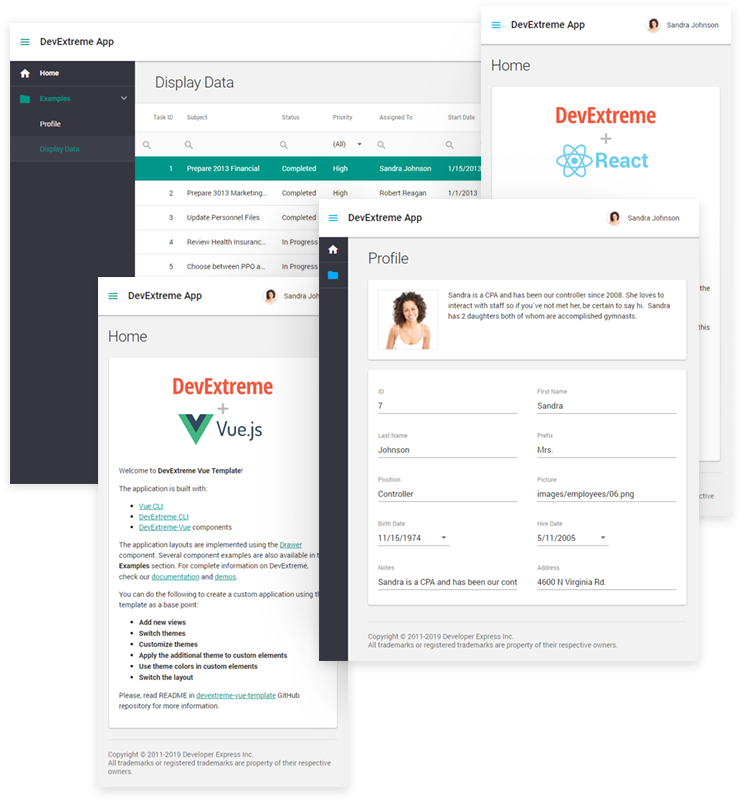
The template implements a responsive application with a navigation menu and several sample views. A choice of layouts is available:

  • The layout side-nav-outer-toolbar shows a top-level toolbar across the entire page width. A Drawer component is located underneath that toolbar.
  • side-nav-inner-toolbar shows the Drawer at full page height. Technically, the toolbar is wrapped in the Drawer, so they show side by side.
  • The single-card layout shows a single adaptive card element on its own.

By default, the template applies one of side-nav-outer-toolbar and side-nav-inner-toolbar to all pages viewed by an authenticated user, while single-card is used to show a login form if the user is not authenticated. The layouts map to React components, so you can change this later as required.

To allow application components to adapt to screen size changes, we created a utility called media-query. Several default breakpoints are configured in that file, and you can see how the App and toolbar components use the information to change their appearances and layouts when screen sizes change.

The navigation menu shown in the Drawer is based on the DevExtreme TreeView component. We use react-router-dom to implement routing in the template.

The application template uses two DevExtreme themes, a base theme and an additional theme. The additional theme is used by default to render the navigation menu. For the base theme, the default is material.orange.light, while the additional theme is material.orange.dark. It is possible to switch to different themes by editing the metadata files in the themes folder and running npm run build-themes to regenerate the .css files and .scss variables.

You can also use the DevExtreme Theme Builder for more complex theme changes.

DevExtreme CLI

Of course it would be possible to download a copy of the template application from its GitHub repository and start working from there. However, our command line interface makes this easier, and it offers a few useful options. Install devextreme-cli like this:

> npm install -g devextreme-cli

The command devextreme is then available. It has built-in help documentation that shows if you run it without parameters.

To create a new React app using DevExtreme, use a command like this:

> devextreme new react-app my-app-name --layout side-nav-outer-toolbar [--empty]

If a layout is not given on the command line, you will be prompted for it. The brackets around --empty denote this as an optional parameter. If you provide it, the resulting application will not contain any sample views.

Alternatively, if you already have a React project, you can install the dependencies devextreme and devextreme-react as well as the required stylesheet references using this command:

> devextreme add devextreme-react

There is also a command available to add a view to an application based on the template. The new view is automatically added to the navigation menu and the routing configuration.

> devextreme add view my-view-name [--icon]

Your Feedback Counts

Please feel free to leave comments below, if you have any thoughts on our implementation. There is also a GitHub issue dedicated to this feature set, and it would be great if you could submit a quick response to this poll to help us analyze how we’re doing.

DevExtreme - Responsive Application Templates & CLI Tools for React and Vue (v19.1)

$
0
0

It takes several steps to include DevExtreme in a React or Vue application project. Of course we optimized the process as much as possible, so it’s not really complicated – but it can be time-consuming and it requires attention to detail. To make things easier, we created two templates for DevExtreme React Applications and DevExtreme Vue Applications. We also extended the DevExtreme CLI to generate and modify your projects.

DevExtreme Responsive Application Templates

Template Features

The templates implement responsive applications with navigation menus and sample views. A choice of layouts is available:

  • The layout side-nav-outer-toolbar shows a top-level toolbar across the entire page width. A Drawer component is located underneath that toolbar.
  • side-nav-inner-toolbar shows the Drawer at full page height. Technically, the toolbar is wrapped in the Drawer, so they show side by side.
  • The single-card layout shows a single adaptive card element on its own.

By default, the templates apply one of side-nav-outer-toolbar and side-nav-inner-toolbar to all pages viewed by an authenticated user, while single-card is used to show a login form if the user is not authenticated. The layouts map to React and Vue components, so you can change this later as required.

To allow application components to adapt to screen size changes, we created a utility called media-query (React, Vue). Several default breakpoints are configured in that file, and the App and toolbar components use the information to change their appearances and layouts when screen sizes change.

The navigation menu shown in the Drawer is based on the DevExtreme TreeView component. We use react-router-dom and vue-router to implement routing in the templates.

The application templates each use two DevExtreme themes, a base theme and an additional theme. The additional theme is used by default to render the navigation menu. For the base theme, the default is material.orange.light, while the additional theme is material.orange.dark. It is possible to switch to different themes by editing the metadata files in the themes folder and running npm run build-themes to regenerate the .css files and .scss variables.

You can also use the DevExtreme Theme Builder for more complex theme changes.

DevExtreme CLI

Of course it would be possible to download a copy of the template application from its GitHub repository (React, Vue) and start working from there. However, our command line interface makes this easier, and it offers a few useful options. Install devextreme-cli like this:

> npm install -g devextreme-cli

The command devextreme is then available. It has built-in help documentation that shows if you run it without parameters.

To create a new DevExtreme app for React or Vue, use a command line similar to these:

# For React
> devextreme new react-app my-app-name --layout side-nav-outer-toolbar [--empty]

# For Vue
> devextreme new vue-app my-app-name --layout side-nav-outer-toolbar [--empty]

If a layout is not specified on the command line, you will be prompted for it. The brackets around --empty denote this as an optional parameter. If you provide it, the resulting application will not contain any sample views.

Alternatively, if you already have a React or Vue project, you can install the required DevExtreme dependencies and stylesheet references using these commands:

# For React - add devextreme and devextreme-react
> devextreme add devextreme-react

# For Vue - add devextreme and devextreme-vue
> devextreme add devextreme-vue

There is also a command available to add a view to an application based on either of the templates. The new view is automatically added to the navigation menu and the routing configuration.

# This command works for React and Vue templates
> devextreme add view my-view-name [--icon]

Your Feedback Counts

Please feel free to leave comments below, if you have any thoughts on our implementations. There are also GitHub issues (React, Vue) dedicated to this feature set, and it would be great if you could submit a quick response to this poll (React, Vue) to help us analyze how we’re doing.

ASP.NET AJAX Control Toolkit v19.1.0 - Now Available

$
0
0

A few years ago, we took over maintenance and guidance for the ASP.NET AJAX Control Toolkit project. Please refer to this blog post for more information on the project and why we stepped in to assist.

As part of our ongoing commitment to the project, we’ve released an update (ASP.NET AJAX Control Toolkit v19.1.0) to address the following issues.

Improvements

  • Visual Studio 2019 Support
  • Security hardening: HTML-encode file names in AjaxFileUpload (#483)

Resolved Issues

  • AutoCompleteExtender: the TextChanged event is not fired in Edge (#458)
  • Rating: The raise_mouseOver method has an invalid argument name (#461)
  • AsyncFileUpload changes the frame target to _top (#466)
  • HtmlEditorExtender unconditionally removes tags with data URLs (#467)
  • NRE in IsLocalizationEnabled() within a PageAsyncTask (#486)

Ready to Upgrade?

To update the ASP.NET AJAX Control Toolkit, please download our most recent installer using the link below.

Download

Or, if you prefer, use Nuget:

ASP.NET AJAX Control Toolkit Nuget package

As always, we welcome your feedback. Please share your thoughts on this update via GitHub.

Want More? Try the DevExpress ASP.NET Subscription for 30-days

We’d like to thank you for installing the DevExpress Edition of the AJAX Control Toolkit and look forward to your feedback as you begin leveraging its capabilities.

If you require additional UI controls for your ASP.NET WebForms application, we invite you to download and try a free 30-day evaluation of our ASP.NET Subscription. With over 100 UI controls, the DevExpress ASP.NET Subscription helps you build your best, and deliver elegant line-of-business applications in the shortest possible time. For a complete list of products and features in our ASP.NET Subscription, please refer to the following webpage.

DevExpress UI for Blazor - Preview 11 - New Blazor TreeView Component and Enhanced ComboBox Features (Now Available)

$
0
0

Preview 11 of the DevExpress UI for Blazor is now available and it includes a new TreeView component and enhanced features for the ComboBox component.

Blazor UI Components – New Blazor TreeView Component

If you’re targeting Blazor and need to use a TreeView in your project, take a look at the following demo for more information on our new Blazor TreeView UI control.

DevExpress Blazor TreeView Component

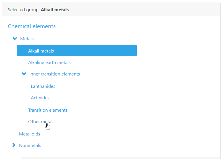
This new components presents hierarchical data within a tree structure. Parent nodes can be collapsed or expanded – and individual nodes can be selected as necessary. The component ships with three API events to manage component behavior.

Blazor ComboBox

Preview 11 ships with several enhancements to our Blazor ComboBox.

Allow User Input

The component allows end-users to enter custom text into the text box when the value does not match a drop-down item. To enable this feature, set the AllowUserInput property to true.

To learn more, see to Combo Box - Allow Input online demo.

Filtering

Our Blazor ComboBox supports two filter modes and now allows end-users to locate combobox items more quickly. Assign “Contains” or “StartsWith” to the FilteringMode property to enable the desired filter mode.

To learn more, see the Combo Box - Incremental Filtering demo.

Keyboard Support

To help improve the end-user experience, Preview 11 includes built-in Keyboard Support. At present, the following shortcuts are supported:

  • Alt+Up or Alt+Down – Toggles the drop-down window
  • Up/Down – Moves focus to the previous/next item within the drop-down window
  • PageUp/PageDown - Scrolls 5 rows (up or down) within the drop-down window
  • Ctrl+Home/Ctrl+End – Scrolls and moves focus to the first/last item in the drop-down window

Blazor Demo Redesign

As our Blazor component library grows, so does our online demo collection. We used our new TreeView to simplify navigation within the demo and updated the appearance of the demo with the ‘Pulse’ Bootstrap theme.

Your Feedback Matters

We want to hear from you. If you’re currently using Blazor, or expect to do so in the near future, please share your thoughts with us below.

JavaScript Editors - Custom Buttons (v19.1)

$
0
0

As you probably know, DevExtreme’s Data Editors library includes a comprehensive suite of field editors (calendar drop down, combo box, etc). If you’ve used DevExtreme in the past, you also know that these UI controls can be used as cell editors within complex “container” components like our JavaScript DataGrid and PivotGrid.

The purpose of this post is to detail the new custom button feature for our text-based JavaScript data edit widgets (available in v19.1+). Though countless usage examples exist, perhaps the best illustration for the virtues of this new feature is the “Show Password” button displayed within password editors (when pressed, the Show Password button reveals the value entered inside the password text box.

Our new implementation allows you to create both simple multi-button text editors (like Show Password), or to use button arrays and control positioning within the editor. As you can see in the images below, our JavaScript text editors allow you to create intuitive text entry fields – be it a currency converter or an advanced Date Edit dropdown.

The code example below demonstrates the ease with which you can reproduce the Advanced DateBox pictured above:

var millisecondsInDay = 24 * 60 * 60 * 1000;

    var dateEditor = $("#advanced-datebox").dxDateBox({
        value: new Date().getTime(),
        stylingMode: "outlined",
        buttons: [{
            name: "today",
            location: "before",
            options: {
                text: "Today",
                onClick: function() {
                    dateEditor.option("value", new Date().getTime());
                }
            }
        }, {
            name: "prevDate",
            location: "before",
            options: {
                icon: "spinprev",
                stylingMode: "text",
                onClick: function() {
                    var currentDate = dateEditor.option("value");
                    dateEditor.option("value", currentDate - millisecondsInDay);
                }
            }
        }, {
            name: "nextDate",
            location: "after",
            options: {
                icon: "spinnext",
                stylingMode: "text",
                onClick: function() {
                    var currentDate = dateEditor.option("value");
                    dateEditor.option("value", currentDate + millisecondsInDay);
                }
            }
        }, "dropDown"]
    }).dxDateBox("instance");

First, please note that role of the control’s location option. It determines where to place the button and offers the following values:

  • before
  • after

Second, the icon option allows you to quickly associate an icon from the DevExtreme Icon Library or to use a custom image as described in our documentation.

Finally, you can specify default actions for the control as needed. Default actions include:

  • dropDown
  • clear
  • spins

If you need to access one of these custom buttons in code, you can do so by calling the new getButton(name) method. For example, if you would like to hide the Today button in the example above, you would use the following code:

dateBoxInstance.getButton("today").option("visible", false); 
Please note that this method does not return predefined buttons.

Angular, Vue, React, ASP.NET MVC / Core and more

As you know, DevExtreme supports multiple web development frameworks. All enhancements described herein are available for:Angular, Vue, React, jQuery,Knockout,ASP.NET MVC and .NET Core.

Test It Now (and provide feedback)

Test-drive the public release now. Use the npm package:

npm install --save devextreme@19.1

Once you’ve had the opportunity to evaluate our JavaScript Data Editors Library and its new custom button feature, please share your feedback/opinion below.


ASP.NET Bootstrap Scheduler - UI Enhancements for Mobile Devices

$
0
0

We’ve extended the capabilities of our ASP.NET Bootstrap Scheduler control in our most recent release (v19.1) with the following mobile-specific features:

Date Navigator UI

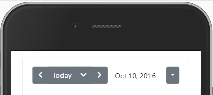
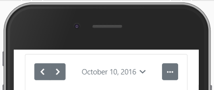
We redesigned the control’s Date Navigator UI. We removed the 'Today' button and made the date item clickable. Once clicked, a calendar UI element appears on-screen (used for date selection). By making this change, we saved space and moved the 'previous date' and 'next date' buttons closer to one another.

Bootstrap Date Navigator in v18.2:

DevExpress Bootstrap Scheduler

Bootstrap Date Navigator in v19.1:

DevExpress Bootstrap Scheduler

Demo

Date Highlighting within the Date Navigator

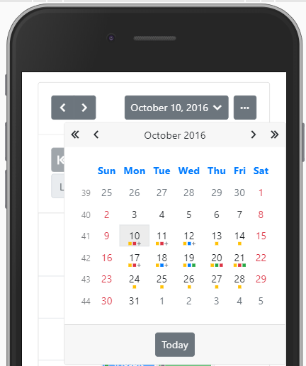
Our Bootstrap Date Navigator can now display appointment marks within individual date items.

DevExpress Bootstrap Scheduler

As you can see, this feature makes it easier to find free or busy days within one’s schedule.

View Selector Adaptivity Enhancements

We upgraded View Selector adaptivity. The following animation demonstrates the difference between our new release and its predecessor.

DevExpress Bootstrap Scheduler

Built-in Floating Action Button

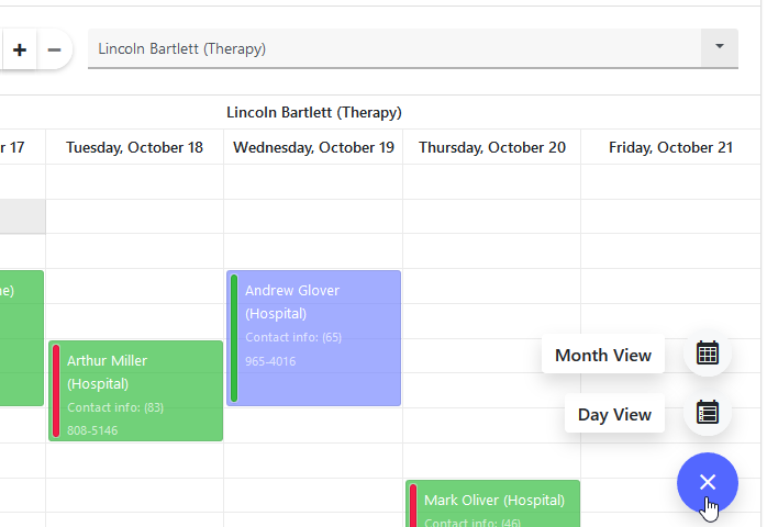
The Bootstrap Scheduler includes built-in Floating Action buttons. These buttons already support key scheduler-related actions (such as adding, editing or deleting appointments).

You can customize the Floating Action button and introduce custom actions as needed. In this demo, we replaced our predefined user actions with custom actions.

DevExpress Bootstrap Scheduler

Demo

As always, we’d love to hear your feedback. Please tell us how you’re using our ASP.NET Scheduler on mobile devices? How likely are you to use these features in your next Bootstrap application?

Report and Dashboard Server - React Viewer Components

$
0
0

Last year, we published a post about using React with the Report and Dashboard Server. We have now created an updated sample that includes React components for Report Viewer and Dashboard Control.

The Report and Dashboard Server (short R&D Server from now on) is a powerful turnkey solution. The sample shows how its frontend components can be integrated in a React app — similar approaches can be used for other client platforms, so R&D Server functionality is available to all JavaScript-based solutions.

Here is the demo application. It is configured to use guest access to our demo server. You can run the embedded app below by clicking the Preview button, or use Open in Editor to see a bigger window. Once the app runs, select a report or dashboard document from the list in the top-left corner and a viewer opens to show that document. In the sandbox IDE, you can also see all the code files in the project.

Technical Details

The components written for the sample do not cover the complete feature set of our HTML/JS widgets. However, they have been designed for “real” use cases, and the following sections outline some important technical points and design considerations.

Please note that the components only view documents from the R&D Server, they don’t utilize any of the designer features of the underlying widgets. The R&D Server already implements a web interface for design purposes and it seems unlikely that most applications would replicate this functionality.

Authentication

Before any documents on an R&D Server can be accessed, an authentication token must be obtained. The component ReportServerProvider does this job in the demo application, and it automatically refreshes the token when it times out. Using a React Context, the current token is provided to those components that need it. For the demo, the Guest account is configured statically.

<ReportServerProvider
  serviceBaseUrl="https://reportserver.devexpress.com"
  username="Guest"
  password="">

Both viewer components ReportServerReport and ReportServerDashboard include code that applies a newly refreshed token to a component instance without a content refresh. This is important to make sure that the end user is not disrupted in their work with the viewer component when a token expires.

Viewer Lifecycles

Both viewer components can switch documents without reinitializing. This results in a smooth user experience when a viewer is already visible and a new document of equal type is selected. The dashboard viewer uses the loadDashboard and unloadDashboard API methods, while the report viewer binds to a Knockout observable.

The demo implements a switch component called ReportServerDocumentViewer. This component encapsulates the other two, providing a very small interface with only two props:

<ReportServerDocumentViewer document={{ id: 10, documentType: 'Report' }} />

Globalize and CLDR

The Dashboard Control requires Globalize and CLDR to be available in the application. Details about this configuration are available in the documentation. The approach described on that page uses react-app-rewired to integrate the dependencies into a project created using create-react-app, without ejecting it. Please note that this is the recommended approach.

For the demo, the project has been ejected because the sandbox environment can’t run projects configured with react-app-rewired.

What Do You Think?

Please feel free to comment below if you have any questions or comments on this sample implementation. Alternatively, please create a Support Center ticket if you need to discuss your specific requirements in detail.

Reporting - Export Report Groups To Separate Excel Sheets

$
0
0

To specify how a document is exported to Excel, our reporting tools provide the property XlsxExportOptions.ExportMode. Here are the three possible values of that property:

NameDescription
SingleFileThe document is exported to a single file. In this mode, page headers and footers are added to the resulting XLSX file just once, at the beginning and the end of the document.
DifferentFilesThe document is exported to multiple files, one report page per file.
SingleFilePageByPageThe document is exported to a single file, but an individual sheet is created for each page.

As you can see, if the report document is split into parts during the export process, this always happens along page boundaries. If you wanted to split the report into individual files or sheets per group instead of page, the only solution in the past was to use the Spreadsheet Document API from the Office File API product suite as described in the article How to export reports to different sheets in an XLSX file by using Spreadsheet Document Server.

In v19.1.4 we made this possible without any additional components. Read on to find out the details.

The RollPaper Property

The name of this property might sound old-fashioned, but it can be used to solve the problem described above. In v19.1.4 we fixed an issue for this feature, so that page breaks are now recognized correctly when RollPaper is true.

Here is a report with one group level:

Report with Group Level

The following image shows the same report with a group footer band inserted. The height of the band is zero and its PageBreak property is set to AfterBand:

Report with Group Footer and PageBreak

The property XtraReport.RollPaper has now been enabled. In the Preview tab you see a document with several pages of different lengths. Each page represents one group.

Report Preview

When this report is exported to Excel using the export mode SingleFilePageByPage, each report group occupies its own sheet in the resulting file:

Export to Excel

Your Feedback Counts

We are interested in your thoughts about the suggested solution described in this post. For the future, we will consider a special export mode SingleFileGroupPerPage. Using this mode, the preview could show “normal” page sizes, while the export would still create the same result you see above. Please submit your responses to this short survey to let us know your priorities:

ASP.NET Core File Manager – Thumbnail Generator Service

$
0
0

Our most recent release (v19.1) includes a new ASP.NET Core File Manager control. Though the component is currently available as a Community Tech Preview (CTP), our customers tell us they’ve already put the control to use in real applications.

In this post, I’ll demonstrate how you can enable preview thumbnails for image files within the ASP.NET Core File Manager control.

Preview Thumbnails

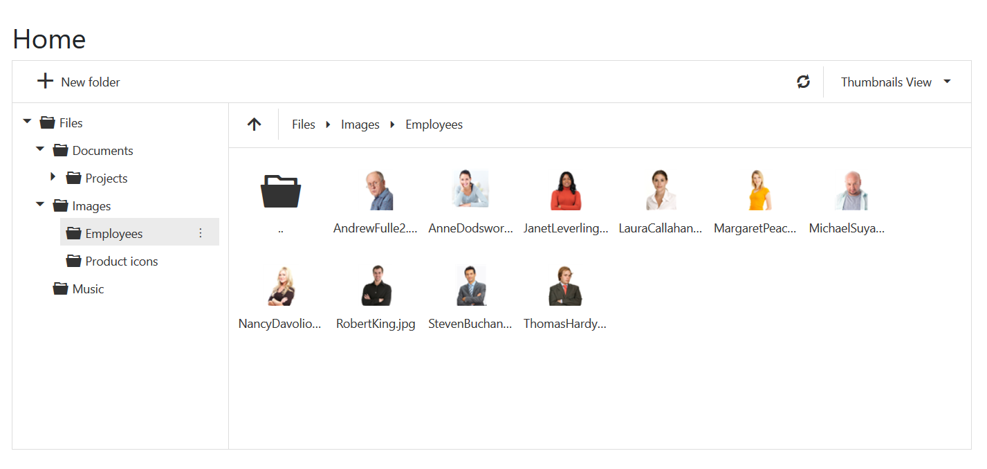
Image thumbnails are important UI elements within all modern file explorers (be it Explorer on PCs or Finder on Macs).

DevExpress-ASPNETCore-FileManager

At present, our File Manager displays default thumbnails for all files. We will support preview thumbnails in a future release. If you’re already using the File Manager in your web app, you can introduce image previews via our Thumbnail Generator service. Simply add it to your project to enable image previews.

Under the Hood

The ThumbnailGeneratorService.cs file contains the code needed to generate custom thumbnails. We use the System.Drawing.Common library to create icons based on your image files.

How to Install

  1. Add the ThumbnailGeneratorService.cs file to your ASP.NET Core Web Application without any modifications.

  2. Register the service in the Startup.cs file:

services
    .AddSingleton<IActionContextAccessor, ActionContextAccessor>()
    .AddSingleton<IThumbnailGeneratorService, ThumbnailGeneratorService>()
  1. Сreate a new method (e.g. FileSystem) in a controller to inject the ThumbnailGenerator service using Dependency Injection:
public IActionResult FileSystem(FileSystemCommand command, string arguments) {
  var config = new FileSystemConfiguration {
      FileSystemProvider = new DefaultFileProvider(rootPath,
          ThumbnailGenerator.AssignThumbnailUrl),
          // ...
       };
       var processor = new FileSystemCommandProcessor(config);
       var result = processor.Execute(command, arguments);
       return Ok(result.GetClientCommandResult());
 }
  1. Assign a custom icon URL to each File Manager item in the customizeThumbnail method:
$(function(){
    $("#fileManagerContainer").dxFileManager({
       // ...
       customizeThumbnail: function (fileManagerItem) {
          return fileManagerItem.dataItem ? fileManagerItem.dataItem.thumbnailUrl : null;
       }
    });
});

You should now see image thumbnails within the DevExpress File Manager control.

DevExpress-ASPNETCore-FileManager

Unix-based Systems

If you encounter the "System.TypeInitializationException: The type initializer for 'Gdip' threw an exception. ---> System.DllNotFoundException: Unable to load DLL 'libgdiplus': The specified module could not be found" exception, please install GDI+.

MacOS

For MacOS systems, call the following command into terminal to install GDI+:

brew install mono-libgdiplus

Survey

We'd love to hear your feedback.


Webinar: Using a JavaScript library with Blazor

$
0
0
A few weeks ago, Julian and I were discussing how it would be helpful to share different snippets of knowledge through a series of short webinars. This weeks presentation "Using a JavaScript library with Blazor" is the first of that series. We wanted to focus on common issues we had come across and the solutions discovered. The session will not be our typical 1 hour format, although we will definately still have a questions & answers segment.
So why a topic on Blazor?
Since Microsoft announced it's bold plan to allow C# developers the ability for building web UI's using the language syntax they are familiar with, we knew that our customers would be looking to us for quality commercial components. Back in April this year, we announced the DevExpress UI Blazor controls, which offered a chance to participate in the free Early Access Program (EAP) as well as a number of tutorials on our YouTube Channel - DevExpress Blazor video training course.
While putting together some sample projects we quickly determined that there are going to be use cases where an existing JavaScript library may be required. Julian is my go-to man for JavaScript questions and while asking his advise recently we thought it would be a great idea to look at how we handled a particular scenario.
Join us at 10am PDT Tuesday (July 16) as we take a look at implementing a 3rd party open-source JavaScript library in a simple server-side Blazor project. If you have not already registered for the webinar, you can click here and save your spot.

There are a number of prerequisites for creating your Blazor project, the main one being the use of Visual Studio 2019 Preview. For full instructions on how to set up your project please head over to our Blazor GitHub page.

As always, we would love to hear how you are adopting this new and exciting technology. Please leave a comment below or send us an email and share your thoughts.


Viewing all 2401 articles
Browse latest View live