Quantcast
Channel: Developer Express Inc.
Viewing all 2401 articles
Browse latest View live

.NET Word Processing — RTL Enhancements

$
0
0

Over our last two release cycles, we’ve significantly improved right-to-left text handling within our Rich Text Editor (WinForms and WPF) and Word Processing Document API. This blog post summarizes what we’ve delivered to date.

v18.2

With this release, we upgraded undo/redo operations, caret navigation in bidirectional paragraphs and implemented the following enhancements to all our word processing components:

  1. Support for dir=”rtl” HTML tag (import and export).
  2. RightToLeft option for paragraphs, paragraph styles, tables, sections and comments in API.
  3. Text Direction for user interface elements (Command UI and dialogs).
  4. Introduced new numbering formats (ArabicAbjad, ArabicAlpha, Hebrew1, Hebrew2) within the API (the ListLevel.NumberingFormat property) and component UI.
  5. Updated Rulers for right-to-left paragraphs.

v19.1 ships with the following new enhancements:

Paragraph Alignment Types

New paragraph alignment options for Arabic text (Justify High, Justify Medium, Justify Low). You can change alignment in code using the Alignment property. The Rich Text Editor for WinForms and WPF also provides new UI elements for language packs installed on a given machine.

Command UI items for paragraph properties (indents, bulleted, numbered and multilevel lists) now adjust to the direction of a focused paragraph.

Line Numbering

We improved line numbering for right-to-left paragraphs. Numbers now change location based on a sections’s direction. You can print and export (to PDF) right-to-left text with line numbering.

Your Feedback Counts

Tell us your thoughts in the comments section below and help us improve our .NET Word Processor by answering the following question:


ASP.NET, MVC, and XAF Popup Control – Google Chrome v75 Render Issue

$
0
0

Recently, we discovered an issue with Google's latest Chrome browser: our Popup Control will not render page content inside Chrome version v75 (specifically v75.0.3770.80).

The issue was caused by Chrome's inability to correctly render IFrame content when using the src attribute. If you'd like to learn more, please take a look at our bug report on chromium.org:

Issue 971641: Chrome 75 does not render IFRAME content if the content was specified using "src" attribute with some delay

What's affected?

The following components are affected by this issue:

  • WebForms ASPxPopupControl
  • PopupControl MVC Extension
  • XAF Pop-up Window

If you set a URL using either the client-side SetContentUrl method or the ContentUrl property, the popup window will appear empty.

Solution

We've addressed Google’s bug in the following versions (available early next week):

  • v18.1.13
  • v18.2.10
  • v19.1.4

If you need a workaround for current versions, register the following script at the bottom of your HTML page (before the body closure tag):

<body><form id="form1" runat="server">
        ...........</form><script>
        if (window.ASPx && ASPxClientUtils.webKitFamily && ASPxClientUtils.browserVersion >= 75) {
            ASPx.SSLSecureBlankUrl = "about:blank";
        }</script></body>

This workaround should be implemented on each web page that contains our Popup control. If you use a MasterPage (or LayoutView in MVC), register the same script in those pages instead of each content page/view.

If you run in to any issues then please contact our support team and they can help you.

DevExtreme - Data Grid - New Excel Export API (CTP in v19.1)

$
0
0

Our DevExtreme Data Grid has supported data exports to Excel for a long time now. This functionality works well and is sufficient for many use cases. However, there are not many customization points and certain export scenarios are difficult to support on this basis. We received requests to improve the export feature set, including these:

  • Add headers and footers
  • Export multiple widgets into one Excel document
  • Export to different sheets
  • Start exporting to a specific cell
  • Include images and hyperlinks in exports

We planned and attempted some modifications and extensions to our own document generator for the XLSX format, but we realized that the required changes would be substantial. We decided to go a different way and provide an adapter to the feature-rich ExcelJS library.

The resulting solution is now available in v19.1 as a CTP. We added the section Advanced Document Customization to our Widget Gallery demo, and you can see there how the new functionality works with all our usual supported platforms, including Angular, Vue, React, jQuery and ASP.NET MVC and ASP.NET Core.

Advanced Document Customization

Exports Using ExcelJS

It is easy to use the new API. Here is a basic code snippet:

 1
2
3
4
5
6
7
8
9
10
11
12
13
14
15
16
17
18
19
onExporting:e => {
varworkbook=newExcelJS.Workbook();
varworksheet=workbook.addWorksheet('Main sheet');

DevExpress.excelExporter
.exportDataGrid({
worksheet:worksheet,
component:e.component
})
.then(function() {
workbook.xlsx.writeBuffer().then(function(buffer) {
saveAs(
newBlob([buffer], { type:'application/octet-stream' }),
'DataGrid.xlsx'
);
});
});
e.cancel=true;
};

These are the steps implemented by this short sample:

  • The trigger point is an event handler for the onExporting event. Technically you can run the export functionality at any point, but if you use this event you can take advantage of the standard Export button supported by the Data Grid. Note that standard processing is deactivated at the end of the code snippet by setting e.cancel = true.
  • Using ExcelJS API calls, a new workbook/worksheet combination is created
  • Using our new API, the Data Grid is exported to the given worksheet
  • To save the document to a file, the saveAs function from FileSaver.js is called.

You are free to customize this approach, for example by referring to any existing worksheet, or by post-processing the document after the export has taken place.

Here is a link to the basic export sample on CodePen.

Advanced Processing

We prepared several additional CodePen samples to cover common use cases. The ExcelJS API is flexible and allows you to modify worksheets directly, or target them multiple times to combine exports.

Headers And Footers

This code sample adds a step between initial export and saving. In this step, the worksheet range used by the exported Data Grid is available, so you can use it to calculate relative cell coordinates. Note that the topLeftCell property is also used here to influence the location of the Data Grid export in the target worksheet.

 1
2
3
4
5
6
7
8
9
10
11
12
13
14
15
16
17
18
19
DevExpress.excelExporter
.exportDataGrid({
component:e.component,
worksheet,
topLeftCell: { row:5, column:1 }
}).then(function(dataGridRange) {
Object.assign(
worksheet.getRow(2).getCell(2),
{ value:"My Header", font: { bold:true, size:16, underline:'double' } }
);
Object.assign(
worksheet.getRow(dataGridRange.to.row+2).getCell(2),
{ value:"My Footer", font: { bold:true, size:16, underline:'double' } }
);
}).then(function() {
workbook.xlsx.writeBuffer().then(function(buffer) {
saveAs(newBlob([buffer], { type:"application/octet-stream" }),
"DataGrid.xlsx");
});

Headers And Footers

The full sample is available in CodePen.

Custom Cell Formats

Call the exporter and pass a function to the option customizeCell in order to influence the format on the basis of grid information. In this example, cells in a grouped Data Grid are colored depending on their group levels.

 1
2
3
4
5
6
7
8
9
10
11
12
13
14
15
16
17
18
19
20
21
22
DevExpress.excelExporter
.exportDataGrid({
component:e.component,
worksheet:worksheet,
customizeCell:function(options) {
vargridCell=options.gridCell;
varexcelCell=options.cell;

varnodeColors= [ 'FFBEDFE6', 'FFC9ECD7'];
varcolor=gridCell.groupIndex!==undefined?
nodeColors[gridCell.groupIndex] :'FFDDDDDD';
Object.assign(excelCell, {
font: { bold:true },
fill: {
type:'pattern',
pattern:'solid',
fgColor: { argb:color },
bgColor: { argb:color }
}
});
}
}).then(function() { ... }

Custom Cell Formats

The CodePen sample is available here.

Multiple Grids

If necessary, you can call the exporter multiple times. Here is an example that targets different locations in the same worksheet:

 1
2
3
4
5
6
7
8
9
10
11
12
13
14
15
16
17
18
19
20
21
DevExpress.excelExporter
.exportDataGrid({
worksheet,
component:dataGrid1,
topLeftCell: { row:4, column:2 }
})
.then(function(dataGridRange) {
returnDevExpress.excelExporter.exportDataGrid({
worksheet,
component:dataGrid2,
topLeftCell: { row:4, column:dataGridRange.to.column+2 }
});
})
.then(function() {
workbook.xlsx.writeBuffer().then(function(buffer) {
saveAs(
newBlob([buffer], { type:'application/octet-stream' }),
'DataGrid.xlsx'
);
});
});

Two Grids Into One Worksheet

Here is the full sample. We have also prepared a similar sample to export two grids into separate worksheets.

Images

ExcelJS has good support for images in workbooks, and these can be combined with Data Grid exports.

Images In Worksheets

Here is the complete CodePen sample.

Show A Load Panel

As a final sample, we prepared a demo that shows a DevExtreme Load Panel while the export is running. This can be useful for large Data Grid setups where the process takes a little while to complete.

Load Panel

The full CodePen sample is here.

What Do You Think?

If you have any feedback on our implementation, or if you feel that your own export scenarios are not completely covered yet, please don’t hesitate to get back to us. You can leave comments below, open Support Center tickets or take part in the discussion on GitHub. We are always interested in your thoughts!

Upgrade to jQuery v3.4.1+ - DevExpress Controls

$
0
0

In late March 2019, a new medium-level jQuery security vulnerability was disclosed.

This vulnerability is specific for jQuery versions older than v3.4.0 and we encourage you to upgrade to jQuery v3.4.1+.

In this post, I'll discuss why you should update both your jQuery and DevExpress installation.

jQuery Prototype Pollution

The new jQuery 'prototype pollution' vulnerability can be dangerous to your websites because:

This security vulnerability referred to and manifests as prototype pollution, enables attackers to overwrite a JavaScript application object prototype. When that happens, properties that are controlled by the attacker can be injected into objects and then either lead to denial of service by triggering JavaScript exceptions, or tamper with the application source code to force the code path that the attacker injects. - Liran Tal

Specifically, the jQuery.extend() method is affected:

"jQuery before 3.4.0, as used in Drupal, Backdrop CMS, and other products, mishandles jQuery.extend(true, {}, ...) because of Object.prototype pollution. If an unsanitized source object contained an enumerable proto property, it could extend the native Object.prototype." - CVE-2019-11358 Detail

For more information on this vulnerability, please refer to the following posts:

DevExtreme, Web Reports, & Dashboards

This vulnerability affects customers who use DevExtreme, Web Reports, or Dashboards.

Our DevExtreme components use the aforementioned jQuery.extend() method. Since DevExpress Web Reports and Dashboards use the DevExtreme widgets, they are also affected by this vulnerability.

The good news: this vulnerability has been fixed in jQuery v3.4.1+. As such, we've updated the following versions of our product suite:

  • v18.1.12
  • v18.2.9
  • v19.1.4

I recommend that you install our update - this will be the easiest way to move to jQuery v3.4.1.

Our ASP.NET MVC extensions do not use the jQuery.extend() method and subsequently, are not affected. However, for safety and consistency, we've upgraded the jQuery version used by our ASP.NET MVC library as well.

Upgrade npm packages

The following Dashboards and Web Reports npm packages are also affected:

  • @devexpress/analytics-core,
  • devexpress-reporting, and
  • devexpress-dashboard.

These packages have jQuery dependency version >= 3.3.1. Please run the following command and it'll update your jQuery to the latest version:

npm i jquery

If you encounter any issues, please contact our support team for immediate assistance.

ASP.NET WebForms for Bootstrap - New Controls & Enhancements (v19.1)

$
0
0

Our most recent ASP.NET Bootstrap release (v19.1) includes a number of new controls and usability enhancements.

New Color Edit

This release includes a new Bootstrap Color Edit control. Its features include:

  • Color indicator
  • Custom color picker
  • Automatic / favorite color item
  • Custom palettes

DevExpress ASP.NET Bootstrap Color Edit

We ported this control from our existing ASP.NET Color Edit control so it provides the same set of features and functionality.

Demo

New Floating Action Button

Our new Floating Action button encapsulates popular end-user actions (e.g., CRUD operations, data sorting, filtering, etc.). Floating Action buttons are fully configurable and support custom actions.

Key features include:

  • Container indication
  • Fixed position
  • Customizable appearance

DevExpress ASP.NET Bootstrap Floating Action Button

This button includes the same features as our ASP.NET Floating Action Button (introduced in late 2018).

For those unfamiliar with our ASP.NET Floating Action Button – This new button element hovers over other controls and offers easy access to common actions. It can be used to replace context menus, toolbars, etc. Take a look at how the Floating Action Button can be used in the Grid View control:

DevExpress ASP.NET Bootstrap Floating Action Button with Grid

Demo

Drop-down Editors - Adaptivity Enhancements

With this release, DevExpress Bootstrap drop-down editors (ComboBox, DateEdit, etc.) can switch to modal mode based upon browser width:

DevExpress ASP.NET Bootstrap Drop Down

Demo

Date Edit - Scroll Picker

We added a new mobile-friendly way to select dates with the DevExpress Bootstrap DateEdit control:

Demo

These features were inspired by the adaptivity enhancements in our ASP.NET Data Editor library.

As always, we’d love your feedback – Tell us what you think of these new DevExpress ASP.NET Bootstrap controls and adaptivity enhancements? Comment below or submit a support ticket via our Support Center.

WinForms Tips & Tricks - What You May Have Missed (Part 5)

$
0
0

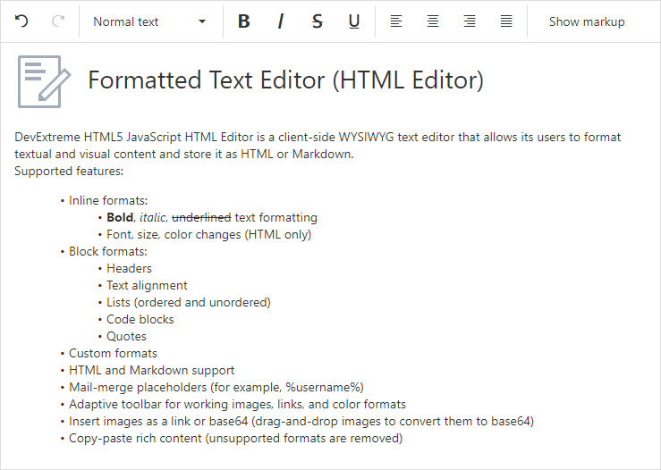
Here it is: the fifth part of our What You May Have Missed series for WinForms developers. Once more we have collected several items that may be new to you.

In case you haven’t seen the previous posts of the series, here is an overview:

Other Tips & Tricks blog posts:

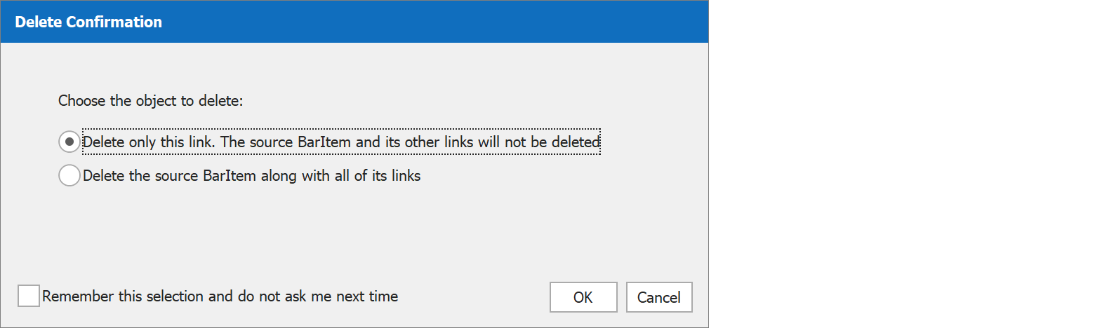
Reset the BarItem Delete Confirmation dialog

When you press the Del key to remove a selected item link from a Bar Manager or Ribbon Control, a confirmation dialog pops up. It asks you to confirm how you would like to remove the element: just that particular link (leaving the source item and any other links intact), or the source item with all of its links.

Delete Confirmation

The dialog includes a checkbox Do not ask me next time, which is obviously useful if you need to repeat the operation. However, you may also regret checking the option when you’re no longer offered a choice when you use the Del key next time. To get the dialog back, find the key HKEY_CURRENT_USER\Software\Developer Express\Designer\XtraBars\ShowBarElementDeletionConfirmation and set it to True.

In the future, we may add an option for this purpose to the dialog Change Design-Time Settings, which you can bring up from the DevExpress menu in Visual Studio. Please let us know in the comments whether you would like to see this happen sooner rather than later.

WindowsUI Button Panel Customization

If you use the WindowsUI View for the Document Manager component, you are probably familiar with the WindowsUI Button Panel. It is a panel with flat round buttons that can be configured as regular push buttons or check buttons. In addition, the panel offers flexible customization options.

Buttons Without Borders

For starters, try turning the property UseButtonBackgroundImages off to remove the default circular borders. Also turn off AllowGlyphSkinning if you use vector icons. The appearance in this configuration may remind you of a flat-style toolbar:

WindowsUI Button Panel Normal Toolbar

On the other hand, it can look completely different:

High Contrast Bottom Toolbar

Note: In case you play along and notice at this point that the buttons don’t seem to visually react to the mouse, please read on for a solution in the section No Borders And Custom States.

Using the property ImageOptions.Glyph you can assign an image collection to each button. Up to five images are supported to represent the states Normal, Hovered, Pressed, Checked, and Disabled. You can use completely independent icons for all states, and the property ImageSize on the DevExpress Image Collection specifies how big your button will appear. In the animation below, buttons use an SvgImageCollection with IconSize set to 64x64.

Buttons With Custom Glyphs

Custom Backgrounds

A similar mechanism can be used for background images. Assign an image collection to the panel property ButtonBackgroundImages and you can have buttons with any border shape you like, instead of the default circles.

Buttons with Custom Background Images

By combining these features you can create completely unique buttons. Here is a panel that uses both custom background shapes and button glyph collections.

Buttons Combining Custom Glyphs And Background Images

No Borders And Custom States

If you do your own tests with borderless buttons and custom glyphs, you may notice that the Button Panel doesn’t show any reactions to mouse actions if AllowGlyphSkinning is off. This happens because there is no background to indicate the state change. You can try to switch AllowGlyphSkinning on and configure ForeColors for Hovered and Pressed states, but then the custom colors will change the icons.

Here is a setup that avoids this problem. AllowGlyphSkinning is off and the background image collection has three images. One is a completely transparent square (that’s the Normal state), the other two are filled black at 30% opacity (for the Hovered and Pressed states). ForeColor values for the Hovered and Pressed states have been configured to Gray and DeepSkyBlue. The animation shows the result: borderless buttons with custom visual states for the background, and icons that don’t change with the states.

Custom Background Visual Status

Integrating With Other Controls

Finally, a WindowsUI Button Panel can be used as a navigation element for TileControl, TileBar, NavigationFrame and ImageSlider controls. The panel looks at the number of child items in the target control and calculates how many “pages” are required to show them all. It then displays a corresponding number of buttons, shown as radio buttons in the animation below. The calculation is fully dynamic – resize the target control at runtime and the number of pages is reassessed automatically.

Button Panel Pager Behavior

To take advantage of this feature, create a Pager Navigation Behavior, set its Target property to the content control being navigated, and the Pager property to the WindowsUI Button Panel (simple Radio Groups are also supported).

Demo Center – Shiny Showcases And Lots More

You know that the DevExpress installer includes many demos for our controls and components. We update those demos continuously, so be sure to check them out when you have time! All DevExpress demos are available from the Demo Center application. There are two main demo types:

  • Real-life Demos are large sample applications that demonstrate many DevExpress controls at once
  • Control Demos are smaller and focus on one specific control each. Control demos usually have many modules that illustrate individual features, typically with a list of settings to try out.

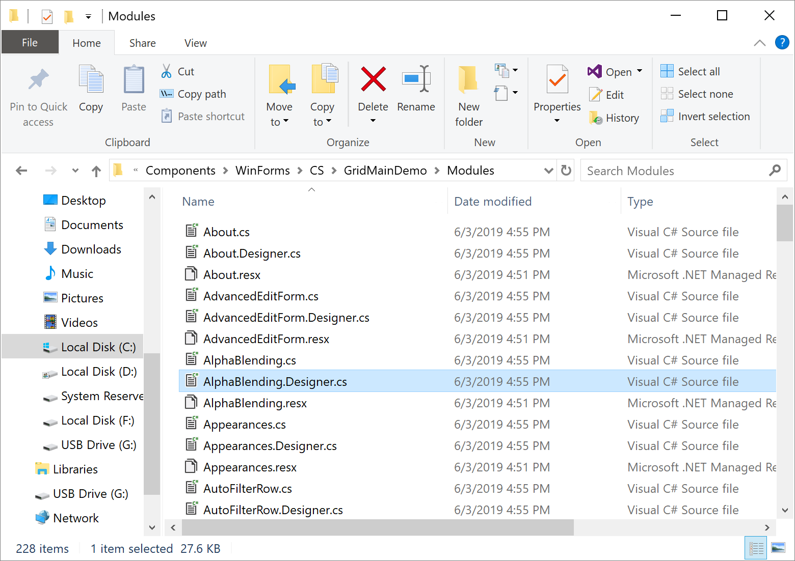
All demos are stored in the directory C:\Users\Public\Documents\DevExpress Demos xx.x\Components\WinForms. If you open one of the folders – here’s the Data Grid demo folder as an example – you’ll see all the modules included in the demo.

Data Grid Demo Modules

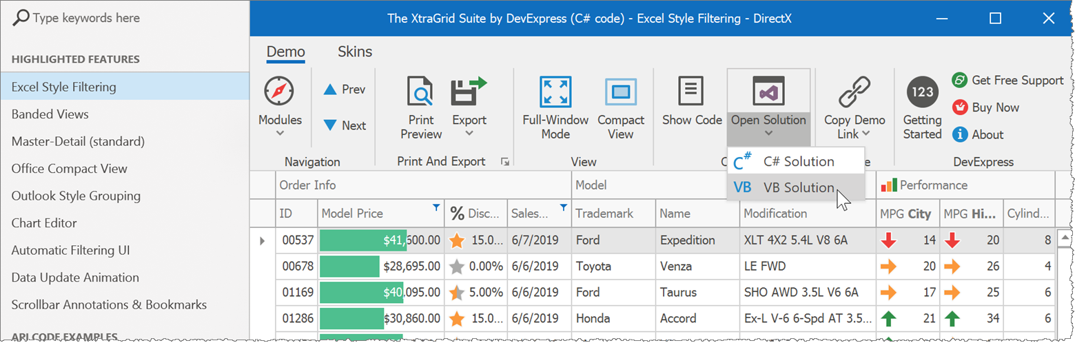
If you see a demo with a feature you’d like to implement in your own application, or some useful customization or design, you need to find the exact Visual Studio solution module that includes the relevant source code.

To make this easy, each demo in the Demo Center has an Open Solution button. Choose your preferred programming language and Visual Studio will open the demo module you’re currently looking at.

Open Solution

The same works for real-life demos, too – just right-click an item in the Demo Center.

Open Solution For A Real-Life Demo

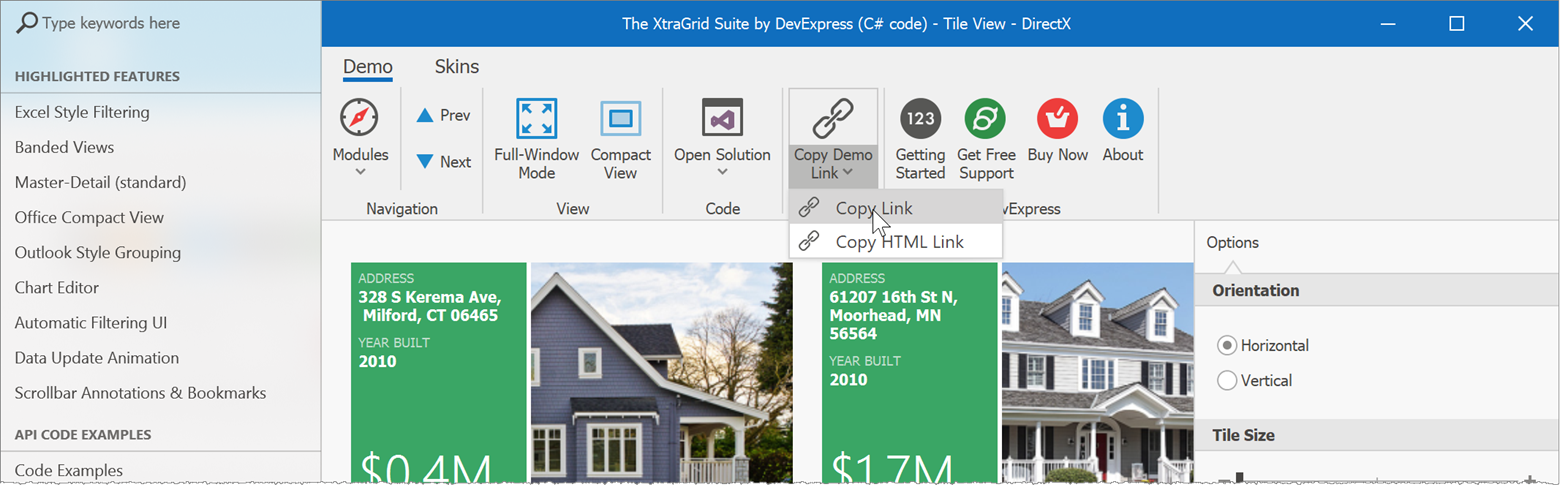
It is also possible to copy links to demos. Our technical writers are main beneficiaries of this feature, when they insert these links into documentation or blog posts, so readers can run demos directly from the page they’re reading. However, you can also use these links to refer colleagues to a demo, or to include in a Support Center ticket.

Copy Demo Link

A final item that deserves a mention is the Code Examples demo. This demo is available for our major controls and components and features small code samples that illustrate how to solve common tasks. You can also use the demo as a playground: just modify the code snippet, it recompiles when you stop typing, and the live preview reflects your changes.

Code Examples

Let’s Hear Your Thoughts

Hopefully you found something interesting in today’s selection. If you did, or if you recently discovered something really cool in the DevExpress suite and you think others might be unaware, please share it in the comment section below!

In addition, we’d like to ask a question. We recently published the rather lengthy post Mastering Filter Editors, and most of our Tips & Tricks posts are quite long as well. Do you like this format, or would you prefer it if we kept individual posts short and focused on one feature at a time?

DevExtreme React Scheduler - Drag & Drop Editing (v19.1)

$
0
0

Great news for users of our native React Scheduler: the component now supports Drag&Drop editing and appointment resizing.

Native React Scheduler Drag&Drop

To activate the new features, you need to add the DragDropProvider plugin to your scheduler configuration. EditingState is also required to handle changes. Overall, your result may look like this:

1
2
3
4
5
6
7
8
<Schedulerdata={data}>
<EditingStateonCommitChanges={...} />

<WeekView />
<Appointments />

<DragDropProvider />
</Scheduler>

The DragDropProvider has two properties allowDrag and allowResize that control which appointments can be dragged or resized. For example, this snippet disables dragging for all-day appointments and completely disables resizing:

1
2
3
4
<DragDropProvider
allowDrag={({ allDay }) => !allDay}
allowResize={() => false}
/>

In addition, you can use the properties draftAppointmentComponent and sourceAppointmentComponent to override the rendering of the dragged elements during the process, for instance to provide visual feedback to the user.

A short guide with an example is available, as well as the reference documentation for the DragDropProvider plugin.

What Do You Think?

If you have any thoughts on our implementation, please don’t hesitate to leave a comment below or take part in our feature discussion on GitHub.

DevExtreme - Web Diagram Control CTP (v19.1) - Getting Started

$
0
0

One of the common scenarios in using a diagram control is creating an organization chart. In this "getting started" article we introduce the few steps needed to create one with our new jQuery Diagram control, save it, load it, configure the control, and so on.

jQuery Diagram: Creating OrgCharts Using our JavaScript Widget

The article also covers these topics:

  • Bind the OrgChart to a data source
  • Load OrgChart "entities" to a toolbox panel
  • Add custom shapes to an OrgChart
  • Save and Load an OrgChart's Layout
  • Configure Page Settings
  • Export an OrgChart

DevExpress Diagram Widget

Demo

Tell us what you think of the new Web Diagram widget and comment below or submit a support ticket via our Support Center.


DevExtreme - Data Grid - Excel Data Export Enhancements

$
0
0

In v18.2 we introduced the callback customizeExcelCell for the DevExtreme Data Grid. However, a few features planned for this customization hook were delayed. Now we have completed the missing functionality and made it available in v18.2.8 and v19.1.2.

The customizeExcelCell callback now receives information about grid cells in group and summary rows, so that the entire grid setup can be replicated in an Excel export.

As usual, the functionality described in this post applies to all platforms supported by DevExtreme, including Angular, Vue, React, jQuery and ASP.NET MVC and ASP.NET Core.

Customize Excel Export

groupIndex

The first of two important changes is that the groupIndex value is passed to customizeExcelCell. This enables you to distinguish different group levels in the callback and format output accordingly. For example, you could assign different background colors:

1
2
3
4
5
6
7
8
if (gridCell.rowType==='group') {
if (gridCell.groupIndex===0) {
options.backgroundColor='bedfe6';
}
if (gridCell.groupIndex===1) {
options.backgroundColor='c9ecd7';
}
}

Background Colors Depending On Group Index

gridCell and groupSummaryItems

The second big change is that the gridCell property includes details about each column and related summary items when customizeExcelCell is called for a group row cell.

This example shows a group caption together with its summary:

1
2
3
4
5
6
7
if (gridCell.rowType==='group') {
if (gridCell.column.dataField==='Employee') {
options.value=
gridCell.value+' ('+gridCell.groupSummaryItems[0].value+' items)';
options.font.bold=false;
}
}

Group Caption With Summary

You can also apply a custom number format to a summary value:

1
2
3
4
5
6
if (gridCell.rowType==='group') {
if (gridCell.column.dataField==='SaleAmount') {
options.value=gridCell.groupSummaryItems[0].value;
options.numberFormat='&quot;Max: &quot;$0.00';
}
}

Formatted Group Header Value

For footer and total summary values, you need to check for rowType === 'groupFooter' and rowType === 'totalFooter' (see the rowType documentation).

Documentation And Demo

Our documentation page for customizeExcelCell contains all relevant information. We also updated the demo Excel Cell Customization to show the new functionality.

Your Feedback Is Welcome

Please feel free to leave comments below if you have any thoughts about the new functionality. Your feedback is important to us!

We’re at NDC Oslo this week

$
0
0

This week, one of the coolest conferences in Europe is taking place in Oslo, Norway. It is the annual NDC Oslo  with an awesome speaker line-up.

John and I will be there with our booth and we brought T-Shirts with our new design on it so you better stop by our booth to get one. I’m sure you’ll like it.

While you’re there I’m more than happy to show you all the new features we have released with our v19.1 version incl. our Blazor components.

If you’re attending to NDC Oslo, make sure to stop by to tell us what you’re developing.

Web Report Designer – Our Reimagined Report Wizard (v19.1.4)

$
0
0

As you may already know, DevExpress Reporting (v19.1.x) ships with a redesigned Web Report Wizard. The purpose of this post is to detail its capabilities, to explain why we redesigned the wizard and to show you how you can leverage our new implementation to deliver better user experiences to your customers.

Goal #1: Reduce the Number of Report Wizard Steps

One of our primary goals during the redesign process was to reduce the number of individual steps within the wizard. To create a standard table report with groups and summaries, our old Report Wizard required users to navigate 11 pages.

We also wanted to reduce the confusion that resulted from the “modal” design of the Report Wizard. As the image below illustrates, our old Report Wizard could be confusing – users often tried to click outside the boundaries of the wizard while creating a new report.

DevExpress Web Report Wizard - Reimagined

Our new wizard is now displayed in full screen and allows end-users to focus on the new report and gives us the ability to make better use of screen real-estate.

The Basic Layout of the New Report Wizard

DevExpress Web Report Wizard - Basic Layout

The New Report Wizard in Action

DevExpress Web Report Wizard

Context-Driven UI

A report wizard such as ours makes compromises. Since its built to address a wide array of usage scenarios, it includes functionality not necessary for all reports (i.e., every report does not require data table relationships, grouping, sorting, summaries, etc.). By converting to a context-driven UI, we’ve made our Report Wizard easier to use. Much like cascading combo boxes, the Report Wizard now populates itself dynamically (based on current selection).

This new design allowed us to cut the number of wizard steps to 5. Users can now create a report in less time and with fewer mouse clicks.

DevExpress Web Report Wizard - Steps

Here's a comparison of the old wizard versus our new wizard:

  Time Spent (sec) Total Clicks
A master-detail report with a summary
Old Wizard (v18.2 and earlier) 00:45 27
New Wizard (v19.1) 00:35 22
A table report with a color scheme
Old Wizard (v18.2 and earlier) 00:22 13
New Wizard (v19.1) 00:17 10

Improved Navigation Model

Standard app wizards do not offer an easy way to navigate between individual steps. If a user makes a mistake, forgets to apply a setting, or does not add the appropriate data source column, he or she must use the "Back" button to find and correct errors made in earlier steps. While this is certainly not the end of the world, it can cause unnecessary frustration and waste valuable time.

To overcome the issue, we chose to include a left navigation bar within the wizard. Your end-users can now navigate to a desired wizard page without unnecessary button clicks.

DevExpress Web Report Wizard - Navigation

Though this may seem like a minor improvement, the net result serves our ultimate aim – reduce the number of clicks and increase overall productivity when using the Report Wizard.

DevExpress Web Report Wizard - Navigation

User Experience Enhancements

During our redesign, we noticed a few usability issues related to our "Add Grouping" and "Add Sorting" Report Wizard pages. In our previous implementation, these pages contained a drop-down list of detail reports and a list of groups and summaries positioned below. Unfortunately, this implementation did not provide enough information to the end user and required users to change selection to add/remove a summary function or a group for a given report or its detail reports.

DevExpress Web Report Wizard - User Experience

We redesigned both these pages, so they now appear as a listbox with two panes: a report name is displayed on the left and a grouping/sorting section with relevant properties is displayed on the right:

DevExpress Web Report Wizard - User Experience

As these images help illustrate, our new approach should improve overall usability.

Your Feedback Counts

We think our new design improves overall usability and addresses a number of important navigation issues. Of course, your opinion is what counts most. Please tell us what you think of the changes described above:

Additional Changes to our Report Wizard

  1. The Report Wizard now allows you to create Vertical reports.
  2. JSON Data Source is now avaialble in the Data Source Wizard.
  3. You can now customize individual Report Wizard pages via our Customization API (you can find examples here). We expect to write documentation for all customization options in the near future.

Backward Compatible

If you prefer our old Report Wizard and don’t want to switch to our new design, please use the following option going forward:

protected void Page_Load(object sender, EventArgs e) {
    ASPxReportDesigner1.SettingsWizard.UseFullscreenWizard = false;
    //...
}

If using ASP.NET MVC and Core:

@(Html.DevExpress().ReportDesigner("ReportDesigner")
    .Height("1000px")
    .WizardSettings(settings => { settings.UseFullscreenWizard = false; })
    .Bind(Model)
)

If using a JavaScript-based framework like Angular:

public object GetReportDesignerModel(string reportUrl) {
    var generator = new ReportDesignerClientSideModelGenerator(HttpContext.RequestServices);
    var model = generator.GetModel(reportUrl, null/*DataSources*/, "/DXXRD", "/DXXRDV", "/DXXQB");
    model.WizardSettings.UseFullscreenWizard = false;
    var modelJson = generator.GetJsonModelScript(model);
    return Content(modelJson, System.Net.Mime.MediaTypeNames.Application.Json);
}

Fullscreen Mode for Web Report Designer

We have some good news for those of you who incorporate our Web Report Designer into a container within a web application. Our next update, (v19.1.4) will include a “full screen mode” option in the Web Report Designer toolbar:

DevExpress Web Report Wizard - Full Screen

Future Plans – Your Feedback is Important

We hope to enhance the Web Report Designer further and to focus our energies on its toolbar and the properties panel. One of our ideas is to replace the toolbar with a compact ribbon similar to that used in our ASP.NET Core Rich Text Editor component:

DevExpress Web Report Wizard - Compact Ribbon

We'd like to hide the Actions panel and move its items to ribbon tabs (which will be control-specific, and selection driven - Action panel items replicate report control smart tags you will have seen in our Visual Studio Report Designer):

DevExpress Web Report Wizard - Actions Panel

ASP.NET MVC Case Study - SmartWeb

$
0
0

Want to see how other developers use DevExpress products?

If so, we’ve published a short case study that details how Escola Pinheiro (a K-12 school in Brazil) used our ASP.NET MVC controls to build SmartWeb. SmartWeb gives students, parents, and teachers a platform through which to communicate grades, reports, schedules and upcoming homework assignments.

SmartWeb Case Study

Do You Have a Story to Share?

We'd love to publish your story on our website. It doesn’t matter if the project is big or small, or which DevExpress tools you used. Fill out this simple case study form and email us at clientservices@devexpress.com.

DevExtreme - HTML Editor - Resizing Media Blocks (v19.1)

$
0
0

We only recently released our DevExtreme HTML Editor and while it is already working good, we're still improving it.

In our v18.2 release we added support for images and media files but without the possibility to visually resize them.

In v19.1 we've added support for this and the nice thing is that you can specify a number of options on the resize behaviour.

First you can decide to enable or disable the resizing, and second you can specify which targets are allowed to be resized.

mediaResizing: { 
    enabled: true, // enables resizing   
    allowedTargets: ["images"] // specifies resizable media types 
}                 

How does it work?

Given the fact that you have enabled the resizing feature as mentioned above, once you click an image, a resizing frame and the grab-handles appear which enables you to resize the object.

And how does it work on a mobile device?

Since DevExtreme controls should work great on any device, when using this feature on a mobile device, we'll adjust the handles and make them bigger so you can resize with your finger.

Limitations and future plans?

The resizing functionality at this stage can only be applied on images. We're currently working on resizing video blocks as well.

Another thing we are working on is the ability to keep the aspect ratio of the media block which is currently being resized.

Try it out?

If you're ready to test this feature, just download and install the current v19.1 release or use NPM to add DevExtreme to your project

npm install --save devextreme@19.1-latest

What do you think?

Let me know what you think of this feature by replying on this post.

DevExpress UI for Blazor - Developer Diary and Preview 10 (Now Available)

$
0
0

The following is a brief summary of changes made to our Blazor product line over the last few weeks.

If you’ve not yet reviewed our Blazor product line, please be certain to check out our Blazor Components webpage. If you are new to Blazor, feel free to review our 4-part Blazor training videos on YouTube.

DevExpress Blazor - Pivot Grid

What's New

After releasing Preview 7, we've added new features and fixed bugs in the following releases:

Preview 8

For this release, we focused on the following Data Grid Enhancements:

Cascading combo boxes that can be used in the cell's Edit Template

Support for Edit Form templates:

DevExpress Blazor - Grid Edit Form Template

Implemented Validation for default Edit Form editors

DevExpress Blazor - Form Validation

Fixed issues

The NullReferenceException occurs after you cancel new row editing.

Preview 9

We addressed the following issue in the Blazor framework:

[Blazor] onclick event no working on some element in iPhone browser. #10725

This issue affected our Data Grid and ComboBox editors as they would not always respond to the onClick event in iPhone Safari browsers.

Note, this Blazor issue is still not resolved. I recommend testing your other UI elements of your Blazor application and make sure they work correctly on iOS devices. You can use TestCafe Studio to create functional tests and catch these types of issues. Learn more here.

We also fixed the following issue: a NullReferenceException occurrs when the FormLayout component is bound to a Model with null values or Data Grid editors are empty (i.e., contain a null value).

Preview 10

We added support for Blazor Preview 6. No Breaking Changes were introduced.

Demos

Test the updated demos online here: DevExpress Blazor Themes - Online Demo

Download the Preview from NuGet

The recent version is available using the following DevExpress NuGet Early Access feed:

https://nuget.devexpress.com/early-access/api

If you are a new user, please refer to this article to learn more about how you can get started with Blazor today.

This preview is made available under the DevExpress Blazor UI license. To gain access to the build free of charge, you will need a DevExpress.com account. You can create a free account to test our NuGet package and can get a free 30-day trial of all our components too.

Watch the Webinar

Your Feedback Matters

Please take a moment to answer the following questions and tell us more about your long-term web development plans?

Office File API – .NET Core (Beta, v19.1)

$
0
0

We’re happy to announce the immediate availability of the DevExpress Office File API library for .NET Core (Beta 1).

With our Office File API for .NET Core, you can create web, console and desktop applications that run across multiple platforms (Windows, Mac, and Linux). Create, load, edit and export rich-text documents and spreadsheets, generate and modify PDF files, and convert different units of measurement for all projects that target .NET Standard 2.0+ / .NET Core 2.1+ platforms.

Primary Features

The DevExpress Office File API for .NET Core allows you to address multiple document-processing requirements:

  • Convert documents to various file formats (Word, Excel, PDF, and HTML). Convert PDF documents to multi-page TIFF.
  • Use mail merge to automatically generate a batch of documents (workbooks or text documents) based on a single document template.
  • Merge documents, workbooks or PDF files into a single file. Split a document or extract its content into multiple files.
  • Protect workbooks, text documents and PDF files. Encrypt your documents with a password and lock-down PDF files by using a digital signature.

Please review our online demo to learn more about common usage scenarios or check out documentation for a complete feature list and additional information.

Try It Now

Visit nuget.devexpress.com to obtain DevExpress NuGet feed URL and install the Office File API packages.

The DevExpress.Document.Processor package includes all Office File API products. Register your DevExpress NuGet feed as a package source and install this package from the Visual Studio's NuGet Package Manager.

If you already have our Office File API components installed on your machine, you can obtain this package from the DevExpress Local package source in the NuGet Package Manager.

Important Note: To use this package in production code, you will need an active license for the DevExpress Office File API Subscription or the DevExpress Universal Subscription.

If you own a license to any other DevExpress subscription, you can install one of the following DevExpress packages to process rich-text documents and generate spreadsheets within your .NET Core application:

These packages are not available in the NuGet Package Manager dialog, but you can install them from the Package Manager console, dotnet CLI, or NuGet CLI.

We have prepared simple examples that demonstrate how to use our Office File API components in your .NET Core application.

Word Processing Document API

Convert a DOCX document to PDF:

using DevExpress.XtraRichEdit;
// ...
RichEditDocumentServer documentProcessor = new RichEditDocumentServer();
// Load a document from a file.
documentProcessor.LoadDocument("Document.docx", DocumentFormat.OpenXml);
// Export the document to PDF.
documentProcessor.ExportToPdf("PdfDocument.pdf");

Spreadsheet Document API

Convert a spreadsheet document to PDF:

using DevExpress.Spreadsheet;
// ...
Workbook workbook = new Workbook();
// Load a document from a file.
workbook.LoadDocument("Document.xlsx", DocumentFormat.Xlsx);
// Export the document to PDF.
workbook.ExportToPdf("PdfDocument.pdf");

PDF Document API

Merge two PDF files into a single document:

using DevExpress.Pdf;
// ...
using (PdfDocumentProcessor pdfProcessor = new PdfDocumentProcessor())
{
   // Create an empty document. 
   pdfProcessor.CreateEmptyDocument("Result.pdf");
   // Append the first PDF file to the created document.
   pdfProcessor.AppendDocument("Document1.pdf");
   // Append the second PDF file to the created document.
   pdfProcessor.AppendDocument("Document2.pdf");
}

Limitations

The following features are currently unavailable (these features are available in our Office File API version for .NET Framework):

  • Ability to print PDF files or export PDF content to an image (Linux and macOS).
  • All PDF features related to DirectX rendering (all operating systems):
    • Stroke and Clip rendering modes
    • Advanced transparency and blend modes
    • CJK fonts support
  • Embedded font support for PDF export (Linux and macOS).

What Do You Think?

As always, we are interested in your feedback. Please feel free to leave comments below or open Support Center ticket. In addition, we would appreciate your responses to this quick survey:


WinForms - Picture Edit - Image Editor Dialog (v19.1)

$
0
0

Using the WinForms PictureEdit control, you can display images on your forms. Not long ago we implemented DirectX rendering support for the control, so that large high-DPI images are handled easily. For v19.1 we added another new feature: an embedded Image Editor dialog.

To bring up this dialog users can right-click an image and select Edit. The operations supported by the Editor are simple but useful: crop, rotate, flip, and changes to brightness, contrast and saturation values.

Note that the option ShowEditMenuItem disables access to the editor when it’s set to False.

Image Editor

When the user clicks the Save button in the Image Editor, the event ImageEditorDialogClosed is raised, so you can implement custom change handling as required.

Custom Actions

We anticipate that you may have custom requirements for image editing operations, so we made the Image Editor extensible. You can add additional commands to the editor in a handler for the event ImageEditorDialogShowing, which appear as buttons in the UI. Commands are classes that implement a simple interface and execute your own editing functionality, possibly using your own UI elements.

1
2
3
4
5
6
7
8
9
publicclassWatermarkCommand : IGraphicCommand {
publicSvgImageImage { get; set; }
publicstringToolTip {
get { return"Add Watermark"; }
}
publicvoidExecute(ImageEditorControleditorControl) {
editorControl.SetActiveTool(newWatermarkToolControl());
}
}

Watermark

The watermark feature shown in the image is fully implemented in this GitHub example, which is a great starting point for your own custom Image Editor actions. It demonstrates a custom button that invokes a dialog where users can add text-based watermarks to an image.

What Do You Think?

Please let us know any thoughts you have about this new feature. We are particularly interested to hear your ideas for additional editor actions – we would like to implement more common actions and reduce the need for custom additions. Please leave your comments below and let us know.

DevExpress VCL Subscription v19.1 released

$
0
0

We are proud to announce the immediate availability of DevExpress VCL Subscription v19.1, our suite of controls for building Windows apps with RAD Studio, using either Delphi or C++Builder. This release ships with numerous new features including:

  • Right-to-Left layout support for Ribbon, Pivot Grid, Vertical Grid, Menus, and Wizard
  • Excel-Inspired Filtering UI in Grid, TreeList, and Vertical Grid
  • Office 2019 Ribbon Style
  • Major updates to the Flow Chart Control
  • New Office 2019 Vector Skin
  • PDF Viewer: Attachment and Text Markup Annotations

To celebrate this release, I presented a webinar yesterday to show off all this and more. If you missed it live, it’s now available on YouTube.

At the end of the webinar we had a Q&A session, some questions being ably answered by the team in the background (Thanks, guys!), and some more clumsily by me. I repeat here what I said at the time: if you have a suggestion, please let us know by writing to support@devexpress.com. We appreciate getting feedback that can help us make better features and enhancements. Also, of course, by doing so you can more easily track our progress on your suggestions.

I’ve edited and listed the questions and answers here:

Q: Does the new [Excel-inspired] filtering appear automatically after re-building?
A: To turn on the new filtering UI, use the dxDefaultFilterPopupWindowMode global constant in the source code to make it active for all Grid, TreeList, and Vertical Grid controls. Or you can use the option that’s available for individual controls.

Q: Is there any possibility to add our own custom date ranges? I deal a lot with schools and would like to add an option for semesters or school years (which may begin on September 1 rather than January 1 for example).
A: Adding custom date ranges is not available at the moment. Great idea, so it is certainly worth adding a suggestion via our support center.

Q: Was hi-DPI support enhanced for themes that do not use SVG?
A: Only SVG-based ones in v19.1, others are scheduled for v19.2.

Q: With regard to your Cloud Access components, such as file access for OneDrive and Google Drive, I would like to see support added for Dropbox. (Several people asked for this.)
A: Great suggestion, please write to support@devexpress.com to notify us, and to be able to track it.

Q: Any possibility of (better / more beautiful) data visualization / charts for VCL? (Several people asked the same.)
A: A good question, one that we have discussed internally in the past and indeed do so for every release. Currently our charting features are part and parcel of our data grid, and (fairly obviously, I guess) we have an internal port where we’ve separated them. The issue then becomes one we’d have to discuss with Embarcadero since TeeChart is provided as part of the RAD Studio install.

Q: With the FlowChart control, is there an OnClick event and/or drill-down capability for the shapes within a flowchart?
A: An interesting idea, but we’d need more details on what you are trying to achieve. Please email support@devexpress.com.

…And of course, there were several variations on this last question…

Q: Any news about FMX support?
A: In essence, we have nothing concrete to announce as yet. Certainly we are working on controls for FireMonkey, mainly the data grid (this now supports master-detail, has editors for text, memo, dates, checkboxes, and supports record navigation, insertion, deletion). The issue is, as we have repeatedly discovered, FMX does not have a lot of the low-level support for UI control management that we have in VCL. Hence, we either wait for it to appear, or fudge some kind of fix. All that takes more time than we’d like.


ASP.NET Bootstrap - Responsive Project Template (v19.1)

$
0
0

In our v18.2 release cycle, we shipped a highly popular responsive project template for ASP.NET WebForms controls and MVC Extensions.

With our most recent release, we’ve extended the capabilities of our ASP.NET WebForms for Bootstrap suite with a similar project template. As you can see from the images below, this template allows you to create engaging and mobile-friendly apps with ease.

Desktop

DevExpress ASP.NET Bootstrap Responsive Project Template

Mobile

DevExpress ASP.NET Bootstrap Responsive Project Template

Tablet

DevExpress ASP.NET Bootstrap Responsive Project Template

The template consists of the following main elements:

  1. A header with an adaptive BootstrapToolbar control. It also contains an icon to hide the sidebar and theme switcher:

DevExpress ASP.NET Bootstrap Responsive Project Template

  1. The sidebar is generated by using predefined Bootstrap classes. It contains a BootstrapTreeView within it.

DevExpress ASP.NET Bootstrap Responsive Project Template

  1. The Overview page (Default.aspx) has a mobile-friendly dashboard-inspired layout. The page contains our most popular Bootstrap controls: BootstrapGridView, BootstrapCardView, BootstrapSchedulerDateNavigator, BootstrapScheduler, BootstrapChart.

DevExpress ASP.NET Bootstrap Responsive Project Template

All controls are placed in adaptive containers: UserControls you can find in the 'UserControls' subfolder.

  1. The 'Tasks data table' (TasksDataTable.aspx) page contains an adaptive BootstrapGridView. The grid has an additional toolbar whose content is based on the selection made within the main toolbar.

DevExpress ASP.NET Bootstrap Responsive Project Template

  1. The 'Event scheduling' (EventScheduling.aspx) page demonstrates stand-alone controls: BootstrapScheduler, BootstrapSchedulerDateNavigator and BootstrapListBox.

DevExpress ASP.NET Bootstrap Responsive Project Template

For more information, please review the project template’s content in our online demo:

https://demos.devexpress.com/RWA/BootstrapResponsiveTemplate/

You can find the new responsive project template in the DevExpress project template gallery:

DevExpress ASP.NET Bootstrap Responsive Project Template

Your Feedback is Welcome

We’d love to hear what you think:

DevExtreme - New Drop Down Button (v19.1)

$
0
0

As you may already know, our most recent release includes a new DropDownButton widget - an action button that activates a drop-down menu when clicked.

DevExtreme Drop Down Button

At first glance, this new DropDownButton may seem similar to our existing SelectBox widget. However, SelectBox is an editor with different visual elements.

You can use the new DevExtreme DropDownButton widget across multiple usage scenarios, including:

Simple Drop-Down Menu

The most common usage scenario for this widget is to create a simple dropdown menu that can be activated with a button click. While the SelectBox can be used for this as well, it is designed for selection and not for navigation or actions (SelectBox requires that you add a field template with two additional icons). DropDownButton includes this usage scenario out-of-the-box:

DevExtreme DropDownButton - Drop-Down Menu

Create a simple drop-down menu with a few lines of code:

$(“#dropDownButton”).dxDropDownButton({
 text: “Download DevExtreme Trial”,
 icon: “save”,
 items: ["Trial For Visual Studio", "Trial For All Platforms", "Package Managers"],
  onItemClick: function(e){
   // perform your actions on item click
  }
});

Split Button

Another popular scenario for the DropDownButton is to use it for split or separated buttons: the first for an immediate action and the second to open/close the widget. For example, the main button can link to a user’s profile page and the second can be used to activate a menu with pre-defined options.

DevExtreme DropDownButton - Split Buttons

Use the following code to implement split buttons:

$(“#dropDownButton”).dxDropDownButton({
       items: [
          {id: 1, name: "Profile", icon: "user"},
          {id: 4, name: "Messages", icon: "email", badge: "5"},
          {id: 2, name: "Friends", icon: "group"},
          {id: 3, name: "Exit", icon: "runner"}
      ],
       splitButton: true,
       onButtonClick: function(e){
           DevExpress.ui.notify("Go to " + e.component.option("text") + "'s profile", "success", 600);
       },
       onItemClick: function(e){
           DevExpress.ui.notify(e.itemData.name, "success", 600);
       },
       text: "Sandra Johnson",
       icon: "images/gym/coach-woman.png",
       displayExpr: "name",
       keyExpr: "id",
       useSelectMode: false
});
Note: SelectBox is a flexible component and its field template can be customized with event subscriptions to address this usage scenario as well. The ultimate goal of our DropDownButton is to reduce such UI related code so you can focus your efforts on business logic.

With Custom Templates

SelectBox does not allow you to use custom content within its popup but DropDownButton does. This feature will help you create such things as custom color pickers or to place multiple widgets inside dropdown content. Use the dropDownContentTemplate if you wish to employ custom styles that differ from those we ship with the widget. If your widget contains a list, you can use an itemTemplate. This option will save you time since you need not fully customize content.

DevExtreme DropDownButton - Custom TemplatesDevExtreme DropDownButton - Custom Templates

Embed in ToolBar

DropDownButton can be easily inserted into a ToolBar (use the “text” stylingMode for this purpose). See our online demo for more information on this option.

DevExtreme DropDownButton - Toolbar

DataSource Support

Though it’s not a common usage scenario for a DropDownButton widget, you can load items from a remote data storage via the widget’s dataSource option. Our widget supports all DevExtreme data stores and works well with asynchronous data.

Test It Today

If you would like to test-drive this feature, use our npm package:

npm install --save devextreme@19.1

What do you think?

Please tell us what you think about this new widget and what additional functionality you require.

Watch the Webinar

To learn more about all JavaScript related features introduced in our v19.1 release, please watch our "New in v19.1 - DevExtreme HTML / JS Controls" webinar.

Spreadsheet – Breaking Change in v19.2

$
0
0

In the upcoming release of .NET Standard 2.1, Microsoft is going to introduce a new Range structure in the System namespace.

All well and good, but since our Spreadsheet API already contains the DevExpress.Spreadsheet.Range interface, you will get the following error when compiling your spreadsheet application under .NET Standard 2.1:

error CS0104: 'Range' is an ambiguous reference between 'DevExpress.Spreadsheet.Range' and 'System.Range'

Now the obvious workaround fix is to use the following code

using Range = DevExpress.Spreadsheet.Range;

but that's not going to help new customers or even you when writing new applications. Hence, in order to fix this issue properly, we've decided to rename our DevExpress.Spreadsheet.Range interface to DevExpress.Spreadsheet.CellRange in the next major release, v19.2. This change will affect all DevExpress Spreadsheet products:

Once v19.2 has been released and you have upgraded to it, you will need to update your projects to use the CellRange name.

Viewing all 2401 articles
Browse latest View live