Quantcast
Channel: Developer Express Inc.
Viewing all 2401 articles
Browse latest View live

Video: Create an MVC Website Inspired by Microsoft Outlook.com

$
0
0

Watch the "Create an MVC Website Inspired by Microsoft Outlook.com" video:

In the webinar, I discuss one of the ways that you can port a large (and beautiful) website, DevAV sample, to ASP.NET MVC.

Demo source code

You can download the source code of the demo project that I used in the webinar here:

Links

I recommend that you also watch the WebForms version of this webinar:

Thanks!


Your Next Great .NET App Starts Here

Year after year, .NET developers such as yourself consistently vote DevExpress products #1.

Experience the DevExpress difference for yourself and download a free 30-day trial of all our products today: DevExpress.com/trial (free support is included during your evaluation).


RAD Studio XE8 has been released

$
0
0

Hand with WrenchI’m quite sure that if you are an Embarcadero RAD Studio fan, you know that XE8 was released yesterday. According to the email from Embarcadero notifying me, it was released at 12:01am – cue an old story my Dad used to tell me that the British Army never planned anything for 12:00am or 12:00pm because no one knew which one was noon and which one was midnight. Whereas one minute past the hour? No problem.

Anyway, if you’ve already downloaded and installed it, you may be turning to DevExpress to see whether the latest release of our VCL Subscription supports it. Coincidentally, we released v14.2.5 of the VCL Subscription overnight too. Unfortunately, our releases clashed and v14.2.5 does not have that all important support for XE8. (After all, we get the new version of RAD Studio at roughly the same time as everyone else.)

So this is a placeholder post to say, yes, we’re now testing our VCL code against the official RAD Studio XE8 release and, yes, you will be getting that support in a few days in a new minor version – v14.2.6 – of your active subscription. Stay tuned!

DevExpress MVVM Framework. FunctionBindingBehavior

$
0
0

All the features described herein are available in both the free and commercial versions of the DevExpress MVVM framework (included in the DevExpress WPF Subscription)

In this post, we’ll examine FunctionBinding behavior, consider why it may be helpful and run through its features.

FunctionBindingBehavior

Let’s start with a common situation - a function in your View Model that filters a collection and the need to bind the function result to your View.

   1:publicclass MainViewModel {
   2:protected MainViewModel() { … }
   3:publicvirtual ObservableCollection<object> Points { get; set; }
   4:public IList<object> GetFilteredItems(DateTime start, DateTime end) {
   5:
   6:return list;
   7:     }
   8: }

The function should be re-invoked once its parameters change. A standard solution for this issue is to introduce additional properties to your View Model that will responsible for the results returned by the function and each of its parameters. Additionally, you’ll need to implement an updating mechanism so it re-invokes the function with newly updated parameters. As you can see in the code snippet below, all of this requires additional code and complication of the View Model in general.

   1:<UserControlx:Class="FunctionBindingExample.View.MainView"
   2:     ...
   3:DataContext="{dxmvvm:ViewModelSource Type=vm:CommonMainViewModel}">
   4:<Grid>
   5:         ...
   6:<dxc:ChartControl ... >
   7:             ...
   8:<dxc:FunnelSeries2D
   9:x:Name="Series"
  10:DataSource="{Binding FilteredItems}" ... />
  11:             ...
  12:</dxc:ChartControl>
  13:<dxe:RangeControl
  14:SelectionRangeStart="{Binding StartRangeDate, Mode=TwoWay, UpdateSourceTrigger=PropertyChanged}"
  15:SelectionRangeEnd="{Binding EndRangeDate, Mode=TwoWay, UpdateSourceTrigger=PropertyChanged}" ... />
  16:</Grid>
  17:</UserControl>


   1:publicclass CommonMainViewModel {
   2:     ...
   3:publicvirtual ObservableCollection<DataItem> Points { get; set; }
   4:  
   5:public IList<DataItem> GetFilteredItems(DateTime start, DateTime end) {
   6:returnthis.Points.Where(x => x.Date.Date >= start && x.Date.Date <= end).ToList();
   7:     }
   8:
   9:publicvirtual IList<DataItem> FilteredItems { get; set; }
  10:     [BindableProperty(OnPropertyChangedMethodName = "Update")]
  11:publicvirtual DateTime StartRangeDate { get; set; }
  12:     [BindableProperty(OnPropertyChangedMethodName = "Update")]
  13:publicvirtual DateTime EndRangeDate { get; set; }
  14:
  15:protectedvoid Update() {
  16:         FilteredItems = GetFilteredItems(this.StartRangeDate, this.EndRangeDate);
  17:     }
  18: }

FunctionBindingBehavior allows you to accomplish this requirement in a more straightforward and elegant way as it allows you to directly bind target property to a function in the View Model or View object without adding extra properties and synchronization code (function will be automatically re-invoked when even one of its parameters changes).

Consider the following code:

   1:publicclass MainViewModel {
   2:     ...
   3:publicvirtual ObservableCollection<DataItem> Points { get; set; }
   4:public IList<DataItem> GetFilteredItems(DateTime start, DateTime end) {
   5:returnthis.Points.Where(x => x.Date.Date >= start && x.Date.Date <= end).ToList();
   6:     }
   7: }
   1:<UserControlx:Class="FunctionBindingExample.View.MainView"
   2:     ...
   3:xmlns:dxe="http://schemas.devexpress.com/winfx/2008/xaml/editors"
   4:xmlns:dxmvvm="http://schemas.devexpress.com/winfx/2008/xaml/mvvm"
   5:xmlns:dxcr="http://schemas.devexpress.com/winfx/2008/xaml/charts/rangecontrolclient"
   6:xmlns:dxc="http://schemas.devexpress.com/winfx/2008/xaml/charts"
   7:xmlns:vm="clr-namespace:FunctionBindingExample.ViewModel"
   8:DataContext="{dxmvvm:ViewModelSource Type=vm:MainViewModel}">
   9:<Grid>
  10:        ...
  11:<dxc:ChartControl ... >
  12:           ...
  13:<dxc:FunnelSeries2Dx:Name="Series" ... />
  14:           ...
  15:<dxmvvm:Interaction.Behaviors>
  16:<dxmvvm:FunctionBindingBehavior
  17:Target="{Binding ElementName=Series}"
  18:Property="DataSource"
  19:Source="{Binding}"
  20:Function="GetFilteredItems"
  21:Arg1="{Binding SelectionRangeStart, ElementName=rangeControl}"
  22:Arg2="{Binding SelectionRangeEnd, ElementName=rangeControl}"/>
  23:</dxmvvm:Interaction.Behaviors>
  24:</dxc:ChartControl>
  25:<dxe:RangeControlName="rangeControl" ... />
  26:</Grid>
  27:</UserControl>

As you can see, the View Model’s GetFilteredItems function is bound to the DataSource property of Series FunnelSeries2D. The parameters of the GetFilteredItems function are based on the RangeControl’sSelectionRangeStart and SelectionRangeEnd property values.

The Target property contains an object whose property will be populated (by default, the target-object is behavior’s associated object). In our example, the target-object is FunnelSeries2D. Target-object property should be specified via Property.

   1:<dxmvvm:FunctionBindingBehavior
   2:Target="{Binding ElementName=Series}"
   3:Property="DataSource"
   4:     ...
   5:/>

The Source property contains an object whose function will be bound to the target-property specified in Property (by default, the source-object is an object located in the data context of the associated object.). The source-function is specified via the Function property.

   1:<dxmvvm:FunctionBindingBehavior
   2:     ...
   3:Source="{Binding}"
   4:Function="GetFilteredItems"
   5:     ...
   6:/>

FunctionBindingBehavior also allows you to specify the source-function’s parameters (if necessary). The maximum number of parameters is 15. Each specified parameter will be automatically converted to the parameterized type where possible.

   1:<dxmvvm:FunctionBindingBehavior
   2:     ...
   3:Arg1="{Binding SelectionRangeStart, ElementName=rangeControl}"
   4:Arg2="{Binding SelectionRangeEnd, ElementName=rangeControl}"
   5:/>

In certain scenarios, you may need to manually re-invoke the source-function. You can do so by using the UpdateFunctionBinding extension method in your View Model:

   1:publicstaticclass POCOViewModelExtensions {
   2:publicstaticvoid UpdateFunctionBinding<T>(this T viewModel, Expression<Action<T>> methodExpression) { … }
   3:
   4: }

For example:

   1:this.UpdateFunctionBinding(x => x.GetFilteredItems(default(DateTime), default(DateTime)));

FunctionBindingBehavior provides full SmartTag support. You can easily define this behavior and configure it in a few clicks. Let’s review how you can define FunctionBindingBehavior at design time.

To begin, assign the FunctionBindingBehavior to the required control. Click the Smart Tag glyph at the top right corner of the control:

1

Next, open the MVVM tab and add the FunctionBindingBehavior item via the «Add Behavior» menu:

1(1)

Specify the target-object using the Target property.

2

And choose the target’s property from the drop-down list.

3

Select the source object and a function of the source object and specify its arguments (By default, Smart Tag uses the DataContext of the target object). Smart Tag automatically generates property lines for the function’s arguments based upon the maximum number of parameters for the selected function parameters. The maximum number of argument property lines is 15.

4

The result will be as follows:

5

An example that illustrates use of the FunctionBindingBehavior class can be found here.

Should you have any questions or need additional assistance feel free to share your comment with us. We’d love to hear what you think.

DevExpress MVVM Framework. MethodToCommandBehavior.

$
0
0

In a previous blog post, we described how to bind a function to a property without introducing additional properties and writing extra code by using FunctionBindingBehavior. In this post, we’ll consider a different but no less useful option.

All the features described herein are available in both the free and commercial versions of the DevExpress MVVM framework (included in the DevExpress WPF Subscription).

MethodToCommandBehavior

For purposes of this post, let’s consider a common usage scenario - the requirement to assign a method to an ICommand type property (invoke a method of a View or ViewModel by using the Button.Command property). You can accomplish this task by implementing corresponding descendants with required command properties or a custom service that allows access the control’s methods in accordance with MVVVM pattern. This, however, requires writing additional classes, methods and properties.

We introduced the MethodToCommand behavior so you can accomplish these tasks with minimal effort. The general concepts behind MethodToCommandBehavior are similar to those of FunctionBindingBehavior. Both MethodToCommandBehavior and FunctionBindingBehavior operate with two objects: Target and Source. The Source property contains an object whose method will be used for creating a command and as a result will be invoked.

The Target property contains an object whose command property is populated with an ICommand object, which is created by MethodToCommand based on the source-method. The source-method and target-command property should be specified via corresponding MethodToCommand.Method and MethodToCommand.Command properties. By default, MethodToCommandBehavior uses its associated object as Target (target-object) and the data context of its associated object as Source (source-object)

The code snippet below illustrates how to invoke the GridControl’s ClearSorting and SortBy methods by clicking bar button items.

   1:<UserControl
   2:     ...
   3:DataContext="{dxmvvm:ViewModelSource Type=vm:MainViewModel}">
   4:<Grid>
   5:<dxb:BarManager>
   6:<dxb:BarManager.Bars>
   7:<dxb:BarCaption="Column Sorting Bar">
   8:<dxb:BarButtonItem
   9:Content="Descending"
  10:Glyph="{dx:DXImage Image=MoveDown_16x16.png}">
  11:<dxmvvm:Interaction.Behaviors>
  12:<dxmvvm:MethodToCommandBehavior
  13:Source="{Binding ElementName=gridControl}"
  14:Method="SortBy"
  15:Arg1="{Binding ElementName=gridControl,Path=CurrentColumn}"
  16:Arg2="Descending">
  17:</dxmvvm:MethodToCommandBehavior>
  18:</dxmvvm:Interaction.Behaviors>
  19:</dxb:BarButtonItem>
  20:<dxb:BarButtonItem
  21:Content="Ascending"
  22:Glyph="{dx:DXImage Image=MoveUp_16x16.png}">
  23:<dxmvvm:Interaction.Behaviors>
  24:<dxmvvm:MethodToCommandBehavior
  25:Source="{Binding ElementName=gridControl}"
  26:Method="SortBy"
  27:Arg1="{Binding ElementName=gridControl,Path=CurrentColumn}"
  28:Arg2="Ascending">
  29:</dxmvvm:MethodToCommandBehavior>
  30:</dxmvvm:Interaction.Behaviors>
  31:</dxb:BarButtonItem>
  32:<dxb:BarButtonItem
  33:Content="Clear Sorting"
  34:Glyph="{dx:DXImage Image=Clear_16x16.png}">
  35:<dxmvvm:Interaction.Behaviors>
  36:<dxmvvm:MethodToCommandBehavior
  37:Source="{Binding ElementName=gridControl}"
  38:Method="ClearSorting">
  39:</dxmvvm:MethodToCommandBehavior>
  40:</dxmvvm:Interaction.Behaviors>
  41:</dxb:BarButtonItem>
  42:</dxb:Bar>
  43:</dxb:BarManager.Bars>
  44:<Grid>
  45:<dxg:GridControlx:Name="gridControl" ... />
  46:</Grid>
  47:</dxb:BarManager>
  48:</Grid>
  49:</UserControl>

In this code snippet, MethodToCommandBehavior’s Target and Command aren’t set. By default, MethodToCommandBehavior uses its associated object as target-object and the Command property of its associated object as target-command property. Therefore, initialization of these properties may be skipped. The Source property is bound to a source-object (GridControl) and the Method to the required GridControl method: SortBy or ClearSorting.

In fact, the SortBy hastreeoverloads. Since we use theoverload method with two parameters, we must specify two parameters - using the Arg1 and Arg2 properties (maximum number of arguments is 15). Where possible, each specified parameter will be automatically converted to the parameterized type. For example, “Descending” will be converted to the ColumnSortOrder.

MethodToCommandBehavior also provide a CanExecuteFunction property that allows you to specify a Boolean function that considers whether the source-method can be executed in its current state.

To manually re-invoke the CanExecuteFunction you can use the following extension method.

   1:publicstaticclass POCOViewModelExtensions {
   2:publicstaticvoid UpdateMethodToCommandCanExecute<T>(this T viewModel, Expression<Action<T>> methodExpression) { … }
   3:
   4: }

The code snippet below illustrates use of CanExecuteFunction.

   1: UpdateMethodToCommandCanExecute(x => x.Operation());

Let’s now review how to define the MethodToCommandBehavior at design time.

The first step is to assign the MethodToCommandBehavior to the corresponding BarButtonItem.

1

The next step is to specify the source-object: Bind the Source property to GridControl by using the Binding Editor.

2

Once complete, select the required source-object method from the drop-down list.

3

Once the method is selected, the Smart Tag generates property lines for method arguments. Specify them in order.

4

Note that the Smart Tag generates property lines based on the maximum number of method arguments (you don’t need to specify them simultaneously).

The following is the generated code.

   1:<dxb:BarButtonItem
   2:
   3:<dxmvvm:Interaction.Behaviors>
   4:<dxmvvm:MethodToCommandBehavior
   5:Source="{Binding ElementName=gridControl}"
   6:Method="SortBy"
   7:Arg1="{Binding ElementName=gridControl,Path=CurrentColumn}"
   8:Arg2="Descending"/>
   9:</dxmvvm:Interaction.Behaviors>
  10:</dxb:BarButtonItem>

An example that illustrates use of the MethodToCommandBehavior class can be found here.

Should you have any questions or need additional assistance feel free to share your comment with us. We’d love to hear what you think.

Microsoft Build 2015: We’re there, come say hi!

$
0
0

All of a sudden it seems, Microsoft Build is again upon us. And what a Build it promises to be. Let’s see what’s been promised, or, even better, what’s been conjectured.

Architectural plans for build1. Visual Studio 2015. OK, it seems fairly clear by now that at a Microsoft developers’ conference called Build, Microsoft are going to announce a new build (geddit?) of Visual Studio 2015. I doubt it’ll be the RTM but instead the RC, or Release Candidate. That’ll make it high time for this software-risk-averse CTO to install it on his machine – virtual machines, what are they?

2. Windows 10. No, definitely not the release, but I dare say there’ll be some kind of developer-related news about the next generation of the Windows platform. There may be another beta release, but then again Microsoft are throwing out new versions regularly already.

3. Developing cross-platform Windows apps. With the previous two items, we’ll be hearing about the ins and outs of creating cross-platform apps. Maybe with some joint time with Xamarin (after all, they are there too). So expect lots of information about Universal apps, especially for the phone. Maybe even for IoT? Who knows. (Well, they do, but you know what I mean.)

4. Azure. Not too sure what will be talked about with regard to Azure. After all, we’ve just had Azure Mobile Services released, but there’s bound to be something new to keep the Azure name in the forefront of everyone’s mind.

Not only all that, but we shall be there too showing off the DevExpress goods in our booth. And swag. Don’t forget that. So please come on over: Mike Roz, Mehul Harry, and Yours Truly will be there to talk about DevExpress products and about what’s coming up in v15.1 in – ooh, I don’t know <cough, cough> – a month’s time? Plus you’ll have the opportunity to ask us difficult questions about how we’re going to be supporting any new functionality related to 1 to 4 above. Plus swag.

See you this week! (Did I mention the swag?)

Microsoft Build 2015 – what a blast!

$
0
0

Well, it’s over, and what a Build it was! I won’t go over what Microsoft had to say – it’s been done to death in news articles, blogs, and tweets – but with regard to DevExpress and its products, possibly the more important things were Visual Studio 2015 RC, Visual Studio Code, Microsoft Edge (née Project Spartan), and Windows 10/Universal Apps. We shall be talking about these announcements and products in the coming weeks and months as we explain how and when we will be supporting them.

This time the arrangement of the “Exhibitors Hall” was different. First, there wasn’t a hall per se, instead the the booths were separated on three floors in Moscone West. We were on the Cloud Platform and Developer Tools floor (the third floor, and the same as the main Keynote floor in fact) and, despite it being at the top of the building, we had a steady flow of customers, old friends, and, I hope, customers-to-be.

Partner booths at Microsoft Build 2015

We had a booth and, as is common with Builds through the years, every vendor’s booth was the same. Here’s Mehul at ours.

DevExpress booth with Mehul Harry at Microsoft Build 2015

Mehul and I fielded every question we could, gave out swag (the shrink-wrapped UI Superhero t-shirts were very popular), and demoed as much as we could. There were, shall we say, many questions about v15.1, our next major release, and, although we couldn’t say too much at the show, we did encourage everyone to stay tuned since we’re about to start blogging about the new features.

Mehul demoing DevExtreme on a Nokia phone

It was great to see so many people with such a strong sense of passion and excitement about the future. I’d have to say we were buoyed up by the enthusiasm of the attendees for the news that Microsoft presented and what it meant for their development stories.

And next week? It’s Microsoft Ignite!

Techorama 2015 at Utopolis Mechelen, Belgium – we’ll be there!

$
0
0

Techorama 2015 is a developers’ conference in Belgium, so what’s not to like? It’s in Mechelen, which is, according to Google Maps, some 30 km north of Brussels (and only 21.1 km from the airport) on May 12 and 13 (that’s next Tuesday and Wednesday to you).

This is a new conference for us, and we’re sponsoring it as a Gold Partner. To make sure the booth is run properly, our Euro-Events Executive Organizer (pronounced “eee-aw”) Rachel insisted that both Don Wibier and I man it, and this we will do to the best of our ability. We have been selected, shall we say, because we are ace at giving out swag. Plus, Don can speak Dutch like a native (because he is) and I can speak French like a bad tourist (because I am), so we’ll fit right into the Belgian bi-language norm. Only in cases of extreme difficulty will I switch into English (like, pretty much immediately).

So, if you’ll be there, please do come over to the DevExpress booth. We’ll be happy to talk about our current product line and drop several hush-hush hints about what’s coming up in v15.1. Also, given the news out of Build last week, you’ll get an excellent opportunity to ask us what we think about the possibilities for new features that face us in the second half of the year. You know: Windows Universal Apps, Windows 10, Visual Studio 2015, ASP.NET 5, etc, etc.

And if you’ll not be there? Well, you’ll miss out on all that. And on the swag.

See you Tuesday!

TestCafe v15.1 (Coming soon)

$
0
0

It's getting close to that time of year - our mid-year release period. The first product we'll update in late May is TestCafe - our automated web app testing platform. If you've not yet evaluated TestCafe and if functional testing is important to your organization, you can download a free 30 day from our website. TestCafe is included in our Universal subscription or can be purchased standalone for $499 (per user/tester).

The following is a brief summary of the new features we'll introduce in the upcoming release of TestCafe:


Automatically Capture Screenshots During Test Execution

To help you determine what occurred during test execution and better understand the cause of test errors, TestCafe v15.1 can automatically capture screenshots for a web page under test. The flexibility built into the product means that you can command TestCafe to take screenshots when the error occurs or at a specific point in time. Captured images are posted within the test Reports tab as pictured below.

Automated Web App Testing - Capturing Screenshots


Enhanced Test Result View

To help analyze test results and address all defects in a timely manner, we've overhauled TestCafe's test Results tab. When you click a task report in the Results tab, TestCafe displays detailed information about the task run within its grid view. As you can see in the image below, you can easily sort, group and filter results as needs dictate.


Autoamted Web App Testing - Results View


Extensive Assertion Failure Reports


The new Results tab includes additional information about assertion failures. TestCafe now displays the assertion code line and highlights the difference between expected and actual values. In addition, the report can include a webpage screenshot captured when the assertion failed.

Automated Web App Testing - Assertions

Test Result Export

TestCafe's Results tab includes an export option so you export your test results into JSON, JUnit and NUnit formats.

Automated Web App Testing - Export to JSON, JUNIT NUNIT


Restarting Tests

With TestCafe v15.1, you can re-run tests directly within the Results tab by using the "Restart" button. At your discretion, you can repeat all tests or restrict the restart to failed tests.

Automated Web App Testing - Restart a Failed Test


Permanent Reports

TestCafe no longer removes test reports once a session is over - it now saves them between sessions. As such, the Results tab displays a report for all executed tasks until you decide to delete them using the Remove report button pictured below. 

Automated Web App Testing - Removing Test Reports


Processing JavaScript Errors

With this update, TestCafe now provides an option to control whether a test fails when JavaScript errors are encountered. The option is available in the test run dialog.

Automated Web Testing - Stopping Tests when encountering JavaScript errors

Should you have any questions about this release or would like to learn more about TestCafe, feel free to Email us at info@devexpress.com. We'll be happy to follow-up. 


TestCafe v15.1 - Web Testing and Automated Screenshot Capture (Coming soon)

$
0
0

As I mentioned yesterday, we are getting close to the official release of TestCafe v15.1. Among the new features we'll introduce in this release is the ability to automatically capture screenshots during test execution so you can track down defects more effectively and get a dynamic look at the state of your web app or failure conditions of any test.

Capturing Screenshots on Demand

You can command TestCafe to capture screenshots by using its special Screenshot action. This action can be used anywhere within a test and as many times as needed. There are two ways to add the Screenshot action to a test. The first is to record it with TestCafe's Visual Test Recorder by clicking the "Add Screenshot" button within the recorder’s toolbar...

Automated Web Application Testing - How to Capture a Screenshot During a Test


...The second way to capture a screenshot during a test is to add the act.screenshot API method to your test code using the code editor.

Automated Web App Testing - Capturing Screenshots during a Test Run


Once you command TestCafe to capture a screenshot - via the Visual Test Recorder or by using its API - it will automatically capture and post the image to your test report within the Results tab. To view the screenshots TestCafe captures, simply click the "Screenshot" icon in the Screenshot column of the report.

Automated Web App Testing - View Captured Screenshots

TestCafe displays the captured image collection in a new window. As you can see below, screenshots are grouped by test steps.

Automated Web Testing - Captured Screenshot Image Collection


Capturing Screenshots on Failure

TestCafe also allows you to capture screenshots when a test fails. These captured images help you quickly isolate the cause of failures within any test. To enable this functionality, check the "Take a screenshot if a test fails" option when starting a test.

Automated Web Testing - Take a Screenshot when a Test Fails

If an error occurs or an assertion fails during the test run, TestCafe will snap an image of the tested application and post it to your test report.

To view the captured image:

  • Switch to the Results tab and click the task report. TestCafe will display detailed results;
  • Click the failed test to view an extended message about the failure.

Automated Web Testing - Failed Tests

As you can see in the image above, the test failed because the assertion did not pass: the actual text for the article header did not match the expected value.  The auto-captured screenshot makes it infinitely easier to understand the cause and effect of test failures. In order to view the screenshot in full screen mode, simply click it - TestCafe will display it in a new browser tab.

Automated Web Testing Made Easy


Hopefully I've been able to show you the value of this new feature - automated screenshots truly make test analysis easier. We'd love to hear your feedback - let us know what you think about TestCafe's automated screenshot capture option.

WPF Data Grid - Performance & UI Enhancements (Coming soon in v15.1)

$
0
0

Our upcoming release (v15.1) will include numerous new features across our WPF product line. In this post, I'll cover a few of the enhancements we've planned for our WPF Data Grid Control.

Binding Performance

Performance matters and in our continuing effort to improve the DevExpress WPF Grid Control, we've taken steps to radically improve data binding speed.

When our Grid control is bound to data via the GridColumn.Binding property, our new binding mechanism allows you to group, sort and filter data nearly 20 times faster than in previous releases. We'll have more metrics to share with you as we get closer to release...


Card View Scrolling

Our WPF Card View now supports per-pixel scrolling. Pixel based scrolling is far more fluid than our current implementation and will be especially useful when displaying large cards within the Grid. 

Another nice by-product of per-pixel scrolling is improved scrolling performance. Cards scroll smoothly and end-user will not experience lags even with the most complex card layout. 

New Master-Detail Capabilities

For those of you who rely on master-detail views within our Grid, we've got some new features that you'll hopefully find valuable - features that have been available in the standard grid layout for some time - they are:

  • Multi-row selection
  • Bands
  • Outlook-style New Item Row

WPF Data Grid Master-Detail View


Data Navigator

If you've used our WinForms Grid, you're probably aware of the integrated Data Navigator within the control. With this update, our WPF Grid Control can now display a Data Navigator within its container by enabling a single option.

WPF Data Grid - Data Navigator

As you can see in the screenshot above, the WPF Data Navigator offers a simple and intuitive interface for a broad range of usage scenarios.

Beta 1 of v15.1 is right around the corner so feel free to share your thoughts about these new features here. We'll be happy to follow-up. Thank you!

DevExpress MVVM Framework. ViewInjectionService.

$
0
0

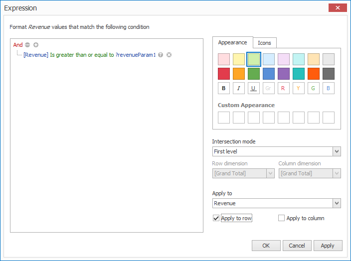
In this blog post, we’ll review a new service provided by the DevExpress MVVM Framework: ViewInjectionService. This service allows you to integrate any ViewModel (with its View) to any control. ViewInjectionService was inspired by concepts found in PRISM. The primary benefit of this new service is that it offers a common and straightforward mechanism to control ViewModels and associated interactions.

All the features described herein are available in both the free and commercial versions of the DevExpress MVVM framework (included in the DevExpress WPF Subscription).

ViewInjectionService

ViewInjectionService provides a core set of methods and properties that allows you to integrate ViewModels (with their Views) to a component. The recommended way to use ViewInjectionService is to work with its ViewInjectionManager.

ViewInjectionService can work with a large number of controls. The following is a list of supported controls (by default):

  • ContentPresenter descendants;
  • ContentControl descendants;
  • Panel descendants;
  • ItemsControl descendants;
  • Selector descendants;
  • TabControl, DXTabControl;
  • FlowLayoutControl;
  • TileLayoutControl;
  • NavBarControl;
  • DocumentGroup;

Note: if you wish to customize an existing injection strategy or implement your own, you can do so easily by writing your own Strategy.

To use ViewInjectionService, add itto the dxmvvm:Interaction.Behaviors collection of a container-control.

   1:<TabControl>
   2:<dxmvvm:Interaction.Behaviors>
   3:<dxmvvm:ViewInjectionService/>
   4:</dxmvvm:Interaction.Behaviors>
   5:</TabControl>

To directly integrate a ViewModel, you can use one of the base ViewInjectionServiceExtensions’sInject extension methods.There are tree overloads of the Inject method:

  • Inject(object key, object viewModel)
  • Inject(object key, object viewModel, string viewName)
  • Inject(object key, object viewModel, Type viewType)

ViewInjectionManager

The advantage of ViewInjectionManager is thatyou can access its properties and methods from any place in your application’s code. To work with multiple regions, ViewInjectionManager uses region identifiers assigned to controls via the RegionName property.

   1:<TabControl>
   2:<dxmvvm:Interaction.Behaviors>
   3:<dxmvvm:ViewInjectionServiceRegionName="{x:Static common:Regions.Main}"/>
   4:</dxmvvm:Interaction.Behaviors>
   5:</TabControl>

Injecting via the manager is performed by using ViewInjectionManagerExtensions'sInject() extension methods.

  • Inject(string regionName, object key, Func<object> viewModelFactory); - adds a ViewModel provided by the viewModelFactory parameter to the control’s ItemsSource (if you’re using an items control) or Content (if you’re using an content control) property and uses the view passed via ItemTemplate or ContentTemplate.
  • Inject(string regionName, object key, Func<object> viewModelFactory, string viewName); - adds a ViewModel provided by the viewModelFactory parameter to the control’s ItemsSource (if you’re using an items control) or Content (if you’re using a content control) property and the specified view via ViewLocator.
  • Inject(string regionName, object key, Func<object> viewModelFactory, Type viewType); - adds a ViewModel provided by the viewModelFactory parameter to the control’s ItemsSource (if you’re using an items control) or Content (if you’re using a content control) property and the specified view via ViewLocator.

The following parameters are common to all:

  • regionName– specifies the region identifier;
  • key– specifies the identifier of the View and its ViewModel
  • viewModelFactory– ViewModel factory that is invoked when its region is shown
  • viewName or viewType– parameters that specify the view that will be created via ViewLocator.

You can integrate the required elements anywhere within your application, disregarding where and when you show views (even from App.xaml.cs).

The Navigate method allows you to navigate between Views by key, even if they are not yet built.

  • Navigate(string regionName, object key);

To control when ViewModel (with its View) became active, inactive or closed, ViewInjectionManager provides the following methods.

  • RegisterNavigatedEventHandler – specifies the event handler that invoked when View with its ViewModel have successfully navigated to a screen.
  • RegisterNavigatedAwayEventHandlerspecifies the event handler that invoked when View with its ViewModel have successfully navigated away from a screen.
  • RegisterViewModelClosingEventHandler – specifies the event handler that invoked when View with its ViewModel is about to close.

To unsubscribe you can use the corresponding UnregisterNavigatedAwayEventHandler, UnregisterNavigatedEventHandler, UnregisterViewModelClosingEventHandler methods. However, unsubscribing from these events is not necessarily, because it does not produce memory leaks.

Let’s consider the following example. Assume that you have several views with view models (CustomersView/CustomersViewModel, ProductsView/ ProductsViewModel and SalesView/SalesViewModel) that have to be shown in an items control.

To accomplish this task, place the items control (suppose, it’s a FlipView control) on MainView and add ViewInjectionService to thecontrol’s dxmvvm:Interaction.Behaviors collection as usual.

   1:<UserControlx:Class="DXSample.View.MainView"
   2:     ...
   3:xmlns:dx="http://schemas.devexpress.com/winfx/2008/xaml/core"
   4:xmlns:dxwui="http://schemas.devexpress.com/winfx/2008/xaml/windowsui"
   5:xmlns:dxmvvm="http://schemas.devexpress.com/winfx/2008/xaml/mvvm"
   6:xmlns:common="clr-namespace:DXSample.Common"
   7:xmlns:v="clr-namespace:DXSample.View">
   8:<Grid>
   9:<dx:LoadingDecoratorGrid.Row="1">
  10:<dxwui:FlipView>
  11:<dxmvvm:Interaction.Behaviors>
  12:<dxmvvm:ViewInjectionServiceRegionName="{x:Static common:Regions.Main}"/>
  13:</dxmvvm:Interaction.Behaviors>
  14:</dxwui:FlipView>
  15:</dx:LoadingDecorator>
  16:</Grid>
  17:</UserControl>

Inject our views with view models by using ViewInjectionManager’s Inject. The following examples uses the Startup event handler:

   1:publicpartialclass App : Application {
   2:privatevoid Application_Startup(object sender, StartupEventArgs e) {
   3:         InitModules();
   4:         ...
   5:     }
   6:  
   7:privatevoid InitModules() {
   8:         ViewInjectionManager.Default.Inject(
   9:             Regions.Main,
  10:             ModuleType.Customers,
  11:             () => CustomersViewModel.Create(),
  12:typeof(CustomersView)
  13:         );
  14:  
  15:         ViewInjectionManager.Default.Inject(
  16:             Regions.Main,
  17:             ModuleType.Sales,
  18:             () => SalesViewModel.Create(),
  19:typeof(SalesView)
  20:         );
  21:  
  22:         ViewInjectionManager.Default.Inject(
  23:             Regions.Main,
  24:             ModuleType.Products,
  25:             () => ProductsViewModel.Create(),
  26:typeof(ProductsView)
  27:         );
  28:  
  29:         ViewInjectionManager.Default.Navigate(Regions.Main, ModuleType.Customers);
  30:     }
  31: }

Where the Regions class is a static class with static string properties:

   1:publicstaticclass Regions {
   2:publicstaticstring Main { get { return"MainRegion"; } }
   3:publicstaticstring Navigation { get { return"NavigationRegion"; } }    
   4: }

ModuleType is an enumeration:

   1:publicenum ModuleType { 
   2:     Customers, 
   3:     Sales, 
   4:     Products 
   5: }

This code is enough to populate the FlipView and produce a working application.

image1

To make the application’s UI more user friendly, let’s add a navigation view to our MainView.

   1:<UserControlx:Class="DXSample.View.MainView"
   2:
   3:xmlns:dx="http://schemas.devexpress.com/winfx/2008/xaml/core"
   4:xmlns:dxwui="http://schemas.devexpress.com/winfx/2008/xaml/windowsui"
   5:xmlns:dxmvvm="http://schemas.devexpress.com/winfx/2008/xaml/mvvm"
   6:xmlns:common="clr-namespace:DXSample.Common"
   7:xmlns:v="clr-namespace:DXSample.View">
   8:<Grid>
   9:<Grid.RowDefinitions>
  10:<RowDefinitionHeight="Auto"/>
  11:<RowDefinitionHeight="*"/>
  12:</Grid.RowDefinitions>
  13:<dxui:TileBarPadding="10">
  14:<dxmvvm:Interaction.Behaviors>
  15:<dxmvvm:ViewInjectionServiceRegionName="{x:Static common:Regions.Navigation}"/>
  16:</dxmvvm:Interaction.Behaviors>
  17:</dxui:TileBar>
  18:<dx:LoadingDecoratorGrid.Row="1">
  19:<dxwui:FlipView>
  20:<dxmvvm:Interaction.Behaviors>
  21:<dxmvvm:ViewInjectionServiceRegionName="{x:Static common:Regions.Main}"/>
  22:</dxmvvm:Interaction.Behaviors>
  23:</dxwui:FlipView>
  24:</dx:LoadingDecorator>
  25:</Grid>
  26:</UserControl>

The next step is to inject items to the TileBar.

   1:publicpartialclass App : Application {
   2:privatevoid Application_Startup(object sender, StartupEventArgs e) {
   3:         InitModules();
   4:
   5:     }
   6:  
   7:privatevoid InitModules() {
   8:         ViewInjectionManager.Default.Inject(
   9:             Regions.Navigation, 
  10:             ModuleType.Customers, 
  11:             () => NavigationItemViewModel.Create(…), 
  12:typeof(NavigationItemView)
  13:         );
  14:         ViewInjectionManager.Default.Inject(
  15:             Regions.Navigation, 
  16:             ModuleType.Sales, 
  17:             () => NavigationItemViewModel.Create(…), 
  18:typeof(NavigationItemView)
  19:         );
  20:         ViewInjectionManager.Default.Inject(
  21:             Regions.Navigation, 
  22:             ModuleType.Products, 
  23:             () => NavigationItemViewModel.Create(…), 
  24:typeof(NavigationItemView)
  25:         );
  26:
  27:         ViewInjectionManager.Default.Navigate(Regions.Navigation, ModuleType.Customers);
  28:
  29:     }
  30: }

Our sample is almost ready. We only need to synchronize the TileBar and FlipView, so they display the same element. We’ll use RegisterNavigatedEventHandler to achieve this:

   1:publicclass CustomersViewModel {
   2:
   3:protected CustomersViewModel() {
   4:
   5:         ViewInjectionManager.Default.RegisterNavigatedEventHandler(this, () => {
   6:             ViewInjectionManager.Default.Navigate(Regions.Navigation, ModuleType.Customers);
   7:         });
   8:     }
   9:
  10: }
  11:publicclass NavigationItemViewModel {   
  12:
  13:protected NavigationItemViewModel() {
  14:         ViewInjectionManager.Default.RegisterNavigatedEventHandler(this, () => {
  15:             ViewInjectionManager.Default.Navigate(Regions.Main, ModuleType);
  16:         });
  17:     }
  18:
  19: }

image2

An example that illustrates use of ViewInjectionService can be found here.

Should you have any questions or need additional assistance feel free to share your comment with us. We’d love to hear what you think.

WPF Controls - High DPI Support (Coming soon in v15.1)

$
0
0

Most WPF developers are well acquainted with layout display issues when using high DPI monitors. The solution many developers use to address these layout deformations is to implement UseLayoutRounding. Though a common practice, UseLayoutRounding may not represent the best solution for your WPF project. For instance – here is an image captured from an app with UseLayoutRounding set to true @150% DPI.


As you can see in the image below, multiple rendering issues are present in this scenario… 


1. Disproportionate border thickness (bottom)
2. Disproportionate displacement (bottom and right indentation for the combo box button)

To help address these issues, our upcoming release (v15.1) will introduce DPI corrections to improve layout rendering and to better support high DPI within our WPF product line. DPI correction has been implemented at the DevExpress theme level and is based on the new DXBorder control.


To enable the DPI correction for WPF controls and obtain a properly rendered layout, you need to apply a DevExpress theme that supports DPI correction and set the standard UseLayoutRounding property to true. In this scenario, DXBorder defined in the applied theme uses improved rendering logic and as you can see in the image below the same app layout (at the same DPI - 150%) will be rendered correctly:

DevExpress WPF Controls - High DPI Support
 
The before and after images below help illustrate improvements (the differences are obvious).

DevExpress WPF Controls - High DPI Support
 
Once we ship v15.1, DPI correction will be supported across all DevExpress WPF Themes (with the exception of the DeepBlue theme).
Should you have any questions or need additional assistance regarding DevExpress DPI Correction feel free to share your comment with us. We’d love to hear what you think.

Techorama: what an awesome conference!

$
0
0

Last week, Don Wibier and I manned the DevExpress booth at Techorama, what I’d characterize as the premier developer conference for Belgium. It was in a delightful little town as well: Mechelen, just north of Brussels. Even better, Techorama was in a local multiplex cinema, Utopolis – it was weird seeing posters for movies on the walls for a conference.

Canalside in Mechelen

The organization of the conference was superb: 800 attendees, 50-odd speakers, a dozen exhibitors, WiFi that worked and wasn’t underpowered, and no problems worth mentioning. It was lucky, shall we say, that Don is a native Dutch speaker: the majority of attendees, I’d guess, were Flemish or Dutch and I only had the odd occasion to practice what little French I have left. It helped of course that we had swag to help the conversations along; such as t-shirts, mugs, mouse pads, laptop stickers. We even raffled off a couple of portable bluetooth speakers.

Don in the DevExpress booth at Techorama

And what conversations we had! Don managed to get in some demos – yes, actual demos of the product! The most popular topics were undoubtedly ASP.NET and DevExtreme, although many of the customers we met (and we met many) confided into using mainly WinForms in their projects. There was also a healthy interest in Universal Windows apps, a topic we shall be talking about in some detail very soon (perhaps even sooner than you think).

Don demoing at the DevExpress booth

All in all, over a fairly intense couple of days, we managed to speak with most of the attendees, I’d say; some even more than once. It’s great to see such passion about developing software and such excitement about what the .NET (or Visual Studio) future brings. Thanks – dankjewel! – to all who came to say hi: I shall certainly recommend we come back next year.

Saint Rumbold's Tower and Cathedral

Wacky moment of the trip: this is Saint Rumbold’s Cathedral with its iconic unfinished tower, visible for miles around. In Dutch, that’s Sint-Rombout, which is also the name of a well-known brand of coffee – Rombouts. Confused, moi?

In a week’s time it’s Microsoft TechDays in The Hague, Netherlands. More double Dutch for me!

TestCafe v15.1 - Exporting Automated Web Test Results (JSON, NUnit, JUnit)

$
0
0

TestCafe v15.1 (due out this week) we'll ship with a number of new features which I described in this blog post. Among the features I outlined last week was the ability to export your TestCafe test results in JSON, JUnit and NUnit formats. I wanted to take a brief moment to explain how this new feature works so you can hit the ground running when we release the new version... 

By default, TestCafe generates reports in JSON format and saves them to a physical directory. You can specify this directory in the Reports section located within TestCafe's Control Panel.

Automated Web Testing - TestCafe Control Panel

With v15.1, TestCafe will allow you to save (and specify format) test reports directly from the Results tab. Click the download/export button pictured below to active the menu and select the desired output format.

Automated Web Testing - Exporting Test Results

This new export option is also available within the detailed results view.

Automated Web Testing - Export Test Results (JSON, NUnit, JUnit)

Once you specify a format, TestCafe will save the report file to your browser’s download folder. 

As you can see, exporting test results in TestCafe v15.1 is both simple and straightforward...Let us know what you think. We welcome your comments and feedback.

DevExpress Dashboard - Conditional Formatting (Coming soon in v15.1)

$
0
0

As you may already know, DevExpress Dashboard - our fully configurable and royalty free Dashboard platform for Windows & the Web - ships as part of our Universal Subscription. If you've not yet had the chance to review it's capabilities, please take a moment to download our free 30 day trial and let us know what you think...

What's Coming in v15

Among the new features we'll introduce in our upcoming release of the DevExpress Dashboard is the ability to apply Excel-like conditional formatting to individual Grid & Pivot Table dashboard items. This feature allows you to highlight specific cells or entire rows using a predefined set of rules.

DevExpress Dashboard Conditional Formatting - Pivot Grid

Comparison rules used for formatting can be divided into the following groups.

  • Value - Allows you to compare static values (such as Greater Than, Less Than, Date Occurring, etc.) or specify a desired criteria in the Expression Editor. You can also pass dashboard parameters to the expression.
  • Top/Bottom - Highlights a specific number of topmost/bottommost values.
  • Average - Highlights cells with values above or below an average.
  • Range - Allows you to apply formatting by specifying a multiple range of values. You can change the number of ranges and select whether to use color or icon ranges.

The Dashboard Designer will ship with the ability to apply format rules to dashboard measures and dimensions. Conditional formatting allows you to modify cell backgrounds, font settings or display specific icons in cells that meet the specified criteria.

With that brief introduction to comparison rules, let's take a look at a few screenshot that illustrate the new features coming your way in v15.1.

Specifying Multiple Format Rules for a Grid 

DevExpress Dashboard - Conditional Formatting

Conditional Formatting - Top N Dialog Window

DevExpress Dashboard Conditional Formatting TopN Values


Conditional Formatting - Color Ranges

DevExpress Dashboard Conditional Formatting Color Range


Conditional Formatting - Color Range Set

DevExpress Conditional Formatting Color Range Set


Conditional Formatting - Editing Rules

DevExpress Dashboard Conditional Formatting - Editing Rules

DevExpress Dashboard makes it easy to edit rules. The Edit Rules dialog displays all rules created for the selected dashboard item. Note that existing rules can be filtered by the required measure or dimension.


Conditional Formatting - Expression Editor

DevExpress Dashboard Expression Editor

With the Expression Editor, you can:

  • Specify the expression used to format values based upon parameter values.
  • Select the required color in the Appearance tab.

Conditional Formatting - Parameters

DevExpress Dashboard Conditional Formatting Parameters

Easily change parameter values as requirements dictate.


So that's a brief overview of Conditional Formatting within the DevExpress Dashboard. We'd love to hear your feedback. Let us know what you think.


WinForms & WPF PDF Viewer - Bookmarks (Coming soon in v15.1)

$
0
0

In the next couple of weeks, I'll be describing the new features and capabilities we'll ship for WinForms and WPF developers in our upcoming release. The bad news - lots of blog posts. The good news- lots of ground to cover as this is going to be a big release. 

WinForms & PDF Viewer - Bookmarks

As you can see in the image below, the DevExpress PDF Viewer v15.1 allows you to display bookmarks within its navigation pane for PDF documents that have been bookmarked.

WinForms and WPF PDF Viewer - Bookmarks
 
You can customize Bookmark behaviors in the navigation pane via the Viewer's PdfOutlineViewerSettings object. Available options include:

  • HideAfterUse– Determines whether the PDF Navigation Pane (where bookmarks are displayed) is hidden once a bookmark is clicked.
  • TextSize– Changes node text size within the Navigation Pane (Small, Medium and Large).
  • WrapLongLines 
  • UseOutlinesForeColor– Allows you to use document foreground color for outline node text in the Navigation Pane.
  • Expanded -  Pane is expanded.
  • Collapsed -  Pane is collapsed.
  • Visible– Pane is visible.
  • Hidden– Pane is hidden.

The PDF Viewer also includes a PaneInitialVisibility property. This property specifies Navigation Pane visibility after loading a new PDF document. It can be set to values listed above or can use its default mode - where the NavigationPaneVisibility property is set either to Visible when a PDF document contains bookmarks, or to Collapsed, if a PDF document does not.


The description above summarizes the new Bookmark Navigation Pane but that's not all that we have planned for the PDF Viewer. We'll describe the other new features shortly but in the meantime, tell us what you think...is this new Bookmark feature going to be something you'll use?

WinForms Reporting - Improved Designer (Coming soon in v15.1)

$
0
0

The next major version of our WinForms Reporting platform will include enhancements to both our Visual Studio Report Designer and our WinForms End-User Report Designer - enhancements that were designed to improve the report design process and to help you get your reports created faster, in a more efficient manner. 

With v15.1, you and your end users will have quick access to all styles and formatting rules available for your report through corresponding nodes in the Report Explorer.

WinForms Report Designer - Design Surface Enhancements

As you can see in the animation above, applying a style or formatting rule to a report control is now as easy as just dragging it from the Report Explorer onto the required report control.

Of course, you can easily add, edit or delete a style or formatting rule using commands available in context menus that are invoked by right-clicking the appropriate root node or associated sub-node.

WinForms Report Designer - Applying Styles


We'd love to hear your thoughts on our improved WinForms Report Designers - is this new feature something you feel will benefit your customers? .

ASP.NET Word-Inspired Rich Text Editor (v15.1)

$
0
0

I'm happy to announce that the DevExpress ASP.NET (Word-Inspired) Rich Text Editor is out of preview and available in the v15.1 release.

ASP.NET & MVC

The new ASP.NET Rich Text Editor (ASPxRichEdit) is available for both platforms: ASP.NET WebForms and MVC!

In the last v14.2 release, we introduced a preview version of the Rich Text Editor with several great features:

DevExpress ASP.NET RichEdit Control

New Features

The v15.1 version of the ASP.NET Rich Text Editor control adds these major features:

  • Numbering and Bulleted Lists
  • Fields support (including DOCVARIABLE field)
  • Hidden symbols
  • Hyperlinks
  • New dialogs for insert symbols, tabs setup, & more
  • Support for streams​
  • Touch support
  • ReadOnly mode
  • Document and Operation restriction settings

Fields Support

Check out this gif animation of the Fields support (including DOCVARIABLE field):

DevExpress ASP.NET RichEdit Control

Online demos

Check out the online demos of the DevExpress ASP.NET Rich Text Editor here:

Demo - Rich Text Editor Control for ASP.NET AJAX

Benefits

With the DevExpress ASP.NET RichText editor control, you can craft and edit rich-text documents with your ASP.NET sites with ease. It's WYSIWYG!

  • A familiar interface like Microsoft Word for editing (with Ribbon UI)
  • Cross-browser compatible (even touch mobile browsers)
  • A rich user interface that's customizable
  • Multiple themes support
  • Document management, export, and print capabilities
  • And more... (read the features section below)

To learn more, please read this introductory blog post:

ASP.NET Word-Inspired Rich Text Editor (Preview release coming soon)


Your Next Great .NET App Starts Here

Year after year, .NET developers such as yourself consistently vote DevExpress products #1.

Experience the DevExpress difference for yourself and download a free 30-day trial of all our products today: DevExpress.com/trial (free support is included during your evaluation).

WPF Pivot Grid & TreeList - Conditional Formatting (Coming soon in v15.1)

$
0
0

v15.1 is coming soon and along with it, the introduction of Excel-inspired conditional formatting for our WPF Pivot Grid and WPF TreeList Controls.

As you know, conditional formatting allows you and your end-users to alter the appearance of individual data cells based on specific conditions - and highlight critical information, identify business trends and compare data points.

WPF TreeList - Conditional Formatting

Once we ship v15.1, the following standard comparison rules will be available for use out-of-the-box for both the WPF Pivot Grid and the TreeList:

  • Above / Below Average - format values that are above or below average.
  • Top / Bottom - format top or bottom ranked values.
  • Greater / Less Than - format cells that contain required value(s).
  • Range - format all cells based on their values using a color scale, data bar or predefined icons.

At design time, you'll be able to use the built-in rule editor to apply and customize conditional formatting without writing a single line of code. For instance, you can define your own conditions using the Custom Condition Editor...

WPF Conditional Formatting Design Time

At runtime, you can use the Conditional Formatting context menu to create new conditions as necessary. Simply right-click the header of a TreeList column or a PivotGrid cell you wish to format to invoke the menu. Then select and specify the required rule.

WPF Pivot Table Conditional Formatting

Conditional formatting rules allow you to modify cell backgrounds, set a font family, font size and font weight or use predefined style settings. Formatting can be applied to either a single cell, an entire intersection or totals. Note that you can also create, sort and modify rules at runtime with the Conditional Formatting Rules Manager.

WPF Conditional Formatting Rule Editor

As always, we welcome your comments and feedback. Let us know what you think of this new feature...


TestCafe v15.1 - Test Results View & Usability Enhancements (Coming soon)

$
0
0

If you been following this blog, you already know that we have a number of superb features shipping inside TestCafe v15.1. In this post, I'll describe our newly redesigned test results view and show you how analyzing web test results has never been easier.

As you can see in the image below, individual test results are now arranged in a grid view - making things much clearer so you can get the answers you need quickly.

Automated Web Testing - Test Result Grid View
 
Each item displayed within the grid offers you insights into the state of your web app and the results of a test run. You can click the test or fixture name to navigate to the respective test or fixture in the Projects tab.

Failed test records are expandable, so you can view details related to failed assertions or errors. If an assertion fails, the grid view includes the assertion code line, and the difference between actual and expected values. 

Automated Web Test Results - Grid View Assertion Failures

If there is an error, information about its cause and the failed test step is displayed.

Automated Web Test Results - Grid View Errors
 
The grid view retains all the features you would typically expect from a grid widget. You can sort records against a specific column by clicking its header.

Automated Web Test Results - Sorting
 
You can also drag a column header and drop it onto the grouping area to group records and thus improve test result readability.

Automated Web Test Results - Grid View Grouping
 
And finally, the search box in the top right corner allows you to filter records by a specific keyword without hassles.

Automated Web Test Results - Filtering

That about covers the new test results UI we'll introduce in this release. Feel free to share your thoughts with us here...tell us what you think about TestCafe v15.1.
 

Viewing all 2401 articles
Browse latest View live