
A number of people have been asking where to find recordings of the recent DX Hotels webinars, we are please to announce they are now available via our YouTube channel.
As always we welcome your feedback.
A number of people have been asking where to find recordings of the recent DX Hotels webinars, we are please to announce they are now available via our YouTube channel.
As always we welcome your feedback.
Yes, I know, I know: you could probably get away without doing any client-side programming in your ASP.NET WebForms app. Back when I started writing web apps some dozen years ago, that’s exactly what I did. I even remember finding this little snippet of JavaScript that would force the caret into the first text field on the page when it was displayed, and using it all the time and virtually nothing else. Ah, those were the days.
These days, it’s different. JavaScript is all grown up now. Yes, you can still find those blog posts about what you get from adding two empty arrays together (“What’s [] + [] equal?”) and other peculiarities of the language, but real JavaScript devs have moved on, have established a set of best practices, and are creating real client-side experiences with the language everyone loves to poke fun at.
So, next Tuesday at 10:00am Pacific time, I’m presenting a webinar on using JavaScript inside your ASP.NET applications. We’ll be doing some refactoring, writing some new code, creating closures, and other things that will show you that JavaScript is a language force to be reckoned with, even in that ASP.NET app. Register here now.
 One of the best practices I’ll be describing almost in passing is the use of strict mode – or should that be, the strict use of strict mode. I’m talking about putting this construct at the top of your functions (or even better, at the top of your JavaScript file):
"use strict";
Since I won’t be talking about it too much in the webinar, here’s what strict mode is all about. Put at its most succinct, it helps you avoid certain mistakes and errors in your JavaScript (see above where I quickly mentioned the peculiarities of the language).
The biggest example here is creating global variables by mistake. You’re deep in some function and you need to store some value in a new variable. In the heat of the moment, you forget the var keyword.
    var closeWidget = function(index) {panel = controlList["dpw" + index];
        panel.Hide();if(noWidgetsAreVisible())
            $(".widgets").addClass("hide-panel");
    };
The code seems to work, but in reality you have created a bug. The panel object here is created as a global variable. It is visible elsewhere in the application. If someone else created a global variable called panel– after all web apps are created in teams of more than one person – you’ve just clobbered their version. And so on. Globals are bad, creating one is easy by mistake, but strict mode throws an error at run-time if that code gets executed. (Mind you, a good lint program would find it too.)
Similar to that is properly declaring a local variable (Hurrah!) but misspelling it as you assign to it (Boo!). Result: another global variable is created with the misspelled name.
Other examples of mistakes that are invisible in normal code but that will throw in strict mode are assignments to non-writable variables. Yes, in non-strict mode these types of assignments will seem to work, but won’t actually do anything. Wouldn’t you rather get an exception than total silence on this kind of mistake? Examples are assigning to a non-writable property, a property that only has a getter, a new property on a non-extensible object.
Ditto delete-ing something that cannot be deleted.
Property names on an object must be unique (I didn’t even now that non-strict mode allowed this). Saves you against inadvertent typos.
Parameter names in a function declaration must be unique. Again saves you from your typos.
No octal syntax for number constants. That is number constants can’t start with a ‘0’. Seems too many new devs have never used octal (blimey, I haven’t in twenty years or so) and so were completely bamboozled when something like 0123 was actually interpreted as 83.
Using with is disallowed. As it should be. Hated it in Pascal/Delphi, it’s worse in JavaScript. Brrr. Thanks, strict mode!
There are some changes to how eval works. In particular, new variables introduced by the code being evaluated will not appear in the surrounding scope. In normal mode, they are and can overwrite outer scoped variables. Which, you must admit, is a bit of a security problem.
arguments simpler to useIn essence, strict mode stops you doing stupid stuff with the arguments pseudo-array. I hardly use it anyway, so haven’t run into any of the things strict mode forbids. (Reminds me though of a daft blog post I read recently that so enjoyed doing stupid stuff with arguments.)
The this variable is no longer guaranteed to be an object. Strict mode will, in certain cases, make this be undefined. This has bitten me mildly before: I used to assume that IIFEs when called had this as the global object. This “strict” behavior also avoids unnecessary boxing of primitive types.
It is no longer possible to “walk the stack” since strict mode makes accessing the caller property illegal. Goes along with the changes to arguments to make JavaScript more secure.
The list of reserved keywords is larger in strict mode. This means that your identifiers now won’t clash with keywords from later JavaScript versions. Things like implements, interface, let, package, private, protected, public, static, and yield.
Function statements must appear at the top of a script or function. Not something that’s bitten me personally, since I don’t use function statements, but buyer beware.
All in all then, strict mode introduces a set of logical restrictions to the language designed to help you avoid common mistakes and errors and to prepare you for newer versions of JavaScript. I recommend wholeheartedly using strict mode (as well as a lint static analyzer) in all your JavaScript code. Most of all, you should register for my webinar.
The DevExpress ASP.NET controls will no longer support Internet Explorer 7 (IE7) in version 15.1 and above.

If you still have to support IE7 then you can use v14.2 of our ASP.NET controls, but my advice is to move forward. Once IE security updates are no longer available, your risk window will start to expand.
Recently I asked if dropping IE7 would affect you and your customers.
The response was a resounding call to drop IE7 and move our codebase forward.
Thank you for your feedback.
I recommend that you upgrade to the latest version of Internet Explorer.
Why? Because many modern websites do not support older browsers. Read more here.
And older browsers also prevent us from moving forward. Read more here.
I'm excited to see the new versions of IE that are being announced with Windows 10. With a possible new rendering engine, improved JavaScript, etc. It's an exciting time to be a web developer.
And, as usual, DevExpress web technologies will support the popular released browsers.
Leave me a comment below or email me: mharry@devexpress.com
Twitter: @mehulharry
Year after year, .NET developers such as yourself consistently vote DevExpress products #1.
Experience the DevExpress difference for yourself and download a free 30-day trial of all our products today: DevExpress.com/trial (free support is included during your evaluation).
DevExpress WPF components are fully integrated into Visual Studio. In addition to the design-time features you’ve come to expect, DevExpress components feature drag & drop functionality, extended context menus and other enhancements for saving development time. Our installer registers several extensions in Visual Studio to simplify interaction with designers and help you build UIs using the MVVM pattern.
Smart Tags are design time extensions for quickly binding to and setting frequently used properties, assigning icons and attaching services and behaviors to components. Smarts Tags are available for DevExpress WPF Controls as well as standard components.
To access the Smart Tag panel, simply select a control and click the Smart Tag glyph  that appears in the top right corner.

Note: It may be difficult to select a particular element in the designer by mouse alone. In these cases, you can accurately select the appropriate element from the Document Outline. The Visual Studio Document Outline displays the document hierarchy in a tree style view.
Each Smart Tag panel has a heading and main properties area:
Each property exposed in the Smart Tag can be set to a value or attached to a binding. To create a binding, click the “barrel” button to bring up the Binding Dialog:

The Binding Dialog provides multiple binding source modes: DataContext, ElementName, RelativeSourceSelf, StaticResource. These modes determine the binding expression of the target property.
If you choose the DataContext source mode, the Binding Dialog will display the properties of the data context object (as in the above image). Note that the DataContext, or a d:DataContext property, is required in XAML for the Binding Dialog to list the available data context properties.
The ElementName mode is useful for binding to a property on a XAML element within the same namescope.

The RelativeSource Self mode is for binding to a property on the same element.

If your source object is contained in a static resource, you can use the StaticResource mode.
You can further specify binding expression settings for BindingMode, UpdateSourceTrigger, and Converter.
If the default settings meets your requirements, simply double-click the required property to apply the binding expression as-is. You can otherwise specify the necessary binding settings and click the OK button at the bottom of the Smart Tag panel.

If a binding already exists on a property, its binding glyph will be highlighted and a binding description will be displayed within the property line.

To attach components from the DevExpress MVVM Framework (DevExpress behaviors and services), click the  (gear) tab to select a behavior or service. The list of available behaviors and services depends on the selected element in the designer.

The properties of behaviors and services can be set or bound in the same manner as control properties.
With the MVVM settings visible, click the Add Behavior button.

Click the EventToCommand item and choose among the list of behaviors and then set the behavior properties.

If for some reason you need to disable Smart Tags on standard WPF controls, simply use the “Disable Smart Tags for standard controls” option from the DEVEXPRESS | WPF Control v14.2 menu.

As soon as we announced the form filling capabilities in v14.2 of the PDF Viewer control you made it clear… you wanted the ability to do it yourself – in code. While it seems like a trivial task (as most PDF features do), it was far from it. Anyone who has looked at the PDF specifications will know there is a lot to consider and we had to make it straightforward for you to implement, after all, it’s what you would expect.
Well, the team have been working tirelessly on it and I am pleased to share that in the v14.2.5 maintenance update, programmatic form filling IS available. There are a number of different ways to interact with form data; directly, via import and via export. Lets take a look at what is involved…
privatevoid FormFillManual(string pathForPdf)
    {PdfDocumentProcessor doc = newPdfDocumentProcessor();
      doc.LoadDocument(pathForPdf);PdfFormData data = doc.GetFormData();
      data["Your_Field_Name_1"].Value = "Some Value 1";
      data["Your_Field_Name_2"].Value = "Some Value 2";
      data["Your_Field_Name_3"].Value = "Some Value 3";
      doc.ApplyFormData(data);
      doc.SaveDocument(pathForPdf);
      doc.CloseDocument();
    }
If you know the names of the fields you want to populate then it is really easy…
Here a sample method receives a string parameter to a path of a PDF Form that you want to fill. After creating a new instance of the PdfDocumentProcessor object the LoadDocument() method is used to load the PDF. Next step is to set up an instance of the new PdfFormData object and populate it via the PdfDocumentProcessor.GetFormData() method. Setting or updating the field values is done by providing the field name as a key, for example: data[“Your_Field_Name_1”].Value = “Some Value 1”. When all values have been set, the ApplyFormData() method is used to update the PdfFormData object, then a call to the SaveDocument() method to commit the changes to the file.
If required, you can easily retrieve a list of field names by iterating through the string collection returned by the method GetFieldNames()
foreach (string name in formData.GetFieldNames())
      {object value = formData[name].Value;
      }
It is possible to fill the PdfFormData object directly from a file, supported formats are:
When instantiating the object, pass the name of the data file and format if you know it (the engine will attempt to discover the format if you omit the parameter).
privatevoid SampleFillPdf(string pathForPdf, string pathForData)
    {PdfDocumentProcessor doc = newPdfDocumentProcessor();
      doc.LoadDocument(pathForPdf);PdfFormData data = newPdfFormData(pathForData); //automatic detection of type
      doc.ApplyFormData(data);
      doc.SaveDocument(pathForPdf);
      doc.CloseDocument();
    }
In this example the PDF document is loaded, then the PdfFormData object is created with the contents of the supplied file. As before a call to the ApplyFormData() method binds the results to the PDF which is then written back to the file.
Conversely, if you want to extract data from a pre-populated form document you can do something like this;
privatevoid SampleExtractPdf(string pathForPdf, string pathForExportedData)
    {PdfDocumentProcessor doc = newPdfDocumentProcessor();
      doc.LoadDocument(pathForPdf);PdfFormData data = doc.GetFormData();
      data.Save(pathForExportedData, PdfFormDataFormat.Fdf);
      doc.CloseDocument();
    }
To add the functionality to the PDF Viewer component via extension methods, all you need to do is reference the DevExpress.Docs assembly.
The v14.2.5 has just been released, so you can start implementing this cool feature immediately, as always I welcome your feedback.
From Februari 23th till Februari 27th the BASTA! Spring 2015 event will take place in Darmstadt Germany where DevExpress will be Gold Sponsor.
This means that we will be present with our booth where John, Oliver and myself will be present to meet you and show you some nice demos on mobile hybrid application development with our DevExtreme product, we will show our WebForms and MVC extensions as well as our WinForms and WPF controls.
Oliver and I are also doing a number of sessions during the conference. Check out Oliver’s speaker profile as well as my own to see what we will be presenting.
Make sure to visit us to get your really cool U.I. superhero shirt and get a ticket for our daily raffle. We’ll be giving away licenses for a DX platform of choice daily each day!
I hope to see you there!
In this post, we’ll review some of the more advanced capabilities of DevExpress Smart Tags: including the ability to quickly set an Application Theme or DataContext, easy toggling between Window styles, and more.
DevExpress Smart Tags provide special editors for root controls (Window/UserControl) to quickly assign a ViewModel to a data context or set an application-wide theme.
If you set the DataContext property, the DevExpress Smart Tag will analyze the modified object. If that object’s type happens to be public, non-nested, unsealed, and also…
... then the Smart Tag treats the underlying object as a POCO object, meaning its DataContext property is set through a ViewModelSource class.
1: DataContext="{dxmvvm:ViewModelSource Type={x:Type ViewModel:MainViewModel}}"The ApplicationTheme property applies a single theme (DeepBlue by default) to the entire application at runtime and in Visual Studio.

When you apply a theme, the DevExpress Smart Tag automatically adds the following code to your application:
App.config file (DevExpress generated code preserves the theme between sessions):
1:<?xmlversion="1.0"encoding="utf-8"?>
2:<configuration>
3:<configSections>
4:<sectionGroupname="userSettings" ... >
5:<sectionname="DXThemeManager" ... />
6:</sectionGroup>
7:</configSections>
8:<userSettings>
9:<DXThemeManager>
10:<settingname="ApplicationThemeName"serializeAs="String">
11:<value>Office2013</value>
12:</setting>
13:</DXThemeManager>
14:</userSettings>
15:</configuration>
App.xaml (DevExpress generated XAML applies the theme set in the App.config):
1:<Applicationx:Class="DXDesignTime.App"
2:xmlns="http://schemas.microsoft.com/winfx/2006/xaml/presentation"
3:xmlns:x="http://schemas.microsoft.com/winfx/2006/xaml"
4:StartupUri="MainWindow.xaml"
5:Startup="OnAppStartup_UpdateThemeName">
6:<Application.Resources>
7:8:</Application.Resources>
9:</Application>
App.xaml.cs
1:publicpartialclass App : Application {
2:privatevoid OnAppStartup_UpdateThemeName(object sender, StartupEventArgs e) {
3: DevExpress.Xpf.Core.ApplicationThemeHelper.UpdateApplicationThemeName(); 4: } 5: }You can assign a Control Glyph directly from its Smart Tag. An icon list of choices can be populated from images in your solution or the DevExpress.Images.v14.2.dll assembly. The DevExpress.Images.v14.2.dll assembly contains common images referenced across a wide range of DevExpress controls. To access the complete icon list, press the  button beside the Glyph or LargeGlyph property.

The following properties will use an Image Gallery to present their available icons sets: Image.Source, AppBarButton.Glyph, TileBarItem.TileGlyph, NavigationBarItem.Glyph, NavButton.Glyph, BarItem.Glyph, BarItem.LargeGlyph, ImageEdit.Source, Window.Icon, NavBarGroup.ImageSource, NavBarItem.ImageSource, RibbonPageGroup.Glyph.
By clicking the Smart Tag’s Convert to DXWindow or Convert to DXRibbonWindow options (both are available when a Window is selected), you can easily convert a Window to a DXWindow or DXRibbonWindow with a single action.

The Smart Tag automatically handles the generation of the necessary XAML and C#.
A few weeks ago, I presented a TestCafe webinar on how to include 3rd party controls inside your automated testing, specifically the DevExpress ASPxGridView control. The team have now published the first official wrappers and made them available via GitHub.
Inside the repository you’ll find the wrappers, examples and comprehensive documentation on how to install as well as detailed explanations on how to implement the different elements of the API.
In addition please check out the knowledge base article showing how to create a test for a master-detail ASPxGridView or the YouTube video tutorial.
In the previous blogs (Smart Tags and Advanced Smart Tag Capabilities), we reviewed the design-time Smart Tag extension and its advanced capabilities that simplify the process of defining and configuring the controls. In this blog, we will review several other extensions that are provided with DevExpress WPF Controls: Instant Layout Assistant, Items Source Configuration Wizard and Chart Designer.
The Instant Layout Assistant is a design-time feature for creating complex layouts with only a few clicks. The Instant Layout Assistant displays a special menu over empty design surfaces (see below).

You can easily disable the Instant Layout Assistant from the Disable Instant Layout Assistant option available in the DEVEXPRESS | WPF Controls v14.2 menu.

The Instant Layout Assistant initially displays a choice of control categories (ribbon, bars, grid, etc.). Based on your selection of a control type, the Instant Layout Assistant will then provide a list of possible layouts. For example, choosing the Docking control type in the Instant Layout Assistant reveals the Navigation Layout, Simple Layout, IDE Layout and MDI Layout docking layouts.

The Instant Layout Assistant will generate a corresponding layout.
Suppose you need an IDE-like layout built with a RibbonControl and GridControl. The first step to creating this layout is to add a Ribbon. To do so, choose the Ribbon Control from the Instant Layout Assistant and then select a ribbon mode. For our purposes, we’ll use the Office2010Layout style:

The Instant Layout Assistant will add the appropriate elements to the form.

To implement the IDE Layout, choose Docking -> IDE Layout.

To add a GridControl to the Error List panel, choose the Grid -> Table View from its Instant Layout Assistant.

This complex layout was created using just six mouse clicks. The UI can be further customized and fine-tuned using Smart Tags and other Visual Studio design tools.
The Items Source Configuration Wizard is a Visual Studio extension that simplifies design time data binding. The Items Source Configuration Wizard sets the following binding options, in order:
The Items Source Configuration Wizard initially displays the available data access technologies (from a Technologies list) alongside matching project data sources (Data Sources list). A new data source can be created by clicking the New Data Source button.

On selecting the data access technology, you can choose a corresponding data source from the Data Sources list. Note that if you create a new data source, be sure to rebuild the solution and reopen the Items Source Configuration Wizard to have the newly created data source listed.

The next step is choosing a data processing mode. The ideal data processing mode depends on your specific needs (e.g., data capacity, parallel data processing). If you’re unsure how to proceed, selecting an item from the list will display explanatory text describing the uses of the item.

As a final step, it’s necessary to specify the remaining data source options. For example, if you’ve chosen Server-Side Data Processing, you need to specify a table for querying the data as well as its primary key.

After the Finish button is pressed, the Items Source Configuration Wizard will bind the control to data in XAML.
1:<Window
2: ...3:xmlns:dx="http://schemas.devexpress.com/winfx/2008/xaml/core"
4:xmlns:dxg="http://schemas.devexpress.com/winfx/2008/xaml/grid"
5:xmlns:my="clr-namespace:GridControl">
6:<Window.Resources>
7:<dx:EntityServerModeDataSource
8:x:Key="EntityServerModeDataSource"
9:ContextType="my:NorthwindEntities"
10:DefaultSorting="Title ASC"
11:KeyExpression="EmployeeID"
12:Path="Employees">
13:<dx:DesignDataManager.DesignData>
14:<dx:DesignDataSettingsRowCount="5"/>
15:</dx:DesignDataManager.DesignData>
16:</dx:EntityServerModeDataSource>
17:</Window.Resources>
18:<Grid>
19:<dxg:GridControl
20:AutoGenerateColumns="AddNew"
21:Name="gridControl1"
22:ItemsSource="{Binding Path=Data, Source={StaticResource EntityServerModeDataSource}}">
23:<dxg:GridControl.View>
24:<dxg:TableViewName="tableView1"ShowTotalSummary="True"/>
25:</dxg:GridControl.View>
26:</dxg:GridControl>
27:</Grid>
28:</Window>
Complete information about this extension and examples are available here and here.
The Chart Designer is a powerful tool for quickly building complex charts from scratch and customizing existing charts without the Visual Studio Properties window. To open the designer at design time, select a chart, open the chart’s Smart Tag and click the Run Designer link at the bottom (as seen in the screenshot below).

This invokes the Chart Designer.

The Chart Designer includes a powerful set of customization options.
You can refer to the Chart Designer help topic in our documentation for a complete description of each of its elements.
As you may know – and in my opinion, should know: it’s a great, time-saving control – the Layout Control provides rich design-time and runtime customization capabilities, giving you and your users the ability to easily arrange controls in the way you want, to resize and hide controls, to specify the alignment of prompts, and so on.
Traditionally, the customization features are activated using a context menu. This menu can be opened by either right-clicking a control's label or padding, or some empty space within the Layout Control itself. If, however, the controls within the layout container are displayed with no or little padding or no labels, or worse there is no empty space at all, it makes difficult for you and your users to activate the customization menu. In such layouts (an example is shown below), you’re forced to engage in some deft “pixel hunting” in order to locate a point where a right-click invokes the customization menu. And we know how annoying that can be.

Worry no more as we have introduced a new Quick Runtime Customization mode and a few usability enhancements in v14.2.6 (yes, in a minor release!) to help with that pixel hunting issue.
The Quick Runtime Customization mode, just like the default customization mode, provides a full range of customization actions, available in a touch-friendly customization form.
To activate this new mode, users have to press and hold a finger (on touch devices) or right-click and hold (using a mouse) within the Layout Control's bounds (including areas occupied by other controls). Quick mode initialization is visualized with an animated load indicator.

Note that the customization buttons are context dependent.
We have addressed the design-time "pixel hunting" issue by introducing design-time glyphs. Two glyphs are displayed once an embedded control is selected. The first glyph  allows you to perform item drag-and-drop operations, while the second glyph
  can be used to invoke the layout item's context menu.
We have also improved layout item resizing. The capability to resize items with no padding has been added.

This enhancement addresses a potentially inaccurate insertion of an item during drag-and-drop. This can happen when the target location may be hidden underneath the item being dragged. With this change, an item being dragged can be temporarily made transparent by pressing and holding the ALT key. This allows you to clearly see the target position.

As I’m sure you can see, these small changes will provide a large improvement in usability. Check them out in v14.2.6, available any day now. Feedback on these enhancements is welcome: just comment on this post or send me an email at julianb@devexpress.com. The team would love to hear from you!

This Saturday, March 7th, 2015, I'll be presenting this free session at the SocalCodeCamp at Cal State Fullerton (in Southern California):
Write once, deploy to multiple mobile platforms
01:30 PM - Saturday, March 07, 2015
Mobile | JavaScript | HTML5
Location: 1113
Creating mobile apps is tough enough. Now try supporting a native look and feel for the top mobile platforms (iOS, Andorid, Windows 8). This session will show you how HTML5 and JavaScript can create cross-platform and native-style apps with ease. You'll see DevExtreme Mobile in action.
This is a free event that's held for two days where you can come and learn about the latest technologies.
Sign up now and be sure to attend my talk. I hope to meet you there.
Try the DevExpress ASP.NET MVC Extensions online now: http://mvc.devexpress.com
Read the latest news about DevExpress ASP.NET MVC Extensions: http://dxpr.es/ov1tQa
Download a free and fully-functional version now: http://www.devexpress.com/Downloads/NET/
Building a CRUD application from scratch can easily become a time-consuming exercise in tedium. Thankfully, most data-bound applications implement a common set of UI and architectural patterns. With the DevExpress Scaffolding Wizard, with only a few clicks you can build a functional application with a well-organized and extendable MVVM structure. Tweak the view layouts and add some app specific functionality — and you’re done.
Since version 13.1, we’ve been improving the Scaffolding Wizard to add new features for coverage of the maximum number of out-of-the-box scenarios and support for many more capabilities to extend scaffolded applications.
The 14.2 release includes a great number of new Scaffolding Wizard features. Let’s overview some of what’s been added.
We previously presented two complex demos: the Outlook Inspired App with a MS Outlook GUI:

and the Touch-Enabled Hybrid App, designed for traditional desktop and touch-enabled devices alike.

These demos are based on code generated by the Scaffolding Wizard featuring several views (approximately twenty), custom logic and functionality. In the process of originally implementing these demos, we found the Scaffolding Wizard’s capabilities proved insufficient alone. This motivated us to significantly improve the Scaffolding Wizards in version 14.2.
The result is that most of the functionality of these demos can be simply generated by running a wizard. We’re eager to share some of our experience creating robust applications using code generated by the Scaffolding Wizard as a starting point.
Our first step was to develop two new templates for the Outlook Inspired and Hybrid UI apps, embodying our vision of the UI patterns which this class of applications should be built. You can follow along with these steps using the same templates and the Northwind Entity Framework model:


One great thing you’ll notice is that all our templates (Tabbed, Outlook Inspired and Hybrid) generate exactly the same Data Model and View Model code. This means you can easily move code and logic (excluding views) to separate assemblies. You could choose to publish two versions of your app: one for the traditional desktop and another for touch-enabled devices.
We rewrote the scaffolding code generators so most scenarios are supported out-of-the-box or with minimal effort.
How long a data request to the server will take to complete depends on several factors: the size of the database, the database server’s performance, available bandwidth, etc. If you’re using Entity Framework Code First, you may also have noticed the first DbContext initialization takes considerable time.
In version 14.2, scaffolded applications now make use of a separate thread to query and load data. The loaded records are then transferred to the main thread and displayed in a grid control or some other data-bound control displaying the collections of entities.

The scaffolding is only aware of the data model, and knows nothing about how many records are stored in a table or the efficiency of loading these records from the server. That’s why the Scaffolding Wizard generates general code that will work in any scenario. This means that manual optimizations may be required. Scaffolded code provides extension points which you can use to customize the default data loading mechanism and solve for any performance issues.
Along with the simple scenario where a lot of heavy objects are requested over a narrow channel, we’ll need to be aware of a less glaring problem.
Entity Framework’s Navigation Properties are loaded on demand. If you have a grid column databound to a nested property on a navigation property (for instance, OrderItem.Order.Date), a separate request to the database to load the navigation property will be performed on each record. This may affect the responsiveness of the grid while scrolling the records.
All these issues can be resolved with a few lines of codes using projections. Despite the intricate name, projections are nothing more than the well-known LINQ Data transformations.
Here’s a tutorial demonstrating how to use projections to improve performance and address other concerns: How To Use Projections to Create Custom Queries and Optimize Performance
If you’re familiar with our grids for the desktop (XtraGrid, DXGrid for WPF), you may be wondering whether it’s possible to use our Instant Feedback mode to solve these performance problems in the most difficult cases (100,000+ heavy objects in the database)? The short answer is yes.
We’ll soon have direct support for Instant Feedback mode in Scaffolding and tell you how to easily switch your collection views to display a collection of objects using Instant Feedback without any UI changes (xaml).
If your entity supports the IDataErrorInfo interface, validation errors will be shown in the UI and invalid entities won’t be saved to the database until the errors are resolved.

We added some new commands to simplify working with scaffolded application as an end-user:


Our Building Outlook-Inspired UI Application tutorial describes how to create a simplified version of our complex demos, with details descriptions of the main ideas and approaches of the original demos. Though this tutorial is quite long (11 steps), each step can be pursued separately to build an independent piece of functionality.
We have a new tutorial overviewing the projections mechanism: How To Use Projections to Create Custom Queries and Optimize Performance
To learn how to create an application bound to WCF see How to: Create an Application Bound to WCF Data Service.
We have also updated the existing tutorials, to illustrate the newly introduced features.
As of version 14.2, the Scaffolding Wizard no longer supports Entity Framework 5. If you have an existing Entity Framework 5 model, you will need to upgrade it to Entity Framework 6 before making use of the Scaffolding Wizard.

Note that MS Visual Studio 2012 uses Entity Framework 5 to generate database-first models (the ADO.NET Entity Data Model project item template). So if you use Visual Studio 2012, be sure to upgrade your entity model before using the Scaffolding Wizard.
We’re curious to hear your feedback on how you’re using scaffolding and what features or guides you’d like to see in the future.
Two new features of the DevExpress ASP.NET HTML Editor control now help your end-users with pasting and inserting media content. The features are part of the v14.2 release:
The DevExpress ASP.NET HTML Editor allows you to insert different types of media content using its built-in toolbar buttons, dialogs, and media file selectors. The following media types are supported:

To enable these features, activate the corresponding Enabled options in the editor's SettingsFlashSelector, SettingsVideoSelector, and SettingsAudioSelector settings.

The DevExpress ASP.NET HTML Editor allows you to apply different formatting for the pasted HTML content. You may use one of three default modes provided with the PasteMode property:

End-users can select one of these modes on the fly using buttons that appear in the top-right corner of the editor. To enable this functionality, set the EnablePasteOptions property to true:

And the DevExpress ASP.NET HTML Editor provides a special client-side BeforePaste event that allows you to easily customize formatting behavior.
New features of the DevExpress ASP.NET HTML Editor are available for both ASP.NET WebForms and MVC platforms. Check out our online demos and try this functionality right now in your browser window:
Save time and money with high quality pre-built components for ASP.NET, Windows Forms, WPF, Silverlight and VCL as well as IDE Productivity Tools and Business Application Frameworks, all backed by world-class service and support. Our technologies help you build your best, see complex software with greater clarity, increase your productivity and create stunning applications for Windows and Web in the shortest possible time.
Download a free and fully-functional version now: http://www.devexpress.com/Downloads/NET/
WPF is the desktop choice for the future! There are so many reasons to support that statement, starting with resolution independent UI all the way through to support for MVVM. However getting to grips with some of the concepts is not the easiest thing in the world. To help discover some of the principles behind this powerful platform I have started to present a series of webinars, the first one (last week), took a 1,000ft view of what WPF was and where it’s heading. This week I’m going to explain how to use the DevExpress MVVM Framework to quickly create stunning WPF applications. We’ll also look at some of the headline controls from the DevExpress WPF suite.
If you haven’t already registered, head on over to the Webinars page.
Part 1 is available via our YouTube Channel.
I'm happy to announce the ASP.NET AJAX Control Toolkit v15.1 release is now available!

Click the download button above to get the latest bits.
Late in 2014, DevExpress took over the maintenance of the venerable ASP.NET AJAX Control Toolkit. Our major goals for the ASP.NET AJAX Control Toolkit were these:
We have updated this release's version number to v15.1 because we wanted a more semantic version number system. Similar to our own version system, you'll be able to tell by year and major release version at a glance. So v15.1 means '2015 major release 1'.
Here's what's new...
DevExpress has redesigned and created an improved ASP.NET AJAX Control Toolkit installer that leverages Visual Studio’s extensibility features. This new installer automatically registers the ASP.NET AJAX Control Toolkit components into the Toolbox of all available Visual Studio versions that you have installed on your system.
The former ASP.NET AJAX Control Toolkit releases provided different assemblies for each .NET version. Starting with v15.1 we've built a single assembly that supports all .NET versions later than .NET 3.5. Support for .NET 3.5 has been dropped.
The ASP.NET AJAX Control Toolkit assembly is now free from external dependencies: it no longer requires AjaxMin, HtmlAgilityPack, or WindowsAzure. All functionality depending on third-party packages has been extracted to separate packages (ASP.NET AJAX Control Toolkit.StaticResources, ASP.NET AJAX Control Toolkit.HtmlEditor.Sanitizer), all of which are available as Nuget packages.
The outdated custom resource bundling and minification mechanism (causing the dependency on ToolkitScriptManager) has been replaced with a modern and better approach, using the ASP.NET Web Optimization framework.
The new Toolkit can be easily used with the latest standard Visual Studio web-project templates. Therefore, it works with Bootstrap. And it also works in modern HTML 5 browsers.
We worked hard to clean and add a structure to the entire source code tree. Unused and outdated code has been removed. The Visual Studio solution has been reorganized to a plain and simple structure. And now the new build pipeline is considerably faster and more straightforward. The new layout is easier to understand and faster to build.
We have removed features from past releases that were incomplete and/or experimental. For example, two major items that caused many issues and headaches were the malfunctioning support for Windows Azure and the so-called “jQueryzation” of ASP.NET AJAX Control Toolkit.
With the v15.1 release, we have addressed some major issues for the ASP.NET AJAX Control Toolkit. Restructuring and cleaning up the toolkit was just the starting point to fixing many of the bugs. We have even more plans for the toolkit so stay tuned!
Get the latest ASP.NET AJAX Control Toolkit v15.1 release and let us know your feedback by reporting it here.
Please take a look at the 'How to upgrade to v15.1 release' article to see how to migrate your existing ASP.NET AJAX Control Toolkit projects to the new v15.1 release.
We’d like to thank you for installing the DevExpress Edition of the AJAX Control Toolkit and look forward to your feedback as you begin its use.
When we took over the fabulous ASP.NET AJAX Control Toolkit, our goal was to reach those web developers who want to use great web user interface controls for their web projects and DevExpress ASP.NET provides that and much more.
Try the free DevExpress 30 day trial.
Email: mharry@devexpress.com
Twitter: @mehulharry
Year after year, .NET developers such as yourself consistently vote DevExpress products #1.
Experience the DevExpress difference for yourself and download a free 30-day trial of all our products today: DevExpress.com/trial (free support is included during your evaluation).
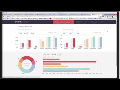
Check out these two interesting webinar videos on "Best practices, tips, and tricks with DevExpress ASP.NET controls".
In part 1, you'll learn about best practices, caching, and charts optimization:
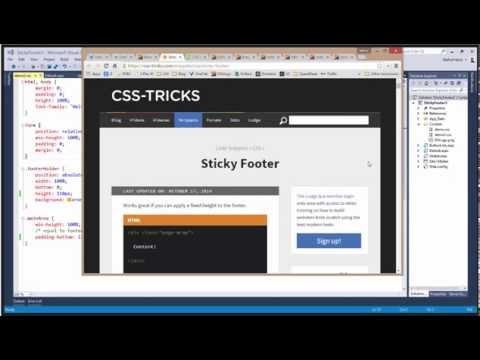
In part 2, you'll learn tips and tricks related to CSS footer, button links, ASPxGlobalEvents control, trackbar+chart control, and Bing maps:
You can download the source code of the demos here:
Here's the links mentioned in the webinars:
From Part 1:
Create First OLAP Cube in SQL Server Analysis Services - CodeProject
create olap cube - Google Search
OLAP Multiple Totals - ASP.NET AJAX OLAP Data Mining Control Demo | DevExpress
Large Database (Server Mode) - ASP.NET AJAX OLAP Data Mining Control Demo | DevExpress
Online transaction processing - Wikipedia, the free encyclopedia
Online analytical processing - Wikipedia, the free encyclopedia
Binding to Large Data (Database Server Mode) - Online Documentation - Developer Express Inc.
From Part 2:
ASPxGlobalEvents Members - Online Documentation - Developer Express Inc.
ControlsInitialized Event - Online Documentation - Developer Express Inc.
BrowserWindowResized Event - Online Documentation - Developer Express Inc.
DevExpress Search - ASPxGlobalEvents sample code
Don's blog post is helpful too.
Thanks!
Year after year, .NET developers such as yourself consistently vote DevExpress products #1.
Experience the DevExpress difference for yourself and download a free 30-day trial of all our products today: DevExpress.com/trial (free support is included during your evaluation).

Unless you're visiting from another planet or have been living in a lava tube, you would know that Xamarin has become an established contender in the mobile application space. It wasn't long before our customers started asking 'when are you going to deliver controls for Xamarin Forms?'.
While that is a straight forward question, the answer is a little more complicated. Developing components that work cross platform is not a trivial thing, and even before you consider the technical aspects, the more important question is ... "what components do you need?". We took a long hard look at that and decided that a powerful grid control was the best place to start.
After months of hard work, I am pleased to be sharing that our DevExpress Grid for Xamarin Forms is close to release, and to mark the occasion Julian and I are going to present to the world the power and flexibility via a webinar on April 7. Use this link and register to secure your spot for this world first event.
Check out this small sample that allows you to explore the DevExpress set of icons included with your DXperience Subscription:

The DevExpress DXperience subscription includes over hundreds of beautiful and professionally designed icons. And you can use these icons with the DevExpress controls because we provide dialogs in Visual Studio for you to choose the icons.
However, there wasn't a decent way to search through the icons outside of Visual Studio.
So we've made an interactive tool (sample) that allows you to search for icons.
And because new icons are added as we develop new controls, demos, etc., you can use the tool to find which icons are included in your installed version.
The tool is available as a code central example project that you can download and run on your local Visual Studio:
Run online: Icon Library Explorer
Download: Source code - Icon Library Explorer - T205563
Help topic: Icon Collection
The sample uses the excellent DevExpress ASP.NET GridView control to see all the available icons.
In the DXperience v14.2.6 minor release, we've added 2 new shopping cart icons:

These icons are available as 16x16 and 32x32, enjoy!
Year after year, .NET developers such as yourself consistently vote DevExpress products #1.
Experience the DevExpress difference for yourself and download a free 30-day trial of all our products today: DevExpress.com/trial (free support is included during your evaluation).
Recently we ran a survey related to DataExplorer and one of the questions was about features people want us to introduce into the product. The second most requested one was adding support for iPhone. No wonder - according to some reports 3/4 of all iOS devices registered in the enterprise are phones. So after some thinking we decided to bring iPhone support into DataExplorer.
This was not a trivial task - DataExplorer was designed for a much larger iPad screen. In addition to that some of the views used on an iPad cannot be used on an iPhone (popups, for example), others behave differently (such as toolbars in landscape orientation on any phone smaller than iPhone 6 Plus). But that was an interesting journey: the first time seeing your app running on a small iPhone 5s instead of a large iPad, making things that didn't fit originally on a phone screen look good in a modified, simpler UI. And as a result you can now enjoy DataExplorer on your iPhone too!
The one big problem of the iPhone is a small screen, even on a quite large iPhone 6 Plus. It's fine for simple UI, but becomes a problem for complex master-detail screens used throughout DataExplorer apps. So we had to come up with a solution for this usability problem. We had several ideas, but ultimately decided that the best way to resolve this issue is to move detail screens away from a master screen and show them separately as drill-down screens. This way a detail screen is just one tap away (as it always was), but that requires one tap or swipe to go back to a master screen. We think it's a good trade-off considering that now the data on the both master and detail screens can be easily consumed even on a small iPhone screen.
It's very easy to turn on this feature: just resize a master screen all the way to the bottom (or to the right if a master-detail screen is oriented horizontally) and you are done. After this the list of detail screens works not as a tab control, but as a toolbar with a button for each detail. This functionality can be used when the master screen is a form or a map (showing a single entity) - it doesn't make much sense when used with a list (since it already has its own drill-down screen).
Because of the differences in screen sizes, the user interface of iPhone apps is different than the UI of iPad apps. Due to this we decided to build separate demos specifically for iPhones: "OData Sample for iPhone" and "North Wind for iPhone". Please take a look at them while trying the new DataExplorer on your iPhone. The rest of the samples are designed for iPad, but you can still open them on a phone to see the limitations of a smaller phone screen :-)
Please try DataExplorer on your iPhone and let us know what you think. We always appreciate your feedback that helps us build a better product for you.
When I first set out to teach our customers the use of our products, back in 2010, the world of programming was different from today. This is particularly true for Web programming, which has evolved to cover various new platforms, devices and architectures. JavaScript has become a much more important language and environment than it was in the past, and for Web programmers using Microsoft technologies, ASP.NET MVC has grown into a versatile und ubiquitous system.
At the same time, some things have remained the same. Our customers, like many in the Microsoft space, have made great investments in Web technology on the basis of ASP.NET WebForms, and our products for that platform have been in continuous development for over a decade now.
The first training course I created back in 2010 targeted our ASP.NET customers, and in June 2015 I will teach an ASP.NET course again. This course covers the process of creating and maintaining applications on the WebForms platform, utilizing DevExpress component technology. The topic is a typical business application - by the way, a general description that still means more or less the same today as it did in 2010. Within the environment defined by the parameters of WebForms - server side rendering, strong state retention mechanisms - this is a modern application that can target any browser or mobile device.
As an addition I made more recently, you will also learn in this course how to make use of the DevExpress ASP.NET MVC extensions, which bring the same set of components to the MVC world and its Razor views.
Here are the details of the ASP.NET event:
Location: Las Vegas (Hard Rock Hotel)
Dates: June 15-17 2015
For details and sign-up options click here
New course: WPF
For programmers of client side applications, the world hasn't been any less turbulent in recent years. I have covered Windows Forms in our courses for years now, and in spite of all the developments towards other client platforms, this has remained a viable alternative for many. However, XAML has turned out to be a stable and consistent technology to describe UI, and most of our customers have dabbled with it - perhaps even in Silverlight, or WinRT, but more likely in WPF.
It has taken a very long time, perhaps surprisingly so in the face of all its great promises, but WPF appears to be the most common choice these days for applications that need to be "native". WPF delivers a powerful UI experience built on a highly productive developer environment, and the DevExpress component suite is just as feature complete here as it is for any other .NET UI platform.
In June 2015, I will teach the inaugural DevExpress WPF course, along similar conceptual lines as other courses. Business applications are once more the focus, with their complex requirements: application architecture, navigation, data visualization and interactive editing, document generation and others.
These are the details of the WPF course:
Location: Las Vegas (Hard Rock Hotel)
Dates: June 10-12 2015
For details and sign-up options click here
And a last thing to mention: we offer the same courses in Europe as well, in October 2015. Click here for a complete overview of all classes we have announced for this year.


