As you may know – and in my opinion, should know: it’s a great, time-saving control – the Layout Control provides rich design-time and runtime customization capabilities, giving you and your users the ability to easily arrange controls in the way you want, to resize and hide controls, to specify the alignment of prompts, and so on.
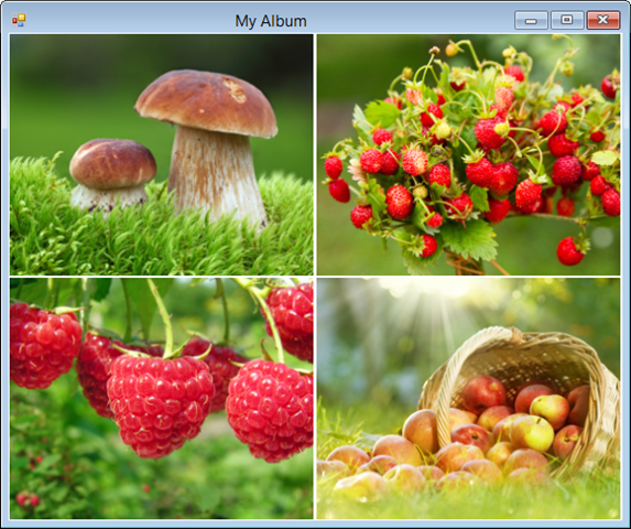
Traditionally, the customization features are activated using a context menu. This menu can be opened by either right-clicking a control's label or padding, or some empty space within the Layout Control itself. If, however, the controls within the layout container are displayed with no or little padding or no labels, or worse there is no empty space at all, it makes difficult for you and your users to activate the customization menu. In such layouts (an example is shown below), you’re forced to engage in some deft “pixel hunting” in order to locate a point where a right-click invokes the customization menu. And we know how annoying that can be.
Image may be NSFW.
Clik here to view.
Worry no more as we have introduced a new Quick Runtime Customization mode and a few usability enhancements in v14.2.6 (yes, in a minor release!) to help with that pixel hunting issue.
Quick Runtime Customization
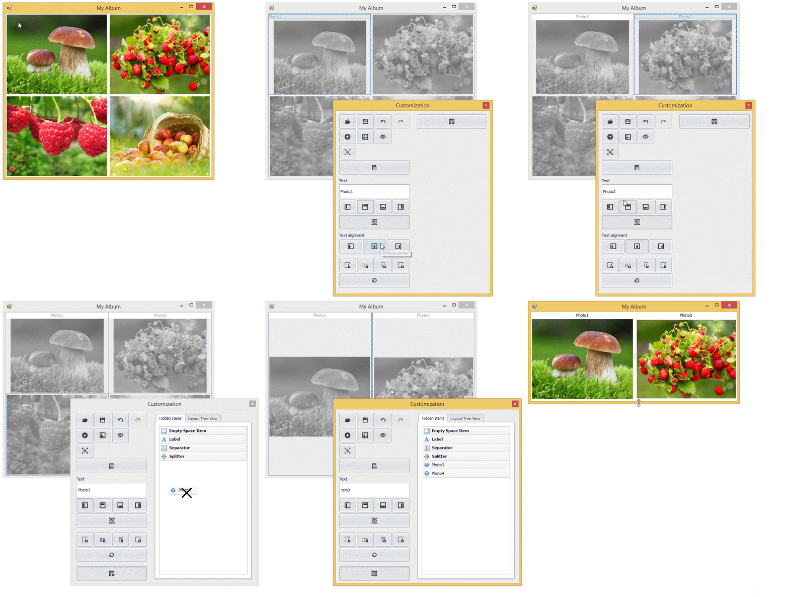
The Quick Runtime Customization mode, just like the default customization mode, provides a full range of customization actions, available in a touch-friendly customization form.
To activate this new mode, users have to press and hold a finger (on touch devices) or right-click and hold (using a mouse) within the Layout Control's bounds (including areas occupied by other controls). Quick mode initialization is visualized with an animated load indicator.
Image may be NSFW.
Clik here to view.
Note that the customization buttons are context dependent.
Design-Time Glyphs and Improved Resizing
We have addressed the design-time "pixel hunting" issue by introducing design-time glyphs. Two glyphs are displayed once an embedded control is selected. The first glyph Image may be NSFW.
Clik here to view. allows you to perform item drag-and-drop operations, while the second glyph Image may be NSFW.
Clik here to view. can be used to invoke the layout item's context menu.
We have also improved layout item resizing. The capability to resize items with no padding has been added.
Image may be NSFW.
Clik here to view.
Alt + Dragging
This enhancement addresses a potentially inaccurate insertion of an item during drag-and-drop. This can happen when the target location may be hidden underneath the item being dragged. With this change, an item being dragged can be temporarily made transparent by pressing and holding the ALT key. This allows you to clearly see the target position.
Image may be NSFW.
Clik here to view.
As I’m sure you can see, these small changes will provide a large improvement in usability. Check them out in v14.2.6, available any day now. Feedback on these enhancements is welcome: just comment on this post or send me an email at julianb@devexpress.com. The team would love to hear from you!
Image may be NSFW.Clik here to view.

