In the previous blogs (Smart Tags and Advanced Smart Tag Capabilities), we reviewed the design-time Smart Tag extension and its advanced capabilities that simplify the process of defining and configuring the controls. In this blog, we will review several other extensions that are provided with DevExpress WPF Controls: Instant Layout Assistant, Items Source Configuration Wizard and Chart Designer.
Instant Layout Assistant
The Instant Layout Assistant is a design-time feature for creating complex layouts with only a few clicks. The Instant Layout Assistant displays a special menu over empty design surfaces (see below).
You can easily disable the Instant Layout Assistant from the Disable Instant Layout Assistant option available in the DEVEXPRESS | WPF Controls v14.2 menu.
The Instant Layout Assistant initially displays a choice of control categories (ribbon, bars, grid, etc.). Based on your selection of a control type, the Instant Layout Assistant will then provide a list of possible layouts. For example, choosing the Docking control type in the Instant Layout Assistant reveals the Navigation Layout, Simple Layout, IDE Layout and MDI Layout docking layouts.
The Instant Layout Assistant will generate a corresponding layout.
Suppose you need an IDE-like layout built with a RibbonControl and GridControl. The first step to creating this layout is to add a Ribbon. To do so, choose the Ribbon Control from the Instant Layout Assistant and then select a ribbon mode. For our purposes, we’ll use the Office2010Layout style:
The Instant Layout Assistant will add the appropriate elements to the form.
To implement the IDE Layout, choose Docking -> IDE Layout.
To add a GridControl to the Error List panel, choose the Grid -> Table View from its Instant Layout Assistant.
This complex layout was created using just six mouse clicks. The UI can be further customized and fine-tuned using Smart Tags and other Visual Studio design tools.
Items Source Configuration Wizard
The Items Source Configuration Wizard is a Visual Studio extension that simplifies design time data binding. The Items Source Configuration Wizard sets the following binding options, in order:
- Data Access Technology
- Data Source
- Data Processing Mode
- Data Source configuration
The Items Source Configuration Wizard initially displays the available data access technologies (from a Technologies list) alongside matching project data sources (Data Sources list). A new data source can be created by clicking the New Data Source button.
On selecting the data access technology, you can choose a corresponding data source from the Data Sources list. Note that if you create a new data source, be sure to rebuild the solution and reopen the Items Source Configuration Wizard to have the newly created data source listed.
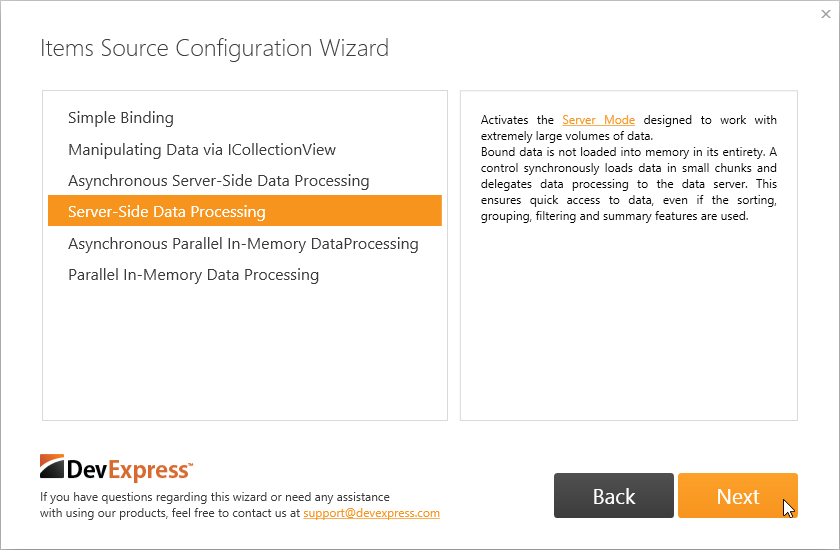
The next step is choosing a data processing mode. The ideal data processing mode depends on your specific needs (e.g., data capacity, parallel data processing). If you’re unsure how to proceed, selecting an item from the list will display explanatory text describing the uses of the item.
As a final step, it’s necessary to specify the remaining data source options. For example, if you’ve chosen Server-Side Data Processing, you need to specify a table for querying the data as well as its primary key.
After the Finish button is pressed, the Items Source Configuration Wizard will bind the control to data in XAML.
1:<Window
2: ...3:xmlns:dx="http://schemas.devexpress.com/winfx/2008/xaml/core"
4:xmlns:dxg="http://schemas.devexpress.com/winfx/2008/xaml/grid"
5:xmlns:my="clr-namespace:GridControl">
6:<Window.Resources>
7:<dx:EntityServerModeDataSource
8:x:Key="EntityServerModeDataSource"
9:ContextType="my:NorthwindEntities"
10:DefaultSorting="Title ASC"
11:KeyExpression="EmployeeID"
12:Path="Employees">
13:<dx:DesignDataManager.DesignData>
14:<dx:DesignDataSettingsRowCount="5"/>
15:</dx:DesignDataManager.DesignData>
16:</dx:EntityServerModeDataSource>
17:</Window.Resources>
18:<Grid>
19:<dxg:GridControl
20:AutoGenerateColumns="AddNew"
21:Name="gridControl1"
22:ItemsSource="{Binding Path=Data, Source={StaticResource EntityServerModeDataSource}}">
23:<dxg:GridControl.View>
24:<dxg:TableViewName="tableView1"ShowTotalSummary="True"/>
25:</dxg:GridControl.View>
26:</dxg:GridControl>
27:</Grid>
28:</Window>
Complete information about this extension and examples are available here and here.
Chart Designer
The Chart Designer is a powerful tool for quickly building complex charts from scratch and customizing existing charts without the Visual Studio Properties window. To open the designer at design time, select a chart, open the chart’s Smart Tag and click the Run Designer link at the bottom (as seen in the screenshot below).
This invokes the Chart Designer.
The Chart Designer includes a powerful set of customization options.
You can refer to the Chart Designer help topic in our documentation for a complete description of each of its elements.


