In this post, we'll review features designed to simplify data processing-related task. The enhancements listed herein were included in our v23.1 release cycle.
Should you have any questions about the features/capabilities outlined in this post, please submit a support ticket via the DevExpress Support Center.
DataSource — Sort and Filter by Locale
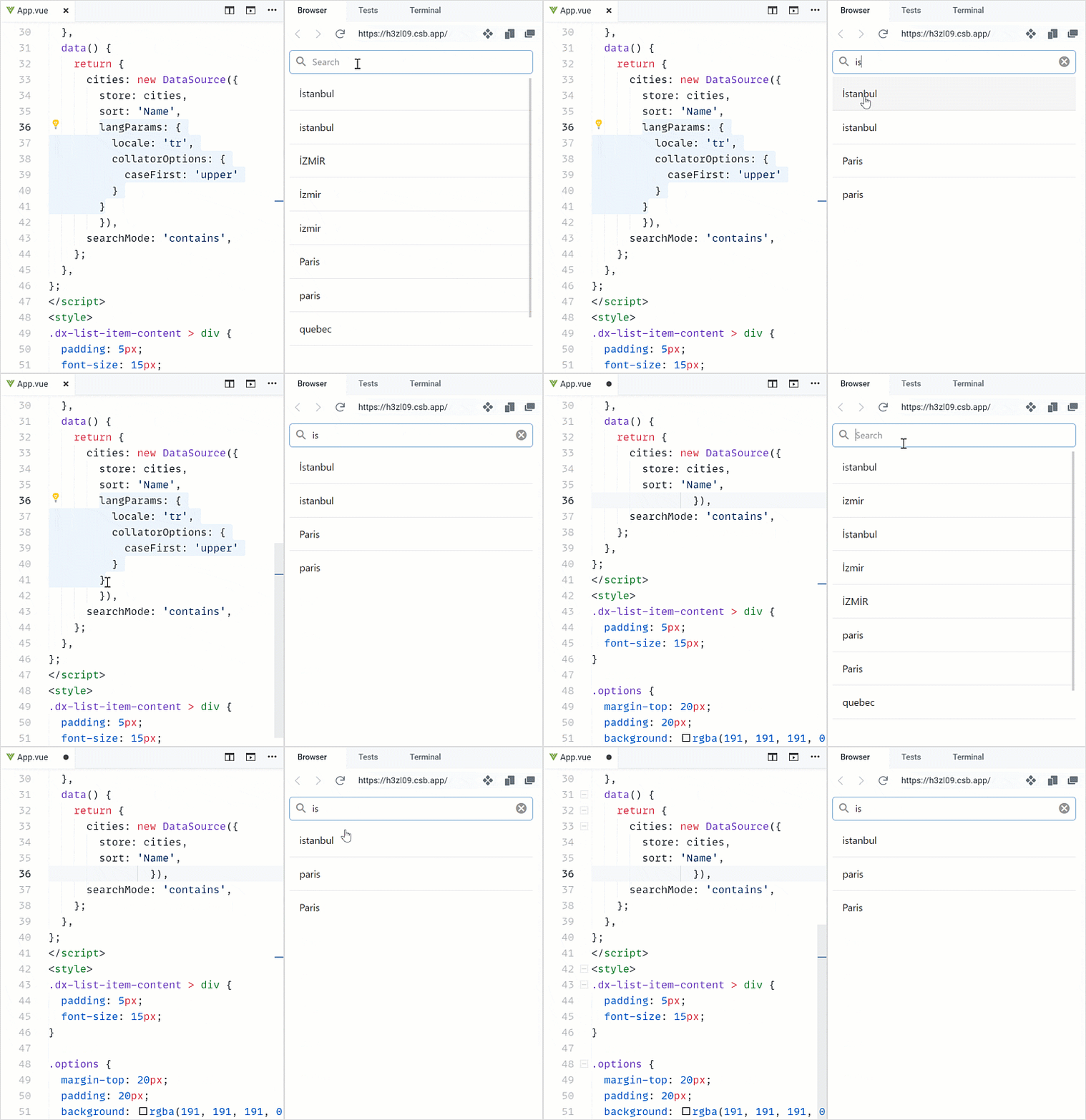
With v23.1, the DataSource allows you to sort and filter data containing special characters associated with different locales (including symbols with diacritics). To enable this feature, define the locale and collator options within the langParams object.

Demo: Select one of the following supported dev frameworks to explore the capabilities of this new feature:
Angular | React | Vue | jQuery
DataGrid/TreeList — Column Chooser Customization
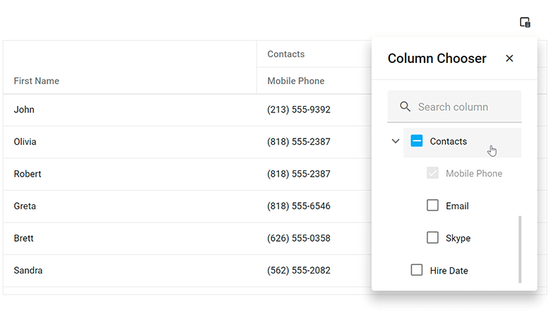
The Column Chooser allows users to hide columns at runtime. In our v23.1 release cycle, we introduced 3 new Column Chooser options.
Our new selection property allows you to configure selection options within the Column Chooser window. Available options include:
- Recursive selection - you can choose whether parent element selection affects child/nested elements.
- "Select all" check box.
- Select a column by clicking its label.

For additional search customization within the Column Chooser, you can define a search configuration object. For example, you can specify a placeholder and implement custom value change handling logic:
import React from 'react';
import 'devextreme/dist/css/dx.light.css';

import DataGrid, {
    ColumnChooser,
    ColumnChooserSearch,
    // ...
} from 'devextreme-react/data-grid';

const searchEditorOptions = {
    placeholder: 'Search column',
    mode: 'text',
    onValueChanged: (e) => {
        // handle the value change here
    }
};

export default function App() {
    return (
        <DataGrid ... >
            <ColumnChooser ... >
                <ColumnChooserSearch
                    enabled={true}
                    editorOptions={searchEditorOptions}
                    // ...
                />
            </ColumnChooser>
        </DataGrid>
    );
}
Additionally, our new position property allows you to set display location for the Column Chooser.
import React from 'react';
import 'devextreme/dist/css/dx.light.css';

import DataGrid, {
    ColumnChooser,
    Position,
    // ...
} from 'devextreme-react/data-grid';

export default function App() {
    return (
        <DataGrid ... >
            <ColumnChooser ... >
                <Position
                    my="right top"
                    at="right bottom"
                    of=".dx-datagrid-column-chooser-button"
                />
            </ColumnChooser>
        </DataGrid>
    );
} DataGrid/TreeList/PivotGrid/Gantt — Header Filter Customization
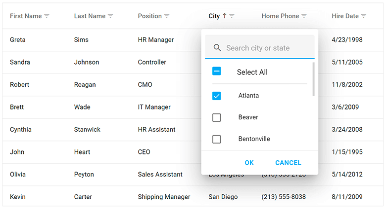
You can now personalize search preferences and the look of the search box within column header filters. You can configure the search box to function as a TextBox component, define comparison rules, and establish a timeout/delay (in milliseconds).

Use the search configuration object to globally configure search settings or use the columns[].headerFilter.search configuration object to make changes to individual columns. Use the fields[].headerFilter.search property to configure search settings in the Pivot Grid.
import React from 'react';
import 'devextreme/dist/css/dx.light.css';

import PivotGrid, {
    HeaderFilter,
    Search,
    // ...
} from 'devextreme-react/data-grid';

const searchEditorOptions = {
    placeholder: 'Search value',
    mode: 'text'
};

export default function App() {
    return (
        <PivotGrid ... >
            <HeaderFilter ... >
                <Search
                    editorOptions={searchEditorOptions}
                    enabled={true}
                    timeout={700}
                    mode="equals"
                />
            </HeaderFilter>
        </PivotGrid>
   );
}