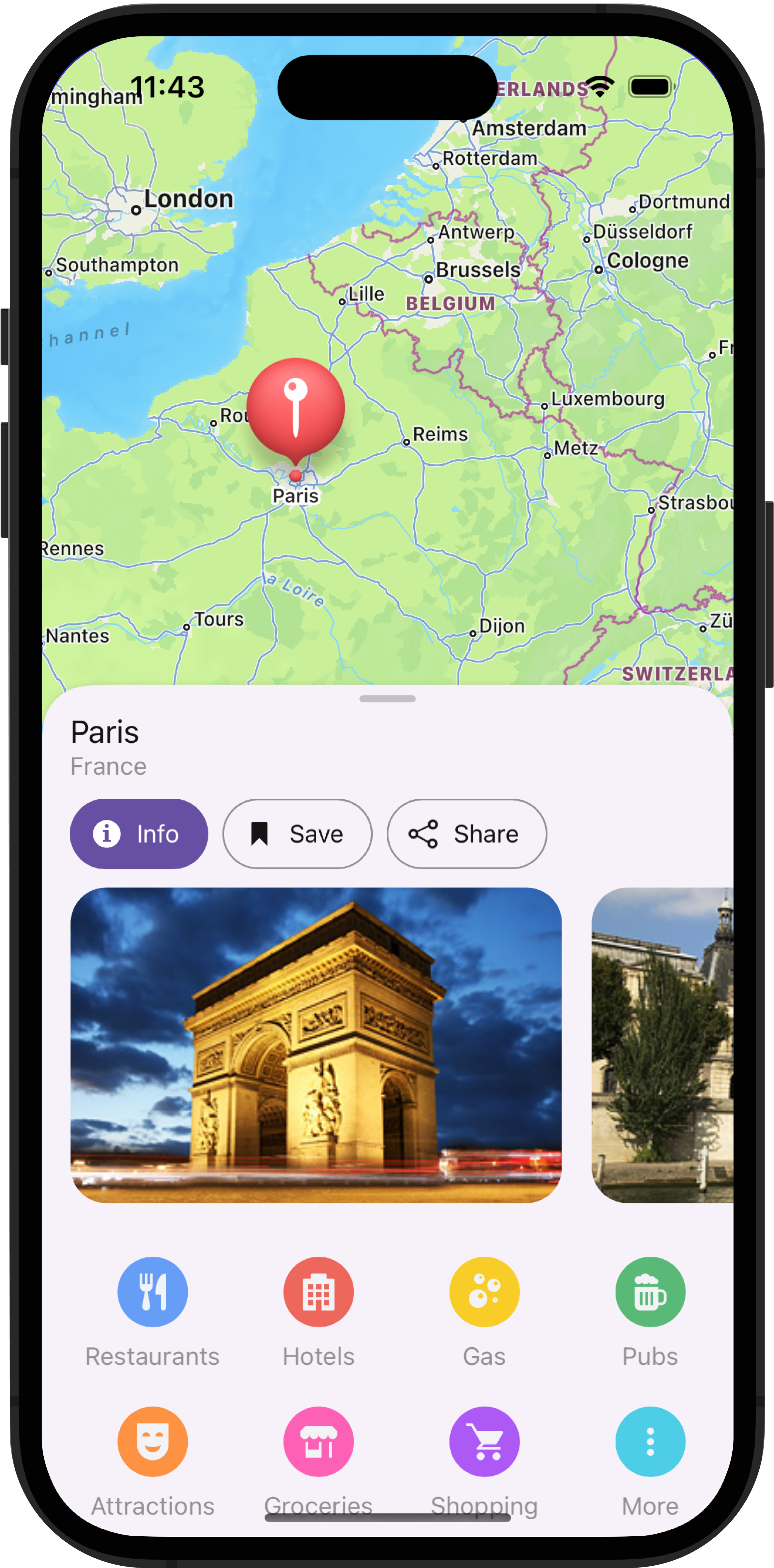
As you may know, Bottom Sheet is a component that displays supplementary content anchored to the bottom of the screen.

This UI metaphor is uncommon for desktop apps, but widely used in the mobile world. It allows you to conditionally display large UI elements, giving them almost the entire screen space without navigating to a separate page.
In this blog post, I’ll demonstrate a few usage scenarios wherein the Bottom Sheet can enhance the mobile user experience.
1. Master–Detail Data
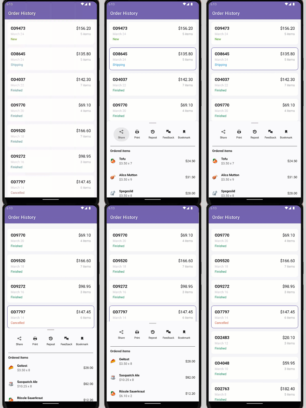
A common solution for master-detail data display in a desktop apps is use of a Data Grid with expandable rows with detail grids. On mobile screens, it may be challenging to allocate space for multiple Data Grids or lists. Additionally, creating an expandable hierarchy level may complicate the UI, especially if each data row displays diverse information. One possible solution to this UI problem is to display detail data in a Bottom Sheet when a master item is selected.

Bottom Sheet allows you to display big data segments visually separated from primary content. Its advantage is that it doesn’t require users to navigate to a separate page to view relevant information.
Our Bottom Sheet supports both modal and inline display modes. In inline mode, you can interact with primary content when the Bottom Sheet is open. When a user interacts with primary content, you may want to provide him/her with more space in the main area, but still keep the Bottom Sheet visible. You can implement this behavior with our Bottom Sheet by setting the HalfExpandedRatio property.

As demonstrated in the animation above, our Bottom Sheet is a good place for additional action buttons related to a tapped item.
2. Display Filter Items
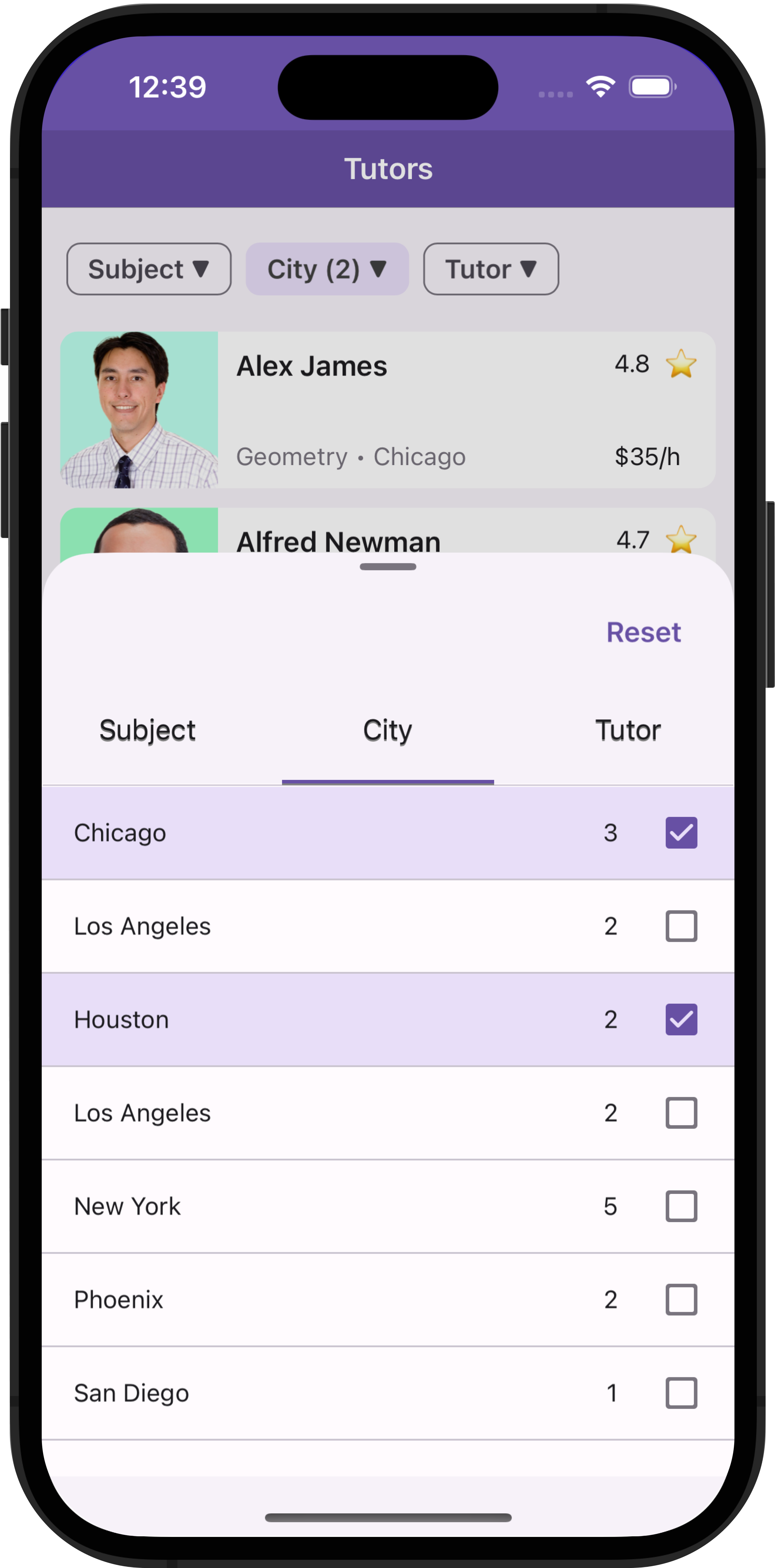
As you may know, you can use Filter UI Elements alongside our Collection View and Data Grid to apply various filters. A common mobile UI implementation is to display filters in a Bottom Sheet. You can use Chips to activate a filter and Tab View to switch from one filter group to another within the same Bottom Sheet.

For additional information, refer to the following: .NET MAUI Mobile — Collection Filtering Best Practices.
3. Select Values
Most business apps include the use of data editors, allowing users to select values from predefined lists. In desktop apps, the obvious component choice is a ComboBoxEdit with a standard dropdown. In mobile apps, dropdown might not be the best solution, because it doesn’t leverage available screen space. DevExpress ComboBoxEdit and Form Item elements offer you item pick modes where the Bottom Sheet is used instead of a dropdown:


Refer to the following blog post for additional item selection-related information: .NET MAUI — 3 ComboBox Dropdown Alternatives for User-Friendly Item Selection within a Mobile App.
Summary
Bottom Sheet is a multi-purpose UI control designed to address a variety of mobile specific UI requirements, including:
- You can use Bottom Sheet to display large data segments within the primary screen.
- Inline (non-modal) display mode allows you to interact with primary content and automatically reduce Bottom Sheet height when required.
- You can display a bar with actions when an item is selected.
- You can add filter items to the Bottom Sheet.
- Bottom Sheet is a capable alternative to a dropdown.