In this blog post, I'll describe a few of our multi-purpose JavaScript UI components (for Angular, React, Vue, and jQuery) and briefly document implementation details for features introduced over the last couple of release cycles.
Should you have any questions about the features/capabilities outlined in this post, please submit a support ticket via the DevExpress Support Center.
Toast Stacking
In previous versions, we offered two methods to call toast notifications. As you may know, if your app called these methods simultaneously, notifications would overlap one other. With v22.1, two new notification methods allow you to stack toast notifications. In addition to stacking toasts one on top of another, you can also change stack direction and toast position.

To display stacked messages, call the notify(message, stack) or notify(options, stack) method:
import { Component, AfterViewInit } from '@angular/core';
import notify from 'devextreme/ui/notify';

@Component({
    selector: 'app-root',
    templateUrl: './app.component.html',
    styleUrls: ['./app.component.css']
})

export class AppComponent implements AfterViewInit {
    ngAfterViewInit() {
        notify("Warning message", {"center", "up-push"});
        // or
        notify({ message: "Error message", width: 300, shading: true }, {"center", "up-push"});
    }
} Resizable with Fixed Aspect Ratio
Our Resizable component offers two new options:
- keepAspectRatio - Specifies whether to maintain the aspect ratio of the component when a user drags its corner handle.
![]()
The keepAspectRatio mode is most useful when resizing images and videos. You can also use the Resizable component to control the size of DataGrid or other dashboard widgets.
- area - Specifies the bounding region used to limit the component's maximum size.
<dx-resizable ...
    [keepAspectRatio]="false"
    area="#container"
>
</dx-resizable> Dynamic Validation Summary
Consider the following use-case: you need to valide a group of components. You attach a validationSummary that displays all validation errors in a list for this group. Then, at some point you need to dynamically alter/recreate the validation group in your application.
To rebind the Summary to the group, you can use our refreshValidationGroup() method.
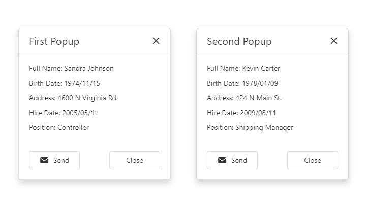
Switch Between Open Popups
Our Popup UI can better handle usage scenarios wherein multiple popup windows are visible simultaneously (instances where popups overlap one another). Users can bring popups from the back to the front by interacting with the popups (click or move):
Floating Labels
All editor components (Autocomplete, ColorBox, DropDownBox, DateBox, Form, Lookup, NumberBox, SelectBox, TagBox, TextArea, TextBox) support floating labels. The label is used as a placeholder and when the editor gets focus, the label moves to a position above the input field.
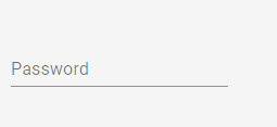
To add a floating label, specify the following properties:
<dx-text-box...
    label="Email"
    labelMode="floating"
>
</dx-text-box>