This is exciting news: in our upcoming v18.1 release, we will have the full set of more than 65 new React components available, based on our existing DevExtreme widgets! This includes Charts, DataGrid, Scheduler, PivotGrid, and many others. The feature set, functionality and appearance of these React components is the same as that of the DevExtreme widgets.
The new React components “wrap” the core implementations of the existing DevExtreme widgets, adapting them to the React core API. That’s why we call this new library DevExtreme React Wrappers. You can follow the development progress in this GitHub repo.
Two Sets of Components for React
The availability of this new set of React components means that we now offer two different libraries for the platform. The library we released first currently has just one component (the React Data Grid), and we call it DevExtreme Reactive Components for React. Admittedly, the name is a bit complicated, but we need to distinguish from the same components that will be available for Vue in the near future! Charts and Scheduler are going to be released soon, and there is overall a lot of traction in this ongoing development.
The DevExtreme Reactive Components were written from the ground up targeting the React and Vue libraries with a shared core. On the other hand, DevExtreme React Wrappers reuse our DevExtreme widgets and make them available as React components.
Both approaches have their advantages. Please read on for more detailed explanations.
Comparing Our Two Offerings
To help you decide which of our libraries for React better suits your development needs, we categorized some of the differences:
Core UI Packages (Building Blocks)
DevExtreme Reactive Components are built on top of popular third party React UI libraries (react-bootstrap, reactstrap and material-ui). This means that our native components use the theming approaches supplied by these libraries, as well as included and third-party themes. Your application will benefit from the controls, the consistent APIs and the look&feel technologies that come with the libraries.
The DevExtreme React Wrappers don’t rely on third-party UI building blocks. They are built with their own markup and style-sheets. They support our own theming system, which supplies customizable themes including Bootstrap and Material Design. You can also import any Bootstrap LESS file to customize these controls with your favorite paid or free Bootstrap theme.
Level of Control
DevExtreme Reactive Components use the native React approach where all UI state is exposed via component properties. This gives you complete control over all aspects of state, and the components can be fully controlled or uncontrolled or anywhere in between. The rendering layers of the components are separate packages, and they can be replaced partially or completely. Reactive Components are configured by composing ‘plugins’, providing granular configuration choices for individual use cases in your application.
DevExtreme React Wrappers do not use this native React technique and therefore appear more like black boxes, components that perform some configuration work internally and invisibly. This can result in reduced manual control, but the automated mechanisms are smart, and you may well find it easier to configure root component properties rather than composing and configuring individual plugins. In the React sense, Wrappers can be used as uncontrolled and partially — not fully, since they expose only parts of their state! — controlled components.
You may prefer one approach over the other — we feel that both have their merits.
Feature Sets and Extensibility
DevExtreme Reactive Components are less than a year old and offer fewer components, less functionality and a smaller feature set than DevExtreme React Wrappers. The individual components are growing and so is the library as a whole. This set of components is young, but due to the modular plugin-based concept, extensibility is fantastic, with the best possible opportunities for you to add your own features or customize built-in ones.
DevExtreme React Wrappers are new for the upcoming v18.1 release, but since they are based on the DevExtreme widgets, they come with a much large feature set. However, some extensibility scenarios are not easy due to the comparatively monolithic component architecture — for instance, it’s not easy to replace the pager for the Data Grid with a custom one. Fortunately the Grid supports pager customization in itself, so you probably don’t need to replace the pager! This is meant as an illustrative example of a complicated customization scenario.
Here is a table with some comparison aspects.
| Aspect | DevExtreme React Wrappers | DevExtreme Reactive Components |
|---|---|---|
| Components | 65+ React Components. Option to use feature/widget from the growing DevExtreme library. | React Data Grid, Charts and Scheduler planned. Option to use native React components from react-bootstrap, reactstrap or material-ui. |
| Performance | Built-in features provide rich high-performance functionality. | Features modularized in plugins, immutable state, memoization, React optimizations, Virtual DOM and lightweight markup result in extreme performance. |
| Server-Side Rendering | Not Available Yet | Available |
| Using Redux | Available | Available |
| Ease of Configuration | Easy, configuration via root component properties | Moderate, configuration via plugin composition |
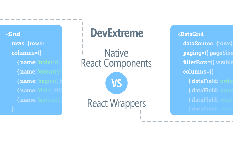
Code Examples
To leave you with an impression of the structure used for configuration purposes by the two component libraries, we have prepared the following examples. Both are shown using uncontrolled (stateful) modes.
DevExtreme Data Grid React Wrapper
<DataGrid
  dataSource={rows}
  paging={{ pageSize: 10 }}
  filterRow={{ visible: true }}
  columns={[
    { dataField: 'orderId', caption: 'Order ID' },
    { dataField: 'country', sortOrder: 'asc' },
    { dataField: 'region' },
    { dataField: 'date', dataType: 'date', filterValue: '2013/04/01' },
    { dataField: 'amount', format: 'currency' }
  ]}
/>
DevExtreme Native React Data Grid
<Grid
  rows={rows}
  columns={[
    { name: 'orderId', title: 'Order ID' },
    { name: 'country', title: 'Country' },
    { name: 'region', title: 'Region' },
    { name: 'date', title: 'Date' },
    { name: 'amount', title: 'Amount' },
  ]}><FilteringState
    defaultFilters={[{ columnName: 'date', value: '2013/04/01' }]} /><SortingState
    defaultSorting={[
    { columnName: 'country', direction: 'asc' } ]} /><PagingState
    defaultPageSize={10} /><IntegratedFiltering /><IntegratedSorting /><IntegratedPaging /><CurrencyTypeProvider for={['amount']} /><Table /><TableHeaderRow showSortingControls /><TableFilterRow /><PagingPanel /><Toolbar /></Grid>
What Do You Think?
We are excited about the launch of this full set of new React Components. We would love to see the great React apps you’ll build with our DevExtreme React Wrappers. In v18.1, they will be in a CTP stage. We are considering further improvements, such as server-side rendering support, Virtual DOM utilization for rendering, better state management capabilities, etc. Please try the components, and let us know which improvements you would like to see in the RTM release.
If you have any questions about the distinction between the two libraries for React, please describe your use cases and we will do our best to help you choose the appropriate DevExtreme Components for React.
Join the Webinar
Sign up for our upcoming “New in v18.1 - DevExtreme HTML / JS Controls” webinar where you’ll have a chance to see our React libraries demonstrated live and ask any questions about our React, Vue, or other client-side offerings.
Join the webinar: https://attendee.gotowebinar.com/register/9186007723238099714