Quantcast
Channel: Developer Express Inc.
Viewing all 2417 articles
Browse latest View live

WinForms Deprecation Notice — Classic Visual Styles

$
0
0

Many of our experienced customers know that you can use the DevExpress WinForms UserLookAndFeel API to enable "classic" visual styles ("Flat", "UltraFlat", "XP", etc.) for an individual control or an entire application. In this post, I’ll describe these "outdated" classic styles and explain why we have chosen to deprecate this API and to leave the "Skin" style as the only option.

The Case for Classic Styles


Let's take a moment and consider some of the reasons why a WinForms developer might be using a classic style like "Flat" or "Border3D" in 2021.

Performance

Each skin stores a large collection of raster or vector images painted above UI elements. If you disable skins and switch to a classic visual style, you could theoretically boost application performance (since UI elements will no longer need to retrieve and draw skin images).

In reality, the difference in performance between a skinned and a "Flat" application is negligible (given modern-day hardware performance). The availability of vector skins makes this concern moot — vector images are lightweight and consume less resources than their raster bitmap counterparts.

Remote Desktop Environments

There's a common myth among our user base that simple paint methods (responsible for flat appearance) are most effective in remote desktop environments. Truth is that all modern remote environments employ videostream encoding. Based on internal tests, vector images produce the best results in this environment. Said differently, we are 100% confident that our vector WinForms themes alongside our new OptimizeRemoteConnectionPerformance setting will deliver the best possible performance in remote environments – and will not sacrifice the overall appearance of your WinForms app.

Ease of Access

Our old "High Contrast" skin was raster image-based. This meant that it could not adapt to system settings. If you wanted your app to use colors from the "Personalize | High contrast settings" Windows menu, you had to enable our classic "Flat" style. While this style could retrieve colors from the active Windows High Contrast theme, certain controls (such as our Ribbon) retained their own unique appearance.

The good news is that with the release of v21.1, you can now use a vector-based High Contrast skin. This skin uses colors from the active Windows preset, and (unlike our classic "Flat" style) guarantees to deliver a unified appearance across all DevExpress WinForms UI controls.

Custom Highlight

Since skin images are painted directly above UI elements, certain usage scenarios prevented you from using an element’s Appearance settings (namely, the "BackColor" property). Disabling skins and switching to a classic style was the default technique for those who wanted to apply custom element appearance (for instance, to paint the "Cancel" SimpleButton red).

This "limitation” is no longer a limitation (v18.2+). With our v18.2 release, we made it possible to use Appearance settings even when a skin is active. To learn more, please review the following blog post from a couple of years ago: Skin Colors and LookAndFeel.

Personal Preferences

Tastes differ, and yes, some people prefer the "unskinned" retro look and feel. The good news is that you can deliver the “retro” look with DevExpress vector skins. Our vector skins include dozens of color variations (palettes), including simplified "gray-ish" color options.


As we’ve hopefully illustrated in this post, the case for classic styles and "unskinned" apps is not what it once was. This reality notwithstanding, you may be asking yourself why? Why deprecate a long-standing feature such as classic styles?

The simple answer to this question is that legacy style settings and some of our newest features are not compatible. For example, in-header filters for the DevExpress WinForms Data Grid do not work correctly when the UserWindowsXPTheme setting is active. In addition, each time we introduce a new feature such as in-header filters, we are forced to rewrite individual control painters. Supporting a legacy feature such as classic styles is expensive and in certain instances, produces unacceptable results (for instance, the XP theme does not look great on high-DPI devices).

What's Next

Removing an entire customization API layer is a big step and we won't rush into it. For now, we are going to stop fixing bugs related to classic styles. We will eventually deprecate these legacy settings so they do not produce issues similar to those related to in-header column filtering.

Of course, we definitely want to hear from you. If you're currently using "XP" or "Style3D" and wish to do so indefinitely, please share your thoughts in the comment section below. Tell us your concerns and your needs. We will listen to all of your concerns and do our best to find a reasonable solution suitable for everyone.


.NET MAUI - FREE Early Access Preview of Multi-Platform App UI Controls (v21.2)

$
0
0

In this post, I’ll describe some of the MAUI controls we expect to ship in November 2021 and describe how you can get your hands on an early access preview (EAP) today. Before I begin, however, two quick reminders:

  • Our Xamarin UI components are available free-of-charge. If you have yet to obtain your free copy of our Xamarin controls, please visit https://www.devexpress.com/xamarin/ to register for this free offer.
  • If you are not yet familiar with Microsoft’s .NET Multi-Platform App UI (MAUI) platform or how Microsoft has positioned MAUI (the evolution of Xamarin Forms), please take a look at Carl Franklin’s interview with Jonathan D, a developer on Microsoft’s MAUI team and Carl’s interview with James M, a well-known Xamarin-MAUI community influencer. Both videos are available on the DevExpress YouTube Channel.

Prerequisites to Test DevExpress MAUI Controls

If you’re ready to explore the capabilities of our .NET MAUI controls (Data Grid and Charting library for mobile development), please consider the following important prerequisites:

  1. Check out Microsoft's most-recent installation guidance for .NET MAUI. As of July 7th, the DevExpress MAUI EAP requires Microsoft.Maui 6.0.100-preview.5.794 (this dependency will change for future MAUI previews).
  2. Register https://nuget.devexpress.com/free/api as a package source in your Visual Studio, if you are NOT an active DevExpress Universal​ customer or have NOT yet registered our free Xamarin UI controls (otherwise, this MAUI preview will be available in your personal NuGet feed automatically).
  3. Browse your NuGet feed to locate required DevExpress.Maui.* packages.
Early Access and CTP builds are provided solely for early testing purposes and are not ready for production use. This EAP may not include all MAUI features/products we expect to ship in our v21.2 release cycle. As its name implies, the EAP offers an early preview of what we expect to ship in 4-5 months.

What's Included

Bullet-Proof & High Performance Core

Like DevExpress Xamarin UI controls, our MAUI controls are written in Objective C for iOS and Java/Kotlin for Android and are seamlessly integrated with the MAUI platform using its "Handlers”.

What our native control "wrapper" approach means for you and your end-users?

  • DevExpress UI controls abstract the complexities of native mobile development - our developers did the dirty work for you (= dealt with difficult programming languages and platform specific headaches).
  • You can deliver unmatched performance, usability, and functionality to your end-user AND do so using C# and .NET 6 (what’s under the hood "just works").
  • Speed, speed, and more speed. For instance, DevExpress MAUI Charts use OpenGL graphics rendering with C++ for the best possible performance on mobile devices, even with millions of points. Our data grid scrolling performance is second to none (when compared to our current competitors). We will publish detailed performance metrics in the coming weeks.

MAUI Data Grid

Our high-impact and feature-complete MAUI grid is included within the DevExpress.Maui.DataGrid NuGet package and ships with the following  built-in features:
  • Large Dataset Support / High-Performance / Smooth Scrolling
  • Multi-Column Sorting
  • Data Summaries, Grouping and Filtering API
  • Pull To Refresh, Load More and Swipe Support
  • Row Drag & Drop
  • Multi-Row Cell Layout
  • Dark and Light Themes,
  • and much more - please check out the full description for our Xamarin Grid to see what to expect from its MAUI counterpart.

Getting Started Tutorials & Examples

MAUI Charts

Our comprehensive collection of 2D chart types is included within the DevExpress.Maui.Charts NuGet package and ships with the following built-in features:

  • Financial Charts / Area, Bar, Line, and Spline Charts
  • Point and Bubble Charts / Pie and Donut Charts
  • High-Performance Real-Time Data Updates
  • Smooth Navigation and Zoom / Series and Point Selection
  • Point and Segment Colorizers
  • Multiple Axes / Tooltips, Crosshair Cursors
  • Dark and Light Themes
  • and much more - please check out the full description for our Xamarin Chart to see what to expect from its MAUI counterpart.

Getting Started Tutorials & Examples

Known Issue: our first MAUI preview only supports Android. MAUI is still in active development and we had issues with the platform itself and control use within iOS (both emulator and real devices). See the following Microsoft issue for more information: GitHub: Cannot deploy MAUI app to an iOS device.

Future Plans

In one of our next DevExpress MAUI previews, we will publish NuGet packages for our MAUI Collection View, Data Editors library, and Navigation Controls. We will support iOS for the aforementioned MAUI controls as well. Ultimately, we want to keep up with the Microsoft previews and port all existing Xamarin Forms UI controls to MAUI in the coming months.

Once we port all MAUI controls, we want to implement TOP user requests for Xamarin controls across our MAUI component suite. This includes, but is not limited to:

  • Migrate to and leverage the power of the DevExpress.Data library (we are currently using a clone). This will help us deliver a seamless user experience for DevExpress customers who have used our WinForms, WPF and ASP.NET components in the past.
  • Template Gallery support. This will allow customers to create mobile apps more quickly. We may integrate MAUI controls into the Unified Component Installer (though 90MB size increase is a concern) or rather redistribute a VSIX from the Visual Studio Marketplace.
  • Multiple enhancements to data editors like chips, simplified localization, auto column width in the grid, and much more.

Of course, we will also publish online documentation, more GitHub examples and videos on our YouTube channel.

Frequently Asked Questions

How is .NET MAUI different from Xamarin Forms?

If you're using Xamarin.Forms today, MAUI should be a painless transition as it represents an evolution of Xamarin.Forms – the two platforms have many similarities. For more information, see Xamarin.Forms Are Available Free-of-Charge | Transition to .NET Multi-platform App UI (MAUI).

Is technical support included with the free MAUI preview?

No, this free MAUI preview does not include technical support from DevExpress. Technical support for DevExpress MAUI controls is only available if you own the DevExpress Universal Subscription.

How can I report bugs or share suggestions on DevExpress MAUI development?

If you encounter a bug, please submit a bug report via our online support system: https://www.devexpress.com/ask. For suggestions to our development team, please complete our survey.

Is the source code included in this free MAUI preview?

No. Component source code is not included in this offer.

Will DevExpress MAUI controls be available free of charge once they are released?

We have NOT finalized our product delivery model for MAUI – we may continue to offer our MAUI controls free of charge OR we may bundle them with an existing DevExpress Subscription.

Will your MAUI controls support desktop form-factor (Windows, Linux, macOS)?

We are excited about the capabilities that .NET MAUI offers for cross-platform UI development. We will finalize our plans for desktop support in our MAUI controls in early 2022. In particular, we look forward to further MAUI evolution for Windows (we also ship WinUI controls). As far as I know, Microsoft also has given higher priority to Windows and WinUI support than Linux and macOS at this stage.

Your Feedback Counts!

If you are currently using Xamarin Forms, considering MAUI, or just investigating your options, feel free to comment below, we’ll be happy to follow-up. Thanks for considering DevExpress for your development needs.

WinForms Tips & Tricks — Virtual Keyboard and New Customer Cases

$
0
0

In this post we'll share some of the more interesting customer requests we've received over the past couple of months. And as a bonus, we’ll show you how to create a virtual keyboard for your app.

Customer Usage Scenarios

  • How to check whether the XtraMessageBox is currently visible (T1009121)
    The DevExpress XtraMessageBox is a replacement for the standard WinForms MessageBox. It allows you to apply DevExpress skins to message boxes used within your app. It also offers extras such as the ability to embed a “Do not show again" checkbox, apply HTML-inspired text formatting (including Image and P tags for multi-line text blocks with images), incorporate button customizations, etc. This ticket explains how to check whether the DevExpress Message Box is visible at runtime.
  • How to display previews of saved layouts (T1006287)
    Having multiple layout versions for users to choose from is a great customization option with one minor downside: you need to apply a layout version to see what it looks like. This ticket explains how to use the DevExpress ScreenCaptureHelper to create snapshots of various layouts and use these images as layout previews.
  • How to implement a 3-state Toggle Switch (T1006935)
    DevExpress ToggleSwitch has two states: On and Off. If you want a third, "Indeterminate" state, you need to use our WinForms CheckEdit instead. This ticket explains how to customize a CheckEdit so that it mirrors the appearance of our WinForms Toggle Switch.
  • How to remove the sub-menu depth limit in DXPopupMenu (T1009286)
    If you ever decide to create a DXPopupMenu with sub-menus inside sub-menus inside sub-menus, you will discover that our default menu nesting limit equals "5". To remove this limit, change the value of the hidden static DXPopupMenu.MaxSubMenuLevel property.
  • How to copy a selected Data Grid row with the "Plus" Data Navigator button (T1008218)
    The DevExpress WinForms Data Grid can display a Data Navigator to simplify grid navigation (browse grid records). The Navigator's "+" button initializes a new blank row. We were recently asked whether this button's behavior can be modified to copy a selected row into a new row and to activate the Edit Form to instantly edit the record. This ticket explains how to achieve this requirement.
  • How to obtain the color values of Conditional Formatting templates (T1007515)
    Conditional Formatting— available across DevExpress data-aware controls — allows you to highlight values that meet specified criteria (for example, paint the five lowest cell values in red). If you need to obtain exact color values for these rule patterns, use the FormatPredefinedAppearances.Default.Find method. See this ticket for more information in this regard.
  • How to copy Grid Summary Item values (T1007122)
    Summaries can display a standard context menu. This menu allows users to change summary type, or add and remove summary items. You can access this menu to populate it with custom entries as needs dictate. For instance, your custom menu item can allow users to copy a summary item value.
  • How to get handles for all rows loaded in Data Grid Instant Feedback mode (T1006630)
    In Instant Feedback mode, our WinForms Data Grid loads its rows asynchronously. To identify which rows are already loaded, you can either iterate through all row handles and call the IsRowLoaded method for each (this strategy works best for smaller data sources with a limited number of records), or handle the RowLoaded event (this strategy offers better performance on large data sources).
  • How to use different editor setups for regular and AutoFilterRow cells (T1005595)
    This ticket explains how to use a three-state CheckEdit for the Data Grid AutoFilterRow and maintain two-state editor for standard data rows (only "Checked" and "Unchecked" states with no "Indeterminate").
  • How to play SWF videos (T985088)
    Back in the old days, our support engineers used to attach flash videos (swf format) to their answers. If you encounter an old support ticket and want to view an old flash tutorial, simply follow the instructions outlined in this ticket.

How to Create a Virtual Keyboard

As a bonus for this month’s WinForms Tips & Tricks post, we’ll show you how to use our WinForms SvgImageBox editor to emulate a virtual keyboard.

To help get things started, we've created a GitHub sample that you can use as a reference: SvgImageBox – Virtual keyboard from SVG file. Copy the sample SVG keyboard image and change the following parameters to suit your requirements:

  • the number of keys inside the "keys" section;
  • the X and Y coordinates of individual keys;
  • key IDs;
  • total SVG image size.
<?xml version="1.0" encoding="utf-8"?>
<svg width="Image_Width" height="Image_Height" ...>
  <defs>
    <g id="key">
      <path .../>
      <text ...>
        <tspan ...">[key]</tspan>
      </text>
    </g>
  </defs>
  <g id="keys">
    <use id="Key_ID" href="#key" transform="matrix(1, 0, 0, 1, Key_X, Key_Y)/>
    ...
  </g>
</svg>

You can modify these parameters in any Notepad-like editor.

When your keyboard image is ready, load it into the SvgImageBox control and copy-and-paste the code from our GitHub sample. This universal code works regardless of SVG keyboard layout. The SendKeys.Send method sends key values to the active text field. As such, you don't need to bind your keyboard to individual input boxes.

DevExtreme DataGrid & TreeList - Pager Enhancements and New Data Editing API (v21.1)

$
0
0
In this short blog post we'll review both data Pager and data editing API-related enhancements introduced in our v21.1 release cycle. Should you have any technical questions related to items covered in this post, please submit a support ticket via the DevExpress Support Center. We will be happy to follow-up.

Data Editing API Enhancements

Our new insert/update/delete Data Grid API (available as a CTP in v20.2) has been released officially. We detailed the benefits of this API in the following blog post:
One feature that our previous blog post did not mention is the ability to insert a new grid record at a custom position. This option is now available as a CTP in our v21.1 release. Review the following discussion page for more information:

Pager Enhancements

Control Display Mode

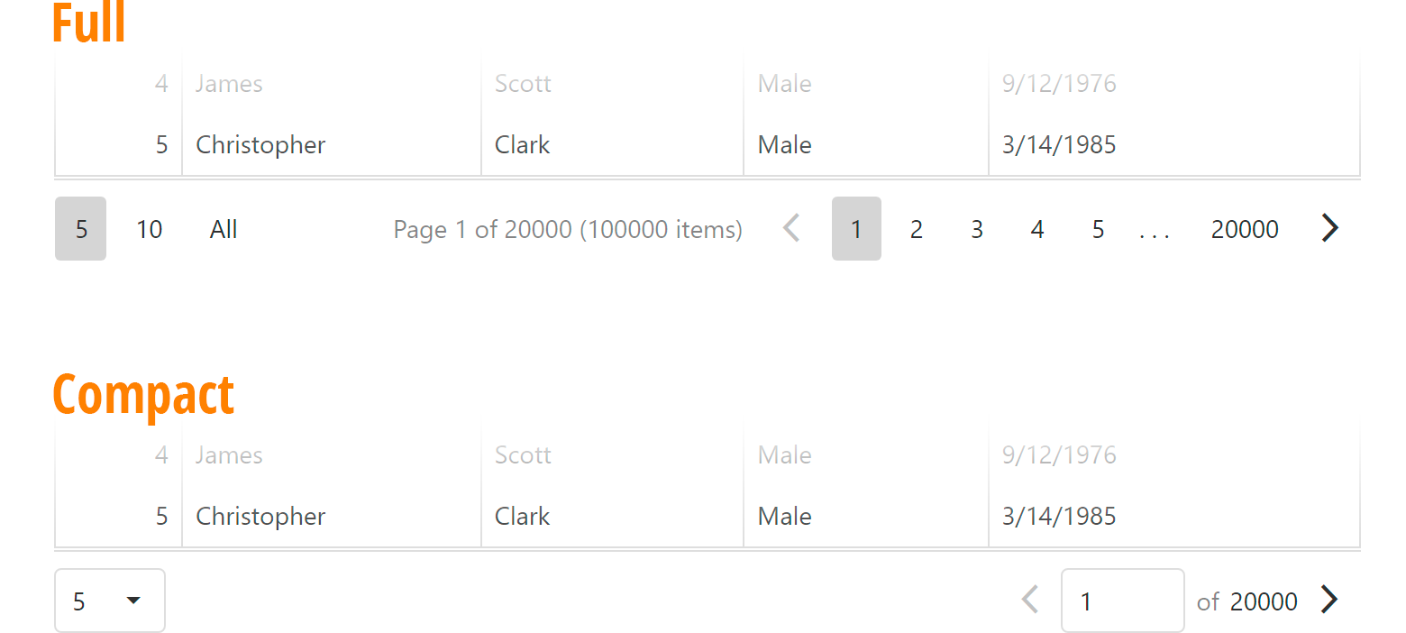
As you may know, our Pager offers both full and compact display modes. In full mode, the DevExtreme Pager displays detailed page information. In compact mode, users can navigate to a specific page by entering the appropriate page number.
The DevExtreme Pager selects Display Mode based upon available screen space. In previous versions, you could not control this behavior. Thanks to your feedback, v21.1 includes a new displayMode property and allows you to control the Display Mode used within your app:

Angular

<dx-data-grid>
  <dxo-pager displayMode="compact">
  <!-- or -->
  <dxo-pager displayMode="full">
</dx-data-grid> 

 Vue

<DxDataGrid>
  <DxPager display-mode="compact" />
  <!-- or -->
  <DxPager display-mode="full" />
</DxDataGrid>  

React

<DataGrid>
  <Pager displayMode="compact" />
  {/* or */}
  <Pager displayMode="full" />
</DataGrid>  

jQuery

$("#dataGridContainer").dxDataGrid({
  pager: {
    displayMode: "compact"
    // or
    displayMode: "full"
  }
};  

Show All Records

If you’ve used the DevExtreme Pager within a project, you may be familiar with our Page Size Selector. This element is used to change the number of grid records within a single page. With our v21.1 release, Page Size Selector now includes an "All" option. When selected, "All" displays all underlying records on a single page.
As you might expect, this feature allows users to disable or circumvent traditional data pagination. Since this may cause performance degradation on extremely large datasets, we made this new feature optional. To enable it, simply include the value "all" within the allowedPageSizes array.

Feedback

If you’ve already used the features outlined in this post, we’d love to hear from you. Please leave a comment below and let us know what you think.

Reporting — Avoid Mistakes in Report Creation with The Help of Report Design Analyzer (v21.1)

$
0
0

As you already know, creating the perfect report is not a trivial undertaking. A well-designed report requires you to validate control position, ensure external element availability (such as images, PDF files, Word and data sources), and manage actual “physical” output (on-screen print preview, printed hard copy, or document export).

To improve the report-design experience and make it more intuitive, we analyzed tech support traffic over the last few years and discovered a set of basic design-related issues – problems that could be resolved with ease directly within the DevExpress Report Designer.

Our new Report Design Analyzer (available in v21.1) extends the capabilities of our Script Errors panel and allows you to uncover key design-related issues with relative ease. The DevExpress Report Analyzer is available within our Visual Studio Report Designer and both our WinForms and WPF End-User Report Designers (we expect to add the Report Analyzer to our Web Report Designer soon – screenshot below).

Revamped Script Error List Panel – The New Report Design Analyzer

The DevExpress Report Design Analyzer displays a list of errors, warnings, and hints throughout the report-design process. As its name suggests, the Report Analyzer’s sole objective is to help you isolate, diagnose, and address common report design/layout related issues.  To help illustrate the capabilities of the Report Design Analyzer, let’s consider a report with two overlapping labels.

Once the Analyzer recognizes an issue, it displays a list of errors/warnings/messages within its issues list. In this instance, the Analyzer reports that two labels overlap one another. If you double-click the warning message (or simply click Source), the Analyzer automatically moves focus to the underlying issue (the control, band, or script that generated the issue).

How to Read and Understand Report Analyzer Messages

The DevExpress Report Analyzer displays a message and a brief explanation for each issue it discovers.

Report Analyzer messages are divided into three distinct categories (by issue severity):

  • Errors (considered most critical): Errors usually prevent a report, band, control, or script from being displayed correctly.
  • Warnings (less severe): A report, band, or control may not meet user expectations.
  • Messages (hints and best practices)

Each message displayed within the DevExpress Report Analyzer includes a unique message code. We added these codes to help you “google” errors and locate possible solutions: Errors, Warnings, and Information Messages. In Visual Studio, message codes also appear as links - when you click the error code link, the Analyzer opens the appropriate DevExpress help topic (with suggested actions).

The DevExpress End-User Report Designer does not display error codes as links. The reason is obvious – we did not want to redirect your end-users to a DevExpress web property. If you think we made a mistake in this regard, please do share your feedback in the comments section below. Should we add an option to enable “code links” for the End-User Report Designer?

You can make the Report Design Analyzer display the following:

  • Report Layout - messages that describe issues with the report layout.
  • Report Creation - issues that occur when a report is rendered (for instance, an external image or PDF file has become unavailable).
  • Report Scripts - issues when script code in a report generates unhandled exceptions.
  • All of the above messages.

Document Generation Issues

Design-related issues arise when you create a report. Errors generally occur during the document generation process. For instance, a document generation error may involve an image control with a missing image source (an image with an external URL specified dynamically). This issue will only appear once a report is previewed (the specified URL is invalid or does not contain an image). When such issues occur, the Report Design Analyzer displays messages to help you troubleshoot the issue further.

Our Report Preview hides the Report Design Analyzer by default (to free up visible space for the preview itself). Though hidden, the Analyzer is running in the background. As you can see in the animation below, an icon and error count give you a quick snapshot on the overall “health” of your report. To activate the Report Analyzer pane, simply click the “bell” icon.

A pop-up hint or fly-out box summarizes all issues within a previewed report. In the following example, the error messages tells us that an error occurred during the report generation process.

What’s Next?

We expect to incorporate the DevExpress Report Design Analyzer within our Web Report Designer. Here’s a sneak peek of its user interface elements:

Your Feedback Matters

As always, we welcome your thoughts. Please comment below and let us know what you think about our implementation. If you’ve encountered a design or runtime generated error that our Analyzer does not detect accurately, please do submit a support ticket via the DevExpress Support Center.

WPF Scheduler – On-Demand Data Loading

$
0
0

Late last year (v20.2), we added on-demand data loading support to our WPF Scheduler control. In this post, we’ll describe how you can use the WPF Scheduler’s API to configure data loading logic within your WPF app.

Performance Impact

Fetching data from the source on demand is a common technique to enhance the startup time for applications with large datasets. To help you estimate the benefit, we measured how long it takes for the Scheduler control to load appointments:

These measurements do not take into account the time it takes to load data items from the source. The performance gain from loading only a part of the data will be higher for slower databases and services.

Getting Started with On-Demand Loading

To enable on-demand data loading, you must handle the DataSource.FetchAppointments event (there is a separate DataSource.FetchTimeRegions event for time regions). When you handle these events, the DevExpress WPF Scheduler loads data only for its currently visible time interval. When a user navigates from one time period to another, our WPF Scheduler queries more information (as necessary) from the data source. Loaded data is cached to reduce query frequency.

To reduce query frequency further, our WPF Scheduler extends the time interval for which to load data to the DataSource.FetchRange property value. The default FetchRange is 1 month. The Scheduler only recalculates this time interval once the user scrolls outside of this range:

Implementation

The following code sample demonstrates how to introduce on-demand data loading for a DbContext data source:


// Data context 
public class SchedulingDataContext : DbContext {
    public SchedulingDataContext() : base(CreateConnection(), true) { }
    static DbConnection CreateConnection() {
        //...
    }
    // Data items
    public DbSet<AppointmentEntity> AppointmentEntities { get; set; }

    //...
}

// Event implementation
void dataSource_FetchAppointments(object sender, DevExpress.Xpf.Scheduling.FetchDataEventArgs e) {
    // Pass data objects to the event's Result property 
    e.Result = dbContext.AppointmentEntities.Where(
        // The search query.
        // Use the item's QueryStart and QueryEnd properties to calculate the correct interval
        // as they take recurrence patterns into account.
        // The event's Interval property returns the time interval for which to load data objects.
        // Its value is the SchedulerControl.VisibleIntervals extended to the DataSource.FetchRange property value in both directions.
        x => x.QueryStart <= e.Interval.End && x.QueryEnd >= e.Interval.Start)
        .ToArray();
}

The Where method’s argument in this snippet is a basic search query with no filtering involved. You can use the FetchDataEventArgs.GetFetchExpression method instead to simplify the implementation:


void FetchAppointments(FetchDataEventArgs e) {
    e.Result = dbContext.AppointmentEntities
        .Where(e.GetFetchExpression<AppointmentEntity>()).ToArray();
}

Sync the Scheduler and the Source

To sync the data source and the Scheduler (with partially loaded data), you need to manually save changes. Built-in CRUD events simplify this requirement. You can write a single handler for all four events:

<dxsch:SchedulerControl
    AppointmentAdded="ProcessChanges"
    AppointmentEdited="ProcessChanges"
    AppointmentRemoved="ProcessChanges"
    AppointmentRestored="ProcessChanges"/>   

void ProcessChanges(object sender, AppointmentCRUDEventArgs e) {
    db.Appointments.AddRange(e.AddToSource.Select(x => (Appointment)x.SourceObject));
    db.Appointments.RemoveRange(e.DeleteFromSource.Select(x => (Appointment)x.SourceObject));
    db.SaveChanges();
} 

If you’d like to learn more about on-demand data loading and if you have the DevExpress WPF Components installed on your machine, click the link below to launch our sample demo:

On-Demand Data Loading Demo: dxdemo://Wpf/DXScheduling/MainDemo/OnDemandDataLoading

Should you have questions about On-Demand Data Loading, please post comments/feedback below.

Nächste Woche: Deutscher Live-Stream zu TestCafé mit Gregor Biswanger

$
0
0

Please note: the following post is written in German language, announcing a third-party event hosted by the German consultant Gregor Biswanger. Please forgive this rare occurrence if you don’t understand German.

TestCafe Live Stream

Testen ist mühsam, langwierig, anstrengend… das ist bekannt. Zumindest als Vorurteil ist das bekannt, und in so manchem Projekt wird entsprechend nicht viel getestet. Wer allerdings schon einmal in einem Projekt mit guter Testabdeckung gearbeitet hat, der weiß auch, wie angenehm das ist: man fühlt sich abgesichert, wenn Änderungen anstehen, und es ist extrem befriedigend, nach erfolgter Implementation eines neuen Bausteins der Anwendung dem automatischen Durchlauf der Tests zuzusehen.

Wenn das nur immer so wäre… nun, ganz können wir Ihnen die Arbeit zur Erstellung von Tests nicht abnehmen. Wir können sie allerdings deutlich vereinfachen, und zu diesem Zweck gibt es unser Produkt TestCafé, in einer Open Source-Version sowie als vollwertige IDE für Tester.

Mit TestCafé schreiben Sie Tests in JavaScript oder TypeScript, die von der UI bis hin zur Backend-Funktionalität jeden Teil ihrer Anwendung abdecken können. Testergebnisse sind voll reproduzierbar und Tests können auf Clients oder Servern ausgeführt werden, ganz ohne grafische Oberfläche, oder in beinahe jedem beliebigen Browser. Ich selbst benutze TestCafé seit vielen Jahren, unter anderem zur automatischen Prüfung von Codebeispielen auf Plattformen wie Codepen, und ich bin von dem System sehr beeindruckt.

Live-Stream Freitag, 23. Juli 2021

Wenn Sie Interesse haben, TestCafé kennenzulernen, gibt es gute Neuigkeiten: Gregor Biswanger wird am Freitag, dem 23. Juli 2021 TestCafé live auf Twitch demonstrieren. Gregor ist Microsoft MVP und arbeitet als unabhängiger Berater, Trainer und Sprecher. Ich kenne ihn schon seit Jahren als Sprecher bei technischen Konferenzen, und ich bin sicher, dass er eine interessante und lehrreiche Vorführung bieten wird.

Bitte folgen Sie diesem Link, um sich für die Teilnahme am Live Stream zu registrieren

Die Teilnahme ist kostenlos, und es gibt viele Preise zu gewinnen! Falls Sie es an dem Freitag nicht schaffen können: wir werden die Aufzeichnung der Veranstaltung später auch auf YouTube verfügbar machen.

Blazor Rich Text Editor for Word, RTF, and Text document editing (available in v21.1)

$
0
0

As you may already know, our most recent Blazor release (v21.1) ships with a new Rich Text Editor component for Blazor (available as a Community Tech Preview - CTP). Much like its ASP.NET MVC counterpart, this new Blazor component supports popular document formats (DOCX, RTF, TXT) and allows you to incorporate a Microsoft Word-inspired user experience within your Blazor Server applications.

Preview Release

At present, our Rich Text Editor CTP supports Blazor Server applications and includes the following built-in features:

  • A Microsoft Word-inspired Text Editor user (including a Ribbon)
  • API to create, open, and save documents (DOCX, RTF, and TXT)
  • Content Formatting: Character Formatting, Paragraph Formatting, Floating Objects (images and text boxes)
  • Content Layout Customization: Document Sections, Multi-column Layouts, Headers, and Footers
  • Document Printing
  • Simple View (Web Layout) Mode

DevExpress Blazor Rich Text Editor

Demo

Character and Paragraph Formatting

The DevExpress Rich Text Editor for Blazor ships with the following text formatting features:

  • font settings (select font name, font size)
  • character style (bold, italics, underlined)
  • background and foreground color

End-users can easily modify entire paragraphs using the control's integrated UI formatting options: paragraph alignment, spacing and indentation, bullets, and numbering.

Additionally, the editor includes built-in UI to edit the document's header/footer and insert a Table of Contents.

Document Management and Document API

Our new Blazor Rich Text control supports asynchronous data binding and allows you to programmatically load document content as needs dictate. Use the DocumentContent property to specify the server-side variable used to store document content you need to load.

<DxRichEdit Id="richEdit" DocumentContent="@documentContent" CssClass="w-100 ch-480" />

@code {
  byte[] documentContent;
  protected override async Task OnInitializedAsync() {
    documentContent = await File.ReadAllBytesAsync(Path.Combine(AppContext.BaseDirectory, "Data\\Documents\\Example.docx"));

    await base.OnInitializedAsync();
  }
}

Our Rich Text Editor for Blazor also includes a special Document API to modify an open document programmatically. Use the DocumentAPI property to dynamically access the document content.

Demo

Floating Objects

The DevExpress Rich Text Editor for Blazor allows your end users to insert text boxes and images of popular formats (JPEG, PNG, and GIF) into a document. Users can create, move, resize, and rotate floating objects.

These floating objects, text boxes and images, can be anchored within a document in one of two ways: either inline (the object is displayed within the text) or floating. Floating means the object is strictly positioned, absolutely or relatively within the document, regardless of text flow. Of course, users can still freely position and scale floating objects using the control's UI.

DevExpress Blazor Rich Text Editor - Floating Objects

Fields

In our Rich Text Editor for Blazor, document fields are special placeholders for non-static data that might change (for instance, a page number or date and time). These placeholders are replaced with actual data when the document is rendered for display or print. Standard fields include DATE, TIME, PAGE, NUMPAGES, TOC, and more.

To store custom (non-standard) information in your document, use the DOCVARIABLE field code. This field allows you to insert the required content programmatically by using the CalculateDocumentVariable event.

Printing

We've added support for WYSIWYG printing to generate a printout that closely mirrors the control's screen layout. When a user clicks the Print ribbon item, the editor will open a new browser tab, render the current document, then call the browser's print dialog.

Simple View

The Simple View mode allows you to display document content without page layout elements (margins, headers, or footers). This view can be useful when you need to display your document on a limited-width page.

You can enable this mode in two ways:

  1. Use the Editor's Ribbon UI (click the Simple View command)
  2. Set the ViewType property to Simple

DevExpress Blazor Rich Text Editor - Simple View

Demo

Feedback

As always, we appreciate your feedback. If you have questions on our Blazor RTF control, please post your comment below or submit a support ticket via the DevExpress Support Center.


WPF Tips & Tricks (May – June 2021)

$
0
0

If you have any questions regarding this month’s WPF Tips & Tricks blog post, please comment below or submit a support ticket via the DevExpress Support Center. We’ll be happy to follow up.

WPF-Related Tips

Interesting WPF-Related Support Tickets

WPF Data Grid

  • Define ToolTip for TreeListView node images (T994154)
  • Allow editing of the HyperlinkEdit column in GridControl (T1009670)
  • Prevent the creation of certain columns when AutoGenerateColumns is enabled (T998481)
  • TreeViewControl - How to manually set focus on the Filter Node (T999090)

WPF Editors

Charts & Map control

  • Crosshair Cursor - How to hide items with zero values (T1007946)
  • How to hide the SidePoint label using a binding expression (T1011714)
  • How to change the custom element template font size depending on the map zoom level (T992742)
  • How to generate MapCustomElements with ListSourceDataAdapter (T991982)

Miscellaneous

  • How to display the Properties Panel when DiagramControl is used instead of DiagramDesignerControl (T1011018)
  • Reorder default BarButtonItems from the tabbed DocumentPanel Context Menu (T997150)
  • Define TileNavPane’s dropdown Height (T996936)

    To specify dropdown height, declare the TileNavPaneBar implicit style:

    <Style TargetType="dxnavi:TileNavPaneBar" 
           xmlns:dxnavi=http://schemas.devexpress.com/winfx/2008/xaml/navigation/internal>
        <Setter Property="Height" Value="70" />
    </Style>
  • ThemedMessageBox – Highlight the Default and Cancel buttons (T998835)
  • Assign Tooltips for Property Grid Control category buttons (T1006676)
  • RadialContextMenu - How to return to the collapsed view after a BarButtonItem is clicked (T1006593)
  • Scheduler - How to change the appointment subject’s alignment (T1008842)

WPF Documentation and Examples

Before we let you go…

Our online help system includes a feedback form (pictured below). If you encounter a help topic that fails to address your questions, please tell us how we can improve the topic or how we can extend its content to better serve your needs.

The Feedback dialog - Step 1The Feedback dialog - Step 2

Pursuit of Optimum Performance

$
0
0

Performance always matters for CodeRush. Productivity tools, by their very definition, should not slow you down.

With the recent CodeRush migration to Microsoft’s Roslyn engine, we eliminated the cost of maintaining an array of language infrastructures. Visual Studio already parses, performs semantic analysis, stores solution structure, and searches for symbols, all of which allows CodeRush to use less memory and increase performance.

However, relying upon the Roslyn engine alone does not solve every performance challenge. CodeRush is a complex product with many points of Visual Studio integration where event listening and custom editor rendering are necessary. And in areas where Visual Studio provides insufficient functionality, CodeRush fills the gap with its own core engine. All these factors can introduce performance challenges, which, if handled improperly, could result in slowdowns and perhaps a “yellow bar” performance warning appearing inside Visual Studio.

Over the years performance has been a top a priority for our team. And our work for many of those years has been reactive: a customer experiences a performance issue; reports it; and then we hunt it down and kill it. This approach often yields positive results, provided we can reproduce the issue. However sometimes we may not have enough information to reproduce the slowdown, or customers may not have been able to provide the essential details needed, for example the results from running a PerfView analysis.

CodeRush Performance Logging

To improve the quality of the data our developers use to make CodeRush faster, in recent years we introduced a performance logging system, which gives CodeRush the opportunity to continually monitor its own performance in critical code sections, and to record any issues, if found, to the CodeRush performance log file.

We monitor many events within both CodeRush’s and Visual Studio’s performance, including:

CodeRush Startup

  • Loading the entire product.
  • Starting each separate CodeRush service.
  • Individual initialization for selected services.

Editor & IDE Events

  • The time spent on each individual handler
  • The time spent processing the entire event (all event handlers)

Visual Studio Interaction

  • Checking the availability of menu items, toolbar buttons, commands, etc.
  • Measuring the execution time of user interface items.
  • Editor rendering time.

Dispatcher.Invoke

  • Any CodeRush code executed through Dispatcher.Invoke.

Since this code is executed on the main UI thread, it needs to be both absolutely necessary and optimized for speed, or performance will suffer. And so CodeRush monitors all of its code blocks executed on the main thread in Visual Studio.

Refactorings & Code Generators

  • Availability checks (determining which refactorings/generators are available)
  • Execution times (how long it takes to apply a refactoring/generator)

Today, with the latest performance logging, if a customer experiences a slowdown, the CodeRush logs are more likely to contain the data needed to show what’s happening and why. And since we introduced performance logging, our support team has been able to more quickly diagnose and solve reported issues.

If you are a member of the DevExpress Customer Experience Program, details of any slowdowns are sent automatically to our support team for analysis. This allows us to get a broader picture of what our customers are experiencing – what causes the slowdown, and under what conditions.

We can also monitor our progress and regression across versions, and as a result, make our work more systematic and strategic.

Strategic Response

Before each sprint, we collect analyze performance data - causes, total number of events, and total sum of all the delays.

In order to more objectively compare changes across minor releases, for every performance event we compare the total delays for that event divided by the sum of all delays for all reported events. This helps us prioritize which events we focus on for each release, and we use that as our primary metric. It’s essentially how we normalize all this performance data across all the releases. Our sprints are 30 days apart, so we get about 12 releases a year.

For each release, we compare the metrics collected for the current release against those of the previous release. For each event, our strategic response depends upon the results of this comparison:

  • Minor changes to the metric, either small improvements or small degradations, generally mean nothing has changed. If work had been performed attempting to improve performance, then it was likely unsuccessful.
  • Significant decreases in the metric means customers are experiencing substantially shorter delays per event (CodeRush is noticeably faster). We work to analyze our changes for this version and make sure we have a reason to explain the change. If we worked to improve performance, this drop in the metric confirms we are moving in the right direction. We can continue to improve performance further, or move on to another challenge if we’re satisfied with the results.
  • Significant increases in the metric means customers are experiencing a longer average delay per performance event. In this case we look closely at the changes across sprints so we can understand what might have caused the change. And then we prioritize addressing it for the next sprint.
  • A performance event has completely disappeared. While on the surface this may appear like a good thing, a significant event like this always warrants deeper investigation. It could mean our efforts led to a complete correction of an issue, or it could mean that perhaps due to changes in the code, one event became another. So our response here is to meticulously analyze the data so we can understand why.
  • A new performance event appeared that has not been previously identified. This almost always happens because we’ve extended the detail of our logging into a new area. For example, if it is unclear what is causing a delay at the start of the service, we might need more logging for the individual stages of that service’s start. This can sometimes cause new performance events to be added as children of the old event.

The important point here is that when the performance data changes across releases, we investigate the cause and verify if the changes were accidental or intentional.

Real World Data

Here are some actual results of CodeRush's performance logging and our data analysis, comparing CodeRush releases 20.2.3 against 20.2.11.

In CodeRush v20.2.3, we had 58 active performance events.

In v20.2.11:

  • For 29 of these events, we managed to achieve performance improvements of more than 50 percent.
  • For 5 of these events, we achieved performance improvements of more than 80 percent.
  • For 22 of these events, we completely fixed the performance issues and never saw them logged again.

Here’s a short summary of what we’ve accomplished in this time span:

Improved startup performance.

We completely rewrote the code engine responsible for interaction with Visual Studio in order to eliminate any slowdowns when Visual Studio loads. We also optimized a number of CodeRush internal services to speed up their work.

This graph shows our results over this time span for improving startup performance (smaller values on the y-axis are faster):

Improving Test Runner performance

A better test discovery engine lets the CodeRush Test Runner find tests in your solution faster. We also optimized internal services and reduced our project dependency graph build time, which improves test run speed.

Faster Rendering

Increasing rendering speed and optimization for Spell Checker, Rich Comments (including Image Embedding), Unused Code Highlighting, Structural Highlighting, and Member Icons.

Speeding up typing performance

Improving typing performance in the Visual Studio editor by optimizing String Format Assistant, Naming Assistant, Smart Semicolon, Smart Dot, IntelliRush, and Code Template Expansion. We also made command availability checking faster.

The CodeRush team continues to work hard to win performance gains, and we look forward to achieving greater progress in this direction in future CodeRush releases.

Do please let us know what you think about CodeRush performance, and if there are areas where we can make CodeRush or Visual Studio even faster for you.

DevExtreme Gantt - Export to PDF, Task Appearance, and Scrolling Enhancements (v21.1)

$
0
0
This post summarizes the newest features/capabilities of DevExtreme Gantt v21.1 including its ability to export content to PDF, customize task appearance settings, and scroll to a specific date.

Export to PDF (CTP)

DevExtreme Gantt v21.1 allows you to export its content to a PDF document and fully supports the following options:
  • WYSIWYG export
  • Page customization (format, orientation, margins)
  • Specific date range export
  • Ability to export the Gantt chart and task list separately

How It Works

Export to PDF is built upon the jsPDF library and its jsPDF-AutoTable plugin. You need to reference/import this library in your project to enable use of this new feature.
To export Gantt as a PDF document, call the exportToPdf method. It accepts an object with the following fields:
{
  // A PDF document constructor
  docCreateMethod: Function 

  // Page format ("A1", "A2", and so on) or size in pixels
  format: string | { width?: number; height?: number } 
  
  // If `true`, the exported document uses horizontal orientation
  landscape: Boolean 
  
  // File name
  fileName: string 
  
  // Allows you to export a particular part of the component
  exportMode: "chart" | "treeList" | "all" 
  
  // Exported date range
  dateRange: "visible" | "all" | { startDate?: Date, endDate?: Date, startIndex?: number, endIndex?: number } 
  
  // Page margins
  margins: { left?: number, right?: number, top?: number, bottom?: number } 
} 
The following code illustrates use of the exportToPdf method within a React project. This code exports a Gantt chart to a PDF document (A4 document with landscape orientation). The same method is available for Angular, Vue, jQuery, ASP.NET MVC, and ASP.NET Core.
import { Gantt } from "devextreme-react/gantt";
import { jsPDF } from "jspdf";
import "jspdf-autotable";

export default function App() {
  const ganttRef = useRef(null);
  const exportGantt = useCallback(() => {
    const gantt = ganttRef.current.instance;

    gantt.exportToPdf({
      docCreateMethod: jsPDF,
      format: "A4",
      landscape: true,
      exportMode: "chart",
      dateRange: "all",
      fileName: "gantt.pdf"
    });
  }, []);

  return (
    <Gantt ref={ganttRef}>
    {/* … */}
    </Gantt>
  );
} 

Try It Now

To explore the capabilities of this new export option, please refer to the following online demo: Export to PDF.
Our Gantt control’s Export to PDF feature is available as a Community Tech Preview (CTP). Since this feature is in active development, we welcome your thoughts and feedback. Feel free to leave a comment below or submit a support ticket via the DevExpress Support Center to share suggestions with us.

API Enhancements

Task Appearance Customization

The DevExtreme Gantt control allows you to customize the appearance of individual task elements within the Gantt chart.
Use the taskContentTemplate to specify the look and feel of each task as needs dictate. Note that an object with information about an individual task is passed as template data.

Scroll the Gantt to a Specific Date

DevExtreme Gantt v21.1 includes a new scrollToDate() method. This method allows you to scroll the chart area programmatically. The method accepts a date value specified as a Date object, date-time string, or timestamp. Any of the following commands scroll the Gantt chart to June 17, 2021:
gantt.scrollToDate(new Date(2021, 5, 17));

gantt.scrollToDate("2021/06/17");

gantt.scrollToDate(1623877200000); 
Note that the chart is scrolled within the current date range. If the target date is outside the range, you may need to change the scaleType property to increase the zoom level before calling the scrollToDate() method.

Your Feedback Matters

As always, we value your feedback. If you have any questions or suggestions, please comment below and let us know what you think of DevExtreme’s newest Gantt features.

Office File API and Office-Inspired Desktop UI Controls – Tips, Tricks, and an Important Breaking Change (June-July 2021)

$
0
0

This post includes a series of interesting support tickets answered throughout June and July along with a breaking change notice and a series of enhancements made to our Office-inspired product line. We hope you find the contents of this post interesting and of business value. Should you have any questions about this post, feel free to comment below.

Upcoming Breaking Change

T1012049 - DataFormatOptions and DXRichEditDataFormatOptions properties are now obsolete
https://supportcenter.devexpress.com/ticket/details/t1012049

With our v21.1.5 release, the following DataFormatOptions and DXRichEditDataFormatOptions members will become obsolete:

  • AllowHtml
  • AllowRtf
  • AllowPlainText

These properties affected both copy and paste operations with format-specific content (after the T964531 breaking change). The insertion of HTML content was disabled by default, but you could set the AllowHtml property to true to enable it. We received a lot of feedback regarding this breaking change and decided to restore and enhance previous behavior.

We added Html, Rtf, and PlainText properties to DataFormatOptions and DXRichEditDataFormatOptions classes instead of the now obsolete members. Set new properties for the appropriate RichEditClipboardMode enumeration value to enable copy/paste operations or enable/disable all clipboard operations. Insertion of HTML content from the clipboard is now enabled by default.

We plan to remove these obsolete members in our v22.1 major release (we will post a second notice on this blog once this change is made).

Tips & Tricks

Word Processing Document API

  • T998620 - How to replace a document field with a different field
    https://supportcenter.devexpress.com/ticket/details/t998620

    Iterate through the Document.Fields collection and obtain the field code for each field. Split the code string by words and check whether this string contains the phrase "MERGEFIELD.” Obtain the word after this phrase (which represents the field name). Replace the field name in the code range and save your results. See the code below for more information.

    using (RichEditDocumentServer wordProcessor = new RichEditDocumentServer())
    {
       Document document = wordProcessor.Document;
       FieldCollection fields = document.Fields; 
    
       // Fill the list of field replacements as needed:
       var newFieldList;
       // ...
    
       wordProcessor.BeginUpdate();
    
       // Iterate through the field collection:
       for (int i = 0; i < document.Fields.Count; i++)
       {
          Field field = fields[i]; 
    
          // Get field code:
          string codeRange = document.GetText(field.CodeRange).Trim();
    
          // Split the code string:
          string[] mergeField = codeRange.Split(' ');    
    
          // Find field name in the replacement list:
          if (newFieldList.ContainsKey(mergeField[1]))
          {
             DocumentRange range = 
             	document.CreateRange(field.CodeRange.Start, field.CodeRange.Length);
             document.BeginUpdate();
    
             // Enable field code:
             field.ShowCodes = true;
    
             // Replace field:
             document.Replace(range,
             	string.Format("MERGEFIELD {0}", newFieldList[mergeField[1]]));
    
             // Update field:
             field.Update();
             document.EndUpdate();
          }
       }
    
       wordProcessor.EndUpdate();
       wordProcessor.SaveDocument("Result.docx", DocumentFormat.OpenXml);
    }
  • T1009825 - How to align text in a table cell
    https://supportcenter.devexpress.com/ticket/details/t1009825

  • T1007313 - How to create a table style with specific formatting for the header row
    https://supportcenter.devexpress.com/ticket/details/t1007313

Excel Export Library

WinForms and WPF Rich Text Editors/Word Processors

  • T1014207 - How to display a tooltip above the caret position
    https://supportcenter.devexpress.com/ticket/details/t1014207

    Call the RichEditControl.GetBoundsFromPosition method within the SelectionChanged event handler to obtain caret screen coordinates. Use the retrieved coordinates to calculate the position for the TooltipController component. The code sample below illustrates use of this API:

    using DevExpress.XtraRichEdit;
    using DevExpress.XtraRichEdit.API.Native;
    using System.Drawing;
    using DevExpress.Office.Utils;
    
    richEditControl.SelectionChanged += richEditControl_SelectionChanged;       
    
    private void richEditControl_SelectionChanged(object sender, EventArgs e)
    {
        RichEditControl richEditor = (RichEditControl)sender; 
    
        // Get caret position: 
        DocumentPosition caretPosition = richEditor.Document.CaretPosition;   
    
        // Calculate tooltip position:
        Rectangle rectangle =
        	Units.DocumentsToPixels(richEditor.GetBoundsFromPosition(caretPosition),
            	richEditor.DpiX, richEditor.DpiY);
        Point point =
        	richEditor.PointToScreen(new Point(rectangle.Left, rectangle.Top));
      
        // Specify tooltip text and position:
        toolTipController1.ShowHint("Tooltip text", point);
    }
  • T1007536 - How to right-align Arabic text
    https://supportcenter.devexpress.com/ticket/details/t1007536

  • T1005930 - How to specify a file path to save a document
    https://supportcenter.devexpress.com/ticket/details/t1005930

WinForms Spreadsheet Control

WinForms PDF Viewer

WPF Spreadsheet Control

Enhancements

Spreadsheet Document API and Spreadsheet Controls (for WinForms and WPF)

  • T1012436 - We added a new ColorPalette property to the Workbook and IWorkbook objects.
    https://supportcenter.devexpress.com/ticket/details/t1012436

    This property returns a WorkbookColorPalette object and allows you to access a color palette for a given workbook. This palette includes 56 RGB colors. You can change each color, copy palette colors from another document, or reset a custom palette to default colors.

    The following code example demonstrates how to copy a color palette from one workbook to another:

    using (Workbook sourceWorkbook = new Workbook())
    using (Workbook targetWorkbook = new Workbook())
    {
        targetWorkbook.LoadDocument("Book1.xlsx");
        sourceWorkbook.LoadDocument("Book2.xlsx");
        targetWorkbook.ColorPalette.CopyFrom(sourceWorkbook.ColorPalette);
    }

Spreadsheet Document API

  • T1008783 - We implemented new CrossType and CrossesAt properties for the Axis interface
    https://supportcenter.devexpress.com/ticket/details/t1008783

    Use the CrossType property to define where a specific axis crosses its perpendicular axis. The following options are available:

    • AxisCrossType.Auto– The category axis crosses at the zero point of the value axis - the minimum value (if minimum is greater than zero) - or the maximum value (if maximum is less than zero).
    • AxisCrossType.Min– The intersection point is the minimum value on the perpendicular axis.
    • AxisCrossType.Max– The intersection point is the maximum value on the perpendicular axis.
    • AxisCrossType.Custom– The CrossesAt property defines the axis intersection point.

    The code below creates a simple line chart and specifies that the chart’s category axis crosses the value axis at the minimum y-value.

    // Create line chart and specify its location.
    Chart chart = worksheet.Charts.Add(ChartType.LineMarker, worksheet["B2:C14"]);
    chart.TopLeftCell = worksheet.Cells["E2"];
    chart.BottomRightCell = worksheet.Cells["K14"];
        
    // Hide chart legend.
    chart.Legend.Visible = false;
        
    // Specify axis intersection point.
    chart.PrimaryAxes[0].CrossType = AxisCrossType.Min;

PDF Document API

New Example: WPF PDF Viewer

The following example demonstrates how use an Adorner element to add a selection rectangle to the PDF Viewer control and extract selected text:
https://github.com/DevExpress-Examples/-How-to-draw-a-rectangle-over-a-PDF-document

As always, if you’ve come across an interesting support ticket you’d like to share with the rest of the DevExpress developer community, please comment below and include the appropriate link.

Reporting — New Native Report Viewer for Blazor Server (Available in v21.1)

$
0
0

As you may already know, we recently released a native Report Viewer component for the Blazor Server platform. Powered by our core reporting engine, our new Blazor Report Viewer has no JavaScript dependencies and utilizes components from our own Blazor product line. It is based on the Blazor Server hosting model and allows you to use C# code to apply customization options to the Viewer itself. This post summarizes some of the capabilities available to you in this release.

Blazor Report Viewer: Key Benefits

Our Blazor Report Viewer component ships with the following key Blazor-related technologies/capabilities:

  • Pure C# implementation: You don’t have to concern yourself with JavaScript when customizing component behavior and associated user experiences.
  • Improved performance: Native implementation reduces load time and increases page navigation speed when compared to JavaScript wrapper based reporting tools.
  • UI Consistency: Our Blazor Report Viewer supports all DevExpress Blazor themes.
  • Seamless four-step integration into existing Blazor apps (see below).

Blazor Report Viewer: A Brief Overview

The first release of out Blazor Report Viewer includes:

  • Toolbar support
    • Page Navigation
    • Editing Fields Toggle
    • Zoom
    • Printing
    • Exporting
    • Document Creation Progress Indicator
  • Parameters Panel
  • Document Editing

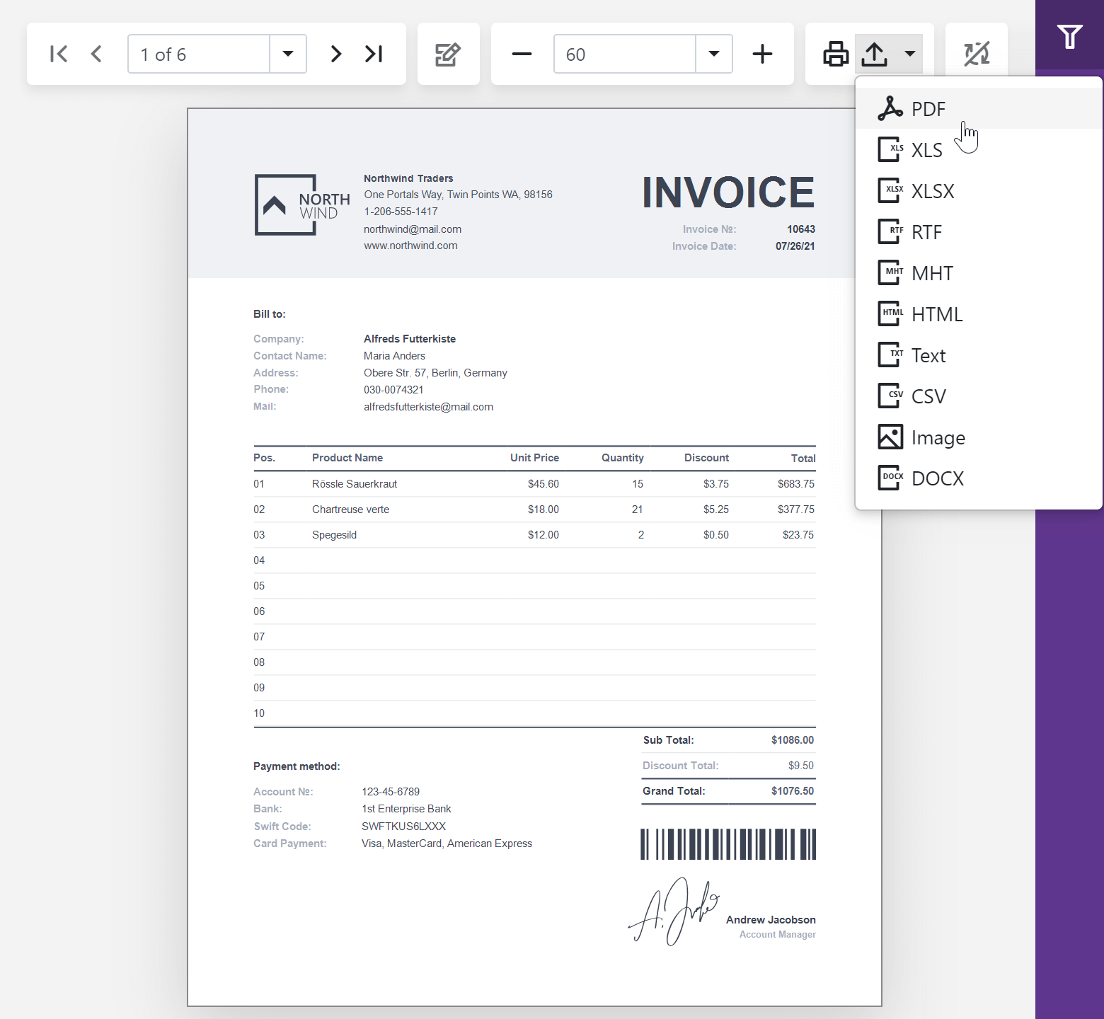
If you have yet to explore our online Blazor Reporting demos, here’s a screenshot of the DevExpress Report Viewer in action:

blazor-native-report-viewer

In our next major update (v21.2), we will extend the capabilities of our Blazor Report Viewer with the following features (and deliver feature parity with our HTML5 Document Viewer):

  • Export Options Panel
  • Search Panel
  • Document Map Panel
  • Ability to resize panels
  • MultiPage View Mode

How To Get Started

If you use the DevExpress Blazor project template, it will take four simple steps to add our Blazor Report Viewer to your page:

  1. Install the DevExpress.Blazor.Reporting.Viewer NuGet package.
  2. Add a few lines of code to the Startup.cs file to register the appropriate DevExpress components.
  3. Add links to the DevExpress Blazor stylesheets to the page.
  4. Add the <DxReportViewer>…</DxReportViewer> markup.

Razor page code is as follows:

<DxReportViewer Report="@Report" RootCssClasses="w-100" @ref="Viewer"></DxReportViewer>

And of course, you’ll need to create a report (an XtraReport or CachedReportSource instance) and assign it to the Report property.

For more information in this regard, please refer to the following help topic: Create a Blazor Report Viewer (Native) Application

Customization

To help modify the Viewer’s appearance and behavior – and to integrate the component within your Blazor application – our Report Viewer ships with a range of customization options. The main API entry point is the DxReportViewer class.

Customize the Toolbar

You can handle the OnCustomizeToolbar event to hide unnecessary/unwanted toolbar items. For instance, the following code hides all export formats except PDF:

@using DevExpress.Blazor.Reporting
@using DevExpress.Blazor.Reporting.Models
// ...
<DxReportViewer @ref="reportViewer"
	OnCustomizeToolbar="OnCustomizeToolbar"
	Report="report"
	RootCssClasses="w-100 h-100"/>
@code {
// ...
	void OnCustomizeToolbar(ToolbarModel toolbarModel) {
		var exportItem = toolbarModel.AllItems
			.Where(item => item.Id == ToolbarItemId.ExportTo).FirstOrDefault();
		exportItem.Items = exportItem.Items
			.Where(format =>
				((ExportFormatItem)format).Format ==
					DevExpress.XtraPrinting.ExportFormat.Pdf).ToList();
	}
}

The OnCustomizeToolbar event also allows you to add a custom toolbar item as needs dictate:

// ...
void OnCustomizeToolbar(ToolbarModel toolbarModel) {
	toolbarModel.AllItems.Add(new ToolbarItem()
		{
			IconCssClass = "oi oi-sun",
			Text = "Sunny",
			AdaptiveText = "Sunny",
			AdaptivePriority = 1,
			Click = async (args) =>
				{
					await YourCustomTaskAsync()
				}
		});
}

Apply Report Parameters

The ParametersModel property allows you to modify report parameters in code and submit them to re-create the document. The following code generates a document with a specific OrderIdParameter:


	var orderParameter = reportViewer.ParametersModel.VisibleItems
		.Where(param => param.Name == "OrderIdParameter").FirstOrDefault();
	orderParameter.Value = 11077;
	reportViewer.ParametersModel.OnSubmitParameters();

You can handle the OnCustomizeParameters event to customize the parameter editor itself. The folllowing code specifies a custom editor for the DateParameter parameter:

// ...
protected ParameterModel parameterModel;
protected DateTime parameterEditorValue
{
	get { return (DateTime)parameterModel.Value; }
	set { parameterModel.Value = value; }
}

void OnCustomizeParameters(ParametersModel parameters)
{
	parameterModel = parameters.VisibleItems
		.Where(param => param.Name == "DateParameter").FirstOrDefault();
	parameterModel.ValueTemplate =
		@<DxDateEdit @bind-Date=parameterEditorValue DisplayFormat="D" Format="d"/>;
}

Localize the Component

You can use standard Blazor localization methods to localize the component’s user interface. Install the DevExpress.Blazor.xx and DevExpress.Blazor.Reporting.Viewer.xx NuGet packages with localized resources to proceed. For more information, review please review our Localization help topic.

Examples

We published customization examples in the following GitHub repositories to help you hit the ground running:

Report Viewer for Blazor - Customization API

This project demonstrates how to customize the Report Viewer component in the following manner:

  • Customize commands in the Toolbar
  • Customize parameter editors

Report Viewer for Blazor - Customize Export

This project demonstrates how to customize the export actions of the Report Viewer component in the following manner:

  • Customize export options
  • Use token-based authentication
  • Manage exported documents

Before You Start Coding

We know that many of you want us to deliver a WebAssembly compatible reporting engine. To help us frame our long-term vision, please do tell us your development strategy in this regard. Do you need to incorporate DevExpress Reports in pure Blazor WebAssembly apps or with an ASP.NET core backend? If you have specific requirements (data type/data volume) or simply cannot use our Blazor Server Report Viewer, please submit a support ticket on the DevExpress Support Center. We'll be happy to follow-up.

Blazor Rich Text Editor - Table and Hyperlink Dialogs (v21.1.5)

$
0
0

Our most recent Blazor UI update (v21.1.5) includes two helpful dialogs for the DevExpress Blazor Rich Text Editor component: 'Insert Table' and 'Hyperlink'. As their name suggests, these new dialogs allow users to create and modify tables or hyperlinks within our Blazor Rich Text Editor.

Note: At present, our Blazor Rich Text Editor component (v21.1.5) is available as a CTP (community technology preview) in the v21.1.5 release.

Insert Table Dialog

The new 'Insert Table' dialog allows users to quickly generate a new table and insert it into an existing document. The dialog includes options to set the table's column and row numbers. Click the 'Table' ribbon item located on the 'Insert' tab to display the dialog.

Blazor-rich-text-editor-insert-table-dialog

Hyperlink Dialog

The editor's new 'Hyperlink' dialog allows users to insert a new hyperlink or edit existing hyperlinks within a document. It includes settings for three hyperlink types: a hyperlink to a web page, a link to a position within the document (bookmark), or an e-mail address.

Click the 'Hyperlink' ribbon item to activate this dialog.

Blazor-rich-text-editor-insert-hyperlink-dialog

Your Feedback Counts

We’d like to hear from you about your development plans and needs. For some quick feedback, please submit your responses to this short survey:

And feel free to post additional comments below. Let us know what you think of our Blazor Rich Text Editor's new dialogs.

.NET MAUI - FREE Early Access Preview of Collection View, Drawer, Tab View and More for Mobile Development (v21.2)

$
0
0

In this post, I’ll describe our latest additions for .NET MAUI Preview 6. To learn more about our Data Grid and Charts, please check out the .NET MAUI Preview 5 announcement. We expect to ship our .NET MAUI controls in November 2021. Before you get your hands on an early access preview (EAP), however, two quick reminders:

  • Reminder: Our Xamarin and .NET MAUI EAP components are available free-of-charge. If you have yet to download your free copy, please visit https://www.devexpress.com/xamarin/ to reserve your free license today.
  • If you are not familiar with Microsoft’s .NET Multi-Platform App UI (MAUI) platform or how Microsoft has positioned MAUI (the evolution of Xamarin Forms), please review Carl Franklin’s interview with Jonathan D, a developer on Microsoft’s MAUI team and Carl’s interview with James M, a well-known Xamarin-MAUI community influencer. Both videos are available on the DevExpress YouTube Channel. Additionally, be sure to check out our FAQ at the bottom of this post for more information.

Prerequisites to Test DevExpress Controls for .NET MAUI Preview 6

If you’re ready to explore the capabilities of our .NET MAUI controls (Data Grid, Charting, Collection View and Navigation library for mobile development), please review the prerequisites for Visual Studio 2022 in our online .NET MAUI documentation.

Early Access and CTP builds are provided solely for early testing purposes and are not ready for production use. This EAP may not include all MAUI features/products we expect to ship in our v21.2 release cycle. As its name implies, the EAP offers an early preview of what we expect to ship in 3-4 months.

What's New for .NET MAUI Preview 6

.NET MAUI Collection View for iOS and Android

The DXCollectionView component uses a template to display a collection of data items in a single column or row in your .NET MAUI apps for Android and iOS. The component is included within the DevExpress.Maui.CollectionView NuGet package and ships with the following  built-in features:
  • Templates for Data Items and Group Headers
  • Data Sorting, Filtering, and Grouping
  • Vertical and Horizontal Scroll
  • Item Drag and Drop
  • Pull-to-Refresh
  • Infinite Scroll
  • Swipe Gestures
  • Multiple Item Selection
  • Themes
  • and much more - please check out the full description for our Xamarin Collection View to see what to expect from its MAUI counterpart.

.NET MAUI Navigation Controls for Android

Navigation views and pages allow you to implement lateral navigation in your .NET MAUI apps for Android. Our Drawer and Tab components are included within the DevExpress.Maui.Navigation NuGet package. For more information on built-in features, please review the following help topics:

Drawer Page | Drawer View

Tab Page | Tab View


.NET MAUI Charting for iOS and Android

DevExpress Controls for .NET MAUI Preview 6 allow you to create native iOS apps (Android app support was introduced in .NET MAUI Preview 5).

Getting Started Tutorials & Examples

Future Plans

We expect to publish NuGet packages for our .NET MAUI Data Editors library and Scheduler Controls shortly. We will also introduce iOS support for our .NET MAUI Data Grid, Drawer, and Tab controls. Said simply, we will synchronize with Microsoft’s preview builds and port all existing Xamarin Forms UI controls to .NET MAUI in the coming months.

Once we port all MAUI controls, we want to add the following capabilities to our MAUI component suite:

  • Migrate to and apply the power of the DevExpress.Data library (we are currently using a clone). This will help us deliver a seamless user experience for DevExpress customers who have used our WinForms, WPF and ASP.NET components in the past.
  • Template Gallery support. This will allow customers to create mobile apps more quickly (we will redistribute a VSIX from the Visual Studio Marketplace).
  • New UI elements such as chips; simplified localization; auto column width within the MAUI Grid, and much more.

Of course, we will further enhance our online documentation, publish more GitHub examples, and videos on the DevExpress YouTube channel.

Frequently Asked Questions

How is .NET MAUI different from Xamarin Forms?

If you're using Xamarin.Forms today, MAUI should be a painless transition as it represents an evolution of Xamarin.Forms – the two platforms have many similarities. For more information, see Xamarin.Forms Are Available Free-of-Charge | Transition to .NET Multi-platform App UI (MAUI).

Is technical support included with the free .NET MAUI preview?

No, this free MAUI preview does not include technical support from DevExpress. Technical support for DevExpress MAUI controls is only available if you own the DevExpress Universal Subscription.

How can I report bugs or share suggestions on DevExpress .NET MAUI development?

If you encounter a bug, please submit a bug report via our online support system: https://www.devexpress.com/ask. For suggestions to our development team, please complete our survey.

Is the source code included in this free .NET MAUI preview?

No. Component source code is not included in this offer.

Will DevExpress .NET MAUI controls be available free of charge once they are released?

We have NOT finalized our product delivery model for .NET MAUI – we may continue to offer our .NET MAUI controls free of charge OR we may bundle them with an existing DevExpress Subscription.

Will your .NET MAUI controls support desktop form-factor (Windows, Linux, macOS)?

We are excited about the capabilities that .NET MAUI offers for cross-platform UI development. We will finalize our plans for desktop support in our MAUI controls in early 2022. In particular, we look forward to further .NET MAUI evolution for Windows (we also ship WinUI controls). As far as I know, Microsoft also has given higher priority to Windows and WinUI support than Linux and macOS at this stage.

What your native control "wrapper" approach means for developers and end-users?

  • Developers can deliver unmatched performance, usability, and functionality to their end-users AND do so using C# and .NET 6 (what’s under the hood "just works").
  • DevExpress UI controls abstract the complexities of native mobile development - our developers did the dirty work for you (= dealt with difficult programming languages and platform specific headaches).
  • Speed, speed, and more speed. For instance, DevExpress .NET MAUI Charts use OpenGL graphics rendering with C++ for the best possible performance on mobile devices, even with millions of points. Our data grid scrolling performance is second to none (when compared to our current competitors). We will publish detailed performance metrics in the coming weeks.

Your Feedback Counts!

If you are currently using Xamarin Forms, considering .NET MAUI, or just investigating your options, feel free to comment below, we’ll be happy to follow-up. Thanks for considering DevExpress for your development needs.

New Blazor Grid - Filter Row, Filter in Code, Group Footer Summary, and more (v21.1.5)

$
0
0

As you may know, we recently introduced an entirely new DevExpress Blazor Grid component in June (available as a CTP version). We continue to improve the capabilities of our new grid and expect to reproduce all the functionality supported by our existing Blazor data grid in short order.

This post summarizes the new features/enhancements we’ve made to the DevExpress Blazor Grid in our most recent minor release (v21.1.5).

If you're ready to switch to the new Grid component right now, please refer to this migration guide.

Filter Row

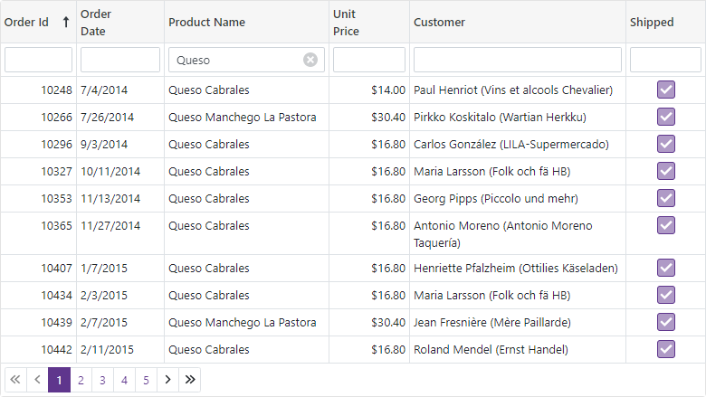
Our Blazor Grid now ships with filter row support – a quick and easy way to incorporate data filtering within your Blazor app. This row displays in-place text editors for all data columns within a given Grid. When a user moves focus into the filter row’s editor, the Grid creates a filter condition based on editor value and applies this condition to the corresponding column.

blazor-grid-filter-row

To activate the filter row, enable the ShowFilterRow option.

<DxGrid Data="@DataSource"
        ShowFilterRow="true">
  @*...*@
</DxGrid>

Documentation | Demo

Customization

We added the following new options to help you customize our Blazor Grid's filter row:

  • FilterRowOperatorType - Specifies the operator used to create a filter condition based on filter row value (Equals, Contains, StartsWith, Greater, Less, and so on).
  • FilterRowValue - Specifies the initial value in the filter row editor.
  • FilterRowEditorVisible - Specifies whether to display the filter row editor.

You can also display your custom editor within a filter row cell (instead of our predefined text editor). To display a custom editor, define a column's FilterRowCellTemplate.

<DxGrid Data="@Data"
        ShowFilterRow="true">
  <Columns>
    <DxGridDataColumn FieldName="OrderId" DisplayFormat="d" SortIndex="0">
      <FilterRowCellTemplate>
        <DxSpinEdit Value="(int?)context.FilterRowValue"
                    ValueChanged="(int? v) => context.FilterRowValue = v"
                    ClearButtonDisplayMode="DataEditorClearButtonDisplayMode.Auto" />
      </FilterRowCellTemplate>
    </DxGridDataColumn>
    <DxGridDataColumn FieldName="OrderDate" DisplayFormat="d">
      <FilterRowCellTemplate>
        <DxDateEdit Date="(DateTime?)context.FilterRowValue"
                    DateChanged="(DateTime? v) => context.FilterRowValue = v"
                    ClearButtonDisplayMode="DataEditorClearButtonDisplayMode.Auto" />
      </FilterRowCellTemplate>
    </DxGridDataColumn>
    <DxGridDataColumn FieldName="ProductName"
                      FilterRowValue='"Queso"'
                      FilterRowOperatorType="GridFilterRowOperatorType.Contains" />
    @*...*@
  </Columns>
</DxGrid>

blazor-grid-filter-row-customization

Documentation | Demo

Filter in Code

You can now set filter options in code. Call the FilterBy method to filter Grid data and the ClearFilter method to reset the applied filter.

<DxGrid Data="@Data"
        ShowFilterRow="true"
        @ref="MyGrid">
  <Columns>
    @*...*@
    <DxGridDataColumn FieldName="UnitPrice" DisplayFormat="c2" />
  </Columns>
</DxGrid>

<DxButton Click="@(() => MyGrid.FilterBy("UnitPrice",
GridFilterRowOperatorType.Equal, 12))">Filter By "Unit Price"</DxButton>
<DxButton Click="@(() => MyGrid.ClearFilter())">Clear Filter</DxButton>

@code {
  object Data { get; set; }
  IGrid MyGrid { get; set; }
  // ...
}

Command Column

Our Blazor Grid now includes a new column type - command. At present, this new command column will only display a Clear button in the filter row. Users can click this button to reset the filter applied to the Grid.

We will extend the command column's functionality to support data management buttons – used to create, edit, and remove data rows.

blazor-grid-command-column

To display a command column, declare a DxGridCommandColumn object within the Columns template.

<DxGrid Data="@Data"
        ShowFilterRow="true">
  <Columns>
    @*...*@
    <DxGridCommandColumn />
  </Columns>
</DxGrid>

You can also display custom content within the column's filter row cell. To do custom content, define the FilterRowCellTemplate.

Documentation | Demo

API Changes

Our Blazor Grid now includes two types of columns: data and command columns.

We made the following API changes to avoid confusion with column names:

  • To add a data column to the Grid, you should now use the DxGridDataColumn class instead of the DxGridColumn class.
  • The DxGridColumn is now labeled as an abstractclass because it contains the base API for both data and command columns.

We've also renamed the following templates:

Group Footer Summary

With v21.1.5, you can display group summary values in group footers. To display summary values in group footers, set the summary item's FooterColumnName property to the name of a group footer column.

blazor-grid-group-footer-summary

<DxGrid Data="@Data"
        ShowGroupPanel="true">
  <Columns>
    @*...*@
  </Columns>
  <GroupSummary>
    <DxGridSummaryItem SummaryType="GridSummaryItemType.Sum"
                        FieldName="TotalPrice"
                        FooterColumnName="TotalPrice" />
  </GroupSummary>
</DxGrid>

Documentation | Demo

Group Footer Templates

Our Blazor Grid now includes the DxGridColumn.GroupFooterTemplate and DxGrid.ColumnGroupFooterTemplate properties. These properties allow you to customize group footers as requirements dictate.

Group Footer Display Mode

By default, our Blazor Grid will display group footers when the corresponding groups are expanded and contain either summary values or custom template content.

You can now modify the manner in which group footers are displayed by defining the new GroupFooterDisplayMode property. Simply use one of the following options: Always , Never , or IfExpanded.

<DxGrid Data="@Data"
        ShowGroupPanel="true"
        GroupFooterDisplayMode="GridGroupFooterDisplayMode.Always">
  @*...*@
</DxGrid>

For consistency, we also renamed the ShowFooter option to FooterDisplayMode so it closely matches GroupFooterDisplayMode. The FooterDisplayMode property allows you to manage the visibility of the Grid's footer section.

Column Name

We also introduced a Name property for all Grid columns. Use this property to specify a unique identifier for a given column (once named, use it to reference the column when creating total or group summaries).

This property will be helpful for columns where the FieldName property is not specified (command columns or data columns with custom display templates).

WPF MVVM – A New Way to Work with Events

$
0
0

Our latest release (v21.1) includes a series of new MVVM-related enhancements for our WPF product line. These enhancements make it much easier to process control events at the ViewModel level (as you’ll soon see, we added multiple command properties and extended EventToCommand behavior capabilities).

In previous versions, events could be processed in the ViewModel in the following manner:

  • Use the EventToCommand behavior to execute a command in response to a raised event.
  • Use the DXEvent mechanism to bind an event to a ViewModel method.

These techniques did not allow you to specify a return value (for example, if you need to set e.IsValid for the ValidateCell event). Previous versions required that you write complex behaviors or pass UI-dependent event args to your ViewModel.

With v21.1, we addressed this limitation and extended MVVM support on a few fronts.

New Command API in our WPF Data Grid

This release includes multiple properties designed to bind a ViewModel’s commands to a control. These properties are command counterparts for WPF Data Grid events that expect a return value:

ValidateRow event -> ValidateRowCommand property

CustomColumnDisplayText event -> CustomColumnDisplayTextCommand property

You no longer need to write special converters. The ViewModel obtains a typed parameter that exposes UI-independent event args. You can modify this parameter at the ViewModel level and return values back to an event. Consider the following example wherein our WPF Data Grid uses a command to customize cell values:

<dxg:GridControl CustomColumnDisplayTextCommand="{Binding CalculateDisplayTextCommand}"/>
public class ViewModel: ViewModelBase {
    // ...

    [Command]
    public void CustomColumnDisplayText(ColumnDisplayTextArgs e) {
        if (e.FieldName == "Value")
            e.DisplayText = string.Format("{0:n2}", e.Value);
    }
}

Refer to the following article for a full list of new command properties: Data Grid Command API. Each property includes a command usage example and includes a link to the corresponding event.

New Command API in Virtual Sources

As you probably know, previous versions of our Virtual Sources were only able to use event handlers to implement data operations. We received numerous suggestions in this regard and were asked to improve event processing at the ViewModel level. We listened and with this release, you simply need to declare a virtual source in XAML and bind its new command properties to process these events at the ViewModel level:

<dxg:GridControl.ItemsSource>
    <dxg:InfiniteAsyncSource ElementType="{x:Type local:IssueData}"
        FetchRowsCommand="{Binding FetchIssuesCommand}"
        GetTotalSummariesCommand="{Binding GetTotalSummariesCommand}"
        GetUniqueValuesCommand="{Binding GetUniqueValuesCommand}">
    </dxg:InfiniteAsyncSource>
</dxg:GridControl.ItemsSource>

You can incorporate data operations at the ViewModel level without introducing UI dependencies. Command parameters expose a platform-independent API that allows you to pass data from the ViewModel to the Data Grid:

public class ViewModel : ViewModelBase {
    // ...
    
    [Command]
    public void FetchIssues(DevExpress.Mvvm.Xpf.FetchRowsAsyncArgs args) {
        args.Result = GetIssuesAsync(args);
    }
}

To learn more, please review the following example on GitHub: How to Bind to InfiniteAsyncSource.

EventToCommand - Event Args Back Conversion

If you want to handle an event that does not have a command property, you can use the EventToCommand behavior and bind your command to the event manually.

We extended EventToCommand capabilities to allow you to define back conversion logic. When you pass event args to a command, you can modify them and return values to the event as needed:

<dxe:TextEdit EditValue="{Binding UserName}">
    <dxmvvm:Interaction.Behaviors>
      <dxmvvm:EventToCommand Command="{Binding UserNameValidationCommand}"
                             EventArgsConverter="{local:ValidateEventArgsConverter}"
                             EventName="Validate"/>
    </dxmvvm:Interaction.Behaviors>
</dxe:TextEdit>
public class ValidationArgs {
    public string ErrorContent { get; private set; }
    public object Value { get; }

    public ValidationArgs(object value) => Value = value;
    public void SetError(bool isValid, string errorContent) => ErrorContent = isValid ? null : errorContent;
}

public class ValidateEventArgsConverter: EventArgsConverterBase<ValidationEventArgs> {
    protected override object Convert(object sender, ValidationEventArgs e) => new ValidationArgs(e.Value);
    protected override void ConvertBack(object sender, ValidationEventArgs e, object parameter) {
        var args = parameter as ValidationArgs;
        e.IsValid = args.ErrorContent == null;
        e.ErrorContent = args.ErrorContent;
    }
}

To learn more about this extended behavior, please refer to the following example on GitHub: How to Use Two Way Conversion.


We hope that these enhancements will be of value and allow you to maintain clean MVVM patterns within your applications when using DevExpress UI controls. Should you have any questions or need additional assistance, please post your comment/feedback below.

CodeRush for Visual Studio 2022 Preview is Now Available

$
0
0
Our most recent CodeRush update (v21.1.6) includes the new CodeRush for VS 2022 extension that supports the Visual Studio 2022 Preview. This extension contains all the currently available CodeRush features and you can download it from the Visual Studio Marketplace (the existing CodeRush extension continues to support Visual Studio 2015, 2017, 2019).
We are using a separate “CodeRush for VS 2022” listing in the Visual Studio Marketplace to denote compatibility with the preview version of VS 2022. When Microsoft ultimately ships Visual Studio 2022, we intend to integrate our VS 2022 extension back into a single CodeRush listing on the marketplace (so one download will get you access to CodeRush supporting Visual Studio versions 2015 through 2022).
We also marked our new CodeRush for VS 2022 extension as “Preview" to give us time to verify a stable integration with Visual Studio 2022 and to get feedback on any possible issues before we release.

How to Install

To access the CodeRush for VS 2022 extension from the Visual Studio Marketplace:
  1. Start the Visual Studio 2022 Preview.
  2. Open the Extensions | Manage Extensions menu item.


  3. In the Manage Extensions window, select the Online tab, search for “CodeRush”, find the CodeRush for VS 2022 extension, select it, and click Download.


  4. Wait until the downloading process completes.


The installation process is similar for all supported Visual Studio versions. For more information, see this article: Install from Visual Studio Marketplace.
If you already have a CodeRush subscription, you can also download a registered version from the DevExpress Download Manager and install it using the .exe installer.

Your Feedback Matters

As always, we welcome your thoughts. Please comment below and let us know what you think about our new preview extension. If you have specific questions or need assistance with CodeRush, feel free to contact us through our Support Center (support@devexpress.com).

Rush Snippets - Key Features and New Enhancements (JavaScript Support, Advanced Imports Generation, and More)

$
0
0

Recently we released Rush Snippets, which includes over 500 code snippets for VSCode.

Here we'll review key features of Rush Snippets and describe new functionality available in the latest update.

Overview

We should probably lead with the fact that Rush Snippets is free, and we have no plans to ever charge for it. We also plan to continue enhancing and maintaining it moving forward, so it's a win-win for VSCode developers.

Secondly, we should emphasize that Rush Snippets delivers significantly more power than what you might otherwise find in a typical collection of snippets. It has been carefully crafted by a dedicated team of developers with over 100 years combined experience building dev tools.

Some highlights of what sets Rush Snippets apart:

  • We Check the Context

    Before expanding any Rush Snippet, we first ensure the code surrounding the caret matches the expected context for the snippet. So Intellisense only lists snippets that make sense for the active code you're in. This reduces noise and keeps Intellisense fast and easy to use. This also means it's unlikely you'll ever get an unexpected snippet expansion. Rush Snippets are built to only expand where they make sense.

  • Rush Snippets Correctly (and Automatically) Generate Imports

    Rush Snippets adds missing dependent imports to the top of the file, if needed, to support the code in the expanding code snippet. New imports are placed alongside existing imports. Rush Snippets also checks if the necessary module import already exists, and only adds modules that need to be declared.

  • Discoverability and Speed

    Rush Snippets deliver two kinds of Snippet shortcuts - ultra-short and descriptive.

    Ultra-short abbreviations are for when you need to create code with maximum speed and efficiency. These snippets are the shortest path from thought to code.

    We also ship snippets with longer, more descriptive names. These more descriptively named snippets improve discoverability, and make the full product accessible without training or memorization. We use meaningful expressions in a standard format, so it's easy to find useful snippets quickly with Intellisense. Like this:

  • More Than a Placeholder

    To mark a section for change, traditional snippets from other companies use tabstops and placeholders. Rush Snippets has taken this technology to the next level in two ways:

  1. We use Fields as a replacement for placeholders, and we use Links to connect placeholders that must have matching text. Fields are rendered with an amber frame around the placeholder text. And unlike traditional placeholders, Rush Snippets fields are solidly anchored in the code, so they still work even if you navigate through the file or switch to another document (for example, while gathering/viewing code elsewhere while entering snippet placeholder data).

  2. We also correctly update link and field positions as you edit the text. So, you can make any changes you like to the code (even outside placeholder fields) and the links will still work, staying right where they belong, in sync with your changes.

The technology is simple, and it just works. Like you'd expect from a professionally-crafted product.

You can read more about Rush Snippets here: Rush Snippets - Speed Up Your Coding in VS Code.

Rush Snippets - Latest Update

The latest Rush Snippets release introduces new snippets for JavaScript projects, React hooks, and advanced imports generation. See the sections below for more details.

JavaScript Support

With the new JavaScript support in this version, Rush Snippets makes JavaScript development fast and easy, and also provides easy access to sophisticated React and Redux library constructs.

TypeScript Support

Rush Snippets also contains snippets for TypeScript (with React and Redux support). You can find a full list of these snippets on the product page.

Improved Imports Generation

It's rare to find a third-party snippets engine for VSCode that includes an understanding of the language, let alone the supporting frameworks. Most third-party snippets are just simple text expansions. And for that reason, if imports are needed to support a snippet they either need to be added manually (by you) after expansion or they typically expand in-place (in the wrong place) along with the snippet text. This traditional approach can easily lead to disorganized or incomplete code, increasing the burden on you to fix the "broken code". It's the opposite of what you want from a productivity tool.

As sometimes seen in competing products, here's an example of the absolutely wrong way to expand snippets with imports:

Snippets should be smarter. And with Rush Snippets they are.

With Rush Snippets, necessary imports are automatically and intelligently added at the top of the file where they belong, rather than being haphazardly dropped at random places in the code. Organized code is good code.

We also check existing imports to avoid duplicating code. Because duplication erodes code quality.

In our latest update, we took our obsession with both quality and organized code to the next level. Now, if a file already imports a required module (but is missing a reference to a needed export, such as useState), then we simply modify the imported object list (instead of adding new modules).

This is how it looks in practice (keep your eyes on line 1 when the snippet expands):

All this effort helps keep the code simple and easier to read. And that's important.

React Hooks Support

React Hooks are a well-established practice for developers who work with React. React Hooks allow you to easily consume React features (for example, state) without declaring component classes. A comprehensive list of React hooks, their detailed descriptions, and code examples are available here: Hooks API Reference.

This Rush Snippets update introduces snippets support for the following hooks: useState, useEffect, useContext, useReducer, useCallback, useMemo, useRef, useLayoutEffect, and useDebugValue.

Looking Ahead

In the first Rush Snippets release we shipped a collection of snippets for TypeScript with support for two UI libraries - React and Redux. In this release, we added support for JavaScript and made our import generation even smarter.

And we expect to continue evolving this product and plan to support other popular libraries, such as Angular and Vue, soon.

Your Feedback Matters

Did we mention that Rush Snippets is totally free, and that you can download it now from the VSCode marketplace? Get it here: Rush Snippets.

If you’re working in VSCode, give Rush Snippets a try and let us know what you think. We look forward to see your feedback/thoughts on Github.

DevExtreme - SCSS, ES6 Modules, and Enhanced TypeScript Support (v20.2-v21.1)

$
0
0

In this blogpost, we’ll review important changes introduced to DevExtreme over our last two major release cycles, including style sheet migration to SCSS, introduction of ES6 modules, and TypeScript enhancements. Should you have any questions on these changes, please comment below or submit a support ticket via the DevExpress Support Center.

SCSS Support

As you know, most front-end developers prefer CSS language extensions (such as Less or Sass) versus pure CSS. These extensions support variables, reusable styles, modular design, and allow developers to write styles as if they were writing code.

DevExtreme has been using CSS language extensions since day one. Previously, our style sheets were written in Less. However, over the last couple of years Sass (specifically, the SCSS syntax of Sass) has gained popularity among the front-end community and major projects, such as Bootstrap and Material. Unfortunately, Less and Sass style sheets are incompatible with one another. Said simply, our Less style sheets could not be used in a Sass project. Based on usage and internal metrics, we decided to migrate DevExtreme style sheets to Sass.

Since v20.2, the devextreme npm package includes SCSS sources. You can modify SCSS variables and imports to create custom themes as needs dictate. Because our style sheets are modular, you can compile only those styles that you actively use within your project.

Please refer to the following discussion page to learn more: DevExtreme Style Sheets - Migration to Sass.

ES6 Modules

In our v21.1 release cycle, we added a set of ES6 modules to our npm package. ES6 modules allow DevExtreme code to be optimized via Tree Shaking and compatible with modern JS bundlers.

Note that the npm package also contains the old CommonJS version of DevExtreme modules for backward compatibility. In most instances, your bundler will switch to the ES6 version automatically.

Although the introduction of ES6 modules is a big step toward bundle size optimization, there’s still room for improvement. Our goal for upcoming releases is to further split the modules into smaller and more independent segments. You can track our progress and leave your feedback in the following discussion page: ES6 Modules.

TypeScript Enhancements

Also in our v21.1 major release, we enhanced event argument typings and separated jQuery types. Every event argument now includes a named type that you can use within your code:

import { AppointmentUpdatingEvent } from 'devextreme/ui/ scheduler;

function handleAppointmentUpdating (e: AppointmentUpdatingEvent): void {
       // ...
}

These types contain information about optional and read-only properties for an event object:

type AppointmentUpdatingEvent = EventInfo<dxScheduler> & {
  readonly oldData: any;
  readonly newData: any;
  cancel?: boolean | PromiseLike<boolean>;
}

We also separated jQuery types to ensure that they are used only with jQuery. For example, there were properties that previously had the following type: Promise<T> & JQueryPromise<T>. You could assign a jQuery promise to these properties even if your project did not use jQuery. From v21.1 onward, the properties accept JQueryPromise<T> only when jQuery is used, and Promise<T> otherwise.

In addition, we continue to expand our TS definitions. You can expect the following enhancements in future release cycles:

  • Stricter typings (no any)
  • Enhanced data layer typings
  • More reusable types

Feel free to join the discussion on GitHub and share your specific requirements with us in this regard.

Your Feedback Matters

As always, should you have specific needs or wish to share your opinions with us, please post a comment below or engage us via our dedicated DevExtreme discussion pages.

Viewing all 2417 articles
Browse latest View live