This post covers the DevExtreme Chart and Range Selector widgets, which are available for jQuery, as Angular components, ASP.NET MVC and ASP.NET Core MVC controls, and as Knockout bindings.
In v17.2, the dxChart and dxRangeSelector controls introduce a small but very useful feature: scale breaks a.k.a. axis breaks. This solves the problem where values in a chart have such a high amplitude that some series points are rendered very small, possibly almost invisible but certainly too small to interact with.
Scale breaks make such charts more useful by skipping parts of the scale. You can declare a collection of custom scale breaks, which is supported for both the value and the argument axis. The breakStyle property allows visual customization of the break appearance.
In the v17.2 release, we've updated many of our ASP.NET controls to use adaptive dialogs. I talked about this feature in this recent ASP.NET Spreadsheet post.
Adaptive Dialogs
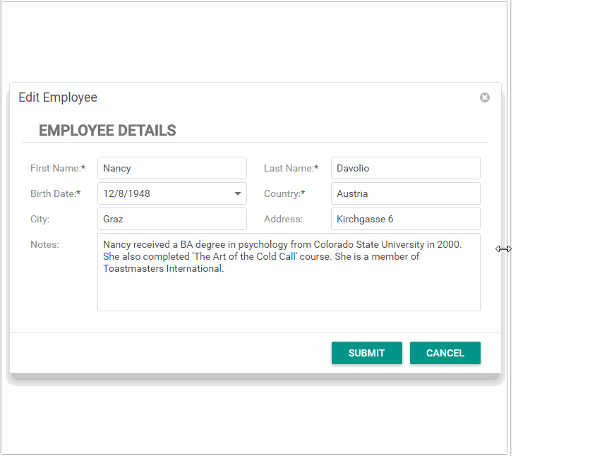
An adaptive dialog will resize its content automatically according to the screen resolution. For example, here's the DevExpress ASP.NET RichEdit's File Open dialog that now supports adaptive behavior:
To achieve this, we used the FormLayout and Popup controls in adaptive mode. For v17.2, we added the adaptive layout feature to the Popup control. Check out the online demos of these controls here:
We use our smaller controls within our larger controls. So the DevExpress ASP.NET Scheduler, RichEdit, etc. now get the benefits of these smaller controls because we use them for functionality like dialogs.
Which Controls?
These four major controls now make use of adaptive dialogs now with v17.2:
Last week, I shared details of our upcoming WPF Dashboard Viewer (CTP). In this post, I’ll describe one of the performance enhancements we’ve incorporated into DevExpress Dashboard v17.2.
Performance is Priority #1
By utilizing a new way to prep data for analysis, we’ve improved data processing and calculation speed across numerous usage scenarios. DevExpress Dashboard now splits underlying data into separate parts which are processed in different CPU threads. As you might expect, this means that you can expect improved performance proportional to the number of cores in your CPU.
Faster is Better
Rather than waste time with hyperbole, we thought it best to illustrate how much faster DevExpress Dashboard v17.2 is when compared to its predecessor. We created the following test to determine data processing speed on a machine with the Intel Core i7 processor (4-cores):
Microsoft's Contoso Dataset with the following SQL request (12M records returned)
select "FactOnlineSales".*, "DimProduct".*, "DimProductSubcategory".*,"DimProductCategory".*
  from ((("dbo"."FactOnlineSales" "FactOnlineSales"
  inner join "dbo"."DimProduct" "DimProduct"
       on ("DimProduct"."ProductKey" = "FactOnlineSales"."ProductKey"))
  inner join "dbo"."DimProductSubcategory" "DimProductSubcategory"
       on ("DimProductSubcategory"."ProductSubcategoryKey" = "DimProduct"."ProductSubcategoryKey"))
  inner join "dbo"."DimProductCategory" "DimProductCategory"
       on ("DimProductCategory"."ProductCategoryKey" = "DimProductSubcategory"."ProductCategoryKey"))
First Test Case
In our first test, we measured data calculation speed for the Grid Dashboard item using the following dimension and measure columns:
Dimensions: ProductCategoryName, ProductSubcategoryName, DateKey (with the Quarter-Year group interval)
Measures: TotalCost, SalesQuantity (all with the Sum summary types).
Data calculation performance for our second test case was as follows:
Needless to say, DevExpress Dashboard v17.2 is significantly faster than its predecessor (3x faster for the first test case and 5x faster for the second).
Should you have any questions about the performance related enhancements to DevExpress Dashboard for .NET or want to share your thoughts with us, feel free to email us support@devexpress.com or submit a comment below.
Three weeks ago, at the start of our beta period for v17.2, I described a fascinating new feature for our data grid in WinForms: sidestepping GDI+ and going straight to DirectX for way faster rendering. At the time I mentioned that, unfortunately, it was limited to apps running under Windows 8 or later.
Well, no more. I am delighted to announce that this new direct-to-DirectX support is now available for grids in apps that run on Windows 7 as well. It’s there in the current version, no need to wait for the next minor.
One of the major themes for the DevExpress ASP.NET Controls in the v17.2 release was 'Adaptive' or the ability to resize content automatically according to the screen resolution.
I've talked about the adaptive features of our other controls here:
With the v17.2 release, the DevExpress ASP.NET Menu also gets an Adaptive feature: Side Menu Mode.
The DevExpress Menu control can automatically transform into a vertical side-menu when the horizontal menu doesn't fit completely on the screen.
You can specify the width of the browser which will determine how the horizontal menu will transform into a side menu. To enable this adaptivity mode, set the EnableCollapseToSideMenu property to true. The new adaptive mode can operate with the existing EnableAutoHideRootItems mode too.
Here is an animated gif to show you how it works:
Experience our online ASP.NET Menu demo here: Responsive Menu
ASP.NET MVC supported
The DevExpress ASP.NET MVC version of our Menu also supports adaptive 'Side Menu Mode' too.
Try it today
You can test these new features today by downloading the DXperience v17.2 that is available in your download center (for existing customers).
Now that the DevExpress Dashboard has been out for a few releases, we're seeing a growing demand from our customers for improving the Web Dashboard usage on mobile devices.
Good news! In this v17.2 release, we have experimented with a Mobile layout to make dashboards more user-friendly and interactive on mobile devices, as they are on Desktop browsers. This new mobile layout will be available as a CTP (Community Technology Preview) in the v17.2 release.
This was a challenging task to adapt a Dashboard that has many visual controls on it and shrink it to fit on mobile browsers. There are some difficulties centering around the Dashboard concept itself. For example, in dashboards, a user interacts with multiple connected items at the same time; but that is not possible on smartphone apps because of the small viewing area.
However, we've come up with a good solution. Our new mobile version will attempt to find a balance between usability of the entire dashboard versus viewing and interacting with one particular Dashboard Item.
This meta tag is a common requirement for Mobile Browsers.
Go to the Web Dashboard declaration and register the Mobile Layout extension using the following code snippet:
function onBeforeRender(sender) {
  var dashboardControl = sender.GetDashboardControl();
  dashboardControl.registerExtension(
    new DevExpress.Dashboard.MobileLayoutExtension(dashboardControl)
  );
}
That’s it. Note that a mobile layout does not replace the classic layout; it’s enabled only in certain conditions:
The Web Dashboard control is set to the Viewer / ViewerOnly mode
The page is open in a mobile browser
Tip: You can use the Device Mode in the Chrome Developer Tools to test mobile views.
Project Status
Once again, this is a CTP version. Report any issues, missing functionality, or suggestions as regular Support Center tickets. We'll be happy to review your feedback and optimize the API based on what we hear. This also serves as a reminder that the API is subject to change until we officially release.
Known limitations
This current version of the Dashboard's mobile layout does not visually indicate a Dashboard Item Group. This means that dashboard items filtering may not work in an obvious way for the end users. To avoid this issue, we recommend that you not show a dashboard with Groups in the Mobile Layout.
We'll continue to work on improving the Dashboard before the final release.
Are you excited by the DevExpress Web Dashboard's Mobile Layout? Drop me a line below.
Starting with the v17.2 release, the DevExpress ASP.NET Popup Control has a new adaptive mode. In this mode, the popup will resize its content automatically according to the screen resolution. This mode provides the best experience for a user on any device, whether it's on the desktop, a tablet, or a phone. You can also configure the maximum and minimum widths to limit the resizing area. This mode supports a fixed header and footer, which will always be displayed regardless of the scroll position.
Check out the AdaptiveLayout demo page that shows how to create adaptive dialogs using the Popup and FormLayout controls:
Mode Switch
The Popup control can also switch modes. You can show the default popup on wider screens and then switch it to adaptive mode on small screens using the PopupControlAdaptivityMode.OnWindowInnerWidth property:
The following video shows how to quickly create an adaptive form using Popup and FormLayout controls:
As you may already know, our most recent release includes an important update to our WinForms Grid and its ability to display charts and visualize data within individual grid cells.
In previous versions, your ability to embed a chart within a grid cell required writing lots of custom code. With v17.2, we’ve reduced this requirement significantly and improved overall functionality. Simply said, v17.2 creates a real nexus between our WinForms Grid and WinForms Chart controls – a nexus designed to help you deliver the best possible user experience across a variety of usage scenarios.
Improved User Experiences for WinForms Developers
Before I show you how easy it is to use this feature, I want to describe why we’ve worked to improve the nexus between our Grid and Chart controls and why you should consider its use for your next WinForms project.
As I hope the following image demonstrates, embedding a chart within our WinForms Grid offers numerous UI/analytics options that simply do not exist when using standalone charts.
This sample app details sales trends/sales projections by state. When data visualizations (charts) are incorporated into our Grid, key information is available to end-users at a single glance. Were we to try and analyze this data using a standalone chart, users would need to navigate individual records and would be unable to understand relevance/consequence in a single snapshot.
Go Beyond the Ordinary
If you’ve used our WinForms Grid in the past, you may be familiar with our Sparkline cell editor – a visualization option designed for simple use-case scenarios.
The nexus between our Grid and Chart control gives you endless visualization options that do not exist when using sparklines. From cross-hair cursors to the display of multiple series (see image above), you can now create decision support systems that are informative AND intuitive…Yes, with v17.2, you can reduce screen clutter and UI complexity – you can improve usability and create apps that exceed expectations.
Getting Started
Adding a chart to individual WinForms Grid cells is easy – here’s how we created the sample used in this blog post.
All charts displayed within our WinForms Grid are cached and will have a minimal impact on performance. Needless to say, each situation and use case is different so if you do encounter performance issues, please don’t hesitate to contact our support team – we’ll be more than happy to assist.
Tell us what you think – how likely are you to embed Charts within our WinForms Grid control? Will you be able to leverage this new feature in your next project?
We are excited to announce that the DevExpress ASP.NET Office controls, Spreadsheet and RichEdit, are getting improved scalability support.
Scalability is the capability of a system, network, or process to handle a growing amount of work, or its potential to be enlarged to accommodate that growth - Wikipedia
Starting with the v2017.2 release, we're providing a Community Technology Preview (CTP) that supports the following excellent features:
Web Applications using these controls can be scaled (in/out) easily
"Sticky Session" / "Session Affinity" is not required, any load balancing is welcome
Microsoft Azure and any cloud computing platforms with IIS are supported
Web Farms and Web Gardens are now supported
Scalability issues are not a problem for most customers. If you're hosting your web application on a single server, then you've not faced any scalability issues. However, for those customers using web apps on scalable hardware then they will be happy to hear about the improved support.
What's the problem?
The ASP.NET Spreadsheet and RichEdit controls are large powerful controls that provide rich functionality. When you open and work on a document in these controls, we need to keep track of the state. Things like the document structures, etc.
Previously, the ASP.NET Spreadsheet and RichEdit controls kept their state of opened documents in the web server's memory (RAM). This approach has an advantage for performance because the parsed document structure was in memory and ready to process the user's requests. However, using RAM to keep state makes the web server stateful and therefore not easy to scale (in/out).
Initially, we came up with a solution for Microsoft Azure that implemented smart routing and used the "Sticky Session" / "Session Affinity" mode to route document-specific user requests exactly to that appropriate web server. Unfortunately, this solution was complex to setup and implement. It also required the "Sticky Session" / "Session Affinity" mode which made balancing the application load less effective. And because it was only available for Azure, it didn't solve other customers who hosted on other platforms like Amazon AWS.
A Better Solution
In the v2017.2 release, the ASP.NET Spreadsheet and RichEdit controls now support an important new mode that allows you to store the opened document states in external storage. This will provide great scalability benefits.
The new mode allows you to not have any state between requests and therefore provides for non-stateful web servers with our RichEdit and Spreadsheet controls. This allows you to host on multiple-server solutions like cloud, web farms, web gardens, etc.
So servers that have no state are treated equally and can process any request. This provides several benefits:
load balancers can effectively spread the workload among other “stateless” web server instances
another great benefit of external state storage is that your web servers can be rebooted/updated/removed with no additional code required to save (or rescue) the state (scale in)
new web servers can also be added on-demand and they start the same as any other web servers in the pool. Therefore they can start participating in the application request processing right away (scale out)
Who is it for?
This new scalability mode and solution is for those who are developing scalable application with DevExpress Office Controls. This new solution allows you to build applications that are hosted on top of cloud computing platforms (with IIS), Microsoft Web Farms, or Web Gardens.
Storage Options
The 'document states' can be stored externally in one of following storage containers:
MS SQL Server database
Redis in-memory data structure store
We chose the above two because of their popularity. Supporting a storage container requires us to create a special 'Document State Provider' interface. We published two such providers for Microsoft SQL Server and Redis respectively. And it's also possible to develop others providers to support more storage containers.
How to enable it?
To turn on the new feature, set the desired document provider in your project's Global.asax file:
void Application_Start(object sender, EventArgs e) {
    ...
    var provider = new DevExpress.Web.SqlOfficeStateProvider.SqlOfficeStateProvider(connectionString);
    // or
    //var provider = new DevExpress.Web.RedisOfficeStateProvider.RedisOfficeStateProvider(connectionString);

    DevExpress.Web.Office.DocumentManager.StateProvider = provider;
    ...
}
In the sample code above, the connectionString refers to the connection string for your storage.
GitHub Sample
To help you test this, we've created and published a sample repo on GitHub:
Your feedback will help us decide the future direction. Please take a minute to fill out this short four question survey about your plans for ASP.NET Core usage:
.NET Core Survey - surveyjs.com
Are you excited by the DevExpress Office Controls support for scalability? Drop me a line below.
Whether used on a standalone basis or within container controls such as our WinForms Grid or TreeList, lookups are indispensable. Over the years, we’ve created numerous lookups to help you address a wide range of usage scenarios. The purpose of this post is to clarify some of the questions we receive about lookups and hopefully explain the purpose behind the lookup controls included within our WinForms subscription.
Before I describe each control individually, I’ll first focus on the similarities between each DevExpress Lookup control.
Data Source Types
All DevExpress Lookups support the same range of available data source types: from simple List and Array objects to remote data sources running on a web-server. For a complete list, please refer to the following help document.
Cascading Record Selection
All DevExpress Lookups support a CascasdingOwner property. As its name implies, this feature allows individual lookups to serve as filters for one another. The following animation demonstrates the value of this property.
Display and Key Members
All DevExpress Lookups allow you to specify different data source fields for Key (values that identify business objects) and Display (values visible to end-users when they select drop-down items) members. For example, in the animation above, the first lookup displays "CategoryID\CategoryName" value pairs. CategoryID is the Key Member needed for cascading record selection and CategoryName is used for display purposes.
Inserting New Records/Values
At their core, all DevExpress lookups are text boxes with a “linked” dropdown menu. Based on business needs, you can put this text box to a good use and allow users to enter new values at any time. For more information on adding records using the lookup’s text field, please refer to the following help document.
Unbound Records/Values
All DevExpress Lookups allow you to display/use unbound values. Though the exact implementation for each lookup differs slightly, you are in total control when using our lookups in unbound mode – you can even mix bound/unbound values as needs dictate.
Resizable Dropdown Windows
To help improve visibility across screen resolutions and remove constraints associated with the dimensions of the control itself, all but one of our Lookups allow end-users to resize “linked” dropdown windows –. The following animation helps demonstrate the value of this all-important feature.
Choosing the Right Lookup Control for Your Next WinForms Project
Now that I’ve described the similarities between our lookups, I’ll focus on each lookup individually and offer you a few use-cases that should help you decide which control to use in your next desktop app.
Standard Lookup Edit (LookUpEdit)
The first lookup I’ll discuss is our venerable LookUpEdit - a lightweight lookup with a simple table layout. Its power lies in its simplicity and we suggest that it be used when you need to display straightforward lookup info (no images, no need for search or advanced capabilities).
Grid-based Lookup Edit (GridLookUpEdit)
The next control on our list is our Grid-based Lookup. As its name implies, this control uses our WinForms Data Grid within its “linked” dropdown. The functionality available to you when using this lookup is nearly endless (display multiple columns, display images, sort against multiple column values, apply filters, etc).
Among the features that differentiates our Grid-based Lookup from our standard lookup is its ability to visualize lookup data. The default View used within the dropdown is our standard Grid View. By using its PopupViewType property, you can add bands to the default tabular layout (you can select between Banded and Advanced Banded Views), or utilize the Tile View when application needs warrant.
By using the Grid-based Lookup’s Tile View, you can improve usability when lookup records include important images (images that require emphasis). The Tile View allows you to manually build templates to highlight important content.
TreeList-based Lookup Edit (TreeListLookUpEdit)
Our TreeLIst-based Lookup is displays a TreeList within its dropdown. It’s been designed to allow users to select values from a tree-like hierarchy. This is definitely a specialized control and was designed for users that need to simplify record selection from hierarchical lists.
Lookup with Integrated Search (SearchLookUpEdit)
The next lookup I want to highlight is our SearchLookUpEdit control – a Grid-based lookup with an embedded Find Panel. As its name implies, this lookup simplifies record selection by allowing users to filter records displayed within the dropdown(the control highlights matching results and supports delayed auto-search mode for optimal performance).
Image ComboBox (ImageComboBoxEdit)
This lightweight lookup is suitable for use when you must display a limited number of unique values. You can supply images for each lookup item and can easily populate the control at runtime - no need to have a data source attached. Includes Enumeration support.
As you may know, our WinForms Grid, TreeList and Vertical Grid controls allow end-users to filter data using Excel-like filter popups. These filter popups were designed to display unique filter options based upon the data type associated with a column.
With our most recent release (v17.2), this feature is now available to those of you using our WinForms Pivot Grid control.
To see this new feature in action, be sure to run our Excel Style Filtering demo. If you have our Demo Center installed (v17.2), you can launch the demo using this link.
This new filtering option has the following advantages over classic filter popups and pre-filters:
Automatic Filtering Options based upon a Field's Data Type
The Pivot Grid detects the filtered field's data type and selects the appropriate UI. For instance, the filter popup displays list of values for string fields...
... a range selector for numeric values ...
... or tree-like filter for date-time values.
Extended Filtering via the Filters Tab
For maximum flexibility, end-users can select from a wide range of predefined operators (such as Begins with, Equals, Contains, etc).
Instant Search
Built-in search allows end-users to locate required values within the filter popup.
Integration with External Filters
Our WinForms Pivot Grid's filtering UI is fully synchronized with our external filter editors (generated using the Filtering UI Context component). This means that any filter operation performed using the Pivot Grid UI is reflected in external filters (and vice versa).
Predefined Filters
Predefined filters can be used to apply filters using specified values missing in an underlying data source.
Filter Editor Support
Filters applied using the Excel-style filter popup can be changed within the Filter Editor dialog, allowing end-users to apply complex filter conditions when necessary.
Instant Filtering
The Pivot Grid immediately updates its data once you change filter values within the popup - without the need to click any buttons.
Important Note: Excel-style filtering is not enabled by default for new projects because it has some limitations:
You cannot use this feature in OLAP mode.
Excel-style filters cannot be used for group filtering.
We expect to support OLAP mode and group filtering in our v18.1 release cycle.
Excel-Inspired Conditional Formatting
Conditional formatting allows you and your end-users to alter the appearance of individual data cells based on specific conditions - and highlight critical information, identify business trends and compare data points. The Pivot Grid's context menu provides a number of presets that allow users to create rules without formulas:
Below are some common usage scenarios...
Highlight values that are less than a specific threshold (4,000,000 in the example below):
Highlight best or worst values. Top 5 trademarks are highlighted in the image below:
Use Color Scales to quickly compare high and low values using their color representation.
When you use conditional formatting to show Data Bars, the Pivot Grid draws a bar in each cell whose width corresponds to the value of the cell relative to the other cells.
Finally, end-users can change rules in our Excel-inspired Rules Manager:
Please take a moment to try our newest WinForms Demos and tell us what you think about these Excel-inspired Pivot Grid features.
Our most recent release (v17.2) ships with three Visual Studio-inspired themes. These themes are a great option for those who prefer a Dock-based UX versus MDI or SDI interfaces.
In addition to use within dock-based apps (apps that mirror the functionality found within Visual Studio), these themes can be used by those of you who prefer a more modern alternative to our Metropolis themes. For those who prefer our Microsoft Office-inspired themes, v17.2 ships with a new Black option:
Both the VS 2017 and Office 2016 SE themes offer a simplified XAML file structure and support Color Palettes. All individual element colors (about 3000-4000 based upon theme complexity) within these themes are grouped into palettes of 30-40 colors - wherein every palette color describes a certain logical portion of the UI.
You can use these Color Palettes as your starting point to create your own themes using the DevExpress Theme Designer tool.
Excited about the new themes or Theme Designer? Have questions or feedback that you want to share? Let us know in the comments below or send us an email at support@devexpress.com.
Last week, John and I organised the first of a series of meetups. This one was in The Colour Kitchen Oudegracht in Utrecht, The Netherlands.
There was a lot of interest and we had a full Colour Kitchen. I started with a short welcome presentation where I talked about some of the v17.2 release highlights. After that, we had some interesting conversations about pretty much all of our tools and products.
Hot on the heels of our European colleagues’ meetups, Oliver, Rory and I will be zipping to London on Wednesday, 6th December.
We are excited to be hosting our UK meetup at The Cartoon Museum in Bloomsbury! It’s a fabulous and unique spot near The British Museum, and we really hope that you will be there to join us.
You can RSVP via our Eventbrite page and join us. We’ll have a festive welcome drink, as well as the usual beer, wine and nibbles for you to enjoy. The museum are even keeping their gift shop open for you to purchase any little Christmas odds and ends that you might like
We’ll introduce you to some of the improvements and enhancements in our latest v17.2 release, but most of all we will be looking forward to chatting, laughing, and sharing a relaxed evening with you all as well as catching up on what you have been achieving with DevExpress in your development over the last twelve months.
We had a wonderful time meeting you all at conferences and events this year. Please help us to round off 2017 with a festive flourish, by joining us for this completely free get-together at The Cartoon Museum on Wednesday, 6th December from 6.30pm.
As most of you may already know, v17.2 includes numerous enhancements targeting DPI Aware application design. A few days ago I wrote about our new vector graphics skin - The Bezier. In this post, I'll focus on glyphs - graphic icons displayed in Ribbon commands, menu items, buttons, and other UI elements.
The following v17.2 enhancements should help you avoid the pitfalls of raster graphic scaling (blurry images, when custom DPI settings are set on target machines):
SVG Icon Builder helps you create custom vector glyphs by combining and manipulating predefined shapes.
The DpiAwareImageCollection component enables DPI-Aware glyph size selection for raster images. You supply an image in a variety of sizes, and an appropriate version is automatically rendered based upon on the user’s DPI settings. This feature assumes you wish to retain raster images as opposed to vector, and I'll mention a few reasons why this might be a good idea.
If you have already decided on vector or raster graphics for your project, only one of these features will be of use to you. If starting a new project, there are pros and cons to consider for each approach...and the new features shipping in v17.2 might sway you in either direction. To put all this information in context and help you decide, I'm going to briefly review all the functionality our WinForms Controls provide when it comes to DPI-Aware command glyph graphics.
Built-In Vector Glyphs
Our long-term goal is to make all built-in user interface DPI-aware by default - without any effort on your part. The easiest way we can achieve that is by providing vector graphics.
For example, if you create a new WinForms project using our "Word-Processing Application" or "Spreadsheet Application" template, you’ll see that Ribbon commands already have vector images assigned. The screenshots below illustrate what you can expect if you enable DPI Awareness mode for the project and test it at different magnification levels.
(A few of our starter project templates haven't yet been updated with vector graphics. We're working on getting it done in future versions.)
After you've created a new project or a new form with built-in UI and graphics, you'll move on to adding custom commands. To make your life simpler with those, we’re providing a built-in DevExpress Image Gallery that includes vector glyphs. The gallery is available in Visual Studio design time, via the SvgImage property that you'll find on DevExpress UI elements.
We could’ve extended the library by coloring, rotating, flipping the shapes, or combining multiple glyphs into one icon. The number of possible combinations would’ve been tremendous though, so we decided to implement an app where you could apply these simple transformations yourself - the SVG Icon Builder app.
SVG Icon Builder
A new feature in the v17.2 release - SVG Icon Builder - is now available in the DevExpress | All Platforms menu in Visual Studio. Here’s a video that quickly demonstrates the editor’s capabilities.
As you have seen, the palette is limited to 6 colors. A fixed set allows us to implement theme-dependent adjustments, such as turning a black shape into white when displayed against a dark background. The video above shows how you can use the app's Preview tab to examine these color adjustments. And you can also see this feature in action in our DevAV demo, when switching between light and dark themes.
Even if you create vector icons manually, without using our SVG Icon Builder, you can still make use of this adjustable palette. Please refer to this documentation topic for details.
Vector versus Raster
Undeniably, vector formats are an easier choice for scaling – you draw an icon once and it’s stretched to fit any required resolution. On the other hand, vector icons limit you to shapes filled with solid colors, and all elements are proportionally resized when scaling. So if you want detailed colorful icons with realistic light effects (think iOS emojis) or you want to keep one-pixel borders in both 32x32 and 128x128 icons, then consider raster formats.
Glyph Style
64x64
128x128
Vector Glyphs
Created once, stretch to any resolution Solid color fills, proportional resizing
Raster Glyphs
Option 1: One hi-res image, automatically scaled down Rich colors, realistic light effects
Raster Glyphs
Option 2: Supply images in a variety of resolutions Single-pixel lines in hi-res images Unique rendering at each resolution level
All things considered, vector graphics is a more practical choice since you draw once to produce resolution-independent and theme-adjustable images. On the other hand, raster images will deliver a more aesthetically pleasing UI, provided that you can invest in a good set of icons in a variety of sizes and you don't need theme-dependent color adjustments.
If you're leaning towards raster images in your applications, you'll need the new component I describe in the next section.
The DpiAwareImageCollection Component
Shipping with v17.2, the DpiAwareImageCollection component extends the ImageCollection concept by allowing you to load each image in multiple sizes. The size to be rendered is chosen automatically based on the DPI settings on the client machine.
Let’s say you need a "large image" for a Ribbon command. The standard size, at 100% DPI, is 32x32. That’s what you set in component settings before loading images.
Once the base size is set, run the collection editor, load up each image in multiple versions, as shown in the video below. Note that I'm using slightly different images for the Save command, with additional detail in the higher-resolution glyph.
Here's how the application will look at different magnification levels. Note a more detailed image loaded for the Save command at a higher resolution.
What's Next and How You Can Help
Here are a few of the improvements our R&D and designer teams plan to introduce with future updates:
Built-in SVG graphics in all UI generated by default.
Automatic conversion of ImageCollection to DpiAwareImageCollection.
A more extensive library of primitives for the SVG Icon Builder.
The last one calls for your feedback. Leave your comments below to help us decide on the type of icons to add to the editor's built-in collection.
Last week, John and I organized another meetup in Frankfurt Germany. We hosted this one in the Ambassador Club on the 7th floor of Fleming’s Selection Hotel in Frankfurt-City. Almost everybody who registered showed up and we talked about virtually all the product lines we have.
Below is an impression of the Frankfurt Meetup:
We are looking to organize some more meetups. Let me know which location would be convenient for you!
John and I also organized our third meetup at the Wirthaus am Bavariapark in Munich, Germany. Again, we had a full house with customers for all of our product lines and we managed to talk with all. I kicked off with some small welcome words and highlighted a number of features of our v17.2 release.
It was fun to see the first snow of the season come down on Munich during the day so when we started, it looked quite white outside.
Below is an impression of the meetup:
And again, if Munich isn't in your neighborhood and you want to meet us? Let me know your location. We are looking to organize some more meetups in the beginning of next year.
Another 30 days, another CodeRush release. In this release, what used to be called “CodeRush for Roslyn” (which works in Visual Studio 2015 and up) is now known simply as CodeRush. If you’re working in earlier versions of Visual Studio CodeRush Classic is still available and supported.
CodeRush has a new product icon, which looks like this:
The new CodeRush icon.
And we have a new product logo text, which looks like this:
The Right Margin Line can help you keep code lines from getting too long or exceeding style guidelines. The margin serves as a visual indicator showing lines that have overrun the specified line length.
You can enable the right margin line using the new button (on the CodeRush Visualize toolbar) and configure it in the CodeRush Options dialog on the Editor | All Languages | Right Margin Line page.
Code Analysis
With Code Metrics you can now establish a Threshold value that determines when the metric appears and when/if the metric contributes to code analysis. This option allows code analysis to report type members that exceed your specified complexity thresholds.
Code Formatting
C# Document Formatting adds the following options:
Wrapping and Spacing configuration for the “??” operator.
Wrapping and Spacing configuration for the base types list.
Wrapping and Spacing configuration for the constructor initializer.
Excessive Line Breaks Removal.
Separate Line Break configuration options before “else”, “while”, “catch” and “finally” keywords.
Navigation
The filtering dialog now has “Select All/None” switches for Scope, Types, Members and Access.
The filtering dialog also gains the ability to quickly reverse a filter (Shift+filter key selects/deselects all but the filter element associated with that key).
As you know, a typical app-wide color scheme consists of numerous palettes/colors/shades. Without the proper tools, creating your own custom theme can be incredibly tedious and time consuming process - a process that very few people willingly tackle.
In this blog post, I will demonstrate how to quickly customize an existing DevExpress WPF theme and how you and your team can leverage our WPF Theme Designer to tailor the look and feel of WPF apps you deliver to end-users.
Download and Install
The DevExpress WPF Theme Designer was designed to reduce the grunt work associated with custom app-wide theme development. It is a free standalone tool that allows you to generate custom themes by altering the base colors of existing DevExpress Themes for the WPF platform. To customize existing DevExpress themes, you'll need to download the Theme Designer and install it on your machine:
Once you've installed the Theme Designer, you are ready to explore its capabilities.
Modify an Existing Theme
Though you can always build a theme from scratch, it's best to start with a theme that offers you most of what you need. My objective in this blog post is to take the DevExpress Office 2016 Colorful theme and modify a couple of its colors so that it is more in line with Microsoft Excel.
To begin, I will build my project by pressing the F6 key or by clicking the Build Ribbon button.
Next, I'll select a DevExpress control on the left panel to preview its color scheme.
The panel on the right displays the theme's palette (combines colors used by different controls). The Palette tab for the Office 2016 Colorful theme includes 29 colors. The Individual Colors tab on the right panel includes thousands of colors. I can group them to see which colors are included within the palette.
Note that changing a palette color automatically sets a new value for all corresponding individual colors. This reduces the amount of work involved in customizing them and helps maintain overall consistency.
Make it Look Like Excel
The next step is to change the background color of the DevExpress Ribbon and Hamburger Menu to mimic the appearance of Microsoft Excel.
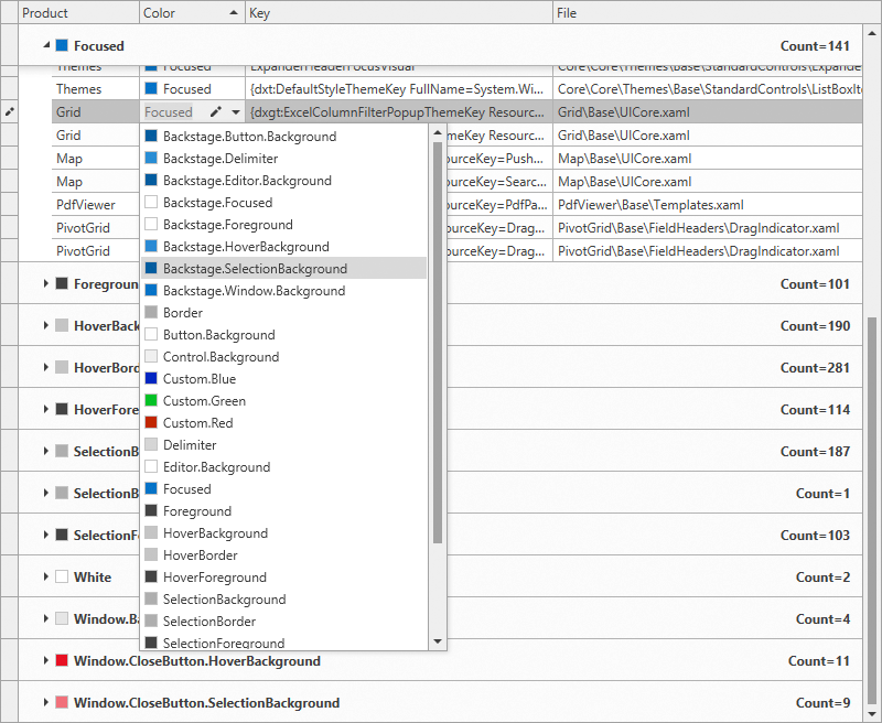
To obtain the name of the required palette color, I select the Filter Colors tool and point to the ribbon background area while holding the SHIFT key.
If you're following along, you'll notice that I must modify the Backstage.Window.Background color. To double-check, I click the Highlight Colors tool and select this palette color to highlight all affected elements.
Once I know what I need to modify, it's time to select the new color. The Theme Designer's built-in Color Picker allows me to select any on-screen color. I'll use it to pick the color (green) used within Microsoft Excel.
Note that by changing the Backstage.Window.Background palette color, I set a new value for all 81 occurrences of this color within different DevExpress controls: the Ribbon's background in the Ribbon, Diagram Designer and Spreadsheet controls, the background of the Hamburger Menu, etc.
I use the Color Editor to set the Backstage.Delimiter, Backstage.HoverBackground and Backstage.SelectionBackground palette colors by modifying the tone and saturation of the Backstage.Window.Background color value.
Apply the New Theme to the Application
To apply the new theme to an application, I'll need to build the assembly by clicking the Publish button and add a reference to this assembly within my application project...
...And add a few lines of code to the app.xaml.cs file.
var theme = new Theme("TestTheme");
theme.AssemblyName = "DevExpress.Xpf.Themes.TestTheme.v17.2";
Theme.RegisterTheme(theme);
ApplicationThemeHelper.ApplicationThemeName = "TestTheme";
If you are ready to customize an existing WPF theme and want to learn more, please refer to the following online resources:
Thank you to everyone who came out to join us at the DevExpress Meetup in London. We had such a lovely evening spending time talking to you about your experiences with DevExpress and getting into the festive spirit.
I’m sure that you will agree that The Cartoon Museum is a unique and quirky place, full of charm and irreverence! We were very grateful to have the excellent professional assistance of the team from Fizz UK. Their staff were absolutely smashing and did a great job for us. I am sure you will join me in saying a huge thank you to them for their time and wonderful service.
We had some really interesting conversations during the evening and we’d like to say thank you to those of you who shared experiences, feedback and ideas with us, and also with one another too! We’d love to hear your feedback about the event, so please do get in touch with Oliver, Rory or me and let us know what you thought, or feel free to leave your feedback in the comments.
Over the coming weeks and months we will start preparing for our releases in 2018, and we will be offering you ways to be a part of that process. Keep an eye out for information on that!
All that I have left to say is I wish you all a very happy festive season and all the best for the coming year.


 I’m sure that you will agree that The Cartoon Museum is a unique and quirky place, full of charm and irreverence! We were very grateful to have the excellent professional assistance of the team from Fizz UK. Their staff were absolutely smashing and did a great job for us. I am sure you will join me in saying a huge thank you to them for their time and wonderful service.
  Over the coming weeks and months we will start preparing for our releases in 2018, and we will be offering you ways to be a part of that process. Keep an eye out for information on that!