Quantcast
Channel: Developer Express Inc.
Viewing all 2370 articles
Browse latest View live

WPF Reporting - GDI+ Document Viewer (Coming soon in v15.1)

$
0
0

A couple of weeks back, I described our new HTML5/Java Script Report Viewer for the Web - in this post, I'll quickly review our new WPF Report Viewer...

v15.1 ships with a brand new WPF Document Viewer that will replace the Document Viewer included in earlier versions of our Reporting platform. This new WPF report preview control utilizes GDI+ for pixel-perfect document rendering...Previewed report documents are displayed exactly as they will appear on paper.

WPF Report Preview - GDI+

Other major enhancements include support for multipage views with continuous scrolling and mouse selection (including the ability to copy selected content to the clipboard).

Both the WPF and HTML5 Document Viewers were engineered to preview reports as accurately as possible and deliver better overall support for features we ship inside our Reporting platform. Together, these new document viewers help you create incredibly consistent user experiences when building solutions for Windows and the web.


DevExtreme HTML5 Widgets - WAI-ARIA Accessibility (Coming soon in v15.1)

$
0
0

With the v15.1 release, the DevExtreme HTML 5/JS widgets now include support for the WAI-ARIA standard (and support screen readers).

WAI-ARIA standard

To understand what WAI-ARIA is, I highly recommend reading this excellent introduction by the W3.org: WAI-ARIA Overview

I've included a short paragraph here:

WAI-ARIA, the Accessible Rich Internet Applications Suite, defines a way to make Web content and Web applications more accessible to people with disabilities. It especially helps with dynamic content and advanced user interface controls developed with Ajax, HTML, JavaScript, and related technologies. Currently certain functionality used in Web sites is not available to some users with disabilities, especially people who rely on screen readers and people who cannot use a mouse. WAI-ARIA addresses these accessibility challenges, for example, by defining new ways for functionality to be provided to assistive technology. With WAI-ARIA, developers can make advanced Web applications accessible and usable to people with disabilities. -WAI-ARIA Overview, w3.org

Technical solution

DevExtreme widgets supports WAI-ARIA standard with the v15.1 release. WAI-ARIA is a web oriented standard, developed in W3C for making web applications accessible. It solves the problem by using special html-attributes in DOM elements which give assistive technologies ability to interact with the page content.

DevExtreme widgets set aria-attributes and change them according to the current control's state.

With DevExtreme v15.1, the end-user can:

  • Interact with widgets without a monitor using the tested screen reader application
  • Interact with widgets without a mouse using our accessible keyboard navigation

Supported Screen Readers

DevExtreme v15.1 supports the NVDA open source screen reader - one of most popular among open source assistive technologies. However, you may use any other assistive technology supporting the WAI-ARIA standard.

Register for v15.1 webinar

To see all the new features coming out for the v15.1 release, sign up for the "What's New for DevExtreme (v15.1)":

Click here to register

I'm preparing to do a fantastic presentation and I hope to see you in the webinar.


Create highly responsive web apps for touch-enabled devices and traditional desktops.

From desktops to mobile devices, DevExtreme HTML5 Data Grid delivers the flexibility you’ll need to build apps that reach the widest audience and deliver touch-first user experiences to power your next great interactive website.

Download a free and fully-functional version of DevExtreme now: Download DevExtreme

WinForms and WPF Spreadsheet: Data Validation, Page Setup and more (Coming soon in v15.1)

$
0
0

Yesterday I discussed the improved Copy/paste functionality  in our Spreadsheet control. In this post, I'll discuss a few other important features we'll introduce for our WinForms and WPF Spreadsheet Control.

Data Validation Support

Use it to prevent invalid data entry into worksheet cells. Here are a few things you'll be able to do with this new feature:

  • Create a drop-down list of predefined values
  • Restrict numbers outside a specified range
  • Restrict dates and times outside a certain time interval
  • Limit the number of characters entered into a cell
  • Validate data using a comprehensive set of spreadsheet formulas

Data validation settings are located in the Data Tools group of the Data tab.

WinForms and WPF Spreadsheet - Data Validation

End-users can apply data validation rules to cells using the Data Validation dialog. The dialog allows them to specify data validation criteria, add a descriptive message to validated cells and create an error alert to be displayed when a user enters invalid data.

WinForms and WPF Spreadsheet - Data Validation Dialog

To specify data validation in code, use the Worksheet.DataValidations property. This provides access to a collection of DataValidation objects, combining the validated cell range, validation rule type and validation parameters required by a rule. For example, you can use the following code to create a data validation rule that invokes a custom error message when a user enters a number less than 5-digits.

// Restrict data entry to a 5-digit number.
DataValidation validation = worksheet.DataValidations.Add(worksheet["B3:B10"], DataValidationType.Custom, "=AND(ISNUMBER(B3),LEN(B3)=5)");
 
// Setup the error message.
validation.ErrorTitle = "Invalid Employee Id";
validation.ErrorMessage = "The value you entered is not valid. Use a 5-digit number for the employee id.";
validation.ShowErrorMessage =true;

Page Setup

In addition to the commands located in the Page Layout ribbon page group, this release incorporates a new Page Setup dialog. Use this dialog to specify printing settings for a worksheet (set page orientation, paper size, page margins, printout and scaling options, etc).

WinForms and WPF Spreadsheet - Page Setup Dialog
 
Headers and Footers

With v15.1, you can now insert headers and footers at the top and bottom of a worksheet printout. To get started, invoke the Page Setup dialog and switch to the Header/Footer tab. Select one of the predefined options in the Header or Footer drop-down list, or click the Custom Header/Footer... button to add your custom header/footer.
 
The Spreadsheet control also supports header/footer codes so you can insert dynamic information, such as page numbers, current date and time, filename, worksheet name, etc.

WinForms and WPF Spreadsheet - Custome Header & Footer
 
To view worksheet headers and footers, invoke the Print Preview window, or export the document to PDF format.

WinForms and WPF Spreadsheet - Print Preview
 
As always, we welcome your comments and feedback. Let us know what you think of these new features.

XAF: Enhancements to App UI Management Settings in the Database (Shipping in v15.1)

$
0
0

This feature was first demonstrated in our v14.2 release and based on your feedback, was one of the most popular additions to the eXpressApp Framework. For this release, we have made it even more powerful by implementing the following features:

  • The latest design-time changes made by developers to the Model.XAFML file representing shared model settings will be automatically re-read and considered by the application while debugging in Visual Studio. Technically, we have integrated a code solution from this Support Center thread under the #DEBUG directive via the XAF solution wizard so that all newly created apps have this default behavior. If you need this feature in your existing app, implement the current solution from the aforementioned thread.
  • As for updating shared model settings in production environments, you can now import the new settings from the application UI via the Import Shared Model Difference Action of ModelDifferenceViewController, which is available in WinForms apps only. Technically, this command silently loads the contents of the Model.xafml file to the Shared Model Difference object stored in the database.


  • Initially, there was no easy way to have application UI settings for WinForms and WebForms apps stored in the database separately. With the v15.1 release, the ModelDifferenceDbStore class constructor was extended to accept the string ContextId parameter. This allows you to pass “Win”, “Web” and other custom constants, like “Tablet”, for different applications and configure their user settings independently. To save you time, the default prefixes are automatically added for new applications by the XAF solution wizard. Existing applications can be modified as follows: 

         private void Application_CreateCustomUserModelDifferenceStore(Object sender, CreateCustomModelDifferenceStoreEventArgs e) {
                 e.Store = new ModelDifferenceDbStore((XafApplication)sender, typeof(ModelDifference), false, "Web");
                 e.Handled = true;
         }


    The code of the Create Model Differences Action of ModelDifferenceViewController was modified to take into account all the available ContextId values and create Model Difference objects in the database for each available application user.

  • Previously, the Copy Model Difference Action opened a dialog to copy model settings for the selected user to another user by fully overriding them. With our current release, you can choose to either Overwrite target model differences or Merge the source and the target using the Copy Behavior option:


    Technically, this is a smarter version of the Copy command that does not replace everything, but rather combines both differences together. At this stage, there are no special dialogs to merge only certain Application Model setting nodes as is done in the Merge Model Tool.     

DevExpress Universal v15.1 has been released

$
0
0

If you are a customer with an active subscription, you should already have received an important email from us: that Universal v15.1 has been published to the Download Center and it’s ready for you to, well, download.

If you have been watching our community site here over the past couple of weeks, you will have realized that this is a release that is packed to the gills with new controls, new features, new improvements across the board, for all the .NET platforms we currently support. And of course we should not forget CodeRush and DevExtreme either. In essence, if your basis for development is Visual Studio, this release is almost overwhelming.

This whole week we have been also presenting live webinars on the new features, four down and two to go. Thank you to everyone who has attended the four so far – they’re on our YouTube channel if you want to watch them again or for the first time – and thank you if you’ll be there tomorrow and next Tuesday for the two remaining ones.

(Of course, if you’ve reached this point and are wondering about our VCL Subscription, rest assured we have not forgotten. Now that .NET is “out of the way”, we shall be talking about VCL starting next week. Stay tuned.)

UI Controls for Desktop, Web and Mobile: DevExpress v15.1

Normally at about this point in these announcement blog posts, I like to point out those features that have most impressed me about our new release. This time, I’m finding it most difficult indeed to limit the bullet list. For example, there’s:

  • The WPF report designer CTP and the new smooth document viewer
  • The pivot grid and scheduler in DevExtreme – like, wow!
  • The new Excel export engine (and the new Data Access engine, come to that)
  • High DPI support in WinForms and WPF – and, mirabile dictu, the RTL support in WinForms
  • Conditional formatting of data everywhere, it seems
  • The ASP.NET Runtime chart designer
  • The dramatic (as in order of magnitude) speed increase for the PDF document processor

And, so on, so forth. As I said, a really impressive release. The teams have really outdone themselves this time, so imagine how much more they’re going to have to do to impress us for v15.2 (cue the CTO evil laugh).

So, please do navigate over to the Download Center and grab the latest installer. You will not be disappointed. As always, if you do have some feedback for us, the support team are ready and waiting for your messages.

WinForms and WPF Charting–Performance improvements in v15.1

$
0
0

In all walks of programming life, performance matters. It is especially true when you are using third-party controls where you have no influence over how quickly the controls and their content renders on the screen. We agree and have always considered high performance as a vital feature of our products. The charting products are no exception: we are always on the lookout to makes our chart rendering engine faster and faster.

Throughout 2013 and 2014, we introduced data aggregation and other great features to our charts, which helped make the rendering of our ASP.NET, WinForms and WPF charts faster several times over, but for 2015 we faced a big challenge: what else can we improve? In v15.1, then, we spent some time analyzing our charting product for Windows applications, and have come up with a few new strategies to increase performance and, also, reduce memory consumption.

Here are some results from our internal tests.

WinForms app, Numeric data:

DataLoading Numeric: AddPoints

DataLoading Numeric: SeriesBinding

DataLoading Numeric: SeriesTemplate


WinForms app, DateTime data:

DataLoading DateTime: AddPoints

DataLoading DateTime: SeriesBinding

DataLoading DateTime: SeriesTemplate

I’m sure you’d agree, those are some really impressive results. If I were you, I’d download 15.1 now – it was released yesterday! – test the new version in your environment on your data, and share your results with us in the comments.

WinForms & WPF Charting - Series Point Colors and Colorizers (Shipping in v15.1)

$
0
0

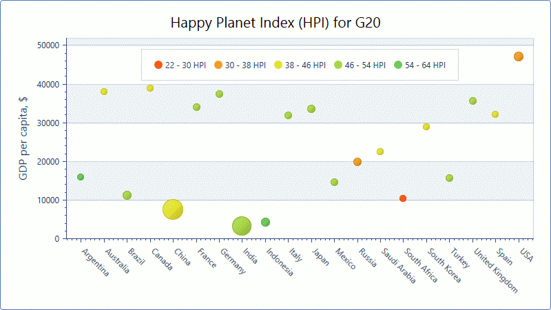
As you already know, we've officially released v15.1 and among the new features we're shipping in our Charting libraries for WinForms and WPF is the ability to associate visual information to charts using colors.

WinForms & WPF Charting

In order to provide this functionality, Color (for WinForms) and Brush (for WPF) properties have been added to the SeriesPoint class.

v15.1 also includes support for Colorizers, allowing you to provide a color from data source's data members. At present, our Chart Control ships with the following predefined colorizers. 

  • Color Object Colorizer – Provides a color object to series points when the data source and its data type can be converted to a color (such as an integer value or string - representing color name or the color).
  • Key-Color Colorizer – This colorizer allows color selection based on a key.
  • Range Colorizer – Use this colorizer if you want to select a color based on numeric values within a range.

To colorize data, assign the selected colorizer to the Series.Colorizer property and specify the ColorDataMember property value of the series. This data member will be processed as a color item by the Color Object Colorizer, as a key by the Key-Color Colorizer and as a numeric value by the Range Colorizer. In addition to series points colors, colorizers can provide information to legends to effectively explain the actual meaning of colors used. 

The following code snippets demonstrate use of colorizers for both our WinForms and WPF Chart Controls.

WinForms (C#)
// Prepare colorizer for a bubble series.
Palette palette = newPalette("Custom");
palette.Add(Color.FromArgb(0xFF5A19), Color.FromArgb(0xFF5A19));
palette.Add(Color.FromArgb(0xE5E335), Color.FromArgb(0xE5E335));
palette.Add(Color.FromArgb(0x6EC95C), Color.FromArgb(0x6EC95C));
 
RangeColorizer colorizer = newRangeColorizer() {
    LegendItemPattern = "{V1} - {V2} HPI",
    Palette = palette
};
colorizer.RangeStops.AddRange(newdouble[] { 22, 30, 38, 46, 54, 64 });
 
// Create and customize a series.
Series bubbleSeries = newSeries() {
    DataSource = HpiData,
    ArgumentDataMember = "Country",
    ColorDataMember = "Hpi",
    View = newBubbleSeriesView(),
    Colorizer = colorizer
};
bubbleSeries.ValueDataMembers.AddRange(newstring[] { "GDP", "Population" });
 
// Add a bubble series to the ChartControl's Series collection.
chartControl1.Series.Add(bubbleSeries);
 
WPF (XAML)
<dxc:BubbleSeries2D DataSource="{Binding Source={StaticResource hpiData}, XPath=CountryStatistics}"
                    ArgumentDataMember="Country" ValueDataMember="Product"
                    WeightDataMember="Population" ColorDataMember="HPI">
    <dxc:BubbleSeries2D.Colorizer>
        <dxc:RangeColorizer RangeStops="22, 30, 38, 46, 54, 64" LegendTextPattern="{}{V1} - {V2} HPI">
                            <dxc:RangeColorizer.Palette>
                                <dxc:CustomPalette>
                                    <dxc:CustomPalette.Colors>
                                        <Color>#FF5A19</Color>
                                        <Color>#E5E335</Color>
                                        <Color>#6EC95C</Color>
                                    </dxc:CustomPalette.Colors>
                                </dxc:CustomPalette>
                            </dxc:RangeColorizer.Palette>
        </dxc:RangeColorizer>
    </dxc:BubbleSeries2D.Colorizer>
</dxc:BubbleSeries2D>

Here is the resulting chart...

WinForms & WPF Charting - Colorizer


.NET data access engine–improvements in v15.1

$
0
0

Data access. Pretty mundane, wouldn’t you say? It’s … just there, doing its stuff, while you worry about how to best present the sea of data so that your users can glean the most important information from it. Well, in order to make your job even easier, we’ve made some major changes to our data access components in v15.1. Are you ready?

Query Builder improvements

It was in v14.1 that we first introduced our Data Access library to our product line. This library provides a set of tools intended to simplify the process of binding to different kinds of data sources.

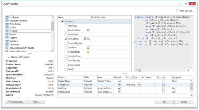
Among this set of tools, I think the Query Builder reigns supreme. It's used by several wizards to provide you and (or?) your end users with a visual interface for constructing custom SQL queries. Unfortunately the Query Designer had some notable limitations from the outset (for example, it did not cover such SQL features as sorting and grouping).

To address this issue, we have made several improvements in v15.1 to the Query Builder’s functionality and usability, without forgetting increasing performance where necessary.

QueryBuilder v15.1: user experience and functionality

New features:

  • A columns list that allows you to preview the set of table columns before adding a table to a query.
  • Revised dialog interface.
  • Improved performance. Column information is now loaded on demand for each data table separately. The performance increase will be especially notable when binding to databases containing many tables with a massive number of columns (for example, when binding to Teradata – see below for information on this).
  • Support for aggregate functions.
  • Support for sorting. If the resulting data is sorted by more than one column, the order in which sorting is applied can be adjusted manually. Specified sorting settings correspond to the optional ORDER BY section of the resulting SQL string.
  • Support for grouping. Specified grouping settings correspond to the GROUP BY section of the resulting query string.

Adding the ability to sort, group and aggregate the data provides more comprehensive coverage of the data shaping functionality of SQL. When you apply such a shaping to a field, it will be marked with a corresponding icon, and this makes the whole process of shaping data more visual and intuitive.

Improved memory consumption

For 15.1 we have improved the internal structure of our SqlDataSource class, as well as the algorithms we use to obtain data from a database table. The upshot of this work is that we’ve drastically reduced its memory consumption in real-life scenarios.

To see the difference between the memory consumption of a SqlDataSource object (bound to the same database) between versions 15.1 and 14.2 , take a look at the chart below. This shows the aggregated profiling information we obtained as provided by the dotMemory profiler. This chart illustrates the dynamic aspect of memory allocation by SqlDataSource from the beginning to the end of the data loading process.

SqlDataSource: Memory Consumption improvements in v15.1

The raw profiling data was obtained from loading the same 3.5-million-row data table, consisting of 20 columns of differing data types.

As you can see, the memory usage has been reduced in v15.1 by about 65%. The improvement in memory consumption is even more pronounced when binding to data tables that contain mostly columns of numeric data types.

Teradata support

With v15.1 we have added support for Teradata (version 13 or later) to our Data Access library. Teradata is a massively parallel processing database management system that typically operates on extremely large amounts of data. Yes, you got it: we’re suddenly talking Big Data.

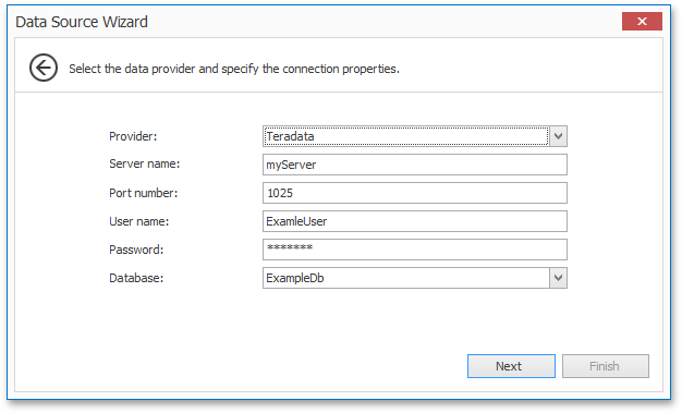
You can now find Teradata in the list of available data providers in the Data Source Wizard when creating a SQL data source. After that, the process of setting up a data connection will be the same as for any other SQL data provider: you need to specify the server address, the required database name, and the user credentials.  

Teradata support in the Data Source Wizard in v15.1

After a connection is set up, you can go to the next wizard page and construct an SQL query to obtain data from tables in the database. All the connection magic is hidden; you just use it as any other SQL data provider.


WinForms Data Layout Control: Data Annotation Attributes (Shipping in v15.1)

$
0
0

For those unaware of our WinForms Data Layout Control, here is a quick summary of its newest feature (Data Annotation Attributes) and how you can build forms and layout individual controls directly from your data source. As I hope you'll discover, this tool is extremely useful - especially when working with detail forms...

Once bound to a data source, the Layout Control retrieves data fields automatically and builds its layout with the appropriate editors (based on the underlying data type). By default, when binding to a simple business object (see Person class below), the DevExpress Data Layout Control automatically generates a linear layout, wherein layout items (controls) are arranged in one column.

public class Person {
        public int ID { get; set; }
        public string LastName { get; set; }
        public string FirstName { get; set; }
        public Image Image { get; set; }
        public string Phone { get; set; }
        public string Email { get; set; }
        public string Skype { get; set; }
        public string AddressLine1 { get; set; }
        public string AddressLine2 { get; set; }
        public string Description { get; set; }
        public DateTime BirthDate { get; set; }
        public Gender Gender { get; set; }
        public string Group { get; set; }
        public DateTime HireDate { get; set; }
        public decimal Salary { get; set; }
        public string Title { get; set; }
    }

DevExpress Form Layout Control

With our most recent update, the Data Layout Control ships with Data Annotation Attribute support (https://documentation.devexpress.com/#WindowsForms/CustomDocument114039) - useful for the automatic generation of complex layouts from a business object. To get started with this new capability, you simply need to mark the bound object's properties using dedicated attributes and assign the object as the control's data source. When building the layout, the control will automatically recognize these attributes and will provide display names and specify layout order item, arrange items into groups and tabbed groups, specify a control's read-only state, assign masks to editors, etc.

Let's dig into this new feature and use specific annotation attributes in the Person class to see the feature in action. First thing we'll do is prevent the ID field from being automatically generated by the Data Layout Control. We'll apply the Display attribute with the AutoGenerateField parameter set to false for the ID field.

[Key,Display(AutoGenerateField =false)]
public int ID { get; set; }

To assign custom captions to layout items, we'll use Display attribute with the Name parameter. For the Image field, we';; specify an empty string to hide the label...

[Display(Name ="Last name :")]
public string LastName { get; set; }
[Display(Name ="First name:")]
public string FirstName { get; set; }
[Display(Name = "")]
public Image Image { get; set; }

By default, single line text editors are generated by the Data Layout Control for editing a bound object's fields. You can change editor types used via the DataType attribute. For instance, the following code specifies use of a multiline Memo editor for the Description field.

[Display(Name = "About :"), DataType(DataType.MultilineText)]
public string Description { get; set; }

And here's the form...

DevExpress Form Layout - Attributes


The Display attribute with GroupName parameter allows you to combine items into groups (borderless, standard or tabbed groups). The following code positions the Email and Skype fields into a borderless group inside the Job tab.

const string EmailAndSkype ="<Root>/<Photo->/<FirstAndLastName>/{Tabs}/Job/<EmailAndSkype->";

[Display(Name = "E-Mail :", GroupName = EmailAndSkype)]
public string Email { get; set; }
[Display(Name = "Skype :", GroupName = EmailAndSkype)]
public string Skype { get; set; }

The form will now look as follows...

DevExpress Form Layout - Detail Form with Groups

Notice that GroupName parameter addresses a target group that is nested in another group. Group names are separated by the slash character. By default, the Layout Control adds auto-generated items to the bottom of the parent group in a vertical orientation and to the right in a horizontal orientation. Of course, you may want to arrange items in the generated layout using a custom order. To do this, you'd apply the Display attribute with the Order parameter.

Display(Name ="", GroupName = Photo, Order=0)]

public Image Image { get; set; }

A look at the final form...


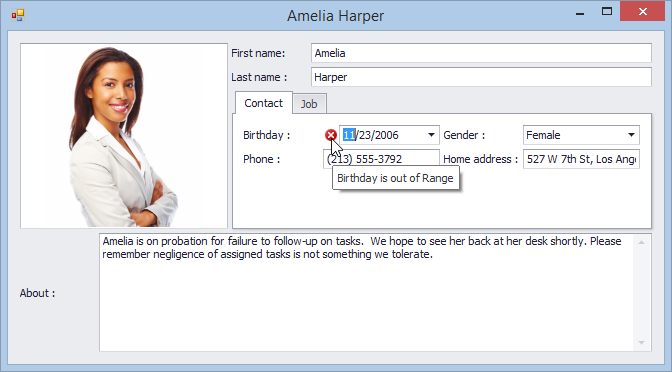
I hope you can see how easy it is to create a ready-to-use form layout by applying Data Annotation attributes to the data object's fields. In addition to layout-aware and editor-specific attributes, the Data Layout Control supports a set of data validation attributes (StringLengthAttribute, RangeAttribute, RequiredAttribute, etc.). In the following example, the Range attribute is used to check whether the BirthDate value is in the specified interval.

[Range(typeof(DateTime),"1/1/1900", "1/1/2000", ErrorMessage = "Birthday is out of Range")]
public DateTime BirthDate { get; set; }
Here is the complete code sample used in this demo:

public class Person {

    const string RootGroup = "<Root>";

    const string Photo = RootGroup + "/" + "<Photo->";

    const string FirstNameAndLastName = Photo + "/" +"<FirstAndLastName>";

    const string TabbedGroup = FirstNameAndLastName + "/" + "{Tabs}";

    const string ContactGroup = TabbedGroup + "/" + "Contact";

    const string BDateAndGender = ContactGroup + "/" +"<BDateAndGender->";

    const string HomeAddressAndPhone = ContactGroup + "/" +"<HomeAddressAndPhone->";

    const string JobGroup = TabbedGroup + "/" + "Job";

    const string HDateAndSalary = JobGroup + "/" +"<HDateAndSalary->";

    const string EmailAndSkype = JobGroup + "/" +"<EmailAndSkype->";

    const string GroupAndTitle = JobGroup + "/" +"<GroupAndTitle->";


    [Key,Display(AutoGenerateField =false)]

    public int ID { get; set; }

   [Display(Name = "Last name :", GroupName = FirstNameAndLastName, Order = 2)]

    public string LastName { get; set; }

   [Display(Name = "First name:", GroupName = FirstNameAndLastName, Order = 1)]

    public string FirstName { get; set; }

   [Display(Name = "", GroupName = Photo, Order=0)]

    public Image Image { get; set; }

   [Display(Name = "Phone :", GroupName = HomeAddressAndPhone)]

    public string Phone { get; set; }

    [Display(Name = "E-Mail :", GroupName = EmailAndSkype, Order=5)]

    public string Email { get; set; }

   [Display(Name = "Skype :", GroupName = EmailAndSkype)]

    public string Skype { get; set; }

   [Display(Name = "Home address :", GroupName = HomeAddressAndPhone)]

    public string AddressLine1 { get; set; }

   [Display(Name = "Work address :", GroupName = JobGroup)]

    public string AddressLine2 { get; set; }

   [Display(Name = "About :", GroupName = RootGroup), DataType(DataType.MultilineText)]

    public string Description { get; set; }

   [Range(typeof(DateTime), "1/1/1900", "1/1/2000", ErrorMessage = "Birthday is out of Range")]

   [Display(Name = "Birthday :", GroupName = BDateAndGender, Order = 3)]

    public DateTime BirthDate { get; set; }

   [Display(Name = "Gender :", GroupName = BDateAndGender)]

    public Gender Gender { get; set; }

   [Display(Name = "Group :", GroupName = GroupAndTitle, Order = 6)]

    public string Group { get; set; }

   [Display(Name = "Hire date :",GroupName=HDateAndSalary, Order=4)]

    public DateTime HireDate { get; set; }

   [Display(Name = "Salary :", GroupName = HDateAndSalary)]

    public decimal Salary { get; set; }

   [Display(Name = "Title :", GroupName = GroupAndTitle)]

    public string Title { get; set; }

}

And before I forget, here's an image of a form layout generated from a business object using our Layout Control -- with data validation enabled.
DevExpress Form Layout Control - Data Validation


WinForms Camera Control (Shipping in v15.1)

$
0
0

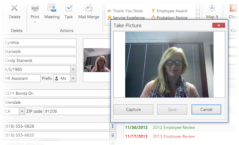
Here's something we didn't get a chance to talk about leading up to release, a new UI component...Our WinForms Camera Control. As it's name implies, the control allows you to view/display live video from your Windows device directly on your form.


When multiple cameras are plugged in, you can select the desired device directly from the customization window and modify video settings as needed (contrast, brightness, saturation).

WinForms Camera Control Settings

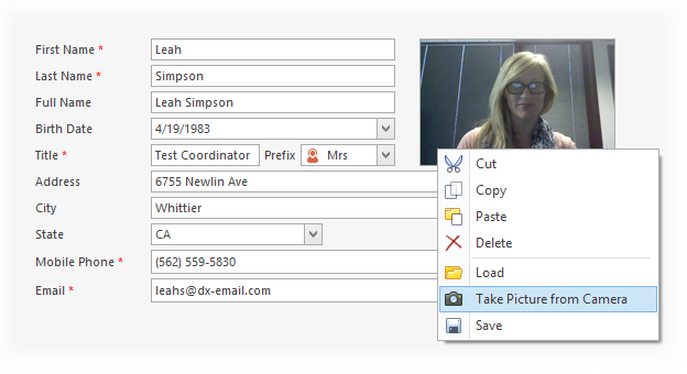
The Camera Control also provides support for context buttons. This feature allows you to add custom functionality to the control by embedding context buttons when necessary (regular button, check button, rating control and track bar). And as you can see from the image below, it's been integrated into our Picture Edit Control. By using the popup menu associated with it, you can capture an image and save it using the Picture Editor.


We've also prepared a tutorial video showing the three different ways you can integrate the new Camera Control into your apps.


CodeRush for Roslyn (preview)

$
0
0

So the entire team has been working hard on CodeRush for Roslyn. This endeavor is huge: Hundreds, if not thousands of language-based features, replacing our core engine with Roslyn’s core engine, and porting tens of thousands of test cases.

Based on what we’ve seen so far, the end results, extremely efficient use of memory, even faster performance, and more, appear to justify the effort.

The Plan

The DevExpress 15.1 release includes two CodeRush products:

  1. CodeRush Classic15.1 (previously known as simply CodeRush). This is the same CodeRush we’ve shipped for years. It includes the full feature set, however 15.1 will not include support for C# 6 and VB 14 language features.
  2. CodeRush for Roslyn (CRR) 1.0 preview. CRR will not include the full CodeRush 14.2 feature set (more details below), however it will include full support for C# 6 and VB 14 language features (and beyond).

The Future of CodeRush Classic

At some point in the future, when we have ported the entire CodeRush Classic feature set to CRR, we intend to deprecate CodeRush Classic. We will continue to support and fix issues in CodeRush Classic for some time beyond this deprecation point, however CodeRush Classic is unlikely to ever get support for new language features (e.g., C# 6, VB 14, and beyond).

Which CodeRush Should I Use?

If you’re working in Visual Studio 2015 with the new language features in C# or VB, you should install CodeRush for Roslyn. If you rely on CodeRush Classic features that haven’t been ported yet, you’ll need CodeRush Classic. If you need both, you can install and use both (more on this in later posts).

Benefits

There are three significant benefits you can expect from CodeRush for Roslyn:

Massive Reduction in Memory Consumption

Refactoring tools need to understand the code. And to refactor and find references quickly, you need to parse the solution source. And that means memory. The bigger the solution, the more memory you need. In CodeRush Classic and in competing tools which have decided not to support Roslyn, the memory required is essentially doubled as the Visual Studio host is also parsing and storing similar results. Owners of huge solutions were hit hard when using tools like CodeRush Classic. With CodeRush for Roslyn, this doubling-up memory waste is a now thing of the past.

To see this savings in action, we created two benchmarks using the following hardware and software:

Machine: Intel® Core™ i7-363QM CPU, 2.40 GHz, 8GB RAM, SSD HD 
OS: Windows 8.1 Enterprise 64-bit
Software:

  • Visual Studio v14.0.22823.1 D14REL
  • CodeRush for Roslyn v0.9
  • Competing Product v9.1

Solutions Tested:

Benchmarks:

  1. Memory.

    Prep: Open solution. Build. Close all documents. Only Solution Explorer and Properties windows are active. Close solution. Close Visual Studio.

    Memory Test: Start Visual Studio, open solution, wait until devenv.exe process CPU usage falls to 0. Calculate managed memory using VSIX plug-in.

  2. Performance.

    Prep: Open Visual Studio with Start Page opened. Wait until all extensions are successfully loaded.

    Performance Test: Click the solution link the solution in the Recent tab and start the timer. Stop the timer when the solution loading progress bar is complete. For VS and CodeRush the progress bar appears in the Solution Explorer. Competing products may place a progress bar in the lower-left corner of the VS status bar.

At DevExpress we have a policy of not mentioning competing products on our site, so I can’t reveal the name of the product we compared CodeRush to. However I can tell you the version number of the competing product we tested was 9.1, and I can tell you the competing product is one that has previously announced they would not exploit the Roslyn engine (which means you would expect their memory usage to be noticeably higher than Visual Studio’s).

Results of the memory tests:

MemoryUse

For the small solution, DotNetOpenAuth, CodeRush uses only 6MB.

For the medium-sized solution, Orchard, CodeRush uses 13MB.

And for the large solution, opening the source code to Roslyn itself, CodeRush uses 55MB.

Faster Performance

Not only was CodeRush Classic storing essentially the same results as Visual Studio was, it was also parsing the same code a second time (just like some competing tools still do). That waste stops with CodeRush for Roslyn. Every feature works noticeably faster and feels snappier, while CRR adds only 0-2 seconds to solution-open times:

 SolutionOpenTimes

Better Language Support

Expect CodeRush for Roslyn to immediately understand and support new C# and VB language features as they are released by the Visual Studio team.

Support for Languages Beyond C# and VB

CodeRush for Roslyn will include parsers and code generators from the CodeRush Classic engine for any languages that Roslyn doesn’t support yet, including XAML, CSS, HTML, and XML. As Roslyn adds support for these languages, We’ll update CRR accordingly to exploit the new support, which should result in additional memory reduction and faster performance.

What’s really exciting, is that as the Visual Studio team and third parties move new languages under the Roslyn engine, you can expect CodeRush for Roslyn to understand those as well. There may be some changes required on our side to support the new languages, however the effort is a small fraction of what it was before Roslyn.

The Preview is Free

Today we’re releasing an early preview of CodeRush for Roslyn on the Visual Studio Gallery. We intend to release updates every four weeks as we approach the final release. The install is VSIX-based, which means updates are quick and easy and can happen from inside Visual Studio.

What’s New

In addition to a port of CodeRush classic features (see below for details), CodeRush for Roslyn also includes two new features.

IntelliRush Hierarchical Filtering

In this release IntelliRush gets a great new feature, Hierarchical Filtering. This lets you slice up the Intellisense hierarchy to only see entries from specified classes in the ancestry.

IntelliRushHierarchicalMenu


Code Coverage

The Code Coverage window shows which lines of code are covered by test cases and which are not.

 image

Features Ported from CodeRush Classic

Features included in the CodeRush for Roslyn (preview):

 image

 image

We Need Your Feedback

Let us know what you love, what you’re missing, and what you’d like changed. When CodeRush for Roslyn is published (awaiting final approval from the powers that be), it will be available here.

IntelliRush Hierarchical Filtering

$
0
0

In CodeRush Classic 15.1 and in CodeRush for Roslyn we added the ability to filter Intellisense members by the class where they are declared.

Here’s how it works. To show this in action, I created a new Windows Universal App, and opened the MainPage.xaml.cs file. Inside the constructor, I typed “this.”

Here’s what I see:

IntelliRush

That’s about 165 entries. That’s a lot to wade through. I can reduce the list if I have an idea of where to look in the hierarchy.

With IntelliRush’s new Hierarchical Filtering, this is easy. I tap the Ctrl key…

IntelliRushCtrlKeyPressed

On the right I see “Hierarchy”.

So I press the letter “h” and I see the class hierarchy listed on the right, from MainPage (the type of the “this” reference) up to Object

IntelliRushHierarchicalMenuUp

Now, if I know the class I want to see members from, I can simply press the number associated with that class. For example, if I only want to see members from the FrameworkElement class shown in this list, I simply press the number 4 from the hint, and my list of 165 members drops to 34:

IntelliRushFrameworkElementEntriesOnly

If I want to slice the class hierarchy to include a range of classes, for example UIElement and up, I can do the following:

  1. Tap Ctrl
  2. Press h

    The Hierarchy hint displays:

    IntelliRushHierarchicalMenu

    UIElement is number 5. So if I want to see members declared in UIElement and all its ancestors, all I need to do is…
  3. Press Shift+5

And with those three keystrokes IntelliRush shows only the entries declared in UIElement and up:

IntelliRushShowingObjectToUIElement

Shift + the class number shows members declared in the specified class and above.
Ctrl + the class number shows members declared in the specified class and below.

On most keyboards the Shift key is above the Ctrl key, so you may find their position (Shift above, Ctrl below) helpful in remembering which modifier key to hit.

The active class is always numbered zero, which allows for some useful shortcuts to keep in mind:

Member ScopeTo filter, tap Ctrl, press H, and then:
Active class only0
Parent class only1
Active & parent classes onlyCtrl+1
Parent class and aboveShift+1
All classes (resets an active filter)Shift+0

Combining Filters

You can combine a hierarchical filter with a member kind filter. Only want to see events declared in the active class or its ancestor? Easy. First, apply a hierarchical filter to isolate members to only the ancestry you’re interested in. Next, apply the member kind filter you want (e.g., tap Ctrl, then press E, to only see events).

Try it Out

IntelliRush’s Hierarchical Filtering is available in both CodeRush Classic 15.1 and CodeRush for Roslyn 1.0.

ASP.NET MVC - Secondary enhancements (Shipping in v15.1)

$
0
0

Now that the DevExpress v15.1 release is available, I wanted to highlight 4 smaller enhancements that you may not have seen:

Minor Enhancements

1. GridView - Provide the capability to use the Search Panel in Custom Data Binding mode.

A new SearchPanel property has been added to the GridViewModel class.

The property's type (DevExpress.Web.Mvc.GridViewSearchPanelState) exposes the following properties:

  • ColumnNames
  • Filter
  • GroupOperator

(more info)

2. PivotGrid - Provide a way to customize control settings before export.

The new MVCxPivotGridExportSettings.BeforeExport property allows you to customize settings before exporting.

(more info)

3. DevexpressEditorsModelBinder - Support binding multiple values selected in MVC Extension editors to a Model's collection-type property.

DevExpressEditorsBinder now supports binding to complex collection-type models and model properties, in a similar manner as the default model binder (DefaultModelBinder) does.

(more info)

4. Binary Image Column Editing

The DevExpress MVC BinaryImage extension can now provides editing features. It has a built-in upload functionality that allows users to upload an image direct to the server and set the BinaryImage column. And you can use it within the DevExpress MVC GridView extension. Simply set up your BinaryImage column and choose your settings:

    settings.Columns.Add(c => {
        c.FieldName = "Photo";
        c.ColumnType = MVCxGridViewColumnType.BinaryImage;var properties = (MVCxBinaryImageEditProperties)c.PropertiesEdit;
        properties.ImageHeight = 170;
        properties.ImageWidth = 160;
        properties.ImageSizeMode = ImageSizeMode.FitProportional;
        properties.CallbackRouteValues = new { Action = "BinaryImageColumnPhotoUpdate", Controller = "Editing" };
        properties.EditingSettings.Enabled = true;
        properties.EditingSettings.UploadSettings.UploadValidationSettings.MaxFileSize = 4194304;
    });

Check out this onlie demo to learn more.

What's new in v15.1

The DevExpress ASP.NET MVC extensions have gotten some major new upgrades and enhancements in the v15.1 release. Check out the full list here:

http://devexpress.com/new

And be sure to check out the latest addition to our MVC suite:

New Rich Text Editor

V15.1 includes our newest MVC Extension – the DevExpress Rich Text Editor for MVC. Like its WebForms counterpart, this extension allows you to introduce powerful word processing capabilities to your next MVC app. The Rich Editor ships with a comprehensive set of text formatting options and a rich collection of Microsoft Word-inspired features.

DevExpress MVC Rich Text Editor - Online demo

Thanks!


Your Next Great .NET App Starts Here

Year after year, .NET developers such as yourself consistently vote DevExpress products #1.

Experience the DevExpress difference for yourself and download a free 30-day trial of all our products today: DevExpress.com/trial (free support is included during your evaluation).

WinForms Grid: Excel Data Export Customization

$
0
0

If you've used our WinForms Grid in the past, you already know that with a single call to the ExportToXlsx, method you can export the contents of the grid and generate a Microsoft Excel document.  In this post, I want to quickly discuss use of our updated Excel Data Export engine and its numerous customization options. In particular, I want to show you how to customize cell values, add a header/footer and get you some code examples so you can implement similar solutions in your WinForms apps.

Excel Data Export - Header Customization

To add a header and display personalized information, such as company name, logo and contact information, we need to handle the CustomizeSheetHeader event. The methods (AddRow, MergeCells and InsertImage) provided by its event arguments allow us to add rows to the output, merge cells, insert images, etc.

void options_CustomizeSheetHeader(ContextEventArgs e){
   
    // ...
    var file = System.Reflection.Assembly.GetExecutingAssembly().GetManifestResourceStream("GridReportBlog.Resources.1.jpg");
    if(file != null){
        var imageToHeader = new Bitmap(Image.FromStream(file));
        var imageToHeaderRange = new XlCellRange(new XlCellPosition(0, 0), new XlCellPosition(5, 7));
        e.ExportContext.MergeCells(imageToHeaderRange);
        e.ExportContext.InsertImage(imageToHeader, imageToHeaderRange);
    }
    // ...
}


Resulting output below...

WinForms Data Grid - Excel Export with Header Customization


Excel Data Export - Cell Customization

Let's now take a look at the CustomizeCell event and how we can use it to replace values in a Boolean column with the check mark symbols. "☑" and "☐"

XlCellAlignment aligmentForDiscontinued = new XlCellAlignment() {
    HorizontalAlignment = XlHorizontalAlignment.Center,
    VerticalAlignment = XlVerticalAlignment.Center
};
void options_CustomizeCell(CustomizeCellEventArgs e){
    if(e.ColumnFieldName == "Discontinued"){
        if(e.Value is bool){
            e.Handled = true;
            e.Formatting.Alignment = aligmentForDiscontinued;
            e.Value = ((bool) e.Value) ? "" :"";
        }
    }
}

Resulting output below...

WinForms Data Grid - Excel Export Cell Customization


Excel Data Export - Footer Customization

Finally, to add a footer to the exported file, we'll need to use CustomizeSheetFooter event. As you can see below, we've added two new rows to the output document and specified formatting using XlFormattingObjects.

void options_CustomizeSheetFooter(ContextEventArgs e){
    e.ExportContext.AddRow();
    var firstRow = new CellObject();
    firstRow.Value = @"The report is generated from the NorthWind database.";
    var rowFormatting = CreateXlFormattingObject(true, 18);
    rowFormatting.Alignment.HorizontalAlignment = XlHorizontalAlignment.Left;
    firstRow.Formatting = rowFormatting;
    e.ExportContext.AddRow(new[]{ firstRow });
    // ...
}

WinForms Data Grid - Excel Data Export Footer Customization

Hopefully this quick tutorial will help you get started with our Excel Data Export engine and help you better integrate your WinForms app with Microsoft Excel.


.NET PivotGrid and Dashboard: OLAP Performance Improvements

$
0
0

OK, let me state the blindingly obvious for a moment: the performance of aggregation or sorting operations (or both!) are key factors when you’re working with OLAP data sources. So, with v15.1, we took the time to do some research and design and have managed to increase the speed of the data engine used in the .NET Pivot Grid and Dashboard by optimizing some basic data processing – anything from constructing queries to the parsing of returned data.

Sorting is now performed on the client side. This allows you to speed up the process of visualizing data in complex scenarios such as sorting by summary and sorting in Tabular mode. Moreover, as an added bonus, using client sorting gives you the capability to perform custom sorting with the CustomServerModeSort events.

To compare the new Pivot Grid’s performance with other products in OLAP mode, we investigated two scenarios. With both scenarios, the pivot data and row areas display fields from the Adventure Works cube and are deployed on a local machine.

Pivot Grid Performance Improvements v15.1


ScenarioPivotGrid v14.2PivotGrid v15.1Competitor 3Competitor 4
#16 sec3 sec5 sec4 sec
#21 min 20 sec19 sec35 sec1 min 40 sec

The chart and table shown illustrate the performance improvements of the Pivot Grid in OLAP mode in v15.1 when sending queries to the Adventure Works cube. The data shows a comparison with the old v14.1 version and a couple of our (unnamed) competitors in this space. Note that the ADOMD provider was used to establish a connection to the OLAP cube.

Here is the data we used for each of the two scenarios.

Scenario 1

Data area:Internet Sales Amount, Internet Order Quantity
Row area:Postal Code, Product
Row count: ~ 100 000

Pivot Grid Performance Improvements Scenario 1

Scenario 2

Data area:Sales amount, Total Product Cost
Row area:Business Type, City, Product
Row count: ~ 600 000
Sorting:Product field is sorted by Total Product Cost

Pivot Grid Performance Improvements Scenario 2

I’m sure you’ll agree with me that these basic performance improvements will enhance the snappiness of the data analytics parts of your applications.


ASP.NET Design-Time Feature Browser (Shipping in v15.1)

$
0
0

Our UI controls are some of the most feature–rich controls in the market, but enabling or disabling certain features means that you need to dig (deep) in your object inspector and the documentation to find the required ones. And that can take a bit of time.

In v14.2 we added the Designer Dialog, and now, to make life even easier, we've introduced our Feature Browser into that dialog. Those of you also using our WinForms controls will already know what I mean with that, since we introduced this in v14.1 for our WinForms controls.

What is the Feature Browser exactly?

In the Feature Browser we have grouped certain “desired behavior” or appearance features together. This makes it easy to access the properties needed for some functionality since they are put right next to each other.

Not only did we filter the properties per feature, we also embedded context sensitive help on a specific feature (instead of a property) all together in the same dialog. You can even click hyperlinks inside the help to set one or more properties in a single operation!

Where can I find it?

The Feature Browser is available for 2 complex controls: the GridView and HTML Editor. It appears when you click the Task button in the Design Surface, followed by clicking the Designer item inside the task menu.

The first page of the Designer contains the Feature Browser, and this allows you to setup the control in seconds.

The Feature Browser for the GridView control

Since the GridView control is the most complex control in our ASP.NET suite and setting up things like ServerMode, Master-Detail, Sorting, Grouping, Summaries and Totals require you to jump into the documentation (at least for the first time), we have put context sensitive help right into the Feature Browser. There is no longer any need to switch back and forth into the documentation.

Feature Browser for the HTML Editor

Though the HTML Editor ships with tons of features like the Tag Inspector, Place holders, Content Element Filtering and choosing to use a Toolbar or Ribbon Control, it is now simpler to configure. Just like with the GridView, there is no need to jump into the documentation.

For that reason, the Context Sensitive help is not included in the HTML Editor Feature Browser. Instead we have made certain choices more visual. For example, changing the Toolbar mode will show you immediately what the appearance will be, and which items are available in the toolbar or ribbon.

Let me know how much it speeds up your development time, or if you’re missing certain features!

VCL Rating Control (Coming soon in v15.1)

$
0
0

We are approaching the first beta of the newest release for our VCL customers and throughout the next week, Julian and I will describe some of the features/products we'll ship in v15.1.

I'll start things off with a quick description of a new control we'll include as part of this release - the DevExpress VCL Rating Control. The control will be available in both unbound and data-aware mode and can be used on a standalone basis or as an in-place cell editor for container components such as the ExpressQuantumGrid.

DevExpress VCL Rating Control

The new Rating Control will be part of the ExpressEditors Library and will offer the following customization options: 

  • Change control orientation from horizontal to vertical.
  • Change control direction.
  • Modify the number of visual elements (stars) displayed in the control.
  • Use custom element images.
  • Use one of three element fill modes (entire star, half-star precision or fill star by the control's value)

There are a number of interesting use-cases for a Rating Control inside a Windows app. We'd love to hear how you might potentially use this control in your projects...


WinForms Layout Control & CRUD Forms - New Table Layout vs Flow Layout Mode

$
0
0

We have a lot of customers who rely on the flexibility of our WinForms Layout Control to create CRUD forms. One of my favorite features is its runtime customization capabilities - something I'll talk about later in the month. In this post, I want to recap something I discussed earlier this week - support for Data Annotation Attributes, a new feature allowing you to create detail forms without writing any code. 

With Data Annotation Attributes, you simply assign a business object as the Data Layout Control’s data source and call the RetrieveFields method. The Layout Control automatically generates the layout by using the attributes applied to the object’s fields. Of course, your business object can contain nested objects and the Layout Control is designed to render those as separate groups. The following is an example in which a Transaction object contains Account and Category nested objects.

WinForms Form Layout - Control Attributes

To simplify things as much as possible, the Layout Control includes an AutoRetrieveFields option - which re-generates the layout each time a data source is assigned. If you find that the auto-generated layout pictured above is too "simple" or if issues arise as a result of stretched controls (for wide forms), you can easily rearrange layout items in code.

LayoutControlGroup autoGenerateGroup = dataLayoutControl1.Root.Items[0] as LayoutControlGroup;
LayoutControlGroup accountItem = autoGenerateGroup.Items[0] as LayoutControlGroup;
LayoutControlGroup categoryItem = autoGenerateGroup.Items[1] as LayoutControlGroup;
LayoutControlItem dateItem = autoGenerateGroup.Items[2] as LayoutControlItem;
LayoutControlItem amountItem = autoGenerateGroup.Items[3] as LayoutControlItem;
categoryItem.Move(accountItem, DevExpress.XtraLayout.Utils.InsertType.Right);
amountItem.Move(dateItem, DevExpress.XtraLayout.Utils.InsertType.Right);


WinForms Data Layout Control

If screen resolution issues persist for wide forms, you can switch to our Flow Layout mode. In this mode, the Layout Control automatically arranges controls back-to-back, wrapping at the Layout Control's rightmost edge (note that nested groups are not supported in Flow Layout mode).

To activate Flow Layout mode and specify cell size, we must set two properties:

autoGenerateGroup.CellSize = new System.Drawing.Size(50, 24);
autoGenerateGroup.LayoutMode = DevExpress.XtraLayout.Utils.LayoutMode.Flow;

This animation below demonstrates the benefits of using Flow Layout mode - as you can see, the form is adaptive as its resized.

DevExpress WinForms Layout Control - Flow Mode


The third option to form design when using our Layout Control (new in v15.1) is Table Layout mode. In Table Layout mode, the control area is divided into rows and columns. Column/row size can be in absolute or relative values. Controls are placed in a specific cell addressed by a column and row and can occupy two or more columns/rows simultaneously.

Let’s take a look at Table Layout mode and create a table consisting of two columns and three rows. Column widths will be 40% and 60% respectively. The COMMENT field will occupy two columns.

LayoutControlGroup autoGenerateGroup = dataLayoutControl1.Root.Items[0] as LayoutControlGroup;
autoGenerateGroup.OptionsTableLayoutGroup.Add(new ColumnDefinition(autoGenerateGroup, 40, SizeType.Percent));
autoGenerateGroup.OptionsTableLayoutGroup.Add(new ColumnDefinition(autoGenerateGroup, 60, SizeType.Percent));
autoGenerateGroup.OptionsTableLayoutGroup.Add(new RowDefinition());
autoGenerateGroup.LayoutMode = DevExpress.XtraLayout.Utils.LayoutMode.Table;
autoGenerateGroup.Items[4].OptionsTableLayoutItem.ColumnSpan = 2;
Here's the form at runtime...

DevExpress Layout Control - Table Mode

To summarize, the DevExpress Layout Control now gives you 3 ways to quickly create high-impact CRUD details forms:

  1. Using DataAnnotations attributes to generate layouts on-the-fly.
  2. Using the control's Flow Layout mode to generate adaptive forms.
  3. Using Table Layout mode to generate the form by placing controls into specific table cells.

We'd love to know how you use the Layout Control in your WinForms project. Your continued feedback will help us refine the features shipping in this product.


ASP.NET Rich Text Editor - Using DocVariable to Add Custom Data and Charts (Shipping in v15.1)

$
0
0

In the "What's new for ASP.NET v15.1" webinar, I showed the mail merge like features of the new DevExpress ASP.NET Rich Text Editor. Click the image below to see the webinar video:

In this blog post, I'll explain some more details about this great new functionality.

Fields Support

In the DevExpress ASP.NET Rich Text Editor (ASPxRichEdit), document fields are special placeholders for non-static data that might change (be updated on field update). These placeholders are replaced with actual data when the document is rendered for display or print. Using fields, you can automate different aspects of your document, such as auto page numbering, inserting actual dates and times, etc. The default Mail Merge ribbon tab can be used to work with fields (create, update, switch between field display modes). There are six field codes:

  • DATE - Inserts the current date and time.
  • TIME - Inserts the current time.
  • HYPERLINK - Enables you to navigate to another location or to a bookmark.
  • NUMPAGES - Inserts the total number of pages.
  • PAGE - Inserts the number of the page containing the field.
  • DOCVARIABLE - Enables you to programmatically insert complex content when this field is updated.

Docvariable

The DevExpress ASP.NET Rich Editor (ASPxRichEdit) enables you to store custom information in the document using document variables. To insert a document variable in the document, use the DOCVARIABLE field code.

The DOCVARIABLE field code has the following syntax:

{ DOCVARIABLE "variable name" "argument1" "argument 2"... }

Argument1, Argument2, etc. are optional parameters.

How to insert a DOCVARIABLE field

To add the Docvariable field code to your RTF doc:

  1. Press Ctrl+F9 to insert a new field
  2. write the DOCVARIABLE keyword, space and a name of a variable

Calculate the field value

To calculate a value of this field in ASPxRichEdit:

First, override the CalculateDocumentVariable event.

In the handler, you can calculate a field result. Get a variable name and arguments (if they are defined) from the event args. Then set the Handled and Value properties. The Value property can have the string or Document types. If it’s set with a string then this string will be inserted as a field result.

If you want to insert some advanced content, you can set the Value property with a Document instance. So, other rich-text document can be inserted as a field result in a current rich-text document.

Here's an example:

protectedvoidDemoRichEdit_CalculateDocumentVariable(object sender, CalculateDocumentVariableEventArgs e) {switch(e.VariableName) {case"Chart":var sales = GetSales(e.Arguments[0].Value);
                DocumentImageSource chart = DocumentImageSource.FromStream(CreateChart(sales));
                RichEditDocumentServer srv = new RichEditDocumentServer();
                srv.Document.Images.Append(chart);
                e.Value = srv.Document;
                e.Handled = true;break;case"CommonSales":var commonSales = GetCommonSales(e.Arguments[0].Value);
                e.Value = commonSales.ToString("C");
                e.Handled = true;break;default:break;
        }
    }

Demo

Try this feature online now:

DevExpress ASP.NET RichEdit demo - Document Variables Support

Thanks.

Your Next Great .NET App Starts Here

Year after year, .NET developers such as yourself consistently vote DevExpress products #1.

Experience the DevExpress difference for yourself and download a free 30-day trial of all our products today: DevExpress.com/trial (free support is included during your evaluation).

DevExpress VCL v15.1 – supported compilers

$
0
0

With v15.1 we are trimming the number of compilers (and therefore IDEs) that we are supporting with the DevExpress VCL subscription. As I’ve said several times over the years, supporting older compilers comes with a cost, perhaps intangible in many ways, but it’s still there and does have an effect.

In essence, if the compiler has XE in the name (and there are eight of these, times two for Delphi and C++Builder), we support it in both 32-bit and in 64-bit modes with our VCL Subscription. That’s the simple rule. Rule 2 is that RAD Studio 2010 is also supported (for now), although the new Rich Text Editor – you saw the beta announcement here 6 months ago, stay tuned for more news in another post – is not supported. And that’s it.

The biggest change then from v14.2 to v15.1 is that we are dropping support for what might be termed “the non-Unicode compilers”: Delphi 7, Delphi 2007 and C++ Builder 2007. As it happens, the new controls we’ve released from v14.1 onwards (spreadsheet, rich text editor, maps, gauges, etc) have not supported these compilers anyway. All we’ve provided over the past year for these compilers have been some enhancements plus bug fixes. Please note that Embarcadero do not provide support for them either (in fact, the last email I read was that XE3 is about to be dropped from their support and upgrade paths).

(Aside: it’s at this point that I did some research. Delphi 7 was released in August 2002, very nearly 13 years ago. I was using a Dell Inspiron 8000 at the time, with a Pentium III and 512MB RAM, running Windows XP (it cost me $3K). I wrote the Deflate and Inflate code for TurboPower’s Abbrevia on that machine. Delphi 2007 was released in March 2007, over 8 years ago. By any stretch of the imagination, these are old: just think of the progress made in computers, technology, apps, run-times, and programming languages over the last 8+ years.)

With v15.1 we wanted to do some major restructuring of the controls. The first part of this will be using the engine that’s part of the new spreadsheet control to provide way better XLS/XLSx export facilities to the grid, treelist, etc. This, candidly, would not be possible with the non-Unicode compilers. All in all, we felt the best business course of action was to consolidate our code to use the latest compilers and language features; it’s the only way we feel we can continue to provide deeper, broader, and, frankly, better features and functionality to our VCL customers.

Having said that, v14.2 is not going away just yet. Yes, it will be superseded by v15.1 in a couple of weeks, but we shall continue to provide bug fixes to it for the next year. Hence if you are an active customer you will still be able to download the minor releases until it, in turn, is retired.

My recommendation though is to move on. It seems to me that every month Embarcadero are providing discounts to upgraders. I would take advantage of them. Retire your legacy apps perhaps, or migrate them to the latest RAD Studio: there will come a day that we will start removing support for the early XE IDEs too. And, of course, if you’re using a later RAD Studio already, stay tuned for more news over the next few days on the new features in v15.1 of DevExpress VCL.

Viewing all 2370 articles
Browse latest View live