Color is such an important element when conveying information in any data visualization. Color can be used as an effective means to compare/contrast data at almost every level of a visualization. Colors also convey meaning in and of themselves (red – stop, green – go). Our analysis components (charts, grids, etc) have always had state-of-the art conditional formatting and custom appearance settings. Our newly minted dashboard component (at the time) benefitted from these features but only on a per-element basis. We realized that we needed a better approach to using colors at a macro level inside of a dashboard. In this release we are delivering on the promise of being a premier vendor for analysis tools by adding several features that deal with coloring.
Improved Automatic Coloring
Colors for individual values displayed within a dashboard are now automatically assigned at the dashboard level. This means that any dashboard element that is added will share the same coloring.
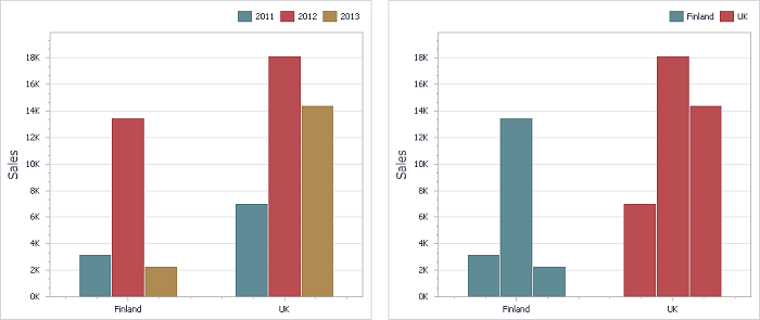
This is done automatically. Previously the same colors did not transfer across elements – this was something we have always had a desire to correct. We are not in the business of correcting things however, we aim to innovate. This automatic coloring is very customizable! You can choose the dimension whose values should be colored:
Customize the granularity of the coloring:
Or even color the data points by measure names:
Color is now automatically an additional tool in your arsenal of data visualization techniques thanks to this fantastic update.
Binding Colors to Data
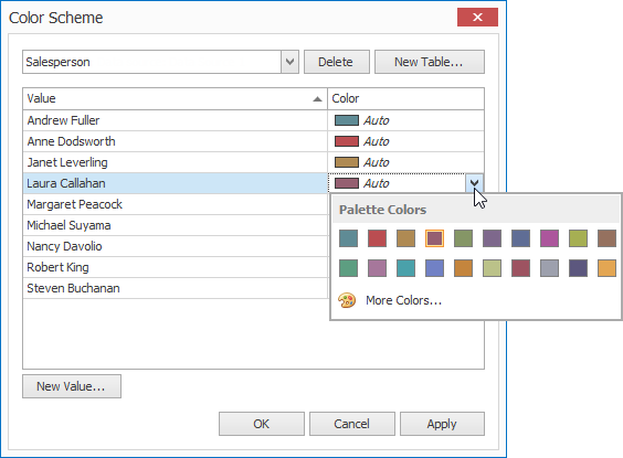
We realize that the default color setting will not always convey what you need. If you need to go beyond the automatic coloring we have provided, you can manually assign colors by selecting the colors yourself through a predefined palette:
You can also select colors that better reflects the meaning of a particular value:
The resulting changes can make for a more meaningful visualization. In the case below we changed the default color assigned to “Critical” to red. Red is a better color in this instance given the inherent meaning we attach to it: “Stop and look!”
Cross-Platform Palette
The best part (and this goes without saying) is that these colors will work for both the web and client dashboards:
Final Thoughts
The amount of value we are providing with this component alone is seriously worth the price of admission. This is rapidly becoming the most versatile tool for creating analysis applications your end-users will enjoy using.
As always, if there are any comments and/or questions, feel free to get a hold of me!
Seth Juarez
Email: sethj@devexpress.com
Twitter: @SethJuarez


