In our previous release (v14.1), we introduced six multi-purpose HTML 5 widgets, including an HTML 5 Color Picker, Menu and Calendar. In our upcoming release (v14.2), we continue to expand our HTML 5 offering with eight new multi-purpose widgets.
HTML 5 TreeView Widget
DevExtreme v14.2 will allow you to display hierarchical data from a tree-like data structure or a plain array, and will include all the user interactions you've come to expect from a TreeView, including collapsing/expanding and checking/unchecking tree nodes.
HTML 5 Accordion Widget
This new widget will allow you to display multiple expandable panes, which can contain text blocks or navigation items.
In the following image, the TreeView widget is displayed on the left and the Accordion is displayed on the right.
HTML 5 Tab Panel
Our new Tab Panel allows you to define both tab caption and tab content simultaneously. In addition, this new widget is touch-optimized - allowing you to switch between tabs with a swipe gesture.
HTML 5 Tag Box
Inspired by the HTML 5 SelectBox, this new widget allows you to select multiple tags from a predefined set. The Tag Box supports incremental filtering and the addition of custom tags on the fly.

HTML 5 Progress Bar
As you would expect, our new Progress Bar widget displays the current progress of operations - either by a specified value or by simple visual feedback. The Progress Bar allows you to set status message format and progress value range.
HTML 5 File Uploader
DevExtreme's new File Uploader supports all DevExtreme themes, allows you to upload multiple files simultaneously, and define the list of available file types.
The following multi-purpose widgets were designed to simplify app design by using mobile friendly grid layouts.
HTML 5 Layout Box
Building an effective layout strategy for your application can be time consuming. Our new Layout Box simplifies this process by automatically re-orienting layouts based on item size (it mirrors the approach used by CSS3 Flex).
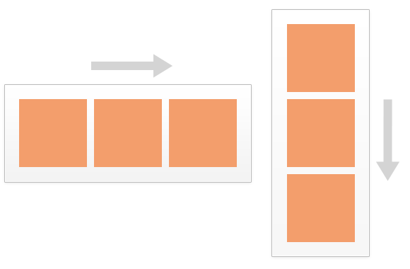
HTML 5 Responsive Layout Box
As you can see by the image below, our Responsive Layout Box is designed to simplify the layout process and help you effectively target multiple devices/form factors. You simply describe the grid's layout - specifying rows, columns and size, then associate items with locations within the grid. 
As always, we welcome your comments and feedback. Let us know what you think.