As we near 14.1 release time I wanted to show you a couple of great features we are adding to our charting offering.
Nested Donut Series View
Image may be NSFW.
Clik here to view.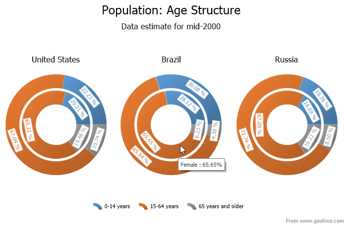
In this particular case we are looking at a number of data points at the same time. The inner and outer donuts represent the female and male population respectively. Additionally the donuts are further subdivided by age. Finally each donut represents a country. In the case of Brazil notice that the female to male ratio of the 15-64 age group is almost equal. The purpose of any good visualization is to provide a large amount of information at a glance. Using the nested donut judiciously should indeed help elucidate data in a concise manner.
This new series view is available WinForms, ASP.NET, WPF, and Silverlight
WinForms Chart Range Control
Image may be NSFW.
Clik here to view.
This particular client of the range control both informs and performs. I am a fan of using all available space when laying out informative and functional UI.
WPF/Silverlight Improvements
As we continue to improve our charting experience there are features which make it into one product group but don’t make it into the other. Two features previously available in WinForms will now be made available in WPF as well. These are automatic data aggregation and Funnel Series view.
Image may be NSFW.
Clik here to view.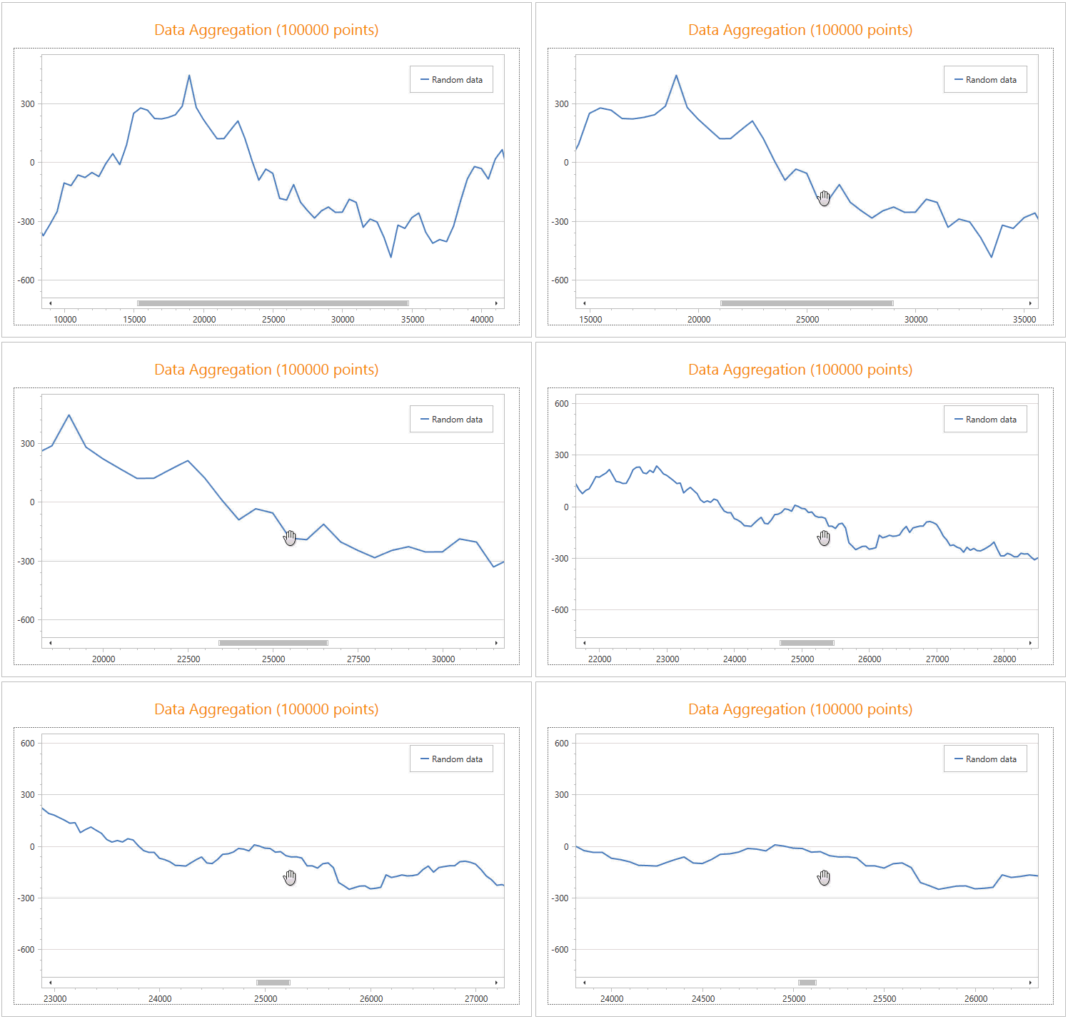
Here’s a look at your funnel view:
Image may be NSFW.
Clik here to view.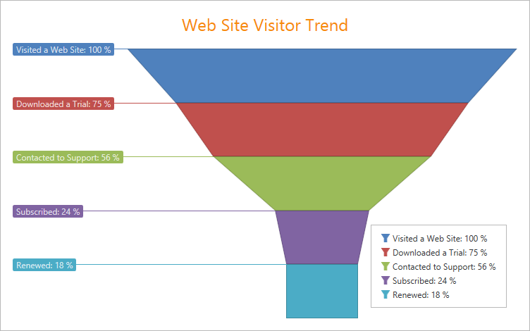
This type of visualization is great to see how things “whittle” down over a particular process.
Text Patterns (Previously Series Points Options)
The best way to explain this is to look at the before and after:
13.2
Image may be NSFW.
Clik here to view.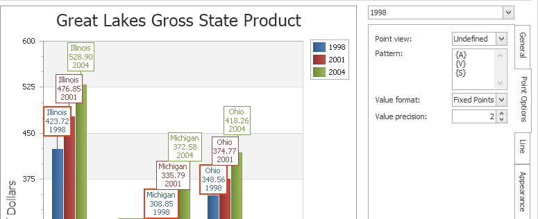
When it comes to editing the way points are displayed, our 13.2 release did not allow custom formats to be used when displaying items.
14.1
Image may be NSFW.
Clik here to view.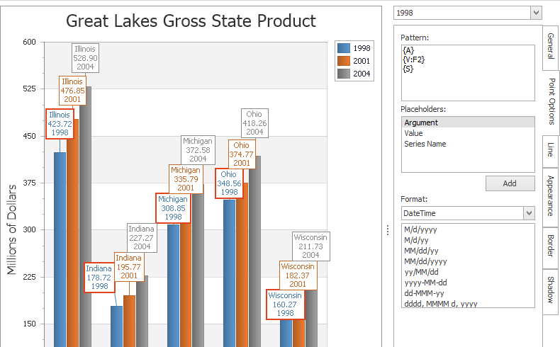
Notice that the 14.1 release changes the flexibility dramatically. All standard .NET formatting can now be used to change the way any portion of the point labels are displayed.
Overall I think it is a significant improvement and adds a breadth of options when displaying data effectively. It is also important to note that these options work across all platforms.
Parting Words
Overall I think we’ve got a number of exciting things happening with our charting toolset. There is yet a lot of innovation to come!
As always, if there are any comments and/or questions, feel free to get a hold of me!
Seth Juarez
Email: sethj@devexpress.com
Twitter: @SethJuarez
Clik here to view.
