We're a couple of months away from our next major release (v24.1). In this post, I'll describe the new features we included in our Early Access Preview (EAP) build. If you encounter issues with our EAP build, feel free to submit a support ticket via the DevExpress Support Center or use the embedded survey to send us feature/product-related feedback.
Installation
To begin using the DevExtreme v24.1 EAP build, simply install target framework related NPM package marked with the 24.1-next tag. Use one of the following commands to proceed:
npm install devextreme@24.1-next --save-exact

npm install devextreme-angular@24.1-next --save-exact // Angular installation

npm install devextreme-react@24.1-next --save-exact // React installation

npm install devextreme-vue@24.1-next --save-exact // Vue installationEarly Access and CTP builds are provided solely for early testing purposes and are not ready for production use. This build can be installed side by side with other major versions of DevExpress products. Please backup your project and other important data before installing Early Access and CTP builds.
This EAP may not include all features/products we expect to ship in our v24.1 release cycle. As its name implies, the EAP offers an early preview of what we expect to ship in two months.
New Splitter Component
This EAP includes our new Splitter component – a component designed to split a single page layout into multiple panes.
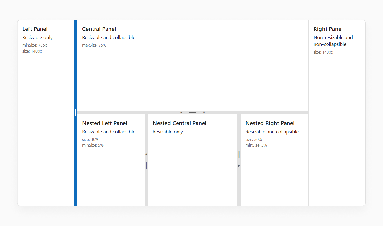
Each pane can contain various content, from HTML pages to components. Panes can be resizable (you can size by moving the handler), and they can be collapsed (you can close them by clicking on an arrow). You can also specify initial, minimum, and maximum size of individual panes.
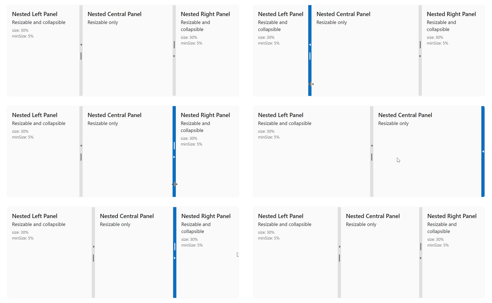
As you might expect, you can combine these properties as needed. You can also create advanced app layouts more by placing one Splitter inside another.
<dx-splitter>
    <dxi-item
        [resizable]="true"
        [collapsible]="false"
        [minSize]="60"
        maxSize="80%"
        [size]="140" // initial pane size, can be defined as pixels and percentage
    >
    </dxi-item>
</dx-splitter>
Select one of the following supported dev frameworks to explore the capabilities of this new feature:
Angular | React | Vue | jQuery
Shadow DOM Support (CTP)
In our upcoming major update, we'll allow you to use DevExtreme components inside Shadow DOM. This capability will be offered as a Community Technology Preview (CTP) for Angular, Vue, and React.
In this EAP release, we have already completed a significant portion of the work needed to support this capability. We are still in the process of testing our components in the Shadow DOM environment. If you are interested in using Shadow DOM technology in your projects, you can install the EAP release for early testing. Should you encounter issues, feel free to submit a ticket via the DevExpress Support Center.
Angular HttpClientModule Support
With this EAP, DevExtreme Data Layer components will rely on Angular HttpClientModule. for server communication within Angular applications. Our new DxHttpModule can be used to integrate this capability.
In the following example, DataSource uses DxHttpModule to intercept requests.
UI/UX and API Enhancements
DropDownButton — Custom Button Template
This EAP allows you to add custom content for a base DropDownButton button (as pictured below).

For example, you can use our new template property to add two lines of text:
<dx-drop-down-button icon="spindown" template="button-template">
    <div *dxTemplate="let data of 'button-template'">
        <div class="text-container">
            <div class="name"> {{ currentEmployee.FirstName }} {{ currentEmployee.LastName }} </div>
            <div class="position"> {{ currentEmployee.Position }} </div>
        </div>
        <span class="dx-icon-{{ data.icon }} dx-icon"></span>
    </div>
</dx-drop-down-button>
Select one of the following supported dev frameworks to explore the capabilities of this new feature:
Angular | React | Vue | jQuery
Form — Group Caption Custom Content
Much like custom button templates, this EAP includes a template for Form group captions.
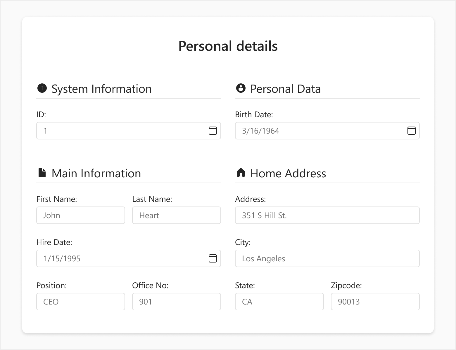
Specify the captionTemplate property to add custom content such as icons:
<dx-form ...>
  <dxi-item itemType="group" caption="Personal Data" captionTemplate="caption-template">
    <dxi-item dataField="firstName"></dxi-item>
    <dxi-item dataField="lastName"></dxi-item>
    <dxi-item dataField="position"></dxi-item>
  </dxi-item>
  <div *dxTemplate="let data of 'caption-template'">
    <i class="dx-icon dx-icon-user"></i>
    {{ data.caption }}
  </div>
</dx-form>
Select one of the following supported dev frameworks to explore the capabilities of this new feature:
Angular | React | Vue | jQuery
HtmlEditor — Spellcheck and CSP Support
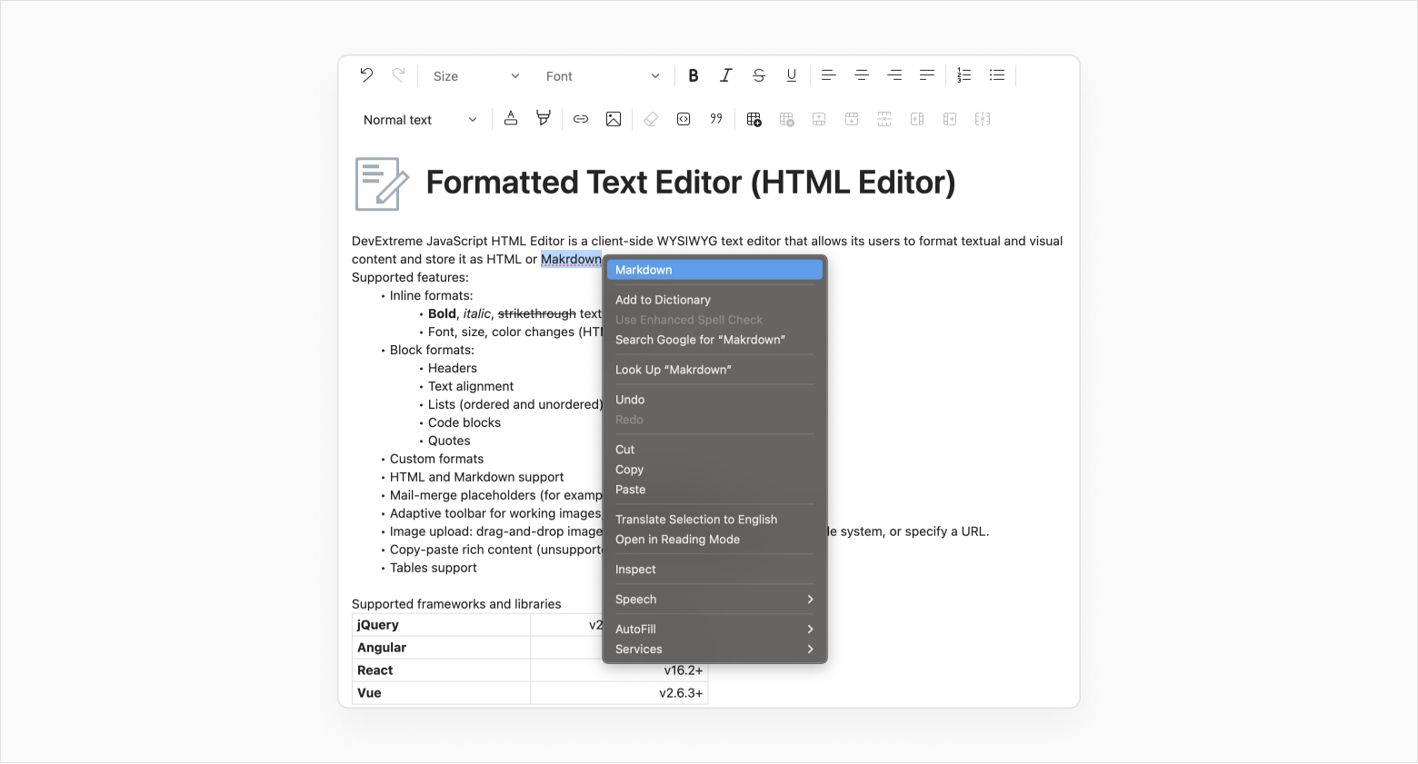
This EAP includes the following HtmlEditor-related enhancements:
- In previous versions, if you wanted to pass markup with inline styles to HtmlEditor value, you had to use Content Security Policy (CSP) directives to avoid errors. With this EAP, our HtmlEditor fully supports CSP.
- HtmlEditor now uses spellcheck functionality across all supported browsers.
ASP.NET Core — Data Validation Enhancements
Standalone Editor Validation
With this EAP, you can use Razor syntax (besides Model-based method) to add validation rules directly to the editors:
@(
    Html.DevExtreme().TextBoxFor(m => m.StringProperty).ValidationRules(tvr => {
        tvr.AddRequired();
    })
)
Remote Attribute — AdditionalFields Property Support
In ASP.NET Core, the Remote attribute implements client-side validation. The AdditionalFields property for this attribute allows you to validate field combinations against data on the server.
This EAP includes support for the AdditionalFields option in the DevExtreme DataGrid and TreeList.
The following code snippet implements email validation in the DataGrid column. If a user enters email info and this address is already in the database, you can check whether to create a new profile or edit an existing record (see RemoteValidation Controller). To introduce this type of validation, simply pass the ID field to AdditionalFields.
View
@(Html.DevExtreme().DataGrid<EmployeeValidation>()
    .Editing(editing => {
         editing.AllowUpdating(true);
         editing.AllowAdding(true);
    })
    .Columns(columns => {
        columns.AddFor(m => m.ID);
        columns.AddFor(m => m.Email);
    })
)
Model
using System.ComponentModel.DataAnnotations;

public class EmployeeValidation {
    public int ID { get; set; }

    [Remote("CheckUniqueEmailAddress", "RemoteValidation", AdditionalFields = nameof(ID))]
    public string Email { get; set; }
}
RemoteValidation Controller
[HttpPost]
public JsonResult CheckUniqueEmailAddress(EmployeeValidation model) {
    var isValid = !db.Employees.Any(emp => {
        var equals = string.Equals(emp.Email, model.Email, StringComparison.OrdinalIgnoreCase);
        return model.ID != emp.ID && equals;
    });
    return Json(isValid);
}
ASP.NET Core — Rich Text Editor Table API
This EAP includes an API designed to modify table layout, decoration, and structure at runtime.
const table = richEdit.document.tables.create(0, columnCount, rowCount);
table.autoFit = false;
table.style = "Grid Table 5 Dark Accent 1";
table.width = { type: TableWidthType.Twips, value: 9000 };
table.tableStyleOptions = {
    ...table.tableStyleOptions,
    totalRow: true,
    headerRow: true,
}