In this post, I'll summarize important Chart and Gauge-related features introduced in our last major release cycle (v23.1).
Charts — Сolor Gradients and Patterns
With v23.1, you now have the ability to customize styles and apply gradients, patterns, and images to your Charts.

To declare linear and radial gradient styles, utilize the registerGradient() method. This method returns a unique ID that can be used in the series/point/pane color object.
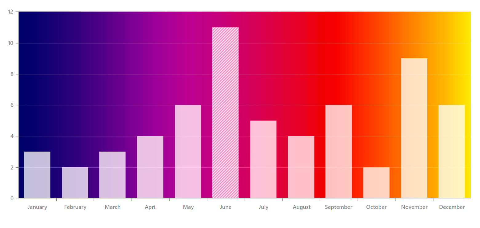
In this example, the Chart pane is colored using a linear gradient.
app.component.ts
import { registerGradient } from "devextreme/common/charts";

const gradientId = registerGradient("linear", {
    colors: [{
        offset: "0%",
        color: "#1D5B79"
    }, {
        offset: "25%",
        color: "#EF6262"
    }, {
        offset: "55%",
        color: "#F3AA60"
    }, {
        offset: "80%",
        color: "#468B97"
    }]
});

export class AppComponent {
    paneColor = {
        fillId: gradientId
    };
}
app.component.html
<dx-chart ... >
    <dxo-common-pane-settings [color]="paneColor">
    </dxo-common-pane-settings>
</dx-chart>
For pattern and image styles, use the registerPattern() method.
.png)
app.component.ts
import { registerPattern } from "devextreme/common/charts";

const patternId = registerPattern({
    width: 10,
    height: 10,
    template: (container) => {
        const rect = document.createElementNS('http://www.w3.org/2000/svg', 'rect');
        rect.setAttribute('x', 0);
        rect.setAttribute('y', 0);
        rect.setAttribute('width', 9);
        rect.setAttribute('height', 9);
        rect.setAttribute('fill', '#461959');
        container.appendChild(rect);
    }
});

export class AppComponent {
    seriesColor = {
        fillId: patternId
    };
}
app.component.html
<dx-chart ... >
    <dxi-series [color]="seriesColor">
    </dxi-series>
</dx-chart>BarGauge — New 'Shift' Mode to Resolve Overlapping Labels
To prevent overlapping labels in a BarGauge when multiple values are displayed closely together, you can utilize the resolveLabelOverlapping property of the Gauge component. This property allows you to specify how the component modifies the position/visibility of labels. With the introduction of our new shift mode, BarGauge labels can dynamically shift their positions as needed to avoid overlap.
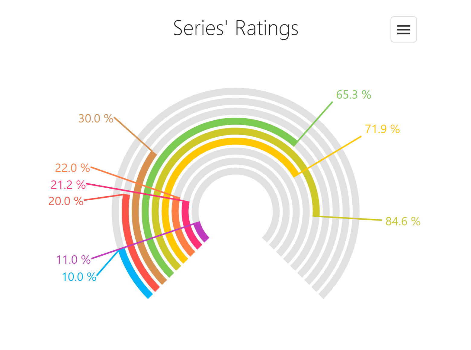
<dx-bar-gauge ...
    resolveLabelOverlapping="shift"
>
</dx-bar-gauge>
Gauge – Custom Content Inside the Component
You can now add custom SVG content (such as text and images) inside the Gauge component.
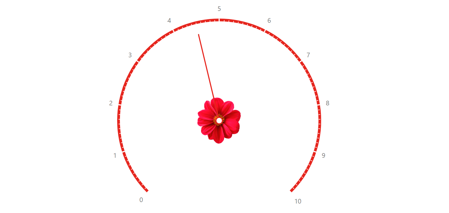
To add custom SVG content, use our new centerTemplate property.
<dx-circular-gauge centerTemplate="centerTemplate" ... >
    <svg *dxTemplate="let gauge of 'centerTemplate'">

        <image href="url/image.png" x="0" y="0" width="100" height="100"></image>
    </svg>

</dx-circular-gauge>