Our next major release (v23.2) is a couple of months away. In this post, I'll describe the new features we included in our Early Access Preview (EAP) build. If you encounter issues with our EAP build, feel free to submit a support ticket via the DevExpress Support Center or use the embedded survey to send us feature/product-related feedback.
Installation
To begin using the DevExtreme EAP build, simply install target framework related NPM package marked with the 23.2-next tag. Use one of the commands below to proceed.
npm install devextreme@23.2-next --save-exact

npm install devextreme-angular@23.2-next --save-exact // Angular installation

npm install devextreme-react@23.2-next --save-exact // React installation

npm install devextreme-vue@23.2-next --save-exact // Vue installationEarly Access and CTP builds are provided solely for early testing purposes and are not ready for production use. This build can be installed side by side with other major versions of DevExpress products. Please backup your project and other important data before installing Early Access and CTP builds.
This EAP may not include all features/products we expect to ship in our v23.2 release cycle. As its name implies, the EAP offers an early preview of what we expect to ship in two months.
Calendar — Discrete Day Multi-Selection
With the new selectionMode option, you now have three distinct modes to choose from: single, multiple, or range selection. In single mode, users can select a single date, while multiple mode enables selection of multiple dates. Range mode allows users to select the first and last dates of a given range.
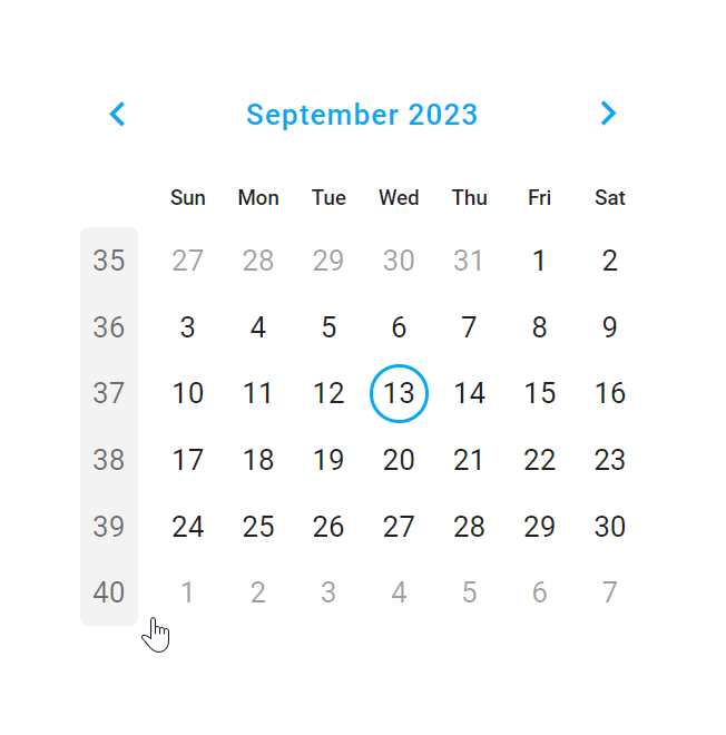
We also expanded the value option, allowing you to set not just a single date as the initial value but also an array of dates. To simplifyCalendar navigation, we also introduced aselectWeekOnClick option, enabling users to select an entire week by clicking on its week number.
Demo: Select one of the following supported dev frameworks to explore the capabilities of this new feature:
Angular | React | Vue | jQuery
Tab/TabPanel — Vertical Orientation and Icon Position
This EAP includes multiple new Tab/TabPanel-related features.
For Tabs, we added a new orientation option that allows you to arrange tabs either horizontally or vertically.
For TabPanel, our new tabsPosition option allows you to align tabs on the right, left, top, or bottom of the panel.
.png)
Both Tabs and TabPanel now include aniconPosition option, allowing you to define where icons are displayed within Tabs (start, end, top, or bottom position).

Demo: Select one of the following supported dev frameworks to explore the capabilities of this new feature:
TabsAngular | React | Vue | jQuery
TabPanelAngular | React | Vue | jQuery
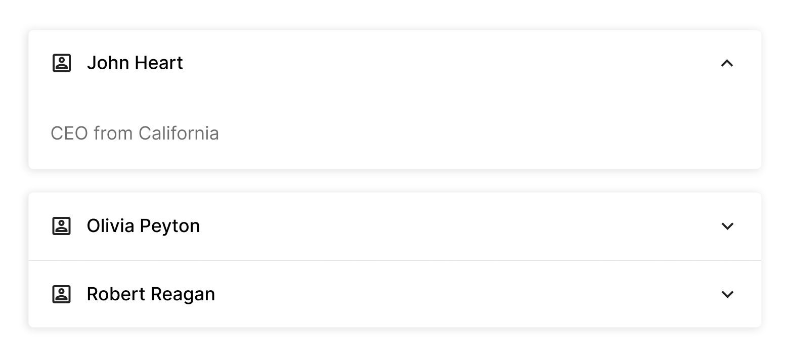
Form/Editors — Change Detection (Dirty State)
This EAP includes enhanced Editor and Form functionality.
First, we renamed the reset method to clear (for uniformity across components). To maintain reset functionality, we introduced a new reset method for our editors, allowing you to revert values to their initial state.
Similarly, we renamed (and deprecated) the Form's resetValues method and introduced clear instead. To maintain reset functionality for the entire Form, we introduced a new reset method.
We also introduced the isDirty flag, which is now available for both editors and Form. The isDirty flag helps determine whether Form items or an editor have undergone changes. It allows you to disable the reset button when the Form remains unchanged, eliminating unnecessary actions. You can also use isDirty when users accidentally close the Form. In such instances, you can prompt users to save changes only if modifications were made.
Demo: Select one of the following supported dev frameworks to explore the capabilities of this new feature:
Angular | React | Vue | jQuery
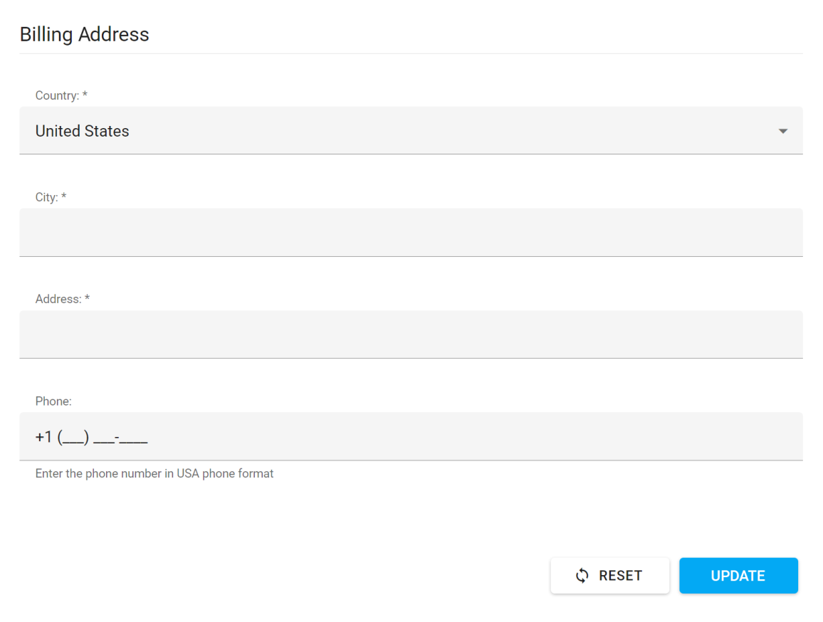
Form — DateRangeBox Support
You can now use editorType: 'dxDateRangeBox' to add our DateRangeBox component to a Form.
%20(2).png)
<dxi-item
    dataField="VacationDates"
    editorType="dxDateRangeBox"
    [editorOptions]="dateRangeBoxOptions"
>
</dxi-item>
Material Theme Enhancements
This EAP includes the following changes to the DevExtreme Material Theme:
To address accessibility-related issues, the disabled state for the Button component now includes a higher contrast color combination.
![Button in the disabled state]()
- We updated the appearance of our ButtonGroup component to ensure consistency with Google's Material Design guidelines.
![ButtonGroup enhancements]()
- Different text editor (type) boxes are now the same height. Thanks to higher contrast color combinations, the content of label and placeholder elements are also more accessible.
![Text editors enhancements]()
- Multiple changes have been introduced within the DevExtreme Accordion component. The text and the icon inside the header are now aligned. The spin icon uses a higher contrast color combination. The component's overall style is more consistent with those outlined in Google's Material Design guidelines.
.png)
.png)
.png)
Accessibility
We continue to enhance accessibility support within the DevExtreme product line. This EAP includes contrast-related enhancements for the DevExpress Data Grid.
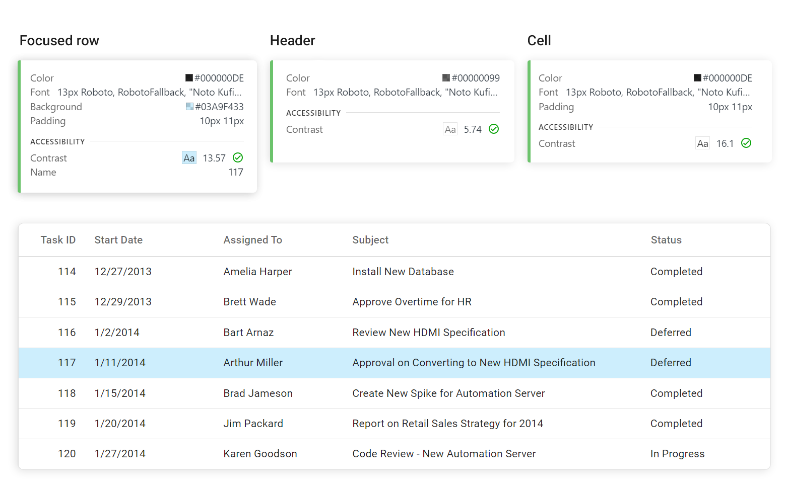
Using WCAG and Section 508 standards, we also improved the reading experience for individuals using screen readers. Enhancements like the reading of validation messages are now available across various components such as the DevExtreme DataGrid, HtmlEditor, DropDownBox, NumberBox, and DateBox.
Note: To help isolate/address accessibility-related issues, we us multiple tools including aXe, Lighthouse, and WAVE.
Vite Support
We addressed Vite installation-related restrictions: You no longer need to specify additional configurations.
Vue Demos — Composition API Support
We converted several of our Vue demos to Composition API. You can check them out using the following links: DataGrid and Editors demos.