This post covers recent changes made to our JavaScript Toolbar component (v22.2) and briefly describes associated implementation details. Feel free to share your feedback using surveys embedded in this post or submit a support ticket via the DevExpress Support Center.
Toolbar Adaptivity Mode
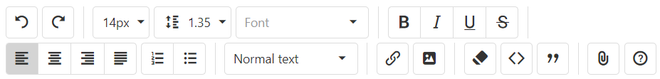
When using our Toolbar within a project, you can add any number of toolbar items to the toolbar itself. Items that do not fit within the toolbar will be hidden. To avoid this behavior and display controls across multiple lines, simply enable the component’s multiline property.
Image may be NSFW.Clik here to view.
Angular
<dx-toolbar ...
    [multiline]="true"
>
    <!-- ... -->
</dx-toolbar>Popup and Popover Toolbar Customization
DevExtreme v22.2 allows you to customize top and bottom toolbars integrated into Popup/Popover (in the same manner as our standalone Toolbar component). To specify whether an item is displayed on a top or bottom toolbar, assign the top or bottom value to the toolbar property. You can use the following properties to customize toolbar items:
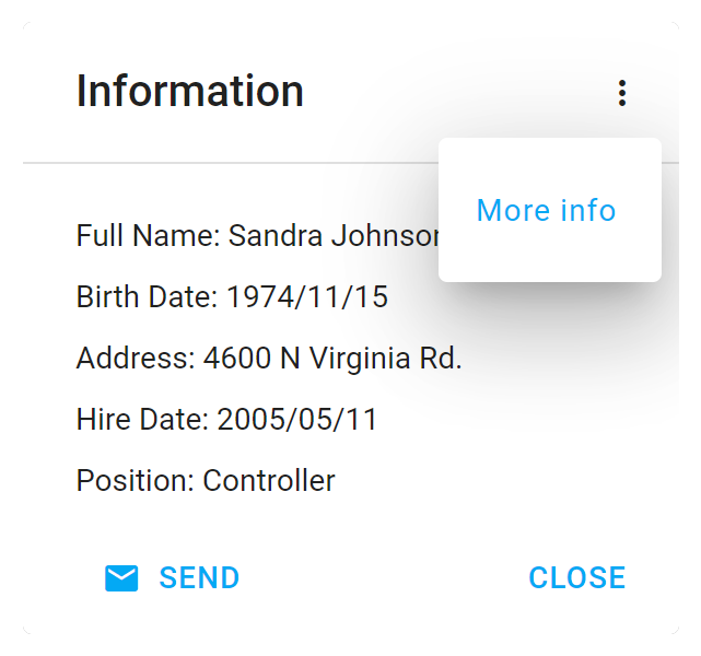
Hide Toolbar Items in the Overflow Menu
The overflow menu can include hidden toolbar items (to help save screen space). If you want to display a toolbar item in the overflow menu permanently, set the item's locateInMenu property to always. You can also set the same property to auto if you want to hide the item only when the Popup's width decreases. If you do not specify the locateInMenu property, toolbar items are not hidden in the overflow menu.
The image below displays a top toolbar item in the overflow menu permanently.
Image may be NSFW.Clik here to view.
Angular
<dx-popup ... >
    <dxi-toolbar-item
        ...
        toolbar="top"
        locateInMenu="always"
    ></dxi-toolbar-item>
</dx-popup>Customize Overflow Menu Items
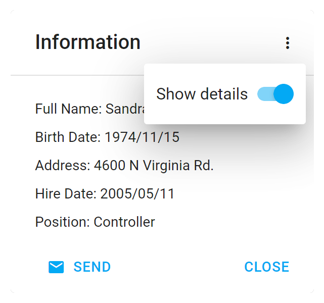
You can customize the appearance of overflow menu items as needs dictate. The menuItemTemplate property allows you to specify the template used to render a menu item.
If you wish to apply a custom CSS class to this item, assign it to the cssClass property.
The image below displays a custom menu item (using Switch component and text label), stylized via the CSS class:
Image may be NSFW.Clik here to view.
Angular
app.component.html
<dx-popup ... >
    <dxi-toolbar-item
        ...
        location="after"
        locateInMenu="always"
        cssClass="menuItemCustomStyle"
        menuItemTemplate="menuItemCustomTemplate"
    > </dxi-toolbar-item>
    <div *dxTemplate="let data of 'menuItemCustomTemplate'">
        <span>Show details</span> <dx-switch></dx-switch>
    </div>
</dx-popup>
app.component.ts
import { Component } from '@angular/core';
import { DxPopupModule, DxSwitchModule, ... } from 'devextreme-angular';
// ...
export class AppComponent {}
app.component.css
::ng-deep.customMenuItemStyle {
    padding: 8px;
} import React from 'react';
import { Popup, ..., ToolbarItem, Switch } from 'devextreme-react/popup';
const menuItemCustomTemplate=React.useCallback(() => {
return `<div>
<span>Show details </span> <Switch/>
</div>`;
}, []);
function App() {
return (
<Popup ... >
<ToolbarItem
...
menuItemRender={menuItemCustomTemplate}
/>
</Popup>
);
}
export default App;Clik here to view.