In this blog post, I'll summarize the major features we expect to ship with DevExtreme v23.1. These features apply to both DevExtreme JavaScript (Angular, React, Vue, jQuery) and DevExtreme-based ASP.NET MVC/Core Controls. To share feedback, please respond to the survey questions embedded within this post.
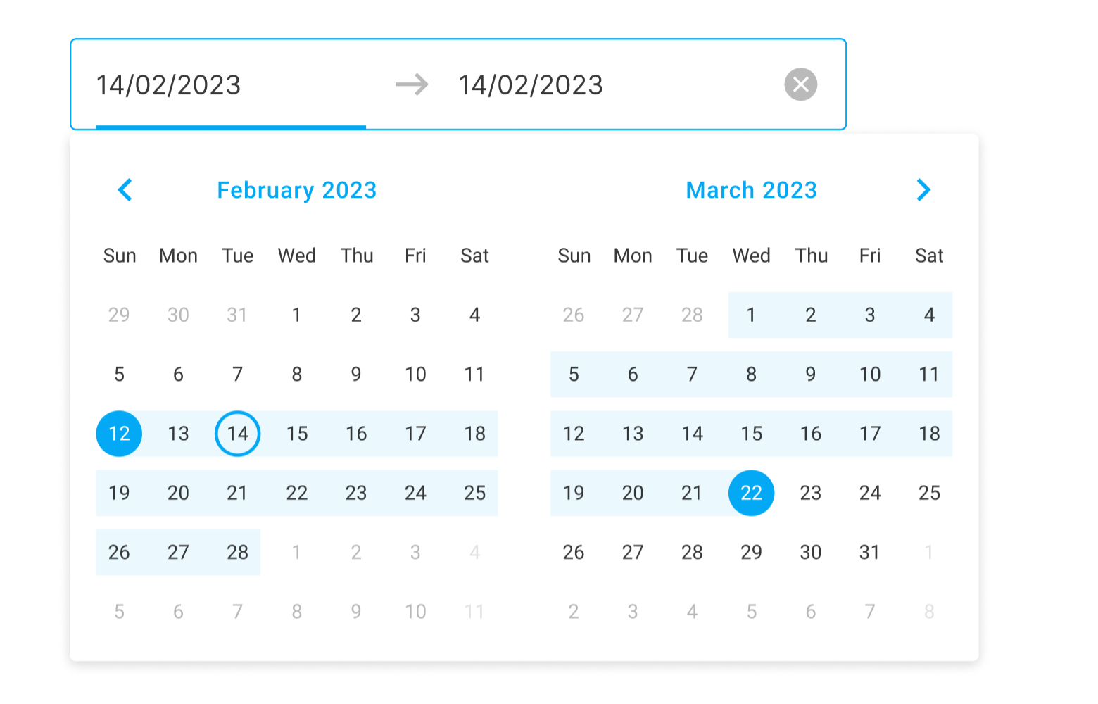
New DateRangeBox Component
DevExtreme v23.1 will ship with a new DateRangeBox editor. As its name implies, this new control will allow end users to select a date range. The component will inherit features found in ourDateBoxcomponent – masked input, flexible popup and calendar customization, input label/styling modes, etc.
UI/UX Customization
DataGrid/PivotGrid/TreeList - HeaderFilter and ColumnChooser Popup Customization
v23.1 will include extended customization options for our HeaderFilter and ColumnChooser popups (for DevExtreme’sDataGrid, PivotGrid, TreeListcomponents).
HeaderFilter enhancements will include:
- Display/hide the 'Select All' checkbox.
- Expose configuration options for our built-in search editor via APIs.
ColumnChooser enhancements will include:
- Set initial position of the popup.
- Display/hide a column when its caption is clicked.
- New SelectAll/UnselectAll option (a checkbox within the UI).
- Enable/disable recursive selection for band columns.
- Expose configuration options for our built-in search editor via APIs.
Based on feedback and available resources, we may incorporate a few additional capabilities listed below.
Charts - Сolor Gradients and Patterns
v23.1 will ship with extended Chart customization options. In addition to plain colors, you will be able to fill Chart elements with gradients, patterns, and pictures.


Charts - Control Label Position in Series
We will add an API to modify default label position (to specify an offset).
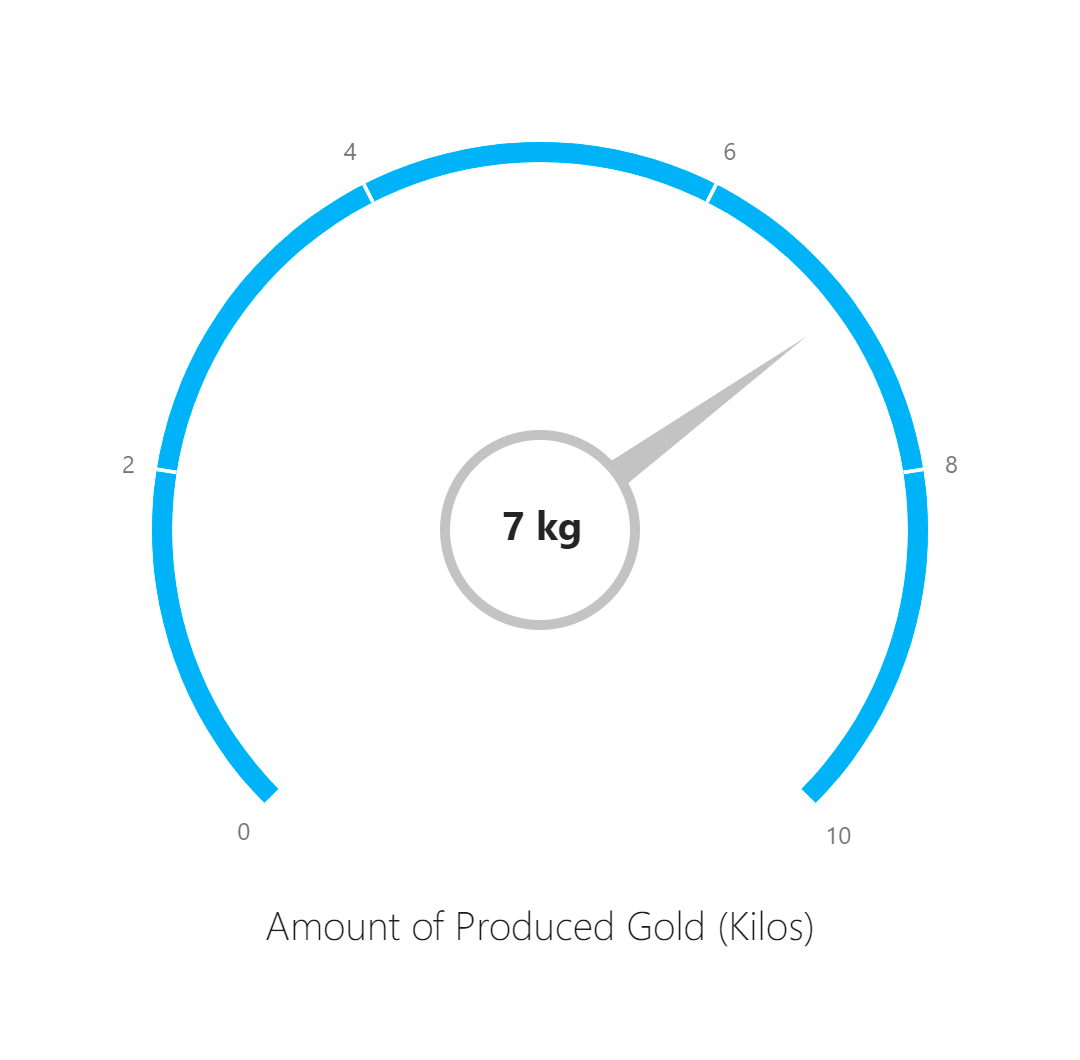
Gauge – Custom Content Inside the Component
With DevExtreme v23.1, you will be able to add custom content (text, images) in the center of the Gauge component. We will deliver this capability via ‘templates'.
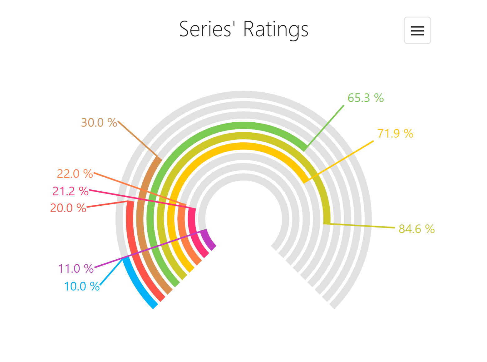
BarGauge - Support 'Shift' Mode to Address Overlapping Labels
At present, BarGaugecan hide labels which overlap one another. In our next major release (v23.1), we will introduce a new `shift` mode option. When enabled, the BarGauge will automatically shift labels to prevent overlaps (as implemented in our PieChart).
Overlay Components - Native Scrolling
Our Popup, Popover, and Tooltip components will ship with native scrolling support. You will no longer need to wrap content with an additional ScrollView component. Another benefit of this enhancement is that touch gesture experiences on mobile devices will improve.
TreeView - Support Custom Expand/Collapse Icons
We plan to extend the TreeView’s API, so you can specify custom expand/collapse icons as needs dictate.
New expandIcon and collapseIcon properties will accept different source types.
$('#treeview').dxTreeView({
    items: products,
    // ...

    expandIcon: './icons/expand_icon.png',
    collapseIcon: './icons/collapse_icon.png',

    // Another option

    expandIcon: 'add',
    collapseIcon: 'minus',
}).dxTreeView('instance');
API Enhancements
Menu - Add the 'url' Option for Items
In our next major release (v23.1), we will introduce a new url option for Menu items. With this change, you will not have to implement complicatedonItemClick event handlers. This feature will also enable built-in web browser capabilities such as open page in a new tab or copy URL address.
$('#menu').dxMenu({
    items: [
        {icon: 'home', url: '/'},
        {text: 'about', url: './about.html'},
        {text: 'products', url: './products.html'},
        {icon: 'cart', url: './cart.html'}
    ],
   // ...
}).dxMenu('instance');
List - Select Items by Click
DevExtreme TreeView and other components include aselectByClickoption. This option specifies whether an item is selected if a user clicks on its caption. We will implement a similar option for ourList component.
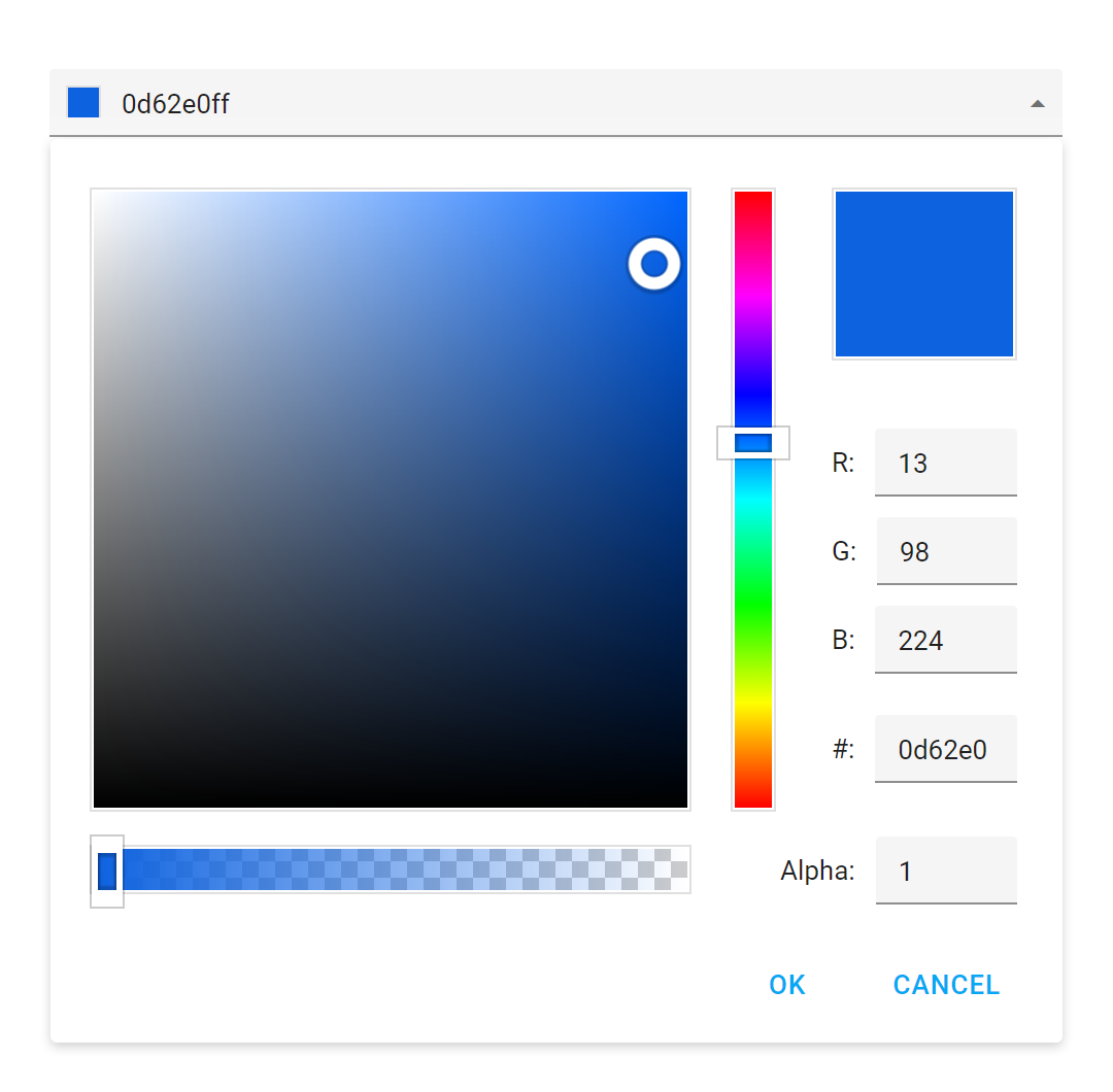
ColorBox – Hexadecimal 8-digit RGBA Format Support
As of now, the DevExtreme ColorBox accepts colors in 3- and 6-digit hexadecimal ("#F00", "#FF0000"), RGB ("rgb(255, 0, 0)"), and RGBA ("rgba(255, 0, 0, 1)") formats (as well as color names). We will add additional hexadecimal (with alpha channel 4- and 8-digit formats) to this list.
UI Template Gallery
We plan to extend our Responsive UI Template Gallery with the following capabilities:
- Add new templates to address additional use cases common to many business-oriented applications.
- Expose existing sub-components as building blocks within separate gallery sections, so that they can be easily reused in your applications.
- Give you the ability to switch themes inside the UI Template Gallery application at runtime.

Security
We will continue to focus on security-related matters and offer extendedContent Security Policy (CSP) support in our components.
Accessibility
We will continue to enhance accessibility support – including enhanced keyboard navigation and screen reader support.
TypeScript Support Enhancements
We expect to incorporate the following enhancements for TypeScript developers:
- Extended TypeScript support in React applications.
- Simplify type imports in Angular, React, and Vue apps.
- Enhance our documentation to better describe TypeScript-related features.