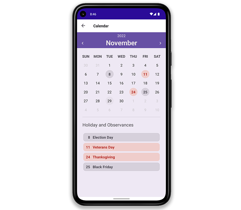
In this post, I'll describe "Material Design 3" related design enhancements we've introduce to our .NET MAUI component line (v22.2).
Material Design is an adaptable system of guidelines, components, and tools that adhere to user interface design best practices. Refer to the Material Design Guidelines for more information.
Colors
New color palettes used in our .NET MAUI Controls v22.2 are based on Google's Material Design 3 Color Guideline.

You can view the new colors in the interactive image below. Drag the slider to explore the difference between previous colors and new counterparts.

Elevation
The Elevation guideline uses colors, shadows, and scrims to create depth within an application. We apply this guideline to controls displayed on top of another element (Popup Control, DataGridView items during drag-and-drop operations, ComboboxEdit, dropdown within the DXCalendar, and many more).

Shape
Element shapes can improve/modernize any mobile app. While sharp/square elements ruled the day five years ago, fluent and rounded shapes are now the norm.
Our .NET MAUI Scheduler Control has been overhauled to use rounded shapes where possible. Drag the slider on the image below to view the difference between versions.

Typography
The Typography guideline sets out to make text more legible/beautiful. As you can see in the image below, we have updated fonts used within our .NET MAUI UI controls.

Accessibility Design Pattern
Our .NET MAUI Controls v22.2 follow the Accessibility Design Pattern. Among other things, this design pattern helps promote text readability. The interactive image below demonstrates the difference between v22.1 and v22.2 (DataGridView). Drag the separator to view the difference.

Interaction States
The Interaction States guideline defines ways to help users better understand the state of a given element: whether it is selected, pressed, disabled, or dragged. We've made appropriate changes to address the requirements set forth in this guideline.
