Our most recent major update (v22.2) ships with a new Blazor Window component. You can use this new component to display a non-modal window with custom content in your Blazor application. The DevExpress Window Component allows you:
- to display additional/relevant information on screen
- to implement custom search dialogs
- to gather information from users or ask for confirmation
The DevExpress Blazor Window component includes the following built-in features:
Header, Body, and Footer Customization
The DevExpress Blazor Window component consists of header, body, and footer elements. As you might expect, our Window component offers multiple customization options for these individual elements.
- ShowHeader | ShowFooter: Controls header/footer visibility. The default Window displays header and body content.
- HeaderText | BodyText | FooterText: Allows you to display plain text within an element and apply all predefined appearance settings.
- HeaderTextTemplate | BodyTextTemplate | FooterTextTemplate: Allows you to display any UI fragment within an element. These templates only affect the text region. As such predefined content alignment and paddings apply.
- HeaderTemplate | BodyTemplate | FooterTemplate: Allows you to customize the entire Window element. Predefined appearance settings do not apply.
<DxWindow ...
    HeaderText="Header"
    BodyText="Lorem ipsum dolor sit amet, consectetur adipiscing elit. Mauris sit amet metus vel
             nisi blandit tincidunt vel efficitur purus. Nunc nec turpis tempus, accumsan orci auctor,
             imperdiet mauris. Fusce id purus magna." showfooter="true">
    <FooterTextTemplate>
        <DxButton Text="OK" Click="@context.CloseCallback"/>
    </FooterTextTemplate>
</DxWindow>

Window Position, Drag Operations
The Blazor Window is centered both horizontally and vertically on screen by default. To modify Window position, use the following properties:
- PositionX and PositionY - Specify both X and Y coordinates of the Window’s top left corner.
- HorizontalAlignment and VerticalAlignment - Controls the horizontal and vertical alignment of the Window.
You can also enable the AllowDrag property to allow users to drag the Window to a new position.
<DxWindow ...
    PositionX=250
    PositionY=250
    AllowDrag=true>
</DxWindow>
Window Size, Resize Capabilities
Our Blazor Window's Width and Height properties allow you to specify the Window’s size in absolute or relative units. You can also force the Window to adapt width/height to its content (auto). Use the MinHeight, MaxHeight, MinWidth, and MaxWidth properties to explicitly define a Window’s size constraints.
<DxWindow ...
    Width="auto"
    MinWidth="300px"
    MaxWidth="600px" >
</DxWindow>
You can also activate the AllowResize property to allow users to modify Window size.
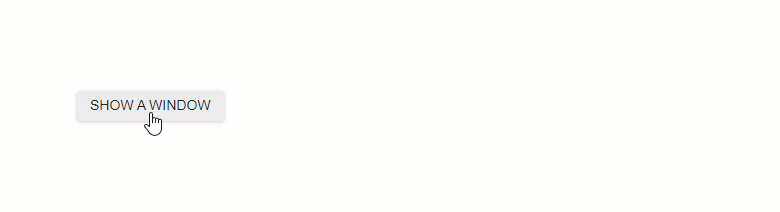
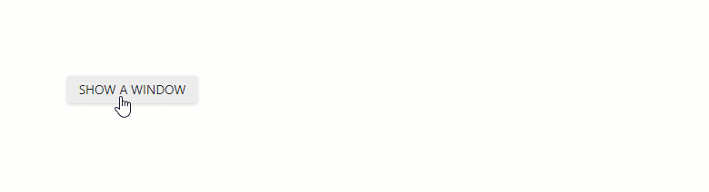
Show and Close Actions
To display and close the Window, you can implement two-way binding for the Visible property.
<DxButton RenderStyle="ButtonRenderStyle.Secondary"
    Click="() => WindowVisible = !WindowVisible">SHOW A WINDOW</DxButton>
<DxWindow @bind-visible="WindowVisible" ... >
	...
</DxWindow>
@code {
    bool WindowVisible { get; set; } = false;
}
You can also call the ShowAsync and CloseAsync methods to display and close the Window asynchronously.
Display Window at a Custom Position
You can also use ShowAtAsync method overloads to display the window at a custom position:
- over the element specified by selector or ElementReference
- at a specified point
- at specified coordinates
<DxButton RenderStyle="ButtonRenderStyle.Secondary"
    Id="windowTarget"
    Text="SHOW A WINDOW AT ELEMENT (BY SELECTOR)"
    Click="OnShowAtElementSelectorClick">
<DxWindow @ref="@windowRef" ... >
	...
</DxWindow>
@code {
    DxWindow windowRef;
    async Task OnShowAtElementSelectorClick(MouseEventArgs args) {
        await windowRef.ShowAtAsync("#windowTarget");
    }
}
</DxButton> Other Components You Can Use to Display a Custom Window
The following components can also be used to display custom windows in a Blazor application: DropDown, Flyout, Popup, and our new Window.
While base functionality for these components is similar, they are often used to address different usage scenarios:
- DropDown - Displays a drop-down window.
- Flyout - Displays a pop-up window with an arrow displayed next to its element. Typically used to display tooltips or hints.
- Popup - Displays a modal adaptive window that overlays the current view.
- Window - Displays a non-modal window. The window captures input focus when it appears, but users can still interact with the page itself.
Your Feedback Matters
Please take a moment to answer the following survey questions. Your feedback will help us fine-tune our long-term Blazor development plans.