The DevExpress Blazor Form Layout control now ships with extended group layout capabilities – including new customization options.
Expand and Collapse Group Content
With v22.2, you can allow users to expand/collapse groups as requirements dictate. Display the expand button to enable this feature in the UI or use the Expanded property to enable this capability in code. Apply the slide animation effect for smooth content expand\collapse operations.
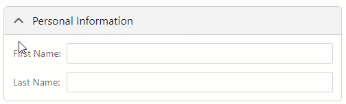
You can also replace expand and collapse buttons with custom icons.
If you are ready to incorporate collapsible groups into your Blazor application, refer to the following GitHub repository for a sample application: https://github.com/DevExpress-Examples/blazor-form-layout-collapsible-groups.
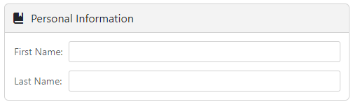
Customize Group Header
You can now use the HeaderIconCssClass property to add a custom icon within a group header.
If our built-in options do not address your customization needs, you can use one of three templates to customize group captions further:
- CaptionTemplate customizes the caption (text placeholder region).
- HeaderContentTemplate customizes the header’s entire client area (retains default header background and expand button).
- HeaderTemplate customizes the entire header including the background and expand button.
Your Feedback Counts
As always, we highly appreciate your feedback.