In our next major update (v22.2), we're adding the dx-class tag property to our HTML & CSS Templates. This tag will apply different CSS styles to the same element, based on the value of a selected property.
The common syntax for this tag is <div dx-class="{PropertyName: N}">...</div>, where PropertyName is the name of a property to which the required CSS style is applied. N represents the list of styles to choose from.
To help explain the power of this new feature, let's take a look at how you can apply the syntax based on property type.
Style Selection for Boolean Properties
If your templates visualize items with a Boolean property, you may want to style these items differently (based on specific business needs/visualization requirements). To visualize "true" or "false" states differently, dx-class property syntax should be as follows:
<div dx-class="{InStock: styleForTrue, styleForFalse}">...</div>Let's assume you design a template for a WinForms Data Grid that displays records from an "Employee" class.
public class Employee {
    public string FirstName { get; set; }
    public string LastName { get; set; }
    public bool OnLeave { get; set; }
    // ...
}
The markup for this class might look like the following:
HTML
<div class="horz-container">
    <div class="name">${FirstName}</div>
    <div class="name">${LastName}</div>
    <div class="vacation-label">Vacation</div>
</div>
CSS
.vacation-label {
    background-color: purple;
    color: White;
    width: 70px;
    height: 20px;
    border-radius: 10px;
    text-align: center;
    display: flex;
    justify-content: center;
    align-items: center;
    font-size: 10px;
    font-weight: bold;
}
For this particular example, we wish to display a badge next to employees currently on "Vacation":

To address this particular requirement, we will need to create an additional CSS style that sets the "visibility = hidden" parameter...
.hidden-element {
    visibility: hidden;
}
...and use dx-class to apply this style for "false" values associated with the OnLeave property.
<div class="vacation-label" dx-class="{OnLeave: , hidden-element}">Vacation</div>
This particular example reveals two important facts about the dx-class property:
- You can (and should) use both
classanddx-classproperties together. The standard property allows you to set up a style applied unconditionally for all data records, whereas additional CSS styles apply additional customizations to records that fit the given criteria. - You can omit a style for either "true" or "false" values if you do not need extra customization for it. To do so, do not specify a style name before or after the comma delimiter:
dx-class="{OnLeave: true-only}ordx-class="{OnLeave: , false-only}.
Style Selection for Enumeration Properties
To switch CSS styles based on enumeration type properties, specify the name of the appropriate property in dx-class...
<div class="defaultItemStyle" dx-class="{TaskSeverity}">
    <!--...-->
</div>
...and create styles that match enumeration values. In the example above, the property responsible for selecting the correct CSS style is the "TaskSeverity" enumeration and it includes the following values: "Minor", "Moderate", "Critical". This means you need to create three CSS styles (or fewer, if you do not need an additional style for specific values):
.Minor { ... }
.Moderate { ... }
.Critical { ... }
The image below illustrates how you can leverage this particular technique in your next WinForms project: the side stripe changes color based on task severity.

If you want to use custom style names, specify them explicitly in the dx-class property:
<div class="defaultItemStyle" dx-class="{TaskSeverity: style-A, style-B, style-C}">
    <!--...-->
</div>
Note that this syntax relies on the order in which enumeration values are declared. So, if our sample "TaskSeverity" enumeration is as follows...
public enum VehicleType {
    Moderate,
    Minor,
    Critical
}
...the template will apply styles in the same order: "style-A" matches "Moderate" values, "style-B" matches "Minor", "style-C" matches "Critical".
Style Selection for String Properties
The dx-class syntax for string properties is similar to that of enumeration values: specify the name of a target property and create styles that match available values for this property.
<div class="defaultItemStyle" dx-class="{FirstName}">
    <!--...-->
</div>
.Christel { ... }
.Lorenza { ... }
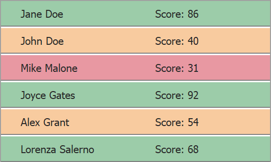
.Erin { ... }String-based selectors cover all cases that cannot be solved using Boolean- or enumeration-based selectors. For example, the image below illustrates a template-based list of student exam results.

public class TestResults {
    public string StudentName { get; set; }
    public int Score { get; set; }
}
To apply different background colors, you can declare a new String property in the data record class, and use this property as a CSS Style selector.
Code behind (C#)
public class TestResults {
    public string StudentName { get; set; }
    public int Score { get; set; }
    public string ScoreRange { get {
        if (Score < 40) return "Rank-Low";
        if (Score >= 40 && Score < 60) return "Rank-Medium";
        return "Rank-High";
    }
}
HTML
<div class="horz-container" dx-class="{ScoreRange}">
	<div class="name">${StudentName}</div>
	<div class="name">$Score: {Score}</div>
</div>
CSS
.Rank-Low { background-color: @Critical/0.5 }
.Rank-Medium { background-color: @WarningFill/0.5 }
.Rank-High { background-color: @Success/0.5; }
Chaining Styles
I've already mentioned that class and dx-class properties complete one another: the first sets a global style, and the second allows you to specify style selection logic. Note that a conditional CSS style does not cancel a global style - both are active at the same time. A global style applies default settings, and a conditional style is applied as a second layer to this "pre-styled" element.
You can also daisy-chain multiple styles for the same value in the dx-class property itself. To do this, enter style names using space as a delimiter. All styles before the next comma character will be applied simultaneously.
dx-class="{BooleanProperty: trueA trueB trueC , falseA falseB}
dx-class="{EnumProperty: value1Style1 value1Style2 ,, value3Style1 value3Style2 }