In a previous post, I shared new Blazor Grid features we expect to deliver in our v22.2 release cycle. Today, I'll describe our v22.2 plans regarding Blazor Data Editors. Please feel free to share your feedback via the inline survey questions below.
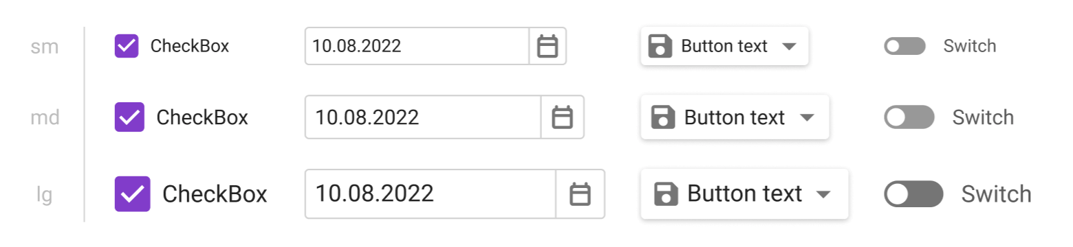
New Render & Size Mode Enhancements
DevExpress Grid, Data Editors, Layout, and Navigation components will switch from Bootstrap to our own rendering engine. The new rendering engine will help us deliver:
- Improved performance with fewer JavaScript interop calls.
- Consistent appearance across DevExpress Blazor controls.
In addition, we expect to significantly improve our Size Modes. New size modes will apply to all controls that use the new rendering engine (Grid, Data Editors, Layout, and Navigation components) and allow you to create "dense" interfaces with more relevant information on the screen.
Important Note. If you develop apps that make use of the four DevExpress themes, you will only see changes in font size and margins/paddings for specific elements. However, if you are working with a Bootstrap-based theme, you should plan an upgrade path in advance. Once the new rendering engine ships, DevExpress controls that support it (Grid, Data Editors, Layout, and Navigation components) will only take CSS variable values (colors, fonts) from your Bootstrap theme. Other theme settings (paddings & margins, colors defined in widgets, shadows, border thickness, rounded corners, pseudo-classes) will be ignored.
Masked Input Enhancements
We will rewrite our Blazor Mask Engine to avoid JSInterop calls, improve performance & stability, and fix longstanding usability issues.
In addition, DevExpress Blazor Data Editors will support the following mask types:
- DateTimeOffset
- TimeSpan
Command Buttons
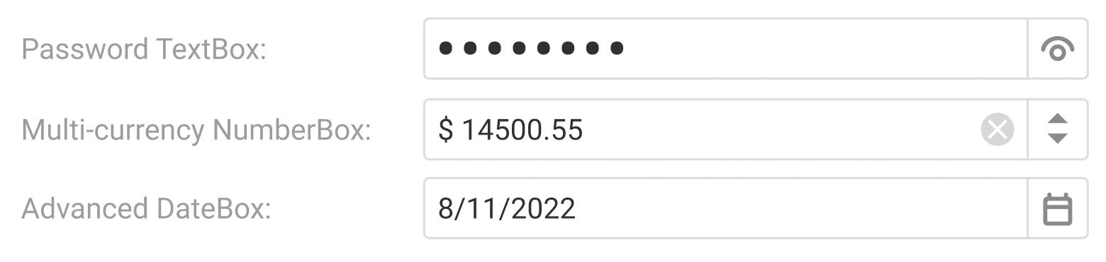
Our Blazor text editors will ship with an API to specify custom command buttons displayed within the edit box. You will also be able to hide or customize built-in command buttons (such as the one that opens a dropdown).
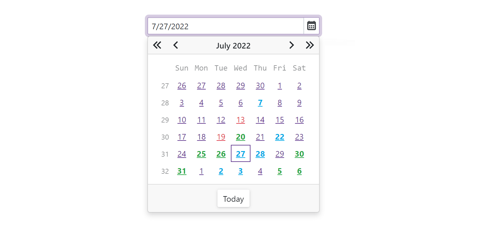
Date Picker — Highlight Special Dates
We will implement an API to highlight specific dates (such as holidays) in the Date Picker's dropdown:
@using Data
<DxDatePicker T="DateTime">
    <DayCellTemplate>
        <a class="@GetCssClassNames(context)">@context.Day.ToString()</a>
    </DayCellTemplate>
</DxDatePicker>
@code {
    CalendarData data = new CalendarData();
    string GetCssClassNames(DateTime date) {
        return data.Holidays.Exists(d => date.Date == d.Date) ? "text-danger" : string.Empty;
    }
}
ComboBox & TagBox — Highlight First Match
DevExpress Blazor ComboBox and TagBox components will automatically highlight the first match after filtering. Once implemented/enabled, end-users can select values faster by typing a keyword and pressing Enter.