With our v22.1 release, the DevExpress WinUI Chart Control ships with a lightweight API hierarchy to help simplify discoverability. Said simply, we revised the Chart Control’s public API structure and decreased API member nesting levels. We also think our API is more intuitive and MVVM-friendly.
In this blog post, I’ll demonstrate the new settings you’ll need to use to modify the Chart Control.
Axes
First, we removed the AxisBase.AxisLabelOptions property and the respective class itself: The following label properties are available at the AxisBase class level:
The same kind of change was applied to the AxisBase.AxisTitle property and the AxisTitle class. You can now use the following AxisBase class properties to set up a chart’s title options:
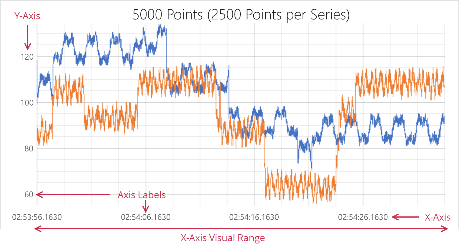
We also hid WholeAxisRange and VisualAxisRange classes from the public API. As such, the following API members (used to define both Visual and Whole ranges) are now available at the AxisBaseclass level:
- VisualRangeStartValue
- VisualRangeEndValue
- VisualRangeStartValueInternal
- VisualRangeEndValueInternal
- SynchronizeVisualRange
- WholeRangeStartValue
- WholeRangeEndValue
- WholeRangeStartValueInternal
- WholeRangeEndValueInternal
- WholeRangeAutoCorrect
- SideMargins
Series
Given the nature of changes we applied to Axes APIs, we used the same pattern for Series.
Properties required to set up Series Label options and Titles for Pie and Funnel view were moved to the base SeriesView class and its descendants for a series. The SeriesView class now features the following API members:
To set up titles for Pie and Funnel views you must now use the following properties:
- PieSeriesView.ShowTitle | FunnelSeriesView.ShowTitle
- PieSeriesView.Title | FunnelSeriesView.Title
- PieSeriesView.TitleContentTemplate | FunnelSeriesView.TitleContentTemplate
- PieSeriesView.TitlePosition | FunnelSeriesView.TitlePosition

Finally, the following properties have changed from attached to regular:
- AxisY.ShowZeroValue
- BarSeriesView.SideBySideBarLabelPosition
- FunnelSeriesView.LabelPosition
- PieSeriesView.LabelPosition
- MarkerSeriesView.LabelAngle
Series Hierarchy Changes
With this release, we also modified the way in which Series are used in the Chart Control. A simple rule to remember is that series type now relies on the Chart Control.
Examples below:
CartesianChart– Use CartesianSeries descendants with this chart. For example, the Series class allows you to add a common XY series that takes one value per argument. See the following help topic for more information: CartesianChart - Series and Series Views.
FunnelChart– Use FunnelSeries objects with this chart. See the following section for more information: FunnelChart - Series and Series Views.
PieChart– Use PieSeries objects with this chart. See the following section for more information: PieChart - Series and Series Views.
This API change will allow us to introduce new series types that require two or more values per argument in the future. For example, when we introduce financial series to our WinUI Chart library, we will need four values ("Open", "High", "Low", and "Close") per argument.
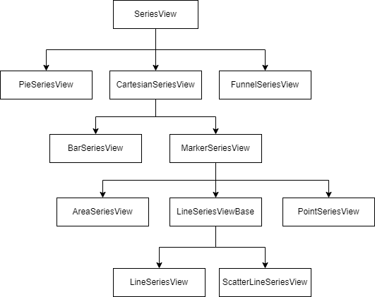
Series View Hierarchy Changes
We’ve also revised the hierarchy of available series and removed some series-specific classes like StackedBarSeriesView or DonutSeriesView. For a complete list of classes, please review the following breaking change document: WinUI Charts - Some series view classes have been removed.
The following diagram demonstrates our new series view hierarchy:
Now, if you’d like to create Stacked or Step charts, you need to use the following properties:
- AreaSeriesView.StackedMode | BarSeriesView.StackedMode | LineSeriesView.StackedMode
- AreaSeriesView.InterpolationMode | LineSeriesView.InterpolationMode
To create donuts and nested donuts, use the PieSeriesView class properties:
Refer to the following help topic for a full list of available series views: Charts Gallery.
Data Source Adapter Changes
To simplify data source initialization, we renamed the DataSourceAdapter class to DataSource and simplified data source assignment. With v22.1, you only need to specify ArgumentDataMember and ValueDataMember properties and disregard DataMemberobject creation:
v21.2
<Charts:Series.Data>
    <Charts:DataSourceAdapter DataSource="{Binding ItemsSource}">
            <Charts:DataMember DataMemberType="Argument"
                               ColumnName="PointArgument"
                               ScaleType="DateTime"/>
            <Charts:DataMember DataMemberType="Value"
                               ColumnName="PointValue"
                               ScaleType="Auto"/>
    </Charts:DataSourceAdapter>
</Charts:Series.Data>
v22.1
<Charts:Series.Data>
    <Charts:DataSource PointSource="{Binding ItemsSource}"
                       ArgumentDataMember="PointArgument"
                       ValueDataMember="PointValue"/>
</Charts:Series.Data>
Data Source & Points
DataPointCollection and DataPoint classes are used to supply static data list to a chart. We renamed these to PointDataCollection and PointData (to follow API naming conventions).
As you can see from the code snippet above, you can now use the DataSource object along with the PointDataCollection list to initialize series data:
We also introduced a base class for point data classes - PointDataBase. The motivation for this change is to create point data entities for new series types in future release cycles. We migrated the following properties from PointData to PointDataBase
Create Series - MVVM Style
You can now create chart series from a collection of view models with the help of the ChartBase.SeriesSource property. The ChartBase.SeriesItemTemplate and ChartBase.SeriesItemTemplateSelector properties allow you to convert a model object to a series.
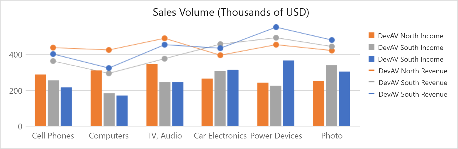
Here’s a sample:
<UserControl
    x:Class="ChartsDemo.SeriesSourceDemo.View"
xmlns="http://schemas.microsoft.com/winfx/2006/xaml/presentation"
    xmlns:x="http://schemas.microsoft.com/winfx/2006/xaml"
    xmlns:local="using:ChartsDemo.SeriesSourceDemo"
    xmlns:dxc="using:DevExpress.WinUI.Charts">
        <DataTemplate x:Key="LineSeriesTemplate" x:DataType="local:SeriesViewModel">
            <dxc:Series DisplayName="{x:Bind Name}">
                <dxc:Series.View>
                    <dxc:LineSeriesView
                        ShowMarkers="True"
                        Brush="{x:Bind ColorIndex, Converter={StaticResource seriesBrushConverter}}"
                        ToolTipPointPattern="{}{A}: ${V}K"
                        LegendMarkerTemplate="{StaticResource LineSeries_LegendMarkerTemplate}" />
                </dxc:Series.View>
                <dxc:Series.Data>
                    <dxc:DataSource
                        PointSource="{x:Bind DataSource}"
                        ArgumentDataMember="Category"
                        ValueDataMember="SalesVolume" />
                </dxc:Series.Data>
            </dxc:Series>
        </DataTemplate>
        <DataTemplate x:Key="BarSeriesTemplate" x:DataType="local:SeriesViewModel">
            <dxc:Series DisplayName="{x:Bind Name}">
                <dxc:Series.View>
                    <dxc:BarSeriesView Brush="{x:Bind ColorIndex, Converter={StaticResource seriesBrushConverter}}" ToolTipPointPattern="{}{A}: ${V}K" />
                </dxc:Series.View>
                <dxc:Series.Data>
                    <dxc:DataSource
                        PointSource="{x:Bind DataSource}"
                        ArgumentDataMember="Category"
                        ValueDataMember="SalesVolume" />
                </dxc:Series.Data>
            </dxc:Series>
        </DataTemplate>
        <local:SeriesTemplateSelector
            x:Key="selector"
            LineSeriesTemplate="{StaticResource LineSeriesTemplate}"
            BarSeriesTemplate="{StaticResource BarSeriesTemplate}" />
    </UserControl.Resources>
    <Grid>
        <Grid.RowDefinitions>
            <RowDefinition Height="Auto" />
            <RowDefinition Height="*" />
        </Grid.RowDefinitions>
        <TextBlock
            Text="Sales Volume (Thousands of USD)"
            FontSize="18"
            HorizontalAlignment="Center"
            TextWrapping="WrapWholeWords"
            Margin="10" />
        <dxc:CartesianChart
            Grid.Row="1"
            SeriesSource="{x:Bind ViewModel.Series}"
            SeriesItemTemplateSelector="{StaticResource selector}"
            SelectionMode="None"
            ToolTipEnabled="True"
            Margin="100,0,100,0">
        </dxc:CartesianChart>
    </Grid>
</UserControl>
Your Feedback Matters
We would love to know what you think of these WinUI-related enhancements and the changes to our WinUI Chart Control’s API.