As you may know, our Form Layout component for Blazor includes data editors and allows you to create responsive edit forms with built-in auto-arrangement support. Our Blazor Tab component allows you to incorporate tabbed interfaces within your web app.
This post details new features/enhancements we’ve made to both components in our most recent release (v21.1).
Form Layout
Caption Position
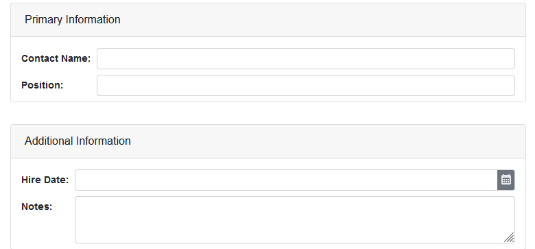
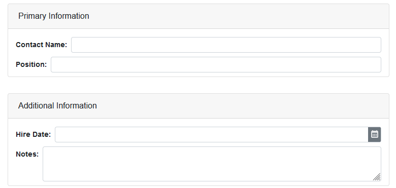
We added a new CaptionPosition property to improve the flexibility of our Form Layout component's auto-generated design. Use this property to display a caption above (Vertical) or to the left of an item (Horizontal).

You can now specify this property individually for each group, tab page, or a single item. When you set the CaptionPosition at the Form Layout level, the property is passed down recursively, unless, one of the descendants has its own CaptionPosition specified. In essence, individual settings have higher priority.
Item Caption Alignment
For a Form Layout with horizontal captions, we added an option that allows you to choose how paddings are calculated between captions and corresponding editors. You can use the ItemCaptionAlignment property to select one of the following options.
- All - Paddings are calculated based on the longest caption in the entire Form Layout component, except for tab pages wherein caption widths are always calculated separately.

- InGroups - Works like the
Alloption, but the longest caption is chosen for each group. Captions outside the group do not affect caption alignment inside the group.

- None - Disables automatic caption width calculations. As such, caption width is equal to the width of its content. The corresponding editor will be placed directly after its caption and therefore, may not align with other editors in the group.

Tabs Enhancements
Render Mode
We added a new RenderMode property for the DevExpress Tabs component for Blazor so you can configure how content within Tabs is loaded by selecting one of the following options:
- Default– The component initially loads only content of an active tab. When a user selects another tab, its content is replaced by the content of the previously active tab in the DOM. Performance for initial load is fast because the component doesn't maintain the state of its tabs.
- AllTabs– The component loads the content of all tabs initially and stores it within the DOM. This mode speeds up navigation between tabs, but the page may take a longer time to load and can increase memory consumption.
- OnDemand (aka Lazy Load) – The component initially loads content of only the active tab. As the user selects other tabs, these are loaded and stored in the DOM. This mode allows you to maintain the tab's state and improve overall performance at the same time.
Tab Click
In v21.1, we implemented the DxTabs.TabClick and DxTabBase.Click events so you can catch and respond to tab clicks, as needed.
Use the TabClick event to process every tab click with the same code:
<DxTabs TabClick="OnTabClick">
  <DxTab Text="Tab 1"></DxTab>
  <DxTab Text="Tab 2"></DxTab>
</DxTabs>

@ClickedTab

@code  {
  public string ClickedTab { get; set; } = "";
  void OnTabClick(TabClickEventArgs e) {
    ClickedTab = $"' Tab {e.TabIndex + 1}' has been clicked";
  }
}
To process a specific tab’s Click event, create an individual event handler for each tab:
@inject IJSRuntime JSRuntime

<DxTabs>
  <DxTab Text="Home" Click="OnHomeTabClick" />
  ...
</DxTabs>

@code  {
  async Task OnHomeTabClick(TabClickEventArgs e) {
    if(e.MouseEventArgs.Detail == 2)
      await JSRuntime.InvokeVoidAsync("open", "/", "_blank");
  }
}