Our most recent release (v20.2), includes a series of new features/capabilities for existing DevExpress Blazor UI controls. In this post, I'll focus on the most recent enhancements to our Blazor Scheduler component.
Before I proceed, a quick word about v20.1 and our expired free Blazor UI component offer. If you downloaded v20.1 free-of-charge, you are entitled to use v20.1 as long as you wish. With our v20.2, our Blazor UI controls are no longer available free-of-charge. Should you require additional information on v20.1, please forward your comments to clientservices@devexpress.com.
Resources
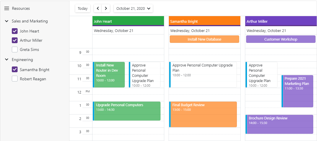
Our Blazor Scheduler now allows you to assign resources to appointments and browse multiple schedules simultaneously. You can group appointments by resources or by dates and display resources in different views:

We've integrated Resource Navigation into our Blazor Scheduler. Your users can show or hide calendars via our integrated Resource Navigator.

You can also create a custom UI as needed. For instance, you can introduce a tree-like resource navigator to filter resources:

Custom Appointment Form
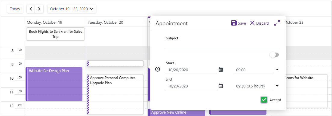
Our Blazor Scheduler has two built-in dialogs to edit appointments: compact and detailed. We've added a flexible new API to create custom layouts for these Appointment Dialogs. You can customize the forms to do the following:
- Add your own editors and bind them to custom fields
- Use custom editors for built-in Appointment items
- Mix custom content with default items
- Combine items into groups to better address your business requirements
Use the following new properties to manage these dialogs:
AppointmentCompactFormLayout - Specifies the layout of the compact form that appears when you create an appointment.

AppointmentFormLayout - Specifies the layout of the pop-up form that appears when you create an appointment and click the expand button, or when you edit an appointment.

Appointment Templates
You can now customize appointment appearance via templates. New templates include:
- HorizontalAppointmentTemplate - applied to all-day appointments (displayed horizontally in the all-day panel);
- VerticalAppointmentTemplate - applied to other appointments (displayed vertically).

Custom Fields
Custom fields allow you to add custom data to appointments, labels, and status fields. For example, use the AppointmentMappings.CustomFieldMappings collection to add custom fields for appointments:
DxSchedulerDataStorage DataStorage = new DxSchedulerDataStorage() {
  AppointmentsSource = AppointmentCollection.GetAppointments(),
  AppointmentMappings = new DxSchedulerAppointmentMappings() {
    ...
    CustomFieldMappings = new List<DxSchedulerCustomFieldMapping> {
      new DxSchedulerCustomFieldMapping { Name = "IsAccepted", Mapping = "Accepted" }
    }
  }
};
New API to assign CSS classes
The TextCssClass and BackgroundCssClass properties allow you to assign CSS classes to appointment labels and status fields. You can also map the label's properties to the data source fields:
AppointmentLabelMappings = new DxSchedulerAppointmentLabelMappings()
{
  Id = "Id",
  Caption = "LabelName",
  Color = "LabelColor",
  TextCssClass = "TextCssClass",
  BackgroundCssClass = "BackgroundCssClass"
}
Should you have any questions about these new features, or if you require assistance on our Blazor product line, please comment below. Please remember, that the features described in this post relate to v20.2. v20.2 is not available free-of-charge. The capabilities described in this post are available to those who own an active ASP.NET/DXperience/Universal Subscription.