We just updated our UI controls for Blazor with official support for the latest version of Blazor WebAssembly. This release also includes two new UI components, a number of new features, and DevExpress Reports for Blazor.
Blazor WebAssembly 3.2.0 support
I'm thrilled to announce that Blazor WebAssembly is now officially released. This is a fully-featured and supported release of Blazor WebAssembly that is ready for production use. Full stack web development with .NET is now here! - Dan Roth, Blazor PM
As you know, Microsoft has officially released both server and client hosting models for the Blazor framework. Our most recent release (v20.1) supports Microsoft’s latest releases: .NET Core 3.1.4 and the Blazor Web Assembly 3.2.0.
Download
To get started with v20.1 today, use the DevExpress NuGet server.
New Reports for Blazor
If you currently own a DevExpress Reports Subscription, you’ll have access to our new Blazor Reporting platform. This Suite includes a Visual Studio Report Designer, a Blazor Report Viewer and a rich set of integrated report elements (tables, shapes, fields, etc).
Blog post | Demo | Documentation
New Adaptive Toolbar
v20.1 ships with a new Command Toolbar component for Blazor. This component allows you to add a lightweight adaptive toolbar to your Blazor apps:

You can create and incorporate the following commands types within your Blazor apps:
- Button
- Drop-down list
- Radio button
- Check button
- Link button
Each button can include an icon, text, or both. Use the DxToolbarItem.Template property to create a custom toolbar item as needs dictate. You can also divide toolbar items into groups.
Our Blazor Toolbar component automatically adapts size for desktop and mobile browsers. When the toolbar cannot fit into its container, the control hides text for items with an icon or moves root items one by one to a root submenu (until the toolbar contains the appropriate number of root items).
New Context Menu
Our new Context or popup menu can display both a single or multi-level context menu.
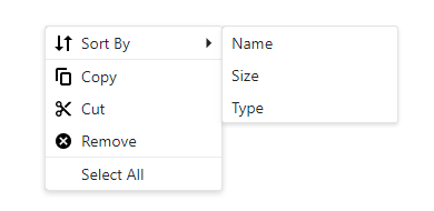
The Context Menu can organize and display items from a hierarchical structure or from a standard list. You can bind the menu to a data source and populate the item collection at runtime. You can also create custom context menu items directly within your Razor markup.
We've added a menu items API to set properties such as Text and Icon, start a new group, and more.
Use the Show(x, y) method to specify the location wherein the context menu is to be displayed. Call the Show method from the either the onClick or onContextMenu Blazor mouse events.
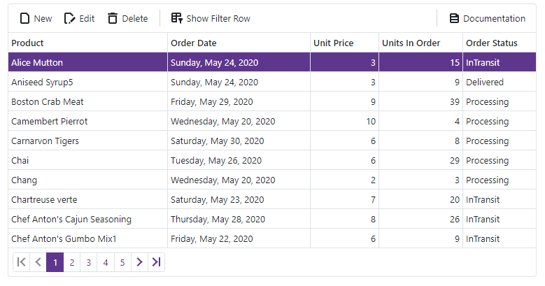
Data Grid
Command Toolbar
Include custom tool buttons in your Blazor Grid by integrating our new Toolbar component. Use the Grid's HeaderTemplate to add toolbars:
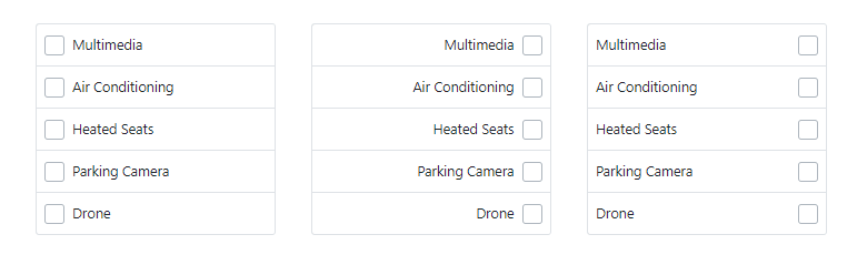
Column Chooser
Our Blazor Data Grid allows you to customize visible columns via its runtime Column Chooser (Column Selector).
Users can reorder columns by dragging icons next to column headers. They can also hide or display columns using checkboxes:
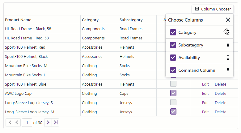
To enable, add the DxDataGridColumnChooserToolbarItem to the grid toolbar's markup.
The Column Chooser is mobile-friendly. On mobile devices it adapts automatically and displays a panel:

Control Display Size
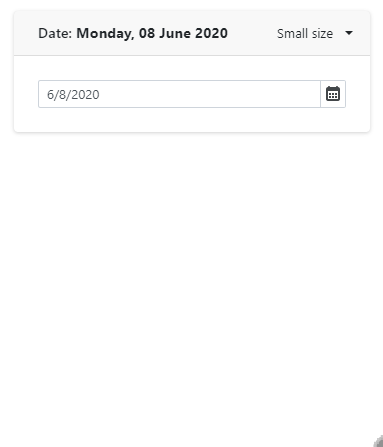
The majority of DevExpress Blazor Editor components now support three size options: Small , Medium , and Large.

Some components, like our Data Grid, are more complex than others (i.e. Button). To accommodate these differences, we introduced the following three SizeMode properties:
- SizeMode - used for simple components, such as our Data Editors, Buttons, and Pager.
- InnerComponentSizeMode - used for the Data Grid and Scheduler. Changes the size of internal UI elements.
- ItemSizeMode - used for our Form Layout and Toolbar. Resizes items.
You can also use the DevExpress global option to modify size mode for the entire Blazor app.
Important note : In v20.1, we changed the default size of all editors to small. If you prefer a different size, simply use the properties listed above.
Data Editors
Display Format Support
Our Text Box, Spin Edit, ComboBox and Date Edit components now support the DisplayFormat property. This allows you to display formatted values (based on conditional formatting rules) that differ from underlying field values. For example, you can display currency values for a field with float values. This property only changes how the value is displayed at runtime and does not affect the underlying value.
Use the new DisplayFormat property to specify a format pattern with standard format strings.
Specify when Values Update
When the Text Box and Spin Edit components are bound to a property or field, associated values are only updated when the editor loses focus. With this release, we added a new BindValueMode property to our Text Box and Spin Edit components.
Set the BindValueMode property to either:
OnLostFocus- Editor value is updated after the editor loses focus.OnInput- Editor value is updated when input values change.
To update editor values immediately after user input changes, set this property to OnInput.
onInput event. Override this event to execute custom code when a user enters a new value within an editor.Input HTML attributes
Many of our Blazor editor components are built with the standard HTML input element. With this release, we've added the ability to assign HTML attributes. Our Text Box, ComboBox, Spin Edit, Date Edit, and TagBox now support the following attributes:
The Text Box, Spin Edit, and Date Edit also support the following attributes:
To apply these attributes, specify them directly in Razor markup:
<DxTextBox name="abc" tabindex="1" autocomplete="on" />Drop-down Window Direction
Our Blazor ComboBox, TagBox, and Date Edit components display a drop-down window below a standard text field. However, if one of these editors was located at the bottom of a page, then the drop-down window portion can be cut off.
With this release, our Blazor ComboBox, TagBox, and Date Edit will automatically open a window above or below their text field (based on available space).
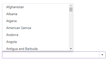
Use the DropDownDirection property to manually define direction as Up or Down.
CheckBox
Content Alignment
Use the new CheckBox Alignment property to align a check mark and text relative to one another.
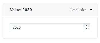
Spin Edit
Custom Increment Value
Use our Blazor Spin Edit's new Increment property to set custom increment values, including decimals:
Charts
Resolve Label Overlap
If chart series contain multiple points, point labels can overlap. With this release, we introduced a LabelOverlap property. Use it to specify how the chart should process overlapping labels.
Series API Enhancement
We added a VisibleChanged event to the chart series object. The event fires when a user changes series visibility (for example, by toggling checkboxes near the series title in the legend). You can also implement two-way binding for the DxChartSeries.Visible property.
XAF's Blazor UI & Example with Security System APIs
For our XAF customers, the team will soon update the online XAF Blazor demo based on the release version of our Blazor components. It will include bug fixes and improved data validation support.
Even if you do not plan to use XAF's UI, you may find this new non-XAF Blazor Server demo and tutorial helpful. It demonstrates how to use DevExpress Blazor components with XAF's non-visual APIs for user authentication and group authorization.
For more information on our business application framework for .NET developers, please follow the XAF Team blog.