Good news about the React Scheduler: we published the first release.
The Scheduler is a native React widget that uses Material-UI for rendering and theming. It supports both controlled and uncontrolled React state modes, and it adheres to Google Material Design guidelines for its visual appearance. With its rich feature set, it integrates perfectly with your React and Material-UI applications.
We have implemented several additional features since our recent blog post about the beta release. Please read on for details.
Appointment Resources
You can configure resources using the new Resources plugin.
Users can associate appointments with resources. Single-instance resources are used for scenarios where just one association is allowed, such as a meeting room. Multiple-instance resources are used when more than one association is allowed, for example when assigning members to a team.
Colors help distinguish resources visually, and they are automatically assigned if they are not supplied by the data source. In this animation, you can also see the resource editors in the appointment editing form.
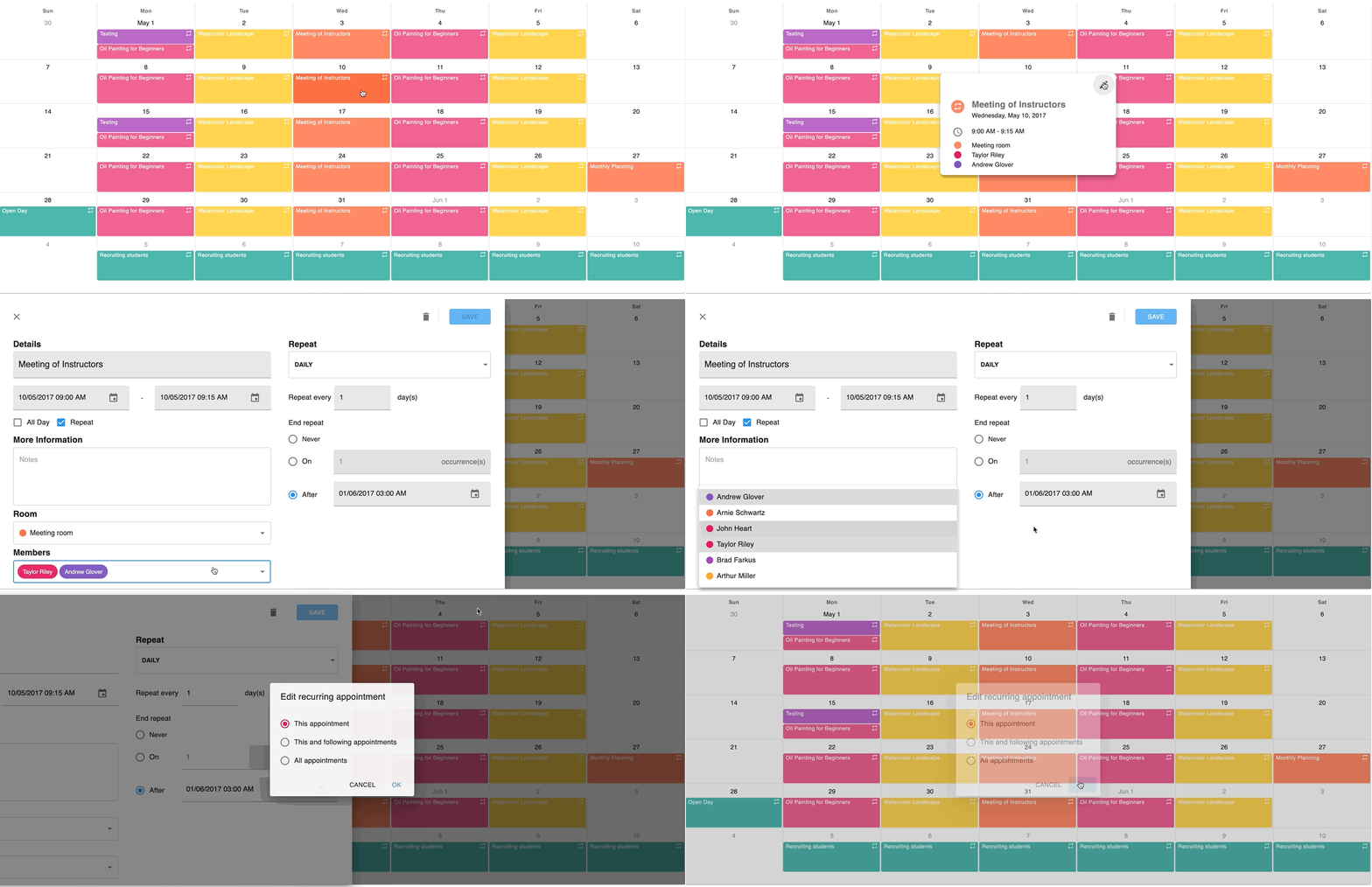
A guide about resources is available in our documentation.
Confirmation Dialog
With the new ConfirmationDialog plugin you can automate the common requirement of asking for confirmation when users delete appointments or cancel the appointment editing form after making changes.
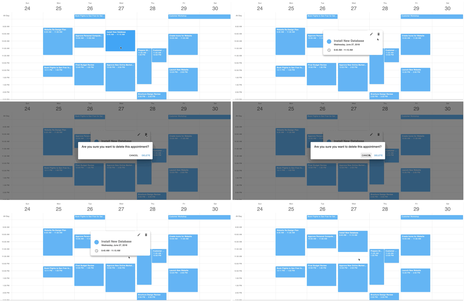
Please click here to find out how to use the confirmation dialog.
Enhanced Appointment Tooltip
We added detail information to the appointment tooltip component. It now includes the weekday as well as resource and recurrency data.
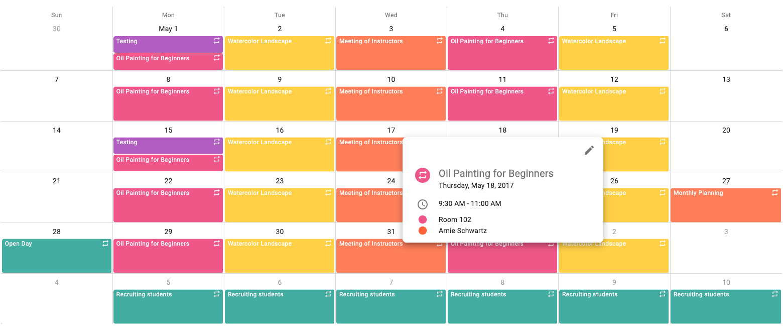
You can find documentation about the appointment tooltip here.
We also improved the customization capabilities of the tooltip component. Please click this link for a demo.
Appearance of Zero-Time Appointments
Some appointments don’t have durations, for instance sunset or sunrise times, or bus/plane/train arrival times. The React Scheduler now displays such appointments like Outlook or Google Calendar, using a fixed height of half a cell, i.e. 15 minutes by default. The same method is used when appointment durations are shorter than the half-cell length.
This change means that all appointment titles and times are displayed correctly in the UI.
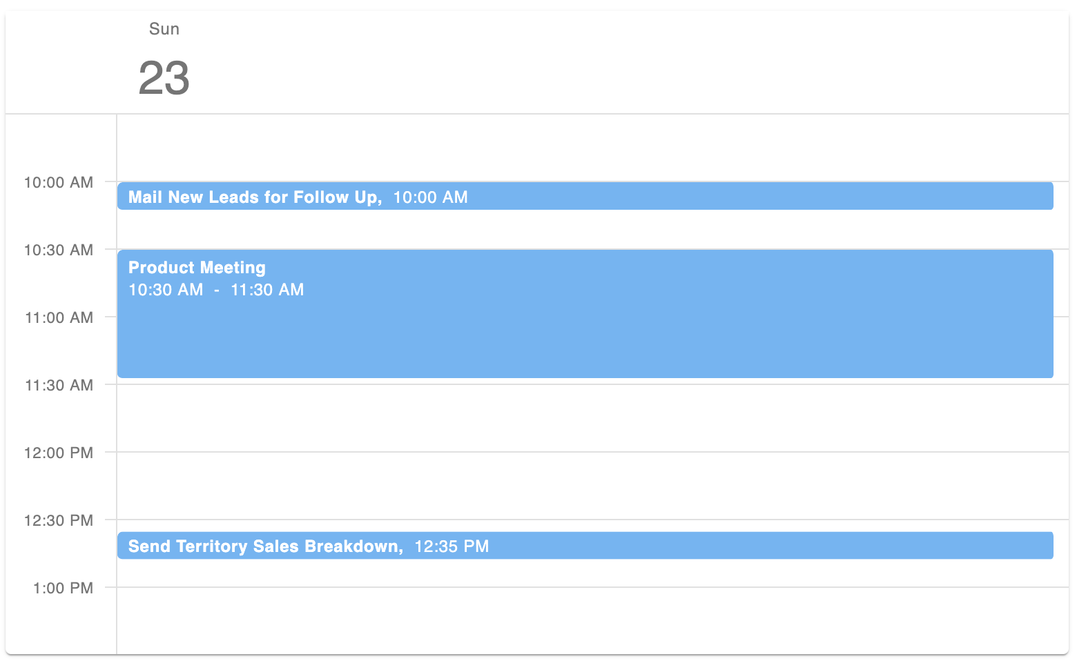
Please click here for details on zero-time appointments
Current Time Visualization
The new CurrentTimeIndicator plugin displays a line to indicate the current time, and it optionally shades time cells and appointments in the past.
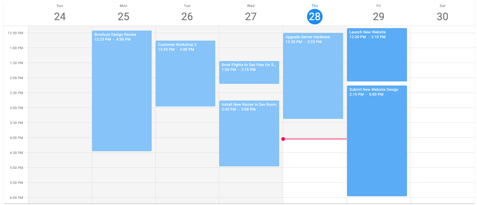
Please see this guide for details.
Fractional Time Scale Start And End
The view properties startDayHour and endDayHour can now be set to floating point numbers. For example, you can use this:
{
  // ...
  startDayHour: 8.5,       // 8:30
  endDayHour: 15 + 2/3     // 15:40 or 3:40pm
}
Future Plans
Based on our roadmap, we are now working on resource and date grouping features. Please feel free send us feedback and feature requests.