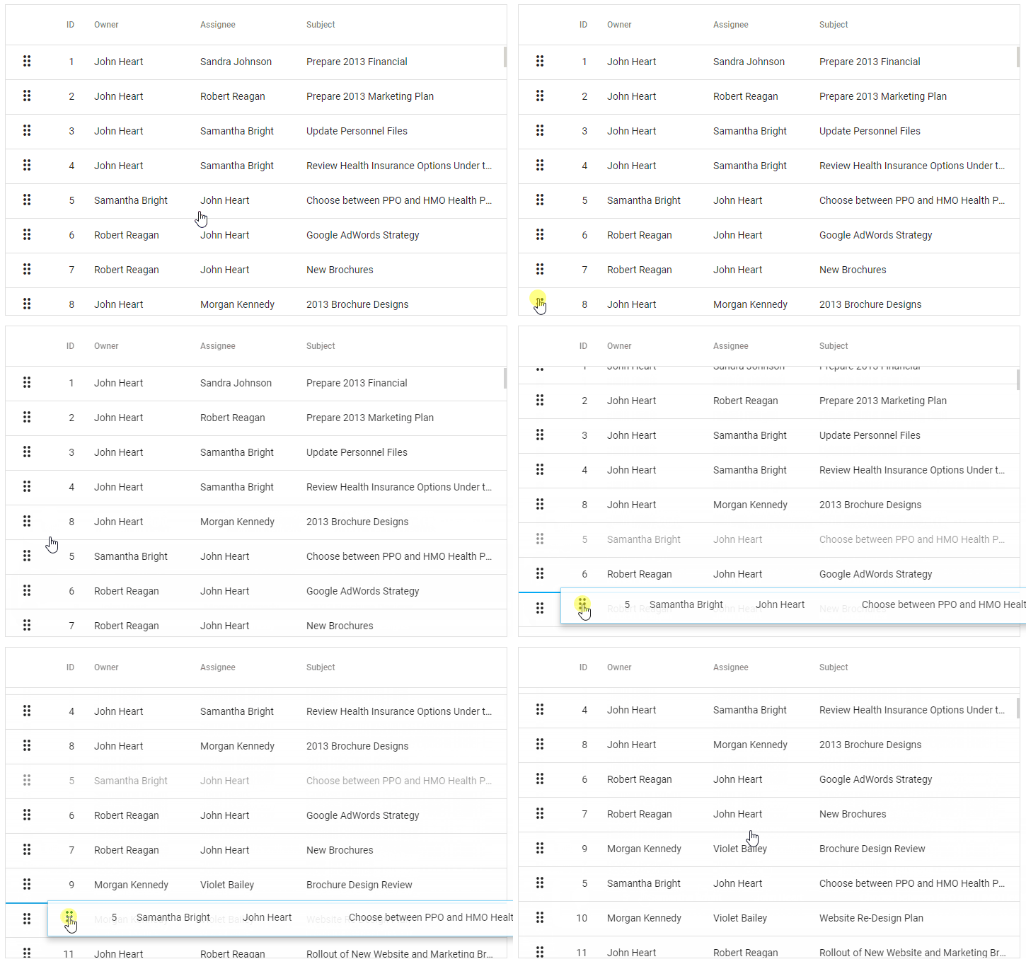
DevExtreme now includes the Draggable and Sortable widgets as a shared drag & drop API. They standardize drag & drop functionality for other widgets in the DevExtreme suite and provide common customization options.
You can use the new widgets to implement drag & drop functionality for your own application and we will publish a blog post with examples soon. For now we’ll focus on the advantages this new approach brings to other DevExtreme widgets.
Record and Node Reordering in Data Grid and Tree List
Both Data Grid and Tree List now support the option rowDragging. You use this option to enable dragging of rows or nodes, and to customize the feature. Most properties are shared with the Sortable widget configuration, but Data Grid and Tree List add the property ShowDragIcons.
As an example, here’s how you enable row reordering in an Angular Data Grid. Please note that all other DevExtreme platforms are supported in addition to Angular.
<dx-data-grid
  ...
  <dxo-row-dragging
    [allowReordering]="true"
    [onReorder]="onReorder">
  </dxo-row-dragging>
</dx-data-grid>
The property allowReordering activates the feature and the event handler onReorder is called when the user completes a drag operation. You need to implement logic in the event handler to change the order of rows in your data source.
Please see the demo DataGrid Local Reordering for an example that rearranges items in a data source array.
The second demo DataGrid Remote Reordering shows how to change an OrderIndex field in a remote data source.
For the Tree List, you can activate node reordering using similar code:
<dx-tree-list
  ...
  <dxo-row-dragging
    [allowDropInsideItem]="true"
    [allowReordering]="true"
    [onReorder]="onReorder">
  </dxo-row-dragging>
</dx-tree=list>
In this case, the allowDropInsideItem option allows the user to move nodes between parents. Please see the demo TreeList Node Drag-and-Drop for an example.
Cross-Component Drag & Drop
Each widget that uses the new drag & drop utility widgets has its own configuration option: rowDragging for the Data Grid and Tree List, itemDragging for the List, and appointmentDragging for the Scheduler. To enable cross-component drag & drop, set the group property of multiple widgets to the same value.
For example, this setup allows the user to drag and drop rows between two Data Grids:
<dx-data-grid
  ...
  <dxo-row-dragging
    group="shared"
    data="grid1"
    [onAdd]="onAdd"
    [onRemove]="onRemove">
  </dxo-row-dragging>
</dx-data-grid>

<dx-data-grid
  ...
  <dxo-row-dragging
    group="shared"
    data="grid2"
    [onAdd]="onAdd"
    [onRemove]="onRemove">
  </dxo-row-dragging>
</dx-data-grid>
You must implement the event handlers onAdd and onRemove to process cross-component operations. Depending on your scenario, you may need to modify the underlying data sources or change filters applied to bound data. The data option shown in the code sample is passed to the event handlers to help you distinguish source and target widgets of a drag operation.
Please see the demo Drag-and-Drop Between Two Grids for an implementation that uses filtering.
Cross-Component Operations With The Scheduler
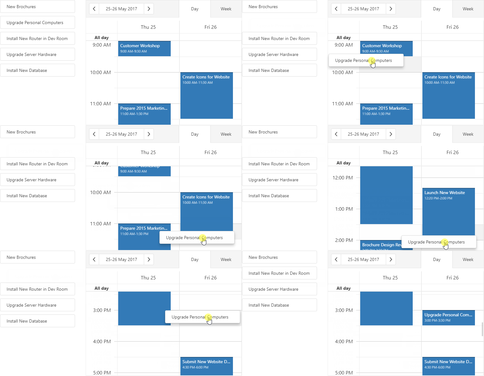
For the Scheduler widget, the appointmentDragging option provides the Draggable API.
<dx-scheduler
  ...
  <dxo-appointment-dragging
    group="shared"
    [onAdd]="onAdd"
    [onRemove]="onRemove">
  </dxo-appointment-dragging>
</dx-scheduler>
You can see here that cross-component dragging also works with a combination of two different widgets. Please see the demo Scheduler Custom Drag-and-Drop for an example of a List/Scheduler combination.
Cross-Component Operations With The List
The List widget has the option itemDragging which supports the Sortable API.
<dx-list>
  ...
  <dxo-item-dragging group="shared" [onAdd]="onAdd" [onRemove]="onRemove">
  </dxo-item-dragging>
</dx-list>

Please see the demo List Item Drag-and-Drop.
Try It Now
Please follow the demo links above or download the latest release to try the new drag & drop capabilities on your own machine. As always, feel free send us your feedback and feature requests.