In this post, we'll detail some of the features we expect to ship in our next major release (v19.2). As always, active Universal and DXperience Subscribers can test the functionality described herein prior to official release. Simply log onto our website and obtain the appropriate build via the DevExpress Download Manager or install the appropriate NPM package.
DataGrid & TreeList
Reordering Records/Nodes & Cross-Component Drag-and-Drop
Our next major release will allow you to reorder DataGrid records and TreeList nodes. We also expect to ship cross-component drag-and-drop support. You can find more information on our implementation and share your feedback via the following
discussion page on GitHub.
![]()
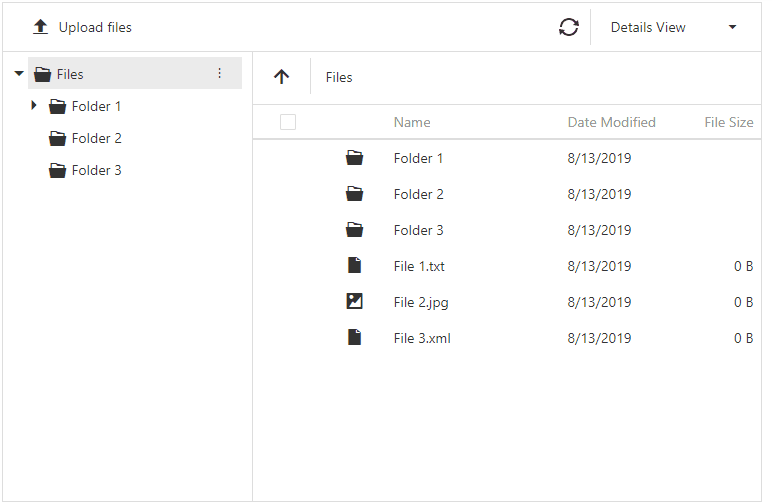
File Manager
Our JavaScript File Manager component will officially ship in the v19.2 release cycle. File Manager can now display file operation progress and its associated status. You can find more information on our implementation and share your feedback via the following discussion page on GitHub.
![]()
![]()
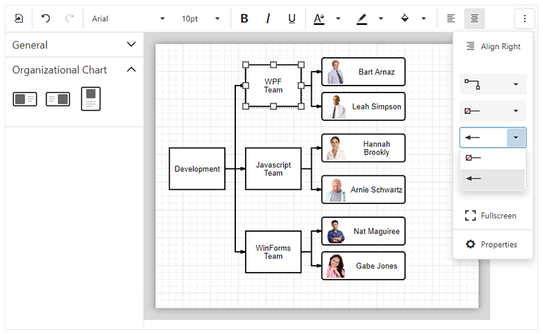
Diagram
Images in Shapes
You can now associate a predefined (or custom) image with new image shapes via a database or the widget’s UI. The image will maintain the shape's size and its position when the shape is moved or resized.
Shape Containers
New shape types - horizontal and vertical containers - allow you to combine other shapes within a "container". Our JavaScript Diagram component supports stacked containers and ships with expand and collapse functionality.
Demo
New Data Binding Capabilities
We implemented advanced data binding for shape settings. You can bind all shape properties including shape and connectors style, shape image URL, position, and size to a database. We expect to support data binding for all new shape settings.
Demo
Full Screen Mode
Our Diagram now supports fullscreen mode. You can add a corresponding toolbar command or use the fullscreen property to enable Fullscreen mode within your web app.
Read Only Mode
Read only mode protects the Diagram from edit operations. Use the readOnly property to enable this diagram option.
Demo
Simple View
When you activate our new Simple View mode, the JavaScript Diagram removes gray document borders and the diagram’s content fully occupies available screen real-estate.
Demo
Zooming Document Content
DevExpress JavaScript Diagram can now apply zoom levels to its content. To change zoom level, use the 'Zoom Level' editor on the Properties panel or CTRL+Mouse Scroll combination. Select the 'Auto Zoom' check box to auto zoom the diagram to fit the page.
UI Customization
JavaScript Diagram provides new APIs to control the visibility and the content of the following UI elements:
To learn more and explore the features described herein, please see our online JavaScript Diagram demo.
Gantt
![]()
Node Editing
The following edit actions will be available:
- Resize and modify tasks.
- Change dependencies between tasks.
- Edit cell values within the Tree List region. The component immediately saves changes on the server and updates the Gantt chart when cell values change.
Change History
Our Gantt stores changes made by an end-user. Changes may be rolled back when necessary.
Task Selection API
DevExpress Gantt ships with a comprehensive API and a customizable UI to control the task selection process.
Region Resizing
End users can resize both Gantt and Tree List regions as needed (via the control’s built-in separator bar).
Real-time Scaling
DevExpress Gantt allows you to browse data across various levels of detail. Hold the CTRL key and rotate your mouse’s scroll wheel to zoom (in or out).
HTML/Markdown Editor
We expect to officially ship our HTML/Markdown Editor in this release cycle. We have addressed several issues including some related to its user interface. We hope to ship enhanced image management functionality (such as file upload and drag-and-drop support) but will not introduce Table support in this release. Table support remains on our ToDo list and we hope to complete it next year.
New Drag-and-Drop Utilities
DevExtreme’s new Drag-and-Drop Utilities will be the base for our DataGrid’s new record/node reordering option. These new utilities will also allow you to construct custom drag-and-drop functionality independent of our UI components. You can find more information on our proposed implementation and share your feedback via the following discussion page on GitHub.
Other UI Widget Enhancements
- You can now control the visibility of our Floating Action Button via its new ‘visible’ option.
- We will introduce Material Design label animation support (based upon Google’s guidelines).
Data Visualization
Discrete Aggregation
We’ve introduced a new ‘aggregateByCategory’ option that changes the way our Chart widget aggregates discrete data. When set to ‘true’, Charts aggregate series points for the same category.
const chartConfig = {
    dataSource: [
        {arg: "A", val: 1},
        {arg: "A", val: 1},
        {arg: "A", val: 1},

        {arg: "B", val: 1},
        {arg: "B", val: 1}
    ],
    series: {
        type: "bar",
        aggregation: {
            enabled: true,
            method: "sum"
        }
    },
    argumentAxis: {
        aggregateByCategory: true
    }
}
The Chart configuration above generates the following:
![]()
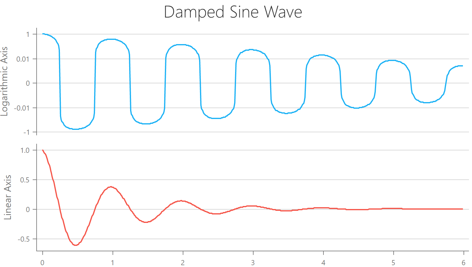
Display Negative Values for Logarithmic Scales
Datasets that contain rapidly growing values with negative and/or zero values can now be visualized within our logarithmic axis.
![]()
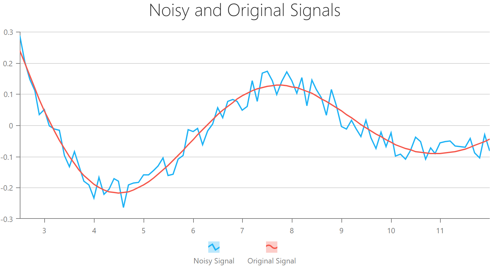
Custom Annotations
Our Chart widget now supports custom annotations. You can use a template to render the desired content inside the annotation container.
![]()
New API for the VectorMap Coordinate Translation
Based upon your great feedback, we've introduced two new methods for coordinate translation (VectorMap). With this new API, you can now deliver more sophisticated map interaction usage-scenarios.
convertToGeo(x, y)
convertToXY(longitude, latitude)
Custom Legend Item Markers
You can now use a custom template to render Chart legend markers.
![]()
Manage Chart Pane Size
You can now control the size of chart panes. Pixels and percentage units are supported.
![]()
Custom Text Inside a Donut
With the aid of our template, you can now place your custom SVG markup inside a Donut chart (your content will be placed at the center of Donut/Pie chart)
![]()
Other Customization Enhancements
We expect to apply the power of template-based customization to other Chart elements (including points, labels, and tooltips). This change will allow you to use any custom HTML/SVG markup to render these elements.
Data Validation
Asynchronous Validation
We expect to introduce asynchronous remote validation support in this release cycle (an example of asynchronous remote validation includes checking whether a user already exists in a database during website registration). You can find more information on our proposed implementation and share your feedback via the following
discussion page on GitHub.
![]()
Improved Code Splitting
This item is in progress and affects our entire codebase. It will take more than one release cycle to complete. Currently, we are focused on making our CSS more modular (you’ll be able to bundle only those styles/features being used in your app).
Native React Grid
Column Resizing Enhancements
Previously, you could only use pixels to specify Grid column width. We now support other CSS size units - such as ‘em’ or ‘%’. This feature is not yet available publicly, but it will be included in an upcoming build.
Virtual Table Enhancements
We’ve introduced the following user-requested enhancements to our VirtualTable plugin:
- Access and track table scroll position via API.
- Virtual table can now seamlessly work with banded column mode.
- Lazy loading with record grouping enabled.
These features are not yet available publicly, but they will be included in an upcoming build.
Group Row Summary
You can now display summary values for a record group.
![]()
Other React Grid Features
We expect to implement the following features later this year:
- Inline cell editing. Improve cell editing by placing a cell into edit mode when clicked (without the need to press the edit button within the edit column).
- List View (adaptive mode). Render/display records as a traditional list with a custom, responsive layout (for improved usability on mobile devices).
Native React Scheduler
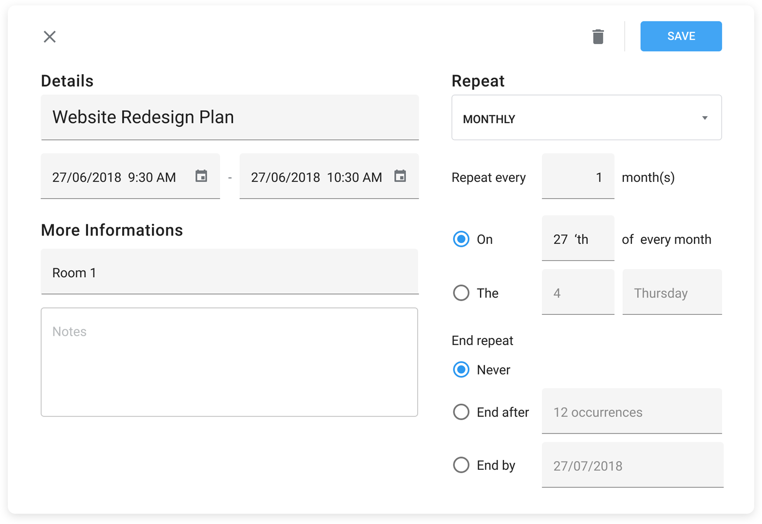
Recurring Appointments
React Scheduler users can now specify recurrence patterns for an appointment in code.
We are working on a new recurring appointment edit form.
![]()
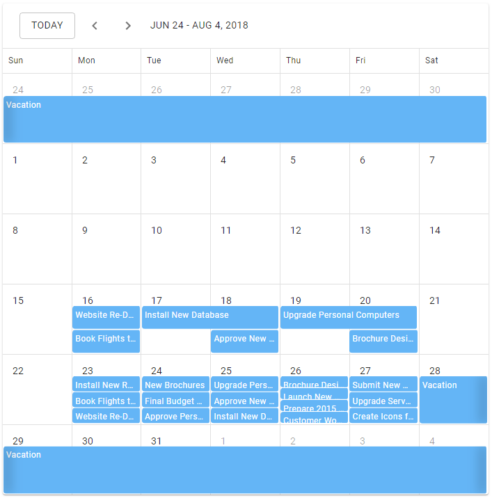
Today Navigation Button
We’ve added a ‘Today’ button to the React Scheduler’s navigation panel. This feature was inspired by Google’s Calendar. A user can use this button to quickly navigate to the current date.
![]()
Native React Chart
Chart Rotation
You can now change chart orientation as needed (swap argument and value axes).
![]()
Transitions on Update
When a chart data source is updated, a transition will be applied to the chart. We are working on this feature and expect to deliver it this year.
NOTE: Early Access and CTP builds are provided solely for early testing purposes and are not ready for production use. This build can be installed side by side with other major versions of DevExpress products. Please backup your project and other important data before installing Early Access and CTP builds.
![]()